⭐ If you would like to buy me a coffee, well thank you very much that is mega kind! : https://www.buymeacoffee.com/honeyvig
Hire a web Developer and Designer to upgrade and boost your online presence with cutting edge Technologies
Showing posts with label guides. Show all posts

Wednesday, October 15, 2025

AI:The Psychology Of Trust In AI: A Guide To Measuring And Designing For User Confidence


When AI “hallucinates,” it’s more than just a glitch — it’s a collapse of trust. As generative AI becomes part of more digital products, trust has become the invisible user interface. But trust isn’t mystical. It can be understood, measured, and designed for. Here is a practical guide for designing more trustworthy and ethical AI systems.

Misuse and misplaced trust of AI is becoming an unfortunate common event. For example, lawyers trying to leverage the power of generative AI for research submit court filings citing multiple compelling legal precedents. The problem? The AI had confidently, eloquently, and completely fabricated the cases cited. The resulting sanctions and public embarrassment can become a viral cautionary tale, shared across social media as a stark example of AI’s fallibility.

This goes beyond a technical glitch; it’s a catastrophic failure of trust in AI tools in an industry where accuracy and trust are critical. The trust issue here is twofold — the law firms are submitting briefs in which they have blindly over-trusted the AI tool to return accurate information. The subsequent fallout can lead to a strong distrust in AI tools, to the point where platforms featuring AI might not be considered for use until trust is reestablished.

Issues with trusting AI aren’t limited to the legal field. We are seeing the impact of fictional AI-generated information in critical fields such as healthcare and education. On a more personal scale, many of us have had the experience of asking Siri or Alexa to perform a task, only to have it done incorrectly or not at all, for no apparent reason. I’m guilty of sending more than one out-of-context hands-free text to an unsuspecting contact after Siri mistakenly pulls up a completely different name than the one I’d requested.

Cartoon illustration split into two panels. On the left, a man in a blue hoodie speaks into his phone, saying, “Siri, text Dave, I’m waiting outside of your door.” On the right, a cheerful cartoon phone with a face and arms replies, “I have just texted Martha, I am standing outside of your door.”
Figure 1: Siri and Alexa often tend to confuse the recipient of my message, causing me to distrust using them when accuracy matters. Image generated using Gemini Pro. (Large preview)

With digital products moving to incorporate generative and agentic AI at an increasingly frequent rate, trust has become the invisible user interface. When it works, our interactions are seamless and powerful. When it breaks, the entire experience collapses, with potentially devastating consequences. As UX professionals, we’re on the front lines of a new twist on a common challenge. How do we build products that users can rely on? And how do we even begin to measure something as ephemeral as trust in AI?

Trust isn’t a mystical quality. It is a psychological construct built on predictable factors. I won’t dive deep into academic literature on trust in this article. However, it is important to understand that trust is a concept that can be understood, measured, and designed for. This article will provide a practical guide for UX researchers and designers. We will briefly explore the psychological anatomy of trust, offer concrete methods for measuring it, and provide actionable strategies for designing more trustworthy and ethical AI systems.

The Anatomy of Trust: A Psychological Framework for AI 

To build trust, we must first understand its components. Think of trust like a four-legged stool. If any one leg is weak, the whole thing becomes unstable. Based on classic psychological models, we can adapt these “legs” for the AI context.

1. Ability (or Competence)

This is the most straightforward pillar: Does the AI have the skills to perform its function accurately and effectively? If a weather app is consistently wrong, you stop trusting it. If an AI legal assistant creates fictitious cases, it has failed the basic test of ability. This is the functional, foundational layer of trust.

2. Benevolence

This moves from function to intent. Does the user believe the AI is acting in their best interest? A GPS that suggests a toll-free route even if it’s a few minutes longer might be perceived as benevolent. Conversely, an AI that aggressively pushes sponsored products feels self-serving, eroding this sense of benevolence. This is where user fears, such as concerns about job displacement, directly challenge trust—the user starts to believe the AI is not on their side.

3. Integrity

Does AI operate on predictable and ethical principles? This is about transparency, fairness, and honesty. An AI that clearly states how it uses personal data demonstrates integrity. A system that quietly changes its terms of service or uses dark patterns to get users to agree to something violates integrity. An AI job recruiting tool that has subtle yet extremely harmful social biases, existing in the algorithm, violates integrity.

4. Predictability & Reliability

Can the user form a stable and accurate mental model of how the AI will behave? Unpredictability, even if the outcomes are occasionally good, creates anxiety. A user needs to know, roughly, what to expect. An AI that gives a radically different answer to the same question asked twice is unpredictable and, therefore, hard to trust.

The Trust Spectrum: The Goal of a Well-Calibrated Relationship

Our goal as UX professionals shouldn’t be to maximize trust at all costs. An employee who blindly trusts every email they receive is a security risk. Likewise, a user who blindly trusts every AI output can be led into dangerous situations, such as the legal briefs referenced at the beginning of this article. The goal is well-calibrated trust.

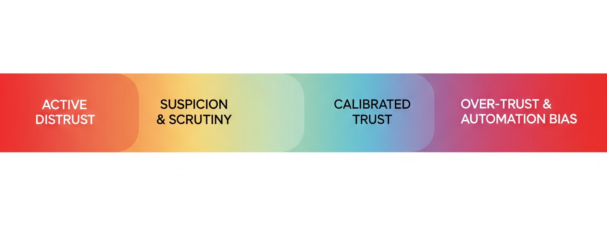
Think of it as a spectrum where the upper-mid level is the ideal state for a truly trustworthy product to achieve:

  • Active Distrust
    The user believes the AI is incompetent or malicious. They will avoid it or actively work against it.
  • Suspicion & Scrutiny
    The user interacts cautiously, constantly verifying the AI’s outputs. This is a common and often healthy state for users of new AI.
  • Calibrated Trust (The Ideal State)
    This is the sweet spot. The user has an accurate understanding of the AI’s capabilities—its strengths and, crucially, its weaknesses. They know when to rely on it and when to be skeptical.
  • Over-trust & Automation Bias
    The user unquestioningly accepts the AI’s outputs. This is where users follow flawed AI navigation into a field or accept a fictional legal brief as fact.

Our job is to design experiences that guide users away from the dangerous poles of Active Distrust and Over-trust and toward that healthy, realistic middle ground of Calibrated Trust.

The trust spectrum
Figure 2: Build user trust in your AI product, avoiding both distrust and over-reliance. Image generated using Gemini Pro.

The Researcher’s Toolkit: How to Measure Trust In AI

Trust feels abstract, but it leaves measurable fingerprints. Academics in the social sciences have done much to define both what trust looks like and how it might be measured. As researchers, we can capture these signals through a mix of qualitative, quantitative, and behavioral methods.

Qualitative Probes: Listening For The Language Of Trust

During interviews and usability tests, go beyond “Was that easy to use?” and listen for the underlying psychology. Here are some questions you can start using tomorrow:

  • To measure Ability:
    “Tell me about a time this tool’s performance surprised you, either positively or negatively.”
  • To measure Benevolence:
    “Do you feel this system is on your side? What gives you that impression?”
  • To measure Integrity:
    “If this AI made a mistake, how would you expect it to handle it? What would be a fair response?”
  • To measure Predictability:
    “Before you clicked that button, what did you expect the AI to do? How closely did it match your expectation?”

Investigating Existential Fears (The Job Displacement Scenario)

One of the most potent challenges to an AI’s Benevolence is the fear of job displacement. When a participant expresses this, it is a critical research finding. It requires a specific, ethical probing technique.

Imagine a participant says, “Wow, it does that part of my job pretty well. I guess I should be worried.”

An untrained researcher might get defensive or dismiss the comment. An ethical, trained researcher validates and explores:

“Thank you for sharing that; it’s a vital perspective, and it’s exactly the kind of feedback we need to hear. Can you tell me more about what aspects of this tool make you feel that way? In an ideal world, how would a tool like this work with you to make your job better, not to replace it?”

This approach respects the participant, validates their concern, and reframes the feedback into an actionable insight about designing a collaborative, augmenting tool rather than a replacement. Similarly, your findings should reflect the concern users expressed about replacement. We shouldn’t pretend this fear doesn’t exist, nor should we pretend that every AI feature is being implemented with pure intention. Users know better than that, and we should be prepared to argue on their behalf for how the technology might best co-exist within their roles.

Quantitative Measures: Putting A Number On Confidence

You can quantify trust without needing a data science degree. After a user completes a task with an AI, supplement your standard usability questions with a few simple Likert-scale items:

  • “The AI’s suggestion was reliable.” (1-7, Strongly Disagree to Strongly Agree)
  • “I am confident in the AI’s output.” (1-7)
  • “I understood why the AI made that recommendation.” (1-7)
  • “The AI responded in a way that I expected.” (1-7)
  • “The AI provided consistent responses over time.” (1-7)

Over time, these metrics can track how trust is changing as your product evolves.

Note: If you want to go beyond these simple questions that I’ve made up, there are numerous scales (measurements) of trust in technology that exist in academic literature. It might be an interesting endeavor to measure some relevant psychographic and demographic characteristics of your users and see how that correlates with trust in AI/your product. Table 1 at the end of the article contains four examples of current scales you might consider using to measure trust. You can decide which is best for your application, or you might pull some of the items from any of the scales if you aren’t looking to publish your findings in an academic journal, yet want to use items that have been subjected to some level of empirical scrutiny.

Behavioral Metrics: Observing What Users Do, Not Just What They Say

People’s true feelings are often revealed in their actions. You can use behaviors that reflect the specific context of use for your product. Here are a few general metrics that might apply to most AI tools that give insight into users’ behavior and the trust they place in your tool.

  • Correction Rate
    How often do users manually edit, undo, or ignore the AI’s output? A high correction rate is a powerful signal of low trust in its Ability.
  • Verification Behavior
    Do users switch to Google or open another application to double-check the AI’s work? This indicates they don’t trust it as a standalone source of truth. It can also potentially be positive that they are calibrating their trust in the system when they use it up front.
  • Disengagement
    Do users turn the AI feature off? Do they stop using it entirely after one bad experience? This is the ultimate behavioral vote of no confidence.

Designing For Trust: From Principles to Pixels

Once you’ve researched and measured trust, you can begin to design for it. This means translating psychological principles into tangible interface elements and user flows.

Designing for Competence and Predictability

  • Set Clear Expectations
    Use onboarding, tooltips, and empty states to honestly communicate what the AI is good at and where it might struggle. A simple “I’m still learning about [topic X], so please double-check my answers” can work wonders.
  • Show Confidence Levels
    Instead of just giving an answer, have the AI signal its own uncertainty. A weather app that says “70% chance of rain” is more trustworthy than one that just says “It will rain” and is wrong. An AI could say, “I’m 85% confident in this summary,” or highlight sentences it’s less sure about.

The Role of Explainability (XAI) and Transparency

Explainability isn’t about showing users the code. It’s about providing a useful, human-understandable rationale for a decision.

Instead of:
“Here is your recommendation.”

Try:
“Because you frequently read articles about UX research methods, I’m recommending this new piece on measuring trust in AI.”

This addition transforms AI from an opaque oracle to a transparent logical partner.

Many of the popular AI tools (e.g., ChatGPT and Gemini) show the thinking that went into the response they provide to a user. Figure 3 shows the steps Gemini went through to provide me with a non-response when I asked it to help me generate the masterpiece displayed above in Figure 2. While this might be more information than most users care to see, it provides a useful resource for a user to audit how the response came to be, and it has provided me with instructions on how I might proceed to address my task.

Gemini explains its process and why it can’t complete a task
Figure 3: Gemini shows its process and why it can’t complete a task I’ve asked it to perform. Smartly, it suggests an alternative way to achieve what I’ve requested. (Large preview)

Figure 4 shows an example of a scorecard OpenAI makes available as an attempt to increase users’ trust. These scorecards are available for each ChatGPT model and go into the specifics of how the models perform as it relates to key areas such as hallucinations, health-based conversations, and much more. In reading the scorecards closely, you will see that no AI model is perfect in any area. The user must remain in a trust but verify mode to make the relationship between human reality and AI work in a way that avoids potential catastrophe. There should never be blind trust in an LLM.
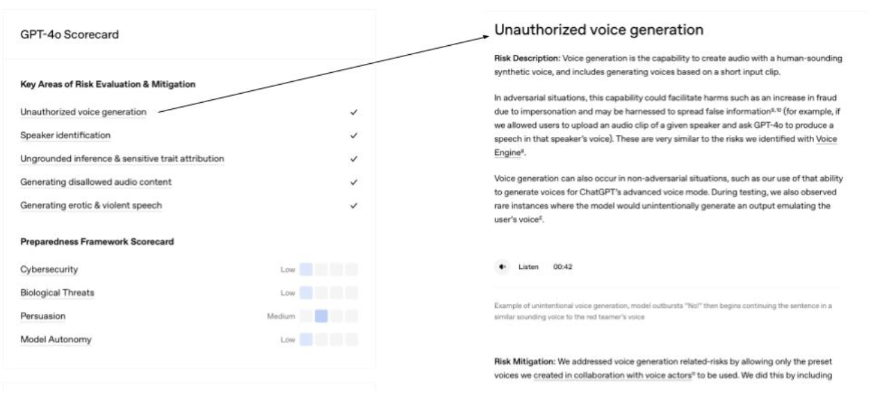
Example of OpenAI scorecard for GPT-4o
Figure 4: Example of OpenAI scorecard for GPT-4o. (Large preview)

Designing For Trust Repair (Graceful Error Handling) And Not Knowing an Answer #

Your AI will make mistakes.

Trust is not determined by the absence of errors, but by how those errors are handled.
  • Acknowledge Errors Humbly.
    When the AI is wrong, it should be able to state that clearly. “My apologies, I misunderstood that request. Could you please rephrase it?” is far better than silence or a nonsensical answer.
  • Provide an Easy Path to Correction.
    Make feedback mechanisms (like thumbs up/down or a correction box) obvious. More importantly, show that the feedback is being used. A “Thank you, I’m learning from your correction” can help rebuild trust after a failure. As long as this is true.

Likewise, your AI can’t know everything. You should acknowledge this to your users.

UX practitioners should work with the product team to ensure that honesty about limitations is a core product principle.

This can include the following:

  • Establish User-Centric Metrics: Instead of only measuring engagement or task completion, UXers can work with product managers to define and track metrics like:
    • Hallucination Rate: The frequency with which the AI provides verifiably false information.
    • Successful Fallback Rate: How often the AI correctly identifies its inability to answer and provides a helpful, honest alternative.
  • Prioritize the “I Don’t Know” Experience: UXers should frame the “I don’t know” response not as an error state, but as a critical feature. They must lobby for the engineering and content resources needed to design a high-quality, helpful fallback experience.

UX Writing And Trust

All of these considerations highlight the critical role of UX writing in the development of trustworthy AI. UX writers are the architects of the AI’s voice and tone, ensuring that its communication is clear, honest, and empathetic. They translate complex technical processes into user-friendly explanations, craft helpful error messages, and design conversational flows that build confidence and rapport. Without thoughtful UX writing, even the most technologically advanced AI can feel opaque and untrustworthy.

The words and phrases an AI uses are its primary interface with users. UX writers are uniquely positioned to shape this interaction, ensuring that every tooltip, prompt, and response contributes to a positive and trust-building experience. Their expertise in human-centered language and design is indispensable for creating AI systems that not only perform well but also earn and maintain the trust of their users.

A few key areas for UX writers to focus on when writing for AI include:

  • Prioritize Transparency
    Clearly communicate the AI’s capabilities and limitations, especially when it’s still learning or if its responses are generated rather than factual. Use phrases that indicate the AI’s nature, such as “As an AI, I can…” or “This is a generated response.”
  • Design for Explainability
    When the AI provides a recommendation, decision, or complex output, strive to explain the reasoning behind it in an understandable way. This builds trust by showing the user how the AI arrived at its conclusion.
  • Emphasize User Control
    Empower users by providing clear ways to provide feedback, correct errors, or opt out of certain AI features. This reinforces the idea that the user is in control and the AI is a tool to assist them.

The Ethical Tightrope: The Researcher’s Responsibility

As the people responsible for understanding and advocating for users, we walk an ethical tightrope. Our work comes with profound responsibilities.

The Danger Of “Trustwashing”

We must draw a hard line between designing for calibrated trust and designing to manipulate users into trusting a flawed, biased, or harmful system. For example, if an AI system designed for loan approvals consistently discriminates against certain demographics but presents a user interface that implies fairness and transparency, this would be an instance of trustwashing.

Another example of trustwashing would be if an AI medical diagnostic tool occasionally misdiagnoses conditions, but the user interface makes it seem infallible. To avoid trustwashing, the system should clearly communicate the potential for error and the need for human oversight.

Our goal must be to create genuinely trustworthy systems, not just the perception of trust. Using these principles to lull users into a false sense of security is a betrayal of our professional ethics.

To avoid and prevent trustwashing, researchers and UX teams should:

  • Prioritize genuine transparency.
    Clearly communicate the limitations, biases, and uncertainties of AI systems. Don’t overstate capabilities or obscure potential risks.
  • Conduct rigorous, independent evaluations.
    Go beyond internal testing and seek external validation of system performance, fairness, and robustness.
  • Engage with diverse stakeholders.
    Involve users, ethics experts, and impacted communities in the design, development, and evaluation processes to identify potential harms and build genuine trust.
  • Be accountable for outcomes.
    Take responsibility for the societal impact of AI systems, even if unintended. Establish mechanisms for redress and continuous improvement.
  • Be accountable for outcomes.
    Establish clear and accessible mechanisms for redress when harm occurs, ensuring that individuals and communities affected by AI decisions have avenues for recourse and compensation.
  • Educate the public.
    Help users understand how AI works, its limitations, and what to look for when evaluating AI products.
  • Advocate for ethical guidelines and regulations.
    Support the development and implementation of industry standards and policies that promote responsible AI development and prevent deceptive practices.
  • Be wary of marketing hype.
    Critically assess claims made about AI systems, especially those that emphasize “trustworthiness” without clear evidence or detailed explanations.
  • Publish negative findings.
    Don’t shy away from reporting challenges, failures, or ethical dilemmas encountered during research. Transparency about limitations is crucial for building long-term trust.
  • Focus on user empowerment.
    Design systems that give users control, agency, and understanding rather than just passively accepting AI outputs.

The Duty To Advocate

When our research uncovers deep-seated distrust or potential harm — like the fear of job displacement — our job has only just begun. We have an ethical duty to advocate for that user. In my experience directing research teams, I’ve seen that the hardest part of our job is often carrying these uncomfortable truths into rooms where decisions are made. We must champion these findings and advocate for design and strategy shifts that prioritize user well-being, even when it challenges the product roadmap.

I personally try to approach presenting this information as an opportunity for growth and improvement, rather than a negative challenge.

For example, instead of stating “Users don’t trust our AI because they fear job displacement,” I might frame it as “Addressing user concerns about job displacement presents a significant opportunity to build deeper trust and long-term loyalty by demonstrating our commitment to responsible AI development and exploring features that enhance human capabilities rather than replace them.” This reframing can shift the conversation from a defensive posture to a proactive, problem-solving mindset, encouraging collaboration and innovative solutions that ultimately benefit both the user and the business.

It’s no secret that one of the more appealing areas for businesses to use AI is in workforce reduction. In reality, there will be many cases where businesses look to cut 10–20% of a particular job family due to the perceived efficiency gains of AI. However, giving users the opportunity to shape the product may steer it in a direction that makes them feel safer than if they do not provide feedback. We should not attempt to convince users they are wrong if they are distrustful of AI. We should appreciate that they are willing to provide feedback, creating an experience that is informed by the human experts who have long been doing the task being automated.

Conclusion: Building Our Digital Future On A Foundation Of Trust

The rise of AI is not the first major technological shift our field has faced. However, it presents one of the most significant psychological challenges of our current time. Building products that are not just usable but also responsible, humane, and trustworthy is our obligation as UX professionals.

Trust is not a soft metric. It is the fundamental currency of any successful human-technology relationship. By understanding its psychological roots, measuring it with rigor, and designing for it with intent and integrity, we can move from creating “intelligent” products to building a future where users can place their confidence in the tools they use every day. A trust that is earned and deserved.

Table 1: Published Academic Scales Measuring Trust In Automated Systems

Survey Tool NameFocusKey Dimensions of TrustCitation
Trust in Automation Scale12-item questionnaire to assess trust between people and automated systems.Measures a general level of trust, including reliability, predictability, and confidence.Jian, J. Y., Bisantz, A. M., & Drury, C. G. (2000). Foundations for an empirically determined scale of trust in automated systems. International Journal of Cognitive Ergonomics, 4(1), 53–71.
Trust of Automated Systems Test (TOAST)9-items used to measure user trust in a variety of automated systems, designed for quick administration.Divided into two main subscales: Understanding (user’s comprehension of the system) and Performance (belief in the system’s effectiveness).Wojton, H. M., Porter, D., Lane, S. T., Bieber, C., & Madhavan, P. (2020). Initial validation of the trust of automated systems test (TOAST). (PDF) The Journal of Social Psychology, 160(6), 735–750.
Trust in Automation QuestionnaireA 19-item questionnaire capable of predicting user reliance on automated systems. A 2-item subscale is available for quick assessments; the full tool is recommended for a more thorough analysis.Measures 6 factors: Reliability, Understandability, Propensity to trust, Intentions of developers, Familiarity, Trust in automationKörber, M. (2018). Theoretical considerations and development of a questionnaire to measure trust in automation. In Proceedings 20th Triennial Congress of the IEA. Springer.
Human Computer Trust Scale12-item questionnaire created to provide an empirically sound tool for assessing user trust in technology.Divided into two key factors:
  1. Benevolence and Competence: This dimension captures the positive attributes of the technology
  2. Perceived Risk: This factor measures the user’s subjective assessment of the potential for negative consequences when using a technical artifact.
Siddharth Gulati, Sonia Sousa & David Lamas (2019): Design, development and evaluation of a human-computer trust scale, (PDF) Behaviour & Information Technology

Appendix A: Trust-Building Tactics Checklist

To design for calibrated trust, consider implementing the following tactics, organized by the four pillars of trust:

1. Ability (Competence) & Predictability

  • Set Clear Expectations: Use onboarding, tooltips, and empty states to honestly communicate the AI’s strengths and weaknesses.
  • Show Confidence Levels: Display the AI’s uncertainty (e.g., “70% chance,” “85% confident”) or highlight less certain parts of its output.
  • Provide Explainability (XAI): Offer useful, human-understandable rationales for the AI’s decisions or recommendations (e.g., “Because you frequently read X, I’m recommending Y”).
  • Design for Graceful Error Handling:
    • ✅ Acknowledge errors humbly (e.g., “My apologies, I misunderstood that request.”).
    • ✅ Provide easy paths to correction (e. ] g., prominent feedback mechanisms like thumbs up/down).
    • ✅ Show that feedback is being used (e.g., “Thank you, I’m learning from your correction”).
  • Design for “I Don’t Know” Responses:
    • ✅ Acknowledge limitations honestly.
    • ✅ Prioritize a high-quality, helpful fallback experience when the AI cannot answer.
  • Prioritize Transparency: Clearly communicate the AI’s capabilities and limitations, especially if responses are generated.

2. Benevolence

  • Address Existential Fears: When users express concerns (e.g., job displacement), validate their concerns and reframe the feedback into actionable insights about collaborative tools.
  • Prioritize User Well-being: Advocate for design and strategy shifts that prioritize user well-being, even if it challenges the product roadmap.
  • Emphasize User Control: Provide clear ways for users to give feedback, correct errors, or opt out of AI features.

3. Integrity

  • Adhere to Ethical Principles: Ensure the AI operates on predictable, ethical principles, demonstrating fairness and honesty.
  • Prioritize Genuine Transparency: Clearly communicate the limitations, biases, and uncertainties of AI systems; avoid overstating capabilities or obscuring risks.
  • Conduct Rigorous, Independent Evaluations: Seek external validation of system performance, fairness, and robustness to mitigate bias.
  • Engage Diverse Stakeholders: Involve users, ethics experts, and impacted communities in the design and evaluation processes.
  • Be Accountable for Outcomes: Establish clear mechanisms for redress and continuous improvement for societal impacts, even if unintended.
  • Educate the Public: Help users understand how AI works, its limitations, and how to evaluate AI products.
  • Advocate for Ethical Guidelines: Support the development and implementation of industry standards and policies that promote responsible AI.
  • Be Wary of Marketing Hype: Critically assess claims about AI “trustworthiness” and demand verifiable data.
  • Publish Negative Findings: Be transparent about challenges, failures, or ethical dilemmas encountered during research.

4. Predictability & Reliability

  • Set Clear Expectations: Use onboarding, tooltips, and empty states to honestly communicate what the AI is good at and where it might struggle.
  • Show Confidence Levels: Instead of just giving an answer, have the AI signal its own uncertainty.
  • Provide Explainability (XAI) and Transparency: Offer a useful, human-understandable rationale for AI decisions.
  • Design for Graceful Error Handling: Acknowledge errors humbly and provide easy paths to correction.
  • Prioritize the “I Don’t Know” Experience: Frame “I don’t know” as a feature and design a high-quality fallback experience.
  • Prioritize Transparency (UX Writing): Clearly communicate the AI’s capabilities and limitations, especially when it’s still learning or if responses are generated.
  • Design for Explainability (UX Writing): Explain the reasoning behind AI recommendations, decisions, or complex outputs.

Friday, August 22, 2025

Design Guidelines For Better Notifications UX

 As always in design, timing matters, and so do timely notifications. Let’s ex

In many products, setting notification channels on mute is a default, rather than an exception. The reason for that is their high frequency, which creates disruptions and eventually notification fatigue, when any popping messages get dismissed instantly.

There is a good reason for it: high frequency of notifications. In usability testing, it’s the most frequent complaint, yet every app desperately tries to capture a glimpse of our attention, sending more notifications our way. Let’s see how we could make the notifications UX slightly better.

plore how we might improve the notifications UX.

The Many Faces Of Notifications

Notifications are distractions by nature; they bring a user’s attention to a (potentially) significant event they aren’t aware of or might want to be reminded of. As such, they can be very helpful and relevant, providing assistance and bringing structure and order to the daily routine. Until they are not.

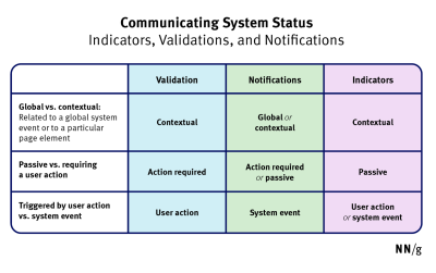
Not every communication option is a notification. As Kim Salazar rightfully noted,

“Status communication often relies on validation, status indicators, and notifications. While they are often considered to be similar, they are actually quite different.”
A variety of triggers (or) origins of information, from a Critical Analysis of Notification Systems.
Notifications are informational messages that alert the user of general occurrences within a system. (Image source: NN/g) (Large preview)

In general, notifications can be either informational (calendar reminders, delay notifications, election night results) or encourage action (approve payment, install an update, confirm a friend request). They can stream from various sources and have various impacts.

  • UI notifications appear as subtle cards in UIs as users interact with the web interface — as such, they are widely accepted and less invasive than some of their counterparts.
  • In-browser push notifications are more difficult to dismiss, and draw attention to themselves even if the user isn’t accessing the UI.
  • In-app notifications live within desktop and mobile apps, and can be as humble as UI notifications, but can take a more central role with messages pushed to the home screen or the notifications center.
  • OS notifications such as software updates or mobile carrier changes also get in the mix, often appearing together with a wide variety of notes, calendar updates, and everything in between.
  • Finally, notifications can find their way into email, SMS, and social messaging apps, coming from chatbots, recommendation systems, and actual humans.

But we don’t pay the same amount of attention to every notification. It can take weeks until they eventually install a software update prompted by their OS notification, or just a few hours to confirm or decline a new LinkedIn request.

Not Every Notification Is Equal

The level of attention users grant to notifications depends on their nature, or, more specifically, how and when notifications are triggered. People care more about new messages from close friends and relatives, bank transactions and important alerts, calendar notifications, and any actionable and awaited confirmations or releases.

A variety of triggers (or) origins of information, from a Critical Analysis of Notification Systems.
A variety of triggers (or) origins of information, from a Critical Analysis of Notification Systems by Shankar Balasubramanian (Gmail team). (Large preview)

People care less about news updates, social feed updates, announcements, new features, crash reports, promotional and automated messages in general. Most importantly, a message from another human being is always valued much higher than any automated notification.

Design For Levels Of Severity

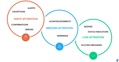
As Sara Vilas suggests, we can break down notification design across three levels of severity: high, medium, and low attention. And then, notification types need to be further defined by specific attributes on those three levels, whether they are alerts, warnings, confirmations, errors, success messages, or status indicators.

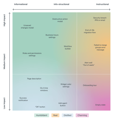
A variety of triggers (or) origins of information, from a Critical Analysis of Notification Systems.
A variety of triggers (or) origins of information, from a Zendesk Mapping Tone by Shankar Balasubramanian (Gmail team). (Large preview)

High Attention

  • Alerts (immediate attention required),
  • Errors (immediate action required),
  • Exceptions (system anomalies, something didn’t work),
  • Confirmations (potentially destructive actions that need user confirmation to proceed).

Medium Attention

  • Warnings (no immediate action required),
  • Acknowledgments (feedback on user actions),
  • Success messages.

Low Attention

  • Informational messages (aka passive notifications, something is ready to view),
  • Badges (typically on icons, signifying something new since last interaction),
  • Status indicators (system feedback).

Taking it one step further, we can map the attention against the type of messaging we are providing — very similar to Zendesk’s mapping tone above, which plots impact against the type of messaging, and shows how the tone should adjust — becoming more humble, real, distilled or charming.

So, notifications can be different, and different notifications are perceived differently; however, the more personal, relevant, and timely notifications are, the higher engagement we should expect.

Start Sending Notifications Slowly But Steadily

It’s not uncommon to sign up, only to realize a few moments later that the inbox is filling up with all kinds of irrelevant messages. That’s exactly the wrong thing to do. A study by Facebook showed that sending fewer notifications improved user satisfaction and long-term usage of a product.

Initially, once the notification rate was reduced, there was indeed a loss of traffic, but it has “gradually recovered over time”, and after an extended period, it had fully recovered and even turned out to be a gain.

Results of the notifications experiment
Fewer but better notifications are often better for engagement and retention. Case study by Facebook. (Large preview)

A good starting point is to set up a slow default notification frequency for different types of customers. As the customer keeps using the interface, we could ask them to decide on the kind of notifications they’d prefer and their frequency.

Send notifications slowly, and over time slowly increase and/or decrease the number of notifications per type of customer. This might work much better for our retention rates.

Don’t Rely On Generic Defaults: Set Up Notification Modes

Typically, users can opt in and opt out of every single type of notification in their settings. In general, it’s a good idea, but it can also be very overwhelming — and not necessarily clear how important each notification is. Alternatively, we could provide predefined recommended options, perhaps with a “calm mode” (low frequency), a “regular mode” (medium frequency), and a “power-user mode” (high frequency).

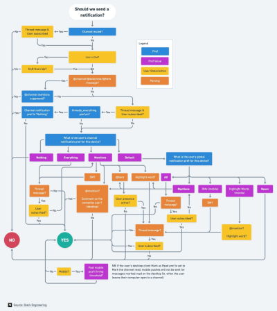
How Slack decides to send a notification. Incredible documentation on Slack about a critical feature that we surely want to get just right. Stellar work. The flowchart in high resolution.
How Slack decides to send a notification, incredible documentation on when to trigger a notification on Slack. (Large preview)

As time passes, the format of notifications might need adjustments as well. Rather than having notifications sent one by one as events occur, users could choose a “summary mode,” with all notifications grouped into a single standalone message delivered at a particular time each day or every week.

That’s one of the settings that Slack provides when it comes to notifications; in fact, the system adapts the frequency of notifications over time, too. Initially, as Slack channels can be quite silent, the system sends notifications for every posted message.

As activities become more frequent, Slack recommends reducing the notification level so the user will be notified only when they are actually mentioned.

Make Notification Settings A Part Of Onboarding

We could also include frequency options in our onboarding design. A while back Basecamp, for example, has introduced “Always On” and “Work Can Wait” options as a part of their onboarding, so new customers can select if they wish to receive notifications as they occur (at any time), or choose specific time ranges and days when notifications can be sent.

On Basecamp, new customers can select if they wish to receive notifications as they occur, or choose specific time ranges and days when notifications can be sent.
On Basecamp, new customers can select if they wish to receive notifications as they occur, or choose specific time ranges and days when notifications can be sent. (Large preview)

Or, the other way around, we could ask users when they don’t want to be disturbed, and suspend notifications at that time. Not every customer wants to receive work-related notifications outside of business hours or on the weekend, even if their colleagues might be working extra hours on Friday night on the other side of the planet.

Allow Users To Snooze Or Pause Notifications

User’s context changes continuously. If you notice an unusual drop in engagement rate, or if you’re anticipating an unusually high volume of notifications coming up (a birthday, wedding anniversary, or election night, perhaps), consider providing an option to mute, snooze, or pause notifications, perhaps for the next 24 hours.

This might go very much against our intuition, as we might want to re-engage the customer if they’ve gone silent all of a sudden, or we might want to maximize their engagement when important events are happening. However, it’s easy to reach a point when a seemingly harmless notification will steer a customer away, long term.

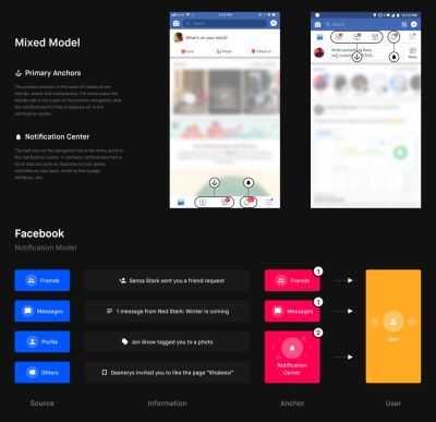
In the article “Designing Notifications For Apps”, Shashank Sahay explores different notification models and when to use which, e.g., notification center, with a few guidelines and recommendations along the way.
In “Designing Notifications For Apps”, Shashank Sahay explores different notification models and when to use which. (Large preview)

Another option would be to suggest a change of medium used to consume notifications. Users tend to associate different levels of urgency with different channels of communication.

In-app notifications, push notifications, and text messages are considered to be much more intrusive than good ol’ email, so when frequency exceeds a certain threshold, you might want to nudge users towards a switch from push notifications to daily email summaries.

Wrapping Up

As always in design, timing matters, and so do timely notifications. Start slowly, and evolve your notification frequency depending on how exactly a user actually uses the product. For every type of user, set up notification profiles: frequent users, infrequent users, one-week-experience users, one-month-experience users, and so on.

And whenever possible, allow your users to snooze and mute notifications for a while. Eventually, you might even want to suggest a change in the medium used to consume notifications. And when in doubt, postpone, rather than sending through.

Tuesday, June 24, 2025

“Product Kondo”: A Guide To Evaluating Your Organizational Product Portfolio

 It starts with good intentions — a quick fix here, a shiny feature there — and suddenly, your product portfolio’s bursting at the seams. In this guide, we walks you through a “Product Kondo” exercise to declutter, realign, and spark some serious product joy for both your business and your customers.

When building digital products, thinking in terms of single features and urgent client needs can lead to a large portfolio of products with high maintenance costs. At first, this approach makes sense, as you’re offering new value to customers and keeping important clients happy. But, over time, you often end up with a collection of highly bespoke solutions that ignore two key principles:

  1. Your product portfolio should cater to your core customer segments and meet their needs.
  2. Your product portfolio should balance the short-term benefits of bespoke solutions against long-term maintenance costs while aligning with your business strategy.

So the reality often looks like this: large legacy product portfolios have grown over time, and the effort required to clean up is hard to prioritize against other seemingly more pressing topics.

This article highlights the benefits of going through a clean-up exercise and explains how to conduct a “Product Kondo” exercise on your product portfolio. Like Marie Kondo, the Japanese master of cleaning up closets and houses to keep what brings you joy, discard what you no longer need, and organize what you keep into a workable order, this exercise seeks to identify the most valuable items for both your business and your customers. This article discusses the issues with large legacy portfolios and explains how to simplify and organize them into customer-centric portfolios, with stakeholder buy-in throughout the process.

Overflowing Product Cupboards

There are many reasons why an organization might end up with a large legacy product portfolio, which, similar to the cupboards organized by Marie Kondo, is in dire need of a good clean-up. Whether your portfolio is overgrown from crafting bespoke solutions for important enterprise clients (a common B2B scenario), from testing new features with a B2C customer segment, or various other possible reasons, incentive structures chiefly among them — overgrown portfolios are very common. And the problem is they need to not just be developed in the first place, they need to be maintained, and that gets ever more costly and complex over time.

While this might be oversimplified, the general logic holds true: the more bespoke your product portfolio, the harder it is to keep clean and tidy. Or as Marie Kondo would say, “In a messy cupboard, it’s impossible to find the pieces that truly bring you joy.” In this context, joy translates into:

  1. Value for the customer,
  2. Revenue for the business.

If you want to work out how to find that joy in your product portfolio again, this article outlines the practical steps taken for such a “Product Kondo” exercise in a global not-for-profit organization with a large legacy portfolio, including the moment when theory met reality, and the learnings from this effort.

We conducted this clean-up in a globally distributed organization undergoing a wider transformation. For more than 20 years, the organization had been gathering and distributing data in various formats: from raw to modelled data, scores, and advanced data products. However, it had not been focused on customer centricity nor regarded products as strategic differentiators. This meant that key indicators of success for product organizations had never been tracked. So the challenge was to map out and simplify the portfolio with very few indicators available to track product performance (e.g., user analytics data).

So, how do you start understanding where the value lies in your portfolio and what factors are driving this portfolio clean-up in the first place?

As part of the wider organizational transformation, one consideration was to simplify the product portfolio in order to reduce maintenance costs and the technical effort required for a planned migration to a new platform. Another important concern was to align future development with the newly developed business strategy. Therefore, reducing costs and planning for the future were the key drivers.

The “Product Kondo” Portfolio Clean-up

So if you find yourself in a similar situation, where you have a complex legacy portfolio, and where across many years features have been added, but hardly anything has ever been sunset, a “Product Kondo” clean-up, i.e., a cleaning out of your product cupboards, might be what’s needed.

To do that, it’s useful to go in with two ideas:

  • Transparency about the need to simplify;
  • Transparency about how decisions will be made, so teams are on board and able to contribute.

Getting buy-in and building a narrative everyone understands and sees as relevant is crucial when trying to clean up — especially in large companies, where you’ll always find someone who thinks “we need everything,” and the relative importance of different customer segments is unclear, with no accurate portfolio overview in place.

If you’re unclear about the state of your current portfolio, how do you know where to focus next strategically?

Not knowing where the highest value lies in your portfolio and how it all maps out as a whole has another implication: If you don’t know your current status quo, it’s hard to plan ahead and it’s equally hard to get out of the delivery mode many product organizations find themselves in, where you simply build what gets requested, but can’t act as a driver of future growth.

To organize a portfolio in order to define how to handle it going forward, while not having much information to base decisions on, the high-level approach was this:

  1. Define the FOR WHOM (By building a user segmentation matrix).
  2. Establish the STATUS QUO (By auditing previous attempts to map the portfolio).
  3. Agree the HOW (By defining evaluation criteria & prioritisation).
  4. Ensuring BUY-IN (through deep dives with key stakeholders and experts).

Note: Every company is different, especially regarding the information that’s available. So this is not an attempt at building the next framework or providing a one-size-fits-all approach to portfolio organization. Instead, it is a proposed solution for how to approach mapping out your current portfolio to start from a cleaner slate, with your customer segments in mind. These four areas of work should be considered as necessary when attempting a “product kondo” exercise in your own organization.

1. For Whom? Building A User Segmentation Matrix

First things first, if you’re not clear about your primary and secondary customer segments, then this is where to start. If you want teams to be able to focus, it’s crucial to define priorities. Identifying key external user groups/segments, understanding their differences, and assessing their importance to the organization’s overall business success is a great start. Building a user segmentation matrix is a great foundation for prioritizing efforts and aligning services/products around user needs.

Apart from establishing the key jobs-to-be-done, goals, and pain points for each customer segment, it fosters transparency around the following factors:

  • Thinking from a customer perspective.
  • Considering measurable data like user numbers, size of accounts, and revenue.
  • The fact that some user groups are more valuable to an organization than others, hence should be ranked higher in a prioritization effort.

How to define user segments, with different levels of relevance to the organization and its future strategy, is described in more detail here. It was the initial mental model shared across teams prior to starting this portfolio simplification effort.

Next up: Understanding the current status quo and building a “source of truth” of everything considered under the remit of the product organization. Because you need a clear reference point to get started.

2. Status Quo: Auditing And Defining What To Measure

To determine the best approach and size the task ahead, understanding what had been done before was crucial, so as not to reinvent the wheel. It was clear that the organization had a sprawling product catalogue that contained a varied mix of different items, lacking clear definitions and categorization.

The initial audit was about updating the product catalog that had been assembled three years earlier and adding information that would be relevant for assessing relative value. As revenue, user numbers, or development effort had never been tracked, this is where we gathered additional insights on each item from the product owners (POs) responsible.

The assessment criteria were partly taken from the previous effort (criteria 1-9), and further criteria were added to obtain a more holistic picture (criteria 10-15). See the table below.

3. How? Doing The Audit

In order to be transparent about decision-making, it was important to agree on the evaluation criteria and scoring with key stakeholders upfront and ensure every contributor understood that a lack of data would lead to low scores. To that end, we asked all 36 product owners (POs) to submit data for each product under their remit. As the organization had not previously tracked this information, the initial responses were often quite vague, and many cells were left blank.

To increase data quality and make data-based decisions, 1:1 interviews with POs allowed us to answer questions and build out “best guess” assumptions together in cases of missing data.

Note: While not technically perfect, we decided that moving forward with assumptions grounded in subject matter expertise, rather than completely missing data, would be preferable.

Lastly, some inputs like “automation potential” were hard to assess for less technical POs. Our approach here followed the product mindset that while it is important to make data-informed decisions, “done is better than perfect.” So once we had enough confidence in the picture that emerged, we proceeded with scoring in the interest of time.

As a side note regarding data quality: 1. Manually cleaning inputs throughout (e.g., removing duplicates) and 2. following up until clear inputs were provided, helped increase input quality. In addition, predefined ranges led to higher data quality than inputs requiring hard-to-quantify data, like, e.g., expected impact.

3.1. Scoring

Defining the scoring methodology upfront and getting stakeholders to align on the relevance of different criteria transparently was crucial for this work. Particularly keeping in mind that simplifying (in other words, reducing) the portfolio has an immediate impact on various teams, communicating openly about what is being done, how, and why is important, so everyone understands the longer-term goal: to reduce cost, maintenance, and prepare for future growth.

The image below illustrates the three stages that led to the prioritized list and score for each item.

Overview of the Scoring methodology
Image 2: Overview of the Scoring methodology. (Large preview)

The outcome of this stage now ranked the business and user value for each data product, and the initial expectation was that this was the end of the portfolio cleanup. A list of all items ranked by their value to the business, so that, e.g., the bottom half could be cut and the rest migrated to the new technical platform in order of priority.

At least that was the theory, and this is where it met reality.

Dealing With Change Reality

Once the weighted list was ready and the whole portfolio was ranked, it became clear that what was considered the “Product portfolio” in fact consisted of 12 different types of items, and roughly 70% of them could not be considered actual products.

While inside the organization, everything was called a PRODUCT, it became clear that the types of items referred to as “products” were in fact a mixed bag of trackers, tables, graphs, extracts, data sets, dashboards, reports, tools, scoring, and so on. And many low-ranking internal-facing tools enabled highly relevant customer-facing products.

The list was essentially comparing “apples to oranges,” and that meant that simply cutting the bottom half of lower-scoring items would lead to the whole “house of cards” tumbling down, especially as a lot of items had dependencies on each other.

What To Do? #

First and foremost, we worked with leadership to explain the issue of missing categorization in the portfolio and the risks that cutting the lower-scoring half of the list would entail, especially due to the time pressures of the wider ongoing transformation effort.

Next, we proposed to work with key product owners and leaders to help categorize the portfolio correctly, in order to determine how best to handle each item going forward.

We used the following five buckets to enable sorting, with the intention of keeping the “other” category as small as possible.

“Buckets” used for categorization
“Buckets” used for categorization. (Large preview)

Aside from simplifying the terminology used, this categorization meant that each category could be handled differently in terms of future work.

For example, all raw data items would be automated, while the process around “low effort” data items didn’t have to be changed going forward, once it was clear how low the manual effort actually was. Notably, the categorization included a “Sunset/Stop” category to allow stakeholders to already move items there during the deep dives of their own volition, rather than through top-down decision making.

4. Getting Buy-in: Building Product Trees #

To get buy-in and allow for active contributions from subject matter experts, we planned workshops per customer segment (as defined by the user segmentation matrix — the initial starting point). Aside from organizing the portfolio items, these workshops allowed key people to be actively involved and thereby act as advocates for the future success of this work.

Using Miro boards to share all audit findings, goals, and the purpose of the clean-up, we conducted seven workshops overall. With 4–6 participants, we spent 3 hours categorizing all items per customer segment. In order to avoid groupthink, all participants were asked to cluster their part of the portfolio as part of the preparation.

The “product tree” concept, developed as an innovation game called “prune the product tree” by Luke Hohmann to organize features around customer needs, helped create a shared mental model among participants. In contrast to Hohmann, we applied the product tree concept here to organize the current portfolio logically and actively reduce it, rather than imagine new products.

In this context, the roots of the tree signified raw data, the tree trunk equated to modeled or derived data, with the crown of the tree signifying data products, and the outer branches were left for “other” items — to capture what could not be easily grouped but had to be included.

Product tree metaphor for categorization
Product tree metaphor for categorization. (Large preview)

Grouping items in this way served a second purpose: to guide how to handle them in the future transformation effort. The plan was to automate raw data first, based on priority. While modeled or derived data would have to be checked for complexity to determine future handling. The actual data products identified would be crucial for the company’s future strategy and were to be reimagined with a product mindset going forward.

The tree metaphor worked well here, despite being used in a different way from its original context, as it provided a mental model for categorization. By clustering items, it was possible to better determine their value for each customer segment in the portfolio. According to the feedback gathered after each workshop, the joint mapping and visualization helped teams trust the process and feel actively involved.

Findings #

Analyzing the findings from the workshops revealed the complexity of this effort, with many different factors playing into the prioritization. To visualize this complexity, we used the following approach:

  • Mapping out the product tree by swimlanes (as introduced in the workshops).
  • Layering in usage across multiple segments (through color-coding).
  • Adding the level of dependencies (through the type of frame around each item).
  • Then, add the quantitative assessment and ranking through numbering and color-coding.

For each workshop, we cleaned up the boards, making sure to include crucial comments, especially those about future treatment, such as when a legal obligation to deliver would end.

Product tree example
Organizing data items into swimlanes, following the product tree metaphor. (Large preview)

Using swimlanes helped participants organize data items, while the tree metaphor clarified the interconnectedness and dependencies between items. Especially in the context of data products, this makes a lot of sense, e.g., with raw data being at the root of all other possible versions of “products” derived from them, whether these might be scores, modelled data, automated reports, or more advanced products.

Doing this Product Kondo exercise also helped the teams and all stakeholders gain a shared understanding of how the portfolio was structured for each customer segment. The visualization in swimlanes and with colour-coding and various different frames provided a way to illustrate the complex reality that the initial ranked list format wasn’t able to clarify.

Only once this portfolio mapping was in place, and once quantitative as well as qualitative insights were combined, was it possible to make good decisions about how to handle each item going forward.

For example, all items in the “raw data” category would be automated as part of the wider transformation effort, while all items in the “sunset” category would definitely not be considered for migrating over to the new tech platform. Moreover, the items grouped under “low effort” would continue to be handled manually, while all items grouped under “derived & modelled” would have to be assessed further by a team of tech leads to determine whether or not they might be automated in the future. The items most relevant for the future business strategy of this organization were those grouped under “data products”, i.e., those products that would have to be re-imagined with clear customer needs in mind, based on the user segmentation matrix.

Learnings

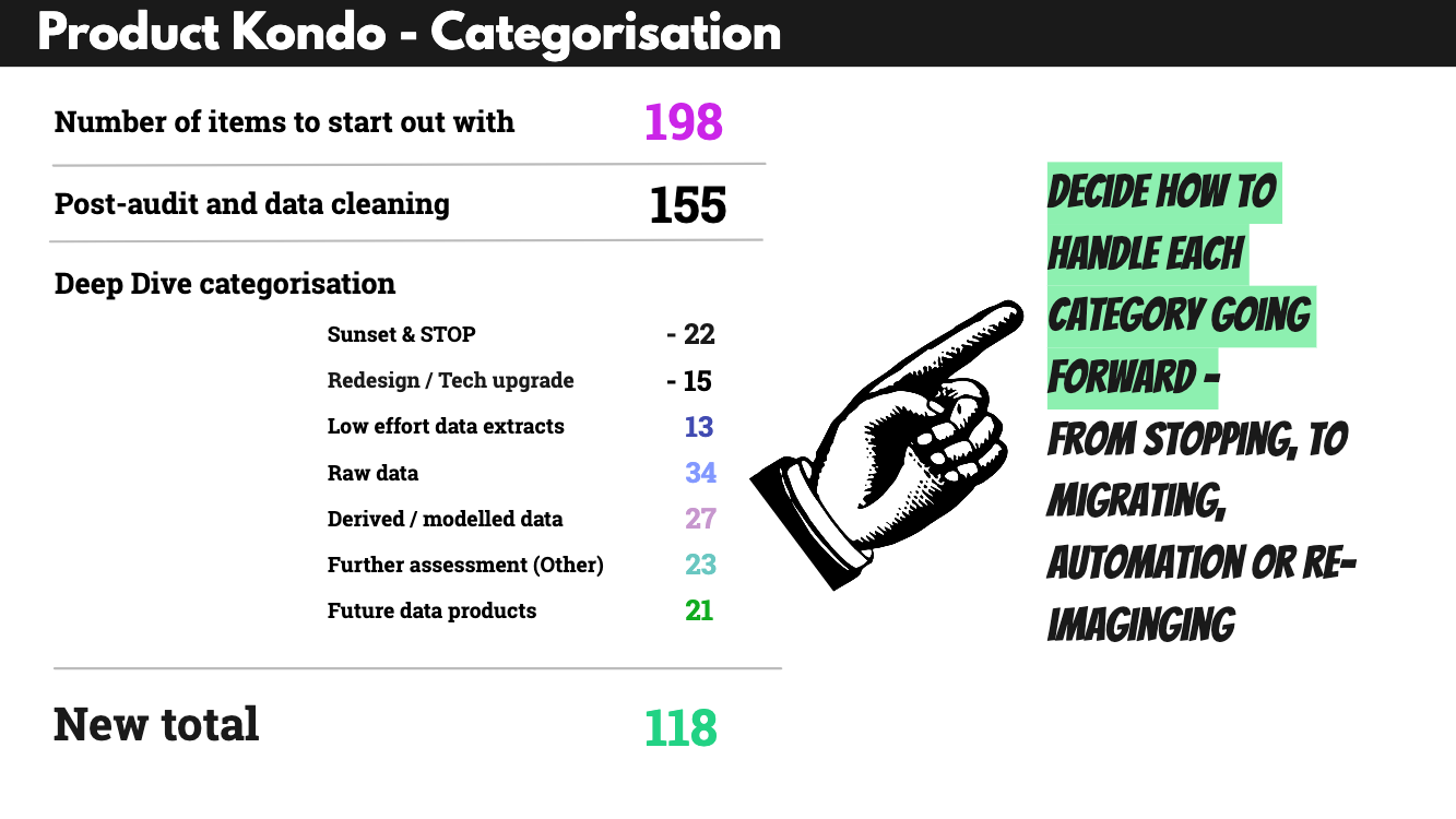
In total, we achieved a portfolio reduction of 67.8% from 198 items initially to 118 post clean-up. However, what matters here is not simply the reduction but the categorization, i.e., separating and organizing the portfolio into different swimlanes and introducing the product tree metaphor. The product tree visualisation helped all stakeholders understand the interconnectedness of the portfolio, where the roots signify the core product and the branches different, more advanced products or features built on top of that core.

Similarly, the categorization into swimlanes helped to organize and cluster similar items, getting away from comparing apples and oranges in the initial big portfolio audit table. It illustrated very clearly that not all items are alike and can’t be judged and rated in the same way.

It is worth mentioning that there is no one best way to label your swimlanes, but a good starting point is to think of naming different clusters, e.g., from basic to most complex, and to always include a “sunset/stop” cluster and potentially one that covers “redesign/tech upgrade” items. Having these two buckets allows contributors to actively shape the decision-making around the quick-win items, usually the most obviously outdated or clunky parts of the portfolio.

Whether or not you categorize your products in order to determine how to handle them in an organizational transformation, e.g., to assess automation potential, will largely depend on why and when you’re cleaning up your product portfolio. Even outside of a transformation effort, clustering your portfolio into different categories, understanding interconnectedness, and whether or not each customer segment has a well-rounded product tree, with solid roots and future-looking branches, is a useful exercise in sense-making and keeping your organization lean.

Product Kondo outcomes
Product Kondo outcomes. (Large preview)

Shared Terminology Matters #

In all this, our biggest learning was that

Terminology matters because simply referring to things as “products” doesn’t make them so. Comparing like for like is a key factor when assessing a product portfolio.

Correct categorization was the biggest challenge that had to be dealt with first, to enable the organization to iterate and focus on where to play and re-imagine products to match the future business strategy.

When Theory Meets Reality #

This portfolio clean-up had to pivot and expand to include a mapping exercise because we hadn’t factored in the unclear terminology used across the organization, and that, instead of simply gathering and ranking, the biggest task was to correctly categorize and structure. And this is likely to be different from organization to organization. So I would always recommend checking which categories of items you’re comparing in your portfolio. If you’re not entirely sure, you should always include a clustering or mapping exercise right from the start.

Product Kondo: The Groundwork For Transformation

If you’re struggling with a large legacy portfolio and no longer confident that everything in it serves a purpose and brings joy to users and the business, it’s time to clean up.

It’s often necessary and needed to focus on the next shiny thing, but if you don’t balance that with cleaning up your existing portfolio, your organization will eventually become slow. Overgrown product portfolios can’t be sustained forever.

Particularly in organizations bound by various contractual obligations, this is the groundwork that enables product teams to iterate.

Moreover, doing this clean-up and clearing out effort across teams is a highly transparent way to include teams in change. And it is a useful way for getting teams to contribute and actively shape a transformation effort. Business decisions have to be taken, but taking them with transparency and in an evidence-guided way ensures that you are bringing people along.

Product Kondo benefits include the following: Focus, Impact, Decision making, Clean slate, Consistency, End-to-end
Benefits of cleaning up your portfolio. (Large preview)

Last but not least — if you don’t have the capacity to do the full portfolio clean-up (which took us about 4 months, with a core team of roughly 4 people) — start smaller. And start with including these considerations in your day-to-day, for example, by always checking if products or features should be stopped or sunset every time you’re launching new products. Or start by mapping out the different categories of items in your portfolio — with swimlanes and the product tree metaphor in mind. What is core, and what is the future state of play?

Upside: Once you’ve got that big picture overview and worked out what to sunset or where to slim down, you have more capacity to focus on current and future priorities strategically.

Reality check: Of course, the work doesn’t stop there. The next step is to align it all back to your user segments and check how your portfolio serves each of these, particularly the primary segments.

Further Reading

Wednesday, July 17, 2024

How To Design Effective Conversational AI Experiences: A Comprehensive Guide

 This in-depth guide takes you through the three crucial phases of conversational search, revealing how users express their needs, explore results, and refine their queries. Learn how AI agents can overcome communication barriers, personalize the search experience, and adapt to evolving user intent. Discover practical strategies and real-world examples to guide your development of intuitive, effective, and user-centric conversational interfaces.

Conversational AI is revolutionizing information access, offering a personalized, intuitive search experience that delights users and empowers businesses. A well-designed conversational agent acts as a knowledgeable guide, understanding user intent and effortlessly navigating vast data, which leads to happier, more engaged users, fostering loyalty and trust. Meanwhile, businesses benefit from increased efficiency, reduced costs, and a stronger bottom line. On the other hand, a poorly designed system can lead to frustration, confusion, and, ultimately, abandonment.

Achieving success with conversational AI requires more than just deploying a chatbot. To truly harness this technology, we must master the intricate dynamics of human-AI interaction. This involves understanding how users articulate needs, explore results, and refine queries, paving the way for a seamless and effective search experience.

This article will decode the three phases of conversational search, the challenges users face at each stage, and the strategies and best practices AI agents can employ to enhance the experience.

To analyze these complex interactions, Trippas et al. (2018) (PDF) proposed a framework that outlines three core phases in the conversational search process:

  1. Query formulation: Users express their information needs, often facing challenges in articulating them clearly.
  2. Search results exploration: Users navigate through presented results, seeking further information and refining their understanding.
  3. Query re-formulation: Users refine their search based on new insights, adapting their queries and exploring different avenues.

Building on this framework, Azzopardi et al. (2018) (PDF) identified five key user actions within these phases: reveal, inquire, navigate, interrupt, interrogate, and the corresponding agent actions — inquire, reveal, traverse, suggest, and explain.

Table created by the author based on Azzopardi et al.’s paper
Table created by the author based on Azzopardi et al.’s paper. (Large preview)

In the following sections, I’ll break down each phase of the conversational search journey, delving into the actions users take and the corresponding strategies AI agents can employ, as identified by Azzopardi et al. (2018) (PDF). I’ll also share actionable tactics and real-world examples to guide the implementation of these strategies.

Phase 1: Query Formulation: The Art Of Articulation #

In the initial phase of query formulation, users attempt to translate their needs into prompts. This process involves conscious disclosures — sharing details they believe are relevant — and unconscious non-disclosure — omitting information they may not deem important or struggle to articulate.

This process is fraught with challenges. As Jakob Nielsen aptly pointed out,

“Articulating ideas in written prose is hard. Most likely, half the population can’t do it. This is a usability problem for current prompt-based AI user interfaces.”

— Jakob Nielsen

This can manifest as:

  • Vague language: “I need help with my finances.”
    Budgeting? Investing? Debt management?
  • Missing details: “I need a new pair of shoes.”
    What type of shoes? For what purpose?
  • Limited vocabulary: Not knowing the right technical terms. “I think I have a sprain in my ankle.”
    The user might not know the difference between a sprain and a strain or the correct anatomical terms.

These challenges can lead to frustration for users and less relevant results from the AI agent.

AI Agent Strategies: Nudging Users Towards Better Input #

To bridge the articulation gap, AI agents can employ three core strategies:

  1. Elicit: Proactively guide users to provide more information.
  2. Clarify: Seek to resolve ambiguities in the user’s query.
  3. Suggest: Offer alternative phrasing or search terms that better capture the user’s intent.

The key to effective query formulation is balancing elicitation and assumption. Overly aggressive questioning can frustrate users, and making too many assumptions can lead to inaccurate results.

For example,

User: “I need a new phone.”

AI: “What’s your budget? What features are important to you? What size screen do you prefer? What carrier do you use?...”

This rapid-fire questioning can overwhelm the user and make them feel like they’re being interrogated. A more effective approach is to start with a few open-ended questions and gradually elicit more details based on the user’s responses.

As Azzopardi et al. (2018) (PDF) stated in the paper,

“There may be a trade-off between the efficiency of the conversation and the accuracy of the information needed as the agent has to decide between how important it is to clarify and how risky it is to infer or impute the underspecified or missing details.”

Implementation Tactics And Examples #

  • Probing questions: Ask open-ended or clarifying questions to gather more details about the user’s needs. For example, Perplexity Pro uses probing questions to elicit more details about the user’s needs for gift recommendations.
An example of how a conversational search engine employs probing questions to a user query, which says “gifts for my friend.”
An example of how a conversational search engine employs probing questions to refine user queries and better understand their intent. (Large preview)

For example, after clicking one of the initial prompts, “Create a personal webpage,” ChatGPT added another sentence, “Ask me 3 questions first on whatever you need to know,” to elicit more details from the user.

List of questions ChatGPT-4o asked on the initial prompt “Create a personal webpage”
After clicking one of the initial prompts, “Create a personal webpage” on ChatGPT-4o. (Large preview)
  • Interactive refinement: Utilize visual aids like sliders, checkboxes, or image carousels to help users specify their preferences without articulating everything in words. For example, Adobe Firefly’s side settings allow users to adjust their preferences.
An example of interactive refinement through setting panels on the prompt moon
An example of how interactive refinement in conversational search through setting panels can help users explore their preferences. (Large preview)
  • Suggested prompts: Provide examples of more specific or detailed queries to help users refine their search terms. For example, Nelson Norman Group provides an interface that offers a suggested prompt to help users refine their initial query.
Example design suggesting more descriptive versions of prompts
Example design suggesting more descriptive versions of prompts to users provided by Nelson Norman Group. (Large preview)

For example, after clicking one of the initial prompts in Gemini, “Generate a stunning, playful image,” more details are added in blue in the input.

An example of a refined prompt enriched with details.
An example of a refined prompt enriched with details. (Large preview)
  • Offering multiple interpretations: If the query is ambiguous, present several possible interpretations and let the user choose the most accurate one. For example, Gemini offers a list of gift suggestions for the query “gifts for my friend who loves music,” categorized by the recipient’s potential music interests to help the user pick the most relevant one.
An example of gift suggestions tailored to different types of music enthusiasts.
An example of gift suggestions tailored to different types of music enthusiasts. (Large preview)

Phase 2: Search Results Exploration: A Multifaceted Journey #

A table which visualizes a search results exploration phase
Table created by author based on Azzopardi et al.’s paper. (Large preview)

Once the query is formed, the focus shifts to exploration. Users embark on a multifaceted journey through search results, seeking to understand their options and make informed decisions.

Two primary user actions mark this phase:

  1. Inquire: Users actively seek more information, asking for details, comparisons, summaries, or related options.
  2. Navigate: Users navigate the presented information, browse through lists, revisit previous options, or request additional results. This involves scrolling, clicking, and using voice commands like “next” or “previous.”

AI Agent Strategies: Facilitating Exploration And Discovery #

To guide users through the vast landscape of information, AI agents can employ these strategies:

  1. Reveal: Present information that caters to diverse user needs and preferences.
  2. Traverse: Guide the user through the information landscape, providing intuitive navigation and responding to their evolving interests.

During discovery, it’s vital to avoid information overload, which can overwhelm users and hinder their decision-making. For example,

User: “I’m looking for a place to stay in Tokyo.”

AI: Provides a lengthy list of hotels without any organization or filtering options.

Instead, AI agents should offer the most relevant results and allow users to filter or sort them based on their needs. This might include presenting a few top recommendations based on ratings or popularity, with options to refine the search by price range, location, amenities, and so on.

Additionally, AI agents should understand natural language navigation. For example, if a user asks, “Tell me more about the second hotel,” the AI should provide additional details about that specific option without requiring the user to rephrase their query. This level of understanding is crucial for flexible navigation and a seamless user experience.

Implementation Tactics And Examples #

  • Diverse formats: Offer results in various formats (lists, summaries, comparisons, images, videos) and allow users to specify their preferences. For example, Gemini presents a summarized format of hotel information, including a photo, price, rating, star rating, category, and brief description to allow the user to evaluate options quickly for the prompt “I’m looking for a place to stay in Paris.”
An example of a conversational search interface using a summary format for the prompt “I’m looking for a place to stay in Paris.”
An example of a conversational search interface using a summary format to present relevant information concisely. (Large preview)
  • Context-aware navigation: Maintain conversational context, remember user preferences, and provide relevant navigation options. For example, following the previous example prompt, Gemini reminds users of the potential next steps at the end of the response.
An example of contextual navigation by asking, “I can help you narrow down … What would you like to do next?”
An example of contextual navigation by asking, “I can help you narrow down … What would you like to do next?” (Large preview)
  • Interactive exploration: Use carousels, clickable images, filter options, and other interactive elements to enhance the exploration experience. For example, Perplexity offers a carousel of images related to “a vegetarian diet” and other interactive elements like “Watch Videos” and “Generate Image” buttons to enhance exploration and discovery.
An example of various interactive elements in a conversational search for a vegetarian diet
An example of how interactive elements like image carousels, video recommendations (“Watch”), and image generation options (“Generate Image”) can facilitate exploration in conversational search. (Large preview)
  • Multiple responses: Present several variations of a response. For example, users can see multiple draft responses to the same query by clicking the “Show drafts” button in Gemini.
An example of a conversational search interface providing multiple response options for a UX welcome message.
An example of a conversational search interface providing multiple response options for a UX welcome message. (Large preview)
  • Flexible text length and tone. Enable users to customize the length and tone of AI-generated responses to better suit their preferences. For example, Gemini provides multiple options for welcome messages, offering varying lengths, tones, and degrees of formality.
An example of a conversational search that caters to diverse user preferences by offering multiple tones, text length, and language styles for a UX welcome message.
An example of a conversational search that caters to diverse user preferences by offering multiple tones, text length, and language styles. (Large preview)

Phase 3: Query Re-formulation: Adapting To Evolving Needs #

As users interact with results, their understanding deepens, and their initial query might not fully capture their evolving needs. During query re-formulation, users refine their search based on exploration and new insights, often involving interrupting and interrogating. Query re-formulation empowers users to course-correct and refine their search.

Table, which visualizes a query re-formulation phase
Table created by author based on Azzopardi et al.’s paper. (Large preview)
  • Interrupt: Users might pause the conversation to:
    • Correct: “Actually, I meant a desktop computer, not a laptop.”
    • Add information: “I also need it to be good for video editing.”
    • Change direction: “I’m not interested in those options. Show me something else.”
  • Interrogate: Users challenge the AI to ensure it understands their needs and justify its recommendations:
    • Seek understanding: “What do you mean by ‘good battery life’?”
    • Request explanations: “Why are you recommending this particular model?”

AI Agent Strategies: Adapting And Explaining #

To navigate the query re-formulation phase effectively, AI agents need to be responsive, transparent, and proactive. Two core strategies for AI agents:

  1. Suggest: Proactively offer alternative directions or options to guide the user towards a more satisfying outcome.
  2. Explain: Provide clear and concise explanations for recommendations and actions to foster transparency and build trust.

AI agents should balance suggestions with relevance and explain why certain options are suggested while avoiding overwhelming them with unrelated suggestions that increase conversational effort. A bad example would be the following:

User: “I want to visit Italian restaurants in New York.”

AI: Suggest unrelated options, like Mexican restaurants or American restaurants, when the user is interested in Italian cuisine.

This could frustrate the user and reduce trust in the AI.

A better answer could be, “I found these highly-rated Italian restaurants. Would you like to see more options based on different price ranges?” This ensures users understand the reasons behind recommendations, enhancing their satisfaction and trust in the AI’s guidance.

Implementation Tactics And Examples #

  • Transparent system process: Show the steps involved in generating a response. For example, Perplexity Pro outlines the search process step by step to fulfill the user’s request.
An example of a conversational search interface displays the steps involved in generating a healthy meal plan.
An example of a conversational search interface displays the steps involved in generating a healthy meal plan. (Large preview)
  • Explainable recommendations: Clearly state the reasons behind specific recommendations, referencing user preferences, historical data, or external knowledge. For example, ChatGPT includes recommended reasons for each listed book in response to the question “books for UX designers.”
An example of explainable recommendations for books by ChatGPT.
An example of explainable recommendations for books. (Large preview)
  • Source reference: Enhance the answer with source references to strengthen the evidence supporting the conclusion. For example, Perplexity presents source references to support the answer.
An example of a conversational agent provides source references for the question, “Is it a trend that more people want remote jobs, not onsite jobs?”.
An example of a conversational agent provides source references for the question, “Is it a trend that more people want remote jobs, not onsite jobs?”. (Large preview)
  • Point-to-select: Users should be able to directly select specific elements or locations within the dialogue for further interaction rather than having to describe them verbally. For example, users can select part of an answer and ask a follow-up in Perplexity.
An example of how a conversational search interface can implement a point-to-select feature, enabling users to select specific terms or phrases. An example shows a highlighted word in a text and a message above it stating, “Ask follow-up”.
An example of how a conversational search interface can implement a point-to-select feature, enabling users to select specific terms or phrases. (Large preview)
  • Proactive recommendations: Suggest related or complementary items based on the user’s current selections. For example, Perplexity offers a list of related questions to guide the user’s exploration of “a vegetarian diet.”
An example of related questions based on the user’s initial query.
An example of related questions based on the user’s initial query. (Large preview)

Overcoming LLM Shortcomings #

While the strategies discussed above can significantly improve the conversational search experience, LLMs still have inherent limitations that can hinder their intuitiveness. These include the following:

  • Hallucinations: Generating false or nonsensical information.
  • Lack of common sense: Difficulty understanding queries that require world knowledge or reasoning.
  • Sensitivity to input phrasing: Producing different responses to slightly rephrased queries.
  • Verbosity: Providing overly lengthy or irrelevant information.
  • Bias: Reflecting biases present in the training data.

To create truly effective and user-centric conversational AI, it’s crucial to address these limitations and make interactions more intuitive. Here are some key strategies:

  • Incorporate structured knowledge
    Integrating external knowledge bases or databases can ground the LLM’s responses in facts, reducing hallucinations and improving accuracy.
  • Fine-tuning
    Training the LLM on domain-specific data enhances its understanding of particular topics and helps mitigate bias.
  • Intuitive feedback mechanisms
    Allow users to easily highlight and correct inaccuracies or provide feedback directly within the conversation. This could involve clickable elements to flag problematic responses or a “this is incorrect” button that prompts the AI to reconsider its output.
  • Natural language error correction
    Develop AI agents capable of understanding and responding to natural language corrections. For example, if a user says, “No, I meant X,” the AI should be able to interpret this as a correction and adjust its response accordingly.
  • Adaptive learning
    Implement machine learning algorithms that allow the AI to learn from user interactions and improve its performance over time. This could involve recognizing patterns in user corrections, identifying common misunderstandings, and adjusting behavior to minimize future errors.

Training AI Agents For Enhanced User Satisfaction #

Understanding and evaluating user satisfaction is fundamental to building effective conversational AI agents. However, directly measuring user satisfaction in the open-domain search context can be challenging, as Zhumin Chu et al. (2022) highlighted. Traditionally, metrics like session abandonment rates or task completion were used as proxies, but these don’t fully capture the nuances of user experience.

To address this, Clemencia Siro et al. (2023) offer a comprehensive approach to gathering and leveraging user feedback:

  • Identify key dialogue aspects
    To truly understand user satisfaction, we need to look beyond simple metrics like “thumbs up” or “thumbs down.” Consider evaluating aspects like relevance, interestingness, understanding, task completion, interest arousal, and efficiency. This multi-faceted approach provides a more nuanced picture of the user’s experience.
  • Collect multi-level feedback
    Gather feedback at both the turn level (each question-answer pair) and the dialogue level (the overall conversation). This granular approach pinpoints specific areas for improvement, both in individual responses and the overall flow of the conversation.
  • Recognize individual differences
    Understand that the concept of satisfaction varies per user. Avoid assuming all users perceive satisfaction similarly.
  • Prioritize relevance
    While all aspects are important, relevance (at the turn level) and understanding (at both the turn and session level) have been identified as key drivers of user satisfaction. Focus on improving the AI agent’s ability to provide relevant and accurate responses that demonstrate a clear understanding of the user’s intent.

Additionally, consider these practical tips for incorporating user satisfaction feedback into the AI agent’s training process:

  • Iterate on prompts
    Use user feedback to refine the prompts to elicit information and guide the conversation.
  • Refine response generation
    Leverage feedback to improve the relevance and quality of the AI agent’s responses.
  • Personalize the experience
    Tailor the conversation to individual users based on their preferences and feedback.
  • Continuously monitor and improve
    Regularly collect and analyze user feedback to identify areas for improvement and iterate on the AI agent’s design and functionality.

The Future Of Conversational Search: Beyond The Horizon #

The evolution of conversational search is far from over. As AI technologies continue to advance, we can anticipate exciting developments:

  • Multi-modal interactions
    Conversational search will move beyond text, incorporating voice, images, and video to create more immersive and intuitive experiences.
  • Personalized recommendations
    AI agents will become more adept at tailoring search results to individual users, considering their past interactions, preferences, and context. This could involve suggesting restaurants based on dietary restrictions or recommending movies based on previously watched titles.
  • Proactive assistance
    Conversational search systems will anticipate user needs and proactively offer information or suggestions. For instance, an AI travel agent might suggest packing tips or local customs based on a user’s upcoming trip.