By the time Facebook became a thing in India and Orkut became
history, even though we had no internet connection in our homes, we
would go to the nearest cafe to surf through the net, and especially
really enjoy all the internet “memes” thoroughly. Inspired by many of
the much loved meme/troll pages in Facebook, we decided to start one of
our own. We had no experience on running a page and frankly it needed
much more attention to get new indulging users/ fan following for the
page than I imagined. Our first page got to 7000 likes within a year, I
still remember getting 10-30 likes per day and I loved waking up
everyday just to check the increase in the audience.
Anyhow, the
first page that we created and worked on – like crazy, out of the blue,
got hacked. I still don’t like to recollect the moment cause it was one
of the few periods that I’d like to forget. But, the passion inside us
didn’t die. We learnt a lot from our previous page and we could have
easily quit, yet we decided to pursue what we love. We launched our next
page with better name, better post and with our experience it got
nearly 10,000 likes in three months. Again that page too got hacked.
We
took a break from pages as we had no fuel to go further, we tried our
luck with YouTube & till date we had no eye on revenue. We pulled of
some videos and started to earn from it via Google’s adsense program.
That gave us fuel to go further, we started our own humor blog and to
market that we started a Facebook page for the same. We were back in
action. But unfortunately that page did very bad. It didn’t even get 500
page likes after months of time. Yet, we earned some more & learned
way more. we watched videos & read articles on social media
marketing and challenges of Entrepreneurship and we decided that we
should give people what they want, and then only expect them to help
back. With the blog page, we weren’t giving any value to the people but
were just pushing links to the page audience. We decided to revamp
everything and to have a new beginning.
We thought lot about what
people want and how we could differentiate our “page” from all the other
mainstream pages. Luckily we ended up deciding to get a “character” for
our page who has the personality that we thought the youth would really
love to follow. That’s how we created our page “Dude” with “Dude”
himself as a stick-man – with a very good sense of humor.Facebook had
developed better tools for protecting pages from getting hacked and we
opted to use that too. This page, from day one was a hit. We put in some
advertising money into the page and boom, we started to get like 20,000
likes per week. We kept intact with our principles rather than pushing
links and earning easy money. After three months we hit 100,000
followers. After 5 months we hit million.
After hitting the
million point, we had some affiliates and earned good. During this time
period Facebook started to reduce all pages reach drastically. We
usually got around 10,000 like for every posts started to receive only
up to 5,000 to 6,000 likes for each post. Facebook had mainly two
agendas:
As there were lots (Billions) of daily active users
for Facebook, if its algorithm was in a way that it showed all posts
from all the pages that a person has followed/liked to that person’s
NewsFeed, it would become too congested. To solve that, Facebook decided
to only promote a page’s post to large audience only if the post got
very good reaction from initial -“actively following users”.
Apart
from the NewsFeed Issue, there came Facebook’s “revenue model” which
included the paid promotions through their ad platform. Therefore they
reduced all pages reach in order to make publishers to spend more on
promoting their content.
At first, we felt frustrated on the
reduction of the page’s reach and we were struggling a lot for paid
promotions and to get more engagement. At that time we had more than 2.5
million followers. Many similar page owners were going against Facebook
and started to quit. But we thought Facebook was not doing anything
wrong but only giving other normal users better experience and only
fairly practicing their revenue model. All the 2.5 million “followers”
weren’t actually our users. It was Zuckerburg’s. His users, therefore he
can do what he wants to do with them. This thinking gave rise to the
riskiest, most challenging and adventurous phase of our entrepreneurial
journey- we decide to create an app for our audience and accumulate our
own users & give them better experience than other medias.
We
researched about the app market and received lots of quotes from
different app building companies. We had a condition of building an app
to the at-most perfection in our budget. We had to re-invest almost
everything that we had made till date. We got another partner who was
ready to brainstorm and to put some more money into the app development.
After 3 months of painstaking hardwork, we were ready to release the
app. We started the pre-launch marketing through email subscriptions and
within 2 days we got more than 6000 people wanting to receive the app.
We released the app. “Dudeapp” on early December 2016. There were major
bugs with the app, yet we struggled & somehow manged to get them
fixed and continued our marketing. Now we have 50,000+ users with plenty
of active users & we hope to improve the app drastically in the
near future after receiving investments of some sort. The app has been
featured in news articles & the Facebooks’ Fbstart mobile app
promotion platform has granted us $40,000 worth of tools and services
for improving the app. All we have to do now is to push ourselves to the
next level by bringing in more features and unparalleled User
experience, and I know we’ll somehow achieve that too.
Things on the web can break — the odds are stacked against us. Lots
can go wrong: a network request fails, a third-party library breaks, a
JavaScript feature is unsupported (assuming JavaScript is even
available), a CDN goes down, a user behaves unexpectedly (they
double-click a submit button), the list goes on.
Fortunately, we as engineers can avoid, or at least mitigate the
impact of breakages in the web apps we build. This however requires a
conscious effort and mindset shift towards thinking about unhappy
scenarios just as much as happy ones.
The User Experience (UX) doesn’t need to be all or nothing — just what is usable.
This premise, known as graceful degradation allows a system to continue
working when parts of it are dysfunctional — much like an electric bike
becomes a regular bike when its battery dies. If something fails only
the functionality dependent on that should be impacted.
UIs should adapt to the functionality they can offer, whilst providing as much value to end-users as possible.
Browsers ignore invalid HTML tags and unsupported CSS properties.
This liberal attitude is known as Postel’s Law, which is conveyed
superbly by Jeremy Keith in Resilient Web Design:
“Even if there are errors in the HTML or CSS, the browser
will still attempt to process the information, skipping over any pieces
that it can’t parse.”
JavaScript is less forgiving. Resilience is extrinsic. We instruct
JavaScript what to do if something unexpected happens. If an API request
fails the onus falls on us to catch the error, and subsequently decide
what to do. And that decision directly impacts users.
Resilience builds trust with users. A buggy experience reflects poorly on the brand. According to Kim and Mauborgne, convenience (availability, ease of consumption)
is one of six characteristics associated with a successful brand, which
makes graceful degradation synonymous with brand perception.
A robust and reliable UX is a signal of quality and trustworthiness,
both of which feed into the brand. A user unable to perform a task
because something is broken will naturally face disappointment they
could associate with your brand.
Often system failures are chalked up as “corner cases” — things that
rarely happen, however, the web has many corners. Different browsers
running on different platforms and hardware, respecting our user
preferences and browsing modes (Safari Reader/ assistive technologies),
being served to geo-locations with varying latency and intermittency
increase the likeness of something not working as intended.
Much like content on a webpage has hierarchy, failures — things going
wrong — also follow a pecking order. Not all errors are equal, some are
more important than others.
We can categorize errors by their impact. How does XYZ not working
prevent a user from achieving their goal? The answer generally mirrors
the content hierarchy.
For example, a dashboard overview of your bank account contains data
of varying importance. The total value of your balance is more important
than a notification prompting you to check in-app messages. MoSCoWs method of prioritization categorizes the former as a must-have, and the latter a nice to have.
If primary information is unavailable (i.e: network request fails) we
should be transparent and let users know, usually via an error message.
If secondary information is unavailable we can still provide the core
(must have) experience whilst gracefully hiding the degraded component.
When the account balance is unavailable we show an error message.
When unread notifications are unavailable we simply remove the count and
popup from the UI, whilst preserving the semantic link a href='/notifications' to the notification center. (Large preview)
Knowing when to show an error message or not can be represented using a simple decision tree:
Primary errors should surface to the UI, whereas secondary errors can be gracefully hidden. (Large preview)
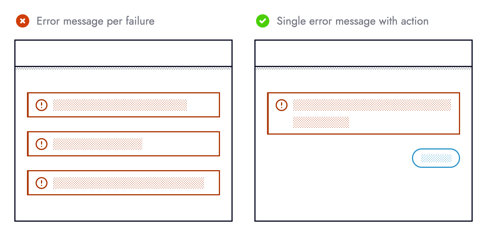
Categorization removes the 1-1 relationship between failures and
error messages in the UI. Otherwise, we risk bombarding users and
cluttering the UI with too many error messages. Guided by content
hierarchy we can cherry-pick what failures are surfaced to the UI, and
what happen unbeknownst to end-users.
Just because 3 errors occurred (left) doesn’t automatically mean 3
error messages should be shown. An action, such as a retry button, or a
link to the previous page helps guide users what to do next. (Large preview)
Medicine has an adage that prevention is better than cure.
Applied to the context of building resilient UIs, preventing an error
from happening in the first place is more desirable than needing to
recover from one. The best type of error is one that doesn’t happen.
It’s safe to assume never to make assumptions, especially when
consuming remote data, interacting with third-party libraries, or using
newer language features. Outages or unplanned API changes alongside what
browsers users choose or must use are outside of our control. Whilst we
cannot stop breakages outside our control from occurring, we can
protect ourselves against their (side) effects.
Taking a more defensive approach when writing code helps reduce
programmer errors arising from making assumptions. Pessimism over
optimism favours resilience. The code example below is too optimistic:
It
assumes that debit cards exist, the endpoint returns an Array, the
array contains objects, and each object has a property named lastFourDigits.
The current implementation forces end-users to test our assumptions. It
would be safer, and more user friendly if these assumptions were
embedded in the code:
Using a third-party method without first checking the method is available is equally optimistic:
stripe.handleCardPayment(/* ... */);
The code snippet above assumes that the stripe object exists, it has a property named handleCardPayment,
and that said property is a function. It would be safer, and therefore
more defensive if these assumptions were verified by us beforehand:
Both examples check something is available before using it. Those familiar with feature detection may recognize this pattern:
if(navigator.clipboard){/* ... */}
Simply
asking the browser whether it supports the Clipboard API before
attempting to cut, copy or paste is a simple yet effective example of
resilience. The UI can adapt ahead of time by hiding clipboard
functionality from unsupported browsers, or from users yet to grant
permission.
Only offer users functionality when we know they can use it. The
copy to clipboard buttons (right) are conditionally shown based on
whether the Clipboard API is available. (Large preview)
User browsing habits are another area living outside our control.
Whilst we cannot dictate how our application is used, we can instill
guardrails that prevent what we perceive as “misuse”. Some people
double-click buttons — a behavior mostly redundant on the web, however
not a punishable offense.
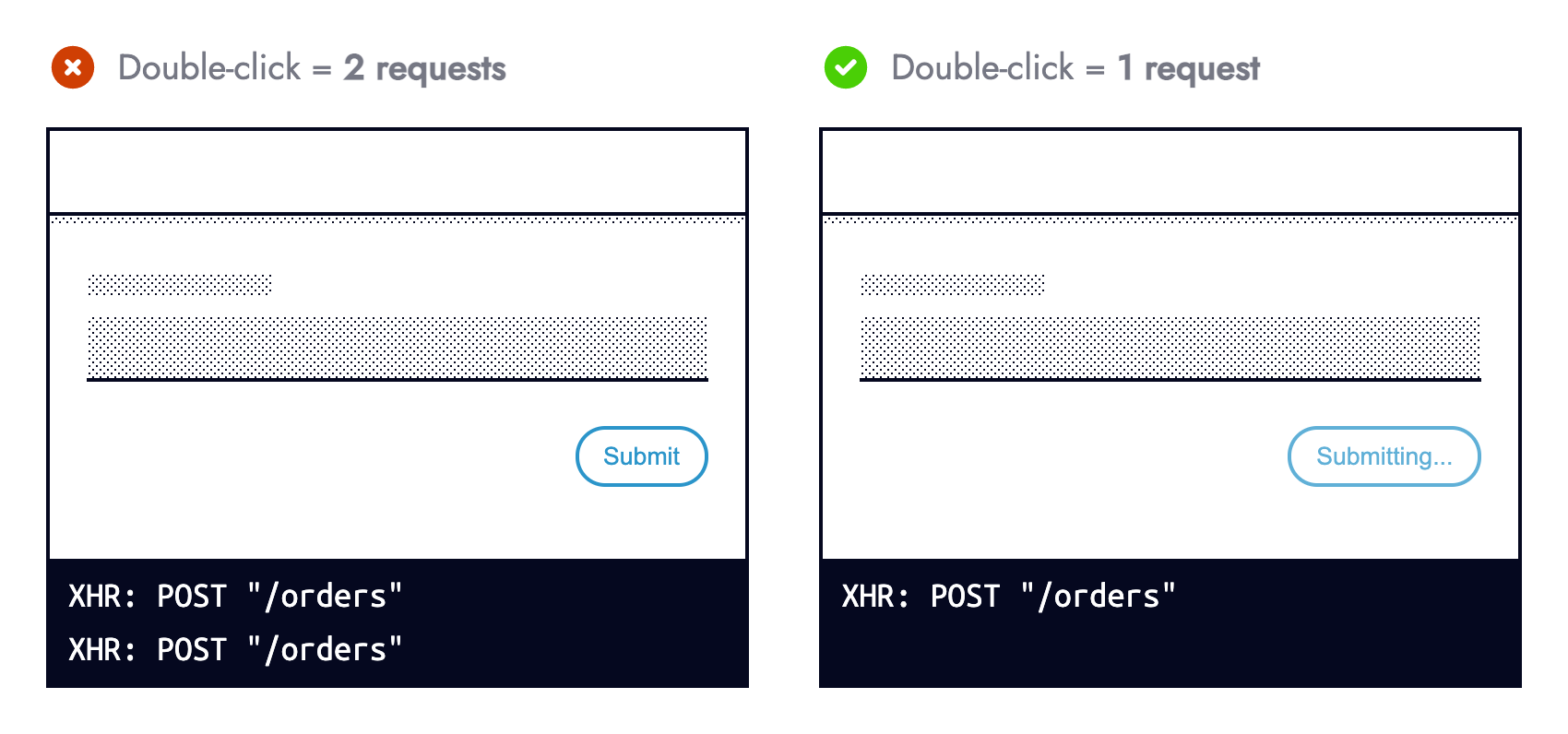
Double-clicking a button that submits a form should not submit the form twice, especially for non-idempotent HTTP methods. During form submission, prevent subsequent submissions to mitigate any fallout from multiple requests being made.
Users should not be punished for their browsing habits or mishaps.
Preventing multiple form submissions because of intentional or
accidental double-clicks is easier than cancelling duplicate
transactions at a later date. (Large preview)
Preventing form resubmission in JavaScript alongside using aria-disabled="true" is more usable and accessible than the disabled HTML attribute. Sandrina Pereira explains Making Disabled Buttons More Inclusive in great detail.
Not all errors are preventable via defensive programming. This means
responding to an operational error (those occurring within correctly
written programs) falls on us.
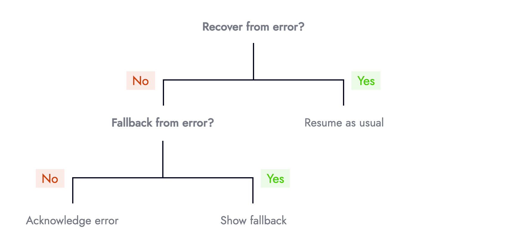
Responding to an error can be modelled using a decision tree. We can either recover, fallback or acknowledge the error:
Decision tree representing how we can respond to runtime errors. (Large preview)
When facing an error, the first question should be, “can we recover?”
For example, does retrying a network request that failed for the first
time succeed on subsequent attempts? Intermittent micro-services,
unstable internet connections, or eventual consistency are all reasons
to try again. Data fetching libraries such as SWR offer this functionality for free.
Risk appetite and surrounding context influence what HTTP methods you
are comfortable retrying. At Nutmeg we retry failed reads (GET
requests), but not writes (POST/ PUT/ PATCH/ DELETE). Multiple attempts
to retrieve data (portfolio performance) is safer than mutating it
(resubmitting a form).
The second question should be: If we cannot recover, can we provide a
fallback? For example, if an online card payment fails can we offer an
alternative means of payment such as via PayPal or Open Banking.
When something goes wrong offering an alternative helps users help
themselves, and avoids dead ends. This is especially important for time
sensitive transactions such as buying stock, or contributing to an ISA
before the tax year ends. (Large preview)
Fallbacks don’t always need to be so elaborate, they can be subtle.
Copy containing text dependant on remote data can fallback to less
specific text when the request fails:
UIs can adapt to what data is available and still provide value.
The vaguer sentence (left) still reminds users that ISA allowances lapse
each year. The more enriched sentence (right) is an enhancement for
when the network request succeeds. (Large preview)
The third and final question should be: If we cannot recover, or
fallback how important is this failure (which relates to “Error
Equality”). The UI should acknowledge primary errors by informing users
something went wrong, whilst providing actionable prompts such as
contacting customer support or linking to relevant support articles.
Avoid unhelpful error messages. The helpful error message (right)
prompts the user to contact CS, including how (phone/ email) and what
hours they operate to manage expectations. It’s not uncommon to provide
errors with a unique identifier that users can reference when making
contact. (Large preview)
UIs adapting to something going wrong is not the end. There is another side to the same coin.
Engineers need visibility on the root cause behind a degraded
experience. Even errors not surfaced to end-users (secondary errors)
must propagate to engineers. Real-time error monitoring services such as
Sentry or Rollbar are invaluable tools for modern-day web development.
A screenshot of an error captured in Sentry. (Large preview)
Most error monitoring providers capture all unhandled exceptions
automatically. Setup requires minimal engineering effort that quickly
pays dividends for an improved healthy production environment and MTTA
(mean time to acknowledge).
The real power comes when explicitly logging errors ourselves. Whilst
this involves more upfront effort it allows us to enrich logged errors
with more meaning and context — both of which aid troubleshooting. Where
possible aim for error messages that are understandable to
non-technical members of the team.
Naming conventions help standardise explicit error messages, which
make them easier to find/ read. The diagram above uses the format:
[Domain] Context — Problem. You needn’t be an engineer to understand a
bank transfer failed, and that the payments teams should investigate (if
they aren’t already doing so). (Large preview)
Extending the earlier Stripe example with an else branch is the perfect contender for explicit error logging:
if(typeof stripe ==="object"&&typeof stripe.handleCardPayment ==="function"){
stripe.handleCardPayment(/* ... */);}else{
logger.capture("[Payment] Card charge — Unable to fulfill card payment because stripe.handleCardPayment was unavailable");}
Note: This
defensive style needn’t be bound to form submission (at the time of
error), it can happen when a component first mounts (before the error)
giving us and the UI more time to adapt.
Observability helps pinpoint weaknesses in code and areas that can be
hardened. Once a weakness surfaces look at if/ how it can be hardened
to prevent the same thing from happening again. Look at trends and risk
areas such as third-party integrations to identify what could be wrapped
in an operational feature flag (otherwise known as kill switches).
Not all fallbacks need to be digital. This is especially true for
processes that already involve manual steps, such as transferring an ISA
from one bank to another. When everything is operational (left) users
submit an online form that populates a PDF they print and sign. When the
third-party suffers an outage or is down for maintenance (right) a kill
switch allows users to download a blank PDF form they can fill in (by
hand), print and sign. (Large preview)
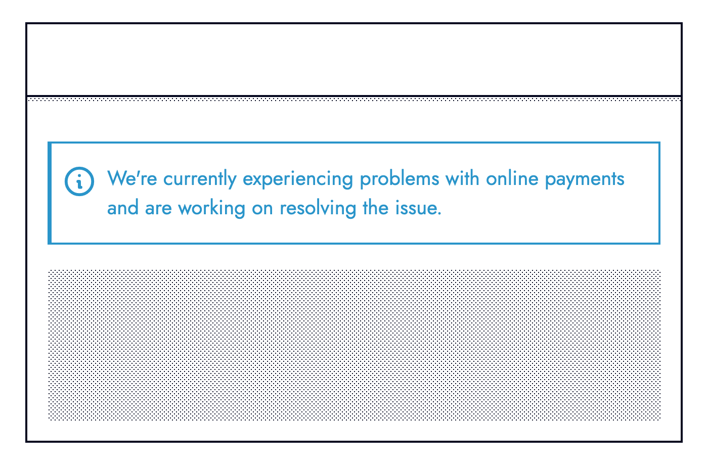
Users forewarned about something not working will be less frustrated
than those without warning. Knowing about road works ahead of time helps
manage expectations, allowing drivers to plan alternative routes. When
dealing with an outage (hopefully discovered by monitoring and not
reported by users) be transparent.
Avoid offloading observability to end users. Finding and
acknowledging issues before customers do leads to a better user
experience. The information banner above is clear, concise, and
reassures users that the issue is known about, and a fix is incoming. (Large preview)
However, they provide valuable learning opportunities for us and our
current or future colleagues. Removing the stigma from the inevitability
that things go wrong is crucial. In Black box thinking this is described as:
“In highly complex organizations, success can happen only
when we confront our mistakes, learn from our own version of a black
box, and create a climate where it’s safe to fail.”
Being analytical helps prevent or mitigate the same error from
happening again. Much like black boxes in the aviation industry record
incidents, we should document errors. At the very least documentation
from prior incidents helps reduce the MTTR (mean time to repair) should
the same error occur again.
Documentation often in the form of RCA (root cause analysis) reports
should be honest, discoverable, and include: what the issue was, its
impact, the technical details, how it was fixed, and actions that should
follow the incident.
Accepting the fragility of the web is a necessary step towards
building resilient systems. A more reliable user experience is
synonymous with happy customers. Being equipped for the worst
(proactive) is better than putting out fires (reactive) from a business,
customer, and developer standpoint (less bugs!).
Things to remember:
UIs should adapt to the functionality they can offer, whilst still providing value to users;
Always think what can wrong (never make assumptions);
Categorize errors based on their impact (not all errors are equal);
Preventing errors is better than responding to them (code defensively);
When facing an error, ask whether a recovery or fallback is available;
User facing error messages should provide actionable prompts;
Engineers must have visibility on errors (use error monitoring services);
Error messages for engineers/ colleagues should be meaningful and provide context;
Learn from errors to help our future selves and others.