Hire a web Developer and Designer to upgrade and boost your online presence with cutting edge Technologies

Monday, October 31, 2022

The Future Of Frontend Build Tools

 This article explores the concept of tooling for frontend development on the web. You will learn why we need frontend tooling, the various stages of evolution it has gone through, and the new developments that will shape the frontend build tools of the future. To follow along with this article, a general understanding of modern frontend development on the web is necessary.

Frontend build tooling is crucial to the workflow of the modern frontend developer for a host of reasons classified under improved developer and user experiences. From the developer’s perspective, frontend tooling gives us: the ability to author modules, a dev server for local development, Hot Module Replacement (HMR) for a shorter feedback loop in development mode, the ability to target legacy browsers with polyfills, processing a host of filetypes apart from JavaScript, the list goes on.

As a result, users can enjoy more capable and feature-rich applications that remain performant through techniques like code-splitting, caching, prefetching, and other resource optimization techniques — with some applications that are even able to work offline.

Frontend tooling gives us so much today that it is hard to imagine that there was a time when it was not even needed at all. A trip down memory lane could help us understand how we got here.

The Past

Before frontend applications became as complex as they are today, all JavaScript was used for was to add basic interactivity to otherwise simple HTML documents — similar to the way Adobe’s Flash was used.

There were no complex “JavaScript-heavy” applications, so, no need for any tooling to make authoring and shipping JavaScript better, but that would not remain the case.

As time went on and we started to create more involved user experiences on the web, we shifted from more static web pages to highly dynamic web applications serving user-specific data. These applications required more JavaScript than their traditional counterparts, and the limits of working with JavaScript became a lot more apparent.

There are two major ways to load JavaScript in the browser. One is with a script tag referencing a JavaScript file, and the other is to write your JavaScript directly in the HTML inside script tags.

<script src="my-javascript-file.js"></script>

<script>
    var a = 1;
    var b = 2;

    var result = a + b;
</script>

This limitation on loading JavaScript becomes a bottleneck when you have lots of JavaScript to load. There are browser limitations to loading many JavaScript files concurrently and maintainability issues with having one huge JavaScript file (like file size, scoping issues, namespace collision, and so on).

We came up with solutions like Immediately Invoked Function Expressions (IIFEs) to help with encapsulation and some of the scoping issues after which, we gained the ability to write our JavaScript in many different files. Then, we needed a way for these many files to be combined into one file to be served in the browser

The present

Being able to split our JavaScript into different files with IIFEs, it seemed like all we needed was a way to concatenate these files and ship a single file to the browser. This need saw the rise of tools like Gulp, Grunt, Brocolli, and so forth. However, we soon realized that our thinking might have been a little too simplistic.

As our applications got even more complex, matters like lack of dead code elimination, full rebuilds for small changes, and other performance issues made us realize that we needed something more than just concatenation. That gave rise to the more modern bundlers like Webpack, Parcel, and others.

With the pace of advancement in the frontend space not slowing down, we have started to observe gaps and issues with the modern build tools.

Some of the major limitations include:

  • Complex setup and configuration of some of these existing bundlers;
  • Increase in build times as applications get larger;
  • Suboptimal performance in development mode.

The rate at which things change in the JavaScript ecosystem is often fatiguing, but the upside is that the community quickly identifies problems and gets to work on potential solutions. With our sights set on improving the performance of frontend tooling, a new generation of build tools is being developed.

The Future

The limitations of the mainstream build tools of the day have led to several attempts to reimagine what a frontend build tool should be and do, and there are quite a few new build tools in the wild today.

Closer inspection will reveal that these new tools seem to be taking two major approaches to solving the problem (not necessarily mutually exclusive): a change in paradigm and a change in platform — both powered by new advancements in the web development ecosystem.

A Replatform

Frontend build tools have traditionally been built with JavaScript and, more recently, Typescript. This made sense, as JavaScript is the language of the web, and authoring build tools for the web in the same language makes it easier for more people to contribute to the effort and build a community around these tools. Still, there are inherent problems with this approach.

As a high-level language, JavaScript cannot reach native levels of performance. This means that tools built on top of this platform have a cap on how performant they can be. So, to break out of this limitation, newer build tools are being built on lower-level, inherently more performant languages like Rust.

Languages like Rust and Go have become popular options for authoring the next generation of build tools with a strong emphasis on performance. Rust, in particular, is popular not only for its performance but also for its impressive developer experience — voted the “most-loved” programming language six years in a row in the Stack Overflow Developer Survey.

In speaking about the decision to build Rome (the build tool and not the city) with Rust, Jamie Kyle says:

“Many others have communicated the performance, memory, and safety benefits of Rust before us — let’s just say everyone who has ever said Rust is good is correct. However, our biggest concern was our own productivity. [...] After some prototyping, however, we quickly realized we might actually be more productive in Rust”

Jamie Kyle in Rome Will Be Written In Rust

The project SWC is at the forefront of this idea of using Rust for frontend build tools. It is now powering projects like Next.js’s new compiler, Deno, Parcel, and others — with a performance that is many orders of magnitude above other existing build tools.

Projects like SWC prove that with a change of the underlying platform, the performance of build tools can be significantly improved.

A paradigm shift

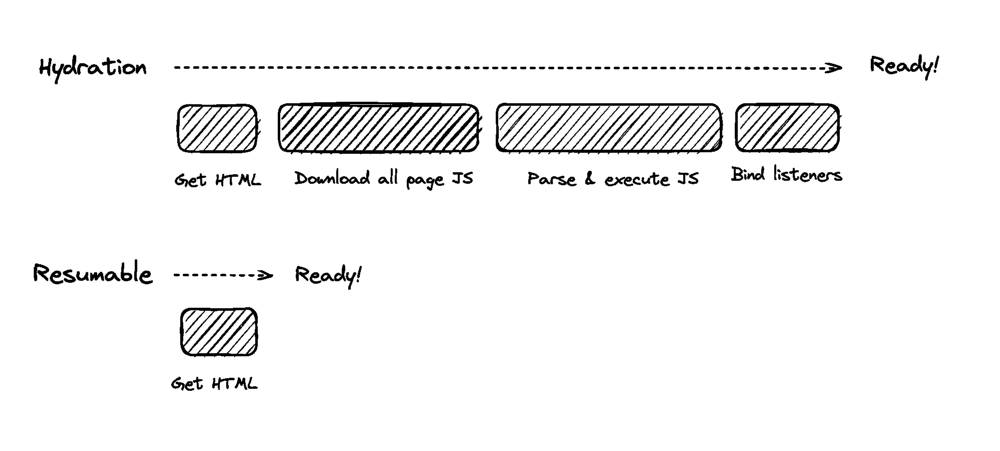
The way a typical frontend build pipeline works today is you author JavaScript modules in many different files, run a command, the build tool picks up these modules, bundles them into a single module, converts them to a format understood by browsers, and serves that file in the browser.

To improve the performance in development mode, a lot of the optimizations that would take more time to complete are left out and are, instead run when we are bundling our production application. This ensures that it takes as little time as possible to spin up a dev server, run our application in development mode and get productive.

The bundling process still takes quite some time, though and as a project grows, build times (even in development) only get longer and longer. Wouldn’t it be great if we could somehow skip bundling altogether while still being able to write modules as usual and have the browser understand how to work with them? A new set of build tools is taking this approach, known as Unbundled Development.

Unbundled development is great. It solves a major issue with existing build tools: they often need to rebuild entire sections of your application for even trivial code changes, and build times get longer as the application grows. We lose the rapid feedback — essential for a pleasant development experience.

One might wonder, if unbundled development is so great, why isn’t it the norm today? There are two major reasons why unbundled development is only starting to gain traction: browser compatibility for cutting edge features and processing node module imports.

1. Browser compatibility for cutting edge features

Unbundled Development is powered by ES Modules (ESM), which brings a standardized module system to JavaScript — supported natively across multiple runtimes, including the browser. With this new capability, we can mark our script tags as modules and can consequently use the import and export keywords that we are all familiar with;

<script type="module" src="main.js"></script>

<script type="module">
  /** JavaScript module code goes here */
</script>

ES modules have been around for quite some time. Still, we are only able to start taking advantage of it for things like unbundled development, mostly because of how long its standardization took across all the players in the web ecosystem.

In her article about ES Modules, on Mozilla Hacks, Lin Clark says:

“ES modules bring an official, standardized module system to JavaScript. It took a while to get here, though — nearly 10 years of standardization work.”

Lin Clark in ES Modules: A Cartoon Deep-Dive

The issue of browser support or lack thereof has plagued frontend development for a long time. This is why we have vendor prefixing our CSS, sometimes the reason for polyfills, why we spend time ensuring cross-platform support for our web applications, and why it sometimes takes quite some time before we can take advantage of the latest and greatest web features in our day to day work.

Try to visit a StackBlitz project using Safari, and you will be greeted with the following screen communicating the lack of support for WebContainers in non-Chromium-based browsers.

The pace of feature adoption is not the same across browser providers, and there are often variations in how different vendors implement certain features. However, the future looks bright with initiatives like Interop 2022.

2. Processing node module imports

Most, if not all, frontend applications we write today depend on external libraries from NPM. For a typical react application, We would import react at the top of our component files like so:

import React from 'react'

/** The rest of your component code */

Trying to load this directly in the browser, as we would need to do for unbundled development, will lead to two issues. First, the browser does not know how to resolve the path to find react and secondly, the react library is published as a Common JS (CJS) module — which cannot run natively in the browser without some pre-processing.

The latter is the bigger issue here, as it is possible, and even trivial, to simply replace our node module imports with relative paths to specific files. Still, the fact that most NPM packages are written in a module format more suitable for Node JS than the browser requires that our NPM dependencies are treated specially to facilitate unbundled development.

Snowpack, in particular, handles this by processing application dependencies into separate Javascript files that can then be used directly in the browser. More on how Snowpack does this can be found here.

With ES Modules now being mainstream in most modern browsers, and clever workarounds for NPM dependencies, build tools like Vite and Snowpack can offer the option of unbundled development with drastically improved performance, snappy builds, besides super fast HMR.

Final Thoughts

Frontend development has come a long way, and our needs are constantly evolving and increasing in complexity. Build tools are an essential part of how we build frontend applications, and existing tools are falling short of the mark sparking the development of new tools that reimagine how build tools should be designed.

With a huge focus on performance, ease of use, and less complex configuration, the next generation of build tools are poised to power ambitious frontend applications for some time to come.

Are you excited about the recent developments in this space? Let me know in the comments what you think about the upcoming innovations and the current landscape.

Simplify Your Color Palette With CSS Color-Mix()

 Defining a color palette and theme can be a lot of work, especially when considering contextual colors for elements’ various states. While CSS color-mix() only blends two colors together, this little function may be the key to maximizing your colors without maximum effort.

There’s a reason for all the new, experimental color features CSS is introducing. And there’s a reason for all the excitement they’re stirring up.

Colors are hard. Defining a base color palette can be time-consuming and involve quite a few stakeholders. And that’s not even considering contextual colors, like hover, active and inactive states. Defining these values requires even more time and more attention to accessibility. This can result in a bloated palette and an even more bloated set of design tokens.

It can be a lot to juggle. 🤹

While the CSS color-mix() function may only blend two colors together, could it be used to simplify color palettes and streamline contextual values across themes?

The CSS Color-Mix() Function

The CSS color-mix() function is an experimental feature that is currently a part of the Color Module 5. True to its name, the function will accept any two colors, mix them together and return a little color Frankenstein.

For the sake of this article, let’s define how these arguments will be called while using this example.

  • Color Space would refer to HSL;
  • Base Color would refer to red;
  • Base Percent would refer to 50%;
  • Blend Color would refer to white;
  • Blend Percent, not shown in this example, will refer to a value covered later.

There are quite a few moving pieces here, so let’s have a quick interactive visual to simulate the base color, base percent, and blend color.

Like with any experimental feature, the syntax or features could change before widespread browser adoption. However, the features in Color Module 5 seem stable enough to, at the very least, begin tinkering ourselves.

At the time of writing this article, browser support is very limited (as in, all but non-existent). The feature can be toggled behind development flags in both Firefox and Safari Technology Preview. But the web moves fast, and it’s probably worth visiting Color-Mix() On Caniuse to see the latest (and hopefully greatest) support.

Now, with the formalities out of the way, grab some dark rum, ginger beer, and lime juice, and let’s get mixing.

Throwback Art Class 🎨

Do you remember learning about the color wheel in art class?

The primary colors anchored the wheel, and when blended, they formed the secondary layer. Lastly, by blending the secondary layer, the tertiary colors were formed. The wheel was complete.

Disregarding the lack of a visual wheel here, CSS color-mix() can be used to create the same effect.

Building the linear color wheel was a lot of fun and a great dive into using color-mix(). It often helps when experimenting with a new feature to already know what the visual outcome should be.

So how does this work?

First: Define the base primary colors.

–primary-1: #ff0;
–primary-2: #f00;
–primary-3: #00f;

Next: Mix the primary colors to create the secondary colors.

–secondary-1: color-mix(in srgb, var(–primary-1) 50%, var(–primary-2));
–secondary-2: color-mix(in srgb, var(–primary-2) 50%, var(–primary-3));
–secondary-3: color-mix(in srgb, var(–primary-3) 50%, var(–primary-1));

Last: Mix the primary and secondary colors to create the tertiary colors.

--tertiary-1: color-mix(in srgb, var(--primary-1) 50%, var(--secondary-1));
--tertiary-2: color-mix(in srgb, var(--secondary-1) 50%, var(--primary-2));
--tertiary-3: color-mix(in srgb, var(--primary-2) 50%, var(--secondary-2));
--tertiary-4: color-mix(in srgb, var(--secondary-2) 50%, var(--primary-3));
--tertiary-5: color-mix(in srgb, var(--primary-3) 50%, var(--secondary-3));
--tertiary-6: color-mix(in srgb, var(--secondary-3) 50%, var(--primary-1));

Of course, when I was in art class, there was only one set of paints. So if you wanted yellow, there was only one yellow. Red? There was only one red. Blue? Well, you get the idea.

But the web and CSS offer a much wider selection of colors in the way of ‘color spaces.’ Some of these color spaces may already be familiar, but there were quite a few I hadn’t used before, including four new CSS color features which are gradually gaining support.

Color spaces can calculate their colors differently from one another. Newer color spaces provide wider palettes with more vivid shades to maximize the latest screen technologies — like ultra-high-definition retina displays. It means that a single color may appear differently across each color space.

Knowing the CSS color-mix() function supports using different color spaces, let’s experiment with color spaces by replacing the use of srgb from the previous example with a custom property to see how the color wheel changes.

Using color-mix to toggle the mixture’s color space

The color-mix() function isn’t limited to only blending HEX codes either. In fact, it can mix multiple color types at once. The previous example can be modified to use different color types while returning the same results.

First: Define the base primary colors

–primary-1: yellow;
–primary-2: rgb(255,0,0);
–primary-3: hsl(240,100%,50%);

Next: Mix the primary colors to create the secondary colors

–secondary-1: color-mix(in srgb, var(–primary-1) 50%, var(–primary-2));
–secondary-2: color-mix(in srgb, var(–primary-2) 50%, var(–primary-3));
–secondary-3: color-mix(in srgb, var(–primary-3) 50%, var(–primary-1));

Mixing N’ Matching 

Recreating childhood art class is fun, but those concepts can be taken further and applied more practically to our adulthood hobbies and careers.

A lot of time can be spent defining every color variation and shade, but color-mix() can blend theme values together to fill in those variation gaps.

Let’s take a look at contextual UI colors, like button :hover and :active states. A lot of time can be spent defining these values to ensure they’re cohesive with the current theme and accessible. But when themes often include primary dark and light colors already, could these values be mixed to create contextual colors a bit more automatically?

See the Pen CSS Color-Mix() – Contextual Button Demo by Daniel Yuschick.
Using color-mix to blend theme colors to create contextual shade

While a similar effect could be created with the HWB color function by increasing the button color’s blackness value, sometimes darkening a button isn’t just a matter of mixing in a splash of black. Just ask anybody who’s ever struggled finding the perfect dark mode theme. This is also where color-mix() stands out from Sass darken() and lighten() functions. The color-mix() function gives greater and granular control of how colors are adjusted, and it does so natively to CSS.

By mixing a specific theme value, like --color-dark-primary , the pseudo-states can be created while remaining visually cohesive with the rest of the theme.

Additionally, a color-mix() result can be used as the base color in another color-mix() function. This is done in the demo to define the buttons’ :active states relative to their :hover state.

When specifying a base percentage, the blend color is mixed with a percentage that would total 100%. If the base percentage is 75%, the blend percent will be 25%.
 :root {
  --color-dark-primary: #dedbd2;
}

button {
  --btn-bg: #087e8b;
  --btn-bg-hover: color-mix(in srgb, var(--btn-bg) 75%, var(--color-dark-primary));
  --btn-bg-active: color-mix(in srgb, var(--btn-bg-hover) 80%, var(--color-dark-primary));

  background: var(--btn-bg);

  &:hover {
    background: var(--btn-bg-hover);
  }

  &:active {
    background: var(--btn-bg-active);
  }
}

In this example, the --btn-bg-hover value is defined by mixing 75% of --btn-bg with --color-dark-primary. Then, --btn-bg-active is set by mixing 80% of --btn-bg-hover with --color-dark-primary again.

It’s important to note when specifying a base percentage that the blend color is mixed with a percentage that would total 100%. If the base is 75%, the blend percent will be 25%.

However, this becomes a bit complicated when introducing a separate blend percent.

Mixing Mastery With Blend Percents

As an optional argument for color-mix(), the blend percent introduces an additional level of mix mastery. In the previous examples, without a blend percentage, the blend color would automatically use a value that, when added to the base percent, totaled 100.

If the base percent was 50, the blend percent would be 50. If the base percent was 99, the blend percent would be 1.

However, specifying a custom blend percent means the percentage total may not always round out so evenly.

While the W3 docs explain the calculations behind this functionality quite well, the math is a tad beyond my abilities to explain clearly — this is art class, after all. But, as best as I can put it:

--math-bg: color-mix(in srgb, red 20%, white 60%);

In this example, the base percentage is 20 while the blend percent is 60 creating a total of 80. This gives us, what’s called, an alpha multiplier of 0.8 where 1 = 100 and 0.8 = 80%.

To fill in the gaps, the function will multiply the base and blend percentages by this alpha multiplier to scale them up to 100% while remaining relative to their original weights.

20% * 100/80 = 25%
60% * 100/80 = 75%

--math-bg: color-mix(in srgb, red 25%, white 75%);

If the base and blend percentages total more than 100, the inverse of this approach would be taken to round down to 100. Again, the math behind the scaling of these values, along with the general mixing calculations, is beyond my depth. For those interested in digging deeper into the technicalities of color-mix(), I would point to the W3 docs.

However, that mathematical understanding isn’t required for the below demo, where both the base and blend percentages can be adjusted to view the result.

Actin’ Shady With Transparencies

Colors with transparency add another level to the color-mix() function. The concept seemed complicated, but after experimenting, opacities look to mix similar to the opaque mix percentages.

 :root {
  --base-opacity: 50%;
  --blend-opacity: 50%;
  --base-color: rgba(255, 0, 0, var(--base-opacity));
  --blend-color: rgba(0, 0, 255, var(--blend-opacity));
}

#result {
  background: color-mix(in lch, var(--base-color) 50%, var(--blend-color));
}

In this sample, the base color is red, and the blend color is blue. In normal circumstances, these colors would mix to create pink. However, each color is defined using rgba and a 50% opacity.

The result is the expected pink shade but with an averaged opacity. If the base opacity is 100% and the blending opacity is 0%, the resulting opacity will be 50%. But regardless of the resulting opacity, the 5050 color mix keeps its consistent pink shade.

The results of using color-mix with transparent colors

A Dash Of Caution

There are inevitable drawbacks to consider, as with any experimental or new feature, and color-mix() is no different.

Custom Properties And Fallbacks

Since CSS custom properties support fallback values for when the property is not defined, it seemed like a good approach to use color-mix() as a progressive enhancement.

--background-color: color-mix(in srgb, red 50%, blue);
background: var(--background-color, var(--fallback-color));

If color-mix() is not supported, the --background-color property would not be defined, and therefore the --fallback-color would be used. Unfortunately, that’s not how this works.

An interesting thing happens in unsupported browsers — the custom property would be defined with the function itself. Here’s an example of this from Chrome DevTools:

Because the --background-color property is technically defined, the fallback won’t trigger.

However, that’s not to say color-mix() can’t be used progressively, though. It can be paired with the @supports() function, but be mindful if you decide to do so. As exciting as it may be, with such limited support and potential for syntax and/or functionality changes, it may be best to hold off on mixing this little gem into an entire codebase.

@supports (background: color-mix(in srgb, red 50%, blue)) {
  --background-color: color-mix(in srgb, red 50%, blue);
}

CurrentColor Is Not Supported 

A powerful little piece of CSS is being able to use currentColor as a value, keeping styles relative to their element. Unfortunately, this relative variable cannot be used with color-mix().

button {
  background: color-mix(in srgb, currentColor 50%, white);
}

The hope was to have ever greater control over relative colors, but unfortunately, using currentColor in this way will not work. While color-mix() can’t achieve relative colors to this degree, the new relative color syntax is also coming to CSS. Read about CSS relative color syntax with Stefan Judis.

Wrapping Up

While color-mix() may not be as powerful as something like color-contrast(), there is definitely a place for it in a CSS tool belt — or kitchen cabinet. Wherever.

The use cases for contextual colors are intriguing, while the integration into design systems and themes (to potentially simplify color palettes while retaining great flexibility) is where I want the most to experiment with in the feature. However, those experiments are likely still a ways off due to the current browser support.

Personally, combining color-mix() with color-contrast() is an area that seems particularly exciting, but without proper browser support, it will still be difficult to fully explore.

Where would you first implement color-mix()? 🤔

Maybe it could be used as a mixin to roughly replicate the lighten() and darken() SCSS functions. Could there be greater potential in the realm of user-generated themes? Or even web-based graphic editors and tools? Maybe it could be used as a simple color format converter based on device capabilities.

Nevertheless, CSS is providing the web with plenty of new and exciting ingredients. It’s only a matter of time before we start mixing up some incredible recipes.

Sunday, October 30, 2022

Five Data-Loading Patterns To Boost Web Performance

 You don’t need a framework for everything, but if you use one, this article will help you use it in the most performant way.

When it comes to performance, you shouldn’t be stingy. There are millions of sites, and you are in close competition with every one of those Google search query results. Research shows that users will abandon sites that take longer than three seconds to load. Three seconds is a very short amount of time. While many sites nowadays load in less than one second, there is no one size fits all solution, and the first request can either be the do or die of your application.

Modern frontend applications are getting bigger and bigger. It is no wonder that the industry is getting more concerned with optimizations. Frameworks create unreasonable build sizes for applications that can either make or break your application. Every unnecessary bit of JavaScript code you bundle and serve will be more code the client has to load and process. The rule of thumb is the less, the better.

Data loading patterns are an essential part of your application as they will determine which parts of your application are directly usable by visitors. Don’t be the site that slows their entire site because they chose to load a 5MB image on the application’s homepage and understand the issue better. You need to know about the resource loading waterfall.

Loading Spinner Hell And The Resource Loading Waterfall

The resource loading waterfall is a cascade of files downloaded from the network server to the client to load your website from start to finish. It essentially describes the lifetime of each file you download to load your page from the network.

You can see this by opening your browser and looking in the Networking tab.

What do you see there? There are two essential components that you should see:

  1. The chart shows the timeline for each file requested and loaded. You can see which files go first and follow each consecutive request until a particular file takes a long time to load. You can inspect it and see whether or not you can optimize it.
  2. At the bottom of the page, you can check how many kB of resources your client consumes. It is important to note how much data the client needs to download. On your first try, you can use it as a benchmark for optimizations later.

No one likes a white blank screen, especially your users. Lagging resource loading waterfalls need a basic placeholder before you can start building the layout on the client side. Usually, you would use either a spinner or a skeleton loader. As the data loads one by one, the page will show a loader until all the components are ready.

While adding loaders as placeholders is an improvement, having it on too long can cause a “spinner hell.” Essentially, your app is stuck on loading, and while it is better than a blank HTML page, it could get annoying, and visitors would choose to exit your site.

But isn’t waiting for the data the point?

Well, yes, but you can load it faster.

Assuming you want to load a social media layout, you might add a loading spinner or a skeleton loader to ensure that you don’t load an incomplete site. The skeleton loader will usually wait for:

  • The data from the backend API;
  • The build layout according to the data.

You make an asynchronous call to an API, after which you get the URL for the asset on the CDN. Only then can you start building the layout on the client side. That’s a lot of work to show your face, name, status, and Instagram posts on the first try.

The Five Data-Loading Patterns You Need to Know

Developing software is becoming easier as frameworks like React, Vue, or Angular become the go-to solution for creating even the simplest applications. But using these bulky frameworks filled with a ton of magical functions you don’t even use isn’t what you should be going for.

You’re here to optimize. Remember, the less, the better.

But what if you can’t do less? How will you serve blazingly fast code, then? Well, it’s good that you’re about to learn five data-loading patterns that you can use to get your site to load quickly or, as you would say, blazingly fast.

Client Side Rendering, Server Side Rendering And Jamstack

Modern JavaScript frameworks often use client-side rendering (CSR) to render webpages. The browser receives a JavaScript bundle and static HTML in a payload, then it will render the DOM and add the listeners and events triggers for reactiveness. When a CSR app is rendered inside the DOM, the page will be blocked until all components are rendered successfully. Rendering makes the app reactive. To run it, you have to make another API call to the server and retrieve any data you want to load.

Server-side rendering (SSR) is when an application serves plain HTML to the client. SSR can be divided into two types: SSR with hydration and SSR without hydration. SSR is an old technique used by older frameworks such as WordPress, Ruby on Rails, and ASP.NET. The main goal of SSR is to give the user a static HTML with the prerequisite data. Unlike CSR, SSR doesn’t need to make another API call to the backend because the server generates an HTML template and loads any data within it.

Newer solutions like Next.js uses hydration, where the static HTML will be hydrated on the client side using JavaScript. Think of it like instant coffee, the coffee powder is the HTML, and the water is the JavaScript. What happens when you mix instant coffee powder with water? You get — wait for it — coffee.

But what is a Jamstack? Jamstack is similar to SSR because the client retrieves plain HTML. But during SSR, the client retrieves the HTML from the server. However, Jamstack apps serve pre-generated HTML directly from the CDN. Because of this, Jamstack apps usually load faster, but it’s harder for developers to make dynamic content. Jamstack apps are good with pre-generating HTML for the client, but when you use heavy amounts of JavaScript on the client side, it becomes increasingly harder to justify using Jamstack compared to Client Side Rendering (CSR).

Both SSR and Jamstack have their own differences. What they do have in common is they don’t burden the client with rendering the entire page from scratch using JavaScript.

When you optimize your site’s SEO, using SSR and Jamstack are recommended because, compared to CSR, both return HTML files that search bots can easily traverse. But search bots can still traverse and compile JavaScript files for CSR. However, rendering every JavaScript file in a CSR app can be time-consuming and make your site’s SEO less effective.

SSR and Jamstack are very popular, and more projects are moving to SSR frameworks like Next.js and Nuxt.js compared to their vanilla CSR counterparts, React and Vue, mainly because SSR frameworks provide better flexibility when it comes to SEO. Next.js has a whole section talking about SEO optimizations on their framework.

An SSR application will generally have templating engines that inject the variables into an HTML when given to the client. For example, in Next.js, you can load a student list writing:

export default function Home({ studentList }) {
  return (
    <Layout home>
        <ul>
          {studentList.map(({ id, name, age }) => (
            <li key={id}>
              {name}
              <br />
              {age}
            </li>
          ))}
        </ul>
    </Layout>
  );
}

Jamstack is popular with documentation sites that usually compile code to HTML files and host them on the CDN. Jamstack files usually use Markdown before being compiled to HTML, for example:

---
author: Agustinus Theodorus
title: ‘Title’
description: Description
---
Hello World

Active Memory Caching

When you want to get data that you already had quickly, you need to do caching — caching stores data that a user recently retrieved. You can implement caching in two ways: using a super-fast key-value store like Redis to save data keys and values for you and using a simple browser cache to store your data locally.

Caching partially stores your data and is not used as permanent storage. Using the cache as permanent storage is an anti-pattern. Caching is highly recommended for production applications; new applications will start using caches as they gradually mature.

But when should you choose between a Redis cache (server cache) and a browser cache (local cache)? Both can be used simultaneously but will ultimately serve a different purpose.

Server caches help lower the latency between a Frontend and Backend; since key-value databases are faster than traditional relational SQL databases, it will significantly increase an API’s response time. However, a local cache helps improve app state management, enabling the app to persist state after a page refresh, and helps future visits.

In summary, if you want to increase the performance of your application, you can use server caches to speed up your APIs, but if you want to persist your app state, you should use the local storage cache. While local caches might not seem helpful at all, it does help reduce the number of API calls to the backend by persisting state that doesn’t frequently change. However, local caches will be better when combined with live data.

Data Event Sourcing

You can make a real-time live connection between the Front-end and Backend via WebSockets. WebSockets are a two-way communication mechanism that relies on events.

In a common WebSocket architecture, the Front-end application will connect to a WebSocket API, an event bus, or a database. Most WebSocket architectures utilize it as a substitute to REST, especially in use cases like chat applications; polling your Backend service every few seconds becomes a very inefficient solution. WebSockets allow you to receive updates from the other end without needing to create a new request via the two-way connection.

WebSockets make a tiny, keep-alive connection compared to normal HTTP requests. Combining WebSockets with local browser cache creates a real-time application. You can update the app’s state based on the events received from the WebSocket. However, some caveats regarding performance, scalability, and potential data conflicts exist.

A pure WebSocket implementation still has a lot of faults. Using WebSockets instead of regular HTTP calls changes how your entire application behaves. Just a slight connection issue can affect your overall UX. For example, a WebSocket cannot have real-time performance when it needs to query the database every time there is a get request. There are bottlenecks in the backend that needs to be optimized for better real-time results to make WebSockets feasible and a more reasonable answer.

There needs to be an underlying architectural pattern that can support it. Event sourcing is a popular data pattern you can use to create reliable real-time applications. While it doesn’t guarantee overall app performance, it will give your customers better UX by having a real-time UI.

Modern JavaScript has WebSocket providers that you can use. The WebSocket class opens a connection to a remote server and enables you to listen when the WebSocket opens a connection, closes a connection, returns an error, or returns an event:

const ws = new WebSocket('ws://localhost');
ws.addEventListener('message', (event) => {
    console.log('Message from server ', event.data);
});

Do you want to react to server events? Add an addEventListener function and insert a callback that it will use:

ws.send('Hello World');

Want to send a message? WebSockets got you. Use the send function to get a message out to the server. It’s as easy as printing “Hello World.” The examples are from the MDN Docs.

Prefetching And Lazy Loading

Prefetching and lazy loading has become common knowledge among frontend developers. Efficient use of a client’s resources and bandwidth can greatly improve your application’s performance.

Prefetching

Prefetching gives developers more granular control over the client’s idle bandwidth, loading resources, and pages that the client might need next. When a website has a prefetch link, the browser will silently download the content and store it within its cache. Prefetched links can have significantly faster loading times when the user clicks them.

<link rel="prefetch" href="https://example.com/example.html">

You specify prefetch URLs within the link HTML element, more specifically, the rel attribute. Prefetching has a few pros and cons:

  • Pros: Prefetching waits until the browser’s network is idle and is no longer in use and will stop when you trigger usage by clicking a link or triggering a lazy loading function.
  • Pros: Prefetching caches data within the browser, making page transitions faster when redirecting to a link.
  • Cons: It can be used to download trackers, compromising user privacy.

Lazy Loading #

Lazy loading is a common data-loading pattern that makes the client load à la carte results, not loading everything until the client needs it. Lazy loading will make the client fetch the latter parts of a website after they’ve scrolled into view.

Lazy loading makes your site load faster by allowing the browser to concentrate on more important, on-screen resources. You won’t need to load all the images/text on a given site when you can’t see it. But lazy loading can only help you delay downloading resources and doesn’t make your resources smaller and more cost-efficient.

However, if you are looking to make a more cost-efficient solution that is similar to lazy loading, try looking for Resumability.

Resumability

Many developers have never heard of the Resumability concept before. Resumability renders JavaScript partially in the server, the final state of the render will be serialized and sent to the client with the corresponding HTML payload. Then the client will finish the rendering, saving time and resources on the client side. Essentially, Resumability uses the server to do the heavy lifting and then gives the client a minimal amount of JavaScript to execute via serialization.

The main idea of Resumability is to serialize the application state from the server to the client. Instead of loading everything (HTML, JS) and hydrating them on the Front-end, Resumability serializes the JavaScript parsing in stages and sends them to the client in HTML.

Visualization of Resumability vs Hydration.
Resumability vs Hydration. (Image source: Qwik) (Large preview)

Page startups will be instantaneous because the client doesn’t have to reload anything and can deserialize the state injected into the HTML. Resumability is a very foreign concept and is not common in many projects. It was coined by the founder of Qwik, Misko Hevery.

Qwik is a JavaScript framework that relies on Resumability under the hood. Unlike other frameworks, Qwik is built from the ground up with Resumability in mind. Frameworks like React and Vue can never utilize Resumability without sacrificing backward compatibility. It is because the lazy loading component of Qwik uses asynchronous lazy loading compared to the synchronous nature of most JavaScript frameworks.

The goal of Qwik is to load as minimal JavaScript as possible. Lazy loading JavaScript is hard and, in some instances, impossible. The less you need it, the better. Resumability allows developers to have fine-grained lazy loading and decreased memory usage for mobile applications optimizing your site for the mobile web.

Using Qwik is similar in some ways to React, specifically, its syntax. Here is a code snippet example of how Qwik works in code. The root of the application will be in the form of HTML:

import { App } from './app';
export const Root = () => {
  return (
    <html>
      <head>
        <title>Hello Qwik</title>
      </head>
      <body>
        <App />
      </body>
    </html>
  );
};

The root has a dependency on App. It will be the lazy loaded Qwik component:

import { component$ } from '@builder.io/qwik';
export const App = component$(() => {
  return <p>Hello Qwik</p>;
});

Qwik and React have similarities at the component level. But it differentiates when you get into the server side of things.

import { renderToString, RenderOptions } from '@builder.io/qwik/server';
import { Root } from './root';
export default function (opts: RenderOptions) {
  return renderToString(<Root />, opts);
}

The code snippet above shows you how the server-side of Qwik serializes the root component using the renderToString method. The client will then only need to parse pure HTML and deserialize the JavaScript state without needing to reload them.

Summary #

Application performance is essential for the client. The more resources you have to load on startup, the more time your app will need to bootstrap. Loading times expectations are getting lower and lower. The less time you need to load a site, the better.

But if you are working on large enterprise applications, how you can optimize your apps are not obvious. Data-loading patterns are one way you can optimize your applications’ speed. In this article, you reviewed five data-loading patterns that may be of use:

  1. Server Side Rendering (SSR) and Jamstack;
  2. Active Memory Caching;
  3. Data Event Sourcing;
  4. Prefetching and Lazy Loading;
  5. Resumability.

All five of which are useful in their own circumstances.

SSR and Jamstack are generally good choices for applications that require less client-side state management. With the advent of modern JavaScript frameworks like React, more people have tried Client Side Rendering (CSR), and it seems that the community has come full circle back to SSR. SSR is the technique used by old MVC web frameworks to use template engines to generate HTML based on the data on the backend. Jamstack is an even older depiction of the original web, where everything was using just HTML.

Active memory caching helps users load data from APIs faster. Active memory caching solves the important issues around data loading by either caching the results on a remote cache server (Redis) or your local browser cache. Another data-loading pattern even uses it, prefetching.

Next, event sourcing is an architectural pattern that supplements the real-time event-based WebSocket APIs. Plain old WebSockets are not enough to become completely efficient because even though the WebSocket itself is real-time, the recurring API call to the database can cause a bottleneck. Event sourcing removes this problem by creating a separate database for retrieving data.

Prefetching and lazy loading are the easiest solutions to implement. The goal of prefetching is to load data silently during network idle times. Clients will save the prefetched link inside their browser caches, making it instantaneous on contact.

Lazy loading reduces the number of resources you need to load on the first click. You only need the resources that you see directly after the page loads. However, Resumability takes lazy loading to the extreme. Resumability is a method of lazy loading JavaScript components by rendering them in the server and then serializing the state to continue the render on the client via HTML.

Where To Go From Here? #

Learning to optimize your Frontend applications is an ongoing process; you need to be proactive about what you implement daily. Data-loading patterns are only one of a few ways you can use to improve your application performance.

But it is best to consider the common pitfalls before making any drastic changes to how your application is structured and consumes and loads data.

If you’re interested in exploring the references, you can check out:

I hope you found this article helpful. Please join the forum discussion below if you have any questions or comments.

Phone Numbers For Web Designers

 The customer journey is not limited to a website alone. Simply by combining the world of website design and telephony, far better results can be obtained for your organization. And thanks to the similarities and mutual benefits, it is an easy step to take.

It is exciting how websites are being optimized. Localization, A/B testing, and cross-domain campaign tracking contribute to your bottom line. But why stop there? The customer experience is not determined by your website alone. Take the next step and start to include your telephony in the optimization span. And it is a relatively easy step to take as you are already familiar with the mechanisms. Simply follow these seven considerations.

First Things First: The Basics #

Before determining which number type to use and when and how to present them on your website, it helps to know which number types are available, to begin with:

Number types
(Large preview)

Each of these numbers can be valid to use, depending on your strategy. It is important to line up the localization, appearance (tone of voice), and other factors of your website and the phone number type you choose. And — like your website — keep testing and optimizing your choice.

Let’s dive into the details of the seven considerations to make.

Localization #

A lot has been written about localization. Why it is important and how to achieve it with your website. All this attention is leading to great results. However, a website and the product are not the only points of contact with the customer and do not fully cover the customer experience domain. So, there is much to be gained here.

The localization of your website and phone number choice needs to be in sync. If your website is tailored per country, the phone number should also be country-specific. It would be weird to have a site for a specific country but not a phone number. And the beauty is that you have already determined the level of localization required for your website. You can simply match the localization needed to the available phone number types.

A graph with number types and matching localisation
(Large preview)

If your website localization is country-based, then get one of these numbers:

  • National number,
  • Freephone number,
  • Premium Rate number.

All of these are suitable for country-wide operating businesses. We’ll get back to how to choose which one fits your case best later in this article.

If your website targets specific areas smaller than a country:

Get local numbers in the same areas you are targeting with your website. It strengthens your website localization strategy, and you continue to earn trust with the local phone numbers. If you have optimized (an instance of) your website specifically for London, it only makes sense to extend that strategy and present a Local London Phone number.

There are two number types that require additional attention:

  1. A mobile phone number is technically a number that is valid country-wide. However, it has its value for a very specific type of business: mostly local operating, independent service providers.
  2. An international freephone number (officially a UIFN number) is a single number that can be activated in multiple countries. If your website strategy is explicitly to express one voice for all, this number type fits that strategy; one single international phone number that can be activated in multiple countries. And it can have its advantages in other areas as well. We’ll dive into those a bit later in this article.
More after jump! Continue reading below ↓

Appearance #

Every type of number expresses an identity. This should match the identity your target market expects from you. Again, consistency is key. Make sure to align the tone of voice and the image you are projecting with your website with the appearance of the phone number(s) you choose.

If you are trying to generate a familiar feel on your website, a local number is your best option. You are calling someone close by, your neighbor. It gives the feeling you know them and that they are trustworthy.

A graph with number types and matching appearances
(Large preview)

If you want to provide a more corporate or formal impression, a national number is your choice. Bigger companies need a lot of phone numbers, and in many cases, they have offices in different cities. National Numbers have been created to overcome the issue of local numbers being snagged away from consumers. And as stated earlier, they can be used in multiple cities, which enables a company to be reachable in multiple cities via the same phone number. Not for nothing, National phone numbers are also called corporate numbers.

Only use a mobile number if you have to exhume mobility while it is ok that you are an independent service provider. Like an independent courier.

Freephone numbers are by far the most effective phone number types for sales lines and support lines for high-end services and products. If you want to welcome your callers with open arms, this is the number type to opt for, without a doubt.

If the phone call is the medium via which you provide your services, premium rate numbers can provide financial compensation for the services provided. In some cases, these numbers are also used as support lines with the goal of building a threshold for the customer to call and some compensation for the cost of the time spent. Note that this will negatively impact your customer experience. In most countries, it is not even allowed to offer a premium rate number for the support line on services under contract or products under warranty.

An international freephone number is counterproductive in localization but has other advantages. This number type has been defined by the ITU as an international alternative for the regular in-country freephone number and has the calling code +800. Having the same number available in multiple countries has its advantages: You only have to print one number on documentation to be used in multiple countries. And if you have international traveling callers, they only have to memorize one number.

Caller And Operational Cost #

Each number type has its own caller and operational cost profile.

A graph with number types and matching callers and operational costs
(Large preview)

The most cost-effective numbers for both callers and you are local, national, and mobile numbers. These number types are mostly called from the caller bundle and have the lowest operational cost.

The purpose of a freephone number is to shift the caller cost from caller to operational. Therefore, the operational cost is relatively high.

A premium rate number is a payment method; therefore, caller cost is high and provides an operational source of income.

The cost model for an international freephone number is similar to the model of a normal freephone number. The cost is shifted to the operation.

Note: Since this is a globally defined phone number type, it is not regulated by the various in-country regulators to whom the caller operators have to answer.

Most fixed line operators do respect the 0-caller tariff. However, some mobile operators use this loophole to charge their customers for calls to these numbers.

Reachability #

Not all number types can be called from everywhere. Obviously, you need to make sure your phone number is reachable by your target audience.

Local, national, mobile and international freephone numbers are usually internationally reachable.

(Large preview)

Normal freephone and premium rate numbers are not. As discussed before, these numbers do have their added value for many organizations. If you use these types of numbers, it is important to make sure you get a number in every target market or at least an alternative number for your local customer who just happened to travel outside of your country.

A/B And Campaign Testing #

With these guidelines, you can make educated choices and proceed with confidence. But do you stop tweaking your website at this point? No, you don’t! This is where you start with optimization via methods like A/B Testing.

Visualization of A/B And Campaign testing
(Large preview)

So why not include the phone number options in the scope of testing? All tools are available. All you have to do is include the phone numbers as an A/B parameter. And by adding the call statistics to the test evaluation, you can get to a more educated and accurate conclusion. Now, instead of the website, you are optimizing the website-phone number combination.

That also brings us to the next optimization. When evaluating an ad campaign or mailing, the evaluation usually stops with the clicks. But using different phone numbers (the same type of phone numbers to keep the evaluation clean) on both legs makes it very easy to add the call and call result statistics to the evaluation, enabling you to make even more educated decisions.

Conclusion #

A/B testing can be used to evaluate and tweak your phone number choices. And by using different phone numbers (of the same type), you can make your Campaign evaluations more accurate.

Website And Phone Number Integration #

Online communication and telephony are often regarded as two distinct domains, but they shouldn’t be. They are both customer contact points, and each can benefit greatly from the other.

Traditionally, just the phone number of the central office was presented. Once the realization set is that localization was also relevant for phone numbers, at least a block with multiple phone numbers was shown.

At the moment (hopefully even more after this article), the phone number shown is an integral part of the localization.

Visualization of website and phone number integration
(Large preview)

Best practice, however, is taking it a step further. Whatever you do, the goal should be to reach the goal as fast and efficiently as possible for your customer and you. This is valid for your website, your phone support, and both combined. The best results can be obtained when information gathered on the website is not wasted but put to the benefit of the following phone call. By simply presenting a phone number based on the information gathered, you skip the necessity of an (extensive) phone menu and have call screening in place. The image shows a chat setup, but obviously, the same result can be achieved with other setups as well.

And in many cases, that information can be used to present relevant self-service alternatives to the visitor. That could mean even higher efficiency for both your customers and you. Do note that it is essential to offer the options to the visitor — do not hide the possibility of calling. That will lead to frustration, negatively impact customer satisfaction, and cost you leads and customers.

Phone Number Presentation #

The last consideration is the presentation of the phone number on your website. Obviously, the presentation depends highly on your website design, but here are a couple of pointers from the phone number perspective:

Always link your phone numbers! Anything you do should contribute to making the life of your audience easier. Most devices are smart and connected, so link your phone number and enable your audience to place the call via a click.

Linking a phone number is easy with the ‘tel’ HTML tag, but what is important is always to use the international format. If you link the local format, visitors from another country will not be able to call the number. In the link, do not place spaces or dashes, just the phone number, for example, tel:+31201234567.

Flags #

It does help to present the flag or ISO code of the country of the number presented. It confirms the localization to the caller. The caller recognizes the flag and feels confident to call the number. If it is someone from another country, at least they are aware they will call internationally. This way, you’ll prevent possible surprises for the caller afterward.

Phobne numbers with matching flags
(Large preview)

Furthermore, it gives you the opportunity to offer alternatives. If you have alternative phone numbers, it is possible to present the flag (combined with the number) in a dropdown. This way, in case the localization of the website is off, any visitor can find their relevant phone number. Note: When having alternatives, do not show all options, but show one (the one that should be relevant according to your site’s localization) and show there are alternatives. That way, you keep it simple.

Caller Tariffs #

Important: When presenting a premium rate phone number, always present the caller’s cost as well.

Besides that, it is the right thing to do, and it is also obligatory in most countries. In most countries, it is even obligatory to present the cost with the same font type, size, and color as the phone number, to avoid any room misinterpretation.

On the other hand, when presenting a freephone number, it is good to make it explicit as well as you want to avoid any chance your visitor does not recognize the number is free to call. What is important in this case is to make sure to use the right language which is understood by your audience. Other names for a “freephone number” are, for instance, a “green number” or “toll-free number”; it has many different names in many other languages. Check with your target audience before naming your number.

The other number types usually fall within everybody’s calling bundle, and there is not really a reason to state the number type. The only thing important for your audience is the country of the phone number. Those numbers are internationally callable, which could impact the caller’s cost.

Takeaway #

It could help to see phone numbers like URLs. They have — on an abstract level — the same dynamics and statistics.

VisitsvsCalls
Session durationvsCall duration
Conversion resultvsConversion result

The customer journey is not limited to a website alone. Simply by combining the world of website design and telephony, far better results can be obtained for your organization. And thanks to the similarities and mutual benefits, it is an easy step to take.