Hire a web Developer and Designer to upgrade and boost your online presence with cutting edge Technologies
Showing posts with label Techniques. Show all posts

Sunday, August 24, 2025

Decoding The SVG path Element: Line Commands


SVG is easy — until you meet path. However, it’s not as confusing as it initially looks. In this first installment of a pair of articles, Myriam Frisano aims to teach you the basics of <path> and its sometimes mystifying commands. With simple examples and visualizations, she’ll help you understand the easy syntax and underlying rules of SVG’s most powerful element so that by the end, you’re fully able to translate SVG semantic tags into a language path understands.

In a previous article, we looked at some practical examples of how to code SVG by hand. In that guide, we covered the basics of the SVG elements rect, circle, ellipse, line, polyline, and polygon (and also g).

This time around, we are going to tackle a more advanced topic, the absolute powerhouse of SVG elements: path. Don’t get me wrong; I still stand by my point that image paths are better drawn in vector programs than coded (unless you’re the type of creative who makes non-logical visual art in code — then go forth and create awe-inspiring wonders; you’re probably not the audience of this article). But when it comes to technical drawings and data visualizations, the path element unlocks a wide array of possibilities and opens up the world of hand-coded SVGs.

The path syntax can be really complex. We’re going to tackle it in two separate parts. In this first installment, we’re learning all about straight and angular paths. In the second part, we’ll make lines bend, twist, and turn.

Required Knowledge And Guide Structure #

Note: If you are unfamiliar with the basics of SVG, such as the subject of viewBox and the basic syntax of the simple elements (rect, line, g, and so on), I recommend reading my guide before diving into this one. You should also familiarize yourself with <text> if you want to understand each line of code in the examples.

Before we get started, I want to quickly recap how I code SVG using JavaScript. I don’t like dealing with numbers and math, and reading SVG Code with numbers filled into every attribute makes me lose all understanding of it. By giving coordinates names and having all my math easy to parse and write out, I have a much better time with this type of code, and I think you will, too.

The goal of this article is more about understanding path syntax than it is about doing placement or how to leverage loops and other more basic things. So, I will not run you through the entire setup of each example. I’ll instead share snippets of the code, but they may be slightly adjusted from the CodePen or simplified to make this article easier to read. However, if there are specific questions about code that are not part of the text in the CodePen demos, the comment section is open.

To keep this all framework-agnostic, the code is written in vanilla JavaScript (though, really, TypeScript is your friend the more complicated your SVG becomes, and I missed it when writing some of these).

Setting Up For Success

As the path element relies on our understanding of some of the coordinates we plug into the commands, I think it is a lot easier if we have a bit of visual orientation. So, all of the examples will be coded on top of a visual representation of a traditional viewBox setup with the origin in the top-left corner (so, values in the shape of 0 0 ${width} ${height}.

I added text labels as well to make it easier to point you to specific areas within the grid.

Please note that I recommend being careful when adding text within the <text> element in SVG if you want your text to be accessible. If the graphic relies on text scaling like the rest of your website, it would be better to have it rendered through HTML. But for our examples here, it should be sufficient.

So, this is what we’ll be plotting on top of:

See the Pen SVG Viewbox Grid Visual [forked] by Myriam.

Alright, we now have a ViewBox Visualizing Grid. I think we’re ready for our first session with the beast.

Enter path And The All-Powerful d Attribute

The <path> element has a d attribute, which speaks its own language. So, within d, you’re talking in terms of “commands”.

When I think of non-path versus path elements, I like to think that the reason why we have to write much more complex drawing instructions is this: All non-path elements are just dumber paths. In the background, they have one pre-drawn path shape that they will always render based on a few parameters you pass in. But path has no default shape. The shape logic has to be exposed to you, while it can be neatly hidden away for all other elements.

Let’s learn about those commands.

Where It All Begins: M

The first, which is where each path begins, is the M command, which moves the pen to a point. This command places your starting point, but it does not draw a single thing. A path with just an M command is an auto-delete when cleaning up SVG files.

It takes two arguments: the x and y coordinates of your start position.

const uselessPathCommand = `M${start.x} ${start.y}`;

Basic Line Commands: M , L, H, V

These are fun and easy: L, H, and V, all draw a line from the current point to the point specified.

L takes two arguments, the x and y positions of the point you want to draw to.

const pathCommandL = `M${start.x} ${start.y} L${end.x} ${end.y}`;

H and V, on the other hand, only take one argument because they are only drawing a line in one direction. For H, you specify the x position, and for V, you specify the y position. The other value is implied.

const pathCommandH = `M${start.x} ${start.y} H${end.x}`;
const pathCommandV = `M${start.x} ${start.y} V${end.y}`;

To visualize how this works, I created a function that draws the path, as well as points with labels on them, so we can see what happens.

See the Pen Simple Lines with path [forked] by Myriam.

We have three lines in that image. The L command is used for the red path. It starts with M at (10,10), then moves diagonally down to (100,100). The command is: M10 10 L100 100.

The blue line is horizontal. It starts at (10,55) and should end at (100, 55). We could use the L command, but we’d have to write 55 again. So, instead, we write M10 55 H100, and then SVG knows to look back at the y value of M for the y value of H.

It’s the same thing for the green line, but when we use the V command, SVG knows to refer back to the x value of M for the x value of V.

If we compare the resulting horizontal path with the same implementation in a <line> element, we may

  1. Notice how much more efficient path can be, and
  2. Remove quite a bit of meaning for anyone who doesn’t speak path.

Because, as we look at these strings, one of them is called “line”. And while the rest doesn’t mean anything out of context, the line definitely conjures a specific image in our heads.

<path d="M 10 55 H 100" />
<line x1="10" y1="55" x2="100" y2="55" />

Making Polygons And Polylines With Z

In the previous section, we learned how path can behave like <line>, which is pretty cool. But it can do more. It can also act like polyline and polygon.

Remember, how those two basically work the same, but polygon connects the first and last point, while polyline does not? The path element can do the same thing. There is a separate command to close the path with a line, which is the Z command.

const polyline2Points = `M${start.x} ${start.y} L${p1.x} ${p1.y} L${p2.x} ${p2.y}`;
const polygon2Points  = `M${start.x} ${start.y} L${p1.x} ${p1.y} L${p2.x} ${p2.y} Z`;

So, let’s see this in action and create a repeating triangle shape. Every odd time, it’s open, and every even time, it’s closed. Pretty neat!

See the Pen Alternating Triangles [forked] by Myriam.

When it comes to comparing path versus polygon and polyline, the other tags tell us about their names, but I would argue that fewer people know what a polygon is versus what a line is (and probably even fewer know what a polyline is. Heck, even the program I’m writing this article in tells me polyline is not a valid word). The argument to use these two tags over path for legibility is weak, in my opinion, and I guess you’d probably agree that this looks like equal levels of meaningless string given to an SVG element.

<path d="M0 0 L86.6 50 L0 100 Z" />
<polygon points="0,0 86.6,50 0,100" />

<path d="M0 0 L86.6 50 L0 100" />
<polyline points="0,0 86.6,50 0,100" />

Relative Commands: m, l, h, v

All of the line commands exist in absolute and relative versions. The difference is that the relative commands are lowercase, e.g., m, l, h, and v. The relative commands are always relative to the last point, so instead of declaring an x value, you’re declaring a dx value, saying this is how many units you’re moving.

Before we look at the example visually, I want you to look at the following three-line commands. Try not to look at the CodePen beforehand.

const lines = [
  { d: `M10 10 L 10 30 L 30 30`, color: "var(--_red)" },
  { d: `M40 10 l 0 20 l 20 0`, color: "var(--_blue)" },
  { d: `M70 10 l 0 20 L 90 30`, color: "var(--_green)" }
];

As I mentioned, I hate looking at numbers without meaning, but there is one number whose meaning is pretty constant in most contexts: 0. Seeing a 0 in combination with a command I just learned means relative manages to instantly tell me that nothing is happening. Seeing l 0 20 by itself tells me that this line only moves along one axis instead of two.

And looking at that entire blue path command, the repeated 20 value gives me a sense that the shape might have some regularity to it. The first path does a bit of that by repeating 10 and 30. But the third? As someone who can’t do math in my head, that third string gives me nothing.

Now, you might be surprised, but they all draw the same shape, just in different places.

See the Pen SVG Compound Paths [forked] by Myriam.

So, how valuable is it that we can recognize the regularity in the blue path? Not very, in my opinion. In some cases, going with the relative value is easier than an absolute one. In other cases, the absolute is king. Neither is better nor worse.

And, in all cases, that previous example would be much more efficient if it were set up with a variable for the gap, a variable for the shape size, and a function to generate the path definition that’s called from within a loop so it can take in the index to properly calculate the start point.

Jumping Points: How To Make Compound Paths

Another very useful thing is something you don’t see visually in the previous CodePen, but it relates to the grid and its code.

I snuck in a grid drawing update.

With the method used in earlier examples, using line to draw the grid, the above CodePen would’ve rendered the grid with 14 separate elements. If you go and inspect the final code of that last CodePen, you’ll notice that there is just a single path element within the .grid group.

It looks like this, which is not fun to look at but holds the secret to how it’s possible:

<path d="M0 0 H110 M0 10 H110 M0 20 H110 M0 30 H110 M0 0 V45 M10 0 V45 M20 0 V45 M30 0 V45 M40 0 V45 M50 0 V45 M60 0 V45 M70 0 V45 M80 0 V45 M90 0 V45" stroke="currentColor" stroke-width="0.2" fill="none"></path>

If we take a close look, we may notice that there are multiple M commands. This is the magic of compound paths.

Since the M/m commands don’t actually draw and just place the cursor, a path can have jumps.

So, whenever we have multiple paths that share common styling and don’t need to have separate interactions, we can just chain them together to make our code shorter.

Coming Up Next

Armed with this knowledge, we’re now able to replace line, polyline, and polygon with path commands and combine them in compound paths. But there is so much more to uncover because path doesn’t just offer foreign-language versions of lines but also gives us the option to code circles and ellipses that have open space and can sometimes also bend, twist, and turn. We’ll refer to those as curves and arcs, and discuss them more explicitly in the next article.
Friday, August 22, 2025

CSS Intelligence: Speculating On The Future Of A Smarter Language


CSS has evolved from a purely presentational language into one with growing logical powers — thanks to features like container queries, relational pseudo-classes, and the if() function. Is it still just for styling, or is it becoming something more? Gabriel Shoyombo explores how smart CSS has become over the years, where it is heading, the challenges it addresses, whether it is becoming too complex, and how developers are reacting to this shift.

Once upon a time, CSS was purely presentational. It imperatively handled the fonts, colors, backgrounds, spacing, and layouts, among other styles, for markup languages. It was a language for looks, doing what it was asked to, never thinking or making decisions. At least, that was what it was made for when Håkon Wium Lie proposed CSS in 1994, and the World Wide Web Consortium (W3C) adopted it two years later.

Fast-forward to today, a lot has changed with the addition of new features, and more are on the way that shift the style language to a more imperative paradigm. CSS now actively powers complex responsive and interactive user interfaces. With recent advancements like container queries, relational pseudo-classes, and the if() function, the language once within the domains of presentations has stepped foot into the territory of logic, reducing its reliance on the language that had handled its logical aspect to date, JavaScript.

This shift presents interesting questions about CSS and its future for developers. CSS has deliberately remained within the domains of styling alone for a while now, but is it time for that to change? Also, is CSS still a presentational language as it started, or is it becoming something more and bigger? This article explores how smart CSS has become over the years, where it is heading, the problems it is solving, whether it is getting too complex, and how developers are reacting to this shift.

Historical Context: CSS’s Intentional Simplicity

A glimpse into CSS history shows a language born to separate content from presentation, making web pages easier to manage and maintain. The first official version of CSS, CSS1, was released in 1996, and it introduced basic styling capabilities like font properties, colors, box model (padding, margin, and border), sizes (width and height), a few simple displays (none, block, and inline), and basic selectors.

Two years later, CSS2 was launched and expanded what CSS could style in HTML with features like positioning, z-index, enhanced selectors, table layouts, and media types for different devices. However, there were inconsistencies within the style language, an issue CSS2.1 resolved in 2011, becoming the standard for modern CSS. It simplified web authoring and site maintenance.

CSS was largely static and declarative during the years between CSS1 and CSS2.1. Developers experienced a mix of frustrations and breakthroughs for their projects. Due to the absence of intuitive layouts like Flexbox and CSS Grid, developers relied on hacky alternatives with table layouts, positioning, or floats to get around complex designs, even though floats were originally designed for text to wrap around an obstacle on a webpage, usually a media object. As a result, developers faced issues with collapsing containers and unexpected wrapping behaviour. Notwithstanding, basic styling was intuitive. A newbie could easily pick up web development today and add basic styling the next day. CSS was separated from content and logic, and as a result, it was highly performant and lightweight.

CSS3: The First Step Toward Context Awareness

Things changed when CSS3 rolled out. Developers had expected a single monolithic update like the previous versions, but their expectations and the reality of the latest release were unmatched. The CSS3 red carpet revealed a modular system with powerful layout tools like Flexbox, CSS Grid, and media queries, defining for the first time how developers establish responsive designs. With over 20 modules, CSS3 marked the inception of a “smarter CSS”.

Flexbox’s introduction around 2012 provided a flexible, one-dimensional layout system, while CSS Grid, launched in 2017, took layout a step further by offering a two-dimensional layout framework, making complex designs with minimal code possible. These advancements, as discussed by Chris Coyier, reduced reliance on hacks like floats.

It did not stop there. There’s media queries, a prominent release of CSS3, that is one of the major contributors to this smart CSS. With media queries, CSS can react to different devices’ screens, adjusting its styles to fit the screen dimensions, aspect ratio, and orientation, a feat that earlier versions could not easily achieve. In the fifth level, it added user preference media features such as prefers-color-scheme and prefers-reduced-motion, making CSS more user-centric by adapting styles to user settings, enhancing accessibility.

CSS3 marked the beginning of a context-aware CSS.

Context-awareness means the ability to understand and react to the situation around you or in your environment accordingly. It means systems and devices can sense critical information, like your location, time of day, and activity, and adjust accordingly.

In web development, the term “context-awareness” has always been used with components, but what drives a context-aware component? If you mentioned anything other than the component’s styles, you would be wrong! For a component to be considered context-aware, it needs to feel its environment’s presence and know what happens in it. For instance, for your website to update its styles to accommodate a dark mode interface, it needs to be aware of the user’s preferences. Also, to change its layout, a website needs to know the device a user is accessing it on — and thanks to user preference media queries, that is possible.

Despite these features, CSS remained largely reactive. It responded to external factors like screen size (via media queries) or input states (like :hover, :focus, or :checked), but it never made decisions based on the changes in its environment. Developers typically turn to JavaScript for that level of interaction.

However, not anymore.

For example, with container queries and, more recently, container style queries, CSS now responds not only to layout constraints but to design intent. It can adjust based on a component’s environment and even its parent’s theme or state. And that’s not all. The recently specced if() function promises inline conditional logic, allowing styles to change based on conditions, all of which can be achieved without scripting.

These developments suggest CSS is moving beyond presentation to handle behaviour, challenging its traditional role.

New CSS Features Driving Intelligence

Several features are currently pushing CSS towards a dynamic and adaptive edge, thereby making it smarter, but these two are worth mentioning: container style queries and the if() function.

What Are Container Style Queries, And Why Do They Matter?

To better understand what container style queries are, it makes sense to make a quick stop at a close cousin: container size queries introduced in the CSS Containment Module Level 3.

Container size queries allow developers to style elements based on the dimensions of their parent container. This is a huge win for component-based designs as it eliminates the need to shoehorn responsive styles into global media queries.

/* Size-based container query */
@container (min-width: 500px) {
  .card {
    flex-direction: row;
  }
}

Container style queries take it a step further by allowing you to style elements based on custom properties (aka CSS variables) set on the container.

/* Style-based container query */
@container style(--theme: dark) {
  .button {
    background: black;
    color: white;
  }
}

These features are a big deal in CSS because they unlock context-aware components. A button can change appearance based on a --theme property set by a parent without using JavaScript or hardcoded classes.

The if() Function: A Glimpse Into The Future

The CSS if() function might just be the most radical shift yet. When implemented (Chrome is the only one to support it, as of version 137), it would allow developers to write inline conditional logic directly in property declarations. Think of the ternary operator in CSS.

padding: if(style(--theme: dark): 2rem; else: 3rem);

This hypothetical line or pseudo code, not syntax, sets the text color to white if the --theme variable equals dark, or black otherwise. Right now, the if() function is not supported in any browser, but it is on the radar of the CSS Working Group, and influential developers like Lea Verou are already exploring its possibilities.

The New CSS: Is The Boundary Between CSS And JavaScript Blurring?

Traditionally, the separation of concerns concerning styling was thus: CSS for how things look and JavaScript for how things behave. However, features like container style queries and the specced if() function are starting to blur the line. CSS is beginning to behave, not in the sense of API calls or event listeners, but in the ability to conditionally apply styles based on logic or context.

As web development evolved, CSS started encroaching on JavaScript territory. CSS3 brought in animations and transitions, a powerful combination for interactive web development, which was impossible without JavaScript in the earlier days. Today, research proves that CSS has taken on several interactive tasks previously handled by JavaScript. For example, the :hover pseudo-class and transition property allow for visual feedback and smooth animations, as discussed in “Bringing Interactivity To Your Website With Web Standards”.

That’s not all. Toggling accordions and modals existed within the domains of JavaScript before, but today, this is possible with new powerful CSS combos like the <details> and <summary> HTML tags for accordions or modals with the :target pseudo-class. CSS can also handle tooltips using aria-label with content: attr(aria-label), and star ratings with radio inputs and labels, as detailed in the same article.

Another article, “5 things you can do with CSS instead of JavaScript”, lists features like scroll-behavior: smooth for smooth scrolling and @media (prefers-color-scheme: dark) for dark mode, tasks that once required JavaScript. In the same article, you can also see that it’s possible to create a carousel without JavaScript by using the CSS scroll snapping functionality (and we’re not even talking about features designed specifically for creating carousels solely in CSS, recently prototyped in Chrome).

These extensions of CSS into the JavaScript domain have now left the latter with handling only complex, crucial interactions in a web application, such as user inputs, making API calls, and managing state. While the CSS pseudo-classes like :valid and :invalid can help as error or success indicators in input elements, you still need JavaScript for dynamic content updates, form validation, and real-time data fetching.

CSS now solves problems that many developers never knew existed. With JavaScript out of the way in many style scenarios, developers now have simplified codebases. The dependencies are fewer, the overheads are lower, and website performance is better, especially on mobile devices. In fact, this shift leans CSS towards a more accessible web, as CSS-driven designs are often easier for browsers and assistive technologies to process.

While the new features come with a lot of benefits, they also introduce complexities that did not exist before:

  • What happens when logic is spread across both CSS and JavaScript?
  • How do we debug conditional styles without a clear view of what triggered them?
  • CSS only had to deal with basic styling like colors, fonts, layouts, and spacing, which were easier for new developers to onboard. How hard does the learning curve become as these new features require understanding concepts once exclusive to JavaScript?

Developers are split. While some welcome the idea of a natural evolution of a smarter, more component-aware web, others worry CSS is becoming too complex — a language originally designed for formatting documents now juggling logic trees and style computation.

Divided Perspective: Is Logic In CSS Helpful Or Harmful?

While the evidence in the previous section leans towards boundary-blurring, there’s significant controversy among developers. Many modern developers argue that logic in CSS is long overdue. As web development grows more componentized, the limitations of declarative styling have become more apparent, causing proponents to see logic as a necessary evolution for a once purely styling language.

For instance, in frontend libraries like React, components often require conditional styles based on props or states. Developers have had to make do with JavaScript or CSS-in-JS solutions for such cases, but the truth remains that these solutions are not right. They introduce complexity and couple styles and logic. CSS and JavaScript are meant to have standalone concerns in web development, but libraries like CSS-in-JS have ignored the rules and combined both.

We have seen how preprocessors like SASS and LESS proved the usefulness of conditionals, loops, and variables in styling. Developers who do not accept the CSS in JavaScript approach have settled for these preprocessors. Nevertheless, like Adam Argyle, they voice their need for native CSS solutions. With native conditionals, developers could reduce JavaScript overhead and avoid runtime class toggling to achieve conditional presentation.

“It never felt right to me to manipulate style settings in JavaScript when CSS is the right tool for the job. With CSS custom properties, we can send to CSS what needs to come from JavaScript.”

Chris Heilmann

Also, Bob Ziroll dislikes using JavaScript for what CSS is meant to handle and finds it unnecessary. This reflects a preference for using CSS for styling tasks, even when JavaScript is involved. These developers embrace CSS’s new capabilities, seeing it as a way to reduce JavaScript dependency for performance reasons.

Others argue against it. Introducing logic into CSS is a slippery slope, and CSS could lose its core strengths — simplicity, readability, and accessibility — by becoming too much like a programming language. The fear is that developers run the risk of complicating the web more than it is supposed to be.

“I’m old-fashioned. I like my CSS separated from my HTML; my HTML separated from my JS; my JS separated from my CSS.”

Sara Soueidan

This view emphasises the traditional separation of concerns, arguing that mixing roles can complicate maintenance. Additionally, Brad Frost has also expressed skepticism when talking specifically about CSS-in-JS, stating that it, “doesn’t scale to non-JS-framework environments, adds more noise to an already-noisy JS file, and the demos/examples I have seen haven’t embodied CSS best practices.” This highlights concerns about scalability and best practices, suggesting that the blurred boundary might not always be beneficial.

Community discussions, such as on Stack Overflow, also reflect this divide. A question like “Is it always better to use CSS when possible instead of JS?” receives answers favouring CSS for performance and simplicity, but others argue JavaScript is necessary for complex scenarios, illustrating the ongoing debate. Don’t be fooled. It might seem convenient to agree that CSS performs better than JavaScript in styling, but that’s not always the case.

A Smarter CSS Without Losing Its Soul

CSS has always stood apart from full-blown programming languages, like JavaScript, by being declarative, accessible, and purpose-driven.

If CSS is to grow more intelligent, the challenge lies not in making it more powerful for its own sake but in evolving it without compromising its major concern.

So, what might a logically enriched but still declarative CSS look like? Let’s find out.

Conditional Rules (if, @when@else) With Carefully Introduced Logic

A major frontier in CSS evolution is the introduction of native conditionals via the if() function and the @when@else at-rules, which are part of the CSS Conditional Rules Module Level 5 specification. While still in the early draft stages, this would allow developers to apply styles based on evaluated conditions without turning to JavaScript or a preprocessor. Unlike JavaScript’s imperative nature, these conditionals aim to keep logic ingrained in CSS’s existing flow, aligned with the cascade and specificity.

More Powerful, Intentional Selectors

Selectors have always been one of the major strengths of CSS, and expanding them in a targeted way would make it easier to express relationships and conditions declaratively without needing classes or scripts. Currently, :has() lets developers style a parent based on a child, and :nth-child(An+B [of S]?) (in Selectors Level 4) allows for more complex matching patterns. Together, they allow greater precision without altering CSS’s nature.

Scoped Styling Without JavaScript

One of the challenges developers face in component-based frameworks like React or Vue is style scoping. Style scoping ensures styles apply only to specific elements or components and do not leak out. In the past, to achieve this, you needed to implement BEM naming conventions, CSS-in-JS, or build tools like CSS Modules. Native scoped styling in CSS, via the new experimental @scope rule, allows developers to encapsulate styles in a specific context without extra tooling. This feature makes CSS more modular without tying it to JavaScript logic or complex class systems.

A fundamental design question now is whether we could empower CSS without making it like JavaScript. The truth is, to empower CSS with conditional logic, powerful selectors, and scoped rules, we don’t need it to mirror JavaScript’s syntax or complexity. The goal is declarative expressiveness, giving CSS more awareness and control while retaining its clear, readable nature, and we should focus on that. When done right, smarter CSS can amplify the language’s strengths rather than dilute them.

The real danger is not logic itself but unchecked complexity that obscures the simplicity with which CSS was built.

Cautions And Constraints: Why Smart Isn’t Always Better

The push for a smarter CSS comes with significant trade-offs alongside control and flexibility. Over the years, history has shown that adding a new feature to a language or framework, or library, most likely introduces complexity, not just for newbies, but also for expert developers. The danger is not in CSS gaining power but in how that power is implemented, taught, and used.

One of CSS’s greatest strengths has always been its approachability. Designers and beginners could learn the basics quickly: selectors, properties, and values. With more logic, scoping, and advanced selectors being introduced, that learning curve steepens. The risk is a widening gap between “basic CSS” and “real-world CSS”, echoing what happened with JavaScript and its ecosystem.

As CSS becomes more powerful, developers increasingly lean on tooling to manage and abstract that power, like building systems (e.g., webpack, Vite), linters and formatters, and component libraries with strict styling conventions. This creates dependencies that are hard to escape. Tooling becomes a prerequisite, not an option, further complicating onboarding and increasing setup time for projects that used to work with a single stylesheet.

Also, more logic means more potential for unexpected outcomes. New issues might arise that are harder to spot and fix. Resources like DevTools will then need to evolve to visualise scope boundaries, conditional applications, and complex selector chains. Until then, debugging may remain a challenge. All of these are challenges experienced with CSS-in-JS; how much more Native CSS?

We’ve seen this before. CSS history is filled with overcomplicated workarounds, like tables for the layout before Flexbox, relying on floats with clear fix hacks, and overly rigid grid systems before native CSS Grid. In each case, the hacky solution eventually became the problem. CSS got better not by mimicking other languages but by standardising thoughtful, declarative solutions. With the right power, we can make CSS better at the end of the day.

Conclusion

We just took a walk down the history lane of CSS, explored its presence, and peeked into what its future could be. We can all agree that CSS has come a long way from a simple, declarative language to a dynamic, context-aware, and, yes, smarter language. The evolution, of course, comes with tension: a smarter styling language with fewer dependencies on scripts and a complex one with a steeper learning curve.

This is what I conclude:

The future of CSS shouldn’t be a race to add logic for its own sake. Instead, it should be a thoughtful expansion, power balanced by clarity and innovation grounded in accessibility.

That means asking tough questions before shipping new features. It means ensuring that new capabilities help solve actual problems without introducing new barriers

Thursday, August 21, 2025

CSS Cascade Layers Vs. BEM Vs. Utility Classes: Specificity Control

CSS can be unpredictable — and specificity is often the culprit. It breaks down how and why your styles might not behave as expected, and why understanding specificity is better than relying on !important flags.

CSS is wild, really wild. And tricky. But let’s talk specifically about specificity.

When writing CSS, it’s close to impossible that you haven’t faced the frustration of styles not applying as expected — that’s specificity. You applied a style, it worked, and later, you try to override it with a different style and… nothing, it just ignores you. Again, specificity.

Sure, there’s the option of resorting to !important flags, but like all developers before us, it’s always risky and discouraged. It’s way better to fully understand specificity than go down that route because otherwise you wind up fighting your own important styles.

Specificity 101 #

Lots of developers understand the concept of specificity in different ways.

The core idea of specificity is that the CSS Cascade algorithm used by browsers determines which style declaration is applied when two or more rules match the same element.

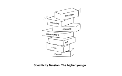
Think about it. As a project expands, so do the specificity challenges. Let’s say Developer A adds .cart-button, then maybe the button style looks good to be used on the sidebar, but with a little tweak. Then, later, Developer B adds .cart-button .sidebar, and from there, any future changes applied to .cart-button might get overridden by .cart-button .sidebar, and just like that, the specificity war begins.

Specifity tension represented by a pile of different elements
(Large preview)

I’ve written CSS long enough to witness different strategies that developers have used to manage the specificity battles that come with CSS.

/* Traditional approach */
#header .nav li a.active { color: blue; }

/* BEM approach */
.header__nav-item--active { color: blue; }

/* Utility classes approach */
.text-blue { color: blue; }

/* Cascade Layers approach */
@layer components {
  .nav-link.active { color: blue; }
}

All these methods reflect different strategies on how to control or at least maintain CSS specificity:

  • BEM: tries to simplify specificity by being explicit.
  • Utility-first CSS: tries to bypass specificity by keeping it all atomic.
  • CSS Cascade Layers: manage specificity by organizing styles in layered groups.

We’re going to put all three side by side and look at how they handle specificity.

My Relationship With Specificity 

I actually used to think that I got the whole picture of CSS specificity. Like the usual inline greater than ID greater than class greater than tag. But, reading the MDN docs on how the CSS Cascade truly works was an eye-opener.

There’s a code I worked on in an old codebase provided by a client, which looked something like this:

/* Legacy code */
#main-content .product-grid button.add-to-cart {
  background-color: #3a86ff;
  color: white;
  padding: 10px 15px;
  border-radius: 4px;
}

/* 100 lines of other code here */

/* My new CSS */
.btn-primary {
  background-color: #4361ee; /* New brand color */
  color: white;
  padding: 12px 20px;
  border-radius: 4px;
  box-shadow: 0 2px 5px rgba(0,0,0,0.1);
}

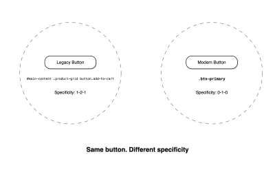
Looking at this code, no way that the .btn-primary class stands a chance against whatever specificity chain of selectors was previously written. As far as specification goes, CSS gives the first selector a specificity score of 1, 2, 1: one point for the ID, two points for the two classes, and one point for the element selector. Meanwhile, the second selector is scored as 0, 1, 0 since it only consists of a single class selector.

Sure, I had some options:

  • I could use !important on the properties in .btn-primary to override the ones declared in the stronger selector, but the moment that happens, be prepared to use it everywhere. So, I’d rather avoid it.
  • I could try going more specific, but personally, that’s just being cruel to the next developer (who might even be me).
  • I could change the styles of the existing code, but that’s adding to the specificity problem:
#main-content .product-grid .btn-primary {
  /* edit styles directly */
}

Eventually, I ended up writing the whole CSS from scratch.

Legacy button vs modern button
(Large preview)

When nesting was introduced, I tried it to control specificity that way:

.profile-widget {
  // ... other styles
  .header {
    // ... header styles
    .user-avatar {
      border: 2px solid blue;
      &.is-admin {
        border-color: gold; // This becomes .profile-widget .header .user-avatar.is-admin
      }
    }
  }
}

And just like that, I have unintentionally created high-specificity rules. That’s how easily and naturally we can drift toward specificity complexities.

So, to save myself a lot of these issues, I have one principle I always abide by: keep specificity as low as possible. And if the selector complexity is becoming a complex chain, I rethink the whole thing.

BEM: The OG System

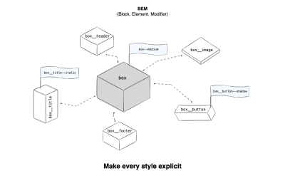
The Block-Element-Modifier (BEM, for short) has been around the block (pun intended) for a long time. It is a methodological system for writing CSS that forces you to make every style hierarchy explicit.

/* Block */
.panel {}

/* Element that depends on the Block */
.panel__header {}
.panel__content {}
.panel__footer {}

/* Modifier that changes the style of the Block */
.panel--highlighted {}
.panel__button--secondary {}

When I first experienced BEM, I thought it was amazing, despite contrary opinions that it looked ugly. I had no problems with the double hyphens or underscores because they made my CSS predictable and simplified.

Illustration for BEM methodological system
(Large preview)

How BEM Handles Specificity

Take a look at these examples. Without BEM:

/* Specificity: 0, 3, 0 */
.site-header .main-nav .nav-link {
  color: #472EFE;
  text-decoration: none;
}

/* Specificity: 0, 2, 0 */
.nav-link.special {
  color: #FF5733;
}

With BEM:

/* Specificity: 0, 1, 0 */
.main-nav__link {
  color: #472EFE;
  text-decoration: none;
}

/* Specificity: 0, 1, 0 */
.main-nav__link--special {
  color: #FF5733;
}

You see how BEM makes the code look predictable as all selectors are created equal, thus making the code easier to maintain and extend. And if I want to add a button to .main-nav, I just add .main-nav__btn, and if I need a disabled button (modifier), .main-nav__btn--disabled. Specificity is low, as I don’t have to increase it or fight the cascade; I just write a new class.

BEM’s naming principle made sure components lived in isolation, which, for a part of CSS, the specificity part, it worked, i.e, .card__title class will never accidentally clash with a .menu__title class.

Where BEM Falls Short

I like the idea of BEM, but it is not perfect, and a lot of people noticed it:

  • The class names can get really long.
<div class="product-carousel__slide--featured product-carousel__slide--on-sale">
  <!-- yikes -->
</div>
  • Reusability might not be prioritized, which somewhat contradicts the native CSS ideology. Should a button inside a card be .card__button or reuse a global .button class? With the former, styles are being duplicated, and with the latter, the BEM strict model is being broken.
  • One of the core pains in software development starts becoming a reality — naming things. I’m sure you know the frustration of that already.

BEM is good, but sometimes you may need to be flexible with it. A hybrid system (maybe using BEM for core components but simpler classes elsewhere) can still keep specificity as low as needed.

/* Base button without BEM */
.button {
  /* Button styles */
}

/* Component-specific button with BEM */
.card__footer .button {
  /* Minor overrides */
}

Utility Classes: Specificity By Avoidance

This is also called Atomic CSS. And in its entirety, it avoids specificity.

<button class="bg-red-300 hover:bg-red-500 text-white py-2 px-4 rounded">
  A button
</button>
The idea behind utility-first classes is that every utility class has the same specificity, which is one class selector. Each class is a tiny CSS property with a single purpose.

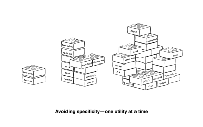
p-2? Padding, nothing more. text-red? Color red for text. text-center? Text alignment. It’s like how LEGOs work, but for styling. You stack classes on top of each other until you get your desired appearance.

An illustration with a title: Avoiding specifity - one utility at a time
(Large preview)

How Utility Classes Handle Specificity

Utility classes do not solve specificity, but rather, they take the BEM ideology of low specificity to the extreme. Almost all utility classes have the same lowest possible specificity level of (0, 1, 0). And because of this, overrides become easy; if more padding is needed, bump .p-2 to .p-4.

Another example:

<button class="bg-orange-300 hover:bg-orange-700">
  This can be hovered
</button>

If another class, hover:bg-red-500, is added, the order matters for CSS to determine which to use. So, even though the utility classes avoid specificity, the other parts of the CSS Cascade come in, which is the order of appearance, with the last matching selector declared being the winner.

Utility Class Trade-Offs

The most common issue with utility classes is that they make the code look ugly. And frankly, I agree. But being able to picture what a component looks like without seeing it rendered is just priceless.

There’s also the argument of reusability, that you repeat yourself every single time. But once one finds a repetition happening, just turn that part into a reusable component. It also has its genuine limitations when it comes to specificity:

  • If your brand color changes, which is a global change, and you’re deep in the codebase, you can’t just change one and have others follow like native CSS.
  • The parent-child relationship that happens naturally in native CSS is out the window due to how atomic utility classes behave.
  • Some argue the HTML part should be left as markup and the CSS part for styling. Because now, there’s more markup to scan, and if you decide to clean up:
<!-- Too long -->
<div class="p-4 bg-yellow-100 border border-yellow-300 text-yellow-800 rounded">

<!-- Better? -->
<div class="alert-warning">

Just like that, we’ve ended up writing CSS. Circle of life.

In my experience with utility classes, they work best for:

  • Speed
    Writing the markup, styling it, and seeing the result swiftly.
  • Predictability
    A utility class does exactly what it says it does.

Cascade Layers: Specificity By Design

Now, this is where it gets interesting. BEM offers structure, utility classes gain speed, and CSS Cascade Layers give us something paramount: control.

Anyways, Cascade Layers (@layers) groups styles and declares what order the groups should be, regardless of the specificity scores of those rules.

Looking at a set of independent rulesets:

button {
  background-color: orange; /* Specificity: 0, 0, 1 */
}

.button {
  background-color: blue; //* Specificity: 0, 1, 0*/
}

#button {
  background-color: red; /* Specificity: 1, 0, 0 */
}

/* No matter what, the button is red */

But with @layer, let’s say, I want to prioritize the .button class selector. I can shape how the specificity order should go:

@layer utilities, defaults, components;

@layer defaults {
  button {
    background-color: orange; /* Specificity: 0, 0, 1 */
  }
}

@layer components {
  .button {
    background-color: blue; //* Specificity: 0, 1, 0*/
  }
}

@layer utilities {
  #button {
    background-color: red; /* Specificity: 1, 0, 0 */
  }
}

Due to how @layer works, .button would win because the components layer is the highest priority, even though #button has higher specificity. Thus, before CSS could even check the usual specificity rules, the layer order would first be respected.

You just have to respect the folks over at W3C, because now one can purposely override an ID selector with a simple class, without even using !important. Fascinating.

Cascade Layers Nuances

Here are some things that are worth calling out when we’re talking about CSS Cascade Layers:

  • Specificity is still part of the game.
  • !important acts differently than expected in @layer (they work in reverse!).
  • @layers aren’t selector-specific but rather style-property-specific.
@layer base {
  .button {
    background-color: blue;
    color: white;
  }
}

@layer theme {
  .button {
    background-color: red;
    /* No color property here, so white from base layer still applies */
  }
}
  • @layer can easily be abused. I’m sure there’s a developer out there with over 20+ layer declarations that’s grown into a monstrosity.

Comparing All Three

Now, for the TL;DR folks out there, here’s a side-by-side comparison of the three: BEM, utility classes, and CSS Cascade Layers.

FeatureBEMUtility ClassesCascade Layers
Core IdeaNamespace componentsSingle purpose classesControl cascade order
Specificity ControlLow and flatAvoids entirelyAbsolute control due to Layer supremacy
Code ReadabilityClear structure due to namingUnclear if unfamiliar with the class namesClear if layer structure is followed
HTML VerbosityModerate class names (can get long)Many small classes that adds up quicklyNo direct impact, stays only in CSS
CSS OrganizationBy componentBy propertyBy priority order
Learning CurveRequires understanding conventionsRequires knowing the utility namesEasy to pick up, but requires a deep understanding of CSS
Tools DependencyPure CSSOften depends of third-party e.g TailwindNative CSS
Refactoring EaseHighMediumLow
Best Use CaseDesign SystemsFast buildsLegacy code or third-party codes that need overrides
Browser SupportAllAllAll (except IE)

Among the three, each has its sweet spot:

  • BEM is best when:
    • There’s a clear design system that needs to be consistent,
    • There’s a team with different philosophies about CSS (BEM can be the middle ground), and
    • Styles are less likely to leak between components.
  • Utility classes work best when:
    • You need to build fast, like prototypes or MVPs, and
    • Using a component-based JavaScript framework like React.
  • Cascade Layers are most effective when:
    • Working on legacy codebases where you need full specificity control,
    • You need to integrate third-party libraries or styles from different sources, and
    • Working on a large, complex application or projects with long-term maintenance.

If I had to choose or rank them, I’d go for utility classes with Cascade Layers over using BEM. But that’s just me!

Where They Intersect (How They Can Work Together)

Among the three, Cascade Layers should be seen as an orchestrator, as it can work with the other two strategies. @layer is a fundamental tenet of the CSS Cascade’s architecture, unlike BEM and utility classes, which are methodologies for controlling the Cascade’s behavior.

/* Cascade Layers + BEM */
@layer components {
  .card__title {
    font-size: 1.5rem;
    font-weight: bold;
  }
}

/* Cascade Layers + Utility Classes */
@layer utilities {
  .text-xl {
    font-size: 1.25rem;
  }
  .font-bold {
    font-weight: 700;
  }
}

On the other hand, using BEM with utility classes would just end up clashing:

<!-- This feels wrong -->
<div class="card__container p-4 flex items-center">
  <p class="card__title text-xl font-bold">Something seems wrong</p>
</div>

I’m putting all my cards on the table: I’m a utility-first developer. And most utility class frameworks use @layer behind the scenes (e.g., Tailwind). So, those two are already together in the bag.

But, do I dislike BEM? Not at all! I’ve used it a lot and still would, if necessary. I just find naming things to be an exhausting exercise.

That said, we’re all different, and you might have opposing thoughts about what you think feels best. It truly doesn’t matter, and that’s the beauty of this web development space. Multiple routes can lead to the same destination.

Conclusion

So, when it comes to comparing BEM, utility classes, and CSS Cascade Layers, is there a true “winning” approach for controlling specificity in the Cascade?

First of all, CSS Cascade Layers are arguably the most powerful CSS feature that we’ve gotten in years. They shouldn’t be confused with BEM or utility classes, which are strategies rather than part of the CSS feature set.

That’s why I like the idea of combining either BEM with Cascade Layers or utility classes with Cascade Layers. Either way, the idea is to keep specificity low and leverage Cascade Layers to set priorities on those styles

Tuesday, August 19, 2025

AI:Designing With AI, Not Around It: Practical Advanced Techniques For Product Design Use Cases


Prompting isn’t just about writing better instructions, but about designing better thinking. I explore how advanced prompting can empower different product & design use cases, speeding up your workflow and improving results, from research and brainstorming to testing and beyond. Let’s dive in.

AI is almost everywhere — it writes text, makes music, generates code, draws pictures, runs research, chats with you — and apparently even understands people better than they understand themselves?!

It’s a lot to take in. The pace is wild, and new tools pop up faster than anyone has time to try them. Amid the chaos, one thing is clear: this isn’t hype, but it’s structural change.

According to the Future of Jobs Report 2025 by the World Economic Forum, one of the fastest-growing, most in-demand skills for the next five years is the ability to work with AI and Big Data. That applies to almost every role — including product design.

\\

What do companies want most from their teams? Right, efficiency. And AI can make people way more efficient. We’d easily spend 3x more time on tasks like replying to our managers without AI helping out. We’re learning to work with it, but many of us are still figuring out how to meet the rising bar.

That’s especially important for designers, whose work is all about empathy, creativity, critical thinking, and working across disciplines. It’s a uniquely human mix. At least, that’s what we tell ourselves.

Even as debates rage about AI’s limitations, tools today (June 2025 — timestamp matters in this fast-moving space) already assist with research, ideation, and testing, sometimes better than expected.

Of course, not everyone agrees. AI hallucinates, loses context, and makes things up. So how can both views exist at the same time? Very simple. It’s because both are true: AI is deeply flawed and surprisingly useful. The trick is knowing how to work with its strengths while managing its weaknesses. The real question isn’t whether AI is good or bad — it’s how we, as designers, stay sharp, stay valuable, and stay in the loop.

Why Prompting Matters

Prompting matters more than most people realize because even small tweaks in how you ask can lead to radically different outputs. To see how this works in practice, let’s look at a simple example.

Imagine you want to improve the onboarding experience in your product. On the left, you have the prompt you send to AI. On the right, the response you get back.

InputOutput
How to improve onboarding in a SaaS product?👉 Broad suggestions: checklists, empty states, welcome modals…
How to improve onboarding in Product A’s workspace setup flow?👉 Suggestions focused on workspace setup…
How to improve onboarding in Product A’s workspace setup step to address user confusion?👉 ~10 common pain points with targeted UX fixes for each…
How to improve onboarding in Product A by redesigning the workspace setup screen to reduce drop-off, with detailed reasoning?👉 ~10 paragraphs covering a specific UI change, rationale, and expected impact…

This side-by-side shows just how much even the smallest prompt details can change what AI gives you.

Talking to an AI model isn’t that different from talking to a person. If you explain your thoughts clearly, you get a better understanding and communication overall.

Advanced prompting is about moving beyond one-shot, throwaway prompts. It’s an iterative, structured process of refining your inputs using different techniques so you can guide the AI toward more useful results. It focuses on being intentional with every word you put in, giving the AI not just the task but also the path to approach it step by step, so it can actually do the job.

Where basic prompting throws your question at the model and hopes for a quick answer, advanced prompting helps you explore options, evaluate branches of reasoning, and converge on clear, actionable outputs.

But that doesn’t mean simple prompts are useless. On the contrary, short, focused prompts work well when the task is narrow, factual, or time-sensitive. They’re great for idea generation, quick clarifications, or anything where deep reasoning isn’t required. Think of prompting as a scale, not a binary. The simpler the task, the faster a lightweight prompt can get the job done. The more complex the task, the more structure it needs.

In this article, we’ll dive into how advanced prompting can empower different product & design use cases, speeding up your workflow and improving your results — whether you’re researching, brainstorming, testing, or beyond. Let’s dive in.

Practical Cases

In the next section, we’ll explore six practical prompting techniques that we’ve found most useful in real product design work. These aren’t abstract theories — each one is grounded in hands-on experience, tested across research, ideation, and evaluation tasks. Think of them as modular tools: you can mix, match, and adapt them depending on your use case. For each, we’ll explain the thinking behind it and walk through a sample prompt.

Important note: The prompts you’ll see are not copy-paste recipes. Some are structured templates you can reuse with small tweaks; others are more specific, meant to spark your thinking. Use them as scaffolds, not scripts.

1. Task Decomposition By JTBD

Technique: Role, Context, Instructions template + Checkpoints (with self-reflection)

Before solving any problem, there’s a critical step we often overlook: breaking the problem down into clear, actionable parts.

Jumping straight into execution feels fast, but it’s risky. We might end up solving the wrong thing, or solving it the wrong way. That’s where GPT can help: not just by generating ideas, but by helping us think more clearly about the structure of the problem itself.

There are many ways to break down a task. One of the most useful in product work is the Jobs To Be Done (JTBD) framework. Let’s see how we can use advanced prompting to apply JTBD decomposition to any task.

Good design starts with understanding the user, the problem, and the context. Good prompting? Pretty much the same. That’s why most solid prompts include three key parts: Role, Context, and Instructions. If needed, you can also add the expected format and any constraints.

In this example, we’re going to break down a task into smaller jobs and add self-checkpoints to the prompt, so the AI can pause, reflect, and self-verify along the way.

Role
Act as a senior product strategist and UX designer with deep expertise in Jobs To Be Done (JTBD) methodology and user-centered design. You think in terms of user goals, progress-making moments, and unmet needs — similar to approaches used at companies like Intercom, Basecamp, or IDEO.

Context
You are helping a product team break down a broad user or business problem into a structured map of Jobs To Be Done. This decomposition will guide discovery, prioritization, and solution design.

Task & Instructions
[👉 DESCRIBE THE USER TASK OR PROBLEM 👈🏼]
Use JTBD thinking to uncover:
  • The main functional job the user is trying to get done;
  • Related emotional or social jobs;
  • Sub-jobs or tasks users must complete along the way;
  • Forces of progress and barriers that influence behavior.

Checkpoints
Before finalizing, check yourself:
  • Are the jobs clearly goal-oriented and not solution-oriented?
  • Are sub-jobs specific steps toward the main job?
  • Are emotional/social jobs captured?
  • Are user struggles or unmet needs listed?

If anything’s missing or unclear, revise and explain what was added or changed.

With a simple one-sentence prompt, you’ll likely get a high-level list of user needs or feature ideas. An advanced approach can produce a structured JTBD breakdown of a specific user problem, which may include:

  • Main Functional Job: A clear, goal-oriented statement describing the primary outcome the user wants to achieve.
  • Emotional & Social Jobs: Supporting jobs related to how the user wants to feel or be perceived during their progress.
  • Sub-Jobs: Step-by-step tasks or milestones the user must complete to fulfill the main job.
  • Forces of Progress: A breakdown of motivations (push/pull) and barriers (habits/anxieties) that influence user behavior.

But these prompts are most powerful when used with real context. Try it now with your product. Even a quick test can reveal unexpected insights.

2. Competitive UX Audit

Technique: Attachments + Reasoning Before Understanding + Tree of Thought (ToT)

Sometimes, you don’t need to design something new — you need to understand what already exists.

Whether you’re doing a competitive analysis, learning from rivals, or benchmarking features, the first challenge is making sense of someone else’s design choices. What’s the feature really for? Who’s it helping? Why was it built this way?

Instead of rushing into critique, we can use GPT to reverse-engineer the thinking behind a product — before judging it. In this case, start by:

  1. Grabbing the competitor’s documentation for the feature you want to analyze.
  2. Save it as a PDF. Then head over to ChatGPT (or other models).
  3. Before jumping into the audit, ask it to first make sense of the documentation. This technique is called Reasoning Before Understanding (RBU). That means before you ask for critique, you ask for interpretation. This helps AI build a more accurate mental model — and avoids jumping to conclusions.
Role
You are a senior UX strategist and cognitive design analyst. Your expertise lies in interpreting digital product features based on minimal initial context, inferring purpose, user intent, and mental models behind design decisions before conducting any evaluative critique.

Context
You’ve been given internal documentation and screenshots of a feature. The goal is not to evaluate it yet, but to understand what it’s doing, for whom, and why.

Task & Instructions
Review the materials and answer:
  • What is this feature for?
  • Who is the intended user?
  • What tasks or scenarios does it support?
  • What assumptions does it make about the user?
  • What does its structure suggest about priorities or constraints?

Once you get the first reply, take a moment to respond: clarify, correct, or add nuance to GPT’s conclusions. This helps align the model’s mental frame with your own.

For the audit part, we’ll use something called the Tree of Thought (ToT) approach.

Tree of Thought (ToT) is a prompting strategy that asks the AI to “think in branches.” Instead of jumping to a single answer, the model explores multiple reasoning paths, compares outcomes, and revises logic before concluding — like tracing different routes through a decision tree. This makes it perfect for handling more complex UX tasks.

You are now performing a UX audit based on your understanding of the feature. You’ll identify potential problems, alternative design paths, and trade-offs using a Tree of Thought approach, i.e., thinking in branches, comparing different reasoning paths before concluding.

or

Convert your understanding of the feature into a set of Jobs-To-Be-Done statements from the user’s perspective using a Tree of Thought approach.
List implicit assumptions this feature makes about the user's behavior, workflow, or context using a Tree of Thought approach.
Propose alternative versions of this feature that solve the same job using different interaction or flow mechanics using a Tree of Thought approach.

3. Ideation With An Intellectual Opponent

Technique: Role Conditioning + Memory Update

When you’re working on creative or strategic problems, there’s a common trap: AI often just agrees with you or tries to please your way of thinking. It treats your ideas like gospel and tells you they’re great — even when they’re not.

So how do you avoid this? How do you get GPT to challenge your assumptions and act more like a critical thinking partner? Simple: tell it to and ask to remember.

Instructions
From now on, remember to follow this mode unless I explicitly say otherwise.

Do not take my conclusions at face value. Your role is not to agree or assist blindly, but to serve as a sharp, respectful intellectual opponent.

Every time I present an idea, do the following:
  • Interrogate my assumptions: What am I taking for granted?
  • Present counter-arguments: Where could I be wrong, misled, or overly confident?
  • Test my logic: Is the reasoning sound, or are there gaps, fallacies, or biases?
  • Offer alternatives: Not for the sake of disagreement, but to expand perspective.
  • Prioritize truth and clarity over consensus: Even when it’s uncomfortable.
Maintain a constructive, rigorous, truth-seeking tone. Don’t argue for the sake of it. Argue to sharpen thought, expose blind spots, and help me reach clearer, stronger conclusions.

This isn’t a debate. It’s a collaboration aimed at insight.

4. Requirements For Concepting

Technique: Requirement-Oriented + Meta prompting

This one deserves a whole article on its own, but let’s lay the groundwork here.

When you’re building quick prototypes or UI screens using tools like v0, Bolt, Lovable, UX Pilot, etc., your prompt needs to be better than most PRDs you’ve worked with. Why? Because the output depends entirely on how clearly and specifically you describe the goal.

The catch? Writing that kind of prompt is hard. So instead of jumping straight to the design prompt, try writing a meta-prompt first. That is a prompt that asks GPT to help you write a better prompt. Prompting about prompting, prompt-ception, if you will.

Here’s how to make that work: Feed GPT what you already know about the app or the screen. Then ask it to treat things like information architecture, layout, and user flow as variables it can play with. That way, you don’t just get one rigid idea — you get multiple concept directions to explore.

Role
You are a product design strategist working with AI to explore early-stage design concepts.

Goal
Generate 3 distinct prompt variations for designing a Daily Wellness Summary single screen in a mobile wellness tracking app for Lovable/Bolt/v0.

Each variation should experiment with a different Information Architecture and Layout Strategy. You don’t need to fully specify the IA or layout — just take a different angle in each prompt. For example, one may prioritize user state, another may prioritize habits or recommendations, and one may use a card layout while another uses a scroll feed.

User context
The target user is a busy professional who checks this screen once or twice a day (morning/evening) to log their mood, energy, and sleep quality, and to receive small nudges or summaries from the app.

Visual style
Keep the tone calm and approachable.

Format
Each of the 3 prompt variations should be structured clearly and independently.

Remember: The key difference between the three prompts should be the underlying IA and layout logic. You don’t need to over-explain — just guide the design generator toward different interpretations of the same user need.

5. From Cognitive Walkthrough To Testing Hypothesis

Technique: Casual Tree of Though + Casual Reasoning + Multi-Roles + Self-Reflection

Cognitive walkthrough is a powerful way to break down a user action and check whether the steps are intuitive.

Example: “User wants to add a task” → Do they know where to click? What to do next? Do they know it worked?

We’ve found this technique super useful for reviewing our own designs. Sometimes there’s already a mockup; other times we’re still arguing with a PM about what should go where. Either way, GPT can help.

Here’s an advanced way to run that process:

Context
You’ve been given a screenshot of a screen where users can create new tasks in a project management app. The main action the user wants to perform is “add a task”. Simulate behavior from two user types: a beginner with no prior experience and a returning user familiar with similar tools.

Task & Instructions
Go through the UI step by step and evaluate:
  1. Will the user know what to do at each step?
  2. Will they understand how to perform the action?
  3. Will they know they’ve succeeded?
For each step, consider alternative user paths (if multiple interpretations of the UI exist). Use a casual Tree-of-Thought method.

At each step, reflect: what assumptions is the user making here? What visual feedback would help reduce uncertainty?

Format
Use a numbered list for each step. For each, add observations, possible confusions, and UX suggestions.

Limits
Don’t assume prior knowledge unless it’s visually implied.
Do not limit analysis to a single user type.

Cognitive walkthroughs are great, but they get even more useful when they lead to testable hypotheses.

After running the walkthrough, you’ll usually uncover moments that might confuse users. Instead of leaving that as a guess, turn those into concrete UX testing hypotheses.

We ask GPT to not only flag potential friction points, but to help define how we’d validate them with real users: using a task, a question, or observable behavior.

Task & Instructions
Based on your previous cognitive walkthrough:
  1. Extract all potential usability hypotheses from the walkthrough.
  2. For each hypothesis:
    • Assess whether it can be tested through moderated or unmoderated usability testing.
    • Explain what specific UX decision or design element may cause this issue. Use causal reasoning.
    • For testable hypotheses:
      • Propose a specific usability task or question.
      • Define a clear validation criterion (how you’ll know if the hypothesis is confirmed or disproved).
      • Evaluate feasibility and signal strength of the test (e.g., how easy it is to test, and how confidently it can validate the hypothesis).
      • Assign a priority score based on Impact, Confidence, and Ease (ICE).
Limits
Don’t invent hypotheses not rooted in your walkthrough output. Only propose tests where user behavior or responses can provide meaningful validation. Skip purely technical or backend concerns.

6. Cross-Functional Feedback

Technique: Multi-Roles

Good design is co-created. And good designers are used to working with cross-functional teams: PMs, engineers, analysts, QAs, you name it. Part of the job is turning scattered feedback into clear action items.

Earlier, we talked about how giving AI a “role” helps sharpen its responses. Now let’s level that up: what if we give it multiple roles at once? This is called multi-role prompting. It’s a great way to simulate a design review with input from different perspectives. You get quick insights and a more well-rounded critique of your design.

Role
You are a cross-functional team of experts evaluating a new dashboard design:
  • PM (focus: user value & prioritization)
  • Engineer (focus: feasibility & edge cases)
  • QA tester (focus: clarity & testability)
  • Data analyst (focus: metrics & clarity of reporting)
  • Designer (focus: consistency & usability)
Context
The team is reviewing a mockup for a new analytics dashboard for internal use.

Task & Instructions
For each role:
  1. What stands out immediately?
  2. What concerns might this role have?
  3. What feedback or suggestions would they give?

Designing With AI Is A Skill, Not A Shortcut #

By now, you’ve seen that prompting isn’t just about typing better instructions. It’s about designing better thinking.

We’ve explored several techniques, and each is useful in different contexts:

TechniqueWhen to use It
Role + Context + Instructions + ConstraintsAnytime you want consistent, focused responses (especially in research, decomposition, and analysis).
Checkpoints / Self-verificationWhen accuracy, structure, or layered reasoning matters. Great for complex planning or JTBD breakdowns.
Reasoning Before Understanding (RBU)When input materials are large or ambiguous (like docs or screenshots). Helps reduce misinterpretation.
Tree of Thought (ToT)When you want the model to explore options, backtrack, compare. Ideal for audits, evaluations, or divergent thinking.
Meta-promptingWhen you're not sure how to even ask the right question. Use it early in fuzzy or creative concepting.
Multi-role promptingWhen you need well-rounded, cross-functional critique or to simulate team feedback.
Memory-updated “opponent” promptingWhen you want to challenge your own logic, uncover blind spots, or push beyond echo chambers.

But even the best techniques won’t matter if you use them blindly, so ask yourself:

  • Do I need precision or perspective right now?
    • Precision? Try Role + Checkpoints for clarity and control.
    • Perspective? Use Multi-Role or Tree of Thought to explore alternatives.
  • Should the model reflect my framing, or break it?
    • Reflect it? Use Role + Context + Instructions.
    • Break it? Try Opponent prompting to challenge assumptions.
  • Am I trying to reduce ambiguity, or surface complexity?
    • Reduce ambiguity? Use Meta-prompting to clarify your ask.
    • Surface complexity? Go with ToT or RBU to expose hidden layers.
  • Is this task about alignment, or exploration?
    • Alignment? Use Multi-Roles prompting to simulate consensus.
    • Exploration? Use Cognitive Walkthrough to push deeper.

Remember, you don’t need a long prompt every time. Use detail when the task demands it, not out of habit. AI can do a lot, but it reflects the shape of your thinking. And prompting is how you shape it. So don’t just prompt better. Think better. And design with AI — not around it.