Words
alone aren’t enough to safeguard best practices in the world of web
design and development. Web design documentation must be like its medium
— interactive and constantly evolving.
As an occasionally competent software developer, I love good documentation. It explains not only how things work but why
they work the way they do. At its best, documentation is much more than
a guide. It is a statement of principles and best practices, giving
people the information they need to not just understand but believe.
As soft skills go in tech land, maintaining documentation is right up there. Smashing has previously explored design documents in a proposal context,
but what happens once you’ve arrived at the answer and need to
implement? How do you present the information in ways that are useful to
those who need to crack on and build stuff?
Documentation often
has a technical bent to it, but this article is about how it can be
applied to digital design — web design in particular. The idea is to get
the best of both worlds to make design documentation that is both
beautiful and useful — a guide and manifesto all at once.
Before
getting into the minutia of living, breathing digital design
documentation, it’s worth taking a moment to revisit what documentation
is, what it’s for, and why it’s so valuable.
The
documentation describes how a product, system, or service works, what
it’s for, why it’s been built the way it has, and how you can work on it
without losing your already threadbare connection with your own sanity.
We won’t get into the nitty-gritty of code documentation. There are plenty of Smashing articles to scratch that itch:
Our
decisions tend to be much more solid when we have to write them down
and justify them as something more formal than self-effacing code
comments. Having clear, easy-to-read code is always something worth
striving for, but supporting documentation can give essential context
and guidance.
We work in an industry with an exceptionally high turnover rate.
The wealth of knowledge that lives inside someone’s head disappears
with them when they leave. If you don’t want to reinvent the wheel every
time someone moves on, you better learn to love documentation. That is
where continuity lies.
Sometimes
things are the way they are for very, very good reasons, and someone,
somewhere, had to go through a lot of pain to understand what they were.
That’s
not to say the rationale behind a given decision is above scrutiny.
Documentation puts it front and center. If it’s convincing, great,
people can press on with confidence. If it no longer holds up, then
options can be reassessed, and courses can be altered quickly.
Documentation
establishes a set of norms, prevents needless repetition, allows for
faster problem-solving, and, ideally, inspires.
In 1959, English author C. P. Snow delivered a seminal lecture called “The Two Cultures”
(PDF). It is well worth reading in full, but the gist was that the
sciences and the humanities weren’t working together and that they
really ought to do so for humanity to flourish. To cordon ourselves off
with specialisations deprives each group of swathes of knowledge.
“Polarisation
is sheer loss to us all. To us as people and to our society. It is at
the same time practical and intellectual and creative loss [...] It is
false to imagine that those three considerations are clearly separable.”
— Charles Percy Snow
Although
Snow himself conceded that “attempts to divide anything into two ought
to be regarded with much suspicion,” the framing was and remains useful.
Web development is its own meeting of worlds — between designers and
engineers, art and data — and the places where they meet are where the
good stuff really happens.
“The clashing point of two
subjects, two disciplines, two cultures — two galaxies, so far as that
goes — ought to produce creative chances.”
— Charles Percy Snow
Snow knew it, Leonardo da Vinci knew it, Steve Jobs knew it. Magic happens when we head straight for that collision.
Web
development is a world of many different yet connected specialisations
(and sub-specialisations for that matter). One of the key relationships
is the one between engineers and designers. When the two are in harmony,
the results can be breathtaking. When they’re not, everything and
everyone involved suffers.
Digital design needs its own language: a
hybrid of art, technology, interactivity, and responsiveness. Its
documentation needs to reflect that, to be alive, something you can play
with. It should start telling a story before anyone reads a word. Doing
so makes everyone involved better: writers, developers, designers, and
communicators.
Design documentation creates a bridge between
worlds, a common language composed of elements of both. Design and
engineering are increasingly intertwined; it’s only right that
documentation reflects that.
So
here we are. The nitty-gritty of design documentation. We’re going to
cover some key considerations as well as useful resources and tools at
your disposal.
The difference between design documentation,
technical documentation, and a design system isn’t always clear, and
that’s fine. If things start to get a little blurry, just remember the
goal is this: establish a visual identity, explain the
principles behind it, and provide the resources needed to implement it
as seamlessly as possible.
What should be covered isn’t
the point of this piece so much as how it should be covered, but what’s
listed below ought to get you started:
When
thinking of design systems and documentation, it’s understandable to
jump to the whats — the fonts, the colors, the components — but it’s
vital also to share the ethos that helped you to arrive at those assets
at all.
Where did this all come from? What’s the vision? The
guiding principles? The BBC does a good job of answering these questions
for Global Experience Language (GEL), its shared design framework.
On
top of being public-facing (more on that later), the guidelines and
design patterns are accompanied by articles and playbooks explaining the
guiding principles of the whole system.
Include
proposal documents, if they exist, as well as work practices. Be clear
about who the designs are built for. Just about every system has a
target audience in mind, and that should be front and center.
Cutting the guiding principles is like leaving the Constitution out of a US history syllabus.
The
days are long gone when brand guidelines printed in a book are
sufficient. Much of modern life has moved online, so too should guidance
for its documentation. Happily (or dauntingly), there are plenty of
platforms out there, many with excellent integrations with each other.
There
can be a chain of platforms to facilitate the connections between
worlds. Figma can lead into Storybook, and Storybook can be integrated
directly into a project. Embrace design documentation as an ecosystem of
skills.
Accommodate agile, constant development by integrating your design documentation with the code base itself.
Although
the abstract, philosophical aspects of design documentation are
important, the system it described is ultimately there to be used.
Consider your users’ goals. In the case of design, it’s to build things consistent with best practices. Show readers how to use the design guidelines. Make the output clear and practical. For example,
How to make a React component with design system fonts;
How to choose appropriate colors from our palette.
As
we’ve covered, the design breaks down into clear, recognizable sections
(typography, color, and so on). These sections can themselves be broken
down into steps, the latter ones being clearly actionable:
What the feature is;
Knowledge needed for documentation to be most useful;
Use cases for the feature;
Implementation;
Suggested tooling.
The Mailchimp Pattern Library
is a good example of this in practice. Use cases are woven right into
the documentation, complete with contextual notes and example code
snippets, making the implementation of best practices clear and easy.
The way things are said is important. Documentation ought to be clear, accessible, and accepting.
As
with just about any documentation, give words like ‘just’, ‘merely’,
and ‘simply’ a wide berth. What’s simple to one person is not always to
another. Documentation should inform, not belittle. “Reducing bias in your writing” by Write the Docs gives excellent guidance here.
Another
thing to keep in mind is the language you use. Instead of using “he” or
“she,” use “one,” “they,” “the developer,” or some such. It may not
seem like a big deal to one (see what I did there), but language like
that helps reinforce that your resources are for everyone.
More
generally, keep the copy clear and to the point. That’s easier said than
done, but there are plenty of tools out there that can help tidy up
your writing:
Alex, a tool for catching insensitive, inconsiderate writing;
Design documentation has a lot more credibility if
it’s walking the walk. If it looks like a hot mess, what are the chances
of it being taken seriously?
Ideally, you should be showcasing a design ethos, not just explaining it. NASA showed way back in 1976 (PDF) that manuals can themselves be beautiful. The Graphics Standards Manual by Richard Danne and Bruce Blackburn feels like a creative work in its own right.
Show
the same care and attention to detail in your design documentation that
you expect users to show in applying it. Documentation should be the
first and best example of it in action.
Make your documentation
easy to navigate and search. The most wonderful resources in the world
aren’t doing anyone much good if they can’t be found. It’s also a
splendid opportunity to show information architecture best practice in action too.
Once
you’ve gone through the trouble of creating a design system and
explaining how it works, why keep that to yourself? Publishing
documentation and making it freely available for anyone to browse is a
fantastic final polish.
Here at the Guardian, for example, our Source design system Storybook can be viewed by anyone, and its code is publicly available on GitHub. As well as being a proving ground for the system itself, it creates a space for knowledge sharing.
Here are just a few fantastic examples of publicly available design documentation:
There are plenty more where these came from in the Design Systems Gallery — a fantastic place to browse for inspiration and guidance.
What’s
more, if there are stories from the formation of your system, writing
articles or blog posts are also totally legit ways of documenting it.
What did the New York Times do when they developed a design system? They wrote an article about it, of course.
Publishing
design documentation — in all its forms — is a commitment, but it’s
also a statement of purpose. Why not share something beautiful, right?
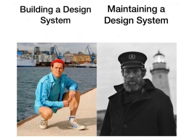
This
is all well and good, I hear you say, arms crossed and brow furrowed,
but who’s going to keep all this stuff up to date? That’s all the time
that could be spent making things.
I hear you. There are reasons that Tweets (Xs?) like this make the rounds from time to time:
Yes,
it requires hard work and vigilance. The time, effort, and heartache
you’ll save by having design documentation will be well worth the
investment of those same things.
To
spare you the suspense, your design documentation isn’t going to be
perfect off the bat. There will be mistakes and situations that aren’t
accounted for, and that’s fine. Own them. Acknowledge blindspots.
Include ways for users to give feedback.
As with most things digital, you’re never really “done.”
Such
thorough, polished design documentation can almost be deterrents,
something only those with deep pockets can make. It may also seem like
an unjustifiable investment of time. Neither has to be true.
Documentation
of all forms saves time in the long run, and it makes your decisions
better. Whether it’s a bash script or a newsletter signup component, you
scrutinize it that little bit more when you commit to it as a standard
rather than a one-off choice. Let a readme-driven ethos into your heart.
Start
small. Choose fonts and colors and show them sitting together nicely on
your repo wiki. That’s it! You’re underway. You will grow to care for
your design documentation as you care for the project itself because
they are part of each other.
Have
you run into a situation where you need the padding of one element to
align with the padding of another element? It’s a common debacle,
especially when a page layout is set with global padding, and you need
to break out of that layout and go full-width but still align the inner
content with the rest of the page. In this article, Brecht De Ruyte
demonstrates the issue with a full-width slider component that breaks
out of the main page container and shares a couple of techniques to keep
it visually aligned with other elements on the page.
You
know what’s perhaps the “cheapest” way to make a slider of images,
right? You set up a container, drop a bunch of inline image elements in
it, then set overflow-x: auto on it, allowing us to swipe through them. The same idea applies nicely to a group of cards, too.
While
that’s a quick and dirty way to get a slider up and running, there is
more we can do to smooth it out a bit. That’s what we’re going to cover
in this tutorial. Specifically, we’re improving our cheap slider with controlled scrolling,
courtesy of CSS Scroll Snapping. The idea is that the slider naturally
stops on an image during the scroll. Otherwise, we could blow through a
bunch of images in a single swipe and lose our place.
But
we’ll go deeper than scroll snapping. The thing with sliders is that it
can be difficult to instruct them on where to “snap.” For example, what
if we want to configure the slider in such a way that images always
snap at the left (or inline-start) edge when swiping right to left?
But
that’s not even the “tricky” part we’re looking at. Say we are working
within an existing page layout where the main container of the page has a
set amount of padding applied to it. In this case, the slider should
always begin at the inline starting edge of the inside of the container,
and when scrolling, each image should snap to the edge rather than
scroll past it.
Simply drop the slider in the layout container,
right? It’s not as straightforward as you might think. If you notice in
the illustrations, the slider is outside the page’s main
container because we need it to go full-width. We do that in order to
allow the images to scroll fully edge-to-edge and overflow the main
body.
Our challenge is to make sure the slider snaps into place
consistent with the page layout’s spacing, indicated by the dashed blue
lines in the drawings. The green area represents the page container’s
padding, and we want images to snap right at the blue line.
Let’s start with some baseline HTML that includes a header and footer, each with an inner .container element that’s used for the page’s layout. Our slider will sit in between the header and footer but lack the same inner .container that applies padding and width to it so that the images scroll the full width of the page.
<header><divclass="container"><!-- some contained header with some nav items --></div></header><main><sectionclass="slider"><!-- our slider --></section><sectionclass="body-text"><divclass="container"><!-- some contained text --></div></section></main><footer><divclass="container"><!-- a contained footer --></div></footer>
In
contrast to the emphasis I’ve put on scroll snapping for this demo, the
real power in creating the slider does not actually start with scroll
snapping. The trick to create something like this starts with the layout
.container elements inside the header and footer. We’ll set up a few CSS variables and configure the .container’s properties, such as its width and padding.
The
following bit of CSS defines a set of variables that are used to
control the maximum width and padding of a container element. The @media rules are used to apply different values to these properties depending on the viewport’s width.
The first couple of lines of the :root element’s ruleset define two CSS custom properties: --c-max-width and --c-padding. These properties are used to control the layout .container’s maximum width and padding.
Next up, we have our @media rules. These apply different values to the --c-max-width and --c-padding properties depending on the screen size. For example, the first @media rule updates the value of --c-max-width from 100% to 800px, as well as the --c-padding from 10px to 12px when the screen width is at least 768px.
Those are the variables. We then set up the style rules for the container, which we’ve creatively named .container, and apply those variables to it. The .container’s maximum width and inline padding are assigned to the also creatively-named -c-max-width and --c-padding
variables. This opens up our container’s variables at a root level so
that they can easily be accessed by other elements when we need them.
I
am using pixels in these examples because I want this tutorial to be
about the actual technique instead of using different sizing units.
Also, please note that I will be using CSS nesting for the demos, as it is supported in every major browser at the time I’m writing this.
Let’s
work on the scroll-snapping part of this slider. The first thing we’re
going to do is update the HTML with the images. Remember that this
slider is outside of the .container (we’ll take care of that later).
<header><!-- .container --></header<sectionclass="slider"><div><imgsrc="..."alt=""></div><div><imgsrc="..."alt=""></div><div><imgsrc="..."alt=""></div><!-- etc. --></section><footer><!-- .container --></footer>
Now we have a a group of divs that are direct children of the .slider.
And those, in turn, each contain one image element. With this intact,
it’s time for us to style this as an actual slider. Flexbox is an
efficient way to change the display behavior of the .slider’s
divs so that they flow in the inline direction rather than stacking
vertically as they naturally would as block-level elements. Using
Flexbox also gives us access to the gap property to space things out a bit.
.slider{display: flex;gap: 24px;}
Now we can let the images overflow the .slider in the horizontal, or inline, direction:
Before
we apply scroll snapping, we ought to configure the divs so that the
images are equally sized. A slider is so much better to use when the
images are visually consistent rather than having a mix of portrait and
landscape orientations, creating a jagged flow. We can use the flex property on the child divs, which is shorthand for the flex-shrink, flex-grow, and flex-basis properties:
This way, the divs are only as big as the content they contain and will not exceed a width of 300px. But! In order to contain the images in the space, we will set them to take up the full 100% width of the divs, slap an aspect-ratio on them to maintain proportions, then use the object-fit property to to cover the div’s dimensions.
We’re using the scroll-snap-type property on the .slider container to initialize scroll snapping in the horizizontal (x) direction. The mandatory
keyword means we’re forcing the slider to snap on items in the
container instead of allowing it to scroll at will and land wherever it
wants.
We’re using the scroll-snap-align property on the divs to set the snapping on the item’s start-ing edge (or “right” edge in a typical horizontal left-to-right writing mode).
Good so far? Here’s what we’ve made up to this point:
Now
that we have all of our pieces in place, it’s time to create the exact
snapping layout we want. We already know what the maximum width of the
page’s layout .container is because we set it up to change
at different breakpoints with the variables we registered at the
beginning. In other words, the .container’s width will never exceed the value of --c-max-width. We also know the container always has a padding equal to the value of --c-padding.
Again, our slider is outside of the .container,
and yet, we want the scroll-snapped images to align with those values
for a balanced page layout. Let’s create a new CSS variable, but this
time scoped to the .slider and set it up to calculate the space between the viewport and the inside of the .container element.
That is a lot of math! First, we’re calculating the minimum value of either the .container element’s max-width or 100%, whichever is smaller, then increasing this minimum value with padding on the .slider. This result is then subtracted from 100%. From this, we get the total amount of space that is available to offset either side of the .slider to align with the layout .container.
We then divide this number by 2 to get the offset width for each specific side. And finally, we add the .container’s inline padding to the offset width so that the .slider
is offset from the inside edges of the container rather than the
outside edges. In the demo, I have used the universal selector (*) and its pseudos to measure the box-sizing of all elements by the border-box so that we are working inside the .slider’s borders rather than outside of it.
If
you think that our code is becoming a bit too chaotic, we can certainly
improve it a bit. When I run into these situations, I sometimes like to
organize things into multiple custom properties just for easy reading.
For example, we could combine the inline paddings that are scoped to the
:root and update the slider’s --offset-width variable with a calc() function that’s a bit easier on the eyes.
:root {/* previous container custom properties */--c-padding-inline:calc(var(--c-padding)*2);}.slider {--offset-width:calc(((100%-(min(var(--c-max-width),100%)+var(--c-padding-inline)))/2)+var(--c-padding-inline));/* etc. */}
We
have a fully-functioning scroll scroll-snapping container at this
point! The last thing for us to do is apply padding to it that aligns
with the layout .container. As a reminder, the challenge is for us to respect the page layout’s padding even though the .slider is a full-width element outside of that container.
This means we need to apply our newly-created --offset-width variable to the .slider. We’ve already scoped the variable to the .slider, so all we really need is to apply it to the right properties. Here’s what that looks like:
.slider {--offset-width:calc(((100%-(min(var(--c-max-width),100%)+(var(--c-padding)*2)))/2)+(var(--c-padding)*2));
padding-inline:var(--offset-width);
scroll-padding-inline-start:var(--offset-width);/* etc. */}
The padding-inline and scroll-padding-inline-start
properties are used to offset the slider from the left and right sides
of its container and to ensure that the slider is always fully visible
when the user scrolls.
padding-inline This sets spacing inside the .slider’s
inline edges. A nice thing about using this logical property instead of
a physical property is that we can apply the padding in both directions
in one fell swoop, as there is no physical property shorthand that
combines padding-left and padding-right. This way, the .slider’s internal inline spacing matches that of the .container in a single declaration.
scroll-padding-inline-start This
sets the scroll padding at the start of the slider’s inline dimension.
This scroll padding is equal to the amount of space that is added to the
left (i.e., inline start) side of the .slider’s content during the scroll.
Now that the padding-inline and scroll-padding-inline-start properties are both set to the value of the --offset-width
variable, we can ensure that the slider is perfectly aligned with the
start of our container and snaps with the start of that container when
the user scrolls.
We could take all of this a step further by
setting the gap of our slider items to be the same as our padding gap.
We’re really creating a flexible system here:
.slider{--gap:var(--c-padding);gap:var(--gap);}
Personally,
I would scope this into a new custom property of the slider itself, but
it’s more of a personal preference. The full demo can be found on CodePen. I added a toggle in the demo so you can easily track the maximum width and paddings while resizing.
But
we don’t have to stop here! We can do all sorts of calculations with
our custom properties. Maybe instead of adding a fixed width to the .slider’s flex children, we want to always display three images at a time inside of the container:
That --flex-width custom property takes 100% of the container the slider is in and subtracts it by two times the --gap. And, because we want three items in view at a time, we divide that result by 3.
The best thing about using custom properties to handle calculations is that they are lighter and more performant
than attempting to handle them in JavaScript. It takes some getting
used to, but I believe that we should use these kinds of calculations a
lot more often. Performance is such an important feature. Even seemingly
minor optimizations like this can add up and really make a difference
to the overall end-user experience.
And, as we’ve seen, we can plug in variables from
other elements into the equation and use them to conform an element to
the properties of another element. That’s exactly what we did to conform
the .slider’s inner padding to the padding of a .container that is completely independent of the slider. That’s the power of CSS variables — reusability and modularity that can improve how elements interact within and outside other elements.
In
this two-part series of articles, Luis shares his experience with
design systems and how you can overcome the potential pitfalls, starting
from how to make designers on your team adopt the complex and
well-built system that you created to what are the best naming
conventions and how to handle the auto-layout of components,
indexing/search, and more. Part 2 concentrates on the key points from
Luis’ framework and practical tips about managing a design system that
should be both robust and easy to adopt.
Welcome back
to my long read about building better components — components that are
more likely to be found, understood, modified, and updated in ways that
promote adoption rather than abandonment.
In the previous installment in the series, we took a good look through the process of building flexible and repeatable components, aligning with the FRAILS framework. In this second part, we will be jumping head first into building adoptable, indexable, logical, and specific components. We have many more words ahead of us.
According to Sparkbox’s 2022 design systems survey, the top three biggest challenges faced by teams were recently:
Overcoming technical/creative debt,
Parity between design & code,
Adoption.
It’s safe to assume that points 1. and 2.
are mostly due to tool limitations, siloed working arrangements, or
poor organizational communication. There is no enterprise-ready design
tool on the market that currently provides a robust enough code export
for teams to automate the handover process. Neither have I ever met an
engineering team that would adopt such a feature! Likewise, a tool won’t
fix communication barriers or decades worth of forced silos between
departments. This will likely change in the coming years, but I think
that these points are an understandable constraint.
Point 3. is a concern, though. Is your brilliant design system adoptable?
If we’re spending all this time working on design systems, why are
people not using them effectively? Thinking through adoption challenges,
I believe we can focus on three main points to make this process a lot
smoother:
There are too many ways to name components in our design tool, from camelCasing to kebab-casing,
Slash/Naming/Conventions to the more descriptive, e.g., “Product Card —
Cart”. Each approach has its pros and cons, but what we need to
consider with our selection is how easy it is to find the component you
need. Obvious, but this is central to any good name.
It’s
tempting to map component naming 1:1 between design and code, but I
personally don’t know whether this is what our goal should be. Designers
and developers work in different ways and with different methods of
searching for and implementing components, so we should cater to the
audience. This would aid solutions based on intention, not blindly
aiming for parity.
Figma can help bridge this gap with the “component description field” providing us a useful space to add additional, searchable names (or aliases, even) to every component. This means that if we call it a headerNavItemActive
in code but a “Header link” in design with a toggled component
property, the developer-friendly name can be added to the description
field for searchable parity.
The advice here is to split the quick styles for ideation and semantic variables into different sets. The semantic styles can be applied at the component level, whereas the raw styles can be used for developing new ideas.
As an example, Brand/Primary
may be used as the border color of an active menu item in your design
files because searching “brand” and “primary” may be muscle memory and
more familiar than a semantic token name. Within the component, though,
we want to be aliasing that token to something more semantic. For
example, border-active.
Note: Some teams go to a further component level with their naming conventions. For example, this may become header-nav-item-active.
It’s hyper-specific, meaning that any use outside of this “Header link”
example may not make sense for collaborators looking through the design
file. Component-level tokens are anoptionalstep
in design systems. Be cautious, as introducing another layer to your
token schema increases the amount of tokens you need to maintain.
How
should we name the bottom border for a header link? A quick reference
style, a production variable, or a component variable? (Large preview)
This
means if we’re working on a new idea — for example, we have a set of
tabs in a settings page, and the border color for the active tab at the
ideation stage might be using Brand/Primary as the fill — when
this component is contributed back to the system, we will apply the
correct semantic token for its usage, our border-active.
Can we support styles for ideation, and variables for production components within our systems? (Large preview)
Do
note that this advice is probably best suited to large design teams
where your contribution process is lengthier and requires the distinct
separation of ideation and production or where you work on a more fixed
versioning release cycle for your system. For most teams, a single set
of semantic variables will be all you need. Variables make this process a
lot easier because we can manage the properties of these separate
tokens in a central location. But! This isn’t an article about tokens,
so let’s move on.
A
key pillar of a successful design system is advocacy across the PDE
(product, design, and engineering) departments. We want people to be excited, not burdened
by its rules. In order to get there, we need to build a community of
internal design system advocates who champion the work being done and
act as extensions of the central team. This may sound like unpaid
support work, but I promise you it’s more than that.
Communicating
constantly with designers taught me that with the popularity of design
systems booming over the past few years, more and more of us are
desperate to contribute to them. Have you ever seen a local component in
a file that is remarkably similar to one that already exists? Maybe
that designer wanted to scratch the itch of building something from the
ground up. This is fine! We just need to encourage that more widely
through a more open contribution model back to the central system.
How
can the (central) systems team empower designers within the wider
organization to build on top of the system foundations we create? What
does that world look like for your team? This is commonly referred to as
the “hub and spoke” model within design systems and can really help to accelerate interest in your system usage goals.
“There
are numerous inflection points during the evolution of a design system.
Many of those occur for the same fundamental reason — it is impossible
to scale a design system team enough to directly support every demand
from an enterprise-scale business. The design system team will always be
a bottleneck unless a structure can be built that empowers business
units and product teams to support themselves. The hub and spoke
(sometimes also called ‘core + federated’) model is the solution.”
In
simple terms, a community can be anything as small as a shared
Slack/Teams channel for the design system all the way up to fortnightly
hangouts or learning sessions. What we do here is help to foster an
environment where discussion and shared knowledge are at the center of
the system rather than being tacked on after the components have been released.
The team at Zalando has developed a brilliant community
within the design team for their system. This is in the form of a
sophisticated web portal, frequent learning and educational meetings,
and encouraging an “open house” mindset. Apart from the custom-built
portal, I believe this approach is an easy-to-reach target for most
teams, regardless of size. A starting point for this would be something
as simple as an open monthly meeting or office hours, run by those
managing your system, with invites sent out to all designers and
cross-functional partners involved in production: product managers,
developers, copywriters, product marketers, and the list goes on.
For those looking for inspiration on how to run semi-regular design systems events, take a look at what the Gov UK team have started over on Eventbrite. They have run a series of events ranging from accessibility deep dives all the way up to full “design system days.”
Leading
with transparency is a solid technique for placing the design system as
close as possible to those who use it. It can help to shift the mindset
from being a siloed part of the design process to feeding all parts of
the production pipeline for all key partners, regardless of whether you
build it or use it.
Back to advocacy!
As we roll out this transparent and communicative approach to the
system, we are well-placed to identify key allies across the product,
design, and engineering team/teams that can help steward excellence
within their own reach. Is there a product manager who loves picking
apart the documentation on the system? Let’s help to position them as a
trusted resource for documentation best practices! Or a developer that
always manages to catch incorrect spacing token usage? How can we enable
them to help others develop this critical eye during the linting process?
This is the right place to mention Design Lint,
a Figma plugin that I can only highly recommend. Design Lint will loop
through layers you’ve selected to help you find possibly missing styles.
When you write custom lint rules, you can check for errors like color
styles being used in the wrong way, flag components that aren’t
published to your library, mark components that don’t have a
description, and more.

Each of these advocates for the system,
spread across departments within the business, will help to ensure
consistency and quality in the work being produced.
Closely
linked to advocacy is the importance of regular, informative, and
actionable communication. Examples of the various types of communication
we might send are:
That’s
a lot! This is a good thing, as it means there is always something to
share among the team to keep people close, engaged, and excited about
the system. If your partners are struggling to see how important and
central a design system is to the success of a product, this list should
help push that conversation in the right direction.
I recommend trying to build a pattern of regularity
with your communication to firstly build the habit of sharing and,
secondly, to introduce formality and weight to the updates. You might
also want to decide whether you look forward or backward with the
updates, meaning at the start or end of a sprint if you work that way.
Or perhaps you can follow a pattern as the following one:
Changelog/release notes are sent on the final day of every sprint.
“What’s next?” is shared at the start of a sprint.
Cool resources are shared mid-sprint to help inspire the team (and to provide a break between focus work sessions).
Small wins are shared quarterly.
Survey results are shared at the start of every second quarter.
Hiring updates are shared as they come up.
What would a sprint-long plan look like for a design systems team’s community? (Large preview)
Outside
of the system, communication really does make or break the success of a
project, so leading from the front ensures we’re doing everything we
can.
The
biggest issue when building or maintaining a system is knowing how your
components will be used (or not used). Of course, we will never know
until we try it out (btw, this is also the best piece of design advice
I’ve ever been given!), but we need to start somewhere.
Design
systems should prioritize quality over speed. But product teams often
work in “ship at all costs” mode, prioritizing speed over quality.
“What
do you do when a product team needs a UI component, pattern, or feature
that the design system team cannot provide in time or is not part of
their scope?”
What
this means is starting with real-world needs and problems. The
likelihood when starting a system is that you will create all the form
fields, then some navigational components, and maybe a few
notification/alerts/callouts/notification components (more on naming conventions later) and then publish your library, hoping the team will use those components.
The harsh reality is, though, the following:
Your team members aren’t aware of which components exist.
They don’t know what components are called yet.
There is no immediate understanding of how components are translated into code.
You’re building components without needing them yet.
As
you continue to sprint on your system, you will realize over time that
more and more design work (user flows, feature work) is being pushed
over to your product managers or developers without adhering to the
wonderful design system you’ve been crafting. Why is that? It’s because
people can’t discover your components! (Are they easily indexable?)
This is where the importance of education and
communication comes into play. Whether it’s from design to development,
design to copywriting, product to design, or brand to product, there is
always a little bit more communication that can happen to ease these
tensions within teams. Design Ops as a profession is growing in
popularity amongst larger organizations for this very purpose — to
better foster and facilitate communication channels not only amongst
disparate design teams but also cross-functionally.
Note: Design Ops
refers to the practice of integrating the design team’s workflow into
the company’s broader development context. In practical terms, this
means the design ops role is responsible for planning and managing the
design team’s work and making sure that designers are collaborating
effectively with product and engineering teams throughout the
development process.
Back to discoverability! That
communication layer could be introduced in a few ways, depending on how
your team is structured. Using the channel within Slack or Teams (or
whichever messaging tool you use) example from before, we can have a
centralized communication channel about this very specific job —
components.
Here’s an example message:
What could release notes look like as a message within your chat software? (Large preview)
Within
this channel, the person/s responsible for the system is encouraged to
frequently post updates with as much context as is humanly possible.
For example:
What are you working on now?
What updates should we expect within the next day/week/month?
Who is working on what components?
How can the wider team support or contribute to this work?
Are there any blockers?
Starting with these questions and answers in a public forum will encourage wider communication and understanding around the system to ultimately force a wider adoption of what’s being worked on and when.
Secondly,
within the tools themselves, we can be over-the-top communicative
whilst we create. Making heavy use of the version history feature within
Figma, we can add very intentional timestamps on activity, spelling out
exactly what is happening, when, and by whom. Going into the weeds here
to effectively use that section of the file as mini-documentation can
allow your collaborators (even those without a paid license!) to get as
close to the work as possible.
Additionally, if you are using a
branch-based workflow for component management, we encourage you to use
the branch descriptions as a way to achieve a similar result.
Branches for component updates promote a much richer timestamp on work that has been completed. (Large preview)
Note: If
you are investigating a branch workflow within a large design
organization, I recommend using them for smaller fixes or updates and
for larger “major” releases to create new files. This will allow for a
future world where one set of designers needs to work on v1, whereas
others use v2.
Undoubtedly, the hardest part of design system work is naming things. What I call a dropdown, you may call a select, and someone else may call an option list. This makes it extremely difficult to align an entire team and encourage one way of naming anything.
However,
there are techniques we can employ to ensure that we’re serving the
largest number of users of our system as possible. Whether it’s using
Figma features or working closer with our development team, there is a
world in which people can find the components they need and when they
need them.
I’m personally a big fan of prioritizing
discoverability over complexity at every stage of design, from how we
name our components to frames to entire files. What this means is that,
more often than not, we’re better off introducing verbosity, rather than trying to make everything as concise as possible.
Of
course, context is very important when naming anything, which is why
the task is so hard. We are currently unaware of how this component will
be used, so let’s introduce a little bit of context to the situation.
Has
your answer changed? The way I look at this component is that, although
the structure is quite generic — rounded card, inner list with icons —
the usage is very specific. This is to be used on a search filter to
provide the user with a set of actions that they can carry out on the
results. You may:
Import a predefined search query.
Export your existing search query.
Share your search query.
For this reason, why would we not call this something like search actions?
This is a simplistic example (and doesn’t account for the many other
areas of the product that this component could be used), but maybe
that’s okay. As we build and mature our system, we will always hit walls
where one component needs to — or can be — used in many other places.
It’s at this time that we make decisions about scalability, not before we have usage.
Other options for this specific component could be:
Action list.
Search dropdown.
Search / Popover.
Filter menu.
The component description field again is the place where we can add alias names for discoverability. (Large preview)
Have
you ever been in a situation where you searched for a component in the
Figma Assets panel and not been sure of its purpose? Or have you been
unsure of the customization possible within its settings? We all have!
I tend to find that this is the result of us (as design systems maintainers) optimizing for creation and not usage. This is so important, so I’ll say it again:
We tend to optimize for the people building the system, not for the people using it.
The
consumers/users of a system will always far outweigh the people
managing it. They will also be further away from the decisions that went
into making the component and the reasons behind why it is built the
way it is.
Here are a few hypothetical questions worth thinking through:
Why is this component called a navbar, and not a tab-bar?
Why does it have four tabs by default and not three, like the production app?
There’s only one navbar in the assets list, but we support many products. Where are the others?
How do I use the dark mode version of this component?
I need a tablet version of the table component. Should I modify this one, or do we have an alternative version ready to be used?
These may seem like familiar questions to you. And if not, congratulations, you’re doing a great job!
Figma makes it easy to build complexity into components, arguably too
easy. I’m sure you’ve found yourself in a situation where you create a
component set with too many permutations or ended up in a world where
the properties applied to a component turn the component properties
panel into what I like to call “prop soup.”
A good design system should be logical (usable). To me, usability means:
Speed of discovery, and
Efficient implementation of components.
The speed of discovery and the efficient implementation of components can — brace yourself! — sometimes mean repetition. That very much goes against our goals of a don’t repeat yourself
system and will horrify those of you who yearn for a world in which
consolidation is a core design system principle but bear with me for a
bit more.
The canvas is a place for ideation and flexibility and a place where we need to encourage the fostering of new ideas fast. What isn’t
fast is a confused designer. As design system builders, we then need to
work in a world where components are customizable but only after being
understood. And what is not easily understandable is a component with an
infinite number of customization options and a generic name. What is understandable is a compact, descriptive, and lightweight component.
Let’s
take an example. Who doesn’t love… buttons? (I don’t, but this atomic
example is the simplest way to communicate our problem.)
One
component variant button with four intentions, two types, three sizes,
and four states. With so many customization options, is there trouble
ahead? (Large preview)
Here, we have one component variant button with:
Four intentions (primary, secondary, error, warning);
Two types (fill, stroke);
Three different sizes (large, medium, small);
And four states (default, hover, focus, inactive).
Even
while listing those out, we can see a problem. The easy way to think
this through is by asking yourself, “Is a designer likely to need all of
these options when it comes to usage?”
With this example, it
might look like the following question: “Will a designer ever need to
switch between a primary button and a warning one?” Or are they actually
two separate use cases and, therefore two separate components?
To
probably no one’s surprise, my preference is to split that component
right down into its intended usage. That would then mean we have one
variant for each component type:
Primary,
Secondary,
Error (Destructive),
Warning.
A series of four separate button variant components, split by each type: primary, secondary, error, warning. (Large preview)
Four components for one button! Yes, that’s right, and there are two huge benefits if you decide to go this way:
The Assets panel becomes easier to navigate, with each primary variant within each set being visually surfaced.
The designer removes one decision from component usage: what type to use.
Let’s
help set our (design) teams up for success by removing decisions! The
design was intentionally placed within brackets there because, as you’re
probably rightly thinking, we lose parity with our coded components
here. You know what? I think that’s totally fine. Documentation and
component handover happen once with every component, and it doesn’t mean
we need to sacrifice usability within the design to satisfy the
front-end framework composability.
Documentation is still a vital part of a design system, and we can
communicate component permutations in a method that meets design and
development in the middle.
Component usability is also heavily informed by the decision to use auto layout or not. It can be hard to grapple with, but my advice here is to go all in
on using auto layout. Not only does it help to remove the need for
eyeballing measurements within production designs, but it also helps
remove the burden of spacing for non-design partners. If your copywriter
needs to edit a line of text within a component, they can feel
comfortable doing so with the knowledge that the surrounding content
will flow and not “break” the design.
Note: Using
padding and gap variables within main components can remove the “Is the
spacing correct?” question from component composition.
Auto
layout also provides us with some guardrails with regard to spacing and
margins. We strive for consistency within systems, and using auto layout
everywhere pushes us as far as possible in that direction.
We
touched on this in the “usable” section, but naming conventions are so
important for ensuring the discoverability and adoption of components
within a system.
The more specific we can make components, the more likely they are to be used in the right
place. Again, this may mean introducing inefficiencies within the
system, but I strongly believe that efficiency is a long-term play and
something we reach gradually over time. This means being incredibly inefficient in the short term and being okay with that!
Specific to me means calling a header a header, a filter a filter, and a search field a search field. Doesn’t it seem obvious? You’re right. It seems obvious, but if my Twitter “name that component” game has taught me anything, it’s that naming components is hard.
Microsoft Fluent 2 doesn’t have a search field. Instead, it has a “combobox” component with a typeahead search function.
Sure,
the intentions may be different between a combobox and a search field
or a search bar, but does your designer or developer know about these
subtle nuances? Are they aware of the different use cases when searching
for a component to use? Specificity here is the sharpest way for us to remove these questions and ensure efficiency within the system.
As I said before, this may mean that we end up performing inefficient activities within the system. For example, instead of bundling combobox and search into one component set with toggle-able settings, we should split
them. This means searching for “search” in Figma would provide us with
the only component we need, rather than having to think ahead if our combobox component can be customized to our needs (or not).
A single search variant component split into two main components, one for each distinct type: Search and Combobox. (Large preview)
It
was a long journey! I hope that throughout the past ten thousand words
or so, you’ve managed to extract quite a few useful bits of information
and advice, and you can now tackle your design systems within Figma in a
way that increases the likelihood of adoption. As we know,
this is right up there with the priorities of most design systems teams,
and I firmly believe that following the principles laid out in this
article will help you (as maintainers) sprint towards a path of more
funding, more refined components, and happier team members.
And should you need some help or if you have questions, ask me in the comments below, or ping me on Twitter/Posts/Mastodon, and I’ll be more than happy to reply.
“Driving change with design systems and process,” Matt Gottschalk and Aletheia Délivré (Config 2023) The
conference talk explores in detail how small design teams can use
design systems and design operations to help designers have the right
environment for them.
Gestalt 2023 — Q2 newsletter In this article article, you will learn about the design systems roadmaps (from the Pinterest team).
“Awesome Design Tokens” A
project that hosts a large collection of design token-related articles
and links, such as GitHub repositories, articles, tools, Figma and
Sketch plugins, and many other resources.
“The Ondark Virus” (D’Amato Design blog) An important article about naming conventions within design tokens.
“API?” (RedHat Help) This
article will explain in detail how APIs (Application Programming
Interface) work, what the SOAP vs. REST protocols are, and more.
“Responsive Web Design,” by Ethan Marcotte (A List Apart) This is an old (but gold) article that set the de-facto standards in responsive web design (RWD).
“Fixed aspect ratio images with variants” (Figma file, by Luis Ouriach — CC-BY license) Aspect
ratios are hard with image fills, so the trick to making them work is
to define your breakpoints and create variants for each image. As the
image dimensions are fixed, you will have much more flexibility — you
can drag the components into your designs and use auto layout.
Mitosis Write components once, run everywhere; compiles to React, Vue, Qwik, Solid, Angular, Svelte, and others.
“Create reusable components with Mitosis and Builder.io,” by Alex Merced A
tutorial about Mitosis, a powerful tool that can compile code to
standard JavaScript in addition to frameworks and libraries like
Angular, React, and Vue, allowing you to create reusable components.
“VueJS — Component Slots” (Vue documentation) Components can accept properties (which can be JavaScript values of any type), but how about template content?
“Magic Numbers in CSS,” by Chris Coyier (CSS Tricks) In
CSS, magic numbers refer to values that work under some circumstances
but are frail and prone to break when those circumstances change. The
article will take a look at some examples so that you know what they are
and how to avoid the issues related to their use.
“Figma component properties” (Figma, YouTube) In this quick video tip, you’ll learn what component properties are and how to create them.
“Create and manage component properties” (Figma Help) New
to component properties? Learn how component properties work by
exploring the different types, preferred values, and exposed nested
instances.
“Using auto layout” (Figma Help) Master auto layout by exploring its properties, including resizing, direction, absolute position, and a few others.
“Add descriptions to styles, components, and variables” (Figma Help) There
are a few ways to incorporate design system documentation in your Figma
libraries. You can give styles, components, and variables meaningful
names; you can add short descriptions to styles, components, and
variables; you can add links to external documentation to components;
and you can add descriptions to library updates.
“What is digital asset management?” (IBM) A
digital asset management solution provides a systematic approach to
efficiently storing, organizing, managing, retrieving, and distributing
an organization’s digital assets.
”Search fields (Components)” (Apple Developer) A search field lets people search a collection of content for specific terms they enter.
“Search — Components Overview” (Material Design 3) Search lets people enter a keyword or phrase to get relevant information.
“Combobox — Components” (Fluent 2) A
combobox lets people choose one or more options from a list or enter
text in a connected input; entering text will filter options or allow
someone to submit a free-form answer.
“Design maturity results ‘23,” (UK Dept. for Education) The results of the design maturity survey carried out in the Department for Education (UK), September 2023.
“Design Guidance and Standards,” (UK Dept. for Education) Design principles, guidance, and standards to support people who use the Department for Education services (UK).
“Sparkbox’s Design Systems Survey, 2022 (5th edition)” The
top three biggest challenges faced by design teams: are overcoming
technical/creative debt, parity between design & code, and adoption.
This article reviews in detail the survey results; 183 respondents
maintaining design systems have responded.
“The hub and spoke design system model,” by Robin Cannon (IBM) No
design system team can scale enough to support an enterprise-scale
business by itself. This article sheds some light on IBM’s hub and spoke
model.
“Building a design system around collaboration, not components” (Figma, YouTube) It’s
easy to focus your design system on the perfect component, missing out
on the aspect that’ll ensure your success — collaboration. Louise From
and Julia Belling (from Zalando) explain how they created and then scaled effectively their internal design system.
“Friends of Figma, DesignOps” (YouTube interest group) This
group is about practices and resources that will help your design
organization to grow. The core topics are centered around the
standardization of design, design growth, design culture, knowledge
management, and processes.
“Linting meets Design,” by Konstantin Demblin (George Labs) The
author is convinced that the concept of “design linting” (in Sketch) is
groundbreaking for digital design and will remain state-of-the-art for a
long time.
“How to set up custom design linting in Figma using the Design Lint plugin,” by Daniel Destefanis (Product Design Manager at Discord) This
is an article about Design Lint — a Figma plugin that loops through
layers you’ve selected to help you find missing styles. You can check
for errors such as color styles being used in the wrong way, flag
components that aren’t published to your library, mark components that
don’t have a description, and so on.
“Design Systems and Speed,” by Brad Frost In
this Twitter thread, Brad discusses the seemingly paradoxical
relationship between design systems and speed. Design systems make the
product work faster. At the same time, do design systems also need to go
slower?
“Ship Faster by Building Design Systems Slower,” by Josh Clark (Principal, Big Medium) Design
systems should prioritize quality over speed, but product teams often
have “ship at all costs” policies, prioritizing speed over quality.
Actually, successful design systems move more slowly than the products
they support, and the slower pace doesn’t mean that they have to be the
bottleneck in the process.
Design Systems, a book by Alla Kholmatova (Smashing Magazine) Often,
our design systems get out-of-date too quickly or just don’t get enough
traction in our companies. What makes a design system effective? What
works and what doesn’t work in real-life products? The book is aimed
mainly at small to medium-sized product teams trying to integrate
modular thinking into their organization’s culture. Visual and
interaction designers, UX practitioners, and front-end developers
particularly, will benefit from the knowledge in this book.
“Making Your Collaboration Problems Go Away By Sharing Components,” by Shane Hudson (Smashing Magazine) Recently
UXPin has extended its powerful Merge technology by adding npm
integration, allowing designers to sync React component libraries
without requiring any developer input.
“Taking The Stress Out Of Design System Management,” by Masha Shaposhnikova (Smashing Magazine) In
this article, the author goes over five tips that make it easier to
manage a design system while increasing its effectiveness. This guide is
aimed at smaller teams.
“Around The Artifacts Of Design Systems (Case Study),” by Dan Donald (Smashing Magazine) Like
many things, a design system isn’t ever a finished thing but a journey.
How we go about that journey can affect the things we produce along the
way. Before diving in and starting to plan anything out, be clear about
where the benefits and the risks might lie.
“Design Systems: Useful Examples and Resources,” by Cosima Mielke (Smashing Magazine) In
complex projects, you’ll sooner or later get to the point where you
start to think about setting up a design system. In this article, some
interesting design systems and their features will be explored, as well
as useful resources for building a successful design system.


