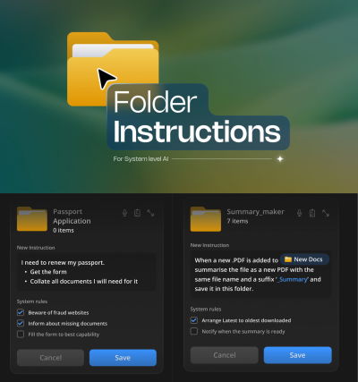
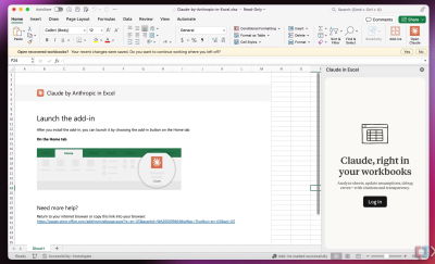
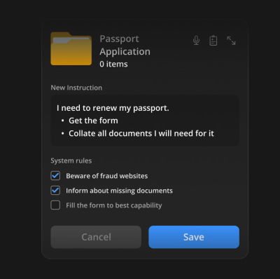
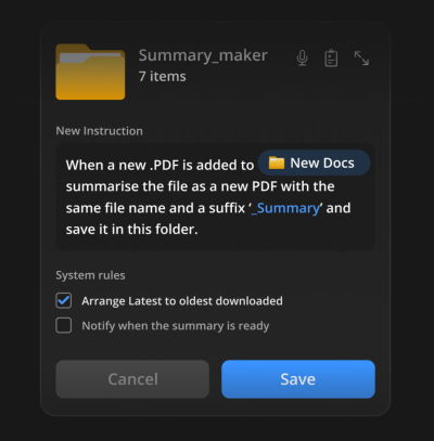
The design community has entered a period of conversational tunnel vision. Because Large Language Models (LLMs) are trained on dialogue, the industry has collectively decided that the chat bubble is the natural home for every AI capability. While the chat interface is a viable and powerful option for many tasks, it is one tool in an expansive toolkit. UX and Product teams must be intentional about the modalities we choose for how users provide their data and commands, and how the system presents its output.
Modality is the way a person uses their senses to interact with a system: seeing, hearing, touching, speaking, or typing.
To pick the best method, you need to think about what the user wants to do, where they are, and how much cognitive effort they are already expending. This guide offers a clear way to figure out the best approach for any product, using two tools to assist in the process: a Task Audit and an Input/Output Alignment Matrix.
Picture a traveler jogging through a loud airport terminal after a sudden gate change. They are dragging their roller bag and carrying a coffee in the other hand. They need to open their airline app to ask the AI assistant where to go. The tool immediately fails the input modality test. It forces the traveler to stop walking, balance their coffee, and type a long booking reference number into a tiny chat box. When they finally hit send, the system fails the output modality test. Instead of flashing a large, high-contrast gate number, the AI returns a dense paragraph explaining the atmospheric weather patterns causing the delay. The actual gate number sits buried at the very bottom.
While they might make the flight just fine, the user won’t forget the moment of anxiety they felt while using the AI tool — an experience that could have served as a way to reinforce a commitment to UX has instead validated the common conception that companies don’t care about or understand customers using their products. In this scenario, the airline built a smart tool, but the interface failed the user. The input required physical dexterity, which the traveler lacked at the time of need. The output demanded a level of reading focus they could not spare. This article will cover how we can avoid this scenario in our AI-powered tools. In order to be successful, we must evaluate the physical and cognitive load of our users to match both the input and output modality to their immediate intent.
Let’s first discuss the limitations of a chat-based interface.
Myth of the Do-It-All Chatbot
The allure of the chatbot is easy to understand from a product development standpoint. It is a blank slate. It suggests that the system can handle anything the user provides. However, a text-heavy interface often causes a high adaptation load. This load increases cognitive demands on users. Over time, this cognitive burden turns into a psychological tax a person pays when changing natural thought processes to accommodate a machine.
When an interface relies solely on conversation, it imposes a dual burden: a linguistic challenge for input and a cognitive challenge for output. We’ll examine both separately below.
Input: Why a Text Box is a Linguistic Barrier
A blank chat box creates a major problem for users who need to discover what a tool can actually do. In a standard graphical interface, menus and buttons provide clear visual cues that signal every available option. A chat box often leads to choice paralysis because users are forced to guess what the AI is capable of. They have to remember the exact phrasing or technical terms required to get the result they want.
Consider a data analyst who wants to find a specific trend in a spreadsheet. In a traditional tool, they might click a filter or sort button. In a chat interface, they must suddenly become a writer and describe that complex logic in a complete sentence. Another example: a manager trying to reorganize a team schedule. Dragging and dropping blocks on a calendar is intuitive. Describing those same scheduling shifts in a text prompt adds a layer of work that makes the task feel more difficult than it should be.
Designing for input means recognizing that composing a prompt is a creative act. It requires a person to translate a vague thought into a specific command. For many professionals, this creates a linguistic barrier. A designer might know exactly how they want an image to look but struggle to describe the lighting or texture in a text prompt. In that case, a slider or a color picker is a much better input method than a text box.
Having addressed the linguistic barrier of constructing input prompts, we must now consider the other half of the conversational burden. This is the cognitive cost the AI imposes when it responds in dense blocks of text.
Output: The Cognitive Cost of Reading Long Text
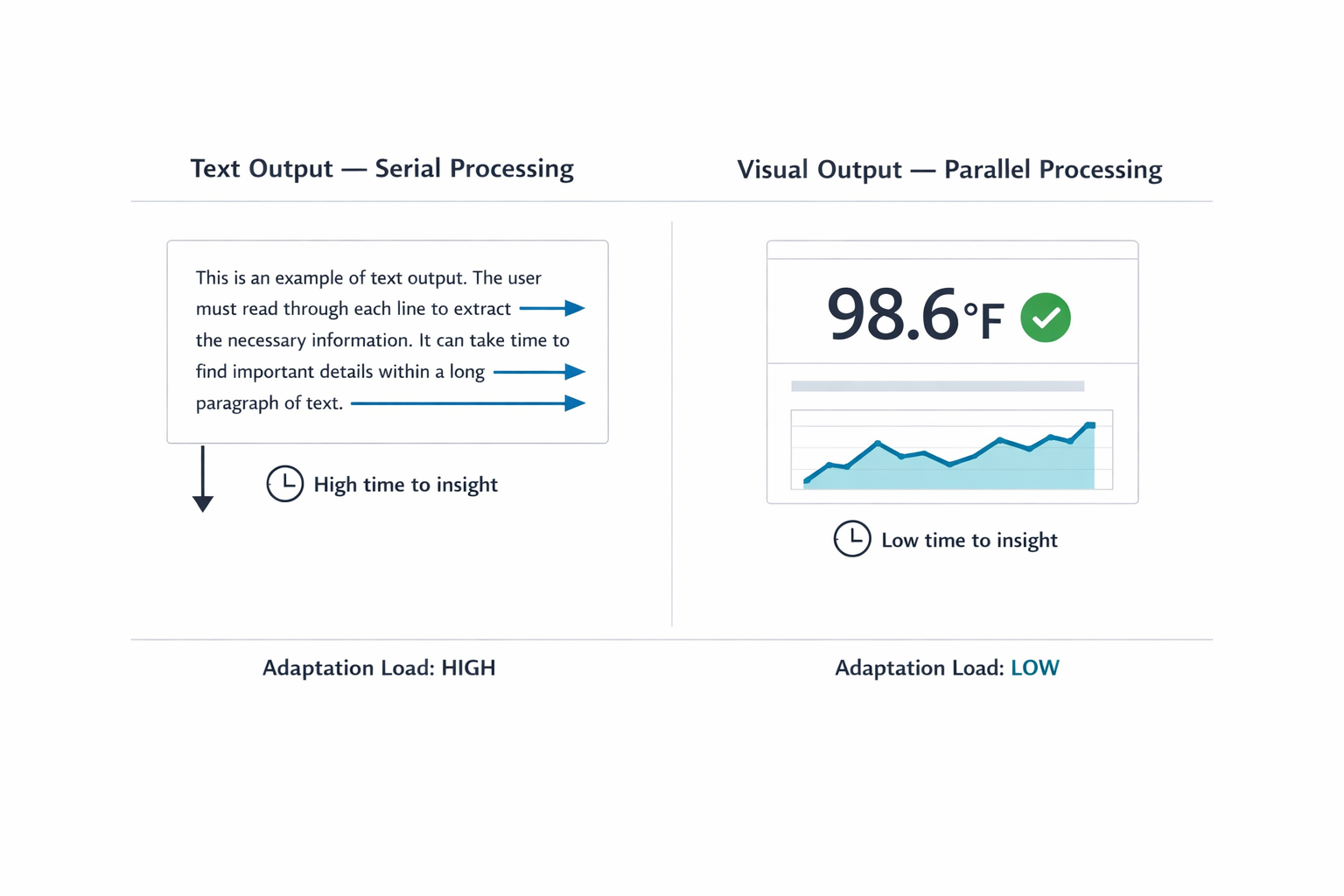
When an AI responds in long blocks of text, it transfers the interpretive work to you, the user. Text is a serial medium: your brain has to read one word after the next to extract meaning. That takes time. Sequential reading is necessary in many scenarios. Complex legal analysis or reviewing nuanced medical histories requires reading full paragraphs. Teams create friction when they default to text for data that visual formats communicate faster. Visual methods allow parallel processing. You can view a chart and spot a pattern in under a second.
Imagine asking an AI for a project status update. Instead of a color-coded dashboard, you receive three paragraphs listing every task completed that week. Now you must read the entire response and mentally summarize it to find the one piece of information you needed. The quick visual check has been replaced by a reading assignment.
The cognitive tax of this work compounds with professional stakes. A doctor asking for a patient’s vital signs needs a clear numerical display, not a narrative describing the readings. A stock trader looking for a price spike needs a line graph immediately, not a written description of price movement over the past hour. In both cases, a text response forces the professional through a slow, error-prone extraction process when speed and accuracy are most important.
A Taxonomy of Input and Output Modalities
Before selecting a modality, practitioners need a shared vocabulary for what the options actually are. The table below maps common input and output modalities to the contexts where each performs best. This is not a ranking. Each modality has a role; the question is always which role it is playing in a given workflow.
Designing for modality inherently requires a strong focus on accessibility. While visual dashboards provide rapid insight for many people, designers need to provide screen-reader-optimized audio alternatives for users with visual disabilities. Modality choices should multiply pathways to information.
Input Modalities
| Modality | Best For | Example Contexts | Cognitive & Physical Rationale |
|---|---|---|---|
| Button / Tap | Single-step, binary actions | Launching a feature; confirming an alert | Eliminates recall overhead by utilizing recognition; maximizes execution speed during time-sensitive tasks. |
| Voice | Hands-busy or eyes-busy contexts | Field technician query; driving navigation | Offloads physical interaction to speech, though bounded by ambient noise and social privacy norms. |
| Natural Language Chat | Ambiguous or exploratory queries | Researching options; asking follow-up questions | Offers users freedom in what they can say; however, the user must figure out how to phrase their request clearly. |
| Form / Wizard | Structured, multi-field data entry | Filling out a contract; configuring a report | Keeps users from missing information by breaking down a complicated task into clear, step-by-step visual sections. |
| GUI (Filters, Sliders, Drag-and-drop) | Complex parameter setting or spatial tasks | Scheduling; data filtering; image editing | Prevents mistakes and ensures users don't miss information by dividing complicated tasks into clear, step-by-step visual parts. |
| Multi-modal (Image + Text) | Visual input paired with description | Uploading a design mockup with annotation | Reduces the effort of explaining things because users can reference an object instead of having to describe it only with words. |
| Gesture | Hands-free spatial interaction | Waving a hand to acknowledge an alert in a sterile operating room | Allows physical interaction without touching a surface. This keeps users safe and clean in contaminated environments and allows for quick input or acknowledgement. |
Output Modalities
| Modality | Best For | Example Contexts | Cognitive & Physical Rationale |
|---|---|---|---|
| Push Notification / Alert | Time-sensitive, ambient awareness | Price spike alert; task completion notice | Provides a quick update that the user can process at a glance. It delivers information without demanding a full break in concentration from their primary task. |
| Audio Summary | Hands-busy or eyes-busy contexts | Status updates while walking; conversational voice agents providing real-time navigation | Delivers information directly to the user’s ear. Removes the need to look at a screen, keeping the user safe and aware of their physical surroundings while moving or working. |
| Short Text Summary | Focused queries needing brief answers | Definition lookup; single-metric status | Gives a fast answer to a direct question. Users can read a short sentence quickly without experiencing the fatigue of scanning paragraphs of text. |
| Visual Dashboard | High-density, comparative analysis | Project status; resource allocation | Enables visual trend and outlier detection. Avoids the mental effort of reading data line-by-line and cross-referencing in real time. |
| Interactive Canvas | Generative or iterative creative tasks | Design iteration; layout adjustment | Allows users to manipulate the output instead of asking an AI to move it via text instructions. Reflects a natural way to interact with the output. |
| Inline Confirmation | Guided task flows needing feedback | Step-by-step configuration wizard with in-line validation | Provides visual proof that the system recorded a choice correctly. Reduces users’ anxiety about wondering if an error occurred. |
Table 1: Input and Output Modality Taxonomy. Use this as a reference during the Task Audit to identify candidate modalities before narrowing to a recommendation.
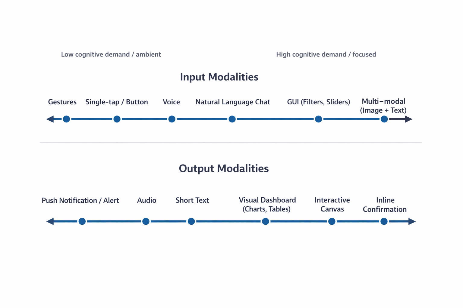
The following FigureFigure 2 illustrates the cognitive spectrum, mapping how mental effort scales across various interaction methods. This spectrum is a critical tool for designers to visualize the shift from low-effort, ambient interactions to high-effort, focused experiences. By understanding where a specific task sits on this spectrum, teams can identify whether a user needs a “glanceable” output that minimizes mental processing or a high-density format that supports deep, analytical thinking.
With this taxonomy established, the next step is to apply a rigorous method to select the optimal input and output combination. Practitioners must ground this selection process in the user’s real-world environment and context.
Task Audit: A Framework for Modality Selection
To choose the right interaction method, practitioners should complete a Task Audit before interface design begins. A formal Task Audit is the framework that moves teams from assumptions about user behavior to evidence. This process gathers data about the physical, social, and cognitive context in which the work actually happens, which then drives all input and output modality decisions.
Use these four areas of focus to anchor the audit:
- Input Constraints:
This addresses whether the user can physically interact with the system
using their hands, such as typing or tapping. It often dictates the
necessity of hands-free interaction methods like voice input when the
user’s hands are occupied by tools or gear.
- Can the user use their hands to type or tap? A mechanic working under a vehicle might need to ask a question using only voice because their hands are occupied and covered in grease.
- Output Constraints:
This defines whether a user can safely and practically view information
on a screen. It concerns situations where a user’s eyes must remain
focused on their environment, making audio or glanceable visual cues the
appropriate display method.
- Can the user safely look at a screen to read information? A delivery driver’s navigation system should provide audio directions because reading a detailed map while driving through an intersection is dangerous.
- Social Constraints:
This considers the environment’s tolerance for audible interaction,
either speaking or listening to audio output. It helps determine if a
quiet space requires silent alerts or if a loud environment demands a
non-audio output method.
- Is the environment appropriate for speaking aloud or listening to audio? An office worker in a quiet, open-plan space would prefer a silent text notification over a spoken voice response.
- Cognitive Load: This
measures the amount of mental effort the user must already dedicate to
their primary task. Teams must design the interface output to either
minimize mental processing, such as with a quick visual indicator, or
support deep thinking with a detailed summary.
- How much mental effort does the task already require? A surgeon needs a quick visual red indicator during a procedure, while a lawyer researching case strategy needs a detailed text summary to absorb at their own pace.
The audit answers two questions for every feature:
- What modality can the user physically use to provide input here?
- What modality can the user realistically process as output here?
Here is how to gather the evidence to inform your task audit. Use one or more of these common UX research-related methods:
1. Contextual Inquiry and Observation
This is the most direct way to capture how people work in their natural setting, and it provides the richest data for identifying physical constraints on both input and output. Observation is necessary because users often perform hidden work: small steps or workarounds they forget to mention in an interview, or environmental details they do not think to describe because they have adapted to them.
The Approach: Go to the user’s actual workspace, whether a field site, warehouse, or office floor. Ask them to perform the task you are studying and observe closely.
What to Look For: This method is most revealing for Input Constraints and Output Constraints.
- Input example
A technician diagnosing equipment who cannot put down their tools rules out typing and points directly to voice input. - Output example
A supervisor in a meeting who looks up and down repeatedly from a screen signals a need for glanceable, low-density output rather than a scrolling text summary.
2. Focused Interviews
Interviews surface the mental models and decision points that observation cannot capture. They are most valuable for understanding Cognitive Load.
The Approach: Conduct one-on-one sessions with end-users and the stakeholders who manage the outcome. Use a structured protocol focused on a specific task. Ask for stories about past successes and failures rather than general opinions.
What to Look For:
- The “Why” Behind High Cognitive Load
Ask users to describe the hardest part of a task. A lawyer may explain that the volume of detail is not the challenge; synthesis for ethical or strategic judgment is. This confirms a need for detailed text output the user can read and absorb at their own pace, not a summary dashboard. - Process Ambiguity
Uncover situations that are unclear or error-prone, which identifies where AI capabilities provide the most leverage and what output format will reduce rather than increase ambiguity.
3. Collaborative Workshops
Workshops are essential for defining task boundaries and establishing required fidelity levels. Product managers and stakeholders bring foundational knowledge of system requirements; researchers apply audit criteria.
The Approach: Use workshops to build a shared Task Inventory. Bring designers, engineers, product managers, and business analysts together to map every step of the process. Product managers and business analysts ensure factual accuracy; the research team applies audit criteria to each step.
What to Look For:
- Social Constraints
Confirm where tasks are performed. A workflow that takes place on a loud manufacturing floor versus a shared quiet library demands very different output modalities. - Ambiguity and Speed Tests
For every task in the inventory, apply two tests. First: Does this step require human ethical judgment? If yes, the AI output must support that judgment, not replace it. Second: Does this step require instantaneous execution? If yes, the interface must support fast input with minimal cognitive overhead.
Once you gather field evidence through these research channels, map your findings directly against the Modality Taxonomy. Each concrete physical or social constraint you document systematically eliminates mismatched interfaces. This process strips away design guesswork, narrowing your architectural choices down to the specific input and output combinations that survive the reality of the user’s environment.
When you ground input and output modality decisions in field evidence rather than interface convention, the resulting design reduces adaptation load for the user and grounds your modality choices in evidence. When you base decisions on field data, you move past interface convention and build a powerful case for the resources needed to create the right experience for your users.
Once the audit is complete, the final step is utilizing the Input/Output Alignment Matrix to formalize the connection between user intent and the optimal modality combination.
Input/Output Alignment Matrix
With Task Audit findings in hand, you can use an Input/Output Alignment Matrix to map user intent to specific modality combinations. This matrix is organized by what the user is trying to accomplish in a given moment. This distinction versus focusing on what your AI is capable of doing matters. If intent changes across a single workday for the same user, the interface should respond to those shifts.
Choosing the wrong modality for the user’s context can lead to user frustration. Users might feel mentally drained if a lot of information is delivered through a format that is hard to process, like getting a massive status update only in text. They may also start worrying if an action was actually completed correctly when a precise command is buried within a long chat exchange. Finally, the system can force users into finding clumsy workarounds, making them adapt to the machine’s method instead of working in their natural, most effective way.
| User Intent | Optimal Input Modality | Optimal Output Modality | Environmental Fit |
|---|---|---|---|
| Quick Status Check | Voice or Single-tap Button | Audio or Push Notification | Hands-busy, Eyes-busy (e.g., Technician on ladder) |
| Specific Detail Query | Natural Language Chat | Short Text Summary | Focused, low-density data need |
| Complex Analysis | GUI (Filters, Sliders) | Visual Dashboard (Charts, Tables) | Desk-based, high-resolution screen |
| Creative Generation | Multi-modal (Image + Text) | Interactive Canvas | Design or drafting environment |
| Monitoring / Alert | Passive (background system) | Push Notification or Audio Alert | Any environment; task is ambient awareness |
| Guided Task Completion | Structured Form or Step-by-step Wizard | Inline Confirmation + Progress Indicator | Focused workflow; user needs verification feedback |
Table 2: Input/Output Alignment Matrix. Map user intent to modality combinations using Task Audit evidence. The two added rows (Monitoring/Alert and Guided Task Completion) cover common enterprise and mobile scenarios not captured in simpler frameworks.
When teams coordinate these factors, they can move past the automatic default of adding a chatbot. Visual layouts enable rapid scanning. Structured inputs remove the burden of constructing perfect sentences. Audio outputs serve users whose hands and eyes are otherwise occupied.
The right modality combination respects the user’s physical and cognitive state at the moment of interaction.
A real-world scenario where environmental constraints dictated a shift in design strategy best demonstrates the practical application of this matrix and the broader audit framework.
Case Study: Adaptive Modality for Field Technicians
The Problem: Cognitive Overload in High-Risk Environments
Field technicians servicing high-voltage electrical grids often face a dangerous misalignment of interface modality. Traditionally, these technicians had to rely on ruggedized tablets to access technical manuals and log status updates. However, the physical constraints of the job — wearing heavy protective gloves and working in bucket trucks at significant heights — made interacting with a standard touch interface nearly impossible while on a job site. Additionally, attempting to read complex, text-heavy diagnostic reports on a screen while maintaining situational awareness created a high cognitive load that increased the risk of safety errors.
Research Methods: Capturing the Reality of the Field
To address this, researchers conducted a Task Audit utilizing three specific methods from this article. First, Contextual Inquiry and Observation revealed that technicians often worked in “hands-busy, eyes-busy” states where any manual input was a significant barrier. Researchers observed technicians wearing mandatory thick protective gloves while in the bucket truck, which made precise screen taps nearly impossible and often triggered the wrong commands.
High-altitude environments also introduced severe screen glare from direct sunlight, washing out the display and making text difficult to read even at full brightness. Furthermore, technicians faced the physical safety risk of trying to manipulate and secure a heavy, ruggedized tablet while balanced in awkward positions, creating a distraction that could lead to dangerous slips or equipment contact. These factors, combined with the need to constantly monitor live wires and the surrounding environment, meant technicians could not safely dedicate their eyes or hands to a standard tablet interface, confirming the severity of the eyes-busy and hands-busy constraints.
Second, Focused Interviews with veteran technicians validated the findings from the field. They confirmed that the operational challenges, including the thick gloves, screen glare, and safety risks, were not unique to one location but were commonly experienced across multiple sites, including high-altitude transmission lines and sprawling power substations. This broad confirmation solidified the need for a non-touch, voice-first solution. The interviews also surfaced a critical cognitive constraint: the need for glance verification of vital signs, such as voltage readings and temperature trends, rather than being forced to read a long narrative description of system health. Technicians stressed that their primary need was immediate, unambiguous verification (is this safe? or where is the fault?), not a lengthy diagnostic report, indicating that a text-heavy response was dangerous to their workflow.
These methods confirmed that the environment required a departure from the traditional chat or form-based AI capability interface.
The Resolution: A Multi-Modal Handoff Solution
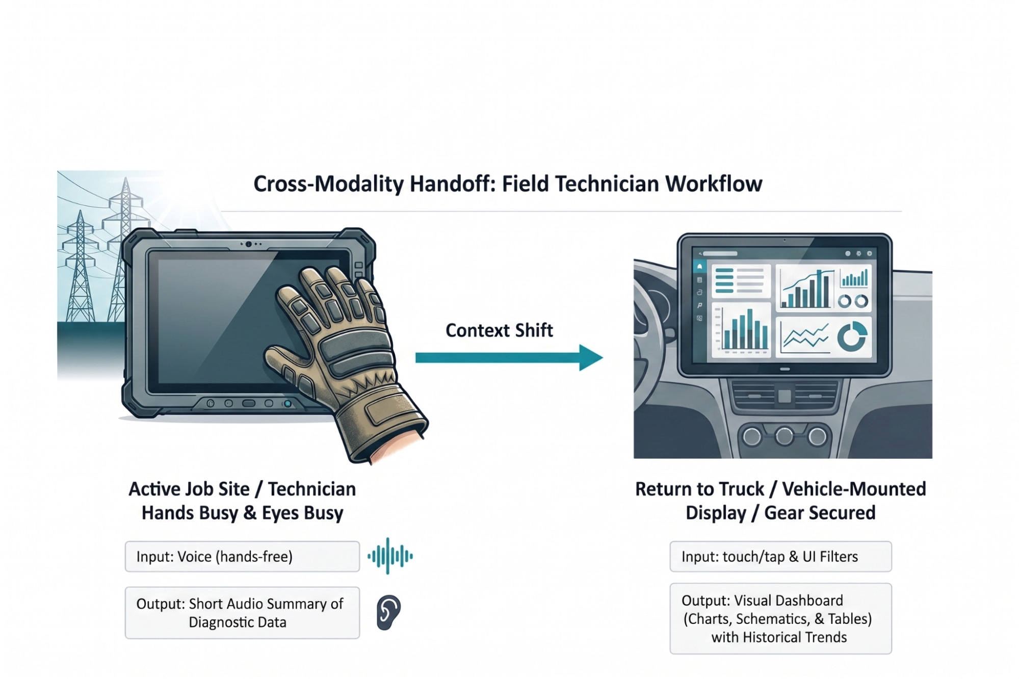
The resulting solution implemented an adaptive modality handoff designed to mitigate the physical and cognitive barriers researchers identified during the research. While active on a job site, technicians utilize voice input to query the system. This method allows them to remain productive while wearing thick protective gloves that would otherwise prevent precise interaction with a touchscreen.
The AI responds with a short audio summary of immediate diagnostic data. This audio feedback bypasses the challenge of screen glare in high-altitude environments and allows the technician to maintain situational awareness of the high-voltage grid without the safety risk of looking away from dangerous equipment. By providing immediate answers to fault locations through audio, the system meets the technician’s need for glance verification through a hands-free and eyes-free channel.
Once technicians return to a truck and secure safety gear, a system automatically hands off workflows to a 15-inch visual dashboard mounted inside a vehicle. A rugged 10-inch field tablet lacks adequate screen real estate for complex schematics. A larger vehicle display allows for parallel processing of historical trend data and wide electrical grid maps. This case study reflects an actual field audit conducted for a national utility provider. Implementing this adaptive approach reduced diagnostic time by twenty percent and increased daily tool adoption among field crews.
Designing for the Environment
An AI capability is only as usable as the interface that delivers it. Researchers and designers must resist the pull toward the path of least resistance. Building a chatbot is fast and familiar, something we’ve been doing for decades now. Building an interface that feels like a natural extension of how someone already works is harder, and it is the work that matters.
Start by leaving the screen. The Task Audit requires presence in the places where work actually happens: the field site, the warehouse floor, the operating room. The physical and social realities of those spaces are not edge cases. They are the design brief.
The future of AI interface design is a diverse ecosystem: visual, vocal, haptic, and ambient, calibrated to user intent and environmental context. The chat window is one tool in that ecosystem. It is the right tool for specific jobs, and often the wrong tool for the jobs we reflexively assign to it.
In order for us to create the greatest likelihood of acceptance and use of the AI capability we offer users, we must fit the modality to the person and the place.
Where to Start
To get started immediately, run a lightweight version of the Task Audit before your next design sprint. Spend two hours observing the workflow in its actual environment. Conduct three to five interviews with the people who perform the task. Bring a PM or analyst into a 90-minute workshop to build a task inventory and apply the four audit questions. You will not have complete data, but you will have enough to make a defensible modality recommendation backed by evidence rather than convention.
I created a Modality Task Audit Template to help guide teams with moving forward. You can download this worksheet and take it directly to your next field observation. It allows design and product teams to document specific physical barriers before writing a single line of code.
Inside this Template:
- Step 1: Physical Reality Check.
An observation checklist to log hand availability, eye focus requirements, and ambient noise levels in a specific workspace. - Step 2: Cognitive Baseline.
A scoring grid to rate required reading density and verification anxiety for a given workflow. - Step 3: The Handoff Map.
A blank flow diagram to chart where a user starts a task (for example, using voice on a mobile phone in a warehouse) and where they finish it (for example, reviewing a visual dashboard on an office monitor).
We focus heavily on training smarter AI models. We owe equal attention to human interfaces. A brilliant underlying model packaged in a lazy text interface fails. When you observe actual work environments and align interaction modalities to them, you remove adaptation friction.
Modality Task Audit Field Template
Use this worksheet during field observations. It allows design teams to document specific physical barriers before writing code.
Part 1: Physical Reality Check
Observe users as they perform a primary task in actual workspaces. Check all applicable conditions.
State of Hands
Visual Focus Requirements
Ambient Noise Level
Part 2: Cognitive Baseline
Rate the mental effort required to complete a specific workflow.
| Metric | Low | Medium | High |
|---|---|---|---|
| Required Reading Density | Single numbers, binary states | Short summaries, simple instructions | Legal contracts, complex diagnostic reports |
| Verification Anxiety | Reversible actions, low stakes | Standard business operations | Irreversible actions, safety risks, financial transactions |
Part 3: Handoff Map #
Chart user journeys across different environments. Document required input and output at each stage.
Stage 1: Initial Action
- Location: ________________________
- Input Method: ________________________
- Output Method: ________________________
Stage 2: Context Transition
- Trigger for environment change (example: user returns to a desk): ________________________
Stage 3: Completion Action
- Location: ________________________
- Input Method: ________________________
- Output Method: ________________________