Color
accessibility is more than just ticking boxes. Even with good contrast,
some color palettes can make interfaces challenging for users. Here are
some practical guidelines to ensure more inclusive design for
colorblind people. An upcoming part of Smart Interface Design Patterns.
Too
often, accessibility is seen as a checklist, but it’s much more complex
than that. We might be using a good contrast for our colors, but then,
if these colors are perceived very differently by people, it can make interfaces extremely difficult to use.
Depending
on our color combinations, people with color weakness or who are
colorblind won’t be able to tell them apart. Here are key points for designing with colorblindness — for better and more reliable color choices.
Colorweakness and Colorblindness
It’s worth stating that, like any other disability, colorblind users are on the spectrum, as Bela Gaytán rightfully noted. Each experience is unique, and different people perceive colors differently. The grades of colorblindness vary significantly, so there is no consistent condition that would be the same for everyone.
When
we speak about colors, we should distinguish between two different
conditions that people might have. Some people experience deficiencies in “translating”
light waves into red-ish, green-ish or blue-ish colors. If one of these
translations is not working properly, a person is at least colorweak. If the translation doesn’t work at all, a person is colorblind.
Depending
on the color combinations we use, people with color weakness or people
who are colorblind won’t be able to tell them apart. The most common use
case is a red-/green deficiency, which affects 8% of European men and 0.5% of European women.
Note: the insights above come from “How Your Colorblind And Colorweak Readers See Your Colors,”
a wonderful three-part series by Lisa Charlotte Muth on how colorblind
and color weak readers perceive colors, things to consider when
visualizing data and what it’s like to be colorblind.
Design Guidelines For Colorblindness
As Gareth Robins has kindly noted, the safe option is to either give people a colorblind toggle with shapes or use a friendly ubiquitous palette like viridis. Of course, we should never ever ask a colorblind person, “What color is this?” as they can’t correctly answer that question.
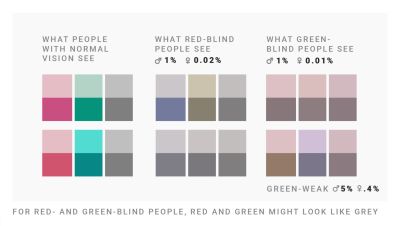
For red- and green-blind people, red and green might look like grey. Designed by Lisa Charlotte Muth. (Large preview)
✅ Red-/green deficiencies are more common in men. ✅ Use blue if you want users to perceive color as you do. ✅ Use any 2 colors as long as they vary by lightness. ✅ Colorblind users can tell red and green apart. ✅ Colorblind users can’t tell dark green and brown apart. ✅ Colorblind users can’t tell red and brown apart. ✅ The safest color palette is to mix blue with orange or red.
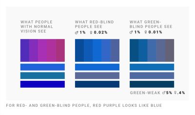
For red- and green-blind people, red-purple looks like blue. Designed by Lisa Charlotte Muth. (Large preview)
🚫 Don’t mix red, green and brown together. 🚫 Don’t mix pink, turquoise and grey together. 🚫 Don’t mix purple and blue together. 🚫 Don’t use green and pink if you use red and blue. 🚫 Don’t mix green with orange, red, or blue of the same lightness.
Never Rely On Colors Alone
It’s worth noting that the safest bet is to never rely on colors alone
to communicate data. Use labels, icons, shapes, rectangles, triangles,
and stars to indicate differences and show relationships. Be careful
when combining hues and patterns: patterns change how bright or dark colors will be perceived.
WhoCanUse?, a fantastic little tool to quickly see how a color palette affects different people with visual impairments. (Large preview)
Who Can Use?
is a fantastic little tool to quickly see how a color palette affects
different people with visual impairments — from reduced sensitivity to
red, to red/green blindness to cataracts, glaucoma, low vision and even
situational events such as direct sunlight and night shift mode.
Use lightness to build gradients,
not just hue. Use different lightnesses in your gradients and color
palettes so readers with a color vision deficiency will still be able to
distinguish your colors. And most importantly, always include colorweak
and colorblind people in usability testing.
How to design for children aged 3–12, with insights into user behavior, considerations for parents, and practical UX guidelines.
Children
start interacting with the web when they are 3–5 years old. How do we
design for children? What do we need to keep in mind while doing so? And
how do we meet the expectations of the most demanding users you can possibly find: parents? Well, let’s find out.
Designing
for children is difficult. Children tend to lose focus and motivation.
They quit when they get bored, and they move on if they can’t get
anywhere quickly enough. They need steady achievements.
So, as designers, we need to appreciate, reward, and encourage small
wins to develop habits and support learning — with progress tracking and
gamification.
Vibrant, colorful, and playful: Fiete Math, a well-designed game for children. (Large preview)
As Deb Gelman, author of Design for Kids discovered, children communicate volumes by how they play,
what they choose to play with, how long they choose to play with it,
and when they decide to play with something else. Yet they don’t get as
disappointed when something isn’t working. They just choose to browse or
play something else.
Most importantly, we can’t design for children without testing. Even better: bring children to co-design their digital experiences
and bring parents to co-design reliable guardrails. With a fun, smart,
and safe product, parents will spread the word about you faster than you
ever could.
As designers, we should always keep in mind that “children” represent a very diverse range of behaviors and abilities. There are vast differences between age groups (3–5, 6–8, and 9–12) — both in terms of how users navigate but also how we communicate to them.
In general, when designing for children, focus on a two-year age range,
max. These days, children start interacting with the web at the age of
3–5. And the very first interactions they learn are swipe, scroll, video
controls, and “Home”.
Whenever you are designing for children, you always design for parents as well. In fact, parents are the most demanding users you can find. They have absolutely no mercy in reviews, requests, complaints, and ratings on the stores.
Something that parents need to rely on: Grace, a parental control app. (Large preview)
That’s not surprising. Parents need safety guarantees, regulations, and certifications — a sort of reassurance
that you treat their safety and privacy seriously, especially when it
comes to third-party integrations or advertising. In fact, they are
often willing to pay for apps more just to avoid advertising.
Parents often value reviews from teachers, educators, doctors, and other parents like themselves. And they need to have parental controls to set specific time limits, rules, access, and permissions.
As Rodrigo Seoane
has pointed out in an email, a major concern to keep in mind is “how
the majority of initiatives for kids rely on and create dependencies on
extrinsic motivations. The reward model keeps their attention in the
short term, but as a core gamified mechanic, it is problematic in the
long run, reducing their cognitive capacity and creating a barrier to
developing any intrinsic motivation.” So whenever possible, design to increase intrinsic motivation.
If you are interested in similar insights around UX, take a look at Smart Interface Design Patterns, our 10h-video course with 100s of practical examples from real-life projects — with a live UX training starting March 8. Everything from mega-dropdowns to complex enterprise tables — with 5 new segments added every year. Jump to a free preview.
With
one billion people aged 60 or older worldwide, inclusivity is more
important than ever. Learn how to create digital experiences that
empower independence and competence for older adults while enhancing
usability for all. An upcoming part of Smart Interface Design Patterns.
Today, one billion people are 60 years or older.
That’s 12% of the entire world population, and the age group is growing
faster than any other group. Yet, online, the needs of older adults are
often overlooked or omitted. So what do we need to consider to make our
designs more inclusive for older adults? Well, let’s take a closer look.
When
designing for older adults, we shouldn’t make our design decisions
based on stereotypes or assumptions that are often not true at all.
Don’t assume that older adults struggle to use digital. Most users are
healthy, active, and have a solid income.
They might use the web differently than younger users, but that doesn’t mean we need to design a “barebones” version for them. What we need is a reliable, inclusive digital experience that helps everyone feel independent and competent.
Good accessibility is good for everyone. To make it happen, we need to bring older adults into our design process and find out what their needs are. This doesn’t only benefit the older audience but improves the overall UX — for everyone.
When designing for older users, keep in mind that there are significant differences in age groups 60–65, 65–70, 70–75, and so on, so explore design decisions for each group individually.
Older adults often read and analyze every word (so-called Stroop effect),
so give them enough time to achieve a task, as well as control the
process. So avoid disappearing messages so that users can close them
themselves when they are ready or present only 1 question at a time in a
form.
Place error messages above the input and add an error summary to highlight errors prominently. (An example from Gov.uk) (Large preview)
Older adults also often struggle with precise movements,
so avoid long, fine drag gestures and precision. If a user performs an
action, they didn’t mean to and runs into an error, be sure your error
messages are helpful and forgiving, as older adults often view error
messages as a personal failure.
As Peter Sylwester has suggested,
sensory reaction times peak at about the age of 24 and then degrade
slowly as we age. Most humans maintain fine motor skills and decent
reaction times well into old age. Therefore, error messages and small
updates and prompts should almost always be a consideration. One good
way to facilitate reaction time is to keep errors and prompts close to
the center of attention.
As always, when it comes to accessibility, watch out for contrast.
Particularly, shades of blue/purple and yellow/green are often
difficult to distinguish. When using icons, it is also a good idea to
add descriptive labels to ensure everyone can make sense of them, no
matter their vision.
We should be careful not to make our design decisions based on assumptions that are often not true at all. We don’t need a “barebones” version for older users. We need a reliable, inclusive product that helps people of all groups feel independent and competent.
Bring older adults in your design process
to find out what their specific needs are. It’s not just better for
that specific target audience — good accessibility is better for
everyone. And huge kudos to wonderful people contributing to a topic
that is often forgotten and overlooked.
Color
accessibility is more than just ticking boxes. Even with good contrast,
some color palettes can make interfaces challenging for users. Here are
some practical guidelines to ensure more inclusive design for
colorblind people. An upcoming part of Smart Interface Design Patterns.
Too
often, accessibility is seen as a checklist, but it’s much more complex
than that. We might be using a good contrast for our colors, but then,
if these colors are perceived very differently by people, it can make interfaces extremely difficult to use.
Depending
on our color combinations, people with color weakness or who are
colorblind won’t be able to tell them apart. Here are key points for designing with colorblindness — for better and more reliable color choices.
It’s worth stating that, like any other disability, colorblind users are on the spectrum, as Bela Gaytán rightfully noted. Each experience is unique, and different people perceive colors differently. The grades of colorblindness vary significantly, so there is no consistent condition that would be the same for everyone.
When
we speak about colors, we should distinguish between two different
conditions that people might have. Some people experience deficiencies in “translating”
light waves into red-ish, green-ish or blue-ish colors. If one of these
translations is not working properly, a person is at least colorweak. If the translation doesn’t work at all, a person is colorblind.
Depending
on the color combinations we use, people with color weakness or people
who are colorblind won’t be able to tell them apart. The most common use
case is a red-/green deficiency, which affects 8% of European men and 0.5% of European women.
Note: the insights above come from “How Your Colorblind And Colorweak Readers See Your Colors,”
a wonderful three-part series by Lisa Charlotte Muth on how colorblind
and color weak readers perceive colors, things to consider when
visualizing data and what it’s like to be colorblind.
As Gareth Robins has kindly noted, the safe option is to either give people a colorblind toggle with shapes or use a friendly ubiquitous palette like viridis. Of course, we should never ever ask a colorblind person, “What color is this?” as they can’t correctly answer that question.
For red- and green-blind people, red and green might look like grey. Designed by Lisa Charlotte Muth. (Large preview)
✅ Red-/green deficiencies are more common in men. ✅ Use blue if you want users to perceive color as you do. ✅ Use any 2 colors as long as they vary by lightness. ✅ Colorblind users can tell red and green apart. ✅ Colorblind users can’t tell dark green and brown apart. ✅ Colorblind users can’t tell red and brown apart. ✅ The safest color palette is to mix blue with orange or red.
For red- and green-blind people, red-purple looks like blue. Designed by Lisa Charlotte Muth. (Large preview)
🚫 Don’t mix red, green and brown together. 🚫 Don’t mix pink, turquoise and grey together. 🚫 Don’t mix purple and blue together. 🚫 Don’t use green and pink if you use red and blue. 🚫 Don’t mix green with orange, red, or blue of the same lightness.
It’s worth noting that the safest bet is to never rely on colors alone
to communicate data. Use labels, icons, shapes, rectangles, triangles,
and stars to indicate differences and show relationships. Be careful
when combining hues and patterns: patterns change how bright or dark colors will be perceived.
WhoCanUse?, a fantastic little tool to quickly see how a color palette affects different people with visual impairments. (Large preview)
Who Can Use?
is a fantastic little tool to quickly see how a color palette affects
different people with visual impairments — from reduced sensitivity to
red, to red/green blindness to cataracts, glaucoma, low vision and even
situational events such as direct sunlight and night shift mode.
Use lightness to build gradients,
not just hue. Use different lightnesses in your gradients and color
palettes so readers with a color vision deficiency will still be able to
distinguish your colors. And most importantly, always include colorweak
and colorblind people in usability testing.
How to design for children aged 3–12, with insights into user behavior, considerations for parents, and practical UX guidelines.
Children
start interacting with the web when they are 3–5 years old. How do we
design for children? What do we need to keep in mind while doing so? And
how do we meet the expectations of the most demanding users you can possibly find: parents? Well, let’s find out.
Designing
for children is difficult. Children tend to lose focus and motivation.
They quit when they get bored, and they move on if they can’t get
anywhere quickly enough. They need steady achievements.
So, as designers, we need to appreciate, reward, and encourage small
wins to develop habits and support learning — with progress tracking and
gamification.
Vibrant, colorful, and playful: Fiete Math, a well-designed game for children. (Large preview)
As Deb Gelman, author of Design for Kids discovered, children communicate volumes by how they play,
what they choose to play with, how long they choose to play with it,
and when they decide to play with something else. Yet they don’t get as
disappointed when something isn’t working. They just choose to browse or
play something else.
Most importantly, we can’t design for children without testing. Even better: bring children to co-design their digital experiences
and bring parents to co-design reliable guardrails. With a fun, smart,
and safe product, parents will spread the word about you faster than you
ever could.
As designers, we should always keep in mind that “children” represent a very diverse range of behaviors and abilities. There are vast differences between age groups (3–5, 6–8, and 9–12) — both in terms of how users navigate but also how we communicate to them.
In general, when designing for children, focus on a two-year age range,
max. These days, children start interacting with the web at the age of
3–5. And the very first interactions they learn are swipe, scroll, video
controls, and “Home”.
Whenever you are designing for children, you always design for parents as well. In fact, parents are the most demanding users you can find. They have absolutely no mercy in reviews, requests, complaints, and ratings on the stores.
Something that parents need to rely on: Grace, a parental control app. (Large preview)
That’s not surprising. Parents need safety guarantees, regulations, and certifications — a sort of reassurance
that you treat their safety and privacy seriously, especially when it
comes to third-party integrations or advertising. In fact, they are
often willing to pay for apps more just to avoid advertising.
Parents often value reviews from teachers, educators, doctors, and other parents like themselves. And they need to have parental controls to set specific time limits, rules, access, and permissions.
As Rodrigo Seoane
has pointed out in an email, a major concern to keep in mind is “how
the majority of initiatives for kids rely on and create dependencies on
extrinsic motivations. The reward model keeps their attention in the
short term, but as a core gamified mechanic, it is problematic in the
long run, reducing their cognitive capacity and creating a barrier to
developing any intrinsic motivation.” So whenever possible, design to increase intrinsic motivation.
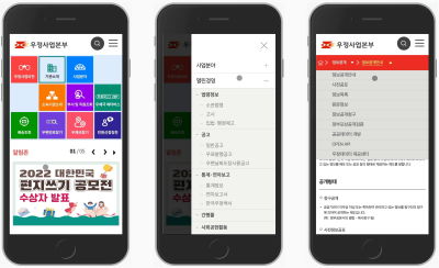
When
designing navigation on mobile, we don’t have to rely on slide-in-menus
or nested accordions. We can also use the curtain and billboard design
patterns, and show multiple levels of navigation at once.
When it comes to complex navigation on mobile,
we often think about hamburger menus, full-page overlays, animated
slide-in-menus, and a wide range of nested accordions. Not all of these
options perform well, and there are some alternative design patterns
that are worth exploring. Let’s dive in!
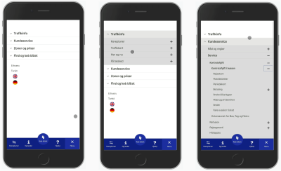
One of the most common strategies for navigation on mobile is to use a good ol’ accordion. In fact, accordions work very well
for multiple levels of navigation and are usually better than slide-in
menus. However, since we open and collapse menus, we also need to
indicate it with an icon. This often results in too many signs pulling user’s attention in too many directions.
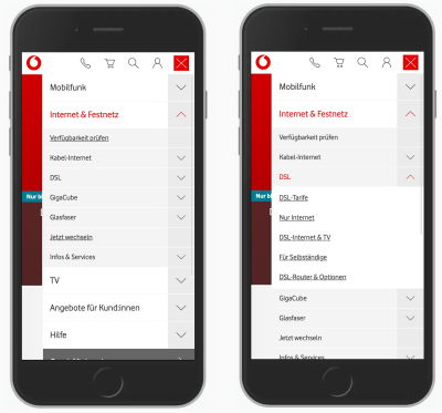
In the example above, Vodafone uses 3 different icons,
pointing either to the bottom (accordion collapsed), to the top
(accordion open), or to the right. The latter indicates that the
selection is a link, driving users to a category page. This is, however, not immediately obvious.
An alternative — and perhaps a slightly more obvious way — is by adding a link underline
to links and removing the icons next to them altogether. As a side
effect, if we eventually have to mix collapsible menus and links to
categories, it’s perhaps a bit more obvious which is which.
In
general, pointing users in too many directions is often unnecessary.
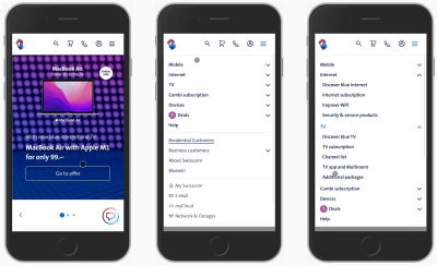
It’s quite likely that you’ll be able to achieve better results with just two icons, indicating whether an accordion is open or not. That’s how it’s done on Swisscom (pictured above), for example.
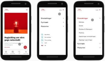
Alternatively, Icelandic Postal Service uses just one single icon,
and to indicate expansion of the accordion, changes the color of the
heading of the section. This seems to be working fairly well, too.
It’s
a good idea to avoid too many icons guiding users in too many
directions. If we can get away without them, it’s a good idea to test
what happens if we do.
More after jump! Continue reading below ↓
2. Don’t Overload Your Navigation With Multiple Actions #
Sometimes navigation menus combine two different functions in one single navigation bar. For example, what if you have categories that you want to link to directly, but then you also want to allow for quick jumps into sub-menu items?
Usually,
this means adding two different actions to the same navigation bar. A
tap on the title of the category would lead to the category; a tap on
the icon would open an accordion or prompt a separate view. And to make
this difference a bit more obvious, we often add a vertical separator. Unfortunately, in practice, that doesn’t work too well.
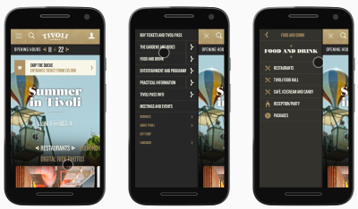
In the example above on Tivoli Gardens Copenhagen,
each section title is linked to a standalone category page. A tap on
the icon on the right, however, opens a separate sub-navigation. Indeed,
a vertical separator does help to distinguish between the two actions,
but it still causes plenty of mistakes.
Sometimes users want to just assess the navigation at a glance, and they aren’t yet committing to going to a dedicated page. Yet here they are, being pushed towards a page
just when they aren’t ready to go there at all. And once they do, they
then have to return back to the previous page and start all over again.
Ideally, we’d avoid this problem altogether.
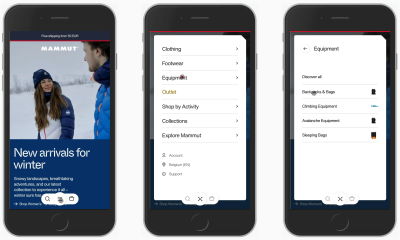
On Mammut, the entire navigation bar
drives the user to the second level of navigation. Their users can move
to discover all items within the category or jump into a sub-category.
Problems solved. Rather than overloading the navigation bar with
separators and separate actions, we can help users move forward confidently and comfortably and prevent mistakes altogether. The next action is always just a tap away.
Always
consider adding a link to the category page within the expanded
accordion or in a separate view, and assign only a singular function to
the entire bar — opening that view.
Not
every navigation item is equally important. Some items are more
frequently used, and they might deserve a little bit more spotlight in
your navigation. In fact, if some items are more important than others,
we can use the billboard pattern and display them more prominently above the navigation.
In the examples above — Otto, Korea Post and Deutsche Post
— we display the most important topics or features more prominently
while the rest of the navigation is available, but gets a slightly less
prominent presence.
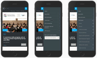
Just like we might have too many icons, we might end up with too many nested levels of navigation, neatly packaged within nested accordions.
For complex sites, it seems like one of the few options to present a
huge amount of navigation available on the site. In fact, we could argue
that by allowing users to jump from any page to any page on the 4th or
even 5th level of navigation, we can massively speed them up in their journeys.
Surprisingly enough, this seems to be right. Expert users typically don’t have massive usability issues with multiple nested accordions. However, infrequent users often struggle to find the information that they need because they don’t understand how the information is organized.
In complex environments, navigation usually mirrors the way the organization is structured internally,
and without that prior knowledge finding the right route to the right
page is difficult at best. In that case, once a user is looking for
something very specific, they seem to use search rather than traversing
the navigation tree up and down. This becomes apparent especially when
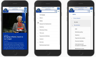
the contrast between levels isn’t obvious, such as on WHO, for example (pictured below).
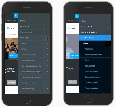
If
we need to include multiple levels of navigation within nested
accordions, it’s a good idea to sparkle just a tiny bit of typographic
and visual contrast to the menu so that every level of navigation is clearly distinct, and it’s also obvious when links to actual pages start appearing. Compare the quick mock-up below.
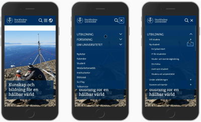
Another way to indicate multiple levels of nesting is by adding different types of icons to make it more obvious where users currently are. This is how it’s done on the Stockholm University website.
Personally, I wasn’t able to verify how well this design pattern works,
but when combined with better typographic contrast, this might be
performing better and is definitely worth testing.
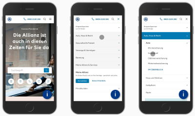
DOT, a public transportation website from Denmark, uses the + icon across multiple levels for their nested accordions. While the chevron is positioned on the left, the + are always positioned on the right. Thus, they display four levels of navigation with nested accordions. Perhaps it’s a bit too much navigation, but it seems to be working fairly well.
On the other hand, it might not be needed at all. Allianz gets away with using a single icon (chevron up and down), but with clearly different designs
for every navigation level. The first level is highlighted with white
text on a blue background; the second level is designed in bold; and the
third level is plain text (which could, of course, be links, too).
Plus, instead of showing all items at the same time, only four most important ones are displayed at first, and the others are available on a separate page. This a great example worth keeping in mind.
Nested accordions
can work with enough contrast between each level. However, if you have
more than three levels of navigation, making it work with a bit of
indentation and various typographic styles will become quite difficult.
Admittedly, many navigation menus on mobile aren’t
accordions. Because each navigation section might contain dozens and
dozens of sub-navigation items, it’s common to see the so-called slide-in menus,
with navigation items sliding in horizontally and presenting users with
a comprehensive menu of all options available on that level.
With that pattern, quick jumps from one level to another are impossible, as users always have to go back to the previous level to move forward.
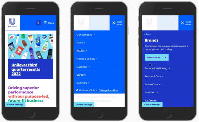
Unilever displays only one level of navigation at a time.
As users navigate further down the rabbit hole, they are presented with
only one level at a time. This does work well to fit all the items and
all the levels that an organization might ever need. However, if a user
isn’t quite sure where to go, the discovery of content tends to be
slower. Also, it’s not necessarily clear where the “Back” button will go
to.
If we do use a slide-in menu, it’s a good idea to replace a generic “Back” button with a more contextual label, explaining to users where exactly they will be returning to. Deutsche Post
(pictured above) does just that. Also, notice that the main page of the
menu features some of the top tasks on the site, in additionally to the
slide-in menu.
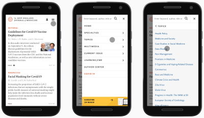
Additionally, The New England Journal of Medicine
adds some typographic contrast to each section, so it’s a bit more
obvious right away what would open up another section and what is a link
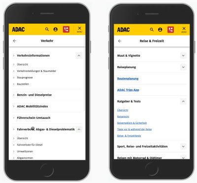
driving to a new page. In fact, we can go quite far by just making links more obvious yet again, as displayed in the example of ADAC below.
It’s worth noting that animated slide-ins can be quite disorienting,
distracting, and annoying for people who use the navigation a lot. Add
to that the slow speed of content discovery, a few too many icons, and a
bit too little contrast between the items, and you have a recipe for
disaster.
A slide-in menu is an option but rarely the best one.
It surely doesn’t perform as well as accordions where jumps between
levels are faster and there is rarely a need to go back. However,
accordions aren’t the only option we have — especially when we want to
help users navigate between levels faster, not slower.
As
we move users from one level to another, we also need to provide a way
for them to move back. But instead of just displaying a “Back” button,
we can stack all the previous sections like a breadcrumb under each
other. And so we get a navigation stack.
On Coolblue,
a Dutch retailer, as users keep exploring deeper levels of navigation,
they can always return all the way to the previous levels that they’ve
been coming from. This allows for faster jumps between levels, and is definitely a good idea when driving users from one-page overlay to another.
7. Use Curtain Pattern To Show Multiple Levels of Navigation #
It
shouldn’t be a big revelation that the speed of navigation is at its
maximum when we display navigation options right away. This is why we
see large buttons appearing as large clickable cards,
filters, and bottom sheets. However, how do we use it in our navigation
menus which barely have any place anyway?
LCFC split the page into two parts, one for each level of navigation.
We could make better use of the available space. For example, what if split the screen vertically, showing one level of navigation on each? Very much like a curtain that we’d pull to one side of a window. That’s what LCFC
(pictured above) does. To move between levels, we don’t need to close
any menus or return back at all — instead, we click on large areas, move
forward, and explore.
And what if you need slightly more space for your lengthy navigation labels? Well, the labels could wrap onto multiple lines,
or we could reduce the width by replacing text labels with icons (as
long as they are unambiguous). It might not work for every project, but
it seems to work for Playstation (pictured below).
The entire first level of navigation collapses into tabs;
yet moving from one level to the other doesn’t require any jumps back.
You might be wondering what the three vertical lines represent —
ideally, one could drag away the pane, but it doesn’t seem to be working
as expected, unfortunately.
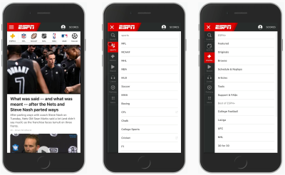
ESPN
uses a very similar approach but reduces the amount of space for the
first level to the minimum. It could be a little bit larger to prevent
mistaps, but the idea is pretty much the same: showing two levels of navigation at the same time.
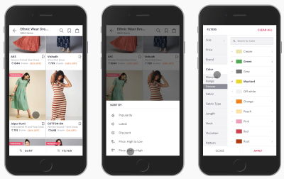
We could use the same approach in other contexts, such as filtering. We display all filter attributes on the left,
and allow users to choose the specific values for these filters in the
second vertical pane. That’s what the filtering experience looks like on
Myntra, an Indian eCommerce retailer pictured below.
If some filters don’t fit in the right pane, users can scroll to explore more or even search for a specific filter
in the selection. Of course, the “Apply” button has to stay floating.
It would be lovely to see the total number of results on that button,
too.
We could take it even further, though. For example, sometimes
users need to select filters that are relevant to them and define their
values in the next step. In that case, we group all filters into a few categories (or even sub-categories), and then present all of the categories and filters as sub-categories side-by-side.
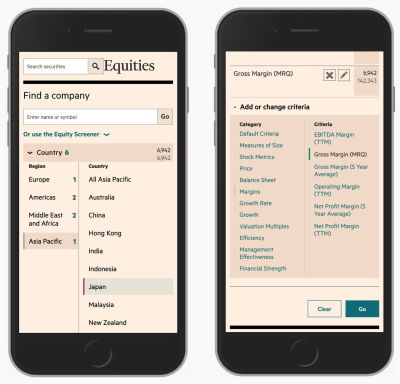
With FT Screener,
for example, users can add or change criteria by exploring multiple
levels at the same time — both the labels for groups and the filters
living within those groups. Once a filter has been chosen, it’s added to
the overview on the top. That’s a simple filter constructor for sophisticated filtering on mobile.
The
vertical split could be used to quickly select one important present or
make a single choice. That would be the case for a language selector,
for example. We could organize all supported countries and languages as
cards or accordions, but they could also work as vertical tabs, as it’s done in the footer of Oracle.
This way, we display only options that are relevant to users.
They never have to go to irrelevant sections or pages since they get a
preview and can navigate away from it quickly, should they wish to do
so.
In general, the curtain pattern works well with a quite flat content architecture,
but is difficult to manage with three or more levels. It shows its
strengths when the speed of navigation matters and when users are likely
to jump between sections a lot.
It’s way faster than slide-in-menus but less flexible than accordions. Still, a great lil’ helper to keep in mind to make better use of available space on mobile.
The
curtain pattern works well for two levels of navigation, but you might
have many more levels than that. In that case, it might be a good idea
to test if it actually has to be this way. What if you show only two or three levels via your menu drawer, but then the rest would be available on standalone pages?
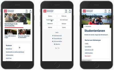
The University of Antwerp
gets away with just one level of navigation on mobile. All the
sub-section exist on standalone pages as cards. In fact, there are
dozens of links on each page, but as long as the navigation is obvious, this might be just what you need.
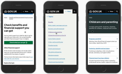
Gov.uk isn’t a particularly small website, but it features only two main sections
with plenty of subsections in its navigation on mobile. However, no
third or fourth-level navigation is accessible from the menu drawer.
Everything else is accessible via links and cards on separate pages.
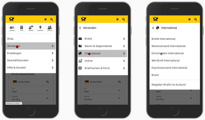
Korea Post
follows along with an interesting twist to that idea. On tap in the
menu, it shows all items living on the second level, but also automatically shows the options from the third level,
too. Additionally, breadcrumbs include drop-downs allowing users to
jump quickly between the siblings of each level. You can find out more
about that pattern (sideways breadcrumbs) in Designing A Perfect Breadcrumbs UX.
Do
you need to display more than two levels of navigation? Perhaps it is
indeed necessary, but chances are high that it isn’t. So perhaps it’s
worth testing a design that features only two levels. Additionally, we can add another feature to it to make navigation even faster.
In
addition to search and navigation, we could study some of the most
frequently visited pages or some of the most popular tasks, and show
them directly, as we saw in the Deutsche Post example earlier above.
We could also add navigation queries to ask users about their intent,
and allow them to choose a topic relevant to them. Think about it as a
mini-search engine for your navigation, designed as a seamless
autocomplete experience. This would give users guidance toward the goal
and help them navigate more reliably.
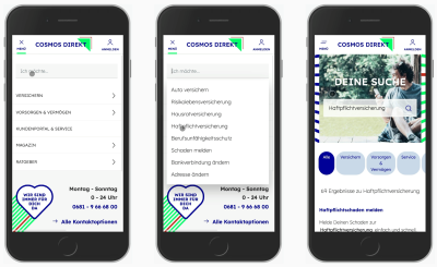
Cosmos Direkt,
a German insurance company, features a <select>-menu that allows
users to select a particular task that they’d like to perform on the
site. This type of navigation exists additionally to search and classic
navigation menu, but increases the speed to relevance significantly.
Inline
validation in web forms is useful when it works, but frustrating when
it fails. Too often it leads to an endless stream of disruptive error
messages or dead-ends without any chance of getting out. Let’s fix it.
Undoubtedly, there are major advantages of inline validation.
We validate input as users type, and so as people move from one green
checkmark to another, we boost their confidence and create a sense of
progression. If an input expects a particular type of content, we can flag errors immediately, so users can fix them right away. This is especially useful when choosing a secure password, or an available username.
However, inline validation can be problematic. Mostly because we can’t really show an error at just the right time when it occurs. And the reason for that is that we can’t really know for sure when a user has actually finished their input, unless they explicitly tell us that they have.
Clicking on a “Submit” button is a very clear signal that users think they are done, but our implementations usually consider leaving an input field as a strong enough signal
to kick off the validation for that input field. Often it will be a
correct assumption, but since it’s merely an assumption, eventually it
will be wrong for some users — we just don’t know how many people, and how often, will be affected by it.
Surely we don’t want to show “wrong” errors;
nor do we want to confuse and frustrate users with flashing error
messages as they type. We want to show errors as they happen, and we
want to replace them with friendly green checkmarks once they are fixed.
How challenging can that be to implement? As it turns out, it is indeed
quite challenging.
There are surprisingly many flavours of inline validation. Over the years, we’ve learned to avoid premature validation
— inline validation that happens when a user just focuses on an empty
input field. In that case, we would display errors way too early, before
users even have a chance to type anything. This isn’t helpful, and it
is frustrating.
Once
a mistake has been done, and user is trying to correct it, we should
remove the error message the moment the input becomes valid. It’s not
the case at Zeit.de
Eventually we moved to real-time validation
which happens as users are typing. To do that, for every single field,
we define a threshold of entered characters, after which we start
validating. This doesn’t really remove frustration entirely, but rather delays
it. As users eventually reach the threshold, if the input isn’t
complete or properly formatted yet, they start getting confronted with
flashes of premature error messages.
Inline validation also typically requires quite elaborate and strict formatting rules.
For example, at which point should we validate a day and a month for a
date input? Would we validate them separately, or validate the date as a
whole? Because both day and month inputs are interdependent, getting
inline validation right there is difficult. From testing, it seems that
validating the date at once helps avoid premature errors for
good. In practice, each input, and each type of input, requires a
conversation about custom validation rules.
Every input fields needs a conversation. For some fields, Ableton validates on blur, and for others validates only on submit.
The most common type of inline validation is late validation: we validate input once a user has left the input field (on blur),
and just let them be as they are filling in the data or copy-paste it.
This surely helps us avoid flashes of errors. However, we assume a
particular order of progression from one field to another. We also
prompt users to interrupt their progression and head back to fix an
error once it has happened.
The one that often gets forgotten: an alternative to inline validation is validation only on submit, as it’s (partly) done on BestBuy.com
So which inline validation technique works best? As it turns out in usability testing, users sincerely appreciate both — the live validation and the late validation — if things go perfectly smoothly. Ironically, they also feel utterly frustrated by any kind of inline validation once errors start showing up one after another.
This
frustration shows up in different ways, from the task abandonment to
the increased frequency of errors. And usually it’s related to a few
well-known issues that inline validation always entails:
Inline validation always interrupts users. A
user might be just trying to answer a question, but error messages keep
flashing in front of them as they type. That’s annoying, disruptive and expensive.
Inline validation often kicks in too early or too late. Errors
appear either when the user is typing, or once they have moved to the
next input field. Both of these options aren’t ideal: the user is
interrupted as they type, or they are focused on the next question, yet we prompt them to fix their previous answer.
Inline validation isn’t reliable enough. Even
though an inline validator might give the user’s input green light, it
can still flash an error message once the input has been re-checked on
the server. A correct format of the input doesn’t mean that the input is
also accurate.
Eventually,
almost every validator will fail. Here are just a few examples of when
it happens. What do we do in such situations? The best way is to always
provide a way out. Large view.
Validation rules aren’t error-prone to exceptions. Validation
rules rarely account for a much-needed wide range of exceptions and
custom rules. They are often based on common assumptions that will
eventually fail for some users — we just don’t know for how many.
Inline validation demands immediate attention. When
an error appears, most users almost instinctively head to the erroneous
input field to fix it right away. But with errors showing up
frequently, users keep switching between the keyboard, mouse and the
screen, rather than fixing all errors at once.
Often error messages are removed too late. While
the user is editing their input, often error messages remain visible
until the user has left the input field again. This leaves users in the
dark as they think they’ve fixed the problem already, but the interface
doesn’t react accordingly.
Let’s see how we can use some simple techniques to address these issues effectively.
Sometimes
it’s critical to show an error immediately as it occurs to prevent
unnecessary work and inaccurate input. For example, we probably want to prevent unnecessary typing if we know that the first few characters don’t match an expected format of the input.
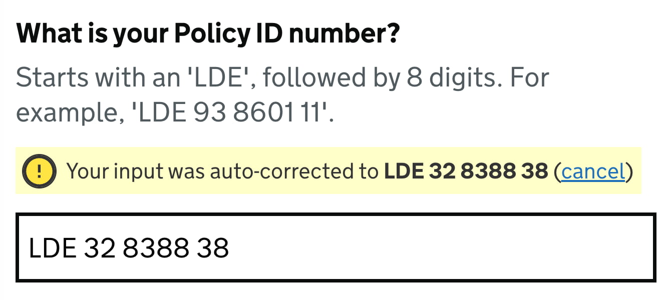
Neither
do we want to allow for Latin characters in a policy number that may
contain only digits. In these cases, we need to communicate to users
immediately that their input can’t be right — no matter how many more characters they would type in the input field.
We
need to display errors if we know that users will appreciate the
interruption. For severe mistakes, we need to flag issues right away. A Gov.uk-inspired design.
This applies, for example, to ill-formatted VAT-numbers, which always start with a 2-digit-prefix, such as DE or LT.
But it also helps with any standardized input such as IBAN number,
credit card number, prefixed policy insurance number or lengthy
digits-only gift-coupon-codes.
We also want to avoid wrong
assumptions or wasted time between pages that potentially don’t even
apply to users. The more severe an error is, the more likely it is that
users might want to see it sooner, rather than later. However, when we do display errors, we need to ensure users will appreciate the interruption.
Especially for complex forms, with plenty of columns, view switchers and filters, premature error messages
are often perceived as an annoyance, and a very distracting one. As
users are typing, any kind of distraction in such environments is highly
unwanted and counter-productive. In fact, distraction often leads to
even more errors, but also reduced accuracy of data and increased
completion times.
Late validation almost always performs better.
It’s just that by validating late, we can be more confident that the
user isn’t still in the process of typing the data in the input field.
The main exception would be any kind of input, for which users can
benefit from real-time feedback, such as password strength meter,
or a choice of an available username, or the character count limit.
There we need to respond to user’s input immediately, as not doing so
would only slow down users desperately trying to find they way around
system’s requirements.
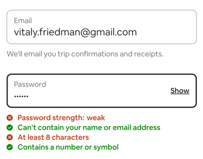
For password strength indicators (like AirBnB’s), we probably don’t want to validate late. But that might be one of the very few exceptions.
In
practical terms, that means that for every input in a form, we need to
review just what kind of feedback is needed, and design the interaction
accordingly. It’s unlikely that one single rule for all inputs will work
well: to be effective, we need a more granular approach, with a few validation modes that could be applied separately for each individual input.
Not all errors are equally severe, of course. Surely sometimes input is just ill-formatted or erroneous, but how do we deal with empty form fields
or indeterminate radio buttons that are required? Users might have left
them empty accidentally or intentionally, and there isn’t really a sure
way for us to predict it. Should we throw an error immediately once the user has left the field empty? The answer isn’t obvious at all.
What
should happen when a user leaves an empty field? Instead of displaying
an error message, we could validate these input fields on submit only to
avoid premature errors. (Source: American Eagle)
The user might have indeed overlooked the input field, but that’s not the only option. They might as well just have jumped in a wrong field by mistake, and left it right away. Or they had to jump back
to the previous field to correct an error triggered by the validator.
Or they skipped the input field because they just wanted to get
something else out of the way. Or maybe they just had to clear up their
input and then move to another browser’s tab to copy-paste a string of
text.
In practice, getting the UX around empty fields right is surprisingly difficult.
Yet again, we can’t predict the context in which a user happens to find
themselves. And as it turns out, they don’t always have a perfectly
linear experience from start to finish — it’s often chaotic and almost
unpredictable, with plenty of jumps and spontaneous corrections,
especially in complex multi-column forms. And as designers, we shouldn’t assume a particular order for filling out the form, nor should we expect and rely on a particular tabbing behavior.
In
my experience, whenever we try to flag the issues with empty fields,
too often we will be pointing out mistakes prematurely. A calmer option
is to validate empty fields only on submit, as it’s a clear indicator that a user indeed has overlooked a required input as they wish to proceed to the next step.
The earliest time to show an error message is when a user leaves a non-empty input field.
Alternatively, depending on the input at hand, we might want to define a
minimum threshold of characters, after which we start validating.
Another issue that shows up eventually is what should happen if a user chooses to change an input field that’s already been validated? Do we validate immediately as they edit the input, or do we wait until they leave the input field?
As Mihael Konjević wrote in his article on the Reward Early, Punish Late pattern, if a user edits an erroneous field,
we should be validating immediately, removing the error message and
confirming that the mistake has been fixed as soon as possible (reward early).
However, if the input was valid already and it is being edited, it’s
probably better to wait until the user moves to the next input field and
flag the errors then (punish late).
Reward users early if they fixed a mistake, and punish them later, once they’ve left the input field. A solution by Mihael Konjević.Reward users early if they fixed a mistake, and punish them later, once they’ve left the input field. A solution by Mihael Konjević.
In technical terms, we need to track the state and contents of each input field,
and have thresholds for when we start validating, and then have rules
for changing input fields that have been validated already, or that
contain errors.
As it turns out, the implementation isn’t trivial, and making it work in a complex form will require quite a bit of validation logic.
Beware that this logic might also be difficult to maintain if some
fields have dependencies or show up only in certain conditions.
5. Prioritize Copy-Paste UX Over Inline Validation #
For pretty much any form, copy-paste is almost unavoidable.
To many users, this seems like a much more accurate way of typing data
as they are less likely to make mistakes or typos. While this is less
typical for simple forms such as eCommerce checkout or sign up forms, it
is a common strategy for complex enterprise forms, especially when
users complete repetitive tasks.
However, copy-paste is often inaccurate,
too. People tend to copy-paste too few or too many characters,
sometimes with delimeteres, and sometimes with “too many” empty spaces
or line breaks. Sadly, this often doesn’t work as expected as the input
gets truncated, causes a flash of error messages or breaks the form
altogether. Not to mention friendly websites that sometimes conveniently
attach a string of text (URL or something similar) to the copied
string, making copy-pasting more difficult.
Mistakes are too common with copy-paste. Perhaps we could allow users to clean up their input, either automatically or manually.
In
all of these situations, inline validation will flag errors, and
rightfully so. Of course, in an ideal world, pasting would automatically
remove all unnecessary characters. However, as text strings sometimes
get appended to copied text automatically, even it wouldn’t really help.
So if it’s not possible, an interesting alternative would is to add the
“clean-up” feature that would cleanse the input and
remove all unnecessary characters from it. Surely we’d also need to
confirm with the user if the input is still right.
Copy-pasted
input could be automatically corrected, with an option to cancel
auto-correct. This requires auto-correct to be smart and reliable. And
this isn’t easy to accomplish.
If instead, after copy-pasting, some parts of the input are automatically removed,
or auto-formatted in a wrong way, it can become quite a hassle to
correct the input. If we can auto-correct reliably, it’s a good idea to
do so; but often getting it right can be quite difficult. Rather than
correcting their own mistakes, users now have to correct system’s mistakes,
and this rarely results in improved user satisfaction. In such
situations, users sometimes would remove the entire input altogether,
then take a deep breath and start re-typing from scratch.
Typically, wrong auto-correct happens because the validator expects a very specific format of input. But should it actually? As long as the input is unambiguous, shouldn’t we accept pretty much any kind of input, in a form that users would prefer, rather than the one that the system expects?
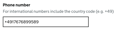
Telephone input with auto-masking. This is difficult to copy-paste, and will cause errors with some users. (Image credit: Jack O’Connor)
A good example of that is a phone number input.
In most implementations, one would often integrate fancy drop-downs and
country selectors, along with auto-masking and auto-formatting in the
phone number input field. Sometimes they work beautifully, but sometimes
they fail miserably — mostly because they collide with the copy-paste,
literally breaking the input. Not to mention that carefully selecting a
country’s international code from a drop-down is much slower than just
typing the number directly.
As long as the input is unambiguous, we should allow and support any input, with or without +, 00
or any delimeters. Auto formatting is fine, but it should work well
with copy-paste. This is copy-paste-friendly UX. (Image credit: GOV.UK Design System)
What’s wrong with the auto-formatting,
by the way? Just like inline validation is never reliable, so is
auto-formatting. The phone number, for example, could start with +49, or 0049 or just the country code 49. It might contain an extension code, and it might be a mobile phone number or a landline number. The question is, how can we auto-format reliably and correctly
most of the time? This requires a sophisticated validator, which isn’t
easy to build. In practical terms, for a given implementation, we need
to test just how often auto-formatting fails and how exactly it fails,
and refine the design (and implementation) accordingly.
One more thing that’s worth mentioning: disabling copy-paste is never a good idea.
When we disable copy-paste for the purpose of security (e.g. email
confirmation), or to prevent mistakes, people often get lost in the copy-paste-loop,
wasting time trying to copy-paste multiple times, or in chunks, until
they eventually give up. This doesn’t leave them with a thrilling sense
of accomplishment, of course. And it does have an impact on the user
satisfaction KPI.
In general, we should always allow users to type in data in their preferred way, rather than imposing a particular way that fits us well. The validation rules should support and greenlight any input as long as it’s unambiguous and not invalid (e.g. containing letters for phone input doesn’t make sense). The data cleaning, then, can be done either with late validation or on the server-side in a post-processing step.
Because
inline validation is never bulletproof, there will be situations when
users will be locked-out, without any option to proceed. That’s not very
different from disabled buttons, which often cause nearly 100% abandonment rates. To avoid it, we always need to provide users with a way out in situations when inline validation fails. That means adding an option to override validation if the user is confident that they are right.
To
support overrides, we can simply add a note next to the input that
seems to be erroneous, prompting users to review their input and proceed despite the inline validation error, should they want to do so.
What happens if the validator doesn't know the address? We can allow users to override validator in some cases.
We surely will end up with some wrong input in our database, but it might be quite manageable and easy to correct — and also worth it, if we manage to boost conversion as a result of that. Eventually, it’s all about making a case around the value of that design decision.
To get there, we need to measure the impact of overrides
for a few weeks. We need to understand just how much more revenue is
coming through with the override and just how much inaccurate input and
expenses or costs we produce because of it. The decision, then, should
be based on these metrics and data, captured by design KPIs. This will give you a comparison to see how costly inline validation actually is and make a case about having one, getting a buy-in to adjust it, or making a case for abandoning it.
It might feel perfectly obvious that inline validation is a perfect tool to validate complex input.
If a user types in a 16-digits-gift-code, or a lengthy insurance policy
number, providing them with confidence about their input is definitely a
good idea.
But typing complex data takes time and effort. For
lengthy input, users often copy-paste or type chunks of data in multiple
steps, often with inline validation flashing left and right as they
enter and leave input fields. And because the input isn’t simple, they
often review their input before proceeding to ensure that they haven’t made any mistakes. This might be one of the cases where inline validation is too much of a distraction at the time when users are heavily focused on a task at hand.
Not very exciting, but might be just right. We allow users to validate when they are confident that their input is complete. European Commission.
So
what do we do? Well, again, we could allow users to validate their
input only when they are confident that it is complete. That’s the case
with the just-in-time validation: we provide users with a “Validate” button that kicks off the validation on request, while the other fields are validated live, immediately.
However, whenever many pieces of content are compounded in a large group
and have restrictive rules — like the credit card details, for example —
it’s better to live validate them all immediately. This can help users
avoid unnecessary input and change the type of input if needed.
8. For Short Forms, Consider Validation on Submit Only #
Once we validate just-in-time, we can of course go even further and validate only on submit. The benefit of it is obvious: users are never distracted or annoyed by validation, and have full control over when their input is validated.
However, the pattern doesn’t seem to work well
for lengthy pages with dozens and dozens of input fields. There, users
often end up typing a lot of unnecessary data before they realize that
their initial input isn’t really applicable. But perhaps we could avoid
the issue altogether.
Many shorter pages tend to perform better than one long page. We can frame them as a part of the journey with a task list pattern. (Image credit: GOV.UK Design System)
As it turns out, shorter pages usually perform better than one long page.
In fact, for sophisticated forms, a better way to deal with complex
journeys is to simplify them. We product a sort of a dashboard of tasks
that a user has to complete in our complex journey, and dedicate single
pages for single tasks. In details, it works like this:
For every page, we validate (mostly) on submit, as users are moving from one page to the next;
We provide users with a task list pattern and support navigation between them, with the option to save input and continue later.
Not
only does the approach make form much simpler to manage; because each
part of the journey is quite simple and predictable, users are also less likely to make mistakes,
but if they do make these mistakes, they can recover from them quickly —
without jumping all over the entire form. Definitely an approach worth
testing once you end up with a slightly more complex user journey.
We’ve
gone all the way from the issues around inline validation towards the
option to abandon it altogether. However, it’s worth stating that inline validation can be very helpful as well. It seems to be most effective when mistakes are common and quite severe.
For example, inline validation is very useful with a password strength meter.
When we describe and live-update password rules as users type, it helps
users choose a password that matches all requirements, is secure and
won’t trigger any error messages.
Users also appreciate immediate help
with any kind of complex input. And, with inline validation, users woul
never fill out entire sections in the form just to realize that these
sections do not apply to them.
All of these advantages make inline
validation a thrilling and thriving UX technique — especially in
situations when most form fields are likely to be completed by browser’s autofill. However, if the inline validation is too eager, users quickly get utterly frustrated by it when errors start creeping out.
Inline validation is useful, but when it fails, its costs can be quite high. With just-in-time validation, reward-early-punish-late-pattern and validating on submit, we avoid unnecessary distractions, complex logic and layout shifts altogether, and communicate errors without annoying users too early or too late.
The downside is, of course, the error recovery speed,
which certainly will be slower, yet in the end, the number of errors
might be lower as well because we’ve simplified the form massively. It’s
just much more difficult to make mistakes if you have just 3–4 input
fields in front of you. And that might be just enough to reduce the
frequency of errors and increase completion rates.


