⭐ If you would like to buy me a coffee, well thank you very much that is mega kind! : https://www.buymeacoffee.com/honeyvig Hire a web Developer and Designer to upgrade and boost your online presence with cutting edge Technologies

Monday, July 27, 2026

The Top 25% Isn't a Ranking. It's a Definition.


The idea that anyone can be in the Top 25% is not some crazy AI-inspired new math.

Just ask any hiring manager what someone’s needs to do to be considered in their Top 25%, and you won't get a percentile. Nobody answers, "outperforms three-quarters of their peers."

Here’s one response.

A top 25% performer consistently delivers results that exceed expectations, not just meets them. They don't need constant direction. They solve problems before they become crises. They make everyone around them more effective, and if I lost them, replacing them would be difficult.

It turns out the Top 25% is a floor, not a ceiling. And when viewed that way, it's a floor most people can reach in the right job, with the right manager, and in the right situation.

Todd Rose, who wrote the End of Average, agrees. In his book he tells a story about how the Air Force had a problem in the late 1940’s: its planes kept crashing because the seats were designed to fit the "average pilot" based on measurements of thousands of airmen. But after measuring 4,063 pilots on ten body dimensions not one single pilot was average on all ten. The fix wasn't better pilots – it was adjustable seats.

Rose’s conclusion for hiring: there is no average person. People are jagged – exceptional on some dimensions, ordinary on others – and their performance is not a fixed property they carry from job to job. It is created, or destroyed, by context: the actual work, the manager, the team, the pace, the stretch.

So while what follows is a reasonable definition of the Top 25%, finding people who fit this “adjustable seat” requires a different way of thinking. “Moneyball for HR!” is the solution.

Ability in relationship to fit drives motivation to excel. Defining the fit factors is the key for better hiring decisions.

One Reasonable Definition of the Top 25%

  1. Delivers exceptional results. Regularly exceeds the performance objectives of the role. Produces higher quality work with fewer mistakes. Can be trusted with the toughest assignments.
  2. Learns faster and adapts quickly. Masters new tools, products, and processes quickly. Adapts when priorities change. Doesn't need to be told twice.
  3. Takes ownership. Acts like the business is theirs. Solves problems instead of escalating every issue. Makes decisions with good judgment.
  4. Makes the team stronger. Helps others succeed. Shares knowledge. Raises the performance of the entire group.
  5. Improves the business. Finds better ways to do things. Eliminates waste. Creates measurable improvements in productivity, quality, customer satisfaction, or profitability.
  6. Can handle bigger challenges. Performs well beyond today's job description. Is promotiable.

Define the Job and Situation Before Defining the Person

Finding people who meet this standard of excellence starts by defining the actual job, the actual situation, the actual resources, the actual team, the true corporate culture, the actual company politics, the intensity of the situation and the hiring manager’s leadership style.

And the process must be bi-directional. All of this must be revealed pre-hire if you want to achieve Top 25% performance post-hire. Given this, you need to source, screen, recruit, hire and manage people who fit this true description of the job. This used to be really hard, pre-AI. Now it’s not.

In fact, we’ve built “The Perfect Hiring System to Hire the Top 25%” and we’re giving it away as a Claude skill.

It all starts with this simple question when opening a new job requisition, “What does the person in this job need to do to be considered a Top 25% person?”

The Perfect Hiring System changes the entire hiring ecosystem at less cost with better results.
In turns out top 25% performers aren't defined by what they know. They're defined by what they accomplish and how they accomplish it.

Back to School Trends: What Sold in 2025

 Back-to-school 2025: school uniforms up 231% MoM and backpacks up 180%, per Shopify data. See top categories by region and what's trending down.
A backpack in a circle on a blue panel on a light blue background.Starting each July, families across the US flood stores—online and offline—to gear up for a new school year. This year, Shopify sales data shows which back-to-school categories are most popular. Explore which trending items saw the biggest jumps, which categories lagged behind, and what the differences across regions might reveal about changing school culture.
Back-to-school sales trends: All US
Product category MoM sales* School uniforms +231% School backpacks +180% Lunch boxes & totes +174% Bulletin boards +81% Stickers & sticker machines +80% Calculators +56% Folders +34% Pencils +27% Water bottles +24% Planners +19% Hand sanitizers & wipes +19% Notebooks & notepads +17% Art & craft paper +15% Laptops +11% Sticky notes +11% Binders +11% Pens +8% Sports uniforms +7% Book covers -1% Markers & highlighters -8%

*Shopify sales data comparing July 2025 to June 2025.

The back-to-school categories that saw the greatest spend in July were backpacks, sports uniforms, water bottles, lunch boxes and totes, pens, and notebooks. Categories with the most growth compared to the previous month were school uniforms (231%), backpacks (180%), and lunch boxes and totes (174%).

School uniforms, while a smaller category in total sales, posted the most dramatic month-over-month growth at +230.6%. This aligns with broader market trends: National Center for Education Statistics data shows that 18.8% of public schools required uniforms in 2019–2020, with requirements more common at the elementary level (21%) than in high schools (12%). Recent projections anticipate the school uniform market to reach a 6.1% compound annual growth rate by 2031, signaling stable, long-term interest.

Especially in uniformed environments, backpacks and lunch boxes play a key role beyond function in student identity—often serving as one of the few forms of self-expression. Water bottles, similarly, have become key accessories where students can showcase personal style—a small but important outlet for identity.

While water bottles, notebooks, and pens were among the most popular spending categories, month-over-month increases were more moderate—24%, 17%, and 8%, respectively—signaling the popularity of these purchases beyond the back-to-school season.

The only back-to-school items that saw month-over-month sales decline were markers and highlighters (8%), and book covers (1%). This decline could indicate that they aren’t requirements on school supply lists, or it could reflect increasing reliance on digital tools, like e-readers and styluses, particularly in higher grade levels.

Build your dream online store today

Join the ranks of the world’s best online stores with Shopify’s powerful tools and features. With the highest-converting checkout, Shopify stores sell more products, lower your costs, and save you time.
Learn more
Back-to-school sales trends by region
Midwest

The top-selling back-to-school item in the Midwest was sports uniforms, followed by water bottles, backpacks, pens, lunch boxes and totes, and notebooks. Stickers and sticker machines saw a more significant month-over-month sales increase compared to other regions, increasing by 174%. Calculator sales declined compared to the previous month, with an 11% drop—the only region to see a MoM decline.
Northeast

The top-selling back-to-school item in the Northeast was sports uniforms, followed by school backpacks, water bottles, pens, and lunch boxes and totes. Sports uniforms saw the strongest MoM growth in the Northeast (25%), while bulletin boards had the smallest MoM growth compared to other regions—24% compared to 104% in the Midwest, 86% in the South, and 49% in the West Coast.
South

The top-selling back-to-school item in the South was backpacks, followed by lunch boxes and totes, water bottles, sports uniforms, pens, and notebooks. The South recorded the strongest MoM growth in water bottle sales (35%), as well as calculator sales (124%), compared to other regions.
West Coast

The top-selling back-to-school item in the West Coast was water bottles, followed by sports uniforms, backpacks, pens, lunch boxes and totes, and notebooks. Even though it accounted for the second-greatest overall sales, sports uniforms sales declined MoM by 14%, perhaps indicating that purchasing starts even earlier compared to other regions.

Designing With Uncertainty: How AI Supercharges Probabilistic Thinking


In a world where AI is informing more design choices, it’s easy to mistake predictions for certainties. This article introduces Probabilistic Design, a mindset that allows UX and product teams to accept uncertainty, decipher AI outputs with nuance, and make smart, adaptive decisions.

In 2024, an Air Canada customer asked a chatbot about bereavement fares. The bot confidently gave him a refund policy that didn’t exist. The airline refused to honor it. A tribunal ruled in the customer’s favor. The bot hadn’t decided anything; it had predicted an answer based on patterns in its training data. The company treated that prediction as policy.

This is the risk at the heart of designing with AI today: probabilistic systems wrapped in deterministic interfaces. The AI offers a guess, the interface presents it as truth, and the user, or the organization, acts on it.

Humans are wired for deterministic thinking. We prefer to believe that past actions determine future outcomes. Flip a coin 999 times and get heads every time, the deterministic mind assumes the coin is rigged. The probabilistic mind accepts that the 1000th flip could still go either way. That second mindset is harder to hold onto, but it is exactly what designers need right now.

Products operate in complex, nonlinear environments, and AI is accelerating that complexity. When designers and product teams treat AI outputs as the answer rather than one of many possible answers, they build fragile experiences, and in some cases, like medical diagnostics or financial forecasting, genuinely dangerous ones.

This article is a practical guide to designing probabilistically with AI as a partner. It is about using AI to sharpen your thinking rather than outsource it, accounting for model bias, human sentiment, and perceived risk along the way.

Probabilistic Thinking + AI

Most questions we ask AI do not produce binary answers. They produce probabilities based on patterns in data. If you ask, “Do aliens exist?” the answer will be somewhere between plausible and uncertain. Scientists consider life elsewhere in the universe likely, but without any concrete evidence, we cannot confirm it. The answer doesn’t resolve the question; it frames it as a probability.

Designers should read AI outputs the same way. They are signals, not conclusions, possible outcomes that have to be interpreted within the context of product goals, user behavior, and business constraints.

Many digital products already work this way. Netflix doesn’t know you’ll enjoy Superstore because you watched The Office; it estimates the probability and surfaces the title accordingly. The interface is responding to a prediction.

Design decisions can follow the same logic. AI models can combine behavioral analytics with research insights to estimate the likelihood of certain outcomes, and those probabilities can act as a yardstick for design strategy. Consider a scenario where analytics suggest a 60% versus 90% confidence that users will complete a purchase. At 60%, the design has to do more persuasive work, testimonials, explanations, comparisons, and reassurance signals may help the user move toward a decision. At 90%, the user is already motivated, and the design should start removing friction so the action can happen quickly. Same screen, very different design problem.

Comparison of two hair product ads showing the same model, with the simplified design on the right labeled 90% confidence and the text-heavy design on the left labeled 60% confidence.
Note: This is an oversimplification of the idea. Please be mindful of the intricate details of your product.

AI can also simulate outcomes using historical data and behavioral models before you commit to a direction. The value of those simulations depends heavily on how prompts are structured, the context they define, the hypothesis being tested, user motivation, and the edge cases you want stressed.

I can think of one such practical use: evaluating early designs through structured prompts, especially when you don’t have direct access to the user group you’re designing for. The prompt below is a starting point for evaluating a design from the perspective of neurodivergent users as well. Treat it as a template, adapt the user group, criteria, and output format to your product, and use it as a conversation starter with your team rather than a verdict.

Evaluate the [design file or weblink] for usability, accessibility, and content relevance from the perspective of neurodivergent users such as those with autism spectrum disorder, ADHD, learning disabilities, etc.
Please consider the following criteria:
  1. Is the layout and navigation intuitive for neurodivergent users?
  2. Is the language and content appropriate and engaging for neurodivergent users?
  3. Are there any barriers (technical, cognitive, or sensory) that this group might face when using the site?
  4. How well does the site meet the specific needs or goals of neurodivergent users?

Provide a SWOT analysis, probability score for successful use by neurodivergent users, and any recommendations for improvement.

Note: This is an oversimplification of the idea. Please be mindful of the intricate details of your product and make any appropriate changes.

That said, simulations do not replace experimentation. Because models are trained on historical data, they reflect past behavior more strongly than they predict future change. Imagine designing a voice interface for elderly users who struggle with touchscreens. A model trained on mobile interaction data might predict low engagement, not because the idea lacks value, but because the dataset reflects different user behavior. Simulations should always surface assumptions, not prevent innovation.

Be Cautious of Skewed Probabilistic Thinking Using AI

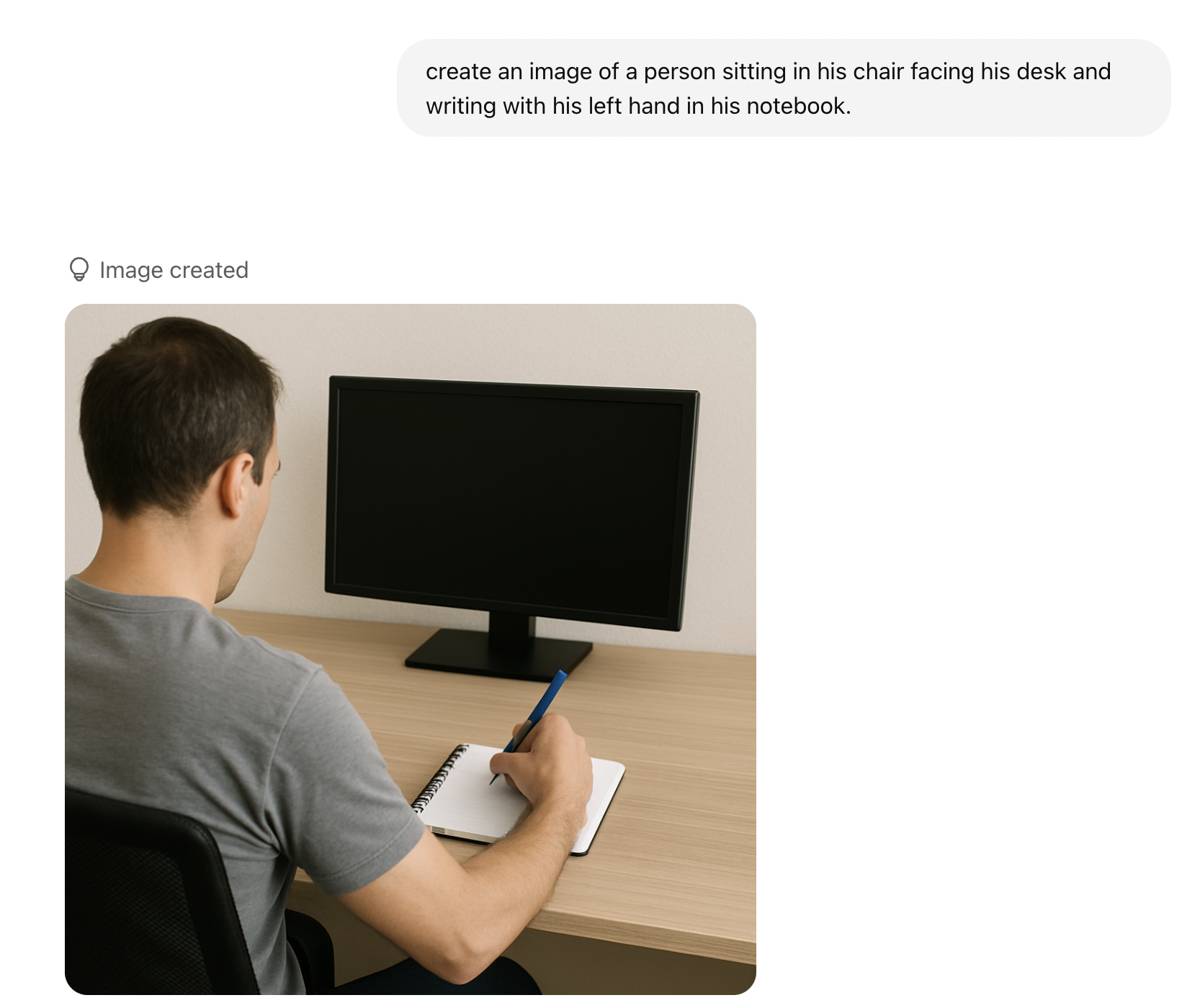
AI systems are built on historical data, more specifically, on the datasets they are trained on. That foundation shapes the outputs we receive. During the AI Summit in France, India’s Prime Minister Narendra Modi shared an example that illustrates this well. If you ask an AI model to generate an image of a person writing with the left hand, the output may still show a person writing with their right hand. The reason is statistical: most people are right-handed, and the training data reflects that. This may have improved over time, but the point remains relevant. I still occasionally see this behavior when generating images with similar models.

What you receive is not truth. It is the most statistically likely outcome given the data available. Always ask whether past data meaningfully predicts future behavior. If additional context can improve the prediction, include it. Without context, the output is just one of many possible answers dressed up as the only one.

Promt, which reads: create an image of a person sitting in his chair facing his desk and writing with his left hand in his notebook, and the image created for it.
(Large preview)

Confidence scores deserve the same scrutiny. Overtrusting a high-confidence output leads to the Air Canada situation. Dismissing a low-confidence one can cause teams to miss a real signal buried in noisy data. A prediction with 90% confidence is not necessarily correct, and a 40% signal is not necessarily useless. Designers must still weigh the possibilities, consider the case in front of them, and bring judgment to what the AI recommends.

Transparency is how you make that possible. As AI systems increasingly shape decisions, people need visibility into how outputs are generated, the sources, the reasoning, and the summaries behind a recommendation. Black-box systems breed distrust. Systems that reveal their reasoning let users evaluate outputs for themselves. That transparency is good design and ethical practice. It respects the trust people place in these tools.

Thinking in probabilities often means resisting the temptation of quick answers. AI can accelerate research and surface patterns faster than ever before, but those outputs are starting points, not final decisions.

Practice Probabilistic Design with AI

Design shapes how a product is ultimately experienced — the decisions designers make determine whether the experience feels adequate, intuitive, or exceptional. And design is inherently full of assumptions and bets. Even the most rigorous research can yield multiple valid solutions to the same problem, each carrying a different probability of success.

Thinking probabilistically means recognizing that design decisions rarely produce binary outcomes. They lead to a range of possible results, and the role of the designer is to navigate those possibilities and identify the path most likely to create value. This mindset also builds adaptability: user needs evolve, strategies change, and sometimes ideas fail. Teams that lean on data signals, experimentation, and learning loops move faster toward the most effective solution.

Before the practical principles, one fundamental idea:

Design decisions should be optimized for likelihood, not certainty.

Design for Likelihood, Not Certainty

Every design decision is a bet, not a guarantee. Even when decisions are informed by research and data, they are still based on smaller samples and assumptions about how users will behave at scale. A well-researched idea can still fail in the real world.

The Air Canada chatbot from the introduction is a design lesson as much as a legal one. The bot was doing what language models do, predicting plausible text. The interface, however, communicated that prediction with complete confidence, no caveats, no “here’s what our policy usually says,” no obvious path to a human. The user read confidence as commitment, and legally, so did the tribunal.

This is what happens when probabilistic systems are wrapped in deterministic interfaces. The interface transforms likelihood into certainty, and that is where the risk emerges.

Designing for likelihood means letting the interface continue to have uncertainty, visible fallbacks to human support, and clear labeling when content is AI-produced, preventing unforeseen issues.

Designers should avoid binary thinking — a great idea does not mean guaranteed success, and a familiar idea is not guaranteed to fail. Examine variations, confidence levels, and edge cases instead. AI can certainly help here, acting as a portfolio-thinking engine that surfaces different interpretations, highlights risks, and generates structured recommendations. The goal is not to optimize for certainty, but for value: it should always be value-driven.

Think of the moment in Avengers: Infinity War when Doctor Strange tells Tony Stark that out of millions of possible futures, there is only one where they win. AI cannot tell you the future, but it can help you explore the possible paths. Instead of asking whether an idea will succeed, ask AI to estimate the likelihood and get a score, and use those signals to guide decisions.

Use Data as a Compass, Not a Map

Even an actual probability is not a final answer. Imagine an AI model predicts an 80% likelihood that users prefer a minimal checkout experience. That does not mean the solution is simply “build a minimal checkout.” Data should function as a compass, not a map.

  • Why did the model produce that prediction?
  • What data influenced it?
  • What assumptions is it leaning on?
  • What user behavior is it actually detecting?

These questions help designers validate predictions through usability testing and additional research. AI excels at identifying patterns, but it rarely explains why those patterns exist. Understanding motivation is still a human-centered research task.

The clearest cautionary tale here is Amazon’s experimental AI recruitment tool, which the company reportedly scrapped after discovering that the model had learned to downgrade resumes from women. The training data, roughly a decade of historical hiring decisions, was skewed toward male candidates, and the model inherited that skew. It began penalizing resumes that included the word “women’s,” as in “women’s chess club captain,” and favoring language more commonly found on men’s resumes. The system was not intentionally biased — the data was. Amazon reportedly tried to adjust it and eventually shut the project down because they could not guarantee it would not surface other discriminatory patterns.

Examples like this are why interpreting AI output critically matters. Designers need to understand the data behind a prediction and evaluate the reliability of the models they depend on. A recommendation is only as good as the data it was trained on, and the only way to know what that data is hiding is to ask.

Experiment as a Learning System

Experimentation is usually framed as a way to validate a design decision. Want to lift the click-through rate of a CTA? Run an A/B test. Probabilistic thinking reframes this. Experiments should not only confirm solutions but also reduce uncertainty.

  • Traditional approach: Testing features to confirm success.
  • Probabilistic approach: Testing assumptions to reduce uncertainty.

Traditional A/B testing is expensive. It costs engineering time, traffic allocation, and user exposure, especially when a losing variant runs against a significant chunk of your audience. AI simulations can help filter weaker ideas before they reach production by making experimentation more efficient. User needs shift constantly, and the most effective teams iterate fast.

AI can help evaluate assumptions early by modeling potential outcomes based on historical and behavioral data. These simulations act as a hypothesis filter, pointing to the directions worth investing engineering effort in. This also supports personalization — different users may respond better to different experiences. Version A may resonate with high-intent users while version B works better for exploratory ones. Multiple experiences living side by side are not a flaw; they can be an intentional strategy.

AI amplifies probabilistic thinking by surfacing scenarios, assigning likelihood scores, and enabling personalization at scale. Experimentation becomes a continuous feedback loop:

Predict → Test → Learn → Adjust → Repeat!

A few steps to make it work:

  • Shift the framing

    • So instead of saying: Will this feature succeed?
    • Ask: What assumptions are we testing?
    • Use this template to define the hypothesis:

      We believe [behavioral assumption] will impact [metric] because [reason]. We’ll know we are right when [evidence].

      Example: We believe simplifying the onboarding flow from 5 steps to 3 will increase completion rate because users experience decision fatigue when too many choices are presented. We’ll know we’re right when we see at least a 15% increase in step-to-step conversion with no drop in activation rate.

  • AI simulations

    • Use AI to predict some of the assumptions.
    • Later, use the learning to identify the top candidates to test the hypothesis.
  • Embrace multi-versions

    • It is absolutely fine to have two live versions.
  • Fail fast

    • Reward learning vs success.
    • Normalize smaller experimentations instead of a sweep of large changes. So instead of taking on a risky bet, pick up a few probabilities and test them.
  • Visualize probability

    • Create a probability table with probabilities of each variant and its prediction of success to keep track of all the changes.

One of the hardest things for designers is making uncertainty understandable and actionable. When uncertainty is hidden, users treat AI outputs as facts. When it’s communicated clearly, trust increases.

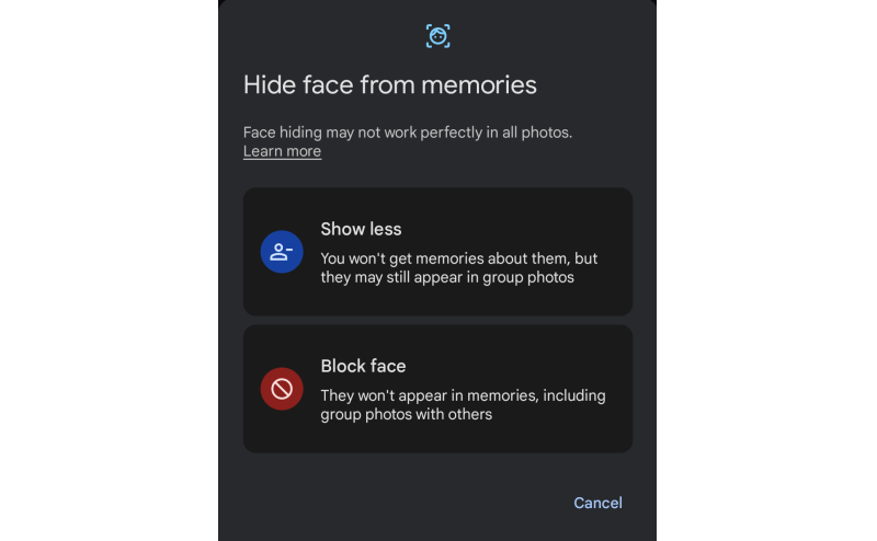
Ranges, estimates, and confidence indicators go a long way. A delivery window of “Friday to Monday” tells the truth about variability without misleading anyone, whereas a specific timestamp that slips erodes trust every time. A face recognition feature that says “this looks like Pratik, is that right?” sets more honest expectations than one that just labels the photo with a name.

(Large preview)

Communicating uncertainty does not weaken trust — it strengthens it. The goal is not to eliminate uncertainty but to design for it intelligently.

Different users respond to uncertainty differently, and your design should account for that:

User typeRiskDesign goal
Overtrusting usersThey act too quickly and trust AI results easily./Show uncertainty more prominently.
Distrustful usersThey ignore AI entirely.Show historical accuracy or confidence levels.
Skeptical/balanced usersUses AI as a guide, not as a rule.Reinforce AI assistance and let them decide the sort of framing.

Keep Humans In the Loop

AI should augment human judgment, and certainly not replace it. The most trustworthy systems are designed with clear moments where people can review, challenge, correct, or override machine suggestions. Human-in-the-loop (HITL) is not a safety net — it is a refinement engine. Every override, correction, or rejection becomes high-quality feedback that improves the model over time.

Control is a prerequisite for adoption. Users are more willing to rely on AI when they understand how a suggestion was generated, can evaluate its implications, and can easily intervene. Well-designed products make this explicit: who is acting, what happens if the suggestion is wrong, and where the user can step in.

These interactions are also critical for system improvement. Every accept, reject, or edit is a strong signal, and compared to passive analytics, this kind of feedback produces far more meaningful training data. It closes the loop between real-world usage and model performance.

What Does HITL Look Like in Practice?

GitHub Copilot is a good everyday example. It offers inline code suggestions that developers can accept with a tab, edit, or ignore entirely. The system never commits code on the user’s behalf. Authorship stays with the humans. Every data point becomes implicit feedback about which suggestions were useful. Gmail’s Smart Compose works similarly, presenting predicted text as optional, keeping tone and intent in the user’s hands.

In higher-stakes contexts, HITL becomes more explicit. Risk and fraud systems typically use probability scores to route decisions: low-risk: proceed automatically; medium-risk: trigger additional verification; and high-risk: escalate to a human reviewer. This balances speed with judgment without removing oversight.

In safety-critical domains like healthcare, human oversight is non-negotiable. AI may flag anomalies or suggest a diagnosis, but the clinician retains final authority. Tools that explain the details help the practitioner understand why a recommendation was made, reinforcing confidence without removing accountability.

Designing for Human Judgment

From a UX perspective, HITL is about matching the interaction pattern to the level of risk. Simple accept/reject affordances work well for low-risk suggestions that improve speed without real consequences. As the stakes climb, impacting data, money, or people, preview and approval steps become essential. Explanations help users calibrate trust rather than blindly accept outputs.

What happens behind the scenes matters just as much. The system should capture user decisions with context, feed them into learning workflows, and log overrides for auditability. Over time, teams can track signals like override rate, confidence accuracy, time-to-approval, and perceived trust. A high override rate is not a user failure. It is a signal that the design or the model needs attention.

The Risk of Getting It Wrong

Poorly implemented HITL systems can fail in subtle ways. Human review can devolve into a rubber stamp. Workflows can slow down so much that users route around the safeguards. Feedback can skew toward a narrow subset of users. These risks are real, but they are design problems, not reasons to remove HITL.

The goal is not to maximize human involvement. It is to focus it where uncertainty, impact, or ethics demand it. Keeping HITL is less about control and more about clarity: clarity about who decides, when uncertainty matters, and how responsibility is shared between people and machines.

Optimize for Resilience, Not Just Conversion

Good design adapts as the landscape shifts. Product design, especially in AI-powered systems, can no longer afford to optimize only for short-term conversion metrics. User intent is fluid as well as ever-changing, environments change rapidly, and probabilistic systems continuously evolve too. What works today can quietly break tomorrow. Designing for resilience means building products that stay reliable, trustworthy, and useful even as assumptions, data, and user behaviors change.

Resilient design shifts the question from:

How do we maximize this metric right now?! → How does this system behave over time, under stress, and in uncertainty?

A resilient system is one that:

  • Adapts as new data and behaviors emerge.
  • Fails safely rather than catastrophically.
  • Remains transparent and explainable.
  • Avoids brittle, over-optimized interaction patterns.
  • Anticipates second-order and unintended effects.

Do not just consider last quarter’s numbers. Peek into the following quarters to identify the shift and make changes accordingly.

Build Systems That Adapt as Probabilities Change

Likelihoods shift constantly, AI models drift, contexts evolve, and user needs mature as well, so designing as if conditions are stable creates fragility in probabilistic environments. A resilient approach assumes volatility as the default.

Think about how recommendation systems tend to evolve. The early version of a content feed optimizes for engagement, and for a while, engagement goes up. Then users start to notice the feed feels narrow, repetitive, maybe even exhausting. Resilient systems rebalance, introducing novelty, diversifying signals, and pulling in long-term satisfaction measures alongside short-term clicks.

Designers should create interfaces that expect change, dynamic re-ranking, contextual explanations, and escape hatches from stale personalization loops, all of which help systems stay useful as probabilities shift.

Optimize for Long-term Outcomes, Not Just Short-term Wins

Short-term conversion gains often hide long-term costs. Speeding up onboarding can reduce comprehension. Maximizing notification CTR can erode trust. Optimizing engagement alone can produce unhealthy usage patterns. Fragile systems maximize numbers while ignoring second-order effects, the downstream consequences that show up weeks or months later.

Duolingo’s hearts system is a good example of designing against this. It introduces friction: if you make too many mistakes, you run out of hearts and have to wait or practice older material to earn more. On paper, that looks like a conversion killer: fewer lessons per session. In practice, the team has publicly discussed how it supports long-term motivation and retention, which is the metric that actually matters for a learning app. Short-term engagement dips, but long-term outcomes improve.

Meta has made a similar, if more reluctant, shift. The company publicly acknowledged that optimizing purely for “time spent” produced unintended emotional and societal effects, which led to a stated pivot toward “meaningful social interactions” as a guiding metric. Whether that shift fully landed is up for debate, but the acknowledgment itself is the point: optimizing for the wrong thing at scale has real downstream cost.

So, designers must routinely ask:

  • What behaviors are we unintentionally reinforcing?
  • Will this interaction still be healthy if repeated at scale?
  • Are we optimizing for the ecosystem’s wellbeing or just the next click?

Plan For Uncertainty the Way You Plan For Scale

Teams routinely plan for traffic spikes, but rarely for uncertainty spikes. Yet AI systems degrade, adversarial behaviors evolve, and external shocks can reshape user behavior overnight. Resilient design assumes variability and prepares for it.

This means designing for degrading confidence. What does your interface do when the AI isn’t sure? Does it quietly fail, or does it gracefully hand off? Does the experience still make sense if AI assistance goes away entirely? A good fallback strategy is as important as the happy path.

Some practical actions:

  • Design for degrading confidence.
    Show fallback states, allow manual overrides, and visualize uncertainty where it matters.
  • Measure long-term user health.
    Track satisfaction, retention quality, and unintended behavior, not just conversion.
  • Build adaptability in.
    Use adjustable ranking rules, dynamic states, and continual experimentation across segments.
  • Model second-order effects early.
    Every optimization casts a shadow; surface it before shipping.
  • Use a resilience checklist before launch.
    How does the system behave under low AI confidence? What’s the safe fallback? What drifts do we anticipate?

Conclusion

If you take one thing from this article into your next design review, make it this:

Stop asking “Will this work?” and start asking “How likely is this to work, and what happens when it doesn’t?”

That single reframe changes how you write hypotheses, interpret AI output, scope experiments, and design for the moments when the system is wrong. Starting this week, name the assumption behind every AI recommendation you accept, find one place in your product where a probabilistic output is presented as a certainty, fix the framing, and design the fallback before the happy path.

The shift from deterministic to probabilistic design is less about new tools and more about a new posture. AI has not introduced uncertainty into our world. It has simply made the uncertainty that was always there impossible to ignore. AI can estimate, simulate, and recommend, but it cannot decide what matters, which users are being overlooked, or which unconventional idea is worth defending against a model trained on yesterday’s data. Those remain human responsibilities. Think in ranges, not points. Test assumptions, not features. Build for adaptation, not perfection. In a world where prediction is cheap, and judgment is rare, the most valuable thing a designer can do is keep asking, What else might be true?


The 8 Most Brutal Business Quotes Ever Said And The Stories Behind Them


Anyone can find a motivational quote.

What you cannot find easily is the story behind it. The moment it was said. What was happening. Why it actually meant something.

This edition is different. Every quote below comes with the context that makes it hit harder than any poster on a wall ever could.

"I knew that if I failed I would not regret that, but I knew the one thing I might regret is not trying."

JEFF BEZOS, 1994

Jeff Bezos said this in 1994. He was 30 years old, earning a six figure salary at a Wall Street hedge fund, and had just told his boss he wanted to quit to sell books on the internet.

His boss asked him to take 48 hours before deciding. Bezos went for a long walk. He came back and quit anyway. He drove cross country to Seattle with his wife, writing the Amazon business plan on the way.

At the time, only 16 million people had ever used the internet. Nobody was buying anything online. Every single person who heard his plan told him it would not work.

He has since said the regret minimisation framework, asking yourself what you would regret more at 80, not trying or trying and failing, is the single most useful thinking tool he has ever used.

The rest, as they say, is a $2 trillion company.

QUOTES YOU HAVE NEVER SEEN ON A POSTER

"Everybody has a plan until they get punched in the mouth."

MIKE TYSON

This was not about boxing. Tyson said this before a fight when a reporter asked how he felt about his opponent having a detailed game plan. It became the most quoted business line nobody expected to come from a boxer. Every founder who has ever had a beautiful pitch deck destroyed in the first investor meeting knows exactly what this feels like. The plan is not the strategy. The ability to adapt after the punch is.

"The most dangerous poison is the feeling of achievement. The antidote is to every evening think what can be done better tomorrow."

INGVAR KAMPRAD, FOUNDER OF IKEA

Kamprad built IKEA from a small mail order business in rural Sweden into the largest furniture retailer on earth. He was also famously frugal to the point of obsession, flying economy class until his 70s and driving a decades old Volvo. The quote above is why. He genuinely believed that the moment you feel satisfied is the moment you start declining. He ran IKEA with that paranoia until the day he died at 91.

"Your most unhappy customers are your greatest source of learning."

BILL GATES

Gates said this at a time when Microsoft was being publicly destroyed in the press for buggy software and poor customer service. Instead of defending the product, he built entire internal systems around studying complaints. The feedback loops he created became one of Microsoft's core operating principles. Most founders hide from negative feedback. Gates built a company around chasing it.

"I never took a day off in my 20s. Not one."

BILL GATES

This one is uncomfortable because it contradicts every work life balance conversation happening right now. Gates has since said he does not recommend this. But he also built Microsoft in those years. The honest version of this quote is not a prescription. It is a description of what it actually took, at that specific moment in history, to build something from zero to dominant. Draw your own conclusions.

QUOTES THAT GOT LAUGHED AT, THEN PROVED EVERYONE WRONG


  1. "There is no reason anyone would want a computer in their home."

KEN OLSEN, FOUNDER OF DIGITAL EQUIPMENT CORPORATION · 1977

This was not mocked at the time. Everyone agreed with him. He was the most respected computer executive in America.

Three years later, Apple launched the Apple II. The rest of the industry followed. Olsen's company went from $6 billion to bankruptcy. The quote lives on as the most expensive wrong prediction in tech history.

2. "Nobody is going to pay to watch other people play video games."

EVERY MEDIA EXECUTIVE · 2008

Twitch's founders were laughed out of pitch meetings. The concept of live streaming gaming was considered absurd. One investor called it "the dumbest idea I have heard this year."

Amazon acquired Twitch in 2014 for $970 million. Live streaming gaming is now a $4.2 billion industry. The investors who passed have not commented publicly.

3. "There is no chance the iPhone is going to get any significant market share."

STEVE BALLMER, MICROSOFT CEO · 2007

He said this on live television. He laughed while saying it. He pointed out that at $499 the iPhone was too expensive to get traction. He was certain.

The iPhone generated $200 billion in revenue in 2023 alone. It is the single most profitable consumer product in history. Ballmer was Microsoft CEO for another six years after this interview.

The pattern across every quote above is the same one.

The people who said the thing everyone else thought sounded wrong were either completely right or completely wrong. There is no middle ground in bold thinking.

The people who nodded along and said nothing built nothing worth quoting.

Self Employed Insider covers the stories, decisions, and thinking behind the people building things worth remembering, every week, free.

Sunday, July 26, 2026

Matching AI Modality To User Intent: Designing The Right Interface


We’ve fallen into conversational tunnel vision, defaulting every AI capability into a chat-based interface simply because LLMs are trained on dialogue data. But great UX is about matching modality to users’ context, intent, and cognitive load, so the interface adapts to the user, not the other way around.

The design community has entered a period of conversational tunnel vision. Because Large Language Models (LLMs) are trained on dialogue, the industry has collectively decided that the chat bubble is the natural home for every AI capability. While the chat interface is a viable and powerful option for many tasks, it is one tool in an expansive toolkit. UX and Product teams must be intentional about the modalities we choose for how users provide their data and commands, and how the system presents its output.

Modality is the way a person uses their senses to interact with a system: seeing, hearing, touching, speaking, or typing.

To pick the best method, you need to think about what the user wants to do, where they are, and how much cognitive effort they are already expending. This guide offers a clear way to figure out the best approach for any product, using two tools to assist in the process: a Task Audit and an Input/Output Alignment Matrix.

Picture a traveler jogging through a loud airport terminal after a sudden gate change. They are dragging their roller bag and carrying a coffee in the other hand. They need to open their airline app to ask the AI assistant where to go. The tool immediately fails the input modality test. It forces the traveler to stop walking, balance their coffee, and type a long booking reference number into a tiny chat box. When they finally hit send, the system fails the output modality test. Instead of flashing a large, high-contrast gate number, the AI returns a dense paragraph explaining the atmospheric weather patterns causing the delay. The actual gate number sits buried at the very bottom.

While they might make the flight just fine, the user won’t forget the moment of anxiety they felt while using the AI tool — an experience that could have served as a way to reinforce a commitment to UX has instead validated the common conception that companies don’t care about or understand customers using their products. In this scenario, the airline built a smart tool, but the interface failed the user. The input required physical dexterity, which the traveler lacked at the time of need. The output demanded a level of reading focus they could not spare. This article will cover how we can avoid this scenario in our AI-powered tools. In order to be successful, we must evaluate the physical and cognitive load of our users to match both the input and output modality to their immediate intent.

Let’s first discuss the limitations of a chat-based interface.

Myth of the Do-It-All Chatbot

The allure of the chatbot is easy to understand from a product development standpoint. It is a blank slate. It suggests that the system can handle anything the user provides. However, a text-heavy interface often causes a high adaptation load. This load increases cognitive demands on users. Over time, this cognitive burden turns into a psychological tax a person pays when changing natural thought processes to accommodate a machine.

When an interface relies solely on conversation, it imposes a dual burden: a linguistic challenge for input and a cognitive challenge for output. We’ll examine both separately below.

Input: Why a Text Box is a Linguistic Barrier

A blank chat box creates a major problem for users who need to discover what a tool can actually do. In a standard graphical interface, menus and buttons provide clear visual cues that signal every available option. A chat box often leads to choice paralysis because users are forced to guess what the AI is capable of. They have to remember the exact phrasing or technical terms required to get the result they want.

Consider a data analyst who wants to find a specific trend in a spreadsheet. In a traditional tool, they might click a filter or sort button. In a chat interface, they must suddenly become a writer and describe that complex logic in a complete sentence. Another example: a manager trying to reorganize a team schedule. Dragging and dropping blocks on a calendar is intuitive. Describing those same scheduling shifts in a text prompt adds a layer of work that makes the task feel more difficult than it should be.

Designing for input means recognizing that composing a prompt is a creative act. It requires a person to translate a vague thought into a specific command. For many professionals, this creates a linguistic barrier. A designer might know exactly how they want an image to look but struggle to describe the lighting or texture in a text prompt. In that case, a slider or a color picker is a much better input method than a text box.

Having addressed the linguistic barrier of constructing input prompts, we must now consider the other half of the conversational burden. This is the cognitive cost the AI imposes when it responds in dense blocks of text.

Output: The Cognitive Cost of Reading Long Text

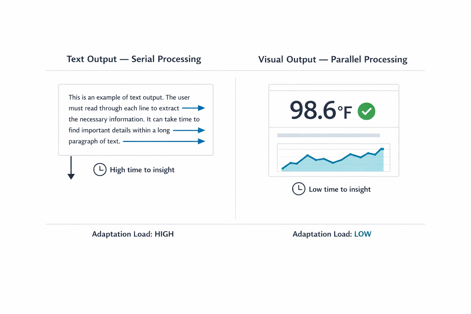
When an AI responds in long blocks of text, it transfers the interpretive work to you, the user. Text is a serial medium: your brain has to read one word after the next to extract meaning. That takes time. Sequential reading is necessary in many scenarios. Complex legal analysis or reviewing nuanced medical histories requires reading full paragraphs. Teams create friction when they default to text for data that visual formats communicate faster. Visual methods allow parallel processing. You can view a chart and spot a pattern in under a second.

Imagine asking an AI for a project status update. Instead of a color-coded dashboard, you receive three paragraphs listing every task completed that week. Now you must read the entire response and mentally summarize it to find the one piece of information you needed. The quick visual check has been replaced by a reading assignment.

The cognitive tax of this work compounds with professional stakes. A doctor asking for a patient’s vital signs needs a clear numerical display, not a narrative describing the readings. A stock trader looking for a price spike needs a line graph immediately, not a written description of price movement over the past hour. In both cases, a text response forces the professional through a slow, error-prone extraction process when speed and accuracy are most important.

The linear text loop (left) forces exhausting sequential verification, causing anxiety. The graphical selection grid (right) permits instant, low-effort visual confirmation (glance verification).
Figure 1: Redesigning for psychological fatigue. The linear text loop (left) forces exhausting sequential verification, causing anxiety. The graphical selection grid (right) permits instant, low-effort visual confirmation (glance verification). 

A Taxonomy of Input and Output Modalities

Before selecting a modality, practitioners need a shared vocabulary for what the options actually are. The table below maps common input and output modalities to the contexts where each performs best. This is not a ranking. Each modality has a role; the question is always which role it is playing in a given workflow.

Designing for modality inherently requires a strong focus on accessibility. While visual dashboards provide rapid insight for many people, designers need to provide screen-reader-optimized audio alternatives for users with visual disabilities. Modality choices should multiply pathways to information.

Input Modalities

ModalityBest ForExample ContextsCognitive & Physical Rationale
Button / TapSingle-step, binary actionsLaunching a feature; confirming an alertEliminates recall overhead by utilizing recognition; maximizes execution speed during time-sensitive tasks.
VoiceHands-busy or eyes-busy contextsField technician query; driving navigationOffloads physical interaction to speech, though bounded by ambient noise and social privacy norms.
Natural Language ChatAmbiguous or exploratory queriesResearching options; asking follow-up questionsOffers users freedom in what they can say; however, the user must figure out how to phrase their request clearly.
Form / WizardStructured, multi-field data entryFilling out a contract; configuring a reportKeeps users from missing information by breaking down a complicated task into clear, step-by-step visual sections.
GUI (Filters, Sliders, Drag-and-drop)Complex parameter setting or spatial tasksScheduling; data filtering; image editingPrevents mistakes and ensures users don't miss information by dividing complicated tasks into clear, step-by-step visual parts.
Multi-modal (Image + Text)Visual input paired with descriptionUploading a design mockup with annotationReduces the effort of explaining things because users can reference an object instead of having to describe it only with words.
GestureHands-free spatial interactionWaving a hand to acknowledge an alert in a sterile operating roomAllows physical interaction without touching a surface. This keeps users safe and clean in contaminated environments and allows for quick input or acknowledgement.

Output Modalities

ModalityBest ForExample ContextsCognitive & Physical Rationale
Push Notification / AlertTime-sensitive, ambient awarenessPrice spike alert; task completion noticeProvides a quick update that the user can process at a glance. It delivers information without demanding a full break in concentration from their primary task.
Audio SummaryHands-busy or eyes-busy contextsStatus updates while walking; conversational voice agents providing real-time navigationDelivers information directly to the user’s ear. Removes the need to look at a screen, keeping the user safe and aware of their physical surroundings while moving or working.
Short Text SummaryFocused queries needing brief answersDefinition lookup; single-metric statusGives a fast answer to a direct question. Users can read a short sentence quickly without experiencing the fatigue of scanning paragraphs of text.
Visual DashboardHigh-density, comparative analysisProject status; resource allocationEnables visual trend and outlier detection. Avoids the mental effort of reading data line-by-line and cross-referencing in real time.
Interactive CanvasGenerative or iterative creative tasksDesign iteration; layout adjustmentAllows users to manipulate the output instead of asking an AI to move it via text instructions. Reflects a natural way to interact with the output.
Inline ConfirmationGuided task flows needing feedbackStep-by-step configuration wizard with in-line validationProvides visual proof that the system recorded a choice correctly. Reduces users’ anxiety about wondering if an error occurred.

Table 1: Input and Output Modality Taxonomy. Use this as a reference during the Task Audit to identify candidate modalities before narrowing to a recommendation.

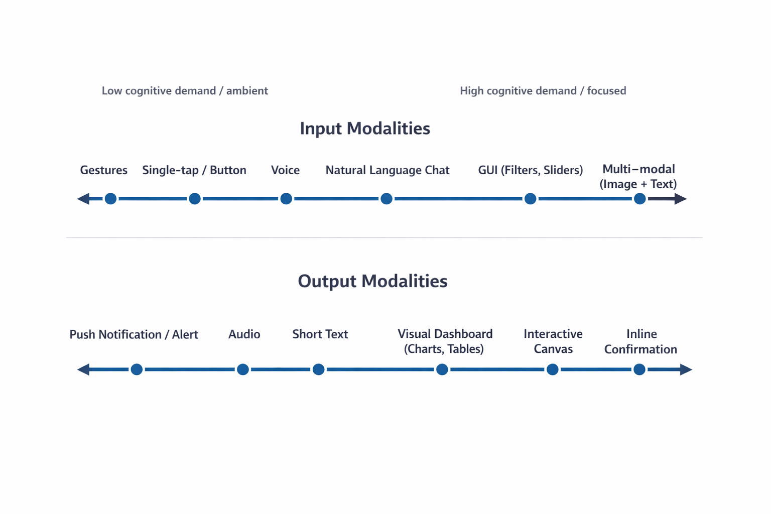
The following FigureFigure 2 illustrates the cognitive spectrum, mapping how mental effort scales across various interaction methods. This spectrum is a critical tool for designers to visualize the shift from low-effort, ambient interactions to high-effort, focused experiences. By understanding where a specific task sits on this spectrum, teams can identify whether a user needs a “glanceable” output that minimizes mental processing or a high-density format that supports deep, analytical thinking.

The Cognitive Spectrum of Modality
Figure 2: The Cognitive Spectrum of Modality. Both input (top) and output (bottom) move from low-effort, ambient interactions to high-effort, focused, and multi-modal experiences, illustrating why the context of use must dictate the design choice. 

With this taxonomy established, the next step is to apply a rigorous method to select the optimal input and output combination. Practitioners must ground this selection process in the user’s real-world environment and context.

Task Audit: A Framework for Modality Selection

To choose the right interaction method, practitioners should complete a Task Audit before interface design begins. A formal Task Audit is the framework that moves teams from assumptions about user behavior to evidence. This process gathers data about the physical, social, and cognitive context in which the work actually happens, which then drives all input and output modality decisions.

Use these four areas of focus to anchor the audit:

  • Input Constraints: This addresses whether the user can physically interact with the system using their hands, such as typing or tapping. It often dictates the necessity of hands-free interaction methods like voice input when the user’s hands are occupied by tools or gear.
    • Can the user use their hands to type or tap? A mechanic working under a vehicle might need to ask a question using only voice because their hands are occupied and covered in grease.
  • Output Constraints: This defines whether a user can safely and practically view information on a screen. It concerns situations where a user’s eyes must remain focused on their environment, making audio or glanceable visual cues the appropriate display method.
    • Can the user safely look at a screen to read information? A delivery driver’s navigation system should provide audio directions because reading a detailed map while driving through an intersection is dangerous.
  • Social Constraints: This considers the environment’s tolerance for audible interaction, either speaking or listening to audio output. It helps determine if a quiet space requires silent alerts or if a loud environment demands a non-audio output method.
    • Is the environment appropriate for speaking aloud or listening to audio? An office worker in a quiet, open-plan space would prefer a silent text notification over a spoken voice response.
  • Cognitive Load: This measures the amount of mental effort the user must already dedicate to their primary task. Teams must design the interface output to either minimize mental processing, such as with a quick visual indicator, or support deep thinking with a detailed summary.
    • How much mental effort does the task already require? A surgeon needs a quick visual red indicator during a procedure, while a lawyer researching case strategy needs a detailed text summary to absorb at their own pace.

The audit answers two questions for every feature:

  1. What modality can the user physically use to provide input here?
  2. What modality can the user realistically process as output here?

Here is how to gather the evidence to inform your task audit. Use one or more of these common UX research-related methods:

1. Contextual Inquiry and Observation

This is the most direct way to capture how people work in their natural setting, and it provides the richest data for identifying physical constraints on both input and output. Observation is necessary because users often perform hidden work: small steps or workarounds they forget to mention in an interview, or environmental details they do not think to describe because they have adapted to them.


The Approach: Go to the user’s actual workspace, whether a field site, warehouse, or office floor. Ask them to perform the task you are studying and observe closely.

What to Look For: This method is most revealing for Input Constraints and Output Constraints.

  • Input example
    A technician diagnosing equipment who cannot put down their tools rules out typing and points directly to voice input.
  • Output example
    A supervisor in a meeting who looks up and down repeatedly from a screen signals a need for glanceable, low-density output rather than a scrolling text summary.

2. Focused Interviews

Interviews surface the mental models and decision points that observation cannot capture. They are most valuable for understanding Cognitive Load.

The Approach: Conduct one-on-one sessions with end-users and the stakeholders who manage the outcome. Use a structured protocol focused on a specific task. Ask for stories about past successes and failures rather than general opinions.

What to Look For:

  • The “Why” Behind High Cognitive Load
    Ask users to describe the hardest part of a task. A lawyer may explain that the volume of detail is not the challenge; synthesis for ethical or strategic judgment is. This confirms a need for detailed text output the user can read and absorb at their own pace, not a summary dashboard.
  • Process Ambiguity
    Uncover situations that are unclear or error-prone, which identifies where AI capabilities provide the most leverage and what output format will reduce rather than increase ambiguity.

3. Collaborative Workshops

Workshops are essential for defining task boundaries and establishing required fidelity levels. Product managers and stakeholders bring foundational knowledge of system requirements; researchers apply audit criteria.

The Approach: Use workshops to build a shared Task Inventory. Bring designers, engineers, product managers, and business analysts together to map every step of the process. Product managers and business analysts ensure factual accuracy; the research team applies audit criteria to each step.

What to Look For:

  • Social Constraints
    Confirm where tasks are performed. A workflow that takes place on a loud manufacturing floor versus a shared quiet library demands very different output modalities.
  • Ambiguity and Speed Tests
    For every task in the inventory, apply two tests. First: Does this step require human ethical judgment? If yes, the AI output must support that judgment, not replace it. Second: Does this step require instantaneous execution? If yes, the interface must support fast input with minimal cognitive overhead.

Once you gather field evidence through these research channels, map your findings directly against the Modality Taxonomy. Each concrete physical or social constraint you document systematically eliminates mismatched interfaces. This process strips away design guesswork, narrowing your architectural choices down to the specific input and output combinations that survive the reality of the user’s environment.

When you ground input and output modality decisions in field evidence rather than interface convention, the resulting design reduces adaptation load for the user and grounds your modality choices in evidence. When you base decisions on field data, you move past interface convention and build a powerful case for the resources needed to create the right experience for your users.

Once the audit is complete, the final step is utilizing the Input/Output Alignment Matrix to formalize the connection between user intent and the optimal modality combination.

Input/Output Alignment Matrix

With Task Audit findings in hand, you can use an Input/Output Alignment Matrix to map user intent to specific modality combinations. This matrix is organized by what the user is trying to accomplish in a given moment. This distinction versus focusing on what your AI is capable of doing matters. If intent changes across a single workday for the same user, the interface should respond to those shifts.

Choosing the wrong modality for the user’s context can lead to user frustration. Users might feel mentally drained if a lot of information is delivered through a format that is hard to process, like getting a massive status update only in text. They may also start worrying if an action was actually completed correctly when a precise command is buried within a long chat exchange. Finally, the system can force users into finding clumsy workarounds, making them adapt to the machine’s method instead of working in their natural, most effective way.

User IntentOptimal Input ModalityOptimal Output ModalityEnvironmental Fit
Quick Status CheckVoice or Single-tap ButtonAudio or Push NotificationHands-busy, Eyes-busy (e.g., Technician on ladder)
Specific Detail QueryNatural Language ChatShort Text SummaryFocused, low-density data need
Complex AnalysisGUI (Filters, Sliders)Visual Dashboard (Charts, Tables)Desk-based, high-resolution screen
Creative GenerationMulti-modal (Image + Text)Interactive CanvasDesign or drafting environment
Monitoring / AlertPassive (background system)Push Notification or Audio AlertAny environment; task is ambient awareness
Guided Task CompletionStructured Form or Step-by-step WizardInline Confirmation + Progress IndicatorFocused workflow; user needs verification feedback

Table 2: Input/Output Alignment Matrix. Map user intent to modality combinations using Task Audit evidence. The two added rows (Monitoring/Alert and Guided Task Completion) cover common enterprise and mobile scenarios not captured in simpler frameworks.

When teams coordinate these factors, they can move past the automatic default of adding a chatbot. Visual layouts enable rapid scanning. Structured inputs remove the burden of constructing perfect sentences. Audio outputs serve users whose hands and eyes are otherwise occupied.

The right modality combination respects the user’s physical and cognitive state at the moment of interaction.

A real-world scenario where environmental constraints dictated a shift in design strategy best demonstrates the practical application of this matrix and the broader audit framework.

Case Study: Adaptive Modality for Field Technicians

The Problem: Cognitive Overload in High-Risk Environments

Field technicians servicing high-voltage electrical grids often face a dangerous misalignment of interface modality. Traditionally, these technicians had to rely on ruggedized tablets to access technical manuals and log status updates. However, the physical constraints of the job — wearing heavy protective gloves and working in bucket trucks at significant heights — made interacting with a standard touch interface nearly impossible while on a job site. Additionally, attempting to read complex, text-heavy diagnostic reports on a screen while maintaining situational awareness created a high cognitive load that increased the risk of safety errors.

Research Methods: Capturing the Reality of the Field

To address this, researchers conducted a Task Audit utilizing three specific methods from this article. First, Contextual Inquiry and Observation revealed that technicians often worked in “hands-busy, eyes-busy” states where any manual input was a significant barrier. Researchers observed technicians wearing mandatory thick protective gloves while in the bucket truck, which made precise screen taps nearly impossible and often triggered the wrong commands.

High-altitude environments also introduced severe screen glare from direct sunlight, washing out the display and making text difficult to read even at full brightness. Furthermore, technicians faced the physical safety risk of trying to manipulate and secure a heavy, ruggedized tablet while balanced in awkward positions, creating a distraction that could lead to dangerous slips or equipment contact. These factors, combined with the need to constantly monitor live wires and the surrounding environment, meant technicians could not safely dedicate their eyes or hands to a standard tablet interface, confirming the severity of the eyes-busy and hands-busy constraints.

Second, Focused Interviews with veteran technicians validated the findings from the field. They confirmed that the operational challenges, including the thick gloves, screen glare, and safety risks, were not unique to one location but were commonly experienced across multiple sites, including high-altitude transmission lines and sprawling power substations. This broad confirmation solidified the need for a non-touch, voice-first solution. The interviews also surfaced a critical cognitive constraint: the need for glance verification of vital signs, such as voltage readings and temperature trends, rather than being forced to read a long narrative description of system health. Technicians stressed that their primary need was immediate, unambiguous verification (is this safe? or where is the fault?), not a lengthy diagnostic report, indicating that a text-heavy response was dangerous to their workflow.

These methods confirmed that the environment required a departure from the traditional chat or form-based AI capability interface.

The Resolution: A Multi-Modal Handoff Solution

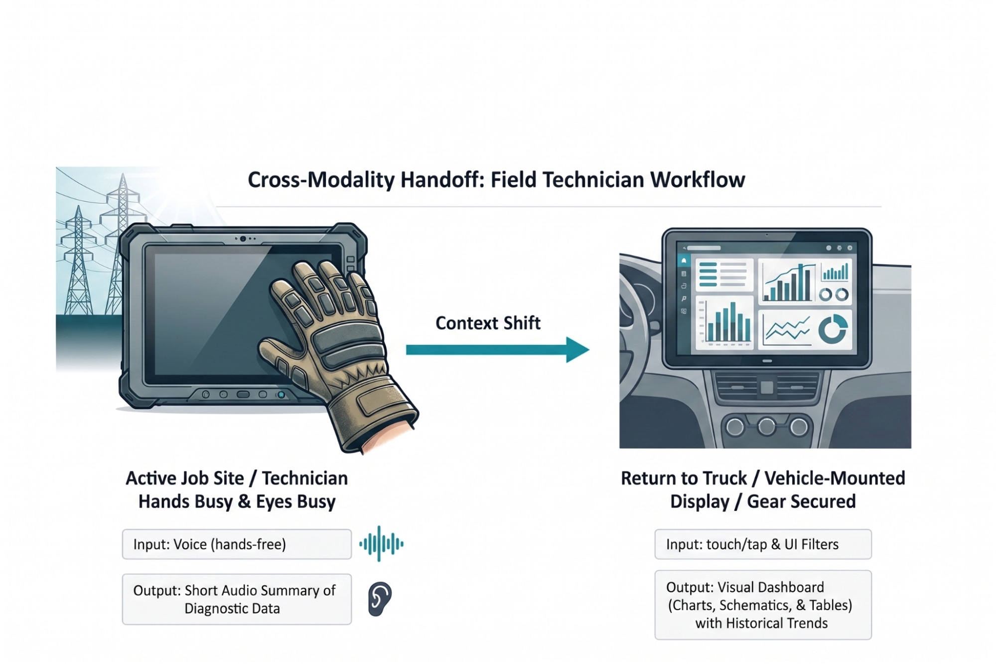
The resulting solution implemented an adaptive modality handoff designed to mitigate the physical and cognitive barriers researchers identified during the research. While active on a job site, technicians utilize voice input to query the system. This method allows them to remain productive while wearing thick protective gloves that would otherwise prevent precise interaction with a touchscreen.

The AI responds with a short audio summary of immediate diagnostic data. This audio feedback bypasses the challenge of screen glare in high-altitude environments and allows the technician to maintain situational awareness of the high-voltage grid without the safety risk of looking away from dangerous equipment. By providing immediate answers to fault locations through audio, the system meets the technician’s need for glance verification through a hands-free and eyes-free channel.

Once technicians return to a truck and secure safety gear, a system automatically hands off workflows to a 15-inch visual dashboard mounted inside a vehicle. A rugged 10-inch field tablet lacks adequate screen real estate for complex schematics. A larger vehicle display allows for parallel processing of historical trend data and wide electrical grid maps. This case study reflects an actual field audit conducted for a national utility provider. Implementing this adaptive approach reduced diagnostic time by twenty percent and increased daily tool adoption among field crews.

Diagram showing a field technician workflow that shifts from voice-based, hands-free interaction on a job site to a visual dashboard on a vehicle-mounted display for reviewing diagnostic data and trends.
Figure 3: Cross-modality handoff diagram for field technicians. Our solution to deliver AI capability using multiple modalities depending on context was the result of auditing user tasks and led to greater adoption of the tool.

Designing for the Environment

An AI capability is only as usable as the interface that delivers it. Researchers and designers must resist the pull toward the path of least resistance. Building a chatbot is fast and familiar, something we’ve been doing for decades now. Building an interface that feels like a natural extension of how someone already works is harder, and it is the work that matters.

Start by leaving the screen. The Task Audit requires presence in the places where work actually happens: the field site, the warehouse floor, the operating room. The physical and social realities of those spaces are not edge cases. They are the design brief.

The future of AI interface design is a diverse ecosystem: visual, vocal, haptic, and ambient, calibrated to user intent and environmental context. The chat window is one tool in that ecosystem. It is the right tool for specific jobs, and often the wrong tool for the jobs we reflexively assign to it.

In order for us to create the greatest likelihood of acceptance and use of the AI capability we offer users, we must fit the modality to the person and the place.

Where to Start

To get started immediately, run a lightweight version of the Task Audit before your next design sprint. Spend two hours observing the workflow in its actual environment. Conduct three to five interviews with the people who perform the task. Bring a PM or analyst into a 90-minute workshop to build a task inventory and apply the four audit questions. You will not have complete data, but you will have enough to make a defensible modality recommendation backed by evidence rather than convention.

I created a Modality Task Audit Template to help guide teams with moving forward. You can download this worksheet and take it directly to your next field observation. It allows design and product teams to document specific physical barriers before writing a single line of code.

Inside this Template:

  • Step 1: Physical Reality Check.
    An observation checklist to log hand availability, eye focus requirements, and ambient noise levels in a specific workspace.
  • Step 2: Cognitive Baseline.
    A scoring grid to rate required reading density and verification anxiety for a given workflow.
  • Step 3: The Handoff Map.
    A blank flow diagram to chart where a user starts a task (for example, using voice on a mobile phone in a warehouse) and where they finish it (for example, reviewing a visual dashboard on an office monitor).

We focus heavily on training smarter AI models. We owe equal attention to human interfaces. A brilliant underlying model packaged in a lazy text interface fails. When you observe actual work environments and align interaction modalities to them, you remove adaptation friction.

Modality Task Audit Field Template

Use this worksheet during field observations. It allows design teams to document specific physical barriers before writing code.

Part 1: Physical Reality Check

Observe users as they perform a primary task in actual workspaces. Check all applicable conditions.

State of Hands

Visual Focus Requirements

Ambient Noise Level

Part 2: Cognitive Baseline

Rate the mental effort required to complete a specific workflow.

MetricLowMediumHigh
Required Reading DensitySingle numbers, binary statesShort summaries, simple instructionsLegal contracts, complex diagnostic reports
Verification AnxietyReversible actions, low stakesStandard business operationsIrreversible actions, safety risks, financial transactions

Part 3: Handoff Map #

Chart user journeys across different environments. Document required input and output at each stage.

Stage 1: Initial Action

  • Location: ________________________
  • Input Method: ________________________
  • Output Method: ________________________

Stage 2: Context Transition

  • Trigger for environment change (example: user returns to a desk): ________________________

Stage 3: Completion Action

  • Location: ________________________
  • Input Method: ________________________
  • Output Method: ________________________

Saturday, July 25, 2026

Weaponizing And Defending The React Flight Protocol: Deserialization Sinks In RSCs


While React Server Components rely on the custom Flight protocol to stream interactive UIs, this same mechanism introduces powerful deserialization sinks that attackers can exploit. Durgesh Pawar breaks down the mechanics behind the CVSS 10.0 “React2Shell” vulnerability to show how protocol manipulation can lead to remote code execution. It also covers a practical, ranked set of defenses, from strict schema validation to CSRF hardening, for securing React applications against these structural risks.

React Server Components don’t send HTML to your browser. They don’t send JSON either. When a server component renders, what actually travels over the wire is a custom streaming protocol called Flight. It’s a line-delimited format with its own type system, its own reference resolution, and its own rules for reconstructing executable behavior on the client.

Most React developers have never opened the Network tab and actually looked at a Flight payload. It looks like a mix of JSON fragments, dollar-sign-prefixed references, and module pointers that the React runtime silently reassembles into a live component tree. The framework handles it, so nobody questions it.

I’m not sure most teams have thought carefully about what that trust actually implies.

I started pulling apart the Flight protocol after CVE-2025-55182 dropped in December 2025. The security community called it React2Shell, and for good reason. It was a CVSS 10.0, unauthenticated remote code execution vulnerability sitting in the Flight deserialization layer. One crafted HTTP request to a Server Function endpoint, and an attacker had shell access. No credentials needed.

The federal Cybersecurity & Infrastructure Agency (CISA) added it to the Known Exploited Vulnerabilities catalog. Sysdig tied in-the-wild exploitation to North Korean state-sponsored actors deploying file-less implants through the Ethereum blockchain. That’s the kind of CVE that gets your attention.

After spending time in the source (mostly getOutlinedModel and getChunk, which is where the resolution logic that matters actually lives), I realized React2Shell wasn’t a one-off parsing bug. It was a symptom. Flight reconstructs executable references, lazy-loaded components, server RPC endpoints, and async state from a stream of text. That’s a deserialization system.

The attack surface extends well beyond a single missing hasOwnProperty check. This article covers how Flight works on the wire, where the deserialization sinks are, what attackers have already weaponized, and what’s still exposed.

This leads to a ranked, practical set of defenses for your own Server Components: schema validation on every Server Action, the server-only package, cross-site request forgery (CSRF) hardening beyond framework defaults, and an assessment of what the Taint API and Web Application Firewalls (WAFs) provide.

Flight On The Wire #

Open your browser’s Network tab on any Next.js App Router page and look for requests returning Content-Type: text/x-component. That’s Flight. It’s not a single JSON blob. It’s a streaming, line-delimited format where each line is a self-contained “row” that the client-side React runtime processes as it arrives over the connection.

Here’s what a simple Flight payload looks like in practice:

1:I["./src/components/ClientComponent.js",["chunks/main.js"],"default"]
2:J["$","article",null,{"children":"$1"}]
0:D{"name":"RootLayout","env":"Server"}

Row 1 is an import directive. It tells the client to load ClientComponent.js from the bundler’s chunk map. Row 2 is a JSON tree that constructs an <article> HTML element, and the "$1" inside children is a reference back to chunk 1 (the imported component). Row 0 defines the server execution context, marking this as a RootLayout running in the Server environment. Even in this tiny example, you can see the mix of structural data, module references, and cross-chunk pointers that makes Flight different from plain JSON.

The Row Format #

Every row follows the same syntax: <ROW_ID>:<ROW_TAG><PAYLOAD>\n. The row ID is a numeric identifier that other rows can reference. The tag is a single character (or short string) that tells the parser what kind of data follows. The payload is the actual content.

Here are the row tags I found while reading through the source:

TagNameWhat it does
JJSON TreeSerialized virtual DOM nodes, component props, and HTML elements.
MModuleMetadata for a specific Client Component module or chunk.
IImportTells the client to load a module from the bundler’s chunk map.
HLHint/PreloadInstructs the browser to preload resources such as stylesheets or fonts.
DDataServer-rendered element context and environment info.
EErrorSerialized server-side exceptions and error boundaries.

So far, this might look like a benign structured data format with some custom tags, but the real complexity and attack surface live in the prefix system.

The $ Prefix System #

This is where I started paying closer attention.

When the client-side parser encounters a string value starting with $, it doesn’t treat it as literal text. It intercepts the string, checks the prefix, and routes it through a type-specific resolution path. The parseModelString function in ReactFlightClient.js is where this happens. It’s essentially a big switch statement on the character after $.

PrefixTypeWhat the parser does with it
$Model ReferenceResolves to another chunk in the stream (e.g., $2 points to row 2).
$:Property AccessTraverses into a resolved chunk’s properties (e.g., $1:user:name).
$SSymbolCreates a native JavaScript Symbol.
$FServer ReferenceRepresents a callable Server Action (an RPC endpoint on the server).
$LLazy ComponentDefers component loading until it’s needed in the render tree
$@Promise/Raw ChunkReturns the internal Chunk wrapper object itself (often acting as a Thenable/Promise), not its resolved value.
$BBlob/BinaryTriggers the blob deserialization handler for binary data.

Every other prefix resolves a chunk and gives you the parsed result. $@ hands you the raw internal Chunk object instead, the wrapper React uses to track resolution state, pending callbacks, and internal metadata (which is why it’s used for Promises and why exploits use it to get a mutable handle). Exposing framework plumbing through the protocol looks like a design mistake to me, though I’d be interested to hear the rationale if there is one.

And $: (property access) is the other critical prefix. It lets the protocol specify a path like $1:user:name, which tells the parser to resolve chunk 1, then access .user, then access .name on the result. That’s arbitrary property traversal driven by data in the stream. If you’ve spent any time auditing JavaScript for prototype pollution, that pattern should feel familiar.

This Is Not Just A Data Format #

Flight is not JSON with extra steps. JSON gives you data. Flight gives you behavior. It reconstructs module references that trigger client-side code loading, creates server action endpoints the client can invoke as RPC calls, sets up Promise chains that the React runtime will await, and builds lazy-loaded component boundaries that execute on demand.

Whether React developers think of it that way or not, the mechanics look very similar to deserialization systems that have historically caused problems. The stream doesn’t just describe what the UI looks like. It instructs the client runtime on what code to load, what functions to call, and what to trust.

If you want to read the implementation yourself, fair warning: the chunk resolution path is miserable to follow. State transitions bounce between helper functions, and the naming obscures what the code is actually doing. I gave up on static reading and just set breakpoints. The key files are react-client/src/ReactFlightClient.js for the client-side parser (look for parseModelString, getChunk, reviveModel, and getOutlinedModel) and react-server/src/ReactFlightServer.js for the serialization side. The reply handler for Server Actions lives in react-server/src/ReactFlightReplyServer.js.

Why Flight Is A Deserialization Sink #

The deserialization pattern is familiar: Java’s ObjectInputStream gave us ysoserial, Python’s pickle executes code on load(), PHP’s unserialize chains __wakeup and __destruct methods, and .NET’s BinaryFormatter was deprecated entirely.

The pattern: deserialize attacker-controlled input → invoke behavior during reconstruction → lose control of execution.

So JavaScript should be immune to this, right? JSON.parse() only produces plain data objects. No constructors fire. No magic methods run. You get back exactly what the JSON string describes, nothing more.

That’s true for raw JSON.parse(). But it stops being true the moment a framework wraps custom deserialization logic around it. And that’s exactly what Flight does.

Prototype Pollution #

JavaScript uses prototype-based inheritance. Every object has a __proto__ link to its prototype, and property lookups walk up this chain. If an attacker injects __proto__ or constructor.prototype as a key during reconstruction, they modify the shared base prototypes that all objects inherit from. Downstream code reads attacker-controlled values without knowing.

Flight’s $: prefix performs property traversal on deserialized objects. The getOutlinedModel function walks colon-separated paths like $1:user:name by iterating through each segment and accessing it on the parent object. If those path segments include __proto__ or constructor, the traversal walks straight up the prototype chain. That’s not a theoretical risk. It’s exactly how React2Shell worked.

Duck Typing and Thenables #

The V8 engine (and the JavaScript spec) treats any object with a .then property as a Thenable. When you await something, the runtime checks for .then and calls it if it exists. No class check. No internal slot verification. If .then is callable, it gets invoked.

Flight resolves chunks asynchronously. If an attacker constructs an object with a manipulated .then property and gets it into the chunk resolution pipeline, the runtime calls the attacker’s function during normal await behavior. The language semantics do the work.

I initially focused on $F because forging Server Action references seemed like the obvious attack surface. After tracing the resolution path, $: property traversal looked much more interesting. I also spent a few hours examining chunk status transitions (pending, blocked, resolved, errored) to see if you could force a chunk into an unexpected state, though that approach didn’t yield any results.

The Core Problem #

These two risks converge in Flight because the protocol doesn’t just deserialize data. It deserializes behavior. The $ prefix system dictates which execution path the parser takes: $F creates a callable server endpoint, $L sets up lazy code loading, $B triggers a blob handler, $@ exposes internal framework state. The parser’s control flow is driven entirely by what’s in the stream.

If an attacker can influence the stream’s content, they control which functions the parser calls, which objects it constructs, and which internal state it exposes.

The Mechanics Of React2Shell #

This is the CVE that proved the theory. CVE-2025-55182, nicknamed React2Shell, is a CVSS 10.0 unauthenticated remote code execution vulnerability in the Flight deserialization layer. One HTTP request, no login required, full shell access.

I want to walk through the entire gadget chain because understanding it reveals how much power the Flight protocol hands to an attacker who can control the stream.

The Root Cause #

The vulnerability sits in getOutlinedModel, a function responsible for resolving deep property paths from the $: reference system. The instance used in the exploit chain lives in the server-side reply handling code (ReactFlightReplyServer.js). When the parser encounters a reference like $1:user:name, it splits on the colons and walks the path segment by segment. Here’s the vulnerable loop:

for (key = 1; key < reference.length; key++)
    parentObject = parentObject[reference[key]];

Two lines. No hasOwnProperty check. No validation that the property exists on the object itself rather than somewhere up the prototype chain. Just parentObject[reference[key]] and move on.

So an attacker supplies $1:__proto__:constructor:constructor, and the loop traverses from a plain JSON object up through Object.prototype to the Object constructor to the Function constructor. Function in JavaScript behaves like eval(). Function("arbitrary code")() executes.

No allowlist on property names. No check for __proto__. I searched reviveModel and the chunk initialization path for any filtering. Nothing.

The Gadget Chain #

Getting from “I can reach the Function constructor” to “I have RCE” requires chaining several Flight protocol features together. The Resecurity write-up covers the full chain in detail; here’s the high-level sequence:

  • Step 1: Prototype walk to Function.
    The $: path __proto__:constructor:constructor walks from any plain object to Object.prototype, then to the Object constructor, then to Function — JavaScript’s built-in eval() equivalent.
  • Step 2: Raw chunk self-reference.
    $@0 returns the raw internal Chunk wrapper instead of its resolved value, giving the attacker a mutable handle on React’s internal state machine.
  • Step 3: Thenable hijack.
    The attacker sets the chunk’s .then to Chunk.prototype.then, so React’s resolution pipeline treats the manipulated chunk as a legitimate Promise-like object and awaits it.
  • Step 4: Context confusion.
    During the second deserialization pass, the payload overwrites _response._formData.get to point to the hijacked Function constructor and places the attacker’s shell command into _response._prefix.
  • Step 5: Trigger via blob handler.
    $B0 invokes the blob handler, which internally calls response._formData.get(response._prefix + blobId) — now equivalent to Function("attacker_shell_command")(). That’s arbitrary code execution with whatever privileges the Node.js process has.

Each step uses a legitimate Flight protocol feature in a way the designers didn’t anticipate. There’s no single “broken” feature. The vulnerability emerges from how these features compose when an attacker controls the input.

Impact #

The numbers on this one are stark:

  • CVSS 10.0. The maximum possible score.
  • Unauthenticated and pre-auth. No credentials needed — and the deserialization happens before any application-level auth checks run, so even endpoints behind login walls are exposed.
  • Single HTTP request. One POST to a Server Function endpoint.
  • Affected React 19.0.0, 19.1.0, 19.1.1, and 19.2.0, across react-server-dom-webpack, react-server-dom-parcel, and react-server-dom-turbopack.
  • CISA added it to the Known Exploited Vulnerabilities catalog within days.

What Happened In The Wild #

Exploitation was immediate. Sysdig published research linking EtherRAT deployments to North Korean state-sponsored actors who weaponized the vulnerability within hours of disclosure. EtherRAT is a file-less implant that uses the Ethereum blockchain for command-and-control communication — a technique researchers call “EtherHiding” — making takedown nearly impossible because you can’t seize a blockchain.

Separately, Palo Alto’s Unit 42 documented a backdoor called KSwapDoor that masquerades as [kswapd1] on infected Linux systems, blending into process lists alongside the legitimate kswapd0 kernel swap daemon; their analysis confirms KSwapDoor uses RC4 encryption to protect its internal strings and configuration data, while C2 communications run over AES-256-CFB with Diffie-Hellman key exchange across a P2P mesh network. The speed and sophistication of these campaigns — state-sponsored actors deploying novel implants through a single unauthenticated HTTP request — underscores why a CVSS 10.0 in a deserialization layer demands immediate patching, not triage.

The Fix #

The React team’s patch is clean and targeted. The core change caches the genuine hasOwnProperty method at module load time:

var hasOwnProperty = Object.prototype.hasOwnProperty;

Then every property check in the deserialization path uses .call() to invoke the cached reference:

hasOwnProperty.call(value, i);

Even if an attacker shadows hasOwnProperty on a malicious object, the check uses the original prototype method. The prototype chain traversal that powered the gadget chain is blocked. This fix shipped in React 19.0.1, 19.1.2, and 19.2.1.

The fix is correct. But reading through the patches, I noticed the React team hardened ownership checks while leaving the property traversal model intact. The $: prefix still walks colon-separated paths; it just validates each step now. I think exposing arbitrary property traversal through a network protocol was a design mistake, and the patch treats the symptom. If future bugs emerge, they’ll likely come from this same area.

The framework patch closes the known gadget chain, but it doesn’t change the fundamental dynamic: the Flight protocol still reconstructs behavior — executable references, module imports, RPC endpoints, async state — from a stream of text. That reconstruction happens before your application code runs, before your validation logic fires, before your auth middleware even sees the request. Relying solely on the framework to protect your Server Components means trusting that every edge case in a complex deserialization parser has been found and fixed. The defenses that follow are the practical steps you can take to limit the blast radius on your own.

Defenses, Ranked By Impact #

Some of these close real attack paths. Others mostly make you feel safer than you are. I’ve ranked these from most-to-least impactful based on what I’ve seen in the vulnerability research. If you only have time for one change, start at the top.

1. Input Validation On Server Actions (Zod, Valibot) #

This is the single most impactful thing you can do at the application level. The Flight deserializer processes raw, unvalidated network input before your code takes control. Strict schema validation is your primary defense against whatever the protocol reconstructs.

Put a schema validation call at the very top of every Server Action, before any business logic runs — and I mean before anything, including logging. If you log an argument before validating it, and that argument triggers the stringification bug from CVE-2025-55183, you’ve leaked source code before your validation even had a chance to run.

Zod and Valibot both work well for this. Validate types, shapes, string lengths, numeric bounds, and enumerated values. Reject anything that doesn’t match. Use .safeParse(), not .parse() — the throwing variant can surface internal error details in the response if you’re not careful with your error boundaries.

"use server"
import { z } from "zod"

const UpdateProfileSchema = z.object({
  name: z.string().min(1).max(100),
  email: z.string().email(),
  role: z.enum(["user", "editor"]),
})

export async function updateProfile(formData: FormData) {
  const parsed = UpdateProfileSchema.safeParse({
    name: formData.get("name"),
    email: formData.get("email"),
    role: formData.get("role"),
  })
  if (!parsed.success) return { error: "Invalid input" }
  // proceed with parsed.data, this is now the only shape
  // your business logic ever sees
}

One important nuance: If your Server Action accepts a plain object argument (not FormData), validate the whole argument — don’t destructure first and validate fields individually. Destructuring before validation means you’re already accessing properties on the unvalidated input, which is exactly the kind of operation the Flight deserializer can exploit.

"use server"
import { z } from "zod"

const CommentSchema = z.object({
  postId: z.string().uuid(),
  body: z.string().min(1).max(5000),
})

// Good: validate the raw argument first
export async function addComment(data: unknown) {
  const parsed = CommentSchema.safeParse(data)
  if (!parsed.success) return { error: "Invalid input" }
  await db.comments.create(parsed.data)
}

// Bad: destructuring before validation
export async function addCommentUnsafe(
  { postId, body }: { postId: string; body: string }
) {
  // by the time this runs, you've already accessed properties
  // on the deserialized input
  const parsed = CommentSchema.safeParse({ postId, body })
  // ...
}

If your Server Action doesn’t start with a schema parse, it’s a vulnerability waiting to happen. I’d argue this should be a lint rule — and if you’re running eslint-plugin-react, consider writing a custom rule that flags any "use server" export without a validation call in its first statement.

2. The server-only Package #

The server-only package is straightforward and effective.

Import server-only at the top of any file that contains database credentials, raw API calls, internal business logic, or anything else that should never cross the server-client boundary. If a Client Component tries to import that file (directly or transitively), the build fails with a clear error.

import "server-only"
import { db } from "./database"

export async function getUser(id: string) {
  return db.query("SELECT * FROM users WHERE id = $1", [id])
}

The failure mode to watch for is barrel files. If you re-export a server-only function through an index.ts that also exports client-safe utilities, any Client Component importing from that barrel will pull in the server-only module transitively and break the build — or worse, if the barrel doesn’t include the server-only import itself, it may silently let server code through. Keep server-only modules in separate files with their own import paths.

// Don't do this: barrel re-export mixes boundaries
// src/utils/index.ts
export { getUser } from "./users"     // has "server-only"
export { formatDate } from "./dates"  // client-safe

// Do this: separate import paths
// Client Component imports from "src/utils/dates" directly
// Server Component imports from "src/utils/users" directly

It also won’t protect you from data leaking through return values. If a Server Component calls getUser() and passes the full user object (including passwordHash or internalRole) as props to a Client Component, that data rides the Flight stream to the browser. The server-only guard prevents the code from crossing the boundary, not the data the code returns. You must explicitly filter your return shapes.

3. CSRF Protections #

After CVE-2026-27978, relying solely on Next.js’s built-in Origin vs. Host header check isn’t enough. The Origin: null bypass showed that framework-level CSRF protection has edge cases.

For state-changing Server Actions (anything that writes data, deletes records, or modifies permissions), layer your own protections on top of the framework’s defaults.

Cookie configuration.
Set SameSite=Strict or SameSite=Lax on session cookies. If you’re using next-auth or a custom session library, verify this is set explicitly — don’t rely on browser defaults, which vary.

// next.config.js or your auth configuration
cookies: {
  sessionToken: {
    name: "__session",
    options: {
      httpOnly: true,
      sameSite: "strict",
      secure: process.env.NODE_ENV === "production",
      path: "/",
    },
  },
}

Explicit CSRF tokens.
For high-value operations (password changes, role assignments, payment actions), generate a per-session CSRF token on the server, embed it in a hidden form field or custom header, and validate it in the Server Action before proceeding.

"use server"
import { cookies } from "next/headers"
import { validateCsrfToken } from "@/lib/csrf"

export async function deleteAccount(formData: FormData) {
  const token = formData.get("csrf_token") as string
  const sessionToken = (await cookies()).get("csrf_secret")?.value
  if (!validateCsrfToken(token, sessionToken)) {
    return { error: "Invalid request" }
  }
  // proceed with deletion
}

The allowedOrigins gotcha.
Never, under any circumstances, add 'null' to experimental.serverActions.allowedOrigins in your Next.js config (even if the officially advisory is more nuanced, saying “unless intentionally required and additionally protected”). That string literal matches Origin: null — the exact header that sandboxed iframes send — and it reopens the CVE-2026-27978 bypass. If you’re seeing CSRF failures from legitimate requests, the fix is to configure your reverse proxy to set the correct Origin and Host headers, not to weaken the validation.

// Never do this
module.exports = {
  experimental: {
    serverActions: {
      allowedOrigins: ["null"],  // reopens CSRF bypass
    },
  },
}

4. The hasOwnProperty Patch #

I covered this in detail in the React2Shell section. The fix is correct, and it completely neutralizes the known gadget chain. It shipped fast, which I respect.

The action item here is to verify you’re actually running a patched version. The RCE fix landed in React 19.0.1, 19.1.2, and 19.2.1. Check your lockfile:

# npm
npm ls react react-dom react-server-dom-webpack

# pnpm
pnpm ls react react-dom react-server-dom-webpack

# yarn
yarn why react-server-dom-webpack

If you see 19.0.0, 19.1.0–19.1.1, or 19.2.0, you’re vulnerable to the RCE. Update immediately. And don’t stop there: the DoS fixes (CVE-2025-55184, CVE-2025-67779, CVE-2026-23864) require 19.0.4+, 19.1.5+, or 19.2.4+. If you updated after React2Shell and then stopped paying attention, you may still be running a version vulnerable to the DoS variants.

It’s a reactive patch, not a structural redesign.

Note: More on that in Where This Goes Next.

5. The Taint API #

React’s taintObjectReference and taintUniqueValue functions register objects or strings with the runtime. If tainted data tries to pass through the Flight serializer, it throws an error. The idea is to prevent sensitive data — user records, API keys, tokens — from accidentally leaking into the client.

Here’s how it looks in practice:

import {
  experimental_taintObjectReference as taintObjectReference
} from "react"
import "server-only"

export async function getUserRecord(id: string) {
  const user = await db.users.findUnique({ where: { id } })
  taintObjectReference(
    "Do not pass the full user object to Client Components. " +
    "Select only the fields you need.",
    user
  )
  return user
}

If a Server Component passes the tainted user object as props to a Client Component, React throws it at serialization time with your custom error message. That’s genuinely useful as a development-time guardrail.

The catch — and it’s a significant one — is that taint tracks object references, not data content. Any derivation breaks the tracking:

const user = await getUserRecord(id)

// taint is lost. Spread creates a new object.
<ClientProfile user={{ ...user }} />

// taint is lost. Individual properties aren't tracked.
<ClientProfile token={user.apiToken} />

// taint is lost. Serialization round-trip creates new refs.
<ClientProfile user={JSON.parse(JSON.stringify(user))} />

// taint fires. Same object reference.
<ClientProfile user={user} />

taintUniqueValue works on specific strings (like API keys), but it’s also reference-based. If the same key value appears in a different variable, the taint doesn’t follow.

Think of taint as a development guardrail, not a security boundary. It catches honest mistakes: a developer accidentally passing a full user object to the client. It won’t stop an attacker who can influence what gets serialized, and it won’t survive routine data transformations that your own code performs. It’s a useful defense-in-depth layer, but shouldn’t be your primary boundary.

6. WAFs #

Web Application Firewalls can add a detection layer for known attack patterns. They can inspect POST requests carrying the Next-Action header, block payloads containing constructor:constructor or __proto__ chains, and flag error responses containing E{"digest" patterns that indicate the server is leaking internal error details.

If you’re running a WAF, here are specific patterns worth adding:

# Block prototype pollution attempts in request bodies
Rule: body contains "__proto__" OR "constructor:constructor"
Action: BLOCK
Scope: POST requests with header "Next-Action"

# Flag potential Flight error leakage in responses
Rule: response body matches /E\{"digest":"[^"]+"/
Action: LOG + ALERT
Scope: responses with Content-Type "text/x-component"

# Block excessively large Server Action payloads
Rule: Content-Length > 1MB for POST with "Next-Action" header
Action: BLOCK (mitigates CVE-2026-23864 zipbomb vector)

But attackers know about WAF inspection buffers, and they’re usually around 128KB. Prepend 130KB of padding before the malicious payload, and the WAF inspects the padding, finds nothing, and lets the request through. Chunked Transfer-Encoding tricks accomplish the same thing.

The failure mode is treating WAF coverage as a security boundary rather than a noise-reduction layer. WAFs catch automated scanners and low-effort attacks, and that has real value. But a motivated attacker will bypass them with padding or encoding tricks. The defenses that actually stop sophisticated attacks are the ones earlier in this list: validating input before it reaches your business logic, keeping sensitive code off the wire, and staying on patched versions.

What Came After React2Shell #

React2Shell wasn’t the end of it. The security audits that followed the December 2025 disclosure shook out a series of related vulnerabilities in the same deserialization surface. None of them are as severe as the original RCE, but they’re worth tracking because some of them required multiple rounds of patching.

CVECVSSTypeDescriptionFixed In
CVE-2025-551847.5DoSInfinite recursion of nested Promises in Server Function deserialization. Hangs the Node.js event loop.19.0.2, 19.1.3, 19.2.2
CVE-2025-677797.5DoSIncomplete fix for CVE-2025-55184. Same loop via edge cases the first patch missed.19.0.4, 19.1.5, 19.2.4
CVE-2026-238647.5DoS/OOMUnbounded request body buffering and zipbomb-style decompression. Memory exhaustion. Disclosed Jan 2026.19.0.4+, 19.1.5+, 19.2.4+
CVE-2025-551835.3Info DisclosureCrafted requests reflect Server Function source code when the function stringifies an argument.19.0.1, 19.1.2, 19.2.1
CVE-2026-279785.3CSRF BypassNext.js treated Origin: null (sandboxed iframes) as “missing” instead of “cross-origin.”Next.js 16.1.7

The DoS pair (CVE-2025-55184 and CVE-2025-67779) is a textbook example of why deserialization parsers are hard to patch correctly. The first fix shipped, researchers found edge cases it missed, and a second round was needed. CVE-2026-23864 added a third DoS vector through unbounded memory allocation rather than CPU exhaustion. (See the defenses section above for specific version checks.)

CVE-2025-55183 is the sneaky one. It’s a source code exposure bug that triggers when a Server Function calls JSON.stringify (or any implicit stringification) on one of its arguments. Developers do this constantly for logging, debugging, or error reporting.

The attacker sends a crafted argument that, when stringified, causes the deserialization parser to reflect the function’s own source code back in the response. Business logic, database queries, and any hardcoded secrets sitting in Server Action files become readable by anyone who can send an HTTP request.

CVE-2026-27978 is a different class of bug entirely. It’s a CSRF bypass in Next.js’s Server Action handling. Next.js validates that the Origin header matches the Host header to prevent cross-site request forgery. But when a request comes from a sandboxed <iframe>, the browser sends Origin: null.

The Next.js parser in action-handler.ts treated the string 'null' as a missing origin rather than an explicit cross-origin indicator. So an attacker could embed a form inside a sandboxed iframe, submit it, and invoke Server Actions using the victim’s authenticated session cookies. Fixed in Next.js 16.1.7.