⭐ If you would like to buy me a coffee, well thank you very much that is mega kind! : https://www.buymeacoffee.com/honeyvig
Hire a web Developer and Designer to upgrade and boost your online presence with cutting edge Technologies

Sunday, September 20, 2026

Stop Treating CSS Container Queries Like Traditional Media Queries


Despite broad browser support, container queries remain surprisingly underused and frequently misunderstood. Let’s look at how they differ from media queries, when to reach for each, and how container queries help reusable components respond naturally to the contexts in which they appear.

To be completely honest with you, I missed the news when CSS Container Queries first shipped. And when I finally heard about it, my very first thought was, “Why exactly do I need this when media queries already exist?”

I’m not proud of that reaction, knowing what I know now, but it was comforting to know that I wasn’t alone. In fact, there are legions of us out there.

What baffles me is that container queries aren’t a new feature, as it currently sits at around 94% browser support. And yet, very few people are actually using it. According to the State of CSS survey, 86% of developers are aware of container queries, but only 41.4% actually use them. Surveys can be biased and not completely representative of our entire field, but this one is certainly the best indicator we’ve got.

Kevin Powell also talked about this at SmashingConf Amsterdam 2026: Container Queries adoption has been terrible. And that is so strange to me, knowing that the ability for components to adapt to the size of their outer container has been at the top of so many CSS wishlists over the years.

I’m not particularly interested in how many people are using container queries as much as in how they are using them. I can’t account for everyone, but from what I’ve seen — including in my own early attempts — many of us are using them wrong.

The bottom line is that incorrect use comes down to the same impression I had when learning about them: they absolutely look just like media queries at first glance. And since they look similar, it’s easy to assume they serve similar purposes and work the same way.

They don’t.

Note: I should state up front that what I’m focusing on in this article is using container size queries, i.e., a responsive design technique for responding to the size of a particular container. There are also container style queries that respond to a container’s computed styles (and are experimental at the time of this writing). You can catch up on those in Juan Diego’s piece here on Smashing Magazine where he examines their possible use cases

Media Queries Look Outward #

The viewport is a proxy. It always has been. Media queries are what gave us the illusion that screen width alone is responsible for how responsive apps adapt to their environment.

Ask yourself this: When you write @media, what are you asking the browser?

@media (min-width: 1024px) {
  .card {
    display: flex;
  }

I, like most developers, am asking the browser: How wide is the screen right now? That’s it.

Media queries answer that beautifully, but what happens when this .card component is placed in a grid cell that’s 300px wide on a 1920px desktop screen?

The media query doesn’t care; it does its job. The viewport is still 1920px, so min-width: 1024px fires and the matched query styles are applied, even though the card only has 300px of space to work with. Eventually, everything in the card deforms, overflows, or cramps up.

“Media queries are dumb. Not dumb in terms of the concept, but dumb in that they don’t know very much. In fact, most people assume that they know more than they do.”

— Kevin Powell

It’s common to think of responsive design purely as a system for updating complete page layouts, like going from two columns on a large screen to a single column on a small screen.

Container Queries Look Inward #

Container queries are smarter than that. They make responsive layouts more reliant on what’s happening inside a component rather than on the outer context that has no insight into a component’s contents. It is more like: “How much space is available for me in this specific spot, right now?”

Here is the same card code example we looked at in the last section, but with a container query:

.card-wrapper {
  container-name: card;
  container-type: inline-size;
}

@container card (min-width: 450px) {
  .card {
    display: flex;
    flex-direction: row;
  }
}

This changes everything. The card isn’t influenced by the viewport; its only concern is whether the .card component’s parent wrapper has at least 450px of inline (i.e., horizontal in a left-to-right writing mode) space. If that condition is true, the component goes horizontal; if not, it goes to its default block display.

See the Pen Viewport vs Container 

“Macro” Layout Vs. “Micro” Layouts #

A very interesting way to distinguish @media and @container queries is the layout type.

Media queries are for the “macro” layout; they look outward. Stuff like page structure, the header that spans the window, footers, main grid layout, system preferences (prefers-color-scheme), device capabilities (touch screens). You know, anything that is majorly true to the entire page structure.

Container queries, I’d say, are for “micro” layouts, i.e., most things that live inside the “macro” layout. We use them when any content needs to responsively fit whatever space it is allocated. Components that come to mind are things like cards, widgets, forms, navigation, and so on.

In other words, think “page layout” vs. “component layout”.

An element shouldn’t magically become “tablet-sized” just because the width exceeds an abstract width threshold like 768px. Instead, it should switch layout when it has enough space to do so, whether that happens on a mobile viewport or inside a desktop sidebar.

In case you’re still not convinced, did you know there are over 2,300 unique viewport sizes on the modern web? Do you think it is possible to account for all of them?

I’m not hating on media queries. It’s that in this era of responsiveness and component re-use, layout logic is closer to the container than the viewport. When we think in terms of containers and components, we’re effectively relying on the content to determine layout, not the viewport.

“

This is how it should be.

Example: Fluid Typography Inside A Component #

Responsive typography is a good example of something many of us have relied on media queries for. The fact that media queries come with their own CSS units — e.g., vw, vh, and so on — that are relative to the viewport size makes media queries look really good for adjusting font size based on the user’s screen size.

.card-title {
  font-size: clamp(100%, 1rem + 2vw, 24px);
}

This works until that same component is moved into a different context, like a sidebar, where the viewport is completely irrelevant. Now, because we tied the responsiveness to the wrong reference point, the scaled typography can get too big or too small.

Container queries come with their very own units — cqi, cqw, cqb, among others — and we can take responsive components further by coupling those units with the CSS clamp() function, using it for fluid typography that scales with the component rather than the viewport:


.card-title {
  font-size: clamp(1rem, .5rem + 3cqi, 2rem);
}
See the Pen Fluid Typography [forked] by Vayo.

With this in place, the entire code is self-contained to that element’s specific container.

Example: Flexbox Wrap Detection #

Interestingly, container queries can, in a way, detect the state of a component’s internal layout. It’s not bulletproof, but it is also something media queries simply cannot do because they only observe the external browser window and are structurally blind to internal layout events like when, for example, flex items wrap onto a new line. Let’s poke at that.

Flexbox is superb at wrapping content (flex-wrap: wrap), allowing flex items to automatically wrap to new lines when the flex container runs out of space to fit them in a single row. But CSS by itself can’t tell when that wrap happens. There isn’t something like a :wrapped pseudo-class or a media query like @media (flex-wrapped: true) that would get us there.

Media queries only observe the browser window, as they can’t see internal changes. That is pretty much what flex wrapping is: a width state change on the item itself.

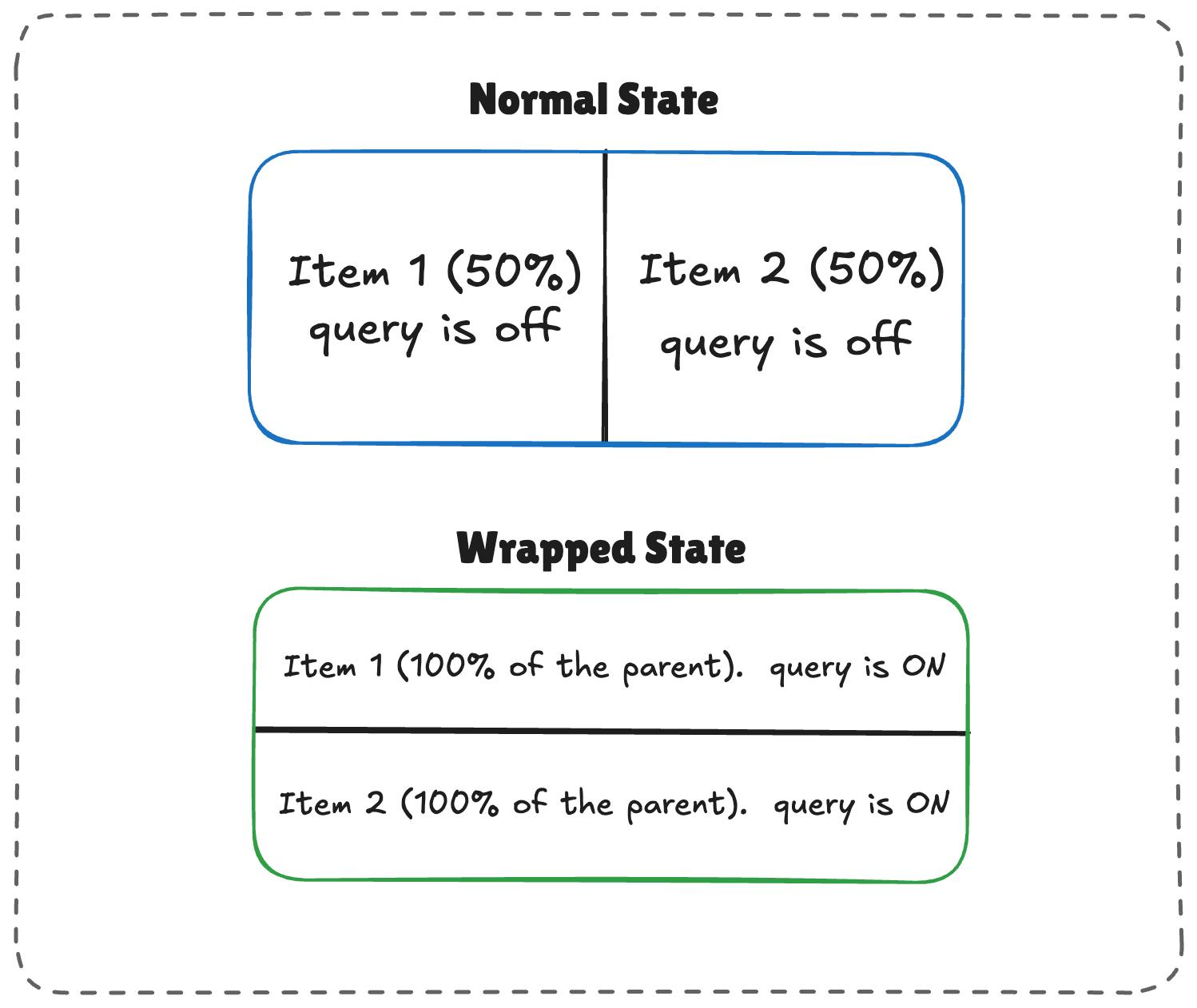
For example, if you have a horizontal menu that is lined up with flexbox and you want the items to restyle themselves only when wrapped, you’d be in JavaScript territory, using ResizeObserver to get that information. However, when we nest container queries inside flex items, we can come up with a workaround to get what we need without JavaScript, thanks to this technique I learned from Kevin Powell. The core idea is to allow a flex item to flex-grow: 1 when we query the container’s inline size.
See the Pen Fluid Typography [forked] by Vayo.
Normal and wrapped states of two responsive items.
(Large preview)

The logic works like this:

  1. When there’s enough room, both items (.flex-item) sit side-by-side, each exactly half the parent container’s width.
  2. When there is limited space, the second item wraps to the next line.
  3. Because flex-grow is active on each item, the wrapped items stretch to fill most of the parent’s width.
  4. If the item is a container itself, it detects the sudden width expansion and fires.
/* The flex parent */
.flex-layout {
  display: flex;
  flex-wrap: wrap;
}

/* Register a flex item as a container */
.flex-item {
  container-type: inline-size;
  flex: 1 1 390px; /* Grow to fill space, wrap at 390px */
}

/* Default Card Styles (narrow / side-by-side) */
.card {
  display: flex;
  flex-direction: column;
  background: #f4f4f4;
}

/* Once there's enough room for a full row */
@container (min-width: 600px) {
  .card {
    flex-direction: row;
    align-items: center;
    background: #e2f0d9;
  }
}

This works. As the parent size shrinks and the cards wrap to two lines, the card item expands, the container query fires, and applies the necessary styles.

See the Pen Flex Wrap Detection Using Container Queries [forked] by Vayo.

Container Queries Do Have Side Effects #

Container queries, like all things, come with some side effects or caveats you will want to watch for before reaching for them.

1. A Container Requires An Extra Wrapper #

Container queries need something similar to a parent-child relationship to function as expected. Let’s say we have this markup:

<div class="card">
  <div class="card-content">...</div>
</div>

We can’t actually query the .card component to adjust the .card-content, like this:

/* DOES NOT WORK */
.card {
  container-name: card;
  container-type: inline-size;
}

@container card (min-width: 400px) {
  .card {
    display: flex;
  }
}

This doesn’t work because a container cannot query itself. In that last example, we’re querying a card container and then attempting to adjust that container’s display based on its size. It’s an infinite loop.

Instead, we need an additional wrapper that makes the .card a descendant of the container:

<div class="cards">
  <div class="card">
    <div class="card-content">...</div>
  </div>
</div>

From there, we can query the .cards container and adjust the .card layout accordingly:

.cards {
  container-name: cards;
  container-type: inline-size;
}

@container cards (min-width: 400px) {
  .card {
    display: flex;
  }
}

In media queries, this doesn’t matter as @media does not care which element you style inside the block; its only concern is the viewport, which is always available. So you can just slap a condition on any element and call it a day.

2. Querying A Container’s size Could Collapse Your Layout #

This happens when querying the container’s size (i.e., its block, or vertical, size) instead of its inline-size:

/* Collapses to 0px even if it has content inside */
.hero-banner {
  container-type: size;
}

Why? Because the browser calculates the container’s dimensions without looking at its children. If we don’t give the .hero-banner an explicit height (or min-height or aspect-ratio), the browser sets a height of 0px.

For that reason, it’s often better to query a container by its inline-size instead. That is, unless you genuinely need to query the container’s block size.

Media queries aren’t affected by this, as they treat height the same way they treat @media (min-height: ...) does, i.e., ask the viewport and move on.

3. Queries Cannot Accept Custom Properties #

Another container query limitation: we can’t query against a custom property value:

:root {
  --breakpoint-lg: 1600px;
}

/* DOES NOT WORK */
@container (min-width: var(--breakpoint-lg)) {
  /* ... */
}

This is because custom properties depend on values that cascade down the DOM tree. There’s the possibility that a container query that relies on a custom property can change that same custom property. And it can quickly get complicated:

:root {
  --breakpoint-lg: 1600px;
}

/* DOES NOT WORK */
@container cards (min-width: var(--breakpoint-lg)) {
  .card {
    --breakpoint-lg: 1000px;
  }
}

When To Reach For Media And Container Queries #

I don’t think any project should wholesale use @container instead of @media. Media queries still play an important role in responsive layouts. It’s about understanding the separation of concerns.

I tend to reach for container queries when a component is used in more than one layout context. For example, a .card element could live in a full-width grid or a narrower sidebar. If that’s the case, then we’ll want the component’s content to determine when it adjusts rather than a media query that looks at the outer viewport.

Similarly, I reach for media queries when a component solely exists at the page level. This would be something like a main navigation that always sits at the top of the page. It is directly influenced by the viewport’s size, meaning that the viewport is a reliable reference for when the navigation needs to adjust. Again, it’s all about “macro” layout versus “micro” layouts.

Here’s a diagram for how I reason about which type of query to use:
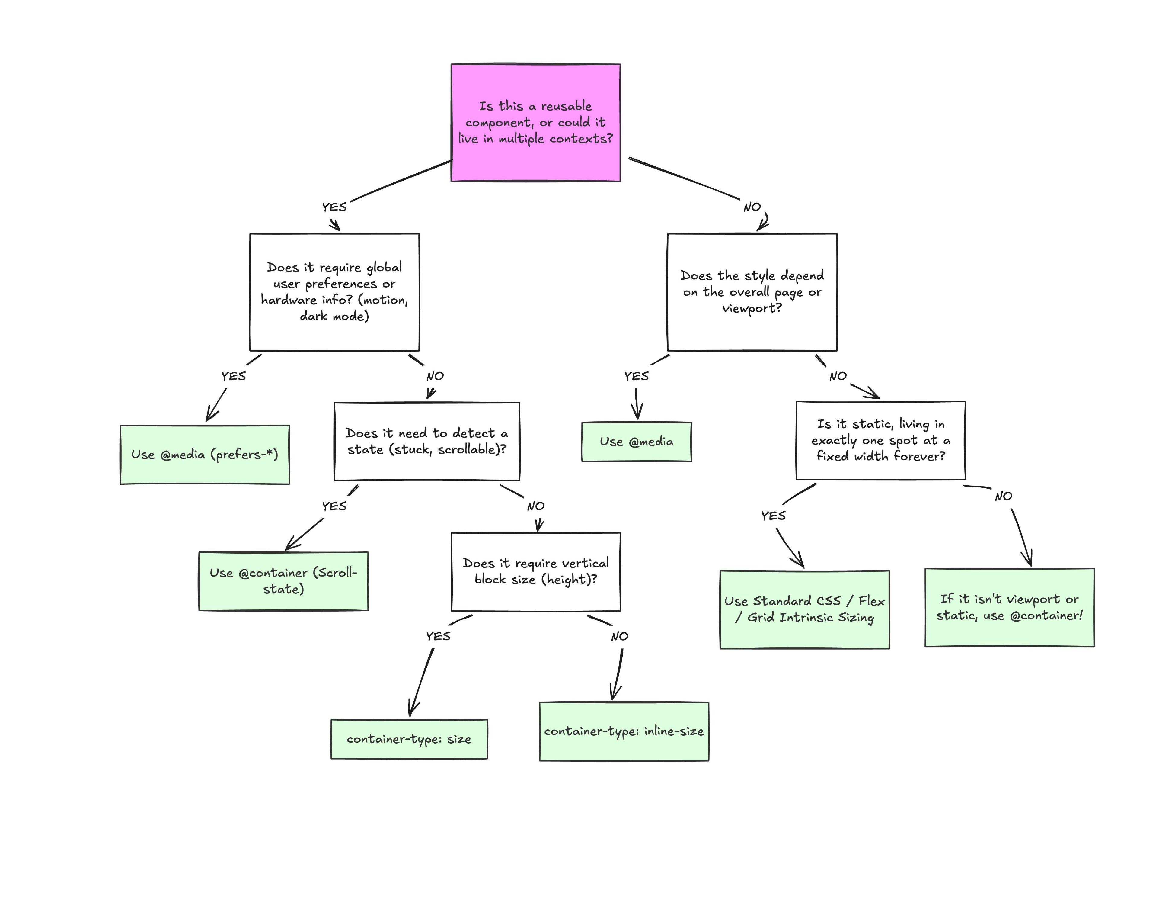
Flowchart for choosing between media and container queries
(Large preview)

Conclusion #

At the end of the day, the core reason why container queries look incredibly similar to media queries is simply familiarity. They’re not exactly “new”, but they are way less understood and adopted than media queries. But media queries have plenty of their own limitations; otherwise, we wouldn’t need container queries to fill those gaps.

What we have is a more effective feature for detecting when a specific component’s context changes and a means for adjusting styles based on its content, as it should be when that component can exist in multiple contexts.


Saturday, September 19, 2026

Building A UX ROI Case That Survives The Boardroom


Strong UX ideas do not secure investment on their own. Through a worked example,  breaks down how to define business value, calculate costs, test causality, and build a credible case for the return on a design initiative.

Sooner or later, a CFO looks at your wireframes and asks what any of it actually does for the bottom line. Storyboards don’t answer that question, and the era when a 5-minute pitch could answer it ended, unfortunately, a while ago.

These days, if you want to win budget, buy-in, and backing for UX, the design has to be provably good for the business, not only for the people using it.

And proving that takes more than taping a dollar sign to a redesign. You have to understand how your organization defines value in the first place, how it measures that value, and how a credible line gets drawn between a design initiative and an outcome leadership already cares about.

Rather than scatter tips, this article follows one worked example the whole way through. Meridian is a mid-size B2B SaaS company, and it is entirely made up — that label matters, so it gets repeated where it counts. Its onboarding redesign carries the same figures from goal-setting through cost accounting, causal testing, and the final ROI number, because a framework only becomes tangible when the numbers connect. Every step is one you can rerun inside your own organization.

Why ROI Matters More Than Ever in UX Conversations 

Companies now want clarity on what every dollar buys, and “delightful user experiences” stopped clearing that bar some time ago. I still remember a former colleague celebrating a $1 million redesign he’d gotten greenlit mostly on the strength of a couple of three.js tricks. Try that pitch in front of a finance team today and see how far the particles get you.

Executives don’t hate UX, they just hate vagueness. A pitch built on “users will find it easier” loses, every time, to the department promising 12% more sales in Q3. The difference is the one between a streamlined checkout flow that reduced cart abandonment with completed purchases up 22%, and the same work rewarded with “the QA testers like it.” One of those goes on your resume. The rest of this article is about earning the first version, with Meridian’s numbers doing the work.


When Business Goals And KPIs Don’t Exist Yet

Most writing about UX ROI makes a convenient assumption: that the organization already owns clean business goals and KPIs for you to hook your work onto. Real companies are messier than that. Plenty run on ambitions like “grow faster” or “improve the customer journey” that nobody ever broke into anything measurable, and an ROI case built on that ambiguity sounds impressive right up until somebody scrutinizes it.

So the first job is often to help the organization define what success even looks like. Interview stakeholders across departments — what does product consider a good quarter, where does customer success watch users struggle, where do sales deals stall — and listen for the themes that keep resurfacing across conversations, because those recurring themes are the company’s latent business objectives. A useful forcing function is the OKR model (Objectives and Key Results), which doesn’t tolerate vagueness.

At Meridian, the stated ambition was “improve the rate of new users’ adoption of the platform,” which you can neither design toward nor measure against. Interviews turned up the real shape of the problem. Trial users needed a median of 14 days to reach first value, most churned before getting there, and onboarding questions were burying the support queue. Out of that came an OKR with actual edges: reduce median time-to-first-value from 14 days to 7 with the use of a guided setup flow, and lift trial-to-paid conversion from 8% to 9.5%.

One warning about formalizing KPIs: Impose them from inside the UX team and leadership will suspect you’ve rigged the field in your own favor, so co-create them with whoever owns the outcome — though never at the price of accepting targets that set your team up for an uncomfortable situation. Meridian’s head of product agreed that setup-completion rate was a fair proxy for onboarding usability, and customer success signed off on time-to-first-value, a number already sitting on their own dashboard.

A KPI ladder that ends at a metric somebody already watches buys you credibility before any design work starts.

Quantifying The Full Cost Of The Investment

ROI has a denominator, and the denominator is where most UX teams go wrong. You can’t calculate a return without strategic financial planning, yet cost usually gets counted as designer salaries or consulting hours and nothing else. A finance team will find the rest whether or not you counted it, so count it first.

Direct costs are the visible ones. Meridian’s redesign ran $45,000 in design and research labor plus another $8,000 in tooling and participant incentives. Licenses for Figma, UserTesting, Hotjar, analytics platforms, research incentive spend — all of it belongs in the total, and that’s before the inevitable instances of vendor lock-in every UX team eventually faces. Engineering sits in the same column, because a UX redesign doesn’t stop at the mockup. Building the guided setup took two frontend sprints plus a QA pass, $38,000 worth, and the project generated about $4,000 of coordination overhead along the way in new syncs and shared dashboards.

The line item nearly everyone misses, and the one worth stealing from this article if you steal nothing else, is stakeholder time. Workshops, design reviews, and feedback sessions all pull senior people away from their primary work. A VP of Product spending four hours a week in UX reviews is a VP not spending those hours on roadmap planning or partner negotiations. Log the attendance — who came, for how long, at what seniority — and price it at fully loaded cost, meaning salary plus benefits divided by productive hours. A quarter’s worth of workshops, reviews, and interviews at Meridian priced out at $22,000.

Add it all up: $45,000 in design labor, $8,000 in tooling, $38,000 in engineering, $22,000 in stakeholder time, $4,000 in coordination. The investment is $117,000. Saying that number out loud beats saying “we spent $45K on design,” precisely because it already includes everything a finance team would have dug up on its own.

Proving Causation, Not Just Correlation

Most UX ROI pitches die right here. Conversions rose after the redesign, sure — and the CFO wants to know how you ruled out the new pricing, the seasonal traffic bump, and the marketing campaign that shipped the same week. Without a convincing answer, your entire ROI story crumbles.

After all these years, the gold standard for proving causation is still A/B testing: run the old experience against the new one on an even traffic split until the sample means something.

Onboarding happens to suit a phased rollout, which is why Meridian could do this cleanly. For eight weeks, half of new trial signups received the redesigned guided setup while half stayed on the legacy flow. Control converted to paid at 8.0%. The variant came in at 9.4%. With roughly 6,100 trials inside the window, the difference was statistically significant, but a 1.4-point gap on a single test is still the kind of result that deserves a second look before anyone builds a budget on it, which is one reason the team held back on attribution below. Where a split isn’t feasible — a change too structural, a user base too small — fall back to a time series instead. Measure steadily for weeks before the change, implement, then keep measuring against the baseline you established.

Documenting whatever else happens around the same time as your UX change is the unglamorous half of causation.

A pricing-page test from Meridian’s marketing team overlapped weeks five through eight of the rollout. The UX team noted it, confirmed it hit both cohorts evenly, and still chose to attribute only 70% of the observed lift to the redesign in the final math. There is no formula that produces that number; treat it as an illustrative assumption for this example.

The team asked how much of the lift could plausibly belong to the pricing test if it had helped one cohort slightly more than the other, settled on a ceiling of about a third, and rounded the redesign’s share down to 70%. Your figure will differ. What matters is that it is written down and argued for before the results arrive, not fitted to them afterwards. That restraint is worth money in a skeptical room. “We attribute roughly 70% of the lift to the onboarding change, with the remainder likely influenced by concurrent pricing work” survives cross-examination; claiming everything does not. Cohort analysis then backed the number up, since the lift held across acquisition channels and tenure bands, and at that point the skeptics had very little left to work with.

Leading and lagging indicators belong on the same slide, because each covers the other’s weakness. Meridian’s leading indicators moved first — setup completion climbed from 62% to 89%, median time-to-first-value dropped from 14 days to 6.5 — and the lagging trial-to-paid number followed. Mechanism first, business outcome second. Presented together, they form a causal chain that’s harder to poke holes in than either one alone.


The ROI Calculation, End to End

So what did Meridian actually earn? The company sees about 40,000 trial signups a year. Lifting conversion from 8.0% to 9.4% adds roughly 560 paying customers annually, and at an average of $1,800 in annual recurring revenue per account, those customers represent about $1,008,000 in new ARR. Applying the conservative 70% attribution from the causal work trims the defensible figure to roughly $706,000.

Set that against the full $117,000 investment and the first-year ROI lands near 5:1, with payback arriving in roughly two months. There’s a second line, too. Onboarding-related support tickets dropped about 30%, some 3,600 fewer tickets a year, worth another $54,000 annually at $15 per resolved ticket. Keep it as its own line rather than folding it into one swollen headline number. The case reads as more honest that way and loses none of its force.

Three assumptions carry that result, and each belongs on the slide next to it. The 40,000 signups and the $1,800 average ARR are the prior year’s actuals held flat, so a growth or pricing change moves the outcome in either direction. The 70% attribution is the illustrative assumption from the causal work, not a measured quantity. And the two-month payback counts new ARR as it lands rather than revenue recognized net of churn, which flatters the timeline; on a net basis the payback stretches to roughly a quarter. State those three plainly and a finance team can adapt the example to its own numbers. Hide them and the whole thing starts to look like marketing math, however careful the experiment was.

What persuades in the final presentation is not sophistication. Open with the baseline: what stalled trials and support volume were already costing. Show the delta in terms leadership reads fluently, metrics like conversion rate uplift chief among them. A chart of setup completion climbing from 62% to 89% will beat a paragraph of UX jargon, and a translation like “each abandoned setup costs us 0.3 support tickets” beats the chart. Above all, keep every figure identical from the first slide to the last. A room full of finance people forgives many things, but never numbers that wobble between slides.

Tailoring The Case To Whoever Holds The Purse Strings

Budget decisions come out of coalitions. A CFO may hold the final say when adding AI to the checkout process, but marketing, product, and customer success all lean on that decision, and each means something different by “value.”

A CFO hears cost, revenue, and risk. A CMO hears conversion and acquisition cost, since UX is a lever for increasing marketing ROI. Product counts support tickets; customer success thinks in retention. The underlying numbers never change; only the framing rotates, and a CFO wants a projection, not a moodboard. Meridian’s CFO slide read “the onboarding redesign protects roughly $706,000 in new ARR a year against a $117,000 investment,” while the CMO version led with what a 9.4% trial conversion does to blended acquisition cost.

Beyond the Dollar Sign: Qualitative and Non-Financial Metrics

Some UX outcomes never translate cleanly into revenue, and pretending they do weakens the parts of your case that are solid.

The trick with qualitative evidence is collecting it rigorously enough that nobody can wave it off as anecdote.

Scores like Net Promoter Score (NPS), CSAT, and Customer Effort Score already sit inside most reporting cadences, which makes them cheap to borrow. Tie your work to their movement, and segment wherever the data allows.

Meridian could say that NPS among trial users on the redesigned onboarding was 51 against 34 for the legacy flow, which lands far harder than any blended average. Verbatim feedback from surveys, support transcripts, and app store reviews adds the emotional weight the scores lack. Internal tools deserve the same discipline, since employee experience is increasingly recognized as a business driver — a dashboard redesign that hands account managers 45 minutes a day back is a productivity gain, a satisfaction gain, and a retention lever all in one.

Brand perception resists direct measurement but leaves tracks in repeat visits, organic referrals, and social sentiment. It carries extra weight in trust-sensitive industries like finance or healthcare, and it forms fast, given that UX design influences the first impressions of a whopping 94% of customers.

Whatever you collect, systematize the collecting. Run pre- and post-surveys with consistent question sets, use structured usability testing with task-based scoring, and put the qualitative right next to the quantitative when you present.

“Setup completion rose from 62% to 89%, and in post-test interviews 8 of 10 participants called the new flow intuitive, against 3 of 10 for the old one” — a pairing like that is much harder to dismiss than either half on its own.

Making the Case Stick #

UX loses the budget battle unless it’s mapped to company-wide objectives, so phrase the proposal in the words of this year’s board presentation.

Nobody at Meridian pitched “simplify the onboarding UI”; the pitch was a redesigned trial experience worth 1.4 points of upgrade rate, roughly $1M in annual recurring revenue before attribution. Bring evidence in both registers, since that is what social proof is for: the case, clearly labeled, plus screenshots, impact graphs, and user quotes. Find internal allies who can repeat the ROI narrative in rooms you’ll never enter, and write the playbook down, because repeatable ROI is what earns recurring investment.

Resources for Going Deeper

This topic has been explored extensively by researchers, practitioners, and consultancies. Here’s a curated set of resources worth studying if you want to build a stronger ROI practice around UX.

  • “Measuring the User Experience” by Tom Tullis and Bill Albert is the definitive guide to UX metrics. It covers everything from task-based measurements to survey design to statistical analysis, and it’s written for practitioners, not academics.
  • Jared Spool’s “The $300 Million Button” case study is a classic example of how a single UX change (removing a mandatory registration step) generated massive revenue uplift. It’s a story every UX professional should have in their back pocket.
  • Forrester’s research on UX ROI provides enterprise-focused frameworks for building business cases around experience design, including their widely cited finding that every dollar invested in UX returns $100.
  • “UX Strategy” by Jaime Levy bridges the gap between design thinking and business strategy, offering practical tools for aligning UX initiatives with organizational goals and market positioning.
  • The Design Value Index by the Design Management Institute tracks publicly traded companies that invest heavily in design against the S&P 500. The data consistently shows that design-led companies outperform the index by significant margins, and it’s a powerful data point for executive presentations.
  • Google’s HEART framework provides a structured approach to selecting UX metrics at scale. HEART stands for Happiness, Engagement, Adoption, Retention, and Task success, and it’s particularly useful for teams that struggle to decide which metrics to track.

Conclusion

A seat at the table never comes from beauty or novelty. It comes from measurable, defensible impact, which means UX leaders have to trade the artist’s posture for the strategist’s. Speak in outcomes rather than outputs. Connect pixels to profit.

When someone challenges the numbers, don’t flinch. Show the controlled experiment, the cohort analysis, and the before-and-after metrics, every figure holding steady from the first slide to the last, the way Meridian’s did, with the customer quotes and the employee-satisfaction data sitting right beside the revenue impact. Prove the work does more than delight users, and be ready to defend the ratio line by line. That’s when the CFO leans in, and that’s when design stops being optional.

The Death Of The Button: Why The Best Interface Is No Interface


The web is evolving beyond menus, forms, and endless clicks toward experiences shaped around human intent. For UX designers, understanding this shift means re-evaluating their role, moving from designing visible interfaces to guiding transparent, intent-driven AI experiences.

Ever since the commercialisation of the Graphical User Interface pioneered by systems like the Xerox Star and popularised by the original Apple Macintosh, software has relied heavily on point-and-click interactions. If you wanted to book a trip, buy a pair of shoes, or research a health symptom, you were expected to navigate a labyrinth of user interfaces. You click menus, adjust range sliders, fill out multi-step forms, deal with cookie pop-ups, and open dozens of browser tabs just to cross-reference basic information. We have become accustomed to spending more time managing the software rather than actually achieving our goals.

That contract is officially changing. Driven by advances in artificial intelligence and large language models, a new generation of web tools is pioneering a radical philosophy: Intent-Driven Design. Rather than expecting our users to learn complex menus and click through elaborate sales funnels, these platforms operate by capturing high-level human goals and silently executing the grunt work in the background.

This vision builds on long-standing HCI concepts like Golden Krishna’s “The Best Interface Is No Interface” and Don Norman’s principles of human-centered design.

The ultimate goal of modern web design is no longer to build prettier buttons or flashy animations; it is to eliminate the interface entirely.

“

Well, at least what we understand based on our current experience.

It is essential for UX designers to understand the changes we’re witnessing and even re-evaluate our role, shifting our focus from designing visible interfaces to guiding transparent, intent-driven AI experiences.

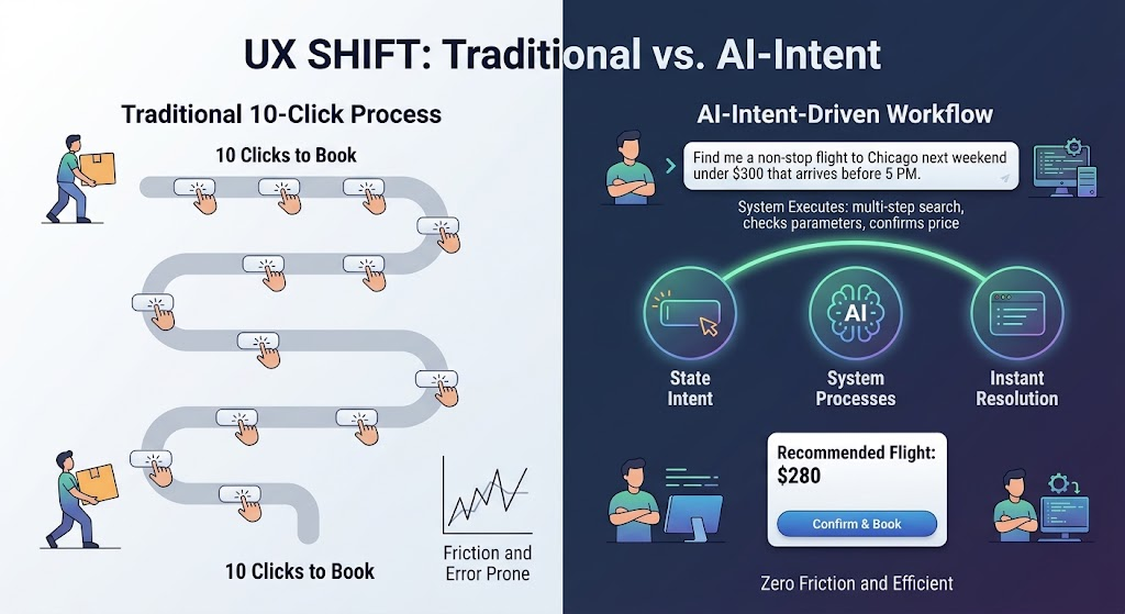
The Death Of The “10-click” Process

To understand where web design is going, we first have to look at the friction we have accepted as “normal” for decades.

Consider the traditional workflow of buying a flight online. The user experience is intentionally hyper-interactive:

  1. Navigate to a travel aggregator or airline website.
  2. Select “Round Trip” from a dropdown menu.
  3. Type the origin city and wait for auto-complete.
  4. Type the destination city and wait for auto-complete.
  5. Click a calendar modal, toggle through months, and select departure and return dates.
  6. Choose the number of passengers and cabin class.
  7. Click “Search” and wait for the results page to load.
  8. Filter by price, layover duration, departure time, and airline.
  9. Sort the results and scan through dozens of individual options.
  10. Click through a three-page checkout funnel dodging upsells for rental cars and travel insurance.

This is a classic point-and-click UI paradigm. The computer acts as a passive container of data, and the human acts as the orchestrator, manually inputting parameters, interpreting raw outputs, and executing each micro-step along the way.

Intent-driven design flips this dynamic entirely. Instead of forcing you to navigate the mechanical steps of how to find a flight, the interface asks a simple question: What are you trying to accomplish?

When you express a goal, such as “Find me a non-stop flight to Chicago next weekend under $300 that arrives before 5 PM”, the software reads your intent, executes the multi-step search query behind the scenes, compares the options, and presents a single actionable resolution. The ten clicks dissolve into one clear intent outcome.

10-click process vs AI-driven intent flow.
10-click process vs AI-driven intent flow. Image generated by Gemini. 

Monday, September 7, 2026

Timing Charts: A Blueprint For SMIL Animations


Discover SMIL, the often-overlooked way to animate SVGs that works inside <img> tags and can fully animate everything in an SVG without JavaScript.

We know that everything on the web is a box by default, but you’ll find many animated <div>s pretending to be circles. But if you’ve ever met a real <circle>, you’ll know that they’ve got a lot more going for them. Dressed in SVG, they fit into a wider range of crowds than a humble <div> wearing HTML/CSS can. <img> has a strict no .html policy.

The <img> tag is not as static as its name suggests. Any embedded JavaScript unfortunately won’t run if you load an SVG file with an <img> tag, but CSS animations work perfectly fine. Many of the SVG attributes do have CSS property counterparts, and the geometry properties have been supported across the major browsers since 2024. Some attributes that you might want to animate, like viewBox, don’t have equivalents yet.

Besides JavaScript and CSS, there’s another way to animate SVGs: Synchronized Multimedia Integration Language (SMIL). Despite its quirks, it’s still worth learning. Like CSS animations, SMIL animations also work in <img> tags and can fully animate everything in an SVG, without JavaScript.

If you’ve never heard of SMIL or need a refresher, check out Andy Clarke’s well-named article. Then we’ll look at a way to plan an animation and make SMIL markup more manageable.

The Break Up

SMIL has a problem: it gets bloated quickly. Unlike CSS and JavaScript, where you can list multiple properties in each keyframe and easily reuse animations, each SMIL tag can only target one element and only one property of that element at a time. A property can be animated through a list of values. But it is still one tag, one element, one property. The shortest way you can write a color and opacity change that will run is the following:

<animate
  attributeName="fill"
  to="someOtherColor"
  dur="someDuration"
/>

<animate
  attributeName="opacity"
  to="someOtherValue"
  dur="someDuration"
/>

That’s not bad, but consider that it needs to be repeated for every element included in the animation. A SMIL animation can quickly get longer than its CSS equivalent.

To make things easier when starting a new animation, let’s plan all of the elements and properties we want to animate, and create a list of descriptive IDs for each tag.

Charting Animation Time And Space

I like to plan my animations using what’s called a timing chart. A timing chart is effectively a line segment; some choose horizontal lines, others prefer vertical, which is a great analogy for animation as a whole because line segments can run parallel, overlap, and follow each other with or without a gap. Just like animations.

For now, we’re only interested in when animations start and stop. When drawing our charts, we’ll forget about the in-between lines and instead draw a line for each component animation, marking the beginning and end. I like to annotate timing with a circle and a bar. You can draw your chart using whatever, and it doesn’t have to be exactly to scale, as long as the relative timing between all the little animations that make up the whole is clear. Besides, adding labels for the durations is an easy cheat to get around drawing to scale.

Here is a demo of how I typically set up a timing chart with more than one animation:

See the Pen colorAndOpacityChange [forked] by Johan Grobler.

The important thing to note is that the timing chart lines are arranged according to how the animations are arranged in time. One piece of the animation follows the next piece, which is followed by a subsequent piece, and so forth. It visualizes how the animation’s parts run together and cascade over time.

S(yncbase)MIL

A big part of SMIL is synchronization. It’s even in the name, after all. And there are multiple ways to specify when an animation should start (here’s a test case to check what your browser supports). One of the most useful ways is with a syncbase value, which is a SMIL tag’s ID followed by either .begin or .end, with an optional positive or negative offset.

Let’s piggyback off the previous animation example that includes changes in color and opacity. If we want the opacity animation to start 300 milliseconds before the color animation finishes, we could do arithmetic. Alternatively, the second animation can use the syncbase value colorChange.end - 300ms. This way, the relative timing between the two animations becomes explicit.

<!-- Starts at an absolute time -->
<animate
  id="colorChange"
  begin="1s"
  ...
/>

<!-- Starts relative to when #first ends -->
<animate
  id="opacityChange"
  begin="colorChange.end - 300ms"
  ...
/>

Using syncbase values, the beginning of an animation is positioned in time relative to the .begin or .end of some other animation. A positive offset moves the start to the right (forwards in time), and a negative offset to the left (backwards in time).

See the Pen syncbase.end [forked] by Johan Grobler.

Something with negative offsets is that they can specify a time before the document has loaded or when a click happens. Computers can’t predict the future (at least not yet). The best they can do is jump the animation to where it would have been had the computer peeked into the future to preemptively start the animation. The second animation only runs from start to finish if there is enough room, so to speak.

See the Pen syncbase.begin [forked] by Johan Grobler.

Syncbase values don’t only allow you to connect animations from .end to .begin. Elect a primary animation; the animation that first comes to mind is usually the best representation of the group. All secondary animations can be set with begin="primary.begin". I’ve only used the ID #primary for emphasis. That way, all the other animations begin relative to that starting point. Stacking animations like this reduces maintenance if, say, we later want the whole group to start at a different time.

Let’s put the idea to work and build a loading indicator (or spinner). Then we’re going to explore how changing the relative timing between the parts changes the effect of the whole animation:

Step 1: Choose An Image Approach

Browsers have wide support for the prefers-reduced-motion media feature and Val Head explains this in depth in another article. We definitely want to respect this user preference as we consider moving things around. In fact, consider it non-negotiable.

There are various approaches to adhering to a user’s prefers-reduced-motion setting when it comes to SMIL. Each with its pros and cons. Evaluating early on what’s going to work best for your use case could save you a partial rewrite down the line.

For example, we could consider using a <picture> element instead of a plain <img> because <picture> supports multiple <source> elements that can be used as fallbacks in a media attribute for reduced motion preferences.

Or one SVG file with an inline CSS @media query that uses display: none to swap between versions. That said, it’s an approach that might cause trouble in various environments. But browsers are continuously changing, and this might not be an issue in the future.

You might also consider a CSS background-image instead because we can wrap that style in a media query — @media (prefers-reduced-motion) — that sets a static image as the fallback for reduced motion preferences.

There are even more options we can turn to! For example, SVG’s <view> element can also be used to swap things out for motion preferences.

Or, if we prefer everything bundled together, we can use JavaScript .matchMedia() and the handy SMIL DOM interface to control which animations start instead of completely switching out files.

For this, I’m avoiding any motion and sticking to opacity animations, which tend to cause less trouble. For a non-interactive animation like this, we can load it in an <img> tag. When we add motion, we can go the <picture> route to show the most appropriate version of our animation.

Step 2: Draw The Graphics

We’re going to do our own version of the classic three-dot spinner:

See the Pen StaticDots [forked] by Johan Grobler.

SVG wizards might be able to do everything directly in a text editor. I recommend using a graphic editor like Inkscape if you’re having trouble visualizing how the markup will be rendered. Once again, Andy Clarke has a great article about his process for optimizing and structuring his own drawings.

Note: There’s a gotcha with Inkscape. Setting what you would expect to be an element’s ID via the Layers window actually sets the value of a metadata attribute used internally by Inkscape. Use Inkscape’s object properties or XML editor window to set the true element’s ID. Your mileage may vary with a different editor. Also, in Inkscape, remember to save the file as optimized SVG when the drawing is done to strip away unneeded metadata.

Step 3: Outline The Animation

OK, so we’re sticking with the opacity animation idea. The dots are going to fade in and out. We’ll use separate <animate> tags for those. Six tags in total.

Our naming scheme is going to be straightforward: we’ll call them #fadeIn and #fadeOut, and to differentiate between each pair of tags, we’ll postfix the tag’s ID with either Left, Middle or Right. Try to follow a convention that makes sense to you when coming up with your own IDs.

The fade-in <animate> tag for the dot on the left:

<animate
  id="fadeInLeft"
  href="#leftDot"
  attributeName="opacity"
  from="0"
  to="1"
  ...
/>

And the fade-out <animate> for the middle dot:

<animate
  id="fadeOutMiddle"
  href="#middleDot"
  attributeName="opacity"
  from="1"
  to="0"
  ...
/>

Step 4: Time The Animations

We have an infinite number of ways in which we could space these six animations in time. Let’s look at a couple of choice examples alongside their timing charts to see how changing the arrangement of the parts impacts the visual effect of the whole animation.

To narrow our choices a bit, all of the <animate> tags will use the same dur value, and none of the syncbase values will have offsets.

For someone coming from a culture that reads from left to right, the dots appearing on screen along the same pattern would feel natural. Let’s also start with all the dots fading out together at the end:

See the Pen dotsVersion1 [forked] by Johan Grobler.

Syncbase values stagger the fade-ins and restart the loop when the dots have disappeared:

<animate
  id="fadeInLeft"
  ...
  begin="0s; fadeOutLeft.end"
/>

<animate
  id="fadeInMiddle"
  ...
  begin="fadeInLeft.end"
/>

<animate
  id="fadeInRight"
  ...
  begin="fadeInMiddle.end"
/>

Since all the fade-outs end at the same time, it is an arbitrary choice which one we use to restart the loop. We’ll consider #fadeOutLeft as the primary animation here and also synchronize the other fade-outs to it with the syncbase value fadeOutLeft.begin. Later, if we want to move the fade-outs in time, all we do is change when #fadeOutLeft starts.

<animate
  id="fadeOutLeft"
  ...
  begin="fadeInRight.end"
/>

<animate
  id="fadeOutMiddle"
  ...
  begin="fadeOutLeft.begin"
/>

<animate
  id="fadeOutRight"
  ...
  begin="fadeOutLeft.begin"
/>

Some Alternate Timings #

Instead of a group fade-out, we could stagger them just like the fade-ins:

<animate
  id="fadeOutMiddle"
  ...
  begin="fadeOutLeft.end"
/>

<animate
  id="fadeOutRight"
  ...
  begin="fadeOutMiddle.end"
/>

Without adding an offset, there are a couple of points in time we could start #fadeOutLeft at. If it starts on fadeInRight.end:

See the Pen dotsVersion2 [forked] by Johan Grobler.

The visual effect is subtly changed by moving up a spot and starting #fadeOutLeft on fadeInMiddle.end instead:

See the Pen dotsVersion3 [forked] by Johan Grobler.

We can see from the charts that we could try moving up a spot further to fadeInLeft.end:

See the Pen dotsVersion4 [forked] by Johan Grobler.

How about starting the sequence with a fade-out:

See the Pen dotsVersion5 [forked] by Johan Grobler.

You might prefer to start with the dot in the middle:

See the Pen centerFirstDots [forked] by Johan Grobler.

As you iterate on your animation, timing charts are a great way to keep track of your work, and they make visual comparison between versions possible. And by drawing a timing chart, you might even see a pattern in the timing between the parts of the animations that you might otherwise have missed.

Step 5: Adding More Animations

As you animate more elements and properties, it gets harder to keep track of what starts when. To see how timing charts can help you make sense of things, let’s build on the basic spinner:

See the Pen staticDotsWithClipPaths [forked] by Johan Grobler.

I’ve added a <rect> for each dot to the drawing. We’ll move those into to a <cilpPath> tag and remove the fill="white". As the animation runs, the rectangles are going to move over the dots for a different approach to animating the stroke than by animating stroke-dashoffset.

We only need a single <clipPath> for all three dots, but it adds structure to the document, and it’s good practice to wrap it, and similar tags, in a <defs> tag:

<defs>
  <clipPath id="dotsClipPath">
  <!-- The geometry of the rectangles and coordinates used here, and later, depends on the viewBox used for their parent <svg> element. -->
    <rect
      id="clipPathLeftRect"
      width="2" height="2"
      x="1" y="6"
    />
    <rect
      id="clipPathMiddleRect"
      width="2" height="2"
      x="4" y="2"
    />
    <rect
      id="clipPathRightRect"
      width="2" height="2"
      x="7" y="6">
  </clipPath>
</defs>

Remember to set the clip path for the <circle>s. Either with CSS or using the clip-path attribute:

<circle
  id="leftDot"
  ...
  clip-path="url(#dotsClipPath)"
/>

<circle
  id="middleDot"
  ...
  clip-path="url(#dotsClipPath)"
  />

<circle
  id="rightDot"
  ...
  clip-path="url(#dotsClipPath)"
/>

Because the dots now have a stroke added, to leave their size unchanged, we need to compensate by subtracting half the value of stroke-width from r:

<circle
  ...
  r="0.9"
  stroke-width="0.2"
  ...
/>

That’s all the changes the graphics need. Have a look at the animated version with its timing chart, then we’ll look in more detail at the changes that have been made to the animation:

See the Pen clipPathDots [forked] by Johan Grobler.

There’s a new animation, #moveClipPathLeft, that starts the whole sequence, and to tweak the animation’s rhythm a bit, there’s a 1s delay between when the fade-outs end and the loop restarts:

<animate
  id="moveClipPathLeft"
  href="#clipPathLeftRect"
  attributeName="y"
  from="6"
  to="4"
  begin="0s; fadeOutLeft.end + 1s"
  fill="freeze"
/>

You could use <animateTransform>s to move the rectangles instead, but we need to move them back to their starting positions at the end for a smooth restart of the animation. You’ll need to take into account which tags can animate and set which data types if you do decide to animate the transform attribute instead of translating the rectangles with the y attribute.

To change things up, the <rect> for the middle dot moves down:

<animate
  id="moveClipPathMiddle"
  href="#clipPathMiddleRect"
  attributeName="y"
  from="2"
  to="4"
  begin="moveClipPathLeft.end"
  fill="freeze"
/>

We’re also using the fill-opacity property instead of the opacity property for the fade-ins, and they’ve been synchronized to start once a dot’s clipping <rect> has finished moving:

<animate
  id="fadeInLeft"
  href="#leftDot"
  attributeName="fill-opacity"
  to="1"
  dur="1s"
  begin="moveClipPathLeft.end"
  fill="freeze"
/>

<animate
  id="fadeInMiddle"
  href="#middleDot"
  ...
  begin="moveClipPathMiddle.end"
  ...
/>

<animate
  id="fadeInRight"
  href="#rightDot"
  ...
  begin="moveClipPathRight.end"
  ...
/>

The fade-outs still use the normal opacity property, so both the fill and stroke fade out together. Because this arrangement is set up to use a group fade-out at the end, there are a few places the markup could be optimized. One of them is dropping the fill="freeze" to automatically reset the dot’s opacity back to its starting value once the tag finishes running:

<animate
  id="fadeOutLeft"
  href="#leftDot"
  attributeName="opacity"
  to="0"
  dur="1s"
  begin="fadeInRight.end"
/>

<!-- We'll still consider #fadeOutLeft as the primary animation here and sync the start of the others to it. -->

<animate
  id="fadeOutMiddle"
  href="#middleDot"
  ...
  begin="fadeOutLeft.begin"
/>

<animate
  id="fadeOutRight"
  href="#rightDot"
  ...
  begin="fadeOutLeft.begin"
/>

For the <animate> tags that did use fill="freeze", we’ll use <set> tags to reset those properties back to their starting values. I’ve simplified the chart a little by lumping those tags together. Because these <set> tags don’t have a duration over which they act, on the chart I’ve drawn the start and end markers over each other.

To reset the fill-opacity on the left dot:

<set
  href="#leftDot"
  attributeName="fill-opacity"
  to="0"
  begin="fadeOutLeft.end"
  fill="freeze"
/>

If you use fill="freeze" with the fade-outs, you’ll need an extra <set> for each dot to reset the middle dot’s opacity:

<set
  href="#middleDot"
  attributeName="opacity"
  to="1"
  begin="fadeOutLeft.end"
  fill="freeze"
/>

The last thing we need to do is move the clipping rectangles back to their starting positions. For the right <rect>:

<set
  href="#clipPathRightRect"
  attributeName="y"
  to="6"
  begin="fadeOutLeft.end"
  fill="freeze"
/>

That’s just one of the possible timing variations, and most of what you’ll need to try some of the others, as we did with the basic spinner, is already in place. You might want to have a try at coming up with a couple of your own alternate timings.

That’s The Benefit Of Timing Charts

To sum things up, we know that balancing the different stages of an animation can be difficult at best, and untenable at worst. Any time we get into multi-step animations that exceed one or two steps, it’s a form of orchestration. You’re almost building a Rube Goldberg machine of markup. And using a timing chart is a strategy I use that I hope will help you in your projects as well. They are outlines of what to expect and when, allowing you to map things out in a way that not only helps plan your code, but also makes future updates and maintenance a lot more bearable than going into it without a plan.

While a timing chart can’t reduce the complexity of the markup, it can give a good overview of what should happen when. Timing charts are definitely not limited to SMIL animations. Unfortunately, syncbase values are, and they can still help even if you’re going to use a different approach to implementing your animation.

Further Reading 

I highly recommend checking out Andy’s other articles on Smashing Magazine. There’s even more stuff on combining CSS and SVG.

Yosra Emad wrote a great article on creating animations with multiple steps in CSS, and you might want to try drawing a few timing charts as you read through it.

When you’re ready to start adding those in-between lines to your timing chart, Nash Vail’s article on easing dives deep into the details of easing curves.

You might also be interested in tests for your browser’s SVG implementation to see what is supported.