⭐ If you would like to buy me a coffee, well thank you very much that is mega kind! : https://www.buymeacoffee.com/honeyvig
Hire a web Developer and Designer to upgrade and boost your online presence with cutting edge Technologies
Showing posts with label Media Queries. Show all posts

Sunday, September 20, 2026

Stop Treating CSS Container Queries Like Traditional Media Queries


Despite broad browser support, container queries remain surprisingly underused and frequently misunderstood. Let’s look at how they differ from media queries, when to reach for each, and how container queries help reusable components respond naturally to the contexts in which they appear.

To be completely honest with you, I missed the news when CSS Container Queries first shipped. And when I finally heard about it, my very first thought was, “Why exactly do I need this when media queries already exist?”

I’m not proud of that reaction, knowing what I know now, but it was comforting to know that I wasn’t alone. In fact, there are legions of us out there.

What baffles me is that container queries aren’t a new feature, as it currently sits at around 94% browser support. And yet, very few people are actually using it. According to the State of CSS survey, 86% of developers are aware of container queries, but only 41.4% actually use them. Surveys can be biased and not completely representative of our entire field, but this one is certainly the best indicator we’ve got.

Kevin Powell also talked about this at SmashingConf Amsterdam 2026: Container Queries adoption has been terrible. And that is so strange to me, knowing that the ability for components to adapt to the size of their outer container has been at the top of so many CSS wishlists over the years.

I’m not particularly interested in how many people are using container queries as much as in how they are using them. I can’t account for everyone, but from what I’ve seen — including in my own early attempts — many of us are using them wrong.

The bottom line is that incorrect use comes down to the same impression I had when learning about them: they absolutely look just like media queries at first glance. And since they look similar, it’s easy to assume they serve similar purposes and work the same way.

They don’t.

Note: I should state up front that what I’m focusing on in this article is using container size queries, i.e., a responsive design technique for responding to the size of a particular container. There are also container style queries that respond to a container’s computed styles (and are experimental at the time of this writing). You can catch up on those in Juan Diego’s piece here on Smashing Magazine where he examines their possible use cases

Media Queries Look Outward #

The viewport is a proxy. It always has been. Media queries are what gave us the illusion that screen width alone is responsible for how responsive apps adapt to their environment.

Ask yourself this: When you write @media, what are you asking the browser?

@media (min-width: 1024px) {
  .card {
    display: flex;
  }

I, like most developers, am asking the browser: How wide is the screen right now? That’s it.

Media queries answer that beautifully, but what happens when this .card component is placed in a grid cell that’s 300px wide on a 1920px desktop screen?

The media query doesn’t care; it does its job. The viewport is still 1920px, so min-width: 1024px fires and the matched query styles are applied, even though the card only has 300px of space to work with. Eventually, everything in the card deforms, overflows, or cramps up.

“Media queries are dumb. Not dumb in terms of the concept, but dumb in that they don’t know very much. In fact, most people assume that they know more than they do.”

— Kevin Powell

It’s common to think of responsive design purely as a system for updating complete page layouts, like going from two columns on a large screen to a single column on a small screen.

Container Queries Look Inward #

Container queries are smarter than that. They make responsive layouts more reliant on what’s happening inside a component rather than on the outer context that has no insight into a component’s contents. It is more like: “How much space is available for me in this specific spot, right now?”

Here is the same card code example we looked at in the last section, but with a container query:

.card-wrapper {
  container-name: card;
  container-type: inline-size;
}

@container card (min-width: 450px) {
  .card {
    display: flex;
    flex-direction: row;
  }
}

This changes everything. The card isn’t influenced by the viewport; its only concern is whether the .card component’s parent wrapper has at least 450px of inline (i.e., horizontal in a left-to-right writing mode) space. If that condition is true, the component goes horizontal; if not, it goes to its default block display.

See the Pen Viewport vs Container 

“Macro” Layout Vs. “Micro” Layouts #

A very interesting way to distinguish @media and @container queries is the layout type.

Media queries are for the “macro” layout; they look outward. Stuff like page structure, the header that spans the window, footers, main grid layout, system preferences (prefers-color-scheme), device capabilities (touch screens). You know, anything that is majorly true to the entire page structure.

Container queries, I’d say, are for “micro” layouts, i.e., most things that live inside the “macro” layout. We use them when any content needs to responsively fit whatever space it is allocated. Components that come to mind are things like cards, widgets, forms, navigation, and so on.

In other words, think “page layout” vs. “component layout”.

An element shouldn’t magically become “tablet-sized” just because the width exceeds an abstract width threshold like 768px. Instead, it should switch layout when it has enough space to do so, whether that happens on a mobile viewport or inside a desktop sidebar.

In case you’re still not convinced, did you know there are over 2,300 unique viewport sizes on the modern web? Do you think it is possible to account for all of them?

I’m not hating on media queries. It’s that in this era of responsiveness and component re-use, layout logic is closer to the container than the viewport. When we think in terms of containers and components, we’re effectively relying on the content to determine layout, not the viewport.

“

This is how it should be.

Example: Fluid Typography Inside A Component #

Responsive typography is a good example of something many of us have relied on media queries for. The fact that media queries come with their own CSS units — e.g., vw, vh, and so on — that are relative to the viewport size makes media queries look really good for adjusting font size based on the user’s screen size.

.card-title {
  font-size: clamp(100%, 1rem + 2vw, 24px);
}

This works until that same component is moved into a different context, like a sidebar, where the viewport is completely irrelevant. Now, because we tied the responsiveness to the wrong reference point, the scaled typography can get too big or too small.

Container queries come with their very own units — cqi, cqw, cqb, among others — and we can take responsive components further by coupling those units with the CSS clamp() function, using it for fluid typography that scales with the component rather than the viewport:


.card-title {
  font-size: clamp(1rem, .5rem + 3cqi, 2rem);
}
See the Pen Fluid Typography [forked] by Vayo.

With this in place, the entire code is self-contained to that element’s specific container.

Example: Flexbox Wrap Detection #

Interestingly, container queries can, in a way, detect the state of a component’s internal layout. It’s not bulletproof, but it is also something media queries simply cannot do because they only observe the external browser window and are structurally blind to internal layout events like when, for example, flex items wrap onto a new line. Let’s poke at that.

Flexbox is superb at wrapping content (flex-wrap: wrap), allowing flex items to automatically wrap to new lines when the flex container runs out of space to fit them in a single row. But CSS by itself can’t tell when that wrap happens. There isn’t something like a :wrapped pseudo-class or a media query like @media (flex-wrapped: true) that would get us there.

Media queries only observe the browser window, as they can’t see internal changes. That is pretty much what flex wrapping is: a width state change on the item itself.

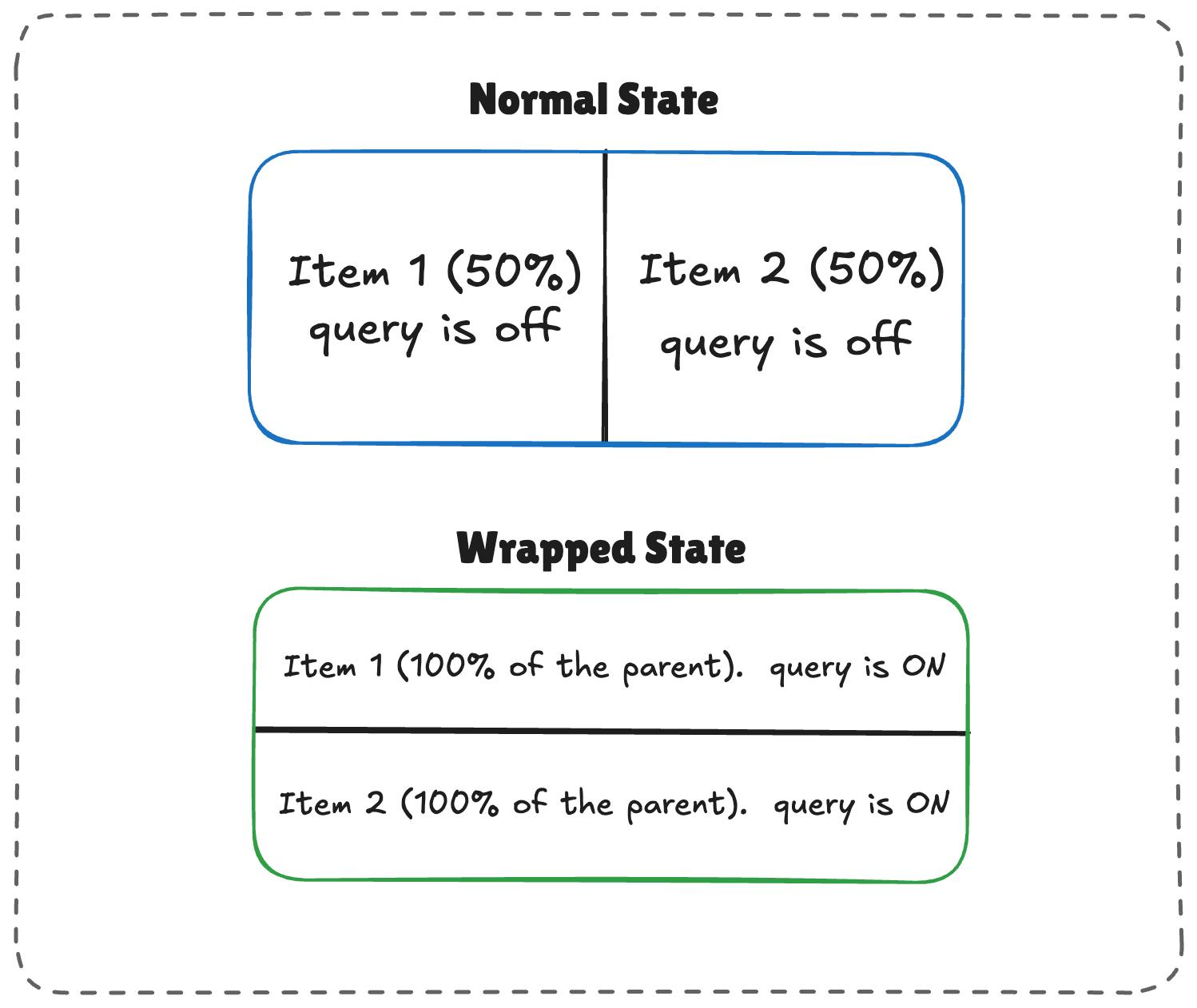
For example, if you have a horizontal menu that is lined up with flexbox and you want the items to restyle themselves only when wrapped, you’d be in JavaScript territory, using ResizeObserver to get that information. However, when we nest container queries inside flex items, we can come up with a workaround to get what we need without JavaScript, thanks to this technique I learned from Kevin Powell. The core idea is to allow a flex item to flex-grow: 1 when we query the container’s inline size.
See the Pen Fluid Typography [forked] by Vayo.
Normal and wrapped states of two responsive items.
(Large preview)

The logic works like this:

  1. When there’s enough room, both items (.flex-item) sit side-by-side, each exactly half the parent container’s width.
  2. When there is limited space, the second item wraps to the next line.
  3. Because flex-grow is active on each item, the wrapped items stretch to fill most of the parent’s width.
  4. If the item is a container itself, it detects the sudden width expansion and fires.
/* The flex parent */
.flex-layout {
  display: flex;
  flex-wrap: wrap;
}

/* Register a flex item as a container */
.flex-item {
  container-type: inline-size;
  flex: 1 1 390px; /* Grow to fill space, wrap at 390px */
}

/* Default Card Styles (narrow / side-by-side) */
.card {
  display: flex;
  flex-direction: column;
  background: #f4f4f4;
}

/* Once there's enough room for a full row */
@container (min-width: 600px) {
  .card {
    flex-direction: row;
    align-items: center;
    background: #e2f0d9;
  }
}

This works. As the parent size shrinks and the cards wrap to two lines, the card item expands, the container query fires, and applies the necessary styles.

See the Pen Flex Wrap Detection Using Container Queries [forked] by Vayo.

Container Queries Do Have Side Effects #

Container queries, like all things, come with some side effects or caveats you will want to watch for before reaching for them.

1. A Container Requires An Extra Wrapper #

Container queries need something similar to a parent-child relationship to function as expected. Let’s say we have this markup:

<div class="card">
  <div class="card-content">...</div>
</div>

We can’t actually query the .card component to adjust the .card-content, like this:

/* DOES NOT WORK */
.card {
  container-name: card;
  container-type: inline-size;
}

@container card (min-width: 400px) {
  .card {
    display: flex;
  }
}

This doesn’t work because a container cannot query itself. In that last example, we’re querying a card container and then attempting to adjust that container’s display based on its size. It’s an infinite loop.

Instead, we need an additional wrapper that makes the .card a descendant of the container:

<div class="cards">
  <div class="card">
    <div class="card-content">...</div>
  </div>
</div>

From there, we can query the .cards container and adjust the .card layout accordingly:

.cards {
  container-name: cards;
  container-type: inline-size;
}

@container cards (min-width: 400px) {
  .card {
    display: flex;
  }
}

In media queries, this doesn’t matter as @media does not care which element you style inside the block; its only concern is the viewport, which is always available. So you can just slap a condition on any element and call it a day.

2. Querying A Container’s size Could Collapse Your Layout #

This happens when querying the container’s size (i.e., its block, or vertical, size) instead of its inline-size:

/* Collapses to 0px even if it has content inside */
.hero-banner {
  container-type: size;
}

Why? Because the browser calculates the container’s dimensions without looking at its children. If we don’t give the .hero-banner an explicit height (or min-height or aspect-ratio), the browser sets a height of 0px.

For that reason, it’s often better to query a container by its inline-size instead. That is, unless you genuinely need to query the container’s block size.

Media queries aren’t affected by this, as they treat height the same way they treat @media (min-height: ...) does, i.e., ask the viewport and move on.

3. Queries Cannot Accept Custom Properties #

Another container query limitation: we can’t query against a custom property value:

:root {
  --breakpoint-lg: 1600px;
}

/* DOES NOT WORK */
@container (min-width: var(--breakpoint-lg)) {
  /* ... */
}

This is because custom properties depend on values that cascade down the DOM tree. There’s the possibility that a container query that relies on a custom property can change that same custom property. And it can quickly get complicated:

:root {
  --breakpoint-lg: 1600px;
}

/* DOES NOT WORK */
@container cards (min-width: var(--breakpoint-lg)) {
  .card {
    --breakpoint-lg: 1000px;
  }
}

When To Reach For Media And Container Queries #

I don’t think any project should wholesale use @container instead of @media. Media queries still play an important role in responsive layouts. It’s about understanding the separation of concerns.

I tend to reach for container queries when a component is used in more than one layout context. For example, a .card element could live in a full-width grid or a narrower sidebar. If that’s the case, then we’ll want the component’s content to determine when it adjusts rather than a media query that looks at the outer viewport.

Similarly, I reach for media queries when a component solely exists at the page level. This would be something like a main navigation that always sits at the top of the page. It is directly influenced by the viewport’s size, meaning that the viewport is a reliable reference for when the navigation needs to adjust. Again, it’s all about “macro” layout versus “micro” layouts.

Here’s a diagram for how I reason about which type of query to use:
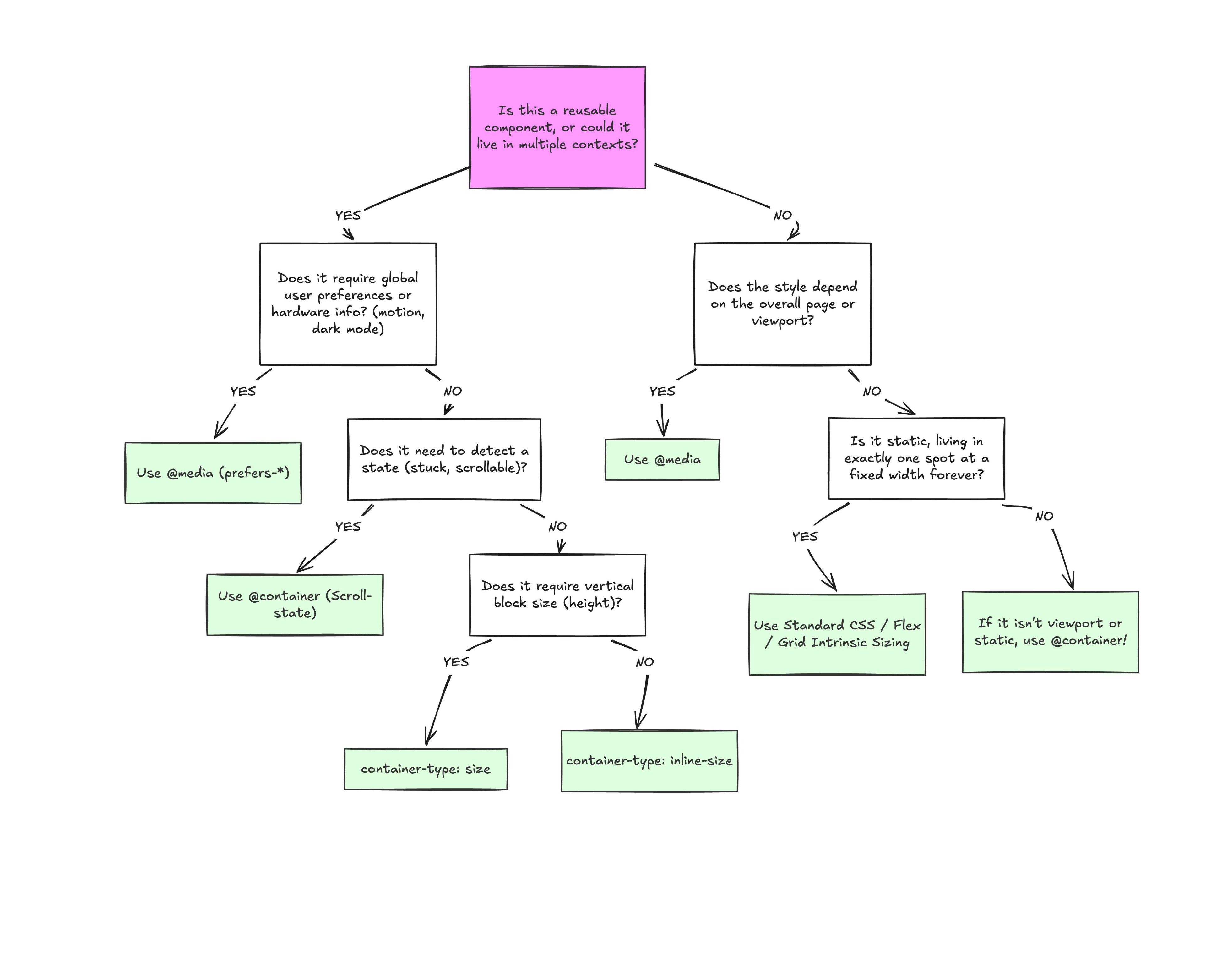
Flowchart for choosing between media and container queries
(Large preview)

Conclusion #

At the end of the day, the core reason why container queries look incredibly similar to media queries is simply familiarity. They’re not exactly “new”, but they are way less understood and adopted than media queries. But media queries have plenty of their own limitations; otherwise, we wouldn’t need container queries to fill those gaps.

What we have is a more effective feature for detecting when a specific component’s context changes and a means for adjusting styles based on its content, as it should be when that component can exist in multiple contexts.


Friday, September 5, 2014

The Reality Behind the Responsive Web Design

've had a hard time believing many people across the globe still believe that fluid grid system and media queries will somehow magically revive your website into the largest hit within a span of few months. Such hopes on a misunderstood concept is sad, and it also makes me angry over all those evangelist of responsive web designs who have sung their hearts out in the praise of responsive web designs without giving away the finer details that matter.


Why am I so annoying today is because I'm tired of writing all the safeguards and advices about those finer details you missed and how they come back to stab you from behind. Hmph(taking a deep breath). Sorry, if I got a bit carried away, happens to you if your sitting 9 hours a day in front of your PC thinking about how to warn others of the supposed foolhardy they are so keen on doing.
Without much ado, responsive web design and mobile ready website means the same if, and only if, a professional and competent web designer is saying so. Otherwise it is a simple case of getting your website to be made to fit in a mobile. Okay, I'm not saying someone is trying to rob you or something, its possible the concerned person or agency in question is himself uncertain about the nuances of responsive web design.
I have to admit the real perspective of RWD can be quite elusive, hence the common misunderstanding. So i'm gonna break it down to you in few simple points so you read them carefully and get an idea of what am I trying to say and why it is important :-
  • Responsive Web Design came into being to support the idea behind making a unified website for all the devices.
  • Flexible images in fluid grid system and media queries definitely constitute a major part of RWD and initially it was all there was to it.
  • So what you think it means is what it meant at the start but as the concept developed a whole new identity emerged.
  • Accommodating your website into mobile is one aspect but representing it in mobile is another.
  • The representation includes content, its placement – what and where, and embedding performance into your website.
  • Studies have shown people will stay on a webpage if it loads within a second or two in the mobile.
  • This combination gives you an actual responsive design and to state it correctly a mobile smart website.
  • The idea is to engage the user to the last minute and communicate with him in a crisp yet effective manner.
I'm hoping whatever I wrote was of some value to you and would help you in deciding the future of your website and your business.

Thursday, November 10, 2011

How To Use CSS3 Media Queries To Create a Mobile Version of Your Website

CSS3 continues to both excite and frustrate web designers and developers. We are excited about the possibilities that CSS3 brings, and the problems it will solve, but also frustrated by the lack of support in Internet Explorer 8. This article will demonstrate a technique that uses part of CSS3 that is also unsupported by Internet Explorer 8. However, it doesn’t matter as one of the most useful places for this module is somewhere that does have a lot of support — small devices such as the iPhone, and Android devices.
In this article I’ll explain how, with a few CSS rules, you can create an iPhone version of your site using CSS3, that will work now. We’ll have a look at a very simple example and I’ll also discuss the process of adding a small screen device stylesheet to my own site to show how easily we can add stylesheets for mobile devices to existing websites.

Media Queries

If you have ever created a print stylesheet for a website then you will be familiar with the idea of creating a specific stylesheet to come into play under certain conditions – in the case of a print stylesheet when the page is printed. This functionality was enabled in CSS2 by media types. Media Types let you specify a type of media to target, so you could target print, handheld and so on. Unfortunately these media types never gained a lot of support by devices and, other than the print media type, you will rarely see them in use.
The Media Queries in CSS3 take this idea and extend it. Rather than looking for a type of device they look at the capability of the device, and you can use them to check for all kinds of things. For example:
  • width and height (of the browser window)
  • device width and height
  • orientation – for example is a phone in landscape or portrait mode?
  • resolution
If the user has a browser that supports media queries then we can write CSS specifically for certain situations. For example, detecting that the user has a small device like a smart phone of some description and giving them a specific layout. To see an example of this in practice, the UK web conference dConstruct has just launched their website for the 2010 conference and this uses media queries to great effect.
dConstruct 2010 website on a desktop browser
The dConstruct 2010 website in Safari on a desktop computer
dconstruct website on the iPhone
The dConstruct 2010 website on an iPhone
You can see from the above example that the site hasn’t just been made smaller to fit, but that the content has actually been re-architected to be made more easy to access on the small screen of the device. In addition many people might think of this as being an iPhone layout – but it isn’t. It displays in the same way on Opera Mini on my Android based phone – so by using media queries and targeting the device capabilities the dConstruct site caters for all sorts of devices – even ones they might not have thought of!

Using Media Queries to create a stylesheet for phones

To get started we can take a look at a very simple example. The below layout is a very simple two column layout.
Simple example in a browser
A very simple two column layout
To make it easier to read on a phone I have decided to linearize the entire design making it all one column, and also to make the header area much smaller so readers don’t need to scroll past the header before getting to any content.
The first way to use media queries is to have the alternate section of CSS right inside your single stylesheet. So to target small devices we can use the following syntax:
@media only screen and (max-device-width: 480px) {

 }
We can then add our alternate CSS for small screen and width devices inside the curly braces. By using the cascade we can simply overwrite any styles rules we set for desktop browsers earlier in our CSS. As long as this section comes last in your CSS it will overwrite the previous rules. So, to linearize our layout and use a smaller header graphic I can add the following:
@media only screen and (max-device-width: 480px) {
  div#wrapper {
   width: 400px;
  }

  div#header {
   background-image: url(media-queries-phone.jpg);
   height: 93px;
   position: relative;
  }

  div#header h1 {
   font-size: 140%;
  }

  #content {
   float: none;
   width: 100%;
  }

  #navigation {
   float:none;
   width: auto;
  }
 }
In the code above I am using an alternate background image and reducing the height of the header, then setting the content and navigation to float none and overwriting the width set earlier in the stylesheet. These rules only come into play on a small screen device.
Simple example on a phone
My simple example as displayed on an iPhone

Linking a separate stylesheet using media queries

Adding the specific code for devices inline might be a good way to use media queries if you only need to make a few changes, however if your stylesheet contains a lot of overwriting or you want to completely separate the styles shown to desktop browsers and those used for small screen devices, then linking in a different stylesheet will enable you to keep the CSS separate.
To add a separate stylesheet after your main stylesheet and use the cascade to overwrite the rules, use the following.

Testing media queries

If you are the owner of an iPhone, Android device or other device that has a browser which supports media queries you can test your CSS yourself. However you will need to upload the code somewhere in order to view it. What about testing devices you don’t own and testing locally?
An excellent site that can help you during the development process is ProtoFluid. This application gives you a form to enter your URL – which can be a local URL – and view the design as if in the browser on an iPhone, iPad or a range of other devices. The screenshot below is the dConstruct site we looked at earlier as seen through the iPhone view on ProtoFluid.
dConstruct site in ProtoFluid
The dConstruct 2010 website in ProtoFluid
You can also enter in your own window size if you have a specific device you want to test for and know the dimensions of it’s screen.
To use ProtoFluid you need to slightly modify the media query shown earlier to include max-width as well as max-device-width. This means that the media query also comes into play if the user has a normal desktop browser but using a very tiny window.
@media only screen and (max-width: 480px), only screen and (max-device-width: 480px) {

 }
After updating your code to the above, just refresh your page in the browser and then drag the window in and you should see the layout change as it hits 480 pixels. The media queries are now reacting when the viewport width hits the value you entered.
You are now all ready to test using ProtoFluid. The real beauty of ProtoFluid is that you can still use tools such as FireBug to tweak your design, something you won’t have once on the iPhone. Obviously you should still try and get a look at your layout in as many devices as possible, but ProtoFluid makes development and testing much simpler.
Note that if you don’t want your site to switch layout when someone drags their window narrow you can always remove the max-width part of the query before going live, so the effect only happens for people with a small device and not just a small browser window.

Retrofitting an existing site

I have kept the example above very simple in order to demonstrate the technique. However this technique could very easily be used to retrofit an existing site with a version for small screen devices. One of the big selling points of using CSS for layout was this ability to provide alternate versions of our design. As an experiment I decided to take my own business website and apply these techniques to the layout.

The desktop layout

The website for my business currently has a multi-column layout. The homepage is a little different but in general we have a fixed width 3 column layout. This design is a couple of years old so we didn’t consider media queries when building it.
edgeofmyseat.com website in Safari on the desktop
My site in a desktop browser

Adding the new stylesheet

There will be a number of changes that I need to make to linearize this layout so I’m going to add a separate stylesheet using media queries to load this stylesheet after the current stylesheet and only if the max-width is less than 480 pixels.

To create my new stylesheet I take the default stylesheet for the site and save it as small-device.css. So this starts life as a copy of my main stylesheet. What I am going to do is go through and overwrite certain rules and then delete anything I don’t need.

Shrinking the header

The first thing I want to do is make the logo fit nicely on screen for small devices. As the logo is a background image this is easy to do as I can load a different logo in this stylesheet. I also have a different background image with a shorter top area over which the logo sits.
body {
  background-image: url(/img/small-bg.png);
 }

 #wrapper {
  width: auto;
  margin: auto;
  text-align: left;
  background-image: url(/img/small-logo.png);
  background-position: left 5px;
  background-repeat: no-repeat;
  min-height: 400px;
 }

Linearizing the layout

The next main job is to linearize the layout and make it all one column. The desktop layout is created using floats so all I need to do is find the rules that float the columns, set them to float: none and width:auto. This drops all the columns one under another.
.article #aside {
  float: none;
  width: auto;
 }

Tidying up

Everything after this point is really just a case of looking at the layout in ProtoFluid and tweaking it to give sensible amounts of margin and padding to areas that now are stacked rather than in columns. Being able to use Firebug in ProtoFluid makes this job much easier as my workflow mainly involves playing around using Firebug until I am happy with the effect and then copying that CSS into the stylesheet.
The mobile layout on ProtoFluid
Testing the site using ProtoFluid

Testing in an iPhone

Having created my stylesheet and uploading it I wanted to check how it worked in a real target device. In the iPhone I discovered that the site still loaded zoomed out rather than zooming in on my nice readable single column. A quick search on the Safari developer website gave me my answer – to add a meta tag to the head of the website setting the width of the viewport to the device width.
After adding the meta tag the site now displays zoomed in one the single column.
edgeofmyseat.com on the iPhone
The site as it now displays on an iPhone
This was a very simple retrofit to show that it is possible to add a mobile version of your site simply. If I was building a site from scratch that I would be using media queries on, there are definitely certain choices I would make to make the process simpler. For example considering the linearized column orders, using background images where possible as these can be switched using CSS – or perhaps using fluid images.
Our desktop layout features a case studies carousel on the homepage, this wasn’t easy to interact with on a touch screen device and so I checked using JavaScript if the browser window was very narrow and didn’t launch the carousel. The way this was already written meant that the effect of stopping the carousel loading was that one case study would appear on the screen, which seems a reasonable solution for people on a small device. With a bit more time I could rewrite that carousel with an alternate version for users of mobile devices, perhaps with interactions more suitable to a touch screen.

More resources

This is a relatively new technique but already there are some excellent tutorials on the subject of media queries. If you know of others then please post them in the comments.

Providing support for Media Queries in older browsers

This article covers the use of media queries in devices that have native support. If you are only interested in supporting iPhone and commonly used mobile browsers such as Opera Mini you have the luxury of not needing to worry about non-supporting browsers. If you want to start using media queries in desktop browsers then you might be interested to discover that there are a couple of techniques available which use JavaScript to add support to browsers such as Internet Explorer 8 (and lower versions) and Firefox prior to 3.5. Internet Explorer 9 will have support for CSS3 Media Queries.

More inspiration

To see more interesting use of Media Queries have a look at Hicksdesign where Jon Hicks has used Media Queries to not only provide a better experience for mobile device users, but also for regular web browser users with smaller windows. Also, have a look at Simon Collison’s website and Ed Merritt’s portfolio for other examples of this technique.

Try it for yourself

Using Media Queries is one place you can really start to use CSS3 in your daily work. It is worth remembering that the browsers that support media queries also support lots of other CSS3 properties so your stylesheets that target these devices can also use other CSS3 to create a slick effect when viewed on an iPhone or other mobile device. If you have implemented media queries on your site, or try this technique after reading this article, let us know in the comments.

Tuesday, November 8, 2011

Techniques For Gracefully Degrading Media Queries

Media queries are the third pillar in Ethan Marcotte’s implementation of responsive design. Without media queries, fluid layouts would struggle to adapt to the array of screen sizes on the hundreds of devices out there. Fluid layouts can appear cramped and unreadable on small mobile devices and too large and chunky on big widescreen displays. Media queries enable us to adapt typography to the size and resolution of the user’s device, making it a powerful tool for crafting the perfect reading experience.
CSS3 media queries, which include the browser width variable, are supported by most modern Web browsers. Mobile and desktop browsers that lack support will present a subpar experience to the user unless we step up and take action. I’ll outline some of techniques that developers can follow to address this problem.
screenshot

It Depends

If you’re looking for the more honest, truthful answer to pretty much any question on web design and usability, here it is: It depends.
– Jeremy Keith
There is no one-size-fits-all fix. Each project has its own focus, requirements and audience. This article will hopefully help you make the best decision for your project by outlining the advantages and disadvantages of each solution.
[Editor's note: Have you already got your copy of the Smashing Book #2? The book shares valuable practical insight into design, usability and coding. Have a look at the contents.]

Mobile First

Your chosen implementation of media queries will have a big effect on how you tackle this. Mobile-first responsive design is the process of building a mobile layout first, and then progressively modifying the layout as more screen space becomes available. This ensures that only the minimum required files are loaded, and it keeps the mobile solution lightweight. Mobile first has the advantage of providing a nice fallback for mobile devices that don’t support media queries, such as older BlackBerrys, Opera Mini and Windows Mobile devices. These devices simply see the most basic layout, with no extra work required of the developer. Ideal!

Technique 1: Do Nothing

Sometimes the lazy approach is the best approach. It keeps your code light and maintainable and reduces any needless processing on the client side. Some old browsers run Javascript like a dog, and old mobile phones struggle to run intensive Javascript. The proprietary non-Webkit browser in most BlackBerrys can take up to eight seconds just to parse the jQuery library. If your project has a long tail of users with low-powered mobile devices, then maybe a mobile-first approach is enough for you.
The elephant in the room is Internet Explorer for the desktop. With a mobile-first solution, large screens will display the content in one column, resulting in a painful reading experience for the user, way past the established maximum for comfort: 50 to 75 characters. It might be worth setting a max-width property in your main container and then upping that max-width in a media query.
01#container {
02 _width: 460px; /* Take that, IE6! */
03 max-width: 460px;
04}
05 
06@media only screen and (width) { /* A quick and simple test for CSS3 media query support. */
07 
08#container {
09  max-width: 1200px; /* Add the real maximum width here. */
10 }
11 
12}

Do Nothing If…

  • Your core audience uses modern smartphones,
  • You are required to provide an acceptable experience to a long tail of feature-phone users,
  • The desktop is not a big part of your Web strategy.
Example: jQuery Mobile (“Any device that doesn’t support media queries will receive the basic C-grade experience”).

Technique 2: Conditional IE Style Sheets

Surprisingly, in researching this article, I found this to be the most popular technique in use on responsive websites. Instead of polyfilling support for media queries, you simply you simply load an additional style sheet only for Internet Explorer load the same stylesheet that you’re serving up to browsers that do understand media queries for Internet Explorer. For mobile-first approaches, this usually entails loading a basic style sheet that sets up a multi-column layout for large screens. Jeremy Keith documents this approach in detail on his blog. He also adds a condition that doesn’t load the style sheet for mobile versions of IE. Crafty.
It’s a simple and effective technique for supporting Internet Explorer on the desktop, and it supports the mobile-first approach because it loads a light and appropriate linear layout for feature phones.
On the other hand, this technique could potentially degrade maintainability, requiring you to maintain a style sheet of duplicate content. It also adds another HTTP request for IE users, which should be avoided if possible.
I’m surprised that Jeremy Keith advocates this technique. The man who proclaimed on stage that user-agent sniffing is “the spawn of Satan” is using a solution aimed squarely at one browser. Bear in mind that this does not work with browsers that do not support CSS3 media queries. But it can be perfectly acceptable in situations where support for other legacy browsers is not required.

Use Conditional IE Comments If…

  • You are using a mobile-first workflow;
  • Your media queries are simple enough to include in a single style sheet;
  • Desktop Internet Explorer requires a multi-column layout, at the expense of speed;
  • You do not have to support a long tail of legacy desktop browsers.
Example: Huffduffer, a mobile-first approach with an additional column for screen widths over 480 pixels.
Bonus example: Designing With Data by Five Simple Steps. I love these guys.

Technique 3: Circumvent Media Query Conditions

The Opera Developer Blog published an article in 2007 detailing the safe usage of media queries. It helped pave the way for CSS3 media query usage by presenting research on the correct way to write them, a way that prevents browsers from applying the containing CSS when they do not understand a media query.
… Browsers like IE.
But what if, with a mobile-first approach, that’s exactly what we do want? What if we were to write our media queries so that the containing CSS gets applied by IE unconditionally. We could then have our full desktop layout without any additional style sheets to load or maintain.
1@media screen, all and (min-width: 300px) {
2    div {
3        background: blue;
4    }
5}
As the blog post states:
Now it is no longer the case that IE does not apply the contents of the query. It now doesn’t understand the second part (all and), so it ignores that and happily applies the contents of the query…

Circumvent Media Query Conditions If…

  • You are only required to support modern smartphones,
  • You are building mobile first and require a desktop layout in IE,
  • Loading time and maintainability must be kept to a minimum.

Technique 4: Respond.js

Scott Jehl’s lightweight polyfill Respond.js offers a leg up for browsers that do not support CSS3 media queries. It can be compressed down to as little as 1 KB, and it parses CSS files fast, without needing any additional libraries.
JavaScript reliance aside, Respond.js appears to be a solid solution for full support of media queries. However, the small file size and speed come at a cost. Respond.js was never meant to be a full-featured solution. Its purpose is to provide the bare minimum for responsive layouts to work.
It supports only the min-width and max-width queries, so it’s not the right solution if you are looking at using device-width, device-height, orientation, aspect-ratio, color, monochrome or resolution. Some good use cases here are not supported, one being the detection of high-resolution devices such as the iPhone 4 and non-color devices such as the Kindle.
Respond.js does not support em-based queries, which makes impossible any decent support for font-size user preferences (even more important on a small screen than on a desktop). Products like Readability and Reeder validate this desire among users to control and refine the reading experience. Em-based media queries will become only more important as we head towards a content-first approach to Web design, so they are worth considering.
There are a lot of small bumps and caveats with Respond.js. I recommend browsing the read-me text and the issue queue before settling on it for you project.

Use Respond.js If…

  • Desktop support is a primary high concern,
  • You are querying only the width and height of the browser,
  • You don’t want to query the width by ems,
  • You have no problem with non-JavaScript users seeing an unoptimized page.
Example: Aaron Weyenberg, a desktop-centric website with a basic layout.

Technique 5: CSS3-MediaQueries-js

CSS3-MediaQueries-js picks up where Respond.js leaves off. It supports the full range of media queries introduced in CSS3. The “everything and the kitchen sink” approach is great for a developer’s peace of mind. Simply drop it in, and tick the “IE support” box.
But there are significant downsides to consider: this script is not fast; it parses CSS much slower than Respond.js; and it weighs in at a hefty 15 KB.

Pro Tip 1

Let’s be responsible and load this file only if the browser doesn’t actually support CSS3 media queries. Otherwise, you’re wasting good time and data. You can use Yepnope to load the 15 KB file if it detects that media queries are not available.
Here’s a modification of a Yepnope function that I wrote for Modernizr’s media query test. Yepnope now comes bundled with Modernizr.
1yepnope({
2test : Modernizr.mq('@media only screen and (width)'),
3yep  : '',
4nope : 'css3-mediaqueries.js',
5});
If you don’t require support for non-IE devices, then replace the Yepnope function with a much lighter conditional comment.
1

Pro Tip 2

If you are building for mobile first, then adding a min-device-width condition to the Yepnope query is definitely worthwhile. This will prevent the hefty 15 KB file from loading on small screens that will never use it. Win!

Use CSS3-MediaQueries-js If…

  • You are using advanced media queries, beyond simple pixel-width conditions;
  • You are happy to take that 15 KB loading hit;
  • Your audience doesn’t include a long tail of feature-phone users.
Example: Hicksdesign uses complex media queries beyond simple width and height.

In Conclusion

Responsive design is still a new way of thinking. Media Queries are a great tool to enhance the experience of browsing a web site on multiple devices and it’s a great idea to consider devices that do no support them. We would be dreaming if we expected an easy solution from day one but at least we have a range of options in front of us that allow us to find the best solution for the problem at hand.
It’s important to bear in mind that context is key, a well informed decision will always yield better results instead of quickly choosing the most popular solution.