Teams
can generate UI faster than ever, but they still have to guarantee that
what they ship is usable, secure, and maintainable. Accessibility as an
operational capability rather than a compliance checklist or
end-of-project audit, and what that looks like in practice.
This article has been kindly supported by our dear friends at Level Access,
who help organizations create accessible and legally compliant
websites, mobile apps, software, and other digital experiences. Thank you!
We
know that right now, a senior engineer is shipping a checkout flow they
“built” in a single afternoon. AI assistant does the heavy lifting,
happy path runs clean, and a rotating chevron spins on the order
summary. Two weeks later, engineering gets a notice from customer
support: a blind customer using a screen reader can’t complete the
purchase because the “Pay Now” control is a <div> with a click handler. No role. Not focusable. Not working.
That
gap — between code that runs and a product people can actually use — is
becoming one of the defining engineering challenges of the AI era.
Teams can generate UI faster than ever, but they still have to guarantee
that what they ship is usable, secure, and maintainable.
Accessibility sits right in the middle of that problem.
This
is not an article about compliance checklists or end-of-project audits.
It’s about engineering systems. Specifically, why accessibility should
be treated as an operational capability — alongside privacy, security,
reliability, and observability — and what that looks like in practice.
The Audit Trap
For
years, the default way to “do” accessibility was the one-time,
audit-only approach: hire a firm, get a list of 200 findings, fix some
of them, file the report. A lot of teams have now moved beyond this
model — and the reason is worth looking into.
Audits do matter. For sales, procurement, governance — they’re essential. When a buyer asks for a VPAT or an ACR, you need one. When legal asks if you’re meeting requirements, you need documentation. Audits serve those purposes well.
But
audits don’t help you build accessible features during sprint planning.
Audits can cost points during a sprint. They don’t catch problems
before merge requests. They don’t scale with deployment velocity.
The mistake, essentially, is tackling accessibility as a snapshot when
you really need constant monitoring. Six months after the audit, the
product has shipped dozens of releases, multiple new features, and a
redesigned nav. The report is now fiction. Compliance is not a state you
reach — it’s a state you maintain, and complexity fights you the whole
way.
The WebAIM Million report,
which scans the top one million home pages every year, found that 95.9%
of pages had detectable WCAG failures in its 2026 run, with an average
of 56.1 errors per page. The number of page elements jumped more than
20% in a single year, likely driven by AI-enabled development and ‘vibe
coding’ — and more elements mean more places to break. Accessibility
debt behaves exactly like technical debt: every inaccessible component
you ship becomes a future remediation project, and the interest
compounds.
Any strategy that treats accessibility as a periodic event rather than a continuous property of the system is going to lose.
The AI Problem Nobody Wants To Name
With the scale at which teams now generate UI, the gap doesn’t just persist; it multiplies.
Start with how fast this arrived. In February 2025, Andrej Karpathy coined “vibe coding”
— a way of working where you “fully give in to the vibes” and “forget
that the code even exists”. You describe intent, the model generates,
you accept the diffs without reading them. It was meant for weekend
projects. It did not stay there. Y Combinator reported that 25% of its Winter 2025 batch had codebases that were 95% AI-generated.
Models
don’t land on non-semantic markup by accident — three forces push them
there. Most React code on GitHub uses non-semantic “soup”, so that’s
what the models learn. Human reviewers and evaluators judge output
visually, so the feedback loop rewards looks, not semantics. And <div onClick> is fewer tokens than <button aria-expanded="true" ...>, so absent a constraint, the model takes the cheap path.
Here’s
the thing about AI-generated UI: it’s inaccessible by default. Not
occasionally — by default. A developer writing in Frontend Masters tested AI-generated React components across multiple tools and documented the pattern.
A typical AI-generated sidebar had ten distinct accessibility failures
in twenty-nine lines: no landmark, no heading, no list structure,
elements with click handlers instead of buttons, no aria-expanded, no
keyboard handling, and unlabeled icons. The accessibility tree — the
structure screen readers actually read — came back as flat, unstructured
text. “Same pixels” as the author put it. “One is a door. The other is a
painting of a door”.
Now connect this to security, because the two failures come from the same root. Veracode’s 2025 GenAI Code Security Report
tested large language models across dozens of coding tasks and found
that a large fraction of AI-generated code introduced security
vulnerabilities — including OWASP Top 10 flaws. Cross-site scripting
failures were particularly common, and security performance did not
meaningfully improve with newer, larger models. The issue wasn’t model
intelligence. It was process: developers generating code without
specifying security constraints and accepting output without systematic
verification.
The same shortcut that skips the security review
skips the accessibility review. At scale, AI won’t close the
accessibility gap — it has industrialized the very thing that creates
it.
The fix is not to ban AI. Your developers are already using
it. The fix is to constrain it and verify it — to treat AI as a very
fast teammate who always needs guardrails.
This is usually where someone says, “Guardrails? Sounds great, but they will slow us down.”
In practice, the opposite tends to be true.
Shift-left
is the entire DevOps thesis, and it applies cleanly here. An
accessibility issue caught during design review is a comment. The same
issue found in production is a remediation project.
Catching an
accessibility issue as a component is built takes minutes. Fixing one
after the fact — discovering it in an audit, diagnosing the root cause,
restructuring the markup, applying the necessary fix, writing tests —
can easily take hours. Multiply that across hundreds of findings from a
late-stage audit, and you have weeks of unplanned work that earlier
automated checks — whether in design reviews, development workflows, or
CI — could have prevented.
Teams that integrate accessibility into
everyday workflows avoid the expensive surprises: emergency audits,
remediation sprints, procurement blockers, and redesigns that quietly
break core user journeys. Accessibility doesn’t reduce velocity.
Unexpected work reduces velocity. In-flow accessibility is one way of
eliminating unexpected work.
What Enterprise-Ready Actually Looks Like
The organizations that scale accessibility successfully do not rely on heroes. They rely on systems.
The highest-leverage place to start is the design system. One accessible component can be reused thousands of times. The GOV.UK Design System
is a useful example: components undergo both automated and manual
testing using assistive technologies such as JAWS, NVDA, VoiceOver, and
TalkBack. The team is explicit about the limits of automation and
supplements tooling with user testing involving people with
disabilities. They’re equally clear that using the design system doesn’t
“magically” make a service accessible; it just gives you a higher
starting point.
Accessibility becomes infrastructure. That’s the lesson.
From there, it moves into the engineering workflow:
Accessibility requirements are included in the Definition of Done.
Pull request reviews include explicit accessibility checks.
Interactive controls use semantic elements (<button>, <a>) by default.
Keyboard navigation and focus management are treated as standard engineering concerns, not optional polish.
Finally, accessibility becomes enforceable through automation:
At that point, accessibility stops depending on memory and starts depending on the process. It becomes part of your platform.
Patterns That Actually Scale
A few implementation patterns consistently show up in teams that do this well.
Constrain AI Before It Generates
Instead
of fixing accessibility after generation, bake requirements directly
into tooling through Cursor rules, Copilot instructions, or
repository-level standards. Tell the model to use semantic HTML. Tell it
when to use buttons versus links. Tell it to expose the state and
labels correctly. Models follow persistent constraints far more reliably
than one-off prompts.
Stop Hand-Rolling Complex Widgets
Comboboxes,
menus, tabs, modals, and similar controls routinely become
accessibility hotspots. Libraries such as Radix UI, React Aria, and
Headless UI already solve many of these problems. The scalable approach
is not about repeatedly implementing accessibility correctly. It’s
inheriting accessible behavior from well-tested primitives.
Capture Accessibility During Design Handoff
Focus
order, labels, heading hierarchy, and interaction states should be
specified before implementation begins. If accessibility requirements
are absent from the design artifact, they are often absent from the
final product. A simple memo at design handoff — what is the tab order,
what are the labels, what happens on error — removes a huge amount of
guesswork later.
None of these patterns is exotic. They’re just DevOps and platform thinking applied to accessibility.
The Broader Business Impact
Engineering
leaders rarely prioritize accessibility solely because of regulations.
But regulations, procurement requirements, user retention, and product
quality all point in the same direction.
Legal pressure continues to increase. Digital accessibility lawsuits in the United States have stayed in the thousands per year, and they are not limited to large enterprises. The European Accessibility Act
is now enforceable across the EU, applying to e‑commerce, banking,
ticketing, telecoms, and more, regardless of where the company is
headquartered. The message is clear: accessibility is no longer a
“nice-to-have” in the eyes of regulators.
But compliance is only part of the story. The bigger story is the market you leave on the table. The World Economic Forum (December 2023)
estimates that the world’s 1.3 billion people with disabilities, “along
with their friends and family, has a spending power of $13 trillion”;
disabled consumers alone control roughly $8 trillion in annual
disposable income, per the Valuable 500.
In the UK alone, the Click-Away Pound Report 2019
found the “Click-Away Pound has risen to £17.1 billion” — more than 4.9
million users with access needs who abandon inaccessible sites and
spend elsewhere, up almost 45% from £11.75 billion in 2016. People don’t
file a bug report. They leave and buy from a competitor.
There is
also a procurement reality that turns accessibility from a cost into a
moat. If you sell B2B or to government, you will increasingly be asked
for proof of accessibility — VPATs/ACRs or equivalent documentation.
According to Level Access’s Seventh Annual State of Digital Accessibility Report,
75% of organizations now require proof of accessibility at least most
of the time when purchasing digital products — essentially unchanged
from 74% in the previous report, but with a notable shift towards
stricter enforcement, as those that always require it rose from 27% to
31%. A strong ACR accelerates the sales cycle; a weak one, or none at
all, creates redlines that stall or kill it. For some buyers, this is a
hard requirement before your product can even enter evaluation. A strong
accessibility story accelerates the sales cycle. A weak one creates
redlines that stall or kill it.
Step back and the deeper pattern
is clear: accessibility is a proxy for engineering maturity. A team that
ships semantic HTML, manages focus, exposes state correctly, and tests
it in CI is a team that has its house in order. The same discipline that
produces an accessible component produces a maintainable, testable,
less buggy one.
For dev and product leaders, that’s the real
business case: accessibility work is platform work. It pays off every
time a feature ships faster and more smoothly, with less rework, than it
otherwise would have.
Systems, Not Sprints
If
you take one thing from this, make it this: accessibility doesn’t come
from an audit, a hero, or a heroic remediation sprint before launch. It
comes from systems.
An accessible design system so components
start right. A Definition of Done so they stay right. Automated testing
and CI gates so regressions fail the build. Governance, so someone owns
it. Guardrails for AI-assisted development so your fastest tool stops
being your biggest liability.
None of those practices is
particularly glamorous. That’s exactly why they work. They’re the same
kinds of boring, reliable systems you already trust for security,
reliability, and performance.
But there’s one thing no tool on
that list can do. No linter, no automated scanner run, no dashboard will
ever tell you what it’s actually like to use your product as a blind
person with a screen reader, or to navigate your checkout with a
keyboard because a tremor makes a mouse inoperable.
So build the systems — you need them, and they’re the only way
accessibility survives contact with a real release schedule. But test
with real users with disabilities regularly. The first time you sit
behind someone using JAWS to fight through a form your team thought was
“done”, something changes. The tooling tells you whether you passed. A
real person tells you whether it actually works.
Accessibility is
not a feature. It’s an operational capability. Treat it that way, and
you get something dev and product leaders already care about: a faster,
safer, more reliable way to ship software.
Many
product teams still lean on usability improvements and isolated
behavioral tweaks to address weak activation, drop-offs, and low
retention – only to see results plateau or slip into shallow
gamification. Anders Toxboe updates persuasive design for today’s
reality, clarifying what has actually held up over the last decade and
how modern frameworks can guide both discovery and ideation.
Ten
years ago, persuasive design was a relatively new frontier in the field
of UX. In a 2015 Smashing article, I was among those who showed a way
for practitioners to move from being primarily focused on improving
usability and removing friction to also guide users toward a desired
outcome. The premise was simple: by leveraging psychology,
we could influence user behavior and drive outcomes like higher
sign-ups, faster and richer onboarding, and stronger retention and
engagement.
A decade later, that promise has proven true — but not
in the same way many of us expected. Most product teams still face
familiar problems: high bounce rates, weak activation, and users
dropping off before experiencing core value. Usability improvements
help, but they don’t always address the behavioral gap that sits
underneath these patterns.
Persuasive design didn’t disappear — it matured.
Today, the more useful version of this work is often called behavioral design:
a way to align product experiences with the real drivers of human
behavior, with an ethical mindset. Done well, it can improve conversion,
onboarding completion, engagement, and long-term use without slipping
into manipulation.
Here’s what I’ll cover:
What has held up from the last decade of persuasive design;
What didn’t hold up, especially the limits of pattern-first gamification;
What changed in how we model behavior, from triggers to context and systems;
How to use modern behavioral frameworks to improve both discovery and ideation;
A practical way to run this work as a team, using a five-exercise workshop sequence, you can adapt to your product.
The
goal is not to add more tactics to your toolkit. It’s to help you build
a repeatable, shared approach to diagnosing behavioral barriers and
designing solutions that support both users’ goals and business
outcomes.
Is Persuasion The Same As Deception?
Behavioral Design is not about slapping deceptive patterns
or superficial “growth hacks” onto your UI. It’s about understanding
what truly enables or hinders your users on their way to achieving their
goal and then designing experiences that guide them to success.
Behavioral design is more about bridging the gap between what users want (achieving their goals, feeling value) and what businesses need (activation, retention, revenue), creating win-win outcomes where good UX and good business results align.
But like with all powerful tools, they can be used both for good and bad. The difference lies in the intention of the designer.
Some designers argue for not promoting behavioral or persuasive design,
while others argue that we need to understand the tools to learn how to
use them well and how we can easily, and often mindlessly, fall into
the trap of promoting an unethical lens.
If we are not
enlightened, then how can we judge what represents good and bad
practice? If we do not understand how psychology works, then we lack the
awareness needed to spot our biases. If we don’t understand these
tools, we can’t spot when they’re misused.
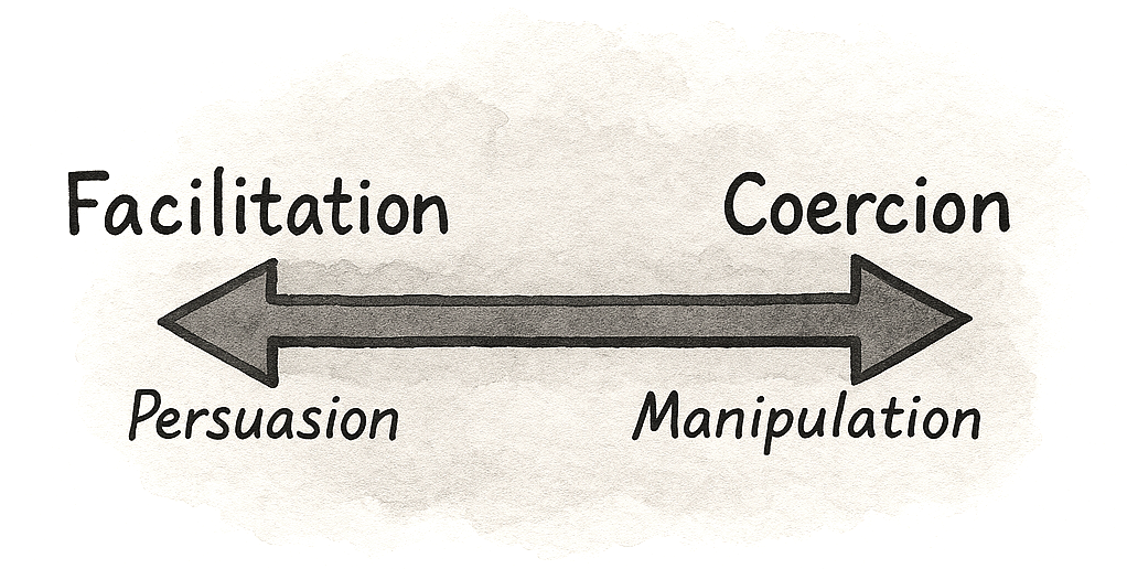
The difference between persuasion and deception is intention, plus accountability.
A Decade Later, What Have We learned?
In
the early 2010s, many teams treated persuasive design as almost
synonymous with gamification. If you added points, badges, and
leaderboards, you were doing psychology. And to be fair, those surface
mechanics did work in some cases, at least in the short term. They could
nudge people through onboarding flows or encourage a few extra logins.
But over the decade, their limits became clear. Once the novelty wore
off, many of these systems felt shallow. Users learned to ignore streaks
that did not connect to anything meaningful or dropped out when they
realized the game layer was not helping them reach a real goal.
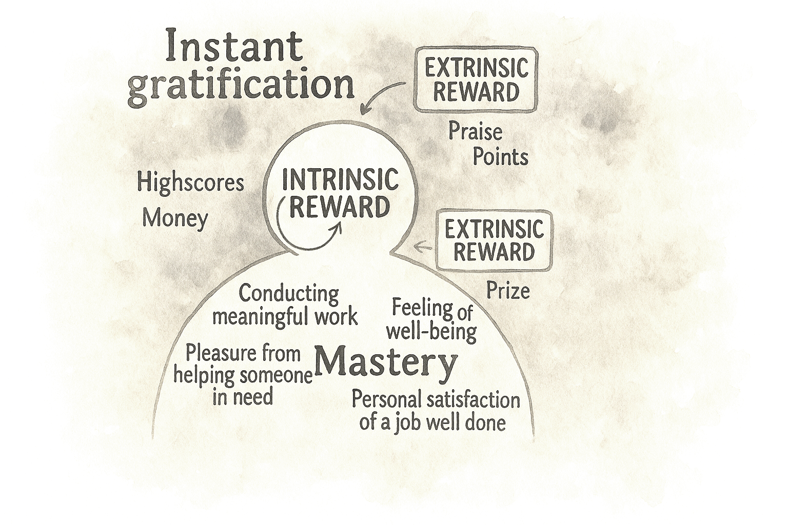
This is where self-determination theory has quietly reshaped how serious teams think about motivation. It distinguishes between extrinsic motivators, such as rewards, points, and status, and intrinsic drivers
like autonomy, competence, and relatedness. Put simply, if your
“gamification” fights against what people actually care about, it will
eventually fail. The interventions that have survived are the ones that
support intrinsic needs. A language learning streak that makes you feel
more capable and shows progress can work because it makes the core
activity feel more meaningful and manageable. A badge that only exists
to move a dashboard number, on the other hand, quickly becomes noise.
Lesson 1: From Quick Fixes To Behavioral Strategy
One
key lesson from the past decade is that behavioral design creates the
most value when it moves beyond isolated fixes and becomes a deliberate strategy.
Many product teams start with a narrow goal: improve a sign-up rate,
reduce drop-off, or boost early retention. When standard UX
optimizations plateau, they turn to psychology for a quick lift, often
with success.
The biggest opportunity is not one more uplift on a
stubborn metric, but having a systematic way to understand and shape
behavior across the product.
Behavioral design isn’t about hacks. It’s about helping people succeed.
Common
signals are easy to recognize: people sign up but never finish
onboarding; they click around once and never return; key features sit
unused. A behavioral strategy doesn’t just ask “What can we change on this screen?” It asks what is happening in the user’s mind and context at those moments.
That might lead you to design an onboarding experience that uses curiosity and the goal-gradient effect
to guide people to a clear first win, instead of hoping they read a
help doc. Or it might lead you to design for exploration and commitment
over time: social proof where it actually matters, appropriate challenges that stretch but don’t overwhelm, progressive disclosure so advanced features show up when people are ready, and the right triggers at the most opportune moment instead of random nags.
Great products aren’t just easy to use. They’re easier to commit to.
Product psychology has shifted from scattered hypotheses to a growing library of repeatable patterns.
Those patterns only shine when they sit inside a coherent behavioral
model: what users are trying to achieve, what blocks them, and which
levers the team will pull at each stage.
Simple nudges, inspired by Thaler and Sunstein, have helped popularize behavioral thinking in design. But we’ve also learned that nudges alone rarely solve deeper behavioral challenges.
A behavioral strategy goes further: it blends tactics, grounds them in
real motivations, and ties experiments to a clear theory of change. The
goal is not a one-off win on today’s dashboard, but a way of working
that compounds over time.
Lesson 2: Game Mechanics Alone Are Not Enough
Game
mechanics alone are no longer a credible behavioral strategy. Ten years
ago, adding points, badges, and leaderboards was almost shorthand for
“we’re doing psychology.” Today, most teams have learned the hard way
that this is decoration unless it serves a real need.
A behavioral
approach starts with a blunt question: What is the game layer in
service of, and for whom? Does it help people make progress that matters
to them, or does it just keep a dashboard happy? If it ignores
intrinsic motivation, it will look clever in a slide deck and brittle in
production.
In practice, that means points and streaks are not
treated as automatic upgrades anymore. Teams ask whether a mechanic
helps users feel more competent, more in control, or more connected to
others. A streak only makes sense if it reflects real progress in a
skill the user cares about. A leaderboard only adds value if people
actually want to compare themselves and if the ranking helps them decide
what to do next. If it does not pass those tests, it is clutter, not a
motivational engine.
Streaks and badges only work when they support something users truly value.
The
most effective products now start with the intrinsic side. They are
clear about what the product helps users become or achieve, and only
then ask whether a game mechanic can amplify that journey. When game
elements are added, they live in the core loop rather than on top of it.
They show mastery, mark meaningful milestones, and reinforce
self-driven goals. That is the difference between treating gamification
as a paint job and using it to support users on a path they already care
about.
Lesson 3: From Cause And Effect To Holistic Systems Thinking
Early
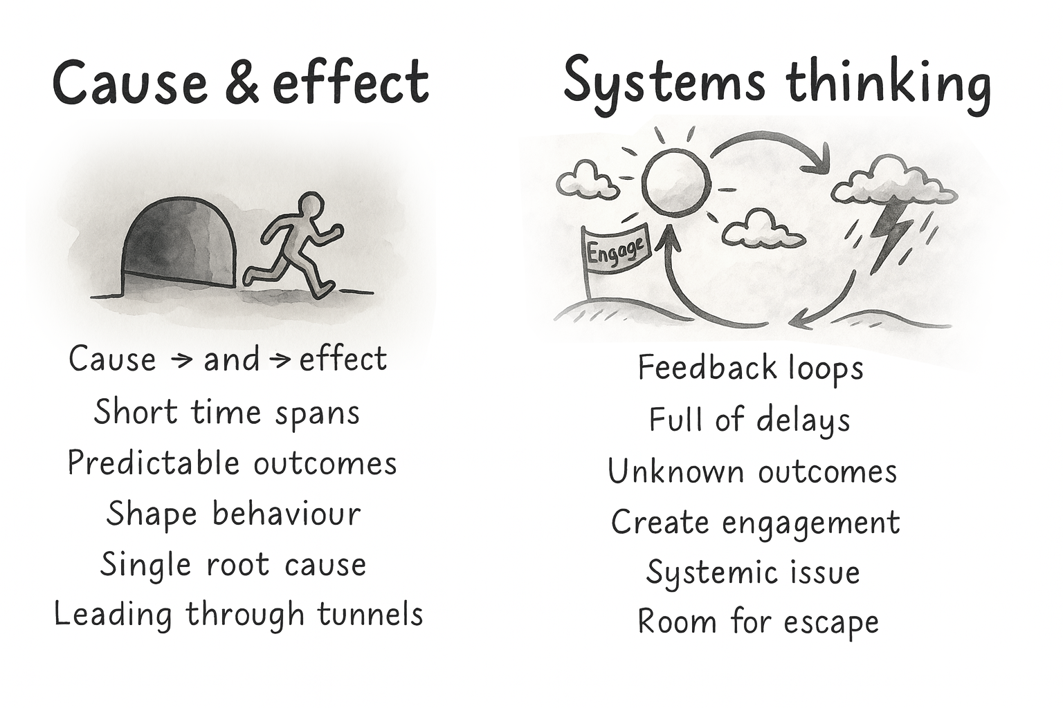
persuasive design often assumed a simple logic: find the broken step,
add the right lever, and users move forward. Nice on a slide, rarely
true in reality.
People don’t act for a single reason. They have
context, history, competing goals, mood, time pressure, trust issues,
and different definitions of success. Two users can take the same step
for completely different reasons. The same user can behave differently
on a different day.
That’s why systems thinking
matters. Behavior is shaped by feedback loops and delays, not just one
trigger. Outcomes we care about, trust, competence, and habit, are built
over time. A change that boosts this week’s conversion can still weaken
next month’s retention.
If you have ever shipped a “conversion
win” and then watched support tickets, refunds, or churn go up, you have
felt this. The local metric improved. The system got worse.
Your
design structures either enable people or box them in. Defaults,
navigation, feedback, pacing, rewards — each of these decisions reshapes
the system and therefore the journeys people take through it.
So
the job is not to perfect a single funnel. It is to build an environment
where multiple valid paths can succeed, and where the system supports
long-term goals, not just short-term clicks.
The job isn’t to perfect one funnel, but to support multiple valid paths.
A
mature behavioral strategy is explicit about that. It is designed for
several paths instead of one “happy flow,” supports autonomy instead of
forcing compliance, and looks at downstream effects instead of only
first-step conversion.
Lesson 4: From Triggers To Context
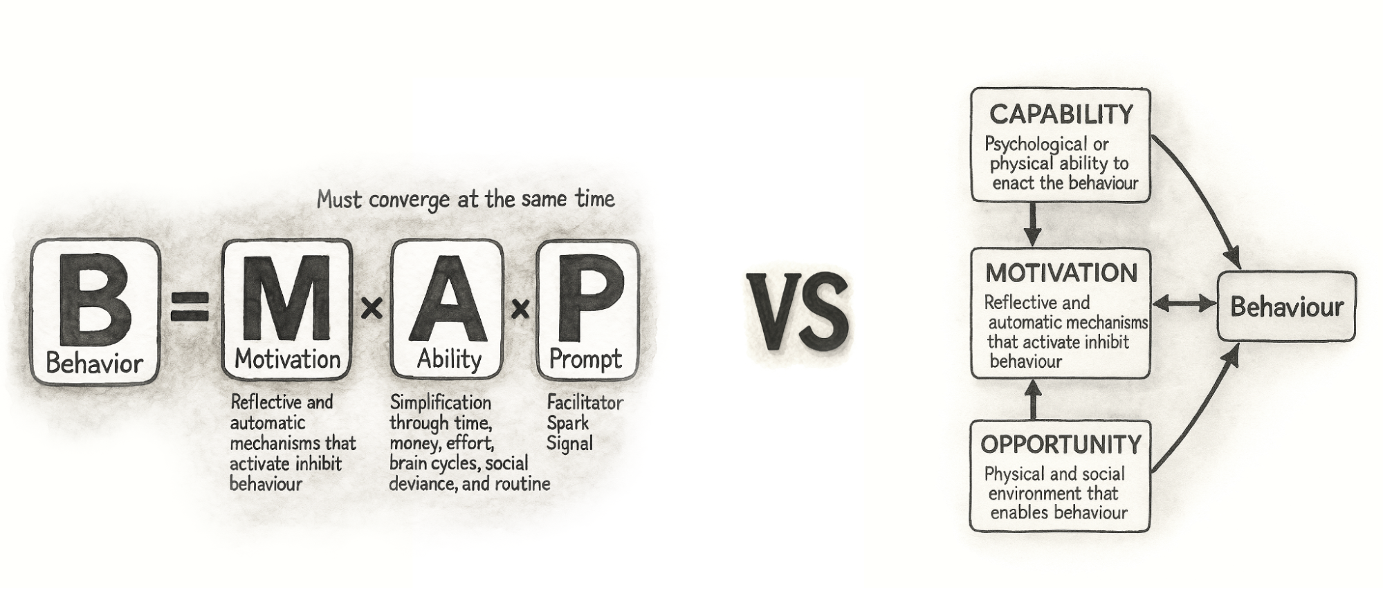
The same shift has happened in the frameworks we use. A decade ago, the Fogg Behavior Model
(FBM) was everywhere. It gave teams a simple trio: motivation, ability,
trigger — and a clear message: shouting louder with prompts does not
fix low motivation or poor ability. That alone was a useful upgrade.
Fogg’s
own work has moved on, too. With Tiny Habits, the focus leans more on
identity, emotion, and making behaviors feel easy and personally
meaningful. That mirrors a broader shift in the field: away from “fire
more prompts” and toward designing environments where the right behavior
feels natural.
Teams eventually ran into the same wall: prompts
do not fix low capability or missing opportunity. You cannot nag people
into skills they do not have or into contexts that do not exist. That is
where many teams that work deeply with behavior change have gravitated
toward COM-B as a more complete foundation.
COM-B breaks behavior into capability, opportunity, and motivation.
It starts with a blunt check: can people actually do this, and does
their environment let them? That maps well to modern products, where
behavior happens across devices, channels, and moments, not on a single
screen. It also plugs into broader behavior change work in health and
public policy, so we do not have to reinvent everything inside UX.
Thinking
this way nudges teams away from simple cause-and-effect stories. A drop
in completion rate is no longer “the button is bad” or “we need more
reminders,” but a question about how skills, context, and motivation
interact. A capability issue might need a better interface and better
education. An opportunity issue might be about device access, timing, or
social surroundings, not layout. Motivation might be shaped as much by
pricing and brand trust as by any in-product message.
Modern
behavioral design is less about activating clicks and more about
shaping conditions where action feels easy and meaningful.
This
broader lens also makes cross-functional work simpler. Product, design,
marketing, and data can share one behavior model and still see their
own responsibilities in it. Designers shape perceived capability and
opportunity in the interface, marketing shapes motivational framing and
triggers, and operations shape the structural opportunity in the
service. Instead of everyone pushing their own levers in isolation,
COM-B helps teams see that they are working on different parts of the
same system.
Lesson 5: Psychology Can Also Be Used To Design And Decode Discovery
COM-B
is often used as a bridge between discovery and ideation. On the
discovery side, it gives structure to research. You can use it to design
interview guides, read analytics, and make sense of observational
studies. It was built to diagnose what needs to change for a behavior to
shift, which maps neatly onto early product discovery.
Good discovery doesn’t just ask what users say, but examines what their behavior reveals.
Instead of asking “Why did you stop using the product?” and writing down the first answer, you deliberately walk through capability, opportunity, and motivation. You ask things like:
Can users actually do this, given their skills and knowledge?
Does their context help or hinder them in practice?
How strong is their motivation compared with other demands on their time and money?
You
walk through recent experiences in detail: which device they used, what
time of day it was, who else was around, and what else they were
juggling. You talk about how important this behavior is compared with
everything else in their life and what trade-offs they make. To
participants, these questions feel natural. Under the hood, you are
systematically covering all three parts of COM-B, in line with how
behavior change practitioners use the model in qualitative work.
You
can look at behavioral data in the same way. Funnel drop-offs, time on
task, and click patterns are clues: are people stuck because they cannot
progress, because the environment gets in the way, or because they do
not care enough to continue? Modern analytics tools make it easier to
watch what people actually do rather than only what they report, and
combining quantitative and qualitative data gives you a fuller picture
than either alone.
When there is a gap between what people say and what they do, you treat it as a signal
rather than an irritation. Someone might say that saving for retirement
is very important, but never set up a recurring transfer. A user might
claim that onboarding was simple, while their session shows repeated
back and forth between steps. Those mismatches are often where biases,
habits, and emotional barriers live. By labelling them in terms of
capability, opportunity, and motivation, and linking them to specific
barriers like risk aversion, analysis paralysis, status quo bias or present bias, you move from vague “insights” to a structured map of what is actually in the way.
The gap between what people say and what they do is not noise — it’s the map.
The
output of this kind of discovery is not just personas and journeys. You
also get a clear statement of the current behavior, the target
behavior, and the behavioral barriers and enablers that sit between
them.
Lesson 6: Use Behavioral Discovery In Your Ideation
The bridge from discovery to ideation can be a single sentence template:
From current behavior to target behavior, by doing X, because of barrier Y.
This
“from–to–by–why” framing forces teams to say what they actually
believe. You are not just saying “add a checklist.” You are saying: “We
believe a checklist will help new users feel more capable, which will
increase the chance they complete setup in their first session.” Now it
is a behavioral hypothesis you can test with experiments, not just a design idea you hope for.
From
there, you can generate several variants that express the same
principle in different ways and design experiments around them. You
might try a few messages that all lean on loss aversion, or several ways of simplifying a high-friction step, or different forms of social proof that vary in tone and proximity.
The
important shift is that you are no longer throwing ideas at the wall.
You are deliberately targeting the capability, opportunity, or
motivation issues that discovery surfaced, and testing which levers
actually work in your context.
Every idea should answer one question: which barrier are we trying to change?
Over
time, this loop between behavioral discovery and ideation turns into a
local playbook. You learn that in your product, some principles reliably
help your users and others fall flat. You also learn that patterns from
glowing case studies do not automatically transfer. Even gamification
and behavior change research often emphasize context-specific, user-centred implementations rather than generic recipes.
This
dual use of psychology in discovery and ideation is one of the bigger
shifts of the past decade. A product trio can look at a stubborn
drop-off point and ask, together, “Is this a capability, opportunity, or
motivation issue?” Then they generate ideas that target that part of
the system instead of guessing. That shared language makes behavioral
design less of a specialist add-on and more of a normal way for
cross-functional teams to reason about their work.
A Decade Later: What Has Proven To Work In Practice
If
the first decade of persuasive design taught us anything, it is that
behavioral insight is cheap until a team can act on it together.
Methods matter.
Over
time, a small set of workshop formats has consistently helped product
teams uncover behavioral barriers, align on opportunities, and generate
solutions grounded in real psychology instead of surface patterns. As
behavioral design has grown from tactical nudges into a strategic
discipline, an obvious question keeps coming up: How do teams actually do this work together in practice?
How
do product managers, designers, researchers, and engineers move from
scattered observations (“people seem confused here”) to a shared
behavioral diagnosis, and then to targeted ideas that reflect the real
drivers of capability, opportunity, and motivation?
One effective way to make this concrete is through a workshop format. The aim is to help teams:
Interpret research through a behavioral lens,
Surface capability, opportunity, and motivation gaps,
Prioritize high-potential opportunities, and
Generate ideas that are both psychologically sound and ethically considered.
Real
product work is messy and full of feedback loops; nobody follows a
perfect step-by-step checklist. But for learning, and especially for
introducing behavioral design into a team for the first time, a
structured sequence of exercises gives people a mental model. It shows
the journey from early discovery to behavioral clarity, from
opportunities to ideas, and finally to interventions that have been
stress-tested through an ethical lens.
The exercises below are one
such recipe. The order is intentional: each step builds on the previous
one to move from empathy and insight to prioritized opportunities,
concrete concepts, and responsible solutions. No team will follow it
letter-perfect every time, but it reflects how behavioral design work
tends to unfold when it goes well.
Before diving into the details,
here is the full recipe and how each exercise contributes to the bigger
behavioral design process:
Behavioral Empathy Mapping Builds a shared understanding of the user’s psychological landscape: emotions, habits, misconceptions, and sources of friction.
Behavioral Journey Mapping Maps the user’s flow over time, and overlays behavioral enablers and obstacles.
Behavior Scoring Prioritizes which behavioral opportunities to tackle first based on impact, feasibility, and evidence.
Ideas First, Patterns Later Encourages context-first ideation, then uses persuasive patterns to refine and strengthen promising concepts.
Dark Reality Evaluates ethical risks, unintended consequences, and potential misuse.
A note on timing:
In practice, this sequence can be run in different formats depending on
constraints. For a compact format, teams often run Exercises 1–3 in a
half-day workshop, and Exercises 4–5 in a second half-day session. With
more time, the work can be spread across a full week: discovery
synthesis early in the week, prioritization mid-week, and ideation plus
ethical review toward the end. The structure matters more than the
schedule; the goal is to preserve the progression from understanding →
prioritization → ideation → reflection.
Below is a brief walkthrough of each exercise as I typically facilitate them in workshops in tandem with a library of persuasive patterns.
Exercise 1: Behavioral Empathy Mapping
The first step is building a shared, psychologically informed understanding of users. Behavioral Empathy Mapping
extends traditional empathy mapping by paying attention to what users
attempt, avoid, postpone, misunderstand, or feel uncertain about. These
subtle behavioral signals often reveal more than stated needs or pain
points.
Goal: Understand what drives or blocks
the target behavior by capturing what users think, feel, say, and do —
and spotting behavioral barriers and enablers.
Steps:
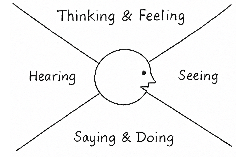
On a whiteboard or large paper, draw an empathy map: Thinking & Feeling, Seeing, Saying & Doing, and Hearing.
Add
research insights by letting everyone silently add sticky notes from
interviews, data, support logs, or observations into the quadrants. One
insight per note.
Identify barriers and enablers. Cluster notes that make the behavior harder (barriers) or easier (enablers).
Output:
A focused map of the psychological and contextual forces shaping the
target behavior, ready to feed into Behavioral Journey Mapping.
Exercise 2: Behavioral Journey Mapping
Once you understand the user’s mindset and context, the next step is to map how those forces play out across time. Behavioral Journey Mapping
overlays the user’s goals, actions, emotions, and environment onto the
product journey, highlighting the specific moments where behavior tends
to stall or shift.
Unlike traditional journey maps, the behavioral
version focuses on where capability breaks down, where the environment
works against the user, and where motivation fades or conflicts arise.
These become early signals of where change is both needed and possible.
The
output shows the team precisely where the product is asking too much,
where users lack support, or where additional motivation or clarity
might be required.
Goal: Map the steps from the user’s starting point to the target behavior, and capture the key enablers and barriers along the way.
Steps:
Draw a horizontal line from A (starting point) to B (target behavior).
With
a clearer picture of the user journey and what moments could benefit
from a behaviorally helpful hand, you are now ready to identify the
behavior it makes most sense to focus on trying to influence.
Goal: Decide which potential target behaviors are worth focusing on first, based on impact, ease of change, and ease of measurement.
Steps:
List
potential target behaviors. Based on the output of the Behavioral
Journey Mapping, list behaviors that could potentially be targeted. One
behavior per sticky note. Be as concrete as possible (what users do,
where, and when).
Create a table with the following columns:
Impact of behavior change (how much it could move the goal),
Ease of change (how realistic it is to influence),
Ease of measurement (how straightforward it is to track).
Potential target behaviors
Impact of behavior change
Ease of change
Ease of measurement
Total
…
…
…
Enter each listed behavior into the table and score them from 0 to 10 in each column.
Sort behaviors by total score and discuss the highest-scoring ones:
Do they make sense given what you know about users and constraints?
Select the primary target behaviors you want to carry into the next exercises. Optionally, note “bonus behaviors” that might follow as a side effect.
Output:
A small set of prioritized target behaviors with a clear rationale for
why they matter now, and a list of lower-priority behaviors you may
revisit later.
A filled-out Behavior Scoring table could look like this:
Potential target behaviors
Impact of behavior change
Ease of change
Ease of measurement
Total
User completes onboarding checklist in first session.
8
6
9
23
User invites at least one teammate within 7 days.
9
4
8
21
User watches the full product tour video.
4
7
6
17
User reads help documentation during onboarding.
3
5
4
12
In
this case, the checklist completion emerges as the strongest initial
focus: it has high impact, is realistically influenceable through design
changes, and can be measured reliably. Inviting a teammate may be
strategically important, but it may require broader changes beyond
interface design, making it a secondary focus.
Exercise 4: Ideas First, Patterns Later
Once
the team has agreed on which behavior matters most, the next risk is
jumping too quickly to familiar psychological tricks. One of the
clearest lessons has been that starting with “the pattern” often leads
to generic solutions that feel clever but fail in context.
Goal: Generate solutions grounded in user context first, then use psychological principles to sharpen and strengthen them.
Steps:
Start
by restating the prioritized target behavior and the key barrier
identified during journey mapping. Keep this visible throughout the
exercise.
Then give the team a short, focused ideation window (10–15 minutes). The
rule here is simple: no references to behavioral models, cognitive
biases, or persuasive patterns yet. Ideas should come directly from the
user context, constraints, and moments uncovered earlier.
Collect
ideas on a shared surface and group similar concepts. Look for multiple
ways of solving the same underlying problem (cluster them together).
Only now do you introduce a library of psychological principles and techniques. I developed the persuasive patterns for this exact purpose. The goal of this step is not to replace ideas, but to refine them:
Which ideas could be strengthened by reducing friction?
Which might benefit from clearer feedback, social signals, or better timing?
Are there alternative ways to achieve the same effect more respectfully or more clearly?
Patterns
are used as lenses, not prescriptions. If a pattern does not improve
clarity, agency, or usefulness in this context, it is simply ignored.
Output:
A refined set of solution concepts that are grounded in real user
context and supported, where appropriate, by behavioral principles
rather than driven by them.
This sequencing helps teams avoid
“pattern-first design,” where ideas are reverse-engineered to fit a
theory instead of addressing real human situations.
Before ideas turn into experiments or shipped features, they need one final test. Not for feasibility or metrics, but for ethics.
Over
the years, this step has proven critical. Many persuasive solutions
only reveal their downside when you imagine them working too well, or
being applied in the wrong hands, or used on the wrong day by the wrong
person.
Goal: Surface ethical risks, unintended consequences, and potential misuse before implementation.
Steps:
Take one or two of the strongest ideas from the previous exercise.
Imagine worst-case scenarios by asking the team to deliberately shift perspective:
What if a competitor used this against us?
What if this nudges users when they’re stressed, tired, or vulnerable?
What happens if this works repeatedly over months, not once?
Could this create pressure, guilt, or dependence?
Capture concerns around autonomy, trust, fairness, inclusivity, or long-term well-being.
For each risk, explore ways to soften or counterbalance the effect:
Clearer intent or transparency,
Lower frequency or gentler timing,
Explicit opt-outs,
Alternative paths forward.
Some ideas are reshaped. Some are paused. Some survive intact, but now with greater confidence.
Output: Solutions that have been stress-tested ethically, with known risks acknowledged and mitigated rather than ignored.
Building A Shared Vocabulary For Product Psychology #
The
teams that get the most out of behavioral design rarely have a single
“psychology expert.” Instead, their team shares a vocabulary around
product psychology and knows how to communicate around customer problem
behaviorally.
A shared vocabulary turns psychology into cross-functional work.
When patterns and principles are shared:
Product, design, engineering, and marketing can talk about behavior without talking past each other.
Discovery insights are easier to interpret because common barriers and drivers have names.
Ideas can be framed as behavioral hypotheses (“we believe this will increase early competence…”) instead of vague guesses.
The Persuasive Patterns
collection grew from this need: giving teams a common language and a
concrete set of examples to point at. Whether used as a printed deck in a
workshop or as long-form references during everyday work, the goal is
the same: make product psychology something the whole team can see and
discuss.
Persuasive design was often framed as a bag of tricks. Today, the work looks different:
Game mechanics are used to support intrinsic motivation, not drive vanity engagement.
Frameworks like COM-B and systems thinking help teams see behavior in context, not as a single trigger.
Behavioral insight is used to shape discovery and ideation, not just last-minute copy changes.
Ethics is part of the design brief, not an afterthought.
The
next step is not more sophisticated nudges. It is a more systematic
practice: simple methods, shared language, and a habit of asking “What is really going on in our users’ lives here?”
If
you start by focusing on one behavioral problem, use a couple of the
exercises in this article, and give your team a shared set of patterns
to reference, you are already practicing persuasive design in the way it
has evolved over the last ten years: grounded in evidence, respectful
of users, and aimed at outcomes that matter on both sides of the screen.
WCAG
is evolving. Since 1999, the Web Content Accessibility Guidelines have
defined accessibility in binary terms: either a success criterion is met
or not. But real user experience is rarely that simple. WCAG 3.0
rethinks the model — prioritizing usability over compliance and shifting
the focus toward the quality of access rather than the mere presence of
features. Could this be the start of a new era in accessibility?
Since their introduction in 1999, the Web Content Accessibility Guidelines (WCAG) have shaped how we design and develop inclusive digital products. The WCAG 2.x series, released in 2008,
introduced clear technical criteria judged in a binary way: either a
success criterion is met or not. While this model has supported
regulatory clarity and auditability, its “all-or-nothing” nature often fails to reflect the nuance of actual user experience (UX).
Over
time, that disconnect between technical conformance and lived usability
has become harder to ignore. People engage with digital systems in
complex, often nonlinear ways: navigating multistep flows, dynamic
content, and interactive states. In these scenarios, checking whether an
element passes a rule doesn’t always answer the main question: can
someone actually use it?
WCAG 3.0 is still in draft, but is evolving — and it represents a fundamental rethinking
of how we evaluate accessibility. Rather than asking whether a
requirement is technically met, it asks how well users with disabilities
can complete meaningful tasks. Its new outcome-based model introduces a
flexible scoring system that prioritizes usability over compliance, shifting focus toward the quality of access rather than the mere presence of features.
WCAG 3.0 isn’t just an update — it’s a paradigm shift.
Unlike WCAG 2.x, which focused primarily on web pages, WCAG 3.0 aims to cover a much broader ecosystem,
including applications, tools, connected devices, and emerging
interfaces like voice interaction and extended reality. It also rebrands itself as the W3C Accessibility Guidelines (while the WCAG acronym remains the same), signaling that accessibility is no longer a niche concern — it’s a baseline expectation across the digital world.
Importantly, WCAG 3.0 will not immediately replace 2.x.
Both standards will coexist, and conformance to WCAG 2.2 will continue
to be valid and necessary for some time, especially in legal and policy
contexts.
Rules alone can’t capture whether a system truly works for someone. That’s why WCAG 3.0 leans into flexibility and future-proofing,
aiming to support evolving technologies and real-world use over time.
It formalizes a principle long understood by practitioners:
Inclusive design isn’t about passing a test; it’s about enabling people.
A New Structure: From Success Criteria To Outcomes And Methods
WCAG 2.x is structured around four foundational principles — Perceivable, Operable, Understandable, and Robust (aka POUR) — and testable success criteria organized into three conformance levels (A, AA, AAA). While technically precise, these criteria often emphasize implementation over impact.
WCAG 3.0 reorients this structure toward user needs and real outcomes. Its hierarchy is built on:
Guidelines: High-level accessibility goals tied to specific user needs.
Outcomes: Testable, user-centered statements (e.g., “Users have alternatives for time-based media”).
Methods: Technology-specific or agnostic techniques that help achieve the outcomes, including code examples and test instructions.
How-To Guides: Narrative documentation that provides practical advice, user context, and design considerations.
This
shift is more than organizational. It reflects a deeper commitment to
aligning technical implementation with UX. Outcomes speak the language of capability, which is about what users should be able to do (rather than just technical presence).
Crucially,
outcomes are also where conformance scoring begins to take shape. For
example, imagine a checkout flow on an e-commerce website. Under WCAG
2.x, if even one field in the checkout form lacks a label, the process may fail AA conformance entirely. However, under WCAG 3.0, that same flow might be evaluated across multiple outcomes
(such as keyboard navigation, form labeling, focus management, and
error handling), with each outcome receiving a separate score. If most
areas score well but the error messaging is poor, the overall rating
might be “Good” instead of “Excellent”, prompting targeted improvements
without negating the entire flow’s accessibility.
From Binary Checks To Graded Scores
Rather than relying on pass or fail outcomes, WCAG 3.0 introduces a scoring model that reflects how well accessibility is supported. This shift allows teams to recognize partial successes and prioritize real improvements.
How Scoring Works
Each outcome in WCAG 3.0 is evaluated through one or more atomic tests. These can include the following:
Binary tests: “Yes” and “no” outcomes (e.g., does every image have alternative text?)
Percentage-based tests: Coverage-based scoring (e.g., what percentage of form fields have labels?)
Qualitative tests: Rated judgments based on criteria (e.g., how descriptive is the alternative text?)
The
result of these tests produces a score for each outcome, often
normalized on a 0-4 or 0-5 scale, with labels like Poor, Fair, Good, and
Excellent. These scores are then aggregated across functional
categories (vision, mobility, cognition, etc.) and user flows.
This allows teams to measure progress, not just compliance. A product that improves from “Fair” to “Good” over time shows real evolution — a concept that doesn’t exist in WCAG 2.x.
Critical Errors: A Balancing Mechanism
To ensure that severity still matters, WCAG 3.0 introduces critical errors, which are high-impact accessibility failures that can override an otherwise positive score.
For
example, consider a checkout flow. Under WCAG 2.x, a single missing
label might cause the entire flow to fail conformance. WCAG 3.0,
however, evaluates multiple outcomes — like form labeling, keyboard
access, and error handling — each with its own score. Minor issues, such
as unclear error messages or a missing label on an optional field,
might lower the rating from “Excellent” to “Good”, without invalidating
the entire experience.
But if a user cannot complete a core action, like submitting the form, making a purchase, or logging in, that constitutes a critical error.
These failures directly block task completion and significantly reduce
the overall score, regardless of how polished the rest of the experience
is.
On the other hand, problems with non-essential features —
like uploading a profile picture or changing a theme color — are
considered lower-impact and won’t weigh as heavily in the evaluation.
Conformance Levels: Bronze, Silver, Gold
In place of categorizing conformance in tiers of Level A, Level AA, and Level AAA, WCAG 3.0 proposes three different conformance tiers:
Bronze: The new minimum. It is comparable to WCAG 2.2 Level AA,
but based on scoring and foundational outcomes. The requirements are
considered achievable via automated and guided manual testing.
Gold:
The highest tier. Represents exemplary accessibility, likely requiring
inclusive design processes, innovation, and extensive user involvement.
Unlike in WCAG 2.2, where Level AAA is often seen as aspirational and inconsistent, these levels are intended to incentivize progression. They can also be scoped
in the sense that teams can claim conformance for a checkout flow,
mobile app, or specific feature, allowing iterative improvement.
What You Should Do Now
While
WCAG 3.0 is still being developed, its direction is clear. That said,
it’s important to acknowledge that the guidelines are not expected to be
finalized in a few years. Here’s how teams can prepare:
Continue pursuing WCAG 2.2 Level AA.It remains the most robust, recognized standard.
Familiarize yourselfwith WCAG 3.0 drafts, especially the outcomes and scoring model.
Embed accessibility into workflows. Shift left. Don’t test at the end — design and build with access in mind.
Involveusers with disabilities early and regularly.
These practices won’t just make your product more inclusive; they’ll position your team to excel under WCAG 3.0.
Potential Downsides
Even though WCAG 3.0 presents a bold step toward more holistic accessibility,
several structural risks deserve early attention, especially for
organizations navigating regulation, scaling design systems, or building
sustainable accessibility practices. Importantly, many of these risks
are interconnected: challenges in one area may amplify issues in others.
Subjective Scoring
The move from binary pass or fail criteria to scored evaluations introduces room for subjective interpretation.
Without standardized calibration, the same user flow might receive
different scores depending on the evaluator. This makes comparability
and repeatability harder, particularly in procurement or multi-vendor
environments. A simple alternative text might be rated as “adequate” by
one team and “unclear” by another.
Reduced Compliance Clarity
That same subjectivity leads to a second concern: the erosion of clear compliance thresholds.
Scored evaluations replace the binary clarity of “compliant” or “not”
with a more flexible, but less definitive, outcome. This could
complicate legal enforcement, contractual definitions, and audit
reporting. In practice, a product might earn a “Good” rating while still
presenting critical usability gaps for certain users, creating a
disconnect between score and actual access.
Until
WCAG 3.0 is formally mapped to those standards, its use in regulated
contexts may introduce risk. Teams operating in healthcare, finance, or
public sectors will likely need to maintain dual conformance strategies
in the interim, increasing cost and complexity.
Risk Of Minimum Viable Accessibility
Perhaps
most concerning, this ambiguity can set the stage for a “minimum viable
accessibility” mindset. Scored models risk encouraging “Bronze is good
enough” thinking, particularly in deadline-driven environments. A team
might deprioritize improvements once they reach a passing grade, even if
essential barriers remain.
For example, a mobile app with strong
keyboard support but missing audio transcripts could still achieve a
passing tier, leaving some users excluded.
Conclusion
WCAG 3.0 marks a new era in accessibility
— one that better reflects the diversity and complexity of real users.
By shifting from checklists to scored evaluations and from rigid
technical compliance to practical usability, it encourages teams to prioritize real-world impact over theoretical perfection.
As one might say, “It’s not about the score. It’s about who can use the product.”
In my own experience, I’ve seen teams pour hours into fixing minor
color contrast issues while overlooking broken keyboard navigation,
leaving screen reader users unable to complete essential tasks. WCAG
3.0’s focus on outcomes reminds us that accessibility is fundamentally
about functionality and inclusion.
For
teams across design, development, and product leadership, this shift is
a chance to rethink what success means. Accessibility isn’t about
ticking boxes — it’s about enabling people.
By preparing now,
being mindful of the risks, and focusing on user outcomes, we don’t just
get ahead of WCAG 3.0 — we build digital experiences that are truly
usable, sustainable, and inclusive.
WCAG
provides guidance for making interactive elements more accessible by
specifying minimum size requirements. In fact, the requirements are
documented in two Success Criteria: 2.5.5 and 2.5.8. Despite this, WCAG
can be difficult to achieve due to a number of misconceptions about the
requirements. In this article, Eric Bailey discusses the nuances of
interactive element sizes and clarifies what it looks like to provide
accessible interactive experiences using WCAG-compliant target sizes.
There
are many rumors and misconceptions about conforming to WCAG criteria
for the minimum sizing of interactive elements. I’d like to use this
post to demystify what is needed for baseline compliance and to point out an approach for making successful and inclusive interactive experiences using ample target sizes.
Getting right to it: When it comes to pure Web Content Accessibility Guidelines (WCAG) conformance, the bare minimumpixel sizefor an interactive, non-inline element is 24×24 pixels. This is outlined in Success Criterion 2.5.8: Target Size (Minimum).
Success Criterion 2.5.8 is level AA,
which is the most commonly used level for public, mass-consumed
websites. This Success Criterion (or SC for short) is sometimes confused
for SC 2.5.5 Target Size (Enhanced),
which is level AAA. The two are distinct and provide separate guidance
for properly sizing interactive elements, even if they appear similar at
first glance.
SC 2.5.8 is relatively new to WCAG, having been released as part of WCAG version 2.2, which was published on October 5th, 2023. WCAG 2.2 is the most current version of the standard,
but this newer release date means that knowledge of its existence isn’t
as widespread as the older SC, especially outside of web accessibility
circles. That said, WCAG 2.2 will remain the standard until WCAG 3.0 is released, something that is likely going to take 10–15 years or more to happen.
SC 2.5.5 calls for larger interactive elements sizes that are at least 44×44 pixels (compared to the SC 2.5.8 requirement of 24×24 pixels). At the same time, notice that SC 2.5.5 is level AAA (compared to SC 2.5.8, level AA) which is a level reserved for specialized support beyond level AA.
Sites that need to be fully WCAG Level AAA conformant are rare.
Chances are that if you are making a website or web app, you’ll only
need to support level AA. Level AAA is often reserved for large or
highly specialized institutions.
Making Interactive Elements Larger With CSS Padding #
The family of padding-related properties in CSS can be used to extend the interactive area of an element to make it conformant. For example, declaring padding: 4px;
on an element that measures 16×16 pixels invisibly increases its
bounding box to a total of 24×24 pixels. This, in turn, means the
interactive element satisfies SC 2.5.8.
This
is a good trick for making smaller interactive elements easier to click
and tap. If you want more information about this sort of thing, I
enthusiastically recommend Ahmad Shadeed’s post, “Designing better target sizes”.
I think it’s also worth noting that CSS margin could also hypothetically be used to achieve level AA conformance since the SC includes a spacing exception:
Spacing:
Undersized targets (those less than 24×24 CSS pixels) are positioned so
that if a 24 CSS pixel diameter circle is centered on the bounding box of each, the circles do not intersect another target or the circle for another undersized target;
[…]
The difference here is that padding extends the interactive area, while margin does not. Through this lens, you’ll want to honor the spirit of the success criterion because partial conformance is adversarial conformance. At the end of the day, we want to help people successfully click or tap interactive elements, such as buttons.
We
tend to think of targets in terms of block elements — elements that are
displayed on their own line, such as a button at the end of a
call-to-action. However, interactive elements can be inline elements as
well. Think of links in a paragraph of text.
Inline interactive elements, such as text links in paragraphs, do not need to meet the 24×24 pixel minimum requirement. Just as margin is an exception in SC 2.5.8: Target Size (Minimum), so are inline elements with an interactive target:
If
the differences between interactive elements that are inline and block
are still confusing, that’s probably because the whole situation is even
further muddied by third-party human interface guidelines requiring
interactive sizes closer to what the level AAA Success Criterion 2.5.5
Target Size (Enhanced) demands.
These may satisfy Apple and Google requirements for designing interfaces, but are they WCAG-conformant
Apple and Google — not to mention any other organization with UI
guidelines — can specify whatever interface requirements they want, but are they copasetic with WCAG SC 2.5.5 and SC 2.5.8?
It’s
important to ask this question because there is a hierarchy when it
comes to accessibility compliance, and it contains legal levels:
Human
interface guidelines often inform design systems, which, in turn,
influence the sites and apps that are built by authors like us. But
they’re not the “authority” on accessibility compliance. Notice how
everything is (and ought to be) influenced by WCAG at the very top of
the chain.
Even if these third-party interface guidelines conform
to SC 2.5.5 and 2.5.8, it’s still tough to tell when they are expressed
in “points” and “density independent pixels” which aren’t pixels, but often get conflated as such. I’d advise not getting too deep into researching what a pixel truly is.
Trust me when I say it’s a road you don’t want to go down. But whatever
the case, the inconsistent use of unit sizes exacerbates the issue.
After all, mouse cursors are for fine movements, and touchscreens are for more broad gestures, right? Not always. The thing is, devices are multimodal. They can support many different kinds of input
and don’t require a special switch to flip or button to press to do so.
A straightforward example of this is switching between a trackpad and a
keyboard while you browse the web. A less considered example is a
device with a touchscreen that also supports a trackpad, keyboard,
mouse, and voice input.
You might think that the combination of
trackpad, keyboard, mouse, and voice inputs sounds like some sort of
absurd, obscure Frankencomputer, but what I just described is a Microsoft Surface laptop, and guess what? They’re pretty popular.
There
is a difference between the two, even though they are often used
interchangeably. Let’s delineate the two as clearly as possible:
Responsive Design is about designing for an unknown device.
Inclusive Design is about designing for an unknown user.
The other end of this consideration is that people with motor control conditions
— like hand tremors or arthritis — can and do use mice inputs. This
means that fine input actions may be painful and difficult, yet
ultimately still possible to perform.
People also use more precise input mechanisms for touchscreens all the time, including both official accessories and aftermarket devices. In other words, some devices designed to accommodate coarse input can also be used for fine detail work.
I’d
be remiss if I didn’t also point out that people plug mice and
keyboards into smartphones. We cannot automatically say that they only
support coarse pointers:
My point is that a mode-based approach to inclusive design is a trap. This isn’t even about view–tap asymmetry.
Creating entire alternate experiences based on assumed input mode
reinforces an ugly “us versus them” mindset. It’s also far more work to
set up, maintain, and educate others.
It’s better to proactively accommodate an unknown number of unknown people using an unknown suite of devices in unknown ways by providing an inclusive experience by default. Doing so has a list of benefits:
A WCAG-conformant 24×24 minimum pixel size requirement for interactive elements is our industry’s best understanding
of what can accommodate most access needs distributed across a global
population accessing an unknown amount of content dealing with unknown
topics in unknown ways under unknown circumstances.
The load-bearing word in that previous sentence is minimum. The guidance — and the pixel size it mandates — is likely a balancing act between:
Setting something up that is functional enough while also
Avoiding a standard that would be impossible to broadly achieve (hence the SC 2.5.5 level AAA rating).
“This
Success Criterion defines a minimum size and, if this can't be met, a
minimum spacing. It is still possible to have very small and
difficult-to-activate targets and meet the requirements of this Success
Criterion.”
Larger interactive areas can be a good thing to strive for. This is to say a
minimum of approximately 40 pixels may be beneficial for individuals
who struggle with the smaller yet still WCAG-conformant size.
Interactive Area Sizing Is As Much An Art As It Is A Science #
We should also be careful not to overcorrect by dropping in gigantic interactive elements in all of our work. If an interactive area is too
large, it risks being activated by accident. This is important to note
when an interactive element is placed in close proximity to other
interactive elements and even more important to consider when activating
those elements can result in irrevocable consequences.
There is
also a phenomenon where elements, if large enough, are not interpreted
or recognized as being interactive. Consequently, users may
inadvertently miss them, despite large sizing.
Conformant and successful interactive areas — both large and small — require knowing the ultimate goals of your website or web app. When you arm yourself with this context, you are empowered to make informed decisions about the kinds of people who use your service, why they use the service, and how you can accommodate them.
For example, the Glow Baby app uses larger interactive elements
because it knows the user is likely holding an adorable, albeit squirmy
and fussy, baby while using the application. This allows Glow Baby to
emphasize the interactive targets in the interface to accommodate
parents who have their hands full.
Source: “Touch Targets on Touchscreens” by Neilsen Norman Group. (Large preview)
For
example, in digital maps, the position of pins is analogous to the
position of places shown on the map. If there are many pins close
together, the spacing between pins and neighboring pins will often be
below 24 CSS pixels. It is essential to show the pins at the correct map
location; therefore, the Essential exception applies.
[…]
When
the "Essential" exception is applicable, authors are strongly
encouraged to provide equivalent functionality through alternative means
to the extent practical.
Note that this exemption language is not carte blanche to make your own work an exception to the rule.
It is more of a mechanism, and an acknowledgment that broadly applied
rules may have exceptions that are worth thinking through and
documenting for future reference.
What about people who are driving in a car? People in
this context probably ought to be provided straightforward, simple
interactions that are facilitated via large interactive areas to prevent
them from taking their eyes off the road. The same could also be said
for high-stress environments like hospitals and oil rigs.
Similarly, devices and apps that are designed for children
may require interactive areas that are larger than WCAG requirements
for interactive areas. So would experiences aimed at older demographics,
where age-derived vision and motor control disability factors tend to
be more present.
Minimum conformant interactive area experiences
may also make sense in their own contexts. Data-rich, information-dense
experiences like the Bloomberg terminal come to mind here.
While you can control what components you include in a design system, you cannot control where and how they’ll be used by those who adopt and use that design system. Because of this, I suggest defensively baking accessible defaults into your design systems because they can go a long way toward incorporating accessible practices when they’re integrated right out of the box.
One option worth consideration is providing an accessible range of choices.
Components, like buttons, can have size variants (e.g., small, medium,
and large), and you can provide a minimally conformant interactive
target on the smallest variant and then offer larger, equally conformant
versions.
There
is no magic number or formula to get you that perfect Goldilocks “not
too small, not too large, but just right” interactive area size. It
requires knowledge of what the people who want to use your service want,
and how they go about getting it.
The best way to learn that? Ask people.
Accessibility
research includes more than just asking people who use screen readers
what they think. It’s also a lot easier to conduct than you might think!
For example, prototypes are a great way to quickly and inexpensively
evaluate and de-risk your ideas before committing to writing production
code. “Conducting Accessibility Research In An Inaccessible Ecosystem” by Dr. Michele A. Williams is chock full of tips, strategies, and resources you can use to help you get started with accessibility research.