Payment of ₹ requested by HONEY VIG. Click the link to pay securely via Razorpay: Make 5000 payment Payment of ₹ requested by HONEY VIG. Click the link to pay securely via Razorpay: Make 5000 payment ⭐ If you would like to buy me a coffee, well thank you very much that is mega kind! : https://www.buymeacoffee.com/honeyvig
Hire a web Developer and Designer to upgrade and boost your online presence with cutting edge Technologies
Showing posts with label Business. Show all posts

Wednesday, July 22, 2026

From Kickoff To First Concept: How To Turn Brand Strategy Into Visual Direction


The strongest visual concepts don’t start in Figma. They start with the right questions. Explore the pre-concept phase of brand identity design, where teams research brand context, uncover hidden assumptions with stakeholders, and turn shared direction into a visual foundation before a single concept is created.

When a branding project fails, it usually happens long before the logo stage: in the strategy phase, when words like “modern,” “trustworthy,” “premium,” “friendly,” and “disruptive” are left undefined. The result is a gap between what the brand is supposed to communicate and what the designer is expected to create. This is the space I like to call the “pre-concept” phase.

At the beginning of a project, designers usually receive many inputs: a brief, a few stakeholder conversations, competitor references, maybe a moodboard or a list of adjectives. From there, they are expected to create visual concepts that feel right. But “right” is difficult to judge when the team has not agreed on what the brand is supposed to communicate in the first place.

As an example, a health tech company we worked with said they wanted to look modern, trustworthy, and disruptive. At first, “disruptive” sounded like a push toward something bold and unconventional. But as we talked, it became clear that disruption, for them, still had to feel credible inside a conservative healthcare environment. Their clients were large government medical institutions. A brand that felt too rebellious, experimental, or visually loud would not create the right kind of trust.

In other words, their version of “disruptive” looked more traditional than the word suggested.

The problem was not that the client used the wrong language. The problem was that the language was too broad to guide design decisions. Before a designer can turn strategy into a visual concept, those words need to become more specific. What kind of modern? Trustworthy in what way? Disruptive compared to whom? And how far can the brand move away from category expectations before it starts to feel wrong for its audience?

This article is about that pre-concept phase: the work that happens after the kickoff but before the first visual direction. While the broader brand identity process for digital products includes strategy, concepts, implementation, and the assets a product team needs to build consistently, this article focuses on the earlier work that makes the first concept possible: researching the brand context, uncovering hidden assumptions with stakeholders, and turning shared direction into a visual foundation. Rather, a practical bridge between what the brand needs to mean and how it might begin to look.

The first place to build that bridge is the brand workshop, where broad discovery needs to become a clearer understanding of the brand context.
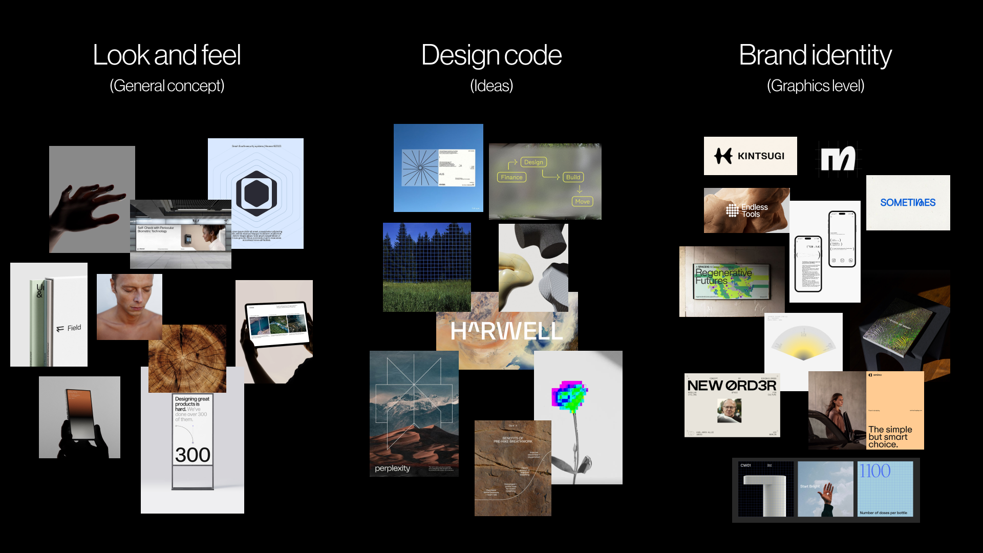
pre-concept phase: Look and feel (general concept), design code (ideas), brand identity (graphics level)
A pre-concept reference board showing how brand character can move from overall look and feel to design code and early brand identity cues. The board uses publicly available visual references to discuss mood, principles, and possible graphic directions before original concept work begins
 

Stage 1: Research The Brand Context

A brand workshop will naturally cover the standard discovery topics: the business, its goals, the product or service, the competitive landscape, and the target audience. This article will not try to list every question a designer should ask in that workshop. For readers who want a broader starting point, we prepared a Brand Workshop Toolkit: Questions and Exercises, a FigJam framework we use in our studio to structure discovery conversations.

Here, I want to focus on a smaller set of questions that are easy to skip but extremely useful before visual work begins. These questions are less about collecting facts and more about clarifying perception. They help the team understand what the brand needs to make people believe, where it needs to feel credible, and which category assumptions it should follow or challenge.

Perception sits at the center of brand discovery because the brand is shaped in someone else’s mind.

“A brand is a person’s gut feeling about a product, service, or company.”

— Marty Neumeier, The Brand Gap

If the brand ultimately lives in someone else’s perception, the workshop has to clarify what perception the team is trying to create.

The perception questions I focus on are:

  • What should people believe about the company after seeing the brand for the first time?
  • What would make the brand feel credible in this category?
  • If the brand were a person in the room, how would they speak?
  • What do customers currently misunderstand about the company, product, or category?
  • Where does the brand need to fit the category, and where does it need to break from it?

These questions help reveal the assumptions behind people’s opinions, instead of simply adding more opinions to the room. The questions matter because brand attributes often sound aligned before they are actually understood. A stakeholder may say the brand should feel “premium,” and everyone may nod. But one person may mean refined and editorial. Another may mean expensive and exclusive. Another may mean clean, quiet, and minimal. The word sounds shared, but it can lead to three completely different visual systems.

For instance, in the health tech project mentioned earlier, the client described the desired brand as “disruptive.” In many categories, that might suggest something bold, loud, or unconventional. But their audience was large government medical institutions, so disruption had to be expressed through clarity, efficiency, and confidence rather than rebellion. If we had taken the word at face value, the visual direction could easily have moved too far from what their audience would trust.

In another project, a fintech team wanted the brand to feel “bold” without losing credibility. That word created useful tension. The word bold could mean bright colors, oversized typography, and a highly expressive system. But in a financial category, it also had to carry signals of security, control, and competence. The question was not whether the brand should be bold, but what kind of boldness would still feel trustworthy.

When the team can define what these attributes mean in context, the designer is no longer working from broad adjectives. They are working from a clearer design problem.

Stage 2: Reveal Hidden Assumptions With Stakeholders

Strategically selected questions can uncover part of the verbal layer, but words alone are rarely enough. To move from language into visual direction, it helps to incorporate exercises that make stakeholders think through images, associations, and relative perception.

Jake Knapp makes a similar point in GV’s Three-Hour Brand Sprint:

“The point of these exercises is to make the abstract idea of “our brand” into something concrete.”

— Jake Knapp

The following two exercises help translate what stakeholders say about the brand into material that can later inform look and feel, design principles, and concept development.

This is also where stakeholder participation becomes important. When clients only receive a strategy presentation, they can stay passive. They may agree in the meeting without noticing the assumptions they are bringing into the process. But when they have to place a competitor on a map, choose an image, or explain why a certain reference feels credible, they become active participants. Their attitudes, beliefs, and disagreements become visible before they have a chance to derail the first concept review.

I usually start by looking outward at the category, then inward at the brand itself.

Exercise 1: Competitor Perception Mapping

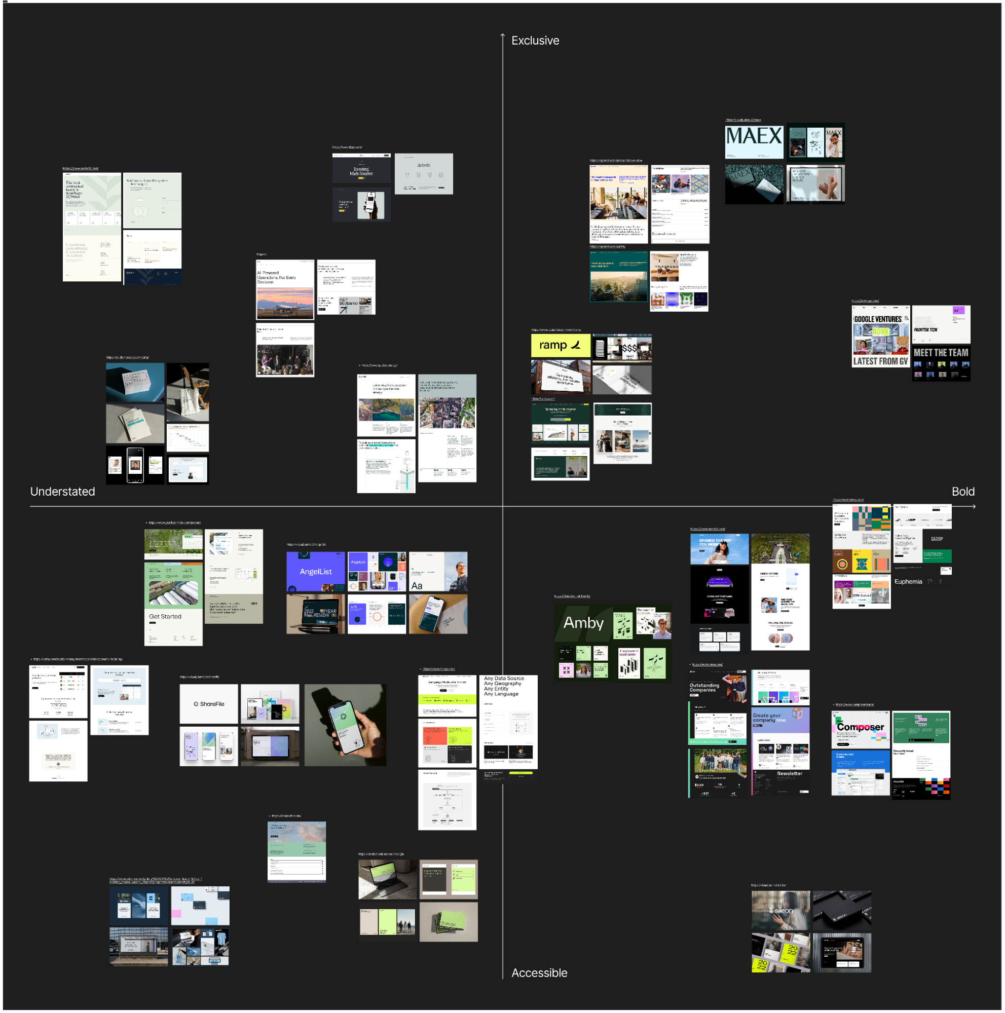
Before the workshop, collect screenshots of competitor brands, websites, product interfaces, social visuals, or other visible brand touchpoints. During the workshop, ask the client team to place those competitors on a simple two-axis map.

This exercise is not about deciding which competitors have “good” or “bad” design. It is about understanding how the client reads the category: what feels credible, what feels generic, what feels too conservative, what feels too experimental, and where there may be an open visual territory for the brand.

The axes should be chosen based on the tension the brand needs to solve. For example:

  • Traditional to progressive.
  • Corporate to human.
  • Understated to bold.
  • Accessible to exclusive.
A completed competitor perception map
A completed competitor perception map showing how stakeholders positioned category references across two axes: understated to bold and accessible to exclusive. The references are used to discuss perception, not to define final design choices.

For a health tech company that wants to feel innovative but works with conservative medical institutions, the map might use traditional to progressive and corporate to human. For a fintech brand that wants to stand out without losing trust, it might use understated to bold and accessible to exclusive.

The most useful part of this exercise is often not the final map, but the disagreement it creates. One stakeholder may read a competitor as progressive, while another sees it as generic. One may see a brand as premium, while another reads it as cold. These disagreements reveal how different people define trust, innovation, credibility, and differentiation. That is exactly the kind of ambiguity that needs to be resolved before design begins.

Exercise 2: Visual Brand Driver

After the team has discussed the category, I like to turn the conversation inward. One exercise we use for this is called Visual Brand Driver. Each stakeholder is asked to choose images for a set of unrelated categories: transport, typeface, activity, furniture, mood, object, animal, architecture, and drink.

The instruction is important: the images should not represent the person’s personal taste. They should represent the company.
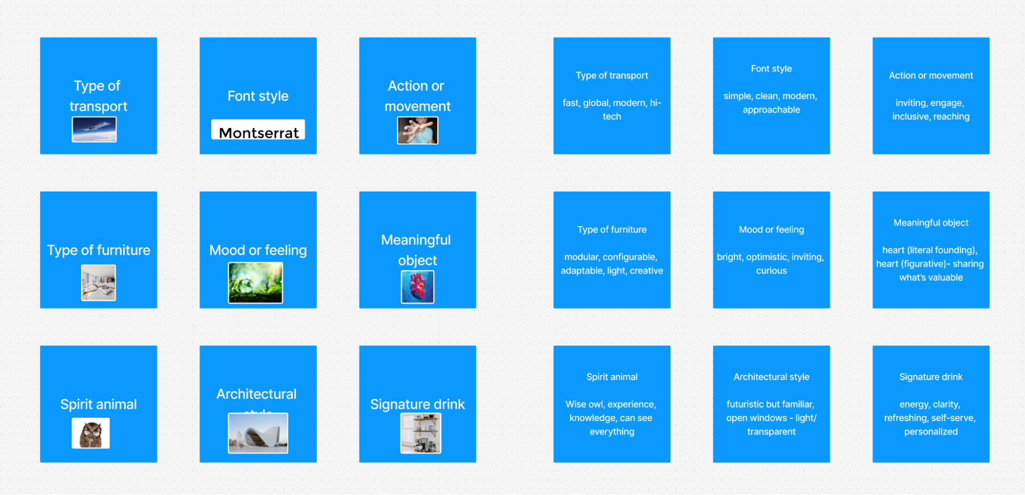
A completed Visual Brand Driver exercise
A completed Visual Brand Driver exercise, where stakeholders use images and adjectives to describe how they perceive the company. 

For example, if the company were a type of transport, what would it be? A quiet electric car, a high-speed train, a private jet, a bicycle, a delivery van? If it were a piece of furniture, would it be a soft lounge chair, a precise modular desk, or a heavy boardroom table?

After choosing the images, each person adds four or five adjectives to explain why they selected them. This part matters more than the image itself. The same object can mean different things to different people. A train might suggest speed, structure, reliability, mass accessibility, or a fixed route. A lounge chair might suggest comfort, calm, informality, or lack of urgency.

The exercise helps create a deeper layer of brand perception. Instead of asking people to describe the company directly, it asks them to think through metaphor and association. Patterns and contradictions become visible. One stakeholder may see the brand as refined and calm, another as energetic and experimental. One may describe the company as precise and structured, another as warm and flexible.

Those differences are not a problem. They are useful materials. They show what needs to be clarified before the visual concept phase begins.

This exercise is also helpful because it separates brand perception from aesthetic preference. A stakeholder may personally like a certain image, but if it does not describe the company, it should not be part of the exercise. That distinction is important throughout the branding process. The question is not “Do we like this?” but “Does this express the right thing about the brand?”

Stage 3: Turn Shared Direction Into A Visual Foundation

Once the workshop has revealed the main assumptions, the next client meeting can turn that shared understanding into a visual foundation. This is still not the first identity concept. It is a working layer between strategy and design, where the client can react to perception, visual principles, and early asset directions before the designer invests time in full concepts.

We usually structure this meeting around three connected layers:

  1. Look and feel
    What should the brand feel like?
  2. Design code
    How can key brand ideas become visual principles?
  3. Branding assets
    What early choices should guide typography, color, logo direction, imagery, and illustration?

Together, these layers move the conversation from perception to practical design boundaries.

Look And Feel

Look and feel boards are not collections of visuals the team likes. They are perception boards. The designer collects references based on the workshop: desired perception, category tension, competitor codes, stakeholder disagreements, and brand character.

If the brand needs to feel trustworthy, modern, and human, the board should help the team discuss what kind of trust, modernity, and humanity are appropriate. Is the brand calm and institutional, or warm and accessible? Is it progressive through precision, or through a more expressive editorial tone?

The point is to let the client respond to perception before reacting to a logo, color palette, or finished visual system.
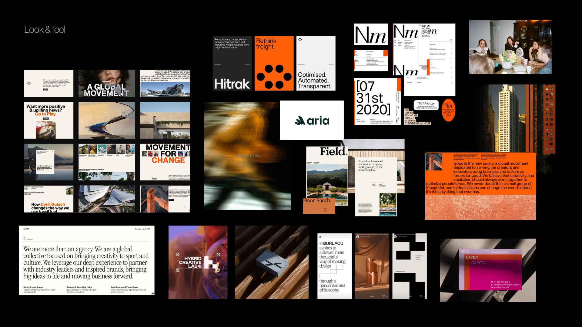
Look And Feel Board
Look And Feel Board For A Prop Tech PR Agency. The board includes third-party visual references gathered for inspiration and discussion during the design process.

Design Code 

Design code makes the direction more specific by translating key brand ideas into visual principles.

For a parenting app in Germany, personalized support for your unique journey might become organic shapes, handwritten lines, and softer compositions. Parenting is messy and magical might become soft gradients, layered imagery, and playful irregularity. Research-backed support for real life might introduce doctor calls, data snapshots, infographics, and editorial layouts that make the brand feel credible.

For a PR agency working with prop tech companies, momentum in motion might become lines, arrows, ripple effects, or motion blur. Springboard might become a lift-off moment and elastic visual energy. Building blocks might become modular shapes or stacked compositions.

The team is not choosing the final graphic expression here. It is testing whether the visual metaphors make sense before concept design begins.
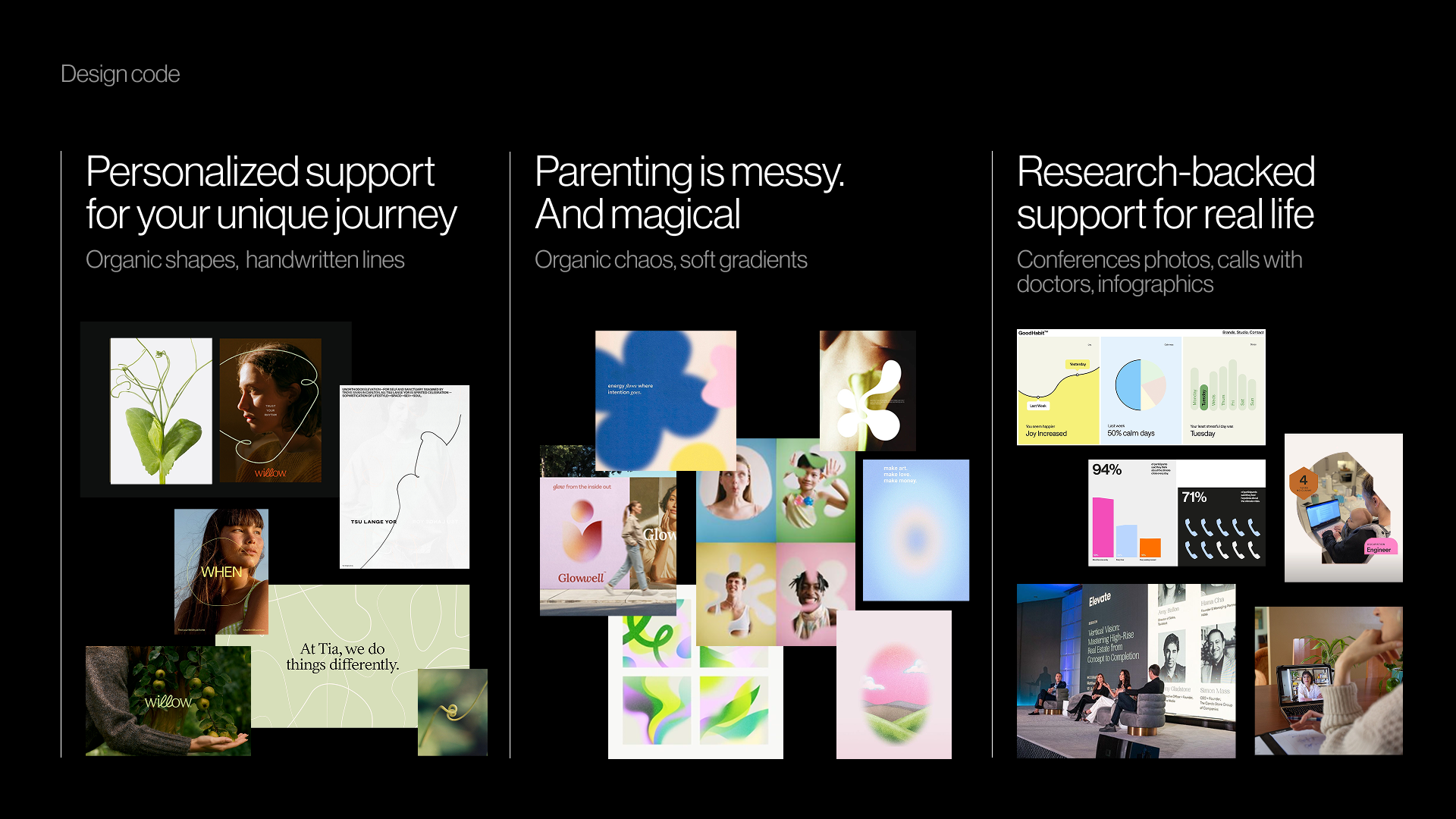
Design Code, which includes Personalized support for your unique journey (Organic shapes, handwritten lines), Parenting is messy and magical (Organic chaos, soft gradients), Research-backed support for real life (Conference photos, calls with doctors, infographics)
Design Code For A Parenting App. The board includes third-party visual references gathered for inspiration and discussion during the design process. (Large preview)

Brand Assets #

The final layer brings the conversation down to the building blocks of identity: typography, color, logo style, photography, illustration, and graphic language.
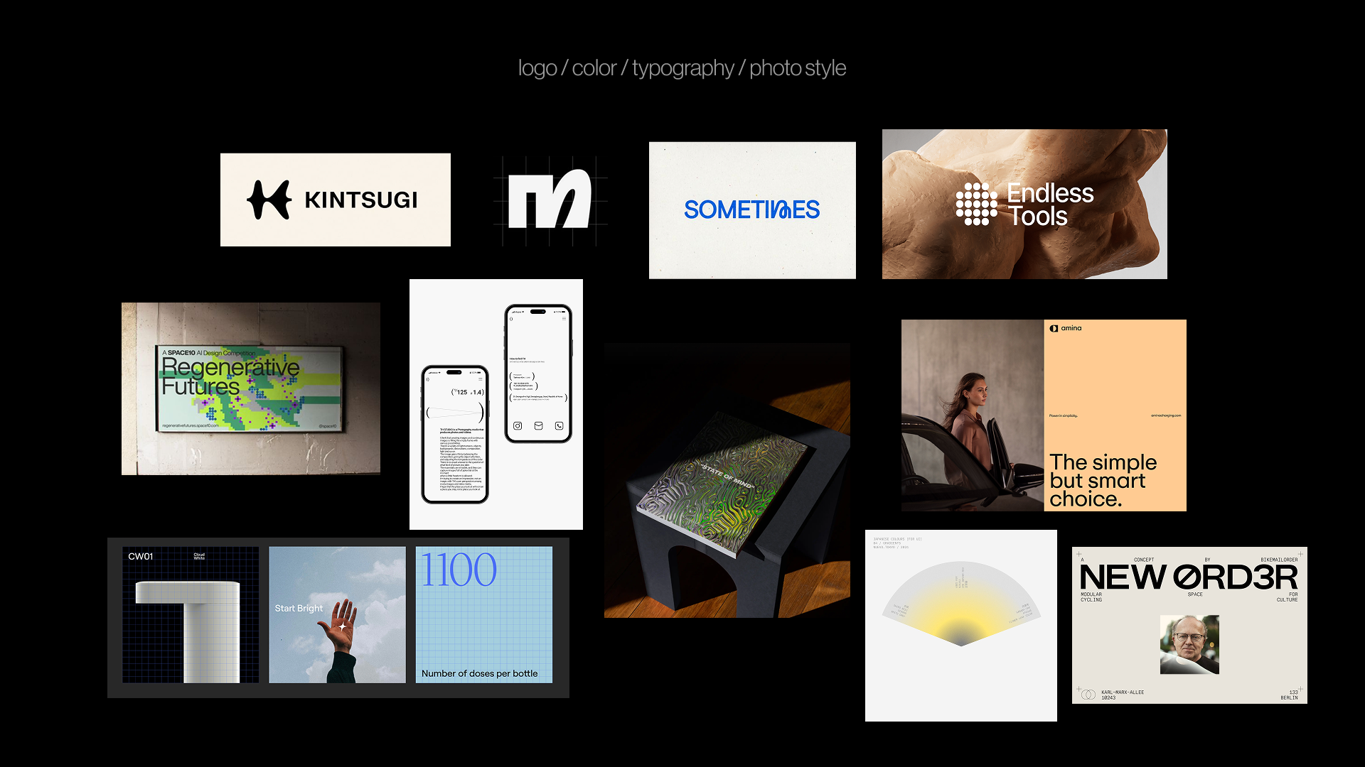
Brand Asset Direction (logo / color / typography / photo style)
Early Brand Asset Direction for an Infrastructure AI Startup. The board includes third-party visual references gathered for inspiration and discussion during the design process.

At this stage, the team can discuss questions such as:

  • Should the typography feel editorial, technical, warm, precise, expressive, or restrained?
  • Should the color palette follow category codes or create contrast?
  • Should the logo be a quiet typographic mark, a flexible symbol, or a more expressive character?
  • Should photography feel documentary, polished, intimate, product-led, everyday, or aspirational?
  • Should illustration explain complex ideas, add warmth, or become a distinctive brand language?

This gives the designer boundaries without making the final identity predictable. The next step is still concept design, but the team is no longer starting from vague adjectives or private expectations.
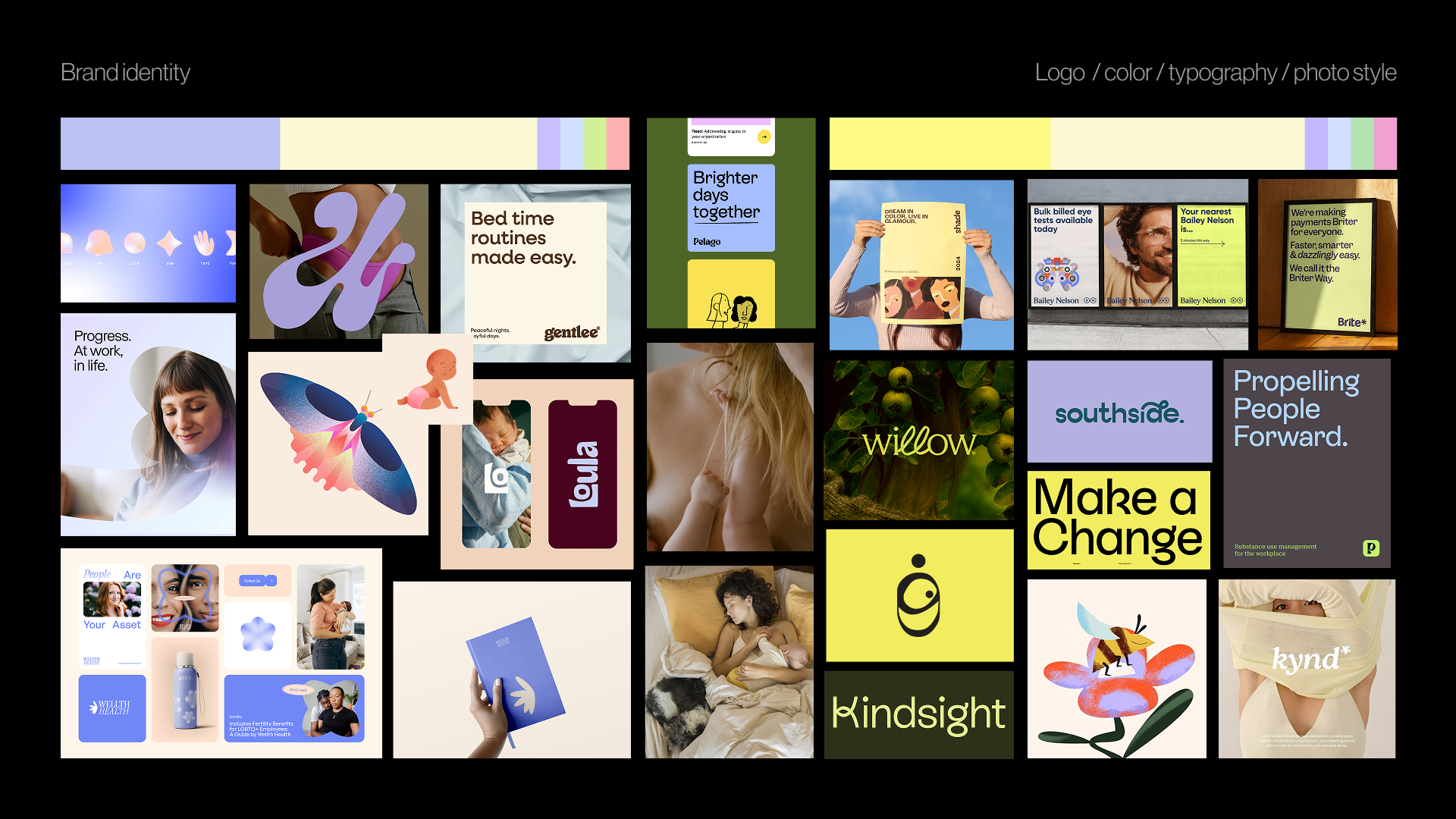
Brand Asset Direction (logo / color / typography / photo style)
Early Brand Asset Direction For A Parenting App. The board includes third-party visual references gathered for inspiration and discussion during the design process. 

Pre-Concept Checklist

Before moving into the first concept, it helps to pause and check whether the team has enough shared direction. The checklist is not meant to make every decision in advance. It is meant to make sure the designer is not starting from vague words, hidden assumptions, or unresolved disagreements.

Before creating the first concept, check whether the team has:

  • A clear understanding of what the brand needs to communicate.
  • A defined brand character.
  • A shared sense of what that character means and what it does not mean.
  • Visual references tied to perception, not taste.
  • Key brand ideas translated into visual principles.
  • Early direction for typography, color, imagery, and graphic language.
  • Documented areas of agreement and disagreement.
  • A clear sense of which concept directions would be wrong before designing them.

This last point is especially useful. A strong pre-concept phase not only tells the designer what to explore. It also clarifies what to avoid: directions that would be too expected, too cold, too playful, too conservative, too loud, too generic, or too far from what the audience can trust.

When the team can name those boundaries, the first concept becomes easier to evaluate. The conversation shifts from “I like it” or “I do not like it” to “Does this express the brand we agreed on?”

The First Concept Should Not Be A Guess

The first concept should not feel like a guess or a surprise reveal. It should feel like the next step in a direction the team already understands.

That does not mean removing intuition, experimentation, or creative risk from the branding process. It means giving those things a sharper problem to solve. When the team has clarified the brand character, tested visual perception, translated ideas into design principles, and discussed the early building blocks of the identity, the designer can explore with more confidence.

Pre-concept work does not need to make the final identity predictable. It needs to make the conversation around it more meaningful. Instead of asking whether the work matches someone’s private expectation, the team can ask a better question: Does this visual direction express what the brand needs to become?


Thursday, June 4, 2026

Ten Data-Backed Truths Of User Experience ROI

Every extra second of friction has a measurable business cost. Carrie Webster shares ten data-backed UX facts that link user experience directly to revenue, retention, and long-term growth.

In the high-stakes economy of today, the cost of a friction-heavy interface is no longer just “lost clicks”, but potentially millions in wasted engineering spend and lost business value. As a veteran UX designer who has helped build digital products since the early mobile-first era, I’ve watched business leaders shift from viewing design as a “cosmetic preference” to recognising that user experience is actually the primary engine of business survival.

A UX design role is as much about research and analytics as it is about pixels, and I believe that hard data is the only tool powerful enough to bridge the gap between design and the boardroom. Facts don’t just advocate for the user; they prove that UX is a non-negotiable requirement for a healthy bottom line. Even in the rooms where decisions are made, UX is frequently undervalued as a ‘visual’ role. I’ve learned that the most effective way to dismantle this myth is through data.

The following ten facts represent the current reality of the digital world. These are not just “design tips”; they are the clinical, data-backed pillars for financial growth in a saturated market. Some of these facts are also commonly used by designers as best practices.

For example, I once led a B2C mobile design project, where I was able to strip 1.2 seconds off the mobile load time by reducing and removing some of the visual assets. The result was an immediate 12% lift in completed transactions, proving that in UX, every tenth of a second is a direct lever for revenue.

1. Fixing Issues In The Design Phase Is 100 Times Cheaper 

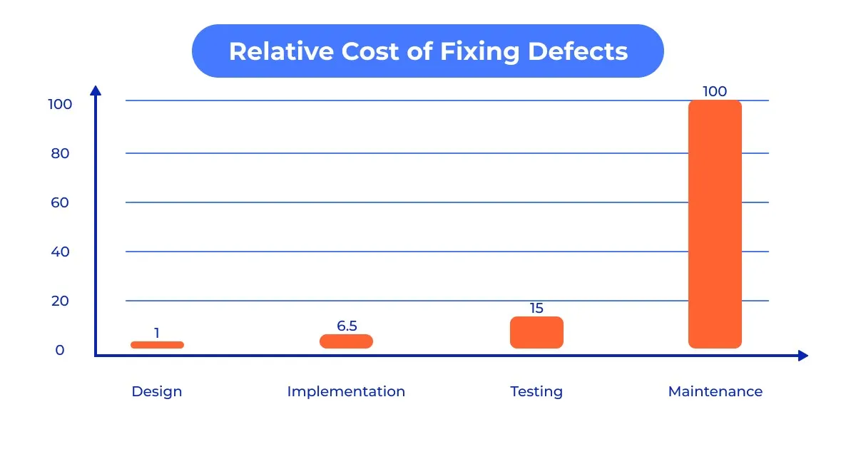
One of the most compelling financial arguments for UX is the 1:100 rule. Modern studies, such as from the IBM Systems Institute and Sugue Technologies, show that fixing an error after a product has been developed and launched can be up to 100 times more expensive than fixing it during the initial design and prototyping phase.

Think of UX as “engineering insurance.” By the time a developer touches the code, every interaction should have been validated. If you discover a fundamental navigation flaw after launch, you aren’t just paying for the fix; you’re paying for technical debt, lost developer time, and the revenue lost while users struggle with a broken flow.

Graph showing the cost of bug fixing during different phases.
Graph showing the cost of bug fixing during different phases. (Image source: QATestLab) 

2. Performance Impacts User Experience 

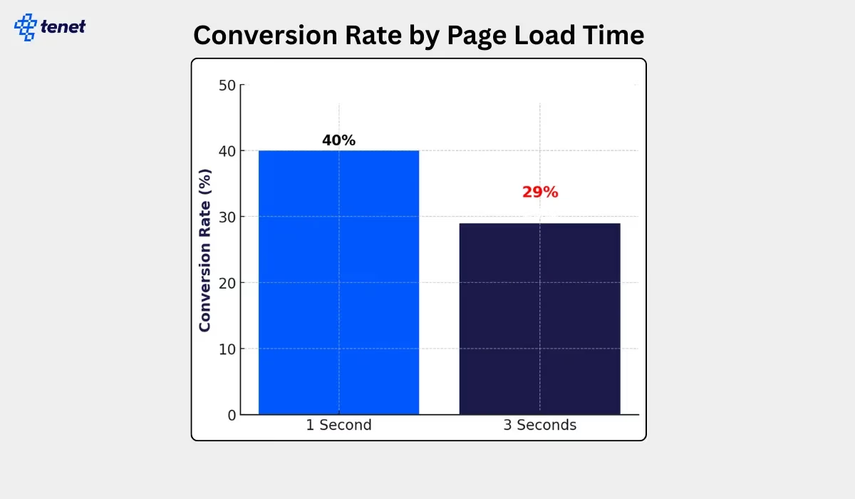
In the current landscape, performance is the essential foundation of user experience. A beautiful interface is worthless if the user bounces before it renders. The data is uncompromising: 47% of users expect a page to load in two seconds or less, and missing this window is a financial catastrophe. A mere one-second delay can reduce conversions by 20% and satisfaction by 16%, while retail businesses lose an estimated $2.6 billion annually to slow load times. When mobile load time moves from one to three seconds, the bounce rate spikes by 32%, and by the third second, conversion rates typically plummet from 40% to 29%.

However, this volatility offers a massive lever for growth. Even a microscopic 0.1-second improvement can lift retail conversions by 8.4%, and travel site conversions by 10.1%. Improving your Largest Contentful Paint (LCP) by 31% — a benchmark 67% of websites achieved as of June 2025 — can drive a direct 8% increase in sales. As a long-time designer, I treat speed as a primary design element.

If the site isn’t instantaneous, the design hasn’t just failed — it effectively doesn’t exist.
Graph showing conversion rate by page load time
When pages load in one second, conversion rates are about 40%. (Image source: Tenet) (Large preview)

3. Your Site Has 50 Milliseconds To Impress Your Customers 

First impressions are both visceral and aesthetic. Research indicates that users form an opinion about a website’s visual appeal in approximately 50 milliseconds (0.05 seconds). That’s not a lot of time! This split-second “gut-feeling” is a survival mechanism that dictates whether a user stays to explore your value proposition or bounces immediately.

In the current market, 94% of first impressions are strictly design related. If your interface feels “off” or dated, users subconsciously project that lack of quality onto your entire product or service. Your content effectively doesn’t exist if your design hasn’t earned the five seconds of attention required to read it.

4. Hick’s Law: The Cost Of Overwhelm 

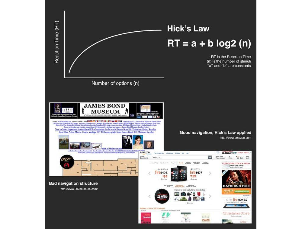
Stakeholders often think “more options” equals “more value.” Psychology proves the opposite. Hick’s Law states that the time it takes to make a decision increases with the number of options available.

Every extra menu item or form field is a “tax” on the user’s brain. As noted by Landbase, top-performing sites now achieve conversion rates exceeding 11%, while average performers struggle below 3%. Those performing well have applied personalization and optimization strategies to simplify the experience.

If you want to increase your revenue by tomorrow, find one field to delete from your checkout flow today.
Demonstrating complex choices vs simple.
Demonstrating complex choices vs simple. (Image source: Mads Soegaard) (Large preview)

5. White Space Improves Comprehension #

“White space” is often viewed as wasted real estate by non-designers. In reality, it is a tool for focus. Strategic use of white space can increase a user’s content comprehension by up to 20%.

White space prevents “cognitive load” from peaking. By giving the user’s eyes a place to rest, you guide them toward the most important elements, usually your “Buy” or “Sign Up” button. In 2026, as attention spans have dropped to roughly 8 seconds, simplicity is the ultimate luxury and a major driver of engagement.

For example, in a fintech dashboard I worked on, analyst users were feeling overwhelmed by a ‘data dump’ layout in some of the dashboard components. I applied more white space around the data to lower their cognitive load. Simply giving the data room to breathe led to a 25% decrease in time-on-task and a significant boost in trial-to-paid conversions.

6. The Power Of “Fake” Progress #

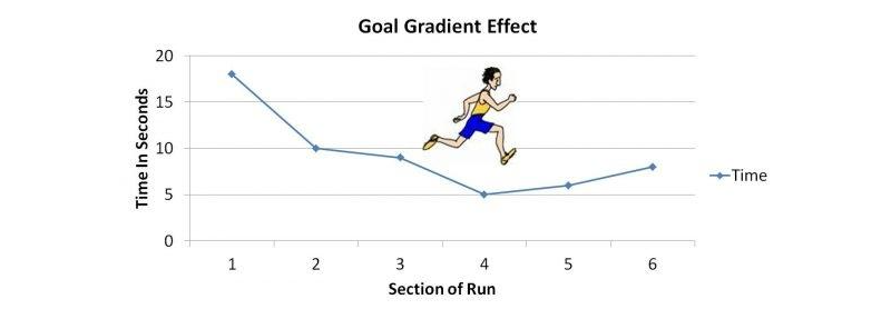
One of the most surprising psychological hacks in UX is that users will complete a task faster if they believe they have already made progress. This is known as the Goal Gradient Effect.

In a classic study, researchers found that a 10-stamp coffee card with two stamps already “pre-filled” was completed significantly faster than an 8-stamp card with zero pre-fills, even though the total spend required was identical. In digital design, showing a progress bar that starts at 15% (simply for creating an account) increases completion rates for onboarding by over 40%. We aren’t just designing screens — we are managing the user’s dopamine and sense of momentum.

Goal Gradient Effect
Increased motivation to reach the target based on current progress. (Image source: Conversion Uplift) (Large preview)

7. Make Your Content Readable 

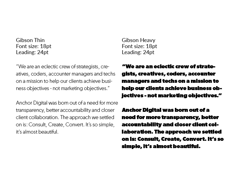
Many stakeholders believe that cramming more text “above the fold” increases value. Data proves the opposite. Proper typography, specifically line spacing (leading) and paragraph width, can increase content comprehension and reading speed by up to 20%.

Optimal line height (generally 1.5x the font size) reduces “visual noise,” allowing the brain to process information with less cognitive effort. When users struggle to read your text due to tight spacing or small fonts, their “perceived effort” increases, leading to a higher bounce rate. Legibility is a conversion tool: if it’s hard to read, it’s hard to buy.

There are many ways to display more legible text. For example, if line spacing (leading) is too small or the font is too heavy, this also impacts readability.

This example demonstrates the difference in readability between a light and a heavy font display.
This example demonstrates the difference in readability between a light and a heavy font display. (Image source: Anchor) 

8. Your Users Only Read 20% Of Your Content 

This truth meshes well with the previous one. Users do not read your website; they scan it. On a typical web page, users read only about 20% to 28% of the text.

Because modern users scan in an F-pattern or Spotted pattern, designing for reading is a tactical error. We must design for scanning.

This requires the following:

  • Bold headers that narrate the value proposition.
  • Bullet points for key benefits.
  • White space to connect users to key information (discussed in the previous truth).
  • High-contrast call-to-action (CTA) buttons. If your core message is buried in a paragraph, it is invisible to nearly 80% of your audience.

9. Why User Testing With 5 People Is The Magic Number 

I have heard of companies that waste six-figure budgets on massive user studies with 100 people, only to get buried in noise. The reality is that testing with just 5 users typically uncovers 85% of usability problems.

This is a mathematical sweet spot. After the fifth user, you reach the point of diminishing returns — you spend more money to find fewer new bugs. The competitive advantage belongs to small and frequent user testing activities. Test with 5 people, iterate, and test with 5 more. It is the most cost-effective way to build a bulletproof product.

Personally, I have followed this guideline many times during user testing activities, and I can confidently say that testing with 5 people does deliver the majority of issues in your design.

10. The Financial ROI Of 9,900% 

Last, but definitely not least, the most staggering statistic in our industry remains consistent. On average, every $1 invested in UX returns $100. This 9,900% ROI isn’t magic, but the sum of increased conversion and reduced support.

A fully optimised UX design can improve conversion rates by up to 400%. Furthermore, intuitive design significantly lowers customer support requirements. When a product is self-explanatory, you don’t need a massive call centre to explain how to use it.

The Depth Of UX Investment #

Beyond these individual statistics, we must address the cumulative effect of a mature UX practice. In my years of practising, the most successful firms are those that treat UX as a continuous improvement loop rather than a one-off project. The data shows that companies with high design maturity see 32% higher revenue growth and 56% higher total returns to shareholderscompared to their less design-focused peers.

This discrepancy exists because mature UX organisations move beyond “user delight” and into “user efficiency.” When you shave 30 seconds off a workflow for a team of 1,000 employees, you aren’t just making them happier; you are reclaiming hundreds of thousands of dollars in annual productivity. This internal ROI is often overlooked, but it is just as vital as consumer-facing conversion rates.

Furthermore, the “experience gap” is real. 80% of companies believe they deliver a “superior experience,” but only 8% of customers agree. This massive disconnect represents a significant market opportunity for those willing to look at the hard data. By bridging this gap through continuous user testing and performance optimisation, you aren’t just improving a product but capturing market share that your competitors are leaving on the table.

The Impact Of AI 

Today, we cannot talk about UX without talking about AI. However, AI hasn’t replaced these 10 facts, but it has accelerated the solution on some of these.

  • Agentic UX
    60% of designers are now building “AI agents” that take actions on behalf of the user, drastically reducing the impact of Hick’s Law by narrowing down choices before the user even sees them.
  • Real-Time Personalisation
    32% of teams use AI to personalise interfaces in real-time, meaning the F-Pattern scanning habits are catered to by moving the most relevant content to exactly where that specific user’s eyes are likely to land.
  • Automated ROI
    93% of designers are using generative AI tools to prototype faster, which brings the 1:100 Cost Ratio even lower by allowing us to find and fix errors before a single line of production code is written.

AI has turned UX from a static map into a living, breathing guide for users. But the fundamental rules of human psychology, such as our 50ms judgments and our need for white space, remain unchanged.

Conclusion 

In summary, here is a list of the key truths to remember:

  1. Fixing issues in the design phase is 100 times cheaper.
  2. Performance impacts user experience.
  3. Your site has 50 milliseconds to impress your customers.
  4. Hick’s Law: The cost of overwhelm.
  5. White space improves comprehension.
  6. The power of “fake” progress.
  7. Make your content readable.
  8. Your users only read 20% of your content.
  9. Why user testing with 5 people is the magic number.
  10. The financial ROI of 9,900%.

As we move deeper into the late 2020s, the line between “design” and “business strategy” has vanished. The data is in, and companies that lead in design outperform their competitors by 1.7x in revenue growth.

UX design is no longer a team you hire to “make things look nice.” It is the research-driven, data-backed discipline that ensures your digital product isn’t just a cost centre, but a revenue-generating machine.

“

In fact, this has always been the case, but I hope that in presenting these cold, hard truths, it now becomes a reality for your business.

As I have found over the years, implementing factual design improvements does make a difference that intuition alone can’t replicate. We are past the era of subjective opinions. The data is clear, the psychology is proven, and the ROI is undeniable. The only question left is whether you’re ready to let the facts lead your design, or if you’ll let your competitors do it first.

Monday, June 1, 2026

The “Bug-Free” Workforce: How AI Efficiency Is Subtly Disrupting The Interactions That Build Strong Teams

 AI tools are eliminating the need to “bug” colleagues for help, but the informal interactions they replace are the very scaffolding that builds team trust, belonging, and innovation. Here explore the research and potential impacts behind that risk and offer practical strategies for maintaining human connection while leveraging AI’s strengths.

Through many discussions with industry colleagues, we’ve started hearing a phrase more often when swapping stories about AI adoption:

“Now I don’t have to bug [someone].”

Product designers don’t need to bug researchers anymore — retrieval-augment generation (RAG) tools surface insights instantly. Product Managers don’t need to bug designers for mockups — AI generates acceptable options. Engineers don’t need to bug accessibility teams — automated scanners flag issues in real-time.

It’s framed as liberation, and in many ways, it is. There’s genuine relief in being unblocked, in not having to wait, in solving problems independently.

With AI, we’re building a “bug-free workforce”.

But what if the bugs that AI is automating away, such as the quick questions, the small talk, the organic connections, are actually an important part of the scaffolding that builds and sustains healthy teams?

The Vanishing Scaffolding

Consider what actually disappears when we turn to AI assistance before engaging with a colleague directly. For instance:

  • The 2-minute Slack exchange that turns into a 20-minute whiteboarding session.
  • The “quick question” that reveals a fundamental misalignment.
  • The accessibility review that becomes mentorship.
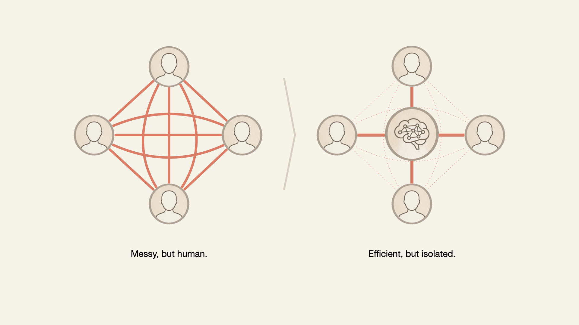
Two diagrams comparing teamwork: a dense, interconnected human network vs a centralized AI-driven network that is efficient but isolates individuals
AI-driven efficiency can weaken team cohesion. (Large preview)

Although these interactions are primarily intended to exchange information and unblock individuals’ tasks, many are the building blocks for the intangible but crucial sense of belonging and connection in the workplace.

The inefficiencies of interpersonal communication and daily interaction build the larger organism known as work culture. When AI disrupts these interactions, what is lost?

What The Research Actually Shows

There is ample psychological research to support our hypothesis: If the trust built through organic and informal connections is threatened, teams will be negatively impacted. Let’s examine a few:

In 2012, MIT’s Human Dynamics Lab (Pentland, 2012) discovered that the best predictor of team productivity wasn’t formal meetings but “energy” from informal communication: the hallway conversations, coffee chats, and quick questions. Teams with the most informal interaction had 35% more successful outcomes. With AI, what energy is not generated, leading to fewer successful outcomes?

In 2015, Google’s Project Aristotle studied over 180 teams to find out why some thrived, and others underperformed. They found that psychological safety, the shared belief among team members that the environment is safe for interpersonal risk-taking, built through frequent, low-stakes interactions, was the number one predictor of high performance. Not intelligence. Not resources. Trust built through micro-moments. The exact micro-moments we see vanishing when we overuse AI.

In 2025, researchers from Harvard, Columbia, and Yeshiva University published a study focused on the impact of AI on performance and team coordination. The authors concluded that AI-driven automation decreased overall team performance and increased coordination failures. These effects were especially large in the short-term and in low- and medium-skilled teams. Automation also decreased team trust.

Why This Matters

When AI disrupts the team’s energy and psychological safety, a sense of disconnection sets in, which, in turn, hurts the company’s bottom line.

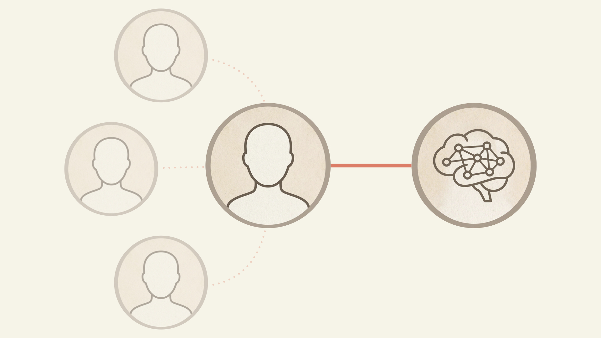
Central worker connected to an AI system, with weaker, fading links to other people
Adding AI to the team increases efficiency, but also risks displacing the human-to-human connections that establish psychological safety. (Large preview)

DISCONNECTED EMPLOYEES LEAVE

People don’t stay at companies because of the work. They stay because of the people. And if connections to colleagues decrease due to AI’s presence, how might that expedite one’s departure?

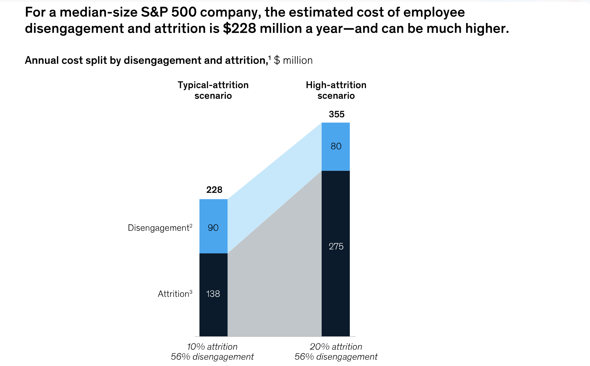
Consider this question in dollar terms. McKinsey’s Great Attrition research found that not feeling a sense of belonging was one of the most frequently cited reasons employees left. When informal micro-interactions disappear, belonging erodes, and people walk.

“Employee disengagement and attrition could cost a median-size S&P 500 company between $228 million and $355 million a year in lost productivity.”

— McKinsey
Chart showing employee disengagement and attrition costs rising from $228M to $355M annually in a higher-attrition scenario
The hidden but real cost of employee disengagement and attrition from McKinsey. (Large preview)

Leaders must ask themselves if the potential gains from AI rollouts and promised productivity gains outweigh the costs of a disengaged and attrition-prone workforce. The evidence suggests otherwise.

DISCONNECTED TEAMS ARE LESS INNOVATIVE

Korean researchers in 2024 analyzed innovation in the private sector and concluded that weak ties — the bridging conversations with people you interact with occasionally — sustained innovative performance in companies characterized by active technological innovation.

Simply put, breakthroughs do not necessarily emerge from your core team but from interactions with the people you would have “bugged” in the past. Eliminating these interactions in favor of AI could not only negatively impact team health, but it could also hurt the business through decreased depth and breadth of innovation in design, coding, content, and beyond.

AI’s seduction is that it feels like pure gain until the team realizes they’ve become strangers who happen to work on the same project.

If a shared sense of purpose and belonging disappears, employers have a workforce less engaged and less innovative, with a higher chance of attrition.

If AI helps us need each other less, how can a company hope to nurture a connected, supported, and effective workforce?

The answer requires a balanced and multi-pronged approach. Use AI tools for dull, repetitive, and high-volume tasks while reserving the human brain for higher-level problem solving. Design physical workspaces and online team interactions that will maintain or increase human connection.

Maintaining The Best Of Both

In short, leverage the best of AI tools and human abilities.

1. USE AI TO ELIMINATE THE TOIL

In the March 2026 article “When Using AI Leads to ‘Brain Fry’,” the authors outline their study of 1,488 full-time U.S.-based workers to understand the impact of AI use on professionals. The result was a concept they call “AI Brain Fry,” a form of acute mental fatigue and cognitive exhaustion resulting from excessive use, interaction, or oversight of AI tools beyond an individual’s cognitive capacity.

Further, the study reveals that the cognitive strain created by intensive AI use carries business costs, including decision fatigue and error-prone work. Perhaps the most troubling finding is that 34% of workers who reported experiencing brain fry intended to quit their jobs. The loss of institutional knowledge caused by turnover is well documented.

One conclusion is that AI is not inherently bad or cognitively taxing. Rather, as with any tool, what matters is how it’s used.

Focusing our energy on identifying the repetitive, unenjoyable parts of our jobs (or “toil”) and using AI to remove them is a way to improve cognitive and team health.

“

Indeed, the Harvard Business Review authors explain that participants in their study who used AI to eliminate toil only had 15% lower rates of burnout but also reported “a higher degree of social connection with peers…because they had more time to spend ‘off keyboard.’” In this toil-elimination scenario, AI did not disrupt team connections; it removed what we consider busy work that prevented the team from solving problems with colleagues.

2. INSTITUTIONALIZE PRODUCTIVE FRICTION #

Steve Jobs famously designed the Pixar studios so employees would have to bump into each other. “Steve realized that when people run into each other, when they make eye contact, things happen,” reflected Brad Bird, the director of The Incrediblesand Ratatouille movies. John Lasseter, responsible for some of Pixar’s most beloved films, shared that he’d “never seen a building that promoted collaboration and creativity as well as this one.” Jobs understood that serendipitous collision drives creative work, and Pixar’s oeuvre reveals the genius.

Pixar Studio’s floor plans, which facilitate face-to-face interaction
Pixar Studio’s floor plans facilitated face-to-face interaction. (Large preview)

What is the equivalent of creating this type of organizational design in the age of AI?

  • Build AI tools that connect the team.
    We’ve found that when building internal agents, it’s best to attach the names of the original creators to the work and to direct seekers to these creators. This way, any seeker not only finds the answer but is connected to others with more institutional knowledge to help.
  • Publicly spotlight successful team uses of AI.
    By finding examples of how teams have used AI to work more effectively and efficiently together and highlighting them in public forums and townhalls, it helps establish the narrative that AI can be something that brings us together rather than pushes us apart.
  • Establish rotation programs.
    If AI means product managers can prototype, have them shadow designers anyway. Having a more holistic understanding of each other’s craft through direct dialogues benefits both sides beyond simple AI outputs.
  • Hold panel discussions on the evolution of work.
    Gather cross-functional partners to regularly discuss and debate how our work is currently changing or could in the near future. It keeps intentionalchange top of mind and in the open.

3. BUILD TEAM COHESION THROUGH AI-INSPIRED LAUGHTER #

Positive humor in the workplace has been studied extensively as a way for teams to bond. We see how AI can improve team connections through a good, absurd laugh.

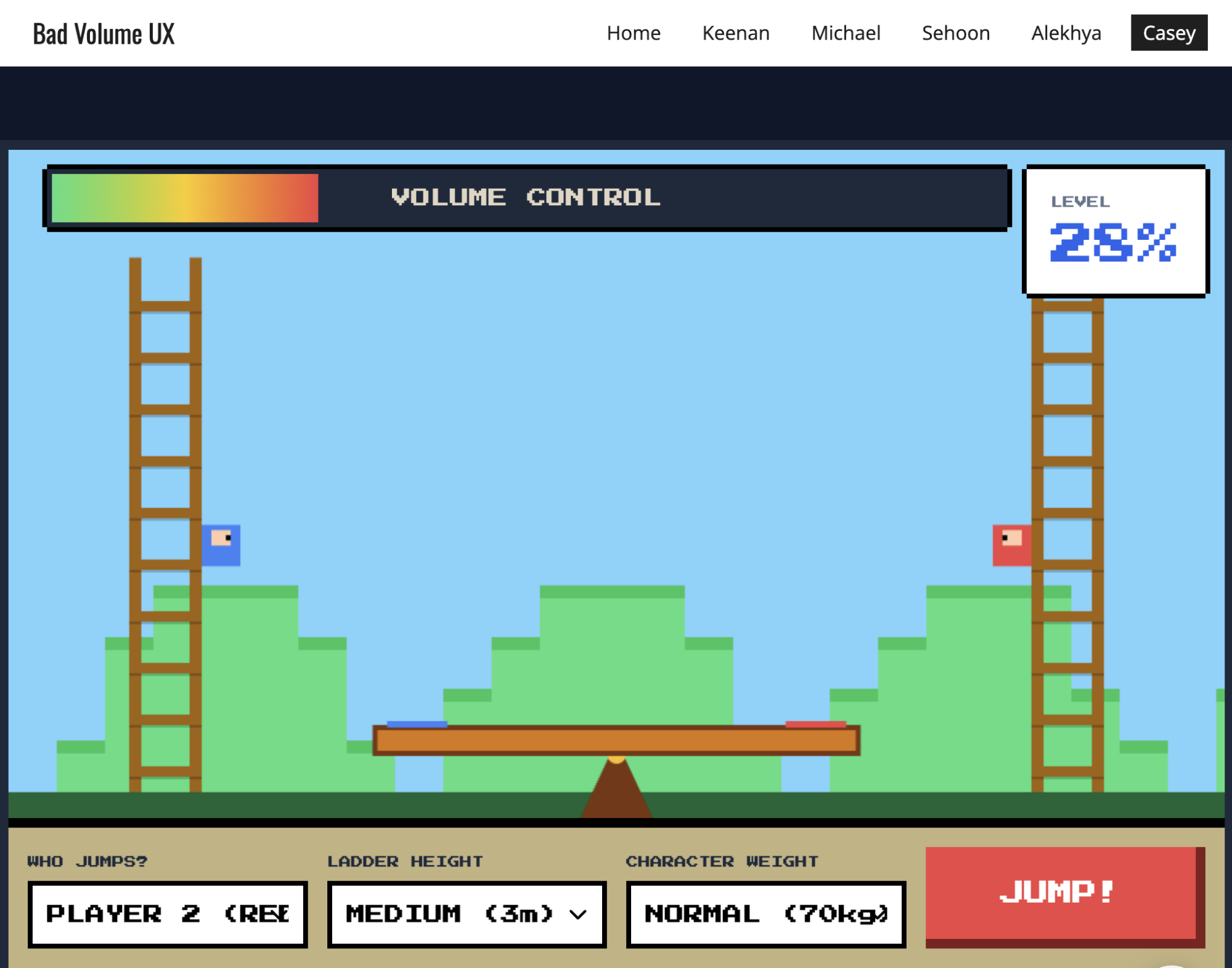
  • Bad UX Vibecoding Competitions
    Give your team a silly prompt (“Design the worst volume control”) and 30 minutes to vibe-code a horrible solution. The process of building these outputs helps the team: learn new AI tools, get the creative juices flowing, and, most importantly, laugh together.
The results of a silly vibe-coding activity the team used to learn and stay connected
The results of a silly vibe-coding activity our team used to learn and stay connected (built with Google Gemini). (Large preview)
  • Hyper-specific AI Creations
    Would a certain image make people smile in this workshop? Is there a funny idea at work that would be even weirder as an AI-generated song? Using them for absurd work moments is a fun way to get people laughing.
AI-created spin on a cliche: you can lead a horse to water, but you can't make it prompt
Use AI to create a spin on a cliche for a laugh or icebreaker for a workshop or team meeting (made with Google Gemini). (Large preview)

Eliminating toil, institutionalizing productive friction, and building team cohesion through humor show the power of integrating the best of the human brain and AI algorithms.

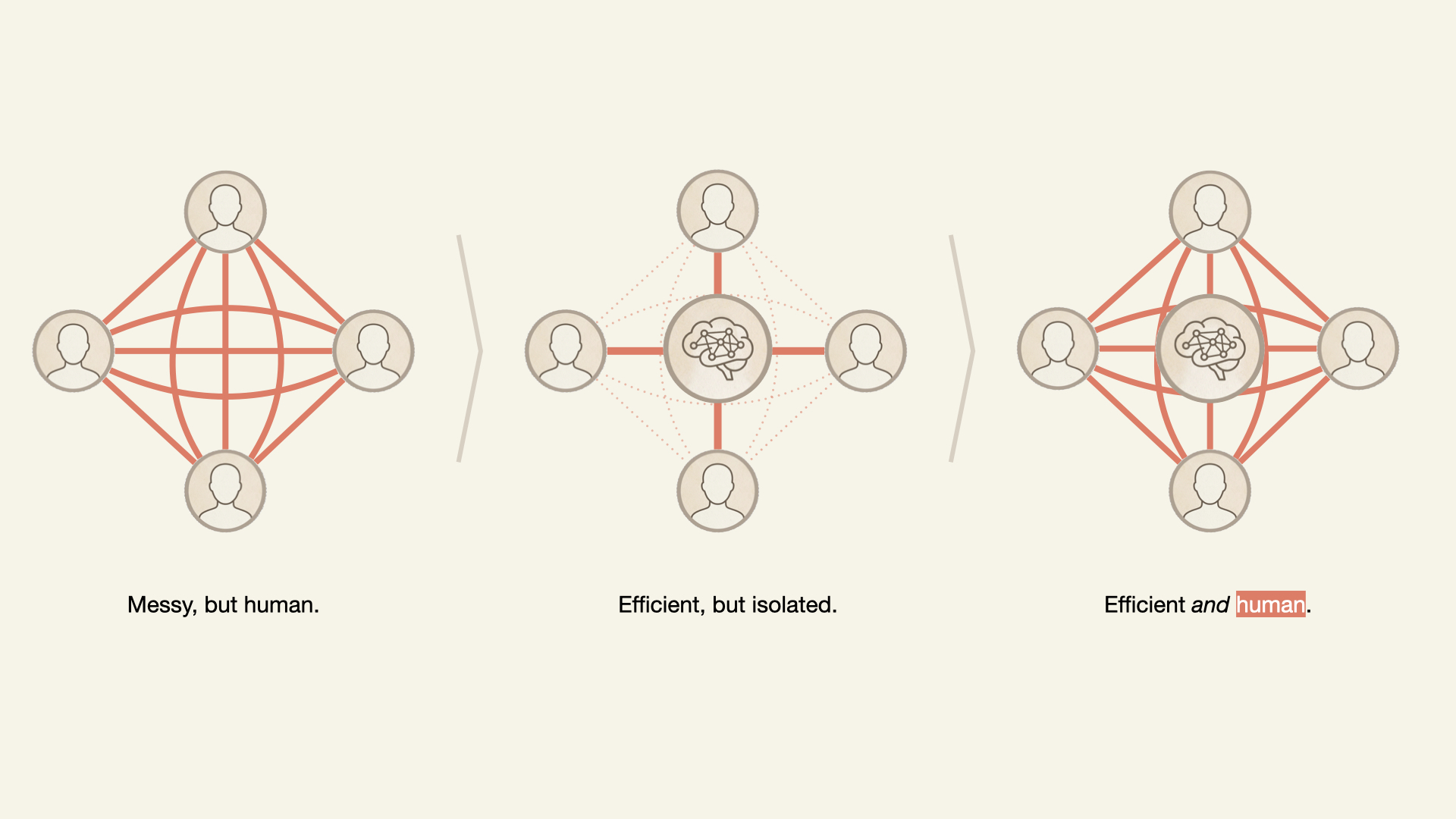
Three diagrams comparing teamwork: a dense, interconnected human network vs a centralized AI-driven network that is efficient but isolates individuals vs an interconnected human network with AI in the middle.
The right combination of AI and human-driven activity increases efficiency while training human connection. (Large preview)

The question isn’t whether to use AI. Contemporary workers have less and less choice. The question is: what kind of team do you want to become when AI is the newest teammate?

“

Conclusion

Leaders who introduce artificial intelligence with an equal amount of emotional intelligence will enable their teams to thrive by leveraging the power of AI while also shielding their teams from the inherent risks associated with the disruptive natures of these new tools.

When the unexpected hits — the crisis, the pivot, the moment that requires trust you can’t manufacture overnight — it will be the teams with cultures intact that will thrive.

REFERENCES