Payment of ₹ requested by HONEY VIG. Click the link to pay securely via Razorpay: Make 5000 payment Payment of ₹ requested by HONEY VIG. Click the link to pay securely via Razorpay: Make 5000 payment ⭐ If you would like to buy me a coffee, well thank you very much that is mega kind! : https://www.buymeacoffee.com/honeyvig
Hire a web Developer and Designer to upgrade and boost your online presence with cutting edge Technologies
Showing posts with label Icons. Show all posts

Thursday, April 25, 2024

Iconography In Design Systems: Easy Troubleshooting And Maintenance

 No matter how sick you might be dealing with unending visual inconsistency, design systems are still challenging. They can scare any designer regardless of their experience. Still, if you want to bring order to chaos, introducing a design system into your workflow is worth the trouble. Tatsiana Tarkan digs deep into iconography as part of a design system and shares some doable tips that will turn icon creation and maintenance into an enjoyable process.

We all have an inherent tendency to like aesthetic and approachable things. That’s why any designer strives to deliver an intuitive and comprehensive design. And any designer knows it’s a pain in the neck, particularly when it comes to complex projects with lots of pages of design, components, and prototypes. As someone who has already traveled that road and learned quite a few valuable lessons, I have some wisdom to share with you.

Granted, tons of articles have been written about design systems, their complexity, and all the ways they can benefit a project. So, I’m not going to waste too many words on the matter. Instead, in this article, I want to dig deeper into iconography as part of a design system. Besides, I’ll share with you doable tips that will turn icon creation and maintenance into an enjoyable — or at least bearable — process. Shall we?

Design Systems: From Chaos To Order #

Design Systems 101 #

Before we actually dive into the alluring and frightening world of iconography, I want to take some time to introduce you to the concept of a design system, as well as share my thoughts and rules that I follow while working with them.

If I were to call a design the way your interface speaks with your user, then — building on the metaphor — it would be fair to view a design system as a language.

Simply put, a design system is a functional set of defined technical standards, best user behavior practices, and navigational patterns that are used to build a pixel-perfect digital product.

It is a powerful designer tool that helps you make sure that you will end up with a coherent product and not a pathetic mess.

It seems that nowadays, designers are obliged to try their hand at creating or at least adopting a design system. So what exactly makes it an all-around beneficial thing for the designer lot? Let’s have a look:

  • The design system makes for the only source of truth since all the components are under one roof and are easily referable.
  • It hosts all the guidelines on how to implement existing components. And following the very same guidelines, designers can easily create new ones that match the former.
  • In the case of a two- (or more) designer team, a design system allows for visual consistency (which is crucial if your project is major and fast-evolving).
  • You can either use ready-made design components or alter them swiftly and in accordance with the guideline if any need arises.
  • You have access to a library of surefire design patterns, which greatly reduces the strain of coming up with new solutions.

That sounds like a treat, right? Still, creating a design system is generally viewed as an exceptionally time- and effort-consuming endeavor. If you do want to develop a design system, there is a way to make the process a bit easier. Enter the atomic design approach.

Atomic Design Approach #

It’s been over six years since I first introduced the atomic approach into my workflow, and let me tell you, it was a game-changer for me as a designer. This methodology is a blessing if you work on a big project with a team of fellow designers.

If you know the pain of trying to track the changes in components throughout the projects, especially if these components are minor, then you’ll see why I’m so enthusiastic about the atomic approach. It allows for smooth and well-coordinated teamwork where every designer is aware of what component they are creating and how to make it consistent with the rest of the system.

The atomic design approach was pioneered by Brad Frost (a chemist of all occupations). It implies building your system brick-by-brick, starting with the smallest items and going all the way up while sustaining hierarchy. There are five stages to the process.

  • Atoms
    In a nutshell, these are basic HTML elements.
Types of atoms according to the Atomic design approach. Example 1: Icon, Example 2: Button, Example 3: Text field, Example 4: Label, Example 5: Checkboxes19
Atoms. (Large preview)
  • Molecules
    They are single-pattern components that do one thing.
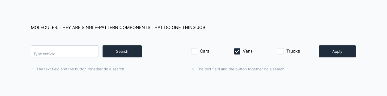
Types of molecules according to the Atomic design approach. Example 1: A text field and a button together perform a search. Example 2: Checkboxes with a button allow to filter by options
Molecules. (Large preview)
  • Organisms
    They are composed of groups of molecules, or/and atoms, or/and other organisms.
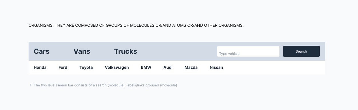
Types of organisms according to the Atomic design approach. Example: A two-level menu bar consists of a search box (molecule), grouped labels/links (molecules)
Organisms. (Large preview)
  • Templates
    They provide a context for using molecules and organisms and focus on the page’s underlying content structure. In other words, templates are the guidelines.
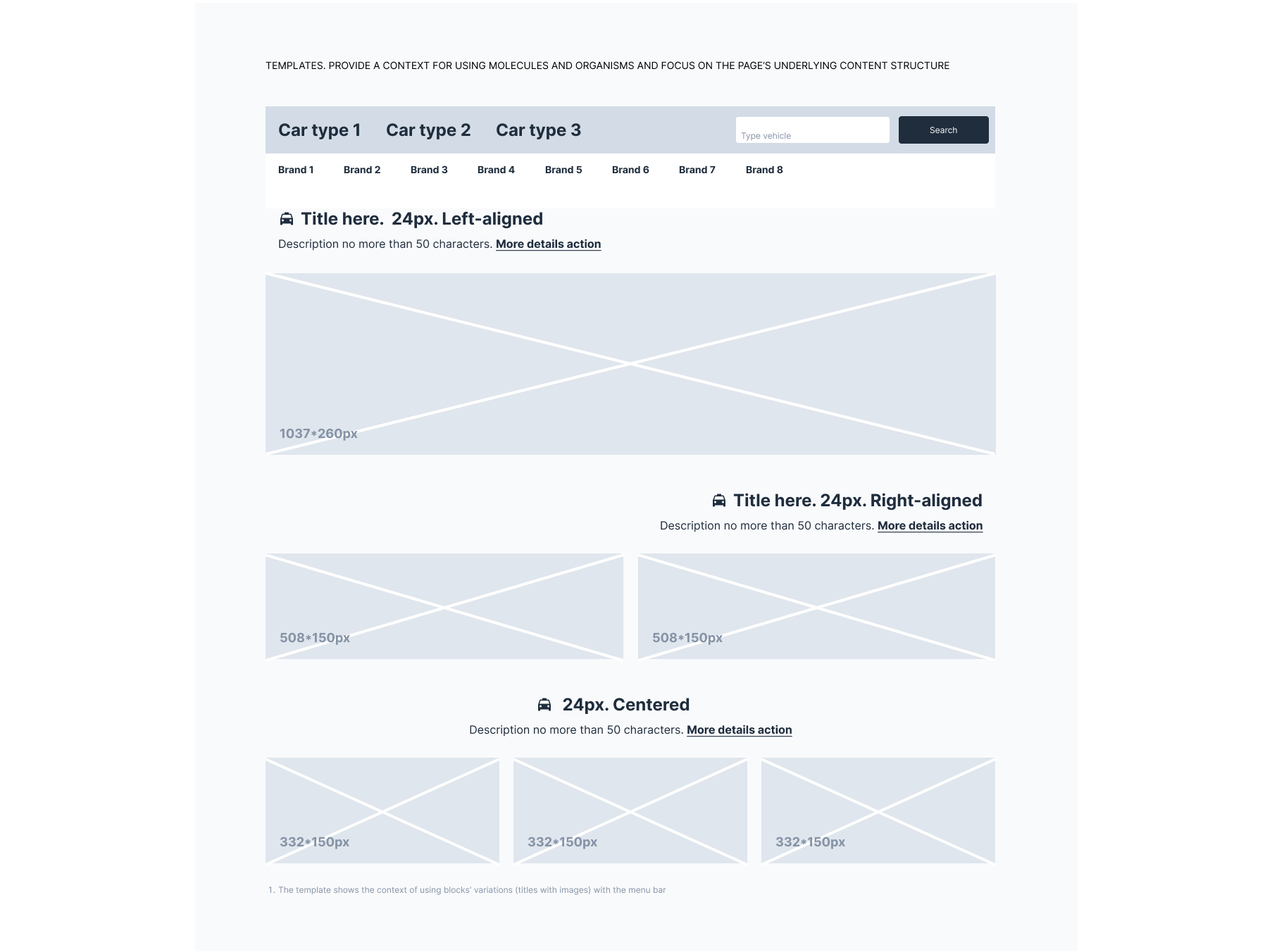
An example of a template according to the Atomic design approach. Example: A template shows the context for using block variations (titles with images) with a menu bar
Template. (Large preview)
  • Pages
    They show what a UI looks like with proper content.
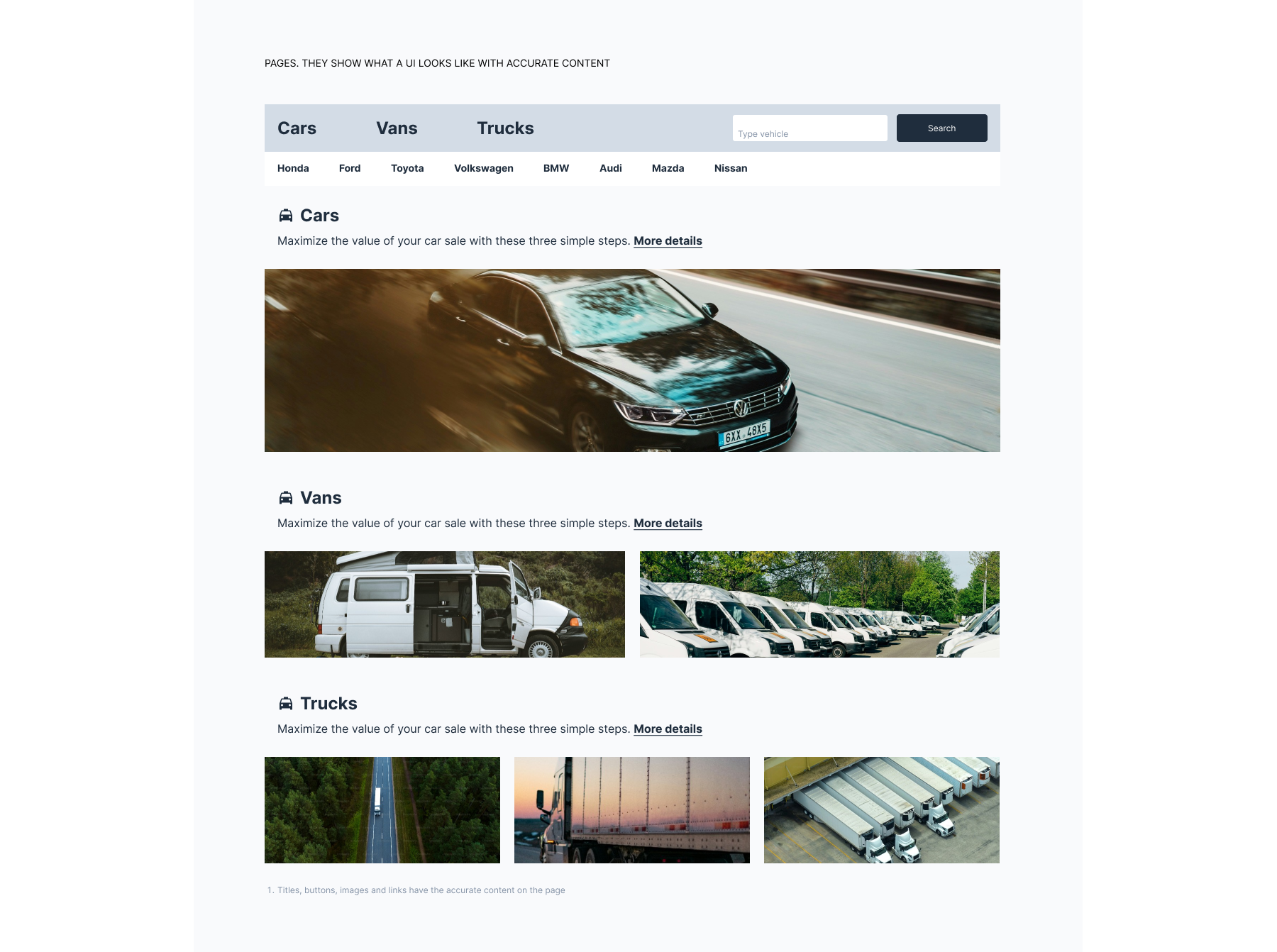
An example of a page according to the Atomic design approach. Example: Titles, buttons, images, and links all display required content on the page
Page. (Large preview)

What exactly makes this approach a thing designers gravitate towards? Here are my two cents on the matter:

  • Creating a design system resembles playing with a construction set. You begin with the smallest components and progress in size, which means you are eating the elephant a bite at a time and don’t get overwhelmed.
  • Altering a component in one place will cause updates wherever a certain atom, molecule, or organism is applied. This eliminates any need for manual tweaking of components.
  • This approach provides designers with design patterns, meaning that you no longer need to create new ones and worry about their consistency.

That’s clearly not all the advantages of this methodology, so if you are interested, go ahead and read more about it in Brad Frost’s book.

What I’m really willing to focus on is our job as designers in creating and maintaining those fabled design systems, both atomic and regular. More specifically, on iconography. And even more specifically, on the pitfalls we have a nasty habit of falling into when dealing with icons as the atoms of our systems. Off we go.

Iconography In Design Systems: Maladies and Remedies #

Common Problems #

Since I’m relying on my own experience when it comes to design systems, it would only be fair if I shared the biggest issues that I personally have with iconography in the context of design systems and how I solve them. I’ll share with you surefire tips on how to keep your iconography consistent and ensure its smooth integration into design environments.

If we regard a single icon from the atomic design standpoint, we would consider it an atom — the smallest but essential element, just like the color palette or typography. If we continue with our language analogy, I will take the liberty of calling icons a design’s vocabulary. So, it’s fairly clear that icons are the actual core of your design.

As any designer knows, users heavily rely on icons as an interactional element of an interface. Despite being the smallest of components, icons might prove to be a major pain in the neck in terms of creation. This is the lesson I have learned during my tenure as a UX designer.

Tip 1: Since an atom is not just an autonomous element, you have to think beforehand about how it will behave as part of a larger component, like a molecule, an organism, or a template.

These are the variables you have to keep in mind when developing an icon:

  • Is your icon scalable?
  • Does it have color variations?
  • Do you classify your icon according to meaning, group, style, or location?
  • Is there an option to change the icon’s meaning or style?
  • How can you easily introduce a new icon into an existing roster?
  • How should you navigate a situation when different designers develop icons separately?
  • How can you make locating a certain icon within your design system easier?

Here are some challenges that I personally face while developing iconography for a design system:

  • How should I keep track of icon updates and maintain their consistency?
  • How should I develop icon creation guidelines?
  • What should I do if current icons happen to be inconsistent?
  • How should I inform my design team of any changes?

It might be hard to wrap your head around so many questions, but worry not. I’ll try my best to cover all these issues as we go on.

Rules Of Thumb #

An icon isn’t just a little pictogram with a certain meaning behind it. An icon is a symbol of action, an interactive element of a digital interface that helps users navigate through the system.

In other words, it is a tool, and the process of building a tool implies following rules. I found out firsthand that if you master the basic icon rules, then you’ll be able to build both stand-alone icons and those that are part of a larger environment with equal efficiency. Besides, you’ll enhance your ability to create icon sets and various icon types within a single project, all while maintaining their readability and accessibility.

Tip 2: Keep consistency by establishing the basic icon rules before building your icon library.

The following are the rules that I abide by:

Grid #

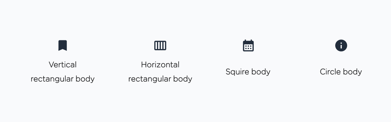
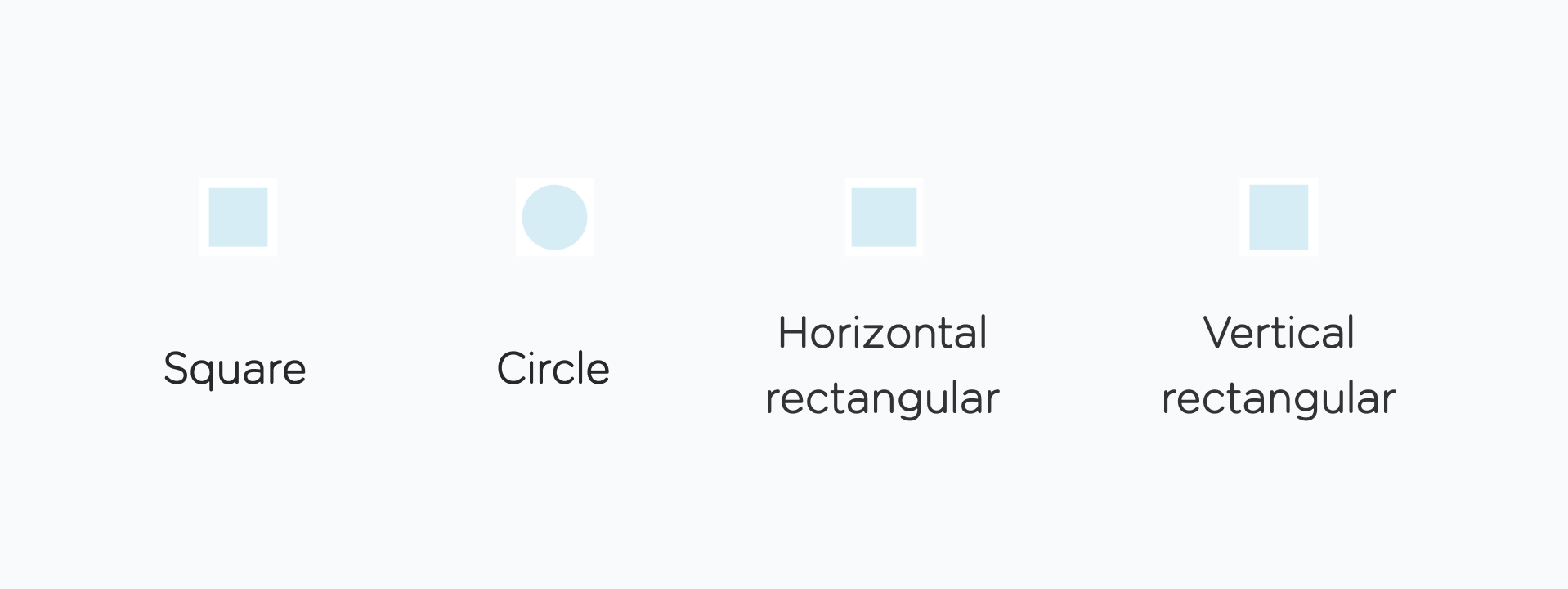
I use the classic 24px grid for standard icons and a 44px grid for larger icons. Each grid consists of the padding area (marked in red, 2 px) and the live area (marked in blue, 20 px). The live area is the space that your icon content stays inside. Its shape depends on the icon’s body and could be circular, square, vertical-rectangular, or horizontal-rectangular.

Before you sit down to draw your icon, decide how much space your icon’s body will occupy in order to come up with the proper shape.
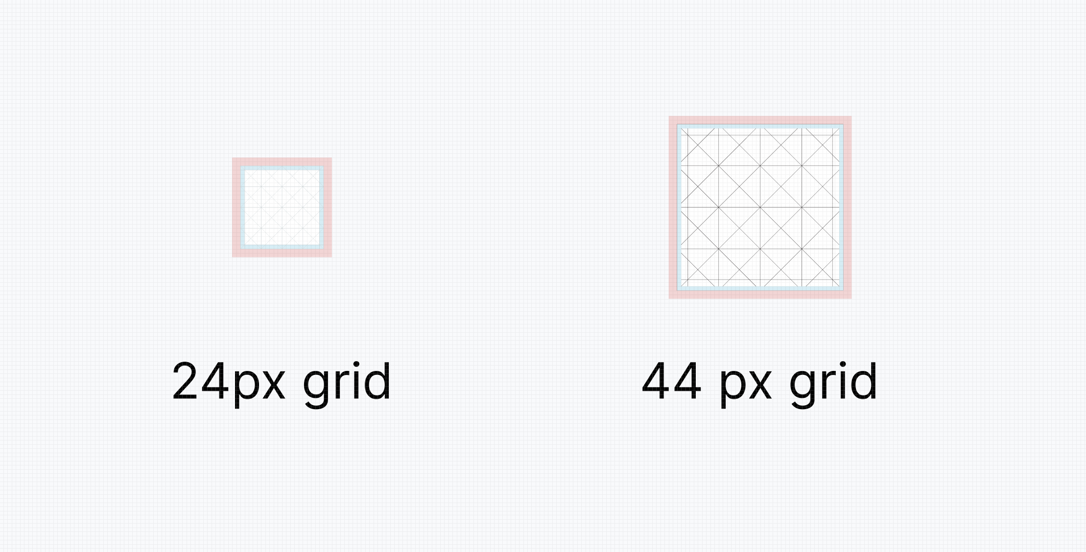
Two types of grid: 24px and 44px
Grids. (Large preview)
4 types of body icons: squire, circle, horizontal rectangular, vertical rectangular
Body icon variations. (Large preview)
4 types of body icons: squire, circle, horizontal rectangular, vertical rectangular
Examples of body icon variations. (Large preview)

Size #

Each icon within a design system has to have a primary size, which is the size that up to 90% of all icons share. I consider the 24px icon size suggested by Google’s Material Design to be the golden standard. This size works well both for desktop and mobile devices.

Still, there is room for exceptions in this rule when an icon needs to be smaller or larger. In this case, I employ a 4-pixel step rule. I increase or decrease the icon’s size by 4 pixels at a time (e.g., I go from 24 to 20, then 16, then 12 px, or 28, 32 px, and so on). I would still personally prefer the golden standard of 24 pixels since I find smaller sizes less readable or larger sizes too visually domineering.
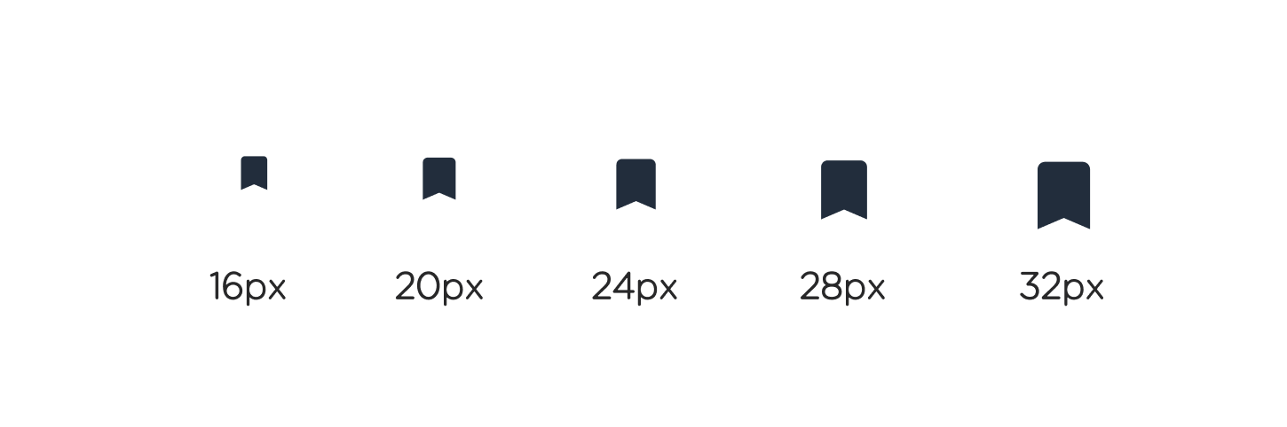
4px step rule applied
Different sizes of one icon. (Large preview)

Weight #

Another key property to consider is the outline weight of your icon if you opt for this type. If you are building an icon library from scratch, it would be wise to test several outline weight values before you make a decision. This is especially crucial for icons that contain fine details.

Granted, you can assign different weight values to different types of icons, but you might struggle to write clear guidelines for your fellow designers. I usually make a conscious decision to go with a unified outline weight for all the icons, namely, 2 points.

Fill #

A solid icon variant might considerably enhance the accessibility and readability of an interface icon. It’s really handy to have both solid and outline icon types. But not all your icons should have two options. If you choose to draw a solid option, determine what parts of your icon you want to make solid.
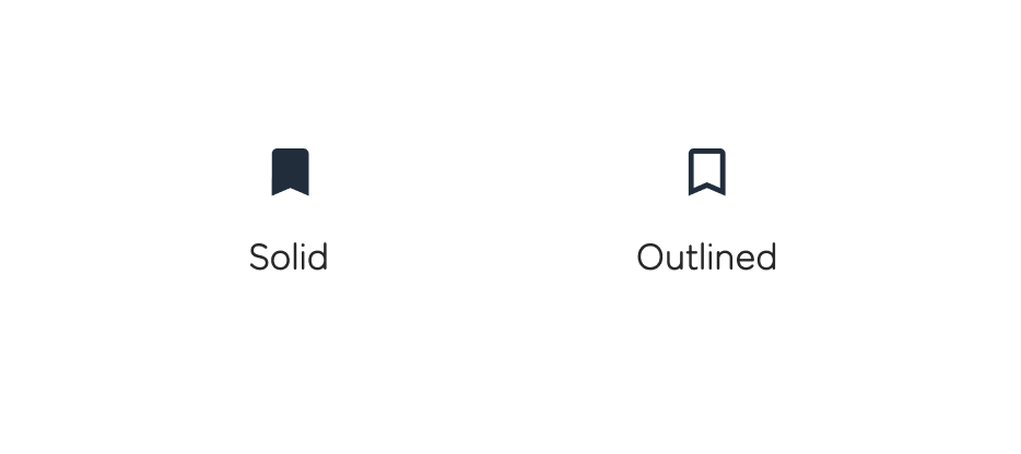
Two variations of solid and outlined icon
One icon in two states. (Large preview)

Design principles #

As I’ve mentioned before, an icon is an essential interface element. This means that an icon should be simplistic, bold, and — what’s even more important in the context of design systems — created according to the unified rules.

I have a little trick I use to see how well a new icon fits the standard. I simply integrate the new icon into the interface populated by already existing elements. This helps determine if the new icon matches the rest.

Anatomy #

Such aspects as corner, counterstroke, and stroke terminal provide the much-desired visual consistency. Obviously, all these elements should be unified for all the icons within a design system. A comprehensive guide to icon anatomy is available at Material Design.
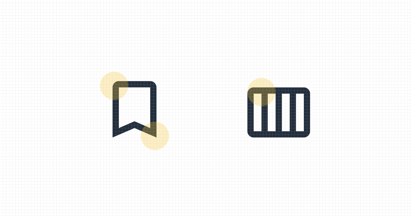
Corner, counter stroke, and stroke terminal shown with yellow mark.
Anatomy of an icon. (Large preview)

Icon Consistency: Surefire Tips #

Before I actually share my tips on how to deal with icons within a design system efficiently, here’s a little backstory to how I came up with them. It all started when I joined a project that already had an established host of icons. There were over a hundred of them. And the number grew because the project was a fast-evolving thing. So, the design system, like any other, was like a living being, constantly in a state of change.

The icon library was a mishmash of different icon types, creating quite a noise. The majority of icons differed in style, size, and application. Another problem I had was the fact that most of the icons did not have the source file. So, there was no way to quickly tweak an icon to match the rest.

The first and most important thing I did was to establish the basic rules for icon creation (that’s something we’ve already covered). This step was supposed to keep the design team from creating inconsistent icons.

Tip 3: Put all your icons on one layout. This way, you’ll get a full visual understanding of your icons and determine repetitive design patterns.

Now, here comes the juicy stuff. Here is my guide on how to sustain iconography in the context of a design system.

  • Divide your icons into subcategories.
    This rule works wonders when you have an array of inconsistent icons on your hands. There is no rule on what subcategories there should be. It all depends on your design system and the number of existing icons.
    In my case, I established three groups divided by size and icon style, which resulted in three subcategories: regular icons, detailed icons, and illustrations. Once you divide your icons in the same manner, it’ll be easier to apply the same rules to each group. Besides, this approach allows for a more structured storage of these icons within your design system.
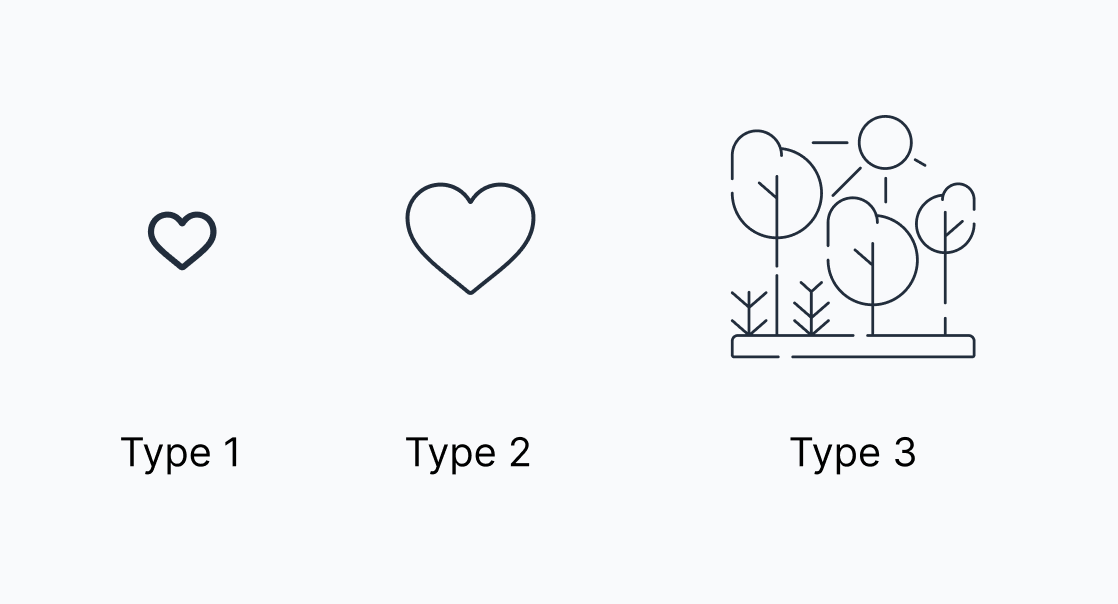
Three subcategories of icons
Subcategories. (Large preview)
  • Determine guidelines for each icon type.
    The next step is as wise as it is hard to pull off. You need to assign certain icon creation rules for each of the icon types (provided you have more than one). This is the basis upon which all your other attempts at achieving visual consistency will be built. To tame all the mismatched icons, I used the basic icon rules we’ve covered above. To keep track, I created a page in Figma for each of the icon types and used the basic size as the file name.
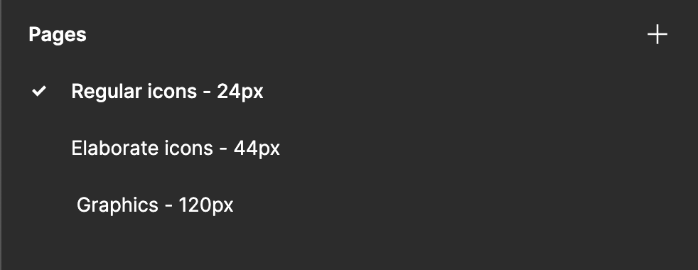
Each page in Figma named after the subcategory of icons
Icons subcategories. (Large preview)
  • Group your icons wisely.
    When naming icons, I opt for the semantic section approach. Generally, you can divide all your icons into groups based on their meaning or application in the interface. Look at the example below; we have three distinct semantic sections: Transport, Services, and Warnings. Depending on their meaning, icons should be assigned to the corresponding sections. Then, those sections are, in turn, divided into subsections. For instance, the Transport section has Ground Transport and Air Transport. The main idea you should stick to is to keep your icons in separate sections.
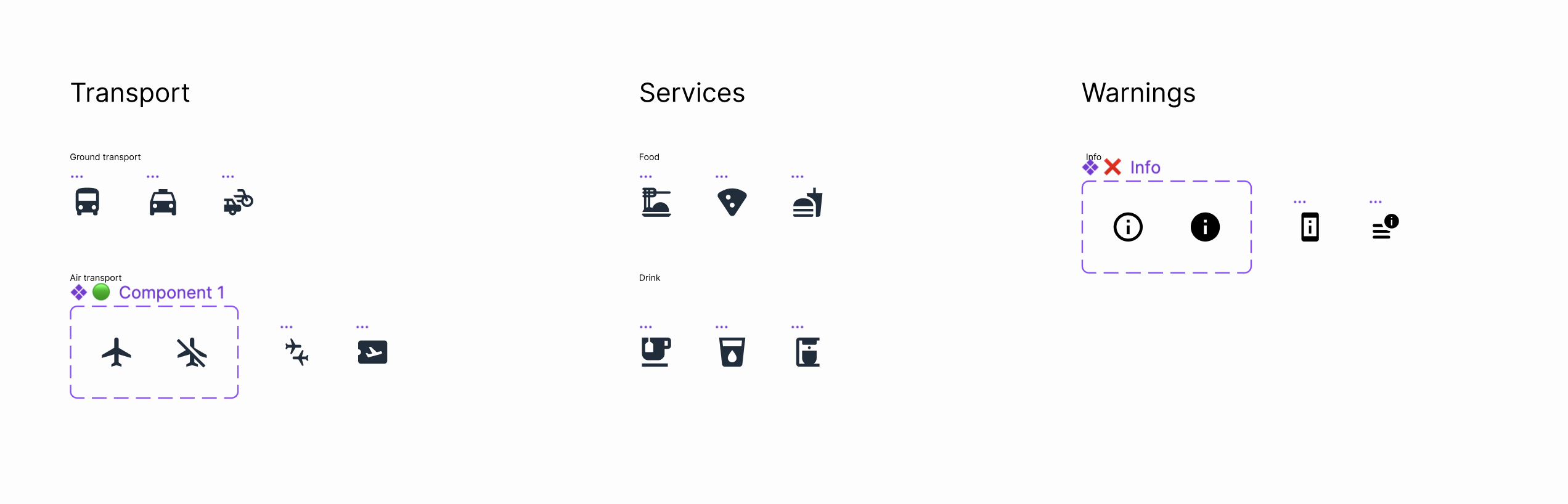
Three groups of icons gathered according to meaning and usage
Groups of icons. (Large preview)
  • Stick to clear names and descriptions.
    I have to admit that dividing icons into semantic sections does have a massive disadvantage: this division could be quite subjective. This is why it is crucial to add a detailed description to each of the icons. This will simplify icon search within a design system and will give a clear understanding of an icon’s application. This is how I create a description:
    • Tags: reference words that facilitate searching for an icon within the system.
    • Usage: a brief description of an icon’s application.
    • Group Name: the name of the group an icon belongs to. This helps with locating an icon right within the library.
    • Designs: an incredibly nifty tool that allows you to insert a link to the design and documentation that features the icon in question. This way, you’ll know the context in which the icon is applied.
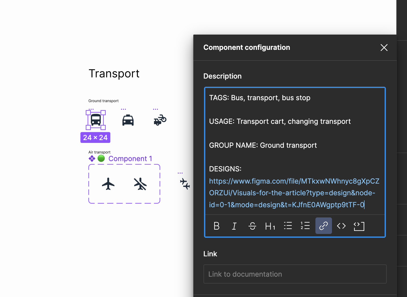
Description includes the following: Tags, Usage, Group name, Designs
Description which belongs to the icon. (Large preview)
  • Use color coding and symbols while updating icon design.
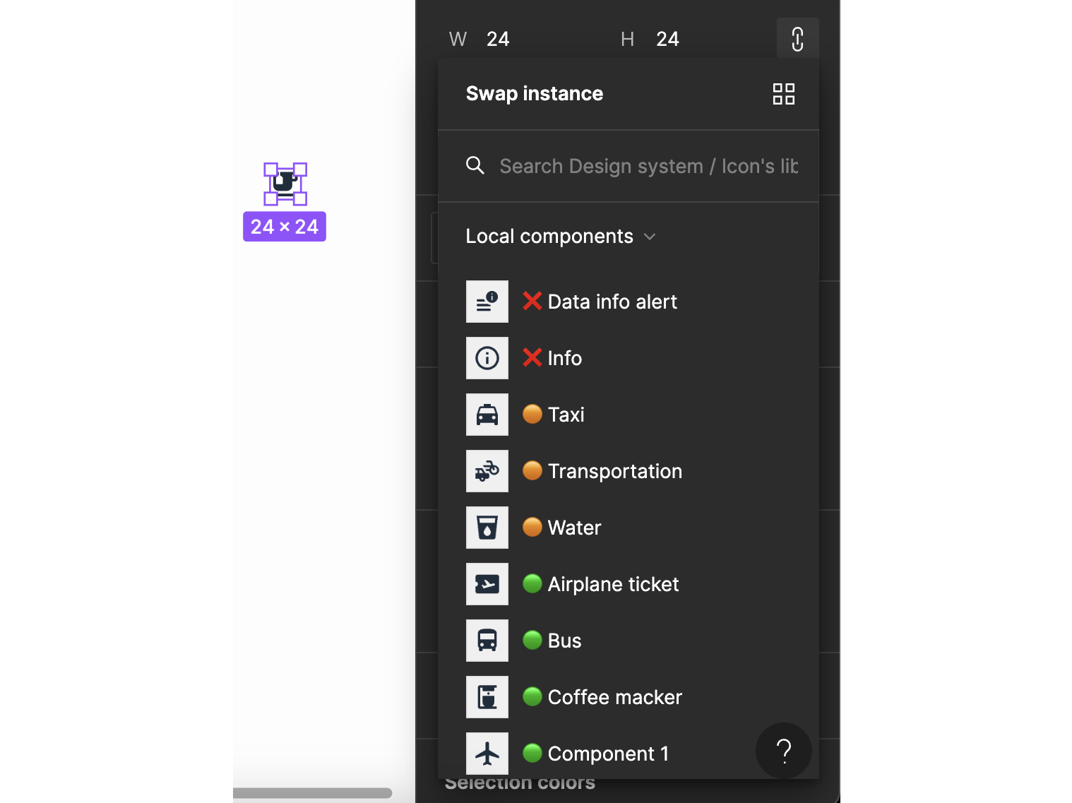
    This trick works best when you are not yet done with the icon library, but you need to communicate to your team which icons are ready to use and which still need a bit of enhancement. For instance, I mark the names of finished icons with a green symbol. An orange symbol marks those icons that need to be improved. And in case I need an icon deleted or drawn anew, I use a red cross.
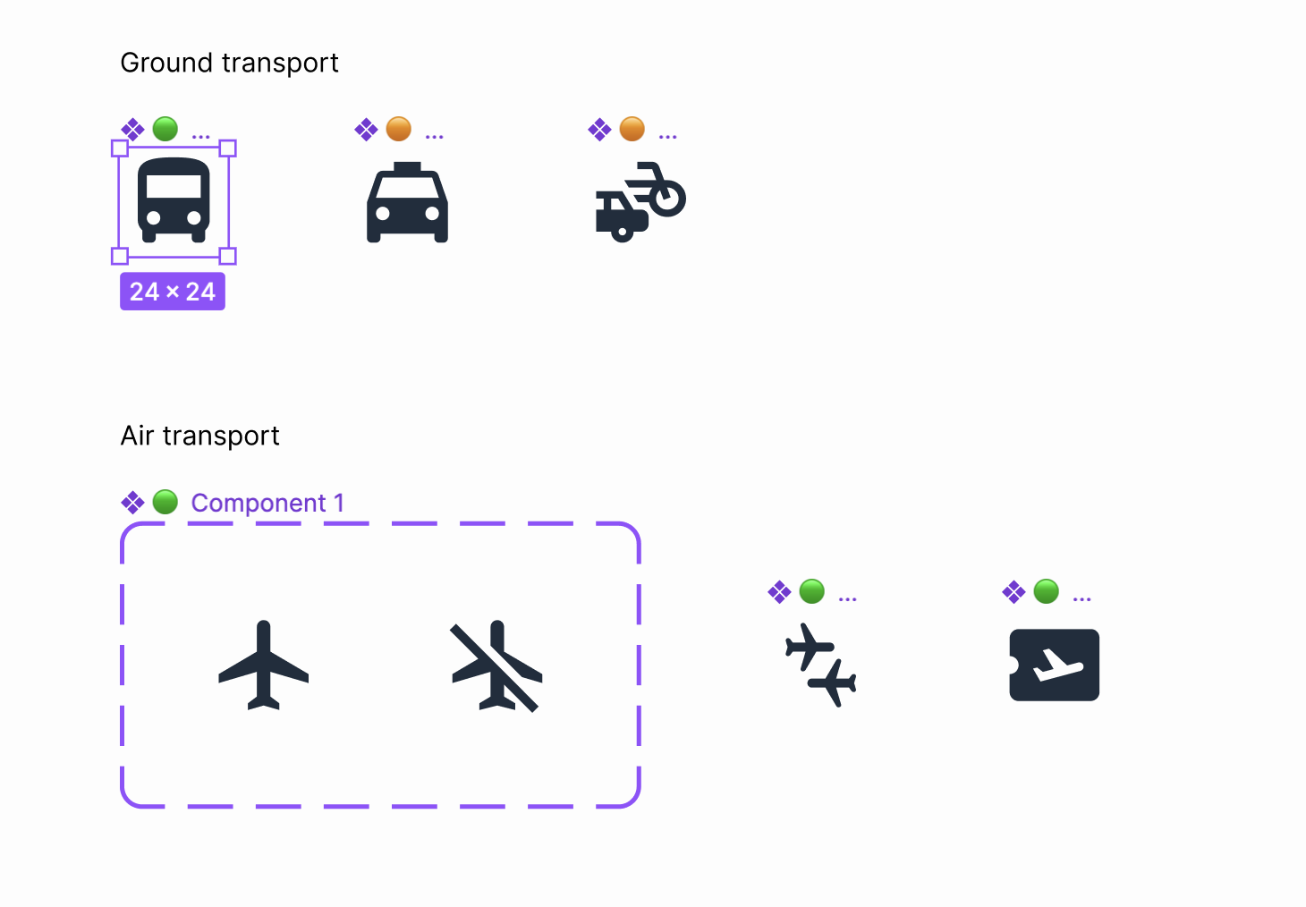
Using green, orange, and red color to show the status of an icon
Icons of one group with color code. (Large preview)
How the color code looks in the list of icons
Colour code. (Large preview)
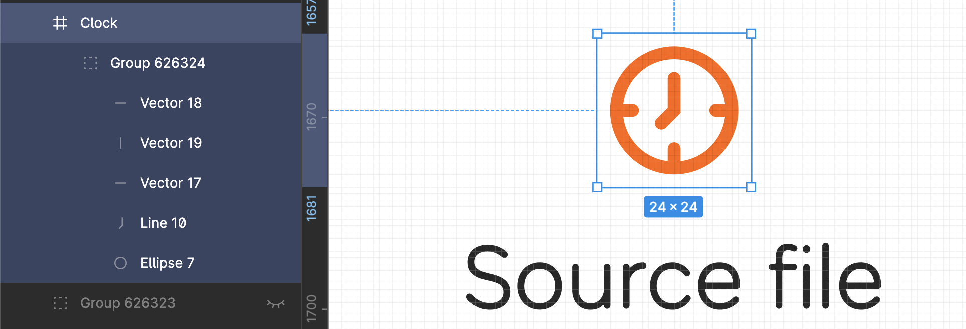
  • Keep non-rasterised versions of icons.
    It can be handy to have a non-rasterised version of an icon at arm’s length. There’ve been cases when I was asked to create a similar icon or an icon that could use the same graphic forms as the existing ones. Should this happen again, I can simply take the original file and easily draw an icon. I store all the non-rasterised icons on a separate page in the file following the defined hierarchy.
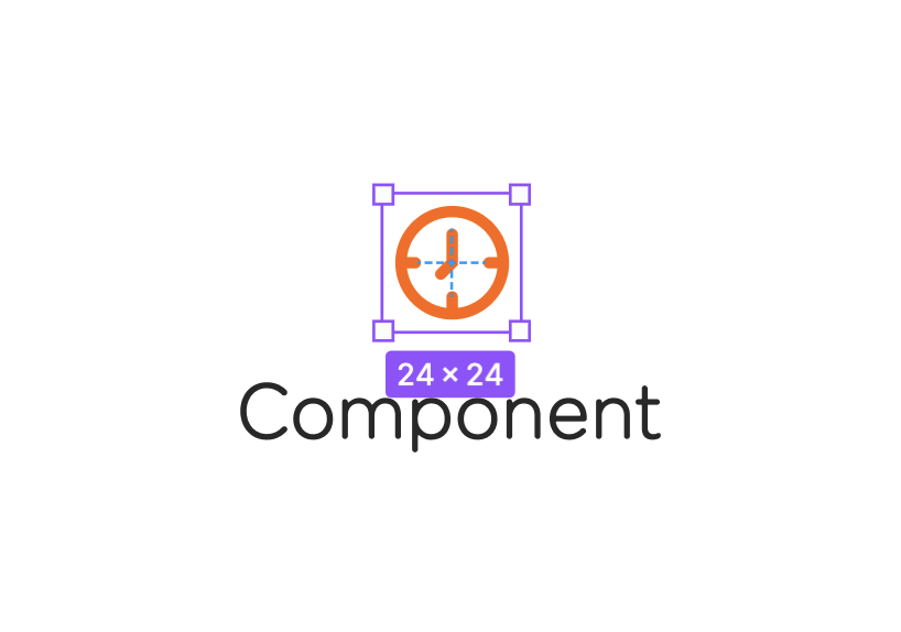
A component for rasterised form of an icon
Original component for an icon. (Large preview)
An original form of an icon that can be transformed easily
Source file for an icon. (Large preview)
  • Rasterise the icon vector.
    Be sure to apply the Outline Stroke feature before you create the icon component. This will allow for easy color change (more on this in the next tip) and scaling.
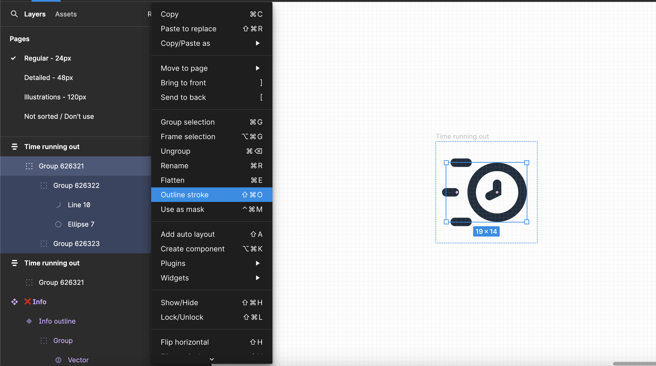
Rasterize an icon before converting it into component
Rasterise the icon vector. (Large preview)
  • Mind the colors of your icons.
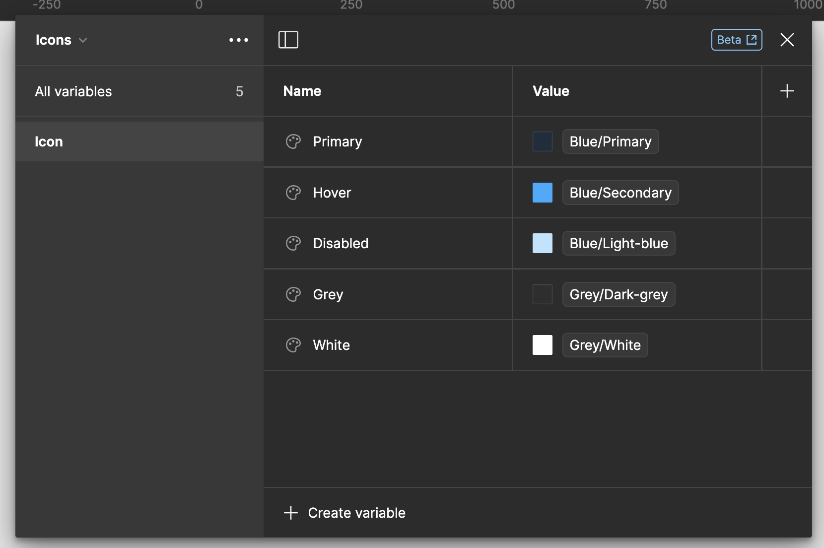
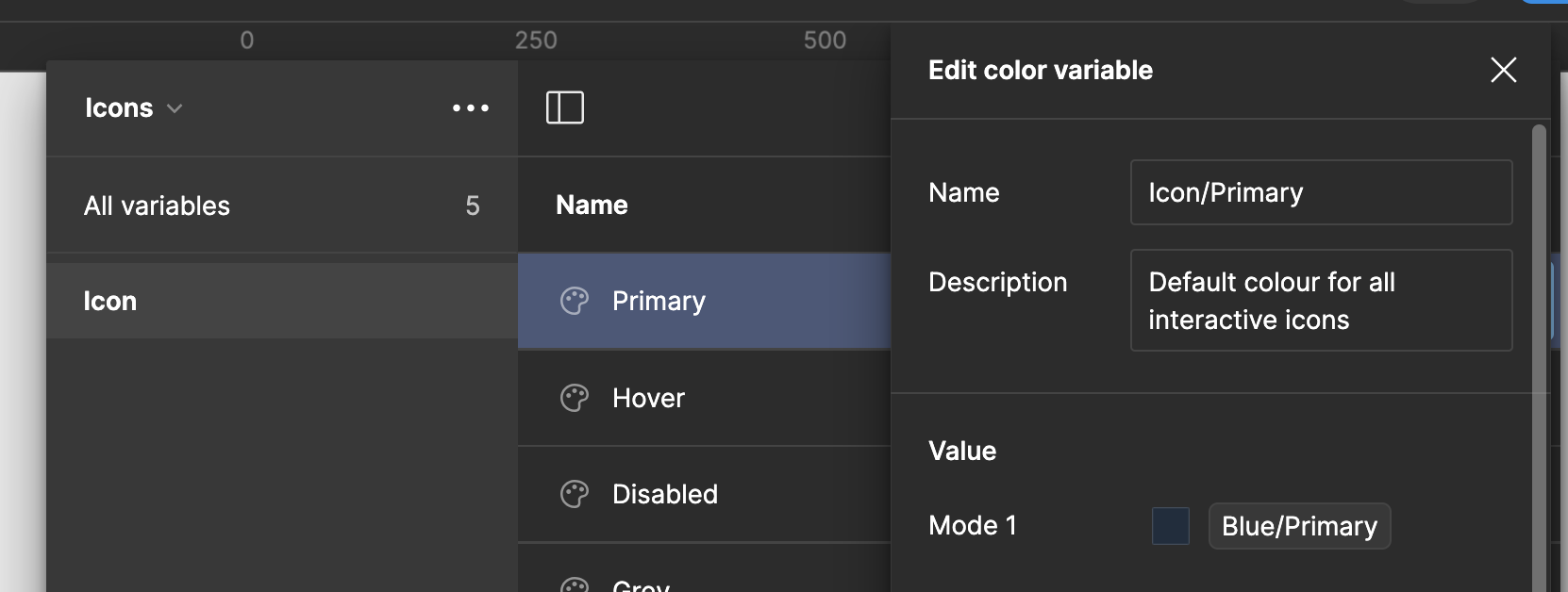
    I suggest keeping icons in the primary, most commonly used color by default. Another worthwhile thing to do is to name all icon colors according to their intended use and the interactions they perform. In order to do that, you need to equip your color library with a separate set of colors for all icon states, like primary, hover, and disabled. Make sure to name each set properly.
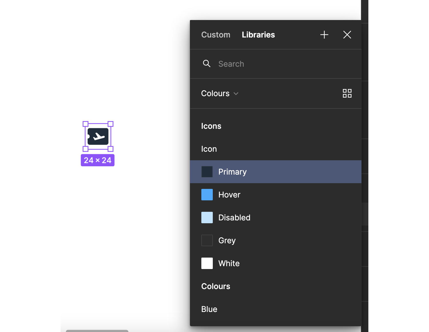
Using colors grouped on interactions of icons, and types of icons: regular, detailed, illustrations
Color names according to interactions and type of icons. (Large preview)
Named set of colors for icons
The color palette in the main design system file. (Large preview)
Each color for each of the icon type has a description
The color description. (Large preview)
  • Assign a designer to maintain icons in the system.
    This is a seemingly trivial tip that, however, will save you trouble maintaining style and categorization consistency. I’ve personally had edge cases when the established rules failed. Having a designated designer who knew their way around the system helped to find a quick solution.

Real Example Of Guidelines Applied #

To wrap up this whole lecture and actually see all these rules in action, take a look at the following template file.

Final Thoughts: Is It Worth It? #

No matter how sick you might be dealing with unending visual inconsistency, design systems are still challenging. They can scare any designer regardless of their experience. Still, if you want to bring order to chaos, introducing a design system into your workflow is worth the trouble, especially when it comes to maintaining iconography.

After all, iconography is the most volatile part of a design system in terms of visual variety. That’s why iconography was the biggest challenge I had to face in my tenure as a designer. And that’s exactly why I am genuinely proud that I’ve tamed that beast and can now share my hacks with you.

Resources #

Public design systems:

Design systems resources:

Icons resources:

Tuesday, February 27, 2024

In Search Of The Ideal Privacy Icon

 cons are capable of enhancing the content that surrounds them, but they have to be self-explanatory for that to happen. We have icons for things we like (a thumbs up), things we can share (a box topped with an up arrow), and even for protection against malicious online attacks (a shield), but what are the options we have for representing “privacy”? The answer is not so straightforward, and Preethi Sam examines the possibilities in this article.

I’ve been on the lookout for a privacy icon and thought I’d bring you along that journey. This project I’ve been working on calls for one, but, honestly, nothing really screams “this means privacy” to me. I did what many of us do when we need inspiration for icons and searched The Noun Project, and perhaps you’ll see exactly what I mean with a small sample of what I found.

Set of 10 icons from a Noun Project search
(Large preview)

Padlocks, keys, shields, and unsighted eyeballs. There’s a lot of ambiguity here, at best, and certainly no consensus on how to convey “privacy” visually. Any of these could mean several different things. For instance, the eyeball with a line through it is something I often see associated with visibility (or lack thereof), such as hiding and showing a password in an account login context.

Signing form with fields for username and password with an option to hide the password
Mailchimp’s login screen is a perfect example of how eyeball iconography is used to indicate visibility. (Large preview)

So, that is the journey I am on. Let’s poke at some of the existing options of icons that exist for communicating privacy to see what works and what doesn’t. Maybe you’ll like one of the symbols we’ll stumble across. Or maybe you’re simply curious how I — or someone else — approach a design challenge like this and where the exploration goes.

Is A Specific Icon Even Necessary? #

There are a couple of solid points to be made about whether we need a less ambiguous icon for privacy or if an icon is even needed in the first place.

For example, it’s fair to say that the content surrounding the icon will clarify the meaning. Sure, an eyeball with a line through it can mean several things, but if there’s a “Privacy” label next to it, then does any of this really matter? I think so.

Visuals enhance content, and if we have one that is not fully aligned with the context in which it is used, we’re actually subtracting from the content rather than adding to it.

“

In other words, I believe the visual should bolster the content, not the other way around.

Another fair point: text labels are effective on their own and do not need to be enhanced.

I remember a post that Thomas Byttebier wrote back in 2015 that makes this exact case. The clincher is the final paragraph:

“I hope all of this made clear that icons can easily break the [most important characteristic of a good user interface: clarity](https://thomasbyttebier.be/blog/a-clear-interface-is-a-better-interface). So be very careful, and test! And when in doubt, always remember this: the best icon is a text label.”

— Thomas Byttebier

The Nielsen Norman Group also reminds us that a user’s understanding of icons is based on their past experiences. It goes on to say that universally recognized icons are rare and likely exceptions to the rule:

“[…] Most icons continue to be ambiguous to users due to their association with different meanings across various interfaces. This absence of a standard hurts the adoption of an icon over time, as users cannot rely on it having the same functionality every time it is encountered.”

That article also makes several points in support of using icons, so it’s not like a black-and-white or a one-size-fits-all sort of rule we’re subject to. But it does bring us to our next point.

Communicating “Privacy” #

Let’s acknowledge off the bat that “privacy” is a convoluted term and that there is a degree of subjectivity when it comes to interpreting words and visuals. There may be more than one right answer or even different answers depending on the specific context you’re solving for.

In my particular case, the project is calling for a visual for situations when the user’s account is set to “private,” allowing them to be excluded from public-facing interfaces, like a directory of users. It is pretty close to the idea of the eyeball icons in that the user is hidden from view. So, while I can certainly see an argument made in favor of eyeballs with lines through them, there’s still some cognitive reasoning needed to differentiate it from other use cases, like the password protection example we looked at.

The problem is that there is no ironclad standard for how to represent privacy. What I want is something that is as universally recognized as the icons we typically see in a browser’s toolbar. There’s little if any, confusion about what happens when clicking on the Home icon in your browser. It’s the same deal with Refresh (arrow with a circular tail), Search (magnifying glass), and Print (printer).

A row of four hand-drawn illustrations of icons sketched in blue ink
Iconography is most effective when it is a literal interpretation of what is being conveyed. (Large preview)

In a world with so many icon repositories, emoji, and illustrations, how is it that there is nothing specifically defined for something as essential on the internet as privacy?

Two MacOS contextual menus for emoji with search results for privacy and private
We have emoji for everything under the sun (🌞), including eggplant (🍆), but nothing on the privacy front. (Large preview)

If there’s no accord over an icon, then we’ll just have to use our best judgement. Before we look at specific options that are available in the wild, let’s take a moment to define what we even mean when talking about “privacy.” A quick define: privacy in DuckDuckGo produces a few meanings pulled from The American Heritage Dictionary:

  1. The quality or condition of being secluded from the presence or view of others. “I need some privacy to change into my bathing suit.”
  2. The state of being free from public attention or unsanctioned intrusion. “A person’s right to privacy.”
  3. A state of being private, or in retirement from the company or from the knowledge or observation of others; seclusion.

Those first two definitions are a good point of reference. It’s about being out of public view to the extent that there’s a sense of freedom to move about without intrusion from other people. We can keep this in mind as we hunt for icons.

The Padlock Icon #

We’re going to start with the icon I most commonly encounter when searching for something related to privacy: the padlock.

Hand-drawn padlock icon illustration sketched in blue ink
(Large preview)

If I were to end my search right this moment and go with whatever’s out there for the icon, I’d grab the padlock. The padlock is good. It’s old, well-established, and quickly recognizable. That said, the reason I want to look beyond the lock is because it represents way too many things but is most widely associated with security and protection. It suggests that someone is locked up or locked out and that all it takes is a key to undo it. There’s nothing closely related to the definitions we’re working with, like seclusion and freedom. It’s more about confinement and being on the outside, looking in.

Relatively speaking, modern online privacy is a recent idea and an umbrella term. It’s not the same as locking up a file or application. In fact, we may not lock something at all and still can claim it is private. Take, for instance, an end-to-end encrypted chat message; it’s not locked with a user password or anything like that. It’s merely secluded from public view, allowing the participants to freely converse with one another.

I need a privacy symbol that doesn’t tie itself to password protection alone. Privacy is not a locked door or window but a closed one. It is not a chained gate but a tall hedge. I’m sure you get the gist.

But like I said before, a padlock is fairly reliable, and if nothing else works out, I’d gladly use it in spite of its closer alignment with security because it is so recognizable.

The Detective Icon #

When searching “private” in an emoji picker, a detective is one of the options that come up. Get it, like a “private” detective or “private” eye?

Hand-drawn detective icon illustration sketched in blue ink
(Large preview)

I have mixed feelings about using a detective to convey privacy. One thing I love about it is that “private” is in the descriptor. It’s actually what Chrome uses for its private browsing, or “Incognito” mode.

Google Chrome’s default Incognito Mode start page
(Large preview)

I knew what this meant when I first saw it. There’s a level of privacy represented here. It’s essentially someone who doesn’t want to be recognized and is obscuring their identity.

My mixed emotions are for a few reasons. First off, why is it that those who have to protect their privacy are the ones who need to look like they are spying on others and cover themselves with hats, sunglasses, and coats? Secondly, the detective is not minimal enough; there is a lot of detail to take in.

When we consider a pictograph, we can’t just consider it in a standalone context. It has to go well with the others in a group setting. Although the detective’s face doesn’t stand out much, it is not as minimal as the others, and that can lead to too many derivatives.

A very minimal icon, like the now-classic (it wasn’t always the case) hamburger menu, gives less leeway for customization, which, in turn, protects that icon from being cosmetically changed into something that it’s not. What if somebody makes a variation of the detective, giving him a straw hat and a Hawaiian shirt? He would look more like a tourist hiding from the sun than someone who’s incognito. Yes, both can be true at the same time, but I don’t want to give him that much credit.

That said, I’ll definitely consider this icon if I were to put together a set of ornate pictographs to be used in an application. This one would be right at home in that context.

The Zorro Mask Icon #

I was going to call it an eye mask, but that gives me a mental picture of people sleeping in airplanes. That term is taken. With some online searching, I found the formal name for this Zorro-esque accessory is called a domino mask.

Hand-drawn mask icon illustration sketched in blue ink
(Large preview)

I’m going with the Zorro mask.

I like this icon for two reasons: It’s minimal, and it’s decipherable. It’s like a classy version of the detective, as in it’s not a full-on cover-up. It appears less “shady,” so to speak.

But does the Zorro mask unambiguously mean “privacy”? Although it does distinguish itself from the full-face mask icon that usually represents drama and acting (🎭), its association with theater is not totally non-existent. Mask-related icons have long been the adopted visual for conveying theater. The gap in meaning between privacy and theater is so great that there’s too much room for confusion and for it to appear out of context.

It does, however, have potential. If every designer were to begin employing the Zorro mask to represent privacy in interfaces, then users would learn to associate the mask with privacy just as effectively as a magnifying glass icon is to search.

In the end, though, this journey is not about me trying to guess what works in a perfect world but me in search of the “perfect” privacy pictograph available right now, and I don’t feel like it’s ended with the Zorro mask.

The Shield Icon #

Hand-drawn shield icon illustration sketched in blue ink
(Large preview)

No. Just no.

Here’s why. The shield, just like the lock, is exceptionally well established as a visual for antivirus software or any defense against malicious software. It works extremely well in that context. Any security-related application can proudly don a shield to establish trust in the app’s ability to defend against attacks.

Again, there is no association with “secluded from public view” or “freedom from intrusion” here. Privacy can certainly be a form of defense, but given the other options we’ve seen so far, a shield is not the strongest association we can find.

Some New Ideas #

If we’re striking out with existing icons, then we might consider conceiving our own! It doesn’t hurt to consider new options. I have a few ideas with varying degrees of effectiveness.

The Blurred User Icon #

The idea is that a user is sitting behind some sort of satin texture or frosted glass. That could be a pretty sleek visual for someone who is unrecognizable and able to move about freely without intrusion.

Hand-drawn icon illustration of a blurry user avatar sketched in blue ink
(Large preview)

I like the subtlety of this concept. The challenge, though, is two-fold:

  1. The blurriness could get lost, or worse, distorted, when the icon is applied at a small size.
  2. Similarly, it might look like a poor, improperly formatted image file that came out pixelated.

This idea has promise, for sure, but clearly (pun intended), not without shortcomings.

The Venetian Blind Icon #

I can also imagine how a set of slatted blinds could be an effective visual for privacy. It blocks things out of view, but not in an act of defense, like the shield, or a locked encasing, such as the padlock.

Hand-drawn Venetian blinds icon illustration sketched in blue ink
(Large preview)

Another thing I really like about this direction is that it communicates the ability to toggle privacy as a setting. Want privacy? Close the blinds and walk freely about your house. Want guests? Lift the blinds and welcome in the daylight!

At the same time, I feel like my attempt or execution suffers from the same fate as the detective icon. While I love the immediate association with privacy, it offers too much visual detail that could easily get lost in translation at a smaller size, just as it does with the detective.

The Picket Fence Icon #

We’ve likened privacy to someone being positioned behind a hedge, so what if we riff on that and attempt something similar: a fence?

Hand-drawn picket fence icon illustration sketched in blue ink
(Large preview)

I like this one. For me, it fits the purpose just as well and effectively as the Zorro mask, perhaps better. It’s something that separates (or secludes) two distinct areas that prevent folks from looking in or hopping over. This is definitely a form of privacy.

Thinking back to The Norman Nielsen Group’s assertion that universally recognized icons are a rarity, the only issue I see with the fence is that it is not a well-established symbol. I remember seeing an icon of a castle wall years ago, but I have never seen a fence used in a user interface. So, it would take some conditioning for the fence to make that association.

So, Which One Should I Use? #

We’ve looked at quite a few options! It’s not like we’ve totally exhausted our options, either, but we’ve certainly touched on a number of possibilities while considering some new ideas. I really wish there was some instantly recognizable visual that screams “privacy” at any size, whether it’s the largest visual in the interface or a tiny 30px×30px icon. Instead, I feel like everything falls somewhere in the middle of a wide spectrum.

Here’s the spoiler: I chose the Zorro mask. And I chose it for all the reasons we discussed earlier. It’s recognizable, is closely associated with “masking” an identity, and conveys that a user is freely able to move about without intrusion. Is it perfect? No. But I think it’s the best fit given the options we’ve considered.

Deep down, I really wanted to choose the fence icon. It’s the perfect metaphor for privacy, which is an instantly recognizable part of everyday life. But as something that is a new idea and that isn’t in widespread use, I feel it would take more cognitive load to make out what it is conveying than it’s worth — at least for now.

And if neither the Zorro mask nor the fence fit for a given purpose, I’m most likely to choose a pictograph of the exact feature used to provide privacy: encryption, selective visibility, or biometrics. Like, if there’s a set of privacy-related features that needs to be communicated for a product — perhaps for a password manager or the like — it might be beneficial to include a set of icons that can represent those features collectively.

A set of four hand-drawn icon illustrations sketched in blue ink
(Large preview)

An absolutely perfect pictograph is something that’s identifiable to any user, regardless of past experiences or even the language they speak.

“

Do you know how the “OK” hand sign (👌) is universally understood as a good thing, or how you know how to spot the food court in an airport with a fork and knife icon? That would be the ideal situation. Yet, for contemporary notions, like online privacy, that sort of intuitiveness is more of a luxury.

But with consistency and careful consideration, we can adopt new ideas and help users understand the visual over time. It has to reach a point where the icon is properly enhancing the content rather than the other way around, and that takes a level of commitment and execution that doesn’t happen overnight.

What do you think about my choice? This is merely how I’ve approached the challenge. I shared my thought process and the considerations that influenced my decisions. How would you have approached it, and what would you have decided in the end?

Thursday, January 18, 2024

In Search Of The Ideal Privacy Icon

 Icons are capable of enhancing the content that surrounds them, but they have to be self-explanatory for that to happen. We have icons for things we like (a thumbs up), things we can share (a box topped with an up arrow), and even for protection against malicious online attacks (a shield), but what are the options we have for representing “privacy”? The answer is not so straightforward, and Preethi Sam examines the possibilities in this article.

I’ve been on the lookout for a privacy icon and thought I’d bring you along that journey. This project I’ve been working on calls for one, but, honestly, nothing really screams “this means privacy” to me. I did what many of us do when we need inspiration for icons and searched The Noun Project, and perhaps you’ll see exactly what I mean with a small sample of what I found.

Set of 10 icons from a Noun Project search
(Large preview)

Padlocks, keys, shields, and unsighted eyeballs. There’s a lot of ambiguity here, at best, and certainly no consensus on how to convey “privacy” visually. Any of these could mean several different things. For instance, the eyeball with a line through it is something I often see associated with visibility (or lack thereof), such as hiding and showing a password in an account login context.

Signing form with fields for username and password with an option to hide the password
Mailchimp’s login screen is a perfect example of how eyeball iconography is used to indicate visibility. (Large preview)

So, that is the journey I am on. Let’s poke at some of the existing options of icons that exist for communicating privacy to see what works and what doesn’t. Maybe you’ll like one of the symbols we’ll stumble across. Or maybe you’re simply curious how I — or someone else — approach a design challenge like this and where the exploration goes.

Is A Specific Icon Even Necessary? #

There are a couple of solid points to be made about whether we need a less ambiguous icon for privacy or if an icon is even needed in the first place.

For example, it’s fair to say that the content surrounding the icon will clarify the meaning. Sure, an eyeball with a line through it can mean several things, but if there’s a “Privacy” label next to it, then does any of this really matter? I think so.

Visuals enhance content, and if we have one that is not fully aligned with the context in which it is used, we’re actually subtracting from the content rather than adding to it.

“

In other words, I believe the visual should bolster the content, not the other way around.

Another fair point: text labels are effective on their own and do not need to be enhanced.

I remember a post that Thomas Byttebier wrote back in 2015 that makes this exact case. The clincher is the final paragraph:

“I hope all of this made clear that icons can easily break the [most important characteristic of a good user interface: clarity](https://thomasbyttebier.be/blog/a-clear-interface-is-a-better-interface). So be very careful, and test! And when in doubt, always remember this: the best icon is a text label.”

— Thomas Byttebier

The Nielsen Norman Group also reminds us that a user’s understanding of icons is based on their past experiences. It goes on to say that universally recognized icons are rare and likely exceptions to the rule:

“[…] Most icons continue to be ambiguous to users due to their association with different meanings across various interfaces. This absence of a standard hurts the adoption of an icon over time, as users cannot rely on it having the same functionality every time it is encountered.”

That article also makes several points in support of using icons, so it’s not like a black-and-white or a one-size-fits-all sort of rule we’re subject to. But it does bring us to our next point.

Communicating “Privacy” #

Let’s acknowledge off the bat that “privacy” is a convoluted term and that there is a degree of subjectivity when it comes to interpreting words and visuals. There may be more than one right answer or even different answers depending on the specific context you’re solving for.

In my particular case, the project is calling for a visual for situations when the user’s account is set to “private,” allowing them to be excluded from public-facing interfaces, like a directory of users. It is pretty close to the idea of the eyeball icons in that the user is hidden from view. So, while I can certainly see an argument made in favor of eyeballs with lines through them, there’s still some cognitive reasoning needed to differentiate it from other use cases, like the password protection example we looked at.

The problem is that there is no ironclad standard for how to represent privacy. What I want is something that is as universally recognized as the icons we typically see in a browser’s toolbar. There’s little if any, confusion about what happens when clicking on the Home icon in your browser. It’s the same deal with Refresh (arrow with a circular tail), Search (magnifying glass), and Print (printer).

A row of four hand-drawn illustrations of icons sketched in blue ink
Iconography is most effective when it is a literal interpretation of what is being conveyed. (Large preview)

In a world with so many icon repositories, emoji, and illustrations, how is it that there is nothing specifically defined for something as essential on the internet as privacy?

Two MacOS contextual menus for emoji with search results for privacy and private
We have emoji for everything under the sun (🌞), including eggplant (🍆), but nothing on the privacy front. (Large preview)

If there’s no accord over an icon, then we’ll just have to use our best judgement. Before we look at specific options that are available in the wild, let’s take a moment to define what we even mean when talking about “privacy.” A quick define: privacy in DuckDuckGo produces a few meanings pulled from The American Heritage Dictionary:

  1. The quality or condition of being secluded from the presence or view of others. “I need some privacy to change into my bathing suit.”
  2. The state of being free from public attention or unsanctioned intrusion. “A person’s right to privacy.”
  3. A state of being private, or in retirement from the company or from the knowledge or observation of others; seclusion.

Those first two definitions are a good point of reference. It’s about being out of public view to the extent that there’s a sense of freedom to move about without intrusion from other people. We can keep this in mind as we hunt for icons.

The Padlock Icon #

We’re going to start with the icon I most commonly encounter when searching for something related to privacy: the padlock.

Hand-drawn padlock icon illustration sketched in blue ink
(Large preview)

If I were to end my search right this moment and go with whatever’s out there for the icon, I’d grab the padlock. The padlock is good. It’s old, well-established, and quickly recognizable. That said, the reason I want to look beyond the lock is because it represents way too many things but is most widely associated with security and protection. It suggests that someone is locked up or locked out and that all it takes is a key to undo it. There’s nothing closely related to the definitions we’re working with, like seclusion and freedom. It’s more about confinement and being on the outside, looking in.

Relatively speaking, modern online privacy is a recent idea and an umbrella term. It’s not the same as locking up a file or application. In fact, we may not lock something at all and still can claim it is private. Take, for instance, an end-to-end encrypted chat message; it’s not locked with a user password or anything like that. It’s merely secluded from public view, allowing the participants to freely converse with one another.

I need a privacy symbol that doesn’t tie itself to password protection alone. Privacy is not a locked door or window but a closed one. It is not a chained gate but a tall hedge. I’m sure you get the gist.

But like I said before, a padlock is fairly reliable, and if nothing else works out, I’d gladly use it in spite of its closer alignment with security because it is so recognizable.

The Detective Icon #

When searching “private” in an emoji picker, a detective is one of the options that come up. Get it, like a “private” detective or “private” eye?

Hand-drawn detective icon illustration sketched in blue ink
(Large preview)

I have mixed feelings about using a detective to convey privacy. One thing I love about it is that “private” is in the descriptor. It’s actually what Chrome uses for its private browsing, or “Incognito” mode.

Google Chrome’s default Incognito Mode start page
(Large preview)

I knew what this meant when I first saw it. There’s a level of privacy represented here. It’s essentially someone who doesn’t want to be recognized and is obscuring their identity.

My mixed emotions are for a few reasons. First off, why is it that those who have to protect their privacy are the ones who need to look like they are spying on others and cover themselves with hats, sunglasses, and coats? Secondly, the detective is not minimal enough; there is a lot of detail to take in.

When we consider a pictograph, we can’t just consider it in a standalone context. It has to go well with the others in a group setting. Although the detective’s face doesn’t stand out much, it is not as minimal as the others, and that can lead to too many derivatives.

A very minimal icon, like the now-classic (it wasn’t always the case) hamburger menu, gives less leeway for customization, which, in turn, protects that icon from being cosmetically changed into something that it’s not. What if somebody makes a variation of the detective, giving him a straw hat and a Hawaiian shirt? He would look more like a tourist hiding from the sun than someone who’s incognito. Yes, both can be true at the same time, but I don’t want to give him that much credit.

That said, I’ll definitely consider this icon if I were to put together a set of ornate pictographs to be used in an application. This one would be right at home in that context.

The Zorro Mask Icon #

I was going to call it an eye mask, but that gives me a mental picture of people sleeping in airplanes. That term is taken. With some online searching, I found the formal name for this Zorro-esque accessory is called a domino mask.

Hand-drawn mask icon illustration sketched in blue ink
(Large preview)

I’m going with the Zorro mask.

I like this icon for two reasons: It’s minimal, and it’s decipherable. It’s like a classy version of the detective, as in it’s not a full-on cover-up. It appears less “shady,” so to speak.

But does the Zorro mask unambiguously mean “privacy”? Although it does distinguish itself from the full-face mask icon that usually represents drama and acting (🎭), its association with theater is not totally non-existent. Mask-related icons have long been the adopted visual for conveying theater. The gap in meaning between privacy and theater is so great that there’s too much room for confusion and for it to appear out of context.

It does, however, have potential. If every designer were to begin employing the Zorro mask to represent privacy in interfaces, then users would learn to associate the mask with privacy just as effectively as a magnifying glass icon is to search.

In the end, though, this journey is not about me trying to guess what works in a perfect world but me in search of the “perfect” privacy pictograph available right now, and I don’t feel like it’s ended with the Zorro mask.

The Shield Icon #

Hand-drawn shield icon illustration sketched in blue ink
(Large preview)

No. Just no.

Here’s why. The shield, just like the lock, is exceptionally well established as a visual for antivirus software or any defense against malicious software. It works extremely well in that context. Any security-related application can proudly don a shield to establish trust in the app’s ability to defend against attacks.

Again, there is no association with “secluded from public view” or “freedom from intrusion” here. Privacy can certainly be a form of defense, but given the other options we’ve seen so far, a shield is not the strongest association we can find.

Some New Ideas #

If we’re striking out with existing icons, then we might consider conceiving our own! It doesn’t hurt to consider new options. I have a few ideas with varying degrees of effectiveness.

The Blurred User Icon #

The idea is that a user is sitting behind some sort of satin texture or frosted glass. That could be a pretty sleek visual for someone who is unrecognizable and able to move about freely without intrusion.

Hand-drawn icon illustration of a blurry user avatar sketched in blue ink
(Large preview)

I like the subtlety of this concept. The challenge, though, is two-fold:

  1. The blurriness could get lost, or worse, distorted, when the icon is applied at a small size.
  2. Similarly, it might look like a poor, improperly formatted image file that came out pixelated.

This idea has promise, for sure, but clearly (pun intended), not without shortcomings.

The Venetian Blind Icon #

I can also imagine how a set of slatted blinds could be an effective visual for privacy. It blocks things out of view, but not in an act of defense, like the shield, or a locked encasing, such as the padlock.

Hand-drawn Venetian blinds icon illustration sketched in blue ink
(Large preview)

Another thing I really like about this direction is that it communicates the ability to toggle privacy as a setting. Want privacy? Close the blinds and walk freely about your house. Want guests? Lift the blinds and welcome in the daylight!

At the same time, I feel like my attempt or execution suffers from the same fate as the detective icon. While I love the immediate association with privacy, it offers too much visual detail that could easily get lost in translation at a smaller size, just as it does with the detective.

The Picket Fence Icon #

We’ve likened privacy to someone being positioned behind a hedge, so what if we riff on that and attempt something similar: a fence?

Hand-drawn picket fence icon illustration sketched in blue ink
(Large preview)

I like this one. For me, it fits the purpose just as well and effectively as the Zorro mask, perhaps better. It’s something that separates (or secludes) two distinct areas that prevent folks from looking in or hopping over. This is definitely a form of privacy.

Thinking back to The Norman Nielsen Group’s assertion that universally recognized icons are a rarity, the only issue I see with the fence is that it is not a well-established symbol. I remember seeing an icon of a castle wall years ago, but I have never seen a fence used in a user interface. So, it would take some conditioning for the fence to make that association.

So, Which One Should I Use? #

We’ve looked at quite a few options! It’s not like we’ve totally exhausted our options, either, but we’ve certainly touched on a number of possibilities while considering some new ideas. I really wish there was some instantly recognizable visual that screams “privacy” at any size, whether it’s the largest visual in the interface or a tiny 30px×30px icon. Instead, I feel like everything falls somewhere in the middle of a wide spectrum.

Here’s the spoiler: I chose the Zorro mask. And I chose it for all the reasons we discussed earlier. It’s recognizable, is closely associated with “masking” an identity, and conveys that a user is freely able to move about without intrusion. Is it perfect? No. But I think it’s the best fit given the options we’ve considered.

Deep down, I really wanted to choose the fence icon. It’s the perfect metaphor for privacy, which is an instantly recognizable part of everyday life. But as something that is a new idea and that isn’t in widespread use, I feel it would take more cognitive load to make out what it is conveying than it’s worth — at least for now.

And if neither the Zorro mask nor the fence fit for a given purpose, I’m most likely to choose a pictograph of the exact feature used to provide privacy: encryption, selective visibility, or biometrics. Like, if there’s a set of privacy-related features that needs to be communicated for a product — perhaps for a password manager or the like — it might be beneficial to include a set of icons that can represent those features collectively.

A set of four hand-drawn icon illustrations sketched in blue ink
(Large preview)

An absolutely perfect pictograph is something that’s identifiable to any user, regardless of past experiences or even the language they speak.

“

Do you know how the “OK” hand sign (👌) is universally understood as a good thing, or how you know how to spot the food court in an airport with a fork and knife icon? That would be the ideal situation. Yet, for contemporary notions, like online privacy, that sort of intuitiveness is more of a luxury.

But with consistency and careful consideration, we can adopt new ideas and help users understand the visual over time. It has to reach a point where the icon is properly enhancing the content rather than the other way around, and that takes a level of commitment and execution that doesn’t happen overnight.

What do you think about my choice? This is merely how I’ve approached the challenge. I shared my thought process and the considerations that influenced my decisions. How would you have approached it, and what would you have decided in the end?