Web 2.0 has its positive and its negative sides. Apart from tremendous technological improvements, provided by Ajax, semantically organized content and the growing popularity of RSS-Feeds, the term “Web 2.0” still hadn’t managed to assert itself as the renewed Web rather than a new revolutionary technology as it is mistakenly being called.
Web 2.0 has its positive and its negative sides. Apart from tremendous technological improvements, provided by Ajax, semantically organized content and the growing popularity of RSS-Feeds, the term Web 2.0 still hadn’t managed to assert itself as the renewed Web rather than a new revolutionary technology as it is mistakenly being called. Here are the microformats.
Consequence: many renewed techniques, which somehow seem to be related to the “new” Web, aren’t fully or properly understood. This results in public misunderstandings and keeps both developers and users away from the use (the improvement) of these techniques.
One of the new terms on the horizon is Microformats (sometimes abbreviated µF or uF) - formats, which make it possible to create meta-content which can be not only read, but also understood by machines (which was the basic idea of Semantic Web, which is not Web 2.0). This post is supposed to give you an idea, what Microformats actually mean, which advantages they have and how you can use them to enrich your content and make it more visible and understandable for search engines.
“Designed for humans first and machines second, microformats are a set of simple, open data formats built upon existing and widely adopted standards.” [Official definition]
“A microformat is a piece of mark up that allows expression of semantics in an HTML (or XHTML) web page. Programs can extract meaning from a web page that is marked up with one or more microformats.” [Wikipedia]
“With Microformats, you can send & publish things like events, business cards, and product reviews as meaningful XHTML that a person can read in a browser, but a program can import, index and remix as native data.” [Michael McCracken]
“Microformats are about using the standards we all know […] to convey as much semantic meaning as possible. They use current XHTML tags such as address, cite, and blockquote and attributes such as rel, rev, and title to create semantically appropriate blocks of code.” [Primer]
“Microformats are not a new language, but adapted to current behaviors and usage patterns and is connected with semantic XHTML.” [About]
“Principles: solve a specific problem, simple as possible, reuse from widely adopted standards (semantic (X)HTML), modularity / embeddability, decentralized development, content, services. [What are microformats]
“That’s what microformats are, adding semantics to markup to take it from being machine readable to being machine understandable.” [Introduction]
“There are lots of different microformats, ranging from very fundamental types of information like contacts, locations, and events, to the slightly more domain specific, like reviews and resumes, to the very domain specific, like wines.”[Introduction]
Existing Microformats
hAtom hAtom is a micro format for content that can be syndicated, primarily but not exclusively weblog postings. hAtom is based on a subset of the Atom syndication format.
hCalendar | hCalendar Creator hCalendar is a simple, open, distributed calendaring and events format, suitable for embedding in (X)HTML, Atom, RSS, and arbitrary XML.
hCard | hCard Creator hCard is a format for representing people, companies, organizations, and places, in semantic XHTML.
hResume | hResume Creator hResume is a microformat for publishing resumes and CVs.
hReview | hReview Creator hReview is an open, distributed format, suitable for embedding reviews (of products, services, businesses, events, etc.) in (X)HTML, Atom, RSS, and arbitrary XML.
rel="nofollow" Is an HTML attribute value used to instruct search engines that a hyperlink should not influence the link target’s ranking in the search engine’s index. Regarded as a microformat.
rel="tag" By adding rel=“tag” to a hyperlink, a page indicates that the destination of that hyperlink is an author-designated “tag” (or keyword/subject) for the current page. Note that a tag may just refer to a major portion of the current page (i.e. a blog post). e.g. by placing this link on a page, <a href="https://technorati.com/tag/tech" rel="tag">tech</a>, the author indicates that the page has the tag “tech”.
XFN XHTML Friends Network (XFN) is a simple way to represent human relationships using hyperlinks developed by Global Multimedia Protocols Group. XFN enables web authors to indicate their relationship(s) to the people in their blogrolls simply by adding a ‘rel’ attribute to their <a href> tags, e.g.: <a href="https://jeff.example.org" rel="friend met">.
XOXO XOXO (eXtensible Open XHTML Outlines) is an XML format for outlines built from XHTML modularization. Developed by several authors as an attempt to reuse XHTML building blocks instead of inventing unnecessary new XML elements/attributes, XOXO is both based on existing behavior of publishing outlines, lists, and blogrolls on the Web, and as a general outline format for 1:1 processing of fundamental programming language datastructures.
xFolk xFolk is a simple and open format for publishing collections of bookmarks.
Advantages of Microformats
“Now your information is scattered all over the Web, and you have to pick which sites you want to use. Soon: the combination of blogging and microformats is now reversing this model. Now, your information remains in your blog, and the Web sites come to you. For instance, if you want to sell something, you can blog about it using an hListing, and a site like edgeio will find it when it aggregates classified advertisements across the Web.” [Introduction]
“Microformats enable the publishing and sharing of higher fidelity information on the Web. Small bits of (X)HTML that identify richer data types like people and events in your webpages. Building blocks that enable users to own, control, move, and share their data on the Web.” [What are microformats]
“Like CSS, microformats let you to do some interesting things through JavaScript and the DOM. After all, microformats are just a bunch of XHTML.” [Primer]
Benefits: they are (search) machine-readable, accurate and appropriate metadata, meaningful markup.
“So what use would microformats be in a web browser? […] Future Web browsers are likely going to associate semantically marked up data you encounter on the Web with specific applications, either on your system or online. This means the contact information you see on a Web site will be associated with your favorite contacts application.” [Mozilla Does Microformats]
“The idea is that i.e. as soon as any page that has an hCard on it you can add to your address book, you can sync it with your PDA, your handheld, and it makes contact information, personal information, on the web a lot more useful.” [Evolving the Web]
Microformats are already being used!
Edgeio.com (Weblog based business as niche for small and large companies), Rubhub.com (determines relationships between websites and peoples, scenarios: find alternative connections for supplies in producer chains, bookseller, car suppliers, internal contact management within large companies), Technorati.com (indexes hCard, hCalendar, and hReview, and also cumulative data is updated via event-driven pings)
Microformats can be used within Firefox Extensions (Tails, Greasemonkey scripts for hCard, hCalendar, xFolks, etc.) and Blogging Extensions (Structured Blogging for Wordpress)
Articles About Microformats
What are micro formats? Designed for humans first and machines second, microformats are a set of simple, open data formats built upon existing and widely adopted standards. Learn more about microformats. The official web-page.
Add magic to your site Heard of the semantic web? Using Microformats everyone can contribute to the richness of the web. John Allsopp explains how.
Evolving the Web Jeremy Keith - This is a transcript of a panel I sat in on at South by Southwest 2006. My fellow panelists are Chris Messina and Norm! The moderator is Tantek Çelik.
Introduction Microformats: Introduction, Structured Data, The Fundamental, Introducing Operator
Microformats Challenge Web Feeds and Web APIs! Microformats are subversive: they not only challenge the approach of full-blown Semantic Web approaches, but even question fundamental Web 2.0 building blocks such as Web Feeds and Web APIs.
Microformats Designed for humans first.by Prof. Dr. Mathias Weske
Microformats Tools
Highlight Microformats with CSS Those that use Firefox with the Tails extension, read no further. This is not for you. You have it given to you on a plate, you don’t know how lucky you are. This is for those of us using Camino, Safari or Omniweb.
Dreamweaver Extension Dreamweaver extension (ideally for use with Dreamweaver 8, although should work for MX and above) implements a few simple Insert Bar Objects to help Dreamweaver users to add hCalendar, hCard, rel-license, rel-tag and XFN data to their documents. After installing, you’ll find a new Microformats category on your Insert Bar. Support for more formats is to follow, so check back.
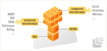
Cheat Sheet This microformats cheat sheet lists the properties by format and also lists each format and the hierarchy. This includes elemental microformats, compound microformats and some of the standard design patterns used.
Icons The starter set contains icons for hCal, hResume, hCard, XFN and a generic TAG icon.
Tutorials, Introductions
Tutorials on Microformats This series of articles deals with numerous aspects of Microformats, including basic theory and purpose of Microformats, hCard, hCalendar, AHAH, hReview, xFolk, hResume, XOXO and hAtom.
Mike Jolley explains step-by-step, what Microformats are, how they can be integrated in web-pages and how you can enhance the efficicency of your content using them.
Using Microformats in WordPress There are two approaches you can take. One: Manually pasting relevant microformat code created via microformat creators. Step-by-step instructions are as follows.
Blogs & Wikis
Microformats.org Designed for humans first and machines second, microformats are a set of simple, open data formats built upon existing and widely adopted standards. Learn more about microformats.
“Do I use a <section> or an <article>
element?” I have had to ask myself this question an unhealthy amount of
times whenever I have to group content in a container element.
A conversation I had on Twitter led me to research this question and ultimately to write on it. It was a conversation with Grace Snow
where I shared an approach to writing HTML that I love to use. I love
to write out my HTML structure (boxes) first and with no content to
ensure I am not thinking of styling while I write my HTML. She then
spotted that I might be making problematic use of the section and article elements in my sincere attempt to be semantic.
It turns out that to choose between section and article, we need our content. In fact, to determine if our content is narrowed down enough to those two, we need our content.
We can build a mental model that ensures we make the best decision every time by taking our content into consideration.
HTML
passes two related but distinct information to user devices. The first
is the visual presentation information, which tells the device how to
display the document by default.
The second is known as semantic information or, simply, semantics. It conveys “meanings”
in the document, i.e., each element’s purpose and the relationship
between them. In this sense, the spec would say that an element “represents” something. So, when you see “represents” in the spec, what follows is the semantic information embedded in the element.
Sighted
users can gleam the semantic meaning from devices like the browser by
observing the visuals. For headings, we can differentiate based on
differences in font size and weight, or in the case of lists, the
presence of bullet point markers or numbered markers. For users who do
not rely on sight, the semantics are only accessible through options or
devices that allow them to request that the semantic information be
announced in other ways that may not be visual. These options and
devices are generally called assistive technology.
HTML prescribes some elements that convey implicit meaning to browsers which browsers can extract to the accessibility API,
making it available to assistive technologies that, in turn, interpret
this meaning to users. This meaning gives users a wholesome sense of the
webpage they are visiting, such as document structure and navigation
assistance, or in this instant case, both document structure and
navigation assistance.
However, it is not only elements that
directly wrap text content that carries semantic information. Elements
meant for grouping other elements also carry some meaning; in some
cases, it may be meaning we want to communicate.
This first step in our mental model is to question if grouping the content as we are about to do is necessary for the document structure to make sense. Broken down, I would ask myself in this kind of manner:
Is
there any possibility the content of this block shares something in
common that adds some sense to my document structure overall when it is
read together?
If I were to describe my document structure to a
person without showing it to them, would I mention that there is that
particular grouped area for them to appreciate the document structure?
If the answer to these questions is “no,” then you may have a situation where a <div> could be appropriate, as Scott O’Hara
notes. Reading Scott’s article could help you further examine the role
your grouping plays and even formulate a better set of questions than
mine. I do not intend to cover the <div> element in
this article as Scott sufficiently covers it. I only intend to state
that first, you must confirm that the grouping you are making is
influenced by document structure. If it is, you can proceed to
interrogate further to determine if it is an <article> or <section>.
To be clear, I do not mean that the grouping must only be influenced by document structure for you to start to consider <article> or <section>.
It is enough that it is one of the possible reasons. For instance, it
is possible for content in your grouping to share a distinct design or
language and, at the same time, influence the document semantics.
We
have now decided that the grouped content serves some function in
describing the document. The next step is to determine which of the
semantic meaning already carried by the article or the section element most accurately describes what function your grouped content is intended to serve in the document structure.
Let us take a look at the primary source of authority on HTML and start to form our understanding of the section and article elements and their inherent semantic meaning.
The article element represents
a complete, or self-contained, composition in a document, page,
application, or site and that is, in principle, independently
distributable or reusable, e.g., in syndication. This could be a forum
post, a magazine or newspaper article, a blog entry, a user-submitted
comment, an interactive widget or gadget, or any other independent
content item.
The section element represents
a generic section of a document or application. A section, in this
context, is a thematic grouping of content, typically with a heading...
Examples
of sections would be chapters, the various tabbed pages in a tabbed
dialog box, or the numbered sections of a thesis. A website’s home page
could be split into sections for an introduction, news items, and
contact information.
...A general rule is that the section element is appropriate only if the element’s contents would be listed explicitly in the document’s outline.
The
linked specs give quite elaborate examples. However, it is safe to say
that the choice is seemingly heavily subjective. Authors must actively
decide if the particular group they have come up with is “complete” and
“independently distributable,” in which case the choice would be an article or if it is a “thematic grouping of content,” in which case the choice would be a section. Let’s consider some tasks.
If you were to build a blog like Smashing Magazine,
which of these elements would you use to wrap the portion of the
landing page that contains the list of all blog posts teasers? In that
wrapped portion, what element would wrap each blog post teaser? If you
click on one of the blog post teasers and land on the expanded post
page, which elements would wrap up the blog article?
If you were to build Twitter, would you wrap each tweet fed into the users’ timeline in an article because they are “self-contained” and “in principle, independently distributable”? Or would you wrap them in a section because they are “a generic section of an application”? Or perhaps, in this case, a div is semantically appropriate? Still taking the Twitter example, is your timeline container a section of the whole Twitter application, or is your timeline an article within your Twitter application? Or perhaps everything is just cake, and nothing is real.
We will return to apply our mental model to these two scenarios.
I reckon the reason for the seeming confusion is the mental model we have. At least that was the case for me.
The article
element was not so-named after a written article. I wrongly assumed
that it was, and perhaps you might have too. I literally just learnt
that an article element existed and assumed that blog
articles are so important on the web that the WHATWG decided to make an
element dedicated to wrapping blog posts like this one. It felt
intuitive to me, but I was wrong. I guess that is why web standards
exist. Intuitions are not always uniform.
It turns out that in the
Oxford English Dictionary and other dictionaries, one of the
definitions for the word article is “a particular item or separate
thing.” This is the sense in which the specs use the article element. It is right there in the spec’s definition of the article
element, but as I said, that is not how I generally use the word
“article.” In fact, dictionaries give the first definition of an
“article” as a written work.
So, while the spec clearly says what sense it is used in, we still do not think of it that way.
I gave my usual answer: think of <article>
not just as a newspaper article or a blog post, but as an article of
clothing — a discrete entity that can be reused in another context. So
your trousers are an article, and you can wear them with a different
outfit; your shirt is an article and can be worn with different
trousers; your knee-length patent leather stiletto boots are an article
(you wouldn’t wear just one of them, would you?).
It means what an articlerepresents
is content that can be taken out of the document and away from the
immediate surrounding content, dropped somewhere else, say on another
page, and still make total sense as it is grouped.
In the same way
that you could use an article, such as a table lamp (an independent
content group), to improve the aesthetics of your living room, and it
would complement your sofa, tv console, curtains, and so on (immediate
surrounding content). Yet, if you were to take your table lamp into your
room, and it was simply placed at your bedside or your workstation, it
would still be identifiable as a complete lamp.
The section element, on the other hand, represents “a thematic grouping of content,” meaning that a section
is a part of a larger group without which it may not necessarily stand
to make complete sense alone. It may stand alone, but in the theme of
your content overall, it is less likely to be standalone. As the spec
put it, “Examples of sections would be chapters, the various tabbed
pages in a tabbed dialog box, or the numbered sections of a thesis. A
website’s home page could be split into sections for an introduction,
news items, and contact information.”
This is why a section would usually have a heading, providing a sort of call back to what part of the larger document the section relates to.
Let
us go back to our lamp analogy. Our lamp itself makes sense as an item,
but in reality, it has different parts that could technically be
separated but really should not. I could take off the umbrella-shaped
hood of my lamp, take the light bulb out, take off the base, and take
off the upright stand. Together, they make up a lamp but, taken apart,
not quite. If you are presented with the umbrella-shaped hood of a lamp,
you are likely to think, “What is this from? Where is the rest of it?”
If you are presented with the light bulb, you are likely to think,
“Where does this go?”
Firstly, let us take the example of a blog website. Our blog is the Smashing Magazine. Let us take a look at our landing page.
Here are the major areas on our landing page:
Header with Site navigation,
Main Area,
Footer with Topic Navigation.
<header><nav><!-- Website navigation goes here --></nav></header><main><!-- We would group the content that should go here --></main><footer><nav><!-- Topic navigation goes here --></nav></footer>
These are groups that already have elements to represent them. So, we are not deciding between section and article for these.
In our Main Content, these are the identifiable groups:
Selected Articles,
Newsletter Subscription,
Components and Guides,
Latest Posts,
Smashing products and offerings,
Smashing conferences,
External articles from community members.
What
element should wrap these grouped content? Let us apply our mental
model. For each of these content groups, we follow this mental model.
Does grouping this content play a role that may help explain my document structure?
If it does not, then I can use a div.
If it does, play a role and proceed to consider if the role matches a section or an article.
What role does it play in my document structure?
Is
the content of this group thematically related such that it helps to
understand the outline of my document? If it is, then it is possibly a section.
Is
the content of this group one that contains content that I can take out
and redistribute to other pages while it does not totally tie to my
document theme and outline? If it is, then it is possibly an article.
I
encourage you to grab a piece of paper and make your grouping before
proceeding to see mine. This way, we can compare how we think of each
content group’s role on our page.
Now let’s build the skeletal grouping for our Smashing Magazine:
Selected Articles Does
it play a role in my document structure? Yes. What role? It is a part
of the outline of content on my landing page. Verdict: section.
Newsletter Subscription Does
it play a role in my document structure? Hmm. Well, it is not exactly
necessarily within the central theme of my landing page, so I am
doubtful about this one. I’d just say “no.” Verdict: div.
Components and Guides Does
it play a role in my document structure? Yes. What role? It is a part
of the outline of content on my landing page. Verdict: section.
Latest Posts Does
it play a role in my document structure? Yes. What role? It is a part
of the outline of content on my landing page. Verdict: section.
Smashing products and offerings Does
it play a role in my document structure? Yes. What role? It is a part
of the outline of content on my landing page. Verdict: section.
Smashing conferences Does
it play a role in my document structure? Yes. What role? It is a part
of the outline of content on my landing page. Verdict: section.
External articles from community members Does
it play a role in my document structure? Yes. What role? It is a part
of the outline of content on my landing page. Verdict: section.
Here is what my Smashing Magazine landing page looks like now:
<header><nav><!-- Website navigation --></nav></header><main><section><!-- Selected articles --></section><div><!-- Newsletter subscription --></div><section><!-- Components and guides --></section><section><!-- Latest posts --></section><section><!-- Smashing products and offerings --></section><section><!-- Smashing conferences --></section><section><!-- External articles from community members --></section></main><footer><nav><!-- Topic navigation --></nav></footer>
We
all might adjudge the role some items play differently. The “Newsletter
Subscription” area, for instance. I would not outline “Newsletter
Subscription” in my document outline, nor would I care to encounter it
on a document outline for a page I visit. Yet again, if it were
Substack, a platform for newsletters, I would definitely see how an area
to subscribe to the newsletter would be a section. And while I have used a div here, it could as well have been an aside, but, of course, that is not why we are here today. The point is how we adjudge our content guides our decision.
I
guess my point is your decision would be marginally better provided you
interrogate and justify the role you want your content group to play in
each case. You would have consciously put effort into making your web
content understandable for users and other developers that would
encounter your technical debt.
So,
we have clicked on one blog article from the “Selected Articles” area
and have expanded that article to its own page. This specific blog
article you are reading, how is it grouped? Again, here is our base
template:
<header><nav><!-- Website navigation --></nav></header><main><!-- This article is wrapped here --></main><footer><nav><!-- Topic navigation --></nav></footer>
Do you wrap it in an article, do you wrap it in a section, or perhaps a div?
Would you break this article itself into smaller grouped bits? Maybe a bunch of sections or a couple of articles? Are there redistributable parts of this article or parts that you would expose to the document outline?
I
would refrain from saying what I arrived at, but I would love to know
what you would use. Take a note of your answers as we shall revisit this
later on.
So, we have one more exercise, a web application, specifically Twitter.
Is the timeline container a section of the whole Twitter application, or is your timeline an article within your Twitter application, or is it a div?
Would you wrap each tweet fed into the users’ timeline in an article because they are “self-contained” and “in principle, independently distributable”? Or would you wrap them in a section because they are “a generic section of an application”? Or perhaps, in this case, a div is semantically appropriate?
If I apply the mental model, below is the way how I would do it:
My
timeline is a part of my document outline, and yet, to an extent, it
can be independently distributed. I could take my timeline out, and it
would stand well alone. It seems like it could be viable for a section or an article.
So, I question further, what do I really intend? Do I want it to
function for redistribution or as a part of my application? If you use
Twitter, you would agree that your timeline is more of an integral part
of your homepage than it is redistributable. Here I would settle for a section.
For each tweet in my timeline, it would be an article.
This is because each tweet is not thematically connected to the next
tweet on my timeline such that I could say it can be a part of an
outline. So, tweets are not sections. They are
“self-contained” and “in principle, independently distributable.” You
can even click a tweet to enter a new world with comments and quote
tweets, and so much more.
Truly, and indeed, if you walk your way through the div-soup of the Twitter page, nested in, there is a nice pretty section just sitting there, as it should be. This section holds your timeline. And if you proceed deeper into the section, and further down a serving of divs, you can pick up an article
holding each tweet. This is where I confess that I let out a tiny
scream when I discovered that my thoughts matched what Twitter did.
This inspection of Twitter also shows how the presence of divs does not mean that semantic meaning has been sacrificed or lost.
Nestled in between all the divs, the Twitter timeline is really wrapped in a section element. (Large preview)Nested further in the section that holds your timeline, each tweet is really wrapped in an article element. (Large preview)
You can nest these elements within each other. You probably already figured that by now after looking at the Twitter example.
divs, articles, and sections
can go into each other without necessarily breaking accessibility. If
you apply the mental model, you can question each nesting you are about
to make and group accordingly.
Take the example of this blog post.
I did not answer how I would wrap it when I asked a few paragraphs ago.
Here is what I could do:
I could wrap this whole article you are reading in an article. Then I would further nest the large chunks of this article into sections
because I want each portion to be really divided up for easy
understanding. So far, this is what this blog post you are reading could
look like:
<header><nav><!-- Website navigation --></nav></header><main><article><h1>Article versus section: Making your choice count in the larger context of accessibility</h1><section><h2>Quick summary</h2><!-- paragraphs go here --></section><section><h2>Introduction</h2><!-- paragraphs go here --></section><section><h2>Document Semantics</h2><!-- paragraphs go here --></section><section><h2>Does my grouping play a semantic role?</h2><!-- paragraphs go here --></section><section><h2>What semantic role does my grouping play?</h2><!-- paragraphs go here --><h3>What the HTML specs say</h3><!-- paragraphs go here --><h3>Understanding what the specs mean</h3><!-- paragraphs go here --></section><section><h2>Let's group some content</h2><!-- paragraphs go here --><h3>A bog website landing page</h3><!-- paragraphs go here --><h3>An article post on a blog website</h3><!-- paragraphs go here --><h3>A web application: Twitter</h3><!-- paragraphs go here --></section><section><h2>Nesting sections AND articles</h2><!-- paragraphs go here --></section><!-- Rest of article continues here --></article></main><footer><nav><!-- Topic navigation --></nav></footer>
Notice how I give my sections appropriate headings since I have decided to use section? Recollect that the spec says a section should typically have a heading. Also, recall that you make sections
if you think they should feature in your document outline. As such, a
heading would provide the text to feature in the outline.
If there is a need for it, your sections and articles could have other grouped content in them. For instance, you could have a header to hold your section’s heading or a footer to hold information about a section, such as links to related documents, etc. If you will, the “Further reading” area of this post could be wrapped in a footer.
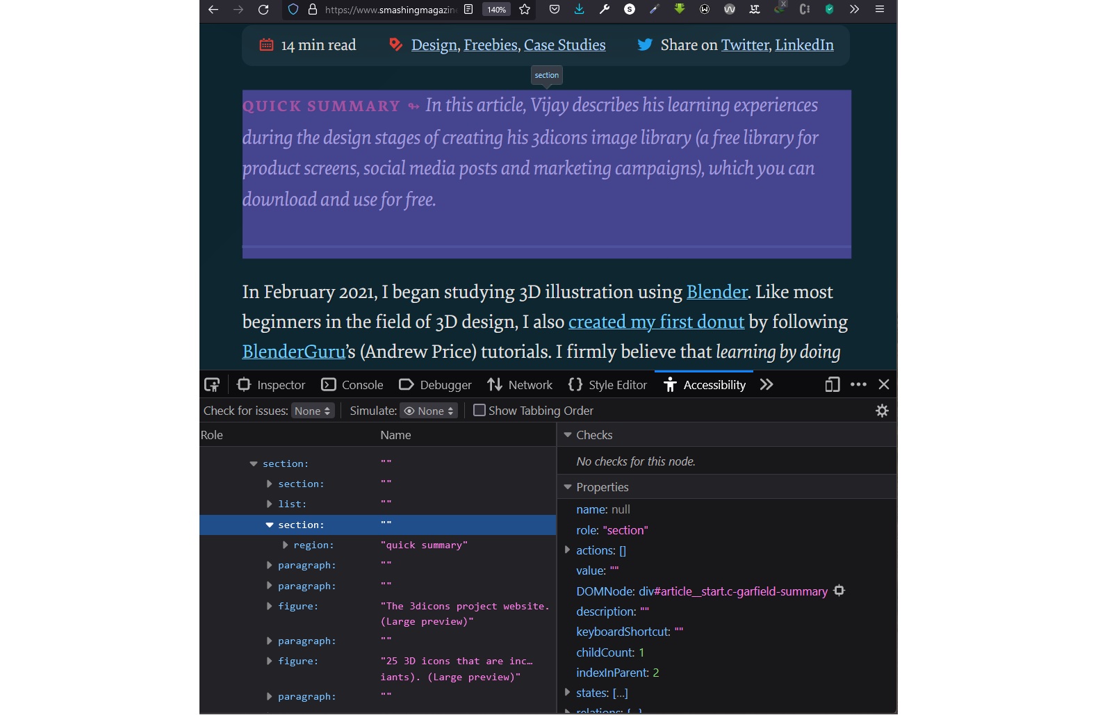
Browsers generate an Accessibility Tree which you can inspect with the developer tools. You can open the developer tools, activate the Inspector, and navigate to the Accessibility tab.
Firefox, Chrome, and Microsoft Edge similarly present the respective roles of the article and section elements on the Accessibility Tree. The article element has the role of “article” on the accessibility tree. The section element has the role of the “section.” This means that the browsers accurately recognise what our grouping of content represents.
However, while the browsers correctly understand what our grouping of content represents, users do not get any particular hints about this. So articles and sections
are not perceivable or otherwise navigable by the keyboard on the
browser. If the page is styled, then visual cues provided by your design
could hint at the grouping of content. But there is no default
underlining or outline on focus as you’d get with links.
Note: I should briefly note that we (Manuel and I) got a little tripped up on browsers exposing the section element as having a role of “section” because, in aria accessibility definitions, the aria role of section is not the same as the HTML section element. The aria role of “section” is an abstract role and should not be used by authors/developers. So please do not set a role="section"
attribute in your HTML. Anyway, it would seem that the browsers may be
using their own internal accessibility terms. This conclusion is
especially supported by the fact that in Firefox, for instance, images
have the role of “graphic,” but aria does not have any role known as a
graphic. Perhaps someone more knowledgeable would definitely be able to
explain what is happening. However, the expected behavior is correct.
Where grouped content is wrapped in an article, different screen readers handle it differently.
In
terms of being perceivable, AccessibilityOz documents that JAWS,
Talkback on Android, and VoiceOver announce the entry into and exit from
an “article” if it encounters it. NVDA and Narrator do not announce an article.
I specifically was able to test on NVDA and Narrator as I use a Windows laptop, and the article was not announced. Manuel was also kind enough to help test on VoiceOver and Talkback, and the article is announced if it is encountered as you traverse the page.
I snooped around and found that NVDA allows you to turn on the option to announce the presence of an article. It is just turned off by default. I am not certain how frequently non-developer users would customise that option.
Regarding navigation, users on Narrator cannot jump to an article as it is not perceivable. Users on NVDA that have activated the option to have articles announced cannot jump to an article.
There is no shortcut for that. It is only announced if encountered
while traversing the page. JAWS has a dedicated shortcut for moving
through articles on a page by pressing the O key. VoiceOver users can jump across articles using the shortcut (VO + Shift + left/right arrow).
While some users would get the presence of an article
announced, others would not. So, the experience is not uniform. I have
also wondered if there is any practical use for announcing an article.
I am not sure when I heard the announcement that I am “in the article”
on a webpage, I would interpret it as “in an independent,
redistributable and self-contained content.” It sounds more like I am in
a “written body of work.” I do not have the capacity to test this
anyway, so it really is just my own thought.
The question, then, is what direct benefits do users of my page get from grouping content semantically within an article? What does it translate to for my users after I have correctly wrapped my group in an article? If there is none, why should I not just use the div instead? Bruce Lawson’s article, “Why You Should Choose HTML5 article Over section” adequately covers that. Reader for Apple’s WatchOS looks out for article
elements to appropriately determine what to display on the iWatch.
While this is not a use case particularly prescribed by the web
standards, perhaps we might see a trend of device makers taking this
approach. So if you are designing your page with WatchOS in mind, this
would be an additional reason to use article, at least over a div.
But
I still wondered if there are any additional reasons directly for the
benefit of users. Why would I want to jump through all articles
on a webpage? Why jump through independent items on a webpage without
context in the manner that JAWS and Voiceover allow? So I did some
digging, and here is what I found about the prescribed functionality for article role by assistive technology:
An
article may be nested to form a discussion where assistive technologies
could pay attention to article nesting to assist the user in following
the discussion…
…When nesting articles, the child articles
represent content that is related to the content of the parent article.
For instance, a weblog entry on a site that accepts user-submitted
comments could represent the comments as articles nested within the
article for the weblog entry.
…When the user navigates to an element assigned the role of article, assistive technologies that typically intercept standard keyboard events should switch to document browsing mode, as opposed to passing keyboard events through to the web application. Assistive technologies may provide a feature allowing the user to navigate the hierarchy of any nested article elements.
I was sadly unable to reproduce this behavior directly. Jumping through articles
on VoiceOver with the shortcut merely announces “article, article,
article.” It does not seem they implemented the feature to allow users
to navigate the hierarchy of nested articles, or I could not get it to
work.
However, it doesn’t hurt to build with nested articles
if it is the appropriate thing to do. If screen reader makers implement
this recommended behavior, your page is already prime and ready for it.
Consider it some sort of future-proofing.
Where grouped content is wrapped in a section, screen readers treat it more consistently.
In terms of being perceivable, all screen readers do not announce entry into or exit from a section. This also means in terms of navigation, there is no way to navigate from one section to another.
WAI-ARIA
(Web Accessibility Initiative — Accessible Rich Internet Applications)
is a specification written by the W3C, defining a set of additional HTML
attributes that can be applied to elements to provide additional
semantics and improve accessibility wherever it is lacking...
Implying that while you may already be writing semantic HTML, you can customise and provide even greater semantic meaning!
In this specific case, we are more concerned with the category of landmark roles
provided by ARIA, which are roles that provide navigational context for
the application or the document. To understand better, the definition of landmark provided by WAI-ARIA reads:
A
type of region on a page to which the user may want quick access.
Content in such a region is different from that of other regions on the
page and relevant to a specific user purpose, such as navigating,
searching, perusing the primary content, etc.
With landmark roles,
we can provide non-sighted users with a key experience that sighted
(and fully non-disabled) users of our page would have: the ability to
first scan or skim through a page and then decide where to focus their attention.
For the specific case of section
and the intended semantic, we intend to pass to users; namely that the
content in it is thematically related or has a central idea, the
particular role of region is our concern.
A perceivable section
containing content that is relevant to a specific, author-specified
purpose and sufficiently important that users will likely want to be
able to navigate to the section easily and to have it listed in a
summary of the page.
We can make specific sections of our page into regions
calculated to make it easier for screen reader users to jump to that
part of the page. This could be especially useful on pages populated
with a lot of content other than the primary reason users might be on
the page.
To create a region, there are two things to do. Firstly, make your element a region by including the attribute-value pairing role="region" in your element’s opening tag. Secondly, you give your region an accessible name. However, where your grouping element is a section, you only have to do the second. This is because if your section element has an accessible name, then it has an implicit role as a region.
As such, it is not recommended to set a role that matches the implied
semantics for the element. So let’s set an accessible name.
An accessible name is simply the name of a user interface element, especially as exposed by the accessibility API to assistive technologies.
Authors must give each element with a region role a brief label that describes the purpose of the content in the region.
An accessible name is required for the region role. If there is no accessible name, then browsers and assistive technologies must not
expose a region to users because users will be jumping to a region with
no description or context, almost like what happens with an article.
There
are multiple ways to provide a name depending on the element involved.
However, we shall narrow it down to what is relevant for a section being used as a region.
The first and most preferred way to name your region is to name via the aria-labelledby attribute. To do this, you reference a visible element on your page
and direct the assistive technology to use the text content of that
visible element as the name of the region. This visible element should
preferably be a heading.
To do this, give the element whose content you are referencing an id attribute with a value of choice. Then give your section element an aria-labelledby attribute. Then set the value of the aria-labelledby attribute to the exact value as the id of the element whose content you are referencing. Take a look at this in action:
<sectionaria-labelledby="posts"><!-- This area contains teasers for all blog posts on the website --><h2id="posts">All blog posts</h2><article><header><p>Cosima Mielke wrote</p><h2>Expand Your Horizons (June 2022 Desktop Wallpapers Edition)</h2></header><div><p>What could be a better way to welcome June than with some colorful inspiration? Well, we might have something for you: wallpapers created with love by artists and designers from across the globe.</p><p><a>Continue reading ↬</a></p></div></article><!-- More blog post teasers here --></section>
Take note that your aria-labelledby does not carry an #, unlike what obtains when linking to an id with an href. It is aria-labelledby="posts" not aria-labelledby="#posts". Remember also that we do not set a role=region for a section element. It is already implied once you give an accessible name.
Using
this code example, screen readers would have the region announced to
them under the landmark navigation as such “all blog posts, region” or
something similar.
The second way to give an accessible name is to use the aria-label
attribute if there is no visible element with content that could
accurately label your region. In this case, the value you give to the aria-label itself would be read as the name of the region.
<sectionaria-label="all blog posts"><!-- This area contains teasers for all blog posts on the website --><article><header><p>Cosima Mielke wrote</p><h2>Expand Your Horizons (June 2022 Desktop Wallpapers Edition)</h2></header><div><p>What could be a better way to welcome June than with some colorful inspiration? Well, we might have something for you: wallpapers created with love by artists and designers from across the globe.</p><p><a>Continue reading ↬</a></p></div></article><!-- More blog post teasers here --></section>
In this code example, there is no heading for the region that we can reference. So this region would be announced as “all blog posts, region” by directly reading the value we supplied for the aria-label attribute. You will notice that the accessible name is written in lowercase. This is because screenreaders could mistake words written in all caps to be acronyms
and then spell them out alphabet by alphabet instead of reading them as
a single word. The sentence case is fine, but please avoid all caps. If
you want to make emphasis, use the em tag.
To recap, aria-labelledby
is a referential naming mechanism and is recommended because users,
relying on assistive technology, get labels from existing content on the
page, ensuring that the experience they are served is significantly the
same as what other users get. On the other hand, aria-label
is a direct naming mechanism. Using it means that users relying on
assistive technology get labels from the author’s interpretation of what
the element does. This is why it is recommended to use it only where no
visible content on the page itself is appropriate. Active
decision-making is required.
Finally, not every section has to be a region. Seriously, on learning this new power to create a region,
it is tempting to look at all elements on your page and go, “you get a
region, you get a region, everyone gets a region.” Please do not do
this. Why? Scott O’Hara explains, “Overpopulating a web page with landmarks will reduce their ability to help users find the most important parts of web pages.” Remember, regions should be attached to areas users want to reach easily. Now let us look at real-life examples of these in play.
Smashing Magazine uses the aria-label
technique for the “Quick Summary” part of this blog post. If you open
your developer tool and Inspect the “Quick Summary”, this is what the
markup looks like:
<sectionaria-label="quick summary"class="article__summary"><spanclass="summary__heading">Quick summary ↬</span><!-- Rest of summary continues here --></section>
Now
screen reader users can jump to the “Quick Summary” region using
shortcuts and get an overview of what the article is about without
having to first interact with the whole article.
Let’s take another look at Twitter, a web application for using the aria-labelledby technique. Look at the developer tools, particularly the section holding your timeline. You will see an aria-labelledby="accessible-list-9" attribute in the section’s opening tag. It points to the h1 element just below it, which has an id="accessible-list-9"
and text content that says “Your Home Timeline.” Now users of screen
readers can use the landmark navigation menu in their screen reader and
navigate to “Your Home Timeline region.”
Two questions may have crossed your mind. First, why is there a role="region" on the section element when the specs say that a section with an accessible name does not need to be assigned a region role expressly? Second, why can’t I see the h1 element with “Your Home Timeline” in my browser if the aria-labelledby is supposed to reference a visible element?
For the first question about declaring role="region" on the section
element, the specs say it is not recommended to expressly set a role
that is the same as the implied semantics. However, they do recognise
that there might be browsers and devices that do correctly expose the
implied semantics. As such, for an application like Twitter used by
hundreds of millions of persons, it is reasonable to set the region role
expressly to cover the bases as they cannot predict all the varying
types of browsers and devices in use.
The second question is why the referenced element for the aria-labelledby
is not on the page. This is a pattern/technique that people building
pages with accessibility in mind employ every now and then. No rule has
been broken here. An h1 element is a visible element. What
has been done here is to use CSS to remove the visual rendering of
elements that are not considered necessary for sighted users but crucial
for non-sighted users. For sighted users, the timeline is identifiable
without a heading. However, the heading is also a reference point to
name the region for screen reader users, so we need it in our HTML. By
using a neat CSS technique, one can take content off the screen but leave it visible to screen readers.
Here’s another interesting thing I noticed when you make your section into a region. Remember our Accessibility tab using the Inspector in our developer tools? Well, the section’s role on the accessibility tree does not directly change to region in Firefox. What happens is that a region branch is created as a child of the section. In Firefox, the tree becomes section → region.
A screenshot of the Accessibility Tree shows that Firefox creates a new region branch as a child of the section when a section is assigned a role of region. (Large preview)
However, in Chrome and Microsoft Edge, the section itself changes to a region role.
A screenshot of the Accessibility Tree in Chrome shows that when a section made into a region, the section is removed from the accessibility tree and replaced with a region. (Large preview)A screenshot of the Accessibility Tree in Microsoft Edge shows that when a section is made into a region, the section is removed from the accessibility tree and replaced with a region. (Large preview)
The
truth is even if you are not designing for display on an iWatch or
other smart gadgets, and even if you have no reason to create regions on your page, you should still use the correct element.
Firstly, this article by Mandy Michael reveals that browsers pay attention to your HTML structure to generate a Reader mode
which strips the page of unnecessary information, images and
background. Safari, Chrome, Firefox, Edge, and other reading apps
specifically look out for HTML sectioning content to prioritise display for reading. The sectioning content includes article and section
amongst others. Without carefully wrapping your content into
appropriate elements, you risk it being ignored when a minimalist view
is created.
Secondly, It helps you actively think about how you
present your content. Content design is a crucial part of our page that
we should be conscious about. It is the basis of our page. The words we
use, the headings we use, and the length of our paragraphs all affect
our users. How we group our content is also essential.
As
designers and developers, we may feel that our main reason for grouping
content is simply to style them. But if we start to care about the
content, we may realise better ways to create our page. Grouping content
does a lot more than preparing our content for visual styling. If we
take care to write our HTML consciously, we can, to an extent, be
certain that we have made our corner of the web a better place for all.
Writing
this article and thinking about how I would have sectioned this page
helped me create a coherent structure for my work. It helped me identify
places where the content was out of place in terms of the surrounding
context. With posts as long as this, thinking of how we group content
becomes crucial.
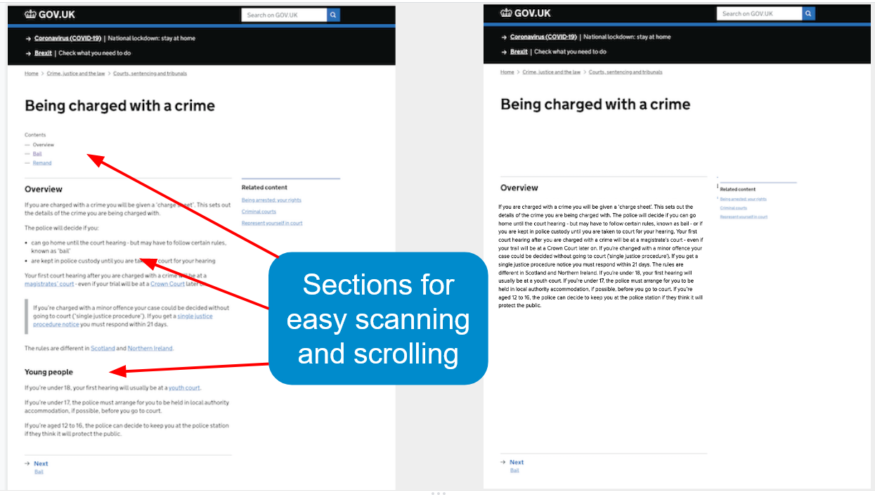
Even where content is extremely short, thinking about how we group content helps create better content. In a recent knowledge-sharing webinar on Content Design and Accessibility, Amanda Diamond
shared this slide showing how a very short content block can be broken
up to make it easier for people to read. These two screenshots contain
the exact same content, yet one is easier to digest. This would be a
perfect place to use a section instead of just a div. Notice how each section carries an appropriate heading explaining each content block.
Two
screenshots of a page giving the exact same information about ‘Being
charged with a crime’. The first is split up into sections with headings
making it easier to scan and scroll. The second contains the same
information in just one paragraph. (Large preview)
We have looked at a mental model that forces us to interact with our content to determine how best to group it. We question:
If the grouping plays a role in our document structure?
If it does, what role does it play?
From our answers, we can choose the appropriate grouping element for our content.
We have also looked at what happens when the browser builds an accessibility tree for our section or article elements and how to extend our section into a region to allow easy navigation.
Finally,
I think we communicate with two sets of consumers of our content — the
end-users who read our pages from an URL and others who have to interact
with our markup. We may tend to think largely in terms of end-users
when it comes to HTML. However, I believe writing HTML that is easy to
understand and self-explanatory for whoever will work on it is
sufficient reason to use the correct semantic element.