⭐ If you would like to buy me a coffee, well thank you very much that is mega kind! : https://www.buymeacoffee.com/honeyvig Hire a web Developer and Designer to upgrade and boost your online presence with cutting edge Technologies
Showing posts with label best practices. Show all posts

Wednesday, July 16, 2025

What Zen And The Art Of Motorcycle Maintenance Can Teach Us About Web Design


Road-tripping along the line between engineering and spirituality, Robert M. Pirsig’s musings on the arts, sciences, and Quality ring as true now as they ever have.

I think we, as engineers and designers, have a lot to gain by stepping outside of our worlds. That’s why in previous pieces I’ve been drawn towards architecture, newspapers, and the occasional polymath. Today, we stumble blindly into the world of philosophy. Bear with me. I think there’s something to it.

In 1974, the American philosopher Robert M. Pirsig published a book called Zen and the Art of Motorcycle Maintenance. A flowing blend of autobiography, road trip diary, and philosophical musings, the book’s ‘chautauqua’ is an interplay between art, science, and self. Its outlook on life has stuck with me since I read it.

The book often feels prescient, at times surreal to read given it’s now 50 years old. Pirsig’s reflections on arts vs. sciences, subjective vs. objective, and systems vs. people translate seamlessly to the digital age. There are lessons there that I think are useful when trying to navigate — and build — the web. Those lessons are what this piece is about.

I feel obliged at this point to echo Pirsig and say that what follows should in no way be associated with the great body of factual information about Zen Buddhist practice. It’s not very factual in terms of web development, either.

Buddha In The Machine #

Zen is written in stages. It sets a scene before making its central case. That backdrop is important, so I will mirror it here. The book opens with the start of a motorcycle road trip undertaken by Pirsig and his son. It’s a winding journey that takes them most of the way across the United States.

Despite the trip being in part characterized as a flight from the machine, from the industrial ‘death force’, Pirsig takes great pains to emphasize that technology is not inherently bad or destructive. Treating it as such actually prevents us from finding ways in which machinery and nature can be harmonious.

Granted, at its worst, the technological world does feel like a death force. In the book’s 1970s backdrop, it manifests as things like efficiency, profit, optimization, automation, growth — the kinds of words that, when we read them listed together, a part of our soul wants to curl up in the fetal position.

In modern tech, those same forces apply. We might add things like engagement and tracking to them. Taken to the extreme, these forces contribute to the web feeling like a deeply inhuman place. Something cold, calculating, and relentless, yet without a fire in its belly. Impersonal, mechanical, inhuman.

Faced with these forces, the impulse is often to recoil. To shut our laptops and wander into the woods. However, there is a big difference between clearing one’s head and burying it in the sand. Pirsig argues that “Flight from and hatred of technology is self-defeating.” To throw our hands up and step away from tech is to concede to the power of its more sinister forces.

“The Buddha, the Godhead, resides quite as comfortably in the circuits of a digital computer or the gears of a cycle transmission as he does at the top of a mountain or in the petals of a flower. To think otherwise is to demean the Buddha — which is to demean oneself.”

— Robert M. Pirsig

Before we can concern ourselves with questions about what we might do, we must try our best to marshal how we might be. We take our heads and hearts with us wherever we go. If we characterize ourselves as powerless pawns, then that is what we will be.

Buddha in the machine
(Large preview)

Where design and development are concerned, that means residing in the technology without losing our sense of self — or power. Technology is only as good or evil, as useful or as futile, as the people shaping it. Be it the internet or artificial intelligence, to direct blame or ire at the technology itself is to absolve ourselves of the responsibility to use it better. It is better not to demean oneself, I think.

So, with the Godhead in mind, to business.

Classical And Romantic #

A core concern of Zen and the Art of Motorcycle Maintenance is the tension between the arts and sciences. The two worlds have a long, rich history of squabbling and dysfunction. There is often mutual distrust, suspicion, and even hostility. This, again, is self-defeating. Hatred of technology is a symptom of it.

“A classical understanding sees the world primarily as the underlying form itself. A romantic understanding sees it primarily in terms of immediate appearance.”

— Robert M. Pirsig

If we were to characterize the two as bickering siblings, familiar adjectives might start to appear:

ClassicalRomantic
DullFrivolous
AwkwardIrrational
UglyErratic
MechanicalUntrustworthy
ColdFleeting

Anyone in the world of web design and development will have come up against these kinds of standoffs. Tensions arise between testing and intuition, best practices and innovation, structure and fluidity. Is design about following rules or breaking them?

Treating such questions as binary is a fallacy. In doing so, we place ourselves in adversarial positions, whatever we consider ourselves to be. The best work comes from these worlds working together — from recognising they are bound.

Steve Jobs was a famous advocate of this.

“Technology alone is not enough — it’s technology married with liberal arts, married with the humanities, that yields us the result that makes our heart sing.”

Steve Jobs

Whatever you may feel about Jobs himself, I think this sentiment is watertight. No one field holds all the keys. Leonardo da Vinci was a shining example of doing away with this needless siloing of worlds. He was a student of light, anatomy, art, architecture, everything and anything that interested him. And they complemented each other. Excellence is a question of harmony.

Is a motorcycle a romantic or classical artifact? Is it a machine or a symbol? A series of parts or a whole? It’s all these things and more. To say otherwise does a disservice to the motorcycle and deprives us of its full beauty.

artifact
(Large preview)

Just by reframing the relationship in this way, the kinds of adjectives that come to mind naturally shift toward more harmonious territory.

ClassicalRomantic
OrganizedVibrant
ScaleableEvocative
ReliablePlayful
EfficientFun
ReplicableExpressive

And, of course, when we try thinking this way, the distinction itself starts feeling fuzzier. There is so much that they share.

Pirsig posits that the division between the subjective and objective is one of the great missteps of the Greeks, one that has been embraced wholeheartedly by the West in the millennia since. That doesn’t have to be the lens, though. Perhaps monism, not dualism, is the way.

In a sense, technology marks the ultimate interplay between the arts and the sciences, the classical and the romantic. It is the human condition brought to you with ones and zeros. To separate those parts of it is to tear apart the thing itself.

Guardian Website Code
A visualization of the Guardian website’s code. You tell me where the classical stops and the romantic begins. (Large preview)

The same is true of the web. Is it romantic or classical? Art or science? Structured or anarchic? It is all those things and more. Engineering at its best is where all these apparent contradictions meet and become one.

What is this place? Well, that brings us to a core concept of Pirsig’s book: Quality.

Quality #

The central concern of Zen and the Art of Motorcycle Maintenance is the ‘Metaphysics of Quality’. Pirsig argues that ‘Quality’ is where subjective and objective experience meet. Quality is at the knife edge of experience.

“Quality is the continuing stimulus which our environment puts upon us to create the world in which we live. All of it. Every last bit of it.”

— Robert M. Pirsig

Pirsig’s writings overlap a lot with Taoism and Eastern philosophy, to the extent that he likens Quality to the Tao. Quality is similarly undefinable, with Pirsig himself making a point of not defining it. Like the Tao, Plato’s Form of the Good, or the ‘good taste’ to which GitHub cofounder Scott Chacon recently attributed the platform’s success, it simply is.

Metaphysics of Quality
(Large preview)

Despite its nebulous nature, Quality is something we recognise when we see it. Any given problem or question has an infinite number of potential solutions, but we are drawn to the best ones as water flows toward the sea. When in a hostile environment, we withdraw from it, responding to a lack of Quality around us.

We are drawn to Quality, to the point at which subjective and objective, romantic and classical, meet. There is no map, there isn’t a bullet point list of instructions for finding it, but we know it when we’re there.

A Quality Web=

So, what does all this look like in a web context? How can we recognize and pursue Quality for its own sake and resist the forces that pull us away from it?

There are a lot of ways in which the web is not what we’d call a Quality environment. When we use social media sites with algorithms designed around provocation rather than communication, when we’re assailed with ads to such an extent that content feels (and often is) secondary, and when AI-generated slop replaces artisanal craft, something feels off. We feel the absence of Quality.

Here are a few habits that I think work in the service of more Quality on the web.

Seek To Understand How Things Work

I’m more guilty than anyone of diving into projects without taking time to step back and assess what I’m actually dealing with. As you can probably guess from the title, a decent amount of time in Zen and the Art of Motorcycle Maintenance is spent with the author as he tinkers with his motorcycle. Keeping it tuned up and in good repair makes it work better, of course, but the practice has deeper, more understated value, too. It lends itself to understanding.

To maintain a motorcycle, one must have some idea of how it works. To take an engine apart and put it back together, one must know what each piece does and how it connects. For Pirsig, this process becomes almost meditative, offering perspective and clarity. The same is true of code. Rushing to the quick fix, be it due to deadlines or lethargy, will, at best, lead to a shoddy result and, in all likelihood, make things worse.

“Black boxes” are as much a choice not to learn as they are something innately mysterious or unknowable. One of the reasons the web feels so ominous at times is that we don’t know how it works. Why am I being recommended this? Why are ads about ivory backscratchers following me everywhere? The inner workings of web tracking or AI models may not always be available, but just about any concept can be understood in principle.

So, in concrete terms:

  • Read the documentation, for the love of god.
    Sometimes we don’t understand how things work because the manual’s bad; more often, it’s because we haven’t looked at it.
  • Follow pipelines from their start to their finish.
    How does data get from point A to point Z? What functions does it pass through, and how do they work?
  • Do health work.
    Changing the oil in a motorcycle and bumping project dependencies amount to the same thing: a caring and long-term outlook. Shiny new gizmos are cool, but old ones that still run like a dream are beautiful.
  • Always be studying.
    We are all works in progress, and clinging on to the way things were won’t make the brave new world go away. Be open to things you don’t know, and try not to treat those areas with suspicion.

Bound up with this is nurturing a love for what might easily be mischaracterized as the ‘boring’ bits. Motorcycles are for road trips, and code powers products and services, but understanding how they work and tending to their inner workings will bring greater benefits in the long run.

Reframe The Questions

Much of the time, our work is understandably organized in terms of goals. OKRs, metrics, milestones, and the like help keep things organized and stuff happening. We shouldn’t get too hung up on them, though. Looking at the things we do in terms of Quality helps us reframe the process.

The highest Quality solution isn’t always the same as the solution that performed best in A/B tests. The Dark Side of the Moon doesn’t exist because of focus groups. The test screenings for Se7en were dreadful. Reducing any given task to a single metric — or even a handful of metrics — hamstrings the entire process.

Rory Sutherland suggests much the same thing in Are We Too Impatient to Be Intelligent? when he talks about looking at things as open-ended questions rather than reducing them to binary metrics to be optimized. Instead of fixating on making trains faster, wouldn’t it be more useful to ask, How do we improve their Quality?

Challenge metrics. Good ones — which is to say, Quality ones — can handle the scrutiny. The bad ones deserve to crumble. Either way, you’re doing the world a service. With any given action you take on a website — from button design to database choices — ask yourself, Does this improve the Quality of what I’m working on? Not the bottom line. Not the conversion rate. Not egos. The Quality. Quality pulls us away from dark patterns and towards the delightful.

The will to Quality is itself a paradigm shift. Aspiring to Quality removes a lot of noise from what is often a deafening environment. It may make things that once seemed big appear small.

Seek To Wed Art With Science (And Whatever Else Fits The Bill)

None of the above is to say that rules, best practices, conventions, and the like don’t have their place or are antithetical to Quality. They aren’t. To think otherwise is to slip into the kind of dualities Pirsig rails against in Zen.

In a lot of ways, the main underlying theme in my What X Can Teach Us About Web Design pieces over the years has been how connected seemingly disparate worlds are. Yes, Vitruvius’s 1st-century tenets about architecture are useful to web design. Yes, newspapers can teach us much about grid systems and organising content. And yes, a piece of philosophical fiction from the 1970s holds many lessons about how to meet the challenges of artificial intelligence.

Do not close your work off from atypical companions. Stuck on a highly technical problem? Perhaps a piece of children’s literature will help you to make the complicated simple. Designing a new homepage for your website? Look at some architecture.

The best outcomes are harmonies of seemingly disparate worlds. Cling to nothing and throw nothing away.

Make Time For Doing Nothing

Here’s the rub. Just as Quality itself cannot be defined, the way to attain it is also not reducible to a neat bullet point list. Neither waterfall, agile or any other management framework holds the keys.

If we are serious about putting Buddha in the machine, then we must allow ourselves time and space to not do things. Distancing ourselves from the myriad distractions of modern life puts us in states where the drift toward Quality is almost inevitable. In the absence of distracting forces, that’s where we head.

  • Get away from the screen.
    We all have those moments where the solution to a problem appears as if out of nowhere. We may be on a walk or doing chores, then pop!
  • Work on side projects.
    I’m not naive. I know some work environments are hostile to anything that doesn’t look like relentless delivery. Pet projects are ideal spaces for you to breathe. They’re yours, and you don’t have to justify them to anyone.

As I go into more detail in “An Ode to Side Project Time,” there is immense good in non-doing, in letting the water clear. There is so much urgency, so much of the time. Stepping away from that is vital not just for well-being, but actually leads to better quality work too.

From time to time, let go of your sense of urgency.

Spirit Of Play

Despite appearances, the web remains a deeply human experiment. The very best and very worst of our souls spill out into this place. It only makes sense, therefore, to think of the web — and how we shape it — in spiritual terms. We can’t leave those questions at the door.

Zen and the Art of Motorcycle Maintenance has a lot to offer the modern web. It’s not a manifesto or a way of life, but it articulates an outlook on technology, art, and the self that many of us recognise on a deep, fundamental level. For anyone even vaguely intrigued by what’s been written here, I suggest reading the book. It’s much better than this article.

Be inspired. So much of the web is beautiful. The highest-rated Awwwards profiles are just a fraction of the amazing things being made every day. Allow yourself to be delighted. Aspire to be delightful. Find things you care about and make them the highest form of themselves you can. And always do so in a spirit of play.

We can carry those sentiments to the web. Do away with artificial divides between arts and science and bring out the best in both. Nurture a taste for Quality and let it guide the things you design and engineer. Allow yourself space for the water to clear in defiance of the myriad forces that would have you do otherwise.

The Buddha, the Godhead, resides quite as comfortably in a social media feed or the inner machinations of cloud computing as at the top of a mountain or in the petals of a flower. To think otherwise is to demean the Buddha, which is to demean oneself.

Other Resources


Thursday, June 19, 2025

Why Designers Get Stuck In The Details And How To Stop


Designers love to craft, but polishing pixels before the problem is solved is a time-sink. This article pinpoints the five traps that lure us into premature detail — being afraid to show rough work, fixing symptoms instead of causes, solving the wrong problem, drowning in unactionable feedback, and plain fatigue — then hands you a four-step rescue plan to refocus on goals, ship faster, and keep your craft where it counts.

You’ve drawn fifty versions of the same screen — and you still hate every one of them. Begrudgingly, you pick three, show them to your product manager, and hear: “Looks cool, but the idea doesn’t work.” Sound familiar?

In this article, I’ll unpack why designers fall into detail work at the wrong moment, examining both process pitfalls and the underlying psychological reasons, as understanding these traps is the first step to overcoming them. I’ll also share tactics I use to climb out of that trap.

Reason #1 You’re Afraid To Show Rough Work

We designers worship detail. We’re taught that true craft equals razor‑sharp typography, perfect grids, and pixel precision. So the minute a task arrives, we pop open Figma and start polishing long before polish is needed.

I’ve skipped the sketch phase more times than I care to admit. I told myself it would be faster, yet I always ended up spending hours producing a tidy mock‑up when a scribbled thumbnail would have sparked a five‑minute chat with my product manager. Rough sketches felt “unprofessional,” so I hid them.

The cost? Lost time, wasted energy — and, by the third redo, teammates were quietly wondering if I even understood the brief.

The real problem here is the habit: we open Figma and start perfecting the UI before we’ve even solved the problem.

So why do we hide these rough sketches? It’s not just a bad habit or plain silly. There are solid psychological reasons behind it. We often just call it perfectionism, but it’s deeper than wanting things neat. Digging into the psychology (like the research by Hewitt and Flett) shows there are a couple of flavors driving this:

  • Socially prescribed perfectionism
    It’s that nagging feeling that everyone else expects perfect work from you, which makes showing anything rough feel like walking into the lion’s den.
  • Self-oriented perfectionism
    Where you’re the one setting impossibly high standards for yourself, leading to brutal self-criticism if anything looks slightly off.

Either way, the result’s the same: showing unfinished work feels wrong, and you miss out on that vital early feedback.

Back to the design side, remember that clients rarely see architects’ first pencil sketches, but these sketches still exist; they guide structural choices before the 3D render. Treat your thumbnails the same way — artifacts meant to collapse uncertainty, not portfolio pieces. Once stakeholders see the upside, roughness becomes a badge of speed, not sloppiness. So, the key is to consciously make that shift:

Treat early sketches as disposable tools for thinking and actively share them to get feedback faster.
A low-fidelity mockup of a photo upload interface for a car listing, used to discuss functionality with the product manager.
A rough mockup shared with the product manager. Is it pretty? Not really. Does it solve the problem? Absolutely.

Reason #2: You Fix The Symptom, Not The Cause

Before tackling any task, we need to understand what business outcome we’re aiming for. Product managers might come to us asking to enlarge the payment button in the shopping cart because users aren’t noticing it. The suggested solution itself isn’t necessarily bad, but before redesigning the button, we should ask, “What data suggests they aren’t noticing it?” Don’t get me wrong, I’m not saying you shouldn’t trust your product manager. On the contrary, these questions help ensure you’re on the same page and working with the same data.

From my experience, here are several reasons why users might not be clicking that coveted button:

  • Users don’t understand that this step is for payment.
  • They understand it’s about payment but expect order confirmation first.
  • Due to incorrect translation, users don’t understand what the button means.
  • Lack of trust signals (no security icons, unclear seller information).
  • Unexpected additional costs (hidden fees, shipping) that appear at this stage.
  • Technical issues (inactive button, page freezing).

Now, imagine you simply did what the manager suggested. Would you have solved the problem? Hardly.

Moreover, the responsibility for the unresolved issue would fall on you, as the interface solution lies within the design domain. The product manager actually did their job correctly by identifying a problem: suspiciously, few users are clicking the button.

Psychologically, taking on this bigger role isn’t easy. It means overcoming the fear of making mistakes and the discomfort of exploring unclear problems rather than just doing tasks. This shift means seeing ourselves as partners who create value — even if it means fighting a hesitation to question product managers (which might come from a fear of speaking up or a desire to avoid challenging authority) — and understanding that using our product logic expertise proactively is crucial for modern designers.

There’s another critical reason why we, designers, need to be a bit like product managers: the rise of AI. I deliberately used a simple example about enlarging a button, but I’m confident that in the near future, AI will easily handle routine design tasks. This worries me, but at the same time, I’m already gladly stepping into the product manager’s territory: understanding product and business metrics, formulating hypotheses, conducting research, and so on. It might sound like I’m taking work away from PMs, but believe me, they undoubtedly have enough on their plates and are usually more than happy to delegate some responsibilities to designers.

Reason #3: You’re Solving The Wrong Problem

Before solving anything, ask whether the problem even deserves your attention.

During a major home‑screen redesign, our goal was to drive more users into paid services. The initial hypothesis — making service buttons bigger and brighter might help returning users — seemed reasonable enough to test. However, even when A/B tests (a method of comparing two versions of a design to determine which performs better) showed minimal impact, we continued to tweak those buttons.

Only later did it click: the home screen isn’t the place to sell; visitors open the app to start, not to buy. We removed that promo block, and nothing broke. Contextual entry points deeper into the journey performed brilliantly. Lesson learned:

Without the right context, any visual tweak is lipstick on a pig.

Why did we get stuck polishing buttons instead of stopping sooner? It’s easy to get tunnel vision. Psychologically, it’s likely the good old sunk cost fallacy kicking in: we’d already invested time in the buttons, so stopping felt like wasting that effort, even though the data wasn’t promising.

It’s just easier to keep fiddling with something familiar than to admit we need a new plan. Perhaps the simple question I should have asked myself when results stalled was: “Are we optimizing the right thing or just polishing something that fundamentally doesn’t fit the user’s primary goal here?” That alone might have saved hours.

Reason #4: You’re Drowning In Unactionable Feedback

We all discuss our work with colleagues. But here’s a crucial point: what kind of question do you pose to kick off that discussion? If your go-to is “What do you think?” well, that question might lead you down a rabbit hole of personal opinions rather than actionable insights. While experienced colleagues will cut through the noise, others, unsure what to evaluate, might comment on anything and everything — fonts, button colors, even when you desperately need to discuss a user flow.

What matters here are two things:

  1. The question you ask,
  2. The context you give.

That means clearly stating the problem, what you’ve learned, and how your idea aims to fix it.

For instance:

“The problem is our payment conversion rate has dropped by X%. I’ve interviewed users and found they abandon payment because they don’t understand how the total amount is calculated. My solution is to show a detailed cost breakdown. Do you think this actually solves the problem for them?”

Here, you’ve stated the problem (conversion drop), shared your insight (user confusion), explained your solution (cost breakdown), and asked a direct question. It’s even better if you prepare a list of specific sub-questions. For instance: “Are all items in the cost breakdown clear?” or “Does the placement of this breakdown feel intuitive within the payment flow?”

Another good habit is to keep your rough sketches and previous iterations handy. Some of your colleagues’ suggestions might be things you’ve already tried. It’s great if you can discuss them immediately to either revisit those ideas or definitively set them aside.

I’m not a psychologist, but experience tells me that, psychologically, the reluctance to be this specific often stems from a fear of our solution being rejected. We tend to internalize feedback: a seemingly innocent comment like, “Have you considered other ways to organize this section?” or “Perhaps explore a different structure for this part?” can instantly morph in our minds into “You completely messed up the structure. You’re a bad designer.” Imposter syndrome, in all its glory.

So, to wrap up this point, here are two recommendations:

  1. Prepare for every design discussion.
    A couple of focused questions will yield far more valuable input than a vague “So, what do you think?”.
  2. Actively work on separating feedback on your design from your self-worth.
    If a mistake is pointed out, acknowledge it, learn from it, and you’ll be less likely to repeat it. This is often easier said than done. For me, it took years of working with a psychotherapist. If you struggle with this, I sincerely wish you strength in overcoming it.

Reason #5 You’re Just Tired

Sometimes, the issue isn’t strategic at all — it’s fatigue. Fussing over icon corners can feel like a cozy bunker when your brain is fried. There’s a name for this: decision fatigue. Basically, your brain’s battery for hard thinking is low, so it hides out in the easy, comfy zone of pixel-pushing.

A striking example comes from a New York Times article titled “Do You Suffer From Decision Fatigue?.” It described how judges deciding on release requests were far more likely to grant release early in the day (about 70% of cases) compared to late in the day (less than 10%) simply because their decision-making energy was depleted. Luckily, designers rarely hold someone’s freedom in their hands, but the example dramatically shows how fatigue can impact our judgment and productivity.

What helps here:

  • Swap tasks.
    Trade tickets with another designer; novelty resets your focus.
  • Talk to another designer.
    If NDA permits, ask peers outside the team for a sanity check.
  • Step away.
    Even a ten‑minute walk can do more than a double‑shot espresso.

By the way, I came up with these ideas while walking around my office. I was lucky to work near a river, and those short walks quickly turned into a helpful habit.

A quiet riverside at sunset — a peaceful spot to recharge
Not quite magical, but this spot helped me reset.

And one more trick that helps me snap out of detail mode early: if I catch myself making around 20 little tweaks — changing font weight, color, border radius — I just stop. Over time, it turned into a habit. I have a similar one with Instagram: by the third reel, my brain quietly asks, “Wait, weren’t we working?” Funny how that kind of nudge saves a ton of time.

Four Steps I Use to Avoid Drowning In Detail

Knowing these potential traps, here’s the practical process I use to stay on track:

1. Define the Core Problem & Business Goal

Before anything, dig deep: what’s the actual problem we’re solving, not just the requested task or a surface-level symptom? Ask ‘why’ repeatedly. What user pain or business need are we addressing? Then, state the clear business goal: “What metric am I moving, and do we have data to prove this is the right lever?” If retention is the goal, decide whether push reminders, gamification, or personalised content is the best route. The wrong lever, or tackling a symptom instead of the cause, dooms everything downstream.

2. Choose the Mechanic (Solution Principle)

Once the core problem and goal are clear, lock the solution principle or ‘mechanic’ first. Going with a game layer? Decide if it’s leaderboards, streaks, or badges. Write it down. Then move on. No UI yet. This keeps the focus high-level before diving into pixels.

3. Wireframe the Flow & Get Focused Feedback

Now open Figma. Map screens, layout, and transitions. Boxes and arrows are enough. Keep the fidelity low so the discussion stays on the flow, not colour. Crucially, when you share these early wires, ask specific questions and provide clear context (as discussed in ‘Reason #4’) to get actionable feedback, not just vague opinions.

4. Polish the Visuals (Mindfully)

I only let myself tweak grids, type scales, and shadows after the flow is validated. If progress stalls, or before a major polish effort, I surface the work in a design critique — again using targeted questions and clear context — instead of hiding in version 47. This ensures detailing serves the now-validated solution.

Even for something as small as a single button, running these four checkpoints takes about ten minutes and saves hours of decorative dithering.

Wrapping Up

Next time you feel the pull to vanish into mock‑ups before the problem is nailed down, pause and ask what you might be avoiding. Yes, that can expose an uncomfortable truth. But pausing to ask what you might be avoiding — maybe the fuzzy core problem, or just asking for tough feedback — gives you the power to face the real issue head-on. It keeps the project focused on solving the right problem, not just perfecting a flawed solution.

Attention to detail is a superpower when used at the right moment. Obsessing over pixels too soon, though, is a bad habit and a warning light telling us the process needs a rethink.


Monday, July 15, 2024

Best Practices For Naming Design Tokens, Components And Variables

 How can we get better at naming? This post is dedicated to naming conventions, tips, and real-world examples that help you name things in a robust and flexible way.

Naming is hard. As designers and developers, we often struggle finding the right name — for a design token, colors, UI components, HTML classes, and variables. Sometimes, the names we choose are too generic, so it’s difficult to understand what exactly is meant. And sometimes they are too specific, leaving little room for flexibility and re-use.

In this post, we want to get to the bottom of this and explore how we can make naming more straightforward. How do we choose the right names? And which naming conventions work best? Let’s take a closer look.

Inspiration For Naming

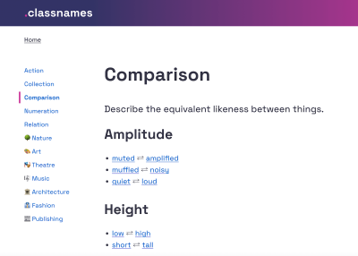
If you’re looking for some inspiration for naming HTML classes, CSS properties, or JavaScript functions, Classnames is a wonderful resource jam-packed with ideas that get you thinking outside the box.

Classnames
Classnames provides thematically grouped lists of words you can use for naming. (Large preview)

The site provides thematically grouped lists of words perfect for naming. You’ll find terms to describe different kinds of behavior, likeness between things, order, grouping, and association, but also themed collections of words that wouldn’t instantly come to one’s mind when it comes to code, among them words from nature, art, theater, music, architecture, fashion, and publishing.

Naming Conventions #

What makes a good name? Javier Cuello summarized a set of naming best practices that help you name your layers, groups and components in a consistent and scalable way.

Naming Good Practices
Javier Cuello explores what makes an effective name. (Large preview)

As Javier points out, a good name has a logical structure, is short, meaningful, and known by everyone, and not related to visual properties. He shares do’s and don’ts to illustrate how to achieve that and also takes a closer look at all the fine little details you need to consider when naming sizes, colors, groups, layers, and components.

Design Tokens Naming Playbook

How do you name and manage design tokens? To enhance your design tokens naming skills, Romina Kavcic created an interactive Design Tokens Naming Playbook. It covers everything from different approaches to naming structure to creating searchable databases, running naming workshops, and automation.

Design Tokens Naming Playbook
The Design Tokens Naming Playbook is a wonderful resource for experimenting with names. (Large preview)

The playbook also features a naming playground where you can play with names simply by dragging and dropping. For more visual examples, also be sure to check out the Figma template. It includes components for all categories, allowing you to experiment with different naming structures.

Flexible Design Token Taxonomy #

How to build a flexible design token taxonomy that works across different products? That was the challenge that the team at Intuit faced. The parent company of products such as Mailchimp, Quickbooks, TurboTax, and Mint developed a flexible token system that goes beyond the brand theme to serve as the foundational system for a wide array of products.

Creating a flexible design token taxonomy for Intuit’s Design System
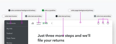
Nate Baldwin shares insights into Intuit’s flexible design token taxonomy. (Large preview)

Nate Baldwin wrote a case study in which he shares valuable insights into the making of Intuit’s design token taxonomy. It dives deeper into the pain points of the old taxonomy system, the criteria they defined for the new system, and how it was created. Lots of takeaways for building your own robust and flexible token taxonomy are guaranteed.

Naming Colors #

When you’re creating a color system, you need names for all its facets and uses. Names that everyone on the team can make sense of. But how to achieve that? How do you bring logic to a subjective topic like color? Jess Satell, Staff Content Designer for Adobe’s Spectrum Design System, shares how they master the challenge.

Naming Colors In Design Systems
Jess Sattell explains how language brings logic to a subjective topic like color. (Large preview)

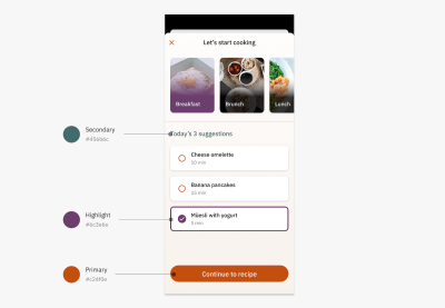
As Jess explains, the Spectrum color nomenclature uses a combination of color family classifier (e.g., blue or gray) paired with an incremental brightness value scale (50–900) to name colors in a way that is not only logical for everyone involved but also scalable and flexible as the system grows.

Another handy little helper when it comes to naming colors is Color Parrot. The Twitter bot is capable of naming and identifying the colors in any given image. Just mention the bot in a reply, and it will respond with a color palette.

Common Names For UI Components #

Looking at what other people call similar things is a great way to start when you’re struggling with naming. And what better source could there be than other design systems? Before you end up in the design system rabbit hole, Iain Bean did the research for you and created the Component Gallery.

The Component Gallery
The Component Gallery collects interface components from real-world design systems. (Large preview)

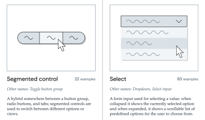
The Component Gallery is a collection of interface components from real-world design systems. It includes plenty of examples for more than 50 UI components — from accordion to visually hidden — and also lists other names that the UI components go by. A fantastic resource — not only with regards to naming.

Variables Taxonomy Map #

A wonderful example of naming guidelines for a complex multi-brand, multi-themed design system comes from the Vodafone UK Design System team. Their Variables Taxonomy Map breaks down the anatomy and categorization of a design token into a well-orchestrated system of collections.

Variables Taxonomy Map
Vodafone’s Variables Taxonomy Map accommodates a complex multi-brand, multi-themed design system. (Large preview)

The map illustrates four collections required to support the system and connections between tokens — from brand and primitives to semantics and pages. It builds on top of Nathan Curtis’ work on naming design tokens and enables everyone to gather insight about where a token is used and what it represents, just from its name.

If you want to explore more approaches to naming design tokens, Vitaly compiled a list of useful Figma kits and resources that are worth checking out.

Design Token Names Inventory #

Romina Kavcic created a handy little resource that is bound to give your design token naming workflow a power boost. The Design Token Names Inventory spreadsheet not only makes it easy to ensure consistent naming but also syncs directly to Figma.

Design Token Names Inventory Spreadsheet
The Design Token Names Inventory spreadsheet automatically syncs to Figma. (Large preview)

The spreadsheet has a simple structure with four levels to give you a bird’s-eye view of all your design tokens. You can easily add rows, themes, and modes without losing track and filter your tokens. And while the spreadsheet itself is already a great solution to keep everyone involved on the same page, it plays out its real strength in combination with the Google Spreadsheets plugin or the Kernel plugin. Once installed, the changes you make in the spreadsheet are reflected in Figma. A real timesaver!

Monday, June 17, 2024

Best Practices For Naming Design Tokens, Components And Variables

 How can we get better at naming? This post is dedicated to naming conventions, tips, and real-world examples that help you name things in a robust and flexible way.

Naming is hard. As designers and developers, we often struggle finding the right name — for a design token, colors, UI components, HTML classes, and variables. Sometimes, the names we choose are too generic, so it’s difficult to understand what exactly is meant. And sometimes they are too specific, leaving little room for flexibility and re-use.

In this post, we want to get to the bottom of this and explore how we can make naming more straightforward. How do we choose the right names? And which naming conventions work best? Let’s take a closer look.

Inspiration For Naming

If you’re looking for some inspiration for naming HTML classes, CSS properties, or JavaScript functions, Classnames is a wonderful resource jam-packed with ideas that get you thinking outside the box.

Classnames
Classnames provides thematically grouped lists of words you can use for naming. (Large preview)

The site provides thematically grouped lists of words perfect for naming. You’ll find terms to describe different kinds of behavior, likeness between things, order, grouping, and association, but also themed collections of words that wouldn’t instantly come to one’s mind when it comes to code, among them words from nature, art, theater, music, architecture, fashion, and publishing.

Naming Conventions

What makes a good name? Javier Cuello summarized a set of naming best practices that help you name your layers, groups and components in a consistent and scalable way.

Naming Good Practices
Javier Cuello explores what makes an effective name. (Large preview)

As Javier points out, a good name has a logical structure, is short, meaningful, and known by everyone, and not related to visual properties. He shares do’s and don’ts to illustrate how to achieve that and also takes a closer look at all the fine little details you need to consider when naming sizes, colors, groups, layers, and components.

Design Tokens Naming Playbook #

How do you name and manage design tokens? To enhance your design tokens naming skills, Romina Kavcic created an interactive Design Tokens Naming Playbook. It covers everything from different approaches to naming structure to creating searchable databases, running naming workshops, and automation.

Design Tokens Naming Playbook
The Design Tokens Naming Playbook is a wonderful resource for experimenting with names. (Large preview)

The playbook also features a naming playground where you can play with names simply by dragging and dropping. For more visual examples, also be sure to check out the Figma template. It includes components for all categories, allowing you to experiment with different naming structures.

Flexible Design Token Taxonomy

How to build a flexible design token taxonomy that works across different products? That was the challenge that the team at Intuit faced. The parent company of products such as Mailchimp, Quickbooks, TurboTax, and Mint developed a flexible token system that goes beyond the brand theme to serve as the foundational system for a wide array of products.

Creating a flexible design token taxonomy for Intuit’s Design System
Nate Baldwin shares insights into Intuit’s flexible design token taxonomy. (Large preview)

Nate Baldwin wrote a case study in which he shares valuable insights into the making of Intuit’s design token taxonomy. It dives deeper into the pain points of the old taxonomy system, the criteria they defined for the new system, and how it was created. Lots of takeaways for building your own robust and flexible token taxonomy are guaranteed.

Naming Colors #

When you’re creating a color system, you need names for all its facets and uses. Names that everyone on the team can make sense of. But how to achieve that? How do you bring logic to a subjective topic like color? Jess Satell, Staff Content Designer for Adobe’s Spectrum Design System, shares how they master the challenge.

Naming Colors In Design Systems
Jess Sattell explains how language brings logic to a subjective topic like color. (Large preview)

As Jess explains, the Spectrum color nomenclature uses a combination of color family classifier (e.g., blue or gray) paired with an incremental brightness value scale (50–900) to name colors in a way that is not only logical for everyone involved but also scalable and flexible as the system grows.

Another handy little helper when it comes to naming colors is Color Parrot. The Twitter bot is capable of naming and identifying the colors in any given image. Just mention the bot in a reply, and it will respond with a color palette.

Common Names For UI Components

Looking at what other people call similar things is a great way to start when you’re struggling with naming. And what better source could there be than other design systems? Before you end up in the design system rabbit hole, Iain Bean did the research for you and created the Component Gallery.

The Component Gallery
The Component Gallery collects interface components from real-world design systems. (Large preview)

The Component Gallery is a collection of interface components from real-world design systems. It includes plenty of examples for more than 50 UI components — from accordion to visually hidden — and also lists other names that the UI components go by. A fantastic resource — not only with regards to naming.

Variables Taxonomy Map #

A wonderful example of naming guidelines for a complex multi-brand, multi-themed design system comes from the Vodafone UK Design System team. Their Variables Taxonomy Map breaks down the anatomy and categorization of a design token into a well-orchestrated system of collections.

Variables Taxonomy Map
Vodafone’s Variables Taxonomy Map accommodates a complex multi-brand, multi-themed design system. (Large preview)

The map illustrates four collections required to support the system and connections between tokens — from brand and primitives to semantics and pages. It builds on top of Nathan Curtis’ work on naming design tokens and enables everyone to gather insight about where a token is used and what it represents, just from its name.

If you want to explore more approaches to naming design tokens, Vitaly compiled a list of useful Figma kits and resources that are worth checking out.

Design Token Names Inventory

Romina Kavcic created a handy little resource that is bound to give your design token naming workflow a power boost. The Design Token Names Inventory spreadsheet not only makes it easy to ensure consistent naming but also syncs directly to Figma.

Design Token Names Inventory Spreadsheet
The Design Token Names Inventory spreadsheet automatically syncs to Figma. (Large preview)

The spreadsheet has a simple structure with four levels to give you a bird’s-eye view of all your design tokens. You can easily add rows, themes, and modes without losing track and filter your tokens. And while the spreadsheet itself is already a great solution to keep everyone involved on the same page, it plays out its real strength in combination with the Google Spreadsheets plugin or the Kernel plugin. Once installed, the changes you make in the spreadsheet are reflected in Figma. A real timesaver!

Want To Dive Deeper?

We hope these resources will come in handy as you tackle naming. If you’d like to dive deeper into design tokens, components, and design systems, we have a few friendly online workshops and SmashingConfs coming up:

We’d be absolutely delighted to welcome you to one of our special Smashing experiences — be it online or in person!

Wednesday, February 28, 2024

The Feature Trap: Why Feature Centricity Is Harming Your Product

 Most product teams commonly adopt a feature-centric mindset, finding them convenient for brainstorming, drafting requirement documents, and integrating into backlogs and ticketing systems. In this article, Andy Budd shows how fixation with features might be holding you back and how making a few small tweaks to your process could make an entire world of difference.

Most product teams think in terms of features. Features are easy to brainstorm and write requirement docs for, and they fit nicely into our backlogs and ticketing systems. In short, thinking in terms of features makes it easy to manage the complex task of product delivery.

However, we know that the best products are more than the sum of their parts, and sometimes, the space between the features is as important as the features themselves. So, what can we do to improve the process?

The vast majority of product teams are organized around delivering features — new pieces of functionality that extend the capabilities of the product. These features will often arise from conversations the company is having with prospective buyers:

  • “What features are important to you?”
  • “What features are missing from your current solution?”
  • “What features would we need to add in order to make you consider switching from your existing provider to us?” and so on.

The company will then compile a list of the most popular feature requests and will ask the product team to deliver them.

For most companies, this is what customer centricity looks like; asking customers to tell them what they want — and then building those features into the product in the hope they’ll buy — becomes of key importance. This is based on the fundamental belief that people buy products primarily for the features so we assemble our roadmaps accordingly.

We see this sort of thinking with physical products all the time. For instance, take a look at the following Amazon listing for one of the top-rated TV sets from last year. It’s like they hurled up the entire product roadmap directly onto the listing!

Screenshot of a very detailed description of a modern TV set sold on Amazon.
An Amazon listing for one of the top-rated TV from last year. It isn’t very engaging, is it? (Large preview)

Now, of course, if you’re a hardcore gamer with very specific requirements, you might absolutely be looking for a TV with “VRR, ALLM, and eARC as specified in HDMI2.1, plus G-Sync, FreeSync, Game Optimizer, and HGiG.” But for me? I don’t have a clue what any of those things mean, and I don’t really care. Instead, I’ll go to a review site where they explain what the product actually feels like to use in everyday life. The reviewers will explain how good the unboxing experience is. How sturdy the build is. How easy it is to set up. They’ll explain that the OS is really well put together and easy to navigate, the picture quality is probably the best on the market, and the sound, while benefiting from the addition of a quality sound bar, is very clear and understandable. In short, they’ll be describing the user experience.

The ironic thing is that when I talk to most founders, product managers, and engineers about how they choose a TV, they’ll say exactly the same thing. And yet, for some reason, we struggle to take that personal experience and apply it to our own users!

Tip: As a fun little trick, next time you find yourself arguing about features over experience, ask people to get out their phones. I bet that the vast majority of folks in the room will have an iPhone, despite Samsung and Google phones generally having better cameras, more storage, better screens, and so on. The reason why iPhones have risen in dominance (if we ignore the obvious platform lock-in) is because, despite perhaps not having the best feature set on the market, they feel so nice to use.

A photo of a conference room full of people.
A conference room full of people. How many people here have an iPhone vs another brand? (Image credit: Alexandre Pellaes) (Large preview)

Seeing Things From The Users’ Perspective #

While feature-centric thinking is completely understandable, it misses a whole class of problems. The features in and of themselves might look good on paper and work great in practice, but do they mesh together to form a convincing whole? Or is the full experience a bit of a mess?

All the annoying bumps, barriers, and inconsistencies that start accruing around each new feature, if left unsolved, can limit the amount of value users can extract from the product. And if you don’t effectively identify and remove these barriers in a deliberate and structured way, any additional functionality will simply add to the problem.

If users are already struggling to extract value from existing features, how do you expect them to extract any additional value you might be adding to the product?

“As a product manager, it’s natural to want to offer as many features as possible to your customers. After all, you want to provide value, right? But what happens when you offer too many features? Your product becomes bloated, convoluted, and difficult to use.”
— “Are Too Many Features Hurting Your Product?

These barriers and inconsistencies are usually the result of people not thinking through the user experience. And I don’t mean user experience in some abstract way. I mean literally walking through the product step-by-step as though you’d never seen it before — sometimes described as having a “beginner’s mind” — and considering the following questions:

  • Is it clear what value this product delivers and how I can get that value?
  • If I were a new user, would the way the product is named and structured make sense to me?
  • Can I easily build up a mental model of where everything is and how the product works?
  • Do I know what to do next?
  • How is this going to fit into my existing workflow?
  • What’s getting in my way and slowing me down?

While approaching things with a beginner’s mind sounds easy, it’s actually a surprisingly hard mindset for people to adopt — letting go of everything they know (or think they know) about their product, market, and users. Instead, their position as a superuser tends to cloud their judgment: believing that because something is obvious to them (something that they have created and have been working on for the past two years), it will be obvious to a new user who has spent less than five minutes with the product. This is where usability testing (a UX research method that evaluates whether users are able to use a digital product efficiently and effectively) should normally “enter the stage.”

The issue with trying to approach things with a beginner’s mind is also often exacerbated by “motivated reasoning,” the idea that we view things through the lens of what we want to be true, rather than what is true. To this end, you’re much more likely to discount feedback from other people if that feedback is going to result in some negative outcome, like having to spend extra time and money redesigning a user flow when you’d rather be shipping that cool new feature you came up with last week.

I see this play out in usability testing sessions all the time. The first subject comes in and struggles to grasp a core concept, and the team rolls their eyes at the incompetence of the user. The next person comes in and has the same experience, causing the team to ask where you found all these stupid users. However, as the third, fourth, and fifth person comes through and experiences the same challenge, “lightbulbs” slowly start forming over the team members’ heads:

“Maybe this isn’t the users’ fault after all? Maybe we’ve assumed a level of knowledge or motivation that isn’t there; maybe it’s the language we’ve used to describe the feature, or maybe there’s something in the way the interface has been designed that is causing this confusion?”

These kinds of insights can cause teams to fundamentally pivot their thinking. But this can also create a huge amount of discomfort and cognitive dissonance — realizing that your view of the world might not be entirely accurate. As such, there’s a strong motivation for people to avoid these sorts of realizations, which is why we often put so little effort (unfortunately) into understanding how our users perceive and use the things we create.

Developing a beginner’s mind takes time and practice. It’s something that most people can cultivate, and it’s actually something I find designers are especially good at — stepping into other people’s shoes, unclouded by their own beliefs and biases. This is what designers mean when they talk about using empathy.

Towards A Two-Tier Process (Conclusion) #

We obviously still need to have “feature teams.” Folks who can understand and deliver the new capabilities our users request (and our business partners demand). While I’d like to see more thought and validation when it comes to feature selection and creation, it’s often quicker to add new features to see if they get used than to try and use research to give a definitive answer.

As an example, I’m working with one founder at the moment who has been going around houses with their product team for months about whether a feature would work. He eventually convinced them to give it a try — it took four days to push out the change, and they got the feedback they needed almost instantly.

However, as well as having teams focused on delivering new user value, we also need teams who are focused on helping unlock and maximize existing user value. These teams need to concentrate on outcomes over outputs; so, less deliver X capability in Y sprints than deliver X improvement by Y date. To do this, these teams need to have a high level of agency. This means taking them out of the typical feature factory mindset.

An illustration that depicts the ‘feature factory’ concept.
Are you working at a feature factory? (Illustration: John Cutler) (Large preview)

The teams focusing on helping unlock and maximize existing user value need to be a little more cross-disciplinary than your traditional feature team. They’re essentially developing interventions rather than new capabilities — coming up with a hypothesis and running experiments rather than adding bells and whistles. “How can we improve the onboarding experience to increase activation and reduce churn?” Or, “How can we improve messaging throughout the product so people have a better understanding of how it works and increase our North Star metric as a result?”

There’s nothing radical about focusing on outcomes over outputs. In fact, this way of thinking is at the heart of both the Lean Startup movement and the Product Led Growth. The problem is that while this is seen as received wisdom, very few companies actually put it into practice (although if you ask them, most founders believe that this is exactly what they do).

Put simply, you can’t expect teams to work independently to deliver “outcomes” if you fill their their calendar with output work.

So this two-tier system is really a hack, allowing you to keep sales, marketing, and your CEO (and your CEO’s partner) happy by delivering a constant stream of new features while spinning up a separate team who can remove themselves from the drum-beat of feature delivery and focus on the outcomes instead.

Further Reading #

  • Why Too Many Features Can Ruin a Digital Product Before It Begins(Komodo Digital)
    Digital products are living, ever-evolving things. So, why do so many companies force feature after feature into projects without any real justification? Let’s talk about feature addiction and how to avoid it.
  • Are Too Many Features Hurting Your Product?(FAQPrime)
    As a product manager, it’s natural to want to offer as many features as possible to your customers. After all, you want to provide value, right? But what happens when you offer too many features? Your product becomes bloated, convoluted, and difficult to use. Let’s take a closer look at what feature bloat is, why it’s a problem, and how you can avoid it.
  • Twelve Signs You’re Working in a Feature Factory,” John Cutler
    The author started using the term Feature Factory when a software developer friend complained that he was “just sitting in the factory, cranking out features, and sending them down the line.” This article was written in 2016 and still holds its ground today. In 2019 there appeared a newer version of it (“Twelve signs You’re Working in a Feature Factory — Three Years Later”).
  • What Is The Agile Methodology?,” (Atlassian)
    The Agile methodology is a project management approach that involves breaking the project into phases and emphasizes continuous collaboration and improvement. Teams follow a cycle of planning, executing, and evaluating.
  • Problem Statement vs Hypothesis — Which ­­Is More Important?,” Sadie Neve
    When it comes to experimentation and conversion rate optimization (CRO), we often see people relying too much on their instincts. But in reality, nothing in experimentation is certain until tested. This means experimentation should be approached like a scientific experiment that follows three core steps: identify a problem, form a hypothesis, and test that hypothesis.
  • The Build Trap,” Melissa Perri (Produx Labs)
    The “move fast and break things” mantra seems to have taken the startup world by storm since Facebook made it their motto a few years ago. But there is a serious flaw with this phrase, and it’s that most companies see this as an excuse to stop analyzing what they intend to build and why they should build it — those companies get stuck in what I call “The Build Trap.”
  • What Is Product-led Growth?(PLG Collective)
    We are in the middle of a massive shift in the way people use and buy software. It’s been well over a decade since Salesforce brought software to the cloud. Apple put digital experiences in people’s pockets back in 2009 with the first iPhone. And in the years since the market has been flooded with consumer and B2B products that promise to meet just about every need under the sun.
  • The Lean Startup
    The Lean Startup isn’t just about how to create a more successful entrepreneurial business. It’s about what we can learn from those businesses to improve virtually everything we do.
  • Usability Testing — The Complete Guide,” Daria Krasovskaya and Marek Strba
    Usability testing is the ultimate method of uncovering any type of issue related to a system’s ease of use, and it truly is a must for any modern website or app owner.
  • The Value of Great UX,” Jared Spool
    How can we show that a great user experience produces immense value for the organization? We can think of experience as a spectrum, from extreme frustration to delight. In his article, Jared will walk you through how our work as designers is able to transform our users’ experiences from being frustrated to being delighted.
  • Improving The Double Diamond Design Process,” Andy Budd (Smashing Magazine)
    The so-called “Double Diamond” is a great way of visualizing an ideal design process, but it’s just not the way most companies deliver new projects or services. The article proposes a new “Double Diamond” idea that better aligns with the way work actually gets done and highlights the place where design has the most leverage.
  • Are We Moving Towards a Post-Agile Age?,” Andy Budd
    Agile has been the dominant development methodology in our industry for a while now. While some teams are just getting to grips with Agile, others have extended it to the point that it’s no longer recognizable as Agile; in fact, many of the most progressive design and development teams are Agile only in name. What they are actually practicing is something new, different, and innately more interesting — something I’ve been calling Post-Agile thinking.

Friday, November 4, 2022

An Accessibility-First Approach To Chart Visual Design

 Using a data visualization case study, we will explore how an accessibility-first approach led us down the path of creating a better visual design for charts. Throughout the article, we will highlight how we used the seemingly constraining Web Content Accessibility Standards (WCAG) to become an empowering factor in our design process. We will also discuss how this approach led us to an unexpected yet better outcome for everyone.

Have you heard the claim that designing for accessibility leads to a better outcome for everyone? Here’s a story about how an accessibility-first approach led to an overall better visual design for a chart.

In 2018, Kent was a founding member of Google Cloud’s first dedicated data visualization team. Kai joined shortly after the team was formed. Early on, we created several prominently featured visualizations in many Google products. Our team, a passionate group of designers, researchers and engineers, also wrote Material Design’s data visualization guidelines. However, as we continued to fulfill our mission, we realized our work wasn’t as inclusive as we had hoped, and as we started embracing new accessibility standards, we realized we had more work to do. We felt strongly that accessibility transcends compliance and that we had an opportunity to create something that is truly useful.

The Need For Accessible Data Experiences #

Data Visualizations Are Ableist #

Visualizations only work well for those who can fully see. According to the National Federation of the Blind, 7.6M people in the United States have a vision disability. We also know that color blindness affects 1 in 12 men worldwide. These people are typically not relying on assistive technology, like screen readers, to consume web content, and they will be the focus of our case study. For most of these people, the value and insights provided by a chart get lost, and in some cases, the chart provides little-to-no information. As part of our mission of organizing the world’s information and making it universally accessible, it’s our responsibility to be good citizens of the web by making data accessible to everyone.

An Accessibility-First Approach Led To A Better Visual Design #

Similar to mobile-first, the accessibility first approach considers accessibility requirements and constraints at the very beginning of the design process. To do this right, we typically validate our ideas with an accessibility testing team, and we codesign our solutions with people who have disabilities. Through this process, we’ve learned a lot, and it has completely changed the way we think about representing data.

There are many ways to make data accessible, but for now, let’s focus on our accessibility-first approach to visual design. Over the past two years, our team has fielded a lot of questions on data accessibility. Believe it or not, the majority of these questions focus on accessible chart colors, encodings, and visual design. This is why we’d like to focus on visual design for now. Our accessibility-first approach ensures that accessibility is a core to the chart’s visual design without compromising focus, sacrificing readability, or adding unnecessary chartjunk.

Let’s compare this approach to a famous piece of architecture, the Guggenheim museum in New York City. In this museum, all of the exhibits and artworks are arranged around a large, accessible ramp that spirals down through the various levels of the building, as depicted in the image below.

A ramp that spirals down through the various levels of the building
A view of the Guggenheim Museum’s iconic interior spiral ramp and atrium. (Image credit: Evan-Amos) (Large preview)

This ramp is a core part of how everyone experiences artwork in the building, and it’s inherently accessible. This is light-years better than the experience in buildings with hidden ramps, lifts, and retrofitted equipment for people with limited-to-no mobility.

Now, let’s look at how we can apply this thinking to visual chart design.

The Challenge #

Recently we were tasked with the challenge of helping developers understand the overall latency and performance of their apps, websites, and digital experiences. An app’s underlying codebase is often made up of a series of functions that execute in order for its features to work. The more efficiently the code is structured, the faster the functions execute, and the better the overall app performs.

Reducing latency is an essential part of any good app experience. After all, who wants to stare at loading screens all day long? It became obvious that a visualization would provide a glanceable diagnostic view of the app’s underlying code, and it could be used to help developers spot inefficiencies in the app’s code.

Choosing A Chart #

To visualize app performance and latency, we considered several chart types. To do this, we wanted to represent each function in the code base as its own chart. For each function, we’d plot the time it took to execute every time it was run.

There are several charts that are meant to show the distribution of a variable. The early exploration in the image below shows all recorded execution times for the same function in the codebase:

Execution times for a sample function plotted on a graph
Execution times for a sample function plotted on a graph. (Large preview)

After many runs of the function, we can get a sense of how performant the function is, whether it is typically fast or slow, as illustrated here:

Execution times for a sample function plotted on a graph with the visulaization of the overall performance
When times are plotted on a graph, we can get a sense of the performance of a function. (Large preview)

Considering Accessibility Standards #

First and foremost, we followed the Web Content Accessibility Guidelines (hereafter referred to as WCAG) in order to ensure that our visualization would meet the necessary accessibility standards. These guidelines are often used to determine whether or not a digital experience can be deemed accessible by auditors. This enabled us to narrow down our options and choose a general direction. Initially, we considered using a histogram (see above) as it’s a more scalable solution than the previous examples shown earlier.

Example histogram chart showing execution times recorded for a function
Example histogram chart showing execution times recorded for a function. (Large preview)
More after jump! Continue reading below ↓

Considering Low-Vision Users #

We knew that the visualization would need to provide at-a-glance insights, even for people with low vision viewing the content at a 200% zoom level. Due to this, the visualization should be scalable and occupy as little screen real estate as possible by default. That way, when zoomed in, low-vision users do not have to scroll to read the chart.

When histograms are reduced in size, it is especially difficult to compare the heights of their bars and map their values back to the compressed Y-axis. In these cases, readability quickly declines. The next image highlights some common readability issues with compressed histograms:

Example of histogram chart with the compressed Y-axis. The values represented by the highlighted bars are difficult to compare to each other
Example of histogram chart with compressed Y axis. The values represented by the highlighted bars are difficult to compare to each other. (Large preview)

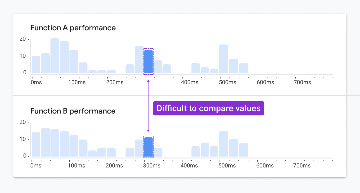
In some cases, we knew we’d want to compare the performance of multiple functions. It isn’t quite easy to compare the heights of bars between two stacked histograms:

Example of stacked histograms. The values represented by the highlighted bars are difficult to compare
Example of stacked histograms. The values represented by the highlighted bars are difficult to compare to each other. (Large preview)

Since we would be limited in our ability to reduce the size of the histogram, we also knew scrolling would become an issue. As a result, we quickly eliminated the possibility of using a histogram.

Instead, we considered using a continuous color ramp to represent the execution times recorded for multiple runs of function in the codebase (see image below). We could also stack multiple swimlanes to provide additional insights.

Example heatmap
Example heatmap. (Large preview)

Considering Color Contrast Requirements #

WCAG accessibility guidelines require that graphics achieve a minimum 3:1 contrast ratio with their background. With this requirement, our options for color values are much more limited, especially when displaying a visualization on a white background, which is a core part of Google’s current brand. To accommodate this, instead of applying a continuous color ramp that mapped to a continuous range of values, we decided to use a limited discrete sequential color palette.

The colors can be mapped to a set of grouped value ranges or bins. This technique is known as data binning, and it enabled us to apply a smaller range of colors to the visualization. In doing this, we could ensure we were using colors that meet WCAG’s minimum 3:1 contrast requirement.

The next image shows a comparison of the continuous palette and the binned discrete sequential palette:

A comparison of a continuous palette and discrete sequential palette
A comparison of a continuous palette and discrete sequential palette. (Large preview)

To achieve the required 3:1 color contrast ratio, we opened up whitespace between each of the heat map tiles. That way, we didn’t have to worry about the shades of color meeting the contrast ratio with each other.

Example heatmap with a high contrast color palette
Example heatmap with a high contrast color palette. (Large preview)

While this update meets the WCAG accessibility requirements, it makes the heatmap more difficult to read. Moreover, the bold nature of this visualization could take focus away from potentially more important screen elements outside of the visualization, such as warnings and alerts.

Considering Colorblind Users #

To reduce the dependency on interpreting colors, WCAG requires that something beyond color is used to communicate meaning. This could be a texture, graphical element, icon symbol, or an additional encoding. It’s easy to add any texture, icon or graphical element to meet this requirement. However, it must be done with a lot of care. During several usability studies conducted on accessible chart designs, we found that participants misinterpreted these additions. Oftentimes people felt they represented an additional metric, status, or carried an unintended meaning. In the end, we’d have to choose something that was subtle yet effective.

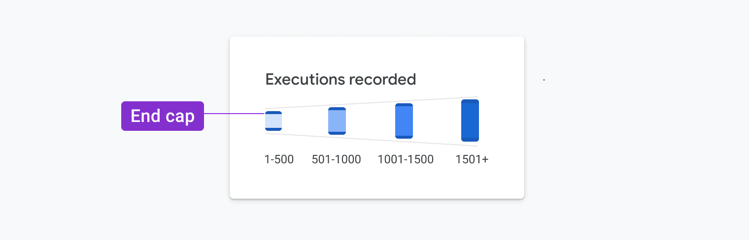
After careful consideration, we chose an additional encoding. Once we introduced the idea of binning the value ranges, we could think again about using box height to represent the five possible value ranges as depicted in the image below:

Chart legend demonstrates the use of box height to represent a value range
Chart legend that demonstrates the use of box height to represent a value range. (Large preview)

With this change, we had absolute control over the ranges in box heights, and we could ensure it would be easy to compare the heights of all the boxes. The image below illustrates this idea applied to the chart:

Visualization demonstrates the use of box height to represent a value range
Visualization that demonstrates the use of box height to represent a value range. (Large preview)

Sidestepping The Color Contrast Requirement #

Now that we had added a second encoding, we wanted to see how we could improve the design. While WCAG recommends that all colors achieve a 3:1 contrast ratio with the white background, we found some ways to work within the guidelines yet use a broader range of values. Since we’re now using multiple encodings (e.g., color shades and box height) to communicate meaning, we realized our options opened up a bit.

To achieve the required contrast ratio, we added end caps to the top and bottom of each box. These end caps are 3px in thickness and achieve a 4.5:1 contrast ratio. We added subtle rounded corners to give it visual appeal and to ensure it fits within the aesthetic of Google’s Material Design system.

Examples of using end caps to mark the tops and bottoms of blocks
Examples of using end caps to mark the tops and bottoms of blocks. (Large preview)

Since the end caps’ position varies, and they achieve the required contrast ratio, we could then apply a broader range of shades to the box fills to strengthen meaning and create a more appealing visual design. We could then use light tones that did not originally achieve the required contrast ratio. We can see an example of this in practice below. The addition of the endcaps was a clever way to ensure low-vision and colorblind users could still read the graph.

Example of end caps applied to the visualization
Example of end caps applied to the visualization. (Large preview)

A New(ish) Chart Type #

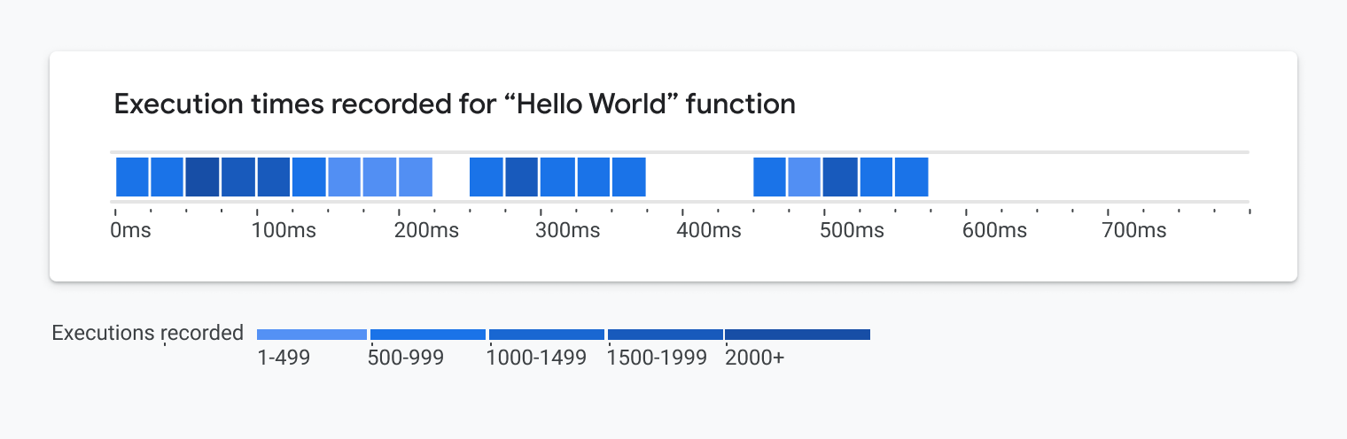
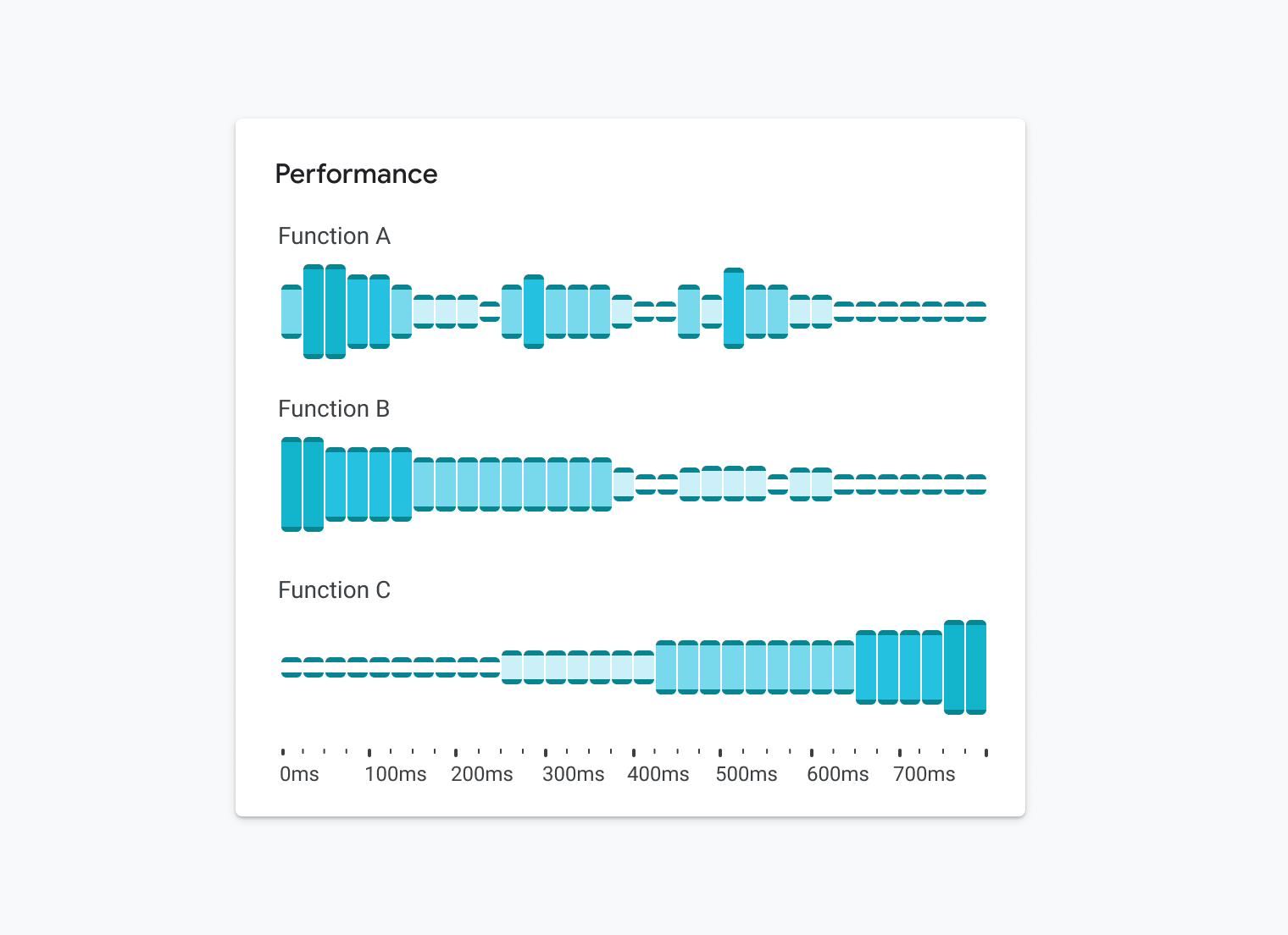
The resulting graph is part histogram and part heatmap — we’re calling it a heat lane. It uses binned ranges to represent both time and number of events. It’s a heavy modification to several chart types that seriously flirts with becoming its own new chart type.

Sample heat lane visualization
Sample heat lane visualization. (Large preview)

So why is this a better visualization for fully sighted people? #

As human beings, most of us were born with the natural ability to subconsciously spot trends, patterns, and outliers in the environment. We do this through the images we see, and it happens nearly instantaneously.

Imagine you’re purchasing produce at the grocery store. It’s quite easy to spot the moldy produce that likely wouldn’t be safe to eat. This ability, known as pre-attentive processing, has been integral to our survival as a species for hundreds of thousands of years.

A visual comparison of a fresh apple and rotten apple.
A visual comparison of a fresh apple and rotten apple. (Large preview)

Visualizations are graphics that leverage these core capabilities. In our case, we’ve exploited these capabilities through the design of this particular chart. It’s fairly easy to glean insights and value within milliseconds of glancing at it.

In the case of the heatlane, there’s a visual “blobbing” effect that takes place when glancing at this. It even holds up when squinting at it or when it’s slightly blurred. All of the visual design decisions we made in order to meet accessibility requirements and WCAG standards are a core part of the chart’s design. Because these ideas were not retrofitted to an existing chart, we were able to create an accessible chart without adding extraneous chartjunk or sacrificing visual design and polish.

In addition to aesthetic benefits, our accessibility-first approach led to more useful applications of the chart. In order to start, the heat lane visualization can be stacked repeatedly (see below) so people can understand the correlation of different event types in the stack.

Visualization of measuring the performance of three functions through stacked heat lanes
Measuring the performance of three functions through stacked heat lanes. (Large preview)

As a bonus, we realized this visualization could be readable as a sparkline as well:

Heat lane reduced to a sparkline
Heat lane reduced to a sparkline. (Large preview)

It also works well as a small multiple:

The heat lane working as a set of small multiples in a scorecard
The heat lane working as a set of small multiples in a scorecard. (Large preview)

Finally, it can show a few or millions of data points. As we started to apply it in our day-to-day work, we quickly realized that the possibilities were endless. In our opinion, the visual polish really shines through in the last few examples.

Conclusion #

Had we not considered the accessibility requirements up front, we might have settled on a generic heatmap or histogram and would not have thought about combining them. We would’ve missed out on creating a more scalable and glanceable visualization that worked for everyone. Similar to how the mobile-first movement improved the way we design digital product experiences, an accessibility-first approach can enable us to create fundamentally better representations of data that can provide more insights and value to everyone.

Doesn’t Accessibility Include More Than Just Visual Design? #

This is all just the beginning. While visual design is a core part of accessibility, we’ve been rethinking our overall approach to data visualization, and we’ve been focused on representing data in ways that provide value and insights for everyone, regardless of their ability. For example, we’ve been structuring our charts in ways that are easy to navigate using a keyboard for people with limited motor skills.

As we’re building charts, we ensure that we’re following the specifications for creating Accessible Rich Internet Applications (ARIA) by using the correct roles, landmarks and attributes so that all the chart’s elements can be properly interpreted by the browser’s screen reader. We’re also determining better ways to highlight emerging trends, spikes, dips and outliers in the data using text. In some cases, we’re even using sonification and providing insightful audio summaries that surface insights within the data. Stay tuned for more on this in the future.

Resources #

To get started in thinking about data accessibility, check out some of these resources:

We’re incredibly proud of our colleagues who contributed to this visualization, including Sierra Seeborn, Jess Klos, Nicholas Cottrell, and Saurabh Kumar. Without everyone’s contributions, we wouldn’t have been able to create, develop and deploy this design as rapidly as we did.