Ever
wondered how to build a paginated list that works with and without
JavaScript? In this article, Manuel explains how you can leverage the
power of Progressive Enhancement and do just that with Eleventy and
Alpine.js.
Most sites I build are static sites with
HTML files generated by a static site generator or pages served on a
server by a CMS like Wordpress or CraftCMS.
I use JavaScript only on top to enhance the user experience. I use it
for things like disclosure widgets, accordions, fly-out navigations, or
modals.
The requirements for most of these features are simple, so
using a library or framework would be overkill. Recently, however, I
found myself in a situation where writing a component from scratch in
Vanilla JS without the help of a framework would’ve been too complicated
and messy.
Lightweight Frameworks
My
task was to add multiple filters, sorting and pagination to an existing
list of items. I didn’t want to use a JavaScript Framework like Vue or
React, only because I needed help in some places on my site, and I
didn’t want to change my stack. I consulted Twitter, and people suggested minimal frameworks like lit, petite-vue, hyperscript, htmx or Alpine.js. I went with Alpine because it sounded like it was exactly what I was looking for:
“Alpine
is a rugged, minimal tool for composing behavior directly in your
markup. Think of it like jQuery for the modern web. Plop in a script tag
and get going.”
Alpine.js
Alpine
is a lightweight (~7KB) collection of 15 attributes, 6 properties, and 2
methods. I won’t go into the basics of it (check out this article about Alpine by Hugo Di Francesco or read the Alpine docs), but let me quickly introduce you to Alpine:
Note:You can skip this intro and go straight to the main content of the article if you’re already familiar with Alpine.js.
Let’s say we want to turn a simple list with many items into a disclosure widget. You could use the native HTML elements: details and summary for that, but for this exercise, I’ll use Alpine.
By
default, with JavaScript disabled, we show the list, but we want to
hide it and allow users to open and close it by pressing a button if
JavaScript is enabled:
<h2>Beastie Boys Anthology</h2><p>The Sounds of Science is the first anthology album by American rap rock group Beastie Boys composed of greatest hits, B-sides, and previously unreleased tracks.</p><ol><li>Beastie Boys</li><li>Slow And Low</li><li>Shake Your Rump</li><li>Gratitude</li><li>Skills To Pay The Bills</li><li>Root Down</li><li>Believe Me</li>
…
</ol>
First, we include Alpine using a script tag. Then we wrap the list in a div and use the x-data directive to pass data into the component. The open property inside the object we passed is available to all children of the div:
<divx-data="{ open: false }"><ol><li>Beastie Boys</li><li>Slow And Low</li>
…
</ol></div><scriptsrc="https://unpkg.com/alpinejs@3.9.1/dist/cdn.min.js"integrity="sha384-mDHH3kdyMS0F6QcfHCxEgPMMjssTurzucc7Jct3g1GOfB4p7PxJuugPP1NOLvE7I"crossorigin="anonymous"></script>
We can use the open property for the x-show directive, which determines whether or not an element is visible:
<divx-data="{ open: false }"><olx-show="open"><li>Beastie Boys</li><li>Slow And Low</li>
…
</ol></div>
Since we set open to false, the list is hidden now.
Next, we need a button that toggles the value of the open property. We can add events by using the x-on:click directive or the shorter @-Syntax @click:
Pressing the button, open now switches between false and true and x-show reactively watches these changes, showing and hiding the list accordingly.
While
this works for keyboard and mouse users, it’s useless to screen reader
users, as we need to communicate the state of our widget. We can do that
by toggling the value of the aria-expanded attribute:
Pretty
neat! You can enhance existing static content with JavaScript without
having to write a single line of JS. Of course, you may need to write
some JavaScript, especially if you’re working on more complex
components.
A Static, Paginated List
Okay, now that we know the basics of Alpine.js, I’d say it’s time to build a more complex component.
I want to build a paginated list of my vinyl records that works without JavaScript. We’ll use the static site generator eleventy (or short “11ty”) for that and Alpine.js to enhance it by making the list filterable.
Setup
Before we get started, let’s set up our site. We need:
a project folder for our site,
11ty to generate HTML files,
an input file for our HTML,
a data file that contains the list of records.
On your command line, navigate to the folder where you want to save the project, create a folder, and cd into it:
cd Sites # or wherever you want to save the projectmkdir myrecordcollection # pick any namecd myrecordcollection
You
don’t have to do all these steps on the command line. You can also
create folders and files in any user interface. The final file and
folder structure looks like this:
Adding Content
11ty allows you to write content directly into an HTML file (or Markdown, Nunjucks, and other template languages). You can even store data in the front matter
or in a JSON file. I don’t want to manage hundreds of entries manually,
so I’ll store them in the JSON file we just created. Let’s add some
data to the file:
[{"artist":"Akne Kid Joe","title":"Die große Palmöllüge","year":2020},{"artist":"Bring me the Horizon","title":"Post Human: Survial Horror","year":2020},{"artist":"Idles","title":"Joy as an Act of Resistance","year":2018},{"artist":"Beastie Boys","title":"Licensed to Ill","year":1986},{"artist":"Beastie Boys","title":"Paul's Boutique","year":1989},{"artist":"Beastie Boys","title":"Check Your Head","year":1992},{"artist":"Beastie Boys","title":"Ill Communication","year":1994}]
Finally, let’s add a basic HTML structure to the index.njk file and start eleventy:
<!DOCTYPEhtml><htmllang="en"><head><metacharset="UTF-8"><metaname="viewport"content="width=device-width, initial-scale=1.0"><title>My Record Collection</title></head><body><h1>My Record Collection</h1></body></html>
By running the following command you should be able to access the site at http://localhost:8080:
eleventy --serve
Displaying Content
Now let’s take the data from our JSON file and turn it into HTML. We can access it by looping over the records object in nunjucks:
<divclass="collection"><ol>
{% for record in records %}
<li><strong>{{ record.title }}</strong><br>
Released in <timedatetime="{{ record.year }}">{{ record.year }}</time> by {{ record.artist }}.
</li>
{% endfor %}
</ol></div>
Pagination
Eleventy
supports pagination out of the box. All we have to do is add a
frontmatter block to our page, tell 11ty which dataset it should use for
pagination, and finally, we have to adapt our for loop to use the paginated list instead of all records:
---
pagination:
data: records
size: 5
---
<!DOCTYPEhtml><htmllang="en"><head><metacharset="UTF-8"><metaname="viewport"content="width=device-width, initial-scale=1.0"><title>My Record Collection</title></head><body><h1>My Record Collection</h1><divclass="collection"><pid="message">Showing <output>{{ records.length }} records</output></p><divaria-labelledby="message"role="region"><olclass="records">
{% for record in pagination.items %}
<li><strong>{{ record.title }}</strong><br>
Released in <timedatetime="{{ record.year }}">{{ record.year }}</time> by {{ record.artist }}.
</li>
{% endfor %}
</ol></div></div></body></html>
If you access the page again, the list only contains 5 items. You can also see that I’ve added a status message (ignore the output element for now), wrapped the list in a div with the role “region”, and that I’ve labelled it by creating a reference to #message using aria-labelledby. I did that to turn it into a landmark and allow screen reader users to access the list of results directly using keyboard shortcuts.
Next, we’ll add a navigation with links to all pages created by the static site generator. The pagination object holds an array that contains all pages. We use aria-current="page" to highlight the current page:
<navaria-label="Select a page"><olclass="pages">
{% for page_entry in pagination.pages %}
{%- set page_url = pagination.hrefs[loop.index0] -%}
<li>
<a href="{{ page_url }}"{% if page.url == page_url %} aria-current="page"{% endif %}>
Page {{ loop.index }}
</a></li>
{% endfor %}
</ol></nav>
Finally, let’s add some basic CSS to improve the styling:
This
works fairly well with 7 records. It might even work with 10, 20, or
50, but I have over 400 records. We can make browsing the list easier by
adding filters.
More after jump! Continue reading below ↓
A Dynamic Paginated And Filterable List
I
like JavaScript, but I also believe that the core content and
functionality of a website should be accessible without it. This doesn’t
mean that you can’t use JavaScript at all, it just means that you start
with a basic server-rendered foundation of your component or site, and
you add functionality layer by layer. This is called progressive enhancement.
Our foundation in this example is the static list created with 11ty, and now we add a layer of functionality with Alpine.
First, right before the closing body tag, we reference the latest version (as of writing 3.9.1) of Alpine.js:
Note:Be
careful using a third-party CDN, this can have all kinds of negative
implications (performance, privacy, security). Consider referencing the
file locally or importing it as a module. In case you’re wondering why you don’t see the Subresource Integrity hash in the official docs, it’s because I’ve created and added it manually.
Since
we’re moving into JavaScript-world, we need to make our records
available to Alpine.js. Probably not the best, but the quickest solution
is to create a .eleventy.js file in your root folder and add the following lines:
This ensures that eleventy doesn’t just generate HTML files, but it also copies the contents of the _data folder into our destination folder, making it accessible to our scripts.
Fetching Data
Just like in the previous example, we’ll add the x-data directive to our component to pass data:
We don’t have any data, so we need to fetch it as the component initialises. The x-init directive allows us to hook into the initialisation phase of any element and perform tasks:
If we output the results directly, we see a list of [object Object]s, because we’re fetching and receiving an array. Instead, we should iterate over the list using the x-for directive on a template tag and output the data using x-text:
<templatex-for="record in records"><li><strongx-text="record.title"></strong><br>
Released in <time:datetime="record.year"x-text="record.year"></time> by <spanx-text="record.artist"></span>.
</li></template>
The <template>
HTML element is a mechanism for holding HTML that is not to be rendered
immediately when a page is loaded but may be instantiated subsequently
during runtime using JavaScript.
<divclass="collection"x-init="records = await (await fetch('/_data/records.json')).json()"x-data="{ records: [] }"><pid="message">Showing <output>{{ records.length }} records</output></p><divaria-labelledby="message"role="region"><olclass="records"><templatex-for="record in records"><li><strongx-text="record.title"></strong><br>
Released in <time:datetime="record.year"x-text="record.year"></time> by <spanx-text="record.artist"></span>.
</li></template>
{%- for record in pagination.items %}
<li><strong>{{ record.title }}</strong><br>
Released in <timedatetime="{{ record.year }}">{{ record.year }}</time> by {{ record.artist }}.
</li>
{%- endfor %}
</ol></div>
[…]
</div>
Isn’t
it amazing how quickly we were able to fetch and output data? Check out
the demo below to see how Alpine populates the list with results.
You
can achieve a lot by using Alpine’s directives, but at some point
relying only on attributes can get messy. That’s why I’ve decided to
move the data and some of the logic into a separate Alpine component
object.
Here’s how that works: Instead of passing data directly, we now reference a component using x-data.
The rest is pretty much identical: Define a variable to hold our data,
then fetch our JSON file in the initialization phase. However, we don’t
do that inside an attribute, but inside a script tag or file instead:
Looking
at the previous CodePen, you’ve probably noticed that we now have a
duplicate set of data. That’s because our static 11ty list is still
there. Alpine has a directive that tells it to ignore certain DOM
elements. I don’t know if this is actually necessary here, but it’s a
nice way of marking these unwanted elements. So, we add the x-ignore directive on our 11ty list items, and we add a class to the html element when the data has loaded and then use the class and the attribute to hide those list items in CSS:
<style>.alpine [x-ignore]{
display: none;}</style>[…]{%-for record in pagination.items %}<li x-ignore><strong>{{ record.title }}</strong><br>
Released in<time datetime="{{ record.year }}">{{ record.year }}</time> by {{ record.artist }}.</li>{%- endfor %}[…]<script>
document.addEventListener('alpine:init',()=>{
Alpine.data('collection',()=>({
records:[],asyncgetRecords(){this.records =await(awaitfetch('/_data/records.json')).json();
document.documentElement.classList.add('alpine');},init(){this.getRecords();}}))})</script>
11ty data is hidden, results are coming from Alpine, but the pagination is not functional at the moment:
Before
we add filters, let’s paginate our data. 11ty did us the favor of
handling all the logic for us, but now we have to do it on our own. In
order to split our data across multiple pages, we need the following:
the number of items per page (itemsPerPage),
the current page (currentPage),
the total number of pages (numOfPages),
a dynamic, paged subset of the whole data (page).
document.addEventListener('alpine:init',()=>{
Alpine.data('collection',()=>({
records:[],
itemsPerPage:5,
currentPage:0,
numOfPages:// total number of pages,
page:// paged itemsasyncgetRecords(){this.records =await(awaitfetch('/_data/records.json')).json();
document.documentElement.classList.add('alpine');},init(){this.getRecords();}}))})
The number of items per page is a fixed value (5), and the current page starts with 0. We get the number of pages by dividing the total number of items by the number of items per page:
The easiest way for me to get the items per page was to use the slice() method in JavaScript and take out the slice of the dataset that I need for the current page:
To only display the items for the current page, we have to adapt the for loop to iterate over page instead of records:
<olclass="records"><templatex-for="record in page"><li><strongx-text="record.title"></strong><br>
Released in <time:datetime="record.year"x-text="record.year"></time> by <spanx-text="record.artist"></span>.
</li></template></ol>
We now have a page, but no links that allow us to jump from page to page. Just like earlier, we use the template element and the x-for directive to display our page links:
<olclass="pages"><templatex-for="idx in numOfPages"><li><a:href="`/${idx}`"x-text="`Page ${idx}`":aria-current="idx === currentPage + 1 ? 'page' : false"@click.prevent="currentPage = idx - 1"></a></li></template>
{% for page_entry in pagination.pages %}
<lix-ignore>
[…]
</li>
{% endfor %}
</ol>
Since we don’t want to reload the whole page anymore, we put a click event on each link, prevent the default click behavior, and change the current page number on click:
I want to be able to filter the list by artist and by decade.
We add two select elements wrapped in a fieldset to our component, and we put a x-model directive on each of them. x-model allows us to bind the value of an input element to Alpine data:
If we change the selected value in each select, filters.artist and filters.year will update automatically. You can try it here with some dummy data I’ve added manually:
Now we have select elements, and we’ve bound the data to our component. The next step is to populate each select dynamically with artists and decades respectively. For that we take our records array and manipulate the data a bit:
This
looks wild, and I’m sure that I’ll forget what’s going on here real
soon, but what this code does is that it takes the array of objects and
turns it into an array of strings (map()), it makes sure that each entry is unique (that’s what [...new Set()] does here) and sorts the array alphabetically (sort()).
For the decade’s array, I’m additionally slicing off the last digit of
the year because I don’t want this filter to be too granular. Filtering
by decade is good enough.
Next, we populate the artist and decade select elements, again using the template element and the x-for directive:
<label for="artist">Artist</label><select id="artist" x-model="filters.artist"><option value="">All</option><template x-for="artist in artists"><option x-text="artist"></option></template></select><label for="decade">Decade</label><select id="decade" x-model="filters.year"><option value="">All</option><template x-for="year in decades"><option :value="year" x-text="`${year}0`"></option></template></select>
We’ve
successfully populated the select elements with data from our JSON
file. To finally filter the data, we go through all records, we check
whether a filter is set. If that’s the case, we check that the
respective field of the record corresponds to the selected value of the
filter. If not, we filter this record out. We’re left with a filtered
array that matches the criteria:
When
you open the first page, click on page 6, then select “1990” — you
don’t see any results. That’s because our filter thinks that we’re still
on page 6, but 1) we’re actually on page 1, and 2) there is no page 6
with “1990” active. We can fix that by resetting the currentPage when the user changes one of the filters. To watch changes in the filter object, we can use a so-called magic method:
Since
the filters only work with JavaScript enabled and functioning, we
should hide the whole form when that’s not the case. We can use the .alpine class we created earlier for that:
I’m using visibility: hidden instead of hidden only to avoid content shifting while Alpine is still loading.
Communicating Changes
The
status message at the beginning of our list still reads “Showing 7
records”, but this doesn’t change when the user changes the page or
filters the list. There are two things we have to do to make the
paragraph dynamic: bind data to it and communicate changes to assistive
technology (a screen reader, e.g.).
First, we bind data to the output element in the paragraph that changes based on the current page and filter:
Next,
we want to communicate to screen readers that the content on the page
has changed. There are at least two ways of doing that:
We could turn an element into a so-called live region using the aria-live attribute. A live region is an element that announces its content to screen readers every time it changes.
<divaria-live="polite">Dynamic changes will be announced</div>
In our case, we don’t have to do anything, because we’re already using the output element (remember?) which is an implicit live region by default.
Note:When
you filter by artist, and the status message shows “1 records”, and you
filter again by another artist, also with just one record, the content
of the output element doesn’t change, and nothing is
reported to screen readers. This can be seen as a bug or as a feature to
reduce redundant announcements. You’ll have to test this with users.
What’s Next?
What
I did here might seem redundant, but if you’re like me, and you don’t
have enough trust in JavaScript, it’s worth the effort. And if you look
at the final CodePen or the complete code on GitHub,
it actually wasn’t that much extra work. Minimal frameworks like
Alpine.js make it really easy to progressively enhance static components
and make them reactive.
I’m pretty happy with the result, but there are a few more things that could be improved:
The pagination could be smarter (maximum number of pages, previous and next links, and so on).
Let users pick the number of items per page.
Sorting would be a nice feature.
Working with the history API would be great.
Content shifting can be improved.
The solution needs user testing and browser/screen reader testing.
P.S.Yes, I know, Alpine produces invalid HTML with its custom x- attribute syntax. That hurts me as much as it hurts you, but as long as it doesn’t affect users, I can live with that. :)
P.S.S.Special thanks to Scott, Søren, Thain, David, Saptak and Christian for their feedback.
We
could make the region focusable and move the focus to the region when
its content changes. Since the region is labelled, its name and role
will be announced when that happens.
Carousels don’t have a good reputation, and
rightfully so. They have plenty of accessibility issues, they often
exhibit low click-through rates, can be very disruptive when
auto-advancing and people frequently scroll past through them. Add to it
small progress dots with tiny tap areas, barely visible labels and a
bit of parallax, and you have a quite troublesome design pattern in your
hands.
Yet somehow carousels still manage to find their way to
websites and applications. They often make a quite lavish appearance in
image galleries and news items, on landing pages and on corporate
websites — and especially for onboarding, testimonials, and product
highlights.
What should we keep in mind if we do need to design a carousel? How do we create a better carousel experience
that helps people, rather than frustrates them? And how do we avoid
common accessibility and usability failures that carousels usually
entail? That’s exactly what this article is all about.
Do Users Actually Use Carousels?
That’s a very fair question, and quite frequently the answer will be: not really. In fact, it’s almost as if some users were allergictowards carousels.
It’s common to see people noticing them, just to make sure they can
dismiss them during the entire session. Not many people connect anything
relevant with carousels since most of the time the content hidden in
the carousel is either irrelevant or promotional — or annoying and
distracting.
That’s not very surprising given how large some carousels actually are, sometimes taking up anything between 50 to 90% of the entire screen.
And because the content displayed in the carousels is rarely a reason
why users end up on the site, it’s dismissed almost instinctively.
Hence, users rarely click through the slides of carousels, especially if
the very first slide isn’t enticing enough or has no connection with
the task at hand.
Carousels definitely won’t help with drawing
more attention to general promotions, internal news, or press releases
which don’t get much interest anyway. Many higher education websites,
public services and online banking (for example) would probably benefit
from removing carousels, rather than adding them in.
Auto-advancing carousels don’t solve the issues listed above either. Whenever any
portion of the content on the page starts moving, many users will
ignore it almost immediately. If you are lucky, users might be trapped
exploring relevant content near the carousel, so they might get a
glimpse of the second or third slide, but they will bundle all their
strengths to ignore it until they move on to the next page.
More
often though many people tend to just scroll past auto-advancing
carousels, trying to get it out of the view and move on with their task.
This is especially noticeable with onboarding tutorials in mobile apps, where the very first thing that users search for when facing an onboarding carousel is a precious “skip” button.
Carousels are also a poor choice when it comes to content discovery.
If something important is presented in one of the later slides of a
carousel, a vast majority of users will experience severe issues
discovering it. Not surprising: if something is important, we should
probably not hide it — this goes for the carousel just like it goes for
the infamous hamburger navigation.
Finally, carousels also pose severe accessibility issues for keyboard and screen reader users who simply can’t use them properly without thorough development work.
Does it mean that we should dismiss carousels for good and always abandon them at all costs? Not necessarily.
Carousels can be quite effective, especially when we
want to highlight all features or options, but lack space to display
them all at once. There are a few contexts in which carousels perform
fairly well though. This holds true especially if a carousel is
meaningfully integrated into a task that a user is trying to complete.
In such cases, click-through rates are usually relatively high: users advance carousels at a roughly linear rate.
Carousels work when:
users are exploring an appropriate option, or choose a pricing plan,
users browse through testimonials, reviews, products or their features,
users
study product image galleries on eCommerce pages to understand the
specifics of a product they are interested in purchasing,
users
want to preview an experience they want to book (hotel, vacation,
museum, theatre, restaurants) — in cases when they want to see large fullscreen images or videos while still being able to navigate between them back and forth,
users explore content details as cards on mobile, swiping left and right.
In other words, carousels work when we provide additional content within a specific, and relevant context.
All of these use cases are very typical for retail, tourism, product
pages, galleries, related items, news stories and portfolios, among
other things. That’s exactly where carousels shine.
Unfortunately,
most of the time the ways we design carousels go very much against
usability and accessibility, making carousels barely usable. Let’s
explore a few techniques and strategies of how to change just that.
Indicate An Honest Scrolling Direction
Carousels
come in various sizes and flavors. This goes for controls as much as
for the direction of these controls. Sometimes we might encounter
progress dots, and sometimes arrows, and sometimes we are expected to
swipe (especially on mobile). Either way, the direction of the carousel’s control indicates expected movement
when navigating the carousel. In a way, it’s a signpost that users read
to understand the mechanics of the interaction. It goes without saying
that it’s in our best interest to not break these expectations
You and Oil features a carousel with a slider aligned vertically. How would you
expect the carousel to work? How would you navigate through the slides?
You might be inclined to drag the handle across the track, but it
doesn’t do anything. You might then be inclined to click on the numbers,
but it doesn’t do anything either. To navigate the carousel, you need
to drag the slider from right to left. That’s unlikely to be expected by
most users though. To solve this, we could flip the progress indicator by 90 degrees, turn it into a horizontal slider and place it above or below the content area.
The same problem appears on the Van Gogh’s museum website. The scrolling indicator is horizontal, yet one needs to scroll vertically to browse through available cards. Dragging the cards horizontally doesn’t seem to be supported. We could add prev/next buttons above the cards to help users navigate in a bit more predictable way.
If
the carousel is moving horizontally, it’s only sensible to hint at
expected behavior with a horizontal indicator. The same goes for
vertical carousels in exactly the same way. It might sound a bit boring,
but it will avoid quite a bit of confusion down the line.
We are very much used to progress dots
indicating the current position in carousels, but there are some good
reasons why we might want to avoid them. For one, sometimes users
desperately try to click on them, assuming that this is a supported
interaction to navigate forwards and backward.
But because these
dots are usually incredibly small, navigating via them — even if it’s
supported — is slow and requires a lot of precision. Usually, this
results in a feverish combination of rage clicks (or taps), mistakes,
and unexpected jumps back and forth.
On the other hand, progress dots aren’t a particularly effective way
to entice users to click through the carousel. They don’t communicate
much; definitely not what each dot represents, nor what users should be
expecting while sliding through the carousel. Progress indicators don’t
convey any particular meaning (except the progress, that is), and thus
aren’t very relevant to encouraging interaction.
On Platform Seven (picture
above), it might not be very obvious what you are supposed to do to
move forward and backward. Also, dots have different shapes and states
which is difficult to decipher. Here, various sections of the page are
grouped and highlighted with white background. This might not be very
obvious to some readers. Here, progress dots do communicate the position in space, but they don’t necessarily invite users to explore that space, nor provide the reasons to do so.
The same problem also appears in regular navigation. Stripe Press
doesn’t include a carousel but provides a navigation on the left. The
design is outstanding, but hover is required to make sense of the
sidebar navigation. Some sort of additional context, e.g. with labels or thumbnails, would probably help in discovery.
In general, it seems to be a good idea to never use progress dots as the only way for users to navigate the carousel.
One way to encourage navigation through the carousel is by adding more context to it. This could be done by using labels, thumbnails or video previews, for example. CreativeDenmark
highlights each slide of the carousel with a distinct section, which is
labeled and includes a video preview on hover. Unfortunately, the
carousel isn’t keyboard-accessible. On mobile, the labels are rotated by
90 degrees — quite unusual, but because labels are relatively short, it
might work in this scenario.
La Cité du Vin replaces progress dots with text labels
to explain what a user should be expecting in the carousel.
Unfortunately, most labels are impossible to read without clicking on
them.
A circular full-height carousel on Squarespace Circle uses labels to highlight individual stories
of contributors. Jumping to a story with some context of what the story
is going to be about is a bit more compelling than clicking through
lifeless progress dots.
Carousels don’t have to show only images — they can highlight video content as well. An example of a carousel with video slices is MySwitzerland.com.
The carousel is auto-advancing, with video segments showing one after
another. Each video segment is represented by a label, placed within a
mini-navigation at the bottom left. Plus, the website is fully
accessible with the keyboard — and it’s visually stunning, too!
Test what happens if you replace progress dots with meaningful labels or key highlights.
Chances are high that carousels that used to have very poor
click-through rates, suddenly will come to life. However, if your
carousel has too many items, or labels are way too lengthy, there are
alternative ways to encourage interaction.
The
useful feature of progress dots is that they indicate progress.
However, we don’t need to rely on them alone to show where a user
currently is. One option is to use a horizontal slider to indicate how far the overall list of options actually is. That’s what Rolex
does, accompanying the slider with an arrow to move forward
step-by-step. This might be perfectly enough — and avoid rage
clicks/taps on the individual dots.
A horizontal progress bar instead of progress dots in a carousel. On Rolex.com. (Large preview)
On Tylko,
a horizontal slider indicates the position in the carousel, with arrows
pointing in both directions of movement. An interesting way to
integrate user profiles, photos and customization options into one single component.
On Tylko, examples are presented as a carousel, with customization options and user profiles combined in each slide. (Large preview)
Bugaboo combines a progress slider with arrows located at the bottom of the carousel,
along with hints that appear on hover. The carousel doesn’t
auto-advance; the horizontal bar merely represents where the user
currently is.
For its carousel, Bugaboo uses a slider at the bottom of the carousel. (Large preview)
Always Indicate The Current Position of The Carousel #
Adding
a horizontal slider alone isn’t ideal though. Especially for longer
carousels, it doesn’t convey enough information to indicate where exactly the user currently is
in the carousel, and how far they have to go to make a full circle. We
can invent various ways of showing progress — perhaps with percentages
or a pie chart visualization, but probably the best one is the simplest
one: numbers.
Daphne Wilde
uses a non-conventional sliding numbers indicator to show where a user
currently is. Users can also click on the images in the carousel to jump
through available options. While this interaction isn’t necessarily
obvious, numbers are large and easy to click and — most importantly
— difficult to mis-tap.
How would you navigate this carousel? On Daphne Wilde, users are expected to click on on numbers to move within the carousel. (Large preview)
The more complex our visualization of the progress is, the more issues it’s likely to bring up. Vallourec
uses a pie chart indicator to highlight sub-sections individually while
highlighting the section as well. Additionally, there is a bit of
parallax-alike experience in place, combined with a vertical carousel.
Vallourec with an unconventional pie chart that indicates the current state in the carousel. It might not be very obvious. (Large preview)
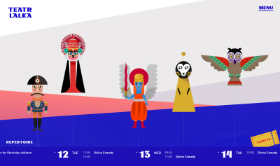
Teatr Lalka,
a puppet theater from Poland, with a creative, dynamic, and accessible
approach to highlighting the position in the carousel (see the second
image at the bottom). Each photo has a label, and it could potentially
contain a short description, too. The entire website uses the metaphor
of the puppet theater, with lovely transitions and animations.
Beautifully designed, from start to finish.
Carousels on Teatr Lalka include a dynamic layout and show the current position in the carousel with numbers. (Large preview)Nothing can beat the clarity of numbers. Point in case: 26may.ge. (Large preview)
26day.ge, a website dedicated to 100 years of Georgia’s first Democratic Republic, uses numbers and transitions
to swipe through the images in the little image gallery. The buttons
are located under the carousel, they are grouped, and there is a little
indicator of the position in the carousel, too. Admittedly, some
transitions are a little bit too heavy though, especially on the
frontpage.
26may.ge uses a carousel with grouped arrows and numbers indicating progress. It’s hard to misundertand it. (Large preview)
No visual representation of progress can beat the clarity of numbers.
If you do use a horizontal slider as an indicator of progress, consider
adding numbers to highlight how many items there are in total, and
where the user currently is. Deciphering ranges and filled bars are
tricky. For shorter carousels this might not be as necessary, but it
probably won’t hurt either.
This might sound a bit obvious, but it’s worth emphasizing: always include prev/next buttons to your carousels. Progress dots don’t necessarily indicate how exactly
a carousel is supposed to be used. They do assume that users will be
swiping left and right on mobile, yet not every implementation of the
carousel supports that — and it might be not obvious at all on desktop.
Plus, sometimes swiping is quite unpredictable, with users underestimating their swiping speed and jumping too far,
just to have to slowly swipe back to make sure they don’t skip anything
relevant. On desktop, navigation through prev/next buttons is much more
common and hence expected. Having a simple navigation pattern that that
helps users navigate through the carousel in single steps can be a big
help.
A classic on Arte.tv: a catalog of options with an arrow vertically centered on the edges of the carousel’s area. (Large preview)
But then there are so many questions that appear about fine little details that go into prev/next buttons. For example, by how many items should a carousel “jump”?
Should the user jump over all visible items that currently appear on
their screen, or should the carousel slowly move one by one, requiring
multiple taps to show new items? Or perhaps we should move by 2–3 items
instead to make jumps more predictable?
When users feel that the movements of the carousel happen too quickly, they seem to have a hard time understanding how far they have jumped through.
So they go back to verify that they didn’t miss anything relevant.
While the movements step-by-step are slower, usually they cause fewer
mistakes, and every now and again moving forward slowly is perfectly
acceptable.
The one that rules them all: the carousel on Netflix jumps users by the entire visible list. (Large preview)
However, if users tend to browse through many items (10+ items)
in a very lengthy carousel, jumping one by one is way too slow, and
jumping by a couple of items is confusing since the beginning and the
end of the list aren’t obvious with every jump. In that case, jumping by
the entire visible list is probably going to bring
better results. The final decision will ultimately lie with your studies
on how your users actually navigate the carousel, and how far they
browse in the list.
Another question that comes up in conversations a lot is the best position of prev/next-buttons. We want to minimize errors,
mistakes, and mishaps as far as possible, and usually, this means
increasing tap sizes and adding enough distance between interactive
elements. At the same time, we want to speed up navigation within the
carousel as far as possible, and this means minimizing the distance
between opposite actions: in our case, that’s moving forward and moving backward.
There is no shortage in available options. We could place the arrow above the carousel, center them vertically/horizontally
on the carousel’s slices, or display them under the carousel.
Additionally, we could group them and display them together, next to
each other, or space them out, and show them on the opposite sides of
the carousel.
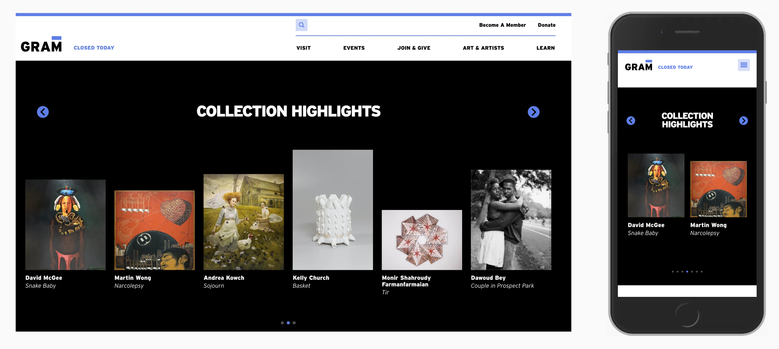
A comparison of the desktop and mobile versions of the Gram Museum website showing both buttons above the carousel. (Large preview)
Gram Museum displays prev/next buttons above the carousel
— both on mobile and on desktop. They are a little bit small, and could
probably be larger. The arrows are aligned to the edges of the
carousel, rather than being grouped together.
On Stripe Life at Jobs, the arrows are placed on the carousel slices, centered vertically.
In fact, that’s a very common decision, but depending on the audience
you have, it can cause trouble. When arrows sit straight on the carousel
slices, and because usually each slice is a link driving users to a
landing page, users accidentally miss the hit target and end up clicking
on the wrong page. This is critical when arrows don’t have enough
padding.
Galaxus
shows a very common pattern for eCommerce sites. Products are displayed
within the carousel, with prev/next buttons on both edges of the
carousel. Also note “Alle anzeigen” link in the right upper corner which
displays all products on a separate page.
The
distance customers have to travel to change direction isn’t short, and
requires re-calibration of fingers, mouse pointer or any other input
device. Example: Casper.com. (Large preview)
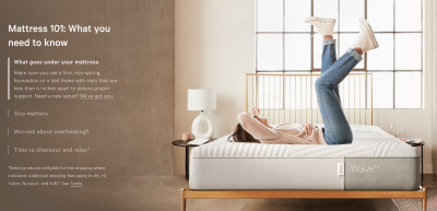
The design on Casper.com might appear exactly the same as in previous examples, but here the prev/next buttons are floating aside from clickable text and images,
making it harder for users to mis-tap. However, once customers need to
change the direction of the movement, they need to travel all the way
back to the other side of the carousel’s galaxy, and then back. That
distance travelled might be wasteful and unnecessary.
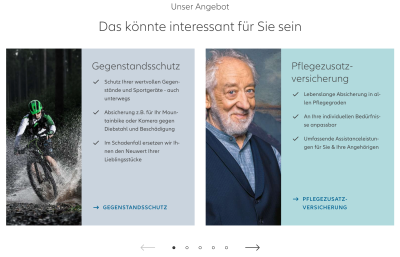
Allianz.de groups arrows on both sides of the progress dots under he carousel. (Large preview)
The distance that customers need to travel on Allianz.de is much shorter. Another common pattern is to display prev/next buttons next to the progress dots,
under the carousel. The only potential issue is that some users might
not understand that the visible sections are only a part of all
available options and scroll down too quickly.
Notice the grouping of prev/next buttons
in the last example. In fact, it seems to be a very good idea, as it
aids users in navigation back and forth quickly without having to
re-calibrate their mouse pointer or their fingers. Both options are
close to each other, so going back and forth is faster than traveling all the way to another side of the carousel, and then back. Also, the option eliminates mishaps or misclicks.
Arrows in use for testimonials on Ritual.com,
beautifully integrated into the design, with videos and text snippets
appearing as the user is sliding between the slices of the carousel. The
arrows are grouped, but since no progress dots are used, they are
positioned closer to the images. With this approach, it’s critical that
hit target areas for arrows are large enough to prevent mistakes.
With
62 CSS pixels in width and height, it’s more than generous for precise
input. Users can focus on a particular area, slightly detached from but connected to the the actual slides of the carousel, and click through precisely and predictably. A great example.
We don’t have to group the buttons horizontally though. On Overpass, the arrows live within the carousel, next to description and under the image. A vertical carousel could be an option, too.
Which one to choose? Test if grouping the buttons closely to each other will reduce mistakes
when a carousel is used. The further away the buttons are from each
other, the more time consuming and slow the carousel experience will
appear to be. The remaining question is whether the buttons should live
above the carousel, on it, or under the carousel. And this depends on
the device the customer is using.
There
is surely no universal solution, but in my experience, one ends up with
fewer usability issues by placing buttons above the carousel. On the
one hand, if the carousel lives all the way on the top of the page, we
definitely want the prev/next buttons to be noticed
early. If the buttons live under the carousel, they might not be noticed
in time or not noticed at all, especially if carousel slices are very
tall.
And if the buttons live right on the slides of the carousel, we end up with visibility issues of arrows
as they might accidentally match the background color of the slide, and
become invisible, or hard to decipher. Plus, users could accidentally
jump to the wrong pages by clicking in just the wrong spot. We can solve
all these issues with the buttons placed above the carousel.
A good reference example to keep in mind is Ritual.com
mentioned above. The buttons are large. They are grouped. The distance
needed to switch directions is minimal. The buttons also live above the
carousel on desktop, leaving enough space for description
to appear under individual images. Swipe gestures are also supported.
The buttons and every carousel’s slide are keyboard-accessible. It’s
just infinitely more difficult to make mistakes with this design.
What
do we do on mobile then? Well, on mobile, displaying prev/next buttons
above the carousel is problematic. Depending on the height of the
carousel’s slices and the position on the screen, every time a user
interacts with the buttons via touch, they might be covering the content of the carousel
with their fingers. Even the navigation heading in the same direction
might make it necessary to lift a finger every time they want to consume
content.
On the other hand, vertically center the buttons on the
carousel is also problematic because taps are very inaccurate on mobile.
Admittedly, as humans, we are much more precise in the center of the screen, but then we need large enough tap areas to avoid mistakes. And the larger tap areas are, the more space we will be taking away from our beloved carousels.
The only viable option left is to display prev/next-buttons under the carousel (on mobile). However, we need to be very cautious about the height of the carousel’s slices: they should never take up more 45–50% of the screen. This sounds like a magic number, but research shows that on mobile, we tend to interact with pages by reading and swiping and scrolling in the center of the screen.
If
a user scrolls down to explore the carousel, we should expect them to
spot the prev/next buttons because they will be in view. Plus, every
time a user interacts with the carousel, their fingers will be far away from the carousel, so we shouldn’t be expecting accidental clicks/taps. Problems solved.
In summary, as long as the prev/next buttons are clearly detached from the content
of the carousels and have a large tap area, they can be centered
vertically and live on the edges of the carousel. For faster navigation
forwards and backwards, we can place the buttons above the carousel on
desktop, and under the carousel on mobile. This is just the least likely
option to produce accidental mistakes.
Usually,
carousels are presenting content that users don’t have much control
about. One way to make the carousel slightly more relevant is by adding filters to the carousels, allowing users to choose what exactly they’d love to see.
Reuters.com combines filters and a carousel with arrows grouped in the right upper corner, above the carousel. (Large preview)
On Reuters.com,
cards, tabs and a carousel complement each other, with the prev/next
buttons to control the carousel placed in the upper right corner of the
section. A great way to encourage users to click through topics of interest
and explore available options — and also jump straight to the category
with the “See all World” button. On mobile, the arrows jump under the
carousel.
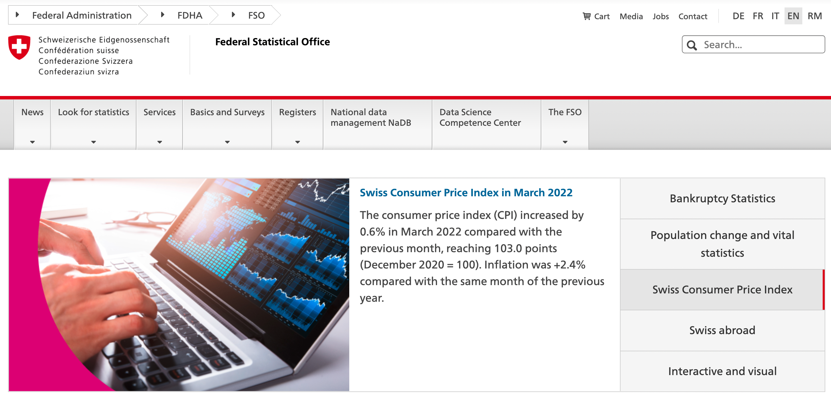
Federal Statistical Office in Switzerland
relies on tabs to change the slice of the carousel. Initially the
carousel auto-advances, but once a user has chosen one of the topics, it
stays still. The height of all slices is the same, so there are no
visual jumps, and no transitions from one side to another. A calm, respectful and functional solution.
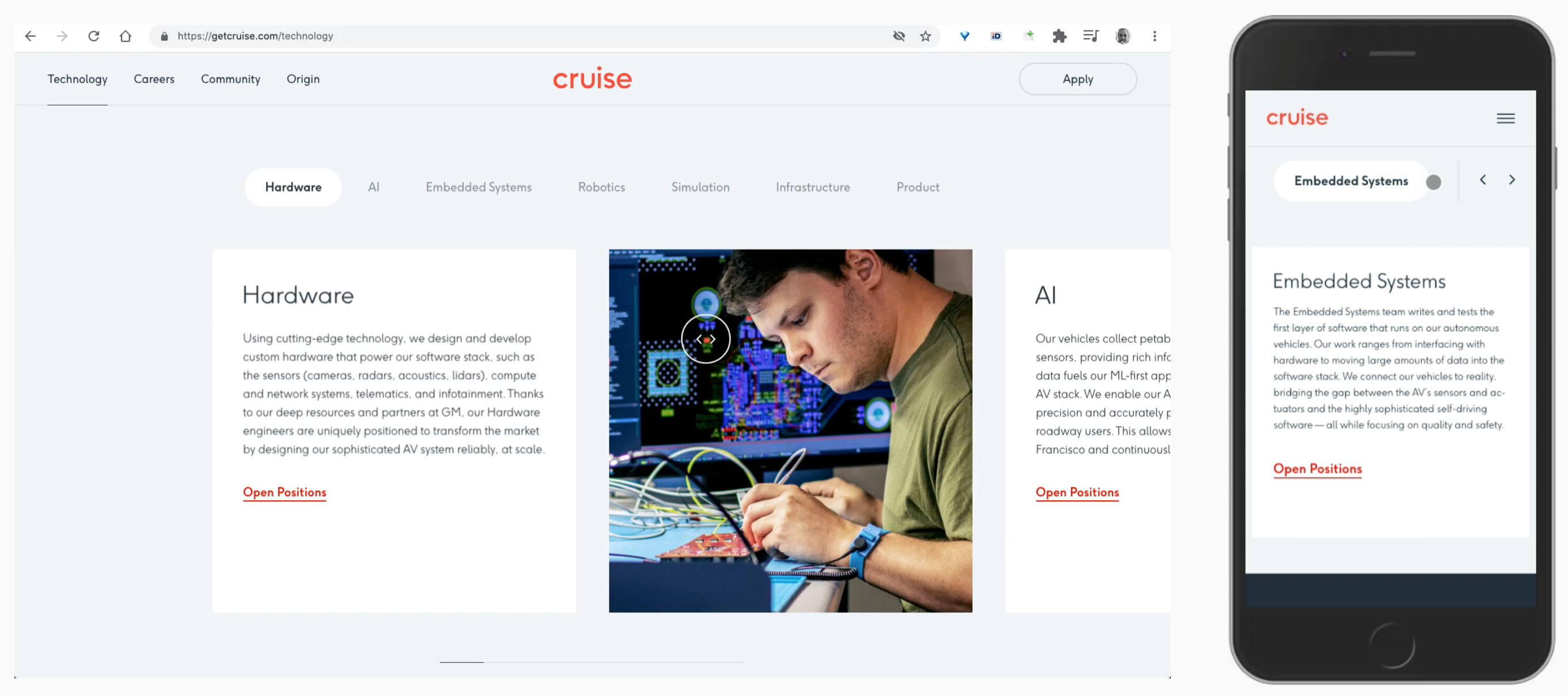
On GetCruise.com,
a tiny horizontal slider appears under the carousel, and the pointer
changes to a custom indicator. The latter highlights that the area is
draggable. In such a case, of course, the content area should be
scrollable with a keyboard alone as well. On mobile, two arrows appear above the carousel, allowing users to jump between topics. No progress dots or sliders are in sight. This could work, too.
Use Thumbnails Or Icons To Encourage Click-Throughs #
The
more relevant content we can display to encourage users to act on them,
the higher click-through rates we should be expecting. Rather than
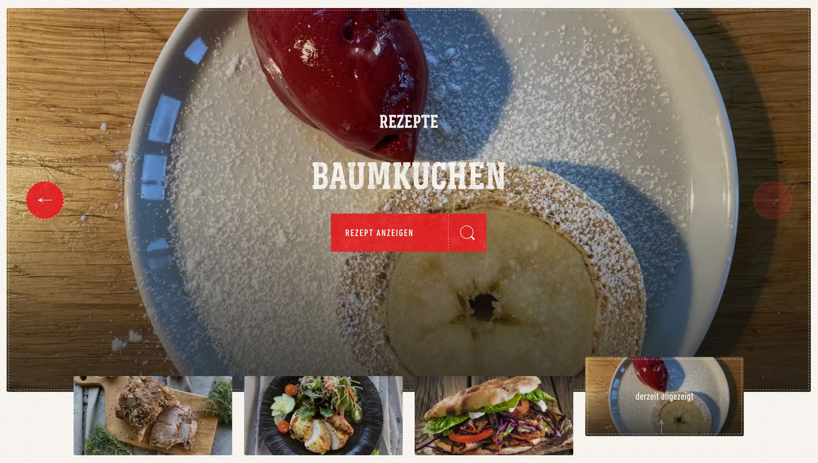
using labels, Weber Grill Original uses thumbnails to highlight their recipes. This is probably going to work better than lifeless dots.
Weber with thumbnails indicating slices of the carousel. (Large preview)
More of a tabbed navigation than a carousel: Philips.de.
Icons requires less space, but can be mysterious if not chosen
properly. Text labels could be a good compliment to the design, and
either way they need to be communicated to screen reader users.
Unfortunately, the carousel is auto-advancing, and there is no way to
pause or stop it — even when hovering or focusing on the individual
slices.
While
some implementations rely on progress indicators, others rely on
prev/next buttons and others rely on thumbnails, there are plenty of
implementations that heavily rely on a single mode of interaction: dragging. Surely users do understand how to drag items on the screen, yet making dragging accessible is nothing short of impossible.
LeadDev’s
carousel for related articles combines a horizontal slider with a green
pointer that indicates that the carousel can be dragged left and right.
(Large preview)
We definitely need to support swiping gestures on mobile, but this shouldn’t be the only method to navigate the carousel. On LeadDev,
related articles are highlighted with a horizontal bar and a large
green icon that indicate that a user can scroll left and right. Adding
arrows to jump left and right might help users be more precise in their
jumps.
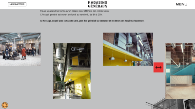
On Magasins Generaux, the only way to browse the gallery is by dragging. This is inaccessible for keyboard users and screen reader users. Large preview)
On Magasins Generaux,
the draggable icon is the only indicator that an image gallery is
draggable. Admittedly, this isn’t a carousel, but unfortunately, the
slides aren’t keyboard-accessible, and tabbing through
the content brings users from the last link in the article to the
footer. It should be possible to navigate to each image and announce its
alternative text.
One of the common issues in the carousel is the discoverability of slices
that are coming in late in the carousel. One way of ensuring that users
understand that they didn’t see everything just yet, is by adding some
sort of information sent to the last visible slides or upcoming slides.
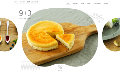
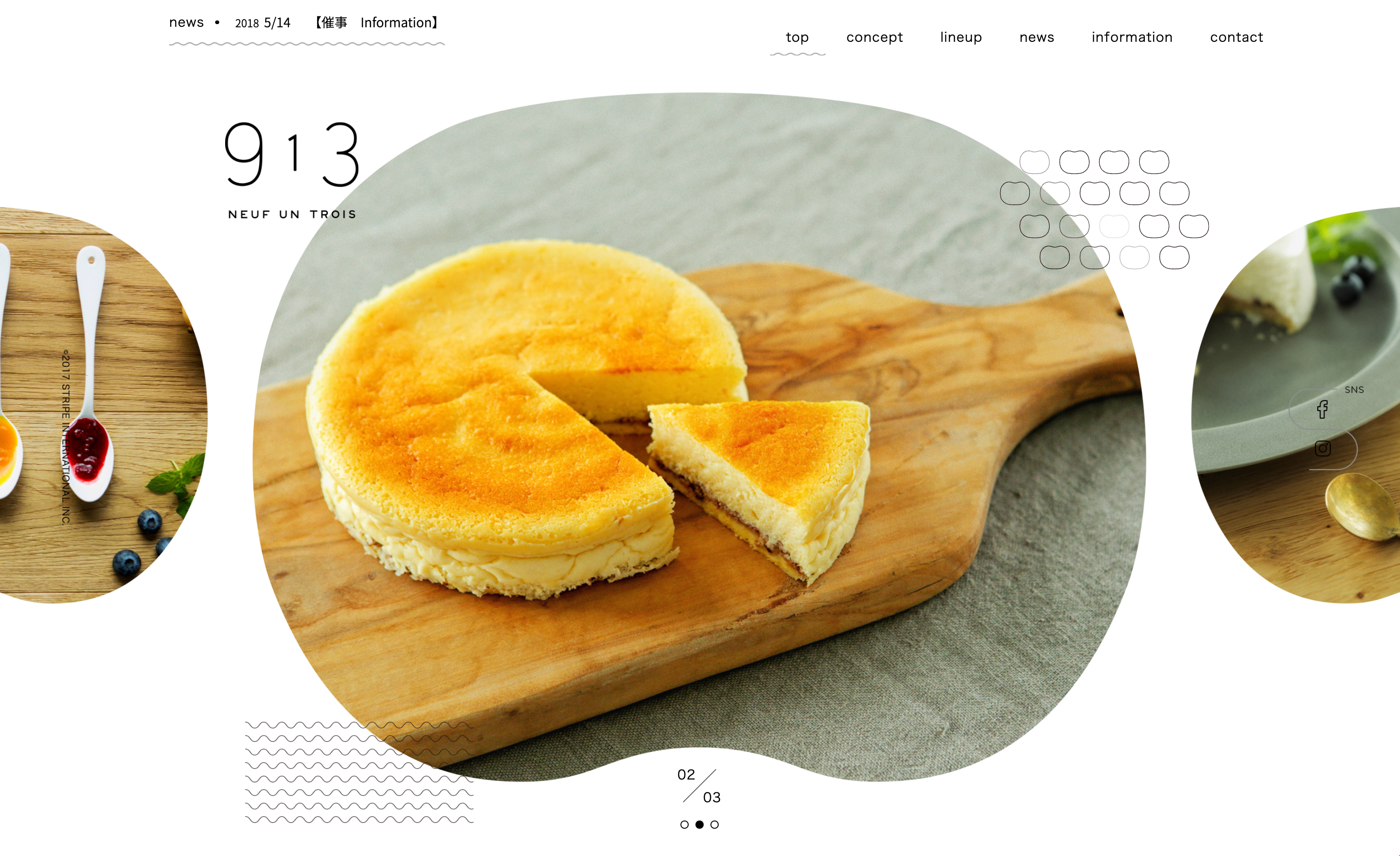
Neufuntrois.com
is a beautiful restaurant website with different shapes used as
carousel slices. Previous and next slides are cut off, making it very
obvious to users that this content can be discovered.
Scroll back to the previous section and compare the first example to the second. You might find a significant difference.
While the first example provides an information scent to the users, the
second does not. Some browsers don’t display scrollbars, and on some
screens, you might be hitting just the wrong resolution, so users won’t
get any clues that some useful content is currently hidden and is just
one swipe away.
On SRF, prev/next buttons are grouped and displayed on the right edge of the carousel, next to an upcoming slice which fades out. This makes it quite obvious that the user hasn’t seen all slides just yet, and can explore them if needed.
It’s a good idea to make sure that the last visible slide is either cropped or fades out, or use any other visual clue, also called information scent,
that there is something out there to be discovered. If we don’t use any
progress bar, nor indicate the overall number of slices, nor use any
prev/next-buttons, we shouldn’t be expecting users understanding how the
carousel works. If you want to avoid usability issues, sprinkle a bit of information scent on your carousel — your users might appreciate it.
Avoid Auto-Advancing, Or Add At Least 5–7s Delay #
Auto-advancing carousels temper with users’ patience and their priorities.
Just like we’ve learned to ignore advertising banners, we tend to
dismiss anything that’s blinking, moving or distracting us. This is true
especially on mobile devices where users often scroll past the carousel
too quickly to even notice that it’s actually auto-advancing. Any kind
of unexpected movement rarely brings more attention to the carousel, but
rather drives the attention away — both on mobile and on desktop.
However, if you absolutely need auto-advancing to draw and keep user’s interest, we could make it work as well — with a solid delay of 5–7s for each slide.
7h34.fr with an auto-advancing carousel and a decent delay of 5s. (Large preview)
7h34,
a lovely design agency website with a circular carousel, that flips
clockwise. Users can also scroll up and down to jump through the slices
of the carousel. The delay between auto-advancing is around 5s.
One way to improve it is to set the right expectations early on, so users get a sense about when the next slide of the carousel should be expected. Google Pixel Buds, for example, is auto-advancing and contains labels. The progress indicator is being filled gradually and slowly, with a 6s delay for each slide,
providing enough time to act on the current slide, scroll down or leave
the page altogether, without being interrupted along the way.
Timeless.ee
uses trolley buses’ names that get filled in as the carousel is
auto-advancing. The latter cycles through retro trolleybuses in Estonia
available for booking or hiring. Like in the previous example, the filling speed
indicates when the next slide should be expected. For some names, it
takes slightly longer to fill in the name, but it’s always beyond 5s.
Ferrari.com highlights a current position in the carousel and uses a little circular indicator. (Large preview)
Ferrari.com highlights a current position in the carousel and uses a little circular indicator to explain that the carousel will auto-advance when the time expires. Ferrari also uses a 7s delay. Unfortunately, here it’s impossible to pause auto-rotation.
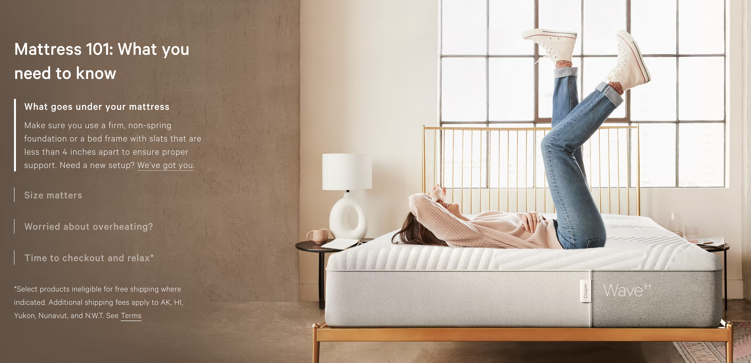
A slightly unusual auto-advancing experience on Casper.com,
with the left bar growing, and accordions collapsing and expanding. The
image doesn’t change as the text gets hidden and revealed. The delay
for this experience is also 7s.
“The
amount of text in a slide should largely determine the duration of a
slide’s visibility. If it’s just a short heading, 5 to 7 seconds proved
to be appropriate in our tests, whereas longer durations were needed for
more text-heavy slides. (Nielsen Norman Group recommends 1 second per 3 words
for auto-rotating slides.) One consequence of this is that you might
need to assign unique durations to individual slides, showing some
slides longer than others.”
Always Include A “Pause” Button For Auto-Advancing Carousels #
If
it’s absolutely critical to include an auto-advancing behavior for one
reason or another, consider what goals the carousel is trying to
achieve. Chances are high that a carousel won’t help you bring good
leads or effective clicks. If it’s absolutely necessary, however, please
make sure to include a “Pause” button as well, so users have an option to pause auto-rotation.
Walmart.com uses a carousel that auto-advances within a few seconds but it is unclear how many products are available or will be shown. (Large preview)
A great example of the implementation is Walmart.com (above). The carousel auto-advances slowly, but only if users don’t act on any of the images. Most importantly, there is a visible “Pause” button
both on mobile and desktop and there is a focus/active state on the
slider as well. Unfortunately, it’s a bit hard to say how many items are
available in the carousel. Numbers would probably help here.
It goes without saying that auto-rotation should stop entirely when a user interacts
with a slice of the carousel, be it by hovering, focusing, or tapping
through available options. Interrupting the exploration of selected
items is a safe way to drive users away from the carousel for good.
With
all of these considerations in mind, one might assume that carousels
are often the best solution. But that’s quite unlikely to be true.
Personally, I’m yet to see a carousel that slashes all expectations by
large and drives KPIs through the roof. In corporate environment where I
often find myself, nobody really trusts me. I always have to argue
about design decisions based on evidence coming from usability and
accessibility tests, and rely on business metrics to drive these
decisions.
Carousels rarely help in driving these metrics
— mostly because they hide relevant content and hence make it less
accessible. Cards, teasers, buttons, navigation all would probably work
better for navigation. However, when it comes to highlighting features
or products or offerings, rather than navigation options, they might
work as well. If you have a strong feeling that a carousel isn’t really working,
or is just the wrong component to use, run a test on a Saturday morning
when there might be less traffic, and build up a case highlighting that
another design might be driving higher KPIs.
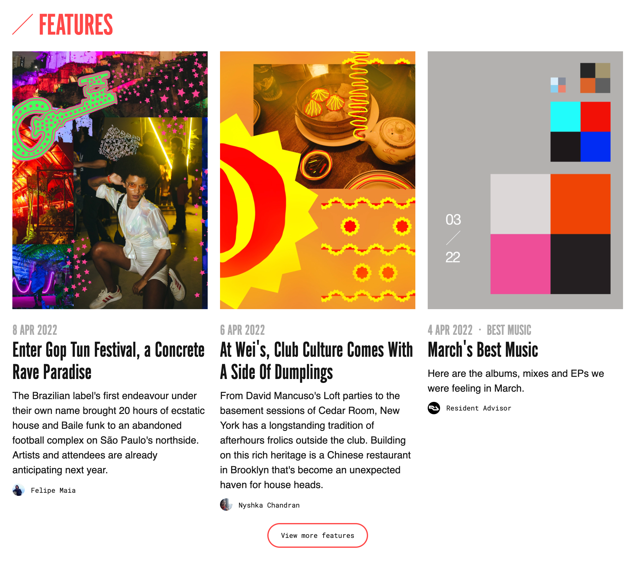
In fact, there is no shortage of alternatives to carousels, and often they are quite easy to implement. ResidentAdvisor
avoid carousels altogether, highlight three last features, and invites
users to explore more with a “View more features” button. The button
could be loading more items or moving users to a separate page. A
predictable and calm design that shows just enough text and visuals to
entice a user to dive in.
Instead of using a carousel, Australia Post
uses a dynamic layout to highlight all features together in the same
area. There are some carousels in use on the page as well, but hiding
features in the carousel would make them inaccessible to at least some
users who’d just quickly scroll past it.
168plymouth uses mini-carousels
for each feature that they want to highlight. There is no rotation, no
auto-advancing, and you can move only in a single direction — moving
backward might not be necessary with just 4 images that every panel
contains.
Deutsches Museum
uses the “load more” pattern to show more items if needed. This makes
the front page quite compact, without too many items appearing all over
the page at a given time.
All of it is to say that not every page needs a carousel,
and very often it might be a wrong and unnecessary pattern to use — so
be cautious when using it, and explore alternatives as a part of your
design process.
Carousels have many accessibility and usability issues, from discoverability to accessibility. In a way, very much like accordions, they provide a way to show and hide some pieces of content — either manually or automatically. And that’s not something that many other components have.
When designing your next carousel, think about whether it could be replaced with another design pattern that would be serving content discoverability
slightly better. If it’s out of the question, consider replacing
progress indicators with labels or thumbnails. Indicate the current
slice of the carousel. Include and group prev/next buttons and display
them above or below the carousel. Use numbers to explain where users are
and how far they can go. Resist auto-advancing as much as you can, and
if you can’t, add a delay of 7s and allow users to pause rotation.
If you are interested in similar insights around UX, take a look at Smart Interface Design Patterns, our shiny new 6h-video course
with 100s of practical examples from real-life projects. Plenty of
design patterns and guidelines on everything from accordions and
dropdowns to complex tables and intricate web forms — with 5 new
segments added every year. Just sayin’!Check a free preview.