Well-documented and readable source code is essential for every collaborative project. Logically structured, well organized and nicely formatted, the code can speed up the bug hunting and help to keep the code clean, minimal and still functional. These facts are particularly important if the code is being developed by a group of developers: in this context a common scheme for source code presentation is necessary. You don’t have to do everything by hand; in fact, there are many tools which can save a lot of time - for you and your co-workers.
Well-documented and readable source code is essential for every collaborative project. Logically structured, well organized and nicely formatted, the code can speed up the bug hunting and help to keep the code clean, minimal and still functional. These aspects are particularly important if the code is being developed by a group of developers: in this context a common scheme for source code presentation is necessary. You don’t have to do everything by hand; in fact, there are many tools which can save a lot of time - for you and your co-workers.
The tools and services we’ve collected below aren’t validators. They format and beautify the code; some of them can remove redundant elements. Using them, you have to make sure you have a backup, so your data can always be restored.
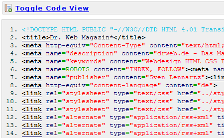
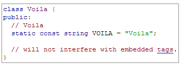
Quick Highlighter can format source codes written in over 85 languages - among them C++, PHP, Ruby, HTML, JavaScript, Perl, Python, Smarty, XML and more. The tool formats source code and highlights inbuilt keywords, data types etc.
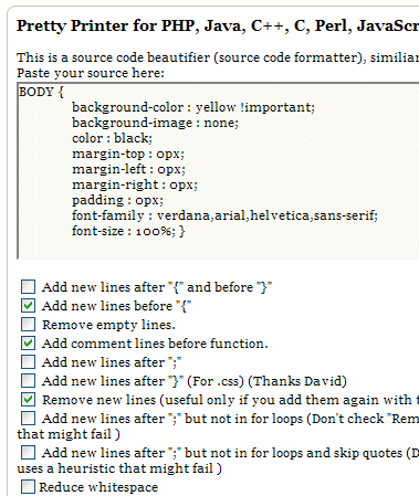
Knows PHP, Java, C++, C, Perl, JavaScript, CSS. The service offers many formatting options you can use to present the code just the way you’d like it to look like.
Ruby Beautifier accepts a command-line list of file names, creates a backup copy of each named file and beautifies the originals. If there is an indentation error (an imbalance of opening and closing keywords), the script will print an error message but will save the result anyway.
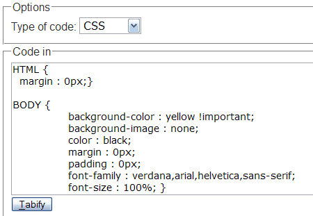
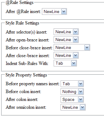
The tabifier is a tool to properly indent computer code. The style it produces is a mix of my personal preferences for indentation plus what I could manage to make a program produce from dirty source. The tabifier currently supports CSS, HTML, and C Style code; the latter being anything that uses curly braces to start and end blocks, and semicolons to terminate statements.
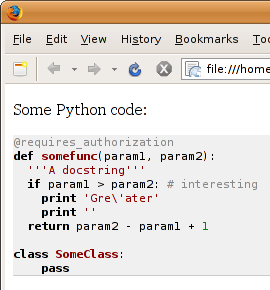
Highlight.js highlights syntax in code examples on blogs, forums and in fact on any web pages. It’s very easy to use because it works automatically: finds blocks of code, detects a language, highlights it. Also available as Wordpress-Plugin and Firefox-extension. Suported languages: Python, Ruby, Perl, PHP, HTML, CSS, Django, JavaScript, VBScript, Delphi, Java, C++, SQL. Similar tools is offered by Google: Googles Javascript Code Prettifier.
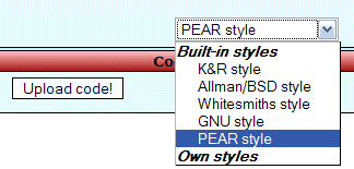
PHP formatter adds comments after control structures, colors the output, links to the php-manual by inline-functions, removes comments and removes empty lines. There are 5 pre-defined layouts, but you can also define your own styles.
Polystyle automatically reformats source code in your personal style. Polystyle learns your formatting style by examining examples of your code. It is another Windows-tool which supports Actionscript, ASP, C/C++, C#, CMAC, CSS, HTML, Java, Javascript, JSP, PHP, Pascal/Delphi, Perl, Python and Visual Basic. Price: 79$, can be used from the shell and Windows Explorer.
How
can we create products and experiences that don’t cause harm to the
planet and to the people who use them? What do we need to consider to
make more sustainable design decisions and reduce the carbon footprint
of our websites? In this post, we compiled valuable resources that will
get you familiar with the principles of sustainable design.
“Sustainable”
design is a paradigm that emphasizes the impact that design practices
and workflows have on the environment with the goal of reducing carbon emissions.
The design decisions we make are reflected in our planet’s climate,
from the energy consumption of the tools we use to how the products we
build interact with the environment and plenty of other things in
between. In this collection, we compiled resources to help you
understand the principles of sustainable design and how to integrate
them into the way we work and the things we make.
The EU Science Hub’s Sustainable Product Policy
estimates that over 80% of all product-related environmental impacts
are determined during the design phase. But how can design teams ensure
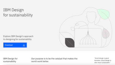
that sustainability is at the core of every design choice they make? To help their designers develop design habits about sustainability, IBM published “IBM Design for sustainability.”
At the heart of the framework is the idea that the user, community, and social value should outweigh any negative environmental and social impact
in the present and the future. To achieve this vision, experiences need
to be inclusive, easy to learn and use, and efficient for both users
and overall power consumption.
The sustainability checklist is part of the framework and it gives practical tips
for optimizing designs to meet these goals. It’s no rocket science, but
the checklist does offer useful considerations that will help improve
performance, speed, and responsiveness.
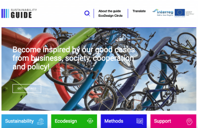
The Sustainability Guide from SVID is an overarching framework for sustainable design and development practices that contains sections wholly dedicated to methods and design principles that are centered around sustainable practices.
The Sustainability Guide from SVID gathers information, methods, and good examples of how to use design to achieve a sustainable business.
The design section illustrates the system-wide lifecycle of the design process, describing it as a circular system where everything in a product design is interconnected and linked by environmental criteria that is embedded at all stages.
The methods section is an archive of tools, resources, case studies, and expert advice that can be used to educate a team, as well as kickstart a team into sustainable environmental practices.
The crux of sustainable design strategies, according to Leyla Acaroglu,
is ensuring that the tools we use in a design workflow and how we use
them today do not have a negative impact on the planet in the future.
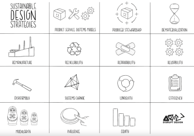
What Leyla does in this extensive Medium post is curate an ecodesign strategy set that covers core considerations for product design
that build sustainability into the process, from manufacturing and
recyclability to efficiency and modularity. By including these
considerations into the design lifecycle, it is possible to develop
products and services that reflect sustainable practices, such as a
product’s ability to dematerialize, how easily it can be recycled, how
long it lasts, whether it can be dissembled by customers, and to what
extent it can be repurposed for other uses.
Is
the admin experience as easy and intuitive as the front-end experience?
Is the message useful for your target audience? Could a Progressive Web
App be an efficient solution? A lot of questions need to be asked when
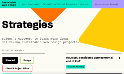
you want to deliver digital products and services that respect the principles of the Sustainable Web Manifesto. The site Sustainable Web Design helps you find the right sustainability strategy for your project.
Sustainable Web Design explores strategies for delivering sustainable web design projects.
The strategies are divided into different categories:
design, client and project ethos, content and marketing, development,
hosting, and business operations. In each category, you’ll find
questions worth considering and an explanation of why it matters. Links
to further reading resources let you dive deeper into each aspect. A
helpful guide that supports you on every step of the design process.
According to some estimates, the impact of the Internet and our gadgets on global greenhouse emissions
is similar to that of the airline industry. To speed up the transition
towards a green, fossil-free Internet, there’s a question we all can ask
ourselves: Are our websites hosted green?
The
Green Web Foundation built a checker to help you quickly find out if
your hosting provider is using green energy or compensating for its
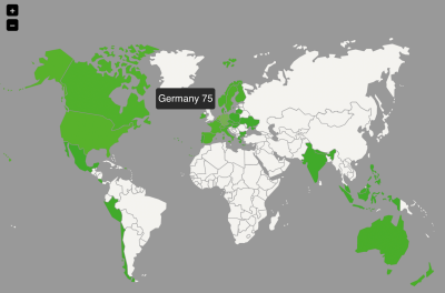
services. All you need to do is enter the URL. If you want to make the switch to a green hosting provider, the foundation also published a directory of 478 green hosting companies in 35 countries. A small step that makes a difference.
So,
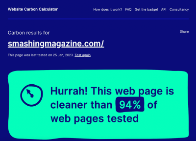
just how large is the carbon footprint of your website? The Internet
uses electricity, of course, but it also relies on data centers that
distribute information, and the energy to power each and every device
that receives that information. Even a small website has a carbon footprint.
The Sustainability Score Calculator
is one way to find out. Employing a methodology that takes
energy-consuming attributes into account, this free calculator estimates
the amount of carbon dioxide produced by a particular website. It looks
at the weight of images on a page, whether web fonts are integrated,
and any front-end frameworks in use, among other considerations, to
inform its calculations.
The
exact amount of carbon dioxide produced by a website can probably be
evaluated in a number of ways, and this specific calculator makes its
own assumptions. Regardless of the exact inputs used in the results, the
fact that the Sustainability Score Calculator can come up with a rough
estimate for a website’s carbon dioxide output on a per page view basis is a reasonable starting point for determining just how big of a footprint a site has on the environment.
The
organization developed the toolkit as a Miro board that is freely
available to clone into your own Miro account. Not a Miro user? You can
still reference the embedded board and zoom into it to view the four-step process
that walks you through concept to presentation, providing useful
considerations, best practices, and even templates you can use right
away.
In the last few years, customers have become more and more aware of how important environmental friendliness
and social responsibility are when making a purchase. But even with
increased awareness, businesses still play a key role in informing,
enabling, and encouraging sustainable behavior. In his post “7 behavioural UX approaches encouraging sustainable purchases,” Damien Lutz takes a closer look at how e-commerce businesses encourage sustainable purchases and what we can learn from them.
Damien Lutz reviews and summarizes seven behavioral UX approaches that encourage users to purchase planet-friendlier products.
From Zalando’s sustainability filters and Amazon’s Climate Pledge Friendly Hub to Qantas’ Green Tier membership and sustainable shopping assistants, Damien analyzes different strategies of nudging customers towards more sustainable decisions. Based on his observations from these real-life examples, he summarizes practical behavioral UX tips that help everyone create experiences that promote sustainability. Interesting insights are guaranteed.
Since 2019, UX/UI designer Sandy Dähnert shares her passion for a sustainable web on her site Green the Web. Last year, she started the Green the Web Podcast on all things sustainable design best practices, ecological and social user research, information architecture, user interface design, and more.
Whether it’s sustainability-infused user journey maps, UX/UI factors for a lightweight website, or approaches for greener checkout, in the podcast Sandy shares her deep love of sustainable UX and UI
design to encourage everyone to step into green design and play an
active role in shaping this new design philosophy. You can listen to the
podcast on Spotify or Apple Podcasts.
The Sustainable UX Playbook is a yet-to-be-released work in progress by the same folks who maintain the Sustainable UX Manifesto. The playbook is set to provide guidelines, best practices, and examples to help you and your team adopt an environmentally-centered design approach.
A promising resource to keep an eye on: the Sustainable UX Playbook, with tips for adopting an environmentally-centered design approach.
The exact date of when the Sustainable UX Playbook will be available is to be determined, but it will be published to SustainableUXPlaybook.com (which currently redirects to the Sustainable UX Manifesto) when it is ready.
The Sustainability Figma Kit
that Elisa Fabbian, Rachele Pedol, and Margherita Troilo created helps
digital designers move from human-centered design to a more sustainable
life-centered design approach. It consists of a learning guide, 23
action cards, and a flowchart.
The learning guide
introduces you to the broader context and importance of designing
products and services with a reduced environmental impact. The action
cards explore problems you might encounter in different phases of the
design process and how to solve them. Last but not least, the flowchart
helps you find out which sustainability actions can be applied to the
specific type of project you are working on by providing useful tips for
designing in a more conscious way.
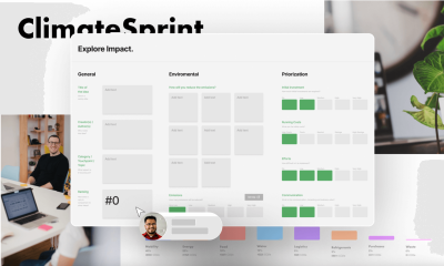
The process is mapped to traditional design thinking, helping you start work by aligning objectives and documenting assertions
before tying them into user needs. What makes this framework
particularly useful is that it helps prioritize the ideas generated by
the process by their environmental impact.
The entire framework is available as a collaborative FigJam board that can be cloned to your own Figma account.
One of the most difficult hurdles to adopting a sustainable design process is figuring out how to discuss the topic as a team.
Getting everyone on the same page about what it means to design
sustainably and how to establish a process for it are paramount for any
team.
That’s what makes the EcoCards Game Workshop Toolkit
such a valuable resource. The toolkit is a collection of three
card-based games designed to facilitate team discussion on sustainable
design practices. Each game is framed as a “workshop” meant to take
place at different stages in the design process, detailing the game rules with a series of steps using a plain deck of playing cards to move the discussion forward.
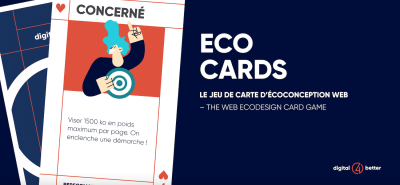
EcoCards is a card game to discover and apply eco-friendly design recommendations.
The
EcoCards are created as a FigJam board that can be cloned to your Figma
account. They are available in English and French translations.
OK,
so perhaps your team has adopted a sustainable design process that aims
to reduce carbon emissions. How do you know it’s working? That’s the
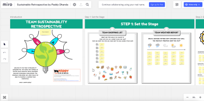
purpose of the Team Sustainability Retrospective, a Miro template produced by Paddy Dhanda.
The activities in Paddy Dhanda’s Team Sustainability Retrospective are perfect for teams wanting to identify and eliminate wasteful activities.
Rather
than high-fiving your team for implementing a sustainable system, this
set of templates will help you assess whether or not your efforts are
paying off in a streamlined five-step process. This
way, your team can re-group after the implementation of the design
process and properly measure its impact with data that form actionable
insights for improving the process even further.
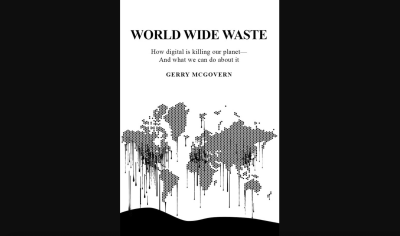
World Wide Waste
is a book by Gerry McGovern, aiming to debunk the perception that being
“digital” is akin to being “green.” It provides a healthy dose of
statistics about the impact of digital products and services and details
the crisis of energy consumption in the world.
World Wide Waste gives us a feel for digital and how it impacts global warming.
For
example, McGovern attempts to clear up the misunderstanding that cloud
technologies are somehow ethereal elements that are carbon-free, but
rather physical data centers that result in large quantifiable
emissions. If nothing else, this book will equip you with the
information you might need to help convince your team to adopt more sustainable practices with statistics and case studies to make the case.
If the World Wide Waste
book is all about defining and diagnosing unsustainable design
practices, then this offering from A Book Apart is aimed at curing those
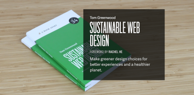
symptoms. Written by lead author of the “Sustainable Web Manifesto” Tom Greenwood, Sustainable Web Design is a collection of practical web design advice for everything from how to measure a website’s environmental impact and identifying low-carbon design practices to creating energy-efficient development processes and creating a hosting environment that helps reduce climate costs.
Tom Greenwood’s book Sustainable Web Design offers a practical path to more carbon-efficient websites that are better for the planet and our users.
Like all A Book Apart publications, Sustainable Web Design
is available in print and digital editions — just remember that the
digital copy is not a carbon-free option, as many of the resources in
this roundup have noted. Then again, the printed copy also has climate
considerations due to the costs of transporting the book to your front
door. Just buying the book is an excellent example of the conundrums of
sustainable design.
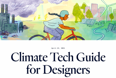
If you’re looking for help establishing yourself in a career in sustainable design, Enrique Allen and the Designer Fund team offer the Climate Tech Guide for Designers.
This
guide is less about teams adopting sustainable design standards than it
is a resource for helping you make a decision about where you work and
who you work for. How passionate is the company about climate? What
problems is the company trying to solve, and are the solutions based on
climate technology and considerations? These are the types of questions
that will allow you to find the right fit for your career.
What
makes this Climate Tech Guide for Designers especially useful is that
it goes beyond company considerations by offering advice for how to
position yourself for a career in climate technology, capping things off
with an extensive list of companies that demonstrate sustainable
practices.
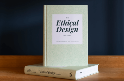
The Ethical Design Handbook
is a book we offer right here at Smashing Magazine. Written by authors
Trine Falbe, Martin Michael Frederiksen, and Kim Andersen, these
guidelines serve as a roadmap to learn about adopting and integrating ethical design practices into a business model.
Wait,
why are we talking about “ethical design” when we’ve been sharing
resources on “sustainable design”? Ethical and sustainable design work
hand-in-hand, as ethical design relies on sustainable digital business practices
in addition to a slew of larger concepts that determine an
organization’s ethical practices, from transparency in how data is
collected to how inclusiveness is built into a design. In other words,
ethical and sustainable design are united by a cause to prevent harm to
people. A sustainable design process supports a healthy environment
that, in turn, supports an ethical responsibility to care about the impact we have on the planet.
The Ethical Design Handbook is your companion for building honest interfaces and growing your business sustainably.
All in all, the Ethical Design Handbook is about leveraging ethical business practices as a market differentiator that can be used as a competitive advantage.
Sustainable design principles are part of that matrix, demonstrating
that sustainable practices can be aligned to — and even enhance —
business objectives.
Another
useful resource to help designers and developers live up to the
responsibility of causing no harm and ensure that the experiences they
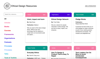
build are inclusive, honest, and safe are the Ethical Design Resources which Lexi Namer maintains in collaboration with the Ethical Design Network and Kate Every.
Ethical Design Resources curates articles, books, courses, frameworks, and much more to help you design ethical products.
On Ethical Design Resources, you’ll find articles, books, courses, frameworks,
tools, talks, videos, podcasts, and more covering different aspects of
ethical design. They help you assess the impact of your design
decisions, uncover harmful practices, and support you in making design
choices that respect your users.
There
you have it, a deep collection of toolkits, frameworks, and resources
you can use to learn about sustainable design practices and how to adopt
them into your own design process. Notice how the collection reveals
that sustainable design is a multifaceted topic that
considers everything from how we work to the specific tools we use to
work. It even covers product design as a whole and the decisions that
impact the sustainability of a product, not to mention how business
objectives influence environmental objectives.
There may not be a
single silver bullet or resource that immediately aligns you and your
work with sustainable design practices. That said, the resources
provided in this roundup can help you make big and small gains
alike, whether it’s reflected in something as seemingly small as the
hosting provider you decide to use for your website or something more
involved such as integrating environmental considerations at every stage
of the design process.
In
complex projects, you’ll sooner or later get to the point where you
start to think about setting up a design system. In this post, we
explore some interesting design systems and their features, as well as
useful resources for building a successful design system that works well
for you and your team.
Design systems ensure
alignment, reusability, and consistency across a project or brand. And
while we have gotten very good at breaking down UIs into reusable
components, a lot of design systems aren’t as useful and practical as
they could be, or they aren’t even used at all. So how can you make sure
that the work you and your team put into a design system really pays
off? How can you create a design system that everyone loves to use?
In this post, we’ll take a closer look at interesting design systems that have mastered the challenge and at resources
that help you do the same. We’ll explore how to deal with naming
conventions, how motion and accessibility fit into a design system, and
dive deep into case studies, Figma kits, and more. We hope that some of
these pointers will help you create a design system that works well for
you and your team.
Below
you’ll find quick jumps to real-world design systems and specific
design system topics. Scroll down for a general overview. Or skip the table of contents.
Bringing
together everything that’s required to manage a healthcare business
digitally, Nordhealth creates software that aims to redefine healthcare.
As such, their design system Nord is heavily focused on accessibility.
Nord is Nordhealth’s design system for products, with reusable components and tools, guided by clear standards.
Nord offers plenty of customization options, themes, and a fully-fledged CSS framework, plus dedicated guides to naming conventions and localization, for example. Unfortunately, the Nord Figma Toolkit isn’t open-sourced yet.
Gusto serves more than 200,000 businesses worldwide, automating payroll, employee benefits, and HR. To enable their team to develop cohesive and accessible experiences for Gusto’s platform, the Workbench
design system encompasses Gusto’s design philosophy, design tokens,
creative assets, React components, and utilities — and documentation to
tie it all together.
The Workbench
design system contains documentation, tools, and standards for building
beautiful, cohesive, and accessible experiences for Gusto’s platform.
What
really stands out in the Workbench system are the comprehensive live
examples that explain exactly how components should be used in different
contexts. Do’s and don’ts, visual explanations, and implementation
details ensure that both designers and developers working with Workbench
can use the design system effectively. For even more convenience, there’s also a Gusto Workbench VS Code Extension with common snippets for UI components.
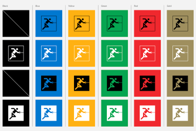
Olympic Brand: Branding And Multi-Lingual Design #
The
Olympic Games are probably one of the most widely recognized brands in
the world. Since the birth of the modern Games more than 125 years ago,
hundreds of people have grown and enhanced the Olympic brand. To increase consistency, efficiency and impact
across all that they do, the IOC hired a Canadian agency to create a
comprehensive design system that conveys the timeless values of the
Olympic Games and propels the brand into the future.
The Olympic design system
is focused on branding and identity design, but also provides examples
of illustrations and graphic elements. It shows how to manage
multi-lingual challenges and how to use typography, with plenty of good
and not-so-good examples and guidance notes along the way.
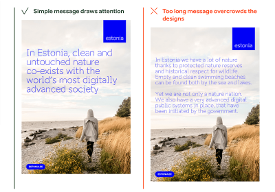
Pure and contrasting nature, digital society, and smart, independent-minded people are the core values behind the brand Estonia. The Brand Estonia design system maps the country’s strengths and shows how to express them through writing, designs, presentations, and videos.
Brand Estonia maps the strengths of Estonia and how to express them.
Stories,
core messages, facts, and plenty of examples and templates provide a
solid foundation for creating texts and designs across the brand — be it
on the web, in social media, or print. A special highlight of Estonia’s
design system lies on authentic photos and custom design attributes such as wordmarks and boulders to underline the message.
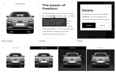
Audi UIs range from websites to applications for a particular service. The Audi design system
provides a joint set of components, modules, and animations to create a
well-balanced, system-wide user experience — from the app to the
vehicle.
From the website to the car’s UI — the Audi design system helps cater for a well-balanced user experience across the brand.
Along with brand appearance guidelines and UI components, a handy feature of the design system is its comprehensive set of visual examples
of how a component should (and shouldn’t) be used in Audi’s interfaces.
There is also a Audi UI Kit for Figma and a Sketch UI library that
ensure that designers use the most up-to-date components and icons in
their products.
Deutsche Bahn: Content Guidelines And UX Writing #
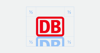
Deutsche Bahn, the national railway company of Germany, is one of the most recognized brands in Germany. With the help of their DB Digital Product Platform, the company enables developers, designers, and copywriters to build flexible digital experiences with an emphasis on mobility.
The
design system features content guidelines, accessibility
considerations, code examples, components, and contextual examples of
how to use them. It also provides guidelines around UX writing and helpful visual guides to accessibility and logo. Everything is open source on GitHub and NPM.
Data
is pretty much useless if we can’t make sense of it. Luckily, data
visualization helps us tell the full story. But how to include data
visualization in a design system? Here are some examples.
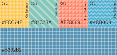
The If Design System includes a comprehensive data visualization style guide with plenty of examples and a focus on color.
Shopify’s design system Polaris
maps out guidelines for how to approach data visualization and defines
five core traits for successful data visualizations. Do’s and don’ts for
different data visualizations deliver practical examples. Culture Amp features helpful further reading resources for each type of data visualization they define in their design system. The If Design System shines a light on color in data visualizations, and the Carbon Design System comes with demos and ready-to-use code snippets for React, Angular, Vue, and Vanilla.
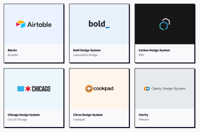
Atlassian, Uber, Shopify, Slack — these are just a few of the design systems you’ll find on Design Systems For Figma. Curated by Josh Cusick, the site is a growing repository of freely available Figma kits of design systems — grouped, organized, and searchable.
Not featured in the collection, but worth looking into as well, is the GOV.UK design system Figma kit. It focuses specifically on complex user journeys and web forms. Lots of valuable insights and inspiration are guaranteed.
Let’s
face it, naming things can be hard. Particularly in a design system,
where you need to find names for your components, styles, and states
that can be easily understood by everyone who works with it. But how to best tackle the task? Ardena Gonzalez Flahavin explores not only why we should care about naming in our design systems but also what we should keep in mind when doing so.
Shayna Hodkin also summarized best practices for solid naming conventions for the different categories in a design system — from colors and text styles to layer styles and components.
Another great read on the topic comes from Jules Mahe. To help you find the right balance between clarity, searchability, and consistency, Jules summarized tips for naming your design files,
understanding what you need to name in a design system, and structuring
it. Three useful resources for futureproofing your design system.
When
building a design system, it’s a good idea to include guidelines and
documentation for accessibility right from the beginning. By doing so,
you reduce the need for repeat accessibility work and give your team more time to focus
on new things instead of spending it on recreating and testing
accessible color palettes or visible focus states again and again. In
her article on accessible design systems, Henny Swan explores what an accessible design system needs to include and how to maintain it.
AdHoc’s Accessibility Beyond Compliance Playbook is for government agencies and other civic organizations looking to mature their practical understanding of accessibility.
To
shift the understanding of accessibility from one of basic compliance
to a truly inclusive, human-centered experience, the team at AdHoc
released their Accessibility Beyond Compliance Playbook.
It explores several ways to improve accessibility — from the immediate
task of building accessible products to creating teams of people that
underscore an Accessibility Beyond Compliance mindset.
Another handy resource to help you incorporate accessibility efforts comes from IBM. Their open-source Carbon Design System
is based on WCAG AA, Section 508, and European standards to ensure a
better user experience for everyone. It gives valuable insights into how
users with vision, hearing, cognitive, and physical impairments
experience an interface and what designers should think about to ensure
their design patterns are operable and understandable.
For more practical tips, be sure to check out the IBM Accessibility Requirements
checklist on which Carbon is based. It features detailed tips to make
different components and design patterns comply with accessibility
standards. A way forward to empowering your diverse user base.
When
it comes to visual elements like icons and illustrations, many
companies have difficulties finding the right balance between being
on-brand, useful, and scalable. The team behind Design Systems For Figma also faced this challenge and came up with a recipe for creating and scaling a system of visuals. Elena Searcy summarized how this system works.
Visuals add a touch of delight to a product, but they should also be functional. Elena Searcy helps us find the right balance.
In
her blog post, Elena starts with the smallest visual element, an icon,
explaining what her team aims for when choosing and creating icons to
make them align with the brand and provide real value
for the user. Elena also shares insights into how they handle
illustrations, including a scalable way of creating them and
considerations regarding anatomy, style, and color. A great example of
how a set of established rules can help make visuals more meaningful.
Motion
in design is powerful. It can help to reduce cognitive load, guide
users through pages and actions, provide user feedback, improve the
discoverability of features, and improve perceived response time. To make full use of motion, the design team at Salesforce created an end-to-end motion language for their products: the Salesforce Kinetics System.
As
Pavithra Ramamurthy, Senior Product Designer at Salesforce, explains,
the intention behind the Salesforce Kinetics System is to enable the
evolution and scaling of kinetic patterns across products, with design
system components that are pre-baked with motion right out-of-the-box.
But how do you scale these motion patterns from design system to product? How would teams actually use the artifacts in their daily workflows? Pavithra wrote a case study that takes a closer look to demonstrate the possibilities. Interesting insights guaranteed.
Introducing
an enterprise design system is a lot of work. But it is work that will
pay off. Especially with large teams, multiple platforms, and numerous
user interfaces to manage, having a single source of truth helps maintain a consistent user experience. So what do you need to consider when building your own? Adam Fard takes a closer look.
As
Adam explains, an enterprise design system is a system of best
practices, reusable design elements, processes, usage guidelines, and
patterns that help reinforce the brand, improve the UX design process,
and optimize the user experience. He compares it to a box of Lego: the
building blocks are the collection of code and design components, the
building instructions that you’ll usually find inside the box correspond
to a collection of guidelines, processes, and best
practices that ensure that co-designing and cross-collaboration are
seamless. If your enterprise traverses numerous sites or apps, Adam’s
writeup is a great opportunity to get familiar with the concept of
enterprise design systems.
When
you’ve built a design system or are just about to start working on one,
metrics might not be the thing you’re concerned about at first sight.
However, measuring your design system is more important than you might
think. In his article “How to measure your design system?”, Jules Mahe dives deeper into why it’s worth the effort.
Jules
explains how to define the KPIs for your design system and how to get
quantitative data measurements to learn more about a design system’s
efficiency. Qualitative data conducted with the help of surveys and
interviews make the narrative more compelling. Of course, Jules also
takes a closer look at how to use the data. As he
concludes, measuring a design system is challenging and requires time,
but it will be a goldmine and one of the essential levers for your
design system’s growth and sustainability.
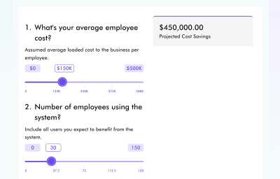
Your boss is hesitant that the work you’ll put into a design system will eventually pay off? The Design System ROI Calculator might be just what you need to convince them that the time and money invested in a design system is a good investment.
How much money could be saved with a design system? The Design System ROI Calculator calculates cost savings for you.
The
ROI calculator helps you understand and project cost savings when
implementing a design system. It calculates total employee savings from
implementing a design system, as well as time saving and efficiency gain
by component or UI element. To estimate total savings, you can select
between different scenarios based on team size and product calculation.
Having
robust components and patterns that can be reused in different
situations is the essential idea behind every design system and often
seems like the magical wand everyone has waited for to solve challenges and improve collaboration.
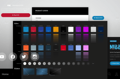
Henry Escoto, UX & Design at FOX Corporation, offers a perspective
on design systems that is a bit different. He claims that it’s actually
the practice which can truly make a difference.
In his case study “Our Design System Journeys”,
Henry shares in-depth insights into FOX Tech Design’s design systems
Delta and Arches to find answers to the following questions: How will a
design system truly help your product design? What does it take to build and execute a design system
within an organization? How to inject the practice into existing
workflows? And last but not least, what is the pay off of such an
investment?
When
you’re starting to work on a design system, you do it with the intent
to build something that lasts, a system that teams love to use and that
saves them precious time in their daily work. However, many attempts to
build a design system end up in great libraries that don’t get used as
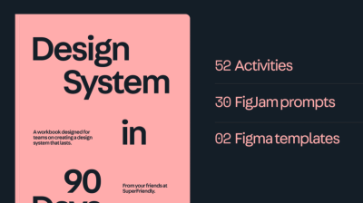
much as you had hoped. But how do you create a design system that becomes an established part of your organization’s workflow? SuperFriendly published a practical workbook in which they take you and your team from zero to a design system that lasts — in 90 days.
Written
for cross-disciplinary teams of design, engineering, and product, the
workbook consists of a 130-page PDF and FigJam prompts and Figma
templates you’ll use to complete activities. No theory, only clear instructions
on what to do and how to do it over a 90-day timeframe. At $349, the
workbook isn’t cheap, but considering that it can save you about 6–9
months of figuring out what work to do, the investment is definitely
worth considering.
Have
you come across a design system you found helpful? Or a resource or
case study that eased your work and that you’d like to share with
others? We’d love to hear about it in the comments below.
In
complex projects, you’ll sooner or later get to the point where you
start to think about setting up a design system. In this post, we
explore some interesting design systems and their features, as well as
useful resources for building a successful design system that works well
for you and your team.
Design systems ensure
alignment, reusability, and consistency across a project or brand. And
while we have gotten very good at breaking down UIs into reusable
components, a lot of design systems aren’t as useful and practical as
they could be, or they aren’t even used at all. So how can you make sure
that the work you and your team put into a design system really pays
off? How can you create a design system that everyone loves to use?
In this post, we’ll take a closer look at interesting design systems that have mastered the challenge and at resources
that help you do the same. We’ll explore how to deal with naming
conventions, how motion and accessibility fit into a design system, and
dive deep into case studies, Figma kits, and more. We hope that some of
these pointers will help you create a design system that works well for
you and your team.
Bringing
together everything that’s required to manage a healthcare business
digitally, Nordhealth creates software that aims to redefine healthcare.
As such, their design system Nord is heavily focused on accessibility.
Nord is Nordhealth’s design system for products, with reusable components and tools, guided by clear standards.
Nord offers plenty of customization options, themes, and a fully-fledged CSS framework, plus dedicated guides to naming conventions and localization, for example. Unfortunately, the Nord Figma Toolkit isn’t open-sourced yet.
Gusto serves more than 200,000 businesses worldwide, automating payroll, employee benefits, and HR. To enable their team to develop cohesive and accessible experiences for Gusto’s platform, the Workbench
design system encompasses Gusto’s design philosophy, design tokens,
creative assets, React components, and utilities — and documentation to
tie it all together.
The Workbench
design system contains documentation, tools, and standards for building
beautiful, cohesive, and accessible experiences for Gusto’s platform.
What
really stands out in the Workbench system are the comprehensive live
examples that explain exactly how components should be used in different
contexts. Do’s and don’ts, visual explanations, and implementation
details ensure that both designers and developers working with Workbench
can use the design system effectively. For even more convenience, there’s also a Gusto Workbench VS Code Extension with common snippets for UI components.
Olympic Brand: Branding And Multi-Lingual Design #
The
Olympic Games are probably one of the most widely recognized brands in
the world. Since the birth of the modern Games more than 125 years ago,
hundreds of people have grown and enhanced the Olympic brand. To increase consistency, efficiency and impact
across all that they do, the IOC hired a Canadian agency to create a
comprehensive design system that conveys the timeless values of the
Olympic Games and propels the brand into the future.
The Olympic design system
is focused on branding and identity design, but also provides examples
of illustrations and graphic elements. It shows how to manage
multi-lingual challenges and how to use typography, with plenty of good
and not-so-good examples and guidance notes along the way.
Pure and contrasting nature, digital society, and smart, independent-minded people are the core values behind the brand Estonia. The Brand Estonia design system maps the country’s strengths and shows how to express them through writing, designs, presentations, and videos.
Brand Estonia maps the strengths of Estonia and how to express them.
Stories,
core messages, facts, and plenty of examples and templates provide a
solid foundation for creating texts and designs across the brand — be it
on the web, in social media, or print. A special highlight of Estonia’s
design system lies on authentic photos and custom design attributes such as wordmarks and boulders to underline the message.
Audi UIs range from websites to applications for a particular service. The Audi design system
provides a joint set of components, modules, and animations to create a
well-balanced, system-wide user experience — from the app to the
vehicle.
From the website to the car’s UI — the Audi design system helps cater for a well-balanced user experience across the brand.
Along with brand appearance guidelines and UI components, a handy feature of the design system is its comprehensive set of visual examples
of how a component should (and shouldn’t) be used in Audi’s interfaces.
There is also a Audi UI Kit for Figma and a Sketch UI library that
ensure that designers use the most up-to-date components and icons in
their products.
Deutsche Bahn: Content Guidelines And UX Writing #
Deutsche Bahn, the national railway company of Germany, is one of the most recognized brands in Germany. With the help of their DB Digital Product Platform, the company enables developers, designers, and copywriters to build flexible digital experiences with an emphasis on mobility.
The
design system features content guidelines, accessibility
considerations, code examples, components, and contextual examples of
how to use them. It also provides guidelines around UX writing and helpful visual guides to accessibility and logo. Everything is open source on GitHub and NPM.
Data
is pretty much useless if we can’t make sense of it. Luckily, data
visualization helps us tell the full story. But how to include data
visualization in a design system? Here are some examples.
The If Design System includes a comprehensive data visualization style guide with plenty of examples and a focus on color.
Shopify’s design system Polaris
maps out guidelines for how to approach data visualization and defines
five core traits for successful data visualizations. Do’s and don’ts for
different data visualizations deliver practical examples. Culture Amp features helpful further reading resources for each type of data visualization they define in their design system. The If Design System shines a light on color in data visualizations, and the Carbon Design System comes with demos and ready-to-use code snippets for React, Angular, Vue, and Vanilla.
Atlassian, Uber, Shopify, Slack — these are just a few of the design systems you’ll find on Design Systems For Figma. Curated by Josh Cusick, the site is a growing repository of freely available Figma kits of design systems — grouped, organized, and searchable.
Not featured in the collection, but worth looking into as well, is the GOV.UK design system Figma kit. It focuses specifically on complex user journeys and web forms. Lots of valuable insights and inspiration are guaranteed.
Let’s
face it, naming things can be hard. Particularly in a design system,
where you need to find names for your components, styles, and states
that can be easily understood by everyone who works with it. But how to best tackle the task? Ardena Gonzalez Flahavin explores not only why we should care about naming in our design systems but also what we should keep in mind when doing so.
Shayna Hodkin also summarized best practices for solid naming conventions for the different categories in a design system — from colors and text styles to layer styles and components.
Another great read on the topic comes from Jules Mahe. To help you find the right balance between clarity, searchability, and consistency, Jules summarized tips for naming your design files,
understanding what you need to name in a design system, and structuring
it. Three useful resources for futureproofing your design system.
When
building a design system, it’s a good idea to include guidelines and
documentation for accessibility right from the beginning. By doing so,
you reduce the need for repeat accessibility work and give your team more time to focus
on new things instead of spending it on recreating and testing
accessible color palettes or visible focus states again and again. In
her article on accessible design systems, Henny Swan explores what an accessible design system needs to include and how to maintain it.
AdHoc’s Accessibility Beyond Compliance Playbook is for government agencies and other civic organizations looking to mature their practical understanding of accessibility.
To
shift the understanding of accessibility from one of basic compliance
to a truly inclusive, human-centered experience, the team at AdHoc
released their Accessibility Beyond Compliance Playbook.
It explores several ways to improve accessibility — from the immediate
task of building accessible products to creating teams of people that
underscore an Accessibility Beyond Compliance mindset.
Another handy resource to help you incorporate accessibility efforts comes from IBM. Their open-source Carbon Design System
is based on WCAG AA, Section 508, and European standards to ensure a
better user experience for everyone. It gives valuable insights into how
users with vision, hearing, cognitive, and physical impairments
experience an interface and what designers should think about to ensure
their design patterns are operable and understandable.
For more practical tips, be sure to check out the IBM Accessibility Requirements
checklist on which Carbon is based. It features detailed tips to make
different components and design patterns comply with accessibility
standards. A way forward to empowering your diverse user base.
When
it comes to visual elements like icons and illustrations, many
companies have difficulties finding the right balance between being
on-brand, useful, and scalable. The team behind Design Systems For Figma also faced this challenge and came up with a recipe for creating and scaling a system of visuals. Elena Searcy summarized how this system works.
Visuals add a touch of delight to a product, but they should also be functional. Elena Searcy helps us find the right balance.
In
her blog post, Elena starts with the smallest visual element, an icon,
explaining what her team aims for when choosing and creating icons to
make them align with the brand and provide real value
for the user. Elena also shares insights into how they handle
illustrations, including a scalable way of creating them and
considerations regarding anatomy, style, and color. A great example of
how a set of established rules can help make visuals more meaningful.
Motion
in design is powerful. It can help to reduce cognitive load, guide
users through pages and actions, provide user feedback, improve the
discoverability of features, and improve perceived response time. To make full use of motion, the design team at Salesforce created an end-to-end motion language for their products: the Salesforce Kinetics System.
As
Pavithra Ramamurthy, Senior Product Designer at Salesforce, explains,
the intention behind the Salesforce Kinetics System is to enable the
evolution and scaling of kinetic patterns across products, with design
system components that are pre-baked with motion right out-of-the-box.
But how do you scale these motion patterns from design system to product? How would teams actually use the artifacts in their daily workflows? Pavithra wrote a case study that takes a closer look to demonstrate the possibilities. Interesting insights guaranteed.
Introducing
an enterprise design system is a lot of work. But it is work that will
pay off. Especially with large teams, multiple platforms, and numerous
user interfaces to manage, having a single source of truth helps maintain a consistent user experience. So what do you need to consider when building your own? Adam Fard takes a closer look.
As
Adam explains, an enterprise design system is a system of best
practices, reusable design elements, processes, usage guidelines, and
patterns that help reinforce the brand, improve the UX design process,
and optimize the user experience. He compares it to a box of Lego: the
building blocks are the collection of code and design components, the
building instructions that you’ll usually find inside the box correspond
to a collection of guidelines, processes, and best
practices that ensure that co-designing and cross-collaboration are
seamless. If your enterprise traverses numerous sites or apps, Adam’s
writeup is a great opportunity to get familiar with the concept of
enterprise design systems.
When
you’ve built a design system or are just about to start working on one,
metrics might not be the thing you’re concerned about at first sight.
However, measuring your design system is more important than you might
think. In his article “How to measure your design system?”, Jules Mahe dives deeper into why it’s worth the effort.
Jules
explains how to define the KPIs for your design system and how to get
quantitative data measurements to learn more about a design system’s
efficiency. Qualitative data conducted with the help of surveys and
interviews make the narrative more compelling. Of course, Jules also
takes a closer look at how to use the data. As he
concludes, measuring a design system is challenging and requires time,
but it will be a goldmine and one of the essential levers for your
design system’s growth and sustainability.
Your boss is hesitant that the work you’ll put into a design system will eventually pay off? The Design System ROI Calculator might be just what you need to convince them that the time and money invested in a design system is a good investment.
How much money could be saved with a design system? The Design System ROI Calculator calculates cost savings for you.
The
ROI calculator helps you understand and project cost savings when
implementing a design system. It calculates total employee savings from
implementing a design system, as well as time saving and efficiency gain
by component or UI element. To estimate total savings, you can select
between different scenarios based on team size and product calculation.
Having
robust components and patterns that can be reused in different
situations is the essential idea behind every design system and often
seems like the magical wand everyone has waited for to solve challenges and improve collaboration.
Henry Escoto, UX & Design at FOX Corporation, offers a perspective
on design systems that is a bit different. He claims that it’s actually
the practice which can truly make a difference.
In his case study “Our Design System Journeys”,
Henry shares in-depth insights into FOX Tech Design’s design systems
Delta and Arches to find answers to the following questions: How will a
design system truly help your product design? What does it take to build and execute a design system
within an organization? How to inject the practice into existing
workflows? And last but not least, what is the pay off of such an
investment?
When
you’re starting to work on a design system, you do it with the intent
to build something that lasts, a system that teams love to use and that
saves them precious time in their daily work. However, many attempts to
build a design system end up in great libraries that don’t get used as
much as you had hoped. But how do you create a design system that becomes an established part of your organization’s workflow? SuperFriendly published a practical workbook in which they take you and your team from zero to a design system that lasts — in 90 days.
Written
for cross-disciplinary teams of design, engineering, and product, the
workbook consists of a 130-page PDF and FigJam prompts and Figma
templates you’ll use to complete activities. No theory, only clear instructions
on what to do and how to do it over a 90-day timeframe. At $349, the
workbook isn’t cheap, but considering that it can save you about 6–9
months of figuring out what work to do, the investment is definitely
worth considering.
Have
you come across a design system you found helpful? Or a resource or
case study that eased your work and that you’d like to share with
others? We’d love to hear about it in the comments below.