Hire a web Developer and Designer to upgrade and boost your online presence with cutting edge Technologies

Friday, March 31, 2023

A Guide To Accessible Form Validation

 Each time we build a field validation from scratch, accessibility doesn’t come out of the box. In this guide, Sandrina breaks down what we need to take into consideration, so that nobody gets stuck on an inaccessible invalid field.

When it comes to form validation, we can explore it from two perspectives: usability and accessibility. “What’s the difference between usability and accessibility?” you may ask. Let’s start from there.

Usability #

Usability is about improving a given action until it’s as easy and delightful as possible. For example, making the process of fixing an invalid field easier or writing better descriptions so the user can fill the field without facing an error message.

To get a really good grasp of the challenges in this process, I highly recommend you to read the deep-dive “Designing better inline validations UX” from Vitaly. There, you’ll learn about the different approaches to validate a field and what are the caveats and trade-offs of each one.

Accessibility #

Choosing the best UX approach is just half of the challenge. The other half is ensuring that any person knows the field is invalid and easily understands how to fix it. That’s what I’ll explore through this guide.

You can look at ‘Accessibility’ and ‘Usability’ as two equally important universes with their own responsibilities. Accessibility is about ensuring anyone can access the content. Usability is about how easy it is to use the website. Once overlapped will take ‘User Experience’ to its best.
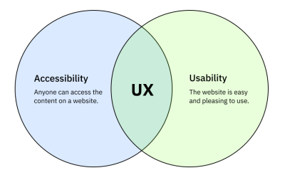
A visual representation of two circles (Accessibility and Usability) that intersect in the middle creating UX
A visual representation of two circles (Accessibility and Usability) that intersect in the middle creating UX. (Large preview)

With these two concepts clarified, we are now ready to dive into accessible validations.

Table Of Contents #

  1. Accessibility In Forms
  2. The Field Instructions
  3. Required Fields
  4. Invalid Fields
  5. Moments Of Validation
  6. Testing Field Validations
  7. Things To Keep In Mind

Accessibility In Forms #

Before we get into validation, let me recap the accessibility fundamentals in forms:

  • Navigation
    The form can be navigated using only the keyboard, so people who don’t use a mouse can still fill and submit the form. This is mostly about setting a compliant focus indicator for each form control.
  • Context
    Each form field must have an accessible name (label), so people who use assistive technologies can identify each field. For example, screen readers would read a field name to its user.

Screen Readers In Forms #

Similar to browsers, screen readers (SR) behave slightly differently from each other: different shortcuts, different semantic announcements, and different features support. For example, NVDA works better with Firefox, while VoiceOver works best with Safari, and both have slightly different behaviors. However, this shouldn’t stop us from building the common solid foundations that are strongly supported by all.

A while ago, I asked on Twitter how screen reader users navigate forms. Most prefer to Tab or use special shortcuts to quickly jump through the fields, but oftentimes can’t do it. The reason is that we, developers, forget to implement those fields with screen readers in mind most of the time.

Currently, many of the field validations can’t be solved with native HTML elements, so we are left with the last resource: ARIA attributes. By using them, Assistive Technologies like screen readers will better describe a given element to the user.

Through the article, I’m using VoiceOver in macOS Catalina for all the scenarios. Each one includes a Copeden demo and a video recording, which hopefully will give you a better idea of how screen readers behave in forms, field descriptions, and errors.

The Field Instructions #

Field Description #

The field label is the first visual instruction to know what to fill in, followed by a description when needed. In the same way sighted users can see the description (assuming a color contrast that meets WCAG 1.4.3 Contrast Minimum), the SR users also need to be aware of it.

To do so, we can connect the description to the input by using the aria-describedby attribute, which accepts an id pointing to the description element. With it, SR will read the description automatically when the user focuses on the field input.

<label for="address">Your address</label>
<input id="address" type="text" aria-describedby="addressHint"/>
<span id="addressHint">Remember to include the door and apartment.</span>
Open the Pen Field Validations — aria-describedby by Sandrina Pereira.

The Future Of ARIA Description #

An ARIA attribute aria-description exists, but it’s not yet supported by most screen readers. So, for now, we’ll need to stick with aria-describedby.

The Difference Between aria-labelledby And aria-describedby #

The attribute aria-labelledby is an alternative to <label> and aria-label, responsible for the field’s accessible name. In short, we should use aria-label for critical information and aria-describedby for additional information. The aria-describedby is announced after the label with a slight pause between both. For example, in the demo above, the Voice Over would announce:

{name} {role} [pause] {description}.
“Your address, input [pause] Remember to include the door and apartment.”

How Descriptions Are Announced #

It’s worth noting that aria-describedby is only meant to some HTML elements. Depending on the screen reader, it’s also announced slightly differently. Some screen readers allow customizing how long the pause between the label and description is and even mute the description. Adrian Roselli has a brilliant deep dive on descriptions exposure across all screen readers. The bottom line is not to rely on descriptions to convey critical information that can’t be easily accessed in another way.

Dealing With Complex Descriptions #

When announcing texts inside aria-describedby, the screen readers will read it as just plain text, ignoring any semantics. Imagine a field that contains a long description with lists, links, or any other custom element:
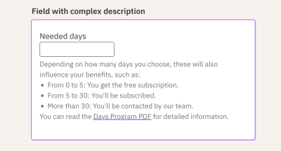
A field with a description that contains a list with three items and link
A field with a description that contains a list of three items and link. (Large preview)

In this field, it would cause more harm than good to connect the entire description to the aria-describedby. Instead, I prefer to connect a short description that hints to the user about the full description so they can navigate to it on their own.

<input id="days" type="text" aria-describedby="daysHintShort"/>
<div class="field-hint">
  <span id="daysHintShort" hidden>
    <!-- This text is announced automatically when the input is focused
    and ignored when the screen reader users navigate to it. -->
    Below it's explained how these days influence your benefits.
  <span>
  <div>Depending on how many days....</div>
</div>

As this short description is exclusive to assistive technologies only, we need to hide it from sight users. A possibility could be using the .sr-only technique. However, a side-effect is that the screen reader user would bump into it again when moving to the next element, which is redundant. So, instead, let’s use the hidden attribute, which hides the short description from assistive technologies altogether, but still lets us use the node’s contents as the inputs’ description.

<input id="days" type="text" aria-describedby="daysHintShort"/>
<div class="field-hint">
  <span id="daysHintShort" hidden>
    <!-- This text is announced automatically when the input is focused,
    and ignored when the screen reader users navigates to it. -->
    Below it's explained how these days influence your benefits.
  </span>
  <div>Depending on how many days....</div>
</div>

I find this pattern very useful for fields with long descriptions or even complex validation descriptions. The tip here is to hint to the users about the full instructions, so they won’t be left alone guessing about it.

Open the Pen Field Validations — complex descriptions by Sandrina Pereira.
More after jump! Continue reading below ↓

Required Fields #

How do you know a field is required? Depending on the context, it might be intuitive (e.g., a login form). Many times we need an explicit clue, though.

The Visual Clue #

The red asterisk is one of the most common visual patterns, like the following:
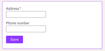
Two fields where one of them has a red asterisk expressing that it’s required
Two fields where one of them has a red asterisk expressing that it’s required. (Large preview)

Visually most people will recognize this pattern. However, people who use SR will get confused. For instance, Voice Over will announce “Address star, edit text.” Some screen readers might completely ignore it, depending on how strict the verbosity settings are.

This is a perfect scenario of an element that, although it’s visually useful, it’s far from ideal for SR users. There are a few ways to address this asterisk pattern. Personally, I prefer to “hide” the asterisk using aria-hidden="true", which tells all assistive technologies to ignore it. That way, Voice Over will just say “Address, edit text.”

<label for="address" class="field-label">
  Address <span class="field-star" aria-hidden="true">*</span>
</label> 

The Semantic Clue #

With the visual clue removed from AT, we still need to semantically tell the input is required. To do so, we could add the required attribute to the element. With that, the SR will say, “Address, required, edit text.”

<input id="address" type="text" required />

Besides adding the necessary semantics, the required attribute also modifies the form behavior. On Chrome 107, when the submit fails, it shows a tooltip with a native error message and focuses the required empty field, like the following:

A tooltip with a native error message below the required empty field
A required invalid field with a native tooltip saying “Please fill out this field”. (Large preview)

The Flaws In Default Validations #

Probably your designer or client will complain about this default validation because it doesn’t match your website aesthetics. Or your users will complain the error is hard to understand or disappears too soon. As currently, it’s impossible to customize the styling and behavior, so we’ll see ourselves forced to avoid the default field validation and implement our own. And just like that, accessibility is compromised again. As web creators, it’s our duty to ensure the custom validation is accessible, so let’s do it.

The first step is to replace required with aria-required, which will keep the input required semantics without modifying its style or behavior. Then, we’ll implement the error message itself in a second.

<input id="address" type="text" required="required" />
<input id="address" type="text" aria-required="true" />

Here’s a table comparing side by side the difference between required and aria-required:

Functionrequiredaria-required
Adds semanticsYesYes
Prevents invalid submitYesNo
Shows custom error messageYesNo
Auto-focus invalid fieldYesNo

Reminder: ARIA attributes never modify an element’s styles or behavior. It only enhances its semantics.

Open the Pen Field Validations — required vs aria-required by Sandrina Pereira.

As an alternative, if you need to keep the required attribute but without the ‘validation behavior’, you can add the novalidate attribute to <form>. Personally, I still prefer the aria-required because it’s easier to control the input behavior isolated in a Field component without depending on the parent element.

Invalid Fields #

The Color Trap #

In a minimalist design, it’s tempting to use only the red color to express that the field is invalid. Although the usage of color is beneficial, using it alone is not enough, as defended by WCAG 1.4.1 Use of Color. People perceive color in different ways and use different color settings, and that red color won’t be noticed by everyone.

The solution here is to complement the colorful error state with an additional visual element. It could be an icon, but even that might not be enough to understand why the field is invalid. So the most inclusive solution is to explicitly show a text message.
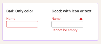
Visual comparison side-by-side. Right-side: Using only color. Left-side: Using also an icon and text.
Visual comparison side-by-side. Right-side: Using only color. Left-side: Using also an icon and text. (Large preview)

The Error Message #

From a usability standpoint, there’s a lot to take into consideration about error messages. In short, the trick is to write a helpful message without technical jargon that states why the field is incorrect and, when possible, to explains how to fix it. For a deep dive, read how to design better error messages by Vitaly and how Wix rewrote all their error messages.

From an accessibility standpoint, we must ensure anyone not only knows that the field is invalid but also what’s the error message. To mark a field as invalid, we use the ARIA attribute aria-invalid="true", which will make the SR announce that the field is invalid when it’s focused. Then, to also announce the error, we use aria-describedby we learned about before, pointing to the error element:

<input
  id="address"
  type="text"
  required="required"
  aria-invalid="true"
  aria-describedby="addressError addressHint"
/>
<span>
  <p id="addressError">Address cannot be empty.</p>
  <p id="addressHint">Remember to include the door and apartment.</p>
</span>

Invalid Field With Description #

A good thing about aria-describedby is that it accepts multiple ids, which is very useful for invalid fields with descriptions. We can pass the id of both elements, and the screen reader will announce both when the input is focused, respecting the order of the ids.

<input
  id="address"
  type="text"
  required="required"
  aria-invalid="true"
  aria-describedby="addressError addressHint"
/>
<span>
  <p id="addressError">Address cannot be empty.</p>
  <p id="addressHint">Remember to include the door and apartment.</p>
</span>
Open the Pen Field Validations — aria-invalid by Sandrina Pereira.

The Future Of ARIA Errors And Its Support #

An ARIA attribute dedicated to errors already exists — aria-errormessage — but it’s not yet supported by most screen readers. So, for now, you are better off avoiding it and sticking with aria-describedby.

In the meantime, you could check A11Ysupport to know the support of a given ARIA attribute. You can look at this website as the “caniuse” but for screen readers. It contains detailed test cases for almost every attribute that influences HTML semantics. Just pay attention to the date of the test, as some tests might be too old.

Dynamic Content Is Not Announced By Default #

Important to note that although aria-describedby supports multiple ids, if you change them (or the elements’ content) dynamically while the input is focused, the SR won’t re-announce its new content automatically. The same happens to the input label. It will only read the new content after you leave the input and focus it again.

In order for us to announce changes in content dynamically, we’ll need to learn about live regions. Let’s explore that in the next section.

Moments Of Validation #

The examples shown so far demonstrate ARIA attributes in static fields. But in real fields, we need to apply them dynamically based on user interactions. Forms are one of the scenarios where JavaScript is fundamental to making our fields fully accessible without compromising modern interactive usability.

Regardless of which moment of validation (usability pattern) you use, any of them can be accomplished with accessibility in mind. We’ll explore three common validation patterns:

  • Instant validation
    The field gets validated on every value change.
  • Afterward validation
    The field gets validated on blur.
  • Submit validation
    The field gets validated on the form submit.

Instant Validation #

In this pattern, the field gets validated every time the value changes, and we show the error message immediately after.

In the same way, as the error is shown dynamically, we also want the screen reader to announce it right away. To do so, we must turn the error element in a Live Region, by using aria-live="assertive". Without it, the SR won’t announce the error message, unless the user manually navigates to it.

Open the Pen Field Validations - instant validation by Sandrina Pereira.

Some nice things to know about this example:

  • While the input is valid, the aria-invalid can be "false" or be completely absent from the DOM. Both ways work fine.
  • The aria-describedby can be dynamically modified to contain one or multiple ids. However, if modified while the input is focused, the screen reader won’t re-announce its new ids — only when the input gets re-focused again.
  • The aria-live attribute holds many gotchas that can cause more harm than good if used incorrectly. Read “Using aria-live” by Ire Aderinokun to better understand how Live Regions behave and when (not) to use it.
  • From a usability perspective, be mindful that this validation pattern can be annoying, the same way it’s annoying when the error shows up too early while we are still typing our answer.

Afterward Validation #

In this pattern, the error message is only shown after the user leaves the field (on blur event). Similar to the ‘Instant Validation’, we need to use the aria-live so that the user knows about the error before start filling the next elements.

Usability tip: I personally prefer to show the on-blur error only if the input value changes. Why? Some screen reader users go through all the fields to know how many exist before starting to actually fill them. This can happen with keyboard users too. Even sight users might accidentally click on one of the fields while scrolling down. All these behaviors would trigger the on-blur error too soon when the intent was just to ‘read’ the field, not to fill it. This slightly different pattern avoids that error flow.

Open the Pen Field Validations - afterward validation by Sandrina Pereira.

Submit Validation #

In this pattern, the validation happens when the user submits the form, showing the error message afterward. How and when exactly these errors are shown depends on your design preferences. I’ll go through two of the most common approaches:

In Long Forms #

In this scenario, I personally like to show an error summary message, usually placed right before the submit button, so that the chances of being visible on the viewport are higher. This error message should be short, for example, “Failed to save because 3 fields are invalid.”

It’s also common to show the inline error messages of all invalid fields, but this time without aria-live so that the screen reader doesn’t announce all the errors, which can be annoying. Some screen readers only announce the first Live Region (error) in the DOM which can also be misleading.

Instead, I add the aria-live="assertive" only to the error summary.

Open the Pen Field Validations - on submit - error summary by Sandrina Pereira.

In the demo above, the error summary has two elements:

<p aria-live="assertive" class="sr-only">
  Failed to save because 2 fields are invalid.
</p>
<p aria-hidden="true">
  Failed to save because 2 fields are invalid.
</p>
  1. The semantic error summary contains a static error summary meant to be announced only on submit. So the aria-live is in this element, alongside the .sr-only to hide it visually.
  2. The visual error summary updates every time the number of invalid fields changes. Announcing that message to SR could be annoying, so it’s only meant for visual updates. It has the aria-hidden so that the screen readers users don’t bump into the error summary twice.

Check the screen reader demo below:

In Short Forms #

In very short forms, such as logins, you might prefer not to show an error summary in favor of just the inline error messages. If so, there are two common approaches you can take here:

  1. Add an invisible error summary for screen readers by using the .sr-only we learned above.
  2. Or, when there’s just one invalid field, focus that invalid field automatically using HTMLElement.focus(). This helps keyboard users by not having to tab to it manually, and, thanks to aria-describedby, will make screen readers announce the field error immediately too. Note that here you don’t need aria-live to force the error announcement because the field getting focused is enough to trigger it.
Open the Pen Field Validations - on submit - auto-focus by Sandrina Pereira.

Accessibility Comes Before Usability #

I must highlight that this is just one approach among others, such as:

  • Error text
    It can be just a simple text or include the number of invalid fields or even add an anchor link to each invalid field.
  • Placement
    Some sites show the error summary at the top of the form. If you do this, remember to scroll and focus it automatically so that everyone can see/hear it.
  • Focus
    Some sites focus on the error summary, while others don’t. Some focus on the first invalid field and don’t show an error summary at all.

Any of these approaches can be considered accessible as long it’s implemented correctly so that anyone can perceive why the form is invalid. We can always argue that one approach is better than the other, but at this point, the benefits would be mostly around usability and no longer exclusively about accessibility.

Nevertheless, the form error summary is an excellent opportunity to gracefully recover from a low moment in a form journey. In an upcoming article, I will break down these form submit patterns in greater detail from both accessibility and usability perspectives.

Testing Field Validations #

Automated accessibility tools catch only around 20-25% of A11Y issues; the more interactive your webpage is, the fewer bugs it catches. For instance, those tools would not have caught any of the demos explored in this article.

You could write unit tests asserting that the ARIA attributes are used in the right place, but even that doesn’t guarantee that the form works as intended for everyone in every browser.

Accessibility is about personal experiences, which means it relies a lot on manual testing, similar to how pixel-perfect animations are better tested manually too. For now, the most effective accessibility testing is a combination of multiple practices such as automated tools, unit tests, manual tests, and user testing.

In the meantime, I challenge you to try out a screen reader by yourself, especially when you build a new custom interactive element from scratch. You’ll discover a new web dimension, and ultimately, it will make you a better web creator.

Things To Keep In Mind For Accessible Fields #

Auto Focusing Invalid Inputs #

Above, I mentioned one possible pattern of automatically focusing the first invalid field, so the user doesn’t need to manually navigate to it. Depending on the case, this pattern might be useful or not. In doubt, I prefer to keep things simple and not add auto-focus. If not obvious, let the user read the summary error message, understand it and then navigate to the field by themselves.

Wrapping Everything Inside <label> #

It might be tempting to wrap everything about a field inside the <label> element. Well, yes, the assistive technologies would then announce everything inside automatically on input focus. But, depending on how ‘extensive’ the input is, it might sound more confusing than helpful:

  • It’s not clear for screen reader users what exactly the label is.
  • If you include interactive elements inside the label, clicking on them might conflict with the automatic input focus behavior.
  • In automated tests (e.g., Testing Library), you can’t target an input by its label.

Overall, keeping the label separate from everything else has more benefits, including having grainier control over how elements are announced and organized.

Disabling The Submit Button #

Preventing the user from submitting an invalid form is the most common reason to disable a button. However, the user probably won’t understand why the button is disabled and won’t know how to fix the errors. That’s a big cognitive effort for such a simple task. Whenever possible, avoid disabled buttons. Let people click buttons at any time and show them the error message with instructions. In the last instance, if you really need a disabled button, consider making it an inclusive disabled button, where anyone can understand and interact with it.

Good UX Is Adaptable #

Most physical buildings in the world have at least two ways to navigate them: stairs and lifts. Each one has its unique UX with pros and cons suited for different needs. On the web, don’t fall into the trap of forcing the same pattern on all kinds of users and preferences.

Whenever you find an A11Y issue in a given pattern, try to improve it, but also consider looking for an alternative pattern that can be used simultaneously or toggled.

Remember, every person deserves a good experience, but not every experience is good for everyone.

Wrapping Up #

Field validations are one of those web concepts without dedicated HTML elements that suit modern web patterns, so we need ARIA to fill in the gaps. In short, this article covered the most common attributes for field validations that make a difference for many people in their web journey:

  • aria-required: To mark a field as required.
  • aria-invalid: To mark the field as invalid.
  • aria-describedby: To connect the description and error message to the input.
  • aria-live: To announce dynamic error messages.

Accessibility is about people, not about ARIA. Besides those attributes, remember to review your colors, icons, field instructions, and, equally important, the validations themselves. Your duty as a web creator is to ensure everyone can enjoy the web, even when a form fails to submit.

Last but not least, I’d like to appreciate the technical review from Ben Mayers, Kitty Giraudel, and Manuel Matuzović. Because sharing is what makes us better. <3

WCAG References #

All the practices we explored in this article are covered by WCAG guideline “3.3 Input Assistance”:

The more I learn about web accessibility, the more I realize accessibility goes beyond complying with web standards. Remember, the WCAG are ‘guidelines’ and not ‘rules’ for a reason. They are there to support you, but if you suspect a guideline doesn’t make sense based on your diverse user research, don’t be afraid to question it and think outside the box. Write about it, and ultimately guidelines will evolve too.

Meet Penpot, An Open-Source Design Platform Made For Designers And Developers Alike

 In the ever-evolving design tools landscape, it can be difficult to keep up with the latest and greatest. In this article, we’ll take a closer look at Penpot, the first design and prototyping tool that’s fully open-source and based on open web standards, making it an ideal choice for both designers and developers.

The world of developer tools lives and breathes open-source. Open, free programming languages, frameworks, or even code editors everyone can contribute to — lay at the heart of the premise of the free, open web. Yet, with the design tools, it’s always been a much different story. For our design processes, most are sticking to a palette of paid, commercial tools — the majority of them were either created or later acquired by big tech companies. Fortunately, also in this space, we’re starting to see some alternatives.

One such alternative is Penpot, an open-source design app that recently started to boom in popularity. With over 250k signups and 20k GitHub stars, Penpot has already made a name for itself, and it’s growing as a viable alternative to other design tools out there.

However, being open-source is not the only thing that makes Penpot unique. It also has a few killer features up its sleeve that make it a really great match for a good collaboration between designers and developers. Curious to learn more? Let’s take a closer look together.

A Design Tool Done Right

If you’ve ever done a fair share of designing and coding, I bet you also had your moments of confusion and frustration. One thing I never managed to understand: Why are the apps used primarily for designing user interfaces that are later built with web technologies often so bad at matching the standards of these exact technologies?

For example, they offer fancy layout tools that follow a completely different logic than how layouts are built on the web. Or they offer drawing tools that work differently than graphics on the web, so once you export your work, you get weird, unexpected results. Why?

The answer is actually quite simple. For most of the design tools, hand-off and developer-focused features were an afterthought. Based on different patterns and standards, they often prove to be confusing and frustrating for developers.

This is where Penpot is different. Created by a team of designers and developers working very closely together, great design-development collaboration was their priority from the start.

Same as other web apps, Penpot can be run on any operating system or web browser. But to make access to it truly open and democratic, it is also based on Open Web Standards. For example, Penpot’s design files are saved in SVG format — the same standard as the most popular image format for vector graphics on the web.

What it means in practice is not only better compatibility with web technologies but a natural parity between designs and code. With Penpot, you don’t have to export to SVG, your graphics are SVG, by definition.

Same works with translating styles from designs into code. Penpot doesn’t have to generate any CSS values. It can just read and cater CSS values directly from designs.

A great example of that in practice is Flex Layout, i.e. Penpot’s layouting feature that not only works exactly like CSS Flexbox. It simply is CSS Flexbox. We’ll give it a shot together in the later part of the article!

Open Source And Why Should You Care

Before we take a deeper dive into the tool itself, let’s talk about Open Source for a bit. But why is it so important, and what does it mean for you?

It Means It’s Free #

In the programming world, Open Source usually means that the source code of the tool, app, or framework is available for anyone to view, modify, and distribute. But why would that be important for you and your choice of a design tool?

First and foremost, the code of the app´ is 100% free and available for commercial use. Every part and feature of the app that is free today will remain as such. Personally, out of all the design tools I have ever tried, I’ve never seen an equally featured and solidly built design app that is completely free, even for a big team. In this field, Penpot is far ahead of any competition.

It Means Better Security And Control

But open source is so much more. It also means greater transparency, control, and security. Anyone can audit the app’s code for potential security vulnerabilities or add new features to the tool that meet specific needs. Additionally, open source means that code cannot be controlled by a single entity or corporation, and users are not locked into a particular vendor’s ecosystem.

That all is true also for Penpot. It might not sound particularly significant or sexy at first glance, but if your company would ever have to worry about maintaining full control over its toolkit’s security standards or if you’d like to avoid vendor lock-in, choosing an app that is Open Source might be a big deal.

It Means Endless Customizability

Have you ever used plugins in a design tool? If so, you’d probably be pleased to hear that customizability is what Penpot brings to a whole new level. Open source means that users can modify the tool’s source code to meet any specific needs, customizing it as necessary.

You not only can extend the functionality of the app. You can literally edit it in any way you like to match your team’s processes and specific needs.

It Means You Can Run It Yourself

Penpot being open source, also means the ability to host your own instance of the tool. This means that you can run Penpot on your servers, having full control over your data and the application itself.

It Means A Peace Of Mind For The Future Of The Tool

Finally, open source provides peace of mind for the future of Penpot. With the tool being open source, users will always have control over the tool they work with, no matter what the future holds. Regardless of what happens next, you’ll always be able to use Penpot on your own terms. This means that people can invest in Penpot with confidence, knowing that they will always have access to the tool and their work (rather than being at the mercy of potential business shifts, acquisitions, pricing changes etc.)

I hope that by now, you’re left with no doubt about how many advantages it brings to work with Open Source tools. Now, let’s take a look at Penpot itself.

Where Penpot Shines…

If you recently worked with any of the most popular design tools in Penpot, you’ll feel right at home. Its interface should be familiar and predictable, and also offer all the basic features you could be looking for.

The user interface is unobtrusive, the perceived performance is good, and everything works as expected. But it’s the handoff-related features where Penpot really shines.

I already mentioned Flex Layout, Penpot’s own layouting feature. If you have ever used the Flexbox model in CSS, it might look oddly familiar. In fact, it’s exactly that: CSS flexbox inside a design app.

And that means not only better parity with code than other design apps (at least as long as you’re planning to use CSS flexbox in your code) but also a better scope of possibilities inside the design tool itself (e.g. you can wrap items of the automatic layout into multiple rows).

More powerful layouts also mean much better possibilities when it comes to designing truly responsive designs. With what Penpot can do, there’s a high chance that, in many cases, you won’t have to create separate designs for different breakpoints ever again.

All of that wouldn’t be as good if not for the great Inspect tab. Penpot gives you all the CSS you might need at hand, as well as the source SVG code of any component you select.

Pretty neat!

…And Where It Doesn’t (Yet)

Regardless of all the praise, Penpot is not perfect either. Being a relatively young tool makes it a challenging task to compete against the giants dominating the design tools scene.

If you compare it closely to other popular design apps, you’ll definitely find a few features missing, as well as some of them not as complex as elsewhere. For example, Penpot’s components toolkit and prototyping features are still relatively simple and limited.

That being said, Penpot’s roadmap is very actively being worked on. You can check what the team is onto right now on their website.

What’s also important to keep in mind is that Penpot’s development potential as an Open Source tool couldn’t be underestimated. The tool’s community of contributors is already pretty strong, and I believe it will only keep growing. That’s a competitive advantage closed source tools will never be able to meet.

Seeing what Penpot can do today, I personally can’t wait to see what’s next.

For example, looking at Penpot’s implementation of Flex Layout, think how cool it would be to have a similar tool for CSS Grid. Who’s in a better place to build it than Penpot? Spoiler alert: if you look at their public roadmap closely enough, you’ll find out they’re already working on it.

Final Thoughts

Even though Penpot is a relatively new tool, it stands as a solid choice for a design platform. It does a great job of narrowing the gap between designers and developers.

I believe it’s an open-source approach and a welcomed change that should only benefit our industry, as hopefully, others will follow.

If you’d like to give Penpot a try, it’s now out of beta and available for you and your team — completely for free

Resources #


Thursday, March 30, 2023

Moving From Vue 1 To Vue 2 To Vue 3: A Case Study Of Migrating A Headless CMS System

 While migrating large front-end systems is usually a daunting task, it can be helpful to understand the reasons and strategies behind it. In this article, we explores its potential benefits and drawbacks and shares what considerations and steps were involved in the process of migrating the front-end interface of Storyblok’s headless content management system.

One of the greatest challenges in software development is not in creating new functionality but in maintaining and upgrading existing systems. With growing dependencies and complexity, it can be a tedious task to continuously keep everything updated. This becomes even more challenging when upgrading a base technology that the whole system runs on.

In this article, we will discuss how Storyblok solved the challenges of migrating the front-end interface of our headless content management system from Vue 1 to Vue 2 to Vue 3 within six years of growing the startup.

While migrating larger front-end systems can be a daunting task, it can be helpful to understand the reasons and strategies behind it. We’ll delve into the considerations and steps involved in such a migration and explore the potential benefits and drawbacks. With a clear understanding of the process, we can approach the migration with more confidence and ensure a smooth transition for our users and stakeholders.

The Vue Ecosystem & Storyblok’s Early Days

The Vue.js framework’s first large pre-beta release happened in late 2016, and Storyblok began work on a full prototype built on top of Vue in late 2015. At the time, Vue was still a relatively new framework, and other more established options like React were available. Despite this, Storyblok decided to take a chance on Vue and built their own prototype on top of it. This turned out to be a good decision, as the prototype worked well, and up to today, Vue is kept as the underlying framework for the front-end interface.

Over the years, Storyblok has played a key role in the growth and development of Vue, participating in forums, conferences, and meetups, sponsoring certain projects, as well as contributing to the Vue ecosystem through open-source projects and other initiatives. As Storyblok grew together with the Vue community over the years, Vue started upgrading its framework, and Storyblok began growing out of its prototype to become a fully-fledged product. This is where our migration story starts.

Ground-up Migration vs. Soft Migration

There were two main points in time when Storyblok was facing large migration challenges. The first one was when the upgrade from Vue 1 to Vue 2 happened. This went hand in hand with the update from Storyblok Version 1 to Storyblok Version 2. The decision was to completely rebuild the system from scratch. This is what we’ll call Ground-up migration. The second large migration happened when going from Vue 2 to Vue 3, where the front-end interface did not change. The existing codebase was updated in the background without visual changes for the user, and this is what we’ll call Soft migration.

Ground-up migration allows for greater flexibility and control over the design and architecture of the new system, but it can be a time-consuming and resource-intensive process. For Storyblok, it allowed the development of an open-source Blok Ink design system as the core of the new system. This design system could then simultaneously be used by our customers to build their own extensions.

Soft migration, on the other hand, can be quicker and more cost-effective, but it’s strongly limited and influenced by the current design and architecture of the existing system. Upgrading large codebases and all their dependencies can take months to achieve, and the time for this can be hard to find in a growing business. When thinking about customers, soft migration tends to be easier because the user doesn’t have to relearn a whole new interface, and no large marketing and communication resources need to be allocated towards this kind of migration.

How were these migration decisions made from a business perspective? After Storyblok was launched as a product in 2017 with Vue 1, it was continuously improved and extended with new features. In 2019, the team received its first seed investment, which allowed them to hire more developers to work on Storyblok. In 2020, work began on Storyblok V2 with Vue 2, with around five developers starting on the project for the first time. Instead of updating the old codebase from Vue 1 to Vue 2, the team decided to start with a completely new codebase. This gave the new team two main benefits:

  1. The developers were fully involved in creating the architecture of the new system;
  2. They learned how the system worked by rebuilding it.

In the core, the decision to make a ground-up migration was correct because the flexibility of that migration allowed the team to build a better, newer, and more stable version of the prototype while also understanding how it works. The main drawbacks of the ground-up migration were the cost of time and resources and getting the buy-in from the customers to switch from the old to the new version.

As Storyblok continued to evolve and improve, the codebase needed to be upgraded from Vue 2 to Vue 3. Migrating to the new version involved updating large amounts of code and ensuring that everything continued to work as expected. In this migration, we had to invest a lot of resources in retesting the interface, as well as allocating time for the developers to learn and understand the changes in Vue 3. This can be especially challenging when working with a large team, as there may be different codebases and business needs to consider.

Ultimately, the decision between these two approaches will depend on the specific needs and circumstances of the migration, including the following:

  • Resources and expertise available,
  • Complexity and size of the system,
  • Desired level of control and flexibility over the design and architecture of the new system.

It’s important to have a clear plan in place to guide the migration process and ensure a smooth transition, so in the next chapter, we will look into what that plan looked like for us.

Strategies For Large Migrations

These five factors are essential to consider when planning a migration:

TimeCreating a timeline for the migration
FunctionalityIdentify and prioritize critical parts of the system to migrate
ResourcesUse automation and tools to support the migration
AcceptanceEngage and communicate with users
RiskMonitor and evaluate the migration process

Creating A Timeline

One of the main challenges of migration is getting the buy-in from the organization, clients, and teams. Since migrations aren’t adding any new functionality, it can be hard to convince a team and the product owners of the importance of migration. However,

In the long term, migrations are necessary, and the longer you put them off, the harder they will become.

Secondly, migrations tend to take more than a few weeks, so it’s a harder and more tedious process that has to be planned with all the developers and stakeholders. Here is what our timeline looked like:

Going from Vue 1 to Vue 2

This process took us around two years from start to finish:

  • Before Mid–2020: Develop new features in the old version.
  • 2020 June: Identify and develop ‘core’ components in a new open-source design system.
  • 2020 November: Create a new Vue 2 project.
  • 2020 Nov — 2021 August: Redevelop all parts of the old app in the new app with the new design system.
  • 2021 August: Beta Release of parts of the new application (e.g., our Visual Editor).
  • 2021 August — 2022 August: Add all the missing functionality from the old app, add new features, and improve overall UX through customer feedback.
  • 2022 August: Official release of the new app.
  • During that time: onboard 20+ developers, designers, QAs, and product owners.

Going from Vue 2 to Vue 3

This process took us around eight months:

  • 2022 July — 2022 November: Start migrating the Design System to Vue 3.
  • 2022 November — 2023 January: remove all the ‘old’ breaking functionality and update or replace old dependencies that depend on Vue 2.
  • 2022 December: Several meetings to explain what changed in Vue 3 with developers and stakeholders and how the transition will happen.
  • 2023 January: Introduce the Vue 3 codebase, switch developers to the new codebase, and thoroughly test and start developing in Vue 3.
  • 2023 February: Launch the Vue 3 version into production.

To create a timeline, you need to identify all the parts of the migration first. This can be done in an excel sheet or a planning tool like Jira. Here is an example of a simple sheet that could be used for creating a rough timeline. It can be useful to split different areas to separate sheets to divide them into the teams they belong to.

Identifying And Prioritizing Functionality to Migrate 

In order to manage the cost and resources required for the migration, it is essential to identify and prioritize the critical features and functionality of the system that need to be migrated. For us, it meant starting bit by bit with more important functionality. When we built the new version of Storyblok, we started with our most important core feature, the “Visual Editor,” and built an entirely new version of it using our Design System. In any migration, you should ask yourself these questions to find out what the priorities are:

  • Is the goal to create a completely new version of something?
  • What parts does the system have? Can some of them be migrated separately?
  • Which parts of the system are most important to the customer?
  • Who knows the system well and can help with the migration?
  • Does every developer need to work on the migration, or can a few ‘experts’ be selected to focus on this task?
  • Can I estimate how long the migration will take? If not, can I break down the parts of the system more to find out how long smaller parts of the system can be migrated?

If you have multiple sub-parts that can be migrated separately, it’s easier to split them to different people to work on the migration. Another big decision is who is working on the migration. For our Vue 1 to Vue 2 migration, all our developers worked on creating the new functionality, but on the Vue 2 to Vue 3, it was one expert (the person who is writing this article) who did most of the migration and then it was handed over to the teams to finish and retest the whole application to see if everything was still working as it should.

At the same time, I organized some training for the developers to dive deeper into Vue 3 and the breaking changes in the system.

The core of the migration strategy always depends on the knowledge of the system as well as the importance of the features to be migrated.

More important features will be migrated and worked on first, and less important things can be kept to be improved in the end.

Use Automation And Tools to Support The Migration

Since a migration process is always very time-consuming, it pays off to invest in some automation of tedious tasks to find out all the problems of the migration. For our migration from Vue 2 to Vue 3, the migration build and its linting were very helpful in finding all the potential problem areas in the app that needed to be changed. We also worked with hand-written scripts that iterate through all Vue files in the project (we have over 600 of them) to automatically add all missing emit notations, replace event names, that updated in Vue 3 and update common logic changes in the unit tests, like adding the global notation.

These scripts were a large timesaver since we didn’t have to touch hundreds of files by hand, so investing time in writing such scripts can really pay off. In the core, utilizing regex to find and replace large logic chunks can help, but for the last final stretch, you will still spend hours fixing some things manually.

In the final part, all the unit and end-to-end tests we already had, helped to find some of the potential problems in the new version of our app. For unit testing, we used Jest with the built-in Test Utils as well as the Vue Testing Library, for the e2e tests, we’re using Cypress with different plugins.

Engage And Communicate With Users

If you create a new version of something, it’s essential to make sure that the experience is not getting worse for the customer. This can involve providing training and support to help users understand and use the new version, as well as collecting feedback and suggestions from users to help improve the new system. For us, this was a very important learning during the ground-up migration from Vue 1 to Vue 2 because we continuously collected feedback from the customer while rebuilding the app at the same time. This helped us to ensure that what we were building was what the customers wanted.

Another way was to have the beta version accessible way ahead of the new version being finished. In the beginning, we only made the Partner Portal available, then the Visual Editor, then the Content Editing, and lastly, the missing parts of the app. By gradually introducing the new parts, we could collect feedback during the development time and adjust things where the customer experience was not perfect yet.

In any scenario, it will be important to ask yourself these questions in a ground-up migration:

  • How can we collect feedback from our customers early and often to ensure what we’re building is working?
  • How can we communicate with the existing customers to make them aware of using the new version?
  • What are the communication channels for the update? Can we leverage the update with the marketing team to make users more excited about it?
  • Who do we have internally that handles communication, and who are the stakeholders who should be updated regularly on the changes?

For us, this meant building ‘feedback buttons’ into the interface to collect feedback from the users starting to use the new version. It pointed to a form where the users could rate specific parts but also give open feedback. This feedback was then handed back to the design team to evaluate and forward if it was valid feedback. Further, we added channels in our Discord to hear directly from developers using the system and introduced ‘tour’ functionalities that showed users where all the buttons and features are located and what they do. Finally, we added buttons to the old app to seamlessly switch between the old and new versions. We did various campaigns and videos on social media to hype our community about using the new version.

In all cases, it’s crucial to find out who the core stakeholders and communicators of the migration are. You can find that out with a simple impact/influence matrix. This matrix documents who is impacted by the migration and who should have how much influence over the migration. This can indicate who you should be in close contact with and who might only need to be communicated with occasionally.


Monitor And Evaluate The Migration Process

Since a migration process will always take a few months or even years to accomplish, it’s essential to monitor the process and make sure that after a few months, it’s still going in the right direction.

Here are some questions that can help you figure out if you’re on the right track:

  • Have all the areas and functionalities that need to be migrated been defined? How are we tracking the process of each area?
  • Are all stakeholders, including users and other teams, being effectively communicated with and their concerns addressed?
  • Are there unexpected issues that have arisen during the migration that require you to adjust the budget and time frame of the migration?
  • Is the new version being properly tested and validated before being put into production?
  • Are the final results of the migration meeting the expectations of the users and stakeholders?

During the different migration phases, we hit several roadblocks. One of them was the customer’s expectations of having the exact same functionality from the old app in the new app. Initially, we wanted to change some of the UX and deprecate some features that weren’t satisfying to us. But over time, we noticed that it was really important to customers to be close to what they already knew from the older version, so over time, we moved many parts to be closer to how the customer expected it to be from before.

The second big roadblock in the migration from Vue 2 to Vue 3 was the migration of all our testing environments. Initially, we didn’t expect to have to put so much effort into updating the unit tests, but updating them was, at times, more time-consuming than the app itself. The testing in the “soft migration” had to be very extensive, and it took us more than three weeks to find and fix all the issues. During this time, we depended heavily on the skills of our QA engineers to help us figure out anything that might not work anymore.


The final step in the migration from Vue 2 to Vue 3 was to put the new version of the app into production. Since we had two versions of our app, one in Vue 2 and one in Vue 3, which looked essentially the same, we decided to do a blue/green deployment. This means that we transferred a subset of the user traffic to the new app while the majority of the users were still using the stable old app. We then tested this in production for a week with only a small subset of our users.

By slowly introducing the new version to just a percentage of the users, we could find more potential issues without disrupting all of our users. The essential part here was to have direct communication with our Sales and Support teams, who are in direct contact with important clients.

Lessons Learnt

Migration to Vue 2

The core lesson when we completely rebuilt Storyblok in Vue 2 was that migrating a large system can be a significant challenge for the development team that consists of new developers who are not familiar with the system yet. By handing the power over to the developers, they could be directly involved in forming the architecture, quality, and direction of the product. In any migration or significant change, the onboarding and training of developers will be an essential part of making the migration successful.

Another big lesson was the involvement of the existing users to improve the quality of the newer version we were building. By slowly introducing the new design and features in different areas of the system, the customers had the opportunity to get used to the new version gradually. With this gradual change, they could give feedback and report any issues or problems they encountered.

Overall, customers have a number of expectations when it comes to software, including:

  • Reliability and stability,
  • Ease of use,
  • Regular updates and improvements,
  • Support and assistance,
  • Security and privacy.

Migrating a large system can impact these expectations, and it’s important to carefully consider the potential impacts on customers and take steps to ensure a smooth transition for them.

Migration to Vue 3

As we got more teams and more customers, it kept getting more critical to keep our production version of the app as stable as possible, so testing was an important part of making sure the quality was monitored and bugs were eliminated. All that time we had invested in unit and e2e testing in the Vue 2 version helped us to find problems and bugs during the migration process to Vue 3.

We found that it was essential to test the migrated system extensively to ensure that it was functioning correctly and meeting all of the required specifications. By carefully planning and executing our testing process, we were able to identify and fix the majority of the issues before the migrated system was released to production.

During the Vue 3 migration, we also saw the advantages of having a ‘separate’ part of the system, our design system, that could be migrated first. This allowed us to learn and study the migration guide there first and then move to the more complex migration of the app itself.

Lastly, a big thing we learned was that communication is essential. We started creating internal communication channels on Slack to keep marketing and other teams up to date on all the functionality changes and new features. Certain people could then weigh in on the ways new features were built.

Conclusion

Migrating Storyblok from Vue 1 to Vue 2 to Vue 3 was a significant challenge for the whole organization. A well-formed migration plan should outline the steps to be taken, the areas and functionalities that need to be migrated and in what way (rebuild or create a new version), the people to be involved, and the expected timeline.

For us, some key takeaways were the importance of involving the development team in forming the architecture and direction of the product, as well as onboarding and training them properly. It was also essential to communicate effectively with stakeholders, including users and other teams, to address their concerns and ensure their expectations were met.

Testing plays a crucial role in ensuring the migrated system functions correctly, and the better your QA engineers, the more smoothly the migration will go. Gradually introducing the new version to a subset of users before a full release can help identify any potential issues without disrupting all users. Another approach is gradually introducing new parts of the system one by one. We made use of both of them.

If you’re planning a large system migration, starting with a well-defined plan is important. Make sure to consider budget and time frame, build in time for testing and validation, continuously monitor the progress of the migration and adjust the plan as necessary.

It’s also important to involve existing users in the migration process to gather feedback and identify any potential issues. Make sure your migration is actually improving the experience for the users or developers. Internal communication is key in this process, so ensure that all stakeholders are effectively communicated with throughout the migration to make sure everyone is on board. Consider gradually migrating different parts of the system to help manage complexity or introducing a new system only to a subset of users first.

And lastly, work with your team. Migrating really takes a lot of hands and time, so the better your teams can work together, the smoother the transition will go.


How AI Is Helping Solve Climate Change

 Climate change is a complex problem that cannot be solved with a swift flick of a biodegradable, magic wand. But certain environmental issues can be solved with the right code. That’s where you come in.

Have you heard of the French artist Marcel Duchamp? One of his most famous works is the “fountain” which was created from an ordinary bathroom urinal. In simply renaming this common object, Duchamp successfully birthed a completely new style of art.

The same can be done with AI. Why do humans only have to use this powerful invention to solve business-related issues? Why can’t we think a little more like Duchamp and use this ‘all-powerful’ technology to solve one of the scariest problems that mankind has ever faced?

The Global Threat Of Climate Change

If you’ve read any recent reports and predictions about the future of our climate, you’ve probably realized that mankind is running out of time to find a solution for the global threat of climate change. In fact, a recent Australian policy paper proposed a 2050 scenario where, well, we all die.

To those who aren’t scared of water levels rising 25 meters by 2050, there have been other studies that suggest human hardships are right around the corner. In March of 2012, the World Water Assessment Programme predicted that by 2025, 1.8 billion people on earth will be living in regions with absolute water scarcity.

So what data and research is leading scientists to believe there will be a water or food apocalypse scenario in the future?Jump to the workshops ↬

According to NASA, the main cause of climate change is the rising amount of greenhouse gases in our atmosphere. And sadly, ‘mother earth’ is not doing this all by herself.

In 1830, humans began engaging in activities that released greenhouse gases, contributing to the rising temperatures that we are feeling today. Some of these activities I refer to include the burning of fossil fuels, the pollution of oceans, and deforestation. However, even the mass production of beef is contributing to climate change.

Now, you may be wondering how humans could combat and limit our greenhouse gas emissions. Obviously, we should be limiting all of the activities that I alluded to above. This would mean limiting our electricity, coal, and oil usage, planting trees, and sadly for many, giving up steak dinners altogether.

But would all of this be enough to undo centuries of atmospheric pollution? Is all of this even accomplishable before humans are forced to face the extinction of their species? I don’t know. Humans haven’t even been able to cease the production of beef, let alone our daily oil-guzzling automobiles and airplanes.

If only there was a very intelligent software that could run some emissions numbers, and tell us if all of these efforts would be enough to prevent future disaster scenarios...

AI Approaches And Environmental Use Cases

Solving any problem takes time. With climate change, it took scientists about 40 years to to gain any sort of understanding of the problem. And that’s fair — humans had to first study the climate to make sure climate change existed, then study the causes of climate change to see the role humans have played. But where are we today after all of this study? Still studying.

And the problem with climate change is that time is not on our side — mankind has to find and implement some solutions relatively fast. That’s where AI could help.

To date, there are two different approaches to AI: rules-based and learning-based. Both AI approaches have valid use cases when it comes to studying the environment and solving climate change.

Rules-based AI are coded algorithms of if-then statementsthat are basically meant to solve simple problems. When it comes to the climate, a rules-based AI could be useful in helping scientists crunch numbers or compile data, saving humans a lot of time in manual labor.

But a rules-based AI can only do so much. It has no memory capabilities — it’s focused on providing a solution to a problem that’s defined by a human. That’s why learning-based AI was created.

Learning-based AI is more advanced than rules-based AI because it diagnoses problems by interacting with the problem. Basically, learning-based AI has the capacity for memory, whereas rules-based AI does not.

Here’s an example: let’s say you asked a rules-based AI for a shirt. That AI would find you a shirt in the right size and color, but only if you told it your size and preferences. If you asked a learning AI for a shirt, it would assess all of the previous shirt purchases you’ve made over the past year, then find you the perfect shirt for the current season. See the difference?

When it comes to helping solve climate change, a learning-based AI could essentially do more than just crunch CO2 emission numbers. A learning-based AI could actually record those numbers, study causes and solutions, and then recommend the best solution — in theory.

AI Impacting Climate Change, Today

To most, AI is buzz word used to describe interesting tech software. But to the companies below, AI is starting to be seen as a secret weapon.

SilviaTerra

Forests are important for our climate. The carbon dioxide that’s emitted by many human activities is actually absorbed by trees. So if we just had more trees.

This is why SilviaTerra was brought to life.

Powered by the funds and technology of Microsoft, SilviaTerra uses AI and satellite imaging to predict the sizes, species, and health of forest trees. Why is this important? It means that conservationists are saved countless hours of manual fieldwork. It also means that we can help trees grow bigger, stronger, and healthier, so they can continue to help our climate.

DeepMind

Sometimes, we may ask ourselves, “What can’t Google do?” Well, it turns out Google can’t really do everything.

Looking to improve their costs (and potentially their carbon footprint), Google turned to a company called DeepMind. Together, the two companies developed an AI that would teach itself how to use only the bare minimum amount of energy necessary to cool Google’s data centers.

The result? Google was able to cut the amount of energy they use to cool their data centers by 35%. But that may not even be the coolest part! DeepMind’s co-founder, Mustafa Suleyman, said that their AI algorithms are general enough to where the two companies may be able to use them for other energy-saving applications in the future.

Although AI is still very controversial among many, it’s difficult not to agree on how it can help to improve sales, productivity, and even customer service.

Green Horizon Project

All of you data-lovers out there know that it’s hard to say you’re impacting something if you’re unable to measure your impact. This is why the Green Horizon Project came about.

IBM’s Green Horizon Project is an AI that creates self-configuring weather and pollution forecasts. IBM created the project with the hope that they could help cities become more efficient, one day.

Their aspirations became a reality in China. Between 2012 and 2017, IBM’s Green Horizon Project helped the city of Beijing decrease their average smog levels by 35%.

CycleGANs 

So here’s a term you may never heard of in your life: “GAN.” It stands for Generative Adversarial Network. Basically, it’s a network that generates statistics or information without you having to do anything.

Why is the term important? Because automation is important when you have limited time and resources to solve a problem.

Intellectuals of Cornell University used GANs to create an AI to train itself to produce images that portray geographical locations before and after extreme weather events. The visuals produced by this AI could help scientists predict the impacts of certain climate changes, helping humans prioritize our combative efforts.

Software With The Potential To Impact Climate Change

In studying the number of AI that is already being used to have a positive impact on climate change, you may be thinking that we don’t need any more new software. And maybe you’re not wrong — why don’t we repurpose the software we do have?

With that being said, here are a few software with the potential to be secret weapons:

Airlitix #

Airlitix is an AI and machine-learning software that is currently being used in drones. While it was originally developed to automate greenhouse management processes, it could quite easily be used to manage the health of national forests. Airlitix has the capacity to not only collect temperature, humidity, and carbon dioxide data, but the AI can also analyze soil and crop health.

But with humans needing to plant over 1.2 trillion trees to combat climate change, we should consider automating our efforts further. Instead of taking the time to tend to national parks, the Airlitix software could be built upon so that drones could plant our trees, release plant nutrients, or even deter forest arsonists.

Both Google and Facebook have very powerful AI software that they currently use to create relevant consumer ads using consumer browsing data. In fact, Google’s AI ‘Google Ads’ has helped their company earn hundreds of billions in revenue.

While revenue is cool, the Google Ads algorithm currently promotes consumer purchases relatively objectively. Imagine if the AI could be rewritten to prioritize the ads of companies that are offering sustainable products and services.

Nowadays, there isn’t much competition for Google. There’s Bing, Yahoo, DuckDuckGo, and AOL. (Out of the people I know, I don’t know any that use AOL.) If you’re feeling fearless, maybe you could develop a new search engine that helps connect consumers with environmentally-friendly companies.

Sure, it would be hard to compete with companies as large as Google, but you don’t have to compete forever to make a profit. There’s always a chance your startup gets acquired, and then you ride off into the sunset.

AlphaGo 

While AlphaGo is an AI software that could help scientists find the next ‘wonder drug,’ it was originally created by DeepMind to teach itself how to master the game of chess. After beating the world’s best chess players, the AlphaGo AI has since moved on to conquer the strategy of more complex board games.

But what do board games have to do with climate change? Well, if the AlphaGo AI can outsmart humans in a game of chess, maybe it can outsmart us in coming up with creative ways to limit and reduce the number of greenhouse gases in our atmosphere.

Future Outlook For AI And Climate

As I see it, the purpose of AI is to assist mankind in solving problems. Climate change has proven to be a complex problem that humans are becoming great at studying, but I have yet to see a very positive future-outlook from environmentalists in the news.

If not to help humans influence climate change directly, couldn’t we use AI to portray doomsday scenarios that scare the world into coming together? Could we use AI to portray positive potential outlooks that would be possible if people were to do more in their daily lives to help triage climate issues?

Even with the latest Amazon fires, I didn’t see any tweets about the idea of using drones to combat the spread of flames. It’s clear to me that even with all of the impressive AI software and tech available to humans today, environmental use cases are still not widespread knowledge.

So my advice to readers is to try the ‘Duchamp approach’ — today. Consider the AI and tech that you use or develop regularly, and see if there’s a way to reimagine it. Who knows, you may be the one to solve a problem that has stumped some of the best climatologists and scientists of our time.