Digital products are getting more and more complex. In this article, Yury Vetrov explains why we need to support more platforms, tweak usage scenarios for more user segments, and hypothesize more.
I’ve been following the idea of algorithm-driven design for several years now and have collected some practical examples. The tools of the approach can help us to construct a UI, prepare assets and content, and personalize the user experience. The information, though, has always been scarce and hasn’t been systematic.
However, in 2016, the technological foundations of these tools became easily accessible, and the design community got interested in algorithms, neural networks and artificial intelligence (AI). Now is the time to rethink the modern role of the designer.
Further Reading on SmashingMag: #
- Conversational Design Essentials: Tips For Building A Chatbot
- Conversational Interfaces: Where Are We Today? Where Are We Heading?
- Is The Internet Killing Creativity?
Will Robots Replace Designers? #
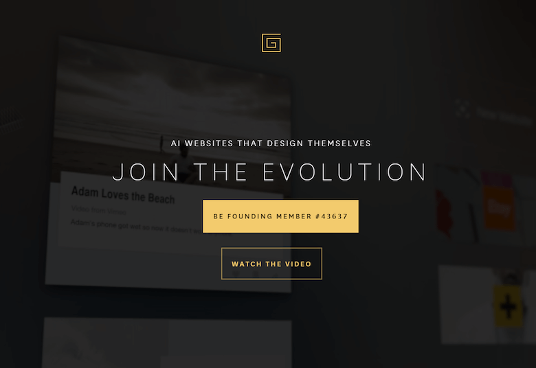
One of the most impressive promises of algorithm-driven design was given by the infamous CMS The Grid. It chooses templates and content-presentation styles, and it retouches and crops photos — all by itself. Moreover, the system runs A/B tests to choose the most suitable pattern. However, the product is still in private beta, so we can judge it only by its publications and ads.
The Designer News community found real-world examples of websites created with The Grid, and they had a mixed reaction — people criticized the design and code quality. Many skeptics opened a champagne bottle on that day.
The idea to fully replace a designer with an algorithm sounds futuristic, but the whole point is wrong. Product designers help to translate a raw product idea into a well-thought-out user interface, with solid interaction principles and a sound information architecture and visual style, while helping a company to achieve its business goals and strengthen its brand.
Designers make a lot of big and small decisions; many of them are hardly described by clear processes. Moreover, incoming requirements are not 100% clear and consistent, so designers help product managers solve these collisions — making for a better product. It’s much more than about choosing a suitable template and filling it with content.
However, if we talk about creative collaboration, when designers work “in pair” with algorithms to solve product tasks, we see a lot of good examples and clear potential. It’s especially interesting how algorithms can improve our day-to-day work on websites and mobile apps.
Creative Collaboration With Algorithms #
Designers have learned to juggle many tools and skills to near perfection, and as a result, a new term emerged, “product designer.” Product designers are proactive members of a product team; they understand how user research works, they can do interaction design and information architecture, they can create a visual style, enliven it with motion design, and make simple changes in the code for it. These people are invaluable to any product team.
However, balancing so many skills is hard — you can’t dedicate enough time to every aspect of product work. Of course, a recent boon of new design tools has shortened the time we need to create deliverables and has expanded our capabilities. However, it’s still not enough. There is still too much routine, and new responsibilities eat up all of the time we’ve saved. We need to automate and simplify our work processes even more. I see three key directions for this:
- constructing a UI,
- preparing assets and content,
- personalizing the UX.
I’ll show you some examples and propose a new approach for this future work process.
Constructing A UI #
Publishing tools such as Medium, Readymag and Squarespace have already simplified the author’s work — countless high-quality templates will give the author a pretty design without having to pay for a designer. There is an opportunity to make these templates smarter, so that the barrier to entry gets even lower.
For example, while The Grid is still in beta, a hugely successful website constructor, Wix, has started including algorithm-driven features. The company announced Advanced Design Intelligence, which looks similar to The Grid’s semi-automated way of enabling non-professionals to create a website. Wix teaches the algorithm by feeding it many examples of high-quality modern websites. Moreover, it tries to make style suggestions relevant to the client’s industry. It’s not easy for non-professionals to choose a suitable template, and products like Wix and The Grid could serve as a design expert.
Surely, as in the case of The Grid, rejecting designers from the creative process leads to clichéd and mediocre results (even if it improves overall quality). However, if we consider this process more like "paired design" with a computer, then we can offload many routine tasks; for example, designers could create a moodboard on Dribbble or Pinterest, then an algorithm could quickly apply these styles to mockups and propose a suitable template. Designers would become art directors to their new apprentices, computers.
Of course, we can't create a revolutionary product in this way, but we could free some time to create one. Moreover, many everyday tasks are utilitarian and don't require a revolution. If a company is mature enough and has a design system, then algorithms could make it more powerful.
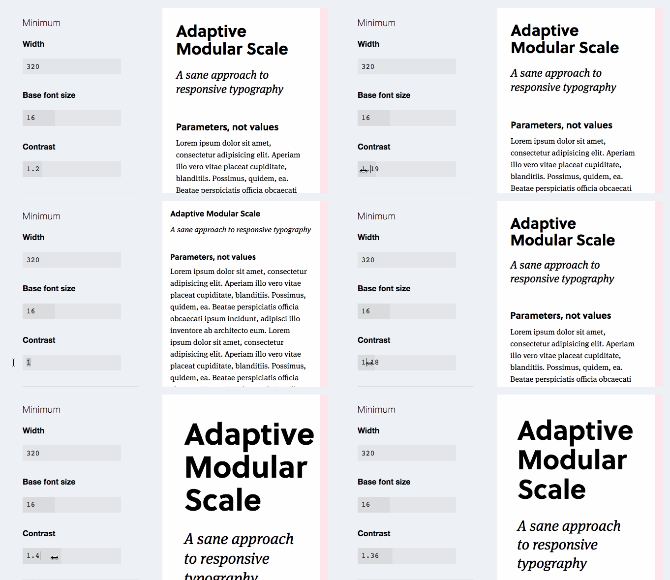
For example, the designer and developer could define the logic that considers content, context and user data; then, a platform would compile a design using principles and patterns. This would allow us to fine-tune the tiniest details for specific usage scenarios, without drawing and coding dozens of screen states by hand. Florian Schulz shows how you can use the idea of interpolation to create many states of components.
My interest in algorithm-driven design sprung up around 2012, when my design team at Mail.Ru Group required an automated magazine layout. Existing content had a poor semantic structure, and updating it by hand was too expensive. How could we get modern designs, especially when the editors weren’t designers?
Well, a special script would parse an article. Then, depending on the article's content (the number of paragraphs and words in each, the number of photos and their formats, the presence of inserts with quotes and tables, etc.), the script would choose the most suitable pattern to present this part of the article. The script also tried to mix patterns, so that the final design had variety. It would save the editors time in reworking old content, and the designer would just have to add new presentation modules. Flipboard launched a very similar model a few years ago.
Vox Media made a home page generator using similar ideas. The algorithm finds every possible layout that is valid, combining different examples from a pattern library. Next, each layout is examined and scored based on certain traits. Finally, the generator selects the "best" layout — basically, the one with the highest score. It's more efficient than picking the best links by hand, as proven by recommendation engines such as Relap.io.

Preparing Assets And Content #
Creating cookie-cutter graphic assets in many variations is one of the most boring parts of a designer's work. It takes so much time and is demotivating, when designers could be spending this time on more valuable product work.
Algorithms could take on simple tasks such as color matching. For example, Yandex.Launcher uses an algorithm to automatically set up colors for app cards, based on app icons. Other variables could be automatically set, such as changing text color according to the background color, highlighting eyes in a photo to emphasize emotion, and implementing parametric typography.

Algorithms can create an entire composition. Yandex.Market uses a promotional image generator for e-commerce product lists (in Russian). A marketer fills a simple form with a title and an image, and then the generator proposes an endless number of variations, all of which conform to design guidelines. Netflix went even further — its script crops movie characters for posters, then applies a stylized and localized movie title, then runs automatic experiments on a subset of users. Real magic! Engadget has nurtured a robot apprentice to write simple news articles about new gadgets. Whew!

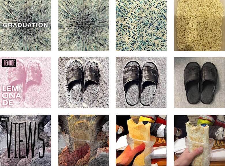
Truly dark magic happens in neural networks. A fresh example, the Prisma app, stylizes photos to look like works of famous artists. Artisto can process video in a similar way (even streaming video).

However, all of this is still at an early stage. Sure, you could download an app on your phone and get a result in a couple of seconds, rather than struggle with some library on GitHub (as we had to last year); but it's still impossible to upload your own reference style and get a good result without teaching a neural network. However, when that happens at last, will it make illustrators obsolete? I doubt it will for those artists with a solid and unique style. But it will lower the barrier to entry when you need decent illustrations for an article or website but don't need a unique approach. No more boring stock photos!
For a really unique style, it might help to have a quick stylized sketch based on a question like, "What if we did an illustration of a building in our unified style?" For example, the Pixar artists of the animated movie Ratatouille tried to apply several different styles to the movie's scenes and characters; what if a neural network made these sketches? We could also create storyboards and describe scenarios with comics (photos can be easily converted to sketches). The list can get very long.
Finally, there is live identity, too. Animation has become hugely popular in branding recently, but some companies are going even further. For example, Wolff Olins presented a live identity for Brazilian telecom Oi, which reacts to sound. You just can't create crazy stuff like this without some creative collaboration with algorithms.
One way to get a clear and well-developed strategy is to personalize a product for a narrow audience segment or even specific users. We see it every day in Facebook newsfeeds, Google search results, Netflix and Spotify recommendations, and many other products. Besides the fact that it relieves the burden of filtering information from users, the users' connection to the brand becomes more emotional when the product seems to care so much about them.
However, the key question here is about the role of designer in these solutions. We rarely have the skill to create algorithms like these — engineers and big data analysts are the ones to do it. Giles Colborne of CX Partners sees a great example in Spotify's Discover Weekly feature: The only element of classic UX design here is the track list, whereas the distinctive work is done by a recommendation system that fills this design template with valuable music.

Colborne offers advice to designers about how to continue being useful in this new era and how to use various data sources to build and teach algorithms. It’s important to learn how to work with big data and to cluster it into actionable insights. For example, Airbnb learned how to answer the question, “What will the booked price of a listing be on any given day in the future?” so that its hosts could set competitive prices. There are also endless stories about Netflix’s recommendation engine.
A relatively new term, "anticipatory design" takes a broader view of UX personalization and anticipation of user wishes. We already have these types of things on our phones: Google Now automatically proposes a way home from work using location history data; Siri proposes similar ideas. However, the key factor here is trust. To execute anticipatory experiences, people have to give large companies permission to gather personal usage data in the background.
I already mentioned some examples of automatic testing of design variations used by Netflix, Vox Media and The Grid. This is one more way to personalize UX that could be put onto the shoulders of algorithms. Liam Spradlin describes the interesting concept of mutative design; it's a well-though-out model of adaptive interfaces that considers many variables to fit particular users.
An Exoskeleton For Designers #
I've covered several examples of algorithm-driven design in practice. What tools do modern designers need for this? If we look back to the middle of the last century, computers were envisioned as a way to extend human capabilities. Roelof Pieters and Samim Winiger have analyzed computing history and the idea of augmentation of human ability in detail. They see three levels of maturity for design tools:
- First-generation systems mimic analogue tools with digital means.
- The second generation is assisted creation systems, where humans and machines negotiate the creative process through tight action-feedback loops.
- The third generation is assisted creation systems 3.0, which negotiate the creative process in fine-grained conversations, augment creative capabilities and accelerate the acquisition of skills from novice to expert.
Algorithm-driven design should be something like an exoskeleton for product designers — increasing the number and depth of decisions we can get through. How might designers and computers collaborate?
The working process of digital product designers could potentially look like this:
- Explore a problem space, and pick the most valuable problem for the business and users to solve (analysis).
- Explore a solution space, and pick the best solution to fix the problem (analysis).
- Develop, launch and market a product that solves this problem (synthesis).
- Evaluate how the product works for real users, and optimize it (analysis and synthesis).
- Connect and unify the solution with other products and solutions of the company (synthesis).
These tasks are of two types: the analysis of implicitly expressed information and already working solutions, and the synthesis of requirements and solutions for them. Which tools and working methods do we need for each of them?
Analysis #
Analysis of implicitly expressed information about users that can be studied with qualitative research is hard to automate. However, exploring the usage patterns of users of existing products is a suitable task. We could extract behavioral patterns and audience segments, and then optimize the UX for them. It's already happening in ad targeting, where algorithms can cluster a user using implicit and explicit behavior patterns (within either a particular product or an ad network).
To train algorithms to optimize interfaces and content for these user clusters, designers should look into machine learning. Jon Bruner gives a good example: A genetic algorithm starts with a fundamental description of the desired outcome — say, an airline's timetable that is optimized for fuel savings and passenger convenience. It adds in the various constraints: the number of planes the airline owns, the airports it operates in, and the number of seats on each plane. It loads what you might think of as independent variables: details on thousands of flights from an existing timetable, or perhaps randomly generated dummy information. Over thousands, millions or billions of iterations, the timetable gradually improves to become more efficient and more convenient. The algorithm also gains an understanding of how each element of the timetable — the take-off time of Flight 37 from O'Hare, for instance — affects the dependent variables of fuel efficiency and passenger convenience.
In this scenario, humans curate an algorithm and can add or remove limitations and variables. The results can be tested and refined with experiments on real users. With a constant feedback loop, the algorithm improves the UX, too. Although the complexity of this work suggests that analysts will be doing it, designers should be aware of the basic principles of machine learning. O'Reilly published a great mini-book on the topic recently.
Synthesis #
Two years ago, a tool for industrial designers named Autodesk Dreamcatcher made a lot of noise and prompted several publications from UX gurus. It's based on the idea of generative design, which has been used in performance, industrial design, fashion and architecture for many years now. Many of you know Zaha Hadid Architects; its office calls this approach "parametric design."
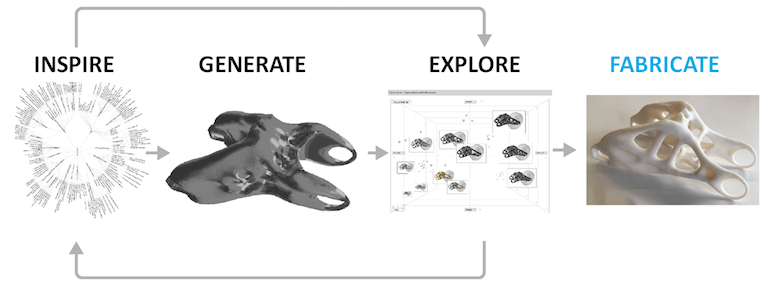
Logojoy is a product to replace freelancers for a simple logo design. You choose favorite styles, pick a color and voila, Logojoy generates endless ideas. You can refine a particular logo, see an example of a corporate style based on it, and order a branding package with business cards, envelopes, etc. It’s the perfect example of an algorithm-driven design tool in the real world! Dawson Whitfield, the founder, described machine learning principles behind it.

However, it’s not yet established in digital product design, because it doesn’t help to solve utilitarian tasks. Of course, the work of architects and industrial designers has enough limitations and specificities of its own, but user interfaces aren’t static — their usage patterns, content and features change over time, often many times. However, if we consider the overall generative process — a designer defines rules, which are used by an algorithm to create the final object — there’s a lot of inspiration. The working process of digital product designers could potentially look like this:
- An algorithm generates many variations of a design using predefined rules and patterns.
- The results are filtered based on design quality and task requirements.
- Designers and managers choose the most interesting and adequate variations, polishing them if needed.
- A design system runs A/B tests for one or several variations, and then humans choose the most effective of them.
It's yet unknown how can we filter a huge number of concepts in digital product design, in which usage scenarios are so varied. If algorithms could also help to filter generated objects, our job would be even more productive and creative. However, as product designers, we use generative design every day in brainstorming sessions where we propose dozens of ideas, or when we iterate on screen mockups and prototypes. Why can't we offload a part of these activities to algorithms?
Experiment by Jon Gold #
The experimental tool Rene by Jon Gold, who worked at The Grid, is an example of this approach in action. Gold taught a computer to make meaningful typographic decisions. Gold thinks that it's not far from how human designers are taught, so he broke this learning process into several steps:
- Analyze glyphs to understand similarities in typefaces.
- Formulate basic guidelines for combining typefaces.
- Identify the best examples of type combinations to understand trends.
- Create algorithms to observe how great designers work.
His idea is similar to what Roelof and Samim say: Tools should be creative partners for designers, not just dumb executants.
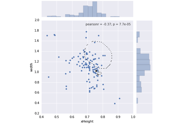
Gold’s experimental tool Rene is built on these principles. He also talks about imperative and declarative approaches to programming and says that modern design tools should choose the latter — focusing on what we want to calculate, not how. Jon uses vivid formulas to show how this applies to design and has already made a couple of low-level demos. You can try out the tool for yourself. It’s a very early concept but enough to give you the idea.
While Jon jokingly calls this approach "brute-force design" and "multiplicative design," he emphasizes the importance of a professional being in control. Notably, he left The Grid team earlier this year.
Do Tools Already Exist? #
Unfortunately, there are no tools for product design for web and mobile that could help with analysis and synthesis on the same level as Autodesk Dreamcatcher does. However, The Grid and Wix could be considered more or less mass-level and straightforward solutions. Adobe is constantly adding features that could be considered intelligent: The latest release of Photoshop has a content-aware feature that intelligently fills in the gaps when you use the cropping tool to rotate an image or expand the canvas beyond the image's original size.
There is another experiment by Adobe and University of Toronto. DesignScape automatically refines a design layout for you. It can also propose an entirely new composition.
You should definitely follow Adobe in its developments, because the company announced a smart platform named Sensei at the MAX 2016 conference. Sensei uses Adobe's deep expertise in AI and machine learning, and it will be the foundation for future algorithm-driven design features in Adobe's consumer and enterprise products. In its announcement, the company refers to things such as semantic image segmentation (showing each region in an image, labeled by type — for example, building or sky), font recognition (i.e. recognizing a font from a creative asset and recommending similar fonts, even from handwriting), and intelligent audience segmentation.
However, as John McCarthy, the late computer scientist who coined the term "artificial intelligence," famously said, "As soon as it works, no one calls it AI anymore." What was once cutting-edge AI is now considered standard behavior for computers. Here are a couple of experimental ideas and tools that could become a part of the digital product designer's day-to-day toolkit:
- StyLit
Creates a 3D model out of sketch. - Autocomplete handdrawn animations
Microsoft's experimental tool for autocompleting illustrations and animations.
But these are rare and patchy glimpses of the future. Right now, it's more about individual companies building custom solutions for their own tasks. One of the best approaches is to integrate these algorithms into a company's design system. The goals are similar: to automate a significant number of tasks in support of the product line; to achieve and sustain a unified design; to simplify launches; and to support current products more easily.
Modern design systems started as front-end style guidelines, but that's just a first step (integrating design into code used by developers). The developers are still creating pages by hand. The next step is half-automatic page creation and testing using predefined rules.
Pros And Cons #
Should your company follow this approach?
Pros #
If we look in the near term, the value of this approach is more or less clear:
- Remove the routine of preparing assets and content, which is more or less mechanical work.
- Broaden creative exploration, where a computer makes combinations of variables, while the designer filters results to find the best variations.
- Optimize a user interface for narrow audience segments or even specific users.
- Quickly adapt a design to various platforms and devices, though in a primitive way.
- Experiment with different parts of a user interface or particular patterns — ideally, automatically.
Altogether, this frees the designer from the routines of both development support and the creative process, but core decisions are still made by them. A neat side effect is that we will better understand our work, because we will be analyzing it in an attempt to automate parts of it. It will make us more productive and will enable us to better explain the essence of our work to non-designers. As a result, the overall design culture within a company will grow.
Cons #
However, all of these benefits are not so easy to implement or have limitations:
- We can only talk about a company's custom solutions in the context of the company's own tasks. The work requires constant investment into development, support and enhancement.
- As The Grid's CMS shows, a tool alone can't do miracles. Without a designer at the helm, its results will usually be mediocre. On the other hand, that's true of most professional tools.
- Breaking past existing styles and solutions becomes harder. Algorithm-driven design is based on existing patterns and rules.
- Copying another designer's work becomes easier if a generative design tool can dig through Dribbble.
There are also ethical questions: Is design produced by an algorithm valuable and distinct? Who is the author of the design? Wouldn't generative results be limited by a local maximum? Oliver Roeder says that "computer art" isn't any more provocative than "paint art" or "piano art." The algorithmic software is written by humans, after all, using theories thought up by humans, using a computer built by humans, using specifications written by humans, using materials gathered by humans, in a company staffed by humans, using tools built by humans, and so on. Computer art is human art — a subset, rather than a distinction. The revolution is already happening, so why don't we lead it?
Conclusion #
This is a story of a beautiful future, but we should remember the limits of algorithms — they're built on rules defined by humans, even if the rules are being supercharged now with machine learning. The power of the designer is that they can make and break rules; so, in a year from now, we might define "beautiful" as something totally different. Our industry has both high- and low-skilled designers, and it will be easy for algorithms to replace the latter. However, those who can follow and break rules when necessary will find magical new tools and possibilities.
Moreover, digital products are getting more and more complex: We need to support more platforms, tweak usage scenarios for more user segments, and hypothesize more. As Frog's Harry West says, human-centered design has expanded from the design of objects (industrial design) to the design of experiences (encompassing interaction design, visual design and the design of spaces). The next step will be the design of system behavior: the design of the algorithms that determine the behavior of automated or intelligent systems. Rather than hire more and more designers, offload routine tasks to a computer. Let it play with the fonts.
No comments:
Post a Comment