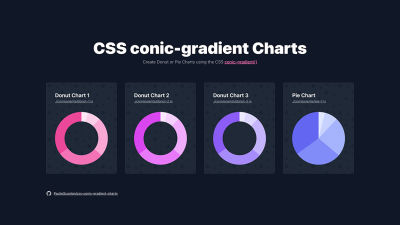
In this article, Paul Scanlon shares a super lightweight approach to creating a Donut chart using conic-gradient().
There are no additional libraries to install or maintain, and there’s
no heavy JavaScript that needs to be downloaded by the browser in order
for them to work. Let’s explore!
CSS is amazing — I’m
regularly surprised at how far it has come in the years I’ve been using
it (~2005 – present). One such surprise came when I noticed this tweet
by Shruti Balasa which demonstrated how to create a pie chart using conic-gradient().
It’s fairly straightforward. Here’s a code snippet:
Using this tiny amount of CSS, you can create gradients that start and stop at specific angles and define a color for each ‘segment’ of the pie chart.

Happy Days! #
Brills, I thought I could use this instead of a charting library for a data dashboard project I’m working on for the new CockroachDB Cloud API, but I had a problem. I didn’t know the values for my chart ahead of time, and the values I was receiving from the API weren’t in degrees!
Here’s a preview link and Open-source repo of how I worked around those two problems, and in the rest of this post, I’ll explain how it all works.
- 🚀 Preview: https://css-conic-gradient-charts.vercel.app/
- ⚙️ Repo: https://github.com/PaulieScanlon/css-conic-gradient-charts
Dynamic Data Values #
Here’s some sample data from a typical API response which I’ve sorted by value.
You can see that each item in the array has a name and a value.
In order to convert the value from a number into a deg value to use with CSS, there are a few things you need to do:
- Calculate the total amount of all the values.
- Use the total amount to calculate the percentage that each value represents.
- Convert the percentage into degrees.
Note: The code I’ll be referring to in the steps below can be found in the repo here: /components/donut-1.js.
Calculate The Total Amount #
Using JavaScript, you can use this little one-liner to sum up each value from the data array, which results in a single total.
Calculate The Percentage #
Now that you have a total_value, you can convert each of the values from the data array to a percentage using a JavaScript function. I’ve called this function covertToPercent.
Note: I’ve used the value of 210 from Cluster 1 in this example.
Convert Percentage to Degrees #
Once
you have a percentage, you can convert the percentage into degrees
using another JavaScript function. I’ve called this function convertToDegrees.
The Result #
As a temporary test, if I were to map over the items in the sorted data array, using the two functions explained above, you’d end up with the following output:
The return value of test_output is an array of the value (in degrees) + the string deg.
This solves one of a two-part problem. I’ll now explain the other part of the problem.
To create a Pie chart using conic-gradient(), you need two deg
values. The first is the angle from where the gradient should start,
and the second is the angle where the gradient should stop. You’ll also
need a color for each segment, but I’ll come to that in a moment.
Using the values from the test_output,
I only have the end value (where the gradient should stop). The start
angle for each segment is actually the end angle from the previous item
in the array, and the end angle is the cumulative value of all previous
end values plus the current end value. And to make matters worse, the
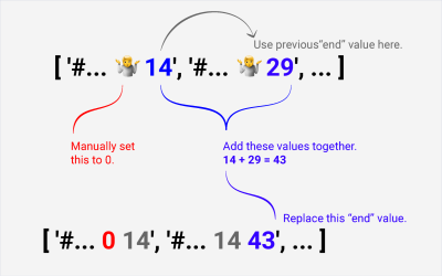
start value for the first angle needs to be manually set to 0 🥴.
Here’s a diagram to better explain what that means:

If that sounds confusing, it’s because it is, but if you look at the output of a function that can do all this, it might make more sense.
The Function That Can Do All This #
And here’s the function that can indeed do all of this. It uses reduce()
to iterate over the data array, performs the necessary addition to
calculate the angles, and returns a new set of numbers that can be used
to create the correct start and end angles for use in a Chart.
I’ve purposefully left this pretty verbose, so it’s easier to add in console.log(). I found this to be quite helpful when I was developing this function.
You might notice the additional map chained to the end of the reduce. By using a map I’m able to modify the returned values and tack on deg, then return them all together as an array of strings.
Using join right at the end converts the array back to a single css_string, which can be used with conic-gradient() 😅.
Using The css_string With An SVG foreignObject #
Now, unfortunately, you can’t use conic-gradient() with SVG. But you can wrap an HTML element inside a foreignObject and style the background using a conic-gradient().
Using the above, you should be looking at a Pie chart. In order to make a Donut chart, I’ll need to explain how to make the hole.
Let’s Talk About the Hole #
There’s
only really one way you can ‘mask’ off the middle of the Pie chart to
reveal the background. This approach involves using a clipPath. This approach looks like the below code snippet. I’ve used this for Donut 1.
Note: The src for Donut 1 can be seen here: components/donut-1.js.
However, there is another way. This approach involves using a <circle /> element and placing it in the center of the pie chart. This will work if the fill of the <circle />
matches the background color of whatever the chart is placed on. In my
example, I’ve used a pattern background, and you’ll notice if you look
closely at Donut 3 that you can’t see the bubble pattern through the center of the chart.
Note: The src for Donut 3 can be seen here: components/donut-3.js.
IMO the clipPath
approach is nicer, but it can be more difficult to amend the path
points to get the desired thickness of the hole if you don’t have access
to something like Figma or Illustrator.
Finally, Colors! #
Colors for charts are something that always cause me problems. Most of the time, the colors I use are defined in CSS, and all this stuff is happening in JavaScript, so how do you use CSS variables in JavaScript?
In my example site, I’m using Tailwind to style ‘all the things’ and by using this trick, I’m able to expose the CSS variables so they can be referred to by their name.
If you want to do the same, you could add a color key to the data array:
And then reference the color key in the array map to return it as part of the css_string. I’ve used this approach in Donut 2.
Note: You can see the src for Donut 2 here: components/donut-2.js.
You could even dynamically create the color name using a hard-coded value (color-pink-) + the index from the array. I’ve used this approach in Donut 1.
Note: You can see the src for Donut 1 here: components/donut-1.js.
If You’re Lucky! #
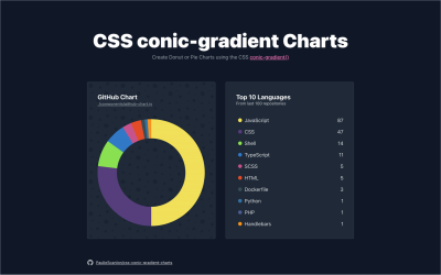
However, you might get lucky and be working with an API that actually returns values with an associated color. This is the case with the GitHub GraphQL API. So. I popped together one last example.

You can see this working in your browser by visiting /github, and the src for both the GitHub Donut Chart and Legend can be found here:
Wrapping Up #
You might be thinking this is quite complicated, and it’s probably easier to use a Charting Library, and you’re probably right. It probably is. But this way is super lightweight. There are no additional libraries to install or maintain, and there’s no heavy JavaScript that needs to be downloaded by the browser in order for them to work.
I experimented once before with creating Donut Charts using an SVG and the stroke-dashoffset. You can read about that in my article, “Create an SVG Doughnut Chart From Scratch For Your Gatsby Blog.” That approach worked really well, but I think I prefer the approach described in this post. CSS is simply the best!
No comments:
Post a Comment