You can incrementally advance corporate UX maturity by conducting user research, designing new features, and repairing existing ones while emphasizing how your work improves the user experience. Experts agree this approach is effective, but it may take long before the company truly groks and values UX. To accelerate culture change, you must find and solve a big unmet user need. But an innovative solution is not enough; you must also successfully navigate UX politics to see your project through to deployment.
During most of my jobs in UX leadership roles over the past 40 years, my teams and I resigned ourselves to making incremental improvements to legacy products and force-fitting new features into existing design frameworks. As a result, appreciation of UX advanced gradually, starting with our development and product management partners and later expanding to other parts of the organization as our contributions gained recognition. But while UX awareness expanded, UX maturity did not increase appreciably.
Whenever I tried a bottom-up approach, driving UX innovation as an individual contributor or front-line manager, I frequently ran into territorial disputes or Not Invented Here (NIH) obstacles. While my colleagues in the development and product management never explicitly said so, the unspoken message was, “That’s not your job. That’s my job. UX needs to stay in its lane.” UX should not be proposing new development projects or creating a vision for future products; these are the exclusive engineering and product management domains.

When I bypassed my product partners and proposed UX innovation initiatives directly to the vice-president or CEO, my ideas were squelched by the Wizard of Oz test. The VP or CEO would tell me that I showed “good initiative” but that more research and a thorough ROI analysis would be required before moving forward.
In other words, they told me:
“Great idea, but before I invest time and resources, you need to bring me the broom from the Wicked Witch of the West.”
Translation:
“Your idea entails too much risk. Rather than shut you down now, I’ll give you an impossible task to complete, and then I’ll consider it again.”
It was the ultimate dodge.

When I worked for corporate innovation teams that trained and consulted with leaders in other divisions within the company, I helped product teams solve wicked hard design problems and invent new products. But the underlying sentiment of my engagements was that I was an outsider who didn’t fully understand the team’s history, constraints, and business domain. Therefore, I was only marginally successful at affecting the division’s culture. I was often regarded as an “expert with a hero complex” who flew in to rescue the product team with the message, “Hi! I’m from corporate, and I’m here to help you!” (whether you want my help or not).

My Last Chance to Get It Right #
After experiencing limited success in changing the corporate culture in my previous UX roles, I was convinced that my best chance of advancing UX maturity was to elicit the participation of every department in the company in a breakthrough project. I believed that lasting change would not result from consulting engagements, executive coaching, design thinking workshops, or one-week design sprints. While these approaches had yielded successful one-off UX projects, they did not effect lasting change in corporate culture.
So, when I signed on as Director of User Experience at Edmentum in 2012, I was determined to do it right. I was nearing the end of the corporate phase of my UX career and understood that this job might be my last opportunity to put all my learnings into practice.
Edmentum was and still is one of the premier education technology companies in the United States. The company began as PLATO — Programmed Logic for Automatic Teaching Operations — a computer-based education platform and online community created in 1960 by Donald Bitzer at the University of Illinois. Ownership of the company has changed hands several times over the decades. When I joined, the company was in the process of rebranding itself as Edmentum after a merger with Archipelago Learning, the creator of Study Island.
It was my first time working for a smaller, privately-owned company and designing products for teachers, administrators, and students. I’ve always been able to empathize with my users, but at Edmentum, it was particularly easy.
The UX director was a new role at Edmentum. The company had only one full-time UX designer, supported by three contractors. On the Nielsen Norman Group’s UX Maturity Scale, I would rate the company at Stage 3 — Emergent. The leadership team recognized the value of UX design and created the director position to develop and execute a strategy for moving forward.
Phase 1: Finding The Big Unmet Need #
The Listening Tour #
I began my job at Edmentum with a listening tour. I asked my boss, the Chief Technology Officer, for a list of people from all departments I could talk to about their perception of UX and what my priorities as a director should be. I met with leaders and individual contributors in development, product management, support, professional services, QA, marketing, and sales. I knew my success was contingent upon my ability to recruit allies from each functional area. To do this, I needed to understand their priorities, the metrics for which they were held accountable, and what kept them up at night.
I also visited customers to begin my observational research program. During my interviews with Edmentum employees, I learned that our PLATO Courseware product was most in need of UX attention. I arranged to accompany one of our professional services consultants on a customer visit to observe how users were interacting with Courseware.
The customers had just been trained on Courseware one week earlier but had requested an additional training session so they could take better notes. They couldn’t remember how to perform basic tasks with the product.
These customers called Courseware the “clicky system” because it took so many clicks to get the results they were trying to achieve. The consultant clicked them through several workflows while they created their cheat sheets. At the end of the session, one of the teachers turned to me and said:
Teacher: It just seems like it’s longer and more convoluted than it has to be. I want to be able to choose a student and then do what I want to do with that student from there. You can edit it. You can delete it. You can manage it or whatever. That’s just an idea.
Me: That’s a very good idea. That’s why I’m here.
Teacher: It just seems like it’s so complicated to get to whatever… She just told us last week how to do this and when it came time a few days later actually to do it, it was like Pfttt! And that’s why we have this meeting to write some notes down.
Just an idea? In a few sentences, she had articulated her #1 big unmet need and how to solve for it. If this were her primary obstacle to success, the same would be true for our other customers.
The breakthrough project was born.
App World vs. My World #
PLATO Courseware was a collection of “mini apps” and functions arranged into logical groupings in the user interface. Part of the design employed a task-first approach (e.g., Create a Class, Assign PLATO Courses), and the other part employed an object-first approach for things teachers create and manage (e.g., Classes, Assignments).
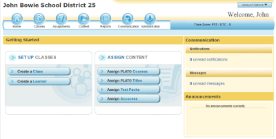
And it certainly was a “clicky system” — the distance between the start of a task and the desired result required clicking through a confusing workflow involving several screens.
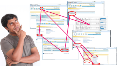
When a teacher launched PLATO Courseware, she saw “App World” — a collection of features and functions arranged in a way that made perfect sense to application developers. But during my customer visit, the teacher explained that she wanted to see “My World” — the world of a classroom full of students. The design of PLATO Courseware was backward: choose a function, then choose the student you want to apply it to. Teachers wanted the reverse of this experience: first, choose a student, then choose a function. Students — the object of focus for the application’s users — were nowhere to be seen on the home screen of the product. This was the core problem.
Phase 2: Envisioning The Solution #
The Prototype #
I returned to the office to envision an entirely new design framework for our flagship product. I had three goals:
- Design the application to be a window into the teacher’s world.
- Embed the actions a teacher performs in her world directly into her primary objects of focus, namely students and groups of students.
- Build a “question answering machine,” one that provides the answers to every question a teacher can ask about her students’ performance.
But first, I needed a genius UX designer to translate these goals into a design architecture and a prototype. I called Mike Boston.
I had worked with Mike at a previous job at UnitedHealth Group. I had never met a person who knew so much and thought so deeply about solving wicked hard design problems. I showed him the video of my site visit with the teacher and my list of three design problems we needed to solve.
Teaching is a data-intensive profession. To Individualize learning for each student, teachers must analyze hundreds of data points each week. The lessons taught on Tuesday are dependent on student performance on Monday’s lessons. Students are grouped according to their reading levels, classroom behaviors, and pace of learning in each subject based on real-time data from previous assignments.
The question answering machine that Mike and I envisioned — aka “The Thing” — would help teachers cope with this mass of raw data. We began by listing the questions that teachers would want to ask “The Thing,” questions like:
- Which students are making good progress on their assignments, and which are struggling?
- Which students do I need to check in with this morning?
- How did Maria do on the remedial instruction I gave her yesterday?
- Are my students on pace to complete the course by the end of the semester?
Our wives were both teachers, so we validated our assumptions with them.
Although question lists are a useful way to derive a catalog of product features, lists of user questions themselves fall short when it comes to telling a convincing story of how a product will be used, what kinds of problems it will solve, how it will add value, save time, increase productivity, and, generally, how it will drive customer sales.
Realizing this, we converted the question list into a user experience narrative. This narrative can be further decomposed into a clickable prototype that can be used for further research and internal communication.
After a few weeks, we had a rudimentary prototype and a story to tell starring a teacher named Mrs. Pamela Jones and her student Maria Alverez. We were ready to pitch “The Thing” to the executive leadership team.
Phase 3: Selling The Project #
The Pitch To The ELT #
Less than three months into my new job, my boss arranged for me to have a fifteen-minute time slot at the beginning of the weekly leadership meeting.
I began with the video clip of the teacher expressing her frustration with the “clicky system,” followed by a demo of PLATO Courseware showing how many clicks were required for a teacher to do anything useful. I described the My World design framework and told the story of a week in the life of Mrs. Jones and Maria using the prototype of the new PLATO Courseware.
At this juncture, the prototype was quite primitive:
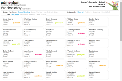
It was, however, a dramatic improvement over the current product. Instead of facing a maze of functions, users would see their classroom of students represented as cards. Vital statistics about each student — the last assignment they worked on, their reading group, and the date and time of their last activity — were available at a glance, along with alerts to events that required a teacher’s response.
Mike included one WOW! factor in the prototype that got the executives’ attention. He had discovered a JavaScript plug-in called Isotope that animated the movement of the cards. When Mrs. Jones used a filter to ask the question, “Which students require an intervention?” the cards would fly around the screen until they came to rest, showing only those students who had a problem with an assignment.
At the end of the demo, the CEO got up from his seat and exclaimed, “This is an entirely new product!” The VP of sales sat at the back of the room and smiled.
I thanked the leadership team for their time and left them to discuss my proposal. My boss told me later that my presentation blew up the remainder of the meeting. The roadmap was revised to make room for the project after the current release was completed.
My Biggest Political Mistake #
“The Thing” was poised to become the greatest success of my career, but a political miscalculation almost doomed it to failure. From previous attempts at advancing corporate UX maturity, I had learned how to avoid many common obstacles to innovation, but one remained that I didn’t anticipate. While I knew I would eventually engage every other department in the project, I didn’t do it early enough.
It didn’t take long for word to spread throughout the company that the new guy had proposed a “game-changing” new product. My primary partners in product development — the development director and the chief product owner — heard about the meeting through the grapevine and were upset, to say the least.
They had every right to be resentful. After only three months on the job, I knew very little about the education technology business domain or the company’s Agile process of building products. From their point of view, I had put on a good show with no consideration for technical feasibility or the impact “The Thing” would have on other projects. I had done the easy part — impressing the ELT — and left them to figure out the hard part of implementing an entirely new design framework with an unknown set of technical challenges. Without the support of these two key partners, the project would fail.
In hindsight, I should have engaged the development director and chief product owner shortly after building the first iteration of the prototype. I should have taken advantage of their domain knowledge and co-presented with them when I pitched the idea to the leadership team.
It took time, but eventually, I was able to repair the damage from this oversight. After fully engaging them in the project, the development director and chief product owner were instrumental in refining the interaction model and proposing changes to the original design that dramatically improved the final product.
Phase 4: Iterating The Concept #
Prototype, Evaluate, Iterate, And Address Constraints #
After receiving the green light from the executive leadership team, we hired a software engineer to take over prototype development and free Mike to solve design problems. For the next few months, Mike, the chief product owner, the development director, and I refined the concept and expanded the teacher question list. My primary directive was to protect Mike from the Agile machine, giving him time and space to work through dozens of iterations without the responsibility of delivering code-ready mockups to development.
This period in which the team was given the freedom to operate independently from the Agile Scrum Machine was essential. The discovery phase for an innovative new product cannot be forced to fit into the Agile Scrum model of software development. Before carving up the product into stories, you must have a holistic picture of how the product looks and behaves. This takes months of intense experiments and continuous research. A “sprint zero” lasting a couple of weeks is not enough time. To immediately apply Scrum to a breakthrough project would be like constructing a jigsaw puzzle one piece at a time, only to discover later that the assembled pieces produced an incoherent and inconsistent mess instead of a beautiful picture.
At the end of three months, “The Thing” had evolved into a three-tiered view of the teacher’s world. The top tier was the classroom, with small cards representing each student and powerful filters to sort and group students based on various attributes:
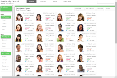
The next level down was a medium-sized card for each student containing details of the student’s progress and buttons that allowed the teacher to take action on the data:
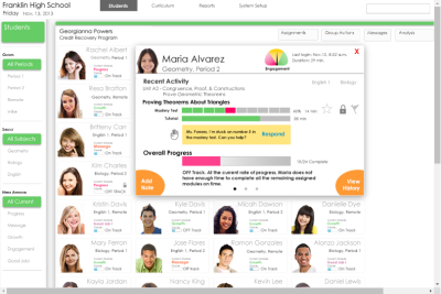
The third tier was a large card with detailed student performance data for each course with affordances for taking notes and assigning remedial instruction as needed.
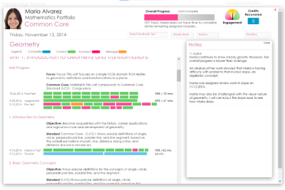
The final prototype contained many more features than could be implemented in one release, but it provided a roadmap to an ultimate vision of what “The Thing” could become over time.
Phase 5: Deployment And Measuring Impact #
Branding, Marketing, And Sales #
After development began, I received an invite to meet with the company’s marketing director. He proposed hiring an outside marketing firm to create a branding package for “The Thing,” complete with a name, logo, and color palette. I was honored that Edmentum was willing to commit that level of investment to bring the product to market. After several meetings with the outside firm to discuss the value proposition and intent behind the new product, we settled on the name “EdmentumTM SenseiTM.”
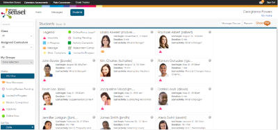
Edmentum Sensei was one of our most promoted features at our trade show expos that year. We received overwhelmingly positive responses from conference attendees, collected Best In Show awards, and were written up in the industry press.

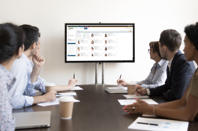
After its release, the sales team reported that Edmentum Sensei practically sold itself and was credited with earning the company numerous new contracts and repeat business. The joke around the office was that the UX team should be given its own sales quota.
Lessons Learned #
Over the next several years, the Edmentum UX team tripled in size. We created another version of Sensei for Study Island, another of our flagship products. Because we had engaged the entire organization during the creation of Sensei, the company evolved from the “emergent” stage in Nielsen Norman Group’s stages of UX maturity to the highest User-Driven level.
Driving innovation based on user research became the company’s modus operandi.
Travel expenses to visit customer sites were never questioned.
Accountability for UX became everybody’s job regardless of their function.
This would not have been the case had I, as the new UX director, settled for incremental enhancements to the existing products rather than insisting on bold innovation.
To conceive and execute your own breakthrough project:
- Do the research. Your customers know what they need.
- Hire the best talent you can find to help you.
- Build a vision prototype. Use the prototype to tell a story.
- Recruit and engage allies. Start with your core product team and expand to other functional areas. Great design is not enough; you must manage the politics.
- Demonstrate how your vision prototype solves a big unmet need. Use videos of your customers to set the stage, then show how your prototype solves their problems.
- Iterate. Get customer feedback. Then iterate some more. Work outside of the Agile machine until the concept is ready to build.
- Build it. Layer the new design on top of the legacy product to minimize development effort.
- Measure the impact. Collect sales data demonstrating how your project contributes to new and repeat sales.
Will this approach advance UX maturity in every company? Probably not, but in my experience, the company-wide breakthrough project is an effective way to accelerate your journey toward a UX-driven culture.
Now all you have to do is… do it again.
No comments:
Post a Comment