Success
in modern UX isn’t about having the most content. It’s about having the
most findable content. Yet even with more data and better tools than
ever, internal search often fails, leaving users to rely on global
search engines to find a single page on a local site. Why does the “Big
Box” still win, and how can we bring users back?
In
the early days of the web, the search bar was a luxury, added to a site
once it became “too big” to navigate by clicking. We treated it like an
index at the back of a book: a literal, alphabetical list of words that
pointed to specific pages. If you typed the exact word the author used,
you found what you needed. If you didn’t, you were met with a “0 Results
Found” screen that felt like a digital dead end.
Twenty-five
years later, we are still building search bars that act like 1990s index
cards, even though the humans using them have been fundamentally
rewired. Today, when a user lands on your site and can’t find what they
need in the global navigation within seconds, they don’t try to learn
your taxonomy. They head for the search box. But if that box fails them,
and demands they use your specific brand vocabulary, or
punishes them for a typo, they do something that should keep every UX
designer awake at night. They leave your site, go to Google, and type site:yourwebsite.com [query].
Or, worse still, they just type in their query and end up on a
competitor’s website. I personally use Google over a site’s search
nearly every time.
This is the Site-Search Paradox.
In an era where we have more data and better tools than ever, our
internal search experiences are often so poor that users prefer to use a
trillion-dollar global search engine to find a single page on a local
site. As Information Architects and UX designers, we have to ask, why
does the “Big Box” win, and how can we take our users back?
The primary reason site search fails is what I call the Syntax Tax.
This is the cognitive load we place on users when we require them to
guess the exact string of characters we’ve used in our database.
Research by Origin Growth on Search vs Navigate shows that roughly 50% of users
go straight to the search bar upon landing on a site. For example, when
a user types “sofa” into a furniture site that has categorised
everything under “couches,” and the site returns nothing, the user
doesn’t think, “Ah, I should try a synonym.” They think, “This site doesn’t have what I want.”
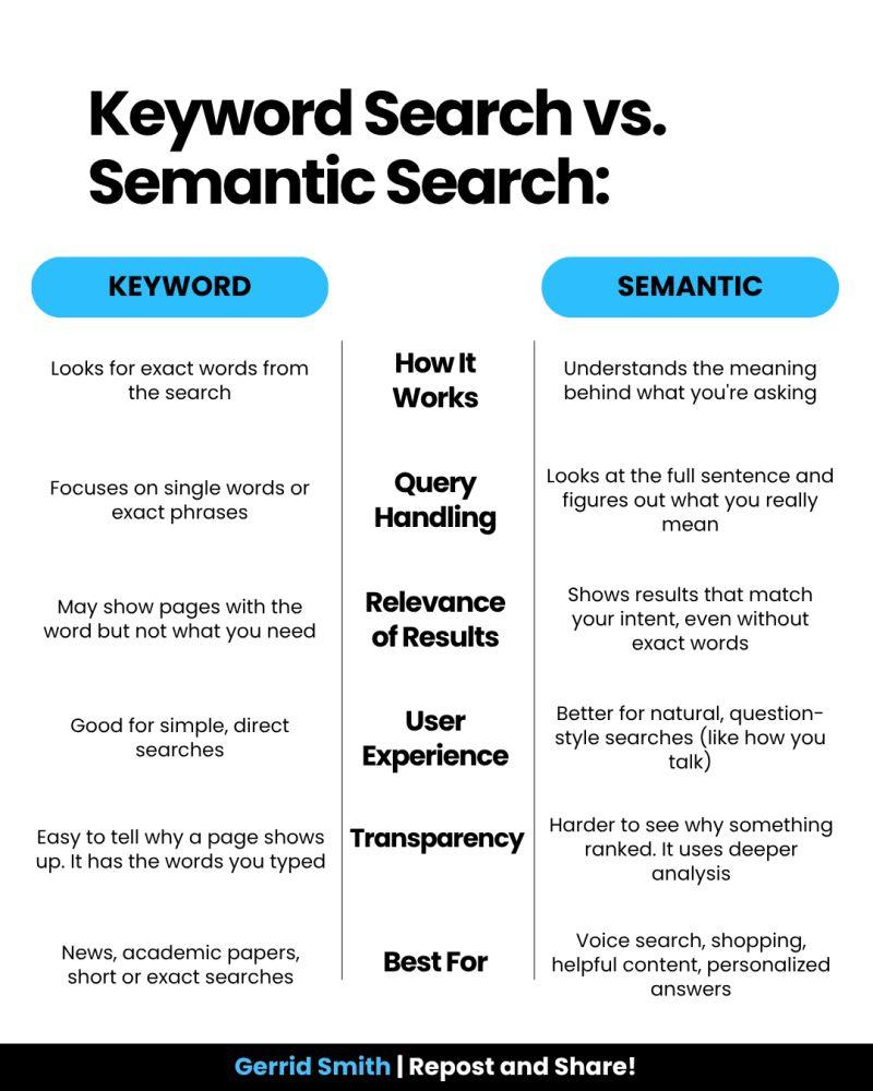
This is a failure of Information Architecture (IA). We’ve built our systems to match strings (literal sequences of letters) rather than things (the concepts behind the words). When we force users to match our internal vocabulary, we are taxing their brainpower.
It
is easy to throw our hands up and say, “We can’t compete with Google’s
engineering.” But Google’s success isn’t just about raw power; it’s
about contextual understanding. While we often treat search as a technical utility, Google treats it as an IA challenge.
Data from the Baymard Institute reveals that 41% of e-commerce sites fail to support even basic symbols or abbreviations, and this often leads to users abandoning a site after a single failed search attempt. Google wins because it uses stemming and lemmatization
— IA techniques that recognize “running” and “ran” are the same intent.
Most internal searches are “blind” to this context, treating “Running
Shoe” and “Running Shoes” as entirely different entities.
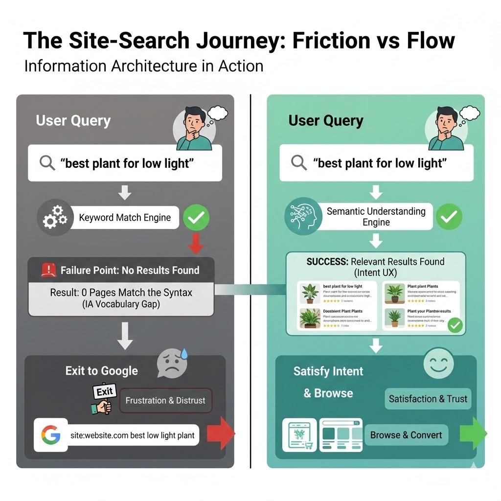
User Query Friction vs. User Flow. (Image source: Created with Gemini) (Large preview)
The UX Of “Maybe”: Designing For Probabilistic Results #
In
traditional IA, we think in binaries: A page is either in a category,
or it isn’t. A search result is either a match or it isn’t. Modern
search, which users now expect, is probabilistic. It deals in “confidence levels.”
According to Forresters, users who use search are 2–3 times more likely to convert than those who don’t, if the search works. And 80% of users on e-commerce sites exit a site due to poor search results.
As designers, we rarely design for the middle ground. We design a “Results Found” page and a “No Results” page. We miss the most important state: The “Did You Mean?” State.
A well-designed search interface should provide “Fuzzy” matches.
Instead of a cold “0 Results Found” screen, we should be using our
metadata to say, “We didn’t find that in ‘Electronics,’ but we found 3 matches in ‘Accessories’.” By designing for “Maybe,” we can keep the user in the flow.
To
understand why IA is the fuel for the search engine, we must look at
how data is structured behind the scenes. In my 25 years of practice,
I’ve seen that the “findability” of a page is directly tied to its
structured metadata.
Consider a large-scale enterprise I worked
with that had over 5,000 technical documents. Their internal search was
returning irrelevant results because the “Title” tag of every document
was the internal SKU number (e.g., “DOC-9928-X”) rather than the
human-readable name.
By reviewing the search logs, we discovered
that users were searching for “installation guide.” Because that phrase
didn’t appear in the SKU-based title, the engine ignored the most
relevant files. We implemented a Controlled Vocabulary,
which was a set of standardised terms that mapped SKUs to human
language. Within three months, the “Exit Rate” from the search page
dropped by 40%. This wasn’t an algorithmic fix; it was an IA fix. It
proves that a search engine is only as good as the map we give it.
Throughout
my two decades in UX, I’ve noticed a recurring theme: internal teams
often suffer from “The curse of knowledge.” We become so immersed in our
own corporate vocabulary, or sometimes referred to as business jargon,
that we forget the user doesn’t speak our language.
I once worked
with a financial institution that was frustrated by high call volumes to
their support centre. Users were complaining they couldn’t find “loan
payoff” information on the site. When we looked at the search logs,
“loan payoff” was the #1 searched term that resulted in zero hits.
Why?
Because the institution’s IA team had labelled every relevant page
under the formal term “Loan Release.” To the bank, a “payoff” was a
process, but a “Loan Release” was the legal document that was the
“thing” in the database. Because the search engine was looking for
literal character strings, it refused to connect the user’s desperate
need with the company’s official solution.
This is where the IA
professional must act as a translator. By simply adding “loan payoff” as
a hidden metadata keyword to the Loan Release pages, we solved a
multi-million dollar support problem. We didn’t need a faster server; we
needed a more empathetic taxonomy.
If
you want to reclaim your search box from Google, you cannot simply “set
it and forget it.” You must treat search as a living product. Here is
the framework I use to audit and optimise search experiences:
Analyse the top 50 most common queries. Are they Navigational (looking for a specific page), Informational (looking for “how to”), or Transactional
(looking for a specific product)? Your search UI should look different
for each. A navigational search should “Quick-Link” the user directly to
the destination, bypassing the results page entirely.
Intentionally
mistype your top 10 products. Use plurals, common typos, and American
vs. British English spellings (e.g., “Color” vs. “Colour”). If your
search fails these tests, your engine lacks “stemming” support. This is a
technical requirement you must advocate for to your engineering team.
Look
at your results page. Does it offer filters that actually make sense?
If a user searches for “shoes,” they should see filters for Size and Colour. Generic filters can be as bad as no filters.
Reclaiming The Search Box: A Strategy For IA Professionals #
To stop the exodus to Google, we must move beyond the “Box” and look at the scaffolding.
Step A: Implement semantic scaffolding. Don’t
just return a list of links. Use your IA to provide context. If a user
searches for a product, show them the product, but also show them the manual, the FAQs, and the related parts. This “associative” search mimics how the human brain works and how Google operates.
Step B: Stop being a librarian, start being a concierge. A
librarian tells you exactly where the book is on the shelf. A concierge
listens to what you want to achieve and gives you a recommendation.
Your search bar should use predictive text not just to complete words,
but to suggest intentions.
Using a “Google-powered” search bar, as seen on the University of Chicago
website, is essentially an admission that a site’s internal
organisation has become too complex for its own navigation to handle.
While it is a quick “fix” for massive institutions to ensure users find something, it is generally a poor choice for businesses with deep content.
By
delegating the search to Google, you surrender the user experience to
an outside algorithm. You lose the ability to promote specific products,
you expose your users to third-party ads, and you train your customers
to leave your ecosystem the moment they need help. For a business,
search should be a curated conversation that guides a customer toward a
goal, not a generic list of links that pushes them back to the open web.
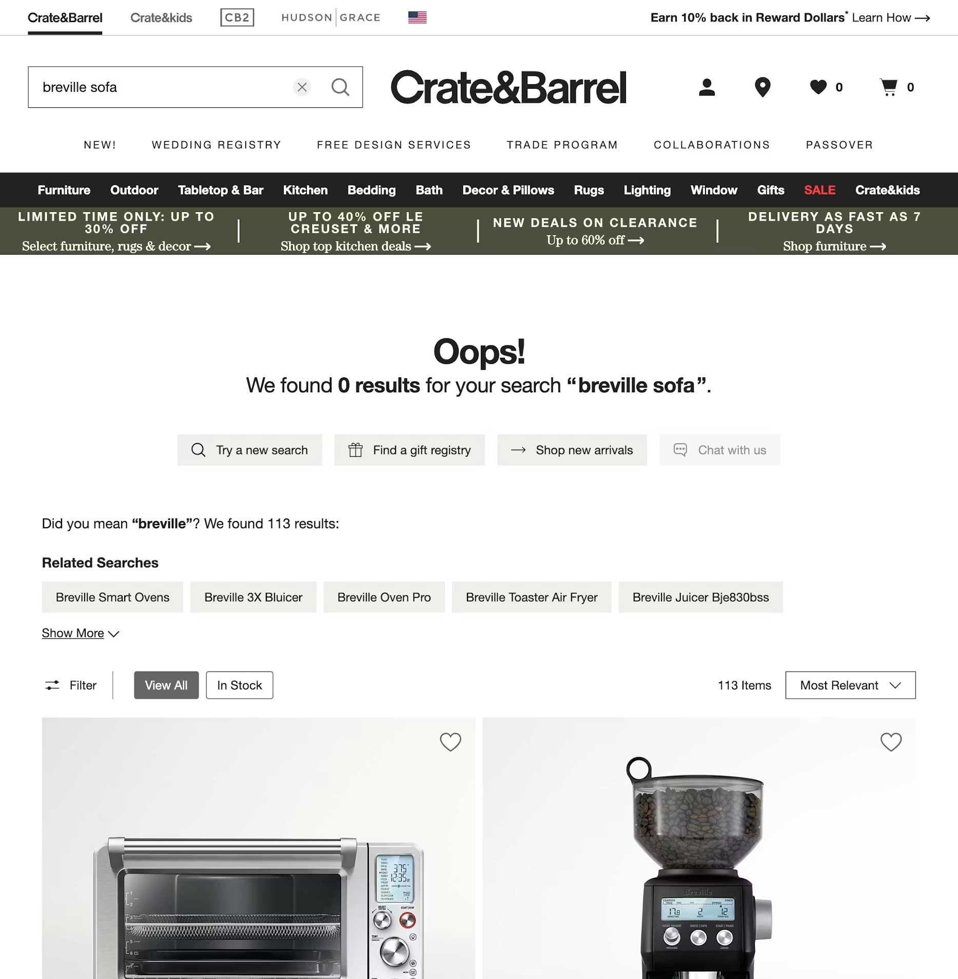
Shows
search results with useful options when there are no exact matches.
Additional suggestions are provided, including a “Did you mean” feature
to help connect users with similar items. (Image source: Crate & Barrel) (Large preview)
Here
is a final checklist for reference when you are building the search
experience for your users. Work with your product team to ensure you are
engaging with the right team members.
Kill the dead-end. Never just say “No results found.” If an exact match isn’t there, suggest a similar category, a popular product, or a way to contact support.
Fix “almost” matches. Make
sure the search can handle plurals (like “plant” vs. “plants”) and
common typos. Users shouldn’t be punished for a slip of the thumb.
Predict the user’s goal. Use an “auto-suggest” menu to show helpful actions (like “Track my order”) or categories, not just a list of words.
Talk like a human. Look
at your search logs to see the words people actually use. If they type
“couch” and you call it “sofa,” create a bridge in the background so
they find what they need anyway.
Smart filtering. Only
show filters that matter. If someone searches for “shoes,” show them
size and color filters, not a generic list that applies to the whole
site.
Show, don’t just list. Use small
thumbnails and clear labels in the search results so users can see the
difference between a product, a blog post, and a help article at a
glance.
Speed is trust. If the search takes more than a second, use a loading animation. If it’s too slow, people will immediately go back to Google.
Check the “failure” logs. Once
a month, look at what people searched for that returned zero results.
This is your “to-do list” for fixing your site’s navigation.
The
search box is the only place on your site where the user tells us
exactly, in their own words, what they want. When we fail to understand
those words, when we let the “Big Box” of Google do the work for us, we
aren’t just losing a page view. We are losing the opportunity to prove
that we understand our customers.
By
moving from literal string matching to semantic understanding, and by
supporting our search engines with robust, human-centered Information
Architecture, we can finally close the gap.
Turn
scattered user research into AI-powered personas that give anyone
consolidated multi-perspective feedback from a single question.
In my previous article,
I explored how AI can help us create functional personas more
efficiently. We looked at building personas that focus on what users are
trying to accomplish rather than demographic profiles that look good on
posters but rarely change design decisions.
But creating personas
is only half the battle. The bigger challenge is getting those insights
into the hands of people who need them, at the moment they need them.
Every
day, people across your organization make decisions that affect user
experience. Product teams decide which features to prioritize. Marketing
teams craft campaigns. Finance teams design invoicing processes.
Customer support teams write response templates. All of these decisions
shape how users experience your product or service.
And most of them happen without any input from actual users.
The Problem With How We Share User Research
You
do the research. You create the personas. You write the reports. You
give the presentations. You even make fancy infographics. And then what
happens?
The research sits in a shared drive somewhere, slowly
gathering digital dust. The personas get referenced in kickoff meetings
and then forgotten. The reports get skimmed once and never opened again.
When
a product manager is deciding whether to add a new feature, they
probably do not dig through last year’s research repository. When the
finance team is redesigning the invoice email, they almost certainly do
not consult the user personas. They make their best guess and move on.
This
is not a criticism of those teams. They are busy. They have deadlines.
And honestly, even if they wanted to consult the research, they probably
would not know where to find it or how to interpret it for their
specific question.
The knowledge stays locked inside the heads of
the UX team, who cannot possibly be present for every decision being
made across the organization.
What If Users Could Actually Speak?
What
if, instead of creating static documents that people need to find and
interpret, we could give stakeholders a way to consult all of your user
personas at once?
Imagine a marketing manager working on a
new campaign. Instead of trying to remember what the personas said
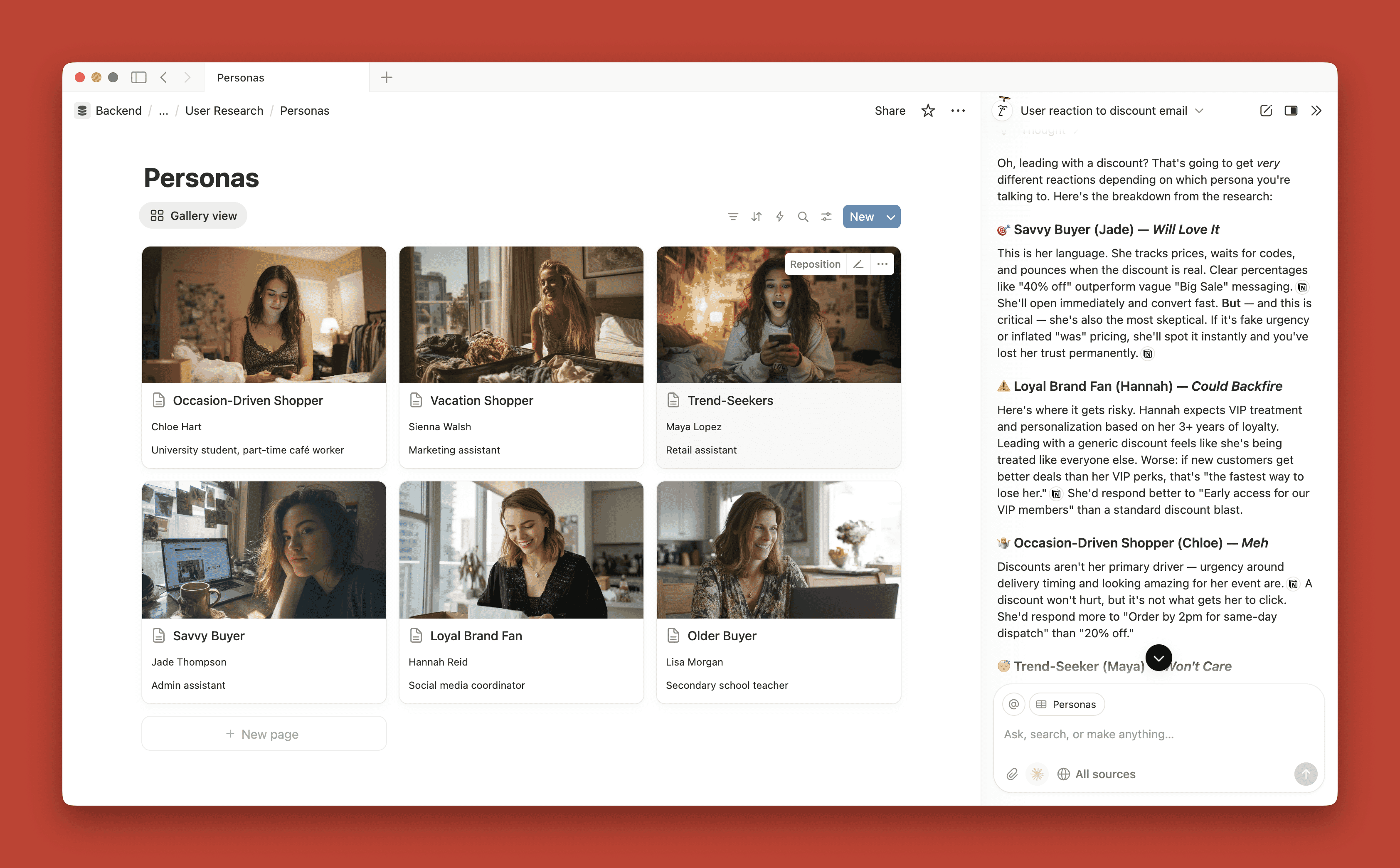
about messaging preferences, they could simply ask: “I’m thinking about leading with a discount offer in this email. What would our users think?”
And
the AI, drawing on all your research data and personas, could respond
with a consolidated view: how each persona would likely react, where
they agree, where they differ, and a set of recommendations based on
their collective perspectives. One question, synthesized insight across
your entire user base.
You can question how personas will react to different scenarios based on the research available. (Large preview)
This
is not science fiction. With AI, we can build exactly this kind of
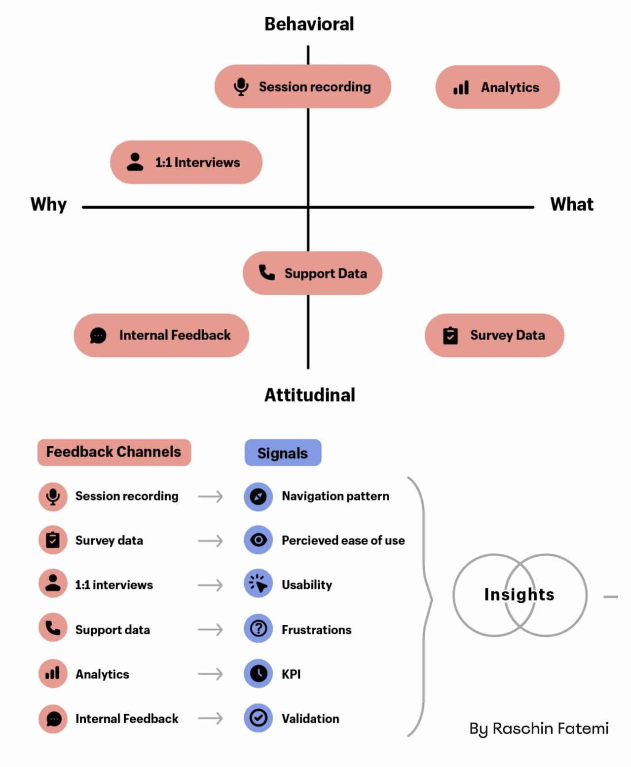
system. We can take all of that scattered research (the surveys, the
interviews, the support tickets, the analytics, the personas themselves)
and turn it into an interactive resource that anyone can query for multi-perspective feedback.
Building the User Research Repository
The
foundation of this approach is a centralized repository of everything
you know about your users. Think of it as a single source of truth that
AI can access and draw from.
If you have been doing user research
for any length of time, you probably have more data than you realize. It
is just scattered across different tools and formats:
Survey results sitting in your survey platform,
Interview transcripts in Google Docs,
Customer support tickets in your helpdesk system,
Analytics data in various dashboards,
Social media mentions and reviews,
Old personas from previous projects,
Usability test recordings and notes.
The
first step is gathering all of this into one place. It does not need to
be perfectly organized. AI is remarkably good at making sense of messy
inputs.
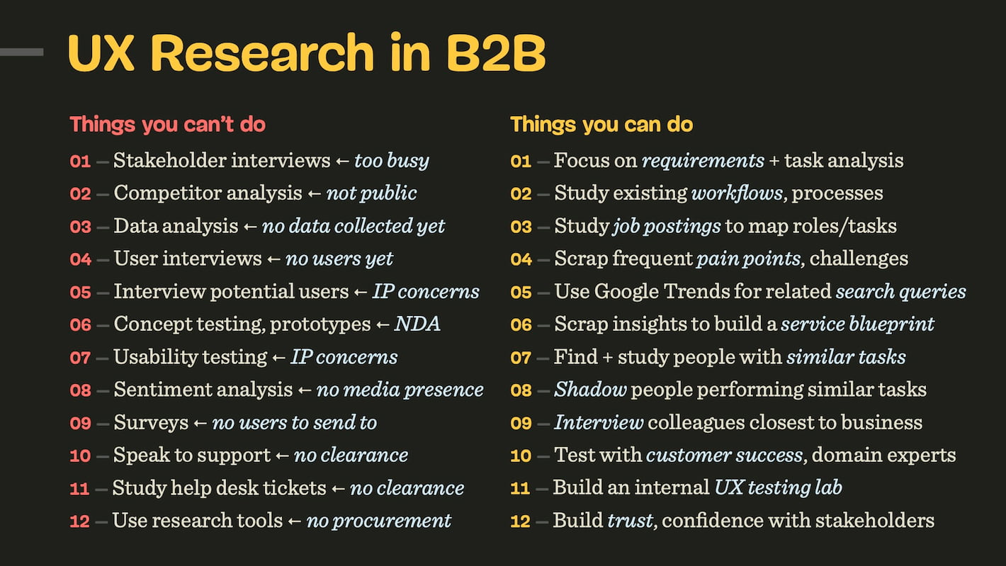
If you are starting from scratch and do not have much
existing research, you can use AI deep research tools to establish a
baseline.
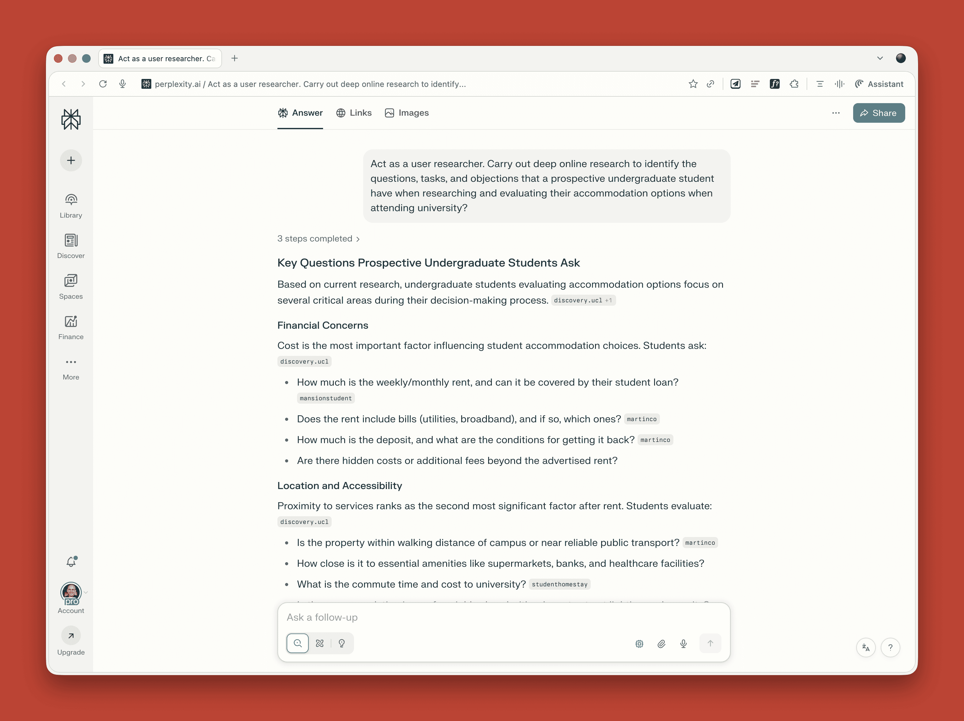
Online deep research with a tool like perplexity can be invaluable as a starting point for user research. (Large preview)
These
tools can scan the web for discussions about your product category,
competitor reviews, and common questions people ask. This gives you
something to work with while you build out your primary research.
Creating Interactive Personas
Once
you have your repository, the next step is creating personas that the
AI can consult on behalf of stakeholders. This builds directly on the functional persona approach I outlined in my previous article, with one key difference: these personas become lenses through which the AI analyzes questions, not just reference documents.
The process works like this:
Feed your research repository to an AI tool.
Ask it to identify distinct user segments based on goals, tasks, and friction points.
Have it generate detailed personas for each segment.
Configure the AI to consult all personas when stakeholders ask questions, providing consolidated feedback.
Here
is where this approach diverges significantly from traditional
personas. Because the AI is the primary consumer of these persona
documents, they do not need to be scannable or fit on a single page.
Traditional personas are constrained by human readability: you have to
distill everything down to bullet points and key quotes that someone can
absorb at a glance. But AI has no such limitation.
This means your personas can be considerably more detailed.
You can include lengthy behavioral observations, contradictory data
points, and nuanced context that would never survive the editing process
for a traditional persona poster. The AI can hold all of this
complexity and draw on it when answering questions.
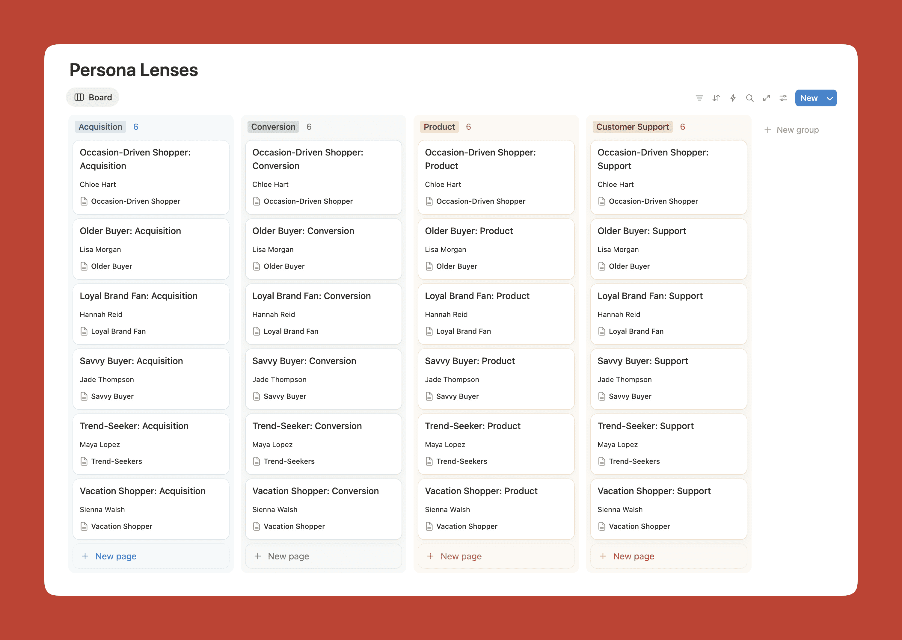
You can also create different lenses or perspectives within each persona,
tailored to specific business functions. Your “Weekend Warrior” persona
might have a marketing lens (messaging preferences, channel habits,
campaign responses), a product lens (feature priorities, usability
patterns, upgrade triggers), and a support lens (common questions,
frustration points, resolution preferences). When a marketing manager
asks a question, the AI draws on the marketing-relevant information.
When a product manager asks, it pulls from the product lens. Same
persona, different depth depending on who is asking.
Personas can have different lenses relevant to different functions within the business. (Large preview)
The
personas should still include all the functional elements we discussed
before: goals and tasks, questions and objections, pain points,
touchpoints, and service gaps. But now these elements become the basis
for how the AI evaluates questions from each persona’s perspective,
synthesizing their views into actionable recommendations.
Implementation Options
You can set this up with varying levels of sophistication depending on your resources and needs.
The Simple Approach
Most
AI platforms now offer project or workspace features that let you
upload reference documents. In ChatGPT, these are called Projects.
Claude has a similar feature. Copilot and Gemini call them Spaces or
Gems.
To get started, create a dedicated project and upload your
key research documents and personas. Then write clear instructions
telling the AI to consult all personas when responding to questions.
Something like:
You are helping stakeholders understand
our users. When asked questions, consult all of the user personas in
this project and provide: (1) a brief summary of how each persona would
likely respond, (2) an overview highlighting where they agree and where
they differ, and (3) recommendations based on their collective
perspectives. Draw on all the research documents to inform your
analysis. If the research does not fully cover a topic, search social
platforms like Reddit, Twitter, and relevant forums to see how people
matching these personas discuss similar issues. If you are still unsure
about something, say so honestly and suggest what additional research
might help.
This approach has some limitations. There are
caps on how many files you can upload, so you might need to prioritize
your most important research or consolidate your personas into a single
comprehensive document.
The More Sophisticated Approach
For larger organizations or more ongoing use, a tool like Notion offers advantages because it can hold your entire research repository
and has AI capabilities built in. You can create databases for
different types of research, link them together, and then use the AI to
query across everything.
Notion
is a powerful tool for user research with built-in AI functionality
that can refer to all your personas as well as your entire research
repository. (Large preview)
The benefit here is that the AI has access to much more context.
When a stakeholder asks a question, it can draw on surveys, support
tickets, interview transcripts, and analytics data all at once. This
makes for richer, more nuanced responses.
There are several scenarios where you still need primary research:
When launching something genuinely new that your existing research does not cover;
When you need to validate specific designs or prototypes;
When your repository data is getting stale;
When stakeholders need to hear directly from real humans to build empathy.
In
fact, you can configure the AI to recognize these situations. When
someone asks a question that goes beyond what the research can answer,
the AI can respond with something like: “I do not have enough
information to answer that confidently. This might be a good question
for a quick user interview or survey.”
And when you do
conduct new research, that data feeds back into the repository. The
personas evolve over time as your understanding deepens. This is much
better than the traditional approach, where personas get created once
and then slowly drift out of date.
The Organizational Shift
If this approach catches on in your organization, something interesting happens.
Instead
of spending time creating reports that may or may not get read, you
spend time ensuring the repository stays current and that the AI is
configured to give helpful responses.
Research communication
changes from push (presentations, reports, emails) to pull (stakeholders
asking questions when they need answers). User-centered thinking becomes distributed across the organization rather than concentrated in one team.
This
does not make UX researchers less valuable. If anything, it makes them
more valuable because their work now has a wider reach and greater
impact. But it does change the nature of the work.
Getting Started
If you want to try this approach, start small. If you need a primer on functional personas before diving in, I have written a detailed guide to creating them.
Pick one project or team and set up a simple implementation using
ChatGPT Projects or a similar tool. Gather whatever research you have
(even if it feels incomplete), create one or two personas, and see how
stakeholders respond.
Pay attention to what questions they ask.
These will tell you where your research has gaps and what additional
data would be most valuable.
As you refine the approach, you can expand to more teams and more sophisticated tooling. But the core principle stays the same: take all that scattered user knowledge and give it a voice that anyone in your organization can hear.
In
my previous article, I argued that we should move from demographic
personas to functional personas that focus on what users are trying to
do. Now I am suggesting we take the next step: from static personas to
interactive ones that can actually participate in the conversations
where decisions get made.
Because every day, across your
organization, people are making decisions that affect your users. And
your users deserve a seat at the table, even if it is a virtual one.
Research
isn’t everything. Facts alone don’t win arguments, but powerful stories
do. Here’s how to turn your research into narratives that inspire trust
and influence decisions.
In the early days of my career, I believed that nothing wins an argument more effectively than strong and unbiased research. Surely facts speak for themselves, I thought.
If
I just get enough data, just enough evidence, just enough clarity on
where users struggle — well, once I have it all and I present it all, it
alone will surely change people’s minds, hearts, and beliefs. And, most
importantly, it will help everyone see, understand, and perhaps even
appreciate and commit to what needs to be done.
Well, it’s not quite like that. In fact, the stronger and louder the data, the more likely it is to be questioned. And there is a good reason for that, which is often left between the lines.
Research Amplifies Internal Flaws
Throughout
the years, I’ve often seen data speaking volumes about where the
business is failing, where customers are struggling, where the team is
faltering — and where an urgent turnaround is necessary. It was right there, in plain sight: clear, loud, and obvious.
Good research doesn't just uncover troubles; it also amplifies internal flaws and poor decisions. Wonderful illustration by José Torre. (Large preview)
But
because it’s so clear, it reflects back, often amplifying all the sharp
edges and all the cut corners in all the wrong places. It reflects
internal flaws, wrong assumptions, and failing projects
— some of them signed off years ago, with secured budgets, big
promotions, and approved headcounts. Questioning them means questioning authority, and often it’s a tough path to take.
As it turns out, strong data is very, very good at raising uncomfortable truths
that most companies don’t really want to acknowledge. That’s why, at
times, research is deemed “unnecessary,” or why we don’t get access to
users, or why loud voices always win big arguments.
So
even if data is presented with a lot of eagerness, gravity, and passion
in that big meeting, it will get questioned, doubted, and explained
away. Not because of its flaws, but because of hope, reluctance to
change, and layers of internal politics.
This shows up most vividly in situations when someone raises concerns about the validity and accuracy of research. Frankly, it’s not that somebody is wrong and somebody is right. Both parties just happen to be right in a different way.
What To Do When Data Disagrees
We’ve all heard that data always tells a story. However, it’s never just a single story. People are complex, and pointing out a specific truth about them just by looking at numbers is rarely enough.
When data disagrees, it doesn’t mean that either is wrong. It’s just that different perspectives reveal different parts of a whole story that isn’t completed yet.
↳ Quant usually comes from analytics, surveys, and experiments.
↳ Qual comes from tests, observations, and open-ended surveys.
Risk-averse teams overestimate the weight of big numbers in quantitative research. Users exaggerate the frequency and severity of issues that are critical for them. As Archana Shah noted, designers get carried away by users’ confident responses and often overestimate what people say and do.
And so, eventually, data coming from different teams paints a different picture. And when it happens, we need to reconcile and triangulate. With the former, we track what’s missing, omitted, or overlooked. With the latter, we cross-validate data
— e.g., finding pairings of qual/quant streams of data, then clustering
them together to see what’s there and what’s missing, and exploring
from there.
And even with all of it in place and data conflicts
resolved, we still need to do one more thing to make a strong argument:
we need to tell a damn good story.
Facts Don’t Win Arguments, Stories Do
Research isn’t everything. Facts don’t win arguments — powerful stories do.
But a story that starts with a spreadsheet isn’t always inspiring or
effective. Perhaps it brings a problem into the spotlight, but it
doesn’t lead to a resolution.
The very first thing I try to do in that big boardroom meeting is to emphasize what unites us — shared goals, principles, and commitments that are relevant to the topic at hand. Then, I show how new data confirms or confronts our commitments, with specific problems we believe we need to address.
When a question about the quality of data comes in, I need to show that it has been reconciled and triangulated already and discussed with other teams as well.
A good story has a poignant ending. People need to see an alternative future
to trust and accept the data — and a clear and safe path forward to
commit to it. So I always try to present options and solutions that we
believe will drive change and explain our decision-making behind that.
They also need to believe that this distant future is within reach, and that they can pull it off, albeit under a tough timeline or with limited resources.
And: a good story also presents a viable, compelling, shared goal that people can rally around and commit to. Ideally, it’s something that has a direct benefit for them and their teams.
These
are the ingredients of the story that I always try to keep in my mind
when working on that big presentation. And in fact, data is a starting point, but it does need a story wrapped around it to be effective.
Wrapping Up
There
is nothing more disappointing than finding a real problem that real
people struggle with and facing the harsh reality of research not being trusted or valued.
We’ve all been there before. The best thing you can do is to be prepared:
have strong data to back you up, include both quantitative and
qualitative research — preferably with video clips from real customers —
but also paint a viable future which seems within reach.
And sometimes nothing changes until something breaks. And at times, there isn’t much you can do about it unless you are prepared when it happens.
“Data
doesn’t change minds, and facts don’t settle fights. Having answers
isn’t the same as learning, and it for sure isn’t the same as making
evidence-based decisions.”
The
Wizard of Oz method is a proven UX research tool that simulates real
interactions to uncover authentic user behavior. Victor Yocco explores
its fundamentals, advanced techniques, and critical considerations,
including its relevance in the emerging field of agentic AI.
New
technologies and innovative concepts frequently enter the product
development lifecycle, promising to revolutionize user experiences.
However, even the most ingenious ideas risk failure without a
fundamental grasp of user interaction with these new experiences.
Consider the plight of the Nintendo Power Glove.
Despite being a commercial success (selling over 1 million units), its
release in late 1989 was followed by its discontinuation less than a
full year later in 1990. The two games created solely for the Power
Glove sold poorly, and there was little use for the Glove with
Nintendo’s already popular traditional console games.
A large part of the failure was due to audience reaction once the product (which allegedly was developed in 8 weeks) was cumbersome and unintuitive. Users found syncing the glove
to the moves in specific games to be extremely frustrating, as it
required a process of coding the moves into the glove’s preset move
buttons and then remembering which buttons would generate which move.
With the more modern success of Nintendo’s WII and other movement-based
controller consoles and games, we can see the Power Glove was a concept
ahead of its time.
The Nintendo Power Glove: A Fistful of Frustration
If
Power Glove’s developers wanted to conduct effective research prior to
building it out, they would have needed to look beyond traditional
methods, such as surveys and interviews, to understand how a user might
truly interact with the Glove. How could this have been done without a
functional prototype and slowing down the overall development process?
Enter the Wizard of Oz method,
a potent tool for bridging the chasm between abstract concepts and
tangible user understanding, as one potential option. This technique
simulates a fully functional system, yet a human operator (“the Wizard”)
discreetly orchestrates the experience. This allows researchers to
gather authentic user reactions and insights without the prerequisite of a fully built product.
The
Wizard of Oz (WOZ) method is named in tribute to the similarly named
book by Frank L. Baum. In the book, the Wizard is simply a man hidden
behind a curtain, manipulating the reality of those who travel the land
of Oz. Dorothy, the protagonist, exposes the Wizard for what he is,
essentially an illusion or a con who is deceiving those who believe him
to be omnipotent. Similarly, WOZ takes technologies that may or may not
currently exist and emulates them in a way that should convince a
research participant they are using an existing system or tool.
WOZ enables the exploration of user needs, validation of nascent concepts, and mitigation of development risks, particularly with complex or emerging technologies.
The
product team in our above example might have used this method to have
users simulate the actions of wearing the glove, programming moves into
the glove, and playing games without needing a fully functional system.
This could have uncovered the illogical situation of asking laypeople to
code their hardware to be responsive to a game, show the frustration
one encounters when needing to recode the device when changing out
games, and also the cumbersome layout of the controls on the physical
device (even if they’d used a cardboard glove with simulated controls
drawn in crayon on the appropriate locations.
Jeff Kelley credits himself
(PDF) with coining the term WOZ method in 1980 to describe the research
method he employed in his dissertation. However, Paula Roe credits Don Norman and Allan Munro
for using the method as early as 1973 to conduct testing on an airport
automated travel assistant. Regardless of who originated the method,
both parties agree that it gained prominence when IBM later used it to
conduct studies on a speech-to-text tool known as The Listening Typewriter (see Image below).
Wizard of Oz testing: The listening typewriter IBM 1984.
In
this article, I’ll cover the core principles of the WOZ method, explore
advanced applications taken from practical experience, and demonstrate
its unique value through real-world examples, including its application
to the field of agentic AI. UX practitioners can use the WOZ method as
another tool to unlock user insights and craft human-centered products and experiences.
The Yellow Brick Road: Core Principles And Mechanics
The
WOZ method operates on the premise that users believe they are
interacting with an autonomous system while a human wizard manages the
system’s responses behind the scenes. This individual, often positioned
remotely (or off-screen), interprets user inputs and generates outputs
that mimic the anticipated functionality of the experience.
Cast Of Characters
A successful WOZ study involves several key roles:
The User The participant who engages with what they perceive as the functional system.
The Facilitator The researcher who guides the user through predefined tasks and observes their behavior and reactions.
The Wizard The individual manipulates the system’s behavior in real-time, providing responses to user inputs.
The Observer (Optional) An
additional researcher who observes the session without direct
interaction, allowing for a secondary perspective on user behavior.
Setting The Stage For Believability: Leaving Kansas Behind
Creating a convincing illusion
is key to the success of a WOZ study. This necessitates careful
planning of the research environment and the tasks users will undertake.
Consider a study evaluating a new voice command system for smart home
devices. The research setup might involve a physical mock-up of a smart
speaker and predefined scenarios like “Play my favorite music” or “Dim the living room lights.”
The wizard, listening remotely, would then trigger the appropriate
responses (e.g., playing a song, verbally confirming the lights are
dimmed).
Or perhaps it is a screen-based experience testing a new
AI-powered chatbot. You have users entering commands into a text box,
with another member of the product team providing responses
simultaneously using a tool like Figma/Figjam, Miro, Mural, or other
cloud-based software that allows multiple users to collaborate
simultaneously (the author has no affiliation with any of the mentioned
products).
The Art Of Illusion
Maintaining the illusion of a genuine system requires the following:
Timely and Natural Responses The
wizard must react to user inputs with minimal delay and in a manner
consistent with expected system behavior. Hesitation or unnatural
phrasing can break the illusion.
Consistent System Logic Responses
should adhere to a predefined logic. For instance, if a user asks for
the weather in a specific city, the wizard should consistently provide
accurate information.
Handling the Unexpected Users
will inevitably deviate from planned paths. The wizard must possess the
adaptability to respond plausibly to unforeseen inputs while preserving
the perceived functionality.
Ethical Considerations
Transparency is crucial,
even in a method that involves a degree of deception. Participants
should always be debriefed after the session, with a clear explanation
of the Wizard of Oz technique and the reasons for its use. Data privacy must be maintained as with any study, and participants should feel comfortable and respected throughout the process.
Distinguishing The Method
The WOZ method occupies a unique space within the UX research toolkit:
Unlike usability testing, which evaluates existing interfaces, Wizard of Oz explores concepts before significant development.
Distinct from A/B testing,
which compares variations of a product’s design, WOZ assesses entirely
new functionalities that might otherwise lack context if shown to users.
Compared to traditional prototyping,
which often involves static mockups, WOZ offers a dynamic and
interactive experience, enabling observation of real-time user behavior
with a simulated system.
This method proves particularly valuable when exploring truly novel interactions or complex systems
where building a fully functional prototype is premature or
resource-intensive. It allows researchers to answer fundamental
questions about user needs and expectations before committing
significant development efforts.
Let’s move beyond the
foundational aspects of the WOZ method and explore some more advanced
techniques and critical considerations that can elevate its
effectiveness.
Time Savings: WOZ Versus Crude Prototyping
It’s
a fair question to ask whether WOZ is truly a time-saver compared to
even cruder prototyping methods like paper prototypes or static digital
mockups.
While paper prototypes are incredibly fast to create and
test for basic flow and layout, they fundamentally lack dynamic
responsiveness. Static mockups offer visual fidelity but cannot simulate
complex interactions or personalized outputs.
The true
time-saving advantage of the WOZ emerges when testing novel, complex, or
AI-driven concepts. It allows researchers to evaluate genuine user interactions and mental models in a seemingly live environment, collecting rich behavioral data that simpler prototypes cannot. This fidelity in simulating a dynamic experience,
even with a human behind the curtain, often reveals critical usability
or conceptual flaws far earlier and more comprehensively than purely
static representations, ultimately preventing costly reworks down the
development pipeline.
Additional Techniques And Considerations
While the core principle of the WOZ method is straightforward, its true power lies in nuanced application and thoughtful execution.
Seasoned practitioners may leverage several advanced techniques to
extract richer insights and address more complex research questions.
Iterative Wizardry
The WOZ method isn’t necessarily a one-off endeavor. Employing it in iterative cycles
can yield significant benefits. Initial rounds might focus on broad
concept validation and identifying fundamental user reactions.
Subsequent iterations can then refine the simulated functionality based
on previous findings.
For instance, after an initial study reveals
user confusion with a particular interaction flow, the simulation can
be adjusted, and a follow-up study can assess the impact of those
changes. This iterative approach allows for a more agile and
user-centered exploration of complex experiences.
Managing Complexity
Simulating
complex systems can be difficult for one wizard. Breaking complex
interactions into smaller, manageable steps is crucial. Consider
researching a multi-step onboarding process for a new software
application. Instead of one person trying to simulate the entire flow,
different aspects could be handled sequentially or even by multiple team
members coordinating their responses.
Clear communication protocols and well-defined responsibilities are essential in such scenarios to maintain a seamless user experience.
Measuring Success Beyond Observation
While qualitative observation is a cornerstone of the WOZ method, defining clear metrics
can add a layer of rigor to the findings. These metrics should match
research goals. For example, if the goal is to assess the intuitiveness
of a new navigation pattern, you might track the number of times users
express confusion or the time it takes them to complete specific tasks.
Combining
these quantitative measures with qualitative insights provides a more
comprehensive understanding of the user experience.
Integrating With Other Methods
The
WOZ method isn’t an island. Its effectiveness can be amplified by
integrating it with other research techniques. Preceding a WOZ study
with user interviews can help establish a deeper understanding of user
needs and mental models, informing the design of the simulated
experience. Following a WOZ study, surveys can gather broader
quantitative feedback on the concepts explored. For example, after
observing users interact with a simulated AI-powered scheduling tool, a
survey could gauge their overall trust and perceived usefulness of such a
system.
When Not To Use WOZ
WOZ,
as with all methods, has limitations. A few examples of scenarios where
other methods would likely yield more reliable findings would be:
Detailed Usability Testing Humans acting as wizards cannot perfectly replicate the exact experience a user will encounter. WOZ is often best in the early stages,
where prototypes are rough drafts, and your team is looking for
guidance on a solution that is up for consideration. Testing on a more
detailed wireframe or prototype would be preferable to WOZ when you have
entered the detailed design phase.
Evaluating extremely complex systems with unpredictable outputs If
the system’s responses are extremely varied, require sophisticated
real-time calculations that exceed human capacity, or are intended to be
genuinely unpredictable, a human may struggle to simulate them
convincingly and consistently. This can lead to fatigue, errors, or
improvisations that don’t reflect the intended system, thereby
compromising the validity of the findings.
Training And Preparedness
The
wizard’s skill is critical to the method’s success. Training the
individual(s) who will be simulating the system is essential. This
training should cover:
Understanding the Research Goals The wizard needs to grasp what the research aims to uncover.
Consistency in Responses Maintaining consistent behavior throughout the sessions is vital for user believability.
Anticipating User Actions While improvisation is sometimes necessary, the wizard should be prepared for common user paths and potential deviations.
Remaining Unbiased The wizard must avoid leading users or injecting their own opinions into the simulation.
Handling Unexpected Inputs Clear
protocols for dealing with unforeseen user actions should be
established. This might involve having a set of pre-prepared fallback
responses or a mechanism for quickly consulting with the facilitator.
All
of this suggests the need for practice in advance of running the actual
session. We shouldn’t forget to have a number of dry runs in which we
ask our colleagues or those who are willing to assist to not only
participate but also think about possible responses that could stump the
wizard or throw things off if the user might provide them during a live
session.
I suggest having a believable prepared error statement
ready to go for when a user throws a curveball. A simple response from
the wizard of “I’m sorry, I am unable to perform that task at this time”
might be enough to move the session forward while also capturing a
potentially unexpected situation your team can address in the final
product design.
Was This All A Dream? The Art Of The Debrief
The
debriefing session following the WOZ interaction is an additional
opportunity to gather rich qualitative data. Beyond asking “What did you think?” effective debriefing involves sharing the purpose of the study and the fact that the experience was simulated.
Researchers should then conduct psychological probing to understand the reasons behind user behavior and reactions. Asking open-ended questions like “Why did you try that?” or “What were you expecting to happen when you clicked that button?” can reveal valuable insights into user mental models and expectations.
Exploring
moments of confusion, frustration, or delight in detail can uncover key
areas for design improvement. Think about the potential information the
Power Gloves’ development team could have uncovered if they’d asked
participants what the experience of programming the glove and trying to
remember what they’d programmed into which set of keys had been.
Case Studies: Real-World Applications
The
value of the WOZ method becomes apparent when examining its application
in real-world research scenarios. Here is an in-depth review of one
scenario and a quick summary of another study involving WOZ, where this
technique proved invaluable in shaping user experiences.
Unraveling Agentic AI: Understanding User Mental Models
A
significant challenge in the realm of emerging technologies lies in
user comprehension. This was particularly evident when our team began
exploring the potential of Agentic AI for enterprise HR software.
Agentic AI
refers to artificial intelligence systems that can autonomously pursue
goals by making decisions, taking actions, and adapting to changing
environments with minimal human intervention. Unlike generative AI
that primarily responds to direct commands or generates content,
Agentic AI is designed to understand user intent, independently plan and
execute multi-step tasks, and learn from its interactions to improve
performance over time. These systems often combine multiple AI models
and can reason through complex problems. For designers,
this signifies a shift towards creating experiences where AI acts more
like a proactive collaborator or assistant, capable of anticipating
needs and taking the initiative to help users achieve their objectives
rather than solely relying on explicit user instructions for every step.
Preliminary
research, including surveys and initial interviews, suggested that many
HR professionals, while intrigued by the concept of AI assistance,
struggled to grasp the potential functionality and practical
implications of truly agentic systems — those capable of
autonomous action and proactive decision-making. We saw they had no
reference point for what agentic AI was, even after we attempted
relevant analogies to current examples.
Building a fully
functional agentic AI prototype at this exploratory stage was
impractical. The underlying algorithms and integrations were complex and
time-consuming to develop. Moreover, we risked building a solution
based on potentially flawed assumptions about user needs and
understanding. The WOZ method offered a solution.
Setup
We
designed a scenario where HR employees interacted with what they
believed was an intelligent AI assistant capable of autonomously
handling certain tasks. The facilitator presented users with a web
interface where they could request assistance with tasks like “draft a personalized onboarding plan for a new marketing hire” or “identify employees who might benefit from proactive well-being resources based on recent activity.”
Behind
the scenes, a designer acted as the wizard. Based on the user’s request
and the (simulated) available data, the designer would craft a response
that mimicked the output of an agentic AI. For the onboarding plan,
this involved assembling pre-written templates and personalizing them
with details provided by the user. For the well-being resource
identification, the wizard would select a plausible list of employees
based on the general indicators discussed in the scenario.
Crucially, the facilitator encouraged users to interact naturally, asking follow-up questions and exploring the system’s perceived capabilities. For instance, a user might ask, “Can the system also schedule the initial team introductions?” The wizard, guided by pre-defined rules and the overall research goals, would respond accordingly, perhaps with a “Yes, I can automatically propose meeting times based on everyone’s calendars” (again, simulated).
As
recommended, we debriefed participants following each session. We began
with transparency, explaining the simulation and that we had another
live human posting the responses to the queries based on what the
participant was saying. Open-ended questions explored initial reactions
and envisioned use. Task-specific probing, like “Why did you expect that?” revealed underlying assumptions. We specifically addressed trust and control (“How much trust…? What level of control…?”). To understand mental models, we asked how users thought the “AI” worked. We also solicited improvement suggestions (“What features…?”).
By
focusing on the “why” behind user actions and expectations, these
debriefings provided rich qualitative data that directly informed
subsequent design decisions, particularly around transparency, human
oversight, and prioritizing specific, high-value use cases. We also had a
research participant who understood agentic AI and could provide
additional insight based on that understanding.
Key Insights
This WOZ study yielded several crucial insights into user mental models of agentic AI in an HR context:
Overestimation of Capabilities Some
users initially attributed near-magical abilities to the “AI”,
expecting it to understand highly nuanced or ambiguous requests without
explicit instruction. This highlighted the need for clear communication
about the system’s actual scope and limitations.
Trust and Control A
significant theme revolved around trust and control. Users expressed
both excitement about the potential time savings and anxiety about
relinquishing control over important HR processes. This indicated a need
for design solutions that offered transparency into the AI’s
decision-making and allowed for human oversight.
Value in Proactive Assistance Users
reacted positively to the AI proactively identifying potential issues
(like burnout risk), but they emphasized the importance of the AI
providing clear reasoning and allowing human HR professionals to review
and approve any suggested actions.
Need for Tangible Examples Abstract
explanations of agentic AI were insufficient. Users gained a much
clearer understanding through these simulated interactions with concrete
tasks and outcomes.
Resulting Design Changes
Based on these findings, we made several key design decisions:
Emphasis on Transparency The user interface would need to clearly show the AI’s reasoning and the data it used to make decisions.
Human Oversight and Review Built-in approval workflows would be essential for critical actions, ensuring HR professionals retain control.
Focus on Specific, High-Value Use Cases Instead
of trying to build a general-purpose agent, we prioritized specific use
cases where agentic capabilities offered clear and demonstrable
benefits.
Educational Onboarding The product onboarding would include clear, tangible examples of the AI’s capabilities in action.
Exploring Voice Interaction for In-Car Systems
In
another project, we used the WOZ method to evaluate user interaction
with a voice interface for controlling in-car functions. Our research
question focused on the naturalness and efficiency of voice commands for
tasks like adjusting climate control, navigating to points of interest,
and managing media playback.
We set up a car cabin simulator with
a microphone and speakers. The wizard, located in an adjacent room,
listened to the user’s voice commands and triggered the corresponding
actions (simulated through visual changes on a display and audio
feedback). This allowed us to identify ambiguous commands, areas of user
frustration with voice recognition (even though it was human-powered),
and preferences for different phrasing and interaction styles before
investing in complex speech recognition technology.
These examples
illustrate the versatility and power of the method in addressing a wide
range of UX research questions across diverse product types and
technological complexities. By simulating functionality, we can gain
invaluable insights into user behavior and expectations early in the
design process, leading to more user-centered and ultimately more
successful products.
The Future of Wizardry: Adapting To Emerging Technologies
The
WOZ method, far from being a relic of simpler technological times,
retains relevance as we navigate increasingly sophisticated and often
opaque emerging technologies.
Consider
the burgeoning field of AI-powered experiences. Researching user
interaction with generative AI, for instance, can be effectively done
through WOZ. A wizard could curate and present AI-generated content
(text, images, code) in response to user prompts, allowing researchers
to assess user perceptions of quality, relevance, and trust without
needing a fully trained and integrated AI model.
Similarly, for
personalized recommendation systems, a human could simulate the
recommendations based on a user’s stated preferences and observed
behavior, gathering valuable feedback on the perceived accuracy and
helpfulness of such suggestions before algorithmic development.
Even
autonomous systems, seemingly the antithesis of human control, can
benefit from WOZ studies. By simulating the autonomous behavior in
specific scenarios, researchers can explore user comfort levels,
identify needs for explainability, and understand how users might want
to interact with or override such systems.
Virtual And Augmented Reality
Immersive
environments like virtual and augmented reality present new frontiers
for user experience research. WOZ can be particularly powerful here.
Imagine
testing a novel gesture-based interaction in VR. A researcher tracking
the user’s hand movements could trigger corresponding virtual events,
allowing for rapid iteration on the intuitiveness and comfort of these
interactions without the complexities of fully programmed VR controls.
Similarly, in AR, a wizard could remotely trigger the appearance and
behavior of virtual objects overlaid onto the real world, gathering user
feedback on their placement, relevance, and integration with the
physical environment.
The Human Factor Remains Central
Despite
the rapid advancements in artificial intelligence and immersive
technologies, the fundamental principles of human-centered design remain
as relevant as ever. Technology should serve human needs and enhance
human capabilities.
It allows us to inject the “human factor”
into the design process of even the most advanced technologies. Doing
this may help ensure these innovations are not only technically feasible
but also truly usable, desirable, and beneficial.
Conclusion
The
WOZ method stands as a powerful and versatile tool in the UX
researcher’s toolkit. The WOZ method’s ability to bypass limitations of
early-stage development and directly elicit user feedback on conceptual
experiences offers invaluable advantages. We’ve explored its core
mechanics and covered ways of maximizing its impact. We’ve also examined
its practical application through real-world case studies, including
its crucial role in understanding user interaction with nascent
technologies like agentic AI.
The strategic implementation of the WOZ method provides a potent means of de-risking product development.
By validating assumptions, uncovering unexpected user behaviors, and
identifying potential usability challenges early on, teams can avoid
costly rework and build products that truly resonate with their intended
audience.
I encourage all UX practitioners, digital product
managers, and those who collaborate with research teams to consider
incorporating the WOZ method into their research toolkit. Experiment
with its application in diverse scenarios, adapt its techniques to your
specific needs and don’t be afraid to have fun with it. Scarecrow
costume optional.
Google
Analytics is often on a “need to know” basis, but why not flip the
script? Paul Scanlon shares how he wrote a GitHub Action that queries
Google Analytics to automatically generate and post a top ten page views
report to Slack, making it incredibly easy to track page performance
and share insights with your team.
Google Analytics is
great, but not everyone in your organization will be granted access. In
many places I’ve worked, it was on a kind of “need to know” basis.
In this article, I’m gonna flip that on its head and show you how I wrote a GitHub Action that queries Google Analytics, generates a top ten list of the most frequently viewed pages on my site
from the last seven days and compares them to the previous seven days
to tell me which pages have increased in views, which pages have
decreased in views, which pages have stayed the same and which pages are
new to the list.
The report is then nicely formatted with icon indicators and posted to a public Slack channel every Friday at 10 AM.
Not only would this surfaced data be useful for folks who might need it, but it also provides an easy way to copy and paste or screenshot the report and add it to a slide for the weekly company/department meeting.
Here’s what the finished report looks like in Slack, and below, you’ll find a link to the GitHub Repository.
Meet Touch Design for Mobile Interfaces, Steven Hoober’s brand-new guide on designing for mobile with proven, universal, human-centric guidelines. 400 pages, jam-packed with in-depth user research and best practices.
To build this workflow, you’ll need admin access to your Google Analytics and Slack Accounts and administrator privileges for GitHub Actions and Secrets for a GitHub repository.
Naturally,
all of the code can be changed to suit your requirements, and in the
following sections, I’ll explain the areas you’ll likely want to take a
look at.
The file name of the Action weekly-analytics.report.yml isn’t seen anywhere other than in the code/repo but naturally, change it to whatever you like, you won’t break anything.
The name and jobs: names detailed below are seen in the GitHub UI and Workflow logs.
The cron syntax determines when the Action will run. Schedules use POSIX cron syntax and by changing the numbers you can determine when the Action runs.
You could also change the secrets variable names; just make sure you update them in your repository Settings.
The Google Analytics API request I’m using is set to pull the fullPageUrl and pageTitle for the totalUsers in the last seven days, and a second request for the previous seven days, and then aggregates the totals and limits the responses to 10.
You can use Google’s GA4 Query Explorer to construct your own query, then replace the requests.
The second maps over the results from this week and compares them to last week.
// Generate the report for this weekconst report = thisWeekResults.map((item, index)=>{const{ url, title, count }= item;const lastWeekCount = lastWeekMap[url];const status =determineStatus(count, lastWeekCount);return{
position:(index +1).toString().padStart(2,'0'),// Format the position with leading zero if it's less than 10
url,
title,
count:{ thisWeek: count, lastWeek: lastWeekCount ||'0'},// Ensure lastWeekCount is displayed as '0' if not found
status,};});
The final function is used to determine the status of each.
// Function to determine the statusconstdetermineStatus=(count, lastWeekCount)=>{const thisCount =Number(count);const previousCount =Number(lastWeekCount);if(lastWeekCount ===undefined|| lastWeekCount ==='0'){returnNEW;}if(thisCount > previousCount){returnHIGHER;}if(thisCount < previousCount){returnLOWER;}returnSAME;};
I’ve purposely left the code fairly verbose, so it’ll be easier for you to add console.log to each of the functions to see what they return.
The Slack message config I’m using creates a heading with an emoji, a divider, and a paragraph explaining what the message is.
Below that I’m using the context object to construct a report by iterating over comparisons
and returning an object containing Slack specific message syntax which
includes an icon, a count, the name of the page and a link to each item.
You can use Slack’s Block Kit Builder to construct your own message format.
Head over to your Google Cloud console, and from the dropdown menu at the top of the screen, click Select a project, and when the modal opens up, click NEW PROJECT.
In this step, you’ll enable the Google Analytics Data API for your new project. From the left-hand sidebar, navigate to APIs & Services > Enable APIs & services. At the top of the screen, click + ENABLE APIS & SERVICES.
Create Credentials for Google Analytics Data API #
With the API enabled in your project, you can now create the required credentials. Click the CREATE CREDENTIALS button at the top right of the screen to set up a new Service account.
A
Service account allows an “application” to interact with Google APIs,
providing the credentials include the required services. In this
example, the credentials grant access to the Google Analytics Data API.
On the next screen, give your Service account a name, ID, and description (optional). Then click CREATE AND CONTINUE.
In my example, I’ve given my service account a name and ID of smashing-weekly-analytics and added a short description that explains what the service account does.
In case you’re wondering, no, you can’t use an object as a variable defined in an .env file. To use these credentials, it’s necessary to convert the whole file into a base64 string.
From your terminal, run the following: replace name-of-creds-file.json with the name of your .json file.
cat name-of-creds-file.json | base64
If you’ve already cloned the repo and followed the Getting started steps in the README, add the base64 string returned after running the above and add it to the GOOGLE_APPLICATION_CREDENTIALS_BASE64 variable in your .env file, but make sure you wrap the string with double quotation makes.
GOOGLE_APPLICATION_CREDENTIALS_BASE64="abc123"
That
completes the Google project side of things. The next step is to add
your service account email to your Google Analytics property and find
your Google Analytics Property ID.
To make queries to the Google Analytics API, you’ll need to know your Property ID. You can find it by heading over to your Google Analytics account. Make sure you’re on the correct property (in the screenshot below, I’ve selected paulie.dev — GA4).
Click the admin cog in the bottom left-hand side of the screen, then click Property details.
On the next screen, you’ll see the PROPERTY ID in the top right corner. If you’ve already cloned the repo and followed the Getting started steps in the README, add the property ID value to the GA4_PROPERTY_ID variable in your .env file.
On the next screen, add the client_email to the Email addresses input, uncheck Notify new users by email, and select Viewer under Direct roles and data restrictions, then click Add.
That
completes the Google Analytics properties section. Your “application”
will use the Google application credentials containing the client_email and will now have access to your Google Analytics account via the Google Analytics Data API.
Navigate to Incoming Webhooks from the left-hand navigation, then switch the Toggle to On to activate incoming webhooks. Then, at the bottom of the screen, click Add New Webook to Workspace.
You should now see your new Slack Webhook with a copy button. Copy the Webhook URL, and if you’ve already cloned the repo and followed the Getting started steps in the README, add the Webhook URL to the SLACK_WEBHOOK_URL variable in your .env file.
From the left-hand navigation, select Basic Information. On this screen, you can customize your app and add an icon and description. Be sure to click Save Changes when you’re done.
To test if your Action is working correctly, head over to the Actions tab of your GitHub repository, select the Job name (Weekly Analytics Report), then click Run workflow.
And
that’s it! A fully automated Google Analytics report that posts
directly to your Slack. I’ve worked in a few places where Google
Analytics data was on lockdown, and I think this approach to sharing
Analytics data with Slack (something everyone has access to) could be
super valuable for various people in your organization.