⭐ If you would like to buy me a coffee, well thank you very much that is mega kind! : https://www.buymeacoffee.com/honeyvig
Hire a web Developer and Designer to upgrade and boost your online presence with cutting edge Technologies
Showing posts with label Skills. Show all posts

Monday, May 11, 2026

Stop Ignoring These Frontend Skills—You’ll Need Them Sooner Than You Think


Let’s be honest: the way we create for the web is evolving at a pace that many people are reluctant to acknowledge.

What was once considered “nice to have” just a year ago is quickly turning into a “must-have” today. If you’re not keeping an eye on these changes, you’ll definitely notice the impact soon.

Here are the frontend skills I believe are shifting from “maybe later” to “learn now” over the next 2–3 years:

1. AI-Powered Coding Tools : Tools like Copilot and Codeium are more than just a novelty. They’re rapidly becoming essential parts of our daily workflow. If you can effectively guide, review, and enhance the suggestions that AI provides, you’ll be able to deliver your projects faster and with greater intelligence.

2. Real Accessibility & Inclusive Design: These days, accessibility is something we expect rather than just admire. Creating experiences that cater to all users right from the beginning will really make you stand out. Very soon, it will become essential for every project.

3. Building for Every Device :These days, it’s not just about web and mobile anymore. Your creations need to look fantastic on every screen - whether it’s a smart TV or whatever new tech comes our way. Responsive and resilient user interfaces are now the standard we should all aim for.

4. Performance Matters : Let’s face it, nobody wants to deal with sluggish apps. Taking the time to profile, optimize, and genuinely care about the user experience is what sets the good apart from the truly great.

5. Privacy-First Frontends; Trust is everything. Make privacy clear, easy to understand, and simple to control in your user interface. For many users - and regulators - this is already a deal-breaker.

6. Strong Fundamentals, Flexible Stack: Frameworks may evolve, but the top developers really grasp the essential concepts and can easily switch between different tools. Stay curious. Keep learning. Don’t limit yourself to just one stack.

What’s Next?

Get ready for more AI in your development tools. The demand for user-friendly and privacy-conscious interfaces is only going to rise. Expect lightning-fast, resilient apps to become standard on every device.

By mastering these skills, you won’t just be securing your future career; you’ll also unlock opportunities for roles and projects that you might not even be aware of yet. If you’re aiming for bigger chances—and want the confidence to embrace them—now’s the time to start.

Feel free to drop a comment if you’d like an invite, or send me a DM if you think there’s a skill that should be added to the list.

What are you currently learning to stay ahead? Let’s chat about it in the comments!


Sunday, January 18, 2026

Pivoting Your Career Without Starting From Scratch


Most developers spend their days fixing bugs, shipping features, and jumping into the next sprint without even thinking about it. After a while, you begin to ask yourself, “Is this still what I want to be doing?” This article looks at how you can move into a new direction in your career without starting from scratch, and how the skills you already use, like problem-solving, communication, and empathy, can open new doors.

Has work felt “different” to you? You show up, do your work, fix what needs fixing, and get the job done, but the excitement isn’t quite the same anymore. Maybe the work has become too routine, or maybe you’ve grown in a way your role hasn’t kept up with. You catch yourself thinking, “I’ve been doing this for years, but where do I go from here?”

It’s not always about the burnouts or frustrations. Sometimes it’s just curiosity. You’ve learned a lot, built things, solved problems, and now a small part of you wants to see what else you can do. Maybe the rise of AI is making you look at your job differently, or maybe you feel ready for a new kind of challenge that does not look like your current day-to-day.

I have seen many people across different fields go through this. Developers moving into product work, designers shifting to UX research, engineers getting into teaching, or support folks building communities. Everyone reaches that point where they want their work to feel meaningful again.

The good thing is you are not starting from zero. The experience you already have, like solving problems, making decisions, working, and communicating with people, those are real, valuable skills that carry over anywhere. Most of the time, the next step is not about leaving tech behind. It’s about finding where your skills make the most sense next.

This article is about that: How to rethink your path when things start to feel a bit stale, and how to move toward something new without losing everything you’ve built so far.

Redefining Your Toolkit

When people start thinking about changing careers, the first thing they usually do is focus on what they do not have. The missing skills, the new tools they need to learn, or how far behind they feel. It is a normal reaction, but it is not always the best place to begin.

Instead, try looking at what is already there. You have probably built more useful skills than you realize. Many of us get used to describing ourselves by our job titles, such as developer, designer, or analyst, but those titles do not fully explain what we actually do. They just tell us where we sit on a team. The real story is the work behind the title.

Think of a developer, for example. On paper, the job is to write code, but in reality, a developer spends most of their time solving problems, making decisions, and building systems that make sense to other people. The same goes for designers. They do not just make things look good; they pay attention to how people think, how they move through a screen, and how to make something feel clear and simple.

Your skills don’t disappear when your title changes. They just find new ways to show up.

These are what people call transferable skills, but you do not need the fancy term to get the idea. These are abilities that stay useful no matter where you go. Problem-solving, curiosity, clear communication, empathy, and learning fast — these are the things that make you good at what you do, even if the tools or roles change.

You already use them more than you think. When you fix a bug, you are learning how to track a problem back to its roots. When you explain a technical idea to someone non-technical, you are practicing clarity. When you deal with tight deadlines, you are learning how to manage priorities. None of these disappear if you switch fields. You apply it somewhere else.

So, before you worry about what you do not know, take a moment to see what you already do well. Write it down if you have to. Not just the tasks, but the thinking behind them. That is where your real value is.

Four Real-World Paths to Explore

Once you start seeing your skills beyond your job title, you may realize how many directions you can actually take. The tech world keeps changing fast: tools change, teams change, new roles show up every year, and people move in ways they never planned.

Here are four real paths that many people in tech are taking today.

FromToWhat ChangesWhy It Works
DeveloperProduct ManagerYou move from building the product to shaping what gets built and why.Developers already understand tradeoffs, user needs, and how features come together. That is product thinking in action.
EngineerDeveloper AdvocateYou focus less on code delivery and more on helping others succeed with your product.You already know the technology inside out, so turning that knowledge into clear communication makes you a natural teacher.
Back-end EngineerSolutions EngineerYou bring your problem-solving mindset to real client challenges.It is not about selling, it is about understanding problems deeply and building trust through technical skill.
DesignerUX Researcher or Service DesignerYou shift from visuals to understanding how people think, feel, and interact.Good design starts with empathy, and that same skill fits perfectly in research and experience design.

What many people discover when they take one of these steps is that their daily work changes, not their identity. The tools and routines might be different, but the core way they think and solve problems stays the same.

The biggest change is usually perspective. Instead of focusing on how something gets built, you begin to care more about why it matters, who it helps, and what impact it has. For many people, that shift often brings back the excitement they might have lost somewhere along the way.

Your First Steps Towards A New Path

When you find a direction that feels interesting, the next step is figuring out how to move toward it without losing your footing where you are. This is where curiosity turns into a plan.

1. Take A Look At What You Bring

Start by checking your strengths. It does not have to be anything complex. Write down what you do well, what feels natural to you, and what people usually ask you for help with.

If you want a simple guide, Learning People has a good breakdown for auditing your personal skills, including a template for identifying and evaluating your skills. Try filling it out; it’s well worth the few minutes it takes to complete.

After listing your strengths, try matching them with roles you’re curious about. For example, if you’re a developer who enjoys explaining things, that could connect well with mentoring, writing tutorials, or developer advocacy.

2. Learn By Getting Close To It

Job descriptions aren’t a perfect reflection of the realities of working a specific job. Talking with people who do that job will. So, reach out to people who already do what you’re interested in and ask them what their day-to-day looks like, what parts they enjoy, and what surprised them when they started.

And if possible, shadow someone or volunteer to help on a project. You don’t need a job change to explore something new. Short, hands-on experiences often teach you far more than any course, and many people are more than willing to take you under their wing, especially if you are offering your time and help in exchange for experience.

3. Build Proof Through Small Experiments

Do something small that points in the direction you want to go. Maybe build a simple tool, write a short piece about what you’re learning, or help a local startup or open-source team. These don’t need to be perfect, but they just need to exist. They show direction, not completion.

Blogging has always been a perfect way to share your learning path and demonstrate your excitement about it. Plus, it establishes a track record of the knowledge you acquire.

4. Shape Your Story As You Grow

Instead of going with the idea of “I’m switching careers,” try thinking of it as “I’m building on what I already do.” That simple shift makes your journey clearer. It shows that you’re not starting from zero — you’re simply moving forward with more intention.

Every career shift, even when it feels exciting, comes with doubts. You might ask yourself, “What if I’m not ready?” or “What if I can’t keep up?” These thoughts are more common than people admit.

Imposter Syndrome

One fear that shows up a lot is imposter syndrome, that feeling you do not belong or that others are “better” or “smarter” at something than you. A recent piece from Nordcloud shared that more than half (58%) of IT professionals have felt this at some point in their career.

Comparison is a silent thief of confidence. Seeing others move faster can make you feel late. But everyone has different opportunities and different timing. What matters is the direction you are moving in, not how fast you go.

Here’s a thought worth remembering:

People who have successfully changed their careers did not wait until they felt brave. Most of them still had doubts, but they just moved anyway, one small step at a time.

Starting Again

Another worry is the idea of starting over. You may feel that you’ve spent too many years in one space to move into another. But you are not returning to the beginning. You are moving with experience. Your habits, discipline, and problem-solving stay with you. They just show up in a different way.

It’s hard — and self-defeating — to imagine the work it takes to start all over again, especially when you have invested many years into what you do. But remember, it’s not always too late. Even Kurt Vonnegut was 47 when he wrote his seminal book, Slaughterhouse Five. You can still enjoy a very long and fruitful career, even in middle age.

Finances

Money and stability also weigh a lot. The fear of losing income or looking uncertain can hold you back. And everyone’s money situation can be wildly different. You may have family to support, big loans to pay back, a lack of reserves, or any number of completely valid reasons for not wanting to give up a steady paycheck when you’re already receiving one.

A simple way to reduce that pressure is to start with small steps. Take a small side gig, try part-time work, or help on a short project in the area you’re curious about. These small tests give you clarity without shaking your foundation.

Conversations With Industry Experts

Below are short interviews with a handful of tech professionals serving in different roles. I wanted to talk with real people who have recently switched careers or are in the process of doing so because it helps illustrate the wide range of situations, challenges, and opportunities you might expect to encounter in a career change.

Thomas Dodoo: Graphic Designer, 5 Years Of Experience

Photo of Thomas DodooBackground: Thomas has an IT background. He first got interested in tech through game development in school, but later discovered that design was what he enjoyed more. Over time, he moved fully into graphic design and branding.

Question: When you were starting, what confused you the most about choosing your path?

Thomas: I wasn’t sure if I should stay with game development or follow design. I liked both, but design came more naturally, so I just kept learning little by little.

Question: Was there a moment that made you take your design work more seriously?

Thomas: Yes, the first time someone trusted me with their full brand. It made me realise this could be more than a hobby.

Question: What skills did you carry over from development into your design work?

Thomas: My background in development helped me think more logically about design. I break things down, think in steps, and focus on how things work, not just how they look.

Adwoa Mensah: Product Manager, 4 Years Of Experience

Photo of Adwoa MensahBackground: Adwoa moved from software testing to product management.

Question: When did you realize it was time to change careers?

Adwoa: I realised it when I started caring more about why things were being built, not just checking if they worked. I enjoyed asking questions, giving input, and thinking about the bigger picture, and testing alone started to feel limiting.

Question: What new skills did you need to learn to move into your new field?

Adwoa: I had to learn how to communicate better, especially with designers, developers, and stakeholders. I also worked on planning, prioritising work, and understanding users more deeply. I learned most of this by watching product managers I worked with, asking questions, reading, and slowly taking on more responsibility on real projects.

Konstantinos Tournas: AI Engineer

Photo of Konstantinos TournasBackground: Konstantinos started programming with zero experience. He had no technical background at first, but he developed a strong interest in artificial intelligence and worked his way into the field.

Question: What moments in your journey made you question yourself, and how did you move past them?

Konstantinos: There were many moments in my career journey when I doubted myself, mainly because I started completely from zero, with no programming background and no connections in the field. What helped me push through was the motivation I had to learn and my genuine love for artificial intelligence. Every time I questioned myself, I reminded myself where I started and how far I had come in such a short amount of time.

Question: When you feel pressure or doubt in your work, what helps you stay grounded?

Konstantinos: When I feel pressure or self-doubt, I usually take a walk in nature. It helps me clear my mind and think creatively about how I can improve my work. In programming, the work rarely stops when your shift ends; problems in the code follow you throughout the day, and overcoming them requires creativity. Walking helps me reset and return with better ideas.

Question: How do you deal with comparing yourself to others in your field?

Konstantinos: Even though I’m competitive by nature, I constantly try to learn from others in my field. I don’t like showing off; I prefer listening. I know I can become great at what I do, but that doesn’t happen overnight. Comparison can be healthy, as long as it pushes you to grow rather than discourages you.

Question: What would you say to someone who feels like they are not good enough to pursue the path they want?

Konstantinos: I started programming without a university degree and with an entirely different background. Patience and persistence truly are the keys to success; it might sound cliché, but they were precisely what helped me. In less than six months, with long hours of focused work, consistency, and determination, I managed to get hired for my dream job simply because I believed in myself and wanted it badly enough.

Yinjian Huang: Product Designer (AI, SaaS), 5 Years Of Experience

Photo of Yinjian HuangBackground: Yinjian works in product design across AI, SaaS, and B2B products. Her work focuses on building early-stage products, shaping user experience, and working closely with engineering and product teams on AI-driven features.

Question: Looking back, what is one decision you made that you think others in your field could learn from?

Yinjian: Keep learning across disciplines: design, PM, AI, and engineering. The broader your fluency, the better you can design and reason holistically. Cross‑functional knowledge compounds and unlocks better product judgment.

Question: What do you wish you had known about handling stress, workload, or expectations earlier in your career?

Yinjian: Communicate early if the workload is too heavy or a deadline is at risk. Flag constraints, renegotiate scope, and make trade‑offs explicit. Early clarity beats late surprises.

Question: How do you evaluate whether a new opportunity or challenge is worth taking on?

Yinjian: I evaluate opportunities on three axes: the learning delta (skills I’ll gain), the people I’ll work with, and alignment with my interests.

Question: What advice would you give to someone who wants to grow in your field but feels stuck or unsure of where to start?

Yinjian: Growth can feel overwhelming at first because there’s so much to learn. Build a simple roadmap: start by making your craft solid, then expand adjacent skills. Find the best resources, practice relentlessly, and seek feedback on tight cycles. Momentum comes from small, consistent wins.

The Bottom Line

This whole piece is just a reminder that it’s fine to question where you are and want something different. Everyone hits that moment when things stop feeling exciting, and you start wondering what’s next. It doesn’t mean you’ve failed. It usually means you’re growing.

I wrote this because I’ve been in that space too, still figuring out what direction makes the most sense for me. So if you’re feeling stuck or unsure, I hope this gave you something useful. You don’t need to have everything sorted out right now. Just keep learning, stay curious, and take one small step at a time.

Friday, June 23, 2023

Practical Design Tips And Guidelines For Beginner Designers

 It’s easy for beginner designers to get overwhelmed and lose confidence when creating presentations, landing pages, app and web design mockups, and even cards. Laurent Baumann shares a few simple guidelines and practical tips to help you in such situations.

As someone who has worked with beginner designers for decades, I have observed a certain common problem. They often get overwhelmed with design tasks such as creating presentations, a personal website, mocking up an app idea, or even making menus or cards. It’s not due to a lack of ability and skills but rather because of unfamiliarity with the rules and systems that graphic designers are trained to understand.

To fill this gap, I have compiled some simple principles that are quick and easy to learn yet can greatly enhance any design project. In this article, we’ll focus on the four key elements of good design. Here they are:

  1. Structure,
  2. Spacing,
  3. Rhythm,
  4. Contrast.

By learning these simple concepts, anyone should be able to create effective designs that not only look good but also cater to diverse audiences, including those with disabilities. Are you ready to learn the power of these fundamental design concepts? If yes, follow me along!

Structure #

Structure helps people absorb information. You see the toolbar before you can discern any individual tool in it. You recognize a form before you can identify a specific field in it. The proper structure helps you access information faster. It’s the main menu, the selection screen, before you dive in.

Let’s review an example. Imagine you are making a registration page for a webinar. The webinar page should contain the following information:

  • The event title,
  • A short synopsis,
  • The price of admission,
  • The time and date of the event,
  • The name of the host,
  • A photo of the host,
  • A short bio for the host,
  • Some social links for the host,
  • A register button,
  • A call-out: “Join me live!”.

Ask yourself, if you had to group those things into several groups/buckets, what would those be? How would you name each group/bucket? Here are the groups I would make, and it might not be precisely how you would group the information, but that’s OK; the idea is to just give you a start!

HeadlineHostLogistics
Call-outHost nameEvent date
TitleHost photoTime & duration
SynopsisHost bioPrice

Social linksRegister button

Now that we have those buckets let’s continue: In what order do we want the audience to ingest them? My choice would be the headline first, then the logistics, with the big register button. I would keep the host information more as a detour, something optional to dive into if you would like to learn more.

Compare these two versions. Isn’t it easier to ingest the information in the one on the right?

Two versions side by side: on the left, the page appears somewhat organized, but the elements are disjointed, and it's hard to follow the flow. On the right, the page has a sidebar with all the host information and a main content with all the events-related stuff
Accessing information is much easier when it’s well organized. (Large preview)

As you can see, the structure of the information greatly influences your ability to absorb it. I will go one step further. I believe beauty is an artifact of well-organized information.

In short, don’t try to make something beautiful. Try to make something well-organized, and watch the beauty emerge!

“A well-designed, user-friendly information architecture ensures that users spend less time and effort searching for information and are successful in finding what they need. Key information-architecture tasks include identifying common features in content, forming groups of similar information objects, and linking documents to other documents on the same topic.”

— Anastasia Stefanuk, “The Importance of Information Architecture to UX Design

Spacing #

Spacing in graphic design refers to the arrangement of elements within a layout. Proper spacing can make your designs more visually appealing and easier for viewers to comprehend. It helps direct attention, creates hierarchy, and improves legibility.

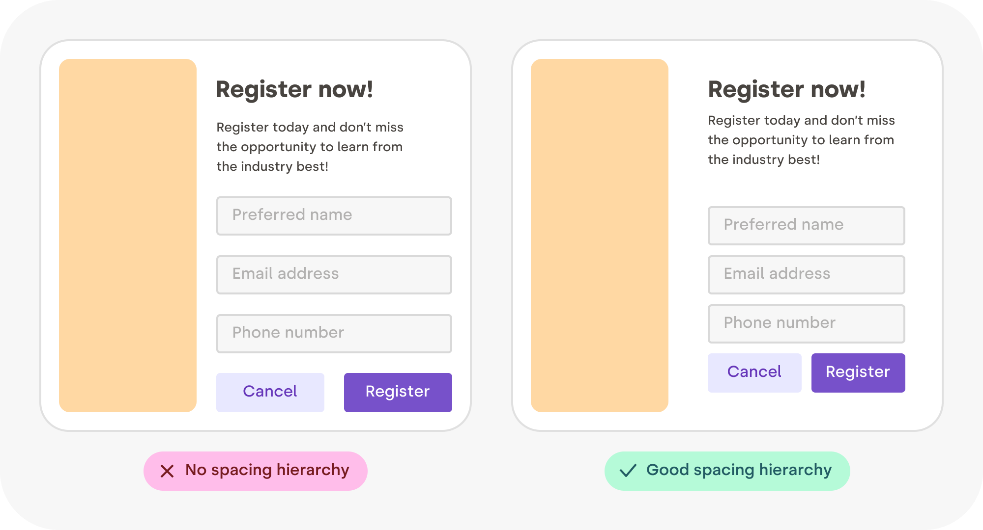
Let’s look at another example. On the left, all the gaps are the same. On the right, the spacing is influenced by the structure. The inner group elements are more tightly grouped, creating a visible “scaffolding” for the content.

Two versions side by side: on the left, all the margins are identical. On the right, the margins are proportional to how related elements are. For example, the fields of the forms are closer together than the elements outside the form.
Different levels of spacing. (Large preview)

In print, space is expensive because the paper is not free. This is why in the past, only “luxury magazines” could afford those beautiful margins and airy layouts. Nowadays, white space is virtually free. Luxury for everybody!

"White space is the area between design elements. It is also the space within individual design elements, including the space between typography glyphs (readable characters). Despite its name, white space does not need to be white. It can be any color, texture, pattern, or even a background image. White space is a great tool to balance design elements and better organize content to improve the visual communication experience.”

— Mads Soegaard, “The Power of White Space in Design

The Space Must Flow #

Consistent spacing around elements gives visual harmony and unity to your work. It ensures a coherent look across all the components of your design. This is because irregular gaps draw the viewer’s attention away from the main focus, which is counterproductive. By maintaining even spacing between all objects, you allow the content to communicate without interference.

Here are some tips for creating a nice flowing space between and around elements.

Centering In A Box #

Sometimes you need to put an image (like a logo, for example) inside a box. In this case, leave at least half its shortest dimension as a minimum margin. E.g., if the image is wide, use half its height as a minimum margin. If the image is tall, use half its width.

Two versions side by side: on the left, all the margins are identical. On the right, the margins are proportional to how related elements are. For example, the fields of the forms are closer together than the elements outside the form
Leave room for the elements to breathe! (Large preview)

Vertically Centering Text #

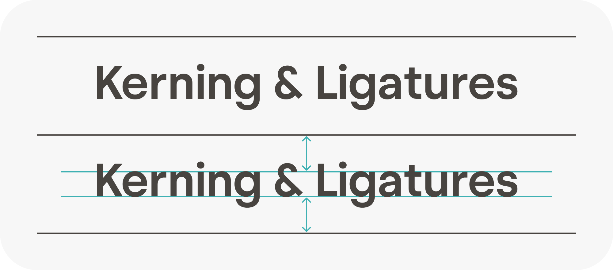
Most of the text mass sits between the baseline and the top of the lowercase letters — squint your eyes slightly, and you will see what I mean. When vertically centering text, a good rule of thumb is to center the lowercase letters’ height. In the designer speech, it is called the “x-height.” Some typefaces might need a tiny vertical adjustment, but we’re going for simple here.

Text properly centered in between 2 lines, based on the height of the lowercase letters
Most of the text mass sits between the baseline and the top of the lowercase letters. (Large preview)
“Why is it called ‘x’ height? Because the letter ‘x’ is the only letter in the alphabet that has all its terminals touch both the baseline and the meanline, with no extending points. Curved letters such as a, c, e, o, r, or s usually pass the font’s x-height slightly.”

— Sirine Matta, “What Are Cap Height and X Height in Typography?

Text In A Shape #

When centering text inside a box (like a button or a label), you need to use the height of the lowercase letters to do the centering and make sure there is the same amount of space all around the text, not just above and below.

Two sets of buttons. In one set, the space is consistent above, below, leftward, and rightward. The other set has inconsistent spacing around
Keep it uniform all around! (Large preview)

Centering Polygons #

When centering a polygon, center the circle passing by each point instead of centering the box around the polygon. Once again, this will ensure the space around the shape is nice and uniform.

A 3-points polygon (a play button) in a circle, with box-based centering and circle-based centering. On another row, the same thing, but with a 5-point polygon (a star)
Get those play buttons and stars properly centered. (Large preview)

Nested Rounded Boxes #

The rounded boxes are great. They don’t have sharp edges. They feel more human, more organic as if these digital shapes have been sanded down or eroded, like pebbles.

However, when putting a rounded box into another one, a mistake I have seen often is to use the same border-radius on the box outside and the box inside. If you do this, the band (represented here with a colored gradient) will not have a consistent width. Instead, you need to use proportional radius when doing such rounded box nesting.

Two rounded corner boxes side by side, each containing an inner box. On the left, the inner box corner radius matches the outer radius. On the right, the inner radius is proportional to the size of the margin. A gradient in each box highlights the fact that the width of the canal is consistent on the right, but not on the left
You need to use proportional radius when nesting one rounded box inside another. (Large preview)

Rhythm #

Human eyes get bored quickly. To keep their interest, you need to give them something new to parse and explore at regular intervals. But you don’t want to make it too hard either, too “new” every time — just a gentle walk along an interesting variety of patterns.

Rhythm contributes to a smooth flow that engages and holds the viewer’s interest while communicating effectively. A visual rhythm also provides directional cues to guide readers through the content.

Well, if you think about it, your slide deck is the same thing, and so is your portfolio, your app onboarding flow, and so many other things. Create variety constrained by a simple set of rules. Start with just left and right, and maybe one day, try using thirds if you feel comfortable. It’s not hard, you’ll see!

On top, a slide deck where every slide is the same layout, versus at the bottom, a slide deck where there is a variety of alternating images and text, creating a nice rhythm
Variety helps keep your audience engaged. (Large preview)
“Rhythm in art and design refers to a relationship between elements that creates a sense of harmony. Rhythm can be seen in patterns, in relationships between colors and shapes, and in repetitions of lines and forms. Rhythms help to guide the viewer’s eye around a piece rather than allowing the eye to settle on a particular focal point.”

— “Rhythm,” part of the “Principles of Design” BBC series

Repetition Is Key To A Rhythm #

Repetition is key to a rhythm. Reusing elements such as colors, shapes, and text styles can create a sense of unity and coherence within your designs, making them feel more organized and visually appealing. It also makes your choices more intentional.

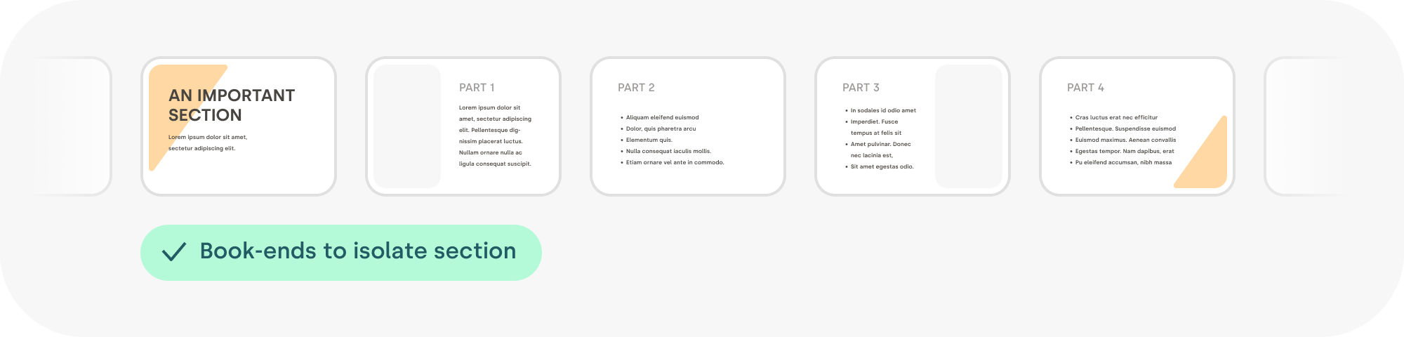
For example, I call a book-end any element that can be repeated to signal the beginning and the end of something. Shapes and colors are a great way to express creativity and bring some life to your content! It helps to tell your audience that a topic has ended in a nice and subtle way.

A series of slides. The first slide has a slanted gold-colored bar underneath the title in the top left. On the last slide, a hint of the same bar can be seen in the bottom right, visually suggesting the end of the section
Using a “book-end” element to mark the beginning and end of any section is a good excuse to add some visual flair. (Large preview)

The repetition of certain visual elements creates patterns that catch our eye, engage our brains, and hold our interest, which can make any design feel more dynamic, expressive, and aesthetically pleasing. Find the guitar riff of your content; find the chorus!

Here is a meta example. These are the elements I reused throughout this article to create a sense of unity between all the illustrations. I had to pick some colors, decide on a style for the arrows, and make many more design choices. A bigger version of this is usually called a design system.

Three panels side-by-side. The first panel contains a collection of different shades of colors used across the article. In the middle, a section is composed of graphic elements like arrows, the avoid and improved pills, and misc elements like icons and gradients. On the right panel, a waterfall of the three font weights and the four fonts sizes used throughout this article
My mini design system. (Large preview)

Reading Rhythm #

When you are feeding words into people’s retinas, you need to find the right compromise between the size of the text chunks and the effort required to move the eye to the next line. That sounds mechanical because it kind of is. Too long a line, and it is hard to locate the beginning of the next line. Too short a line, and your reading gets interrupted too often for an eye carriage return.

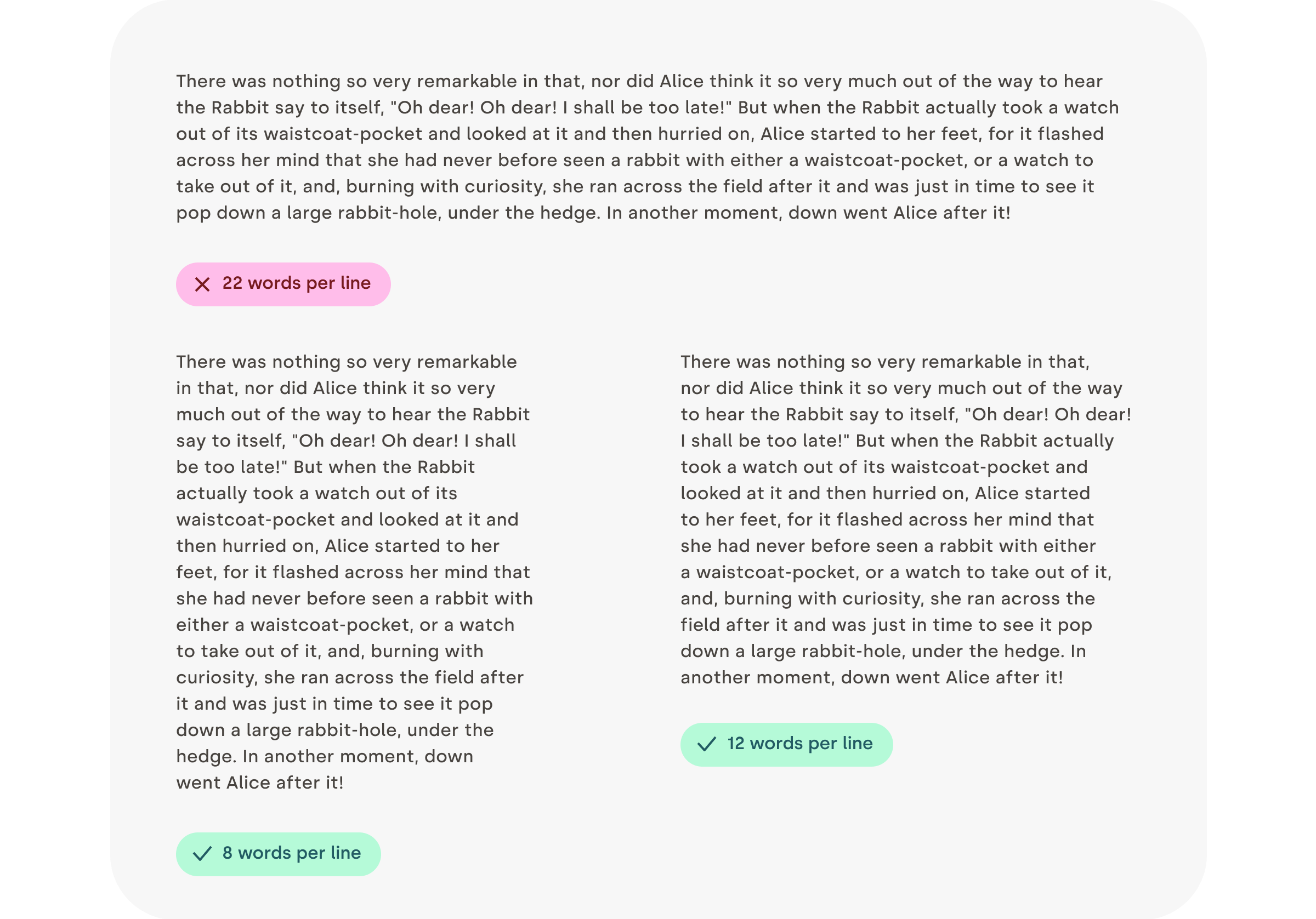
I usually find that between eight and twelve words per line are a good goal for the main text block. Just count the words in a couple of sentences — no need to be too strict. Also, keep in mind that it’s a good rule for English, but other languages might have different sweet spots. For a sidebar, a caption, or something narrower, you can aim for five to six words.

Try reading some text in the example. You will see how much easier it is for your eyes to follow when the lines are not too long!

On the top, a paragraph with very long lines (over 22 words per line). Underneath, on the left, a paragraph of text with eight words per line, and on the right, a paragraph of text with 12 words per line. Both bottom paragraphs are significantly easier to read
Narrower columns are easier to read. (Large preview)

Before going further, I’d like to quote Gary Provost, an American writer and writing instructor, whose words on rhythm are spot-on:

“This sentence has five words. Here are five more words. Five-word sentences are fine. But several together become monotonous. Listen to what is happening. The writing is getting boring. The sound of it drones. It’s like a stuck record. The ear demands some variety. Now listen. I vary the sentence length, and I create music. Music. The writing sings. It has a pleasant rhythm, a lilt, a harmony. I use short sentences. And I use sentences of medium length. And sometimes, when I am certain the reader is rested, I will engage him with a sentence of considerable length, a sentence that burns with energy and builds with all the impetus of a crescendo, the roll of the drums, the crash of the cymbals–sounds that say listen to this, it is important.”

Gary Provost

Not So Justified #

Justified text appears aligned on both sides. This is a very desirable attribute, but it’s very hard for it to happen naturally. Editing and design tools all do a pretty bad job of creating justified text that looks good. Instead, you will need to fine-tune letter spacing, word spacing, use good hyphenation, and sometimes even rewrite your text. Your job is to avoid text gaps that will hurt the pace of reading.

So, unless you spend the time to do the work manually, I suggest that you use left-aligned text instead. The price to pay for this shiny right edge is not worth it!

Three columns of text: on the left, a nice-looking, carefully crafted justified text with hyphenation and minimal gaps. In the middle, an automatically justified text with inelegant gaps. On the right, a left-aligned text
Justifying text properly is hard, left aligned is less risky and looks better. (Large preview)

Contrast #

Contrast refers to the use of differences (in color, size, shape, weight, direction, or texture) to attract attention, create hierarchy, enhance readability, and even evoke emotions like calm or energy. If a rhythm is the beat, contrast is the melody.

Mind The Low Contrast #

To ensure your content is accessible to everybody, including people with visual impairments, text on a colored background should have enough contrast to be easily readable. There are plenty of apps or plugins that can calculate that for you (I’ve included a few references at the end of the article, check Further Reading). For now, all you really need to know is that a contrast ratio of 4.5 or higher is recommended.

Four buttons in a row. The two leftmost buttons have a sufficient color-contrast ratio. The two buttons on the right have combinations of colors that don’t provide enough contrast
Contrast should always guide your choice of color. There are many options to make the text accessible, and you need to pick the one (if possible) with the best contrast ratio. (Large preview)

Text Size Contrast #

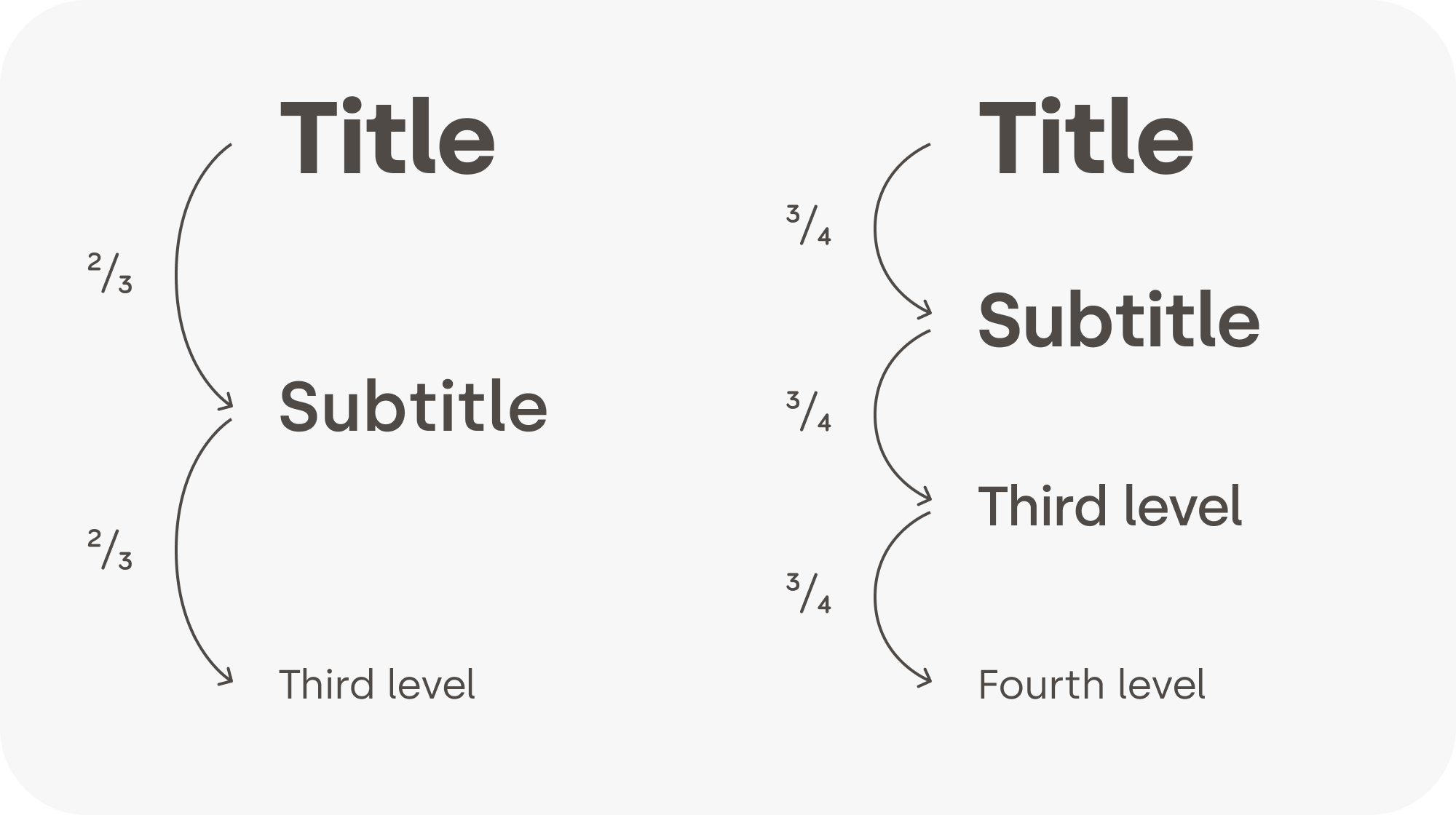
Text size can be used as a very convenient tool for structuring information. A well-structured text can significantly lower the effort required for the viewer to ingest the information. The contrast between each heading level should be high enough for the structure to be visible.

If possible, a consistent ratio between different header levels usually looks more elegant. In general, the weight of the text (bold, regular, light) decreases as the level increases.

Two scales of text sizes, side by side. On the left, the first row is a large text header. Underneath it, the text is two-thirds its height, and so on. On the right, in the other column, the first row is the same large text as the left column. Underneath it, the text is three-quarters its height, and so on
Structure starts with titles (headings). (Large preview)

Text Weight Contrast #

Sometimes, the typeface you are using comes with many weights, like medium, semi-bold, light, and so on. In those cases, it’s usually recommended to skip one weight when pairing them to create enough contrast between them.

A scale of the words: thin, light, regular, medium, semi-bold, bold, heavy. Each word uses its respective weight. Underneath, two identical sentences. In the first one, half the sentence is in regular, and the other half in medium. The contrast between the two is pretty low. In the second sentence, the first half uses regular, but the second half uses semi-bold, offering a much better contrast
Too many subtle font weights? Skip one. (Large preview)

Avoid Unintentional Contrast #

Combining text with an icon can help comprehension, improve visual appeal, or increase the importance of an element. However, always make sure the thickness of the text matches the thickness of the icon. That will make it feel as if it were part of the typeface. It does look more elegant, but it also saves your audience from even thinking about it, which is a recurring theme in graphic design. Good design is invisible!

Three pairs of icon and text. On two of the pairs, the text is either thinner or bolder than the icon. In the middle pair, the text and the icon have a matching thickness, and it looks like one thing
Matching thickness makes elements feel like a unit. (Large preview)
“Although we can’t help but notice poor design, good design is much harder to detect. We’d go even further:* good design is invisible*. This raises a logical question: what, then, is good design? Is it when form follows function? Is it the perfect arrangement of design elements on a modernist grid? Is it 24-point headings and 8-point body text? Is it a solid set of principles that you work to every time on every job? The answer might surprise you — good design is all of this. And none of it.”

— Damien Stanyer, “Why is good design invisible?

Conclusion #

That might have surprised you, but creating and iterating on designs isn’t about making things pretty. Your job as a designer is to lower the cognitive load for people to ingest the information, create a rhythm that keeps your viewer engaged, and make sure everybody can access the content.

“The most important advice I would give to emerging designers — even those that have already won awards — is that* learning never stops*. You can always improve your craft, whether you’ve won one award or twenty. Remember, you’re never going to be an expert in everything. I have worked on so many things, from book design to exhibition design, hospitality, tech, and everything in between — and I’ve taken something new from the experience every time. Now I’m the executive creative director at a global agency, and I still find myself learning something new every day.”

— Lisa Smith, “Learning Never Stops

Next time you are faced with the need to design something, I hope those tips will make you feel a little bit more confident and comfortable! And remember, everybody can be a designer, but every designer has a lot to learn and to keep learning. It’s a process that never stops.

Further Reading #

I created a list of additional resources about the topics that I have tried to cover briefly so far. (And if you think this list is missing something of value, please do leave a comment at the end of the article. Thank you! 💖)

Friday, November 4, 2022

Resolving Conflicts Between Designers And Engineers


Weekly tips on front-end & UX.
Trusted by 200,000+ folks.

In this article, Scott Himmer will go over some areas where you might find the design and engineering conflicts manifesting, what some of the contributing factors are, and strategies to work through the challenges.

In software development, UX designers and software engineers can get locked in verbal combat, which feels like a chess game of debate and wordplay. I’ve been there too many times and have the battle scars to prove it. If there has been anything I’ve learned from conflicts in the software development process, it’s that it’s not exclusively a cultural phenomenon, and obviously, it’s not productive.

The people involved in the conflicts generally react to a negative state of the world that no one wishes to be in. Sometimes it says more about a particular culture than us as individuals. Regardless of the reason, it’s not a good state for the organization or company to be in and will rob you of productivity, team cohesion, and focus on delivering customer value. Every company and department has its own challenges. In this article, we will go over some areas where you might find the challenges manifesting, what some of the contributing factors are, and strategies to work through the challenges.

I used to see the conflict between design and engineering in the software development process as annoying and an impediment to software design. When I began to see patterns in people and organizations involved in the conflicts mentioned above, I started to lean into the conflicts and see them more as an opportunity. I want to highlight some common contributing factors to design and engineering conflicts and lay out some strategies to work through them.

While engineers hold the keys to feasibility and how the technology works, designers hold the keys to the customer/market need and principles toward a delightful user experience.

If the two sides (design and engineering) don’t come together in perfect harmony, it could result in a functional feature that customers don’t enjoy or a good experience that’s not efficient and/or expensive to build. It’s not an either-or but an “and.” The design and the tech have to come together in harmony to balance the feasibility with aspects of a delightful experience.

I have found that, often, it’s easier for an engineer to see the aspects of a good user experience than for a designer to understand the technical aspects of how something functions, let alone how feasible it is. Regardless, the two sides work best when both lower their guards and reach across the aisle. Only then are your teams truly committed to delivering a great customer experience.

Assessing The Chasms #

There can be several contributors to the aforementioned dissension. From an organizational structure standpoint, contributors to the chasm could be boiled down to the following categories: culture, teams, roles, and individuals.

A review of the literature in saylor.org’s course lays these categories out in a bit more detail, and they note that “sometimes the structure of the organization itself can directly lead to conflict” whether that be based on the organizational structure or the authority provided within the structure.

I’ve seen these categories manifested in several ways. You may be able to relate to some of them. Let’s discuss them below.

Culture #

People do what they get rewarded for. If your organization incentivizes teams based on productivity, they will get good at cranking out widgets. Even if those widgets fall short of the customer expectations, the teams will become good at delivering what you asked for. Their focus becomes output over outcomes. This can cause teams to cut corners and produce “good-enough” solutions that miss the mark once released to customers. This is largely driven by the culture within the organization and can permeate the management hierarchy.

Teams #

Similar to what I mentioned regarding culture, a team, while aligned with the larger culture, typically has a team sub-culture. Sometimes a team culture can be seemingly at odds with the corporate culture. For example, a corporate culture that is collaborative and open can have teams that are hyper-focused on metrics and productivity that misconstrue the intent of the culture to meet productivity metrics. This is generally done to reduce uncertainty. I’ve worked with teams that became so hyper-focused on themselves that sizing a single user story practically took up an entire meeting.

Roles #

Staying in our lanes as designers and engineers. Personally, I couldn’t be more opposed to people staying in their lanes. I recognize that designers and engineers fulfill specific business needs, but we should be a unified body when it comes down to delivering outcomes. Engineers should have opinions on design, and designers should have opinions on the applied technical solution. The cross-pollination of views should support one another, which almost always leads to a better outcome.

Individuals #

I can be a contributor or a hindrance. I can become so focused on myself and my desires that I close myself off to others’ views. Rather than focusing on the outcome and the team, my views are forced on others, including the customer. I have seen this causes engineers to be entirely focused on output, “Just tell me what you want from me,” rather than collaborating on the outcome.

More after jump! Continue reading below ↓

United We Stand Or Divided We Fall #

Let me provide a few examples from my experience. I worked at one company where I tried several experiments to work more effectively with engineering. At a certain point, a prevailing schism was entrenched and a rather strong engineering-focused culture of “let us build it, get out of the way, and we’ll let you know what we need.” This tension had created an “us vs. them” mentality.

For this same company, I was brainstorming with a team for an upcoming project. As we started to get into sketching, I was met with blank stares followed by a litany of technical constraints. It was awkward, to say the least. Reflecting on it, I don’t think it went well because there wasn’t Product Owner buy-in, nor the proper context was set. I realized from that experience that when we are entrenched in a particular culture/team mindset focused on output for an extended period of time, it can be poisonous and entrench not only our behavior but also our mindset.

Last but not least, while working at a different company, I noticed a middle management cultural problem. The senior leadership spoke about collaboration, great design, and high quality. The agile teams executing on work agreed with this philosophy and were trying to work towards the leadership vision. However, middle management was making decisions that conflicted with senior leadership. The engineering manager would tell engineers to build things that completely excluded design. When designers tried to engage in the process, the engineers were just following orders. There were engineering building and shipping things with little to no Product Management or UX Design input, which showed in the product.

For an organization to be successful, they need to be united. We need to balance our thought processes and cross-pollinate our skills for our organizations to thrive.

It is wise to give the organization and teams the benefit of the doubt. Too often, we’re all just caught in the middle of what appears to be dysfunction. That dysfunction can be an opportunity for change if we learn to navigate the distraction that leads to conflicts.

Distractions #

Several studies have dug into this problem space of conflicts with teams, specifically UX designers and software engineers. A 2002 study by Dejana Tomasevic and Tea Pavicevic found that “tasks conflicts are the most common type of conflict. A 2019 study by Marissa Wilson also found that “100% of conflicts reported were task conflicts”.

After being in the trenches for a while, I’m not surprised by these studies, so I’d like to add some color to the study findings directly from the trenches. From my experience, most of the barriers to engineering and design collaboration are simply distractions. Although cultural issues can be barriers to collaboration, if people really want to bring about a positive change, they will find a way.

Let’s review some distractions that you’ll likely need to overcome:

  • Timing
    Designers generally build up ideas (induction) while engineers break them down (deduction) to chunk out building the solution. While there is time to build up ideas and time to break down work, getting the timing right for either of these is important to avoid conflicts. Too often, we’re trying to build up ideas, and our partners are trying to break down the work.
  • Miscommunications
    Designers and engineers have different skill sets and backgrounds. As a result, both groups come from different perspectives, speak different languages, and use different terms. This can lead to tremendous frustration, as Ari Joury points out in his article on designer and developer clashes.
  • Mis-alignments
    If you don’t have the same frame of reference, you will have disagreements. It might be impossible to share every detail at every moment with everyone on the team, but there must be a shared understanding of the problem and the value the team is targeting. Misalignments can cause teams to pull in different directions.
  • Role factions
    Sometimes teams get too focused on who’s responsible/owns what part of the solution. In a truly collaborative environment, the team owns the solution they’re working toward. Designers should get comfortable leaning into the engineering space, even if it’s to learn more about it. Same for engineers, lean into the design space and learn.
  • Metrics
    Metrics help teams to be more focused on the outcome. They also help us be more incremental in our approach. You definitely want a healthy balance here because metrics on value delivery vs. metrics on team productivity can sometimes feel at odds. This can lead teams to focus on getting all the details right, which robs time away from delivering an outcome. Winston Churchill once said, “perfection is the enemy of progress.”

Though the list above is not exhaustive, there have been common themes in the various companies and teams I’ve worked with. The teams you work with within your company may be experiencing one or multiple of these distractions. Hopefully, not all of them! Regardless, designers and engineers will have conflicts if they work together. It’s our job as business partners to lean into them and work through them for teams to be successful.

Striving For Unity #

I think it’s crucial to understand that trust has to be the cornerstone of any team unity. In an article by Built In in 2021, they provide a variety of examples for uniting teams. In it, Jillian Priese, Engineering Manager at Granular tells us that for her teams, “When trust is present, it makes all the difference in the world.” And that without trust, it’s “easy for engineers and designers to question one another’s motivations and abilities.” Whatever the barrier, we must employ strategies to close the gaps and bring unity to the team.

Here are some tips that I’ve found to be effective:

  • Discover together.
    While the design team is in the discovery phase of a project, make a point to include the engineers. In the research stage, they can be observers while hearing from actual users of their code. Don’t forget to include them in the ideation process as well. Give them room to fall in love with the problem space. As you discover, iterate, and refine, pull in engineers to get their input, particularly in areas where you want special interactions to take place. They can help you balance the approach to provide more value and be more feasible.
  • Be curious.
    Try not to assume too much and be prepared to learn. Designers have a lot to learn from engineers, and engineers can learn a lot from designers. Cross-pollination of skills strengthens teams. You don’t have to be a designer or engineer, but you should spend some time learning a little about your partner’s role and their work. Exercise empathy and keep each other honest.
  • Speak their language.
    As Ari Joury notes in his article, designers and engineers speak different languages. Designers and engineers sometimes assume they’re speaking the same language and using the same terms only to find that when the wires get crossed, they are talking about different things. Sometimes you will learn to slow down for clarity and shared understanding. Engineers need to be willing to patiently translate foreign technology to designers. Designers need to be ready to patiently sketch and use visuals to translate concepts to engineers sometimes.
  • Be together.
    I literally mean that you sit with each other when you can. As a designer, I have learned a lot from sitting with or in near proximity to engineers about their work, each of them individually, about myself, and the need to modify my work behavior to be a better partner. If you happen to be remote, make a team commitment to be available whenever needed, and be sure you follow through on that commitment to help build trust.

It’s really powerful and rewarding when engineers are more aligned with UX designers because they can elevate good designs to be great designs when they’re fully engaged. I like to believe that engineers breathe life into UX designs through the power of technology.

Practical Examples #

As noted above, no company is the same, and different tactics should be used depending on your team’s challenges. Here are some practical examples of how I have put the tips above into practice.

Growing By Learning #

At one organization, I came in as the lone designer being dropped into an existing team. It was awkward because the culture had generally been tech-centric. I was the outsider and struggled to make headway. Over time, I realized that the team was open to more design collaboration but was a bit new to working with a designer. The team was in another country, so I petitioned to spend a few days working with them.

Part of my plan was to focus on our epic, which has a lot of frontend work; the other part of applying some design exercises. Since the team was new to design thinking, we did a lateral thinking exercise and UI pattern workshop. After that, things began to gel with us. The team became more user aware and empathetic, and the team started to come to me with UI defects and great ideas for solutions. I enjoyed working with that team.

Make Yourself Available #

At another smaller organization, the UX team was positioned with the Product Management (PM) department. The PM and Engineering departments were located on separate floors in the same building. It didn’t take long to realize that the barriers to collaboration while manifesting in several ways, were rooted in physical separation.

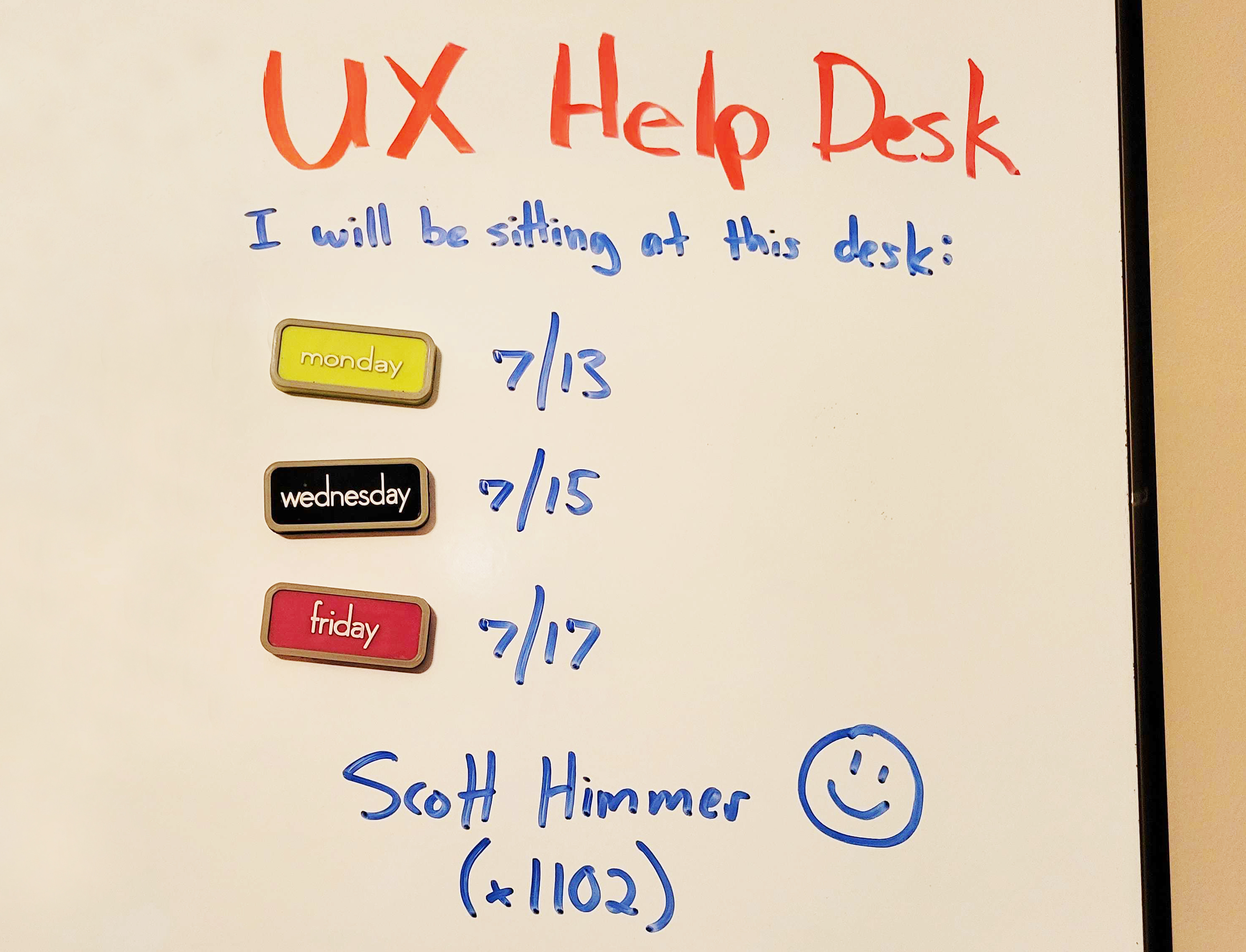
UX Help Desk
Image by Scott Himmer. (Large preview)

To start working to resolve this, I set up shop in the engineering space a few times per week. A sort of “UX Help Deck,” if you will. At first, I think they thought it was weird, but eventually, people began to open up. It facilitated many opportunities to better understand the team’s needs, educate them on the users’ needs, learn about their tech stack, and find in-roads with Product Owners and Engineering Managers. Fortunately, much of the engineering team appreciated it. So, we built great relationships and made a lot of progress in a short amount of time.

Playing To Their Tune #

At a much larger organization, I worked against a heavily entrenched engineering-centric culture. I made quite a few mistakes in that environment, such as not seeking more clarity on the authority of roles for the project, not pursuing more clarity in the project direction and priorities, and pushing back more against unreasonable hot-headed stakeholders.

I gained a lot of patience working with architects that had little experience working with UX designers. We were speaking different languages at different levels about different needs. They had a ton of domain knowledge from years of experience. So, they would pull these obscure edge cases out of thin air in conversations as a sort of trump card to any reasonable design recommendation. It was frustrating and humbling. To them, UX was all about “looking pretty” (the visceral aspects of the user interface). Sigh.

From my end, they saw UX as the lipstick they could just apply to the pigs they wanted to build. The in-road there was playing to their mindset. The architects fundamentally wanted to build a system that was robust, scalable, and easy to maintain quickly. The system being user-centered was the least important in their mind, and even that was generally boiled down to “looking nice,” which is not user-centered.

However, I believed we could build user-centered solutions and teach them along the way, but I had to think more modular and scalable. We needed to establish a frontend framework quickly and lay down some foundational guidelines we could build upon. We used that as building blocks that engineering could buy into. That helped them see UX as an ally to their goals rather than an adversary. We created a design system that helped us focus on user needs yet efficiently design at scale. While we got buy-in pretty quickly with engineers, we eventually began to see traction with the architects as the slow, grueling process slugged on.

Conclusion #

Finding the impediments that are preventing the unification of the clan is important. It’s essential for your organization, your customers, and your sanity. It does entail effort but is well worth it. Experiment with your teams to find what works for them. The same strategy might not work for every team. When you meet resistance, don’t pull away, but lean into it and be patient.

As a reminder of the things we covered:

  • Assess the level at which you’re finding the biggest chasms;
  • Identify the distractions you’re seeing in your teams and what might be contributing to them;
  • Take action and experiment with different tactics to establish unity.

Challenge the status quo when appropriate. You may ruffle some feathers at first, but sometimes disruption is needed to get to a better state.

You may not make friends at first, but you will get respect. You may find that thirty percent of the people are on board with you. Another thirty percent are interested but not yet sold. The remaining percent of nay-sayers who want to continue with the status quo will eventually come along as the rest of the clan unites around them. Fight the good fight, my friends, and unite the clans!