Search Live, built into the Google app, lets people talk directly with Google Search in real time.
Users can share their phone camera feed so Search can “see” what they’re looking at.
How it works. Tap the Live icon in the Google app (Android, iOS).
Ask questions.
Optionally turn on the camera so Search can interpret what’s in front of you.
Search responds with answers, context, and cites its sources at the bottom.
What’s new: Unlike earlier testing in Labs, the full release includes both voice and camera input. Google demoed this at I/O, but only the talk-and-listen mode was live until today.
What it looks like. Here’s a video Google shared of Search Live:
Why we care. This is another way users can have
conversations with Google’s AI instead of typing queries. Answers could
increasingly bypass traditional clicks, and further erode traffic to
websites. The inclusion of links (citations at the bottom) means
publishers and brands could still see some benefits, but most searchers
likely will have little need or desire to click on those links or dig
deeper after getting their answer.
Cloudflare’s new Content Signals Policy is meant to give publishers
more control over how crawlers and bots use their data, beyond
traditional directives that only regulate crawling and indexing.
How it works. The policy adds three new machine-readable directives to robots.txt:
search: permission for building a search index and showing links/snippets (traditional search).
Cloudflare will automatically add these directives for millions of
customer sites that already use its managed robots.txt service.
Yes, but. Google has not committed to honoring these instructions.
Cloudflare CEO Matthew Prince told The Information
(subscription required) that Google was given a heads up about content
signals, but has not said whether it will respect the new signals.
Robots.txt directives are not legally binding, and Cloudflare acknowledged that some companies may ignore them.
Why we care. Will Google or other AI companies
voluntarily comply? I doubt it. Still, this new option at least gives
you a way to push back – a way to say “yes to search, no to AI
Overviews,” a control that simply didn’t exist before. That matters
because AI-generated answers have been widely criticized for eroding
traffic and providing little to no value in return.
Bigger picture:
Cloudflare says bots could exceed human traffic on the internet by
2029, raising the stakes for giving publishers tools to manage how their
content is reused.
The company has released its Content Signals Policy under a CC0 license to encourage adoption beyond its own customer base, hoping it becomes a broader industry standard.
But Cloudflare also notes signals alone aren’t enough. Publishers
who want stricter control should combine them with bot management and
firewall rules.
Bottom line. Unless Google and others formally
recognize and adhere to these instructions, publishers remain caught in a
lose-lose situation: keep content open and risk misuse, or shut it down
altogether.
It now serves as a search destination where people turn for answers, ideas, and products.
Creator Search Insights
gives creators and brands a window into that behavior – highlighting
trending queries, underserved topics, and real audience interests.
And the data backs up this shift: two-thirds of U.S. consumers use at least one social network for search, nearly half use several, and four of the top seven search platforms – YouTube, Facebook, Instagram, and TikTok – are social.
What TikTok’s Creator Search Insights can do for you
TikTok’s Creator Search Insights tool gives creators visibility into the topics people are searching for on the platform.
Accessible by typing “Creator Search Insights” in the search bar or
visiting TikTok.com/inspiration, it provides real-time insights straight
from the source, including:
Trending searches with massive volume spikes: Terms showing growth over 1,000% based on TikTok’s internal data.
Content gaps that highlight underserved search topics:
The tool specifically identifies topics with high search volume but
limited content, showing opportunities for creators to fill demand.
Search popularity trends over multiple timeframes:
Users can view data across different time periods to understand whether
trends are temporary spikes or show sustained interest.
AI-generated content guidance: For each trending topic, TikTok provides specific tips and content suggestions.
Searches by followers: For accounts with over 1,000
followers, the tool shows what the specific audience is searching for,
enabling highly targeted content creation.
One-click video prompts: Allows creators to act instantly on trending topics with suggested content frameworks.
This toolkit helps marketers align content with real user demand, and
we should see this as a clear sign that TikTok is investing in search
as a core experience.
The new search discovery funnel
The traditional search funnel has evolved dramatically.
Although social search was once primarily upper-funnel, the rapid
growth of social commerce has turned it into a full-funnel feature.
Even so, consumer journeys tend to take winding paths through social
search, with shoppers often jumping between platforms or stepping back
into an earlier stage of the funnel.
Almost 40% of TikTok users conduct searches on the platform several
times per day, while 73% search at least once daily – a frequency that
exceeds all other platforms, including Google.
Instagram, YouTube, and Facebook demonstrate similarly high
engagement levels, with over two-thirds of users on each platform
searching daily.
TikTok reports that 25% of users input a search query within the first 30 seconds of launching the app.
Why you should be excited about Creator Search Insights
Creator Search Insights underscores what many marketers have long
suspected: TikTok functions as a discovery engine where intent-driven
searches happen at scale.
Gen Z leads this shift, with most turning to TikTok, YouTube, and Instagram for search.
In fact, Gen Z uses TikTok as their go-to search engine at roughly twice the rate of the general population – 59% versus 29%.
And even against cutting-edge AI tools, TikTok holds its ground: 58%
of Gen Z search on the platform compared to 44% who use ChatGPT.
Social media has transformed how an entire generation looks for answers.
What the tool doesn’t offer (where gaps remain)
Creator Search Insights is powerful for uncovering what people are searching for on TikTok.
However, it stops short of showing how visible content actually is in
those results – a critical gap for brands measuring performance.
Key limitations include:
No absolute search volume, only relative popularity indicators.
Limited historical data.
No competitive visibility tracking.
No measurement of your own content’s placement in results.
These blind spots have fueled the rise of specialized TikTok SEO
tools like TokTrak.io, which track where specific videos rank for chosen
search terms over time.
Used together, they complete the picture: Creator Search Insights
surfaces demand, while third-party tools show who’s capturing it.
What this means for brands
Social search plays an underrated role in today’s fragmented search landscape.
Google may still dominate traditional search, but consumers now pose questions wherever they spend time online.
With the average U.S. consumer logging an hour and a half daily on
social networks, platforms like TikTok, YouTube, and Instagram have
become leading search destinations in their own right.
The implications span every stage of the funnel:
TikTok’s search evolution: Once mainly a
top-of-funnel tool, TikTok’s strong search functionality, combined with
TikTok Shop, now drives lower-funnel action.
Cross-platform behavior: Social search journeys
rarely follow a straight line. Users bounce between discovery and
consideration, often completing purchases on different platforms.
Intent differences: As Kira Henson, director of paid social and search at Good Apple, puts it:
“You go to Google for an answer versus you go to social search to begin your journey.”
So, where do we go from here?
Creator Search Insights reinforces TikTok’s role as a true search
destination, giving marketers direct access to real-time demand signals
across the customer journey.
The key is integration, not replacement.
Use the tool to spot emerging topics and language, then validate
those insights against SEO platforms, Google Trends, and your own
analytics.
For brands serious about TikTok visibility, specialized trackers like
TokTrak.io can monitor ranking performance and close the visibility
gap.
As search fragments across platforms, the winners will be brands that adapt strategically.
Elevate your monthly
PPC updates with clear, insightful stories that showcase results,
highlight value, and strengthen client loyalty.
My experience has shown one simple truth: clients stay or go based not on results alone, but on the service they receive.
This holds true for the vast majority of clients we’ve worked with.
You can deliver excellent outcomes, but if clients feel underserved, they’re likely to leave.
Clients aren’t always rational, and that’s exactly why every touchpoint matters – especially reporting.
Reporting is often your main connection with clients and can define how they perceive your service.
That makes it one of the most important parts of your business.
So, what makes a great report?
This article tackles the key principles of building reports that
stand out – complete with examples of what works and what doesn’t.
Reports vs. dashboards
Before we begin, let’s quickly clarify the difference between reports and dashboards.
Reports are detailed documents delivered at set intervals – often monthly – in formal formats such as PDFs or slideshows.
They typically include more commentary and are designed as one-off documents.
Dashboards, while they may display similar charts and graphs, provide real-time campaign data with little commentary.
They’re usually accessed through online platforms like Looker Studio.
Today, many agencies use reports and dashboards interchangeably.
A monthly report might simply be a dashboard printout with added commentary.
Platforms like Looker Studio or Agency Analytics even let you
integrate reporting elements into dashboards and export them as PDFs.
Because of this, the distinction between the two has blurred, and we often use “reporting” to cover both.
Regardless of format, every great report I’ve seen follows three key principles:
Simplicity.
Insight.
Context.
Let’s break these down and see how they apply.
Simplicity
Great communicators take complex ideas and make them easy to understand. Reporting is no different.
With so much data available, a great report simplifies information into a form that’s useful and insightful.
Simplicity should guide every aspect of report design – from the structure and order of pages to layout, graphs, and visuals.
The goal is always to make your report as clear as possible and avoid what analytics expert Avinash Kaushik calls “data puke” – overwhelming clients with too much information.
Ways to achieve simplicity include:
Design for client needs: Report creators often
focus on what they think is important rather than what the client needs.
Understand each client’s KPIs to keep reports focused. A CEO may only
need top-level KPIs, while a regional sales manager may need audience
metrics.
Focus on KPIs: For every new page or graph, ask
whether it helps show whether the KPI is being achieved. Provide the
minimum pages, graphs, and tables needed to convey the point.
Organize by concept: Structure pages around ideas –
KPIs, platforms, campaigns, or regions. You can split pages by KPI or
by platform (Meta vs. Google).
Include a summary page: Multiple pages are useful,
but clients are time-poor. A summary page centralizes insights so
readers can get the big picture quickly.
Branding and credentials: Adding your company logo (and the client logo) makes the report look professional and personalized.
The example from Data Studio Guru’s Full Screen Dashboard reflects these principles well:
Clear, focused data.
Sidebar navigation separating dashboard sections.
An overview page.
Strong focus on KPI metrics like transactions and revenue.
Well-spaced elements with good contrast.
(One limitation: there’s no commentary included, which is acceptable for dashboards but not ideal for a final report.)
Michael Howe-Ely’s Ultimate Ads Dashboard is another strong example, featuring:
An excellent summary page combining all ad platforms side by side.
In-depth platform pages for deeper dives.
Sidebar navigation.
Insight
The second guiding principle is insight.
While the dashboards above don’t include commentary, a great report must go beyond presenting data to providing insight.
A strong report should include:
Data: Present charts and tables in a clear, simplified format.
Observation: Summarize what happened in the data.
Interpretation: Explain why it happened.
Action: Recommend what to do next based on this understanding.
This progression from data to action is what makes insights truly actionable.
Each page should focus on a single concept or KPI and include no more
than three key insights that follow the four-step process above.
AI can help automate parts of this, especially generating observations, but it’s not yet strong at interpretation.
Context
The third guiding principle is context. Without it, data exists in a vacuum.
A great report must provide context to make metrics meaningful. There are two key types of context to include:
Historical performance.
Industry benchmarks.
Historical performance shows whether results are improving over time.
Show both month-over-month (MoM) and year-over-year (YoY) changes in your graphs.
YoY comparisons are especially useful for seasonal businesses because they compare performance to the same time last year.
In the report below, KPIs show both MoM and YoY deltas to clearly signal changes over time:
Graphs on a timeline add even more detail by showing multiple time periods.
In the graph below, the conversion metric is tracked over 12 months:
Compare two distinct time-period curves on one graph to make changes easy to spot.
For example, the chart below shows URL clicks on the blue curve vs. URL clicks from the previous month on the light blue curve:
Industry benchmarks add another layer of context.
Clients may say it’s great that conversions are increasing or cost
per acquisition is decreasing, but how does that compare to competitors?
Reliable sources include:
Google Keyword CPC data: Compare keyword CPCs with competitor CPCs using Google’s keyword tool.
Wordstream benchmarks: Wordstream aggregates and publishes key metrics such as conversion rates across industries in the U.S.
Combining historical performance with industry benchmarks gives clients a clearer, more meaningful picture of results.
Your roadmap to effective PPC reporting
Getting started with reporting is easier than ever.
Google’s Looker Studio is a strong starting point, with plenty of
plug-and-play templates available from Google and third-party
marketplaces like byMarketers.
These can get you up and running in minutes.
No matter which tools or software you choose, anchor every report in
the three key principles of simplicity, insight, and context
Google Ads Misrepresentation policy will be updated on October 28, 2025.
Google will update its Misrepresentation policy specific to the Dishonest Pricing Practices.
Specifically, this will require advertisers to disclose the payment
model or full expense that a user will incur before and after purchase,
and clarify any false or misleading impressions of the cost of a product
or service.
What is changing. Google will update the policy specific to these changes:
Advertisers must clearly and conspicuously disclose the payment
model or full expense that a user will bear before and after purchase.
Pricing practices that create a false or misleading impression of
the cost of a product or service, leading to inflated or unexpected
charges are prohibited. This includes, but is not limited to:
Bait-and-switch tactics: Deceptively advertising a product or
service at an enticing, often unrealistic, low price to lure customers,
with no genuine intent to sell it, only to pressure them into buying a
different, typically more expensive or inferior, alternative once
they’re engaged
Price Exploitation: Exploiting individuals in vulnerable situations
or under duress, leveraging their immediate need or lack of reasonable
alternatives to demand a payment significantly higher than the
prevailing market rate. For example, a locksmith threatening to leave
the customer unless a cost above what was quoted is paid on the spot
Promoting apps as free when a user must pay to install the app
Promoting a free trial without clearly stating the trial period or
that the user will be automatically charged at the end of the trial
Violation timeframe. Google will begin enforcing the
policy update on October 28, 2025, with full enforcement ramping up
over approximately 4 weeks, the company said.
If you do get a violation, it will not lead to immediate account
suspension without prior warning. A warning will be issued, at least 7
days, prior to any suspension of your account.
Recommendation. Google recommends that you review
this policy update to determine whether or not any of your ads fall in
scope of the policy. If they do fall within the scope, then remove those
ads before October 28, 2025, Google added.
Why we care. Make sure to review any ads that may
fall within the scope of this policy change. You do not want those ads
to have a negative impact on your campaigns and overall ad accounts.
OpenAI’s latest hire
hints at a future where advertisers can run campaigns directly in
ChatGPT, reaching 700 million weekly active users.
OpenAI is hiring a Growth Paid Marketing Platform Engineer to help
develop tools for ad platform integration, campaign management, and
real-time attribution.
The role is part of a new ChatGPT growth team tasked with building the backbone of OpenAI’s in-house paid marketing platform.
Why we care.OpenAI wants to monetize free users via ChatGPT ads by 2026,
according to reports. It seems that OpenAI is now starting to build
that ad-buying infrastructure so brands can run campaigns on ChatGPT.
That would give advertisers access to a new platform with massive reach
(700 million weekly users as of August).
The details. The listing calls for building APIs, data pipelines, and experimentation frameworks to optimize ad spend. According to the job description:
“We are looking for an experienced fullstack engineer to join our new
ChatGPT Growth team to build and scale the systems that power OpenAI’s
marketing channels and spend efficiency. Your role will include projects
such as developing campaign management tools, integrating with major ad
platforms, building real-time attribution and reporting pipelines, and
enabling experimentation frameworks to optimize our objectives. As we
are in the early stages of building this platform, we will rely on you
to design and implement foundational MarTech infrastructure that make
our marketing investments more effective, measurable, and automated. We
value engineers who are impact-driven, autonomous, and adept at turning
ambiguous business goals into robust technical systems.”
Zoom out. OpenAI’s ad product could allow brands to input goals and have ChatGPT autonomously plan, buy, and measure campaigns.
Fidji Simo, OpenAI’s chief of applications, is currently looking for
a candidate who can “lead a new team that will be tasked with bringing
ads to ChatGPT,” Adweek reported.
Bottom line. Advertisers may soon have to decide whether to invest in ChatGPT as a paid media channel.
If Google Ads finds an unlinked and unassociated Google Analytics account, Google may recommend you link it.
Google Ads can now surface a recommendation to link your unlinked
Google Analytics account to your Google Ads account. The neat part is
that the linking of your Google Ads and analytics account can be done
with a single click.
How it works. Google will show this as a
recommendation in the Recommendations section of the Campaigns page in
the Google Ads console for eligible users. All you need to do is
review the recommendation and click “Apply.”
What it looks like. Here is a screenshot of the recommendation:
Even if you don’t believe the stat, knowing how well your ad
campaigns perform is a no-brainer. So make sure to track the success of
your ad campaigns using GA4 or some other analytics tool
As customer journeys migrate into LLMs, you need new ways to track behavior. Here’s how LLM tracking tools approach the problem.
For a decade, marketing strategy was engineered to master Google’s “messy middle.”
Today, the customer’s exploration and evaluation journey has migrated
from the open web (PPC, Reddit, YouTube, websites) into closed AI
environments (ChatGPT, AI Mode, Perplexity), making direct observation
impossible.
Your marketing analytics stack faces funnel blindness. You must
reconstruct customer journeys from fragmented data offered by LLM
visibility tools.
Funnel reconstruction relies on two primary data streams
The rush to measure LLM performance has vendors promising dashboards
to help you “Analyze your AI visibility right now.” This work requires
reconciling two fundamentally different data streams:
Synthetic data (the prompts you choose to track as a brand).
Observational data (clickstream data).
Every LLM visibility tracking platform delivers products built from some extraction, recombination, or brokerage of this data.
Funnel reconstruction relies on two primary data streams
The questions, commands, and scenarios you want to track are, by their nature, synthetic.
Lab data is inherently synthetic. Lab data does not come from the
real world; it is the direct output you get when you inject chosen
prompts into an LLM.
Tools like Semrush’s Artificial Intelligence Optimization (also known
as Enterprise AIO) curate a list of prompts for brands to help map the
theoretical limits of your brand’s presence in generative AI answers.
Companies use lab data to benchmark performance, spot errors or bias,
and compare outputs across different queries or models. It shows how
various models respond to exactly what the brand wants to test.
This approach only reflects how the system performs in test
conditions, not what happens in real-world use. The data you get is
pulled from a world that doesn’t exist, without any persistent user
context (memories ChatGPT keeps of its users’ habits, for example).
These engineered scenarios are idealized, repetitive, and distant from
the messy middle and real demand.
Lab metrics show the “best case” output you get from prompts you
carefully design. They tell you what is possible, not what is real. They
cannot predict or reflect real-world outcomes, conversions, or market
shifts.
The only actionable results come from observed field data: what
actually happens when anonymous users encounter your brand in
uncontrolled environments.
Synthetic persona injection and system saturation
Some vendors use two bold strategies – system-level saturation and
user-level simulation – to compensate for the lack of real customer
data.
“Sometimes, personas are assigned to these prompts. Sometimes, it
boils down to brute-forcing a thousand prompt variants to see how LLMs
respond,” said Jamie Indigo, Technical SEO authority.
One strategy, employed by vendors like Brandlight,
is system-level saturation. This brute-force approach maps a brand’s
entire citation ecosystem by analyzing millions of AI responses.
System-level saturation is designed to maximize exposure by revealing
the structural footprint of the system itself, rather than modeling
user behavior. This approach is designed to maximize influence and
exposure in AI environments by targeting the most impactful sources,
rather than a tool for modeling or predicting authentic user behavior.
The alternative strategy is user-level simulation, used by tools like
Quilt. This involves injecting thousands of synthetic personas into the
testing environment. Persona injection means creating simulated users
for your prompts (distinct types, priorities, edge-case scenarios) and
feeding their tailored prompts to an LLM in testing environments.
Experts like Indigo acknowledge the value of this approach, which
helps expose clarity gaps and reveal edge behaviors. Others, like Chris Green, a veteran Fortune 500 SEO strategist, underscore its arbitrary nature, pointing out that it remains disconnected from real-world behavior patterns.
These synthetic personas may offer structural insight and help brands stress-test, but do not predict audience outcome or campaign ROI.
These methods are useful for product teams that need fast, cheap
feedback on their logic, language, and interactions. They cannot
reproduce the randomness and unpredictability of actual users.
Real user behavior, as captured in clickstream data, rarely matches
lab personas or occurs in any meaningful sequence. Case in point: humans
are now starting to rely on agentic AI to make online purchases.
Clickstream data: Validating what’s real
If lab data maps the possibilities, field data validates reality.
That data is clickstream data, the record of how users interact with digital platforms:
Pages they view.
Results they click.
Paths they follow.
Companies like Similarweb or Datos (a Semrush company) offer data
capturing genuine user actions, collected through browser extensions,
consented panels, app telemetry, and provider networks.
Visibility tools like Semrush’s Enterprise AIO are built on this
principle, leveraging clickstream data, sequential metrics showing which
AI results are seen, engaged with or ignored.
This is the only ground truth available, exposing your brand’s
real-world impact and pinpointing the precise moments of friction or
success.
The integrity of the underlying clickstream data of any LLM visibility tool is central to validating what’s real.
Most analytics platforms buy data from brokers, so the quality of your insights is dictated by the quality of their source.
You should focus on scale and quality when it comes to clickstream
data. Ask the following questions of any platform/tool you are
considering:
What is the scale? Aim for tens of millions of anonymized users across relevant device/region.
Is the data cleaned, deduplicated, and validated?
What about bot exclusion and compliance?
No dashboard or reporting tool can be trusted if it is not built on
strong clickstream signals. Weak clickstream panels, small samples,
limited geographies, hide minority behaviors and emergent trends.
Most AI analytics do not own their clickstream panels (except
Semrush’s Enterprise AIO); they buy from brokers who extract from global
browser/app data. Vendors segment only as far as their panels stretch.
Where strategy is forged
Lab data, including all the prompts you curate and track, is only
half the story. Without the validation of field data (clickstream data),
your lab data remains an idealized marketing funnel.
Field data, without the context of the lab’s map, is just a rearview mirror, providing the “what” but never the “why.”
Manage the delta between the two, reconcile, and calibrate the map of
what’s possible in an ideal scenario against evidence of what actually
works and brings revenue. This is the feedback loop you should seek from
LLM visibility tools. The actionable intelligence, the actual strategy,
is forged in the gap between them.
You should consider the “messy middle” a dynamic intelligence feedback loop, not a static funnel analysis.
Modern online marketing means mapping what is possible with what is profitable.
Search and AI systems
demand more than global reputation. Scale E-E-A-T with local expertise,
trust signals, and structured authority.
Many still treat E-E-A-T as a box to tick in an SEO audit.
But it’s more than that – it’s how search engines and AI systems decide which content to trust.
The paradox?
Global brands that dominate in one country often underperform in others.
Without clear local trust and authority signals, even the strongest global reputation may not carry across borders.
Why E-E-A-T breaks down across borders
When Google or an LLM compares multiple content options, it must choose which is the most complete, accurate, and trustworthy.
That decision once leaned heavily on backlinks.
Now, advanced algorithms consider a richer mix – authorship, structured data, entity connections, local signals, and even user engagement patterns – to determine the best answer for each market.
This is where global brands often stumble.
Despite deep pockets and strong reputations, they lose to local
competitors not because of weaker products, but because those
competitors send clearer local trust and authority signals.
You can have the best English content in the world.
But if it appears on a French page with machine-translated copy, no
local context, and no regional recognition, Google may not see it as
authoritative in France.
Your customers won’t either.
To see why, it helps to look at how each element of E-E-A-T falters when applied across markets.
Experience
Google increasingly prioritizes lived experience content that shows:
First-hand use.
Direct observation.
Regional familiarity.
Translated content often fails here, lacking local examples and nuance.
Example: A global electronics brand’s Japanese site
shows only U.S. product reviews and does not mention region-specific
certifications, voltage requirements, or local retailers.
Expertise
Expertise must be contextual and demonstrable.
A central content team with no local expert input can’t meet the same threshold as a local subject matter expert.
Example: Medical advice reused globally without
review from a local doctor, despite differences in standards of care and
legal requirements.
Authoritativeness
Authority isn’t automatically portable across markets. It’s
reinforced locally through citations, backlinks, and recognition in
regional media or industry associations.
Example: A luxury fashion brand with no Japanese
media backlinks is outranked by smaller domestic competitors with a
strong local presence.
Trustworthiness
Trustworthiness is often where global brands fail, especially in regulated categories.
Local websites may have existed, but without compliance details or
region-specific trust markers, Google substituted a machine-generated
localized version of an authoritative English source.
Japan adds another layer of complexity. Healthcare content has one of the highest E-E-A-T thresholds.
Yet, a Japanese doctor may be referred to as “Sensei” (先生), a generic
title, and list prestigious medical school credentials or research
achievements without the “MD” suffix Western systems expect.
We can’t assume Google fully understands this local nuance and considers the content as authoritative.
The challenge grows when the schema implementation is inconsistent.
Suppose author credentials, affiliations, or brand relationships
aren’t stored in a structured, uniform way in your CMS or database.
In that case, you can’t scale trustworthy structured data, and your trust signals will remain fragmented.
This is where localization and technical SEO must come together:
Local expert bios must be built into content templates, not added ad hoc.
Schema must reflect regional expressions of trust, not just Western defaults.
Database fields and CMS templates must be structured to enable scalable markup, not fight against it.
Trust isn’t just about what the user sees – it’s about what the system can verify.
And in a world where AI-driven search is deciding who gets cited, these gaps are no longer academic. They’re existential.
Local idioms, cultural context, measurements, and regulatory differences all matter.
Without them, content may be understandable, but it will be irrelevant.
The ‘HQ knows best’ trap
Centralized content production often leaves local teams with little influence.
Localization becomes a checkbox instead of a strategic effort.
Token localization
One blog post, one page, or one local expert quote won’t move the needle.
You need consistency, depth, and reinforcement over time.
Over-reliance on machine translation
Scalable, but devoid of lived experience, leading to generic, unconvincing content.
Missing local citations or media mentions
Strong U.S. PR doesn’t help if there’s zero local coverage in the local market.
Missing or weak local entities
Google’s Knowledge Graph and AI systems increasingly rely on local entity connections.
If your local brand variant or expert author isn’t registered, cited, or recognized, your content may not get surfaced.
Inconsistent branding
Different product names, logos, or messaging can dilute brand recall in global campaigns and fragment off-page signals.
Without clear entity connections between these variations, search
engines may treat them as separate brands – making it harder to
consolidate authority and leverage your global reputation in local
markets.
Compliance and cultural gaps
A global privacy policy isn’t enough. GDPR, LGPD, and Japan’s APPI all have local nuances.
Tone-deaf localization can tank brand trust even if everything is technically accurate.
Cultural expectations around trust
Trust badges that work in Korea may not resonate in the U.S., and vice versa.
Inconsistent URL and hreflang implementation
Inconsistent use of canonical tags or misconfigured hreflang can
result in Google serving the wrong language or country version,
undermining both user trust and compliance.
Ensuring a clean, consistent URL strategy with correct hreflang mapping is essential for protecting local visibility.
How to fix it: Building real local E-E-A-T
Local expert involvement in content
Work with local product managers, engineers, doctors, or compliance officers, not just translators.
Add bios, credentials, and structured author markup. Coordinate this
globally so your CMS and database can handle different naming
conventions and brand identities.
For instance, in Asia, Whisper is P&G’s feminine care brand.
Without schema linking Whisper to Procter & Gamble via parentOrganization or sameAs, the local site cannot inherit P&G’s global authority in feminine care.
Earn local authority
Run PR and outreach campaigns in each market to earn citations from regional media, trade associations, and industry events.
Show real trust signals
These markers need to be visible to both people and search systems. Examples include:
Native-language privacy policies.
Local office addresses and phone numbers.
Region-specific compliance marks and certifications.
Reviews on local platforms (e.g., Rakuten in Japan).
Demonstrate local experience
Use market-specific examples, imagery, testimonials, and data.
Reference local regulations, cultural practices, or environmental factors that affect product use.
Don’t overlook visual signals and media assets.
Be sure to localize imagery, alt text, and even structured data
(ImageObject) to reinforce the market connection so that search engines
and AI systems can recognize the market context in both the visual
content and its metadata.
Measuring local E-E-A-T
Localizing content isn’t enough – you need to verify that search engines and customers recognize your authority.
Key metrics include:
Branded vs. non-branded traffic by region.
Local backlink growth and diversity.
Knowledge Graph presence for local authors and brands.
Inclusion in AI Overviews/Perspectives by market.
Review volume and sentiment in local ecosystems.
Relevance is built, not assumed
Global reputation doesn’t automatically equal local trust.
Search engines and AI systems are more capable than ever of assessing
regional authority, credibility, and experience – so are your
customers.
It is crucial to collaborate globally on this initiative so that the
database can be structured to accommodate different nomenclatures and
reference points.
If this is not structured, it makes automation difficult.
Failing to establish strong local E-E-A-T signals doesn’t just impact
rankings. It affects how your brand is perceived in that market.
If search engines and AI systems don’t select your content as the
most authoritative answer, local competitors will occupy that space,
shaping customer perception and eroding both market share and brand
trust over time.
The brands winning now aren’t just translating. They are:
Low-value,
duplicative content drags down visibility. Break free from content-only
SEO and build a smarter approach to AI-era optimization.
Content has long been the fuel for SEO, and its importance continues as AI-driven search relies on rich, trustworthy information.
I’ve always believed in doing the “good” and “right” things when it
comes to creating content at scale – but even good things can become
problems when overdone.
Too often, SEO and AI visibility efforts get reduced to publishing
more blogs, landing pages, or articles in the pursuit of quick wins that
executives want to see.
While content is critical, treating SEO as a production machine creates the illusion of progress.
Activity without performance bloats sites with duplicative,
commoditized, or low-value pages that both search engines and customers
overlook.
Real results come when content is balanced with technical SEO, authority building, and alignment to business goals, not when output becomes the strategy itself.
Breaking free from a content-only mindset means broadening how we define SEO success.
The following areas show where to shift focus and rebalance your strategy.
Seek out content bloat
Use audits – whether with third-party crawlers, AI tools, or manual reviews – to surface low-value content.
This includes:
Duplicative or outdated pages.
Content that’s confusing or poorly aligned to your niche, audience, or value proposition.
Realign SEO goals
If your objectives are tied too heavily to content, are vague or
incomplete, or are linked only to tactics rather than a robust, leading –
not trailing – strategy, they’re due for a reset.
Step one is to revisit your overarching SEO and visibility goals.
Then connect those goals directly to your content strategy – focusing
on quality over volume – and map each piece to a funnel stage, customer
journey touchpoint, or specific ROI metric.
Integrate technical SEO
When content dominates your SEO strategy, it’s easy to overlook the technical factors that determine visibility.
On-page optimization may help, but without attention to site health
and user experience, your content may never reach its full potential.
Crawling and indexing have always been core to SEO, and they remain critical for both search engines and LLMs.
If your content can’t be properly discovered and sourced, it won’t surface for your audience – regardless of quality.
Beyond that, factors like page experience and rendering influence how
your site is ranked and, more importantly, how visitors interact with
it.
Poor UX can drive users back to search results, undermining the very visibility you’re working to achieve.
Leverage authority building
I’ve long said, “great content attracts great links.”
That phrase nods to the early days of SEO, and while simplified, it still holds true.
The problem is that content alone often creates an “if you build it,
they will come” mentality – one that leaves deserved visibility and
engagement on the table.
Earning backlinks, PR, mentions, and other third-party validation remains vital for both search and LLMs.
Leaving these signals out of your planning means missing a key dimension of optimization.
Authority building should be integrated into your SEO and content
strategy to add purpose and extend the impact of what you publish.
You can follow agile methodology or use different terminology and
approaches, but the key is to define the time periods and milestones
that matter.
Day-to-day distractions and the habit of piling new tasks onto
existing efforts blur where one initiative ends and another begins.
Combined with the shifting environment of attribution and
measurement, it becomes difficult to set clear starting and stopping
points in SEO and AI optimization.
When content is the main focus, the instinct is often to do more when
results fall short. A sprint model helps break that pattern.
By planning efforts in defined cycles, you can measure outcomes objectively and conduct retrospectives.
Those insights then help you realign your overall and content
strategies, bringing a more data-driven, disciplined approach to each
next phase.
When I hear about a company’s content strategy, the first questions I ask are:
Why are they doing it?
What is it producing?
How were those decisions made?
Sometimes the cadence exists because it’s what the company has always
done. Other times, it traces back to a best practices recommendation.
I don’t approach those conversations with a fixed cadence of my own, or with the intent to blow up what’s working.
In many cases, the timing and tactics are sound.
The problem comes when we stop asking questions. Without a regular, healthy review, it’s easy to slip into checklist mode.
Any marketing activity that becomes just another box to tick loses its sense of investment and expected return.
Instead of weighing the time, money, and opportunity costs against
other options, we risk treating strategy like routine busywork.
Build cross-functional alignment
At SMX West in early 2020 – just before the pandemic – I spoke about the benefits of aligning SEO and PPC.
What I couldn’t predict was how essential cross-functional integration would become in the era of AI.
Digital channels have always influenced each other, but AI raises the stakes.
Brand, UX, IT, search, social, and content all need to work together efficiently.
The same goes for marketing, sales, product, and leadership.
Integration prevents SEO and AI initiatives from being dismissed as “just marketing tasks.”
It ensures they connect to business-outcome-driven KPIs, new measurement models, and company-wide AI priorities.
Breaking free from content-only SEO
SEO has never been about content alone, and in the era of AI-driven
search, it can’t afford to be reduced to a publishing treadmill.
Breaking free means balancing content with technical health, authority signals, agile planning, and cross-functional alignment.
By shifting from sheer output to intentional strategy, you avoid
bloat, earn visibility where it matters, and position SEO as a driver of
growth rather than just another box to check
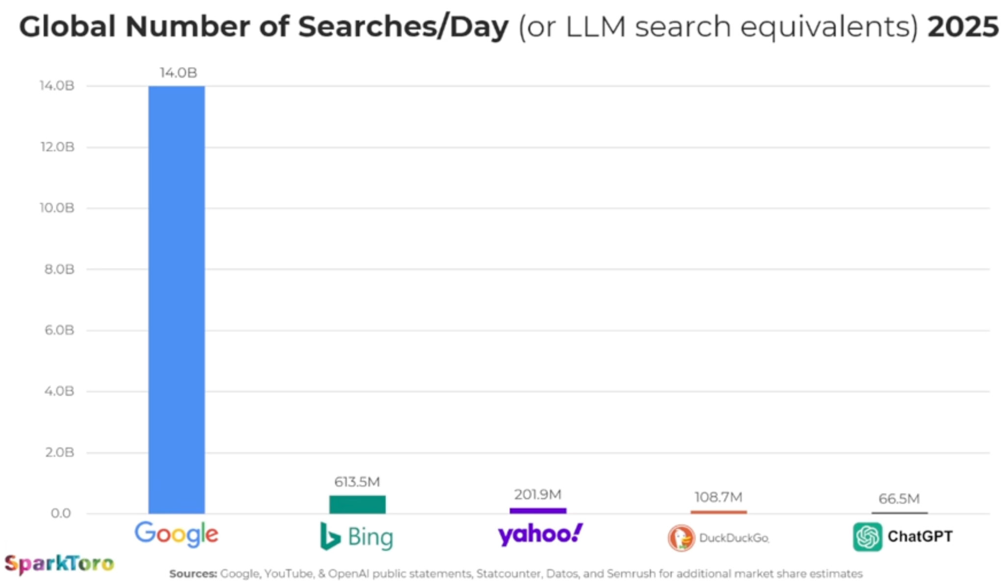
ChatGPT handles 66
million search-like prompts daily vs. 14 billion Google searches. AI is
growing, but Google search still dominates.
ChatGPT now processes 66 million “search-like” prompts per day, while
Google still processes about 14 billion searches daily – roughly 210
times more. That’s the latest AI search reality check, via Rand Fishkin,
CEO and co-founder of SparkToro.
By the numbers. Google processes ~210x more searches than ChatGPT. Even DuckDuckGo outpaces ChatGPT in referrals, per estimates.
OpenAI CEO Sam Altman said ChatGPT handled 1 billion prompts per day in December. By July, that number was 2.5 billion prompts.
Much of that growth comes from API calls (businesses plugging GPT into products).
Why we care. Google still dominates discovery, even
as AI Overviews are eroding clicks to many websites. Meanwhile, ChatGPT
is tiny compared to Google – yet in certain niches, it may be more
influential than DuckDuckGo. So beware of the AI search hype – focus on
where your audience spends their time.
Discover how LLM
visibility is reshaping SEO. Learn to track brand mentions in AI
responses, new metrics beyond rankings, and optimization strategies for
2025.
Generative AI is reshaping how people search and discover
information, making traditional SEO metrics like rankings and
click-through rates incomplete.
To address this, Semrush’s AI Visibility Index
provides a holistic view of marketing visibility, layering LLM
visibility data alongside traditional search. It reports on both global
insights and industry-specific breakdowns, helping marketers see the
bigger picture of where their brands stand.
The numbers speak for themselves: ChatGPT alone sees over 800 million
active users weekly and more than 2.5 billion prompts daily, much of
which is invisible to conventional analytics. That’s a lot of potential
audience engagement.
With AI-powered search experiences—from Google’s Search Generative
Experience to ChatGPT, Claude, and Perplexity—brands now need to think
about “LLM visibility,” or how often they surface in AI-generated
responses. Understanding and optimizing for this new dimension is
quickly becoming a core part of brand tracking and digital strategy.
The great source-mention divide
It’s tempting to think that if you’re crushing it at E-E-A-T, you’ll
see killer rankings in the SERPs and you’ll be frequently mentioned in
LLMs as well as cited as a source.
Think again. You’ll need a more refined approach.
We already know that AI frequently cites lower-ranking search results.
But the way AI handles specific brands is even more nuanced. That same
Index found that fewer than 25% of the most mentioned brands were also
the most sourced.
Take B2B SaaS leader Zapier. The Index found that it’s the #1 cited
search in digital technology and software, but only #44 in brand
mentions.
What are LLMs picking up on? The answer lies in the types of assets
associated with the brand’s presence. Zapier maintains a large library
of integration guides and tutorials, giving it strong authority for AI
training since it’s effectively a repository of facts. But when people
talk in reviews and discussions, competing brands tend to come up more
often.
Publishing a ton of content on your site alone is not enough. LLMs
also rely on specific platforms as sources they’ve identified as
authorities, providing a knowledge foundation. New information is
compared to and understood in terms of this foundation. Your presence on
these platforms can also help your visibility.
Why does this matter? A single mention in an AI response might carry
more weight than a traditional search result because it’s presented as a
curated, authoritative recommendation rather than one of many options.
It also might reach a more motivated audience that’s closer to
conversion.
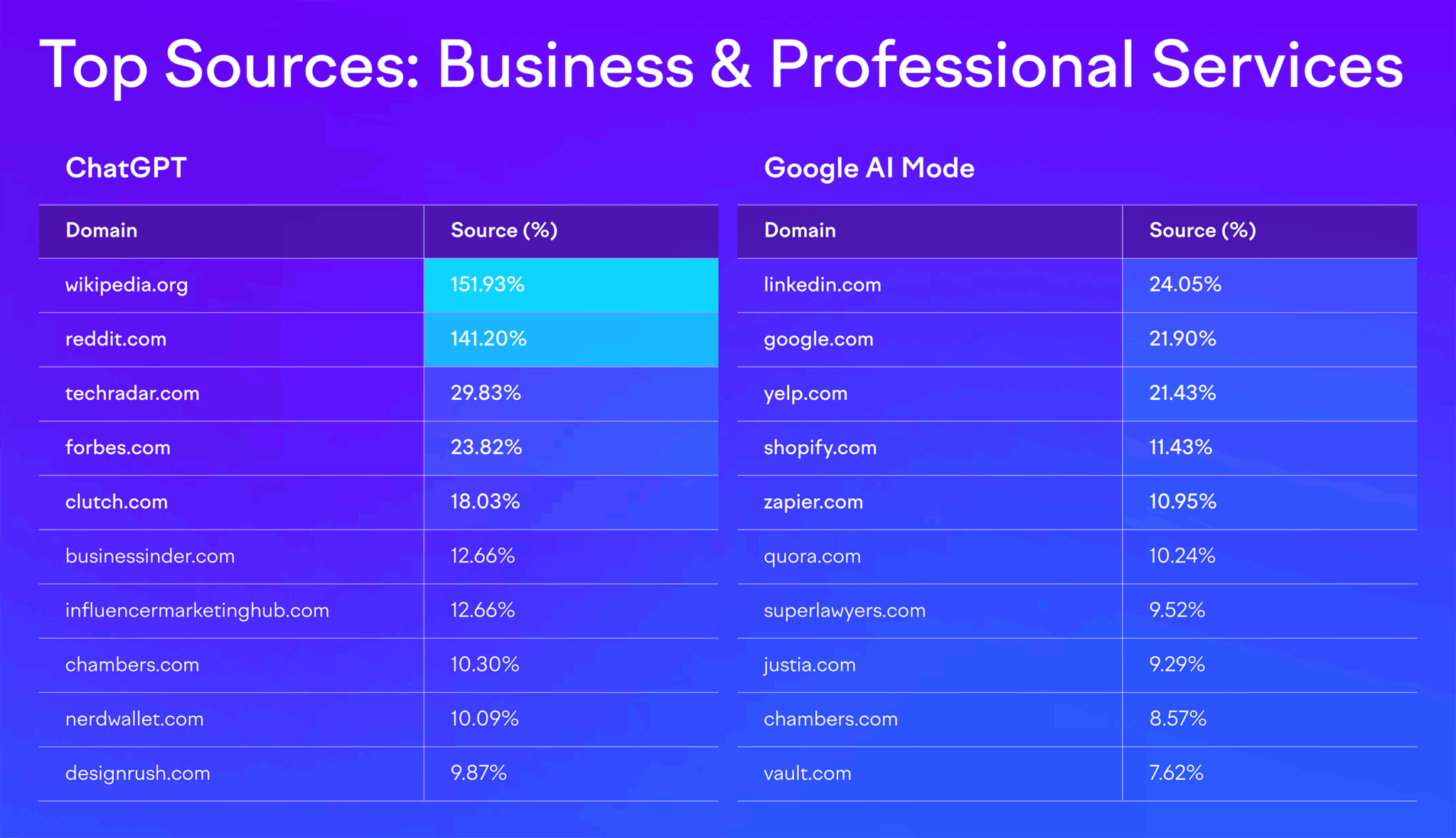
Data also shows that the weighting of sources varies by LLM as well
as by industry. For example, while ChatGPT tends to rely on Wikipedia
and Reddit as major sources, Google AI Mode shows way more variation.
These snapshots of industry trends are powerful starting points for
your work and can help illuminate next steps for the next 90 days. But
keeping close tabs on your competitors in both the SERPs and LLMs will
help you not only directly outpace them, but could also give you
insights into trends and headwinds.
Your next steps: starting checklist for LLM visibility
This checklist highlights practical steps you can start on now to
make your content and brand more discoverable in AI-powered
environments. From technical SEO adjustments to content rewrites and
community engagement, these actions help ensure your entity is
understood, cited, and trusted by both search engines and generative AI
platforms.
Verify your robots.txt file for AI crawlers
AI-driven crawlers such as GPTBot (OpenAI), CCBot (Common Crawl), and
Claude-We (Anthropic) function similarly to traditional search engine
bots, but their role is to feed information into large language models.
If your robots.txt file accidentally blocks them, whether through
overbroad disallow rules or inherited directives, you’re effectively
shutting the door on your content being indexed for use in generative AI
platforms.
This doesn’t just affect training data; it also limits your chances
of being surfaced in real-time responses, summaries, and AI-powered
search features.
Regularly auditing your robots.txt file, testing crawler access,
and aligning permissions with your visibility goals helps ensure that
your brand’s knowledge remains accessible where discovery increasingly
happens: inside AI-driven engines and assistants.
Ensure server-side rendering (SSR) for critical content
Many AI systems, like traditional crawlers, still have difficulty
parsing client-side rendered content that depends heavily on JavaScript.
If your critical text, product information, or structured data only
appears after scripts execute, there’s a strong chance it won’t be fully
captured or indexed by AI crawlers. Server-side rendering (SSR) solves
this by delivering pre-rendered HTML directly from the server, ensuring
that the essential content is visible at the time of crawl.
This approach not only improves accessibility for AI systems like
ChatGPT or Perplexity but also enhances performance for users on slower
connections. By implementing SSR for high-value pages—such as product
detail pages, core service offerings, and FAQ hubs—you create a
consistent, crawlable foundation that boosts visibility in both
traditional search results and generative AI outputs.
Implement semantic HTML5 and heading hierarchies
Using elements like <article>, <section>, <nav>,
and <header> provides explicit signals about the role and
relationship of different blocks of content. For example, wrapping a
blog post in <article> tells crawlers this is a standalone piece
of information, while <aside> can mark supporting context.
Heading hierarchies (H1 through H6) work the same way: they create a
logical outline of your content. An H1 defines the page’s core topic,
H2s break it into key themes, and H3s or H4s drill into supporting
points. AI crawlers use these patterns to parse and extract information
accurately, which directly influences whether your content can be cited
in generative responses. Pages that rely only on visual styling (bold
fonts, larger text) without semantic tags risk being misinterpreted or
overlooked entirely.
By consistently applying semantic HTML and clear heading structures,
you make your site more machine-readable, improve content
extractability, and increase the odds that both search engines and AI
platforms pull your information into summaries, snippets, and
conversational answers.
Analyze competitor citations in AI platforms
When you test your priority topics in AI platforms such as ChatGPT,
Claude, or Perplexity, you’re essentially auditing the sources those
systems deem trustworthy and authoritative. Pay close attention to which
competitors, publications, or data sets are consistently cited in
responses. This reveals the knowledge graph you’re competing against—the ecosystem of entities, sources, and relationships that AI models use to assemble answers.
If your competitors’ blogs, research reports, or even forum
contributions appear but your brand does not, that’s a signal of a
content or authority gap. It may mean you need to produce more in-depth
resources, pursue stronger backlinks and citations, or distribute
expertise across third-party sites that AI systems favor. Over time,
this type of monitoring shows patterns: which types of sources (academic
studies, media outlets, niche blogs, Q&A forums) carry the most
weight and where you can strategically position your brand to earn
visibility.
In practice, this exercise turns AI outputs into a form of
competitive intelligence, helping you benchmark your brand’s presence in
generative ecosystems and prioritize the content formats and authority
signals that AI models actually reward.
Track your site’s performance & competitors with AI optimization tools
AI optimization (AIO) tools like the AI SEO Toolkit
extend beyond traditional SEO analytics by tracking how your brand
shows up inside generative platforms. Instead of just measuring keyword
rankings or backlinks, these tools reveal your presence across AI
assistants and AI-powered search, showing how often your brand is cited
compared to competitors, what topics are working for you, and what
prompt opportunities are out there. They also surface mentions in
AI-generated outputs, letting you see whether platforms like ChatGPT,
Claude, or Perplexity are pulling your brand into responses, and in what
context.
Equally important is sentiment analysis. AIO tools can detect whether
your brand is described positively, negatively, or neutrally within
these generative answers. This helps you understand not only how visible
you are, but also how you’re being framed in the conversations that
influence decision-making.
For example, if competitors are cited more frequently or framed more
favorably, it highlights opportunities to strengthen your authority
signals through better content, reviews, or media coverage.
You also see Share of Voice alongside sentiment. In traditional
marketing and SEO, Share of Voice measures what percentage of the
overall conversation or visibility your brand commands compared to
competitors. In the world of AI optimization tools, it works the same
way, but the “conversation” is happening inside generative platforms
like ChatGPT, Claude, Gemini, or Perplexity.
For example, if you ask an AI assistant 100 queries in your category
(say, “best project management software” or “how to reduce cloud
costs”), and your brand is cited or mentioned in 20 of those answers,
your Share of Voice would be 20%. The tools automate this at scale: They
track how often your brand appears, how it’s positioned (top citation
vs passing mention), and how that compares to key competitors.
This metric is powerful because it tells you how much space your
brand occupies in AI-driven discovery ecosystems, where traditional
ranking reports can’t reach. A rising Share of Voice means AI platforms
increasingly trust and surface your content, while a declining one is an
early warning that competitors are capturing attention in generative
results. In the AI SEO Toolkit, you can dive deeper into what’s driving
positive or negative sentiment and figure out what’s needed to put your
brand in the best light, authentically.
In short, these tools give you a new layer of competitive
intelligence—one that reflects the realities of AI search. By monitoring
visibility, mentions, and sentiment, you can benchmark your standing,
identify gaps, and adapt your strategy to stay discoverable and credible
in the spaces where users are increasingly finding answers.
Write LLM-friendly text with data and expertise
LLMs are designed to surface clear, factual, and verifiable
information. When content leans too heavily on buzzwords or vague
promises—“industry-leading,” “cutting-edge,” “best-in-class”—AI systems
have little substance to work with and are less likely to extract or
cite it. What resonates instead are specifics: quantifiable data,
well-attributed statistics, expert commentary, and case studies that
provide evidence.
For example, instead of writing “Our platform improves efficiency,” you might say “Our platform reduces average processing time by 37%, based on a study of 500 enterprise clients.”
Similarly, weaving in expert quotes from industry leaders or
referencing reputable sources signals to AI that your content is
trustworthy and grounded in fact. This not only increases your odds of
being cited in AI-generated responses but also builds credibility with
human readers who demand more than marketing spin.
Ultimately, the more concrete, evidence-backed language you embed in
your content, the more LLMs will view it as useful material to pull into
conversational answers, summaries, and overviews—directly boosting your
visibility in generative search.
Add FAQs to improve AI interpretation
Adding FAQ sections to your most important pages—such as product,
service, and topic hubs—bridges the gap between how people ask questions
and how AI systems deliver answers. Users often type or speak their
queries in a natural, conversational way (“How much does this cost?” “Is
this safe for beginners?”), and AI platforms are built to recognize and
respond to this Q&A structure. By anticipating these questions and
embedding them into your content, you make it easier for generative
models to parse, extract, and cite your information.
FAQs also help you capture long-tail queries that may not justify
standalone pages but are still valuable for traffic and visibility. When
optimized with clear, concise answers—and, where relevant, enriched
with structured data markup—they
can feed directly into AI Overviews, featured snippets, and
conversational responses. This not only boosts your chances of being
quoted but also positions your site as a reliable resource when users
are in research or decision-making mode.
Over time, well-crafted FAQs strengthen your site’s role as a
conversational authority, ensuring that both search engines and
AI-driven platforms recognize your content as aligned with the way
people actually ask questions.
Engage in communities authentically
Active participation in niche online communities like Reddit, Quora,
and GitHub not only builds trust with human audiences but also increases
your footprint in the sources that AI systems frequently draw from.
These platforms are rich with Q&A-style content, practical
solutions, and peer-to-peer insights, which are exactly the kind of
material large language models index and surface in generative answers.
The key is to engage authentically. Instead of dropping links or
promotional soundbites, focus on answering questions thoroughly, sharing
unique perspectives, or contributing code snippets and documentation
where relevant. Over time, your contributions can gain upvotes,
visibility, and citations, signaling authority both to users and to AI
models trained on that content.
By embedding your expertise into these high-signal communities, you
effectively plant seeds of authority across the web. These contributions
not only drive referral traffic and brand recognition but also increase
the likelihood that your insights will be quoted, paraphrased, or
referenced in AI-generated responses, extending your reach well beyond
your owned channels.
Harvest and manage reviews for sentiment control
Reviews act as social proof not only for people but also for AI
systems. Generative models scan sentiment signals from platforms like
Google, G2, Trustpilot, Yelp, or industry-specific directories, and they
often incorporate those perspectives into summaries and
recommendations. If most of the visible reviews about your brand are
negative or if you lack reviews altogether, AI may interpret your entity
as less credible, reducing the likelihood of being favorably cited in
conversational search.
The solution is to proactively encourage authentic reviews from
satisfied customers and manage feedback consistently. Prompting clients
at the right moment in their journey, simplifying the review process,
and addressing complaints constructively all help shift sentiment in
your favor. Positive patterns of feedback create a reputation signal
that both users and AI can trust, while thoughtful responses to negative
reviews demonstrate accountability.
Over time, this builds a reputation moat: a body of credible,
third-party validation that AI systems draw from when generating
answers. In practice, that means your brand isn’t just trusted by human
audiences; it becomes algorithmically trusted, increasing your chances
of being surfaced, recommended, and cited across AI-driven platforms.
Develop media partnerships
Media coverage functions as a high-value trust signal in both
traditional SEO and AI-driven discovery. Mentions in reputable
outlets—whether through press articles, interviews, podcast appearances,
or industry features—are disproportionately influential because AI
models weigh these sources more heavily than self-published content.
When your brand is cited by journalists or discussed in respected media,
that reference becomes part of the authoritative data pool models use
to generate responses.
Strategically, this means pursuing earned media partnerships should
go beyond PR vanity—it’s a visibility play in the era of generative AI.
Pitching thought leadership pieces, offering expert commentary, or
collaborating on podcast discussions not only introduces your brand to
new audiences but also creates durable citations that AI systems are
more likely to trust and replicate.
By cultivating these relationships, you build a citation footprint
that extends across different formats (articles, transcripts, audio
summaries). Each mention increases the probability that your brand
surfaces in AI overviews, conversational answers, and knowledge graph
associations, reinforcing your authority in the spaces that matter most.
Build entity-based content clusters
Entity-based clustering takes the traditional SEO concept of topic
clusters and adapts it for the AI-first search environment. Instead of
treating each page as a standalone asset, you organize content
around well-defined entities—people, products, industries, or
concepts—that map directly to how AI systems structure knowledge. A
strong cluster typically includes a pillar page that defines the entity,
supported by subpages, FAQs, and related resources that cover its
attributes, use cases, and connections to other entities.
This structure makes it easier for AI systems to understand
relationships and context. For example, a cybersecurity brand that
builds a cluster around “Zero Trust Security” would include subtopics
like authentication methods, case studies, regulatory standards, and
common FAQs. By interlinking these assets, you give both search engines
and LLMs a clear semantic map, reinforcing your expertise in that
domain.
The payoff is twofold: Your brand is more likely to be recognized as
an authoritative source within that knowledge space, and your content
becomes more extractable, meaning AI platforms can easily pull accurate,
well-structured snippets into summaries, answers, and generative search
results. In short, entity-based clusters teach AI systems exactly who
you are and why you’re credible.
The shift toward AI-mediated information discovery represents the
most significant change in search behavior since the advent of Google.
Developing competency in LLM visibility tracking and optimization will
ensure your brand remains discoverable and authoritative in the new
landscape of AI-powered information consumption.
As these tools and methodologies continue to mature, the brands that
invest early in understanding and optimizing for LLM visibility will
have significant competitive advantages in the AI-first world that’s
rapidly approaching. Dive deeper into the AI Visibility Index or go straight into exploring your LLM visibility.