⭐ If you would like to buy me a coffee, well thank you very much that is mega kind! : https://www.buymeacoffee.com/honeyvig Hire a web Developer and Designer to upgrade and boost your online presence with cutting edge Technologies
Showing posts with label Machine learning. Show all posts

Friday, September 22, 2023

Using Friction As A Feature In Machine Learning Algorithms

 Friction often has a negative connotation in user experience design, but it actually has many benefits. Its best-known use case is mitigating unintended consequences in high-risk scenarios, yet it has a new place in the age of artificial intelligence. Adding strategic friction to interfaces can lead to profound efficiency gains in machine learning algorithms. This makes learning to leverage it a priority for any applications hoping to remain competitive.

A common assumption in user experience design is less friction makes apps more delightful. But in practice, the happy path isn’t always the smoothest. The term “friction” in the digital sense usually refers to anything that makes experiences cumbersome. It’s an analogy to the physical resistance that occurs when objects interact. Digital friction comes in many forms, from frustrating flows to confusing copy. But plenty of scenarios actually benefit with a bit of resistance. Its killer feature is mitigating unintended consequences, such as an accidental Alexa shopping spree.

You’ve likely already encountered intentional friction many times. Most apps leverage it for destructive actions, account security, and error handling, as recommended by experts from Norman Nielsen Group to the magazine you’re currently reading.

Yet friction has found a new calling in the age of artificial intelligence. When implemented correctly, it can improve the efficiency of AI systems such as machine learning algorithms. These algorithms are often used to personalize experiences through predictive recommendations. Some applications incorporating these algorithms realize that adding a bit of friction to their interface can turn each user interaction into an opportunity to improve algorithmic quality.

While less friction makes an app smoother, a bit more may make it even smarter.

Various examples of dialogs in popular apps that display before important actions are taken. They include headlines such as “abusive website ahead” or “notify 11 people across 3 time zones?” with additional information explaining the consequences of an action and a button that allows a user to confirm before proceeding
Various examples of the friction in popular apps. (Sources: Discord, MacOS, MailChimp, Slack, Airbnb, GitHub, Lyft, and Venmo) (Large preview)

Friction As A Feature #

Before venturing down the AI rabbit hole, let’s explore some simple examples showcasing the basic benefits of friction in UX. These are a helpful foundation to build off as we ascend into more complex applications for machine learning algorithms. Regardless of your familiarity, this will ground the following lessons in first principles.

Preventing Unintended Consequences #

A common use for friction is error prevention, the fifth entry in Jakob Nielsen’s list of usability heuristics. In scenarios with the potential for high-cost errors, such as irreversible deletion, apps often request confirmation before executing requests. Confirmations often display in a modal, locking the rest of the screen to increase focus on copy explaining an action’s implications. This extra step provides some extra time to consider these ramifications.

“By forcing us to slow down and think at this exact moment, we’re kept from making potentially disastrous decisions by accident.”

— Archana Madhavan in Amplitude’s “Onboarding With The IKEA Effect: How To Use UX Friction To Build Retention

Sometimes more resistance is present when the consequences can be catastrophic. For instance, a confirmation may involve cognitive work such as typing “DELETE” to submit a deletion request. This level of resistance makes sense when considering the humbling fact of life from Steve Krug’s classic UX book Don’t Make Me Think, which states, “We don’t read pages. We scan them.” This makes it easy to imagine how a streamlined design can make it too easy to overlook the consequences of a click.

A generic delete modal example that requires a user to type the phrase “delete account” into an input field to confirm their deletion request
A delete modal that requires cognitive effort to minimize accidents. (Image source: UX Psychology) (Large preview)

While these tactics may look comically cumbersome, they mitigate devastating downsides. This use of friction is like a train’s brakes screeching to a halt right in time to avoid a collision — everyone breathes a sigh of relief, crisis averted. This also outlines the basic framework for understanding when to add friction. It boils down to a cost-benefit analysis: do the rewards of streamlining outweigh the risk? If not, slow it down. Now let’s move on from a black & white example to venture into a grayer area.

Nudging Toward Healthy Behavior #

Some problems aren’t classifiable as errors but still aren’t in anyone’s best interest. Trying to solve them becomes wicked because there is no right or wrong solution. Yet that doesn’t make failing to address them any less of an existential risk. Consider social media’s medley of knee-jerk, tribalistic behavior. It has led many to question the value of these apps altogether, which isn’t good for business, or society at large. In an attempt to encourage more thoughtful discourse, these platforms turn to friction.

A prompt displays when a user attempts to retweet an article. The headline reads, “Headlines don’t tell the full story,” and the subheadline reads, “You can read the article on Twitter before Retweeting”. Available actions include an article card that can be clicked to read the article as well as buttons to “Retweet” & “Quote Tweet”
A Twitter prompt nudges users to read an article before retweeting it. (Image source: Twitter) (Large preview)

Twitter explored adding an extra step that asks people to read articles before retweeting them. This nudge aims to craft a more trustworthy experience for everyone by slowing the spread of misinformation. According to their reporting, people shown the prompt opened articles 40% more often, and some decided not to retweet it after all. They built on this success by showing a warning before users post messages which include harmful language.

Instagram also implemented a similar feature in its fight against online bullying. Adam Mosseri, the Head of Instagram, published a blog post stating that this “intervention gives people a chance to reflect.” Although specific data isn’t provided, they suggest it had promising results in cultivating a more humane experience for their communities.

These examples show how faster is not always better. Sometimes we need restraint from saying things we don’t mean or sharing things that we don’t understand. Friction helps algorithms in a similar manner. Sometimes they also need more information about us so they don’t recommend things we won’t appreciate.

Understanding Preferences & Objectives #

Let’s shift focus to AI with a simple example of how friction plays a role in machine learning algorithms. You’ve probably signed up for an app that begins by asking you a bunch of questions about your interests. Behind the scenes, an algorithm uses these answers to personalize your experience. These onboarding flows have become so common over the past decade that you may have forgotten a time before apps were smart enough to get to know you.

A screen from Twitter’s 2014 onboarding flow with a headline that reads “What are you interested in?” & a subheadline that reads “Choose one or more of the options below, and we’ll suggest some good stuff for you”. Below this text is a list of checkboxes that correspond to categories of content featured on Twitter
Twitter’s onboarding flow in 2014. (Image source: useronboard.com) (Large preview)

You may have never even questioned why you must go through a preference capture flow before getting to explore content. The value is obvious because no one wants the quickest path to something irrelevant. Many apps are simply in the business of making relevant connections, and these personalization tactics have been one of the best ways to do so. A McKinsey report illuminates this further by reporting that “35 percent of what consumers purchase on Amazon and 75 percent of what they watch on Netflix come from product recommendations based on such algorithms.”

“The top two reasons that customers churn are 1) they don’t understand your product, and 2) they don’t obtain any value from it. Customer onboarding can solve both of these issues.”

— Christina Perricone in HubSpot’s “The Ultimate Guide to Customer Onboarding

Perhaps these onboarding flows are so familiar that they don’t feel like friction. They may seem like necessary steps to unlock an app’s value. However, that perspective quickly changes for anyone designing one of these flows. The inherent tension lies in attempting to balance the diametrically opposite needs of two parties. On the one hand, an algorithm provides better output relative to its input (although asymptotes exist). Success is a function of maximizing data collection touchpoints, but this tends to result in more steps with more complex questions.

In short, the quicker an app makes a recommendation, the more likely it will be wrong. On the other hand, an extremely long onboarding flow is unlikely to make an amazing first impression on new users. I had the pleasure of walking this tightrope when designing the onboarding flow at Headliner. Each new step we added always felt like it would be the straw that broke the camel’s back. We nervously monitored our activation reports for signs we went too far but surprisingly saw no meaningful dropoff. Yet, even a slight decrease would easily be worth the improved retention that personalization yielded.

Headliner’s new user onboarding flow. (Source: headliner.app)

The Product Design Manager at Stitch Fix, Deanna Alcorn, documented their process of working through this. The tension is clearly illustrated when she asks the question, “How do we get customers to evaluate as many images as possible while keeping it fun and fast?”. While their case study is a great reference, the right solution will be different for every app. Your onboarding flow should follow the needs of your algorithm while balancing the needs of your users.

With that said, there is one app that is legendary for its rapid personalization, and surprisingly, it doesn’t have any onboarding flow at all.

Giving An Algorithm Glasses #

TikTok’s personalization is so good that the New York Times compares it to mind reading. But after signing up for their service, you can just start browsing! In stark contrast, Instagram has multiple onboarding steps without the same algorithmic reputation. How can TikTok have such an advantage if it doesn’t even ask you what you want to see?

 A sequence of screens sampled from Instagram’s onboarding flow. The first screen has a headline that reads, “Next, you’ll be able to sync your contacts to find your friends,” with a “continue” button and a smaller “skip” button. The second screen reads “Get Facebook suggestions” with a “continue” button and a smaller “skip” button. The third screen reads “Discover people” above a list of popular users that can be followed
Instagram’s numerous onboarding screens collect information to improve their algorithmic recommendations. (Image source: Instagram) (Large preview)

This is thanks to some clever interface innovations. TikTok’s design turns user engagement into clear signals they use to tweak their algorithms. Content recommendation quality is a direct function of this, which some refer to as an algorithm’s vision.

Optimizing an app’s key interactions to understand implicit signals makes an explicit means of capturing preferences unnecessary.

Engagement Signals #

Every interaction is an opportunity to improve understanding through bidirectional feedback. An interface should provide system feedback to the user engaging with it while also reporting to the system how performance meets user expectations. Everything from button taps to the absence of action can become a signal. Interfaces that successfully incorporate this are referred to as algorithm-friendly.

A diagram illustrated by Maximillian Piras displays a feedback loop: “user engagement” → “signals” → “data collection” → “model training” → “content filtering” → “personalization” → back to “user engagement” in a continuous loop
A feedback loop in an algorithm-friendly interface. (Image source: Maximillian Piras) (Large preview)

A study by Apple’s Machine Learning Research Department details their success in leveraging engagement signals, which they believe “provide strong indications of a user’s true intent,” to efficiently train a machine learning model through a process called Reinforcement Learning from Human Feedback. Their results documented “significant accuracy gains in a production deep learning system,” meaning that an interface designed well enough to analyze naturally occurring user behavior is all that is needed to create personalization that feels like mind reading.

Instagram actually employs this strategy as well, although its approach is a bit less cohesive since they seem to be in a perpetual state of transition.

TikTokification #

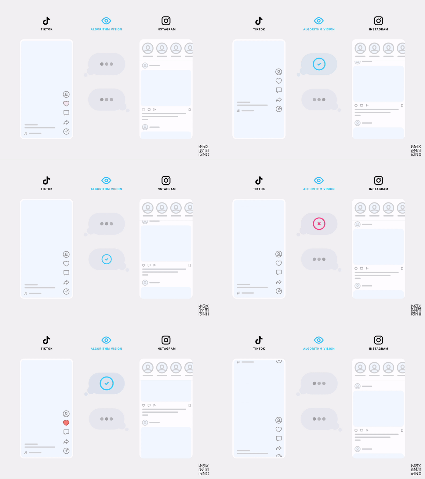
But what exactly makes an interface algorithm-friendly? In TikTok’s case, it was the design decision to only show one video at a time. That’s right, friction! By decreasing the information density in the viewport at any given time, they increased their understanding of a user’s focus. This localizes interactions (or lack thereof) to specific content as quality measures.

Gustav Söderström, the Co-President, CPO & CTO at Spotify has referred to this approach as “giving the algorithm glasses.” Compare this to the medley of distractions in other feeds, and it’s easy to imagine which one is better at collecting data.

Using friction as a tool allows designers to craft an interface that separates engagement signals from noise.

An animation by Maximillian Piras displays an “algorithm vision” comparison of TikTok’s feed with Instagram’s. TikTok provides cleaner signals since only one piece of content remains in the viewport at a time.
Algorithmic visibility comparison of TikTok & Instagram’s home feeds. (Source: Maximillian Piras) (Large preview)

As we return to my aforementioned framework for evaluating when to add friction, we can understand how it makes sense in this scenario. While each interaction may take slightly longer, relevant content can be found quicker. The trade-off makes sense since relevance sits atop a user’s hierarchy of needs.

Additionally, if you were to measure friction over a longer time horizon, you likely would find an experience with better personalization feels more frictionless. This is because the efficiency in helping users find what they’re looking for would consistently compound (although, again, asymptotes exist). So each subsequent visit theoretically requires less work on the user’s part, which makes the alternate approach look like the cumbersome one.

“The secret of why some of these products are so good at recommendations is not actually that they have better algorithms. It’s the same algorithms with a more efficient user interface.”

— Gustav Söderström in The Verge’s “Why Spotify wants to look like TikTok

While TikTok popularized this interface, anybody who was single in the last decade may notice a similarity to dating apps. Using directional gestures as engagement signals dates back to the swipeable card paradigm Tinder introduced in 2012. They, too, limited the viewport to one result at a time and used actions to inform subsequent recommendations. But TikTok took it mainstream since not everyone needs a dating app, and those who do will churn once they’ve met someone.

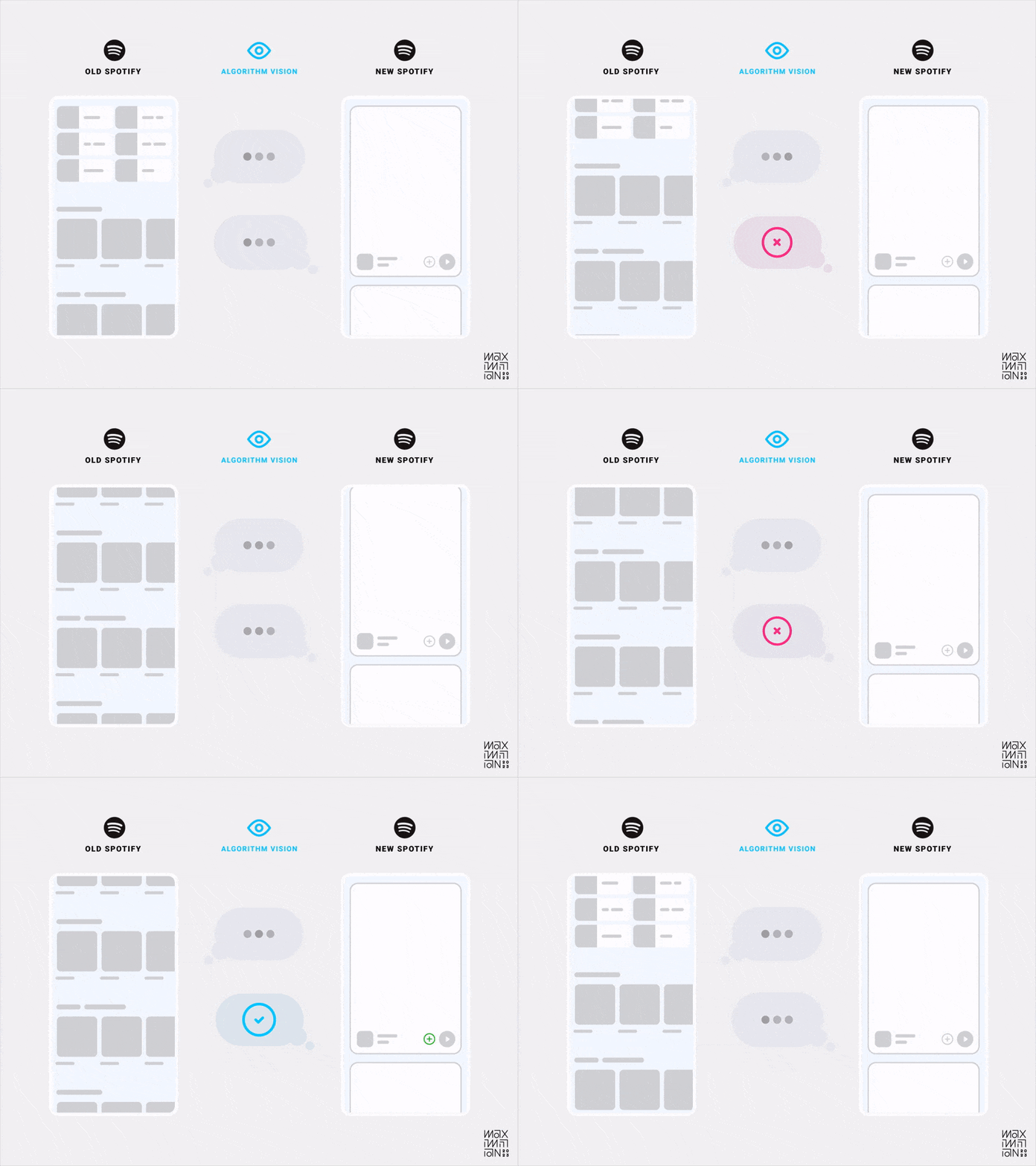
The results of using this paradigm in everyday entertainment led many platforms to copy it in hopes of the same algorithmic gains. The latest to embark on this journey is Spotify, much to the chagrin of their users. In fact, this decision even landed it on Mashable’s list of worst app updates in 2023. But Söderström says they don’t have a choice, and he believes in the long run, the signal clarity will make up for any interim backlash because of how much quicker it can learn user preferences. Critics fail to realize how important these changes are for Spotify’s future.

In the machine learning age, apps with inefficient interfaces for signal analysis risk becoming uncompetitive.

An animation by Maximillian Piras displays an “algorithm vision” comparison of Spotify’s old & new home feed designs within their mobile app. Their new home feed provides cleaner signals since only one piece of content remains in the viewport at a time.
Algorithmic visibility comparison of Spotify’s old & new home feeds. (Source: Maximillian Piras) (Large preview)

Making Lemonade #

The reason this approach is so powerful is due to the compounding nature of good data. Optimizing signals for any individual user creates a data network effect that benefits everyone else. It even turns negatives into positives! An individual bad experience can mitigate others from encountering the same, making the system antifragile.

This approach dates back to 2003 with the introduction of Amazon’s item-to-item collaborative filtering. You may know it as “customers who viewed this also viewed this.”

An illustration by Maximillian Piras displays an icon of a user that is connected to three icons representing media files. Each of these media files is then connected to many more media files, which then are recursively linked to many others. This linking of media files continues until the icons are cropped by the edge of the canvas
Item-to-item collaborative filtering. (Image source: Maximillian Piras) (Large preview)

This type of filtering produces high-quality recommendations with limited user data. It does so by building relationships between items to proxy user preferences. With only two to three data points, an algorithm can draw connections across the entire dataset. It effectively piggybacks off previous patterns that are similar enough.

This means an app like TikTok only needs a few swipes before it can make high-probability assumptions about your preferences. That’s why friction is so useful in algorithm-friendly interfaces. If the initial interactions send clean signals, then an algorithm can graph a user’s interests almost immediately.

Friction In The Future #

We began in the past by reviewing how friction found its way into UX toolkits through error prevention and healthy nudges. Then we moved on to its ability to help algorithms learn user preferences and objectives. While explicit onboarding flows are still in vogue, TikTok is popularizing an interface that makes them unnecessary by using implicit engagement signals leading to significant algorithmic gains. Yet the machine learning age is just beginning, and friction is only accelerating its evolution.

Inverting The Pareto Principle #

We’ve focused on algorithms that recommend content, but more diverse uses of personalization may emerge due to the newfound capabilities of Large Language Models. These models unlock the ability to manipulate unstructured data at scale. This allows engagement patterns of greater complexity to be analyzed and productized. The result is algorithms can recommend much more than media and metadata.

Perhaps they can craft completely personalized feature sets based on our preferences and objectives. Imagine selecting effects in Photoshop and seeing suggestions such as “Creators who used this effect also used this one.” These capabilities could increase the usage of buried features that only power users tend to find.

Microsoft is exploring this by adding Copilot to its products. They claim the “average person uses less than 10% of what PowerPoint can do,” but AI will unlock all that latent value.
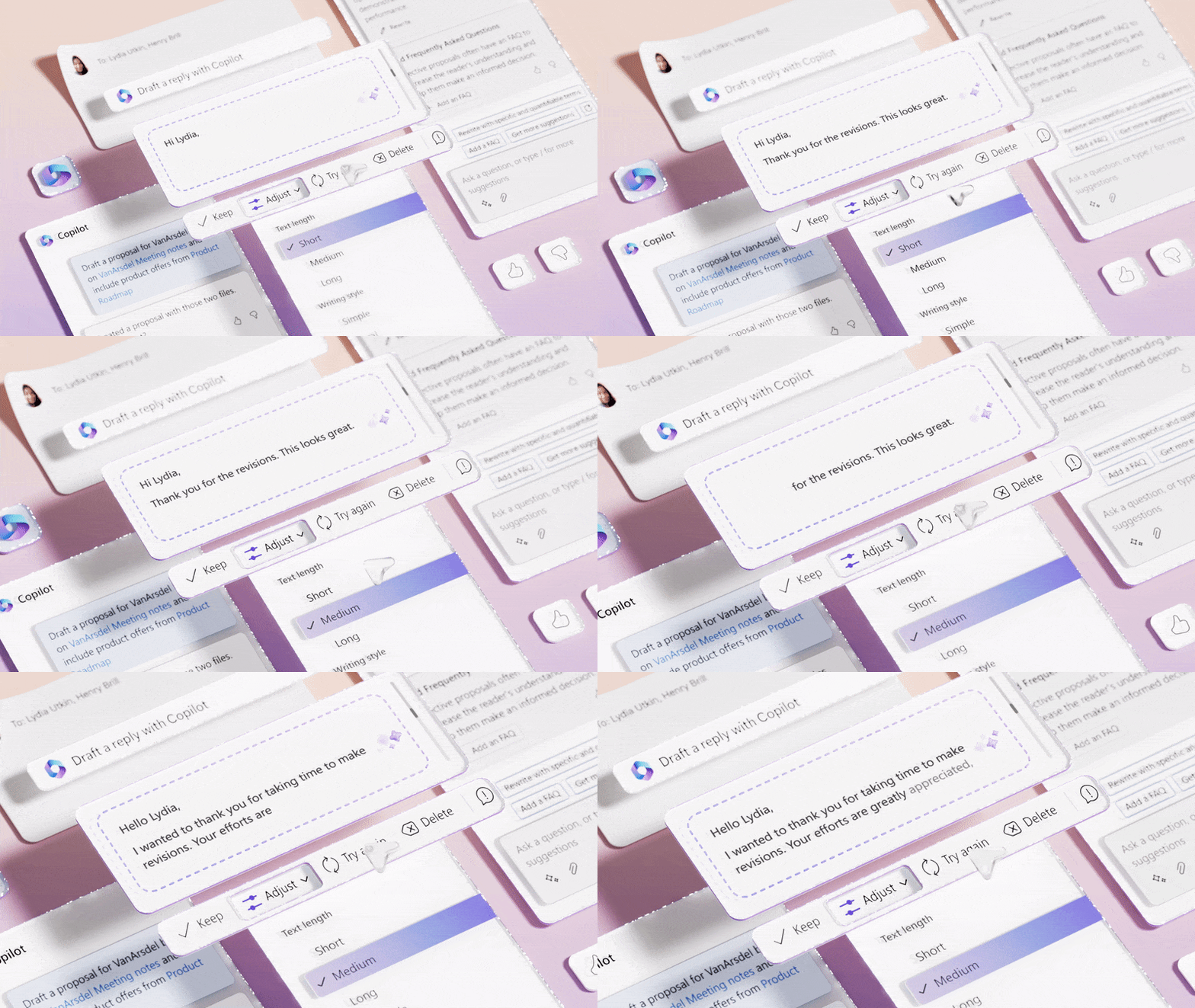
A collage of various Microsoft interface elements that illustrate how users can type their goals into a chat window so generative AI can help them execute tasks. A block of AI-generated text is displayed & a cursor parses values in a dropdown labeled “Adjust”. Each value allows the user to manipulate the generated text based on parameters such as “Text length”.
Microsoft Copilot uses LLMs in an attempt to unlock the 90% of features that most users don’t know exist. (Source: Microsoft Design) (Large preview)

Using LLMs to create feature recommendation engines is a fascinating idea. It would allow developers to stop relying on the Pareto Principle for prioritization. Especially because Joel Spolsky claims the 8020 rule is actually a myth.

“A lot of software developers are seduced by the old “80/20” rule. It seems to make a lot of sense: 80% of the people use 20% of the features… Unfortunately, it’s never the same 20%. Everybody uses a different set of features.”

— Joel Spolsky in “Strategy Letter IV: Bloatware and the 80/20 Myth

It would be nice if irreducible simplicity in interface design were only a power law away, but feature creep is hard to combat when different people find value in different options. It’s unrealistic to believe that there is some golden 20% of features driving 80% of value. If there was, then why isn’t the Pareto Principle ever applied to content?

I can’t imagine a team at YouTube suggesting that removing 80% of videos would improve the service. Instead, it’s viewed as a routing problem: find the right piece of content for the right person. If machine learning algorithms can recommend features, I hope the value of friction goes without saying at this point. The efficiency gains unlocked by algorithm-friendly interfaces absolutely apply.

Hallucinations Or Creations #

The recent inflection point in the capability of LLMs unlocks an entirely new computing paradigm. The legendary UX researcher Jakob Nielsen believes it introduces the first new UI paradigm in 60 years, which he calls Intent-Based Outcome Specification. Instead of telling computers what to do, we now explain an outcome so they can determine how to achieve it.

Using machine learning algorithms to recommend features is one example. Another fairly new example that you’re likely familiar with is chatbots like ChatGPT. Hundreds of millions of people already use it, which is a testament to how out of this world the experience is. Yet therein lies a problem: sometimes its responses literally aren’t grounded in reality because it has a tendency to make them up! This isn’t obvious to those unfamiliar with the technology’s inner workings since there aren’t many safeguards. As a result, some people become dangerously overreliant on its unverified output.

In one case, a lawyer based legal arguments on research from ChatGPT only to find out in court that multiple cited sources turned out to be completely nonexistent. The lawyer’s defense was that he was “unaware of the possibility that its content could be false.” Examples like this reinforce the importance of friction in preventing unintended consequences. While ChatGPT’s empty state mentions its limitations, they obviously aren’t stated explicitly enough for everyone.

The empty state for ChatGPT displays three columns of text above the input field. The columns are titled “Examples”, “Capabilities”, & “Limitations”. Within each column, there are three rows of text blocks, all displayed in the same font size, color, & weight
ChatGPT’s empty state mentions its limitations, but the lack of text hierarchy in this design means many users are likely to overlook them. (Image source: ChatGPT) (Large preview)

Extra steps and prompts, such as those mentioned earlier, could better educate users about what is referred to as a “hallucination.” It’s a phenomenon of chatbots confidently outputting responses that don’t align with their training data. Similar to telling a lie when you don’t have a correct answer, although that characterization overly anthropomorphizes the software.

Yet some see hallucinations as more of a feature than a bug. Marc Andreessen, the co-founder of Netscape, states during an interview that “another term for hallucination is just simply creativity.” He views it as a significant evolution from the hyperliteral systems of the past because they can now brainstorm and improvise.

The problem is that chatbot interfaces tend to be simplistic by attempting to be one size fits all. More controls or modes would educate users about available output types so they can specify which they expect. Sometimes we may want an imaginative response from a creative partner. Other times we want the hyper-accuracy of a deterministic calculator, such as ChatGPT’s Wolfram plugin.

Perhaps a creativity slider or persona selector similar to Maggie Appleton’s exploration will better align the system to user needs. However it’s implemented, a bit of friction can maximize benefits while minimizing risks.

Finding Your Friction #

We’ve covered using friction for simple error prevention to complex algorithm optimizations. Let’s end with a few tips that make implementing it as smooth as possible.

Peak-End Rule #

When adding resistance to an experience, the Peak-End Rule is a useful psychological heuristic to leverage. It’s rooted in studies by Daniel Kahneman & Amos Tversky, where they found that perception of painful experiences doesn’t tend to correlate with duration. It’s the peak & end of the experience that subjects recall.

In practice, experts suggest that delight is a function of positive emotional peaks and rewarding emotional payoffs. Optimizing for the peak & end provides room to shift focus from time spent and steps taken as performance indicators; long and complex experiences can still be delightful if designed correctly.

A chart titled “Peak-End Rule” by Maximillian Piras displays “emotion” on the y-axis and “time” on the x-axis. A trend line is drawn that begins below the midway point of the y-axis labeled with a neutral face emoji. The trendline shoots upward to an all-time high point located two-fourths through the graph and labeled with a happy face emoji. The trendline drops to its lowest point, located three-fourths through the graph and labeled with a sad face emoji. The trendline ends closer to its all-time high, labeled with a happy face emoji
The Peak-End Rule states that experiences tend to be recalled by the emotional peaks & end state as opposed to their full duration. (Image source: Maximillian Piras) (Large preview)

Maps Aren’t Territories #

People experience friction emotionally, but developers see it as a value on a chart. In the same way that a map is not a territory, this ratio is only an approximation of the actual experience. It’s something to consider when evaluating any strategies for adding or removing friction. Since applications are complex ecosystems, any measurements should consider a holistic view. Every step has second-order effects, which makes one-dimensional measurements prone to blind spots.

For example, when a wrong file is deleted, the data can’t report people cursing at their computer screen. Nor is it likely to include the context of them opening a new file just to recreate their old file from scratch. The same subjectivity applies to all instances of friction. For instance, are your reports equipped to measure the trade-off of an action that takes longer but results in better data collection? It might increase algorithmic efficiency, which compounds across a neural network.

As we’ve discussed, better recommendations tend to yield better retention, which tends to yield more revenue if a business model aligns with usage. Myopic measurements will miss these types of gains, so make sure to analyze friction in a way that really matters.

Keep Pushing #

As software is eating the world, AI is eating software. If it’s a paradigm shift as big as social, mobile, or even the web, then applications must adapt or die. If you want to remain competitive in the machine learning age, then don’t fear friction.

Thursday, July 13, 2023

Time Serious Forecast using Python


Introduction:

         Time series are one of the most common things encountered in daily life. For example Financial prices, weather, home energy usage, and even weight are all of data that can be collected at regular intervals. In the series collect the data points at constant interval time which leads the data have the dependency with the time.
The Time series has the sudden increase or decrease in certain intervals(Month, day, hour ...). Which will implies the non stationary in the data modelling. The sudden increase we may called like trends, seasonality and so on.

Data Analysis in Time series:

In python, we have the great library Pandas to handle the time series objects, particularly the datatime64[ns] class which stores time information and allows us to perform some operations really fast.
In the below example we are going to use the AirPassanger.csv data set. Initially, we have to load the necessary libraries


import pandas as pd
import numpy as np
import matplotlib.pylab as plt
%matplotlib inline

load the AirPassanger data set to the Pandas data frame,

data = pd.read_csv('AirPassengers.csv')
data.head();

Looking at the output


       The data contains a particular month and number of passengers travelling in that month .The data type here is object (month) Let’s convert it into a Time series object and use the Month column as our index.

dateparse = lambda dates: pd.datetime.strptime(dates, '%Y-%m')
data = pd.read_csv('/home/ubuntu/Downloads/AirPassengers.csv', parse_dates=['Month'], index_col='Month',date_parser=dateparse)
data.index

You can see that now the data type is ‘datetime64[ns]’.Now let’s just make it into a series rather than a data frame


to convert the data frame to time serious

#converting time series
ts = data['#Passengers'] 

And also we can see the various time based index operations,


Stationarity:

     This is a very important concept in Time Series Analysis. In order to apply a time series model, it is important for the Time series to be stationary; in other words all its statistical properties (mean,variance) remain constant over time. This is done basically because if you take a certain behaviour over time, it is important that this behaviour is same in the future in order for us to forecast the series. There are a lot of statistical theories to explore stationary series than non-stationary series.

Checks for Stationarity:

    There are many methods to check whether a time series (direct observations, residuals, otherwise) is stationary or non-stationary.

     Look at Plots:  You can review a time series plot of your data and visually check if there are any obvious trends or seasonality.
     Summary Statistics: You can review the summary statistics for your data for seasons or random partitions and check for obvious or significant differences.
     Statistical Tests: You can use statistical tests to check if the expectations of stationarity are met or have been violated (Augmented Dickey-Fuller test).

The best way to understand you stationarity in a Time Series is by the plot:


It’s clear from the plot that there is an overall increase in the trend,with some seasonality in it.

Plotting Rolling Statistics :The function will plot the moving mean or moving Standard Deviation. This is still visual method

NOTE: moving mean and moving standard deviation — At any instant ‘t’, we take the mean/std of the last year which in this case is 12 months)

Augmented Dickey-Fuller test :

      Statistical tests make strong assumptions about your data. They can only be used to inform the degree to which a null hypothesis can be rejected or fail to be reject. The result must be interpreted for a given problem to be meaningful.

Nevertheless, they can provide a quick check and confirmatory evidence that your time series is stationary or non-stationary.

The Augmented Dickey-Fuller test is a type of statistical test called a unit root test.

The intuition behind a unit root test is that it determines how strongly a time series is defined by a trend.

There are a number of unit root tests and the Augmented Dickey-Fuller may be one of the more widely used. It uses an autoregressive model and optimizes an information criterion across multiple different lag values.

The null hypothesis of the test is that the time series can be represented by a unit root, that it is not stationary (has some time-dependent structure). The alternate hypothesis (rejecting the null hypothesis) is that the time series is stationary.

Null Hypothesis (H0): If failed to be rejected, it suggests the time series has a unit root, meaning it is non-stationary. It has some time dependent structure.

Alternate Hypothesis (H1): The null hypothesis is rejected; it suggests the time series does not have a unit root, meaning it is stationary. It does not have time-dependent structure.

We interpret this result using the p-value from the test. A p-value below a threshold (such as 5% or 1%) suggests we reject the null hypothesis (stationary), otherwise a p-value above the threshold suggests we fail to reject the null hypothesis (non-stationary).

p-value > 0.05: Fail to reject the null hypothesis (H0), the data has a unit root and is non-stationary.
p-value <= 0.05: Reject the null hypothesis (H0), the data does not have a unit root and is stationary.

The below function used to find out the rolling mean, std and dickey-fuller test information. Which will plot the all the three value result in plot. Its useful to filter create the good insights to the developer.


from statsmodels.tsa.stattools import adfuller
def test_stationarity(timeseries):
    
    #Determing rolling statistics
    rolmean = pd.rolling_mean(timeseries, window=12)
    rolstd = pd.rolling_std(timeseries, window=12)

    #Plot rolling statistics:
    orig = plt.plot(timeseries, color='blue',label='Original')
    mean = plt.plot(rolmean, color='red', label='Rolling Mean')
    std = plt.plot(rolstd, color='black', label = 'Rolling Std')
    plt.legend(loc='best')
    plt.title('Rolling Mean & Standard Deviation')
    plt.show(block=False)
    
    #Perform Dickey-Fuller test:
    print('Results of Dickey-Fuller Test:')
    dftest = adfuller(timeseries, autolag='AIC')
    dfoutput = pd.Series(dftest[0:4], index=['Test Statistic','p-value','#Lags Used','Number of Observations Used'])
    for key,value in dftest[4].items():
        dfoutput['Critical Value (%s)'%key] = value
    print(dfoutput)

Now let’s parse our time series data ,

test_stationarity(ts)


This will be continue on Next tutorial.

Decision Tree Algorithm in Machine Learning


Decision Tree in ML


Decision Tree algorithm belongs to the family of supervised machine learning algorithm. It is simple and popular and is based on choices as suggested by its name. This algorithm works both for continuous as well as choice variables i.e. it can be used for both classification as well as regression problems. The article unfolds in three sections, commencing with a general introduction of the algorithm, followed by the mathematical concepts that builds the blocks for the same and we shall conclude with a code walk through on building a  Decision Tree model in Python using Loan approval data set.

1. Introduction

Decision Tree learns decision rules inferred from prior data that we use to train it. The motive is to predict the target variables or predict the class based on these decision rules. As the name suggests, the algorithm solves problems by using a tree representation. Each internal node of the tree are attributes and the leaf nodes corresponds to the class labels.

1.1. Terminology

Root Node: It represents the entire population or sample and this further gets divided into two or more homogeneous sets.
Splitting: It is a process of dividing a node into two or more sub-nodes.
Decision Node: When a sub-node splits into further sub-nodes, then it is called the decision node.
Leaf / Terminal Node: Nodes do not split is called Leaf or Terminal node.
Pruning: When we remove sub-nodes of a decision node, this process is called pruning. You can say the opposite process of splitting.
Branch / Sub-Tree: A subsection of the entire tree is called branch or sub-tree.
Parent and Child Node: A node, which is divided into sub-nodes is called a parent node of sub-nodes whereas sub-nodes are the child of a parent node.


Figure 1. A sample Decision Tree


2. Pseudocode and Assumptions
The best attribute should be set a:s the root of the tree.
Split the data set into subsets in such a way that the subset contains the same value as an attribute.
Repeat the above two steps till the leaf nodes of all the branches of the tree is found out.
For predicting a class label for a record we start from the root of the tree. We compare the values of the root attribute with the record's attribute. On the basis of comparison, we follow the branch corresponding to that value and jump to the next node. The process is continued till the leaf node is reached.

We must first assume the whole training set is first taken as the root in the beginning, and the feature values are preferred to be categorical in nature. In case the values are continuous, it is discretized prior to model training. All the entries/records are distributed recursively in the sense that, the distribution will give similar information repeatedly for similar types of records.   Decision Trees follow Sum of Product (SOP) representation. The Sum of product (SOP) is also known as Disjunctive Normal Form. For a class, every branch from the root of the tree to a leaf node having the same class is conjunction (product) of values, different branches ending in that class form a dis-junction (sum).

3. Attribute Selection and Mathematical Elucidations.

Let us suppose that there are “k” number of attributes in the data set and our first step, as discussed above would be to select an attribute which will be set as the root attribute of tree. Random selection of the root and subsequent nodes will be a great idea since the decision of making strategic splits heavily affects a tree’s accuracy. For the same purpose, researchers have come up with several criteria of attribute selection, to name a few:
  • Entropy
  • Information Gain
  • Gini Index
These criterions will calculate values for every attribute. The values are sorted, and attributes are placed in the tree by following the order i.e, the attribute with a high value(in case of information gain) is placed at the root.

3.1. Entropy
The degree of randomness in the information given by an attribute is measured by entropy. More the entropy, it becomes more ambiguous to draw any concrete conclusion from the information. Generally, in the tree a branch with zero entropy is placed at the terminal node and branches with more than zero entropy needs to be split further. Mathematically,
<math xmlns="http://www.w3.org/1998/Math/MathML"><mi>E</mi><mfenced><mi>S</mi></mfenced><mo>=</mo><munder><mo>&#x2211;</mo><mi>i</mi></munder><mo>-</mo><msub><mi>p</mi><mi>i</mi></msub><msub><mi>log</mi><mn>2</mn></msub><msub><mi>p</mi><mi>i</mi></msub></math>

Where, S is the current state, p is the probability of an event i in the state S. For multiple attributes,

3.2. Information Gain

Information gain or IG is a statistical property that measures how well a given attribute separates the training examples according to their target classification. The building of a Decision Tree is based on finding the attribute that has the highest information gain. It computes the difference between entropy before split and average entropy after split of the dataset based on given attribute values.

<math xmlns="http://www.w3.org/1998/Math/MathML"><mi>I</mi><mi>n</mi><mi>f</mi><mi>o</mi><mi>r</mi><mi>m</mi><mi>a</mi><mi>t</mi><mi>i</mi><mi>o</mi><mi>n</mi><mo>&#xA0;</mo><mi>G</mi><mi>a</mi><mi>i</mi><mi>n</mi><mo>(</mo><mi>T</mi><mo>,</mo><mi>X</mi><mo>)</mo><mo>&#xA0;</mo><mo>=</mo><mo>&#xA0;</mo><mi>E</mi><mi>n</mi><mi>t</mi><mi>r</mi><mi>o</mi><mi>p</mi><mi>y</mi><mo>(</mo><mi>T</mi><mo>)</mo><mo>&#xA0;</mo><mo>-</mo><mo>&#xA0;</mo><mi>E</mi><mi>n</mi><mi>t</mi><mi>r</mi><mi>o</mi><mi>p</mi><mi>y</mi><mo>(</mo><mi>T</mi><mo>,</mo><mi>X</mi><mo>)</mo></math>
           

Where T is the state before split and X is the state after split.

3.3. Gini Index

Gini Index is used to evaluate the splits of the dataset by using a cost function. It is calculated by subtracting the sum of the squared probabilities of each class from 1. Unlike information gain, it favours large partitions and is simpler to implement and to be noted that it performs binary splits only. Higher the value of Gini index higher the homogeneity. Mathematically,
<math xmlns="http://www.w3.org/1998/Math/MathML"><mi>G</mi><mi>i</mi><mi>n</mi><mi>i</mi><mo>&#xA0;</mo><mo>=</mo><mo>&#xA0;</mo><mn>1</mn><mo>-</mo><mo>&#xA0;</mo><munder><mo>&#x2211;</mo><mi>i</mi></munder><msup><mfenced><msub><mi>p</mi><mi>i</mi></msub></mfenced><mn>2</mn></msup></math>


4. Decision Tree using Python

As discussed previously, here we shall build a simple decision tree model in this section. For the same we have used the loan approval dataset. The dataset could be used to do Classification as well as regression, although however we shall use Decision Tree classifier to predict whether loan should be approved or not.

###Import required libraries
import pandas as pd
import numpy as np
import matplotlib.pyplot as plt
from sklearn.tree import DecisionTreeClassifier
from sklearn.metrics import accuracy_score
from sklearn.metrics import classification_report
from sklearn.metrics import confusion_matrix
from sklearn.model_selection import train_test_split 

Read the data:

#import the data
df = pd.read_csv("train.csv")
df.info()


Python gives output as follows:

<class 'pandas.core.frame.DataFrame'>
RangeIndex: 614 entries, 0 to 613
Data columns (total 13 columns):
Loan_ID              614 non-null object
Gender               601 non-null object
Married              611 non-null object
Dependents           599 non-null object
Education            614 non-null object
Self_Employed        582 non-null object
ApplicantIncome      614 non-null int64
CoapplicantIncome    614 non-null float64
LoanAmount           592 non-null float64
Loan_Amount_Term     600 non-null float64
Credit_History       564 non-null float64
Property_Area        614 non-null object
Loan_Status          614 non-null object
dtypes: float64(4), int64(1), object(8)
memory usage: 62.4+ KB

The data has attributes as shown above and is pretty much self explanatory in nature and with the help of which we will be predicting the Loan_Status, whether loan will be approved or not.
As we see, there is missing data in the set. One way is to either drop the variable but that comes with a cost of losing a lot of degrees of freedom. Here, we will use simplistic methods to impute the missing values in the data. It is not necessary that we go by such preprocessing methods as shown here. For simplicity let us do the following steps to modify the data.


#Data Preprocessing

df["Gender"].fillna("unknown",inplace = True)
df["Married"].fillna("unknown",inplace = True)
df["Credit_History"].fillna(df.Credit_History.mean(),inplace = True)
df["Dependents"].fillna(0,inplace = True)
df["LoanAmount"].fillna(df.LoanAmount.mean(),inplace = True)
df["Self_Employed"].fillna("No",inplace = True)
df["Loan_Amount_Term"].fillna(round(df.Loan_Amount_Term.mean()),inplace=True)

As shown above, missing gender and marital status is filled with “unknown”, Credit History and loan amount and the loan amount terms is filled in with the mean of the variables. Whether the person is self employed is given “No” and number of dependents has been given 0 if the data was missing. After the preprocessing, we have:


<class 'pandas.core.frame.DataFrame'>
RangeIndex: 614 entries, 0 to 613
Data columns (total 13 columns):
Loan_ID              614 non-null object
Gender               614 non-null object
Married              614 non-null object
Dependents           614 non-null object
Education            614 non-null object
Self_Employed        614 non-null object
ApplicantIncome      614 non-null int64
CoapplicantIncome    614 non-null float64
LoanAmount           614 non-null float64
Loan_Amount_Term     614 non-null float64
Credit_History       614 non-null float64
Property_Area        614 non-null object
Loan_Status          614 non-null object
dtypes: float64(4), int64(1), object(8)
memory usage: 62.4+ KB

All the fields are non-null , we will go ahead with some more feature extraction.


In[]: df["Dependents"]= df["Dependents"].map({"0":int(0),"1":int(1),"2":int(2),"3+":int(3)})
Dependents is the number of people dependent on the loan applicant. Since they are ordinal in nature we shall just map it to integer numbers.    

Let us get the summary statistics of the data.


df.describe()

A simple does that for you in python, its given as follows:


Dependents
ApplicantIncome
CoapplicantIncome
LoanAmount
Loan_Amount_Term
Credit_History
Loan_Status
count
599
614
614
614
614
614
614
mean
1
5403
1621
146
342
1
0
std
1
6109
2926
84
64
0
0
min
0
150
0
9
12
0
0
0
0
2878
0
100
360
1
0
1
0
3813
1189
129
360
1
0
1
2
5795
2297
165
360
1
1
max
3
81000
41667
700
480
1
1


Loan status as discussed before is the target variable and is labelled in 0s and 1s.


For training and validating the model let’s split the data into training and testing set.


X_train , X_test , y_train , y_test =train_test_split(X,y,test_size=0.33, random_state=42)

We are keeping the test size as 1/3rd of the total size of the whole data set. As a next step we will create the model, first with the “Gini” criterion, then with the Entropy criterion. Then we will fit the model to the training data and then predict for the test data. The code is simple and is as follows:

Model using Gini Criterion

clf_gini = DecisionTreeClassifier(criterion = "gini",random_state = 100,max_depth=3, min_samples_leaf=5)
In[] : clf_gini.fit(X_train, y_train)
Out[]: DecisionTreeClassifier(class_weight=None, criterion='gini'
            ,max_depth=3,
            max_features=None, max_leaf_nodes=None,
            min_impurity_decrease=0.0, min_impurity_split=None,
            min_samples_leaf=5, min_samples_split=2,
            min_weight_fraction_leaf=0.0, presort=False, random_state=100,
            splitter='best')
y_pred = clf_gini.predict(X_test)

y_pred in the above code is the predicted values of the target.

Let’s evaluate the model.

print("Confusion Matrix: ", confusion_matrix(y_test, y_pred))
print ("Accuracy : ",accuracy_score(y_test,y_pred)*100)
print("Report : ", classification_report(y_test, y_pred))


Gives the following output:


Confusion Matrix:  [[129 2]
[ 48  24]]

Accuracy :  75.36945812807882
Report :               precision recall f1-score   support

          0 0.73      0.98 0.84   131
          1 0.92      0.33 0.49     72

avg / total       0.80 0.75   0.71 203


The accuracy with the model is 75%. Let’s check what happens if we use the entropy criterion.

Model with Entropy Criterion

clf_ent = DecisionTreeClassifier(criterion = "entropy",random_state = 42,
max_depth=3, min_samples_leaf=10)

clf_ent.fit(X_train, y_train)

Out[] : DecisionTreeClassifier(class_weight=None, criterion='entropy',             max_depth=3,
            max_features=None, max_leaf_nodes=None,
            min_impurity_decrease=0.0, min_impurity_split=None,
            min_samples_leaf=10, min_samples_split=2,
            min_weight_fraction_leaf=0.0, presort=False, random_state=42,
            splitter='best')


y_pred = clf_ent.predict(X_test)

y_pred is defined as before. The evaluation report is given as below:


print("Confusion Matrix: ", confusion_matrix(y_test, y_pred))
print ("Accuracy : ",accuracy_score(y_test,y_pred)*100)
print("Report : ", classification_report(y_test, y_pred))

The reports are given as below:

Confusion Matrix:  [[129 2]
[ 39  33]]
Accuracy :  79.80295566502463
Report :               precision recall f1-score   support

          0 0.77      0.98 0.86   131
          1 0.94      0.46 0.62     72

avg / total       0.83 0.80   0.78 203

As we see that, using “Entropy” gives a better accuracy than the “Gini” model.