Payment of ₹ requested by HONEY VIG. Click the link to pay securely via Razorpay: Make 5000 payment Payment of ₹ requested by HONEY VIG. Click the link to pay securely via Razorpay: Make 5000 payment ⭐ If you would like to buy me a coffee, well thank you very much that is mega kind! : https://www.buymeacoffee.com/honeyvig
Hire a web Developer and Designer to upgrade and boost your online presence with cutting edge Technologies
Showing posts with label cross-browser. Show all posts

Friday, November 18, 2011

CSS Data URIs – Use Them In All Browsers Now!


CSS Data URIs – Use Them In All Browsers Now!
Data URIs are one of the best techniques in CSS, allowing developers to avoid referencing external images and instead embed them directly into a stylesheet. The main advantage of this approach is to save HTTP requests.
HTTP requests are a huge performance bottleneck, and the reason techniques such as CSS image sprites have been popular for some time. Basically, if you can avoid requesting an extra file, not only does it save your server the work of looking up the file, but it also saves your user the download time. In fact, HTTP request management is so important, that it is the top issue in the Yahoo Performance Rules.
Data URIs are an excellent way to reduce HTTP requests and speed up your pages, so let’s walk through how to use them in all major browsers.

When To Use Data URIs

When used instead of an image sprite, data URIs save a single HTTP request, and every little bit counts. However they are even more useful for images that are difficult to include in sprite sheets, for instance custom list bullets that need a varying amount of whitespace.
Although data URIs are an excellent way to reduce HTTP requests, it doesn’t make sense to use them in every situation. Since they embed the raw file data directly in the stylesheet, data URIs can lead to stylesheet bloat if they are used heavy-handedly.
Data URIs are great for any imagery that is repeated on all the pages of your site. However, for page-specific images it is usually better to reference an external image in the stylesheet. Since the file data is embedded directly in the stylesheet, data URIs will be downloaded by all your site’s visitors, regardless of whether they hit the page with that particular image. That said, you can feel free to embed page-specific data URIs on the individual page, just take care not to include them in a site-wide stylesheet.

How To Use Data URIs

Fortunately embedding data URIs is relatively simple. First you’ll need to generate a text string of the raw image data. For this I like to use the Base64 Online Generator.
Once you have the image data, simply place it directly in your stylesheet as an inline background image:
blah {
    background-image: url("data:image/png;base64,iVBORw0KGgoAAAANS ...
UhEUgAAABgAAAAYCAMAAADXqc3KAAADU5ErkJggg==");
}
Here we’ve used image/png to specify the content type, but make sure to change this to image/jpg or image/gif depending on the MIME type of the image you’re embedding. Additionally make sure to keep the data URI all on one line without line-breaks.

Supporting Data URIs in IE

Kuato Lives IE
Firefox, Chrome, Safari and Opera all support data URIs. However, as you may have guessed data URIs are not fully supported in IE, so special accommodations need to be made for everyone’s favorite browser.

Data URIs in IE8

IE8 mostly supports data URIs with a few minor caveats. The main problem is that IE8 data URIs cannot exceed 32kb, however this is not a huge issue, since embedded images rarely exceed this limit.
Additionally, data URIs can only be used for a handful of HTML elements in IE8: , , & . But this only concerns markup, and when it comes to CSS, IE8 allows data URIs on any element. Finally, IE8 data URIs can only be used in CSS declarations that accept a url() parameter, however since data URIs are rarely used differently, this is basically a non-issue.

Data URIs in IE6 and IE7

While IE6 and IE7 don’t technically support data URIs, we can achieve something similar using MHTML and a technique pioneered by Stoyan Stefanov. First include the images as MIME data within a stylesheet:
/*
Content-Type: multipart/related; boundary="MYSEPARATOR"

--MYSEPARATOR
Content-Location: image1
Content-Transfer-Encoding: base64

iVBORw0KGgoAAAANSUhEUgAAABgAAAAYCAMAAADXqc3KAAAD....U5ErkJggg==
--MYSEPARATOR
Content-Location: image2
Content-Transfer-Encoding: base64

iVBORw0KGgoAAAANSUhEUgAAABgAAAAYCAMAAADXqc3KAAAA....U5ErkJggg==
--MYSEPARATOR--
*/
Be careful with the separators here, or you will have issues with Vista / Windows 7. The boundary declaration can be used to define any separator string you want, however be sure to start each new data block with --MYSEPARATOR and end the MIME data with --MYSEPARATOR--. Next, reference the MHTML images in your stylesheet:
/*
The MIME data from above goes here
*/

.image1 {
  background-image: url("data:image/png;base64,[raw data here]");
  *background-image: url(mhtml:http://mysite.com/styles.css!image1);
}

.image2 {
  background-image: url("data:image/png;base64,[raw data here]");
  *background-image: url(mhtml:http://mysite.com/styles.css!image2);
}
Here we’re first including the standard data URI for most browsers, then using the star hack to define the MHTML image data for IE6 and 7. Note the url in the mhtml declaration; it uses the stylesheet’s url followed by the Content-Location defined in the MIME data section. However this technique has one clear drawback, which is that we are now including the image data twice on one page. Considering the large size of raw image data, it doesn’t make sense to include it twice unless you’re embedding very small images. Fortunately this issue can be avoided in a number of ways. One approach might be to use server side browser sniffing to only enable the MIME data for the affected browsers. Alternately, you can use browser conditionals to include a separate stylesheet for IE7 and lower. This has several advantages, including being able to attach other browser-specific styling without relying on CSS selector hacks. However, don’t include an IE7 stylesheet on top of your main stylesheet, or you’ll defeat the purpose of reducing HTTP requests. Instead include separate stylesheets for both:


Here we’ve included the stylesheet main-styles.css for IE8 and non-IE browsers, as well as ie7-styles.css for IE7 and below. Although somewhat more difficult to maintain, this approach ensures the lowest number of HTTP requests (and these stylesheets can be built dynamically as part of a build process).

Using Data URIs For Fonts

Data URIs aren’t only useful for images, they’re also a great way to reduce HTTP requests for fonts embedded with @font-face. Embedding fonts with data URIs is the same as embedding images, except with a different MIME type:
@font-face {
    font-family: "My Font";
    src: url("data:font/opentype;base64,[base-encoded font here]");
}
To generate the raw font data, you can use the base64 generator we discussed earlier, or better yet use Font Squirrel’s @font-face generator. Simply use the “expert” mode and enable the “Base64 encode” option: Font Squirrel's @font-face generator Unfortunately there are a few notable drawbacks to using @font-face data URIs. First, Font Squirrel states that SVG and EOT file types do no support data URIs. However as Aaron Peters proves, EOT can be supported (although SVG is still not an option). Additionally, unlike images which use the same data URI across all browsers, @font-face uses several different browser-specific implementations. Considering the relatively large size of font files, it would be a mistake to embed all these font files in a single stylesheet. So similar to the MHTML example above, use server side browser sniffing, or a similar method to serve the data to only the appropriate browsers.

10 Things Every Good Web Developer Should Know (A Checklist)


10 Things Every Good Web Developer Should Know (A Checklist)
My favorite thing about web development is the wide variety of skills it uses. Being a good developer means staying on your toes and always learning, because there are so many important skills and these are constantly changing.
Here’s a checklist of 10 skills that are some of the most important for good web developers to have. These focus a bit on front-end skills, but they apply to all developers:

1. Regular expressions

regex
Regular expressions are used to parse strings, basically to find and replace bits of text. While this may seem trivial, the versatility of regex makes it quite powerful. There are a wide variety of methods for optimizing a regex string, which can mean huge performance differences for your app.
Regular expressions can be used with just about any language, they work great with Javascript’s replace() and PHP’s preg_replace() to name a few. They are also great for Apache rewrites.
It’s surprising how few web devs use regex considering how useful it is. So if you haven’t already, make sure to learn regular expressions.

2. Basic SEO

SEOmoz
A knowledge of basic SEO is essential for any good web developer. While you can leave keyword research to your clients, a developer should have sound strategies for targeting those keywords on the page. This means clean markup and good use of </code>, <code><meta></code>, <code><h1></code> and <code><h2></code> tags on the front-end, as well as solid link and directory structure organization on the back-end. </p> <p>The best resources I’ve found for learning SEO are the <a href="http://www.seomoz.org/article/beginners-guide-to-search-engine-optimization">Beginner’s Guide to Search Engine Optimization</a> and <a href="http://www.seomoz.org/article/search-ranking-factors">Search Engine Ranking Factors v2</a>, both from SEOmoz.</p> <p><a name="js-library"></a></p> <h2>3. A good Javascript library</h2> <p><img src="http://jonraasch.com/img/blog/jquery-logo.gif" alt="jQuery javascript library" class="leftImg"></p> <p>Even if you don’t write much Javascript, knowing a good Javascript language can make that little bit so much easier. Whether it’s <a href="http://jquery.com/">jQuery</a> (my personal favorite), <a href="http://mootools.net/">Mootools</a>, or whatever, learning a Javascript library will cut your Javascript dev time in half. First, these libraries take the cross-browser guess-work out of Javascript programming so you can stop feature checking and start animating. Additionally, they provide a ton of easy animation options and make selecting nodes in the DOM a piece of cake.</p> <p>More adventurous Javascripters might even want to tackle a Javascript UI language. There are plugins for the libraries above, but I’d recommend <a href="http://www.dojotoolkit.org/">Dojo with Dijit</a>.</p> <p><a name="cross-browser"></a></p> <h2>4. Cross-browser debugging</h2> <p><img src="http://jonraasch.com/img/blog/cross-browser.png" alt="cross-browser" class="leftImg"></p> <p>In order to reach as many viewers as possible, your websites need to work in all the major browsers (IE6, IE7, IE8, FF2, FF3, Safari 4, Opera 9). Everyone hates cross-browser debugging, but the better you get the less you’ll have to do it.</p> <p>The best cross-browser debugging is preventative, starting with valid HTML and a good reset stylesheet. For my reset CSS, I just use <code>* { margin: 0; padding: 0 }</code> but you can also use <a href="http://meyerweb.com/eric/tools/css/reset/">a more robust option</a>. </p> <p>Beyond this it helps to understand the various <a href="http://www.quirksmode.org/compatibility.html">quirks specific to certain browsers</a>. Top of this list is usually Internet Explorer, and in particular IE6 (yes, still). And while most IE issues boil down to the infamous <a href="http://www.satzansatz.de/cssd/onhavinglayout.html">haslayout bug</a>, you shouldn’t rely on something heavy-handed like <code>* { zoom: 1 }</code> to solve these.</p> <p><a name="images"></a></p> <h2>5. Image processing and optimization</h2> <p><img src="http://jonraasch.com/img/blog/photoshop-cs4.png" alt="photoshop" class="leftImg"></p> <p>Although most developers rely on professional designers for design assets, it is just as important for devs to know their way around Photoshop. A strong knowledge of image processing not only allows you to make quick changes to comps without bouncing them back to the designer, it also helps you to understand what is possible when asking for design changes.</p> <p>One Photoshop skill that is particularly important for webdevs is image optimization. Image file sizes are probably the largest threat to bandwidth and optimizing images can make or break a site’s load time. Photoshop and Illustrator’s “Save for Web” option makes image optimization a lot easier: simply press Ctrl-Alt-Shift-S on PC or Command-Alt-Shift-S on Mac to access this wizard.</p> <p><a name="valid-html"></a></p> <h2>6. Building layouts with valid HTML/CSS (and no tables)</h2> <p><img src="http://jonraasch.com/img/blog/box-model.gif" alt="CSS box model" title="The CSS box model"></p> <p>Let’s face it: it’s not 1996 and even back-end developers need to know how to write good front-end code, meaning valid HTML and CSS—not a bunch of tables. The markup should be clean and validate according to it’s doctype and the CSS should be separated from the HTML, which means no inline styles and especially no <font> tags.</p> <p>For starters learn the <a href="https://developer.mozilla.org/en/CSS_Reference">various CSS tags</a> and the <a href="http://jessey.net/simon/articles/003.html">CSS box model</a>. From there you should learn W3C specifications on how to write valid code.</p> <p>Whenever you write HTML it should naturally be valid xHTML; meaning properly nested nodes, closed image tags with specified alt attributes and other basics. Then you can go on to learn which nodes can be nested within which, and other more complex validation issues. In the end you’ll find that the <a href="http://validator.w3.org/">w3c’s HTML validator</a> hardly ever throws an error, which is a really good feeling.</p> <p><a name="law"></a></p> <h2>7. Copyright / cyber law basics</h2> <p><img src="http://jonraasch.com/img/blog/justice-illustration.png" alt="law" class="leftImg"></p> <p>You don’t need a law degree, but it’s best for all developers to have at least a basic knowledge of copyright and cyber law wherever they do business.</p> <p>Since websites are essentially publications, copyright issues tend to be the most common legal issue for sites. From user generated content with stolen Flickr photos to quoting paragraphs from the New York Times, it’s important to know when you’ll get sued, when you’ll get an angry letter and when you’re okay. It’s also good to know when to sue and when to send an angry letter <img src="http://jonraasch.com/blog/wp-includes/images/smilies/icon_smile.gif" alt=":)" class="wp-smiley"> .</p> <p>Beyond copyright laws it’s good to understand privacy and <a href="http://www.coppa.org/comply.htm">COPPA</a> regulations as well as read carefully through any agreements you have with registrars / hosting companies (and clients!).</p> <p><a name="rewrites"></a></p> <h2>8. Apache rewrites</h2> <p><img src="http://jonraasch.com/img/blog/apache-logo.jpg" alt="apache http" class="leftImg"></p> <p>Apache rewrites make it easy to take messy URLs and make them clean and easy to type (if you know <a href="http://jonraasch.com/blog/10-things-every-web-developer-should-know-2#regex">regular expressions</a>). You can take something ugly like <code>index.php?section=about&page=bio</code> and rewrite it to the much prettier: <code>about/bio</code>.</p> <p>But beyond simply cleaning URL’s, Apache’s mod_rewrite can be used to quickly turn a simple page into a complete app with a directory structure. Simply rewrite the various query string variables to be directories, and you’re all set. </p> <p>However be careful: Apache rewrite issues are notoriously hard to debug. The rewrites can’t provide any debugging info themselves and will often skip over info you include through other methods. So be aware, rewrites can cause a nightmare that you can’t track down.</p> <p><a name="debugger"></a></p> <h2>9. Debugging Software</h2> <p><img src="http://jonraasch.com/img/blog/firebug.jpg" alt="firebug debugger" class="leftImg"></p> <p>A good debugger will make your web programming go so much quicker. </p> <p>When it comes to the front-end, I like <a href="http://getfirebug.com/">Firebug</a>, which allows you to click elements on the page and analyze which styles are being applied and from which stylesheet. You can additionally add or remove styles on the fly, as well as edit the page markup. </p> <p>Firebug also helps with Javascript debugging, providing a better analysis of Javascript errors, as well as a console for running Javascript on the fly and displaying output from <code>console.log()</code>. Finally it provides NET info, showing you the loading time of various front-end assets as well as anything that is 404′ing or otherwise not loading.</p> <p>I don’t use a back-end debugger but I hear <a href="http://xdebug.org/">xDebug</a> is good for PHP.</p> <p><a name="version-control"></a></p> <h2>10. Version control</h2> <p><img src="http://jonraasch.com/img/blog/mercurial.gif" alt="Mercurial VC" class="leftImg"></p> <p>Last but definitely not least, every good developer should know and use version control. Version control not only is the best way to backup files as you work on them, it is really the only way to effectively collaborate with other developers. </p> <p>Version control works by keeping a record of the changes in a directory’s contents. As you work you can commit any changes to this record, or roll back to any previous version.</p> <p>I personally like <a href="http://blog.ianbicking.org/distributed-vs-centralized-scm.html">distributed as opposed to centralized</a> version control, since it provides two levels of VC: you can commit changes to your local repository and then push these changesets to a centralized server. This allows you to make a number of small or potentially unstable changes locally, then push a set of final changes to your team.</p> <p>When it comes to distributed VC I like <a href="http://mercurial.selenic.com/wiki/">Mercurial</a>, and for centralized I like <a href="http://subversion.tigris.org/">Subversion</a>.</p><p> </p><h2>Now what do you think?</h2> <p>Did I leave anything off the checklist above? What do you think of the items on there? They aren’t in any order, but is any item more or less important? Please post any thoughts in the comments below.</p><p> </p></DIV>

A million ways to embed custom fonts (and keep typography nerds off your back)


custom font embedding
It’s happened more times than I can remember: I finish a front-end for a site, using custom font embedding, pixel-for-pixel CSS, the works. But when it comes time for design review, the designer moans: “Can you make that font a bit heavier, it doesn’t look organic!” Assuming that “organic” really means something and ignoring that the font looks 99% identical to Helvetica, I have to trust their better judgement.
Has this happened to you? Well it’s time for us developers to stop complaining about web typography. Custom font embedding has been around for years, and it has finally gotten to the point that typography nerds can be equally happy with the fonts on a website as they are with the Photoshop comps. Many of the things that were a total pain to support previously have become a piece of cake. Leading, kerning, and all the major typography buzzwords have been handled for some time. Even drop shadows and Photoshop-style font rasterization options such as ‘strong’ and ‘crisp’ are now fully supportable.
So let’s make sure that we don’t become dinosaur developers, and get up on these modern methods of custom font embedding.
In this article we’ll cover all types of font embedding, from older image replacement methods to embedding fonts with Flash, as well as native browser methods and even full Javascript font support with the new script Typeface.js.

Dynamic image replacement (The old way)

ImageMagick
In order to fully appreciate how far custom font embedding has come, it is important to learn a bit about its history. However if you really don’t care, feel free to skip to the next section, since these methods are all but obsolete.
A few years ago the primary way to embed non-web-safe fonts on a website was more complex. Basically, the backend would use a graphic script like ImageMagick to convert a font file into an image for phrases on the fly. At the browser level, Javascript would then replace that phrase in the HTML with the image. See an example here.
Drawbacks:
The main drawback to this method of custom font embedding is that it’s very resource heavy. While the importance of caching for these early scripts is obvious, even then it only made sense to replace a few headings here and there, and totally dynamic content could present a processing problem.
Additionally, once the Javascript kicked in and replaced the given text, the user would see the change flicker in their browser, a problem amplified by slower computers. Finally, since this method would essentially take the font and slice it up into a series of images, only the very basic aspects of the font were supported. If, for instance, you wanted to use bolding, the script would have to use a new font file, an additional cache for those phrases, etc.
The Verdict:
PHP and backend font embedding is obsolete; use the more modern methods below.

Enter sIFR 2 and Flash embedding

sIFR 2
While the original methods of custom font support are fairly obsolete, they did pave the way for more modern methods, one of which is Flash based embedding. Fully supportable on regular HTML pages, Flash embedding draws on a lot of the same concepts as image replacement scripts: custom font areas are flagged within the HTML and Javascript is used to replace the original websafe text with the custom font. The only difference is with Flash embedding, Flash is used for the font support, rather than a backend ImageMagick script.
Supporting custom fonts using Flash makes sense for a variety of reasons. Flash natively supports custom fonts, which are embedded within the SWF file. Since the SWF is compiled, the font is furthermore inaccessible to end users, thus eliminating any licensing concerns. Also, since the Flash replacement occurs entirely on the front-end, it can be achieved without backend access and more importantly without a large toll on the server. For all these reasons, I switched immediately to Flash font support with sIFR 2.
sIFR 2 supports a variety of typography options beyond simply embedding the font. Italics, bolding and underlining can all be achieved with a single file. Beyond these there are controls for letter spacing (kerning), line-height (leading) and other common typography requests. Additionally, sIFR 2 uses CSS 3 selectors to streamline the flagging of replacement text.
Drawbacks:
While sIFR 2 is a big step up from dynamic image replacement, it also has a variety of drawbacks. The main problem with sIFR 2 is that fonts tend to expand to fit the area of the SWF, which is determined by the dimensions of the original HTML text. For most developers this doesn’t present a huge problem, since font sizes are fairly easy to hack into place using line-height and other CSS tricks for the HTML text. However, for doing pixel perfect renditions of designer comps sIFR 2 is a total nightmare. I’ve pulled my hair out time and again with sIFR 2, with designers never seeming 100% happy with the end result.
The Verdict:
sIFR 2 is a pretty decent option, but sIFR 3 is better.

sIFR 3 solves sIFR 2′s bugs and more

sIFR 3
Thankfully, almost all my font replacement woes were resolved with the release of sIFR 3. While still officially in beta, sIFR 3′s advancements over sIFR 2 can not be ignored, and after extensive testing I am now using it in production.
Most importantly, sIFR 3 fixes the font-expansion issue described above, rendering font sizes with either a user-generated Javascript variable or the native font size of the HTML text by default. Like sIFR 2, sIFR 3 easily supports a variety of typography options. Additionally, sIFR 3 has made the styling of custom embedded fonts much easier, using more intuitive CSS controls and selectors.
Finally, sIFR 3 introduces a wider variety of styling options, offering drop shadows, outerglow and gradients on embedded text.
Drawbacks:
The main drawback to sIFR 3 is that it still relies on replacing fonts using Javascript. Although it has methods to ensure that the user doesn’t see the change as a flicker, the user must still wait for the page to load, and then wait for the custom fonts. Furthermore, sIFR 3 requires Flash Player 8 or higher, however this is a non-issue for the vast majority of users. Finally, since the font is still being replaced dynamically, sIFR 3 is a bit cumbersome to use for all the fonts on a page.
I have encountered a few minor bugs with sIFR 3, mostly surrounding the wrapping of text in floated content, however I assume these will be cleared up with the full release.
The Verdict:
All things considered sIFR 3 is my favorite method for embedding custom fonts: feature-rich and well supported, it is currently the most headache-free option.

The new kid on the block: Typeface.js

typeface.js
Typeface.js is an interesting new script that embeds custom fonts using nothing other than Javascript. It provides a number of typography customization options, covering most of the basics such as font-weight, color and line-height in addition to offering some advanced typography options like font-stretch and letter-spacing.
While not the most feature-rich method, Typeface.js has the advantage of not requiring Flash Player to run. In addition, preparing fonts for use with Typeface.js is easier than with sIFR: instead of building a font file in Flash, fonts can be converted using either an online tool or a Perl module.
Drawbacks:
Typeface.js is still in its infancy and is unfortunately unusable in my opinion. While officially supporting all modern browsers, cross-browser implementation is spotty, with fonts rendering differently across different browsers. Additionally, it takes a long time to load in IE, and fonts are only selectable in browsers that support canvas.
Finally, the biggest drawback to embedding fonts with Typeface.js is licensing. While Flash embedding methods compile font files into the SWF, Typeface.js still exposes the font file to the end user. And as the Typeface.js website warns, “Many font vendors specifically prohibit redistribution and embedding of their fonts.” So make sure you have proper licensing before you use a font with Typeface.js.
The Verdict:
Typeface.js is an interesting project although not yet ready for use in production. In the future it may become a viable option for font embedding, however only with redistributable fonts.

And why don’t we just do it this way? (Native browser methods)

browser embedding
With the variety of methods for embedding custom fonts, it’s easy to forget that it shouldn’t be all that difficult. Why can’t we just pass the font file to the browser, and then allow it to render the page accordingly? Well it turns out in a lot of cases you can.
Custom font embedding has been supported by native browser methods since IE 4. Here Microsoft came up with Embedded Open Type (EOT), a proprietary file type that got around font licensing issues. To encourage EOT use, Microsoft also released a conversion tool: WEFT.
Embedding fonts through native browser methods is such a good idea that it was written into the CSS2 specifications by the W3C and is already being supported by Safari as well as betas for Firefox and Opera. However the EOT format is owned by Microsoft.
How to use it:
In browsers that support the font-face property, custom fonts can be embedded with a small chunk of CSS:
@font-face {
    font-family: "Robson Celtic";
    src: url("http://site/fonts/rob-celt")
}
Afterwards the font can be used as normal within the CSS:
p {
    font-family: "Robson Celtic";
    font-size: 1em;
}
Isn’t that awesome? I mean no Javascript, no Flash, nothing but straightup markup. It’s really the way it should be, but unfortuantely we don’t live in a perfect world.
Drawbacks:
The main drawback to this method is cross-browser support. While supported by all modern IEs as well as Safari, current releases of Firefox and Opera are left out.
Additionally, since the proprietary EOT format only works in IE, different font files need to be passed to IE and the other browsers. Finally, with non-IE browsers developers run into the same licensing issues as with Typeface.js, where the font is exposed to the end user so only appropriately licensed fonts can be used.
The Verdict:
I really wish this were a viable option, however with the lack of current browser support, these native methods seem a long way off. Additionally, a new open-source or more freely distributed font format than EOT will need to be supported before developers can use browser-based methods for all fonts regardless of license.
So stick with sIFR 3 for now, it is currently the best method for embedding custom fonts.

Great Examples of Drawing With CSS


Great Examples of Drawing With CSS
I’ve always been a fan of drawing page components with pure CSS rather than using image support. Although rendering the page with CSS can sometimes be a pain, the rewards of fewer HTTP requests & less download time make it well worthwhile.
Until recently, most web designers and developers couldn’t design using CSS alone, because there simply wasn’t enough cross-browser support for all the wonderful CSS3 attributes.
However, with IE9 just around the corner and Opera 10.5 already released, we are extremely close to the point where we can render web pages in CSS3 across all modern browsers (IE, Firefox, Chrome, Safari, Opera). Legacy browsers won’t get left out, since our CSS3 pages can degrade gracefully to square corners, flat-color backgrounds, etc. Additionally, we can use browser-specific stylesheets that include plain old image support for key design elements that shouldn’t degrade.
CSS3 makes drawing elements with CSS a whole lot nicer. Besides easy-to-use attributes such as border-radius and box-shadow, CSS3 introduces some very versatile new attributes such as RGBA opacity on any element with color, and a variety of CSS gradients on background, text & borders.
Let’s go through some examples of drawing with CSS so you get just as excited as I am:

CSS Triangles

CSS triangles
Although CSS3 support makes drawing pages with CSS a lot easier, the concept is by no means new. Here’s a trick for rendering triangles of any shape using CSS alone. Works in all browsers down through IE6.

CSS Speech Bubbles

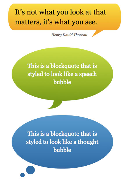
CSS Speech Bubbles
These CSS speech bubbles take the CSS triangle trick to the next level, combining it with rounded rectangles to form a wide variety of speech bubbles. Check out the link for all the different options.

CSS3 Raindrop

CSS Raindrop
This pure CSS3 raindrop is simply gorgeous. It uses a number of gradients as well as other tricks for a stunning image-less result.

Opera Logo in CSS

CSS Opera Logo
David Desandro built this CSS Opera logo a few weeks ago. Notice the screenshots of how nicely it degrades across older browsers / IE.

Safari Rendered With Safari

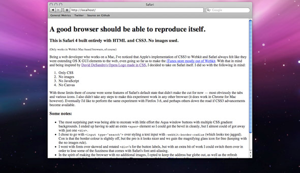
Safari UI rendered with Safari
How meta! Check out this Safari UI rendered using Safari. As the page says, “A good browser should be able to reproduce itself”.

CSS3 Aqua Button

CSS3 Aqua Button
This Aqua Button built in using CSS3 gradients is a really nice alternative to image based buttons. Think of all the images you’ll save, since most UI buttons have a static, hover & click state.

Did I Miss Any?

There are tons of great pure CSS rendering demos out there. Please post any ones I missed in the comments below (if they don’t use any images).

Graceful Degradation With CSS3


Graceful Degradation With CSS3
With IE9 in development and Opera 10.5 released, CSS3 is a few steps away from being supported by all modern browsers. But users may take a while to upgrade, and responsible developers will support legacy browsers for years to come.
For some, cross-browser development means making websites that look exactly the same in all browsers. But if developers continue to cater websites to inadequate browsers such as IE6, then they’re just holding back modern browsers from performing to their potential.
Graceful degradation is not about allowing websites to look bad in older browsers, but about making them look great in modern ones. It means taking advantage of CSS3′s useful features to progressively enhance web pages for the vast majority of users.

Deciding What’s Disposable

Fortunately, most CSS3 properties degrade fairly nicely on their own. Rounded corners become square, gradients become flat colors, and transitions become hard changes.
Peripheral elements in a web design can generally afford to degrade naturally, while core elements cannot. Deciding which CSS3 features are expendable is a three-step process:
  1. Determine which elements are visually essential. Could text-shadows drop off or rounded corners be made square?
  2. If styling is going to drop off, determine in which browsers degradation is acceptable. Make this decision based on the website’s usage across different browsers and versions. This is one of those instances when analytics (or historical data in the absence of analytics) should inform website design.
  3. Finally, pay particular attention to UI elements. Are CSS3 properties being used to convey crucial interface elements, such as clickable buttons and active states?

Supporting What’s More Important

Websites usually have at least a few visual elements that are essential to their design. Fortunately, most CSS3 features are easily supported across all major browsers. While image support is always an option, CSS3 styles can usually be supported without relying on images.

Background Gradients
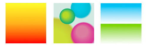
CSS3 Gradients in Webkit
Background gradients can be rendered in IE using the IE gradient filter.
First, let’s build a button with a CSS background gradient that works in Firefox, Chrome and Safari:
.button {
    background-color: #ED9C47; /* fallback flat color */
    background-image: -webkit-gradient(linear, left top, left bottom,
    from(#EFB67B), to(#DB7306) ); /* for Chrome + Safari */
    background-image: -moz-linear-gradient(  top,
    #EFB67B, #DB7306 ); /* for Firefox */
}
Next, let’s extend this example to IE. We’ll want to call this next bit of CSS for IE only; by using a browser conditional, for instance.
/* call this in IE only */
.button {
    filter: progid:DXImageTransform.Microsoft.gradient(
        startColorstr='#EFB67B', endColorstr='#DB7306');
}
Although useful, IE’s gradient filter has a couple of drawbacks: it doesn’t support color stop, and it doesn’t support angled or radial gradients. For these, you’ll have to stick to image support. Additionally, this method works only for backgrounds, not borders, text, etc.
Beyond IE, background gradients can be supported in Opera via canvas.

RGBa Transparency

RGBa transparency vs. opacity
In most cases, gracefully degrading RGBa colors simply means including fallback RGB or Hex colors:
.button {
    background-color: rgb( 50, 200, 150 ); /* fallback color */
    background-color: rgba( 50, 200, 150, .8); /* RGBa color */
}
But a number of tricks are available for supporting alpha transparency as well. First and probably most obvious is CSS opacity. But opacity has a number of drawbacks, namely that it is inherited by child elements.
For example, let’s support RGBa using opacity in IE:
.button {
    background-color: rgb( 50, 200, 150);
    filter: alpha(opacity = 80);
}
This gives our button’s background color the correct opacity of 80%, but this opacity is in turn inherited by all of its descendants, such as the button’s text.
Fortunately, we can get alpha transparency working properly in IE using the same IE filter that we applied to background gradients:
/* call this in IE only */
.button {
       background: transparent;
       filter: progid:DXImageTransform.Microsoft.gradient(
           startColorstr='#8032c896', endColorstr='#8032c896');
       zoom: 1;
}
The trick here is that IE’s gradient filter accepts color inputs with alpha values, so we simply set both the start and end colors to our desired RGBa color. But the color format is a bit strange: it starts with 80 for 80% transparency, followed by the Hex value 32c896 for rgb( 50, 200, 150).
Finally, make sure to set the background to transparent, otherwise the background color will show beneath the alpha transparency.

Rounded Corners

CSS rounded corners will soon be available in all modern browsers
Rounded corners can be achieved in IE using a simple .htc hack.
Let’s start by rounding corners in Firefox, Chrome, Safari and Opera:
.button {
    -webkit-border-radius: 10px; /* for Chrome + Safari */
    -moz-border-radius: 10px; /* for Firefox */
    -khtml-border-radius: 10px; /* for Konqueror */
    border-radius: 10px; /* for Opera 10.5, IE9 and future-proofing */
}
Next, let’s incorporate the .htc hack for IE.
First, upload Curved Corner to your website, and include this extra bit of CSS for IE only:
/* call this in IE only */
.button {
    behavior: url(/your-path-to/border-radius.htc);
}
This hack is handy but comes with a major caveat: it can only round all four corners equally. To round each corner differently, sticking to image support is best. Image support is also best for elements whose dimensions change dynamically.
Finally, be warned that this .htc hack runs in JavaScript and has performance disadvantages compared to CSS support.

Box Shadows and Text Shadows

Firefox vs. IE shadow implementations
Box shadows can be supported in IE using the shadow filter.
Let’s start with a box-shadow for Firefox, Chrome, Safari and Opera:
.button {
    -webkit-box-shadow: 5px 5px 5px #777; /* for Chrome + Safari */
    -moz-box-shadow: 5px 5px 5px #777; /* for Firefox */
    box-shadow: 5px 5px 5px #777; /* for Opera 10.5, IE9
        and future-proofing */
}
Now, let’s extend this with some CSS for IE specifically:
/* call this in IE only */
.button {
    zoom: 1;
    filter: progid:DXImageTransform.Microsoft.Shadow(
        color='#777777', Direction=135, Strength=5);
}
In this filter, color lines up with box-shadow’s color setting, but Direction and Strength are a bit different.
Direction needs to be calculated in degrees from the two offsets. In this example, we used 135 for 135° from the twelve o’clock position, which falls off to the bottom right. Unfortunately, the angle isn’t very precise and rounds to the 45° mark. So, 150 becomes 135°, and 170 becomes 180°.
Strength is the shadow offset distance in pixels, with an equal blur value. In our example, the shadow falls off 5 pixels to the bottom-right, with a blur of 5 pixels.
The differences in the Direction and Strength settings present a major drawback for IE’s shadow filter: the settings remain attached to the element and can’t be used with more advanced offset or blur values.
The same shadow filter can also be used to apply text shadows by simply setting the element’s background to transparent. But the lack of proper offset values tends to make these look harsh.
A more subtle technique for text shadows relies on IE’s glow and blur filters, but unfortunately they still fall short visually.

Transitions

Transitions are one of the most useful features available in CSS3, and luckily they degrade pretty nicely on their own. Let’s use transitions to build a hover animation for our button:
.button {
    width: 200px;
    height: 50px;
    -webkit-transition-property: width, height; /* Chrome + Safari */
    -webkit-transition-duration: .5s;
    -webkit-transition-timing-function: linear;
    -moz-transition-property: width, height; /* FF4 future-proofing */
    -moz-transition-duration: .5s;
    -moz-transition-timing-function: linear;
    -o-transition-property: width, height; /* Opera 10.5+ */
    -o-transition-duration: .5s;
    -o-transition-timing-function: linear;
}

.button:hover {
    width: 300px;
    height: 75px;
}
This animation works in Chrome, Safari and Opera, but not in current versions of IE or Firefox. But even in the unsupported browsers, the transition degrades automatically to the basic hover states.

We’ll have to use more than simple CSS if we want to extend the animation to IE and Firefox. Let’s use jQuery to build the animation, and let’s start by determining whether the current browser supports transition:


Here, we’re checking the document style object to see whether transition is supported (in any of its various browser prefixes). We could have used the jQuery browser object, but feature detection is a much better approach than browser sniffing.
Next, let’s attach a hover event to our button that triggers the transition animation:
// make sure to execute this on page load
$(function() {
    // determine if the browser supports transition
    var thisStyle = document.body.style,
    supportsTransition = thisStyle.WebkitTransition !== undefined ||
        thisStyle.MozTransition !== undefined ||
        thisStyle.OTransition !== undefined ||
        thisStyle.transition !== undefined;

    // assign jQuery transition if the browser doesn't support
    if ( ! supportsTransition ) {
        var defaultCSS = {
            width: 200,
            height: 50
        },
        hoverCSS = {
            width: 300,
            height: 75
        };

        // loop through each button
        $('.button').each(function() {
            var $thisButton = $(this);

            $thisButton.hover(function() {
                // execute this on mouseover
                $thisButton.css(defaultCSS)
                    .animate(hoverCSS, 500, 'linear' );
            }, function() {
                // execute this on mouseout
                $thisButton.animate(defaultCSS, 500, 'linear' );
            });
        });
    }
});
Here, we’re applying our hover and default CSS using jQuery’s animate() API. To match our CSS3 transition, we’ve set the animation duration to 500 milliseconds (or .5s) and assigned the “linear” easing method.
One thing to notice is that on mouse-over, we apply the default CSS first using jQuery’s css() API, and then we call animate() with the hover CSS. We do this to override the :hover pseudo-class that we applied in our CSS.
Now, our CSS transition works across all major browsers. This script can be modified to build transitions for any CSS property that is supported by jQuery.animate().
This technique works with any numeric CSS attribute. Additionally, jQuery UI extends the animate() function to support non-numeric attributes, such as color.

Final Thoughts

Although still imperfect, CSS3 support is now available in all modern browsers except IE.
IE’s filters and .htc hacks fill in most of the gaps but come with their own set of drawbacks. They are generally pretty quirky, and problems arise when trying to combine multiple filters. Additionally, these browser hacks are much slower than pure CSS alternatives.
Ultimately, hacks for supporting CSS3 in unsupported browsers will always fall a bit short. But this shouldn’t hold back websites from performing as well as they should in more modern browsers.