Many
UI trends are designed to capture attention and signal innovation, but
those goals often conflict with the needs of mental health apps:
reducing cognitive strain, fostering trust, and providing a sense of
refuge. Here it introduces an evaluation framework that helps
designers assess whether trendy visual and interaction patterns support
or undermine the unique goals of mental health experiences.
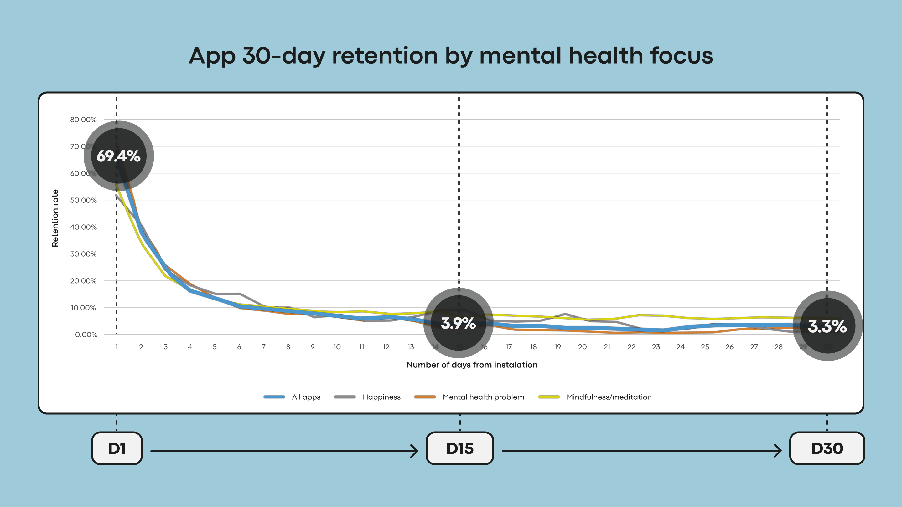
Mental health applications keep facing a continuing, measurable crisis: many people stop using them quickly. The data is stark: almost 95% of users who open the app on day 1 abandon the app by day 30, with a median 30-day retention of only 3.3%. Even the recognised mental health giants lose around 50% of their users
within the first ten days. This severe engagement loss and retention
collapse are why effective interface design must be a clinical and
operational priority. Good design is not merely aesthetic; it is a
fundamental tool for user retention.
While many factors drive this abandonment, research suggests that mental health apps have tended to prioritise visual appeal at the expense of what actually sustains
users. In a space defined by vulnerability and cognitive strain,
chasing visual fashion risks adding effort when users have the least to
spare — quietly trading away the utility and trust
the app depends on. Users don’t open mental health apps out of
curiosity, but from need — often while stressed, anxious, overwhelmed,
or exhausted. In these states, an unconventional icon, a confusing
gesture, or a flashy animation instead of a delightful surprise becomes an extra cognitive overload. Moreover, it becomes a reason to disengage.
In
those moments, visual experimentation from a mild distraction can turn
into a friction that undermines the very help the app is meant to
deliver. A solution must be a visual interface that is simple in usage
and understanding from the first moment.
For a decade, we’ve been obsessed with "Pixel Perfection." We
argued over hex codes, debated the radius of a button, and spent months
perfecting "Click Paths."
The reality? In 2026, your users don’t want to click through your beautiful menu. They want an answer.
We are witnessing the violent transition fromDeterministic UI(the static site you built) toGenerative UI(the interface that builds itself around the user).
1. The Netflix-ification of Everything
Remember when you had to browse "Genres" to find a movie? Now, Netflix builds a unique homepage for you the second you log in.
If your SaaS or E-commerce site still looks the same for a
first-time visitor as it does for a 5-year veteran, you aren't
"consistent"—you’re irrelevant.Generative UImeans
the interface morphs based on intent. If the AI detects a user is
frustrated, the "Help" button shouldn't just be there; it should be theonlything there.
2. Accessibility is your new SEO
Here is a hard truth: If an AI Agent (like Gemini or GPT-6) can’t
"crawl" your site and understand it instantly, you don't exist.
Old way:Making your site accessible to be "nice."
New way:Using
Semantic HTML because if the AI can’t read your site, it won't
recommend you to the millions of people using Voice Search and AI
Personal Assistants.
3. The "Invisible" UI (Example: Uber)
The most successful interface of the last decade is theUber map. Why? Because it’s invisible. You don’t "navigate" a menu to find a car. You see a map, you see a car, you press one button.
The future isn't more buttons; it’sZero UI. It’s systems that use token-driven logic to automate the boring stuff so humans can do the creative stuff.
The Bottom Line:
Stop building for browsers. Start building forbehaviors.
If your design system requires a manual to understand, you’ve
already lost. The winners of 2026 will be the ones who blend high-end
aesthetics with "Invisible" AI logic.
I’m calling it: The "Sidebar and Dashboard" layout is officially dead. Who’s brave enough to disagree?👇
Drop a comment below: Is your team still stuck in the "Pixel-Perfect" trap, or are you building for the AI era?
You probably have been there before. How do we choose between showing a modal to users, and when do we navigate them to a separate, new page? And does it matter at all?
Actually, it does. The decision influences users’ flow, their context, their ability to look up details, and with it error frequency and task completion. Both options can be disruptive and frustrating — at the wrong time, and at the wrong place.
So we’d better get it right. Well, let’s see how to do just that.
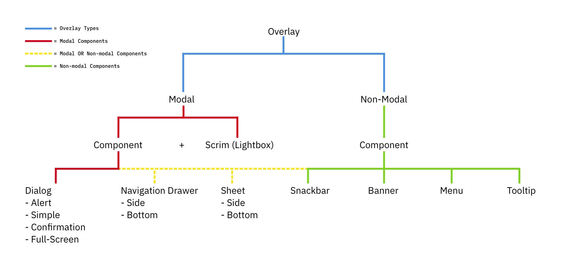
Modals vs. Dialogs vs. Overlays vs. Lightboxes
While
we often speak about a single modal UI component, we often ignore fine,
intricate nuances between all the different types of modals. In fact, not every modal is the same. Modals, dialogs, overlays, and lightboxes — all sound similar, but they are actually quite different:
Understanding modal vs. nonmodal and lightbox vs. nonlightbox dialog boxes for good UX. (Image source: Popups by NN/g)
Dialog A generic term for “conversation” (user ↔ system).
Overlay A small content panel displayed on top of a page.
Modal User must interact with overlay + background disabled.
Nonmodal User must interact with overlay + background enabled.
Lightbox Dimmed background to focus attention on the modal.
As Anna Kaley highlights,
most overlays appear at the wrong time, interrupt users during critical
tasks, use poor language, and break users’ flow. They are interruptive by nature, and typically with a high level of severity without a strong need for that.
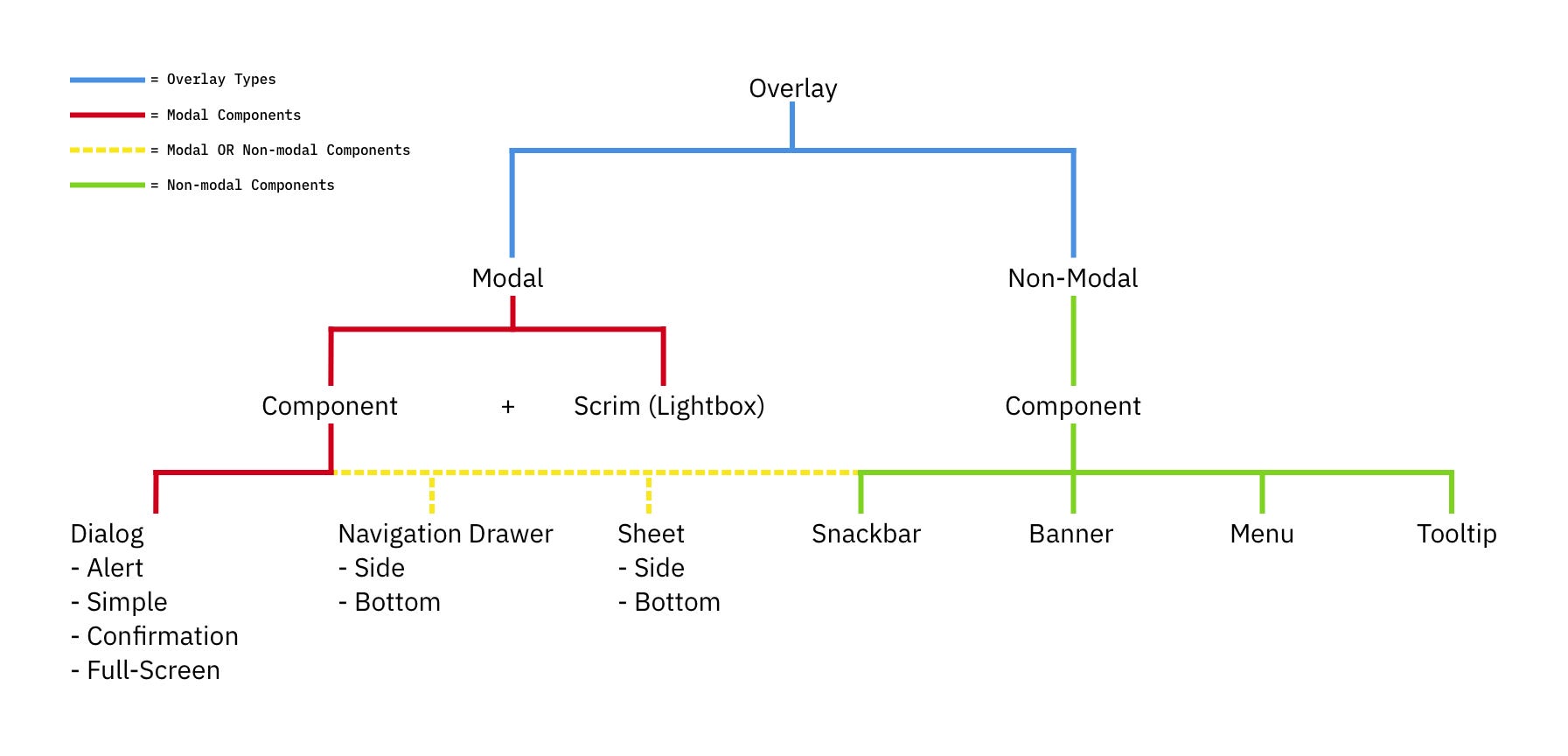
The many sides of modals and overlays. A little tree to understand the differences for UI components. (Image source: Ryan Neufeld) (Large preview)
Surely users must be slowed down and interrupted if the consequences of their action have a high impact, but for most scenarios non-modals are much more subtle and a more friendly option to bring something to the user’s attention. If anything, I always suggest it to be a default.
Modals → For Single, Self-Contained Tasks
As designers, we often dismiss modals as irrelevant and annoying — and often they are! — yet they have their value as well. They can be very helpful to warn users about potential mistakes
or help them avoid data loss. They can also help perform related
actions or drill down into details without interrupting the current
state of the page.
But the biggest advantage of modals is that they help users keep the context
of the current screen. It doesn’t mean just the UI, but also edited
input, scrolling position, state of accordions, selection of filters,
sorting, and so on.
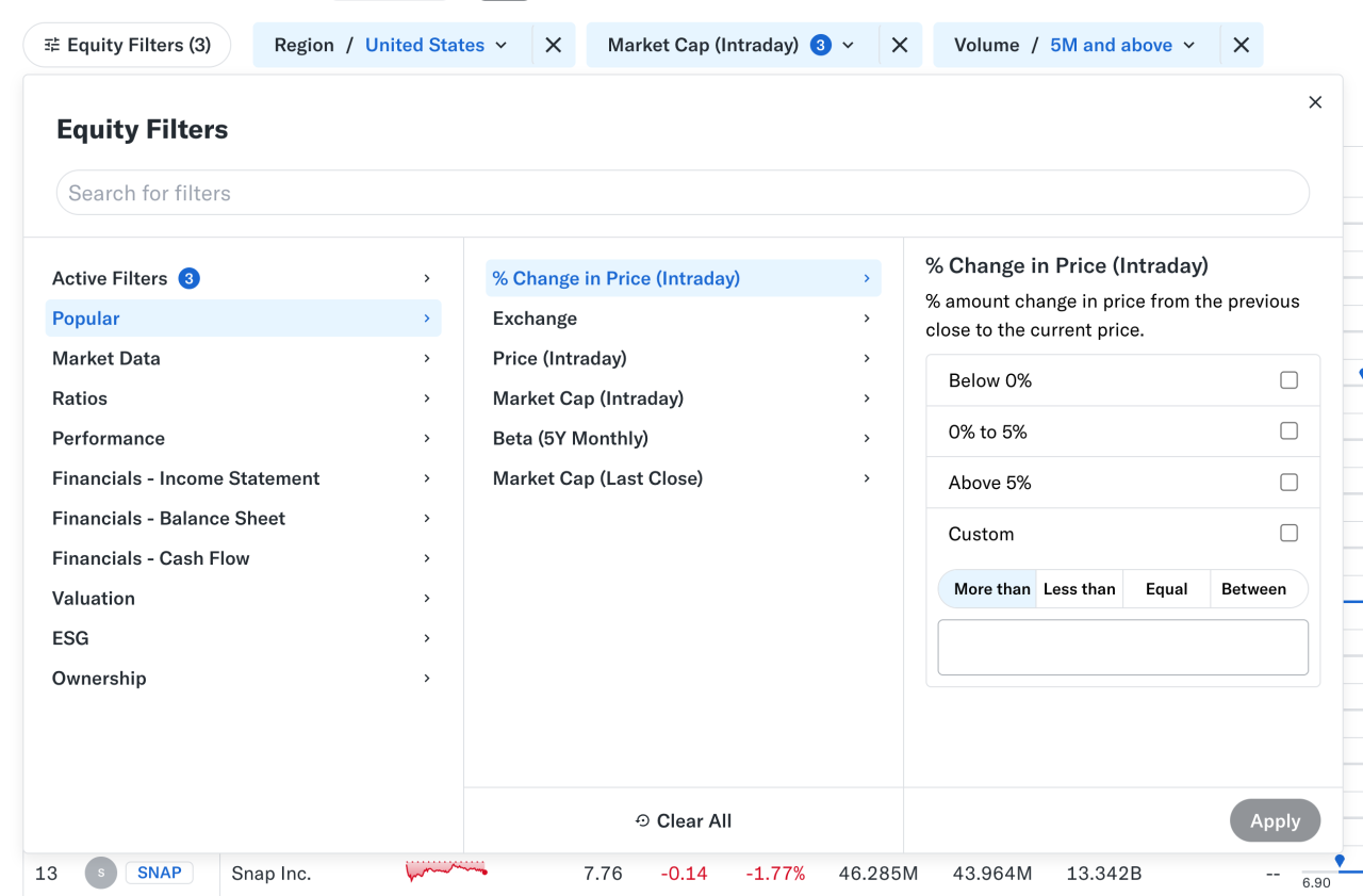
Nonmodal in action: large and small overlays for filters and a modal for customization work well on Yahoo! Finance. (Large preview)
At times, users need to confirm a selection quickly
(e.g., filters as shown above) and then proceed immediately from there.
Auto-save can achieve the same, of course, but it’s not always needed
or desired. And blocking the UI is often not a good idea.
However, modals aren’t used for any tasks. Typically, we use them for single, self-contained tasks
where users should jump in, complete a task, and then return to where
they were. Unsurprisingly, they do work well for high-priority, short
interactions (e.g., alerts, destructive actions, quick confirmations).
When modals help:
🚫 Modals are often disruptive, invasive, and confusing. 🚫 They make it difficult to compare and copy-paste. ✅ Yet modals allow users to maintain multiple contexts. ✅ Useful to prevent irreversible errors and data loss. ✅ Useful if sending users to a new page would be disruptive.
✅ Show a modal only if users will value the disruption. ✅ By default, prefer non-blocking dialogs (“nonmodals”). ✅ Allow users to minimize, hide, or restore the dialog later. ✅ Use a modal to slow users down, e.g., verify complex input. ✅ Give a way out with “Close”, ESC key, or click outside the box.
Pages → For Complex, Multi-Step Workflows
Wizards or tabbed navigation within modals
doesn’t work too well, even in complex enterprise products — there,
side panels or drawers typically work better. Troubles start when users
need to compare or reference data points — yet modals block this
behavior, so they re-open the same page in multiple tabs instead.
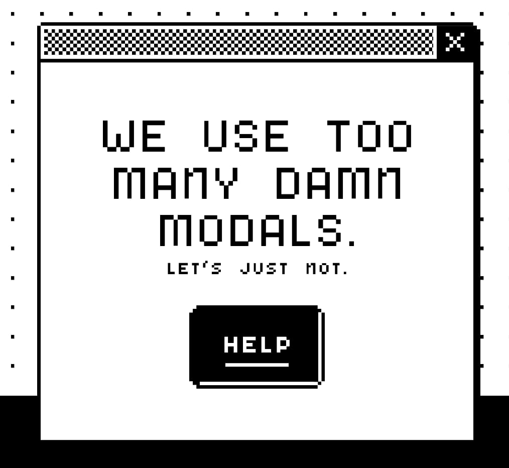
Perhaps, we use Too Many Modals. A not-very-modal-friendly project by Adrian Egger.
For more complex flows and multi-step processes, standalone pages work best.
Pages also work better when they demand the user’s full attention, and
reference to the previous screen isn’t very helpful. And drawers work
for sub-tasks that are too complex for a simple modal, but don’t need a
full page navigation.
When to avoid modals:
🚫 Avoid modals for error messages. 🚫 Avoid modals for feature notifications. 🚫 Avoid modals for onboarding experience. 🚫 Avoid modals for complex, lengthy multi-step-tasks. 🚫 Avoid multiple nested modals and use prev/next instead. 🚫 Avoid auto-triggered modals unless absolutely necessary.
Avoid Both For Repeated Tasks
In
many complex, task-heavy products, users will find themselves
performing the same tasks repeatedly, over and over again. There, both modals and new page navigations add friction because they interrupt the flow or force users to gather missing data between all the different tabs or views.
Too
often, users end up with a broken experience, full of never-ending
confirmations, exaggerated warnings, verbose instructions, or just
missing reference points. As Saulius Stebulis mentioned, in these scenarios, expandable sections or in-place editing often work better — they keep the task anchored to the current screen.
In
practice, in many scenarios, users don’t complete their tasks in
isolation. They need to look up data, copy-paste values, refine entries
in different places, or just review similar records as they work through
their tasks.
Overlays and drawers are more helpful in maintaining
access to background data during the task. As a result, the context
always stays in its place, available for reference or copy-paste. Save
modals and page navigation for moments where the interruption genuinely
adds value — especially to prevent critical mistakes.
Modals vs. Pages: A Decision Tree
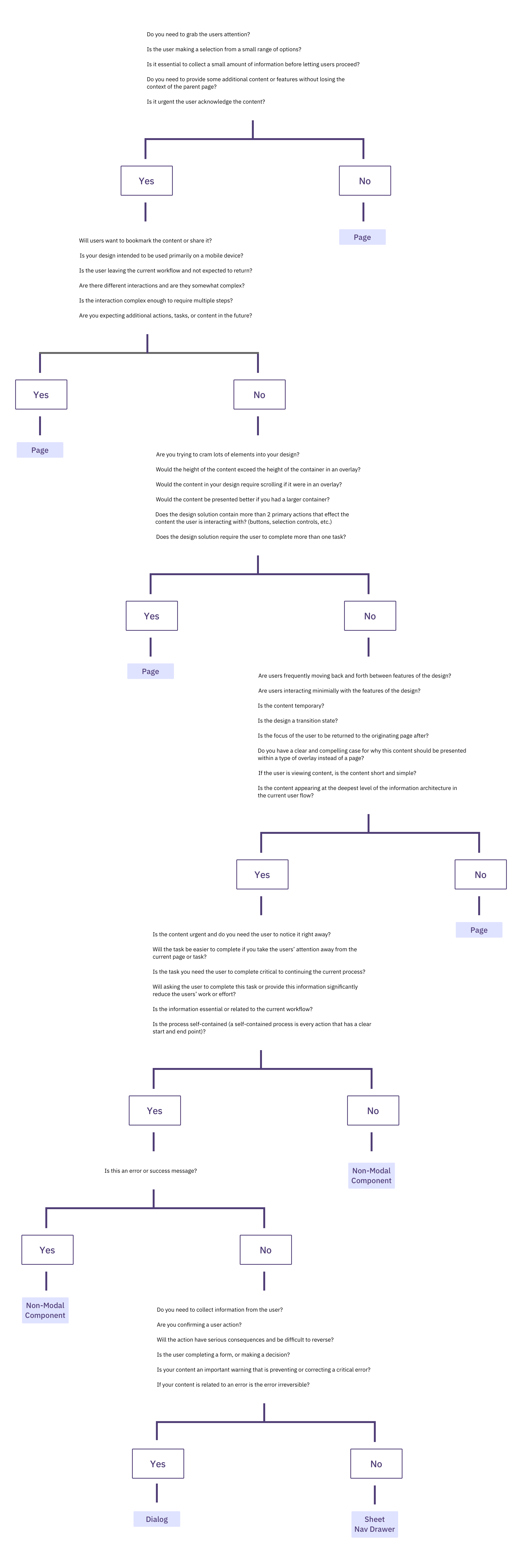
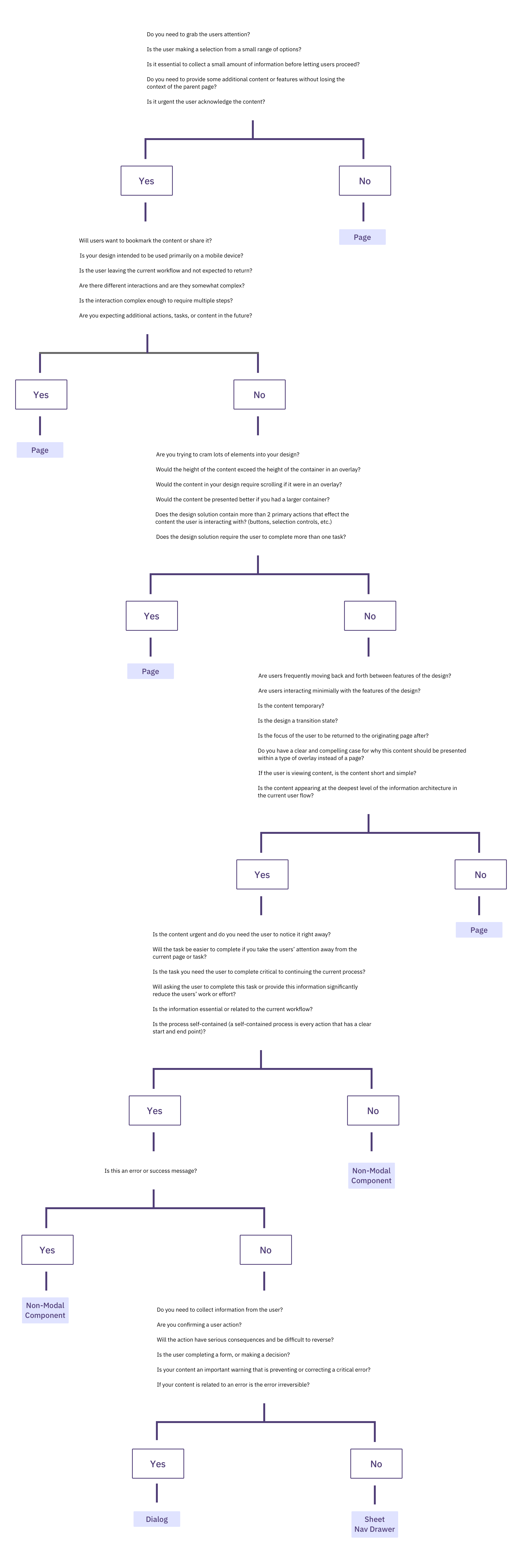
A while back, Ryan Neufeld put together a very helpful guide to help designers choose between modals and pages. It comes with a handy PNG cheatsheet and a Google Doc template with questions broken down across 7 sections.
It’s lengthy, extremely thorough, but very easy to follow:
A
flowchart to choose between page vs. modal, with the page being the
default, and modals reserved for interruption and focus. Put together by
wonderful Ryan Neufeld.
It might look daunting, but it’s a quite simple 4-step process:
Context of the screen. First, we check if users need to maintain the context of the underlying screen.
Task complexity and duration. Simpler, focused, non-distracting tasks could use a modal, but long, complex flows need a page.
Reference to underlying page. Then, we check if users often need to refer to data in the background or if the task is a simple confirmation or selection.
Choosing the right overlay. Finally, if an overlay is indeed a good option, it guides us to choose between modal or nonmodal (leaning towards a nonmodal).
Wrapping Up
Whenever
possible, avoid blocking the entire UI. Have a dialog floating,
partially covering the UI, but allowing navigation, scrolling, and
copy-pasting. Or show the contents of the modal as a side drawer. Or use
a vertical accordion instead. Or bring users to a separate page if you
need to show a lot of detail.
But if you want to boost users’ efficiency and speed, avoid modals at all costs. Use them to slow users down, to bundle their attention, to prevent mistakes. As Therese Fessenden noted, no one likes to be interrupted, but if you must, make sure it’s absolutely worth the cost.
You can find a whole section about modals and alternatives in Smart Interface Design Patterns, our 15h-video course
with 100s of practical examples from real-life projects — with a live
UX training later this year. Everything from mega-dropdowns to complex
enterprise tables — with 5 new segments added every year. Jump to a free preview. Use code BIRDIE to save 15% off.
For years, developers have been hacking around the limitations of border-radius, using clip-path, SVG masks, and fragile workarounds just to get anything other than round corners. The new corner-shape property finally changes that, opening the door to beveled, scooped, and squircle corners.
When
I first started building websites, rounded corners required five
background images, one for each corner, one for the body, and a prayer
that the client wouldn’t ask for a different radius. Then the border-radius
property landed, and the entire web collectively sighed with relief.
That was over fifteen years ago, and honestly, we’ve been riding that
same wave ever since. Just as then, I hope that we can look at this
feature as a progressive enhancement slowly making its way to other
browsers.
I like a good border-radius like any other
guy, but the fact is that it only gives us one shape. Round. That’s it.
Want beveled corners? Clip-path. Scooped ticket edges? SVG mask.
Squircle app icons? A carefully tuned SVG that you hope nobody asks you
to animate. We’ve been hacking around the limitations of border-radius
for years, and those hacks come with real trade-offs: borders don’t
follow clip-paths, shadows get cut off, and you end up with brittle code
that breaks the moment someone changes a padding value.
Well, the new corner-shape changes all of that.
What Is corner-shape?
The corner-shape property is a companion to border-radius. It doesn’t replace it; it modifies the shape of the curve that border-radius creates. Without border-radius, corner-shape does nothing. But together, they’re a powerful pair.
The property accepts these values:
round: the default, same as regular border-radius,
squircle: a superellipse, the smooth Apple-style rounded square,
bevel: a straight line between the two radius endpoints (snipped corners),
scoop: an inverted curve, creating concave corners,
notch: sharp inward cuts,
square: effectively removes the rounding, overriding border-radius.
And you can set different values per corner, just like border-radius:
You can also use the superellipse() function with a numeric parameter for fine-grained control.
.element{border-radius: 25px;corner-shape:superellipse(0);/* equal to 'bevel' */}
So the question here might be: why not call this property “border-shape” instead? Well, first of all, that is something completely different that we’ll get to play around with soon. Second, it does apply to a bit more than borders, such as outlines, box shadows, and backgrounds. That’s the thing that the clip-path property could never do.
Why Progressive Enhancement Matters Here
At the time of writing (March 2026), corner-shape
is only supported in Chrome 139+ and other Chromium-based browsers.
That’s a significant chunk of users, but certainly not everyone. The
temptation is to either ignore the property until it’s everywhere or to
build demos that fall apart without it.
I don’t think either approach is right. The way I see it, corner-shape is the perfect candidate for progressive enhancement, just as border-radius was in the age of Internet Explorer 6. The baseline should use the techniques we already know, such as border-radius, clip-path, radial-gradient masks and look intentionally good. Then, for browsers that support corner-shape,
we upgrade the experience. Sometimes this can be as simple as just
providing a more basic default; sometimes it might need to be a bit
more.
Every demo in this article is created with that progressive enhancement idea. The structure for the demos looks like:
@layer base, presentation, demo;
The presentation layer contains the full polished UI using proven techniques. The demo layer wraps everything in @supports:
@layer demo{@supports(corner-shape: bevel){/* upgrade styles here */}}
No
fallback banners, no “your browser doesn’t support this” messages. Just
two tiers of design: good and better. I thought it could be nice just
to show some examples. There are a few out there already, but I hope I
can add a bit of extra inspiration on top of those.
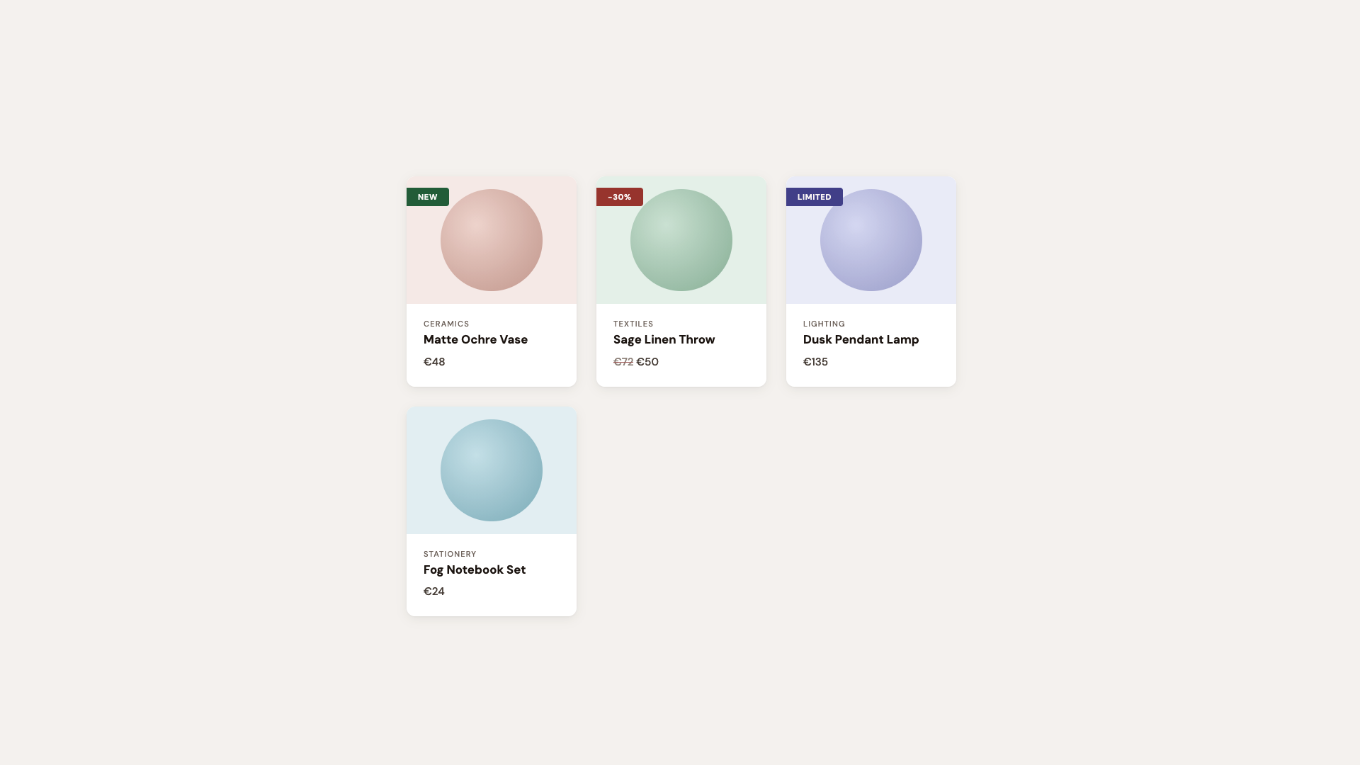
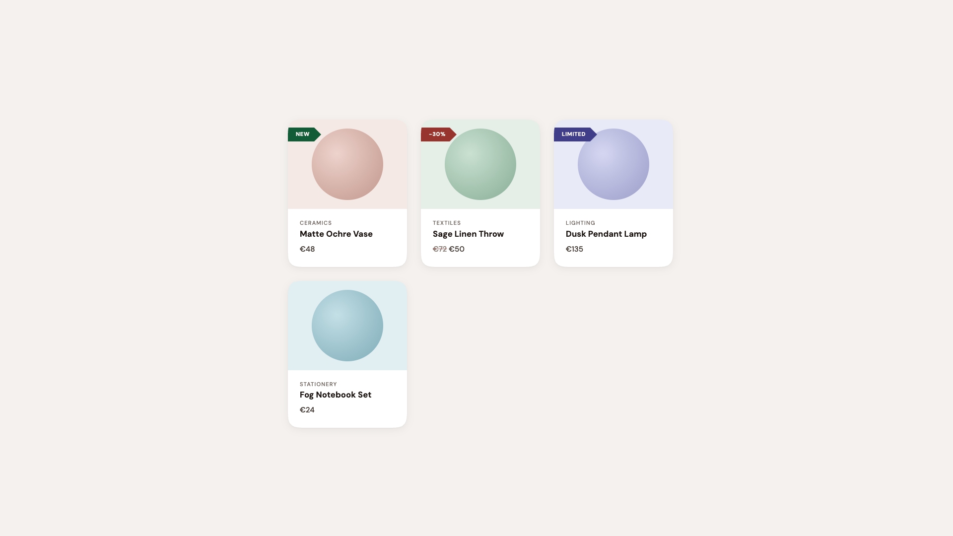
Demo 1: Product Cards With Ribbon Badges
Every
e-commerce site has them: those little “New” or “Sale” badges pinned to
the corner of a product card. Traditionally, getting that ribbon shape
means reaching for clip-path: polygon() or a rotated
pseudo-element, let’s call it “fiddly code” that has the chance to fall
apart the moment someone changes a padding value.
But here’s the thing: we don’t need the ribbon shape in the baseline. A simple badge with slightly rounded corners tells the same story and looks perfectly fine:
The round bevel bevel round combination creates a directional ribbon. Round where it meets the card edge, beveled to a point on the other side. No clip-path, no pseudo-element tricks. Borders, shadows, and backgrounds all follow the declared shape because it is the shape.
The cards themselves upgrade from border-radius: 12px to a larger size and the squircle
corner-shape, that smooth superellipse curve that makes standard
rounding look slightly off by comparison. Designers will notice
immediately. Everyone else will just say it “feels more premium.”
Hot tip: Using the squircle
value on card components is one of those upgrades where the
before-and-after difference can be subtle in isolation, but
transformative across an entire page. It’s the iOS effect: once
everything uses superellipse curves, plain circular arcs start looking
out of place. In this demo, I did exaggerate a bit.
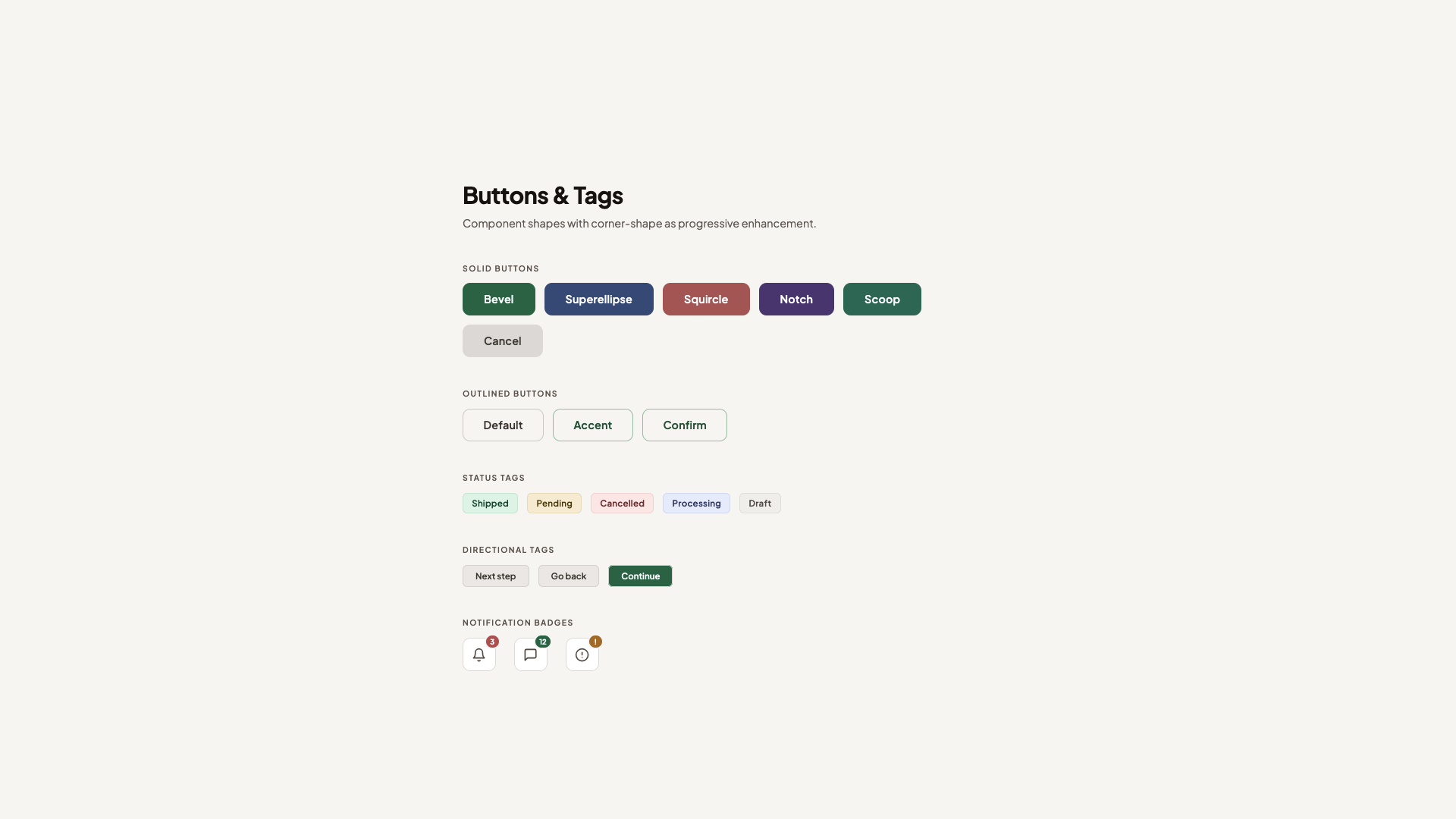
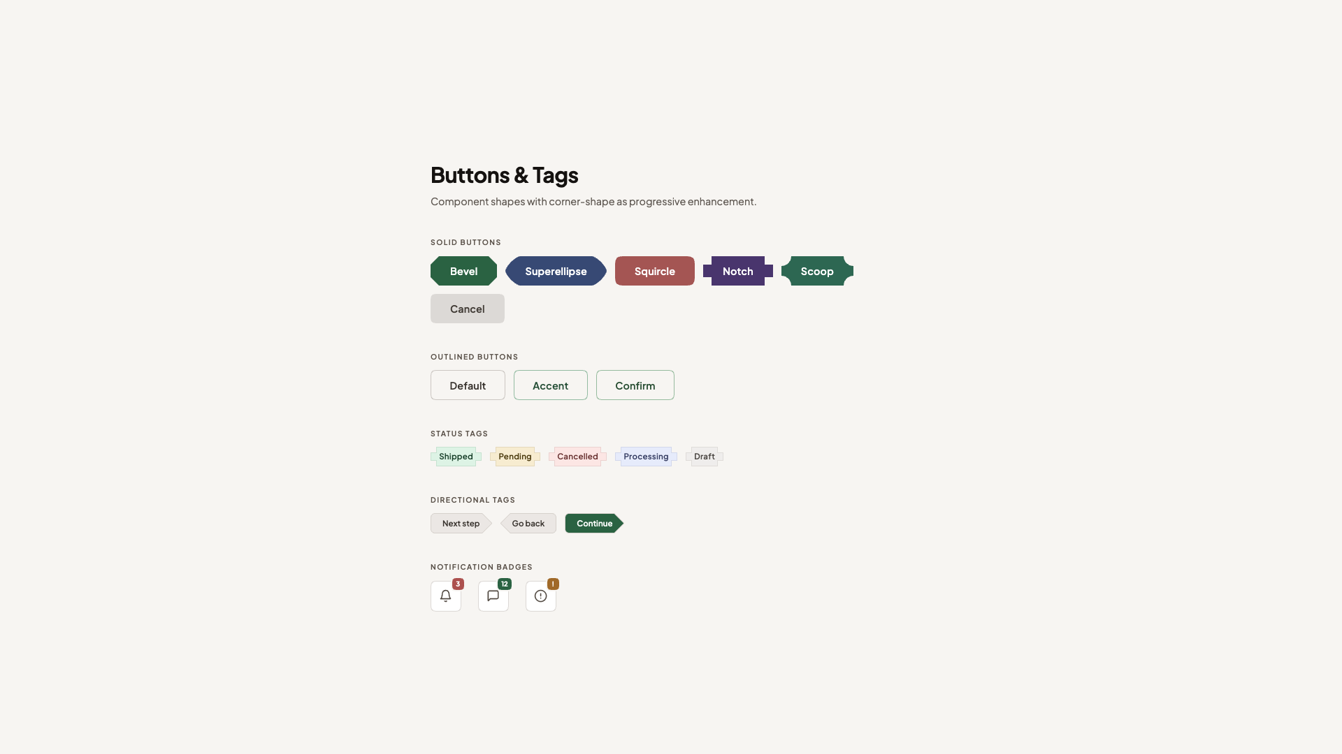
This is the “component library demo”, the one that shows corner-shape
isn’t just for hero sections. It’s practical, everyday UI: solid
buttons, outlined buttons, status tags, directional arrows, notification
badges.
The set-up is intentionally clean. Standard border-radius: 10px buttons with a polished typeface. Everything works, everything looks professional. You could do this without hesitation.
The corner-shape layer turns it into a showcase. Each button type gets its own shape to demonstrate the range of what’s possible:
The primary button starts beveled, faceted, and gem-like, and softens to squircle on hover. Because corner-shape values animate via their superellipse()
equivalents, the transition is smooth. It’s a fun interaction that used
to be hard to achieve but is now a single property (used alongside border-radius, of course).
The secondary button uses superellipse(0.5), a value that is between a standard circle and a squircle, combined with a larger border-radius for a distinctive pill-like shape. The danger button gets a more prominent squircle with a generous radius. And notch and scoop each bring their own sharp or concave personality.
Beyond buttons, the status tags get corner-shape: notch, those sharp inward cuts that give them a machine-stamped look. The directional arrow tags use round bevel bevel round (and its reverse for the back arrow), replacing what used to require clip-path: polygon(). Now borders and shadows work correctly across all states.
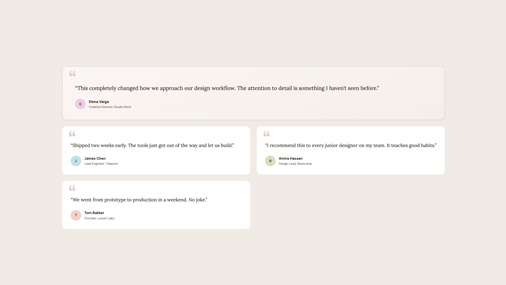
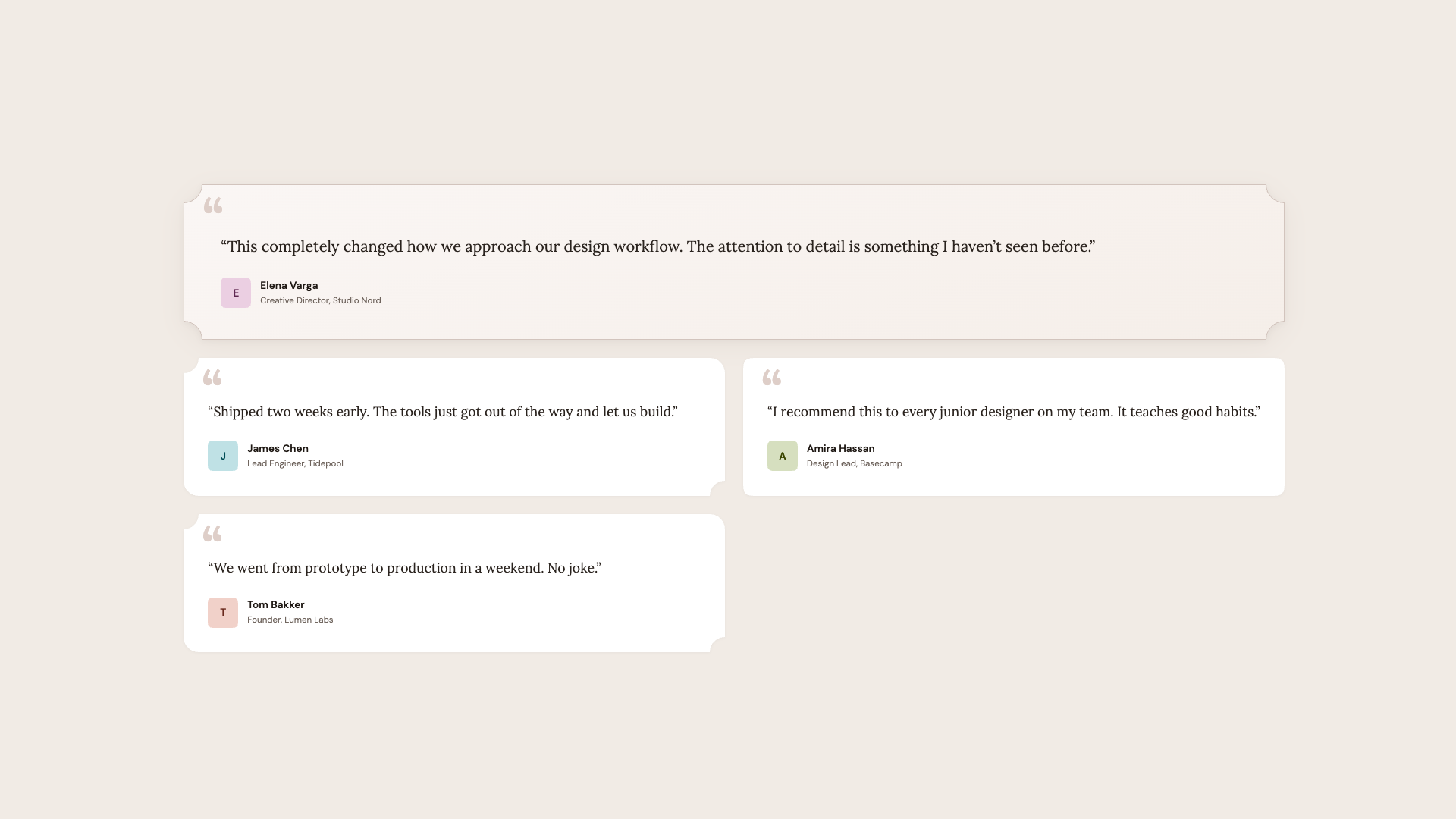
This
demo is probably my favourite one. At its foundation, these are just
testimonial cards with serif typography, a sandy palette, and scooped
corners on the featured card. The design language is intentionally
different from the clean geometric buttons demo, and that’s the point. corner-shape merely adds that extra “edge”.
The basis is standard border-radius: 16px
cards. The featured testimonial spans full width with a subtle gradient
and a decorative open quote mark. Normal cards alternate in a
two-column grid. It already looks like something from a premium
marketing site.
The featured card gets full scoop
corners, concave on all four sides, creating an organic, almost
hand-crafted feel that matches the serif typography. Even-numbered cards
mix scoop round, giving each one a slightly different personality without any extra markup.
The author avatars switch from circles to squircle. A small touch that makes it a bit more “different”.
Fallback. Supported.
Hot tip:corner-shape: scoop
pairs beautifully with serif fonts and warm color palettes. The concave
curves echo the organic shapes found in editorial design, calligraphy,
and print layouts. For geometric sans-serif designs, stick with squircle or bevel.
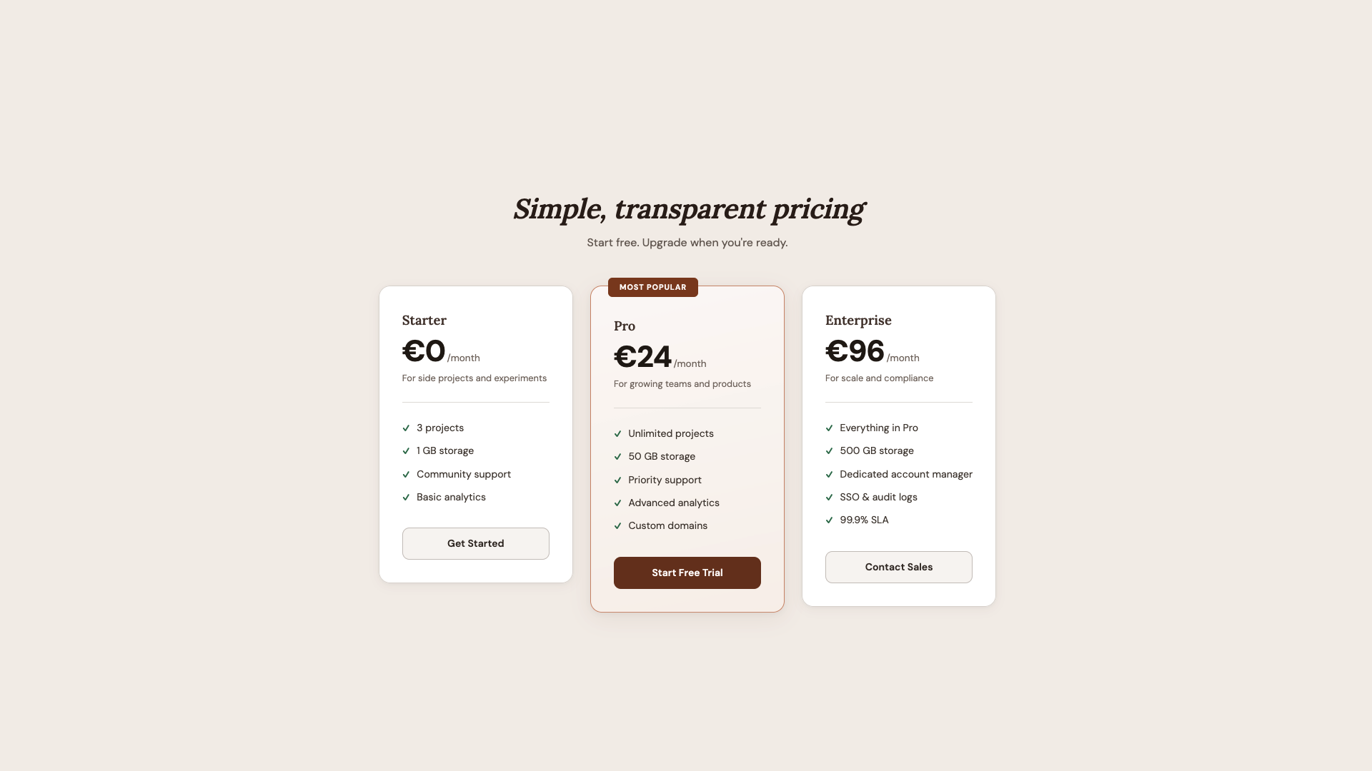
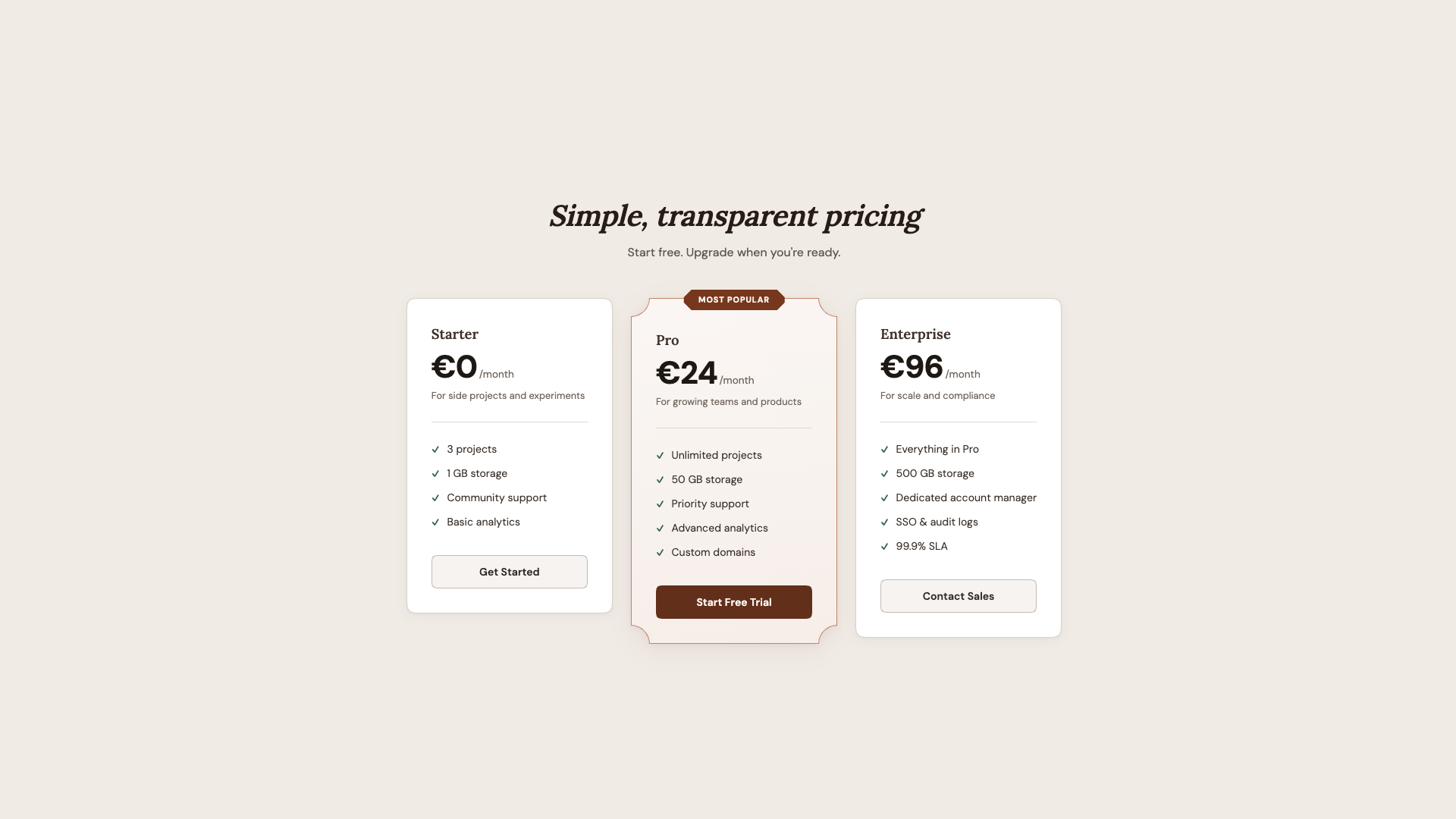
Every
SaaS site needs a pricing page, and the visual hierarchy challenge is
always the same: make one plan stand out without the others feeling
neglected. This demo solves it with corner-shape.
This is quite similar to the last demo in that we once again have a nice baseline for browsers that don’t yet support corner-shape.
We have three cards in a row, where the featured plan is distinguished
by a warm gradient background, a stronger border, and a “Most Popular”
badge.
Regular plans get squircle for that premium feel. The featured plan gets scoop, concave corners that immediately set it apart from its neighbors. The “Most Popular” badge centers itself and takes on corner-shape: bevel, creating a gem-like, faceted shape that feels like a jewel pinned to the card. The CTA buttons get squircle to match the card language.
What
I like about this demo is how the shape hierarchy mirrors the content
hierarchy. The most important element (featured plan) gets the most
distinctive shape (scoop). The badge gets the sharpest shape (bevel). Everything else gets a simpler upgrade (squircle). Shape becomes a tool for visual emphasis, not just decoration.
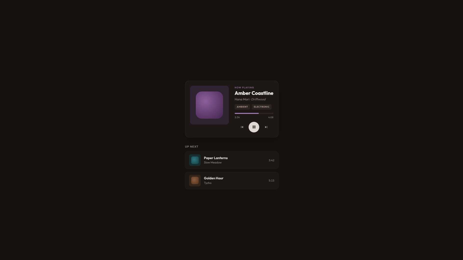
The
final demo is a warm dark UI for a music player with album art,
playback controls, genre tags, and a listening queue. It’s the most
visually complex demo, and it shows how corner-shape works across many different element types within a single cohesive design.
This time, I went for a dark warm palette built on oklch(18% 0.015 40), and standard rounded corners throughout. The album art gets border-radius: 12px, queue items get border-radius: 12px, genre tags get border-radius: 5px. It looks good. It’s a complete, polished player.
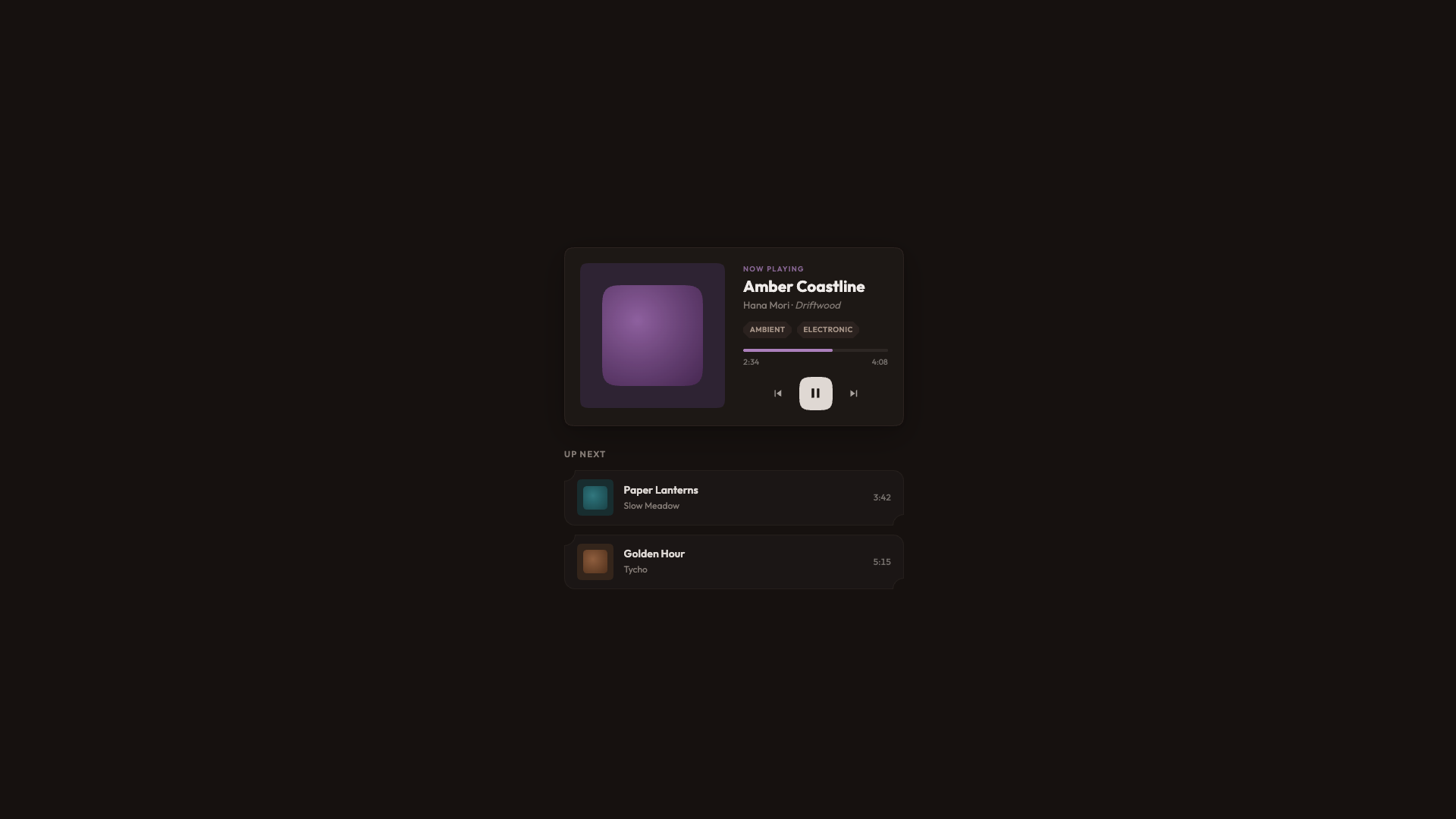
The player card and album art get squircle, the same curves used for app icons and album thumbnails. Album art swatches go from border-radius: 22% to a proper squircle at 26%, which is a subtle but meaningful difference in the visual elements you stare at while listening.
Queue items get scoop round,
resulting in concave corners on the top-left and bottom-left, and round
on the right. It gives each row a distinctive feel without overwhelming
the layout. Genre tags get bevel for that sharp feeling.
The Play button also gets corner-shape: squircle on its existing border-radius: 50%
to fit the album covers. On the surface, the difference is barely
noticeable, but it contributes to the overall feel of the player.
As of writing, corner-shape is available in Chrome 139+ and Chromium-based browsers. Firefox and Safari don’t support it yet. The spec lives in CSS Borders and Box Decorations Module Level 4, which is a W3C Working Draft as of this writing.
For practical use, that’s fine. That’s the whole point of how these demos are built. The presentation layer delivers a polished, complete UI to every browser. The demo layer is a bonus for supporting browsers, wrapped in @supports (corner-shape: ...). I lived through the time when border-radius
was only available in Firefox. Somewhere along the line, it seems like
we have forgotten that not every website needs to look exactly the same
in every browser. What we really want is: no “broken” layouts and no
“your browser doesn’t support this” messages, but rather a beautiful
experience that just works, and can progressively enhance a bit of extra
joy. In other words, we’re working with two tiers of design: good and
better.
Wrapping Up
The approach I keep coming back to is: don’t design for corner-shape, and don’t design around the lack of it. Design a solid baseline with border-radius
and then enhance it. The presentation layer in every demo looks
intentionally good. It’s not a degraded version waiting for a better
browser. It’s a complete design. The demo layer adds a dimension that border-radius alone can’t express.
What surprises me most about corner-shape is the range it offers — the amazing powerhouse we have with this single property: squircle for that premium, superellipse feel on cards and avatars; bevel for directional elements and gem-like badges; scoop for editorial warmth and visual hierarchy; notch for mechanical precision on tags; and superellipse() for fine control between round and squircle. And the ability to mix values per corner (round bevel bevel round, scoop round) opens up shapes that would have required SVG masks or clip-path hacks.
We went from five background images to border-radius, to corner-shape. Each step removed a category of workarounds. I’m excited to see what designers do with this one.