Everyone is talking about content. Googling the phrase “content
strategy” retrieves almost 50 million results — a clear indicator that
interest in content is very much in the zeitgeist. By the time you read
this, I expect that number will have grown even higher.
But I also suspect that the substance of the talk would be quite different if content were truly respected. I believe this because the way we talk about content is beginning to sound a lot like the way we talk about money.
Money, however, is not simply a quantitative measure of units — a figure that can be repeatedly plugged into an equation until it produces something positive. Money is a representation of value. It is a symbol — not a quantitative measure, but a qualitative one. Indeed, the concept of value is a chimera; it evades objective meaning just as readily from one person to another as it does for the same person from one context to another.

Consider movie tickets: Breaking down a $10 ticket to its cost per minute — roughly 11 cents for a two-hour picture — gets you no closer to a true valuation of the movie than assuming its initial production costs are a relevant indicator. After all, could anyone seriously argue that its $200 million price tag made the phenomenally bad film 2012 better than The King’s Speech, an Academy Award-winning independent production that cost only $15 million? Neither a movie’s length nor its cost can predict value, at least as far as the consumer is concerned. But after the last frame fades from view, ask any moviegoer about value and you’ll certainly get strong responses. Duration alone doesn’t satisfy. Quality will be the subjective basis on which people decide whether seeing a film is worth $10. That much is plain to viewers, yet elusive to creators who have other pressures in formulating their expectations of success.
As this simple example shows, when it comes to money, we could certainly stand to distance ourselves from a units-based perspective and consider the story that a qualitative perspective tells. One day, I imagine, it will be clear that our insistence on focusing only on the quantitative was at least in part responsible for the mess we ended up in back in 2008. We may wish for a formula to solve our financial woes, but we know that they are rooted in our system of value, not in our system of measure.
Sadly, the same thing is happening in marketing. Whereas a disconnect between money and value has created disastrous fiscal bubbles, a disconnect between content and value is inflating a bubble of its own. Content — today’s currency of attention — has taken the place of money as a panacea. To be sure, vanity is also a factor here. The visibility that an individual or group can have today as a result of content is unprecedented, motivating production when silence might be wiser. But I am more interested here in exploring the inflation of content’s business value than the inflation of egos. After the last recession, we learned enough about bubbles to be able to watch this one inflate from the inside.
As I write this, I’m overwhelmed by content — everything from blogs to books — by marketers, social scientists and others, who are studying in detail the expanding content bubble from their unique points of view, fascinated by the transformative force of creativity on society, especially of course on marketing, but perhaps discounting the fact that they write from within it. Yet writing about the content bubble from within the content bubble is not producing the criticism it should. The complexity of content surely merits study, but my simple understanding of what is happening is this: Because we can create content, we do.
In the first chapter of my new book, The Strategic Web Designer, I set the stage by asking the question, “What is the Web?” and taking the “scenic route” to the answer, however subjective it may be. But I suppose a more accessible definition could be that the Web simply is content. In an article written for SEED magazine about our struggle to manage the information we’ve produced (among other things), Iris Vargas accounts for the almost incomprehensibly large corpus of digital content in the world:
And yet, content is the point of every website. For those who design things for the Web, this provides a bit of a paradox, doesn’t it? Amidst a glut of content, one is left to question: What is it all for?
But content isn’t free; even lousy content costs something. And if a balance sheet doesn’t include a budget line for content creation, then it’s not detailed enough. Someone is paying for it, in time.

In this regard, content marketing has taken many of its cues from the wrong source: print publishing. The publishing industry — magazines, especially — has been propped up by advertising, which is problematic on two levels. The first is that advertising-subsidized publishing avoids the reality of the true cost of content. Before it even reaches the reader, content gets distorted in value. Without some advertising, readers would have to pay the full cost — something that publishers at some point believed would be impossible, thus creating a self-fulfilling prophecy. This leads to the second problem: that a system that has always depended on subsidies will tend to carve the path of least resistance. Rather than slowly wean off advertising and increase the cost to the reader, it will depend more heavily on advertising and reduce the cost to the reader.
That is, until the ratio reaches an imbalance and readers begin to question why they are paying to see ads. This is a simple law of… well, economics. Before the bubble pops, readers will accept that advertisers have subtle, unspoken editorial control. But as soon as the tipping point is reached, where advertising volume supersedes everything else, readership will begin to drop for one simple reason: readers’ sense of value has been violated.
In 2008, when the overall market experienced a significant decline, magazine advertising dropped by almost 12%. That may not sound like much, but when you consider that only 42 magazines saw an increase in advertising of any kind that year, the dramatic reality of the situation becomes clearer. In fact, Folio Magazine pointed out that it was the “biggest dropoff since 2000, the earliest year comparative PIB numbers are available.”
I personally remember receiving a much slighter than usual issue of Advertising Age in 2009 and chuckling at a sticker placed over the masthead that read, “Marketing in a Recession: It might be only 28 pages, but it’s jam-packed with good advice.” Though I was aware that the previous issues’ bulk was inflated by ads, not by more content, picking up the newly lean and austere 25-page issue certainly made me question my subscription. Advertising, it seems, not only has played an integral role in the economics of publishing, but has also created an illusion of health. I had to see AdAge reduced to almost nothing in order to realize that, for me, the value hadn’t been there for quite some time.
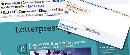
Unfortunately, the imbalance between advertising and content intrinsic to the print publishing industry has not substantially changed in its online form. In fact, it’s gotten worse. Just about every mass media website has an immediately obvious imbalance of ads and content. Take a moment to open an article from your favorite website — you know, The Huffington Post, I Can Has Cheezburger, Perez Hilton or Engadget (which, for better or for worse, are the most popular destinations on the Web today) — and notice how the page is filled mostly with peripheral stuff that has very little to do with the article on the page.
All you have to do is glance at these tiny screenshots to see the obvious imbalance:

“Stuff,” by the way, isn’t meant to be casual; it should be the new standard term for content that is carelessly stuffed into every last pixel available to it. After all, when I use the word “content,” advertisements, social media widgets and lures to even more (supposedly related) content aren’t what I have in mind at all. Nonetheless, by force of volume, stuff is evidently what the publishers value more than content. Surveying pages like these, you certainly shouldn’t conclude that enabling users to read is high up on the priority list for online publishers, either. Nor are many other things that readers — or designers, for that matter — hold sacred.
If publishers don’t care whether their websites’ content is read, what do they care about? It’s simple: they care about clicks, because clicks validate advertising. Mass media publishers know that their websites receive such a high volume of traffic that crowding their pages with as many opportunities for users to click makes statistical sense. When hundreds of thousands of users access a Web page on a daily basis, it’s highly probable that a significant number of them will click a link (any link will do) that either prolongs their visit or sends them elsewhere via a paid advertisement.
Both scenarios are valuable to the publisher. A click on an ad… well, that’s just easy money; a click to another page on the website just increases the chance that the visitor will eventually click on an ad. At this level, it simply doesn’t matter whether the visitor’s experience with the content is satisfying. For publishers, it is about volume — that’s all. The more visitors their websites get, the more money they will make. This is shock and awe; the special ops happen behind the scenes, and there’s no hero stuff going on. It’s number crunching and content farming all the way up.
It might sound cynical, but quality couldn’t factor any less than it does in the content strategy of most mass media. This isn’t just true on the Web. The statistical value of volume is at the heart of cable television programming, as well. Cable news, especially, employs the same shotgun tactics of the website publishers I’ve been describing, except that instead of measuring the value of viewer attention by page views and clicks, they measure it by the amount of time viewers remain dialed in to their broadcast.
By creating the illusion that important news is happening all the time — so much so that a perpetual feed of news runs at the bottom of most programs, while the rest of the screen is divided Brady Bunch-style into smaller boxes of talking heads, social media commentary and, of course, sponsored messages — cable news captures us in a steady yet unsatisfying trance and leads us on with repeated promises that the really important stuff is “coming up, just after this.”

Image source.
Television has the added advantage of being able to speak, literally, to both viewers and listeners, simultaneously weaving complex and unrelated audio and visual messages in and out of its programming, while our brains filter through only the information that is relevant to us. Unfortunately for readers’ attention, that just doesn’t work well on the Web.
Yet, the advertising-subsidized publishing model carried over from print to Web has worked as well as those who profit from it require. In fact, it has worked so well that advertising-subsidized content has reached an inflection point at which the more apt phrase is content-subsidized advertising. But the term you’re likely more familiar with is one I used earlier: “content farming,” the process of creating content with such great prolificacy — if not promiscuity — that it becomes purely a platform for advertising.
Put simply, a content farm is distinguished by its prioritization of advertising opportunity over quality of content — a disingenuousness made clear to any user who arrives at one from a search, only to find its articles too brief, too promotional or just too stupid to be useful. Just as there is no such thing as unlawful stupidity, there are, of course, no regulations against stupidity online. Adam Gopnik, commenting in the New Yorker on the “cognitive exasperation” of the online experience, puts it in terms I immediately connected with:
This entire system — the complex interweaving of consumer demand for content and various industries’ demands for consumer attention — as far as it exists online, has been perpetuated by search engines. Because search engines are best suited to index words, written content has become the focus of marketing.
You’ve no doubt heard the very popular marketing motto that epitomizes this: “Content is king.” I, for one, couldn’t think of a worse catchphrase. Forgiving the sense of entitlement engendered by the word “king,” shouldn’t a phrase like this be aspirational instead, linking content and value in a way that causes us to reach for something bigger than ourselves, better and more true, rather than complacently accepting a slave economy in which we almost certainly exist at the bottom?
While nothing is inherently wrong with profitably matching user interest to content — specifically, in the various ways in which Google does so — the absence of value as an essential and reliable factor in the equation, as well as the fact that the structure of this economy is strongest when content is text, makes for the instability we are experiencing. Indeed, it has led me to question numerous times, for myself and my clients, whether written content truly is the best way to represent expertise.
For instance, do the Marriott and Skittles really need blogs?

Image source.
Those in the health-care industry might also perceive reasons to take up content strategies of their own, but often locality and emergency are the primary factors in a consumer’s choice of care providers, rather than researched, advance consideration. Similarly, utility-type services — plumbers, electricians, mechanics and cleaners — are more likely to be selected on the basis of what is nearby, immediately available and affordable, rather than any pitch that a blog or newsletter may provide. That isn’t to say that some form of content shouldn’t occupy a piece of the overall marketing strategy; there may be opportunities to use audio, video and social media that could be quite effective, while not being the lead marketing initiative.
On the other hand, there are instances in which written content marketing works quite well. At the products end of the business spectrum, those manufactured for businesses (rather than consumers), are typically heavily researched by buyers — who make active use of search engines to do so — before being purchased. Case studies, white papers, blog posts and other articles can satisfy the researcher’s need for sharable, decision-reinforcing information, especially if they are enabling a buying decision that will ultimately be made by someone else. The same dynamic exists within any “knowledge industry” service. For professionals in design, advertising, marketing, public relations, law or finance, the essential intangibility of their expertise must be carefully described in depth in diverse ways to qualify the specific nature of what they do and for whom they are best suited to do it.
I list these considerations in order to point out that our role as strategic advisors to our clients is not to promulgate the latest marketing practices but to diagnose their needs and prescribe the best solution. Content marketing, though essential to the success of some enterprises, is not the best fit for others. Naturally, our own fraught experience in employing content marketing for ourselves may be instructive of that point as well.

To many designers, marketers and other advertising professionals, content marketing presents many challenges, the most dire of which is so rarely discussed that most don’t realize it exists until they’ve struggled (if not failed) to create content for so long that they’re ready to give up for good. The problem is that, when all is said and done — when we’ve accepted that writing content and optimizing it for search engines is critical to expressing expertise on the Web in a way that increases qualified, likely-to-convert traffic to your website — many of us never wanted to be writers in the first place!
Not every expert wants to write. Yet somehow, we’ve found ourselves facing the prospect of spending more and more of our time creating content that describes what we do than doing that actual thing we do best, whether it be design or something else. It is this conflict, in concert with other factors — those I’ve explored so far in this essay having to do with the glut and occasional misappropriation of content, as well as the limited mental bandwidth we each have to filter useful signal from the noise — that often predetermines the parabolic trajectory of many a content marketing plan. What begins with a burst of enthusiasm and creativity rises to an early peak, only to plummet just as fast as it began in rapid stages, from exhaustion to frustration, hopelessness, then bitterness. In the end, in the dysphoric coda, one questions everything: “I’m a designer. Why am I doing this?”
If you have asked that question, whether in a similar struggle or something a bit less dramatic, you are not alone. While some have discovered an affinity for writing and gladly added it to their repertoire, many once-confident designers contend greatly with it, the strain coloring the rest of their professional practice and giving them a feeling of inadequacy that only builds with the decline of their energy.
The rise and fall of the content marketer will almost certainly lead to a redefinition of the role of content within marketing, as well as a redistribution of labor that more closely corresponds to the reality that not everyone is a writer, just as not everyone is a designer. Search engines, which provided the inception of this new writing industry, will also likely provide a needed transition to something more sustainable. As the technology of today is optimized to interpret meaning and expertise from indexable text, the technology of tomorrow will be capable of doing the same thing with content in less tangible forms. Authority algorithms will process sound, video, social media and any other data relevant to discerning expertise — such as tenure, revenue, growth, recommendations, professional certifications — in addition to text, reducing the inordinate pressure on individuals today to make what was once a peripheral discipline in their profession a central one.
A solution to this predicament is unlikely to present itself spontaneously, nor is any content strategy alone airtight enough to keep creators from struggling. The key is to understand the different roles necessary to fulfill a content strategy in a sustainable way. In her excellent book The Elements of Content Strategy, Erin Kissane stresses the importance of discerning between those who conceive the strategy and those who create the content as a means of preserving quality and output over time:
A successful content strategy relies less upon the content itself — although that element certainly is essential — than upon a person who is able to inspire those who create the content, coalescing their unique voices around a consistent point of view, even as the stream of conversation around them ebbs and flows. Depending on the size of the team, this person may or may not create content themselves; a truly hard line between roles might not be necessary unless the content output is great enough to warrant one. In my firm, for example, I perform this role, among others, while also producing plenty of content of my own. The more important facet of this role is the authority and responsibility that accompanies it. This person, regardless of the title they carry, must view the direction of the firm’s content marketing as being a major part of their job description. While I came down hard on the print publishing industry for the ways in which its economic foundation devalues content, its editors in chief — whose production, if any, is secondary to their leadership — provide the best example of how this role should function.
For those who create content, of course, the content itself is a priority. But no single piece of content, no matter how excellent, will be as successful as a steady, long-term flow of quality content. This is why the success of any content marketing strategy is achieved by committed leadership.
While the leader’s job is first and foremost to ensure that the content’s point of view remains consistent with the firm’s purpose and that quality is preserved, various management techniques will also be critical to sustaining the production of fresh material. The ways of dealing with the complexity of content marketing will vary greatly according to the size of the organization, but two particular techniques are essential to teams of all sizes: establishing a workflow (the process by which content is conceived, executed, evaluated, approved and delivered) and establishing an editorial calendar (which identifies topics, content types, authors and deadlines in advance). The various points of the workflow process, especially those that place quality control barriers between the content creators and the websites on which their content will eventually be found, are those that require the team to be comprised of a diversity of roles. Kristina Halvorson’s book Content Strategy for the Web is a comprehensive enough treatment of the topic to serve as a primary handbook for anyone involved in content marketing, whether leading, managing or producing.
Though strengthened by proactive, intentional leadership and management, your content marketing strategy will still be vulnerable to something that is mysterious enough to slip through the cracks of any well-conceived machine: the creative process of producing the content itself. Writing, especially, is difficult to do well and often. As discussed earlier, it requires a level of focus and investment that sometimes comes into direct conflict with the job you’d rather do, whether that is design or something else. One solution may be to employ dedicated writers, but few marketing teams have that luxury. The reality is that, for now, many designers will have to write and create other forms of content in order to sustain their livelihoods. It is not within the scope of this piece to offer advice on how to write well — there are many fine resources on that topic — but I can share some insight by invoking what I call the nonwritten disciplines of writing.
There are four nonwritten disciplines that make for successful professional writing: reading, planning, research and editing. None can be left out; each is just as important as the other. But if I had to prioritize one, it would be reading.
Reading is a discipline that many books on writing strangely leave out. (The other three — planning, research and editing — are all essential pieces of the content workflow that are covered in great detail by some of the books mentioned in this essay, including my own.) Yet, there is no writing without reading. Perhaps better said, there is no good writing without reading. If you want to write, or need to write — the two need not be in agreement — then you must make reading a part of your life. (If you are thinking to yourself, “I don’t like to read,” then I promise you right now that’s not true; you just have yet to find what you like.)
Any aspiring writer, whatever their purpose, must actively seek out content, in any form, that covers the topics they’re interested in, even if they do not need to cover those topics in their writing. Reading is about exposing yourself to the ideas of others in order to enrich your own thinking — which need not be truly novel to merit writing about. There is an art to revealing ideas through the written word, one that good writers practice primarily with restraint, reserving the majority of their knowledge as an unwritten foundation for what they actually put to words — the tip of the iceberg. Because reading will supply much of the knowledge that makes up the background of your writing, it is indispensable.

Promotion, of course, presents plenty of difficulties of its own, far too many to cover adequately here. This entire essay, from the admonition to restore content to its own gold standard to the process by which the purpose of content should align with the purpose of the business, could be reframed to address the content that we create to promote our content. Indeed, our email blasts, comments on forums, message boards and other blogs, as well as our social media engagement, is all, in the end, content. Yet, it has a slightly different purpose. All of these kinds of promotion, insofar as they are done to increase awareness of your content, share that goal of eliciting action. But in this case, the action is not “buying” anything but simply agreeing to offer attention to what you have to say. The job of promotion should be to enable your content to do its job. When the relationship between content and promotional content is reversed — when it’s all promotion — ugly things happen. It certainly doesn’t take much time for an intelligent person to see when the emperor has no clothes, or for that person to spread the word far and wide. In that regard, it bears consideration that what we say to get attention is very different from what we say once we have it.
But I also suspect that the substance of the talk would be quite different if content were truly respected. I believe this because the way we talk about content is beginning to sound a lot like the way we talk about money.
The Content Bubble
The trouble with this is that we don’t really get money, either. Few are foolish enough to say it aloud, but the actions of many betray a single fallacy that remains the pernicious root of recurring fiscal irresponsibility: that with enough money, any problem can be solved. Removed from crisis, we know this to be untrue. We’ve seen it. We’ve lived through it. Yet, we continue to obsess over how much we have and how much more we think we need.Money, however, is not simply a quantitative measure of units — a figure that can be repeatedly plugged into an equation until it produces something positive. Money is a representation of value. It is a symbol — not a quantitative measure, but a qualitative one. Indeed, the concept of value is a chimera; it evades objective meaning just as readily from one person to another as it does for the same person from one context to another.
Consider movie tickets: Breaking down a $10 ticket to its cost per minute — roughly 11 cents for a two-hour picture — gets you no closer to a true valuation of the movie than assuming its initial production costs are a relevant indicator. After all, could anyone seriously argue that its $200 million price tag made the phenomenally bad film 2012 better than The King’s Speech, an Academy Award-winning independent production that cost only $15 million? Neither a movie’s length nor its cost can predict value, at least as far as the consumer is concerned. But after the last frame fades from view, ask any moviegoer about value and you’ll certainly get strong responses. Duration alone doesn’t satisfy. Quality will be the subjective basis on which people decide whether seeing a film is worth $10. That much is plain to viewers, yet elusive to creators who have other pressures in formulating their expectations of success.
As this simple example shows, when it comes to money, we could certainly stand to distance ourselves from a units-based perspective and consider the story that a qualitative perspective tells. One day, I imagine, it will be clear that our insistence on focusing only on the quantitative was at least in part responsible for the mess we ended up in back in 2008. We may wish for a formula to solve our financial woes, but we know that they are rooted in our system of value, not in our system of measure.
Sadly, the same thing is happening in marketing. Whereas a disconnect between money and value has created disastrous fiscal bubbles, a disconnect between content and value is inflating a bubble of its own. Content — today’s currency of attention — has taken the place of money as a panacea. To be sure, vanity is also a factor here. The visibility that an individual or group can have today as a result of content is unprecedented, motivating production when silence might be wiser. But I am more interested here in exploring the inflation of content’s business value than the inflation of egos. After the last recession, we learned enough about bubbles to be able to watch this one inflate from the inside.
As I write this, I’m overwhelmed by content — everything from blogs to books — by marketers, social scientists and others, who are studying in detail the expanding content bubble from their unique points of view, fascinated by the transformative force of creativity on society, especially of course on marketing, but perhaps discounting the fact that they write from within it. Yet writing about the content bubble from within the content bubble is not producing the criticism it should. The complexity of content surely merits study, but my simple understanding of what is happening is this: Because we can create content, we do.
In the first chapter of my new book, The Strategic Web Designer, I set the stage by asking the question, “What is the Web?” and taking the “scenic route” to the answer, however subjective it may be. But I suppose a more accessible definition could be that the Web simply is content. In an article written for SEED magazine about our struggle to manage the information we’ve produced (among other things), Iris Vargas accounts for the almost incomprehensibly large corpus of digital content in the world:
“As of January 2010, the total amount of digital content that humans had collectively produced was estimated at 1 zettabyte. To put this into perspective, the letter “z” in a standard Word document amounts to roughly 1 byte. A typed page comes to about 2,000 bytes. A high-resolution photograph? 2 million bytes, or megabytes. Add six more zeros and you get two terabytes — the equivalent of all the information contained in the U.S. academic research library. Another six zeros (we’re now at 18) brings us to the exabyte. Five exabytes, according to some scholars, could store all the words ever spoken by human beings. One thousand exabytes equals one zettabyte, the total amount of digital content in the world as of this time last year.”One zettabyte sure does sound impressive, but its meaning is still elusive. We easily understand megabytes and gigabytes — even terabytes — and we can visualize the space they require by thinking of the portable hard drives we carry around. But envisioning a zettabyte? I’m not sure I can do that in the same way. That’s where Eli Pariser comes in. In his fascinating book The Filter Bubble, he offers a bit more detail on the specific kinds of content that account for these numbers:
“We are overwhelmed by a torrent of information: 900,000 blog posts, 50 million tweets, more than 60 million Facebook status updates, and 210 billion e-mails are sent off into the electronic ether every day. Eric Schmidt likes to point out that if you recorded all human communication from the dawn of time to 2003, it’d take up about 5 billion gigabytes of storage space. Now we’re creating that much data every two days.”Accounting for the kinds of content that make up this massively growing corpus is helpful — I know what a typical blog post looks like. Granted, much of the content that Vargas and Pariser mention (such as status updates, emails and the like) is not typically what we’d consider Web content, but enough of it is to infer a sobering point: The Web does not need any more content.
And yet, content is the point of every website. For those who design things for the Web, this provides a bit of a paradox, doesn’t it? Amidst a glut of content, one is left to question: What is it all for?
The True Cost(s) Of Content
Our collective prolificacy makes at least one thing quite clear: We value content. Or, at least we think we do. Gaining insight into value, its subjectivity notwithstanding, has always been the pursuit of advertising. And today, the assumption of the value of content — undifferentiated as it is — has been enough to create a new “currency” in marketing (or, to employ a historical metaphor more fitting of the frenzy let loose by Web 2.0, a new Gold Rush). In scrambling to get a piece of the action, we build our marketing strategies upon the same logic of “more” that failed to keep financial collapse at bay: If we create enough content, people will pay attention to us and line up, ready to buy.But content isn’t free; even lousy content costs something. And if a balance sheet doesn’t include a budget line for content creation, then it’s not detailed enough. Someone is paying for it, in time.
In this regard, content marketing has taken many of its cues from the wrong source: print publishing. The publishing industry — magazines, especially — has been propped up by advertising, which is problematic on two levels. The first is that advertising-subsidized publishing avoids the reality of the true cost of content. Before it even reaches the reader, content gets distorted in value. Without some advertising, readers would have to pay the full cost — something that publishers at some point believed would be impossible, thus creating a self-fulfilling prophecy. This leads to the second problem: that a system that has always depended on subsidies will tend to carve the path of least resistance. Rather than slowly wean off advertising and increase the cost to the reader, it will depend more heavily on advertising and reduce the cost to the reader.
That is, until the ratio reaches an imbalance and readers begin to question why they are paying to see ads. This is a simple law of… well, economics. Before the bubble pops, readers will accept that advertisers have subtle, unspoken editorial control. But as soon as the tipping point is reached, where advertising volume supersedes everything else, readership will begin to drop for one simple reason: readers’ sense of value has been violated.
In 2008, when the overall market experienced a significant decline, magazine advertising dropped by almost 12%. That may not sound like much, but when you consider that only 42 magazines saw an increase in advertising of any kind that year, the dramatic reality of the situation becomes clearer. In fact, Folio Magazine pointed out that it was the “biggest dropoff since 2000, the earliest year comparative PIB numbers are available.”
I personally remember receiving a much slighter than usual issue of Advertising Age in 2009 and chuckling at a sticker placed over the masthead that read, “Marketing in a Recession: It might be only 28 pages, but it’s jam-packed with good advice.” Though I was aware that the previous issues’ bulk was inflated by ads, not by more content, picking up the newly lean and austere 25-page issue certainly made me question my subscription. Advertising, it seems, not only has played an integral role in the economics of publishing, but has also created an illusion of health. I had to see AdAge reduced to almost nothing in order to realize that, for me, the value hadn’t been there for quite some time.
Unfortunately, the imbalance between advertising and content intrinsic to the print publishing industry has not substantially changed in its online form. In fact, it’s gotten worse. Just about every mass media website has an immediately obvious imbalance of ads and content. Take a moment to open an article from your favorite website — you know, The Huffington Post, I Can Has Cheezburger, Perez Hilton or Engadget (which, for better or for worse, are the most popular destinations on the Web today) — and notice how the page is filled mostly with peripheral stuff that has very little to do with the article on the page.
All you have to do is glance at these tiny screenshots to see the obvious imbalance:
“Stuff,” by the way, isn’t meant to be casual; it should be the new standard term for content that is carelessly stuffed into every last pixel available to it. After all, when I use the word “content,” advertisements, social media widgets and lures to even more (supposedly related) content aren’t what I have in mind at all. Nonetheless, by force of volume, stuff is evidently what the publishers value more than content. Surveying pages like these, you certainly shouldn’t conclude that enabling users to read is high up on the priority list for online publishers, either. Nor are many other things that readers — or designers, for that matter — hold sacred.
If publishers don’t care whether their websites’ content is read, what do they care about? It’s simple: they care about clicks, because clicks validate advertising. Mass media publishers know that their websites receive such a high volume of traffic that crowding their pages with as many opportunities for users to click makes statistical sense. When hundreds of thousands of users access a Web page on a daily basis, it’s highly probable that a significant number of them will click a link (any link will do) that either prolongs their visit or sends them elsewhere via a paid advertisement.
Both scenarios are valuable to the publisher. A click on an ad… well, that’s just easy money; a click to another page on the website just increases the chance that the visitor will eventually click on an ad. At this level, it simply doesn’t matter whether the visitor’s experience with the content is satisfying. For publishers, it is about volume — that’s all. The more visitors their websites get, the more money they will make. This is shock and awe; the special ops happen behind the scenes, and there’s no hero stuff going on. It’s number crunching and content farming all the way up.
It might sound cynical, but quality couldn’t factor any less than it does in the content strategy of most mass media. This isn’t just true on the Web. The statistical value of volume is at the heart of cable television programming, as well. Cable news, especially, employs the same shotgun tactics of the website publishers I’ve been describing, except that instead of measuring the value of viewer attention by page views and clicks, they measure it by the amount of time viewers remain dialed in to their broadcast.
By creating the illusion that important news is happening all the time — so much so that a perpetual feed of news runs at the bottom of most programs, while the rest of the screen is divided Brady Bunch-style into smaller boxes of talking heads, social media commentary and, of course, sponsored messages — cable news captures us in a steady yet unsatisfying trance and leads us on with repeated promises that the really important stuff is “coming up, just after this.”
Image source.
Television has the added advantage of being able to speak, literally, to both viewers and listeners, simultaneously weaving complex and unrelated audio and visual messages in and out of its programming, while our brains filter through only the information that is relevant to us. Unfortunately for readers’ attention, that just doesn’t work well on the Web.
Yet, the advertising-subsidized publishing model carried over from print to Web has worked as well as those who profit from it require. In fact, it has worked so well that advertising-subsidized content has reached an inflection point at which the more apt phrase is content-subsidized advertising. But the term you’re likely more familiar with is one I used earlier: “content farming,” the process of creating content with such great prolificacy — if not promiscuity — that it becomes purely a platform for advertising.
Put simply, a content farm is distinguished by its prioritization of advertising opportunity over quality of content — a disingenuousness made clear to any user who arrives at one from a search, only to find its articles too brief, too promotional or just too stupid to be useful. Just as there is no such thing as unlawful stupidity, there are, of course, no regulations against stupidity online. Adam Gopnik, commenting in the New Yorker on the “cognitive exasperation” of the online experience, puts it in terms I immediately connected with:
“Our trouble is not the over-all absence of smartness but the intractable power of pure stupidity, and no machine, or mind, seems extended enough to cure that.”Nevertheless, Google will try — the irony of its effort notwithstanding. Though the minds at Google have taken a clear stand against content farming — and, implicitly, for the machine arbitration of quality — by updating its algorithm to pinpoint its harvest, content farming is actually a logical extrusion of what Google created in the first place.
This entire system — the complex interweaving of consumer demand for content and various industries’ demands for consumer attention — as far as it exists online, has been perpetuated by search engines. Because search engines are best suited to index words, written content has become the focus of marketing.
You’ve no doubt heard the very popular marketing motto that epitomizes this: “Content is king.” I, for one, couldn’t think of a worse catchphrase. Forgiving the sense of entitlement engendered by the word “king,” shouldn’t a phrase like this be aspirational instead, linking content and value in a way that causes us to reach for something bigger than ourselves, better and more true, rather than complacently accepting a slave economy in which we almost certainly exist at the bottom?
While nothing is inherently wrong with profitably matching user interest to content — specifically, in the various ways in which Google does so — the absence of value as an essential and reliable factor in the equation, as well as the fact that the structure of this economy is strongest when content is text, makes for the instability we are experiencing. Indeed, it has led me to question numerous times, for myself and my clients, whether written content truly is the best way to represent expertise.
Working Content
There are, in fact, plenty of instances in which the written content model is undeniably inadequate. With a few exceptions, most consumer products are not easily marketed with much text. Typically, consumers prefer to let products “speak for themselves” both in usage and in researching their performance in reviews — which, of course, are found in abundant supply on the Web — rather than defer to what the maker has to say about their wares. In most cases, our aversion to being sold to is so strong that we struggle to believe the seller even when we believe in the value of their product!For instance, do the Marriott and Skittles really need blogs?
Image source.
Those in the health-care industry might also perceive reasons to take up content strategies of their own, but often locality and emergency are the primary factors in a consumer’s choice of care providers, rather than researched, advance consideration. Similarly, utility-type services — plumbers, electricians, mechanics and cleaners — are more likely to be selected on the basis of what is nearby, immediately available and affordable, rather than any pitch that a blog or newsletter may provide. That isn’t to say that some form of content shouldn’t occupy a piece of the overall marketing strategy; there may be opportunities to use audio, video and social media that could be quite effective, while not being the lead marketing initiative.
On the other hand, there are instances in which written content marketing works quite well. At the products end of the business spectrum, those manufactured for businesses (rather than consumers), are typically heavily researched by buyers — who make active use of search engines to do so — before being purchased. Case studies, white papers, blog posts and other articles can satisfy the researcher’s need for sharable, decision-reinforcing information, especially if they are enabling a buying decision that will ultimately be made by someone else. The same dynamic exists within any “knowledge industry” service. For professionals in design, advertising, marketing, public relations, law or finance, the essential intangibility of their expertise must be carefully described in depth in diverse ways to qualify the specific nature of what they do and for whom they are best suited to do it.
I list these considerations in order to point out that our role as strategic advisors to our clients is not to promulgate the latest marketing practices but to diagnose their needs and prescribe the best solution. Content marketing, though essential to the success of some enterprises, is not the best fit for others. Naturally, our own fraught experience in employing content marketing for ourselves may be instructive of that point as well.
To many designers, marketers and other advertising professionals, content marketing presents many challenges, the most dire of which is so rarely discussed that most don’t realize it exists until they’ve struggled (if not failed) to create content for so long that they’re ready to give up for good. The problem is that, when all is said and done — when we’ve accepted that writing content and optimizing it for search engines is critical to expressing expertise on the Web in a way that increases qualified, likely-to-convert traffic to your website — many of us never wanted to be writers in the first place!
Not every expert wants to write. Yet somehow, we’ve found ourselves facing the prospect of spending more and more of our time creating content that describes what we do than doing that actual thing we do best, whether it be design or something else. It is this conflict, in concert with other factors — those I’ve explored so far in this essay having to do with the glut and occasional misappropriation of content, as well as the limited mental bandwidth we each have to filter useful signal from the noise — that often predetermines the parabolic trajectory of many a content marketing plan. What begins with a burst of enthusiasm and creativity rises to an early peak, only to plummet just as fast as it began in rapid stages, from exhaustion to frustration, hopelessness, then bitterness. In the end, in the dysphoric coda, one questions everything: “I’m a designer. Why am I doing this?”
If you have asked that question, whether in a similar struggle or something a bit less dramatic, you are not alone. While some have discovered an affinity for writing and gladly added it to their repertoire, many once-confident designers contend greatly with it, the strain coloring the rest of their professional practice and giving them a feeling of inadequacy that only builds with the decline of their energy.
The rise and fall of the content marketer will almost certainly lead to a redefinition of the role of content within marketing, as well as a redistribution of labor that more closely corresponds to the reality that not everyone is a writer, just as not everyone is a designer. Search engines, which provided the inception of this new writing industry, will also likely provide a needed transition to something more sustainable. As the technology of today is optimized to interpret meaning and expertise from indexable text, the technology of tomorrow will be capable of doing the same thing with content in less tangible forms. Authority algorithms will process sound, video, social media and any other data relevant to discerning expertise — such as tenure, revenue, growth, recommendations, professional certifications — in addition to text, reducing the inordinate pressure on individuals today to make what was once a peripheral discipline in their profession a central one.
Practical Content
In the meantime, creating content remains a challenge we must address practically. If you don’t want to do something, you’re likely to either struggle doing it at all or struggle doing it consistently and effectively. As I have already discussed, not everyone has the desire to create marketing material, which presents a dilemma to content marketers working today: Those who should do it are often least likely to do it well.A solution to this predicament is unlikely to present itself spontaneously, nor is any content strategy alone airtight enough to keep creators from struggling. The key is to understand the different roles necessary to fulfill a content strategy in a sustainable way. In her excellent book The Elements of Content Strategy, Erin Kissane stresses the importance of discerning between those who conceive the strategy and those who create the content as a means of preserving quality and output over time:
In its purest form, content strategy does not produce content. It produces plans, guidelines, schedules, and goals for content, but not the substance itself, except inasmuch as examples are required to illustrate strategic recommendations. But if you have the ability to create good content, you’ll have a real advantage over content strategists who do not.This is a significant distinguishing factor that is often overlooked. In fact, while many of the firms I have consulted have enthusiastically adapted the content-marketing approach to their website and quickly conceived of a feasible content strategy, just as many have failed to consistently implement it. This is largely due to a lack of leadership.
A successful content strategy relies less upon the content itself — although that element certainly is essential — than upon a person who is able to inspire those who create the content, coalescing their unique voices around a consistent point of view, even as the stream of conversation around them ebbs and flows. Depending on the size of the team, this person may or may not create content themselves; a truly hard line between roles might not be necessary unless the content output is great enough to warrant one. In my firm, for example, I perform this role, among others, while also producing plenty of content of my own. The more important facet of this role is the authority and responsibility that accompanies it. This person, regardless of the title they carry, must view the direction of the firm’s content marketing as being a major part of their job description. While I came down hard on the print publishing industry for the ways in which its economic foundation devalues content, its editors in chief — whose production, if any, is secondary to their leadership — provide the best example of how this role should function.
For those who create content, of course, the content itself is a priority. But no single piece of content, no matter how excellent, will be as successful as a steady, long-term flow of quality content. This is why the success of any content marketing strategy is achieved by committed leadership.
While the leader’s job is first and foremost to ensure that the content’s point of view remains consistent with the firm’s purpose and that quality is preserved, various management techniques will also be critical to sustaining the production of fresh material. The ways of dealing with the complexity of content marketing will vary greatly according to the size of the organization, but two particular techniques are essential to teams of all sizes: establishing a workflow (the process by which content is conceived, executed, evaluated, approved and delivered) and establishing an editorial calendar (which identifies topics, content types, authors and deadlines in advance). The various points of the workflow process, especially those that place quality control barriers between the content creators and the websites on which their content will eventually be found, are those that require the team to be comprised of a diversity of roles. Kristina Halvorson’s book Content Strategy for the Web is a comprehensive enough treatment of the topic to serve as a primary handbook for anyone involved in content marketing, whether leading, managing or producing.
Though strengthened by proactive, intentional leadership and management, your content marketing strategy will still be vulnerable to something that is mysterious enough to slip through the cracks of any well-conceived machine: the creative process of producing the content itself. Writing, especially, is difficult to do well and often. As discussed earlier, it requires a level of focus and investment that sometimes comes into direct conflict with the job you’d rather do, whether that is design or something else. One solution may be to employ dedicated writers, but few marketing teams have that luxury. The reality is that, for now, many designers will have to write and create other forms of content in order to sustain their livelihoods. It is not within the scope of this piece to offer advice on how to write well — there are many fine resources on that topic — but I can share some insight by invoking what I call the nonwritten disciplines of writing.
There are four nonwritten disciplines that make for successful professional writing: reading, planning, research and editing. None can be left out; each is just as important as the other. But if I had to prioritize one, it would be reading.
Reading is a discipline that many books on writing strangely leave out. (The other three — planning, research and editing — are all essential pieces of the content workflow that are covered in great detail by some of the books mentioned in this essay, including my own.) Yet, there is no writing without reading. Perhaps better said, there is no good writing without reading. If you want to write, or need to write — the two need not be in agreement — then you must make reading a part of your life. (If you are thinking to yourself, “I don’t like to read,” then I promise you right now that’s not true; you just have yet to find what you like.)
Any aspiring writer, whatever their purpose, must actively seek out content, in any form, that covers the topics they’re interested in, even if they do not need to cover those topics in their writing. Reading is about exposing yourself to the ideas of others in order to enrich your own thinking — which need not be truly novel to merit writing about. There is an art to revealing ideas through the written word, one that good writers practice primarily with restraint, reserving the majority of their knowledge as an unwritten foundation for what they actually put to words — the tip of the iceberg. Because reading will supply much of the knowledge that makes up the background of your writing, it is indispensable.
It’s Content All the Way Down
I began this essay by looking at the staggering volume of content available on the Web and by challenging our sense of its value and purpose. When content is seen purely as a means to an end, as a unit as divorced from value as our monetary currency so often is, it will tend toward an articulation that is so cheap as to have no hope of achieving even its ill-conceived goals. On the other hand, when content is not focused enough on a concrete goal — even one that is not particularly motivating to a writer, such as advertising — it can just as easily head in the opposite direction, self-indulgently alienated from its purpose and with no future other than online obscurity. It’s not that no one reads purposeless content (very few do, though), but that no one takes action after reading it. Eliciting action, whether it be buying a product, service or even just an idea, is a worthy purpose for any piece of content — and one that should shape how it is conceived, produced and promoted.Promotion, of course, presents plenty of difficulties of its own, far too many to cover adequately here. This entire essay, from the admonition to restore content to its own gold standard to the process by which the purpose of content should align with the purpose of the business, could be reframed to address the content that we create to promote our content. Indeed, our email blasts, comments on forums, message boards and other blogs, as well as our social media engagement, is all, in the end, content. Yet, it has a slightly different purpose. All of these kinds of promotion, insofar as they are done to increase awareness of your content, share that goal of eliciting action. But in this case, the action is not “buying” anything but simply agreeing to offer attention to what you have to say. The job of promotion should be to enable your content to do its job. When the relationship between content and promotional content is reversed — when it’s all promotion — ugly things happen. It certainly doesn’t take much time for an intelligent person to see when the emperor has no clothes, or for that person to spread the word far and wide. In that regard, it bears consideration that what we say to get attention is very different from what we say once we have it.