Payment of ₹ requested by HONEY VIG. Click the link to pay securely via Razorpay: Make 5000 payment Payment of ₹ requested by HONEY VIG. Click the link to pay securely via Razorpay: Make 5000 payment ⭐ If you would like to buy me a coffee, well thank you very much that is mega kind! : https://www.buymeacoffee.com/honeyvig
Hire a web Developer and Designer to upgrade and boost your online presence with cutting edge Technologies
Showing posts with label Workflow. Show all posts

Wednesday, October 14, 2026

70 Expert Ideas For Better CSS Coding


CSS isn’t always easy to deal with. Depending on your skills and your experience, CSS coding can sometimes become a nightmare, particularly if you aren’t sure which selectors are actually being applied to document elements. An easy way to minimize the complexity of the code is as useful as not-so-well-known CSS attributes and properties you can use to create a semantically correct markup. We’ve taken a close look at some of the most interesting and useful CSS tricks, tips, ideas, methods, techniques and coding solutions and listed them below.

CSS isn’t always easy to deal with. Depending on your skills and your experience, CSS coding can sometimes become a nightmare, particularly if you aren’t sure which selectors are actually being applied to document elements. An easy way to minimize the complexity of the code is as useful as not-so-well-known CSS attributes and properties you can use to create a semantically correct markup.

We’ve taken a close look at some of the most useful CSS tricks, tips, ideas, methods, techniques and coding solutions and listed them below. We also included some basic techniques you can probably use in every project you are developing, but which are hard to find once you need them.

And what has come out of it is an overview of over 70 expert CSS ideas which can improve your efficiency of CSS coding. You might be willing to check out the list of references and related articles in the end of this post.

We’d like to express sincere gratitude to all designers who shared their ideas, techniques, methods, knowledge and experience with their readers. Thank you, we, coders, designers, developers, information architects - you name it - really appreciate it.

You might be interested in reading our article 53 CSS-Techniques You Couldn’t Live Without, which should provide you with a basic toolbox for CSS-based techniques you might use in your next projects.

1.1. Workflow: Getting Started

  • After you have a design, start with a blank page of content. “Include your headers, your navigation, a sample of the content, and your footer. Then start adding your html markup. Then start adding your CSS. It works out much better.” [CSSing]
  • Use a master stylesheet. “One of the most common mistakes I see beginners and intermediates fall victim to when it comes to CSS is not removing the default browser styling. This leads to inconsistencies in the appearance of your design across browsers, and ultimately leaves a lot of designers blaming the browser. It is a misplaced blame, of course. Before you do anything else when coding a website, you should reset the styling.” Master Stylesheet: The Most Useful CSS Technique, Ryan Parr

    master.css
    @import url("reset.css");
    @import url("global.css");
    
    @import url("flash.css");
    @import url("structure.css");
    
  • Reset your CSS-styles first. “You can often eliminate the need to specify a value for a property by taking advantage of that property’s default value. Some people like doing a Global white space reset by zeroing both margin and padding for all elements at the top of their stylesheets. [Roger Johansson]

  • Keep a library of helpful CSS classes. Useful for debugging, but should be avoided in the release version (separate markup and presentation). Since you can use multiple class names (i.e. <p class="floatLeft alignLeft width75">...</p>), make use of them debugging your markup. (updated) [Richard K. Miller]

    CSS:
    .width100 { width: 100%; }
    .width75 { width: 75%; }
    .width50 { width: 50%; }
    .floatLeft { float: left; }
    .floatRight { float: right; }
    .alignLeft { text-align: left; }
    .alignRight { text-align: right; }
    
  • Eric Meyer’s Global Reset, Christian Montoya’s initial CSS file, Mike Rundle’s initial CSS file.

1.2. Organize your CSS-code

  • Organize your CSS-styles, using master style sheets. “Organizing your CSS helps with future maintainability of the site. Start with a master style sheet. Within this style sheet import your reset.css, global.css, flash.css (if needed) and structure.css and on occasion a typography style sheet. Here is an example of a “master” style sheet and how it is embedded in the document:”

    h2 { }
    #snapshot_box h2 {
        padding: 0 0 6px 0;
        font: bold 14px/14px "Verdana", sans-serif; }
    #main_side h2 {
        color: #444;
        font: bold 14px/14px "Verdana", sans-serif; }
    .sidetagselection h2 {
        color: #fff;
        font: bold 14px/14px "Verdana", sans-serif; }
    
  • Organize your CSS-styles, using flags. “Divide your stylesheet into specific sections: i.e. Global Styles – (body, paragraphs, lists, etc), Header, Page Structure, Headings, Text Styles, Navigation, Forms, Comments, Extras. [5 Tips for Organizing Your CSS]

    /* -----------------------------------*/
    /* ---------->>> GLOBAL <<<-----------*/
    /* -----------------------------------*/
    
  • Organize your CSS-styles, making a table of contents. At the top of your CSS document, write out a table of contents. For example, you could outline the different areas that your CSS document is styling (header, main, footer etc). Then, use a large, obvious section break to separate the areas.

  • Organize your CSS-styles, ordering properties alphabetically. “I don’t know where I got the idea, but I have been alphabetizing my CSS properties for months now, and believe it or not, it makes specific properties much easier to find.” [Christian Montoya]

    body {
        background: #fdfdfd;
        color: #333;
        font-size: 1em;
        line-height: 1.4;
        margin: 0;
        padding: 0;
    }
    
  • Separate code into blocks. “This might be common sense to some of you but sometimes I look at CSS and it’s not broken down into “sections.” It’s easy to do an it makes working with code weeks, months, or years later much easier. You’ll have an easier time finding classes and elements that you need to change. Examples: /* Structure */, /* Typography */ etc.” [CSS Tips and Tricks]

  • Hook, line, and sinker. Once you have your CSS and sections in place start considering where your selector “hooks” will live by using structural hooks in your mark up. This is your saving grace for future editing and maintenance of the site. This will also give you strength in your document.” [Ryan Parr]

  • Break your style sheet in separate blocks. “I break down my style sheet into three separate blocks. The first is straight element declarations. Change the body, some links styles, some header styles, reset margins and padding on forms, and so on. […] After element declarations, I have my class declarations; things like classes for an error message or a callout would go here. [..] I start by declaring my main containers and then any styles for elements within those containers are indented. At a quick glance, I can see how my page is broken down and makes it easier to know where to look for things. I’ll also declare containers even if they don’t have any rules.” [Jonathan Snook]

1.3. Workflow: Handling IDs, Classes, Selectors, Properties

  • Keep containers to a minimum. “Save your document from structural bloat. New developers will use many div’s similar to table cells to achieve layout. Take advantage of the many structural elements to achieve layout. Do not add more div’s. Consider all options before adding additional wrappers (div’s) to achieve an effect when using a little nifty CSS can get you that same desired effect.” [Ryan Parr]
  • Keep properties to a minimum. “Work smarter, not harder with CSS. Under this rule, there are a number of subrules: if there isn’t a point to adding a CSS property, don’t add it; if you’re not sure why you’re adding a CSS property, don’t add; and if you feel like you’ve added the same property in lots of places, figure out how to add it in only one place.” [CSSing]
  • Keep selectors to a minimum. “Avoid unnecessary selectors. Using less selectors will mean less selectors will be needed to override any particular style — that means it’s easier to troubleshoot.” [Jonathan Snook]
  • Keep CSS hacks to a minimum. “Don’t use hacks unless its a known and documented bug. This is an important point as I too often see hacks employed to fix things that aren’t really broken in the first place. If you find that you are looking for a hack to fix a certain issue in your design then first do some research (Google is your friend here) and try to identify the issue you are having problems with. [10 Quick Tips for an easier CSS life]
  • Use CSS Constants for faster development. “The concept of constants – fixed values that can be used through your code [is useful]. [..] One way to get round the lack of constants in CSS is to create some definitions at the top of your CSS file in comments, to define ‘constants’. A common use for this is to create a ‘color glossary’. This means that you have a quick reference to the colors used in the site to avoid using alternates by mistake and, if you need to change the colors, you have a quick list to go down and do a search and replace.” [Rachel Andrew]

    # /*
    # Dark grey (text): #333333
    # Dark Blue (headings, links) #000066
    # Mid Blue (header) #333399
    # Light blue (top navigation) #CCCCFF
    # Mid grey: #666666
    # */
    
  • Use a common naming system. Having a naming system for id’s and classes saves you a lot of time when looking for bugs, or updating your document. Especially in large CSS documents, things can get a big confusing quickly if your names are all different. I recommend using a parent_child pattern. [10 CSS Tips]

  • Name your classes and IDs properly, according to their semantics. “We want to avoid names that imply presentational aspects. Otherwise, if we name something right-col, it’s entirely possible that the CSS would change and our “right-col” would end up actually being displayed on the left side of our page. That could lead to some confusion in the future, so it’s best that we avoid these types of presentational naming schemes. [Garrett Dimon]

  • Group selectors with common CSS declarations. “Group selectors. When several element types, classes, or id:s share some properties, you can group the selectors to avoid specifying the same properties several times. This will save space – potentially lots of it.” [Roger Johansson]

  • Isolate single properties that you are likely to reuse a lot. “If you find yourself using a single property a lot, isolate it to save yourself repeating it over and over again and also enabling you to change the display of all parts of the site that use it.”

  • Move ids and class naming as far up the document tree as you can. Leverage contextual selectors as much as possible. Don’t be afraid to be verbose in your selectors. Longer selectors can make css documents easier to read while also cutting down the chances of developing class- or divitis. [Chric Casciano]

  • Learn to exploit the cascading nature of CSS. “Say you have two similar boxes on your website with only minor differences - you could write out CSS to style each box, or you could write CSS to style both at the same time, then add extra properties below to make one look different.”

  • Use Your Utility Tags: <small>, <em> and <strong>. “Many times you’ll have a section in your design that calls for various typographical weights/looks all on the same line, or very close to each other. drop in random divs and classes because I feel they’re not semantic and defeat the purpose of your nice XHTML everywhere else.” Instead, use semantic tags. [Mike Rundle’s 5 CSS Tips]

1.4. Workflow: Use shorthand notation

  • Shorten hexadecimal colour notation. “In CSS, when you use hexadecimal colour notation and a colour is made up of three pairs of hexadecimal digits, you can write it in a more efficient way by omitting every second digit: #000 is the same as #000000, #369 is the same as #336699 [Roger Johansson]
  • Define pseudo classes for links in the LoVe/HAte-order: Link, Visited, Hover, Active. “To ensure that you see your various link styles, you’re best off putting your styles in the order “link-visited-hover-active”, or “LVHA” for short. If you’re concerned about focus styles, they may go at the end– but wait until you’ve read this explanation before you decide.” [Eric Meyer]

    a:link { color: blue; }
    a:visited { color: purple; }
    a:hover { color: purple; }
    a:active { color: red; }
    
  • Define element’s margin, padding or border in TRouBLed-order: Top, Right, Bottom, Left. “When using shorthand to specify an element’s margin, padding or border, do it clockwise from the top: Top, Right, Bottom, Left.” [Roger Johansson]

  • You can use shorthand properties. “Using shorthand for margin, padding and border properties can save a lot of space.

    CSS:
    margin: top right bottom left;
    margin: 1em 0 2em 0.5em;
    (margin-top: 1em; margin-right: 0; margin-bottom: 2em; margin-left: 0.5em;)
    
    CSS:
    border: width style color;
    border: 1px solid #000;
    
    CSS:
    background: color image repeat attachment position;
    background: #f00 url(background.gif) no-repeat fixed 0 0;
    
    CSS:
    font: font-style (italic/normal) font-variant (small-caps) font-weight font-size/line-height font-family;
    font: italic small-caps bold 1em/140% "Lucida Grande",sans-serif;
    

1.5. Workflow: Setting Up Typography

  • **To work with EMs like with pxs, set font-size on the body-tag with 62.5%**. Default-value of the font-size is 16px; applying the rule, you’ll get one Em standing for roughly ten pixels (16 x 62.5% = 10). “I tend to put a font-size on the body tag with value: 62.5%. This allows you to use EMs to specify sizes while thinking in PX terms, e.g. 1.3em is approximately 1.3px. ” [Jonathan Snook]
  • Use universal character set for encoding. “[..] The answer is to use a single universal character set that’s able to cover most eventualities. Luckily one exists: UTF-8, which is based on Unicode. Unicode is an industry standard that’s designed to enable text and symbols from all languages to be consistently represented and manipulated by computers. UTF- 8 should be included in your web page’s head like this. [.Net Magazine 20 pro tips]

  • You can change capitalisation using CSS. If you need something written in capitals, such as a headline, rather than rewriting the copy, let CSS do the donkey work. The following code will transform all text with an h1 attribute into all capitals, regardless of format”. [.Net Magazine 20 pro tips]

    h1 {
        text-transform: uppercase;
    }
    
  • You can display text in small-caps automatically. The font-variant property is used to display text in a small-caps font, which means that all the lower case letters are converted to uppercase letters, but all the letters in the small-caps font have a smaller font-size compared to the rest of the text.

    h1 {
        font-variant: small-caps;
    }
    
  • Cover all the bases - define generic font-families. “When we declare a specific font to be used within our design, we are doing so in the hope that the user will have that font installed on their system. If they don’t have the font on their system, then they won’t see it, simple as that. What we need to do is reference fonts that the user will likely have on their machine, such as the ones in the font-family property below. It is important that we finish the list with a generic font type. [Getting into good coding habits]

    p {
        font-family: Arial, Verdana, Helvetica, sans-serif;
    }
    
  • Use 1.4em - 1.6em for line-height. “line-height:1.4” for readable lines, reasonable line-lengths that avoid lines much longer than 10 words, and colors that provide contrast without being too far apart. For example, pure black on pure white is often too strong for bright CRT displays, so I try to go with an off-white (#fafafa is a good one) and a dark gray (#333333, another good one).” [Christian Montoya]

  • Set 100.01% for the html-element. This odd 100.01% value for the font size compensates for several browser bugs. First, setting a default body font size in percent (instead of em) eliminates an IE/Win problem with growing or shrinking fonts out of proportion if they are later set in ems in other elements. Additionally, some versions of Opera will draw a default font-size of 100% too small compared to other browsers. Safari, on the other hand, has a problem with a font-size of 101%. The current “best” suggestion is to use the 100.01% value for this property.” [CSS: Getting into good habits]

1.6. Workflow: Debugging

  • Add borders to identify containers. “Use plenty of test styles like extra borders or background colors when building your documents or debugging layout issues. div { border:1px red dashed; } works like a charm. There are also bookmarklets that apply borders and do other things for you.” You can also use * { border: 1px solid #ff0000; }. [Chric Casciano]. Adding a border to specific elements can help identify overlap and extra white space that might not otherwise be obvious. [CSS Crib Sheet]

    * { border: 1px solid #f00; }
    
  • Check for closed elements first when debugging. “If you ever get frustrated because it seemed like you changed one minor thing, only to have your beautiful holy-grail layout break, it might be because of an unclosed element. [10 CSS Tips]

2.1. Technical Tips: IDs, Classes

  • 1 ID per page, many classes per page. “Check your IDs: Only one element in a document can have a certain value for the id attribute, while any number of elements can share the same class name. [..] Class and id names can only consist of the characters [A-Za-z0-9] and hyphen (-), and they cannot start with a hyphen or a digit (see CSS2 syntax and basic data types).” [Roger Johansson]
  • Element names in selectors are case sensitive. “Remember case sensitivity. When CSS is used with XHTML, element names in selectors are case sensitive. To avoid getting caught by this I recommend always using lowercase for element names in CSS selectors. Values of the class and id attributes are case sensitive in both HTML and XHTML, so avoid mixed case for class and id names.” [Roger Johansson]
  • CSS classes and IDs must be valid. “I.e. beginning with a letter, not a number or an underscore. IDs must be unique. Their names should be generic, describe functionality rather than appearance.” [CSS Best Practices]
  • You can assign multiple class names to a given element. “You can assign multiple class names to an element. This allows you to write several rules that define different properties, and only apply them as needed.” [Roger Johansson]

2.2. Technical Tips: Use the power of selectors

Roger Johansson has written an extremely useful series of articles about CSS 2.1 Selectors. These articles are highly recommended to read - some useful aspects can be found in the list below. Note that selectors ‘>’ and ‘+’ aren’t supported in IE6 and earlier versions of Internet Explorer (updated).

  • You can use child selectors. “A child selector targets an immediate child of a certain element. A child selector consists of two or more selectors separated by a greater than sign, “>”. The parent goes to the left of the “>”, and whitespace is allowed around the combinator. This rule will affect all strong elements that are children of a div element. [Roger Johansson]

    div > strong { color:#f00; }
    
  • You can use adjacent sibling selectors. An adjacent sibling selector is made up of two simple selectors separated by a plus sign, “+”. Whitespace is allowed around the adjacent sibling combinator. The selector matches an element which is the next sibling to the first element. The elements must have the same parent and the first element must immediately precede the second element. [Roger Johansson]

    p + p { color:#f00; }
    
  • You can use attribute selectors. Attribute selectors match elements based on the presence or value of attributes. There are four ways for an attribute selector to match:

    [att]
    Matches elements that have an att attribute, regardless of its value.
    [att=val]
    Matches elements that have an att attribute with a value of exactly “val”.
    [att~=val]
    Matches elements whose att attribute value is a space-separated list that contains “val”. In this case “val” cannot contain spaces.
    [att|=val]
    Matches elements whose att attribute value is a hyphen-separated list that begins with “val”. The main use for this is to match language subcodes specified by the lang attribute (xml:lang in XHTML), e.g. “en”, “en-us”, “en-gb”, etc.
    
  • The selector in the following rule matches all p elements that have a title attribute, regardless of which value it has:

    p[title] { color:#f00; }
    
  • The selector matches all div elements that have a class attribute with the value error:

    div[class=error] { color:#f00; }
    
  • Multiple attribute selectors can be used in the same selector. This makes it possible to match against several different attributes for the same element. The following rule would apply to all blockquote elements that have a class attribute whose value is exactly “quote”, and a cite attribute (regardless of its value):

    blockquote[class=quote][cite] { color:#f00; }
    
  • You should use descendant selectors. “Descendant selectors can help you eliminate many class attributes from your markup and make your CSS selectors much more efficient. ” [Roger Johansson]

  • Be careful when styling links if you’re using anchors. “If you use a classic anchor in your code (<a name="anchor">) you’ll notice it picks up :hover and :active pseudo-classes. To avoid this, you’ll need to either use id for anchors instead, or style with a slightly more arcane syntax: :link:hover, :link:active” [Dave Shea]
  • Define relationships for links. “The rel attribute is supposed to indicate a semantic link relationship from one resource to another.

    a[rel~="nofollow"]::after {
        content: "2620";
        color: #933;
        font-size: x-small;
    }
    a[rel~="tag"]::after {
        content: url(https://www.technorati.com/favicon.ico);
    }
    
  • “These make use of the attribute selector for space separated lists of values. Any a element with a relationship containing those values will be matched. Links with the nofollow relationship will be followed by a dark red skull and crossbones (?) and those with the tag relationship will be followed by the Technocrati icon.” [Handy CSS]

  • You can mark external links automatically. Many people make use of the non-standard rel="external" relationship to indicate a link to an external site. However, adding that to each and every link is time consuming and and unnecessary. This style rule will place an north east arrow after any link on your site to an external site. [Handy CSS]

    a[href^="https://"]:not([href*="smashingmagazine.com"])::after {
        content: "2197";
    }
    
  • You can remove dotted links with outline: none;. To remove dotted links use outline: none;:

    a:focus {
        outline: none;
    }
    

2.4. Technical Tips: CSS-Techniques

  • You can specify body tag ID. “In most cases placing an ID in the body tag will allow you manipulate CSS presentational items and markup elements by page by page basis. Not only will you be able to organize your sections you will be able to create multiple CSS presentations without changing your markup from template to template or page to page.” [Ryan Parr, Invasion of Body Switchers]
  • You can create columns with equal heights with CSS. Equal Height Technique: a method to make all columns appear to be the same height. But without the need for faux column style background images. Faux Columns: with background images.
  • You can align vertically with CSS. “Say you have a navigation menu item whose height is assigned 2em. Solution: specify the line height to be the same as the height of the box itself in the CSS. In this instance, the box is 2em high, so we would insert line-height: 2em into the CSS rule and the text now floats in the middle of the box!”
  • You can use pseudo-elements and classes to generate content dynamically. Pseudo-classes and pseudo-elements. Pseudo-classes and pseudo-elements can be used to format elements based on information that is not available in the document tree. For example, there is no element that refers to the first line of a paragraph or the first letter of an element’s text content. You can use :first-child, :hover, :active, :focus, :first-line, :first-letter, :before, :after and more.
  • You can set <hr> to separate posts beautifully. “Restyling the horizontal rule (
    ) with an image can be a beautiful addition to a web page. [CSS: Best Practices]
  • You can use the same navigation (X)HTML-code on every page. “Most websites highlight the navigation item of the user’s location in the website. But it can be a pain as you’ll need to tweak the HTML code behind the navigation for each and every page. So can we have the best of both worlds?” [Ten More CSS Tricks you may not know]

    _XHTML:_
    
  • Insert an id into the <body> tag. The id should be representative of where users are in the site and should change when users move to a different site section.

    CSS:
    #home .home, #about .about, #contact .contact
    {
        commands for highlighted navigation go here
    }
    
  • You can use margin: 0 auto; to horizontally centre the layout. “To horizontally centre an element with CSS, you need to specify the element’s width and horizontal margins.” [Roger Johansson]

    _XHTML:_
    
    CSS:
    #wrap {
    width:760px; /* Change this to the width of your layout */
    
    margin:0 auto;
    }
    
  • You can add CSS-styling to RSS-feeds. “You can do a lot more with an XSL stylesheet (turn links into clickable links, etc), but CSS can make your feed look much less scary for the non-technical crowd. [Pete Freitag]

    <?xml version="1.0" ?>
    <?xml-stylesheet type="text/css" href="https://you.com/rss.css" ?>
    
    ...
    
  • You can hide CSS from older browsers. “A common way of hiding CSS files from old browsers is to use the @import trick. [Roger Johansson]

    @import "main.css";
    
  • Always declare margin and padding in block-level elements. [10 CSS Tips]

  • Set a width OR margin and padding. “My rule of thumb is, if I set a width, I don’t set margin or padding. Likewise, if I’m setting a margin or padding, I don’t set a width. Dealing with the box model can be such a pain, especially if you’re dealing with percentages. Therefore, I set the width on the containers and then set margin and padding on the elements within them. Everything usually turns out swimmingly.” [Jonathan Snook]

  • Avoid applying padding/borders and a fixed width to an element. “IE5 gets the box model wrong, which really makes a mess of things. There are ways around this, but it’s best to side-step the issue by applying the padding to the parent element instead of the child that gets a fixed-width. [CSS Crib Sheet]

  • Provide print styles. “You can add a print stylesheet in exactly the same way that you would add a regular stylesheet to your page:

    _or_
    
  • This ensures that the CSS will only apply to printed output and not affect how the page looks on screen. With your new printed stylesheet you can ensure you have solid black text on a white background and remove extraneous features to maximise readability. More about CSS-based print-Layouts.

2.5. Technical Tips: IE Tweaks

  • You can force IE to apply transparence to PNGs. “In theory, PNG files do support varied levels of transparency; however, an Internet Explorer 6 bug prevents this from working cross-browser.” [CSS Tips, Outer-Court.com]

    #regular_logo
    {
        background: url('test.png'); width:150px; height:55px;
    }
    /*  */
    * html #regular_logo
    {
        background:none;
        float:left;
        width:150px;
        filter:progid:DXImageTransform.Microsoft.AlphaImageLoader(src='test.png', sizingMethod='scale');
    }
    /* */
    
  • You can define min-width and max-width in IE. You can use Microsoft’s dynamic expressions to do that. [Ten More CSS Trick you may not know]

    #container
    {
        min-width: 600px;
        max-width: 1200px;
        width:expression(document.body.clientWidth < 600? "600px" : document.body.clientWidth > 1200? "1200px" : "auto");
    }
    
  • You can use Conditional Comments for IE. “The safest way of taking care of IE/Win is to use conditional comments. It feels more future-proof than CSS hacks – is to use Microsoft’s proprietary conditional comments. You can use this to give IE/Win a separate stylesheet that contains all the rules that are needed to make it behave properly. ” [Roger Johansson]

Workflow: Get Inspired

  • Play, experiment with CSS. “Play. Play with background images. Play with floats.” [Play with positive and negative margins. Play with inheritance and cascading rules. Play. [Chric Casciano]
  • Learn from others. Learn from great sites built by others. Any site’s HTML is easily accessible by viewing a page’s source code. See how others have done things and apply their methods to your own work. [.Net Magazine 20 pro tips]


Monday, October 12, 2026

35 Designers x 5 Questions

 35 designers. 5 questions. 5 precise answers. Result: 175 professional suggestions, tips and ideas from some of the best web-developers all around the world. In March we’ve selected over 35 prominent designers and design companies, contacted them and asked to answer five design-related questions, sharing their knowledge and experience with fellows developers. 

35 designers. 5 questions. 5 precise answers. Result: 175 professional suggestions, tips and ideas from some of the best web-developers all around the world. In March we’ve selected over 35 prominent designers and design companies, contacted them and asked to answer five design-related questions, sharing their knowledge and experience with fellows developers. 

35 Designers: how did we find them? 

How do you find the best designers worldwide? OK, a legitimate question. The fact is that we’ve tried so select the best ones, but we definitely have missed many creative, talented artists with solid portfolios, who are rather unknown in the community.


We didn’t choose by our intuition, we weren’t looking for any suggestions. Instead, we’ve spent few days analyzing Technorati rankings, Alexa rankings, link popularity, 9Rules directory, Design-Feed contributors and few more design-related web-sites. Besides, we’ve taken a close look at the professional experience of designers, their reputation in the design-community and the popularity of articles they’ve written in their weblogs.

We’ve browsed through numerous articles and hundreds of portfolios and in the end we’ve managed to select over 45 out of them. We’d like to thank all designers for participation and also thank to designers who had informed us in time whether they will be able to participate or not.

Five Questions

We’ve asked five questions. One single text line would have sufficed.

  • 1 aspect of design you give the highest priority to.
  • 1 most useful CSS-technique you use very often.
  • 1 font you use in your projects very often.
  • 1 design-related book you highly recommend to read.
  • 1 design magazine you read on a daily/weekly basis (online or offline).

In the end we’ve received more answers than we expected. The results - over 80 CSS-based tips, design ideas, suggestions, fonts, design-related books and online-magazines - are listed below. It’s interesting to know, how designers work their magic. It’s interesting to know what you can actually learn from them.

35x5

1 aspect of design you give the highest priority to.

The initial part of the design process is probably the most creative and sophisticated part of web-development. First sketches, first layouts, first typography and color decisions - sometimes it appears that there are simply too many things to keep in mind - but also too many things left out by mistake in the final design. Yet there have to be the most important ones. Design aspects you, being a professional web-developer, give - or should give - the highest priority to; the ones that make or break a web-site.

You don’t learn them - you explore and grasp them. Depending on your personal style and your personal workflow, you determine the things you consider to be the most important in your designs - according to your professional experience, demanding clients, users’ behavior and constructive feedback. Communication is the key, but to find the right key is the task web-developers have to accomplish. In fact, every developer makes his/her own decision, setting the priorities of the things to be considered during the whole design process.

Yet it’s interesting to know, which aspects of design are given the highest priority by experienced and competent web-developers.

1.1 Communication

  • The ability for it to communicate. This is also what I admire the most in design. [Filipe Varela, Portugal]
  • Design is all about finding the right solution to a particular problem (usually a communication problem when dealing with sites). That’s why I feel that the most important aspect would be understanding the user and centering everything around him/her. Lucian Slatineanu, US/Romania]
  • The initial stages of design: meeting the client to establish key audiences and aims; designing overall site labelling and architecture that meets the aims of these audiences; testing initial layouts to determine if they are successfully achieving the key aims. If these aspects have not been thought through carefully and tested then the overall site could fail - regardless of how elegant or engaging the design. [Russ Weakley, Australia]

1.2. Usability

  • I think design usability has to be right up there. I like to think about how people will navigate the site even before starting any other design elements. By getting the navigation clear in my mind, the design begins to fall into place around it. Andy Peatling, Canada]
  • Usability. There’s a lot of room for creativity, but I want my web sites to be functional first and foremost. I’ll compromise graphic design for usability, but try not to compromise usability for graphic design. [Patrick Griffiths, UK]
  • Usability, always! Everything we design should be easy to use. [Paul Boag, UK]
  • I think that I apply the most emphasis on usability in my designs. As well as being aesthetically pleasing, a design should be a joy to use. It’s no good having the sexiest user interface in existence, if the user can’t figure out how to use it. It’s practically worthless. The true challenge of design, I feel, is making something look visually beautiful - but combining this with a lot of usability. Nobody says that something which is accessible can’t be aesthetically pleasing - in my mind, there are different levels of beauty, and to make a design work, utility has to be a major one of them. [Oliver Beattie, UK]
  • Usability and functionality is always the first priority, but past that there are no boundaries. Thanks to css and javascript, you can make most anything happen on the web now. [Nick Francis, US]
  • Usefulness. [Mike Davidson, USA]

1.3. Typography

  • Designing on a grid. This makes things far more orderly visually, not to mention it allows the code to be more modular. Lately, I have had clients who are making the jump to layouts that are tailored to the 1024×768 pixel resolution. As such, I have found myself gravitating towards 960 pixels as the optimal width to work with. [Nathan Smith, US]
  • Typographic Design. [Mark Boulton, UK]
  • Symmetry and equal spacing. [Kyle Neath, US]
  • Good typography. [Matthew Buchanan, New Zealand]
  • Hierarchy! Too many designers ignore it in part or in full. [Cameron Moll, USA]

1.4. Navigation

  • Readability and clear indication of what is navigation and what is content. There is nothing worse than a really pretty page that leaves me thinking where I am and what I can do. [Christian Heilmann, UK]
  • Navigation. Doesn’t matter how the site looks, or what Javascript trickery you tack on, if the navigation doesn’t make sense the site simply isn’t user-friendly. [Ryan Masuga, US]
  • I think that the navigation of any website is the most important element. I try to make sure that the site content is organised into logical sections and that the navigation then reflects this. [Dan Lindop, UK]

1.5. Details 

  • Details. Little things like spacing and buttons have a huge impact on the overall design. [R. Marie Cox, US]
  • I try to give highest priority to the small details. You know, the stuff that most people overlook. That means noticing the extra 1px of padding, the color of that gradient, or the size of that text. [Keegan Jones, US]
  • Attention to detail. [Wolfgang Bartelme, Austria]
  • Never underestimate the power of a detailed wire-frame. Take the time at the beginning to plan, it will pay off immensely during design/development. [Matt Downey, US]
  • I try to take a balanced outlook on the importance of individual design elements. However, one area I often catch myself obsessing over is color selection. [Rob Goodlatte, US]

1.6. Standards, Accessibility

  • Standards and accessibility. It is the main consideration I have with anything that I build or design, sometimes to the detriment of the design itself. Accessible and standards-based designs do not automatically mean they will be ugly, but I know I’m a stronger coder than I am a designer, so I tend to find that if I focus on that aspect, the design suffers from ‘neglect’ if that makes sense. [Ian Lloyd, UK]
  • Accessibility. [Roger Johansson, Sweden]

1.7. Content

  • Content - page content will make or break a website. [Derek Punsalan, US]

1.8. Approach

  • I’d say it’s impossible to nail it down to one thing, but if I have to, the simple answer is purpose. It’s easy to create something that appears to be visually sophisticated, but it rarely serves a purpose.For me, design is about the underlying purpose and what you want to communicate. Design as decoration, or design without purpose, often hurts more than it helps. However, I’ve found that if the goal and the underlying content is valuable, the rest of the design will generally take care of itself. [Garrett Dimon, US]
  • We consciously don’t consider code at all during the design process. Our designer still does a lot of print work, and what’s great about print is that there are no constraints. Print design has no boundaries with texture, typography or the smallest of details. As long as it fits on the page, it works! So in many ways, we try to bring the layering and the detail of print design to the web. It takes twice as long to code it, but who cares, we are in this for great design. [Nick Francis, US]
  • I always try to give priority to a solution for the problem at hand, even if it means doing something less aesthetically pleasing or having to ignore a coding standard. [James Mathias, US]
  • Rest - the most important (and least utilized) tool in design is to make time AWAY from design in order to strengthen the time you do spend designing. [Natalie Jost]
  • I usually spend the most amount of time focused on solving my clients #1 objective (or solving the largest problem). Aesthetically speaking, I tend to get caught up in the subtle details of design, trying to make sure everything is just right. [Jesse Bennett-Chamberlain, Canada]

1 most useful CSS-technique you use very often.

As we’ve found out earlier, there are at least dozens of CSS-based techniques a web-developer should always keep ready to hand. However, some techniques are being used more often than the other ones. Learning through each and every designed web-site, developers follow their personal development schemes, using the same tricks all the time, using the same approach consequently during the design process.

A look behind the scenes reveals: professionals permanently use CSS Global Reset, numerous browser bugs workarounds, CSS Image Replacement as well as some further techniques. They all are listed below.

2.1. Global Reset

  • Whitespace reset. Though I’m a bit more judicious in my selection of which elements to zero out. [Cameron Adams]

    * { margin: 0; padding: 0; }
    
  • I prefer all elements (across the browser board) to start at 0. Helps ensure that pages look consistent. [Derek Punsalan, US]

  • Resetting the browser default styles. Either manually or using the styles from Yahoo. [Mark Boulton, UK]

  • I never start coding a site without stripping the default browser styling. To quickly achieve this, I’m using a modified version of Tantek Celik’s “undohtml.css“. More details can be found in Undoing html.css and using debug scaffolding. [Lucian Slatineanu, US/Romania]

  • Whitespace reset in CSS (originally inspired by Left Justified). It’s gone into all of my projects for the past 2 years. [Kyle Neath, US]

    * {
    padding:0;
    margin:0;
    }
    
    h1, h2, h3, h4, h5, h6, p, pre, blockquote, label, ul, ol, dl, fieldset, address { margin:1em 5%; }
    li, dd { margin-left:5%; }
    fieldset { padding: .5em; }
    

2.2. Browser Bugs Workarounds

  • I like using #whatever { height: 1%; } in a msie_patch.css file (linked with conditional comments) as it fixes a great deal of problems with that browser. [James Mathias, US]
  • The underscore hack. [Mike Davidson, USA]
  • An understanding of what the HasLayout bug is and how to work around it. [Paul Boag, UK]
  • One particularly useful tool are conditional comments, allowing me to serve up fixes for the broken rendering in Internet Explorer 6 and 7. Even though IE7 is newer, it is still far from being a good product. I am thankful that Microsoft at least provided us with a work-around solution for their shoddy browsers. [Nathan Smith, US]
  • I would love to say something like “testing systematically across as many browsers and platforms as possible during the markup/css phase”. Although this is very important, the most useful technique for me is the use of conditional comments to deal with older versions of Internet Explorer. This technique allows you to isolate these browsers odd behaviours and deal with them in a single file - away from your other css rules, without any hacks. It is a module and clean way of working. [Russ Weakley, Australia]
  • If you’re having problems getting a layout to work correctly across different browsers, apply different background colours to the elements you’re struggling with. This is particularly useful for sorting out issues with floated elements and margins as you can normally see exactly where the problem is. [Dan Lindop, UK]

2.3. CSS Image Replacement #

  • The basic CSS image replacement for logos and headers. I use that on every single logo - that way, it’s text underneath for the search engines and readers, but looks as it should for the user. [Ryan Masuga, US]
  • I think the power of using background images is amazing. Whenever you need to display text as an image due to fonts or for something like a logo, it’s easy to make it work and keep it 100% accessible. This is not rocket science, but it’s important. For instance, if I wanted to display a logo. The wrong way: <img src="logo.gif" alt="Company Logo" /> The right way:

    XHTML:
    
    <h1 id="logo">Company Name</h1>
    
    CSS:
    
    h1 {
    height:100px /* height of logo */
    width:100px /* width of logo */
    background:url(logo.gif) no-repeat;
    text-indent:-9000px;
    }
    
    • Look at your website on a mobile phone if you want to understand why “the right way” is better. You will also appreciate it when it comes time to redesign the site and you don’t have to touch the html. [Nick Francis, US]
    • Replacing text with a background image. For instance, if you want to display the logo of your company instead of just plain text, you could do something like that:
    • This is not just great for people using a screenreaders, but may also have a positive impact on your Google PageRank. [Wolfgang Bartelme, Austria]
    • The background-position rollover trick popularized by Dave Shea - CSS Sprites. [Rob Goodlatte, US]
    • Combining several background images into one and using background-position to display the part I want. [Roger Johansson, Sweden]
    • Sliding doors is an obvious choice, especially when creating fluid layouts or tabbed navigation. I’ve almost got to the point where I use a whole bunch so regularly, they all blend into one! Andy Peatling, Canada]
    • Auto selecting navigation. [Jesse Bennett-Chamberlain, Canada]
    • Using overflow:auto to clear floated elements. Simple Clearing of Floats. [Matthew Buchanan, New Zealand]
    • Every web site must have a menu of some sort so I’ll go with the use of unordered lists to create them. The flexibility it allows amazes me every time I use it. [Filipe Varela, Portugal]
    • Using more than one class per element. For example, I could give a paragraph tag two classes. <p class="highlight clear">. This may seem extremely novice but I find that when I talk to people about this, they have no idea it’s possible. (This also comes in handy when you want the last element class to take on a slightly different property as the ones before it.) [Matt Downey, US]

      <p class="highlight clear">
      
    • A trick that I use a lot in development is this: div { border: 1px solid red; }. In other words, quickly set borders on for everything to help work out layout issues (I also use the Web Developer Toolbar a lot for this kind of thing) [Ian Lloyd, UK]

      div { border: 1px solid red; }
      
    • This would have to be Easy Clearing. [R. Marie Cox, US]

      .clearfix:after {
        content: ".";
        display: block;
        height: 0;
        clear: both;
        visibility: hidden;
        }
      
      .clearfix {display: inline-block;}
      
      /* Hides from IE-mac */
      * html .clearfix {height: 1%;}
      .clearfix {display: block;}
      /* End hide from IE-mac */
      
    • Making the absolute relative. More about this technique in Making the Absolute, Relative. [Christian Heilmann, London, England]

    • Absolute positioning. I wouldn’t say I use it nearly as often as other techniques, but it’s invaluable for getting solving tough coding challenges. [Cameron Moll, USA]

    • Liquid and elastic design, if you can call them CSS techniques! [Patrick Griffiths, UK]

    • Simple shorthand is the most basic and useful technique - nothing fancy, just beautiful simplicity. [Natalie Jost]

    • Google.com & Firebug. :) [Garrett Dimon, US]

    • Reusable code. In nearly all of the CSS which I’ve written recently, I’ve started developing code which can be applied to any element. For example, I might have a ‘hide’ class for an element on a page which I want to be hidden, or a ‘mute’ class for something which I want to be ‘muted’ (i.e. with less emphasis than regular content — footnotes, for example). To see this technique in action, just take a look at any of my stylesheets.Another technique I use is to develop a robust grid, with ‘column block’ making up the grid. To do this, I define several classes, such as ‘col_1′, ‘col_2′ — but not how you might expect. Where you could assume that ‘col_1′ is the first column in the design, I take a slightly different approach by defining this as a column which spans 1 ‘column block’ — ‘col_2′ would span 2 ‘column blocks’ etc. [Oliver Beattie]

    • Helvetica [Mark Boulton, UK]

    • Helvetica Nueve. Can’t get enough. [Kyle Neath, US]

    • I love simple fonts like Helvetica, Chalet etc. - and there are so many classic serif fonts that are absolutely gorgeous; Times is a classic but today’s users seem to tire of it because of overuse — so others like Garamond, Caslon, Baskerville, Minion and Palatino all hold a special place with me. [Oliver Beattie]

    • Using Univers Condensed a fair bit at the moment [Cameron Adams]

    • Each project is unique and if you want to help achieve a proper degree of differentiation there is no such thing as a “very often used font”. However, if I were to choose one of my personal favorites, I would have to go with the Univers family from Linotype. [Lucian Slatineanu, US/Romania]

    • Helvetica for a sans-serif and Lucida Bright for a serif. [Natalie Jost]

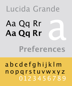
    • Lucida Grande. [Nick Francis, US]

    • Lucida Grande. [Roger Johansson, Sweden]

    • Lucida Grande is a beautiful font for normal text. I also like the cleanness of Trebuchet MS or Arial when used big on headers. [Filipe Varela, Portugal]

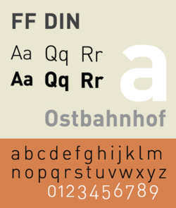
    • FF DIN. [Keegan Jones, US]

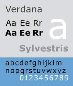
    • I do like Trebuchet, and Verdana (10px and below). “Regular” font: Lately, I’ve been using DIN. [Ryan Masuga, US]

    • It’s hard to pick just one, but I’d be lying if I didn’t say FF DIN. [Rob Goodlatte, US]

    • I love simple fonts like Helvetica, Chalet etc. - and there are so many classic serif fonts that are absolutely gorgeous; Times is a classic but today’s users seem to tire of it because of overuse - so others like Garamond, Caslon, Baskerville, Minion and Palatino all hold a special place with me. [Oliver Beattie]

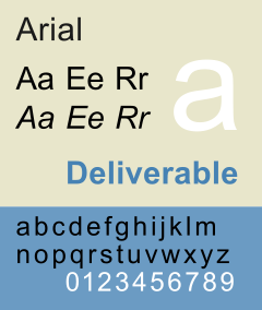
    • I use Arial (sans-serif) or Georgia (serif) in every web-site project. [James Mathias, US]

    • Keeping “web friendly fonts” in mind, the most often used font for coded pages is Arial. [Derek Punsalan, US]

    • As well as the usual Arial, Verdana etc. for body copy, I tend to use clean sans-serif fonts for headings. I try to use a variety of different fonts but I am quite partial to a bit of Rockwell at the moment. [Dan Lindop, UK]

    • Arial. Sorry! I’ve been leaving typography, which I know embarrassingly little about, to the designers I’ve been working with recently. [Patrick Griffiths, UK]

    • I am totally not a font person, so I just use the usual suspects. Arial, Verdana. I’m sure that’s like fingernails on chalkboards for some people. [R. Marie Cox, US]

    • Web: Verdana 11px (150% leading). Display: Maple (Process Type). Print: Mercury Text (H&FJ) [Matthew Buchanan, New Zealand]

    • Mmm, I’m a big fan of Georgia. I know that means that if Georgia is not available, it means falling back to Times New Roman, but hey ho, them’s the breaks. [Ian Lloyd, UK]

    • I find myself using Georgia and Verdana quite a bit. They are good utility fonts and are fairly ubiquitous. While I wish there was more variety available, there are only a handful of fonts which are reliable, due to the limited selection installed across multiple operating systems. The key to best using fonts is to know what typefaces are available in which environments. I have seen quite a few sites which resort to using sIFR, but I think that with a little research and patience, there is still quite a bit that can be done within the browser itself. One thing I have learned by dabbling in typography is that the default sans-serif font on Ubuntu is considerably wider than the sans-serif on other operating systems. While the sans-serif for Windows and Mac tends to look like Arial or Helvetica, the default sans-serif on Ubuntu is actually closer to Verdana in width. [Nathan Smith, US]

    • I use Myraid Pro quite a lot, probably too much. I’m just in love with it’s different variations, each one can portray a very different message. Andy Peatling, Canada]

    • “Myriad Pro” and “Neue Helvetica” are my favorites. Both flexible, elegant and yet readable. [Wolfgang Bartelme, Austria]

    • MetaPlus. [Mike Davidson, USA]

    • Gotham. [Jesse Bennett-Chamberlain, Canada]

    • It always depends on the context, but I’ve found Frutiger to be a reliable standby. [Garrett Dimon, US]

    • Warnock Pro (entire family) [Cameron Moll, USA]

    • Dax Regular [Paul Boag, UK]

    • Lately I’ve really liked the way Avenir looks on the screen. The font has a very fresh feel and works well with hum-drum web fonts. [Matt Downey, US]

    • Century Gothic, I just like the cleanliness of it. [Christian Heilmann, London, England]

    • Many of my corporate clients have existing corporate identities. In these cases, my role is often about interpreting corporate identities into the web environment. This means that fonts are often dictated from the outset. For other clients, I don’t think I have particular favourite fonts. I use different fonts - depending on the client and the feeling we are trying to get across. Even within serif font families there have not been particular favourites. I’ve used Rockwell, Clarendon, Goudy and even American Typewriter.I generally try to use as few actual image-based fonts as possible. I’m always conscious that the site may be viewed by small screen devices, by people who have images turned off, by blind users or people with screen magnifiers. Often image-based fonts are a barrier or an irritation to these people. Ideally, I prefer my content to be able to scale, display well on any device and be flexible enough so that users can override my settings.I generally try to use as few actual image-based fonts as possible. I’m always conscious that the site may be viewed by small screen devices, by people who have images turned off, by blind users or people with screen magnifiers. Often image-based fonts are a barrier or an irritation to these people.Ideally, I prefer my content to be able to scale, display well on any device and be flexible enough so that users can override my settings. [Russ Weakley, Australia]

    • “Don’t Make Me Think” by Steve Krug. [Jesse Bennett-Chamberlain, Canada]

    • “Don’t Make Me Think” by Steve Krug. It’s a small book with a big message about web usability. If you’re a web designer and haven’t read it, I would highly recommend it. Andy Peatling, Canada]

    • Don’t Make Me Think by Steve Krug. Again, not sure if this is quite ‘designer’ enough for you, but I wish more web developers and designers would read this before creating their first web site. It should be the law. [Ian Lloyd, UK]

    • “Don’t Make Me Think” by Steve Krug. It is a simple book but also very powerful. It is an ideal book to give to entire teams to read - including content writers, designers, developers and clients. [Russ Weakley, Australia]

    • “Don’t Make Me Think” - it was fast enough pace to keep my attention. [R. Marie Cox, US]

    • “Don’t make me think!” by Steve Krug. best hour of your time you ever spent on learning usability. [Christian Heilmann, London, England]

    • Hands down, bar-none, undoubtedly the best book written about web design is Don’t Make Me Think by Steve Krug. [Patrick Griffiths, UK]

    • More usability than design related, but one of the influential books for me was Steve Krug’s - Don’t Make Me Think [Lucian Slatineanu, US/Romania]

    • For CSS Design I would recommend CSS Mastery by Andy Budd. For UI design and understanding usable layouts I would recommend Don’t Make Me Think! by Steve Krug. Many people may not consider the second book a design book, but I think it is crucial for any designer to understand how users think. Design is not only aesthetic, but also has to be functional in order to create results for your client. [Nick Francis, US]

    • “CSS Mastery” by Andy Budd is a great introduction to producing good CSS layouts. I’ve read a few others on this subject but this is the best in my opinion. [Dan Lindop, UK]

    • With seamingly endless resources online, I find it hard to justify purchasing an actual book off the shelf. The only book that I have purchased and can recommend CSS Mastery by Andy Budd (with Cameron Moll & Simon Collison). A great primer for anyone interested in building a strong foundation from which to build off of. [Derek Punsalan, US]

    • The Elements of Typographical Style, by Robert Bringhurst. This is the book which inspired WebTypography.net. Another great book about user interface design is Don’t Make Me Think by Steve Krug. It encourages web designers to create intuitive site navigation and messages. [Nathan Smith, US]

    • The Elements of Typographic Style [Cameron Moll, USA]

    • Elements of Typographic Style by Bringhurst. [Mark Boulton, UK]

    • The Elements of Typographic Style is pretty boring, but it’s amazing how much you pick up from it while you’re dozing off. [Cameron Adams]

    • Jeffrey Zeldman’s “Designing with Web Standards” [Paul Boag, UK]

    • I like “Transcending CSS”, it has some good ideas and is great for inspiration, plus my screenshot is in there (page 48). [James Mathias, US]

    • If there is one book that many, many people working in the Web industry desperately need to read it is Ian Lloyd’s “Build Your Own Website The Right Way Using HTML & CSS”. [Roger Johansson, Sweden]

    • “How to be a Graphic Designer Without Losing Your Soul” by Adrian Shaughnessy [Rob Goodlatte, US]

    • Web Standards Solutions by Dan Cederholm. [Matthew Buchanan, New Zealand]

    • The only book I have on my desk is “Bulletproof Web Design” by Dan Cederholm. That’s more CSS than design - but I don’t buy design books. They’re way too expensive, they take up space, and I can find everything I need online, if I need something. [Ryan Masuga, US]

    • Pro CSS Techniques book by Jeff Croft, Ian Lloyd and Dan Rubin. But if I had to pick one book that I’d recommend to everyone starting on their journey towards standards development it would be Web Standards Solutions by Dan Cederholm. [Matt Downey, US]

    • Well, it’s a not a book to read but sure is eye candy. And it’s not just one either: ‘Los Logos’, ‘Dos Logos’ and ‘Tres Logos’. Love ‘em. [Filipe Varela, Portugal]

    • Can’t recall a book that I’ve read specifically on design. But here are some web related books that I recommend: Books for your brain. [Keegan Jones, US]

    • All of Edward Tufte’s books. They aren’t directly related to design per se, but they have an incredible wealth of information with regards to communicating and pragmatic aesthetics. [Garrett Dimon, US]

    • Making and Breaking the Grid by Timothy Samara. An introduction to grid based layouts. Highly recommendable. [Wolfgang Bartelme, Austria]

    • Ogilvy On Advertising. [Mike Davidson, USA]

    • I’ve just got a copy of Web Standards Creativity by (among many, many others) Cameron Adams, Mark Boulton, Andy Clarke, Jeff Croft, Dan Rubin etc. - that one’s a pretty good read. Also, it’s good to read other books not directly related to web designs. For example, I’ve got quite a few print books:1) Letterpress - New applications for traditional skills (David Hury)2) Grid Systems (Kimberley Elam) 3) The Elements of Typographic style etc.

    • Chasing the Perfect by Natalia Ilyin. [Natalie Jost]

    • Defensive Design (37 Signals). [Kyle Neath, US]

    • Two CSS books that are absolutely brilliant are Transcending CSS by Andy Clarke and Pro CSS Techniques by Jeff Croft, Ian Lloyd and Dan Rubin. [Oliver Beattie]

    • I don’t read any design magazines on a regular basis - online or offline. I just started reading Digital Web a little bit. I have a newsreader that I hardly open anymore because I’m busy with work! I sift through cssmania.com now and then just to see what people are up to, and spend all my time on the ExpressionEngine forums. [Ryan Masuga, US]

    • Digital Web. [Jesse Bennett-Chamberlain, Canada]

    • There aren’t really any printed magazines that I read regularly. I suppose that my online reading list is probably fairly typical for most web designers, consisting of the usual suspects: Digital Web Magazine, A List Apart, UX Magazine, Boxes + Arrows, and of course Smashing – though you guys need a unique site design. [Nathan Smith, US]

    • A List Apart. [Mike Davidson, USA]

    • Online, I trust A List Apart, sorry that one’s probably obvious. I really like Create Magazine in print, just because I enjoy looking at the ads. [Nick Francis, US]

    • I don’t get design magazines from the shops, at all - I tend to find them too pretentious or up themselves, to be honest! Likewise, I’ve not bought techie magazines for a long while. For me, it’s all online, and once more I’m thinking more on the technical/techniques front. So for me it’s still alistapart.com - great writers, good ideas and nicely presented. [Ian Lloyd, UK]

    • A List Apart. [Oliver Beattie]

    • Design Observer. [Lucian Slatineanu, US/Romania]

    • Does Wired count as a design magazine? It’s certainly got some of the best infographics I’ve ever seen. [Cameron Adams]

    • Pingmag [Derek Punsalan, US]

    • I really live the vibe and the variety that Netdiver features every day. [Filipe Varela, Portugal]

    • UX Magazine is a great read, and post a lot of fun articles. I also fill my feed reader with a bunch of web standards/web design/usability blogs and scan through them when I can find a spare minute from working! Andy Peatling, Canada]

    • I Check out Smashing Magazine from time to time, but I don’t really read a lot of design magazines, unless they have something specific. I do, however, watch Pixelperfect with Bert Monroy every week. [James Mathias, US]

    • Why Smashing Magazine, of course. [R. Marie Cox, US]

    • Fontblog.de - a German weblog on typography and other design related stuff. [Wolfgang Bartelme, Austria]

    • .net magazine (cheating, I get it for free as I am a contributor) [Christian Heilmann, London, England]

    • Communication Arts. [Kyle Neath, US]

    • Relevant Magazine. It’s extremely well designed (even the ads!), and it’s inspiring to flip through. If nothing else, it helps spark good design ideas. [Keegan Jones, US]

    • Computer Arts and .net magazine monthly. [Dan Lindop, UK]

    • HOW magazine is always an incredible source of design inspiration for me. Seeing printed and promotional pieces really challenge me to think about how to display and organize information on the web. [Matt Downey, US]

    • I like to read things that will broaden my horizons as a designer, not narrow them. A recent magazine I picked up in the UK which had great design, but also great content, was a magazine called Monocle. [Mark Boulton, UK]

    • I don’t follow any particular design magazines. Occasionally I’ll browse through a copy of Computer Arts or Communication Arts. [Rob Goodlatte, US]

    • I don’t read any on a regular basis any more - there are so many nowadays I just follow links and suggestions to interesting articles. [Patrick Griffiths, UK]

    • I really haven’t read any magazines. I’ve spent most of my time exploring books and finding books on classical aspects of design like typography and the grid. I’ve also found it incredibly enlightening to read books from different industries or different periods in art and history. It’s easy to follow the latest “fads” and apply that to a design, but it’s the classical and unchanging principles that really make a quality design stand out regardless of its particular style. I’m also starting to get into books on psychology, anthropology, and other related books that lend themselves to understanding human behavior and think of how we can apply that knowledge to the web. [Garrett Dimon, US]

    • I don’t read design magazines anymore. I used to, but these days I don’t have the time. Or the interest. [Roger Johansson, Sweden]

    • I don’t read any particular one on a weekly basis, but I pick up any design-related mags as often as I can with topics that range from food to architecture to aircraft design etc. [Cameron Moll, USA]

    • I do not read offline magazines now. Even with online magazines, I do not really “read” them in the true sense. I skim across a wide range of sites every couple of days as well as hitting a wide range of RSS feeds. Russ Weakley, Australia

XHTML:

  <h1 id="logo">My Company</h1>

CSS:

#logo {
  background: transparent url("pathtoyourimage.png") no-repeat 0 0;
  display: block;
  width: 100px;
  height: 50px;
  overflow: hidden;
  line-height: 1000px;
}

2.4. Approach

One font you use in your projects very often.

Web-typography defines the content. Or was it the other way around? Nevermind: the point is that if you use web-typography properly, you can not only improve the readability of your content, but also give it a more profound structure and provide your readers with efficient visual cues and hints.

Where to start your search for professional typefaces? Professionals deliver answers.

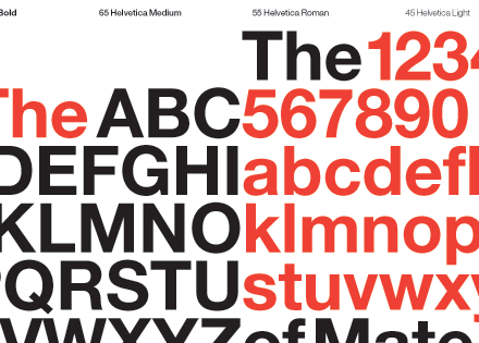
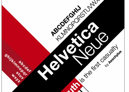
3.1. Helvetica, Helvetica Neue

Helvetica

[ Source: Slowcode.com]

Helvetica Neue

3.2. Univers

Univers

[ Source: Linotype.com]

3.3. Lucida Grande, Lucida Bright

Lucida Grande

[ Source: Wikipedia]

3.4. FF DIN

FF Din

[ Source: Wikipedia]

3.5. Arial, Verdana

Arial

[ Source: Wikipedia]

Verdana

[ Source: Wikipedia]

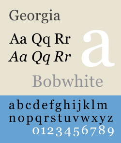
3.6. Georgia

Georgia

[ Source: Wikipedia]

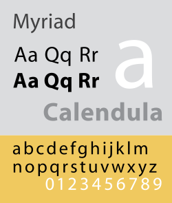
3.7. Myriad Pro

Myriad Pro

[ Source: Wikipedia]

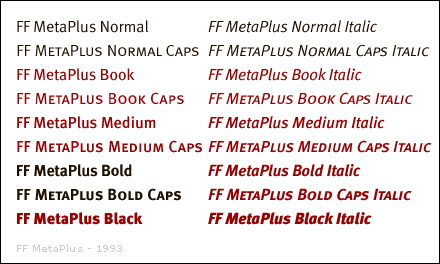
3.8. Meta Plus

FF Meta Plus

[ Source: Fontshop]

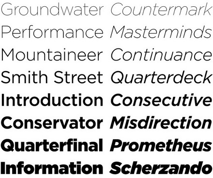
3.9. Gotham

Gotham

[ Source: Typography.com]

3.10. Frutiger

Frutiger

[ Source: Wikipedia]

3.11. Warnock Pro

Warnock Pro

[ Source: Veer.com]

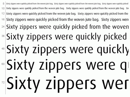
3.12. Dax Regular

Dax Regular

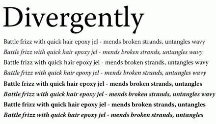
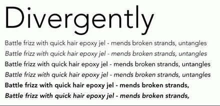
3.13. Avenir

Avenir

[ Source: Veer.com]

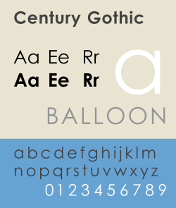
3.14. Century Gothic

Century Gothic

[ Source: Wikipedia]

3.15. Approach

[ Source: Slowcode.com]

Helvetica Neue

3.2. Univers

Univers

[ Source: Linotype.com]

3.3. Lucida Grande, Lucida Bright

Lucida Grande

[ Source: Wikipedia]

3.4. FF DIN

FF Din

[ Source: Wikipedia]

3.5. Arial, Verdana

Arial

[ Source: Wikipedia]

Verdana

[ Source: Wikipedia]

3.6. Georgia

Georgia

[ Source: Wikipedia]

3.7. Myriad Pro 

Myriad Pro

[ Source: Wikipedia]

3.8. Meta Plus 

FF Meta Plus

[ Source: Fontshop]

3.9. Gotham

Gotham

[ Source: Typography.com]

3.10. Frutiger #

Frutiger

[ Source: Wikipedia]

3.11. Warnock Pro

Warnock Pro

[ Source: Veer.com]

3.12. Dax Regular #

Dax Regular

3.13. Avenir #

Avenir

[ Source: Veer.com]

3.14. Century Gothic

Century Gothic

[ Source: Wikipedia]

3.15. Approach

Of course, the Web is full of information. And of course, you can find everything you need, googling for few minutes. However, studying a complex subject, it’s always nice to have a good book about your topic right in front of you.

So if you’d be asked to suggest a design-related book, what book would you suggest?

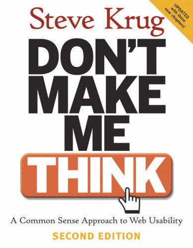
4.1. “Don’t Make Me Think” by Steve Krug

Don't make me think by Steve Krug

4.2. “CSS Mastery” by Andy Budd

CSS Mastery by Andy Budd

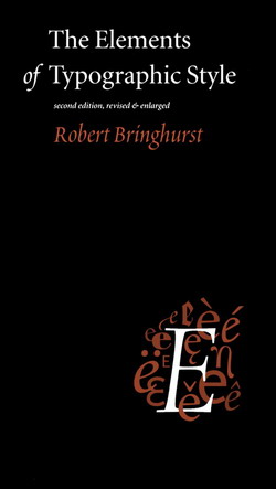
4.3. “The Elements of Typographical Style” by Robert Bringhurst #

The Elements of Typographic Style by Robert Bringhurst

Saturday, October 10, 2026

Preventing Spam: Bulletproof Solutions


Spam is probably one of the most difficult problems we have to deal with. E-Mail-filters, such as those used in GMail, provide accurate results, but not every company is willing to use extern services for its private mails. The problem occurs when web-developers have to display e-mail-addresses on a web-page.

Spam is probably one of the most difficult problems we have to deal with. E-Mail-filters, such as those used in GMail, provide accurate results, but not every company is willing to use extern services for its private mails. The problem occurs when web-developers have to display e-mail-addresses on a web-page.

How can you make sure that not a single spam mail will find its path to the inbox of your client? Or, speaking in more concrete terms, the question is, how should you display e-mails on a web-page in order to minimize spam attacks? Let’s take a look at some modern and bulletproof solutions and techniques which will help you to prevent spam in your mailbox or the mailbox used by your clients.

Avoid stereotypes

Sometimes web-developers tend to rewrite the original e-mail, so spam-bots can’t recognize it. This method might solve the problem, but spam-bots might catch on this sooner or later. Besides, many users might have problems decoding it - unless you provide some instructions how to decode the text. Most popular approaches are:

  • Replace dots with “d-o-t”, “@” with [at] and as many spaces as possible. Example: e-mail@office.com -> e-mail [at] office [d-o-t] com
  • Insert some characters before and after the “@”-symbol. Example: e-mail@office.com -> e-mail {!@!} office.com.
  • Avoid stereotypes - e-mails like info@domain.com, service@domain.com, admin@domain.com are likely to be spammed anyway.


Replace text with images

Apparently, most spam-bots don’t scan images on the web (yet?), so it seems reasonable to place the text inside of an image without referring to it as an e-mail-address. There are free web-tools which generate images “on the fly”, so the only thing you have to do is to place them on web-pages.

Replace text with ASCII and Javascript-coded text #

Another popular approach is to represent e-mail-adresses as ASCII code or Javascript-coded text. Users don’t see any difference in e-mail-presentation, but spam-bots won’t find the e-mail analyzing the source code - well, not yet. Some web-tools to convert e-mail links to ASCII code:

  • Online Email Protector: to use, simply type you email address below and then click in either of the textboxes. You can use the simple link code, or the more complicated Javascript link.
  • Email Riddler is an online tool that encrypts and transform your email address into a series of numbers when displaying it, making it virtually impossible for spam harvesters to crawl and add your email to their list.
  • Advanced Email Link Generator with Anti-Spam Encoder: this tool will generate mailto: links you can copy and paste into your web pages and emails. The Anti-Spam Encoder is an encoding scheme designed to cloak email addresses from spammer’s email harvesting robots, yet be visible and readable for your site visitors.

Bulletproof Solution

A simple solution I’ve been using for my recent project turned out to be the most effective I ever had. The most important rule to avoid spam is never mention it somewhere in the Web. So what I’ve suggested to do is to create two e-mail-accounts - the one for business contacts, which will be used only for communication with partners and serious clients and the second one, which will be decoded and published on the Web for any other purposes.

Once a potential client has written at the e-mail-address mentioned on the Web, the company will continue its communication via the first, “business” e-mail. On the other hand, brief questions or some small remarks will be responded via “open” e-mail, published online. Once the “open” e-mail gets included in spam databases and the company starts to get junk mail, it will be replaced by a new one.

This way your primarily, business contacts will always stay in touch with you via your business account and you reduce the amount of received spam to 0%.

Using GMail spam-filters externally 

Another useful technique to minimize the amount of spam-mails ending up in your inbox is letting it through gmail-filters. Unfortunately, GMail doesn’t have a function which would enable users to use Google’s filter directly. However, you can forward all the mails coming to your e-mail-box to your GMail account, and set your GMail account to forward the filtered messages to your private “clean” e-mail-account. The results aren’t always accurate, but you’ll see the difference immediately.

Have your e-mails already been flagged as spam, although you’ve sent a seemingly legitimate proposal to your client? Have you ever wondered why the efficiency of your newsletter campaigns suddenly dropped down? In both cases you deal with a problem which is harder to get done with than you think it is: bulletproof e-mail delivery.

The main problem with undelivered mails is that both sides — sender and recipient — don’t really know what happened. Was the e-mail sent? Is the task done? Was the e-mail delivered? Most recipients will never know that an e-mail flagged as spam was sent to them — they just don’t receive the e-mail. And most senders will never know that an e-mail flagged as spam wasn’t delivered — they just don’t get a response.

This article suggests over 20 bulletproof techniques, best practices and related services you can use to ensure best e-mail and newsletter delivery rates.

Where Do We Stand?

E-mail is a primarily mean of communication in the Web. Instant messaging supplements e-mail, however it’s a choice when it comes to communication with people you know well and/or you have a regular contact with. So where do we stand? And what is the main problem with e-mail delivery? And why do we have to deal with it?

  1. Spam-filters calculate “spam score” to detect junk mail. To determine whether a given e-mail is spam or not most spam filters consider a number of different attributes, such as content, length, percentage of text, use of images, number of recipients, headers etc. Usually they calculate the so-called “spam score” for every e-mail which passes the server.If the mail’s score exceeds a certain threshold the mail is blocked and lands in the spam folder. The level where the threshold is set is defined by the mail server configuration. By default, this spam filter flags messages with a score greater than 5 as spam.
  2. Spam filters aren’t perfect. Over the last years the efficiency of spam filters used by e-mail software clients and web-based e-mail-services has improved dramatically. However, since the strength level of anti-spam-algorithms has increased, it’s inevitable that also more legitimate e-mails don’t get through them. The result is that these filters, in order to block a good percentage of spam mails, block a good percentage of “suspicious” — in reality non-spam — messages as well.
  3. Newsletters remain important, RSS-feeds haven’t made the breakthrough yet. In its recent usability study Nielsen Norman Group found out that news feeds are definitely not for everybody, and they’re not a replacement for email newsletters. Apparently, “feeds are a cold medium in comparison with email newsletters. Feeds don’t form the same relationship between company and customers that a good newsletter can build.[..] Given that newsletters are a warmer and much more powerful medium, it is probably best for most companies to encourage newsletter subscriptions and promote them over feeds on their website.” Therefore it’s important to be aware of some sound techniques to pass through anti-spam-filters and thus guarantee a good newsletter delivery.
  4. E-mail delivery is tricky. The fact is that in most cases you never really know whether your first e-mail adressed to someone who doesn’t know you and/or isn’t expecting your e-mail will come through mail filters. And since the recipient doesn’t expect your mail he/she won’t be able to take it into consideration. Therefore it’s necessary to be aware of some techniques to ensure the delivery of your e-mails.

Best Practices For E-Mail Delivery

According to latest studies, your reputation determines your email delivery more than your content. So if you meet the expectations of your readers / recipients and don’t send irrelevant information you improve the delivery rates of your e-mails. Apparently, “most delivery challenges are due to subscriber feedback; such feedback typically takes the form of complaints by recipients who mark the message as “spam” in their respective email clients and problematic traffic patterns such as bounces and spam trap hits.”

However, it’s not always enough. Let’s take a look at the best practices for optimal e-mail delivery rates.

  1. Avoid follow-ups, ask for a brief feedback — one word “soon” is enough. Since you don’t know whether your e-mail is delivered or not, don’t assume that it is delivered. However, don’t send a follow-up in doubt; follow-ups which usually include the copy of an original e-mail aren’t effective and get on recipients’ nerves. Instead ask the recipient in the first message to send you a brief note that your e-mail was received. For instance, ask to write back “soon”, “got it” etc. once they’ve received the e-mail — indicate that no further comment or instant reply to your mail is necessary.
  2. Don’t attach large files to your first e-mail (unless specified by the employer). Instead provide the detailed information on where the your CV and portfolio can be found on your personal web-site. Or simply copy and paste your resume in your e-mail. Compressed files (.zip, .tar etc.) and images are still strong signals for spam detection algorithms.
  3. Use a consistent senders’ name and email. Make it easier for your recipient to recognize you. Don’t change from “Max Mutermann” to “Developer’s team”. Don’t change your e-mail suddenly. Once your recipient has mistakenly considered and reported your message as spam you are likely to never be able to contact them again.
  4. Never put a link before important information. Once the recipient has clicked upon the link you’ve provided and landed on some page he/she has no information about, you’re lost. Many recipients might not get back to your message and report you as spam.
  5. Snail mail is bulletproof. If possible, follow-up on your e-mail with a “snail mail” version sent to the real postal address. This is a great way to establish contact and stay in touch with a person! Reference the e-mailed version you sent (including the date, time, and subject if possible). [Source]
  6. Avoid fictional or irrelevant sender’s name. Communicate with your recipient personally. Instead of nicknames or company titles use your first and last name. Notice that spam-filters award e-mails without sender’s name (or with an empty name) with spam score points. The sender’s name shouldn’t include numbers or symbols rather than your actual name. Instead of “no-reply@yourdomain” or “admin@yourdomain” provide your readers with concrete and short contact information, e.g. “Max Mustermann” . The “reply-to” field shouldn’t be empty.

Best Principles For Bulletproof Newsletter Delivery

Since newsletters are still an important part of marketing campaigns, to achieve the highest response rate you’d like to ensure the highest delivery rate. The principles and rules listed below might help you to increase the delivery rate of your newsletters.

  1. Send newsletters regularly. Let your subscribers know when your emails are coming. If you offer a subscription to your newsletter from your web site then tell each and every subscriber exactly when to expect your newsletter.
  2. Tuesday / Wednesday 2-3pm = Increased Response. Your subscribers will come to “expect” your email to arrive in their inbox on the same day at the same time every week, meaning that they want to read your content and are generally more receptive to any special offers or promotions you may include. This means that they are less likely to misunderstand your newsletter and report it as spam.
  3. Slow down your newsletter delivery. Instead of using tools which boost your newsletter through mail servers to achieve “instant delivery” prefer “slow” delivery tools. Avoid sending mails to multiple (dozens or even hundreds) recipients using CC:-attribute. Use professional newsletter software or professional e-mail-delivery services. “When ISPs detect a flood of email, it looks like the work of a virus or a spammer.” [Source]
  4. Use a tag line at the beginning of the subject line. Mark your newsletters as such. Make it easier for your readers to recognize your newsletter. E.g. ‘[SM Newsletter] Nr. 297, 16.10.2007 — Usability Glossary — Splash Pages — Big Typography’. Remain consistent. Otherwise your readers might consider your e-mails as spam and report it.
  5. Always insert the current date in the content. A correct date which indicates when the newsletter was sent is more important than you probably think it is. If the date isn’t mentioned or is provided incorrectly, the newsletter is given spam score points.
  6. HTML is OK, but only if MIME-Multipart is used. When sending newsletters as HTML make sure that also the plain text version is attached. Messages sent in MIME-Multipart-Format are automatically sent in a way that subscribers without active HTML-Viewer still get a decently formatted e-mail. It is important that both plain text and the HTML-version have the same or very similar content. The percentage of text should be higher than the percentage of HTML or images. Keep your message size between 20 and 40 Kb.
  7. Use CSS sparingly. In most cases it is better to use inline CSS-styling in HTML instead of referring to CSS-file in HTML. However, referring to external CSS-files is better than sending them with newsletter.
  8. Avoid graphics and complex HTML-elements. Spam-filters consider a number issues related to HTML. For instance, if the newsletter has too many closed tags, too many graphic (images) or structural (tables) elements it gets just as many spam score points. Besides, many readers use software (e.g. Outlook) which automatically blocks images; if users don’t understand what the mail is about they’ll report is as spam. Complex HTML (particularly if more than 50% of HTML-code are HTML-tags) is generously awarded with many spam score points — keep it simple. Colorful backgrounds, tables, JavaScripts and web forms shouldn’t be in newsletters.
  9. Motivate your users to add you to their whitelists. To ensure the bulletproof e-mail-delivery ask your readers to add you to whitelists. You can create Email whitelist instructions in seconds — for a number of e-mail applications.
  10. Screen your advertisers and partners. If your newsletter includes a link to a blacklisted web site you might get a whole bunch of spam score points. Verify the sites and e-mails you are linking to; check if they are already blacklisted or were reported as spam (or spam sources) before placing their advertisements in your newsletter. Even if the company is legitimate, it is possible that spammers have used their accounts for sending out spam mails.
  11. Monitor new subscribers. Monitor new subscribers in your lists. Set suspicious “spamflag” addresses such as “abuse@”, “nospam@”, “postmaster@”, “marketerspam@” as inactive subscribers. [Source]
  12. Verify your subscribers with signup confirmation. Always make your mailing lists double opt-in. This means that when a user subscribes to your mailing list, they will be sent an email with a link that they must click on to confirm their subscription. This is very important because many people can accidentally enter an incorrect email address, or even the email address of someone else on purpose. When that person receives a newsletter they did not subscribe to, they will assume they have been spammed, and your newsletter (and possibly your web server) will be reported as spam.It also keeps invalid email addresses off of your list, which reduces the volume and percentage of undeliverable messages that you send. Since undeliverable rates also factor into filtering rules, keeping invalid email addresses from being subscribed to your list will help you to avoid content filtering. [Source]
  13. Test your newsletters before sending them out. Always check the “spam score” of your newsletters with SpamCheck and further tools (most of them are listed below).