Hire a web Developer and Designer to upgrade and boost your online presence with cutting edge Technologies

Saturday, July 23, 2011

29 Free CSS Frameworks and Tools for Web Developers

A CSS framework is a pre-prepared library that is meant to allow for easier, more standards-compliant styling of web pages using the Cascading Style Sheets language.
Some developers are tired of writing the same CSS code so thinking of this some CSS frameworks are written to get the job done in a short way.Well,some developers always prefer to write the codes as unique but the below CSS frameworks may help you.
Complete List of CSS Frameworks
———————————————————————————————————–
1.YAML Yet Another Multicolumn Layout
css_frameworks
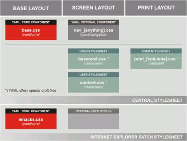
Yet Another Multicolumn Layout” (YAML) is an (X)HTML/CSS framework for creating modern and flexible floated layouts. The structure is extremely versatile in its programming and absolutely accessible for end users.
  • A flexible, accessible layout concept for designing column-based and grid-based CSS layouts,
  • Extensive Cross-browser compatiblity (IE 5.0/Win+) for bullet-proof layout rendering in every situation,
  • The fewest possible restrictions for the designer (fixed or flexible layouts, variable column widths, etc.),
  • User-defined order of content columns in the source code (“any order columns”),
  • Stylesheet templates ordered by function to work efficently,
  • Column separators and backgrounds all generated without images and continuous down to the footer,
  • Flexible grid-system via subtemplates for almost all purposes
2.YUI 2: Grids CSS
css_frameworks
The foundational YUI Grids CSS offers four preset page widths, six preset templates, and the ability to stack and nest subdivided regions of two, three, or four columns. The 4kb file provides over 1000 page layout combinations. Other features include:
  • Supports fluid-width (100%) layouts as well as preset fixed-width layouts at 750px, 950px, and 974px, and the ability to easily customize to any number.
  • Supports easy customization of the width for fixed-width layouts.
  • Flexible in response to user initiated font-size adjustments.
  • Template columns are source-order independent, so you can put your most important content first in the markup layer for improved accessibility and search engine optimization (SEO).
  • Self-clearing footer. No matter which column is longer, the footer stays at the bottom.
3.960 Grid System
css_frameworks
The 960 Grid System is an effort to streamline web development workflow by providing commonly used dimensions, based on a width of 960 pixels. There are two variants: 12 and 16 columns, which can be used separately or in tandem
4.BlueTrip Css Framework
css_frameworks
A full featured and beautiful CSS framework which originally combined the best of Blueprint, Tripoli (hence the name), Hartija, 960.gs, and Elements, but has now found a life of its own.
Features
  • 24-column grid
  • Sensible typography styles
  • Clean form styles
  • A print stylesheet
  • An empty starter stylesheet
  • Sexy buttons
  • Status message styles
Example Sites Using BlueTrip
Ankhou
Freelancetheworkspace
Wellspring.northbay
5.Emastic
css_frameworks
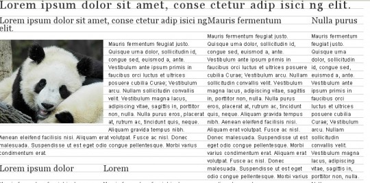
Emastic is a CSS Framework with below features;
  • Lightweight (compressed weight less then 4kb)
  • Personalized width of the page in (em,px,%)
  • Use of fixed and fluid columns in the grid.
  • Elastic Layout with “em”s
  • Baseline Grid Typography
6.Elasticss
css_frameworks
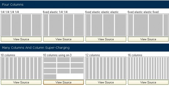
A simple css framework to layout web-based interfaces, based on the printed layout techniques of 4 columns but with capabilities to unlimited column combinations. and capacity to make elastic, fixed and liquid layout easily
Elastic CSS Framework is a freestyle framework you can mix and nest any number of columns, you can even mix any number of columns, fixed-columns, and elastic-columns.
>Click To See Sites Using
7.Baseline CSS Framework
css_frameworks
Baseline can be used in many different ways. Use the reset.css and base.css file as a starting point, include the type.css for typographic control or include all files to have a complete foundation to start your web project.Baseline can be used in many different ways. Use the reset.css and base.css file as a starting point, include the type.css for typographic control or include all files to have a complete foundation to start your web project.
8.The Fluid Grid System
css_frameworks
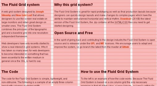
A web grid system designed by Joseph Silvashy and New Gold Leaf that allows designers to use the screen real estate on large monitors and retain great design on smaller ones. The Fluid Grid System combines the principals of the typographic grid and a baseline grid into one resolution-independent framework.
9.MarkerCSS
css_frameworks
Code open source for web page layout,flexibly and quickly, based on standard CSS
10.The Golden Grid PSd Template Included
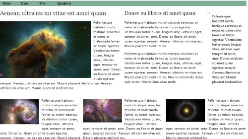
css_frameworks
The Golden Grid is a web grid system. It ‘s a product of the search for the perfect modern grid system. It ‘s meant to be a CSS tool for grid based web sites.There are two CSS systems called golden-base(golden.css) and golden-extend(reset.css, golden.css , typography.css)
  • Golden Base = min css reset + grid system
  • Golden Extend = complete css reset + grid system + typography
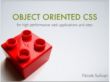
11.Object Oriented CSS-OOCSS
css_frameworks
Nicole first presented Object Oriented CSS at Web Directions North in Denver. Since then, the response has been overwhelming. OOCSS allows you to write fast, maintainable, standards-based front end code. It adds much needed predictability to CSS so that even beginners can participate in writing beautiful websites.
12.Lovely CSS
css_frameworks
The Lovely CSS Framework is a simple and straight forward way to easily deploy an XHTML/CSS site.Based on a simple 960px wide grid system, featuring multiple column layouts, and various pluggable add-ons. Additionally, it contains the most common and useful js scripts along with other ready to use snippets (plug-ins) which make life easier.
13.Blueprint
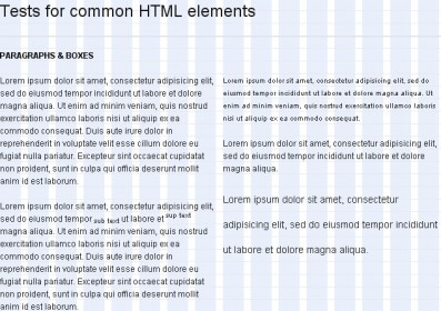
css_frameworks
Blueprint is a CSS framework, which aims to cut down on your development time. It gives you a solid foundation to build your project on top of, with an easy-to-use grid, sensible typography, useful plugins, and even a stylesheet for printing.
Features
  • A CSS reset that eliminates the discrepancies across browsers.
  • A solid grid that can support the most complex of layouts.
  • Typography based on expert principles that predate the web.
  • Form styles for great looking user interfaces.
  • Print styles for making any webpage ready for paper.
  • Plugins for buttons, tabs and sprites.
  • Tools, editors, and templates for every step in your workflow.
Click To See Sites Using Blueprint
14.52 Framework
css_frameworks
The 52framework was started by the enavu network as a way to expedite the process of the usage of the latest standards in web development, and the love of the number 52. The 52framework provides an easy way to get started using html5 and css3 while still supporting all modern browsers (including ie6).
What’s in 52 Framework Box
index.html – The the index file is the demo page
grid_demo.html – The grid_demo is a page filled with all the possibilities
html5.js – this javascript file is what allows us to use the HTML5 elements today
general.css – this file includes all the general styles
grid.css – the grid stylesheet contains your grid styling
reset.css – based on the Eric Meyers reset this reset stylesheet has been modified to include the HTML5 elements the framework uses
code.jpg, code.psd – the code image is used for the tag.
grid.jpg, grid.psd – the grid.jpg is being deprecated in the next version

15.Elements CSS Framework
css_frameworks
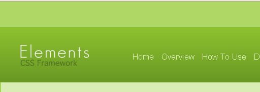
Elements is a CSS Framework that was developed by Ben Henschel. It lets you write CSS easier, faster, more efficient, and allows you to organize all of your project files. There are many files and folders that make up Elements.From client files to design to code to getting out on the web, Elements is with you through out the entire process.
Features
  • Lightweight
  • Collection of preset classes
  • Lightbox included
  • An awesome mass reset
  • Adds style and usablity to external links with icons
  • Can be easily uploaded to your website hosting server
16.Content With Style
css_frameworks
Created by Mike Stenhouse.There are 5 main layouts.
17.Typogridphy
css_frameworks
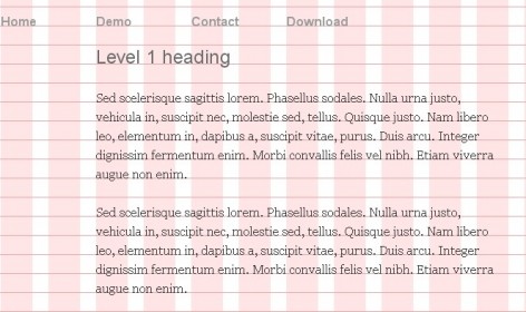
A Typographical and Grid Layout CSS Framework From Harry Roberts of CSS Wizardry(http://csswizardry.com/).Typogridphy is a CSS framework constructed to allow web designers and front-end developers to quickly code typograhically pleasing grid layouts.It also uses a typographical method know as ‘creating vertical rhythm’, whereby all adjacent lines of text line up horizontally, regardless of line breaks and new paragraphs.The source is fairly well documented, and a basic knowledge of CSS will be enough to see you on your way.
18.The 1Kb CSS Grid
css_frameworks
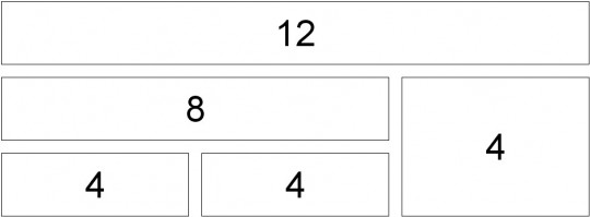
Here is a fresh take on the CSS grid (loosely based on Nathan Smith’s 960 Grid System). Its mission is to be lightweight.Here is the demo screenshot.
19.Easy Framework
css_frameworks
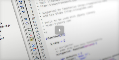
Easy is a CSS/HTML/JavaScript framework started as a personal project and then grew into something more. Easy is more than a CSS framework designed for building layouts. It includes built-in (jQuery powered) interactive functions that are so easy to use that you really don’t have to know first thing about JavaScript. It also includes a library of preformatted and precoded CSS/HTML content blocks that you can simply paste into your master template. With a way of file organization it allow you to easily create your own content blocks. Framework includes all 3 layers of front-end: structural, presentational and interactive what makes it the true all-in-one solution for your next front-end project.
20.Compass
css_frameworks
Compass is a CSS Meta-Framework that provides ports of the best of breed CSS frameworks to Sass(http://sass-lang.com/) and ready to use in your ruby-based web application or stand-alone via a simple command-line interface.
21.Floatz
css_frameworks
Floatz is a flexible, powerful and easy to use CSS framework. It provides a rich set of reusable CSS classes and code snippets that help web designers and programmers to build state of the art, semantic thus more accessible web sites and applications, based on web standards, in less time.
22.SenCSs
css_frameworks
SenCSs does everything else: baseline, fonts, paddings, margins, tables, lists, headers, blockquotes, forms and more.

Features

Sets a vertical rhythm for all elements (18px baseline)
Sets a common typographic standard across browsers
Has fonts specified for windows, mac and linux
Is optimised, meaning no “double resets”, to make the CSS as efficient as possible
23.FEM CSS Framework
css_frameworks
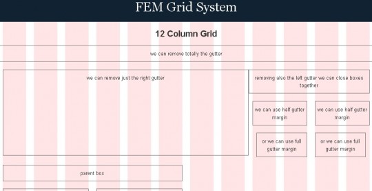
FEM CSS Framework is a 960px width + 12 column grid system + CSS common styles, to easy and fast develop web layouts.It is based in the 960 Grid System, but with a twist in the philosophy to make it more flexible and faster to play with boxes.
24.Primary CSS
css_frameworks
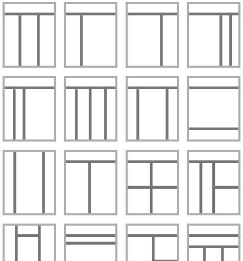
Primary is a simple CSS Framework, designed for Developers and Designers in order to make using CSS as easy as possible.Primary is an experiment based on the concepts of legendary comic book artist Wally Wood’s “22 Panels That Always Work”.Primary is Open Source.
25.Formee
css_frameworks
Formee works with the technique provided by Fluid 960 Grid System (created by Stephen Bau, based on the 960 Grid System by Nathan Smith) to compose the form’s layout, allowing total flexibility to put it in any website or web system.Reached over 6.500 downloads until now.
26.Instant Blueprint
css_frameworks
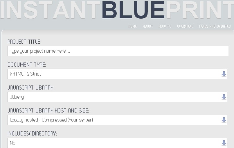
Instant Blueprint allows you to quickly create a web project framework with valid HTML/XHTML and CSS in only a matter of seconds, allowing you to get your project up and running faster!
27.Less Framework
css_frameworks
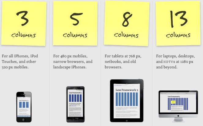
Less Framework is a cross-device CSS grid system based on using inline media queries.
28.RMSforms
css_frameworks
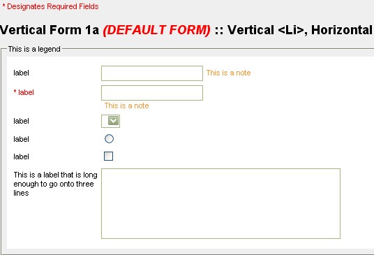
RMSforms” CSS Forms framework is a work in progress. The goal of this project is to make form styling as simple as possible.
29.xCSS
css_frameworks
xCSS bases on CSS and empowers a straightforward and object-oriented workflow when developing complex style cascades. Using xCSS means a dramatic cut down to your development time by: having a intuitive overview of the overall CSS structure, using variables, re-using existing style cascades and many other handy features.

CSS Pitfalls for Web Designers to Avoid

The stylistic language of CSS has been among us for many years, yet while it possesses the ability to engage and entrance our visitors with increasingly complex feats of layout and design engineering, poor decision making can affect the final outcome. While often due to a lack of awareness of the implications or from personal choice, a number of potentially problematic issues exist that can result from innocent decisions. This article aims to correct these common practices.

Proprietary Code Isn’t Demonic

The first pitfall that needs to be addressed is the common misconception regarding proprietary code such as webkit transitions and animations. One of the major reasons why vendor prefixed code is frowned upon by many in the industry is simply because it doesn’t validate. Because the code was not set or sanctioned by the W3C, those who rely on the validators see it as a mistake rather than a helpful feature which can boost a site’s beauty which is rather a shame when you think about it.
As designers, we regularly find ourselves trapped within code. With CSS having a specified limit on what properties are valid, custom properties are given an opportunity to push the boundaries, test new features like CSS3 before it goes final and not intrude on the general layout. Yes of course, if you make your code depend on them, it’s likely to break, but surely you make your CSS progressively enhance to such code and update your site anyway, so there’s not really anything to worry about! Using proprietary CSS isn’t a bad thing – it just requires an extra bit of attention and maintenance.

Ignoring Browsers or Mobile Devices

The next pitfall we can address is one which seems to be trickling into the mainstream, but not at a proportionate pace in relation to its visible growth. Like them or not, many cellphones and handheld devices now have Internet access, and not just that clunky WAP system which existed in the 90’s. Many smartphones and featurephones actually have a fully fledged browser within them. With this in mind, why do so many people still remain loyal to testing in desktop rendering engines?
People are using the web in all sorts of ways they didn’t in the past. Televisions are being enabled, phones are already enabled and there have even been refrigerators with Internet access in the past though it’s fair to say that it didn’t take off. Some people don’t test outside of the desktop because of perceived costs this is less of an issue with the range of good emulators. It’s also not fair to say that the usage numbers don’t justify the testing after all, usability should be paramount. If your site doesn’t already work on handheld devices, it’s now time to consider making the experience better.

Inline Style When External Will Do

Many standards advocates have been promoting the importance of separating structure, behaviour and style for the reasons of ease of maintainability and the advantages of caching, yet still to this day there are many individuals who make use of either the style attribute, style tags within the header or even resort to using deprecated stylistic elements within their code. While the more perceptive and up-to-date amongst you will already avoid this at all costs, the bad trend just seems to continue!
In this case the resolution of such problematic coding is education and while we all know that taking that CSS, stripping it from the page and breaking it into a separate file will give you the amazing and cool bandwidth savings that browser caching provides possibly more if you have GZIP enabled on the server, the necessity of many CMS products, prebuilt apps and WYSIWYG editors to continue applying style in such a manner requires immediate attention. There is rarely a case where internal style is of more use than external, and as such, learning to avoid repetitive coding is worth the effort.

Keep it Together (Less Files are Good)

Following on from the previous pitfall, something which plenty of active designers who code beyond the novice level will encounter is the separation of stylesheets into smaller files. While the breaking down of style into separate files may serve a purpose if you update your CSS files regularly and wish to maximize caching, the argument that separate files are easier to navigate seems to showcase the IDE or editor’s lack of code tracking methods than a real need to invoke added HTTP requests.

Putting it simply, editors like Notepad++ have the ability to cleverly collapse code, which removes any potential issue which may result from lengthy CSS files. If your current editor doesn’t have such a function, it may be worth changing to a tool that does as unless you update your CSS regularly, the extra HTTP requests to the server are waste produce. While this may seem rather picky, it’s easier from the browser to navigate “view source” in a single file, and as media selectors can target specific conditions like print styles or certain widths, you can still have the separation within a single file.

Typeface Dependence and Unit Values

Finally it’s worth mentioning the pitfalls of typeface and unit value dependence. Back when the web was young, the need for selecting relatively Websafe typefaces was critical, yet while the lures of @font-face may give another impression, this still hasn’t changed. So many sites assume that a font has been installed or font-face will be available that many simply ignore the traces of usable fallback mechanisms. In addition, tonnes of sites still use PX units on text which is crazy for IE users.

With Websafe fonts, it’s easy to say that there’s no such thing as most typefaces can be uninstalled along with font-face downloads disabled, and with CSS3 not being available everywhere, it’s still very important that we acknowledge those devices. When you make use of the font-family property in CSS, always ensure that you have a proper stack formed with fallback options, it’s that simple. As for measuring text unit’s in PX, while the Zoom function in every browser will handle the task of resizing it with ease, IE’s Text Size accessibility option (even in IE9) can’t resize PX measured text!

Think Before You Style

There are plenty of mistakes we can end up with while coding, from forgetting the hash character in color hex values to spelling the properties incorrectly or even forgetting about case sensitivity in CSS selector names. While the journey of getting to grips with CSS may be long and slightly daunting for the less experienced coder, the need to think about what you’re doing, exploring the risks of using both standardised and proprietary code in browsers and staying in control of your site is critical.
For the more advanced CSS developers out there, the terrors of hasLayout and the new frontiers of mobile design will remain heavily in our focus as will browser compatibility. For beginners, the way in which you build, structure, organise and maintain your code (and getting past those simple yet somewhat annoying validation issues) will be paramount. In either case, it’s acceptable that we will all suffer at the hands of our own mistakes (or those of browsers) in the future, so the best thing any of us can do is stay vigilant, read the specifications, keep learning and stay on top of what’s new!
Questions
Do you agree with my observations that vendor prefixed codes can be helpful? Are you a fan of font-face and non-Websafe typography? Do you test or build for mobile devices? Or are you the person who still uses inline styles or tonnes of separate CSS files? Let us know in the comments!


Friday, July 22, 2011

10 Principles for Keeping Your Programming Code Clean

A common issue in almost every profession that can drive people completely insane is having to continue from what somebody else started. The main reason for this being the fact that everyone has different ways of working, and sometimes these self-induced habits can be just downright messy.
In order to make code look cleaner, and thus, support team work (meaning that somebody else might need to work with what was coded before), there are certain considerations that should be taken into account.

Keeping Your Programming Code Clean

1. Revise Your Logic Before Coding

Before blindly typing into the debugger of choice, some flow diagrams or written pseudo-code might come in handy to previously verify the logic behind those lines of code. Writing it down first can clarify many doubts or insecurities about complex functionality, and therefore save a lot of time. But most importantly, helping you get it right faster will also help you avoid all the messy code replacements and additions that tamper with the following principles.

2. Clearly Expose the Structure of the Page

Working with main containers is useful, but working with main containers with a representative ID is even more useful. Consider the following starting scenario:
...
...
...
The structure appears evident, thanks to the DIV containers that are concretely named after their destined content. Not only will it be simpler to start adding code, but it’ll also be perfectly transparent for someone who tries to add or remove something afterward. This structuring method, however, should be aided by the next statement.

3. Use the Correct Indentation

Supporting the previous pronouncement on structure, indentation distinctly displays the opening and closing points of each element used. If every line of code is glued to the left side of the screen, it’ll be very hard to distinguish the exact place where an element is closed. Therefore, it’ll mess up the effort made at designing a complete structure, since it won’t be noticeable afterward.

4. Write Explanatory Comments

Underestimating the value of good comments is disregarding a very effective way of code documentation. It’s easy, fast, and very straight-to-the-point, since it’s done right then and there when it’s needed.
Comments are also efficient considering the fact that they can be read at the exact moment of doubt. They can, however, be overused. And that brings us to the next recommendation.

5. Avoid Abusing Comments

Comments aren’t to be treated lightly. When commenting on code, the current functionality is explained in terms of variables and results. What comments are NOT made for is:
  • Writing explanatory notes to self (e.g. /* Will finish this later… */).
  • Blaming stuff on other people (e.g. /* John coded this. Ask him. */).
  • Writing vague statements (e.g. /* This is another math function. */).
  • Erasing chunks of code. Sometimes people are not sure of erasing things and it’s not absolutely evil to comment that code instead.
What’s not right is to just leave it afterwards. It’ll be terribly confusing. If the code will be documented via embedded comments, the team members need to make sure those comments are there for a reason.
Examples of good comment use are:
  • Authoring specifications (e.g. /* Coded by John, November 13th 2010 */).
  • Detailed statements on the functionality of a method or procedure (e.g. /* This function validates the login form with the aid of the e-mail check function */).
  • Quick notifications or labels that state where a recent change was made (e.g. /* Added e-mail validation procedure */).

    6. Avoid Extremely Large Functions

    In the process of adding functionality to an application, its coded methods tend to grow accordingly. One can come across functions that consist of up to a hundred lines of code, and this tends to become confusing.
    A better practice would be to break up large functions into smaller ones. Some procedures may even be repeating themselves amongst the rest of the functions conforming the whole application process. The team could make better use of those repeated procedures through separate functions. This, however, should have been avoided from the beginning if the first recommendation was carried out correctly.

    7. Use Naming Standards for Functions and Variables

    Whenever a variable or a function is created, its name should be descriptive enough as to give a general idea of what it does or what it’s for.
    There are companies that have their own pre-established naming standards (e.g. The prefix ‘int_’ for any numeric variables), but there are also many companies in which the employees do not keep these standards. Laziness makes people work double the time during future redesigns, so everyone needs to start learning how to get rid of it.

    8. Treat Changes with Caution

    The correct appliance of changes summarizes a lot of what has been previously said, like commenting meaningfully and not disrupting indentations. Nevertheless, it needs to be emphasized. Whenever there’s a need for adding, removing, or changing something, there should also be an awareness of not meddling with previous efforts for maintaining the code clean and ordered.
    This mainly involves:
  • Keeping the correct indentations (e.g. when inserting an IF clause, its contents’ indentations will be augmented).
  • Commenting on the modification made or broadening the existing comments.
  • Respecting standards in use.

9. Avoid Indiscriminate Mixing of Coding Languages

In-line CSS styling and scattered JavaScript tags with short procedures within them are very good examples of incorrect mixing of coding languages throughout your development process. Ignoring this principle will result in huge element tags with an embedded STYLE property, lots of interruptions in the flow of the structure because of embedded functions, and of course lots and lots of confusion.
Even with the addition of comments, it’ll still look like everything and nothing at the same time. Having the appropriate divisions between different coding languages will give order to the logic applied. This brings us, though, to the next consideration.

10. Summarize Your Imports

Even though it is much better to have additional coding languages imported from different files, this shouldn’t be abused. If there are too many style sheets, they can probably be summarized into one or two.
This won’t only save space and make things look cleaner, but it will also save loading time. Each imported file is an HTTP request that tampers with the performance of your application. So apart from being a consideration for tidiness, it is also a consideration for efficiency.
And, of course, this way one can avoid dealing with Internet Explorer’s limit to the number of individual stylesheets.

To Sum Up

What’s convenient isn’t always what’s best for the development process, since finding the convenient way to do something tends to drive us towards disregarding coding efficiency. Implied in this case for efficiency, there is a high need to keep up with standards in order to maintain a code that’s readable in the future. Considering that it won’t always be the same person who works on upgrading the same application, code should be sufficiently open and understandable for it to really support team work.


Wednesday, July 20, 2011

Magento install error - Exception printing is disabled

Here is a known error which can occur when installing Magento:
There has been an error processing your request
Exception printing is disabled by default for security reasons.
Error log record number: XXXXXXXXXXXXXXX
Here is the solution:
  1. Navigate to the "errors" folder.
  2. Change local.xml.sample to local.xml
  3. You should now see a new list of crazy errors all over the Magento page - this is okay.
  4. Open magento/lib/Zend/Cache/Backend/File.php and look for:
    protected $_options = array(
    'cache_dir' => 'null',
  5. Change it to:
    protected $_options = array(
    'cache_dir' => 'tmp/',
  6. Save it.
  7. Now the final step is to go create a tmp folder in the root Magento folder.
  8. That's it.

Monday, July 18, 2011

Internet Explorer & CSS issues

Trying to get CSS-based websites to look the same across all browsers can often be difficult. Many of the problems however lie with Internet Explorer implementing CSS commands differently to other, more standards compliant browsers. All is not lost, however, as many of the differences you see across browsers are caused by the same Internet Explorer CSS issues...

1. Page elements are narrower in Internet Explorer

Perhaps the most famous IE and CSS problem is Internet Explorer's misinterpretation of the CSS box model, which can cause page elements to be narrower in IE. Every HTML element is essentially a box, the width of which is the total of its margin, border, padding and content area. Imagine the following CSS rule:
div {
margin: 5em;
padding: 4em;
border: 1em solid green;
width: 30em
}
This means that each div is 50em wide in total. This amount is made up of a 30em wide content area, and a 4em padding, 1em border and 5em (invisible) margin on both the left and right sides.
In IE however, the border and padding are included in the width of the content, as opposed to added on. In IE therefore, the width of the content is only 20em (30em less 5em padding and border on either side), and the total width of the div is just 40em.
This CSS box model problem occurs in IE5.x, and can occur in IE6, depending on how you declare the ISO value in the HTML code. There are two ways of doing this:

The first command is placed on the very first line of the HTML document and the second can be placed anywhere within the . In order for XHTML pages to validate it's compulsory to use one of these commands. The W3C recommends using the first command as the second will be phased out in the future.
By using the first command however, Internet Explorer 6 will render the CSS box model incorrectly, just like in version 5 browsers. To fix the box model problem, you'll need to insert a CSS hack to send different width values to different browsers. The CSS hack you use will depend on which ISO value you use, and therefore which versions of IE are rendering the box model incorrectly.
To fix up only IE5.x, use the following CSS commands:
div {
margin: 5em;
padding: 4em;
border: 1em solid green;
width/**/:/**/ 40em;
width: 30em
}
To fix up all versions of IE, use these CSS commands:
div {
margin: 5em;
padding: 4em;
border: 1em solid green;
width: 40em
}
html>body div {
width: 30em
}


2. Text spilling out of its container in non-IE browsers

Internet Explorer, unlike other browsers, will expand borders and background colours so text doesn't spill out of its containing element.


If you're viewing this in Internet Explorer, the box should look fine. In all other browsers the text is spilling out of the right-hand side of the box. The box has been assigned class="box" and has the following CSS commands assigned to it:
.box {
width: 40px;
border: 2px solid #781351;
padding: 3px;
background: #d7b9c9;
white-space: nowrap
}
Non-IE browsers will adhere to the width: 40px CSS command, which is why the box doesn't expand in these browsers. IE instead interprets width as min-width, and therefore expands the box to fit the text (the same applies with height and min-height).
To ensure the text doesn't spill out of the box in all browsers, you'll need to use the following CSS rule, in addition to the first one:
html>body .box
{
width: auto;
min-width: 40px
}
IE will ignore this CSS command, as the command has html>body at the front of it (see the article, CSS hacks and browser detection2 for more on this). As such, this CSS command is only for non-IE browsers. The first CSS rule, width: auto, cancels out the original width rule. The second command, min-width: 40px then assigns a minimum width to the box, so the box will always expand to fit the text.
Check out the box again (you won't see any difference in Internet Explorer, so open this up in another browser to see the change)


3. Disappearing background images
IE has a very freaky bug where it likes to make background images (and sometimes even text - particularly if there are floated elements around) disappear. This often happens when you scroll up and down on a web page and you can usually make the background re-appear by refreshing the page.
Obviously you won't want your site visitors to have to refresh a page to see a background image in full! A freaky solution to this freaky problem is to insert the CSS command, position: relative into the CSS rule containing the background image:
.foo {
background: url(filename.jpg);
position: relative
}
Occasionally this won't work, so another solution is to assign a width or a height to the element with the background image. You may not want to assign a height or width, so a solution is to assign a height of 1% for Internet Explorer. Because IE interprets height as min-height (see point 2 above) this CSS rule won't affect the appearance:
.foo {
background: url(filename.jpg);
height: 1%
}
html>body .foo {
height: auto
}
The height: 1% CSS command is cancelled out by the height: auto CSS command. Internet Explorer doesn't understand html>body, so by inserting this in front of the second CSS rule this whole CSS rule is ignored by IE.


4. Widths only working on IE

Every HTML element is either a block or an inline element. Examples of block elements include

, ,
,

and
. Example of inline elements include , , , and .
One of the characteristics of inline elements is that you can't change the width of an inline element. The following CSS rule shouldn't, in theory, work:
span {
width: 100px
}
This CSS rule won't work, except in Internet Explorer where each span will now have a width of 100px. In every other browser however, the width of the span will simply be the width of the number of characters contained in the element. The solution? Make the span a block level element:
span {
width: 100px;
display: block
}
(Turning the span into a block element will make the width command work in every browser, but it will also make the span begin on a new line. To combat this, you could assign float: left to the span.)


5. Unstyled version of web page appearing in IE
When your website loads up in Internet Explorer, does an unstyled version of the page appear for a second or two, before the styled version kicks in this? If so, your website may be suffering from what's known as the Flash Of Unstyled Content3 (or FOUC).
If you're using the @import directive (e.g. ) to call up your CSS file then this phenomenon may be happening on your website in IE. It's weird, there's no logical explanation for it, but this problem obviously needs to be fixed.
The simple solution to this illogical problem is an equally illogical solution - insert either a link or a script element into the header:

It doesn't matter which one you insert (or even if you insert both). If you provide a print stylesheet, using the link element to reference it (as indicated in the example above), then you'll never see the FOUC phenomenon.


6. Fixed width web page not sitting in centre of window

Got a fixed width website and can't get it to centrally align in the window in Internet Explorer? Or you can get it to centrally align in IE but not in any other browser? Fear not, it's not your fault! Unfortunately, the correct way of centrally aligning content through CSS doesn't actually work in IE:
#container {
width: 770px;
margin: 0 auto
}
The second command, margin: 0 auto, basically gives our containing element an automatic margin on the left and right, thereby positioning the containing element in the centre of the browser window.
IE however, will need slightly different commands to make this work:
body {
text-align: center
}
#container {
width: 770px;
margin: 0 auto;
text-align: left
}
This will then centrally align the container in IE too. To prevent the text from centrally aligning too, we insert text-align: left into the container div.