Today,
we’ll take a look at the Sass function that does all the work for you —
with no media queries, no breakpoints, and no design jumps. In this
article, explains what FabUnit stands for and why she
decided to create her very own responsive magic formula.
What
if we were able to implement the sizes of designer’s contribution
without hassle? What if we could set custom anchor points to generate a
perfectly responsive value, giving us more options as the fluid size
approach? What if we had a magic formula that controlled and
synchronized the whole project?
It is often the case that I
receive two templates from the designer: One for mobile and one for
desktop. Lately, I have been asking myself how I could automate the
process and optimize the result. How do I implement the specified sizes
most effectively? How do I ensure a comfortable tablet view? How can I
optimize the output for large screens? How can I react to extreme aspect
ratios?
I
would like to be able to read the two values of the different sizes
(font, spaces, etc.) in pixel and enter them as arguments into a
function that does all the work for me. I want to create my own
responsive magic formula, my FabUnit.
When I started working on this topic in the spring and launched the FabUnit, I came across this interesting article by Adrian. In the meantime, Ruslan and Brecht have also researched in this direction and presented interesting thoughts.
How Can I Implement The Design Templates Most Effectively?
I
am tired of writing media queries for every value, and I want to avoid
design jumps. The maintenance and the result are not satisfying. So what
is the best way to implement the designer’s contribution?
But
for my projects, I usually need more setting options. The tablet view
often turns out too small, and I can neither react to larger viewports
nor to the aspect ratio.
And
it would be nice to have a proportional synchronization across the
whole project. I can define global variables with the calculated values,
but I also want to be able to generate an interpolated value locally in
the components without any effort. I would like to draw my own
responsive line. So I need a tool that spits out the perfect value based
on several anchor points (screen definitions) and automates the
processes for most of my projects. My tool must be fast and easy to use,
and the code must be readable and maintainable.
What Constants From The Design Specifications Should Our Calculations Be Based On? #
Let’s take a closer look at our previous example:
The body font size should be 16px on mobile and 22px on desktop (we will deal with the complete style guide later on). The mobile sizes should start at 375px and continuously adjust to 1024px. Up to 1440px, the sizes are to remain statically at the optimum. After that, the values should scale linearly up to 2000px, after which the max-wrapper takes effect.
This gives us the following constants that apply to the whole project:
Xf  375px       global      screen-min
Xa  1024px      global      screen-opt-start
Xb  1440px      global      screen-opt-end
Xu  2000px      global      screen-max
The body font size should be at least 16px, ideally 22px. The maximum font size at 2000px should be calculated automatically:
Yf  16px        local       size-min
Ya  22px
Yb  22px        local       size-opt
Yu  auto
So, at the end of the day, my function should be able to take two arguments — in this case, 16 and 22.
fab-unit(16, 22);
The Calculation
If you are not interested in the mathematical derivation of the formula, feel free to jump directly to the section “How To Use The FabUnit?”.
So, let’s get started!
More after jump! Continue reading below ↓
Define Main Clamps
First, we need to figure out which main clamps we want to set.
Now we have to combine the two clamps. This might get a little tricky. We have to consider that the two lines, slope1 and slope2, can overwrite each other, depending on how steep they are. Since we know that slope2 should be 45 degrees or 100% (m = 1), we can query whether slope1 is above 1. This way, we can set a different clamp depending on how the lines intersect.
If slope1 is steeper than slope2, we combine the clamps like this:
clamp(Yf, slope1,clamp(Yb, slope2, Yu))
If slope1 is flatter than slope2, we do this calculation:
Because
we now see how the cat jumps, we treat ourselves to another cookie. In
the case of an extremely wide format, e.g. mobile device landscape, we
want to scale down the sizes again. It’s more pleasant and readable this
way.
So
what if we could include the aspect ratio in our calculations? In this
example, we want to shrink the sizes when the screen is wider than the
aspect ratio of 16:9.
Now
we can integrate the formula into our setup. In this article, we’ll
look at how to implement it in Sass. The two helper functions ensure
that we output the rem values correctly (I will not go into it in
detail). Then we set the anchor points and the aspect ratio as constants
(respectively, Sass variables). Finally, we replace the coordinate
points of our formula with variable names, and the FabUnit is ready for
use.
/* other use cases for calling fab-unit 🪄 */.grid{display: grid;grid-template-columns:repeat(auto-fit,minmax(fab-unit(200, 500), 1fr));gap: $fab-space-m;}.thing{flex: 0 0 fab-unit(20, 30);height:fab-unit(20, 36, 660, 800, 1600, 1800);/* min, opt, … custom anchor points */}
We are now able to draw the responsive line by calling fab-unit()
and specifying just two sizes, the minimum and the optimum. We can
control the font sizes, paddings, margins and gaps, heights and widths,
and even — if we want to — define grid columns and flex layouts with it.
We are also able to move the predefined anchor points locally.
To
ensure good accessibility, I recommend testing in each case whether all
sizes are sufficiently zoomable. Arguments with a large difference
might not behave as desired. For more information on this topic, you can
check the article “Responsive Type and Zoom” by Adrian Roselli.
Conclusion
Now
we have created a function that does all the work for us. It takes a
minimum and an optimum value and spits out a calculation to our CSS
property, considering the screen width, aspect ratio, and the specified
anchor points — a single formula that drives the entire project. No
media queries, no breakpoints, no design jumps.
The FabUnit
presented here is based on my own experience and is optimized for most
of my projects. I save a lot of time and am satisfied with the result.
It may be that you and your team have another approach and therefore
have other requirements for a FabUnit. It would be nice if you were now
able to create your own FabUnit according to your needs.
I would be happy if my approach inspired you with new ideas. I would be honored if you directly use the npm package of the FabUnit from this article for your projects.
The world of design systems can be overwhelming sometimes. There’s a lot
to take in when you get into that space! In this article,
dives into a simple component and explores some issues, complexity, and
power we can encounter.
Before we start with a deep dive into the details and the anatomy of a
component, let’s start at a higher level and see what we’re working on
within our design system.
Laying It All Out
Whether we’re at the beginning of our design systems journey or working on improving what we have, audits are a useful process to get clarity on what is actually used in our websites or apps.
At the beginning of a design system, assuming it’s for an existing
product, an audit of what design artifacts we have helps get an
appreciation of the current state of play. You might use an online
collaboration tool or walls in your office with printouts and post-its.
Laying out what exists where and grouping and categorizing them helps to
quantify what’s used ‘in the wild.’
From this, we can zoom in a
little, picking one component at a time, and ask some questions about
it: What is the purpose of this component? What is it for? Early on,
this engages us with a line of questioning that seeks out the intent of a
given component, giving clarity to the problem which is there to solve.
Our components are a collection of solved problems, after all.
There
may be a lot to go at, and there may be many variants of the same or
similar-looking components out there already, so how do we rationalize
them and go deeper into what they are?
Pick A Component
Let’s pick a component to dive into a little more. I’ll use our sign-up form on zeroheight for this example.
It’s
a pretty simple form with simple elements, such as text, form inputs,
buttons, links, and some kind of divider. There are many properties that
we can already assume might be reusable. There’s some limited
typography in here, some colors, and some interactive elements.
The
use case for this form is quite clear: it enables you to sign in to
your account. Is this the only component like this? I did a very quick
audit and found a few others, such as our account creation and forgotten
password forms. What’s their purpose? As we don’t yet have any other
components, I’ll call this Form, but I know that in the future, that might change as the audit brings up other kinds of forms.
Systems Thinking, Breaking It Down, And Finding An Archetype
Part of the process is to abstract a component from a user journey and try to look at it from a system perspective:
What is it?
What use cases does it have?
How might people use it in their work?
This
abstraction is also useful when we think about naming. This sign-in
form isn’t called “account sign-in” or something so specific as that
would make reuse clumsy in other contexts. Now, “sign in” becomes a use
case for the Form component — an implementation of the generic properties to satisfy a user need and business challenges.
As
we break down the constituent parts of these forms, we have some
smaller elements that will, over time, have many use cases. We can’t
predict at this stage what they might all be or their requirements, but
we can start by being opinionated — do one job based on what we know and
plan how we can make good changes as we learn more. This theme will
come up more in the future as the design system matures as initial
assumptions are challenged.
“
At
its most abstract, we now have a collection of things that can be used
together to make bigger things that can all relate to each other in
various ways. We have a system map under the surface. If we break the
instances of what will be our form component down a little further, we
can look at its constituent parts.
Label
I’ve used two ways to visualize the form label, which I now feel should be a Label component
as it has a few things going on: it has an additional part of the label
to show if it should say it’s optional, and it may contain a link.
Based on the audit, I don’t currently have a scenario where both of
these things are present at once, but I should document that assumption
as I go, as, by the looks of it, that may involve some more work on the
layout.
I’ve used a simple red outline just to demark where the
line height creates the space, but I can go further with this if I find
it useful to show spacing between the label text and the optional copy.
This
is where we get right into the anatomy of what these components are
composed of: they’re described through various design decisions or
parameters. As we zoomed in on our innocuous form label, we found that
aside from the typography and color for the label text, it has some
optional elements and potentially some internal logic (not showing these
both at the same time).
We can map out how these things relate to each other
Buttons
So
far in the audit, I found two instances of buttons that we’ll call
primary and secondary based on what I perceive their use cases to be.
Both have subtle changes for their hover/focus states.
We
can do more with these in the future in terms of giving a clearer sense
of state, and as we look across other components, there may be other
treatments or use cases of buttons to consider. For now, this helps us
keep things simple and have something to break down and understand.
Based on how these first instances of the buttons are today, I’ve
redlined them to give some clarity and transparency to their
composition.
Roughly examined, we have some properties we can play more with:
Text: font size and line height;
Spacing units;
Border: radius and width;
Height;
Fixed and full-width options.
This
gives us our architectural or base instance of the button that we can
not only create variants from but, later on, apply themes to.
Documenting this generic abstraction or archetype of our button
can be helpful as we question properties and wonder why things are a
certain way. The initial audit gives us a view of how they are today;
changes from this benefit from that additional context.
This kind
of annotation helps critique an object or composition outside of its use
cases and becomes a valuable stage of collaboration and challenging
assumptions. While we’re often used to interrogating designs to extract
values, annotations are far more explicit and get to the core of what a given component’s visuals are.
While
we cite pixel values, that doesn’t imply that’s what the output is. At
this stage, we’re working on a design tool and measuring in a consistent
unit of measurement how it is rendered. In our live code, we might use a
mix of px, %, ems/rems, and so on. We have many more choices that are appropriate for the medium we output to.
From the audit, I found that our form field has a label (now a Label component with various properties) and the input element itself.
Laying out the variants of the form fields from the audit. (Large preview)
This
similar presentation is used for text input as well as a
select/drop-down element, and on focus, it changes the border color to
highlight it for the user. By bringing these elements together, we can
look at the overall composition of the Form Field component we want to build.
What we have here is a structure that we can work with: the overall composition of the Form Field with the Label and Input components with the spacing units we want to include. We’ve baked in some initial assumptions based on our audit:
There will be a label with these optional elements;
The input would also be a drop-down;
There will be no supplementary text;
Our spacing should be at the top (based on how it is today).
Adding
this to a broader composition for the first part of our sign-in form.
We stack some heading text with two instances of our Form Field component, a spacing unit, and a Button. For many of the other instances of the forms from our audit, we’re adding or subtracting the number of Form Fields or adding the divider with a secondary Button.
This is why a hierarchy of components helps with composition, and why Atomic Design became a great vehicle for describing it. Here, our layers could be described as follows:
Atoms: Label, Input, and Button;
Molecule: Form Field;
Organism: Sign-up Form, Sign-in Form, or Forgot Password Form.
Dependent on how much logic you’re comfortable with in your components, you might either have one User Access Form
(for want of a better name) or create one per use case. Each use case
could either live in the design system or be composed within the app
that product teams work in. Again this comes back to what the scope of
the design system is considered to be and the workflow of the team or
teams in the organization.
Aside
from being about visual properties, it’s also an opportunity to
consider presentational logic: What should be a toggleable property such
as showing/hiding? This basic logic being established early helps with
knitting both our design tools with our coded component. An example of
this could be how close Storybook’s visualization of “controls” is very similar to the component properties we now have in Figma.
Properties
From
working up our composition and describing what it’s made of, I’ve
abstracted a number of properties that we can use as part of the broader
audit. From these components, I’ve found some uses of typography, some
colors, spacing, and a border-radius, which tally with what we’d found
in the button.
These
are the smallest building blocks we currently have. When we lay them
out like this, they’re kind of abstract. In that broader audit, what we
will start to notice is the use of each of these categories of
properties site-wide. Seeing each category like this helps us to ask
questions: Do we have too many shades of grey? What should our
typographic hierarchy be? Do we have use cases for our colors?
Many
of these questions can be answered over time. Focusing on this first
component, we can exploit these properties in a very literal sense as we
create them in our design tool and in code — through design tokens.
Each
of these categories and their value can be encoded in this way to give
us a shared abstraction that we can work with across our specialisms. Tokens
can bring us together through we name things and talk about them
because they have shared values rather than those that need to be
inspected or translated from one place to another.
Assigning
some unique values to these properties, we can abstract the values and
treat these as placeholders. This now means we have flexibility in our
component should any of these change. It also enables us to plan some
fun stuff for the future.
Themes
I like to think about themes as an application of brand
— groups of properties that describe that implementation for a purpose
or particular outcome. All of the properties we’ve looked at already
could be described in different ways across themes, as well as others we
haven’t attributed yet (such as border width on the input).
In
this instance, we have a single brand and a single theme, but we can
give ourselves options for future changes by setting up some
relationships between these values we have and their current use case.
This is where it really gets fun!
With design tokens, though a prescribed format is on its way from the W3C community group, there are a lot of different ways that people structure them. Nathan Curtis does a great job of diving into some of these strategies,
which you should check out. For the purpose of the journey we’re on,
I’m going to explore a few concepts, such as core, semantic, and
component-level tokens. Brad Frost has a great blog post
that goes into greater depth about this aspect of our journey, looking
at how you can structure your tokens for multiple brands with multiple
themes.
Look at the tokens we’ve abstracted so far; we have a
bunch of values. It’s not clear through all of them what their intent
is. You can see core tokens often expressed very much like $color-pink-500
to define a mid-hued pink. Core tokens tend to be very specific and so
aren’t all that flexible in the system, but they can be useful.
When
we look at theming, having a semantic layer can be really important
because these are placeholders for values that have a clear use case.
You may see $color-action used for links or buttons, for
example. You may either want to use semantic token naming directly to
store your values or want to make references between tokens. Token
aliases are ways of pointing the value of a token at a different design
token. Here, $color-action would just refer to $color-pink-500.
Our system could use the semantically named token, and we’re free to
change the relationship to a core token (or its direct value) and see
massive change. If you’re stuck for semantic names for your colors, you
could always try Color Parrot (as is often the case, naming isn’t easy).
This
becomes really powerful when we create a theme. Within our theme, we
would have a collection of these references so that with a quick switch
between token sets in our themes, many of these relationships would
change from color to typography, spacing units, and so on. Pointing our
design files or code at a new collection of tokens can evoke a lot of
very broad change, very simply. It’s worth having a play with Token Zen Garden to play with themed token sets and see how powerful they can be.
It’s worth taking a look at Danny Banks and Lukas Oppermann’s
posts on ways you can tackle dark mode, but there are many ways to
think about this as a concept. You might often see “dark mode” described
as a theme, which can be totally valid. I tend to think of either it as
a sub-theme or mode. This, more often than not, just describes
a color palette change. So when defining a theme structure, would we
want to apply dark mode or any other we devise across our themes? This
terminology then gives us the ability to think about hierarchy: in our
given context, is a mode within a theme or a layer up from it in terms
of how we structure our tokens and theme?
For the purposes of the
journey on which we’re on, I’ll have our current look and feel stored as
“default” and create a second theme called “soft.” The intent of this
second theme would be to make a more fun, welcoming feel to the UI and
keep it fun. Our structure might look a bit like this:
We
can make more of the themes by being able to change the nature of our
token relationships across them. We can do this by having tokens for our
component’s properties. This might mean that your button background
color becomes a design token, which points to a semantic color value
within our current theme. In our “soft” theme, we may have an expanded
range of colors available to us, so we want to change the relationships
between some of our tokens.
A better example might be that in our
“soft theme,” we want to make things more rounded. In our original
theme, we so far had only one radius, but in “soft,” we might have many.
This first difference in our themes might play out.
Tokenize As You Go
Through
making changes across themes, we may find we want to enable more
changes to our layout than we originally anticipated. Here the work is
tokenizing a design decision within the component and adding the
relationships or storing values for this new property to each theme. Our
default theme would store the current value and abstract it from code
or the design tool into a design token; our “soft” theme, in this
instance, would then be free to do something different with it.
In
our example, we may want to indent the label’s text to align with the
content within the input field. We add a token for the component of $label-indent,
and in the default theme, store a value of zero as the current layout
is left aligned. In our “soft” theme, we can now create a relationship
between this token and a spacing unit we already have defined.
I
believe that in many of these things, we’re unlikely to get an ideal
configuration from the start. We can follow some great articles and case
studies but knowing how we can and should evolve our systems is really
fundamental to maturing a design system. If we start with core tokens
and get to a point where using semantic tokens makes sense, then
introduce them and find a migration path. If you want a second theme,
then we can make it a little easier by creating component-level design
tokens and having sets of relationships between them.
Each new
design change or challenge may then boil down to these tiniest of values
within a sprawling system but in creating this network effect through
our token relationships is where we get the real power. Who would’ve
thought?
All
of this process becomes quite academic if it’s not actually used in
some kind of output from the system. On the whole, we should aim for the
contents of our design tokens to be relatively platform agnostic as
they’re describing design decisions, not how they may be output in code.
For web-centric projects, it’s only natural to lean towards CSS.
Using a project such as Style Dictionary,
you can take your tokens and run them through a process to generate the
necessary outputs. For the web, that could be anything from vanilla
CSS, Sass, LESS, or something more suited for CSS-in-JS.
All of your tokens are collated into a single object and then run
through some templating. It’s also possible to transform values at this
point to change what’s stored to a format more desirable for the type of
output you need. That may mean that you take a hex code color value and
transform it to rgba or even UIColor for Swift
when working with output for native iOS apps. The great thing about it
is that you can get something generating really quickly but have the
scope to create your own workflow from the API it exposes.
Very
often, audits are started from what we can see on the live site or app,
which makes total sense. Another dimension you can add to that is to do
an audit of what exists in the code. This gives a more rounded view of
the ecosystem you’re working with and also helps to plot what an
evolutionary path might look like. Proving out a concept quickly with a
single component and finding any pain points or room for improvements
when it comes to workflow early can be invaluable.
Depending on
the team or org structure, you might have multiple codebases. Here,
scoping what you consider to be in your design system can help inform
the rest of your process. If the scope of the system ends at
documentation, it’s useful to agree on that early. Likewise, if it
encapsulates live code, that can inform how processes need to work to
enable that and empower the people using it. When we look at the output
from our design tokens, these early scoping decisions may help determine
what output(s) are needed to be consumed by what teams in what format.
The
opportunity to bring the power that tokens can enable to be talking
about and working with the same thing over copying values is massive.
Zoom Back Out
From
our initial audit, we’ve gone pretty deep into the details and looked
at this very atom-like structure. Looking at our layouts, spotting
patterns, and use cases through to how we describe the properties and
capabilities of these details and then make use of them through
relationships.
As we zoom back out to look at our site or app,
it’s more apparent how many properties these designs may have in common.
With a different perspective, we can better appreciate similarities and
differences and consider purpose and intent in our naming and
structures. This gives us a network of objects that we pull together to
solve user and business needs. The way that our tokens form this
graph-like presentation in the minutiae is also often present and the
very high level between people, teams, and organizations.
All
of these layers matter to different people at different times, but they
are all interconnected and need to work as part of a cohesive whole to
really provide value and a great experience for everyone working with
it. That can be pretty overwhelming. Take a deep breath. Start at something simple
like a printout of an important user journey; break down and down
again. Learn a lot as you go. Document it. Do the next one and the next.
Spot the patterns, challenge your initial assumptions, and revise,
improve and evolve the system.
In
complex projects, you’ll sooner or later get to the point where you
start to think about setting up a design system. In this post, we
explore some interesting design systems and their features, as well as
useful resources for building a successful design system that works well
for you and your team.
Design systems ensure
alignment, reusability, and consistency across a project or brand. And
while we have gotten very good at breaking down UIs into reusable
components, a lot of design systems aren’t as useful and practical as
they could be, or they aren’t even used at all. So how can you make sure
that the work you and your team put into a design system really pays
off? How can you create a design system that everyone loves to use?
In this post, we’ll take a closer look at interesting design systems that have mastered the challenge and at resources
that help you do the same. We’ll explore how to deal with naming
conventions, how motion and accessibility fit into a design system, and
dive deep into case studies, Figma kits, and more. We hope that some of
these pointers will help you create a design system that works well for
you and your team.
Below
you’ll find quick jumps to real-world design systems and specific
design system topics. Scroll down for a general overview. Or skip the table of contents.
Bringing
together everything that’s required to manage a healthcare business
digitally, Nordhealth creates software that aims to redefine healthcare.
As such, their design system Nord is heavily focused on accessibility.
Nord is Nordhealth’s design system for products, with reusable components and tools, guided by clear standards.
Nord offers plenty of customization options, themes, and a fully-fledged CSS framework, plus dedicated guides to naming conventions and localization, for example. Unfortunately, the Nord Figma Toolkit isn’t open-sourced yet.
Gusto serves more than 200,000 businesses worldwide, automating payroll, employee benefits, and HR. To enable their team to develop cohesive and accessible experiences for Gusto’s platform, the Workbench
design system encompasses Gusto’s design philosophy, design tokens,
creative assets, React components, and utilities — and documentation to
tie it all together.
The Workbench
design system contains documentation, tools, and standards for building
beautiful, cohesive, and accessible experiences for Gusto’s platform.
What
really stands out in the Workbench system are the comprehensive live
examples that explain exactly how components should be used in different
contexts. Do’s and don’ts, visual explanations, and implementation
details ensure that both designers and developers working with Workbench
can use the design system effectively. For even more convenience, there’s also a Gusto Workbench VS Code Extension with common snippets for UI components.
Olympic Brand: Branding And Multi-Lingual Design #
The
Olympic Games are probably one of the most widely recognized brands in
the world. Since the birth of the modern Games more than 125 years ago,
hundreds of people have grown and enhanced the Olympic brand. To increase consistency, efficiency and impact
across all that they do, the IOC hired a Canadian agency to create a
comprehensive design system that conveys the timeless values of the
Olympic Games and propels the brand into the future.
The Olympic design system
is focused on branding and identity design, but also provides examples
of illustrations and graphic elements. It shows how to manage
multi-lingual challenges and how to use typography, with plenty of good
and not-so-good examples and guidance notes along the way.
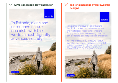
Pure and contrasting nature, digital society, and smart, independent-minded people are the core values behind the brand Estonia. The Brand Estonia design system maps the country’s strengths and shows how to express them through writing, designs, presentations, and videos.
Brand Estonia maps the strengths of Estonia and how to express them.
Stories,
core messages, facts, and plenty of examples and templates provide a
solid foundation for creating texts and designs across the brand — be it
on the web, in social media, or print. A special highlight of Estonia’s
design system lies on authentic photos and custom design attributes such as wordmarks and boulders to underline the message.
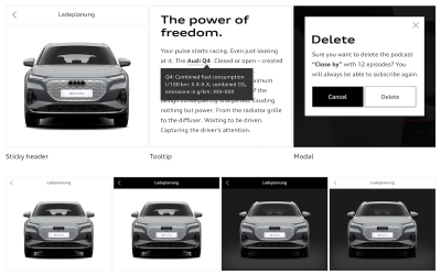
Audi UIs range from websites to applications for a particular service. The Audi design system
provides a joint set of components, modules, and animations to create a
well-balanced, system-wide user experience — from the app to the
vehicle.
From the website to the car’s UI — the Audi design system helps cater for a well-balanced user experience across the brand.
Along with brand appearance guidelines and UI components, a handy feature of the design system is its comprehensive set of visual examples
of how a component should (and shouldn’t) be used in Audi’s interfaces.
There is also a Audi UI Kit for Figma and a Sketch UI library that
ensure that designers use the most up-to-date components and icons in
their products.
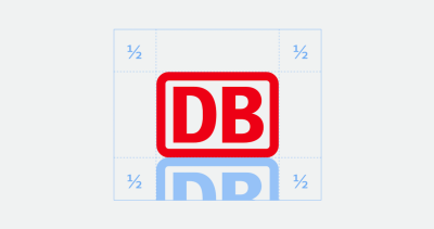
Deutsche Bahn: Content Guidelines And UX Writing #
Deutsche Bahn, the national railway company of Germany, is one of the most recognized brands in Germany. With the help of their DB Digital Product Platform, the company enables developers, designers, and copywriters to build flexible digital experiences with an emphasis on mobility.
The
design system features content guidelines, accessibility
considerations, code examples, components, and contextual examples of
how to use them. It also provides guidelines around UX writing and helpful visual guides to accessibility and logo. Everything is open source on GitHub and NPM.
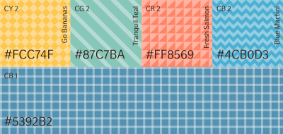
Data
is pretty much useless if we can’t make sense of it. Luckily, data
visualization helps us tell the full story. But how to include data
visualization in a design system? Here are some examples.
The If Design System includes a comprehensive data visualization style guide with plenty of examples and a focus on color.
Shopify’s design system Polaris
maps out guidelines for how to approach data visualization and defines
five core traits for successful data visualizations. Do’s and don’ts for
different data visualizations deliver practical examples. Culture Amp features helpful further reading resources for each type of data visualization they define in their design system. The If Design System shines a light on color in data visualizations, and the Carbon Design System comes with demos and ready-to-use code snippets for React, Angular, Vue, and Vanilla.
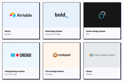
Atlassian, Uber, Shopify, Slack — these are just a few of the design systems you’ll find on Design Systems For Figma. Curated by Josh Cusick, the site is a growing repository of freely available Figma kits of design systems — grouped, organized, and searchable.
Not featured in the collection, but worth looking into as well, is the GOV.UK design system Figma kit. It focuses specifically on complex user journeys and web forms. Lots of valuable insights and inspiration are guaranteed.
Let’s
face it, naming things can be hard. Particularly in a design system,
where you need to find names for your components, styles, and states
that can be easily understood by everyone who works with it. But how to best tackle the task? Ardena Gonzalez Flahavin explores not only why we should care about naming in our design systems but also what we should keep in mind when doing so.
Shayna Hodkin also summarized best practices for solid naming conventions for the different categories in a design system — from colors and text styles to layer styles and components.
Another great read on the topic comes from Jules Mahe. To help you find the right balance between clarity, searchability, and consistency, Jules summarized tips for naming your design files,
understanding what you need to name in a design system, and structuring
it. Three useful resources for futureproofing your design system.
When
building a design system, it’s a good idea to include guidelines and
documentation for accessibility right from the beginning. By doing so,
you reduce the need for repeat accessibility work and give your team more time to focus
on new things instead of spending it on recreating and testing
accessible color palettes or visible focus states again and again. In
her article on accessible design systems, Henny Swan explores what an accessible design system needs to include and how to maintain it.
AdHoc’s Accessibility Beyond Compliance Playbook is for government agencies and other civic organizations looking to mature their practical understanding of accessibility.
To
shift the understanding of accessibility from one of basic compliance
to a truly inclusive, human-centered experience, the team at AdHoc
released their Accessibility Beyond Compliance Playbook.
It explores several ways to improve accessibility — from the immediate
task of building accessible products to creating teams of people that
underscore an Accessibility Beyond Compliance mindset.
Another handy resource to help you incorporate accessibility efforts comes from IBM. Their open-source Carbon Design System
is based on WCAG AA, Section 508, and European standards to ensure a
better user experience for everyone. It gives valuable insights into how
users with vision, hearing, cognitive, and physical impairments
experience an interface and what designers should think about to ensure
their design patterns are operable and understandable.
For more practical tips, be sure to check out the IBM Accessibility Requirements
checklist on which Carbon is based. It features detailed tips to make
different components and design patterns comply with accessibility
standards. A way forward to empowering your diverse user base.
When
it comes to visual elements like icons and illustrations, many
companies have difficulties finding the right balance between being
on-brand, useful, and scalable. The team behind Design Systems For Figma also faced this challenge and came up with a recipe for creating and scaling a system of visuals. Elena Searcy summarized how this system works.
Visuals add a touch of delight to a product, but they should also be functional. Elena Searcy helps us find the right balance.
In
her blog post, Elena starts with the smallest visual element, an icon,
explaining what her team aims for when choosing and creating icons to
make them align with the brand and provide real value
for the user. Elena also shares insights into how they handle
illustrations, including a scalable way of creating them and
considerations regarding anatomy, style, and color. A great example of
how a set of established rules can help make visuals more meaningful.
Motion
in design is powerful. It can help to reduce cognitive load, guide
users through pages and actions, provide user feedback, improve the
discoverability of features, and improve perceived response time. To make full use of motion, the design team at Salesforce created an end-to-end motion language for their products: the Salesforce Kinetics System.
As
Pavithra Ramamurthy, Senior Product Designer at Salesforce, explains,
the intention behind the Salesforce Kinetics System is to enable the
evolution and scaling of kinetic patterns across products, with design
system components that are pre-baked with motion right out-of-the-box.
But how do you scale these motion patterns from design system to product? How would teams actually use the artifacts in their daily workflows? Pavithra wrote a case study that takes a closer look to demonstrate the possibilities. Interesting insights guaranteed.
Introducing
an enterprise design system is a lot of work. But it is work that will
pay off. Especially with large teams, multiple platforms, and numerous
user interfaces to manage, having a single source of truth helps maintain a consistent user experience. So what do you need to consider when building your own? Adam Fard takes a closer look.
As
Adam explains, an enterprise design system is a system of best
practices, reusable design elements, processes, usage guidelines, and
patterns that help reinforce the brand, improve the UX design process,
and optimize the user experience. He compares it to a box of Lego: the
building blocks are the collection of code and design components, the
building instructions that you’ll usually find inside the box correspond
to a collection of guidelines, processes, and best
practices that ensure that co-designing and cross-collaboration are
seamless. If your enterprise traverses numerous sites or apps, Adam’s
writeup is a great opportunity to get familiar with the concept of
enterprise design systems.
When
you’ve built a design system or are just about to start working on one,
metrics might not be the thing you’re concerned about at first sight.
However, measuring your design system is more important than you might
think. In his article “How to measure your design system?”, Jules Mahe dives deeper into why it’s worth the effort.
Jules
explains how to define the KPIs for your design system and how to get
quantitative data measurements to learn more about a design system’s
efficiency. Qualitative data conducted with the help of surveys and
interviews make the narrative more compelling. Of course, Jules also
takes a closer look at how to use the data. As he
concludes, measuring a design system is challenging and requires time,
but it will be a goldmine and one of the essential levers for your
design system’s growth and sustainability.
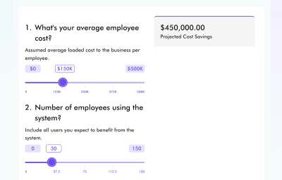
Your boss is hesitant that the work you’ll put into a design system will eventually pay off? The Design System ROI Calculator might be just what you need to convince them that the time and money invested in a design system is a good investment.
How much money could be saved with a design system? The Design System ROI Calculator calculates cost savings for you.
The
ROI calculator helps you understand and project cost savings when
implementing a design system. It calculates total employee savings from
implementing a design system, as well as time saving and efficiency gain
by component or UI element. To estimate total savings, you can select
between different scenarios based on team size and product calculation.
Having
robust components and patterns that can be reused in different
situations is the essential idea behind every design system and often
seems like the magical wand everyone has waited for to solve challenges and improve collaboration.
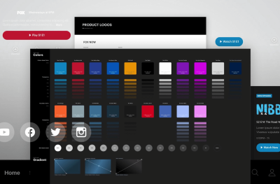
Henry Escoto, UX & Design at FOX Corporation, offers a perspective
on design systems that is a bit different. He claims that it’s actually
the practice which can truly make a difference.
In his case study “Our Design System Journeys”,
Henry shares in-depth insights into FOX Tech Design’s design systems
Delta and Arches to find answers to the following questions: How will a
design system truly help your product design? What does it take to build and execute a design system
within an organization? How to inject the practice into existing
workflows? And last but not least, what is the pay off of such an
investment?
When
you’re starting to work on a design system, you do it with the intent
to build something that lasts, a system that teams love to use and that
saves them precious time in their daily work. However, many attempts to
build a design system end up in great libraries that don’t get used as
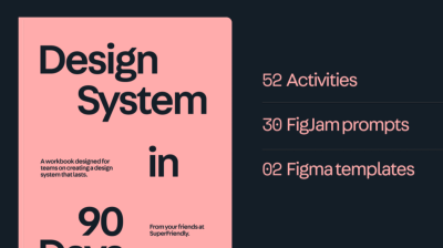
much as you had hoped. But how do you create a design system that becomes an established part of your organization’s workflow? SuperFriendly published a practical workbook in which they take you and your team from zero to a design system that lasts — in 90 days.
Written
for cross-disciplinary teams of design, engineering, and product, the
workbook consists of a 130-page PDF and FigJam prompts and Figma
templates you’ll use to complete activities. No theory, only clear instructions
on what to do and how to do it over a 90-day timeframe. At $349, the
workbook isn’t cheap, but considering that it can save you about 6–9
months of figuring out what work to do, the investment is definitely
worth considering.
Have
you come across a design system you found helpful? Or a resource or
case study that eased your work and that you’d like to share with
others? We’d love to hear about it in the comments below.