Helpful PDF worksheets and tools to get the design system effort up and running — and adopted! Kindly powered by How To Measure UX and Design Impact, a friendly course on how to show the impact of your incredible UX work on business.
So
we want to set up a new design system for your product. How do we get
it up and running from scratch? Do we start with key stakeholders, UI
audits, or naming conventions? And what are some of the critical conversations we need to have early to avoid problems down the line?
Fortunately, there are a few useful little helpers to get started — and they are the ones I tend to rely on quite a bit when initiating any design system projects.
Design System In 90 Days Canvas
Design System in 90 Days Canvas (FigJam template) is a handy set of useful questions
to start a design system effort. Essentially, it’s a roadmap to discuss
everything from the value of a design system to stakeholders, teams
involved, and components to start with.
tle helper to get a design system up and running — and adopted!
— in 90 days. Created for small and large companies that are building a
design system or plan to set up one. Kindly shared by Dan Mall.
Practical Design System Tactics
Design System Tactics is a practical overview of tactics to help designers make progress with a design system at every stage
— from crafting system principles to component discovery to design
system office hours to cross-brand consolidation. Wonderful work by the
one-and-only Ness Grixti.
Design System Checklist by Nathan Curtis (download the PDF) is a practical 2-page worksheet for a 60-minute team activity, designed to choose the right parts, products, and people for your design system.
Of
course, the point of a design system is not to be fully comprehensive
or cover every possible component you might ever need. It’s all about being useful enough
to help designers produce quality work faster and being flexible enough
to help designers make decisions rather than make decisions for them.
Useful Questions To Get Started With
The value of a design system lies in it being useful and applicable — for a large group of people in the organization. And according to Dan, a good start is to identify where exactly that value would be most helpful to tackle the company’s critical challenges and goals:
What is important to our organization at the highest level?
Who is important to our design system effort?
What unofficial systems already exist in design and code?
Which teams have upcoming needs that a system could solve?
Which teams have immediate needs that can grow our system?
Which teams should we and have we talked to?
Which stakeholders should we and have we talked to?
What needs, desires, and concerns do our stakeholders have?
What components do product or feature teams need now or soon?
What end-user problems/opportunities could a system address?
What did we learn about using other design systems?
What is our repeatable process for working on products?
What components will we start with?
What needs, desires, and concerns do our stakeholders share?
Where are our components currently being used or planned for?
Useful Resources
Here are a few other useful little helpers that might help you in your design system efforts:
A canvas often acts as a great conversation starter.
It’s rarely complete, but it brings up topics and issues that one
wouldn’t have discovered on the spot. We won’t have answers to all
questions right away, but we can start moving in the right direction to turn a design system effort into a success.
Learn
how two designers tackled the challenges of building a
localization-ready design system for a global audience. This case study
dives into how Rebecca and Mark combined Figma Variables and design
tokens to address multilingual design issues, such as text overflow, RTL
layouts, and font inconsistencies. They share key lessons learned and
the hurdles they faced — including Figma’s limitations — along with the
solutions they developed to create dynamic, scalable designs that adapt
seamlessly across languages, themes, and densities. If you’re navigating
the complexities of internationalization in design systems, this
article is for you.
Mark and I work as product
designers for SAS, a leader in analytics and artificial intelligence
recognized globally for turning data into valuable insights. Our primary
role is to support the token packages and component libraries for the
SAS Filament Design System. SAS’ customer base is global, meaning people
from diverse countries, cultures, and languages interact with products
built with the Filament Design System.
SAS designers use Figma
libraries developed by the Filament Design System team to create UX
specifications. These high-fidelity designs are typically crafted in
English, unknowingly overlooking multilingual principles, which can
result in layout issues, text overflow, and challenges with
right-to-left (RTL) languages. These issues cascade into the
application, ultimately creating usability issues for SAS customers. This highlights the need to prioritize localization from the start of the design process.
This would allow us to design and test multilingual capabilities more effectively, ensuring our design system was both flexible and adaptable.
While
researching localization integration for design systems, we realized a
significant gap in existing documentation on supporting localization and
internationalization in design tokens and Figma Variables. Many of the
challenges we faced, such as managing typography across locales or
adapting layouts dynamically, were undocumented or only partially
addressed in available resources.
Our story demonstrates how
combining foundational principles of multilingual design with design
tokens can help tackle the complexities of language switching in design
systems. We are not arguing that our approach is the best, but given the
lack of documentation available on the subject, we hope it will get the
conversation started.
But before we start, it’s essential to understand the distinction between Localization (L10n) and Internationalization (I18n).
Localization (L10n) refers to the process of adapting designs for specific languages, regions, or cultures and involves the following:
Translating text;
Adjusting
layouts to accommodate language-specific requirements, such as longer
or shorter text strings or right-to-left (RTL) text for languages like
Arabic;
Ensuring visual elements are culturally appropriate and resonate with the target audience.
Internationalization (I18n)
is the preparation phase, ensuring designs are flexible and adaptable
to different languages and regions. Key considerations in Figma include:
Using placeholder text to represent dynamic content;
Setting up constraints for dynamic resizing to handle text expansion or contraction;
Supporting bi-directional text for languages that require RTL layouts.
These
concepts are not only foundational to multilingual design but also
integral to delivering inclusive and accessible experiences to global
users.
Pre-Figma Setup: Building A Framework
Understanding Our Design Token System
Before
diving deeper, it’s crucial to understand that our design tokens are
stored in JSON files. These JSON files are managed in an application we
call “Token Depot,” hosted on our corporate GitHub.
We utilize the
Tokens Studio plugin (pro plan) to transform these JSON files into
Figma libraries. For us, design tokens are synonymous with variables —
we don’t create additional variables that only exist in Figma. However,
we do create styles in Figma that serve as “recipe cards” for specific
HTML elements. For instance, an H2 might include a combination of
font-family, font-size, and font-weight.
It’s important to note that our design token values are directly tied to CSS-based values.
Initial Setup: Theme Switching And Localization
In 2022, we took on the massive task of refactoring all our token names to be more semantic. At that time, we were only concerned with theme switching in our products.
Our tokens were re-categorized into the following groups:
Color
Brand colors (SAS brand colors)
Base colors (references to Brand colors)
Typography (e.g., fonts, spacing, styles)
Space (e.g., padding, margins)
Size (e.g., icons, borders)
Style (e.g., focus styles)
Motion (e.g., animations)
Shadow.
In our early setup:
A core folder contained JSON files for values unaffected by theme or brand.
Brand folders included three JSON files (one for each theme). These were considered “English” by default.
A
separate languages folder contained overrides for other locales,
stacked on top of brand files to replace specific token values.
Our
JSON files were configured with English as the default. Other locales
were managed with a set of JSON files that included overrides for
English. These overrides were minimal, focusing mainly on font and
typography adjustments. For example, bold typefaces often create issues
because many languages like Chinese, Japanese, or Korean (CJK languages)
fonts lack distinct bold versions. Thus, we replaced the font-weight
token value from 700 to 400 in our CJK locales.
We also update the
values for font-family, letter spacing, font-style, and font-variant
tokens. In Figma, our application screens were originally designed in
English, and in 2023, we only implemented theme-switching modes, not
language options. Additionally, we created detailed lists to document
which design tokens could be converted to Figma variables and which
could not, as the initial release of variables supported only a limited
set.
Introducing Density Switching
The introduction of density switching
in our products marked a significant turning point. This change allowed
us to revisit and improve how we handled localization and token
management. The first thing we had to figure out was the necessary token
sorting. We ended up with the following list:
With
density, we expanded locale-specific value changes beyond font-family,
letter spacing, font-style, and font-variant tokens to additionally
include:
Font sizes
Icon sizes
Line height
Spacing
Border radius.
Revisiting
our type scale and performing numerous calculations, we documented the
required token value changes for all the locales across the density.
This groundwork enabled us to tackle the restructuring of our JSON files effectively.
JSON File Restructuring
In our token repository, we:
Updated the tokens in the core folder.
Added a density folder and a language folder in each brand.
After
collaborating with our front-end development team, we decided to
minimize the number of JSON files. Too many files introduce complexity
and bugs and hinder performance. Instead of creating a JSON file for
each language-density combination, we defined the following language
categories:
Language Categories
Western European and Slavic Languages
Polish, English, French, German, and Spanish
Chinese Languages
Simplified and traditional scripts
Middle Eastern and East Asian Languages
Arabic, Hebrew, Japanese, Korean, Thai, and Vietnamese
Global Diverse
Africa, South Asia, Pacific, and Indigenous languages, Uralic, and Turkic groups.
These
categories became our JSON files, with one file per density level. Each
file contained tokens for font size, icon size, line height, spacing,
and border-radius values. For example, all Chinese locales shared
consistent values regardless of font-family.
In addition, we added a folder containing JSON files per locale, overriding core values and theme folders, such as font-family.
Figma Setup: Bridging Tokens And Design
Token Studio Challenges
After
restructuring our JSON files, we anticipated gaining support for
typography variables in the Tokens Studio plugin. Instead, Tokens Studio
released version 2.0, introducing a major shift in workflow.
Previously, we imported JSON files directly into Figma and avoided
pushing changes back through the plugin. Adjusting to the new version
required us to relearn how to use the plugin effectively.
Our first challenge was navigating the complexity of the import process. The $metadata.json and $themes.json
files failed to overwrite correctly during imports, resulting in
duplicate collections in Figma when exporting variables. Despite
recreating the required theme structure within the plugin, the issue
persisted. To resolve this, we deleted the existing $metadata.json and $themes.json
files from the repository before pulling the updated GitHub repo into
the plugin. However, even with this solution, we had to manually remove
redundant collections that appeared during the export process.
Once
we successfully migrated our tokens from JSON files into Figma using
the Tokens Studio plugin, we encountered our next challenge.
Initially,
we used only “English” and theme modes in Figma, relying primarily on
styles since Figma’s early variable releases lacked support for
typography variables. Now, with the goal of implementing theme, density,
and language switching, we needed to leverage variables — including
typography variables. While the token migration successfully brought in
the token names as variable names and the necessary modes, some values
were missing.
Typography variables, though promising in concept, were underwhelming in practice.
For example, Figma’s default line-height multiplier for “auto” was 1.2,
below the WCAG minimum of 1.5. Additionally, our token values used
line-height multipliers, which weren’t valid as Figma variable values.
While a percentage-based line-height value is valid in CSS, Figma
variables don’t support percentages.
Our solution involved
manually calculating pixel values for line heights across all typography
sizes, locale categories, and densities. These values were entered as
local variables in Figma, independent of the design token system. This
allowed us to implement correct line-height changes for density and
locale switches. The process, however, was labor-intensive, requiring
the manual creation of hundreds of local variables. Furthermore,
grouping font sizes and line heights into Figma styles required
additional manual effort due to the lack of support for line-height
multipliers or percentage-based variables.
Examples:
For CJK locales, medium and low density use a base font size of 16px, while high density uses 18px.
Western European and Slavic languages use 14px for medium density, 16px for high, and 12px for low density.
Additional Challenges
Figma vs. Web Rendering In
Figma, line height centers text visually within the text box. In CSS,
it affects spacing differently depending on the box model. This mismatch
required manual adjustments, especially in light of upcoming CSS
properties like leading-trim.
Letter-Spacing Issues While
CSS defaults to “normal” for letter-spacing, Figma requires numeric
values. Locale-specific resets to “normal” couldn’t utilize variables,
complicating implementation.
Font-Family Stacks
Example stack for Chinese: font-family-primary: 'AnovaUI', '微软雅黑体', 'Microsoft YaHei New', '微软雅黑', 'Microsoft Yahei', '宋体', 'SimSun', 'Helvetica Neue', 'Helvetica', 'Arial', sans-serif.
Starting
with a Western font ensured proper rendering of Latin characters and
symbols while maintaining brand consistency. However, Figma’s designs
using only AnovaUI (SAS Brand Custom font) couldn’t preview locale-based
substitutions via system fonts, complicating evaluations of
mixed-content designs.
Finally, as we prepared to publish our new library, we encountered yet another challenge: Figma Ghosts.
Figma
“ghost variables” refer to variables that remain in a Figma project
even after they are no longer linked to any design tokens, themes, or
components.
These variables often arise due to incomplete
deletions, improper imports, or outdated metadata files. Ghost
variables may appear in Figma’s variable management panel but are
effectively “orphaned,” as they are disconnected from any meaningful use
or reference.
Why They Cause Issues for Designers:
Clutter and Confusion Ghost
variables make the variable list longer and harder to navigate.
Designers might struggle to identify which variables are actively in use
and which are obsolete.
Redundant Work Designers
might accidentally try to use these variables, leading to
inefficiencies or design inconsistencies when the ghost variables don’t
function as expected.
Export and Sync Problems When
exporting or syncing variables with a design system or repository,
ghost variables can introduce errors, duplicates, or conflicts. This
complicates maintaining alignment between the design system and Figma.
Increased Maintenance Overhead Detecting
and manually deleting ghost variables can be time-consuming,
particularly in large-scale projects with extensive variable sets.
Thematic Inconsistencies Ghost
variables can create inconsistencies across themes, as they might
reference outdated or irrelevant styles, making it harder to ensure a
unified look and feel.
Addressing ghost variables requires
careful management of design tokens and variables, often involving
clean-up processes to ensure only relevant variables remain in the
system.
Cleaning Up Ghost Variables
To
avoid the issues in our Figma libraries, we first had to isolate ghost
variables component by component. By selecting a symbol in Figma and
navigating the applied variable modes, we had a good sense of which
older versions of variables the symbol was still connected to. We found
disconnected variables in the component library and our icon library,
which resulted in compounded ghost variables across the system. We found
that by traversing the layer panel, along with a fantastic plug-in
called “Swap Variables,” we were able to remap all the ghost variables
in our symbols.
If we had not completed the clean-up step, designers would not be able to access the overrides for theme, density, and locale.
Designing Symbols For Localization
To
ensure Figma symbols support language swapping, we linked all text
layers to our new variables, including font-family, font-size, and line
height.
We do not use Figma’s variable feature to define text
strings for each locale (e.g., English, Spanish, French) because, given
the sheer breadth and depth of our Products and solutions, it would
simply be too daunting a task to undertake. For us, using an existing
plug-in, such as “Translator,” gives us what we need.
After
ensuring all text layers were remapped to variables, along with the
“Translator” plug-in, we were able to swap entire screens to a new
language. This allowed us to start testing our symbols for unforeseen layout issues.
We
discovered that some symbols were not supporting text wrapping when
needed (e.g., accommodating longer words in German or shorter ones in
Japanese). We isolated those issues and updated them to auto-layout for
flexible resizing. This approach ensured all our Figma symbols were
scalable and adaptable for multilingual support.
Delivering The System
With
our component libraries set up to support localization, we were ready
to deliver our component libraries to product designers. As a part of
this step, we crafted a “Multilingual Design Cheat Sheet” to help
designers understand how to set up their application mockups with
Localization and Internationalization in mind.
Multilingual Design Cheat Sheet:
General Principles
Design flexible layouts that can handle text wrapping and language-specific requirements such as right-to-left orientations.
Use real content during design and development to identify localization issues such as spacing and wrapping.
Research the cultural expectations of your target audience to avoid faux pas.
Text & Typography
Use Filament Design Systems fonts to ensure support of all languages.
Avoid custom fonts that lack bold or italic styles for non-Latin scripts like CJK languages.
Reserve additional space for languages like German or Finnish.
Avoid hardcoded widths for text containers and use auto-layout to ensure long text strings are readable.
The Filament Design System tokens adjust line height per language; make sure you are using variables for line-height.
Use
bold sparingly, as Filament tokens override bold styling in some
languages. Instead, opt for alternative emphasis methods (e.g., color or
size).
Layout & Design
Mirror
layouts for RTL languages (e.g., Arabic, Hebrew). Align text, icons,
and navigation appropriately for the flow of the language.
Use auto-layout to accommodate varying text lengths.
Avoid embedding text in images to simplify localization.
Allow ample spacing around text elements to prevent crowding.
Language-Specific Adjustments
Adapt formats based on locale (e.g., YYYY/MM/DD vs. MM/DD/YYYY).
Use metric or imperial units based on the region.
Test alignments and flows for LTR and RTL languages.
Localization Readiness
Avoid idioms, cultural references, or metaphors that may not translate well.
Provide space for localized images, if necessary.
Use Figma translation plug-ins to test designs for localization readiness and use real translations rather than Lorem Ipsum.
Test with native speakers for language-specific usability issues.
Check mirrored layouts and interactions for usability in RTL languages.
Lessons Learned And Future Directions
Lessons Learned
In
summary, building a localization-ready design system was a complex yet
rewarding process that taught Mark and me several critical lessons:
Localization and internationalization must be prioritized early. Ignoring multilingual principles in the early stages of design creates cascading issues that are costly to fix later.
Semantic tokens are key. Refactoring
our tokens to be more semantic streamlined the localization process,
reducing complexity and improving maintainability.
Figma variables are promising but limited. While
Figma Variables introduced new possibilities, their current limitations
— such as lack of percentage-based line-height values and manual setup
requirements — highlight areas for improvement.
Automation is essential. Manual
efforts, such as recalculating and inputting values for typography and
density-specific tokens, are time-intensive and prone to error. Plugins
like “Translator” and “Swap Variables” proved invaluable in streamlining
this work.
Collaboration is crucial. Close
coordination with front-end developers ensured that our JSON
restructuring efforts aligned with performance and usability goals.
Testing with real content is non-negotiable. Design
issues like text wrapping, RTL mirroring, and font compatibility only
became apparent when testing with real translations and flexible
layouts.
Future Directions
As we look
ahead, our focus is on enhancing the Filament Design System to better
support global audiences and simplify the localization process for
designers:
Automatic mirrored layouts for RTL languages. We
plan to develop tools and workflows that enable seamless mirroring of
layouts for right-to-left languages, ensuring usability for languages
like Arabic and Hebrew.
Improved figma integration. Advocacy
for Figma enhancements, such as percentage-based line-height support
and better handling of variable imports, will remain a priority.
Advanced automation tools. Investing
in more robust plugins and custom tools to automate the calculation and
management of tokens across themes, densities, and locales will reduce
manual overhead.
Scalable localization testing framework. Establishing
a framework for native speaker testing and real-world content
validation will help us identify localization issues earlier in the
design process.
Expanding the multilingual design cheat sheet. We
will continue to refine and expand the cheat sheet, incorporating
feedback from designers to ensure it remains a valuable resource.
Community engagement. By
sharing our findings and lessons, we aim to contribute to the broader
design community, fostering discussions around integrating localization
and internationalization in design systems.
Through these
efforts, Mark and I hope to create a more inclusive, scalable, and
efficient design system that meets the diverse needs of our global
audience while empowering SAS designers to think beyond English-first
designs.
The
Penpot team is not slowing down on its mission to build a free design
tool that not only offers powerful design features but is also
well-integrated with code and modern development practices. In its
latest release, Penpot, as the first design tool ever, introduces
support for native design tokens. Let’s take a closer look at this concept and how you can employ it in your process.
This article has been kindly supported by our dear friends at Penpot,
whose mission is to provide an open-source and open-standards platform
to bring collaboration between designers and developers to the next
level. Thank you!
It’s
already the fifth time I’m writing to you about Penpot — and what a
journey it continues to be! During this time, Penpot’s presence in the
design tools scene has grown strong. In a market that recently felt more
turbulent than ever, I’ve always appreciated Penpot for their clear
mission and values. They’ve built a design tool that not only delivers
great features but is also open-source and developed in
active dialogue with the community. Rather than relying on closed
formats and gated solutions, Penpot embraces open web standards and commonly used technologies — ensuring it works seamlessly across platforms and integrates naturally with code.
Their latest release is another great example of that approach. It’s also one of the most impactful. Let me introduce you to design tokens in Penpot.
Design
tokens are an essential building block of modern user interface design
and engineering. But so far, designers and engineers have been stuck
with third-party plugins and cumbersome APIs to collaborate effectively
on design tokens and keep them in sync. It’s high time we had tools and
processes that handle this better, and Penpot just made it happen.
About Design Tokens
Design tokens can be understood as a framework to document and organize your design decisions.
They act as a single source of truth for both designers and engineers
and include all the design variables, such as colors, typography,
spacing, fills, borders, and shadows.
The concept of design tokens
has grown in popularity alongside the rise of design systems and the
increasing demand for broader standards and guidelines in user interface
design. Design tokens emerged as a solution for managing increasingly
complex systems while keeping them structured, scalable, and extensible.
The
goal of using design tokens is not only to make design decisions more
intentional and maintainable but also to make it easier to keep them in
sync with code. In the case of larger systems, it is often a one-to-many
relationship. Design tokens allow you to keep the values agnostic of
their application and scale them across various products and
environments.
On top of maintainability benefits, a common reason to use design tokens is theming.
Keeping your design decisions decoupled means that you can easily swap
the values across multiple sets. This allows you to change the
appearance of the entire interface with applications ranging from simple
light and dark mode implementations to more advanced use cases, such as
handling multiple brands or creating fully customizable and adjustable
UIs.
Implementation Challenges
Until
recently, there was no standardized format for maintaining design
tokens — it remained a largely theoretical concept, implemented
differently across teams and tools. Every design tool or frontend
framework has its own approach. Syncing code with design tools was also a
major pain point, often requiring third-party plugins and unreliable
synchronization solutions.
However, in recent years, W3C, the
international organization responsible for developing open standards and
protocols for the web, brought to life a dedicated Design Tokens
Community Group with the goal of creating an open standard for products and design tools to handle design tokens.
Once this standard gets more widely adopted, it will give us hope for a
more predictable and standardized approach to design tokens across the
industry.
To make that happen, work has to be done on two ends,
both design and development. Penpot is the very first design tool to
implement design tokens in adherence to the standard that the W3C is
working on. It also solves the problem of third-party dependencies by
offering a native API with all the values served in the official,
standardized format.
Design Tokens In Practice
To
better understand design tokens and how to use them in practice, let’s
take a look at an example together. Let’s consider the following user
interface of a login screen:
Imagine
we want this design to work in light and dark mode, but also to be
themable with several accent colors. It could be that we’re using the
same authentication system for websites of several associated brands or
several products. We could also want to allow the user to customize the
interface to their needs.
If we want to build a design that works
for three accent colors, each with light and dark themes, it gives us
six variants in total:
Six variants of a login screen design with three accent colors and light and dark mode options. (Large preview)
Designing
all of them by hand would not only be tedious but also difficult to
maintain. Every change you make would have to be repeated in six places.
In the case of six variants, that’s not ideal, but it’s still doable.
But what if you also want to support multiple layout options or more
brands? It could easily scale into hundreds of combinations, at which
point designing them manually would easily get out of hand.
This is where design tokens come to the rescue. They allow you to effectively maintain all the variants and test all the possible combinations, even hundreds of them, while still building a single design without repetitive work.
You
can start by creating a design in one of the variants before starting
to think about the tokens. Having a design already in place might make
it easier to plan your tokens’ hierarchy and structure accordingly.
In
this case, I created three components: 2 types of buttons and input,
and combined them with text layers into several Flex layouts to build
out this screen. If you’d like to first learn more about building
components and layouts in Penpot, I would recommend you revisit some of
my previous articles:
Now
that we have the design ready, we can start creating tokens. You can
create your first token by heading to the tokens tab of the left sidebar
and clicking the plus button in one of the token categories. Let’s
start by creating a color.
Creating your first design token in Penpot
To use design tokens effectively, it’s critical to plan their naming and structure well.
You might have noticed that when I created a token, Penpot
automatically created for me a new set, called Global. All design tokens
have to be organized within sets.
I called my first set
“primitives,” so I can store literal values such as “blue,” “purple,” or
“grey.” To support multiple shades of color, I used numbers, so the
final token names I used are, for example, “slate.1” or “slate.10”.
At
this point, we can start thinking about handling multiple colors for
various themes. To make it easy to switch between tokens, all you have
to do is create multiple sets with tokens of the same names. To do that,
I split the primitives into two sets, “light” and “dark.” You can nest
your token sets by adding slashes into their names.
Creating design token sets in Penpot
In
the video above, you can see that I have two sets, light and dark, each
with tokens of the same names but different values. At this point, you
could already reference your primitive tokens to switch between light
and dark values. However, in the future, you might use the same shade of
grey for multiple purposes, like border, background, or text. It would
be a more maintainable approach to keep these definitions independent.
To
achieve that, we need to introduce a second abstraction layer. In this
case, I created a new tokens set called “globals” that references the
primitives set. All values in “globals” reference other already existing
tokens, such as “primitives.”
For globals, I used semantic naming
such as “text.muted” or “background.primary” to stress that the token
names are agnostic from their literal values. In other words, the
“text.muted” name works well for both light and dark modes, the same as
“background.primary” works as a token name no matter what brand color is
currently in use. For comparison, “text.dark” or “background.blue”
would not make sense if we wanted to make them dynamic and be able to
switch between different modes and brand colors.
In
Penpot, you can reference other tokens in token values by wrapping them
in curly brackets. So, if you select “slate.1” as your text color, it
will reference the “slate.1” value from any other set that is currently
active. With the light set active, the text will be black. And with the
dark set active, the text will be white.
Creating alias tokens in Penpot
You
can apply your global tokens to any layer you want. To do that, select a
layer and then right-click a token of your choice. In the context menu,
you can select among the values that are compatible with a token. In
the case of a color, it will be either fill or stroke.
Applying design tokens to layers in Penpot
Now,
if you switch on and off the sets, you can see the design responding to
the change. With the light set active, the text appears black, and with
the dark set active, the text appears white.
Changing token sets in Penpot
As
you probably noticed, more than one set can be active at the same time,
even if they contain values of the same names, like light and dark
sets. In such a case, a set lowest on the list will override the already
defined values. You can think of it as defining variables in any
programming language or properties in CSS. The last value of equal
specificity is the one that counts.
However, you don’t need to
switch the sets on and off manually to test your design’s appearance. To
make that easier, Penpot also offers another concept called Themes. Themes are the best way to manage your sets and combine them into functional design choices.
In
the case of light and dark mode, I created two themes: “light” and
“dark,” under a group called “Mode.” This makes it much clearer how the
sets should be used and makes it easier to switch between the predefined
options.
Creating themes in Penpot
For
each theme, I selected two sets. One that defines the values (“light”
or “dark”) and one that is actually used to style the designs
(“globals”). Now, you can use the Themes dropdown to quickly switch
themes.
At this point, we have two layers of abstraction:
primitives (such as basic color shades) and a semantic layer
(background, text, and so on). Sometimes, you might need more than that.
With this setup, you can easily switch between light and dark mode, but
what if you also want to switch between the several brand colors I
showed earlier, while still being able to change the mode? For
that, we need another theme (let’s call it “Brand”) and another couple
of sets under a parent set that would also be called “Brand.” For the
latter, I made three options: “Slate,” “Indigo,” and “Purple.” In
real-life scenarios, these could be names of brands, products, and so
on.
To bring it all together, the brand sets need to reference
primitives, while the “globals” set needs to reference “brand” sets.
This way, we are creating three different brands, each with its own
separate values for light and dark mode.
This allows us to switch between brands and modes and test all the possible combinations.
Switching between themes in Penpot
What’s Next?
I
hope you enjoyed following this example. If you’d like to check out the
file presented above before creating your own, you can duplicate it here.
Colors
are only one of many types of tokens available in Penpot. You can also
use design tokens to maintain values such as spacing, sizing, layout,
and so on. The Penpot team is working on gradually expanding the choice
of tokens you can use. All are in accordance with the upcoming design
tokens standard.
The benefits of the native approach to design tokens implemented by Penpot go beyond ease of use and standardization. It also makes the tokens more powerful. For example, they already support math operations using the calc() function you might recognize from CSS. It means you can use math to add, multiply, subtract, etc., token values.
Once
you have the design token in Penpot ready, the next step is to bring it
over to your code. Already today, you can export the tokens in JSON
format, and soon, an API will be available that connects and imports the
tokens directly into your codebase. You can follow Penpot on LinkedIn, BlueSky, and other social media
to be the first to hear about the next updates. The team behind Penpot
is also planning to make its design tokens implementation even more
powerful in the near future with support for gradients, composite tokens (tokens that store multiple values), and more.
To learn more about design tokens and how to use them, check out the following links:
By
adding support for native design tokens, Penpot is making real progress
on connecting design and code in meaningful ways. Having all your
design variables well documented and organized is one thing. Doing that
in a scalable and maintainable way that is based on open standards and
is easy to connect with code &mdahs; that’s yet another level.
The
practical benefits are huge: better maintainability, less friction, and
easier communication across the whole team. If you’re looking to bring
more structure to your design system while keeping designers and
engineers in sync, Penpot’s design tokens implementation is definitely
worth exploring.
Tried it already? Share your thoughts! The Penpot team is active on social media, or just share your feedback in the comments section below.
In today’s turbulent landscape of design, Penpot stands out with its
commitment to open-source, free unlimited access, and its unique, robust
features. An example could be its new components system that takes
another leap forward in aligning design with code. Let’s dive into how
it empowers both designers and developers to create more maintainable
and scalable design systems.f you’ve been following along with our Penpot series, you’re already
familiar with this exciting open-source design tool and how it is
changing the game for designer-developer collaboration. Previously,
we’ve explored Penpot’s Flex Layout and Grid Layout features, which bring the power of CSS directly into the hands of designers.
Today, we’re diving into another crucial aspect of modern web design and development: components.
This feature is a part of Penpot’s major 2.0 release, which introduces a
host of new capabilities to bridge the gap between design and code
further. Let’s explore how Penpot’s implementation of components can
supercharge your design workflow and foster even better collaboration
across teams.
About Components
Components
are reusable building blocks that form the foundation of modern user
interfaces. They encapsulate a piece of UI or functionality that can be
reused across your application. This concept of composability — building
complex systems from smaller, reusable parts — is a cornerstone of
modern web development.
Why does composability matter? There are several key benefits:
Single source of truth Changes to a component are reflected everywhere it’s used, ensuring consistency.
Flexibility with simpler dependencies Components can be easily swapped or updated without affecting the entire system.
Easier maintenance and scalability As your system grows, components help manage complexity.
In
the realm of design, this philosophy is best expressed in the concept
of design systems. When done right, design systems help to bring your
design and code together, reducing ambiguity and streamlining the
processes.
However, that’s not so easy to achieve when your
designs are built using logic and standards that are much different from
the code they’re related to. Penpot works to solve this challenge
through its unique approach. Instead of building visual artifacts that
only mimic real-world interfaces, UIs in Penpots are built using the
same technologies and standards as real working products.
This
gives us much better parity between the media and allows designers to
build interfaces that are already expressed as code. It fosters easier collaboration as designers and developers can speak the same language when discussing their components. The final result is more maintainable, too. Changes created by designers can propagate consistently, making it easier to manage large-scale systems.
Now,
let’s take a look at how components in Penpot work in practice! As an
example, I’m going to use the following fictional product page and
recreate it in Penpot:
To
create a component in Penpot, simply select the objects you want to
include and select “Create component” from the context menu. This
transforms your selection into a reusable element.
Create components
Creating Component Variants
Penpot
allows you to create variants of your components. These are alternative
versions that share the same basic structure but differ in specific
aspects like color, size, or state.
You can create variants by using slashes (/) in the components name, for example, by naming your buttons Button/primary and Button/secondary. This will allow you to easily switch between types of a Button component later.
Create variants
Nesting Components And Using External Libraries
Components
in Penpot can be nested, allowing you to build complex UI elements from
simpler parts. This mirrors how developers often structure their code.
In other words, you can place components inside one another.
Moreover,
the components you use don’t have to come from the same file or even
from the same organization. You can easily share libraries of components
across projects just as you would import code from various dependencies
into your codebase. You can also import components from external
libraries, such as UI kits and icon sets. Penpot maintains a growing list of such resources
for you to choose from, including everything from the large design
systems like Material Design to the most popular icon libraries.
Nesting components
Organizing Your Design System
The new major release of Penpot comes with a redesigned Assets panel,
which is where your components live. In the Assets panel, you can
easily access your components and drag and drop them into designs.
For the better maintenance of design systems, Penpot allows you to store your colors and typography as reusable styles. Same as components, you can name your styles and organize them into hierarchical structures.
Assets panel and styles
Configuring Components
One
of the main benefits of using composable components in front-end
libraries such as React is their support of props. Component props
(short for properties) allow you a great deal of flexibility in how you
configure and customize your components, depending on how, where, and
when they are used.
Penpot offers similar capabilities in a design
tool with variants and overrides. You can switch variants, hide
elements, change styles, swap nested components within instances, or
even change the whole layout of a component, providing flexibility while
maintaining the link to the original component.
Configure components
Creating Flexible, Scalable Systems
Allowing you to modify Flex and Grid layouts in component instances is where Penpot really shines. However, the power of these layout features goes beyond the components themselves.
With
Flex Layout and Grid Layout, you can build components that are much
more faithful to their code and easier to modify and maintain. But
having those powerful features at your fingertips means that you can
also place your components in other Grid and Flex layouts. That’s a big
deal as it allows you to test your components in scenarios much closer
to their real environment. Directly in a design tool, you can see how
your component would behave if you put it in various places on your
website or app. This allows you to fine-tune how your components fit
into a larger system. It can dramatically reduce friction between design
and code and streamline the handoff process.
Adjust and create overrides
Generating Components Code
As
Penpot’s components are just web-ready code, one of the greatest
benefits of using it is how easily you can export code for your
components. This feature, like all of Penpot’s capabilities, is
completely free.
Using Penpot’s Inspect panel, you can quickly
grab all the layout properties and styles as well as the full code
snippets for all components.
Code inspect
Documentation And Annotations
To
make design systems in Penpot even more maintainable, it includes
annotation features to help you document your components. This is
crucial for maintaining a clear design system and ensuring a smooth handoff to developers.
Annotations
Summary
Penpot’s
implementation of components and its support for real CSS layouts make
it a standout tool for designers who want to work closely with
developers. By embracing web standards and providing powerful, flexible
components, Penpot enables designers to create more developer-friendly designs without sacrificing creativity or control.
All
of Penpot’s features are completely free for both designers and
developers. As open-source software, Penpot lets you fully own your
design tool experience and makes it accessible for everyone, regardless
of team size and budget.
Ready to dive in? You can explore the file used in this article by downloading it and importing into your Penpot account.
As
the design tool landscape continues to evolve, Penpot is taking charge
of bringing designers and developers closer together. Whether you’re a
designer looking to understand the development process or a developer
seeking to streamline your workflow with designers, Penpot’s component
system is worth exploring.
How
can we get better at naming? This post is dedicated to naming
conventions, tips, and real-world examples that help you name things in a
robust and flexible way.
Naming is hard.
As designers and developers, we often struggle finding the right name —
for a design token, colors, UI components, HTML classes, and variables.
Sometimes, the names we choose are too generic, so it’s difficult to understand what exactly is meant. And sometimes they are too specific, leaving little room for flexibility and re-use.
In this post, we want to get to the bottom of this
and explore how we can make naming more straightforward. How do we
choose the right names? And which naming conventions work best? Let’s
take a closer look.
Inspiration For Naming
If you’re looking for some inspiration for naming HTML classes, CSS properties, or JavaScript functions, Classnames is a wonderful resource jam-packed with ideas that get you thinking outside the box.
Classnames provides thematically grouped lists of words you can use for naming. (Large preview)
The
site provides thematically grouped lists of words perfect for naming.
You’ll find terms to describe different kinds of behavior, likeness
between things, order, grouping, and association, but also themed collections of words
that wouldn’t instantly come to one’s mind when it comes to code, among
them words from nature, art, theater, music, architecture, fashion, and
publishing.
What makes a good name? Javier Cuello summarized a set of naming best practices that help you name your layers, groups and components in a consistent and scalable way.
As
Javier points out, a good name has a logical structure, is short,
meaningful, and known by everyone, and not related to visual properties.
He shares do’s and don’ts to illustrate how to achieve
that and also takes a closer look at all the fine little details you
need to consider when naming sizes, colors, groups, layers, and
components.
Design Tokens Naming Playbook
How do you name and manage design tokens? To enhance your design tokens naming skills, Romina Kavcic created an interactive Design Tokens Naming Playbook. It covers everything from different approaches to naming structure to creating searchable databases, running naming workshops, and automation.
The playbook also features a naming playground where you can play with names simply by dragging and dropping. For more visual examples, also be sure to check out the Figma template. It includes components for all categories, allowing you to experiment with different naming structures.
How
to build a flexible design token taxonomy that works across different
products? That was the challenge that the team at Intuit faced. The
parent company of products such as Mailchimp, Quickbooks, TurboTax, and
Mint developed a flexible token system that goes beyond the brand theme to serve as the foundational system for a wide array of products.
Nate Baldwin wrote a case study in which he shares valuable insights into the making of Intuit’s design token taxonomy.
It dives deeper into the pain points of the old taxonomy system, the
criteria they defined for the new system, and how it was created. Lots
of takeaways for building your own robust and flexible token taxonomy
are guaranteed.
When
you’re creating a color system, you need names for all its facets and
uses. Names that everyone on the team can make sense of. But how to
achieve that? How do you bring logic to a subjective topic like color? Jess Satell, Staff Content Designer for Adobe’s Spectrum Design System, shares how they master the challenge.
As
Jess explains, the Spectrum color nomenclature uses a combination of
color family classifier (e.g., blue or gray) paired with an incremental
brightness value scale (50–900) to name colors in a way that is not only
logical for everyone involved but also scalable and flexible as the system grows.
Another handy little helper when it comes to naming colors is Color Parrot.
The Twitter bot is capable of naming and identifying the colors in any
given image. Just mention the bot in a reply, and it will respond with a
color palette.
Looking at what other people call similar things is a great way to start when you’re struggling with naming.
And what better source could there be than other design systems? Before
you end up in the design system rabbit hole, Iain Bean did the research
for you and created the Component Gallery.
The Component Gallery is a collection of interface components from real-world design systems. It includes plenty of examples
for more than 50 UI components — from accordion to visually hidden —
and also lists other names that the UI components go by. A fantastic
resource — not only with regards to naming.
A
wonderful example of naming guidelines for a complex multi-brand,
multi-themed design system comes from the Vodafone UK Design System
team. Their Variables Taxonomy Map breaks down the anatomy and categorization of a design token into a well-orchestrated system of collections.
The map illustrates four collections required to support the system and connections between tokens — from brand and primitives to semantics and pages. It builds on top of Nathan Curtis’ work on naming design tokens and enables everyone to gather insight about where a token is used and what it represents, just from its name.
Romina Kavcic created a handy little resource that is bound to give your design token naming workflow a power boost. The Design Token Names Inventory spreadsheet not only makes it easy to ensure consistent naming but also syncs directly to Figma.
The
spreadsheet has a simple structure with four levels to give you a
bird’s-eye view of all your design tokens. You can easily add rows,
themes, and modes without losing track and filter your tokens.
And while the spreadsheet itself is already a great solution to keep
everyone involved on the same page, it plays out its real strength in
combination with the Google Spreadsheets plugin or the Kernel plugin. Once installed, the changes you make in the spreadsheet are reflected in Figma. A real timesaver!
How
can we get better at naming? This post is dedicated to naming
conventions, tips, and real-world examples that help you name things in a
robust and flexible way.
Naming is hard.
As designers and developers, we often struggle finding the right name —
for a design token, colors, UI components, HTML classes, and variables.
Sometimes, the names we choose are too generic, so it’s difficult to understand what exactly is meant. And sometimes they are too specific, leaving little room for flexibility and re-use.
In this post, we want to get to the bottom of this
and explore how we can make naming more straightforward. How do we
choose the right names? And which naming conventions work best? Let’s
take a closer look.
Inspiration For Naming
If you’re looking for some inspiration for naming HTML classes, CSS properties, or JavaScript functions, Classnames is a wonderful resource jam-packed with ideas that get you thinking outside the box.
Classnames provides thematically grouped lists of words you can use for naming. (Large preview)
The
site provides thematically grouped lists of words perfect for naming.
You’ll find terms to describe different kinds of behavior, likeness
between things, order, grouping, and association, but also themed collections of words
that wouldn’t instantly come to one’s mind when it comes to code, among
them words from nature, art, theater, music, architecture, fashion, and
publishing.
Naming Conventions
What makes a good name? Javier Cuello summarized a set of naming best practices that help you name your layers, groups and components in a consistent and scalable way.
As
Javier points out, a good name has a logical structure, is short,
meaningful, and known by everyone, and not related to visual properties.
He shares do’s and don’ts to illustrate how to achieve
that and also takes a closer look at all the fine little details you
need to consider when naming sizes, colors, groups, layers, and
components.
How do you name and manage design tokens? To enhance your design tokens naming skills, Romina Kavcic created an interactive Design Tokens Naming Playbook. It covers everything from different approaches to naming structure to creating searchable databases, running naming workshops, and automation.
The playbook also features a naming playground where you can play with names simply by dragging and dropping. For more visual examples, also be sure to check out the Figma template. It includes components for all categories, allowing you to experiment with different naming structures.
Flexible Design Token Taxonomy
How
to build a flexible design token taxonomy that works across different
products? That was the challenge that the team at Intuit faced. The
parent company of products such as Mailchimp, Quickbooks, TurboTax, and
Mint developed a flexible token system that goes beyond the brand theme to serve as the foundational system for a wide array of products.
Nate Baldwin wrote a case study in which he shares valuable insights into the making of Intuit’s design token taxonomy.
It dives deeper into the pain points of the old taxonomy system, the
criteria they defined for the new system, and how it was created. Lots
of takeaways for building your own robust and flexible token taxonomy
are guaranteed.
When
you’re creating a color system, you need names for all its facets and
uses. Names that everyone on the team can make sense of. But how to
achieve that? How do you bring logic to a subjective topic like color? Jess Satell, Staff Content Designer for Adobe’s Spectrum Design System, shares how they master the challenge.
As
Jess explains, the Spectrum color nomenclature uses a combination of
color family classifier (e.g., blue or gray) paired with an incremental
brightness value scale (50–900) to name colors in a way that is not only
logical for everyone involved but also scalable and flexible as the system grows.
Another handy little helper when it comes to naming colors is Color Parrot.
The Twitter bot is capable of naming and identifying the colors in any
given image. Just mention the bot in a reply, and it will respond with a
color palette.
Common Names For UI Components
Looking at what other people call similar things is a great way to start when you’re struggling with naming.
And what better source could there be than other design systems? Before
you end up in the design system rabbit hole, Iain Bean did the research
for you and created the Component Gallery.
The Component Gallery is a collection of interface components from real-world design systems. It includes plenty of examples
for more than 50 UI components — from accordion to visually hidden —
and also lists other names that the UI components go by. A fantastic
resource — not only with regards to naming.
A
wonderful example of naming guidelines for a complex multi-brand,
multi-themed design system comes from the Vodafone UK Design System
team. Their Variables Taxonomy Map breaks down the anatomy and categorization of a design token into a well-orchestrated system of collections.
The map illustrates four collections required to support the system and connections between tokens — from brand and primitives to semantics and pages. It builds on top of Nathan Curtis’ work on naming design tokens and enables everyone to gather insight about where a token is used and what it represents, just from its name.
Romina Kavcic created a handy little resource that is bound to give your design token naming workflow a power boost. The Design Token Names Inventory spreadsheet not only makes it easy to ensure consistent naming but also syncs directly to Figma.
The
spreadsheet has a simple structure with four levels to give you a
bird’s-eye view of all your design tokens. You can easily add rows,
themes, and modes without losing track and filter your tokens.
And while the spreadsheet itself is already a great solution to keep
everyone involved on the same page, it plays out its real strength in
combination with the Google Spreadsheets plugin or the Kernel plugin. Once installed, the changes you make in the spreadsheet are reflected in Figma. A real timesaver!
Want To Dive Deeper?
We
hope these resources will come in handy as you tackle naming. If you’d
like to dive deeper into design tokens, components, and design systems,
we have a few friendly online workshops and SmashingConfs coming up:
No
matter how sick you might be dealing with unending visual
inconsistency, design systems are still challenging. They can scare any
designer regardless of their experience. Still, if you want to bring
order to chaos, introducing a design system into your workflow is worth
the trouble. Tatsiana Tarkan digs deep into iconography as part of a
design system and shares some doable tips that will turn icon creation
and maintenance into an enjoyable process.
We all have
an inherent tendency to like aesthetic and approachable things. That’s
why any designer strives to deliver an intuitive and comprehensive
design. And any designer knows it’s a pain in the neck, particularly
when it comes to complex projects with lots of pages of design,
components, and prototypes. As someone who has already traveled that
road and learned quite a few valuable lessons, I have some wisdom to
share with you.
Granted, tons of articles have been written about
design systems, their complexity, and all the ways they can benefit a
project. So, I’m not going to waste too many words on the matter.
Instead, in this article, I want to dig deeper into iconography as part of a design system.
Besides, I’ll share with you doable tips that will turn icon creation
and maintenance into an enjoyable — or at least bearable — process.
Shall we?
Before
we actually dive into the alluring and frightening world of
iconography, I want to take some time to introduce you to the concept of
a design system, as well as share my thoughts and rules that I follow
while working with them.
If I were to call a design the way your
interface speaks with your user, then — building on the metaphor — it
would be fair to view a design system as a language.
Simply put, a design system is a functional set of defined technical standards, best user behavior practices, and navigational patterns that are used to build a pixel-perfect digital product.
It is a powerful designer tool that helps you make sure that you will end up with a coherent product and not a pathetic mess.
It
seems that nowadays, designers are obliged to try their hand at
creating or at least adopting a design system. So what exactly makes it
an all-around beneficial thing for the designer lot? Let’s have a look:
The design system makes for the only source of truth since all the components are under one roof and are easily referable.
It hosts all the guidelines
on how to implement existing components. And following the very same
guidelines, designers can easily create new ones that match the former.
In the case of a two- (or more) designer team, a design system allows for visual consistency (which is crucial if your project is major and fast-evolving).
You can either use ready-made design components or alter them swiftly and in accordance with the guideline if any need arises.
You have access to a library of surefire design patterns, which greatly reduces the strain of coming up with new solutions.
That
sounds like a treat, right? Still, creating a design system is
generally viewed as an exceptionally time- and effort-consuming
endeavor. If you do want to develop a design system, there is a way to make the process a bit easier. Enter the atomic design approach.
It’s
been over six years since I first introduced the atomic approach into
my workflow, and let me tell you, it was a game-changer for me as a
designer. This methodology is a blessing if you work on a big project
with a team of fellow designers.
If you know the pain of trying to
track the changes in components throughout the projects, especially if
these components are minor, then you’ll see why I’m so enthusiastic
about the atomic approach. It allows for smooth and well-coordinated
teamwork where every designer is aware of what component they are
creating and how to make it consistent with the rest of the system.
The
atomic design approach was pioneered by Brad Frost (a chemist of all
occupations). It implies building your system brick-by-brick, starting
with the smallest items and going all the way up while sustaining
hierarchy. There are five stages to the process.
Atoms In a nutshell, these are basic HTML elements.
Templates They
provide a context for using molecules and organisms and focus on the
page’s underlying content structure. In other words, templates are the
guidelines.
What exactly makes this approach a thing designers gravitate towards? Here are my two cents on the matter:
Creating a design system resembles playing with a construction set. You begin with the smallest components and progress in size, which means you are eating the elephant a bite at a time and don’t get overwhelmed.
Altering a component in one place will cause updates wherever a certain atom, molecule, or organism is applied. This eliminates any need for manual tweaking of components.
This approach provides designers with design patterns, meaning that you no longer need to create new ones and worry about their consistency.
That’s
clearly not all the advantages of this methodology, so if you are
interested, go ahead and read more about it in Brad Frost’s book.
What
I’m really willing to focus on is our job as designers in creating and
maintaining those fabled design systems, both atomic and regular. More
specifically, on iconography. And even more specifically, on the
pitfalls we have a nasty habit of falling into when dealing with icons
as the atoms of our systems. Off we go.
Since
I’m relying on my own experience when it comes to design systems, it
would only be fair if I shared the biggest issues that I personally have
with iconography in the context of design systems and how I solve them.
I’ll share with you surefire tips on how to keep your iconography
consistent and ensure its smooth integration into design environments.
If
we regard a single icon from the atomic design standpoint, we would
consider it an atom — the smallest but essential element, just like the
color palette or typography. If we continue with our language analogy, I
will take the liberty of calling icons a design’s vocabulary. So, it’s
fairly clear that icons are the actual core of your design.
As any
designer knows, users heavily rely on icons as an interactional element
of an interface. Despite being the smallest of components, icons might
prove to be a major pain in the neck in terms of creation. This is the
lesson I have learned during my tenure as a UX designer.
Tip 1: Since an atom is not just an autonomous element,
you have to think beforehand about how it will behave as part of a
larger component, like a molecule, an organism, or a template.
These are the variables you have to keep in mind when developing an icon:
Is your icon scalable?
Does it have color variations?
Do you classify your icon according to meaning, group, style, or location?
Is there an option to change the icon’s meaning or style?
How can you easily introduce a new icon into an existing roster?
How should you navigate a situation when different designers develop icons separately?
How can you make locating a certain icon within your design system easier?
Here are some challenges that I personally face while developing iconography for a design system:
How should I keep track of icon updates and maintain their consistency?
How should I develop icon creation guidelines?
What should I do if current icons happen to be inconsistent?
How should I inform my design team of any changes?
It
might be hard to wrap your head around so many questions, but worry
not. I’ll try my best to cover all these issues as we go on.
An icon isn’t just a little pictogram with a certain meaning behind it. An icon is a symbol of action, an interactive element of a digital interface that helps users navigate through the system.
In
other words, it is a tool, and the process of building a tool implies
following rules. I found out firsthand that if you master the basic icon
rules, then you’ll be able to build both stand-alone icons and those
that are part of a larger environment with equal efficiency. Besides,
you’ll enhance your ability to create icon sets and various icon types
within a single project, all while maintaining their readability and
accessibility.
Tip 2: Keep consistency by establishing the basic icon rules before building your icon library.
I
use the classic 24px grid for standard icons and a 44px grid for larger
icons. Each grid consists of the padding area (marked in red, 2 px) and
the live area (marked in blue, 20 px). The live area is the space that
your icon content stays inside. Its shape depends on the icon’s body and
could be circular, square, vertical-rectangular, or
horizontal-rectangular.
Before you sit down to draw your icon,
decide how much space your icon’s body will occupy in order to come up
with the proper shape.
Each
icon within a design system has to have a primary size, which is the
size that up to 90% of all icons share. I consider the 24px icon size
suggested by Google’s Material Design to be the golden standard. This
size works well both for desktop and mobile devices.
Still, there
is room for exceptions in this rule when an icon needs to be smaller or
larger. In this case, I employ a 4-pixel step rule. I increase or
decrease the icon’s size by 4 pixels at a time (e.g., I go from 24 to
20, then 16, then 12 px, or 28, 32 px, and so on). I would still
personally prefer the golden standard of 24 pixels since I find smaller
sizes less readable or larger sizes too visually domineering.
Another
key property to consider is the outline weight of your icon if you opt
for this type. If you are building an icon library from scratch, it
would be wise to test several outline weight values before you make a
decision. This is especially crucial for icons that contain fine
details.
Granted, you can assign different weight values to
different types of icons, but you might struggle to write clear
guidelines for your fellow designers. I usually make a conscious
decision to go with a unified outline weight for all the icons, namely, 2
points.
A
solid icon variant might considerably enhance the accessibility and
readability of an interface icon. It’s really handy to have both solid
and outline icon types. But not all your icons should have two options.
If you choose to draw a solid option, determine what parts of your icon
you want to make solid.
As
I’ve mentioned before, an icon is an essential interface element. This
means that an icon should be simplistic, bold, and — what’s even more
important in the context of design systems — created according to the
unified rules.
I have a little trick I use to see how well a new
icon fits the standard. I simply integrate the new icon into the
interface populated by already existing elements. This helps determine
if the new icon matches the rest.
Such
aspects as corner, counterstroke, and stroke terminal provide the
much-desired visual consistency. Obviously, all these elements should be
unified for all the icons within a design system. A comprehensive guide
to icon anatomy is available at Material Design.
Before
I actually share my tips on how to deal with icons within a design
system efficiently, here’s a little backstory to how I came up with
them. It all started when I joined a project that already had an
established host of icons. There were over a hundred of them. And the
number grew because the project was a fast-evolving thing. So, the
design system, like any other, was like a living being, constantly in a
state of change.
The icon library was a mishmash of different icon
types, creating quite a noise. The majority of icons differed in style,
size, and application. Another problem I had was the fact that most of
the icons did not have the source file. So, there was no way to quickly
tweak an icon to match the rest.
The first and most important
thing I did was to establish the basic rules for icon creation (that’s
something we’ve already covered). This step was supposed to keep the
design team from creating inconsistent icons.
Tip 3: Put all your icons on one layout. This way, you’ll get a full visual understanding of your icons and determine repetitive design patterns.
Now, here comes the juicy stuff. Here is my guide on how to sustain iconography in the context of a design system.
Divide your icons into subcategories. This
rule works wonders when you have an array of inconsistent icons on your
hands. There is no rule on what subcategories there should be. It all
depends on your design system and the number of existing icons. In my
case, I established three groups divided by size and icon style, which
resulted in three subcategories: regular icons, detailed icons, and
illustrations. Once you divide your icons in the same manner, it’ll be
easier to apply the same rules to each group. Besides, this approach
allows for a more structured storage of these icons within your design
system.
Determine guidelines for each icon type. The
next step is as wise as it is hard to pull off. You need to assign
certain icon creation rules for each of the icon types (provided you
have more than one). This is the basis upon which all your other
attempts at achieving visual consistency will be built. To tame all the
mismatched icons, I used the basic icon rules we’ve covered above. To
keep track, I created a page in Figma for each of the icon types and
used the basic size as the file name.
Group your icons wisely. When
naming icons, I opt for the semantic section approach. Generally, you
can divide all your icons into groups based on their meaning or
application in the interface. Look at the example below; we have three
distinct semantic sections: Transport, Services, and Warnings. Depending
on their meaning, icons should be assigned to the corresponding
sections. Then, those sections are, in turn, divided into subsections.
For instance, the Transport section has Ground Transport and Air
Transport. The main idea you should stick to is to keep your icons in
separate sections.
Stick to clear names and descriptions. I
have to admit that dividing icons into semantic sections does have a
massive disadvantage: this division could be quite subjective. This is
why it is crucial to add a detailed description to each of the icons.
This will simplify icon search within a design system and will give a
clear understanding of an icon’s application. This is how I create a
description:
Tags: reference words that facilitate searching for an icon within the system.
Usage: a brief description of an icon’s application.
Group Name: the name of the group an icon belongs to. This helps with locating an icon right within the library.
Designs:
an incredibly nifty tool that allows you to insert a link to the design
and documentation that features the icon in question. This way, you’ll
know the context in which the icon is applied.
Description which belongs to the icon. (Large preview)
Use color coding and symbols while updating icon design. This
trick works best when you are not yet done with the icon library, but
you need to communicate to your team which icons are ready to use and
which still need a bit of enhancement. For instance, I mark the names of
finished icons with a green symbol. An orange symbol marks those icons
that need to be improved. And in case I need an icon deleted or drawn
anew, I use a red cross.
Keep non-rasterised versions of icons. It
can be handy to have a non-rasterised version of an icon at arm’s
length. There’ve been cases when I was asked to create a similar icon or
an icon that could use the same graphic forms as the existing ones.
Should this happen again, I can simply take the original file and easily
draw an icon. I store all the non-rasterised icons on a separate page
in the file following the defined hierarchy.
Rasterise the icon vector. Be
sure to apply the Outline Stroke feature before you create the icon
component. This will allow for easy color change (more on this in the
next tip) and scaling.
Mind the colors of your icons. I
suggest keeping icons in the primary, most commonly used color by
default. Another worthwhile thing to do is to name all icon colors
according to their intended use and the interactions they perform. In
order to do that, you need to equip your color library with a separate
set of colors for all icon states, like primary, hover, and disabled.
Make sure to name each set properly.
Color names according to interactions and type of icons. (Large preview)The color palette in the main design system file. (Large preview)The color description. (Large preview)
Assign a designer to maintain icons in the system. This
is a seemingly trivial tip that, however, will save you trouble
maintaining style and categorization consistency. I’ve personally had
edge cases when the established rules failed. Having a designated
designer who knew their way around the system helped to find a quick
solution.
No
matter how sick you might be dealing with unending visual
inconsistency, design systems are still challenging. They can scare any
designer regardless of their experience. Still, if you want to bring
order to chaos, introducing a design system into your workflow is worth
the trouble, especially when it comes to maintaining iconography.
After all, iconography is the most volatile part of a design system in terms of visual variety.
That’s why iconography was the biggest challenge I had to face in my
tenure as a designer. And that’s exactly why I am genuinely proud that
I’ve tamed that beast and can now share my hacks with you.
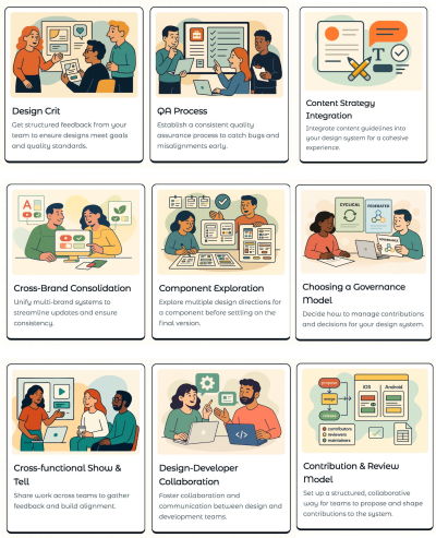


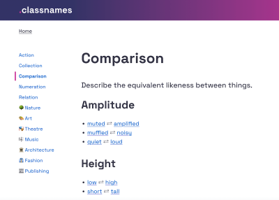
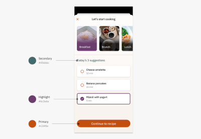

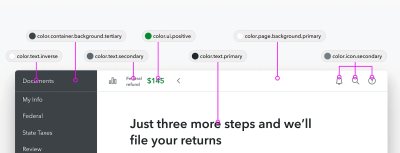

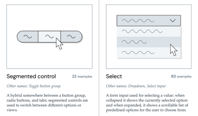
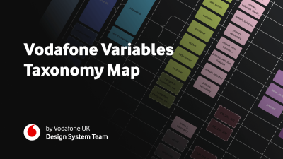


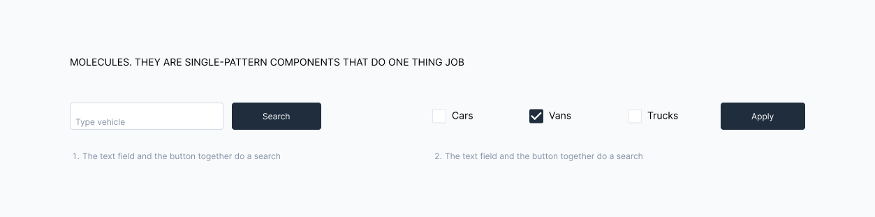
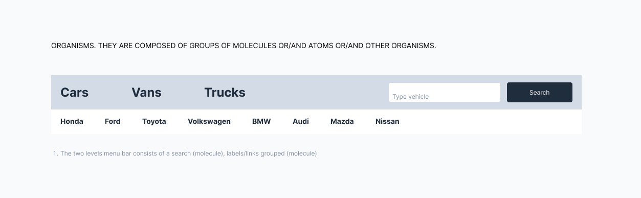
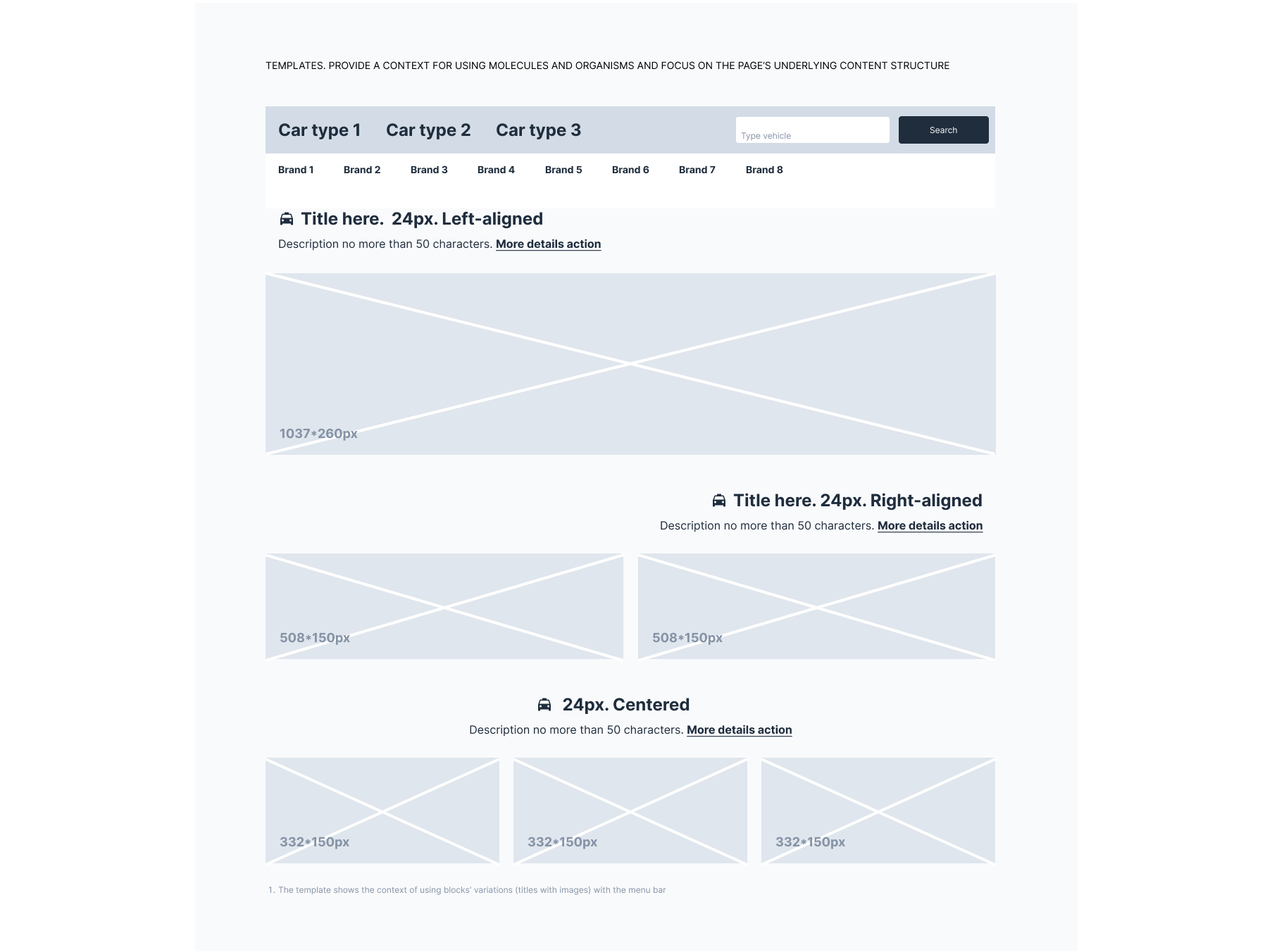
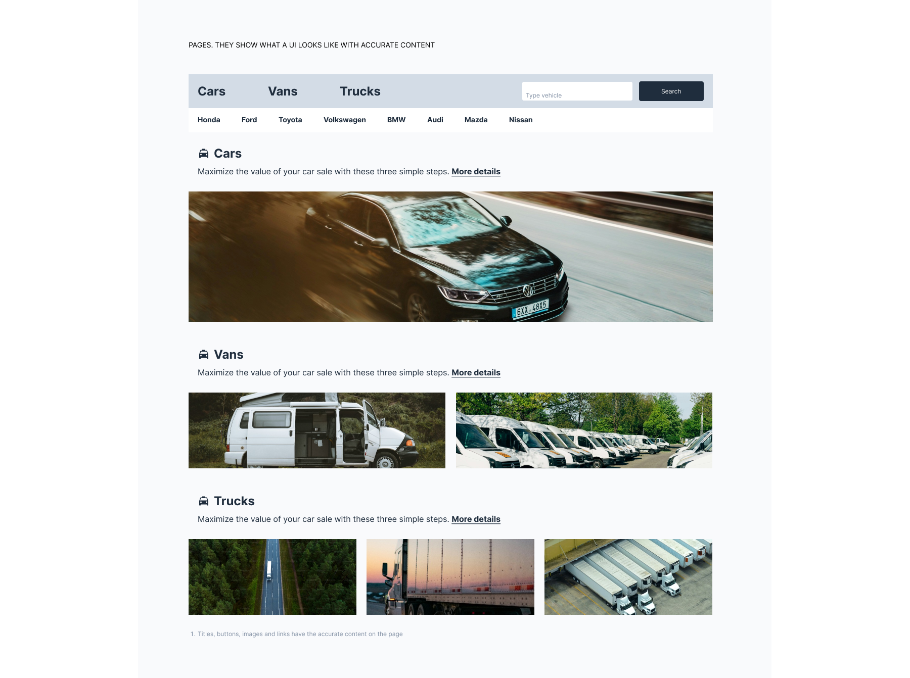
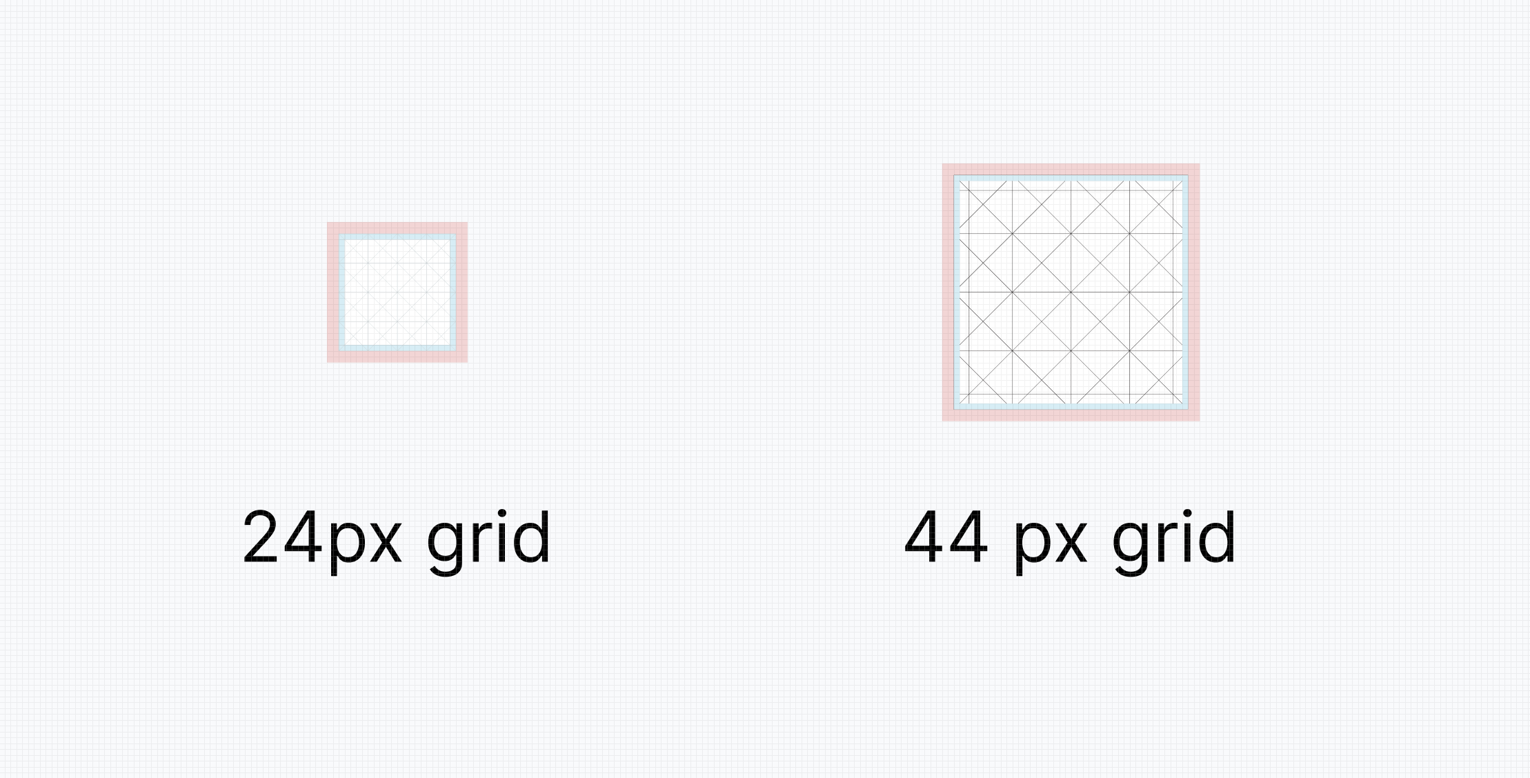
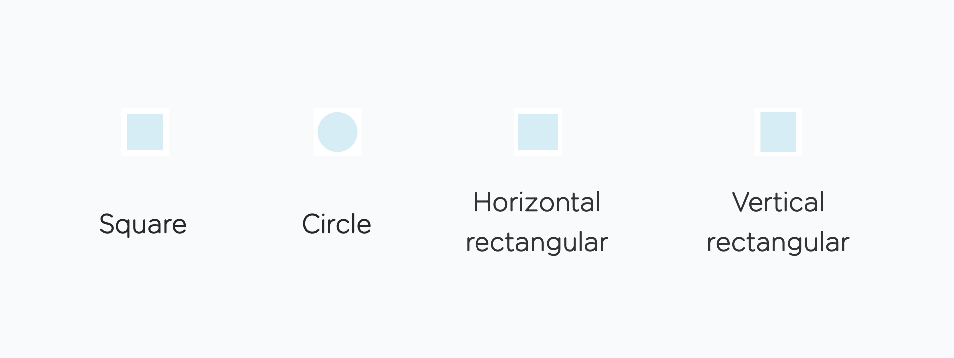
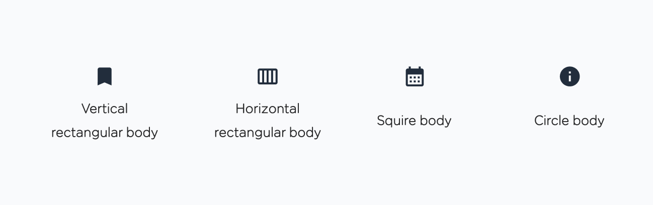
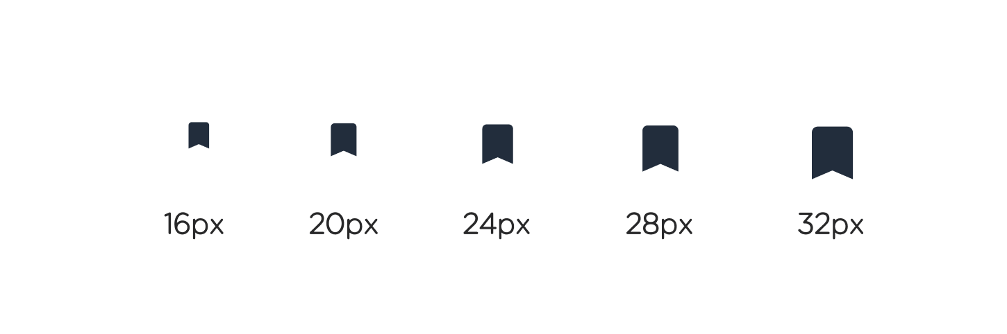
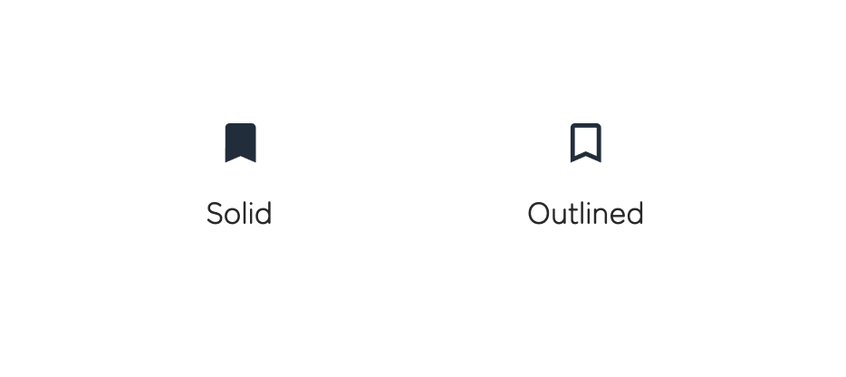
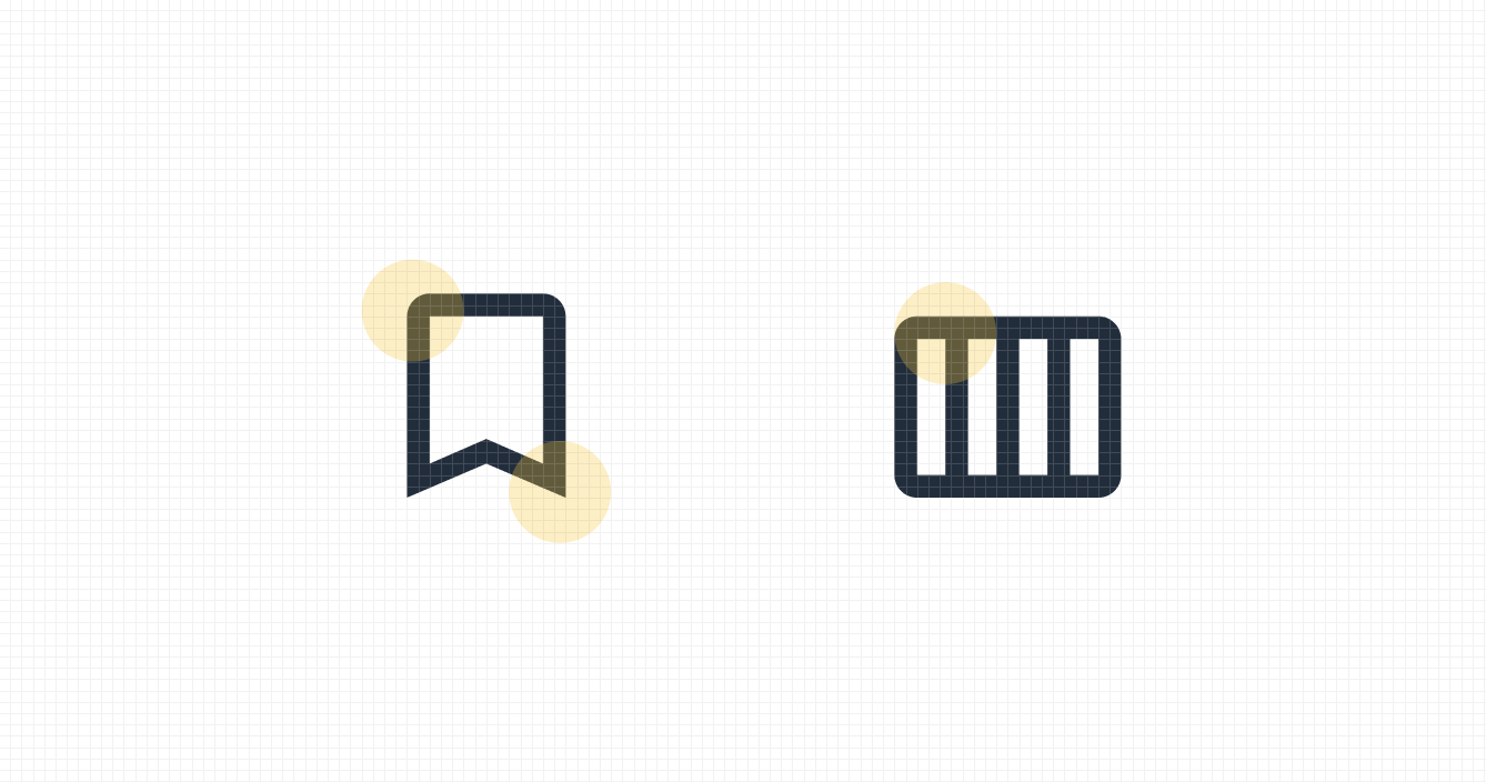
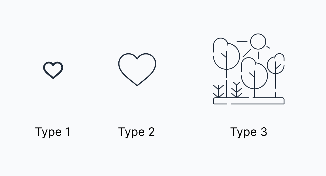
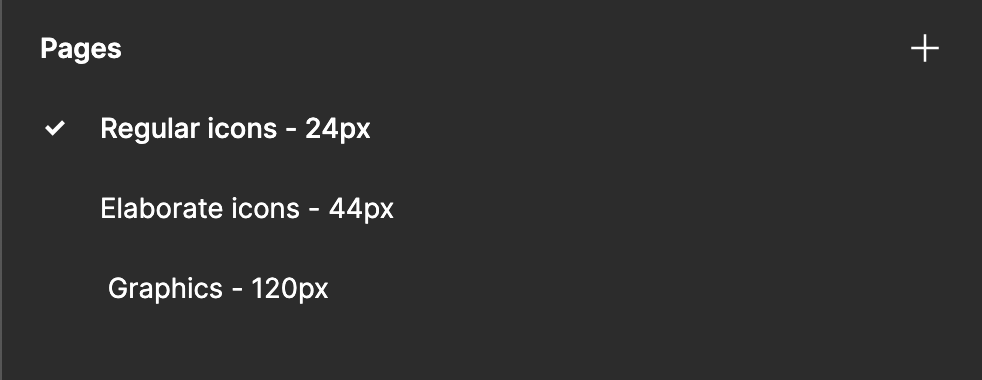
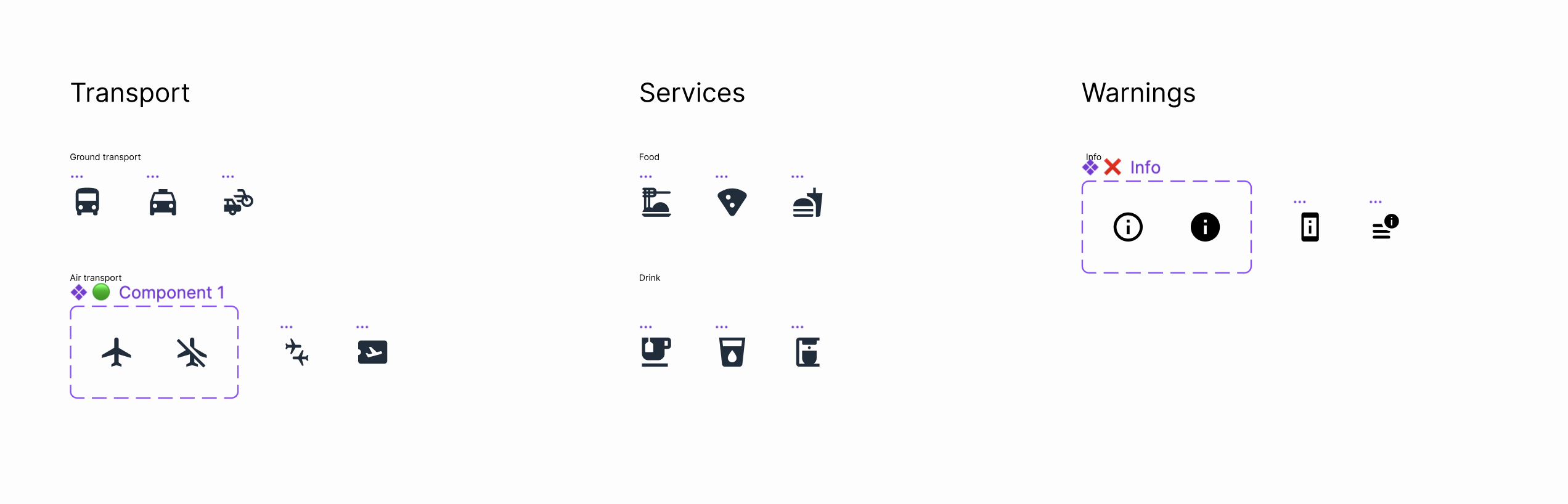
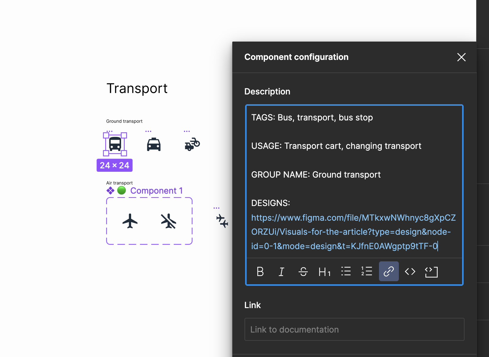
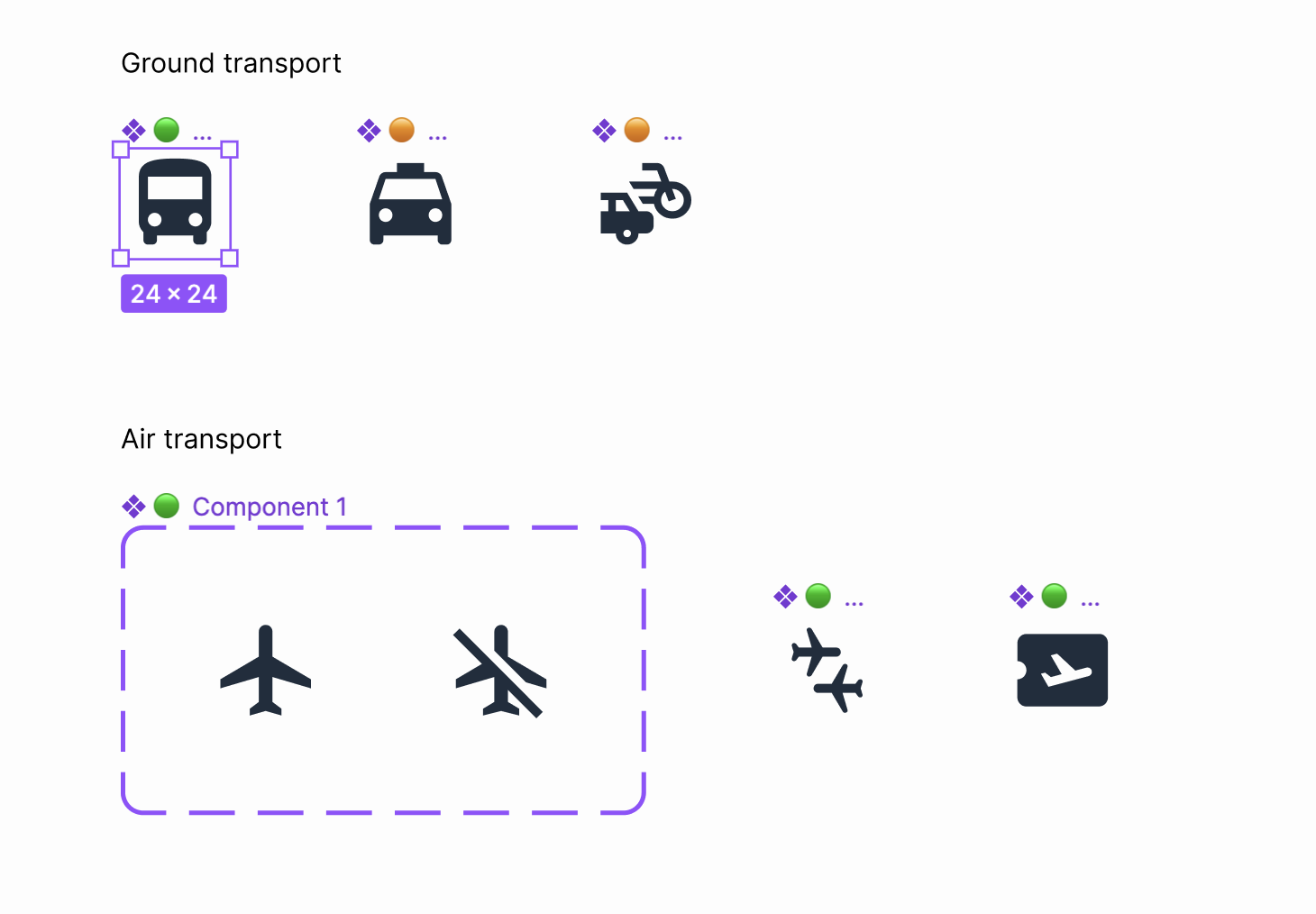
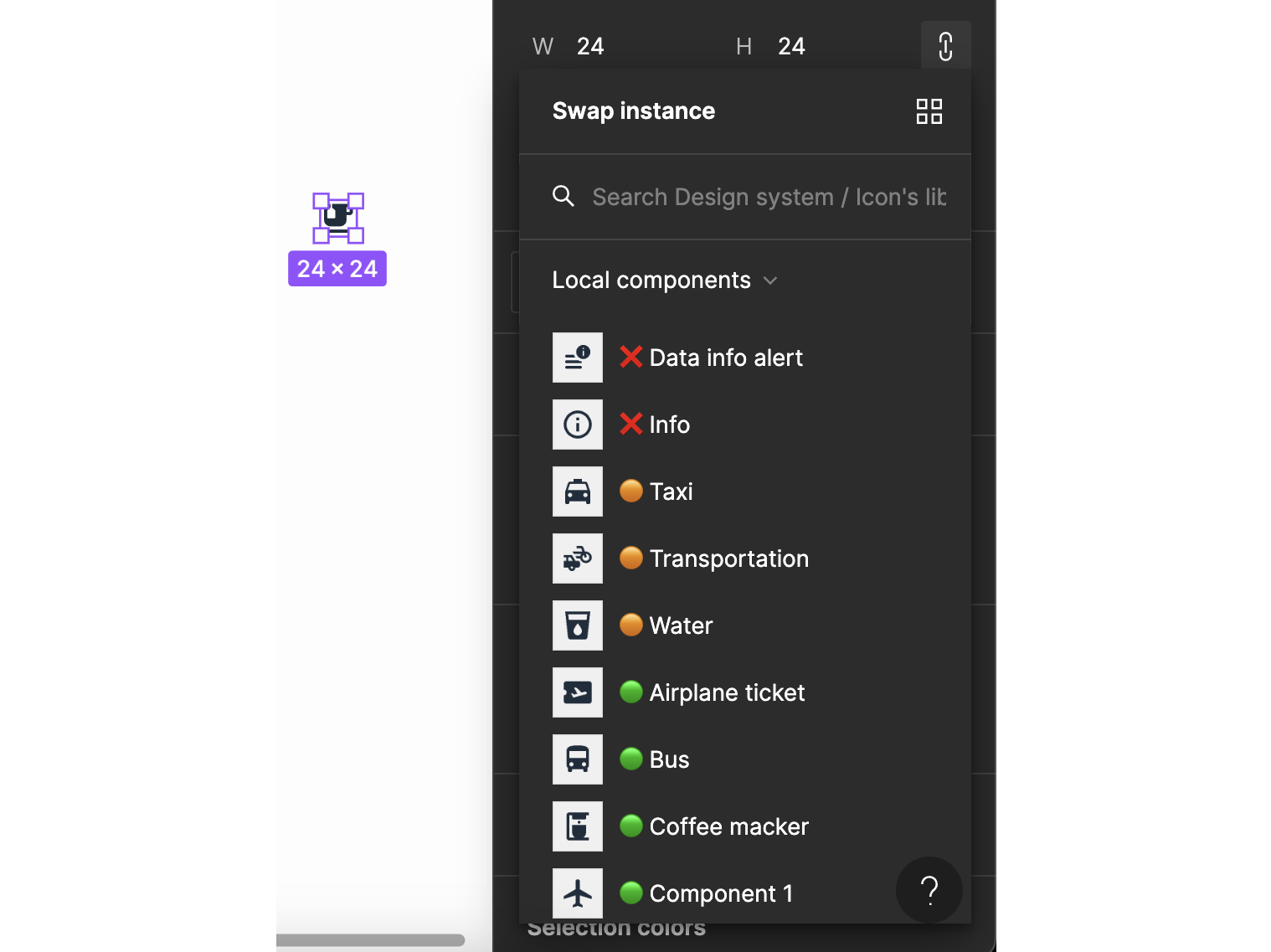
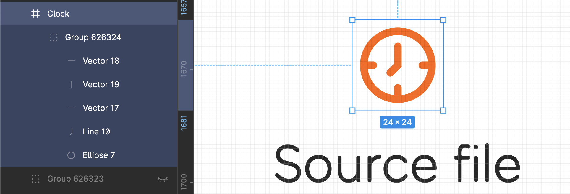
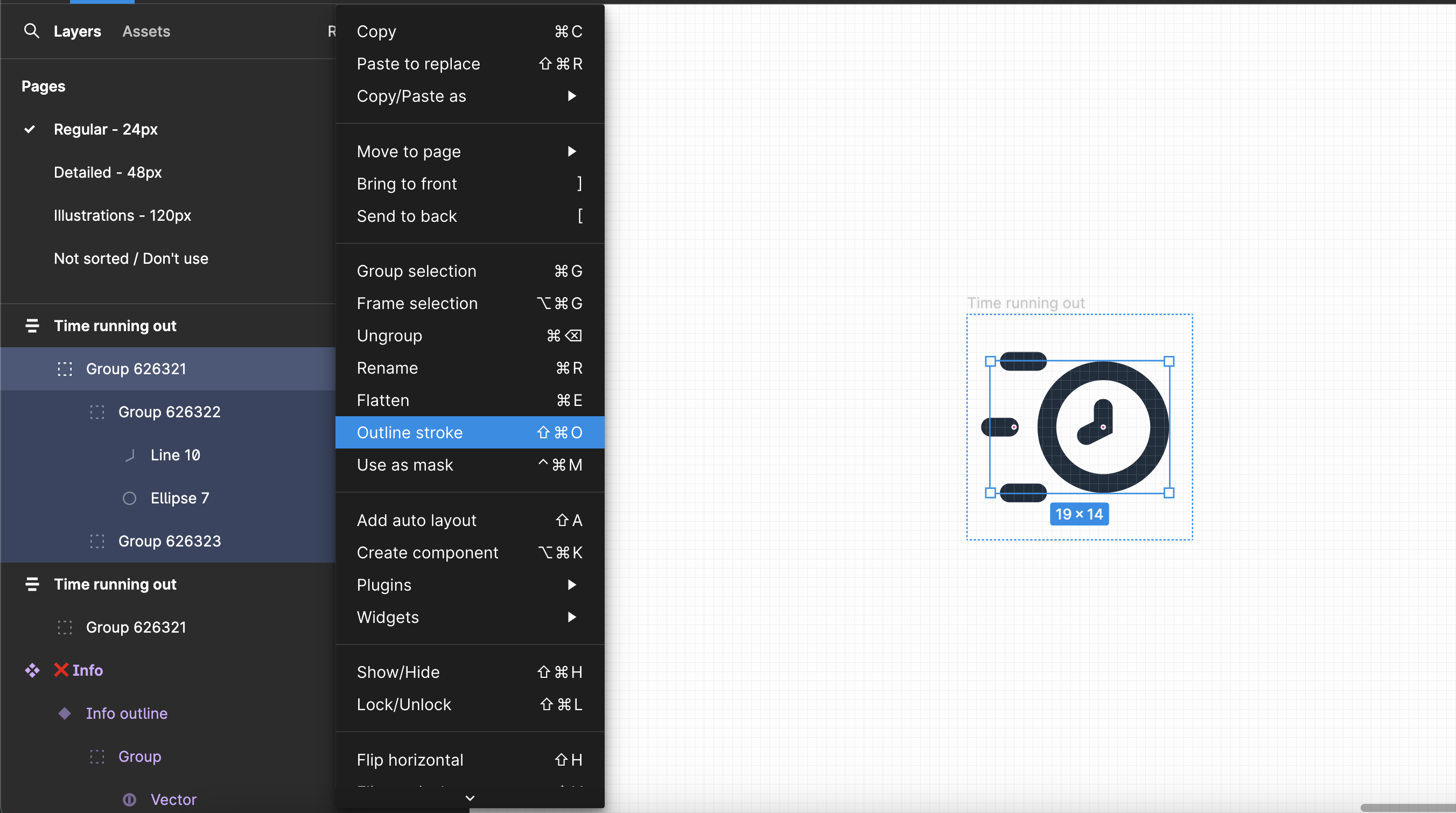
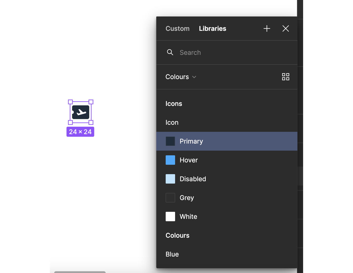
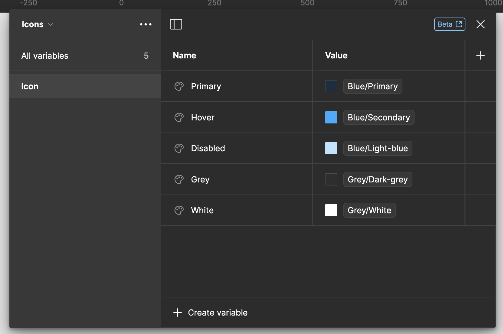
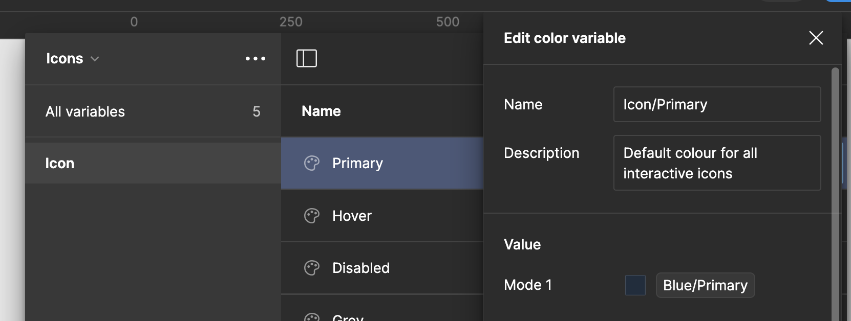