⭐ If you would like to buy me a coffee, well thank you very much that is mega kind! : https://www.buymeacoffee.com/honeyvig
Hire a web Developer and Designer to upgrade and boost your online presence with cutting edge Technologies
Showing posts with label Figma. Show all posts

Monday, April 6, 2026

Testing Font Scaling For Accessibility With Figma Variables


Accessibility works best when it blends into everyday design workflows. The goal isn’t a big transformation, but simple work processes that fit naturally into a team’s routine. With Figma variables, testing font size increases becomes part of the design flow itself, making accessibility feel almost inevitable rather than optional.

Building a true culture of digital accessibility in a company is a mission of resilience and perseverance. It’s not difficult for the discourse on accessibility to fall into the usual clichés. Accessibility is very important for people. The accessibility of digital products and services promotes inclusion. Or even, all professionals on the teams should be involved in accessibility work. Of course. No one in their right mind will dispute any of these statements (I hope).

However, the second part of this conversation, which very few companies reach, is “how?” How do we make this happen in the midst of the day-to-day work of digital transformation teams, which, as we all know, are immersed in demanding scripts, often with a very limited number of people available? Most of the time, the choice ends up being between “we do this” and “that.” And it shouldn’t, because, in these cases, I never saw accessibility winning in this equation.

It shouldn’t be this way. You don’t need to be this way. First of all, because choosing between accessibility and anything else isn’t the right choice. Accessibility is no longer just another feature to be added to the others. It’s an added value for the business and, currently, a legal obligation that can have serious consequences for companies. On the other hand, there are intelligent, optimized, and impactful ways to incorporate accessibility principles into the natural dynamics of teams. It’s possible to work on accessibility without turning team operations upside down. In essence, that’s what AccessibilityOps does. Empowering people and providing teams with simple processes so they can integrate accessibility work into their daily routines without disproportionate effort.

Accessibility And Design

Working on digital accessibility in design can involve several actions. It’s clear that we need to pay particular attention to color and how it’s used to convey meaning. Of course, the interaction sizes of elements must be comfortable. But, most importantly, we must think about design from a versatile perspective. An interface isn’t a poster. We can control many aspects of that design, but how users interact with the interface is subject to an endless number of variables. The type of device, context, purpose, network quality, etc. All of this greatly affects each person’s experience and interaction. Along with all this, when digital accessibility concerns are brought into the design process, it adds even more variables.

Assistive technologies
(Large preview)

People often use what are called assistive technologies and strategies. Basically, these are technological tools or, at the very least, “tricks” that people resort to in order to find more comfortable usage models. The famous screen readers, commonly associated with the use of blind people (but which are not only useful to them), for example, are an assistive technology. Changing colors or color contrasts between different elements is also an assistive technology. Increasing the font size (which we discussed in this text) is another example. There are countless assistive technologies and strategies. Almost as many as the different contexts of use for each person.\

We Don’t Control Everything 

In other words (and this is the “bad news” for us designers), “our design” is subject, from the users’ perspective, to transformations that we don’t control. It will be “transformed” by the user, ensuring that they can interact with the application and everything it offers in the most comfortable way possible. And that’s a good thing. If this happens and everything goes well, we will have surely done our accessibility work very well, and we all deserve congratulations. If the user applies any of these support technologies and strategies and still cannot use the digital application, it’s a sign that something is not working as it should.

Oh, and speaking of which. Don’t even think about blocking the use of these technologies or support strategies. They may be “destroying” your beautiful design, but they are allowing more and more people to actually use the app. In the end, wasn’t that exactly what we promised we wanted to do? Design for (all) people. Without exception?

Increase Font Size #

How many times have we heard someone — friends, family, or even colleagues — complaining that this or that text is too small? Text plays a very important role in the digital experience. Much information is conveyed through text: instructions for use, button captions, or interactive elements. All of this uses text as a communication tool. If reading all these elements is difficult, naturally, the experience is severely impaired.

Comfortable text reading, regardless of its function, is a non-negotiable principle. This reading can be facilitated by using comfortable sizes in the design. However, supporting technologies and strategies, through the functionality of increasing font size, can also help improve readability. According to APPT data, 26% of Android and iOS mobile device users increase the default font size (data from February 2026). One in four users increases the font size on their smartphone. This is a very significant sample of people, making this functionality unavoidable in design processes.
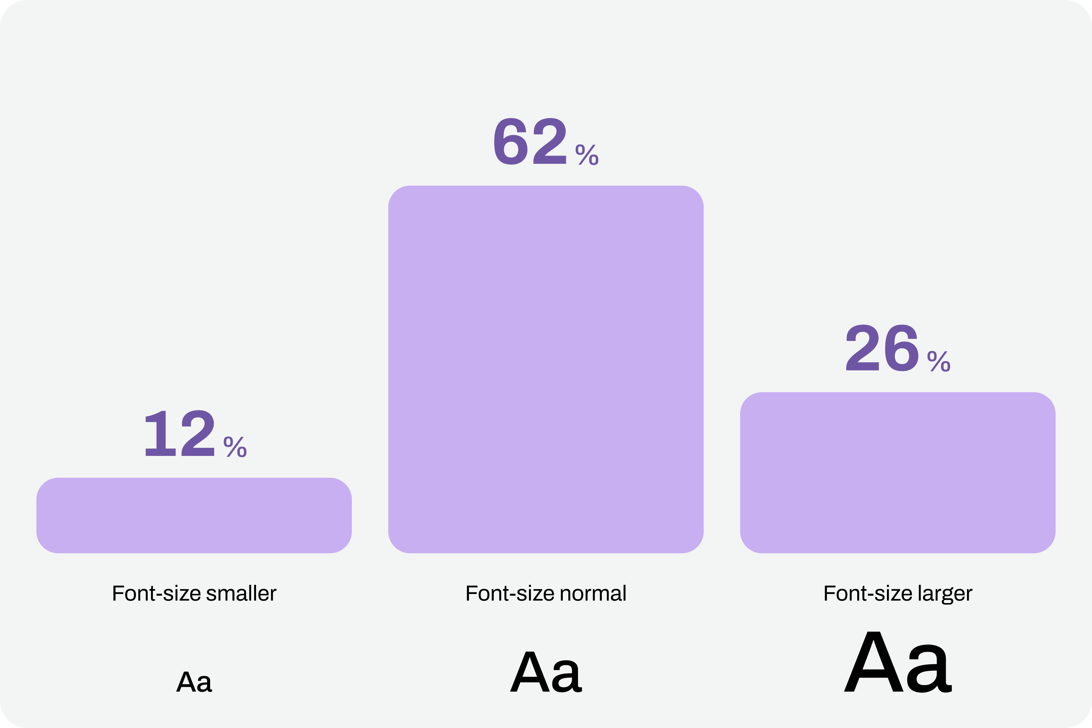
Chart with font sizes where 26% of users use large font-size.
(Large preview)

Compliance With Guidelines

Increasing font size in interfaces can represent a huge design challenge. It’s important to understand that, suddenly, some text elements, due to user actions, can double in size from their initial size.

“With the exception of captions and text images, text can be resized without assistive technology up to 200% without loss of content or functionality.”

Success criterion 1.4.4, “Resizing Text” of the Web Content Accessibility Guidelines (WCAG), version 2.2

This success criterion is at the AA compliance level, meaning this is an absolutely mandatory feature according to any legal framework.

It’s easy to understand the 200% in this success criterion. If we assume we design the interfaces at a 100% scale, meaning the element size is the initial size, then increasing the text by up to 200% will correspond to doubling the initial size. Other enlargement scales can also be used, such as 120%, 140%, and so on. In other words, we have to ensure that users can increase the text to double its initial size through supporting technologies or strategies (and this is not a minor detail).

To comply with this standard, we don’t need to provide text size increase tools in the interfaces. In practice, these features are nothing more than redundancy. Devices already allow this to be done in a standardized way. Users who really need this setting know it (because, without it, their lives would be much more difficult). Well, they already have this setting applied across their device. And that means we can eliminate these additional interface elements, simplifying the experience.
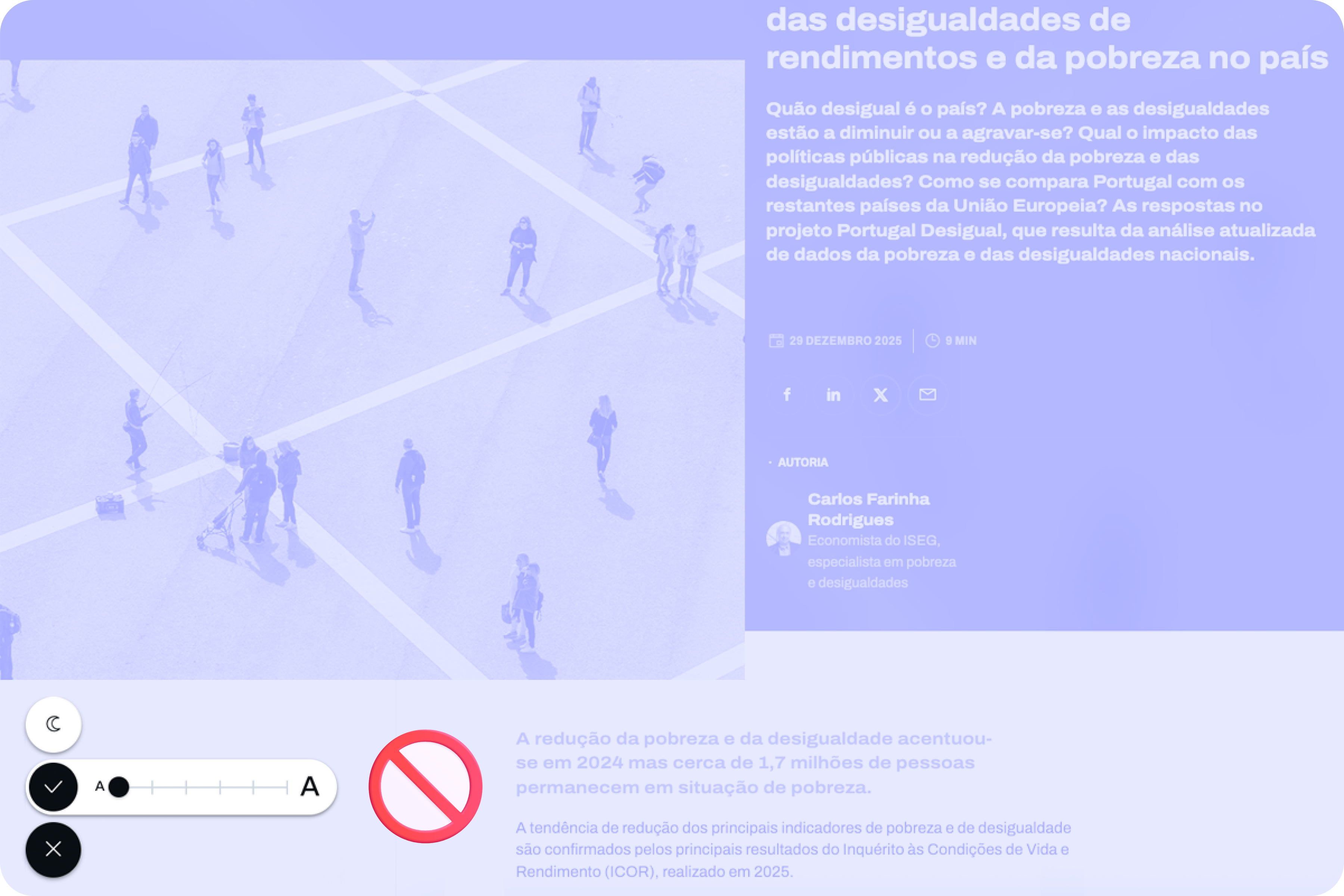
Text size increase tool in the interface
(Large preview)

Standardized Access

An important concept to remember about assistive technologies, particularly in this case regarding increasing font size, is that most devices already have many of these tools installed by default. In other words, in many cases, users don’t need to purchase their own software or buy a specific type of device just to have this functionality.

Whether on mobile devices or even in web browsers, in the vast majority of cases, it’s easy to find installed features that allow you to increase the default font size we’re using throughout the interface. This principle of increasing font size can be applied to digital products, such as apps, or even to any type of website running on the standard web browsers used today.

iPhones #

On iPhone devices, the font size increase feature is integrated by default. To use this feature, simply access the “Settings” panel, select “Accessibility,” and within the “Vision” options group, access the “Text Size and Display” feature and configure the desired font size increase on that screen.
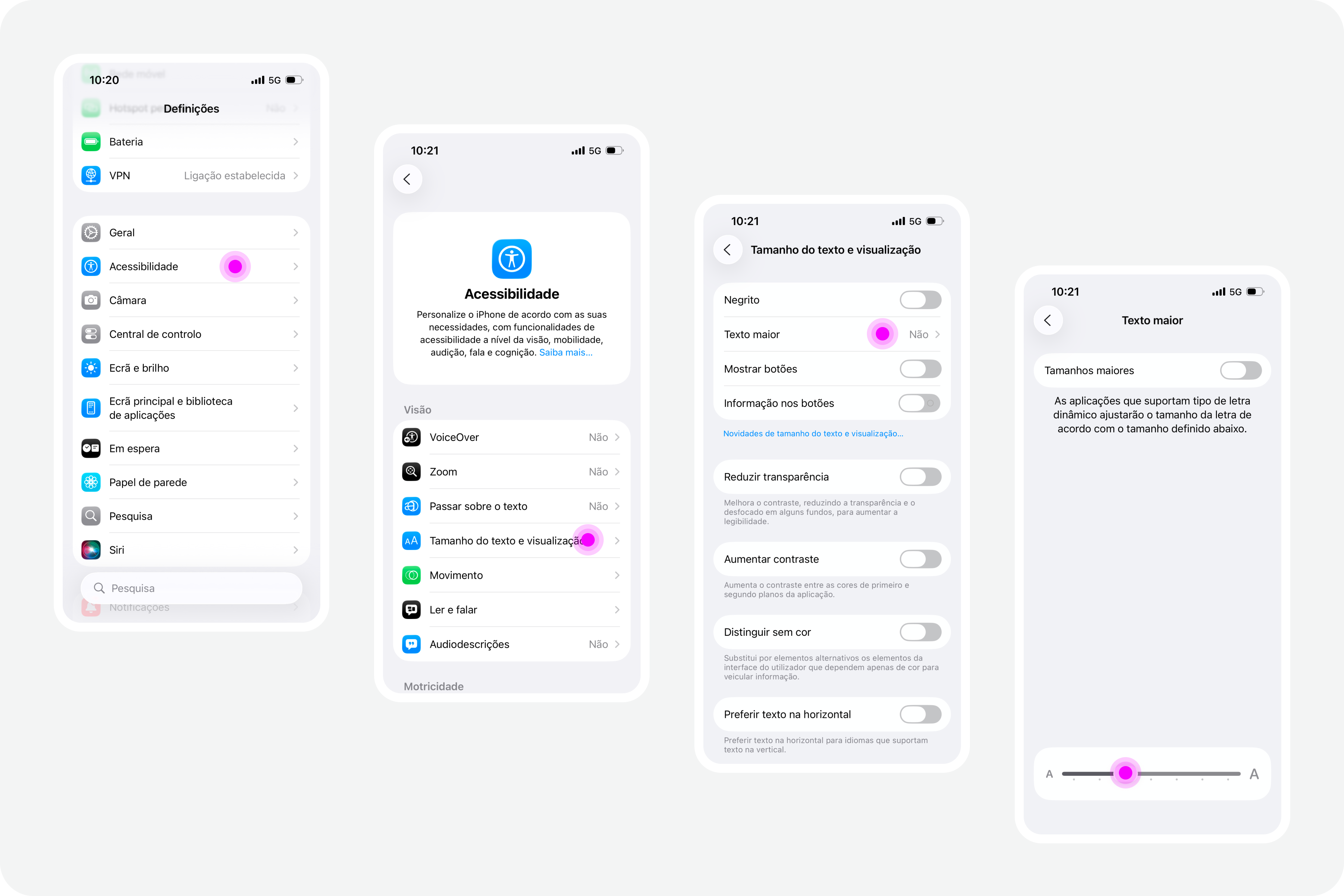
iPhone screens with settings on accessibility
(Large preview)

Google Chrome

Web browsers also offer, by default, the functionality to increase font size. For example, in Google Chrome, this feature is available in the “Options” panel, specifically in the “Appearance” area. In the list of options that appear in this group, simply select the “Font size” option. Normally, the “Medium — Recommended” option will be selected. You can change this setting to any other available font size. Try, for example, the “Very large” option.
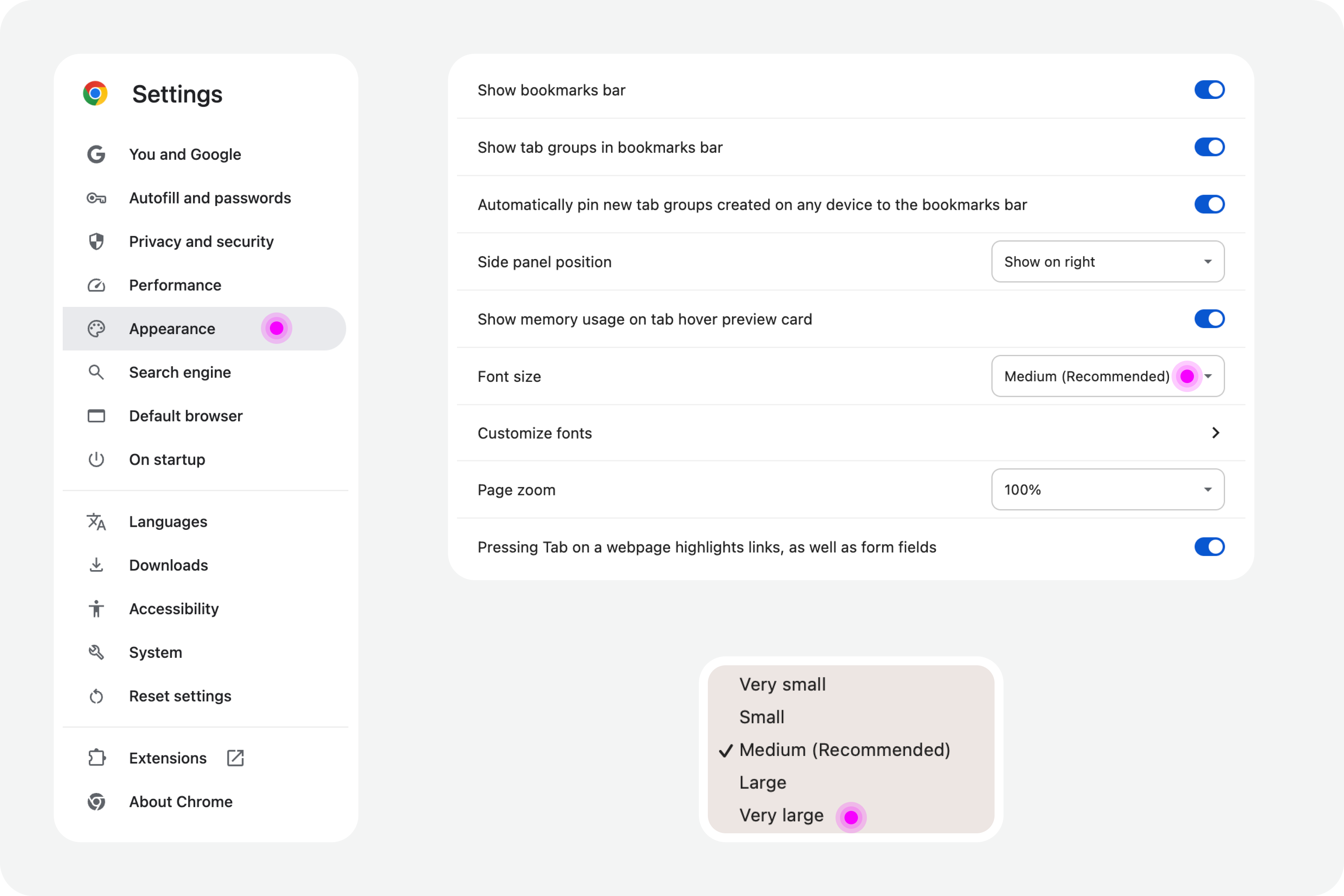
Google Chrome settings on accessibility
(Large preview)

Test In Figma #

To ensure that digital accessibility work becomes effective in the daily lives of teams, it is essential to find simple work processes. Actions or initiatives that can be integrated into the team’s routine, that address accessibility in an integrated way, and do not require a dramatic transformation of the current reality. If that were necessary, he believes, it wouldn’t happen most of the time. Therefore, designing simple work processes is half the battle for accessibility to truly happen, in this case, also within a design team.

Regarding testing font size increases in design, we have extraordinary tools at our disposal today. Those who remember the days of designing complex interfaces in Adobe Photoshop will recognize the differences in the tools we have today (and thankfully so). It’s now possible, through tools like Figma, to create such dynamism in design that testing font size increases for accessibility becomes almost unavoidable for the team.
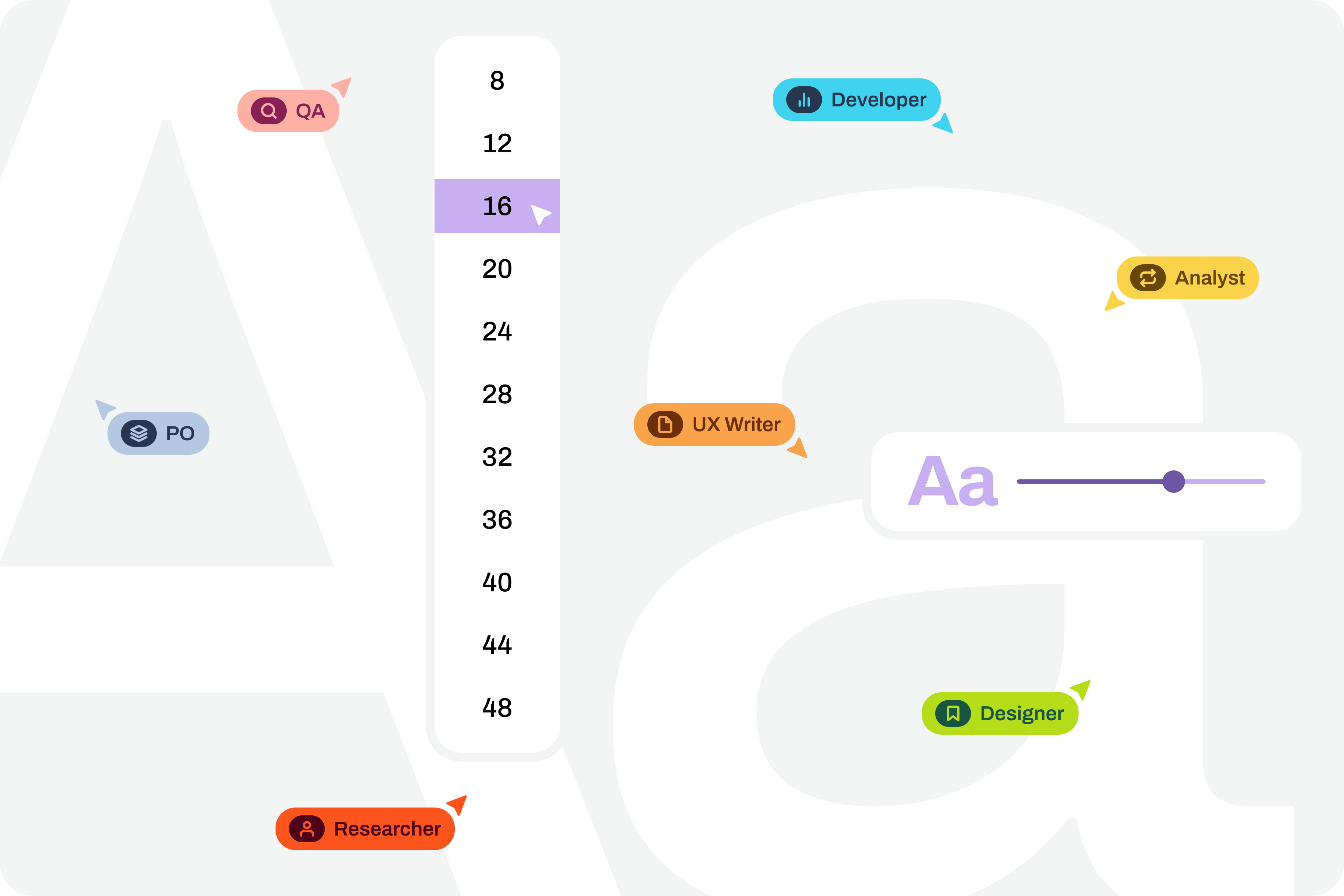
Visualization on font sizes
(Large preview)

Note: To take this test, you need to have a strong grasp of Figma’s text styles, auto layouts, and variables. These three are fundamental tools for success without much extra effort. If you haven’t yet mastered these features, it’s highly recommended that you start there. Don’t skip steps. Learning is a gradual process that must be followed in a structured, step-by-step manner.

Where Do We Want To Go?

The font size increase test in Figma that we want to perform is simple. We want to have a set of variables available for all the text styles we use in the interface, allowing us to choose whether we want to see the interface with the text at a scale of 100%, 120%, 140%, 160%, 180%, or 200%. As we apply this set of variables (much like applying variables for light and dark mode), we observe the transformations of the text in the interface and understand to what extent adaptations are needed in each version of the interface with different typographic scales.
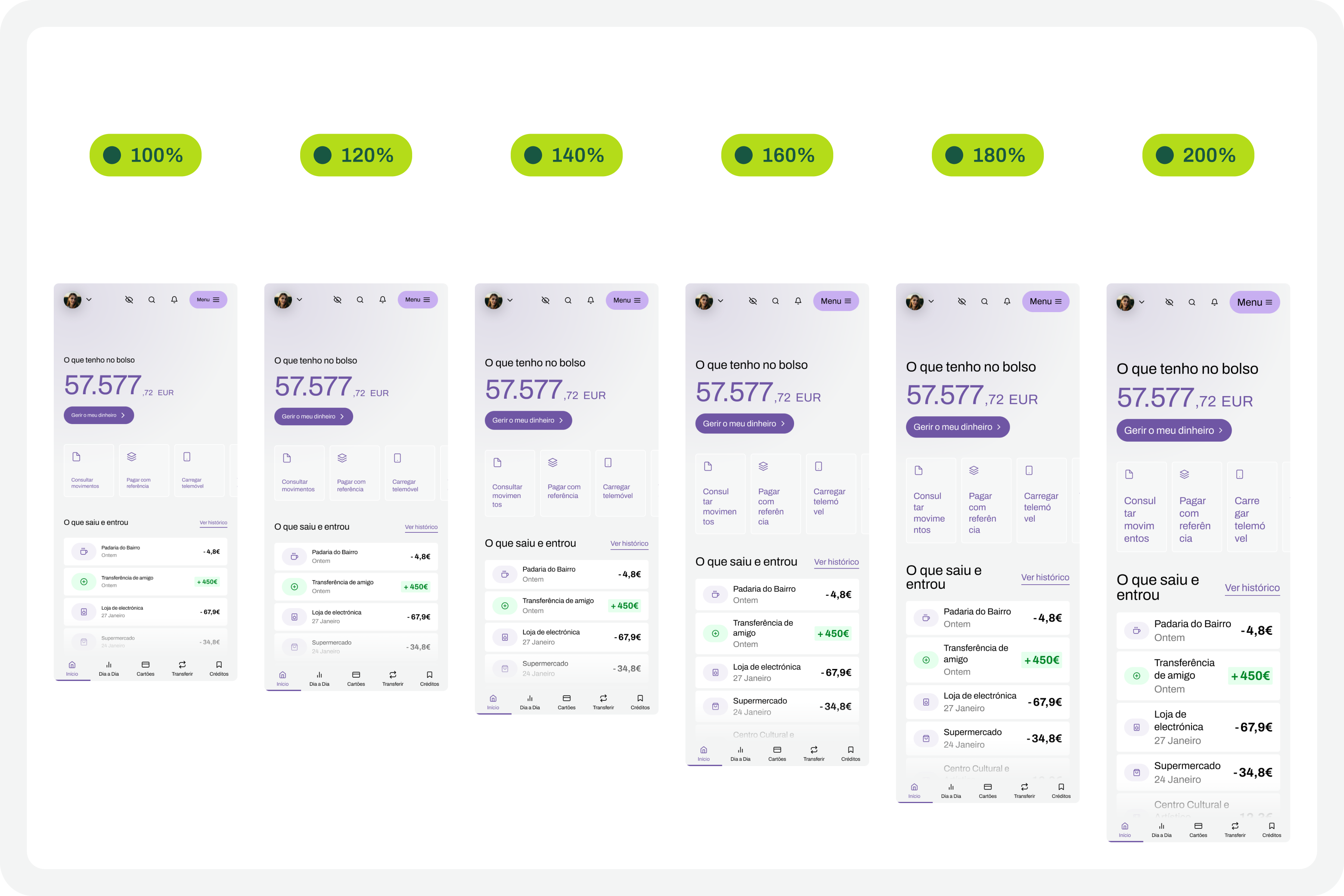
Font scaling
(Large preview)

How Do We Make This Happen? #

For this test to go so smoothly, you need to do some groundwork. Design systems can greatly help optimize much of this initial work. But I won’t lie to you. For the test to work well, your design needs to have a very serious level of organization and systematization.

This isn’t really a guide, because each team will have its own work model, and these recommendations can be applied in different ways (and that’s okay). However, for this test to work, it’s important to ensure certain assumptions in the design. To help you phase the implementation of this test model, here are some steps to follow. Step-by-step instructions to guide you in organizing your files and ensuring you can fully execute this test in the simplest and most practical way possible.

1. Designing The Interfaces #

It all starts with the design. Before any testing, the focus should, as it should, be on the design of each interface that we will want to test later. At this stage, there is still no specific concern with the font size increase test that we will perform later. Naturally, all interface design should, from the outset, follow the most basic accessibility recommendations applied to design.
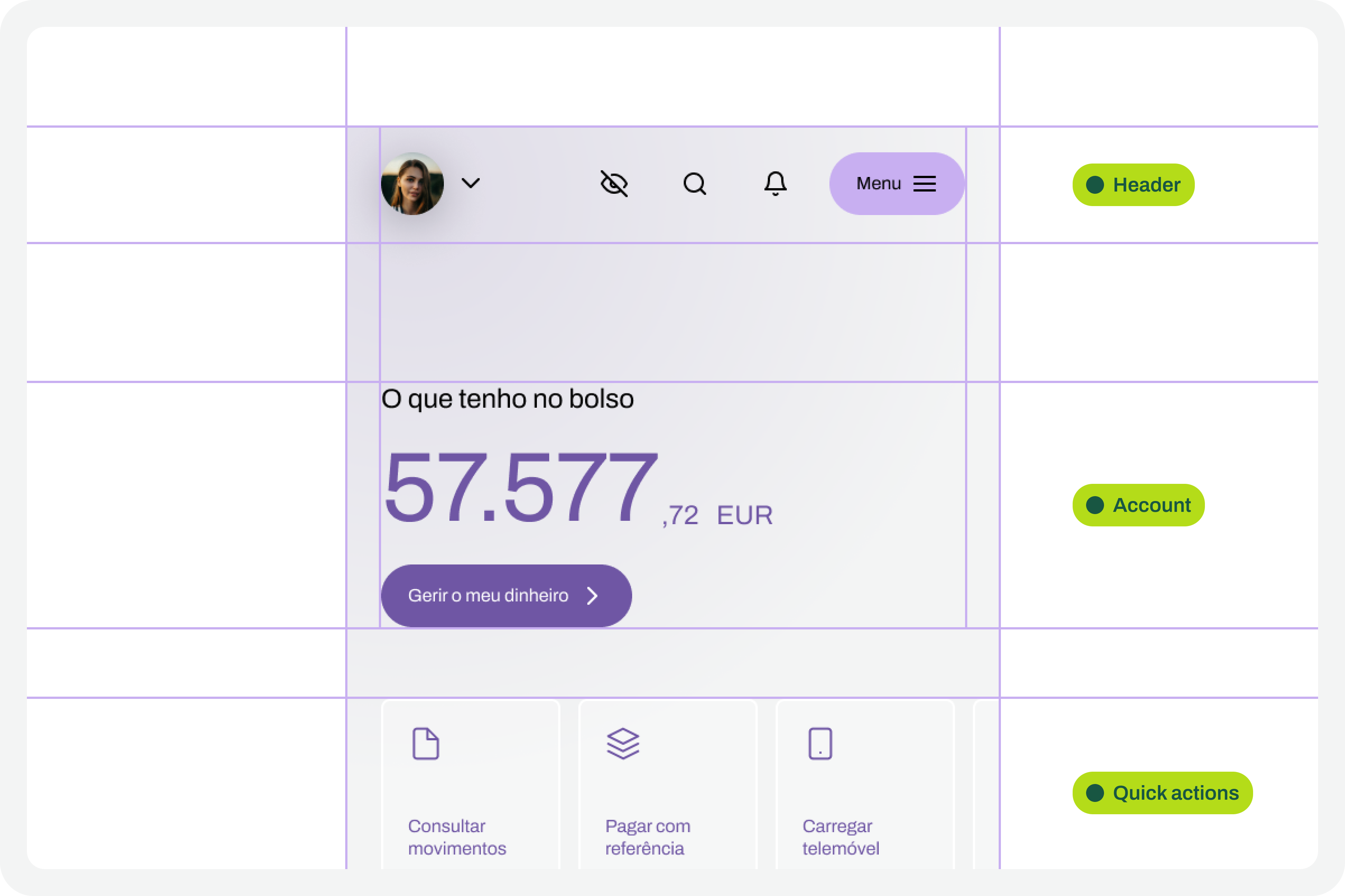
Design screens
(Large preview)

2. Apply Auto Layouts To All Elements 

In every screen design you create, you’ll need to ensure you apply auto layouts perfectly. This is a very important step. It’s this consistent application of auto layouts to the entire structure and design elements that will later guarantee the scalability of the interface when we start testing font size increases. You really can’t underestimate this step. If you don’t pay it the attention it deserves, you’ll see when we test typographic scaling in the interfaces, everything breaking down like an elephant in a china shop.
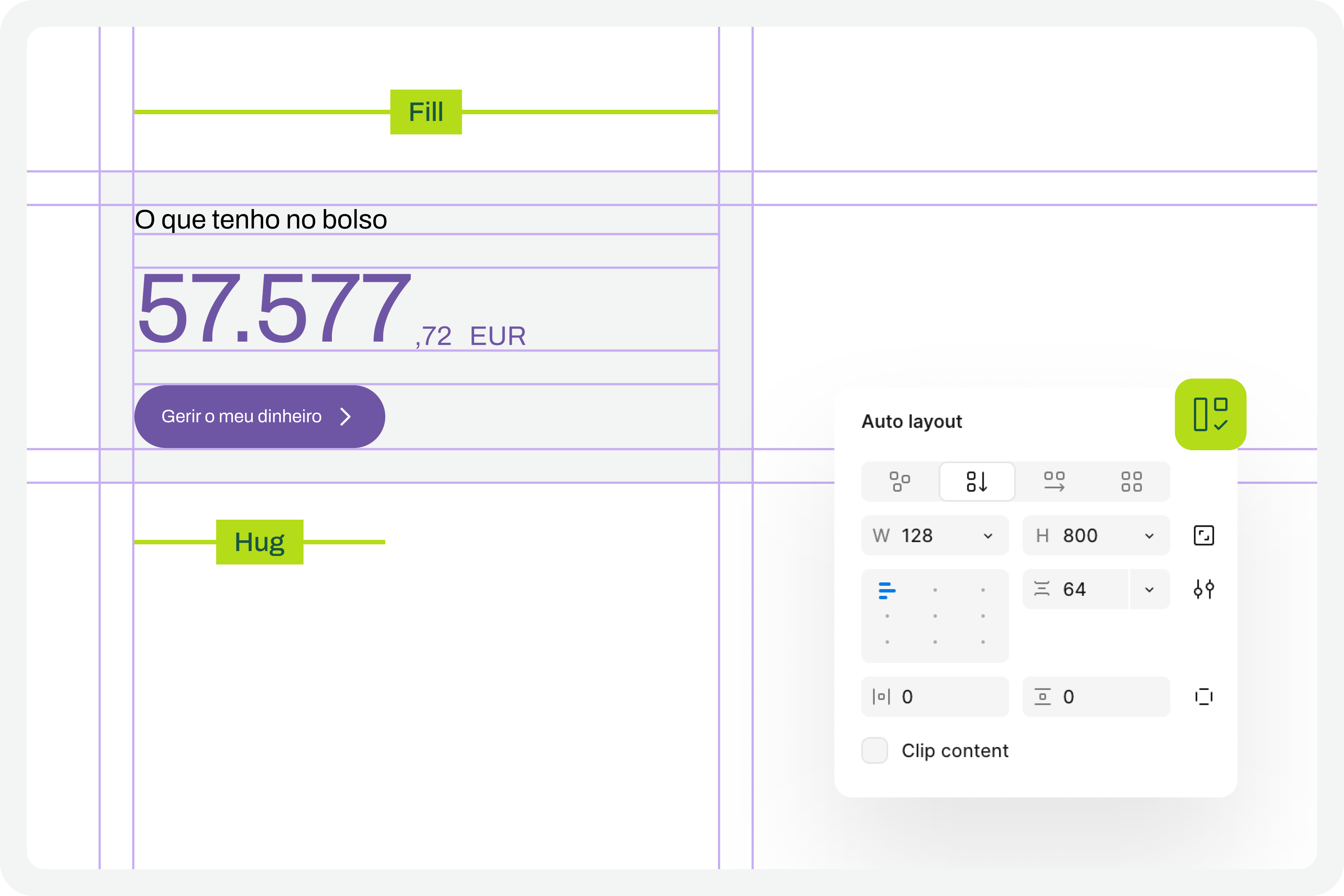
Auto layout
(Large preview)

3. Structuring And Applying Text Styles

To perform our font size increase test, we’ll also need you to have applied text styles to each interface design. You probably even started creating them as you were drawing. Great. If you haven’t done so, it’s important that you do it now. For the test to work perfectly, we really need this. Don’t leave any text element in the design without a text style applied.
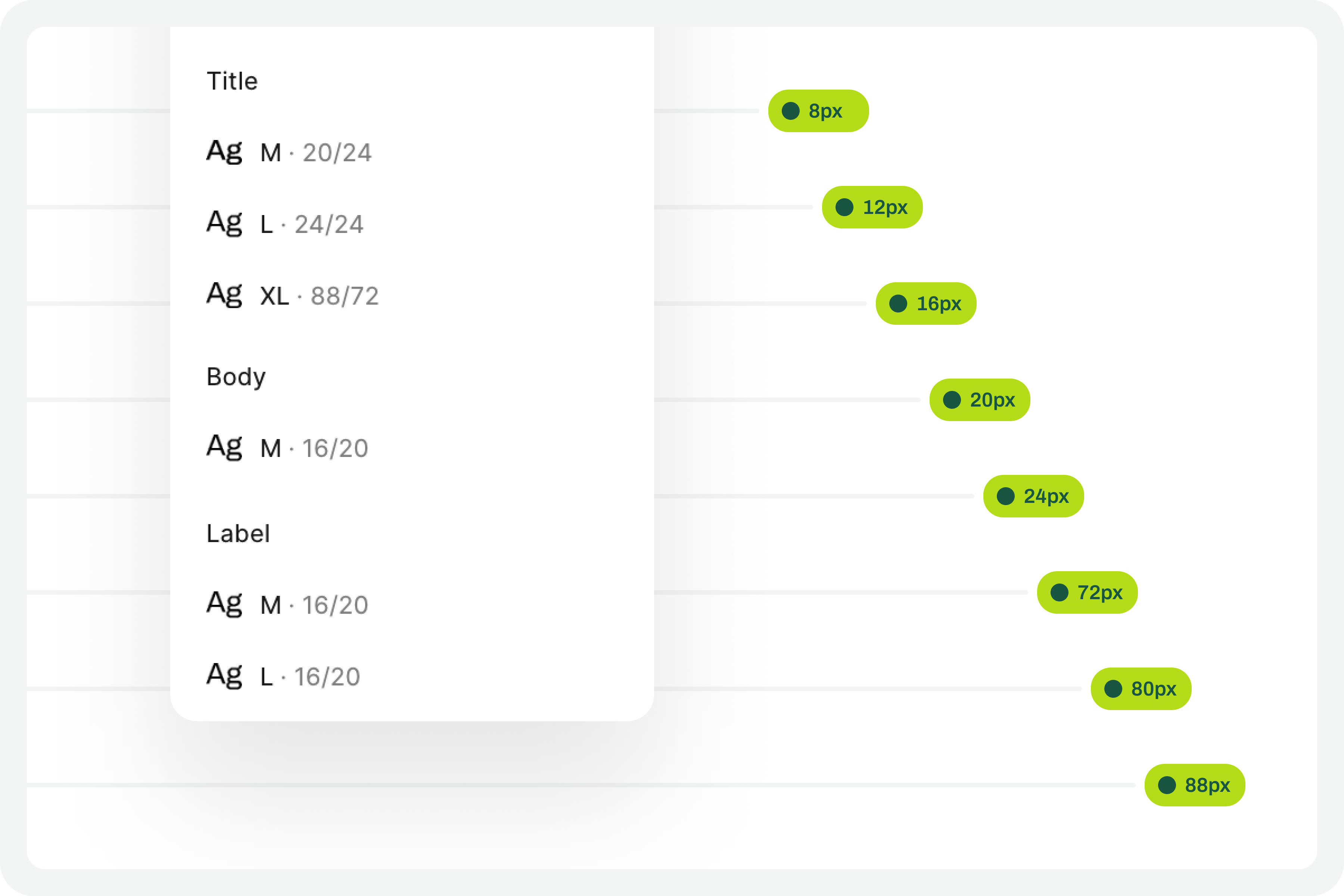
Text styles
(Large preview)

4. Define The Set Of Variables 100% #

This test forces a fairly high degree of optimization. In practice, this means we will have to use Figma variables for all the characteristics of the text styles we have in the interface. At this stage, you must define Figma “number” variables for at least the font-size and line-height of the text styles you applied to the drawing. With this step, you are defining the font size increase scale values for a 100% visualization model, that is, the initial and reference version of the drawing. It is important that you structure these variables for each text style in the drawing because, subsequently, we will have to consider the enlargement scale of each of these text elements.
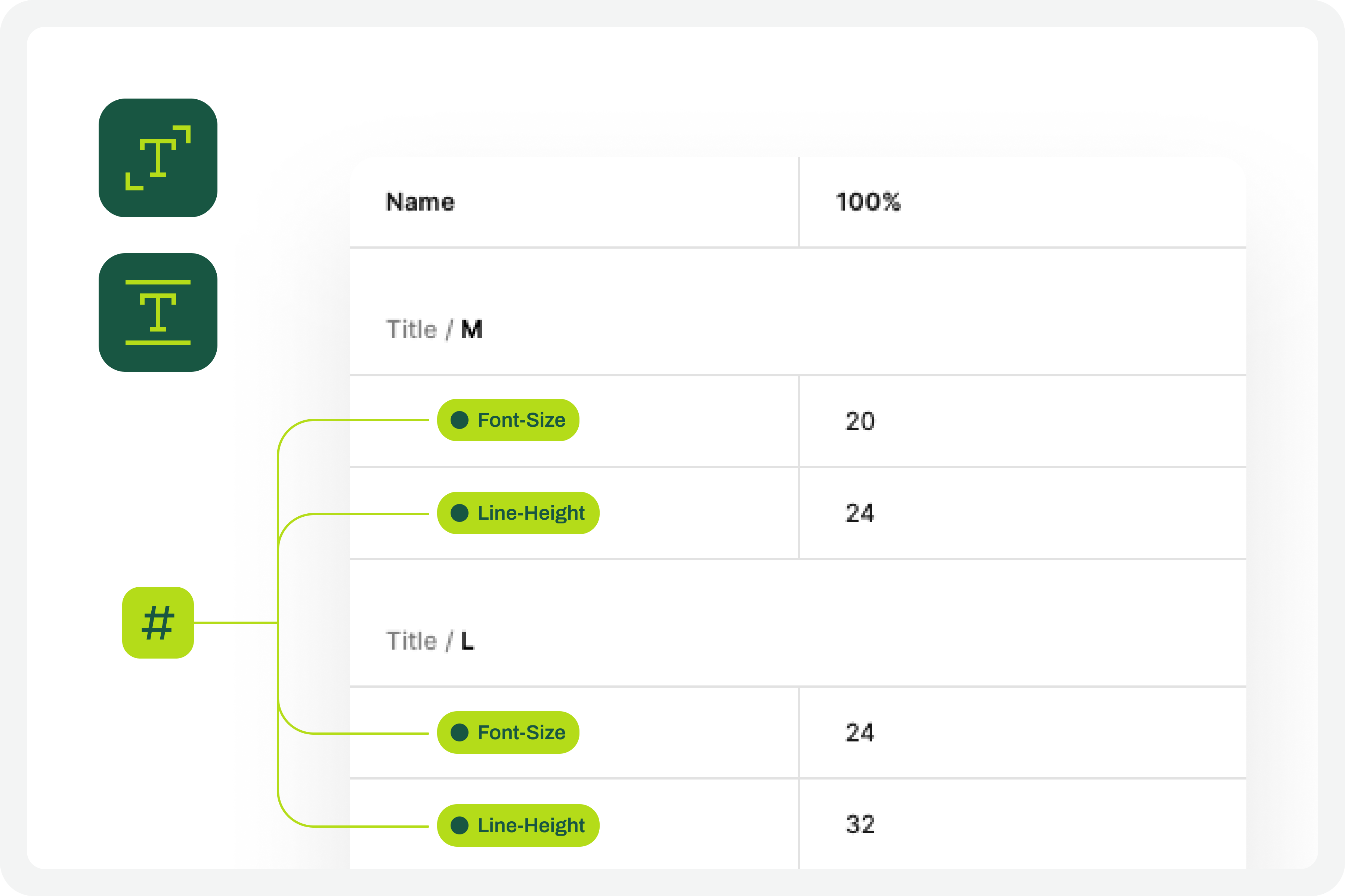
Defining the set of variables 100%
(Large preview)

5. Apply The Variables To The Text Styles 

Having defined the variables for the 100% scale text styles, you must now apply them to the elements of the text styles already created. Don’t forget to apply variables at least to the font-size and line-height characteristics. If you have more typographical variables, that’s fine. But you should at least have variables applied to font-size and line-height. This is really very important.
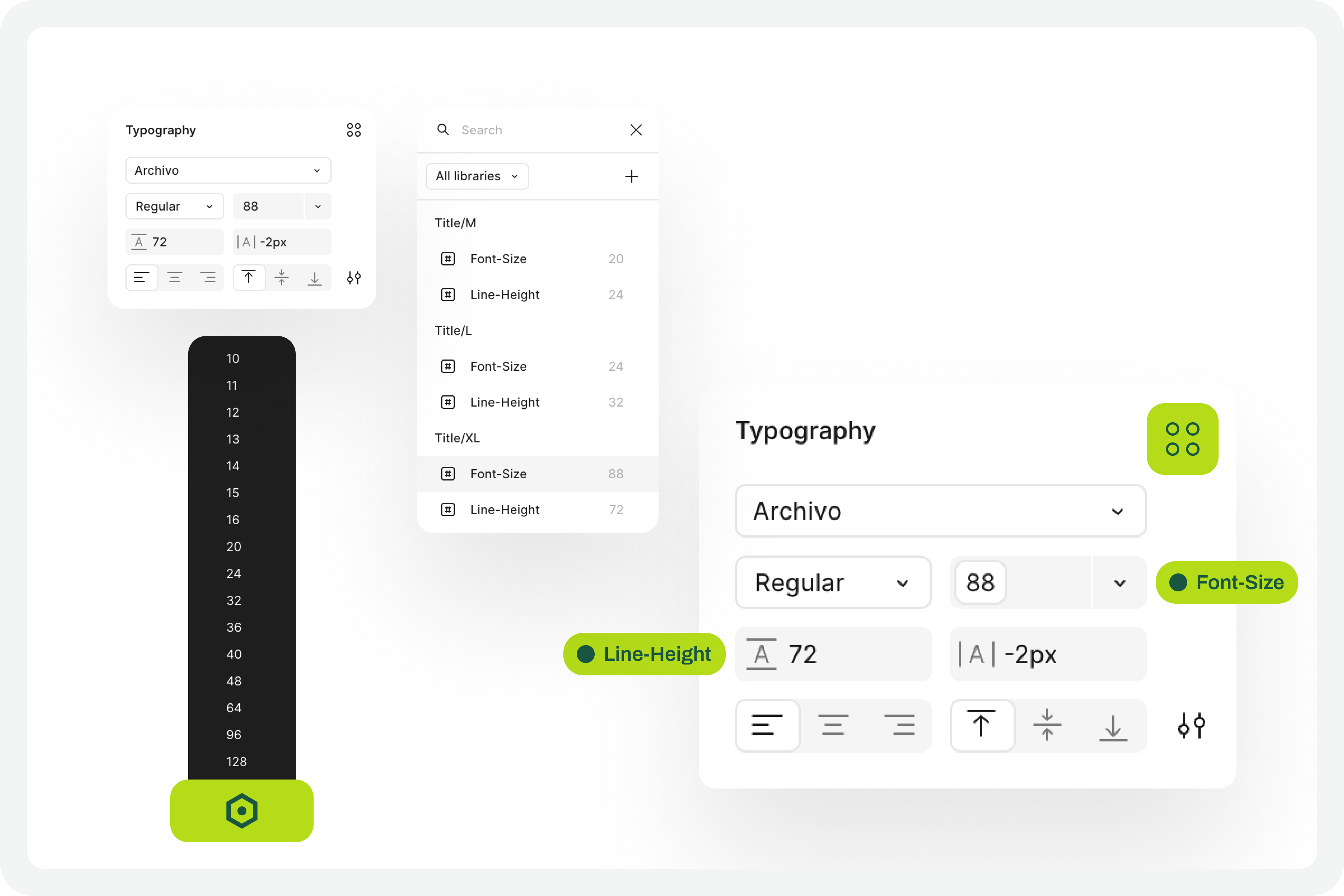
Applying variables to the text styles
(Large preview)

6. Define The Variables For Increasing The Text Size #

Now that you have the variables applied to the 100% scale text styles, the next step is to create the variables for the other font size increase scales. In practice, you have to create the variables that will tell the system what font size each text style will grow to when the increase scale is 120%, 140%, 160%, etc.

To define the font-size and line-height values, simply multiply the initial value by the scale percentage. For example, if a text style has a font-size of 16px, the size for the 120% scale will be 16 multiplied by 1.2, which gives a result of 19.2. Repeat this calculation for all font-size and line-height values of the font size increase scale percentages you choose.

You can also choose whether or not to apply rounding to the final values. This is an approximate test, and therefore any differences that may arise from rounding will not affect the final perception of the test result.
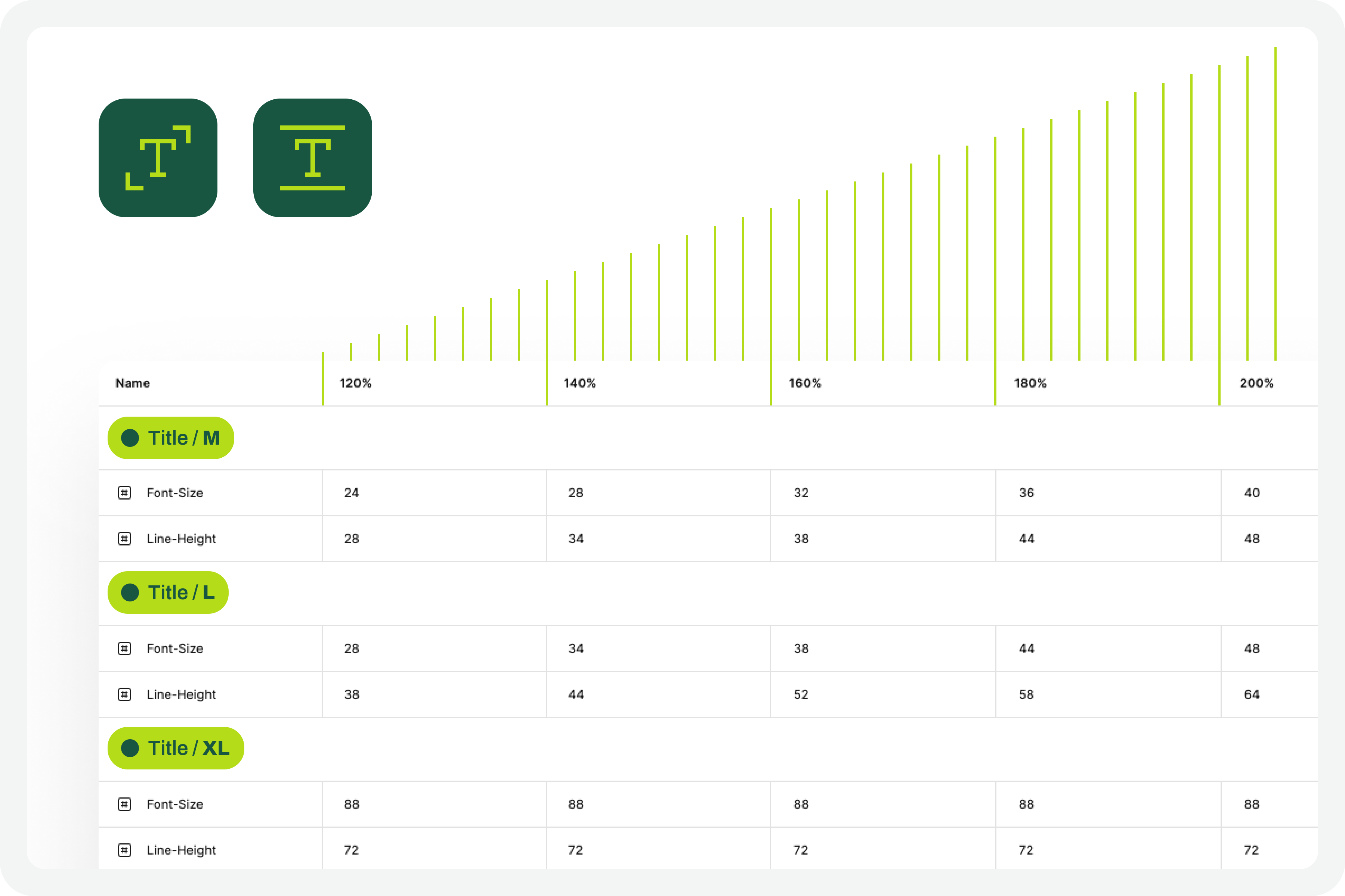
Font scalling variables
(Large preview)

7. Apply Variables To Different Scale Versions

The moment of truth has arrived. The next step is to understand if we have everything working so that the test runs perfectly. Therefore, you should copy the original interface and apply the set of variables for each of the font size increase rates that make sense to you. Repeat this process for all the font size increase percentages you have defined.

As a suggestion, you can use the 120%, 140%, 160%, 180%, and 200% increase percentages as a reference. If you want to simplify, you can reduce the number of scaling percentages you are working with. Regardless of the number of percentages you are working with, you should always work with the minimum of 100% and 200% scales.
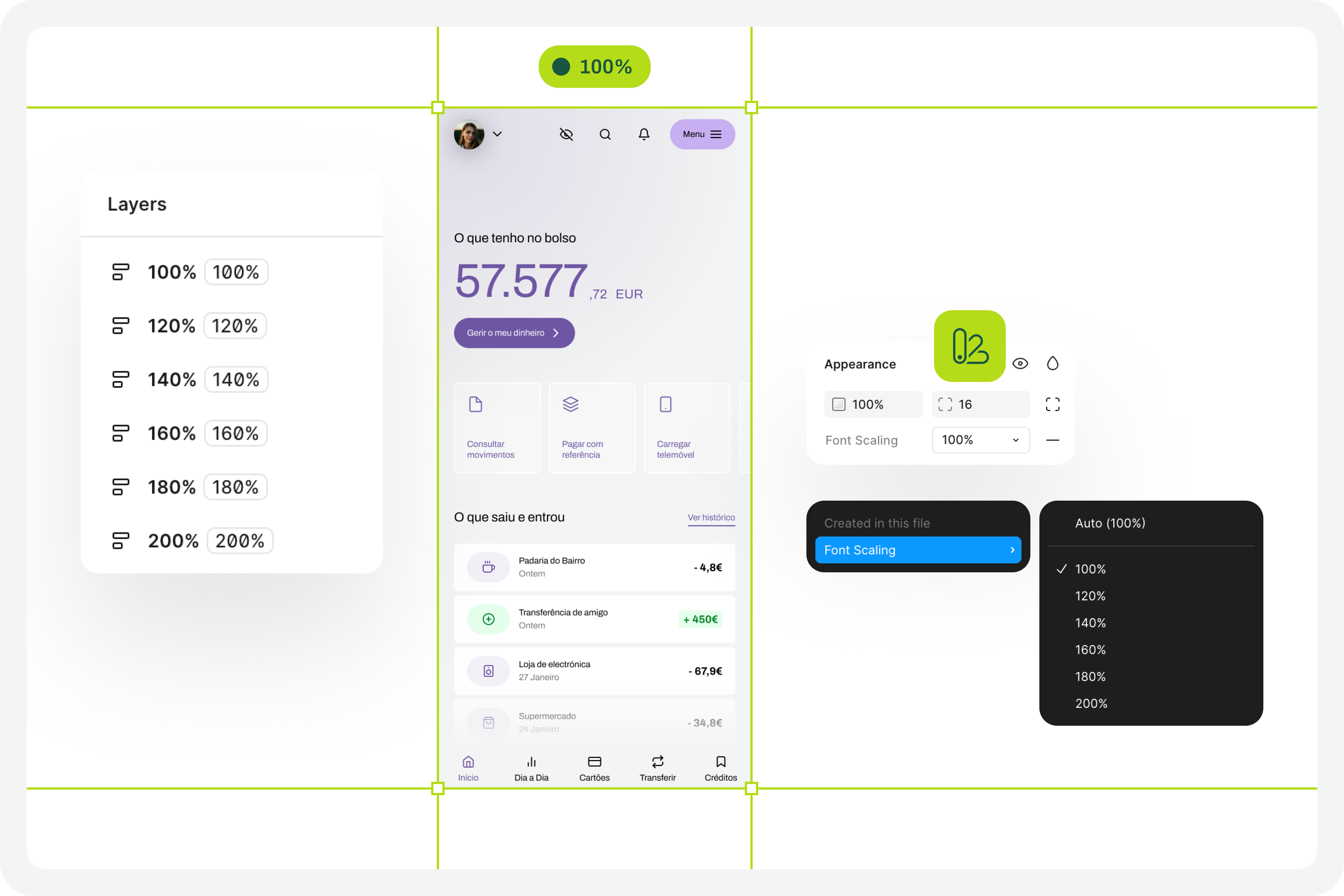
Applied variables to different scale versions
(Large preview)

8. Identify Areas For Improvement #

By applying different font size increase scales to the same screen, it’s easy to understand where improvements might be needed. This is where the real test of increasing font size in interface design and the most interesting accessibility work begins.

In your analysis of the various screens, keep some important aspects in mind:

  • The fact that the text appears gigantic isn’t a problem and doesn’t “ruin” the design. Remember that this can mean the difference between someone being able to use a particular product or service or not.
  • An accessibility problem exists when increasing the font size makes it impossible for the user to read certain texts or to activate certain controls.
  • For text elements that are already very large, increasing the font size might not make sense. Doing so could make those elements disproportionate, which wouldn’t improve readability (since they are already a good size) and would occupy completely unnecessary space.
  • If there are elements that appear to be popping out of the screen, the first step is to confirm how you are applying auto layout. Many design aspects can be easily resolved with the proper use of auto layout.
  • Regardless of the scale of font size increase, it is essential to maintain the visual hierarchy of the typography, as this readability is important for perceiving the different levels of information present on the screen.
  • This test can help identify elements that may need adjustments directly in the code to function well at a given scale of increase. Not everything can be solved through design alone, and that’s perfectly fine. Accessibility is essentially a team effort.
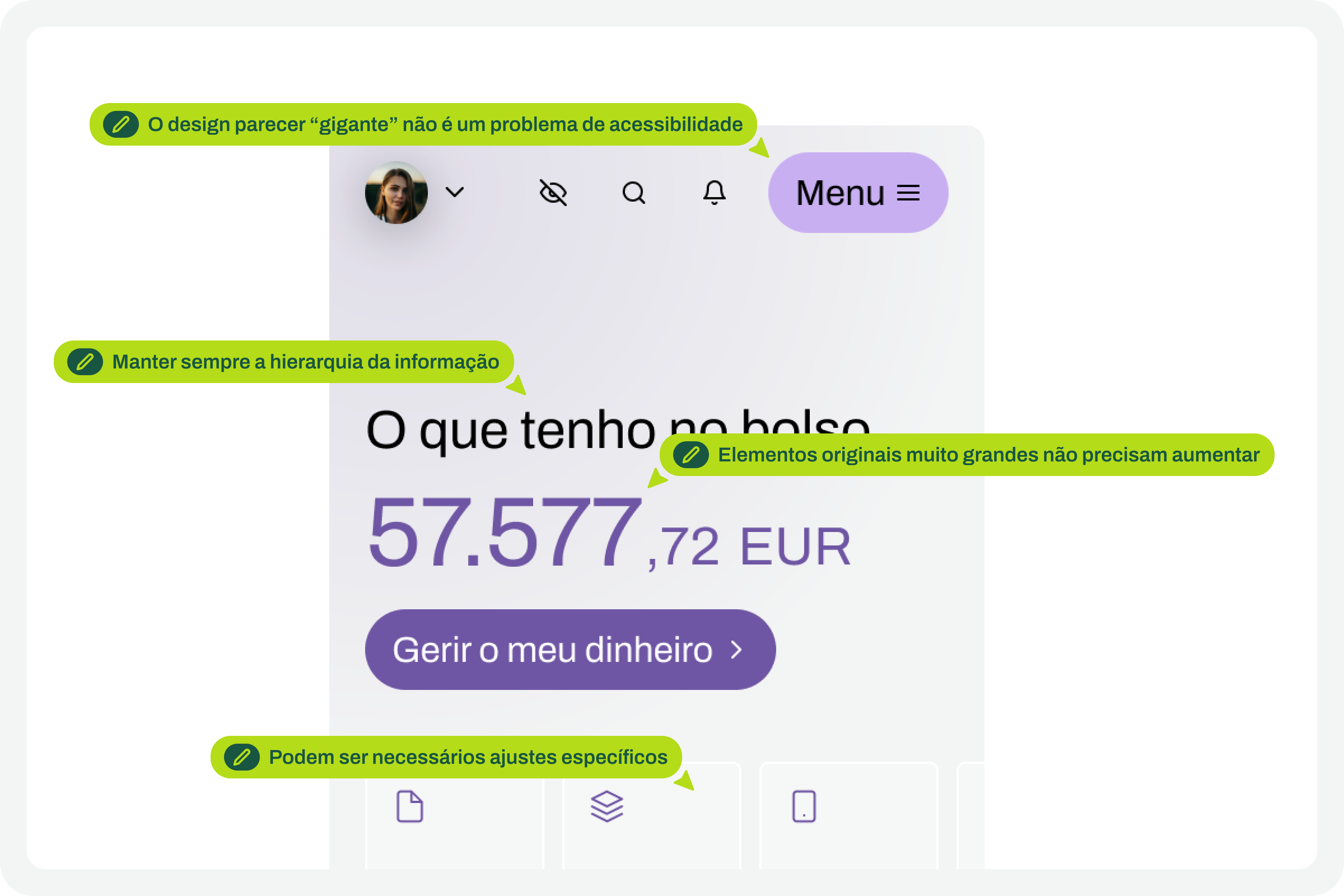
Critical points for improvement
(Large preview)

9. Make Corrections And Adjustments To The Design

Finally, based on the various screens with different text enlargement scales applied, you can make the design changes that make sense. Some of these adjustments may only be necessary in code. In these cases, you document all these suggestions and pass them on to the development team. It is also crucial to reinforce (again) that some of the problems you may encounter in the design can be quickly resolved in the design process, with the simple and correct application of auto-layout properties.
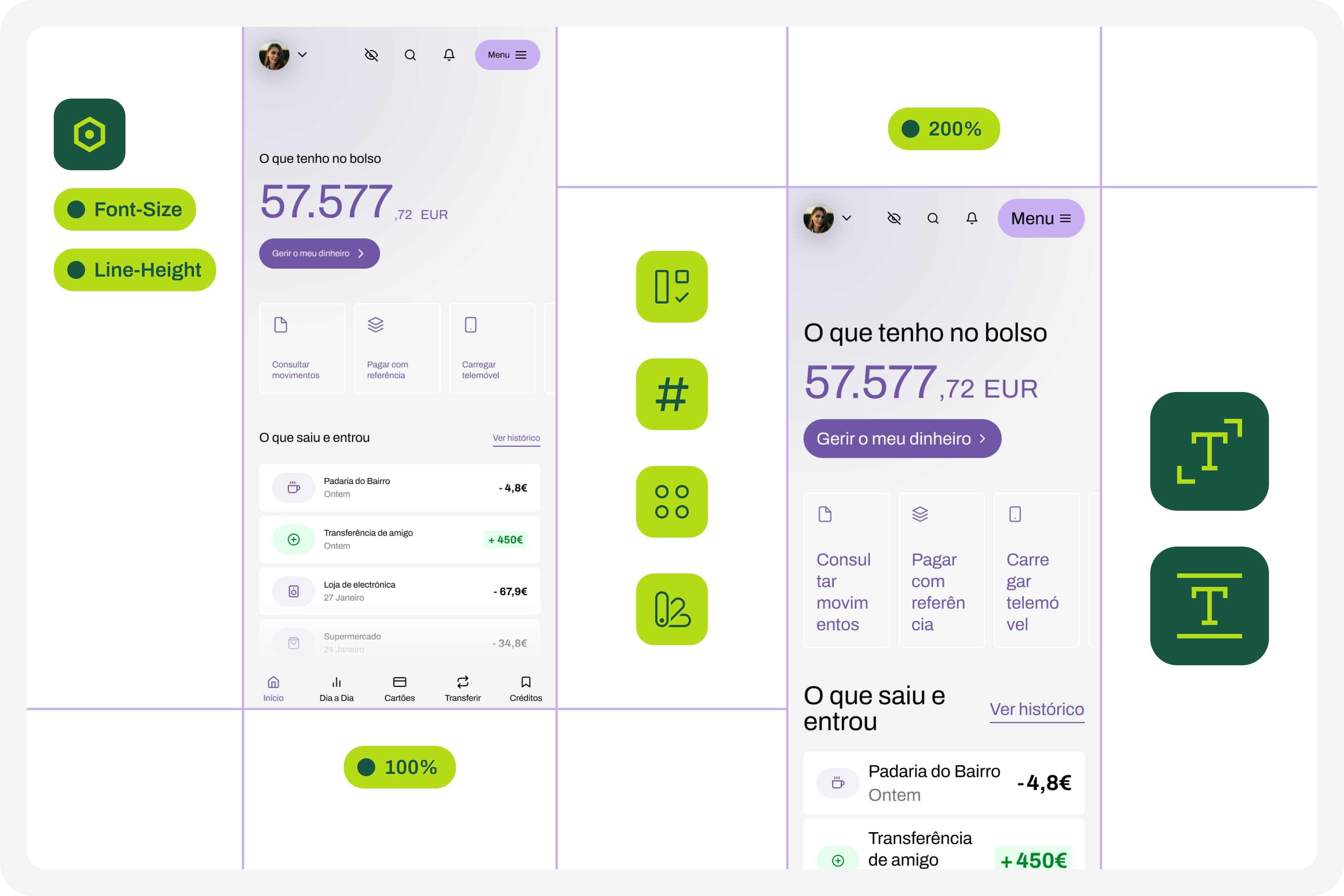
Design changes to those critical points
(Large preview)

10. Go Back To The Beginning And Repeat The Process

This is a cyclical approach. This means you should repeat these steps, or variations thereof, as many times as necessary throughout the project. It’s natural that, over time and with process optimization, some of these steps will cease to make sense. That’s absolutely not a problem. But the most important thing to realize here is that accessibility and this process of testing font size increases shouldn’t be done just once, and that’s it. It’s a test to be done many, many times throughout the day-to-day work of each project and team.
Starting point
(Large preview)

The Role Of Design Systems #

At first glance, this list of steps might seem like a complex exercise. But it’s not. This is because the vast majority, if not all, of these steps are easy to execute in any context where a design system exists. In fact, design systems have become an unavoidable standard in the Product Design industry. We can discuss what each team calls a design system, but the truth is that it’s very difficult today to find a Product Design team that doesn’t have, at the very least, a minimally structured library of components and styles.

Visualization on design systems

With this foundation, whether more or less documented, it’s very easy to apply this type of font size increase test using Figma variables. Furthermore, if your design system already has, for example, structured variables for light and dark mode, it means you’re already applying the exact same principles we used to perform this test. So, nothing new.

Working with design systems involves a level of structuring and organization that is also very useful for creating this type of test. There’s a myth that design systems limit creativity. This is not true. Design systems help solve the “bureaucratic” part of design, so we can actually have more time for what matters: in this case, testing accessibility and building more and more products and services that are truly accessible to the greatest number of people.

Example File

It’s always easier to see an example than just read a description of a process. If this is true in many disciplines of knowledge, in design, this premise makes even more sense. Therefore, in this Figma file, freely published and openly available to the community, you’ll find a practical example of the entire testing process described here. Remember that this is just an example. There may be countless ways to perform this type of test within the context of a Figma file.
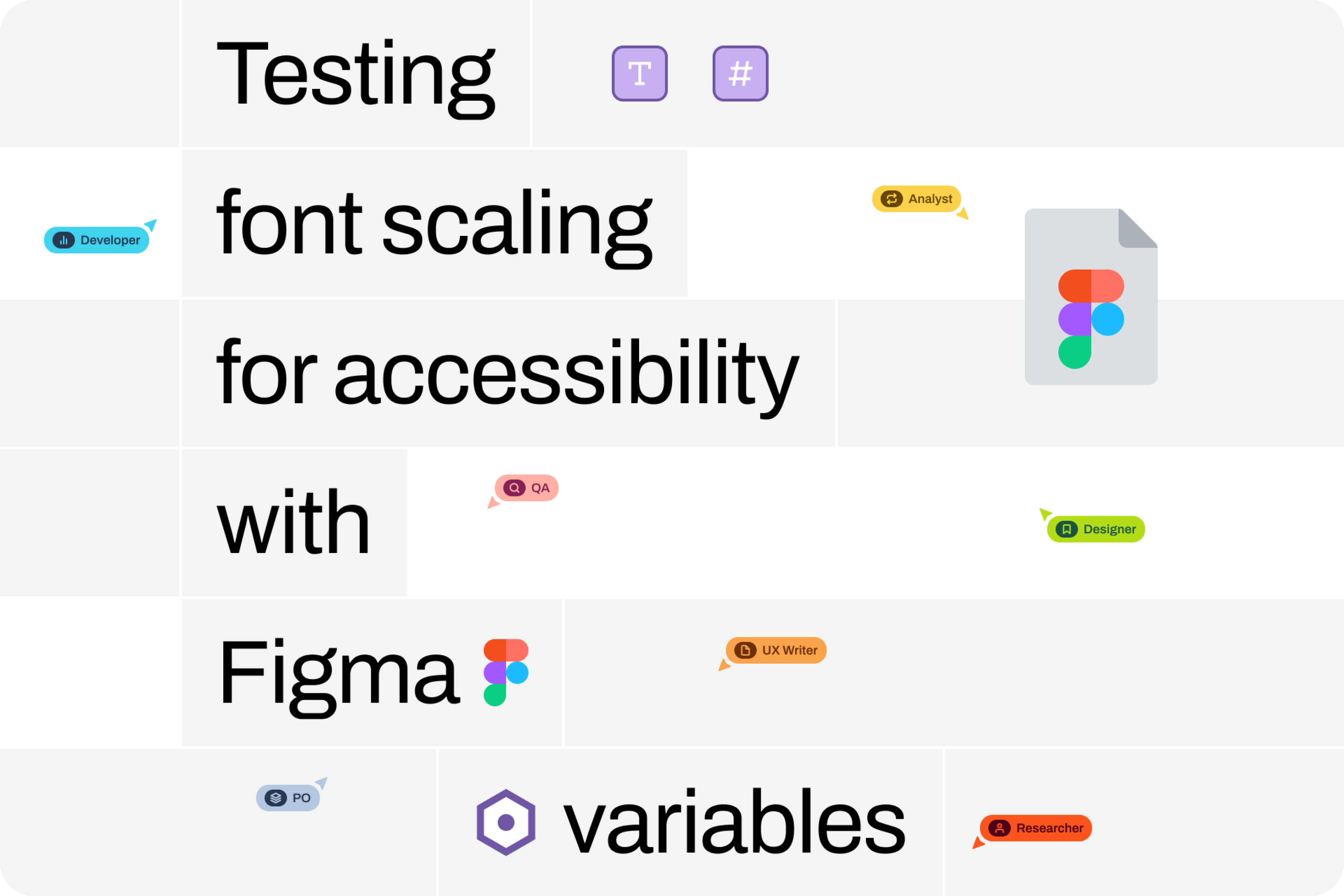
Visualization for the Figma file on testing font scaling
(Large preview)

Be sure to look at this approach with a critical eye. It’s a suggestion for testing font size increases that follows a specific process. Despite this, the approach should be adapted to your team’s specific reality, processes, and level of maturity. Simply copying formulas from other teams without understanding if they make sense in our own context is a sure way to make accessibility efforts disproportionate. Every situation is unique. This approach attempts to simplify accessibility work as much as possible in this specific context. And remember: if something happens, however small, it’s a step forward, not a step backward. And that should be celebrated by everyone on the team.

Monday, June 23, 2025

Integrating Localization Into Design Systems


Learn how two designers tackled the challenges of building a localization-ready design system for a global audience. This case study dives into how Rebecca and Mark combined Figma Variables and design tokens to address multilingual design issues, such as text overflow, RTL layouts, and font inconsistencies. They share key lessons learned and the hurdles they faced — including Figma’s limitations — along with the solutions they developed to create dynamic, scalable designs that adapt seamlessly across languages, themes, and densities. If you’re navigating the complexities of internationalization in design systems, this article is for you.

Mark and I work as product designers for SAS, a leader in analytics and artificial intelligence recognized globally for turning data into valuable insights. Our primary role is to support the token packages and component libraries for the SAS Filament Design System. SAS’ customer base is global, meaning people from diverse countries, cultures, and languages interact with products built with the Filament Design System.

SAS designers use Figma libraries developed by the Filament Design System team to create UX specifications. These high-fidelity designs are typically crafted in English, unknowingly overlooking multilingual principles, which can result in layout issues, text overflow, and challenges with right-to-left (RTL) languages. These issues cascade into the application, ultimately creating usability issues for SAS customers. This highlights the need to prioritize localization from the start of the design process.

With the introduction of Figma Variables, alongside the advancements in design tokens, we saw an opportunity for designers. We imagined a system where a Figma design could dynamically switch between themes, densities, and even languages.

This would allow us to design and test multilingual capabilities more effectively, ensuring our design system was both flexible and adaptable.

While researching localization integration for design systems, we realized a significant gap in existing documentation on supporting localization and internationalization in design tokens and Figma Variables. Many of the challenges we faced, such as managing typography across locales or adapting layouts dynamically, were undocumented or only partially addressed in available resources.

Our story demonstrates how combining foundational principles of multilingual design with design tokens can help tackle the complexities of language switching in design systems. We are not arguing that our approach is the best, but given the lack of documentation available on the subject, we hope it will get the conversation started.

But before we start, it’s essential to understand the distinction between Localization (L10n) and Internationalization (I18n).

Localization (L10n) refers to the process of adapting designs for specific languages, regions, or cultures and involves the following:

  • Translating text;
  • Adjusting layouts to accommodate language-specific requirements, such as longer or shorter text strings or right-to-left (RTL) text for languages like Arabic;
  • Ensuring visual elements are culturally appropriate and resonate with the target audience.

Internationalization (I18n) is the preparation phase, ensuring designs are flexible and adaptable to different languages and regions. Key considerations in Figma include:

  • Using placeholder text to represent dynamic content;
  • Setting up constraints for dynamic resizing to handle text expansion or contraction;
  • Supporting bi-directional text for languages that require RTL layouts.

These concepts are not only foundational to multilingual design but also integral to delivering inclusive and accessible experiences to global users.

Pre-Figma Setup: Building A Framework

Understanding Our Design Token System

Before diving deeper, it’s crucial to understand that our design tokens are stored in JSON files. These JSON files are managed in an application we call “Token Depot,” hosted on our corporate GitHub.

We utilize the Tokens Studio plugin (pro plan) to transform these JSON files into Figma libraries. For us, design tokens are synonymous with variables — we don’t create additional variables that only exist in Figma. However, we do create styles in Figma that serve as “recipe cards” for specific HTML elements. For instance, an H2 might include a combination of font-family, font-size, and font-weight.

It’s important to note that our design token values are directly tied to CSS-based values.

Initial Setup: Theme Switching And Localization

In 2022, we took on the massive task of refactoring all our token names to be more semantic. At that time, we were only concerned with theme switching in our products.

Our tokens were re-categorized into the following groups:

  • Color
    • Brand colors (SAS brand colors)
    • Base colors (references to Brand colors)
  • Typography (e.g., fonts, spacing, styles)
  • Space (e.g., padding, margins)
  • Size (e.g., icons, borders)
  • Style (e.g., focus styles)
  • Motion (e.g., animations)
  • Shadow.

In our early setup:

  • A core folder contained JSON files for values unaffected by theme or brand.
  • Brand folders included three JSON files (one for each theme). These were considered “English” by default.
  • A separate languages folder contained overrides for other locales, stacked on top of brand files to replace specific token values.

Our JSON files were configured with English as the default. Other locales were managed with a set of JSON files that included overrides for English. These overrides were minimal, focusing mainly on font and typography adjustments. For example, bold typefaces often create issues because many languages like Chinese, Japanese, or Korean (CJK languages) fonts lack distinct bold versions. Thus, we replaced the font-weight token value from 700 to 400 in our CJK locales.

We also update the values for font-family, letter spacing, font-style, and font-variant tokens. In Figma, our application screens were originally designed in English, and in 2023, we only implemented theme-switching modes, not language options. Additionally, we created detailed lists to document which design tokens could be converted to Figma variables and which could not, as the initial release of variables supported only a limited set.

Introducing Density Switching

The introduction of density switching in our products marked a significant turning point. This change allowed us to revisit and improve how we handled localization and token management. The first thing we had to figure out was the necessary token sorting. We ended up with the following list:

Tokens Impact By Theme And Density

Unaffected by Theme or Density:

  • Color
  • Brand colors
  • Base colors
  • Motion
  • Shadow
  • Size
  • Border size
  • Outline size
  • Typography
  • Base font size
  • Letter spacing and word spacing
  • Overflow, text, and word style tokens.

Tokens Impacted by Density:

  • Typography
  • Font sizes
  • Line Height
  • Font spacing
  • Size
  • Border radius
  • Icon sizes
  • Space
  • Base spacing.

Tokens Impacted by Theme:

  • Colors
  • Action, body, container, dataviz, display, heading, highlight, icon, label, status, syntax, tag, text, thumbnail, and zero-stat
  • Size
  • Border size
  • Typography
  • Font-family
  • Style
  • Action (focus styles).

With density, we expanded locale-specific value changes beyond font-family, letter spacing, font-style, and font-variant tokens to additionally include:

  • Font sizes
  • Icon sizes
  • Line height
  • Spacing
  • Border radius.

Revisiting our type scale and performing numerous calculations, we documented the required token value changes for all the locales across the density. This groundwork enabled us to tackle the restructuring of our JSON files effectively.

JSON File Restructuring

In our token repository, we:

  1. Updated the tokens in the core folder.
  2. Added a density folder and a language folder in each brand.

After collaborating with our front-end development team, we decided to minimize the number of JSON files. Too many files introduce complexity and bugs and hinder performance. Instead of creating a JSON file for each language-density combination, we defined the following language categories:

Language Categories

  • Western European and Slavic Languages
    • Polish, English, French, German, and Spanish
  • Chinese Languages
    • Simplified and traditional scripts
  • Middle Eastern and East Asian Languages
    • Arabic, Hebrew, Japanese, Korean, Thai, and Vietnamese
  • Global Diverse
    • Africa, South Asia, Pacific, and Indigenous languages, Uralic, and Turkic groups.

These categories became our JSON files, with one file per density level. Each file contained tokens for font size, icon size, line height, spacing, and border-radius values. For example, all Chinese locales shared consistent values regardless of font-family.

In addition, we added a folder containing JSON files per locale, overriding core values and theme folders, such as font-family.

Figma Setup: Bridging Tokens And Design

Token Studio Challenges

After restructuring our JSON files, we anticipated gaining support for typography variables in the Tokens Studio plugin. Instead, Tokens Studio released version 2.0, introducing a major shift in workflow. Previously, we imported JSON files directly into Figma and avoided pushing changes back through the plugin. Adjusting to the new version required us to relearn how to use the plugin effectively.

Our first challenge was navigating the complexity of the import process. The $metadata.json and $themes.json files failed to overwrite correctly during imports, resulting in duplicate collections in Figma when exporting variables. Despite recreating the required theme structure within the plugin, the issue persisted. To resolve this, we deleted the existing $metadata.json and $themes.json files from the repository before pulling the updated GitHub repo into the plugin. However, even with this solution, we had to manually remove redundant collections that appeared during the export process.

Once we successfully migrated our tokens from JSON files into Figma using the Tokens Studio plugin, we encountered our next challenge.

Initially, we used only “English” and theme modes in Figma, relying primarily on styles since Figma’s early variable releases lacked support for typography variables. Now, with the goal of implementing theme, density, and language switching, we needed to leverage variables — including typography variables. While the token migration successfully brought in the token names as variable names and the necessary modes, some values were missing.

Typography variables, though promising in concept, were underwhelming in practice. For example, Figma’s default line-height multiplier for “auto” was 1.2, below the WCAG minimum of 1.5. Additionally, our token values used line-height multipliers, which weren’t valid as Figma variable values. While a percentage-based line-height value is valid in CSS, Figma variables don’t support percentages.

Our solution involved manually calculating pixel values for line heights across all typography sizes, locale categories, and densities. These values were entered as local variables in Figma, independent of the design token system. This allowed us to implement correct line-height changes for density and locale switches. The process, however, was labor-intensive, requiring the manual creation of hundreds of local variables. Furthermore, grouping font sizes and line heights into Figma styles required additional manual effort due to the lack of support for line-height multipliers or percentage-based variables.

Examples:

  • For CJK locales, medium and low density use a base font size of 16px, while high density uses 18px.
  • Western European and Slavic languages use 14px for medium density, 16px for high, and 12px for low density.

Additional Challenges

  • Figma vs. Web Rendering
    In Figma, line height centers text visually within the text box. In CSS, it affects spacing differently depending on the box model. This mismatch required manual adjustments, especially in light of upcoming CSS properties like leading-trim.
  • Letter-Spacing Issues
    While CSS defaults to “normal” for letter-spacing, Figma requires numeric values. Locale-specific resets to “normal” couldn’t utilize variables, complicating implementation.
  • Font-Family Stacks
    • Example stack for Chinese:
      font-family-primary: 'AnovaUI', '微软雅黑体', 'Microsoft YaHei New', '微软雅黑', 'Microsoft Yahei', '宋体', 'SimSun', 'Helvetica Neue', 'Helvetica', 'Arial', sans-serif.

Starting with a Western font ensured proper rendering of Latin characters and symbols while maintaining brand consistency. However, Figma’s designs using only AnovaUI (SAS Brand Custom font) couldn’t preview locale-based substitutions via system fonts, complicating evaluations of mixed-content designs.

Finally, as we prepared to publish our new library, we encountered yet another challenge: Figma Ghosts.

What Are Figma Ghost Variables? #

Figma “ghost variables” refer to variables that remain in a Figma project even after they are no longer linked to any design tokens, themes, or components.

These variables often arise due to incomplete deletions, improper imports, or outdated metadata files. Ghost variables may appear in Figma’s variable management panel but are effectively “orphaned,” as they are disconnected from any meaningful use or reference.

Why They Cause Issues for Designers:

  • Clutter and Confusion
    Ghost variables make the variable list longer and harder to navigate. Designers might struggle to identify which variables are actively in use and which are obsolete.
  • Redundant Work
    Designers might accidentally try to use these variables, leading to inefficiencies or design inconsistencies when the ghost variables don’t function as expected.
  • Export and Sync Problems
    When exporting or syncing variables with a design system or repository, ghost variables can introduce errors, duplicates, or conflicts. This complicates maintaining alignment between the design system and Figma.
  • Increased Maintenance Overhead
    Detecting and manually deleting ghost variables can be time-consuming, particularly in large-scale projects with extensive variable sets.
  • Thematic Inconsistencies
    Ghost variables can create inconsistencies across themes, as they might reference outdated or irrelevant styles, making it harder to ensure a unified look and feel.

Addressing ghost variables requires careful management of design tokens and variables, often involving clean-up processes to ensure only relevant variables remain in the system.

Cleaning Up Ghost Variables

To avoid the issues in our Figma libraries, we first had to isolate ghost variables component by component. By selecting a symbol in Figma and navigating the applied variable modes, we had a good sense of which older versions of variables the symbol was still connected to. We found disconnected variables in the component library and our icon library, which resulted in compounded ghost variables across the system. We found that by traversing the layer panel, along with a fantastic plug-in called “Swap Variables,” we were able to remap all the ghost variables in our symbols.

If we had not completed the clean-up step, designers would not be able to access the overrides for theme, density, and locale.

Designing Symbols For Localization

To ensure Figma symbols support language swapping, we linked all text layers to our new variables, including font-family, font-size, and line height.

We do not use Figma’s variable feature to define text strings for each locale (e.g., English, Spanish, French) because, given the sheer breadth and depth of our Products and solutions, it would simply be too daunting a task to undertake. For us, using an existing plug-in, such as “Translator,” gives us what we need.

After ensuring all text layers were remapped to variables, along with the “Translator” plug-in, we were able to swap entire screens to a new language. This allowed us to start testing our symbols for unforeseen layout issues.

We discovered that some symbols were not supporting text wrapping when needed (e.g., accommodating longer words in German or shorter ones in Japanese). We isolated those issues and updated them to auto-layout for flexible resizing. This approach ensured all our Figma symbols were scalable and adaptable for multilingual support.

Delivering The System

With our component libraries set up to support localization, we were ready to deliver our component libraries to product designers. As a part of this step, we crafted a “Multilingual Design Cheat Sheet” to help designers understand how to set up their application mockups with Localization and Internationalization in mind.

Multilingual Design Cheat Sheet:

  1. General Principles
    • Design flexible layouts that can handle text wrapping and language-specific requirements such as right-to-left orientations.
    • Use real content during design and development to identify localization issues such as spacing and wrapping.
    • Research the cultural expectations of your target audience to avoid faux pas.
  2. Text & Typography
    • Use Filament Design Systems fonts to ensure support of all languages.
    • Avoid custom fonts that lack bold or italic styles for non-Latin scripts like CJK languages.
    • Reserve additional space for languages like German or Finnish.
    • Avoid hardcoded widths for text containers and use auto-layout to ensure long text strings are readable.
    • The Filament Design System tokens adjust line height per language; make sure you are using variables for line-height.
    • Use bold sparingly, as Filament tokens override bold styling in some languages. Instead, opt for alternative emphasis methods (e.g., color or size).
  3. Layout & Design
    • Mirror layouts for RTL languages (e.g., Arabic, Hebrew). Align text, icons, and navigation appropriately for the flow of the language.
    • Use auto-layout to accommodate varying text lengths.
    • Avoid embedding text in images to simplify localization.
    • Allow ample spacing around text elements to prevent crowding.
  4. Language-Specific Adjustments
    • Adapt formats based on locale (e.g., YYYY/MM/DD vs. MM/DD/YYYY).
    • Use metric or imperial units based on the region.
    • Test alignments and flows for LTR and RTL languages.
  5. Localization Readiness
    • Avoid idioms, cultural references, or metaphors that may not translate well.
    • Provide space for localized images, if necessary.
    • Use Figma translation plug-ins to test designs for localization readiness and use real translations rather than Lorem Ipsum.
    • Test with native speakers for language-specific usability issues.
    • Check mirrored layouts and interactions for usability in RTL languages.

Lessons Learned And Future Directions

Lessons Learned

In summary, building a localization-ready design system was a complex yet rewarding process that taught Mark and me several critical lessons:

  • Localization and internationalization must be prioritized early.
    Ignoring multilingual principles in the early stages of design creates cascading issues that are costly to fix later.
  • Semantic tokens are key.
    Refactoring our tokens to be more semantic streamlined the localization process, reducing complexity and improving maintainability.
  • Figma variables are promising but limited.
    While Figma Variables introduced new possibilities, their current limitations — such as lack of percentage-based line-height values and manual setup requirements — highlight areas for improvement.
  • Automation is essential.
    Manual efforts, such as recalculating and inputting values for typography and density-specific tokens, are time-intensive and prone to error. Plugins like “Translator” and “Swap Variables” proved invaluable in streamlining this work.
  • Collaboration is crucial.
    Close coordination with front-end developers ensured that our JSON restructuring efforts aligned with performance and usability goals.
  • Testing with real content is non-negotiable.
    Design issues like text wrapping, RTL mirroring, and font compatibility only became apparent when testing with real translations and flexible layouts.

Future Directions

As we look ahead, our focus is on enhancing the Filament Design System to better support global audiences and simplify the localization process for designers:

  • Automatic mirrored layouts for RTL languages.
    We plan to develop tools and workflows that enable seamless mirroring of layouts for right-to-left languages, ensuring usability for languages like Arabic and Hebrew.
  • Improved figma integration.
    Advocacy for Figma enhancements, such as percentage-based line-height support and better handling of variable imports, will remain a priority.
  • Advanced automation tools.
    Investing in more robust plugins and custom tools to automate the calculation and management of tokens across themes, densities, and locales will reduce manual overhead.
  • Scalable localization testing framework.
    Establishing a framework for native speaker testing and real-world content validation will help us identify localization issues earlier in the design process.
  • Expanding the multilingual design cheat sheet.
    We will continue to refine and expand the cheat sheet, incorporating feedback from designers to ensure it remains a valuable resource.
  • Community engagement.
    By sharing our findings and lessons, we aim to contribute to the broader design community, fostering discussions around integrating localization and internationalization in design systems.

Through these efforts, Mark and I hope to create a more inclusive, scalable, and efficient design system that meets the diverse needs of our global audience while empowering SAS designers to think beyond English-first designs.

Monday, July 15, 2024

Best Practices For Naming Design Tokens, Components And Variables

 How can we get better at naming? This post is dedicated to naming conventions, tips, and real-world examples that help you name things in a robust and flexible way.

Naming is hard. As designers and developers, we often struggle finding the right name — for a design token, colors, UI components, HTML classes, and variables. Sometimes, the names we choose are too generic, so it’s difficult to understand what exactly is meant. And sometimes they are too specific, leaving little room for flexibility and re-use.

In this post, we want to get to the bottom of this and explore how we can make naming more straightforward. How do we choose the right names? And which naming conventions work best? Let’s take a closer look.

Inspiration For Naming

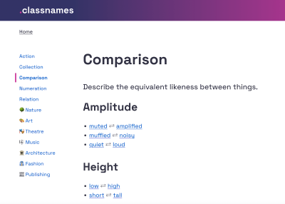
If you’re looking for some inspiration for naming HTML classes, CSS properties, or JavaScript functions, Classnames is a wonderful resource jam-packed with ideas that get you thinking outside the box.

Classnames
Classnames provides thematically grouped lists of words you can use for naming. (Large preview)

The site provides thematically grouped lists of words perfect for naming. You’ll find terms to describe different kinds of behavior, likeness between things, order, grouping, and association, but also themed collections of words that wouldn’t instantly come to one’s mind when it comes to code, among them words from nature, art, theater, music, architecture, fashion, and publishing.

Naming Conventions #

What makes a good name? Javier Cuello summarized a set of naming best practices that help you name your layers, groups and components in a consistent and scalable way.

Naming Good Practices
Javier Cuello explores what makes an effective name. (Large preview)

As Javier points out, a good name has a logical structure, is short, meaningful, and known by everyone, and not related to visual properties. He shares do’s and don’ts to illustrate how to achieve that and also takes a closer look at all the fine little details you need to consider when naming sizes, colors, groups, layers, and components.

Design Tokens Naming Playbook

How do you name and manage design tokens? To enhance your design tokens naming skills, Romina Kavcic created an interactive Design Tokens Naming Playbook. It covers everything from different approaches to naming structure to creating searchable databases, running naming workshops, and automation.

Design Tokens Naming Playbook
The Design Tokens Naming Playbook is a wonderful resource for experimenting with names. (Large preview)

The playbook also features a naming playground where you can play with names simply by dragging and dropping. For more visual examples, also be sure to check out the Figma template. It includes components for all categories, allowing you to experiment with different naming structures.

Flexible Design Token Taxonomy #

How to build a flexible design token taxonomy that works across different products? That was the challenge that the team at Intuit faced. The parent company of products such as Mailchimp, Quickbooks, TurboTax, and Mint developed a flexible token system that goes beyond the brand theme to serve as the foundational system for a wide array of products.

Creating a flexible design token taxonomy for Intuit’s Design System
Nate Baldwin shares insights into Intuit’s flexible design token taxonomy. (Large preview)

Nate Baldwin wrote a case study in which he shares valuable insights into the making of Intuit’s design token taxonomy. It dives deeper into the pain points of the old taxonomy system, the criteria they defined for the new system, and how it was created. Lots of takeaways for building your own robust and flexible token taxonomy are guaranteed.

Naming Colors #

When you’re creating a color system, you need names for all its facets and uses. Names that everyone on the team can make sense of. But how to achieve that? How do you bring logic to a subjective topic like color? Jess Satell, Staff Content Designer for Adobe’s Spectrum Design System, shares how they master the challenge.

Naming Colors In Design Systems
Jess Sattell explains how language brings logic to a subjective topic like color. (Large preview)

As Jess explains, the Spectrum color nomenclature uses a combination of color family classifier (e.g., blue or gray) paired with an incremental brightness value scale (50–900) to name colors in a way that is not only logical for everyone involved but also scalable and flexible as the system grows.

Another handy little helper when it comes to naming colors is Color Parrot. The Twitter bot is capable of naming and identifying the colors in any given image. Just mention the bot in a reply, and it will respond with a color palette.

Common Names For UI Components #

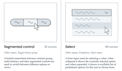
Looking at what other people call similar things is a great way to start when you’re struggling with naming. And what better source could there be than other design systems? Before you end up in the design system rabbit hole, Iain Bean did the research for you and created the Component Gallery.

The Component Gallery
The Component Gallery collects interface components from real-world design systems. (Large preview)

The Component Gallery is a collection of interface components from real-world design systems. It includes plenty of examples for more than 50 UI components — from accordion to visually hidden — and also lists other names that the UI components go by. A fantastic resource — not only with regards to naming.

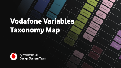
Variables Taxonomy Map #

A wonderful example of naming guidelines for a complex multi-brand, multi-themed design system comes from the Vodafone UK Design System team. Their Variables Taxonomy Map breaks down the anatomy and categorization of a design token into a well-orchestrated system of collections.

Variables Taxonomy Map
Vodafone’s Variables Taxonomy Map accommodates a complex multi-brand, multi-themed design system. (Large preview)

The map illustrates four collections required to support the system and connections between tokens — from brand and primitives to semantics and pages. It builds on top of Nathan Curtis’ work on naming design tokens and enables everyone to gather insight about where a token is used and what it represents, just from its name.

If you want to explore more approaches to naming design tokens, Vitaly compiled a list of useful Figma kits and resources that are worth checking out.

Design Token Names Inventory #

Romina Kavcic created a handy little resource that is bound to give your design token naming workflow a power boost. The Design Token Names Inventory spreadsheet not only makes it easy to ensure consistent naming but also syncs directly to Figma.

Design Token Names Inventory Spreadsheet
The Design Token Names Inventory spreadsheet automatically syncs to Figma. (Large preview)

The spreadsheet has a simple structure with four levels to give you a bird’s-eye view of all your design tokens. You can easily add rows, themes, and modes without losing track and filter your tokens. And while the spreadsheet itself is already a great solution to keep everyone involved on the same page, it plays out its real strength in combination with the Google Spreadsheets plugin or the Kernel plugin. Once installed, the changes you make in the spreadsheet are reflected in Figma. A real timesaver!

Monday, June 17, 2024

Best Practices For Naming Design Tokens, Components And Variables

 How can we get better at naming? This post is dedicated to naming conventions, tips, and real-world examples that help you name things in a robust and flexible way.

Naming is hard. As designers and developers, we often struggle finding the right name — for a design token, colors, UI components, HTML classes, and variables. Sometimes, the names we choose are too generic, so it’s difficult to understand what exactly is meant. And sometimes they are too specific, leaving little room for flexibility and re-use.

In this post, we want to get to the bottom of this and explore how we can make naming more straightforward. How do we choose the right names? And which naming conventions work best? Let’s take a closer look.

Inspiration For Naming

If you’re looking for some inspiration for naming HTML classes, CSS properties, or JavaScript functions, Classnames is a wonderful resource jam-packed with ideas that get you thinking outside the box.

Classnames
Classnames provides thematically grouped lists of words you can use for naming. (Large preview)

The site provides thematically grouped lists of words perfect for naming. You’ll find terms to describe different kinds of behavior, likeness between things, order, grouping, and association, but also themed collections of words that wouldn’t instantly come to one’s mind when it comes to code, among them words from nature, art, theater, music, architecture, fashion, and publishing.

Naming Conventions

What makes a good name? Javier Cuello summarized a set of naming best practices that help you name your layers, groups and components in a consistent and scalable way.

Naming Good Practices
Javier Cuello explores what makes an effective name. (Large preview)

As Javier points out, a good name has a logical structure, is short, meaningful, and known by everyone, and not related to visual properties. He shares do’s and don’ts to illustrate how to achieve that and also takes a closer look at all the fine little details you need to consider when naming sizes, colors, groups, layers, and components.

Design Tokens Naming Playbook #

How do you name and manage design tokens? To enhance your design tokens naming skills, Romina Kavcic created an interactive Design Tokens Naming Playbook. It covers everything from different approaches to naming structure to creating searchable databases, running naming workshops, and automation.

Design Tokens Naming Playbook
The Design Tokens Naming Playbook is a wonderful resource for experimenting with names. (Large preview)

The playbook also features a naming playground where you can play with names simply by dragging and dropping. For more visual examples, also be sure to check out the Figma template. It includes components for all categories, allowing you to experiment with different naming structures.

Flexible Design Token Taxonomy

How to build a flexible design token taxonomy that works across different products? That was the challenge that the team at Intuit faced. The parent company of products such as Mailchimp, Quickbooks, TurboTax, and Mint developed a flexible token system that goes beyond the brand theme to serve as the foundational system for a wide array of products.

Creating a flexible design token taxonomy for Intuit’s Design System
Nate Baldwin shares insights into Intuit’s flexible design token taxonomy. (Large preview)

Nate Baldwin wrote a case study in which he shares valuable insights into the making of Intuit’s design token taxonomy. It dives deeper into the pain points of the old taxonomy system, the criteria they defined for the new system, and how it was created. Lots of takeaways for building your own robust and flexible token taxonomy are guaranteed.

Naming Colors #

When you’re creating a color system, you need names for all its facets and uses. Names that everyone on the team can make sense of. But how to achieve that? How do you bring logic to a subjective topic like color? Jess Satell, Staff Content Designer for Adobe’s Spectrum Design System, shares how they master the challenge.

Naming Colors In Design Systems
Jess Sattell explains how language brings logic to a subjective topic like color. (Large preview)

As Jess explains, the Spectrum color nomenclature uses a combination of color family classifier (e.g., blue or gray) paired with an incremental brightness value scale (50–900) to name colors in a way that is not only logical for everyone involved but also scalable and flexible as the system grows.

Another handy little helper when it comes to naming colors is Color Parrot. The Twitter bot is capable of naming and identifying the colors in any given image. Just mention the bot in a reply, and it will respond with a color palette.

Common Names For UI Components

Looking at what other people call similar things is a great way to start when you’re struggling with naming. And what better source could there be than other design systems? Before you end up in the design system rabbit hole, Iain Bean did the research for you and created the Component Gallery.

The Component Gallery
The Component Gallery collects interface components from real-world design systems. (Large preview)

The Component Gallery is a collection of interface components from real-world design systems. It includes plenty of examples for more than 50 UI components — from accordion to visually hidden — and also lists other names that the UI components go by. A fantastic resource — not only with regards to naming.

Variables Taxonomy Map #

A wonderful example of naming guidelines for a complex multi-brand, multi-themed design system comes from the Vodafone UK Design System team. Their Variables Taxonomy Map breaks down the anatomy and categorization of a design token into a well-orchestrated system of collections.

Variables Taxonomy Map
Vodafone’s Variables Taxonomy Map accommodates a complex multi-brand, multi-themed design system. (Large preview)

The map illustrates four collections required to support the system and connections between tokens — from brand and primitives to semantics and pages. It builds on top of Nathan Curtis’ work on naming design tokens and enables everyone to gather insight about where a token is used and what it represents, just from its name.

If you want to explore more approaches to naming design tokens, Vitaly compiled a list of useful Figma kits and resources that are worth checking out.

Design Token Names Inventory

Romina Kavcic created a handy little resource that is bound to give your design token naming workflow a power boost. The Design Token Names Inventory spreadsheet not only makes it easy to ensure consistent naming but also syncs directly to Figma.

Design Token Names Inventory Spreadsheet
The Design Token Names Inventory spreadsheet automatically syncs to Figma. (Large preview)

The spreadsheet has a simple structure with four levels to give you a bird’s-eye view of all your design tokens. You can easily add rows, themes, and modes without losing track and filter your tokens. And while the spreadsheet itself is already a great solution to keep everyone involved on the same page, it plays out its real strength in combination with the Google Spreadsheets plugin or the Kernel plugin. Once installed, the changes you make in the spreadsheet are reflected in Figma. A real timesaver!

Want To Dive Deeper?

We hope these resources will come in handy as you tackle naming. If you’d like to dive deeper into design tokens, components, and design systems, we have a few friendly online workshops and SmashingConfs coming up:

We’d be absolutely delighted to welcome you to one of our special Smashing experiences — be it online or in person!

Wednesday, February 28, 2024

Building Components For Consumption, Not Complexity (Part 1)

 Design systems can be of immense help, but failure to adopt them invalidates the hard work that goes into building the thing in the first place! In this two-part series of articles, Luis shares his experience with design systems and how you can overcome the potential pitfalls, starting from how to make designers on your team adopt the complex and well-built system that you created to what are the best naming conventions and how to handle the auto-layout of components, indexing/search, and more.

Design systems are on the tip of every designer’s tongue, but the narrative in the industry mainly focuses on why you need a design system and its importance rather than the reality of endless maintenance and internal politics. The truth is that design teams spend years creating these systems only to find out that few people adhere to the guidelines or stay within the “guardrails.”

I’ve been fortunate with Figma to host and run workshops at various conferences across Europe that center on one very specific aspect of product design: components.

I love components! They are the start, the end, the hair-tearing-out middle, the “building blocks,” and the foundation — the everything within every great product design organization.

The reason they are so important to me is because, firstly, who doesn’t like efficiency? Second, and more importantly, they are proven to increase the time-to-delivery from design to engineering, and here comes a buzzword — they offer a route to return on investment (ROI) within design teams. This is becoming increasingly important in a tough hiring market. So what’s not to love?

Note: You may be interested in watching Matt Gottschalk’s talk from Figma’s Config 2023 conference, which was dedicated to the topic of ROI within small design teams. The talk explored how small design teams can use design systems and design operations to help designers have the right environment for them to deliver better, more impactful results.

Driving change with design systems and process.” (YouTube recording of Matt Gottschalk and Aletheia Délivré talks at Figma Config 2023.)

Well, let me tell you a little secret: components are hard, but not actually hard to create. In fact, it’s arguably too easy to create a component on the design side. Have you ever seen a local component in your design files, one that a member of your team created to speed up their ideation and workflow? And speaking of speed…

“It’s a signature trait of design system teams to believe they’re moving too slow and must move faster. Actually, successful design systems move more slowly than the products they support.”

— Josh Clark, “Ship Faster by Building Design Systems Slower

There’s nothing stopping anyone from creating more components outside of your design system whenever they want. Nothing even stops people from creating components that are identical to the ones you already have! Don’t worry, we’ve all been there.

The ease at which we can create components contrasts a lot with the difficulty of creating a “good component.” The word “good” is subjective, and that’s exactly my point: every organization has different requirements, many design teams struggle to align on naming conventions even for the simplest of components, and most engineering teams work in slightly different ways.

I would personally prefer not to use phrasings such as “good” or “bad” components because, as curious creatives, we all know that there’s no such thing as “one size fits them all” when it comes to design. That beautiful user interface kit you paid $99 for? It wasn’t designed for your business, so you have to recreate or manipulate a lot of the work to make it fit. That glorious ReactJS calendar widget your engineers found? It turns out it’s not accessible within screen readers, and you have to remodel it and then go through another round of quality assurance (QA) testing anyway.

Components are inherently part of a system that spans design and engineering — and often brand and marketing, too. We, as designers, are seemingly on a mission to call this a design system, but I’d much prefer for us as an industry to steer away from applying the word “design” to activities that are cross-functional by nature. It will improve collaboration and help to foster a culture of shared responsibility. It’s important to remind ourselves that everyone is a problem solver, regardless of job title! Maybe we could agree to call them simply… systems? (Let’s maybe not argue over that just yet; we’ve only just begun.)

As proof of this, a designer can help craft an API (application programming interface) structure, and an engineer can help fine-tune a user flow for a complex form. This is collaboration in its purest form and something we shouldn’t try to make harder by applying one discipline’s area as a stamp on cross-functional output.

Additionally, with the inherent flexibility of our design tools, we’re often setting ourselves up for failure with our creations.

Ultimately, all we want are components which are:

  • Flexible,
  • Repeatable,
  • Adoptable,
  • Indexable,
  • Logical,
  • Specific.

For now, let’s call this the FRAILS framework.

Note: You’re probably thinking: “flexible” and “specific,” aren’t they a bit conflicting? And you’d be kind of right. However, this is one of the goals of almost every design team I’ve spoken to. There is a world where both flexible and specific can live side by side, but the challenge we face is the need to decide on a model of a system that is either flexible or rigid or lives in a “halfway house.” (I’ll explain a little later how we can tackle either of these approaches.)

In this article (Part 1), we’ll take the first two points, Flexible and Repeatable, and we will look at building systems with these goals in mind. Ready? Let’s go.

Flexible #

When asked to define “consumable components,” I often find that the most common answer by the design teams is “a component that is flexible.” This can mean a few things!

Flexible: The Component Instances Can Be Modified #

When planning for scale, the easiest approach (from a maintenance perspective) is to create a small batch of components that can be modified infinitely at the instance level. This makes a lot of sense! Reusability — or don’t repeat yourself (DRY) — is a key concept in software engineering. Why wouldn’t we want to borrow from this established norm?

“Don’t repeat yourself (DRY) is a principle of software development aimed at reducing repetition of information that is likely to change, replacing it with abstractions that are less likely to change. The DRY principle is stated as: “Every piece of knowledge must have a single, unambiguous, authoritative representation within a system.”

— “Don’t repeat yourself” (Wikipedia)

But there is a side effect to flexibility, and that is when something is modified to a level that you, the maintainer, don’t want. As I said earlier, it’s incredibly easy to make changes in design software, which can sometimes mean you are setting components up to be too flexible.

As an example, let’s take the negative (warning) state of your form input fields, the one often with a nice red border if some data is missing or incorrectly entered into them. What happens if a designer on your team changes that to a rather nice green color? This is flexibility in its core, and we can accidentally promote this by creating generic components that require customization with every usage.

A diagram which illustrates semantic color meanings. Red is for negative, orange is for notice, green is for positive, blue is for informative, and accent recreated from Adobe Spectrum’s design system.
Diagram illustrating through labels the semantic color meanings for red (negative), orange (notice), green (positive), and blue (informative and accent) recreated from Adobe Spectrum’s design system. (Large preview)

Like in most things, a solution to this is education and communication. If you aren’t comfortable with modifications on styles, you may want to set up your components in such a way as to indicate this. For example, using emojis in layers is the quickest way to say, “Hey, please don’t edit this!” or “You can edit this!”.

Or, consider shipping out components that are named for intention. Would separating components entirely (components named for intention) work better? An Input/Error, rather than a customizable Input?

On the left is shown a single component, one input that contains two fields (default and error); on the right, there are now two components: one is for default, the other for error.
Splitting components: one input field with a default and error state becomes two individual components. (Large preview)

When considering the emoji name approach, here’s a set that I’ve relied on in the past:

  1. Components
    • 🚨 Deprecated
    • 🟠 Not ready
  2. Component instances
    • 🔐️ Not editable
    • ✍️ Overwritten name
  3. Layers
    • ✍️ Editable
    • 🚨 Important
  4. Component properties
    • ◈ Type
    • ✍️ Edit text
    • 🔁️ Swap instance
    • 🔘 Toggle
    • ←️ Left
    • →️ Right
    • 🖱 Interaction
    • 📈 Data
    • ↔️ Size
An illustration that shows emoji naming conventions within components, component instances, layers, and component properties.
Emoji naming conventions within components, component instances, layers, and component properties. (Large preview)

Flexible: Responsive Design #

Ahh, our old friend, responsive design (RWD)!

“The control which designers know in the print medium, and often desire in the web medium, is simply a function of the limitation of the printed page. We should embrace the fact that the web doesn’t have the same constraints and design for this flexibility. But first, we must accept the ebb and flow of things.”

— John Allsopp, “A Dao of Web Design

As it stands, there is no native solution within Figma to create fully responsive components. What I mean by “fully responsive” is that layout directions and contents change according to their breakpoint.

Here’s an example:

The same card is at different breakpoints: desktop (1440), tablet (768), and mobile (320). The card contains the following elements: a photo of raspberries, ‘Card Title’, ‘Card description’, and ‘Action’ button; and each element within each card is rearranged differently at different breakpoints.
A card at different breakpoints: desktop (1440), tablet (768), and mobile (320). (Large preview)

Note: It is technically possible to achieve this example now with auto layout wrapping and min/max widths on your elements, but this does not mean that you can build fully responsive components. Instead, you will likely end up in a magic numbers soup with a lengthy list of variables for your min and max widths!

With this limitation in mind, we may want to reconsider goals around responsive design within our component libraries. This may take the form of adapting their structure by introducing… more components! Do we want to be able to ship one component that changes from mobile all the way up to the desktop, or would it be easier to use, find, and customize separate components for each distinct breakpoint?

“Despite the fun sounding name, magic numbers are a bad thing. It is an old school term for ‘unnamed numerical constant,’ as in, just some numbers put into the code that are probably vital to things working correctly but are very difficult for anyone not intimately familiar with the code to understand what they are for. Magic numbers in CSS refer to values which ‘work’ under some circumstances but are frail and prone to break when those circumstances change.”

— Chris Coyier, “Magic Numbers in CSS

Never be hesitant to create more components if there is a likelihood that adoption will increase.

Then, what does this look like within Figma? We have a few options, but first, we need to ask ourselves a few questions:

  1. Does the team design for various screen sizes/dimensions? E.g., mobile and desktop web.
  2. Does the development team build for a specific platform/screen size(s)? E.g., an iOS team.
  3. Do you build apps aligning with native style guides? E.g., Material Design.
An image that shows a matrix that can help you decide whether your components should be shared or unique. It is created in the form of a table; the table header has ‘Shared Components’ and ‘Unique Components’; on the left, there is a series of questions in three rows, and there are checkboxes in the columns/rows intersections.
A matrix to help you decide whether your components should be shared or unique. (Large preview)

The answers to these questions will help us determine how we should structure our components and, more importantly, what our library structures will look like.

An illustration that shows a design system structure example within Figma. The title is ‘UI Kit’, and below are five boxes: ‘File: Foundations’, ‘File: Icons’, ‘File: ‘Global’, ‘File: iOS’, and ‘File: Android’.
A design system structure example within Figma. (Large preview)

If the answer to questions 1. (Design for various screen sizes/dimensions?) and 2. (build for a specific platform/screen sizes?) is “No,” and to 3. (Build apps aligning with native style guides?) is “Yes,” to me, this means that we should split out components into separate component library files. We don’t want to enter into a world where an iOS component is accidentally added to a web design and pushed to production! This becomes increasingly common if we share component naming conventions across different platforms.

If the answer to question 3. (“Do we build native apps, using their design guidelines?”) is “Yes,” this definitely requires a separate component library for the platform-specific styles or components. You may want to investigate an option where you have a global set of styles and components used on every platform and then a more localized set for when designing on your native platforms.

The example below, with an example mapping of library files for an iOS design project, is inspired by my Figma community file (“Simple design system structure”), which I created to help you set up your design system more easily across different platforms.

Get “Simple design system structure” [FigJam file / Luis Ouriach, CC-BY license]

An example mapping of library files for an iOS design project. The image is similar to the previous one: the title is ‘UI Kit’, and below are five boxes. From the first four boxes (‘File: Foundations’, ‘File: Icons’, ‘File: ‘Global’, ‘File: iOS’), there are four arrows going into another larger box at the bottom that says: ‘File: iOS App designs’. From the box ‘File: Android’, there is no arrow.
An example mapping of library files for an iOS design project. (Large preview)

If you are designing across multiple platforms in a device-agnostic manner, you can bring components a lot closer together! If you aren’t currently working with an agnostic codebase, it might be worth checking Mitosis (“Write components once, run everywhere”).

A common challenge among development teams is using the same language; while one sub-team may be using Vue, another perhaps is using React, causing redundant work and forcing you to create shared components twice. In “Create reusable components with Mitosis and Builder.io,” Alex Merced explores in detail Mitosis, a free tool developed under the MIT license. Mitosis can compile code to standard JavaScript code in addition to frameworks and libraries such as Angular, React, and Vue, allowing you to create reusable components with more ease and speed.

A screenshot of a page from the Simple design system structure Figma community file, by Luis Ouriach.
The “Simple design system” Figma community file. (Large preview)

Using A Variant #

This may look like a variant set, with a specific property for device/size/platform added. For example,

A screenshot that shows the use of variants. There are two cards here that are similar to the ones found in the ‘A card at different breakpoints’ illustration. The cards contain the following elements: a photo of raspberries, ‘Card Title’, ‘Card description’, and ‘Action’ button; and each element within each card is rearranged differently for the different platforms: desktop and mobile.
Using variants for different platform types. (Large preview)

As you can imagine, as those components increase in complexity (with different states added, for example), this can become unwieldy. Combining them into the same variant is useful for a smaller system, but across larger teams, I would recommend splitting them up.

Using Sections #

You could consider grouping your components into different sections for each platform/device breakpoint. The approach would be the following:

  1. Use pages within Figma libraries to organize components.
  2. Within the pages, group each breakpoint into a section. This is titled by the breakpoint.
  3. Name the component by its semantic, discoverable name.
An image similar to the previous one in the list. The cards again contain the following elements: a photo of raspberries, ‘Card Title’, ‘Card description’, and an ‘Action’ button. On the left, the Desktop card layout is shown with a horizontal content arrangement, and on the right, the Mobile one with a vertical content arrangement.
Using sections for components. (Large preview)

There is a caveat here! I’m sure you’re wondering: “But couldn’t variables handle these breakpoints, removing the need for different components?” The answer, as always, is that it’s down to your specific implementation and adoption of the system.

If your designer and developer colleagues are comfortable working within the variable workflow, you may be able to consolidate them! If not, we may be better served with many components.

Additionally, the split-component approach allows you to handle components in a structurally different manner across these different sizes — something that is not currently possible with variants.

Auto Layout #

Regardless of how we organize the components, responsiveness can be pushed very far with the use of auto layout at every level of our screens. Although it can be intimidating at first, the auto layout makes components work similarly to how they would be structured in HTML and CSS, moving design and engineering teams closer together.

Auto layout and minimum width within Figma in action.

As mentioned before, we can get very close to responsive design with Figma by using variables and auto layout, but should your layout structure or typography styles differ significantly between each breakpoint, you may be better off maintaining multiple components instead of one hyper-flexible one.

Repeatable #

In their essence, every component is repeatable. The challenge with how reusable a component is arises when we start to think about its specificity. Specificity normally means the following:

  • Textual content: labels, titles, or text content generally.
  • Imagery/media: cropping, aspect ratios, style.
  • Arrangement: the order of elements within components.

Textual Content #

Overrides for text are often a large hurdle to jump over when starting your design system journey, but there are two main things we can do to reduce potential losses and maintain override preservation within our instances.

“Override preservation” is quite a mouthful, so let’s define that first.

A screenshot that shows a generic input field, with a value of ‘Label’.
A generic input field. (Large preview)

Let’s take a simple example: a generic input field. In your main component, you’re likely to have a text label within it with the text, e.g., “Label.” Generics are useful! It means that we can swap this content to be specific to our needs at an instance level.

Now, let’s say you insert this component into your design and swap that “Label” content for a label that reads “Email address.” This is our override; so far, so good.

A screenshot that illustrates an override to the previous input field. The value now reads ‘Email address’.
Let’s change the value of “Label” to “Email address” — this is an override! (Large preview)

However, if you then decide to change your main component structurally, you put that label at risk of losing its overrides. As an example of a structural change, your original “Placeholder” now becomes a “Label” above the input field. Instinctively, this may mean creating a new text element for the label. But! Should you try this, you are losing the mapping between your original text element and the new one.

A more complex illustration that shows what happens when you make a structural change and the ‘Placeholder’ becomes a ’Label’ above the input field. Top: Old component; bottom: New component.
If you make a structural change and the “Placeholder” becomes a “Label” above the input field, you create a new text element for the label, losing the mapping between your original text element and the new one. (Large preview)

This could potentially break your existing signed-off designs. Even though this seems like it could work — layer names are a great way to preserve overrides — they are separate elements, and Figma won’t know how to transfer that override to the new element.

At this point, introducing component properties can save us from this trouble. I’d recommend adding a text component property to all of your text layers in order to try to prevent any loss of data across the design files in which we are using the component.

An illustration that shows how a text component property is added to your text layers.
I recommend adding a text component property to your text layers. (Large preview)

As I showed before, I find adding a writing emoji (✍️) to the property name is a nice way to keep our component properties panel as scannable as possible.

Content Specificity #

A decision then needs to be made about how specific the default content is within the component.

And this is where we should ask ourselves a question: do we need to change this content frequently? If the answer is yes, abstracting specific textual values from components means that they can be interpreted more widely. It’s a little bit of reverse psychology, but a text layer reading “[placeholder]” would prompt a designer to change it to their local use case.

Two examples are shown. On the left is ‘Fixed content’, on the right is ‘Flexible content’. In the flexible content example (on the right), a text layer reading ’[placeholder]’ below ‘[Label]’ would prompt a designer to change it to their specific local use case.
Fixed content/Flexible content example. In the flexible content example, a text layer reading “[placeholder]” would likely prompt a designer to change it to their local use case. (Large preview)

If the answer is no, we will bake the fixed value we want into the component. Going back to our input field example, we might set the default label value to be “Email address” instead of “placeholder.” Or, we could create an entirely new email address component! (This is a call we’d need to make based on anticipated/recorded usage of the component.)

Imagery / Media #

When setting up a content system within Figma, a few different questions immediately pop up:

  1. How do you use specific media for specific components?
  2. How do you fix aspect ratios for media?

Within Figma, an image is essentially a fill within a shape rather than its own content type, and this impacts how we manage that media. There are two ways to do this:

  1. Using styles.
  2. Using component sets (variants).

Before we look at styles and components, though, let’s take a look at the format that all assets within Figma could take.

There are six boxes in the image. The top row is Media format: [Domain] / [Type] / [Name]; and the bottom row is Media example: Figma.com / Logo / FigJam.
The proposed media format: [Domain] / [Type] / [Name], with an example: Figma.com / Logo / FigJam. (Large preview)

Practically, I would advise setting up your media assets as their own library within Figma, potentially even setting up a few libraries if you work across various products/brands with different approaches to media.

A proposal for a Figma library media structure. Three file boxes on the left: Media → Global, Media → Product, Media → Marketing. Then there’s an arrow that points from these three file boxes to another box on the right, which shows ‘Pages’ at the top of it, and then there are ‘Logos, Icons, Illustrations, Images, Videos’ underneath.
A proposal for a Figma library media structure. There are three files: Media → Global, Media → Product, Media → Marketing. Within these files, the idea is to have the following page structure: Logos, Icons, Illustrations, Images, and Videos. (Large preview)

For example, the imagery your product team uses within design files and marketing materials is likely to be very different, so we would look to set these up as different Figma libraries. A designer using those assets would toggle “on” the library they need to create an asset for a specific intention, keeping the right media in the right place.

Because this media is the same as any other style or component within Figma, we can use slash naming conventions to group types of media within the names.

Domain examples:

  • Company website,
  • Product,
  • Marketing,
  • Sub brand/s.

Media types:

  • Logo,
  • Icon,
  • Illustration,
  • Image,
  • Video.
A screenshot that shows four example styles. Four boxes on it, and inside each box: ‘Figma.com/Logo/Figma,’ ‘Figma.com/Icon/Variable,’ ‘Figma.com/Illustration/Components,’ ‘Figma.com/Image/Office.’
Four example styles: Figma.com/Logo/Figma, Figma.com/Icon/Variable, Figma.com/Illustration/Components, Figma.com/Image/Office. (Large preview)

Example names, using the format:

  • Figma.com/Logo/Figma,
  • Figma.com/Icon/Variable,
  • Figma.com/Illustration/Components,
  • Figma.com/Image/Office,
  • Designsystems.com/Logo/Stripe,
  • Designsystems.com/Icon/Hamburger,
  • Designsystems.com/Illustration/Orbs,
  • Designsystems.com/Image/Modular grid.

These are split into:

  • Library: Figma.com or Designsystems.com,
  • Media type: Illustration or Logo,
  • Media name: e.g., Component libraries, Iconography.

Although I’m using images for the examples here, it works with video assets, too! This means we can move in the direction of effectively using Figma like a mini DAM (digital asset manager) and iterate fast on designs using brand-approved media assets, rather than relying on dummy content.

“A digital asset management solution is a software solution that provides a systematic approach to efficiently storing, organizing, managing, retrieving, and distributing an organization’s digital assets. DAM functionality helps many organizations create a centralized place where they can access their media assets.”

— IBM, “What is digital asset management?

Using Fill Styles #

Fill styles aren’t just for color! We can use them for images, videos, and even illustrations if we want to. It’s worth bearing in mind that because of the flexible nature of fills, you may want to consider working within fixed sizes or aspect ratios to ensure cropping is kept to a minimum.

Figma’s redline “snapping” feature lets us know when the original asset’s aspect ratio is being respected as we resize. It’s a pretty cool trick!

The redline “snapping” feature lets us know when the original asset’s aspect ratio is being respected as we perform a resize.

Using Component Sets (Variants) #

Instinctively, this may not make much sense. Images as components? But they are images! However, it provides us with much more control over how images are used across the system.

Images as components is the method you’ll want to use if you are designing in a world of fixed aspect ratios for design, e.g., 16:9, 4:3, 1:1, and so on. This is typically defined by the grid you use in designs and is most useful for people who aren’t using media as a background for a flexible object.

It’s also the best method for assets like logos, illustrations, and icons, where you may need variations of the original for different use cases. For example, a filled and an outline version or different stroke widths for different sizes.

A detailed image that shows a proposal for structuring a Figma variant component for mixed aspect ratios and sizes. The top shows the X axis (for the aspect ratios), and the left shows the Y axis (for the sizes, in pixels). A photo of a cat is being used to illustrate the different aspect ratios.
A proposal for structuring a Figma variant component for mixed aspect ratios and sizes. Along the X axis are the aspect ratios, and on the Y axis are the sizes. (Large preview)

You can get the above example from Figma’s community:

Fixed aspect ratio images with variants” [Figma file / Luis Ouriach, CC-BY license]

For this world, though, I would advise against trying to hack Figma into setting up fully responsive images. Instead, I’d recommend working with a predefined fixed set of sizes in a component set. This may sound like a limitation, but I strongly believe that the more time we spend inside Figma, the further we get from the production environment. “Can we test this in the actual product?” is a question we should be asking ourselves frequently.

Practically, this looks like creating a component set where we set the fixed sizes along one dimension and the aspect ratio along the other. Creating a matrix like this means we can use the Component Properties panel to toggle between sizes and aspect ratios, preserving the media inside the component.

This can be used in tandem with a separate set of components specifically for images. If we combine this with Figma’s “nested instances” feature within variant components, we can “surface” all the preferred images from our component set within every instance at the aspect ratios needed!

A detailed image that demonstrates how to nest a main variant component for each image type, which is then nested inside a separate variant component for the size. Again, a photo of a cat is being used in the explanation.
A demonstration of nesting a main variant component for each image type, which is then nested inside a separate variant component for the size. (Large preview)

Arrangement #

This is the hardest thing to predict when we think through the usability of customizable components. The simplest example here is our old enemy: the form. Instinctively, we may create a complete form in a component library and publish it to the team. This makes sense!

The issue is that when a designer working on a particular project requires a rearrangement of that structure, we are kind of in trouble.

A detailed image that shows a form component in two variations. On the left, we have a form with ‘full name’, ‘email address’, and a ‘sign up’ button. On the right is shown a form in the same visual style, but the fields are ‘first name’, ‘second name’, and ‘email address’; and the button after the fields is now a button group (two buttons): one button for “cancel”, the other button for “sign up”.
A form component in two variations. Left: We have a form with “full name,” “email address,” and a “sign up” button. Right: Here we have a form in the same visual style, but the fields are “first name,” “second name,” and “email address.” The button has been converted into a button group: one button for “cancel,” the other for “sign up”. (Large preview)

This problem extends to almost all component groups that require manipulation. Tables, menus, lists, forms, navigation… we will hit this wall frequently. This is where I’d like to introduce the concept of fixed vs flexible content within components, which should help to address the future problems of a world where we put the DRY (don’t repeat yourself) principles at risk.

As design system maintainers, we naturally want to keep components as composable as possible. How can this one component be used in lots of different ways without requiring us to ship an infinite number of variations? This is the central theme of the DRY principle but can be challenging in design tools because of the lack of component order management within the main components.

As a result, we often end up in a world where we build, maintain, and ship endless variations of the same component in an attempt to keep up with snowflake implementations of our core component.

“‘When should we make something a component?’ is a question I’ve been fielding for years. My strong answer: right from the start. Creating things with a component-based mindset right out the gate saves countless hours — everything is a component!”

— Brad Frost, “Design system components, recipes, and snowflakes

For example, the form we spoke about before could be one for:

  • Logging in;
  • Registering;
  • Signing up to the newsletter;
  • Adding billing information.

These are all clearly forms that require different data points and functionality from an engineering perspective, but they will most likely share common design foundations, e.g., padding, margins, headings, labels, and input field designs. The question then becomes, “How can we reduce repetition whilst also encouraging combinatorial design?”

An illustration that shows how to fix the spacing values between each element while making the combinations of components infinitely flexible. Two forms with different spacing component combinations are being shown.
When designing forms, we need to fix the spacing values between each element but make the combinations of components infinitely flexible. (Large preview)

A concept that has been long-used in the developer world and loosely agreed upon in the design community is termed “component slots.” This approach allows the design system maintainers to ship component containers with agreed properties — sizing, padding, and styles — whilst allowing for a flexible arrangement of components inside it.

Taking our previous form examples, we can then abstract the content — login form, register form, newsletter form, and billing information form — and provide a much simpler shell component from the library. The designers using this shell (let’s call it a “form/wrapper”) will then build their forms locally and replace the slot component inside the shell with this new custom main component.

This is best explained visually:

Figma tip: Scoped slot components

The question then becomes: “Where should these custom components live?” The process becomes the same as it would for any component, which should hopefully align with your team’s policy already.

A complex illustration that shows a usage graph for components. There are three main elements in the illustration. The top one shows the ‘Global component,’ the middle one ‘Domain/team component,’ and the bottom one ‘Snowflake component.’
A usage graph for components. If you need a snowflake component specific to your feature work, store it locally in the file. If it is required by your specific team or platform, you can move it into a team library. If it needs to be globally used, move it into the broader design system. (Large preview)

Does this custom component need to live in multiple files? If yes, we move it to the next level up, either team-level libraries or global, if working on a smaller system. If not, we can comfortably keep that component local to the specific Figma file on a page (I like to call it “❖ Components”).

Important: For this premise to really work, we must employ auto layout at every level, with no exceptions!

Conclusion #

That was a lot to process (over five thousand words, actually), and I think it‘s time for us to stop staring at the computer screen and take a little break before walking through the next set of principles.

Go grab a drink or take some rest, then meet me in Part 2, where you will learn even more about the adoptable, indexable, logical, and specific components.