New EU guidelines, why AI sparkles aren’t enough, when AI labels are
required, and what the rules mean for AI-powered features and products.
There’s been a lot of confusion and panic this week about “huge fines”, “drastic measures” and “sweeping new AI rules” in the EU.
In reality, it’s a lot more narrow — and a lot more sensible. And
mostly it’s about making AI more obvious when it actually needs to be
obvious — especially for AI-generated content.
Starting from Aug 2, 2026, AI labelling is a legal requirement for any company that serves EU citizens. And similar to European Accessibility Act,
it’s not limited to EU companies. It affects any company worldwide with
EU operations as long as their AI output is used by people in the EU.
Let’s see what exactly it means for us.
The goal of AI labelling is to help everyone exposed to AI content to recognize, in a clear and distinguishable way, that the content has been artificially generated or manipulated.
Deepfakes.
Any image, audio, or video that resembles a real person, object, place,
or event and would falsely appear authentic or truthful. Content that
is not deceptively realistic generally doesn’t apply.
Chatbots and AI agents. Users must be informed if they’re not talking to a human.
Fully AI-written text. Specifically on matters of public interest, where there has been no human review or editorial work.
Emotion recognition and biometric categorization tools.
Both providers (who build or supply the AI system) and deployers
(who use it) carry legal obligations. Similar to GDPR and EAA, a
company doesn’t escape Article 50 just because it licensed an external
AI tool from a third party.
However, it doesn’t mean that all AI-generated content must be explicitly labelled.
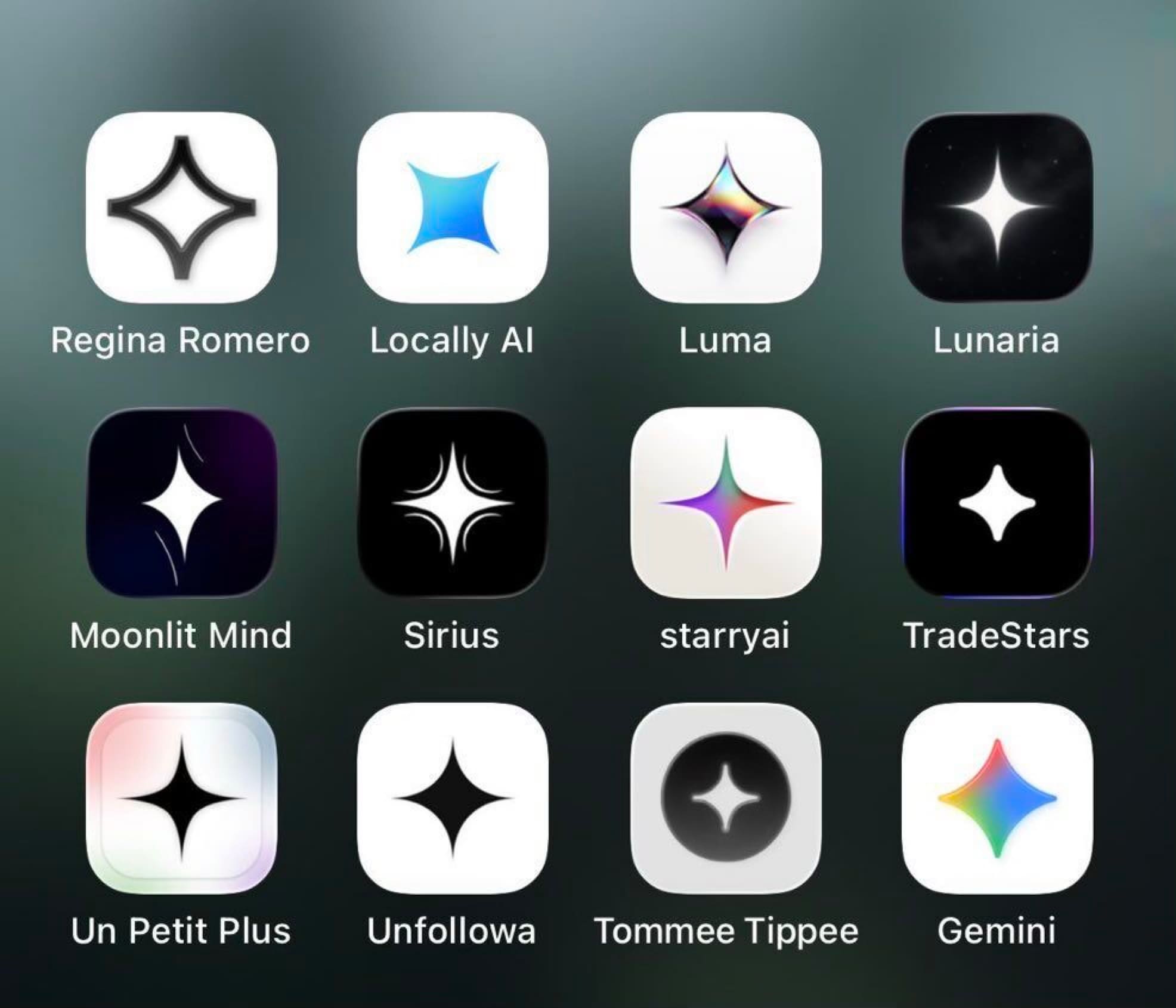
Sparkles
everywhere in AI products: but they don’t always communicate what
exactly is AI-generated, and what isn’t. Source: Chris Joyce, LinkedIn.
Not All AI-Generated Content Must Be Labelled
Beyond the use cases above, pretty much everything else — the vast majority of AI-assisted work — simply isn’t covered by new transparency rules. Most notably, the disclosure obligation does not apply where the AI-generated text has been reviewed and edited by a human, with a named person or entity taking editorial responsibility for it.
Some
confusion circles around what exactly “public interest” means, where it
starts and where it ends. On its own, it refers to health, safety,
environment, economy, finances, politics, science, or culture. If
AI-generated product claims touch upon them, the disclosure rule
applies.
Some law firms recommend labelling realistic AI-generated illustrations or photos
as a precaution for advertising, marketing and other commercial
content. AI-generated product illustrations, photos, or posters do need a disclosure, as long as they resemble a real person, place, object, or event.
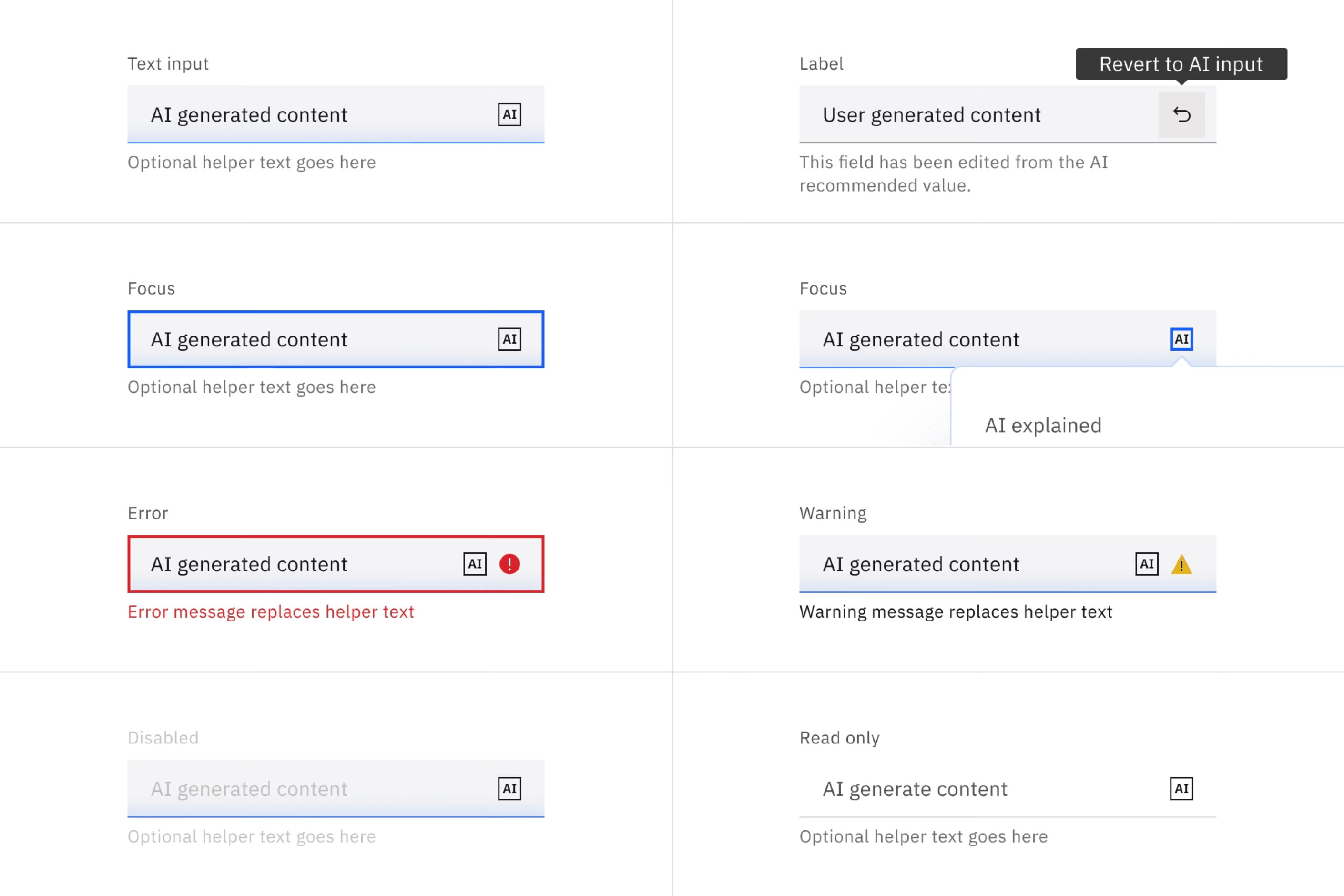
Carbon’s AI label in context within a complex data dashboard. (Image source: Carbon Design System) (Large preview)AI label placement examples across different interface components. (Image source: Carbon Design System)
The Fine Line Between “Edited” And “AI-Generated”
But at which point does edited AI content stop being AI content? When a form is pre-filled with AI, but then a user edits it, is it still AI? EU Commission’s guidance is a little fuzzy. Small assistive edits — spellcheck, grammar, formatting, cropping, colour correction, and AI-generated translation — don’t count as AI generation.
AI-generated summaries, composite imagery, substantive rewrites, or adding and removing elements from a photo are considered AI generation. In practice, fine-tuning a sentence a person wrote is fine, but generating the sentence on its own requires a disclosure.
“A human skimmed it before publishing” doesn’t qualify as editorial review. The Commission is explicit that it needs to be substantive, with a named person responsible for the editorial control.
In other words, the fine line lies between intentional manual intervention and automated generation. The latter always has to be disclosed (exception: closed B2B environments).
Carbon AI Label usage variants: inline, icon-only, and explainability panels. (Image source: Carbon Design System)
AI Sparkles Probably Not Enough
As part of the Code of Practice, the European Commission has published an EU AI icon set. It’s a specific “AI” mark (similar to the AI label in Carbon Design System) — not the generic ✨ sparkle that many products use to signal AI. The signal must be “clear and distinguishable”.
The sparkle might be too ambiguous
to signal AI clearly. Mostly because it’s often used to mean
“AI-powered feature”, rather than “this specific content was generated
by AI”. That’s the kind of signal EU guidelines are trying to rule out.
The
EU’s official AI icon set: three variants covering basic AI, fully
generated, and partially modified content. (Image source: European Commission)
The icon should be clearly visible, with a plain language label and accessible to assistive technologies. A safe bet is to pair any icon with plain text (“AI-generated”) — and it needs to persist when being reshared or downloaded.
In fact, the EU Commission also published Code of Practice on marking and labelling of AI content.
It Isn’t Just EU
It might feel like a yet another regulation coming from the EU, but in reality there are plenty of other similar regulations that emerged recently worldwide:
China has mandatory AI labelling since 1 September 2025. With visible tags and watermarked metadata.
California
has SB 942, as amended by AB 853, which became mandatory on the exact
same day as the EU rules (2 August 2026), deliberately timed to align.
South Korea
has the AI Basic Act that took effect on 22 January 2026, widely cited
as the first comprehensive national-level AI law to mandate deepfake
labels. Fines are modest by EU standards (roughly $20K per violation),
with a one-year grace period before enforcement bites.
India
has an IT Rules amendment, in force since 20 February 2026. Platforms
must label “synthetically generated information”, and takedown timing
for most harmful deepfakes was cut to 3 hours.
Why the sparkle ✨ alone isn’t enough to signal AI-generated content — users need clearer disclosure. (Image source: NNGroup)
All of these are signs of upcoming AI regulation that looks more like a pattern,
rather than a coincidence. So if you’re shipping anything AI this year,
it’s probably a good idea to have a conversation about what exactly is
going to be AI-labelled, and what not.
Wrapping Up
One final note is that new EU AI transparency rules are much broader than US laws on AI disclosure, where certain state laws require disclosures for synthetic human performers, political advertising or specific AI applications.
None
of this really deserves panic or confusion. It’s about a fairly simple
idea that has been emerging worldwide at almost the same time:
When
AI content could easily be mistaken for human content, creators must
say so — in a way that is clear, obvious, and unambiguous. And parts of
the UI that are AI-generated must be disclosed as such.
If anything, it will help people distinguish between AI slop and not AI — and everybody can only benefit from that.
When tasked with building a highly interactive, tactile web experience,
the architecture must serve the art direction. In this article, it explains their architectural rationale for building a digital
stress-relief squeeze toy game using Lottie animations, DOM events, and
distance-based math to maintain absolute control over their designers’
intentional motion.
When front-end developers and UX engineers are tasked with building a
web interface that feels tactile, bouncy, or destructive, the industry
instinct is almost always the same: reach for a physics engine.
Frameworks like Matter.js, Cannon.js, or custom WebGL solutions have
become the gold standard for creating immersive, gamified websites.
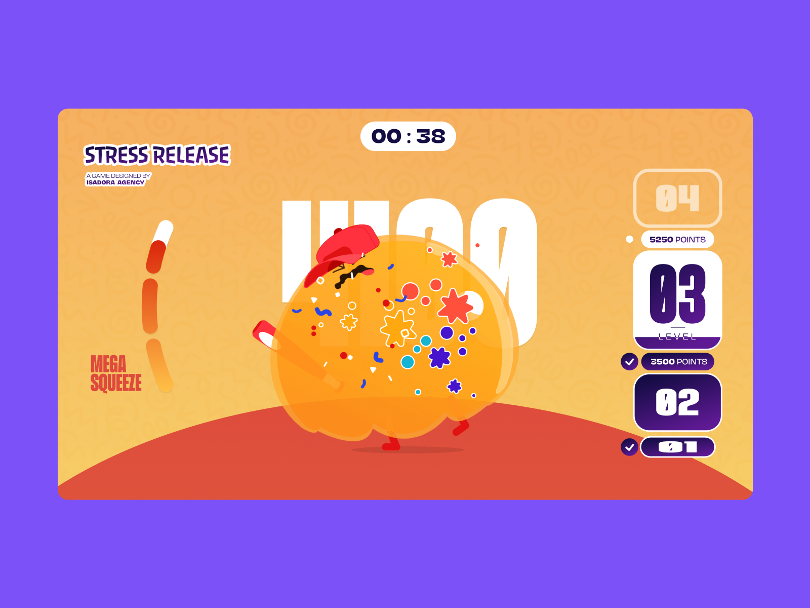
When our team at Isadora Agency
set out to build Stress Release, a digital stress-relief squeeze toy
designed to let burnt-out creatives smash, stretch, and distort animated
UI characters, we initially explored that route. The goal was to build a
highly tactile experience where every click yielded a satisfying, squishy reaction.
But
as we began prototyping, we realized something crucial: Physics engines
produce plausible motion, but in our case, the animators produced intentional motion.
We
didn’t need our characters to act like realistic rubber balls bouncing
uncontrollably around a canvas. We needed them to react in very
specific, highly designed ways. So, we scrapped the physics engine
entirely.
In this article, we’ll break down how we built a real-time stress-relief squeeze toy without a single line of WebGL or Matter.js, relying entirely on programmatic Lottie state controls, DOM manipulation, and distance-based math.
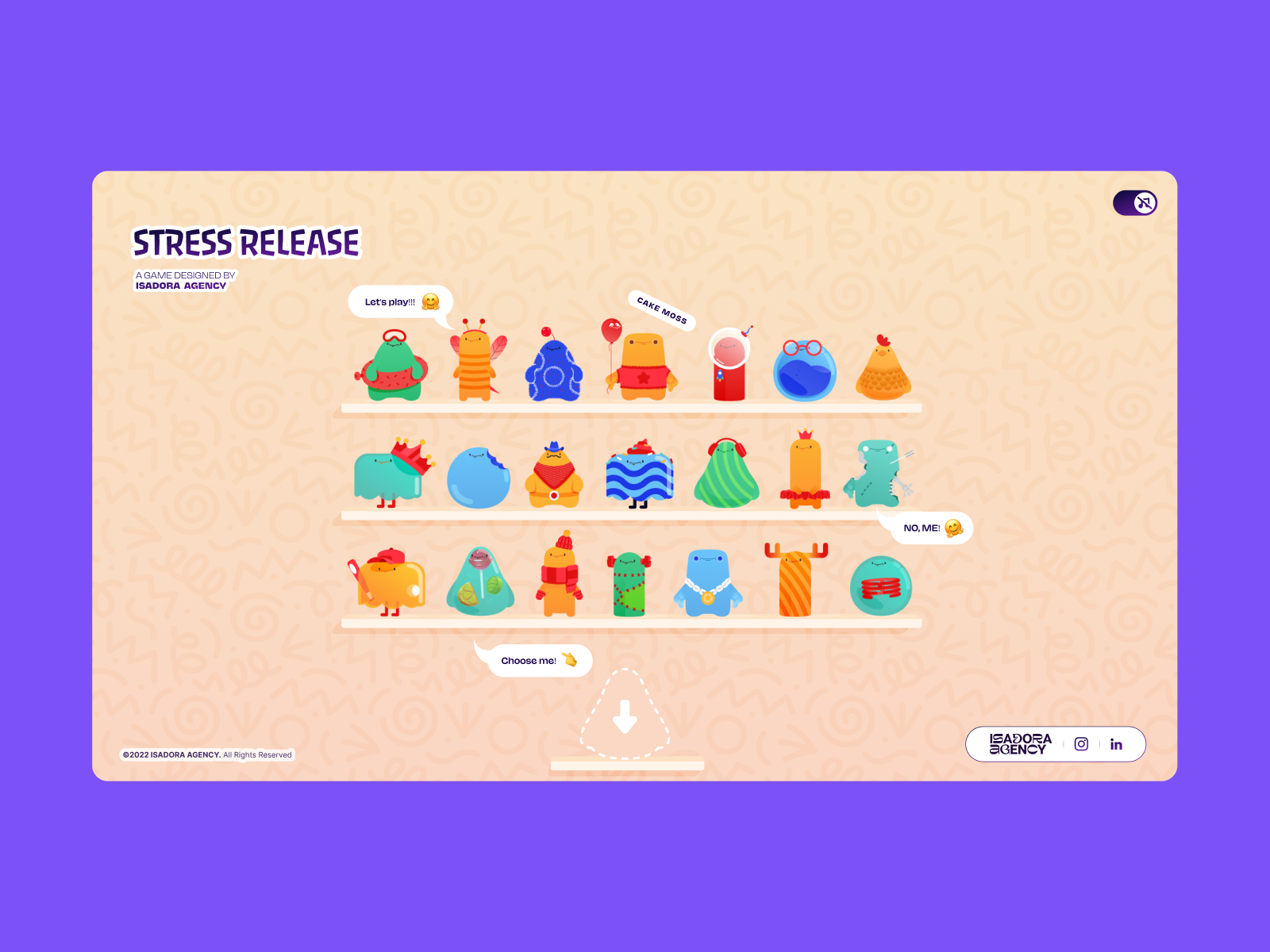
The
Stress Release character shelf introduces players to a collection of
animated stress-relief toys, each powered by bespoke Lottie animation
states.
The Design Requirements: Intentional Motion
Our core requirement for Stress Release was absolute deterministic control. Our animators had crafted bespoke .json Lottie files that required exact, frame-by-frame sequencing.
For
instance, our ‘mega squeeze’ reaction required a precise 181-frame
build-up followed by a specific release sequence. To honor this design,
we needed an architecture that wouldn’t overwrite the animators’ crafted
keyframes with algorithmic approximations.
The tighter the
click-feedback loop (click → squish → score), the more you need
deterministic frame control. By choosing programmatic state control
using Lottie’s native API, we ensured that the interaction layer acted
as a flawless trigger for the animation layer.
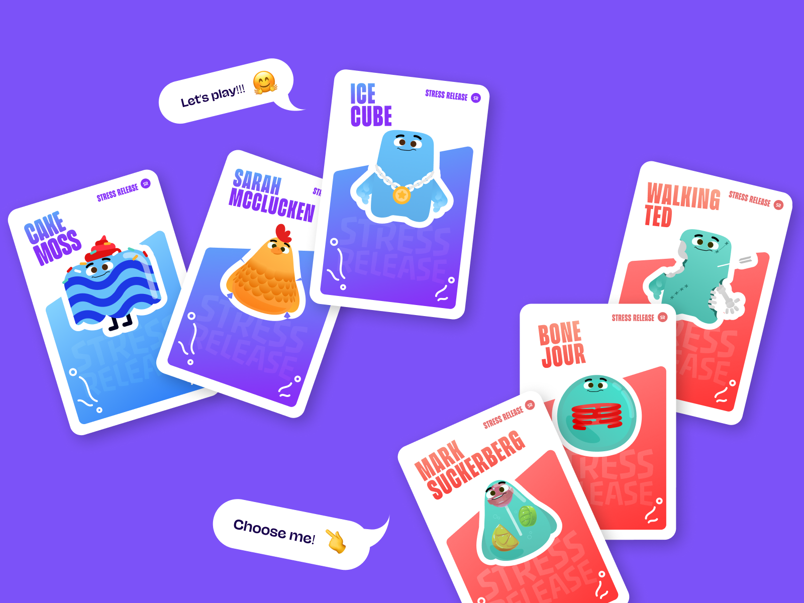
Character
cards showcase the intentionally designed personalities and visual
identities that informed each animation sequence and interaction state.
Creating Tactile Feedback: Mapping DOM Elements To Lottie States
Because
our architecture relied on Lottie and the standard DOM, rendering is
handled directly by the Lottie runtime, which plays the JSON-based
vector animations as SVGs internally. We selected elements directly by
ID and CSS class, driving their behavior using a combination of Lottie
animation segments, CSS transforms, and click-event math.
To achieve a deeply satisfying “tactile feel” upon hitting a character, we used radial input mapping. The first step was converting the click from page coordinates into the character’s local coordinate space.
Every
click was measured against the character’s center point, then
translated into score, feedback intensity, and explosion placement:
// Character's center point in its own coordinate spacevar x_center =parseFloat($("#playChar").width()/2);var y_center =parseFloat($("#playChar").height()/2);// Click position relative to the character's top-left cornervar offset =$("#playChar").offset();// document-relative positionvarX=parseFloat(e.pageX - offset.left);varY=parseFloat(e.pageY - offset.top);// Vector from center to click pointvar a =parseFloat(X- x_center);var b =parseFloat(Y- y_center);
Then we calculate the straight-line distance from the center of the click using the Pythagorean theorem:
var distance = Math.hypot(a, b);
That single number drives everything: the score, the feedback intensity, and where the explosion animation appears:
// Distance zones map to point rewardsif(distance <10) givePts =100;// bullseyeelseif(distance <40) givePts =getRndInteger(70,90);elseif(distance <70) givePts =getRndInteger(40,70);elseif(distance <100) givePts =getRndInteger(20,40);elseif(distance <120) givePts =getRndInteger(10,20);elseif(distance <145) givePts =getRndInteger(1,10);else givePts =0;// miss// Explosion Lottie repositioned to the exact click pointvar shiftPosition = window.innerWidth <1023?-20:200;$("#explosionChar").css({"margin-left": a + shiftPosition +"px","margin-top": b + shiftPosition +"px",});// Fire the squish animation instantly
explosion.goToAndPlay(0);
The
result is a concentric zone system — a perfect circle of scoring rings
around the character’s center, similar to a dartboard. The visual
complexity of the Lottie SVG is completely irrelevant to hit detection;
the hitbox is always a clean circle. Critically, the explosion Lottie
animation is repositioned to (a, b) — the same vector used for scoring,
so it always appears exactly where the player clicked. This spatial
accuracy creates the tactile “I hit that” sensation entirely through math and DOM positioning.
Distance-based
click detection and synchronized Lottie reactions create the tactile
sensation of physically hitting the character.
Interaction Handling: Controlling The Narrative
Because
the experience used DOM-managed SVG elements, desktop clicks and mobile
taps could be handled directly through native event listeners. This
avoided extra raycasting or coordinate remapping layers, while keeping
the interaction model aligned with how the animations were rendered.
Since
the game requires a visual reaction at a specific point, Lottie handles
all the squish and bounce feelings internally through its animation
curves. Each character has a defined set of animation sections (idle
loops, reaction frames, and end states) stored as frame ranges. When a
click lands, we jump directly to the exact segment that matches the
current game state:
// Animation sections defined as frame ranges per characterconst play_segments =[{
charId:0,
sections:{
idle:[0,40],// looping idle state
squeeze1:[41,80],// light reaction
squeeze2:[81,120],// medium reaction
squeeze3:[121,160],// heavy reaction},
playOrder:["squeeze1","squeeze2","squeeze3"],
endAnimation:[161,200]}];
On every click, we advance through the play order and fire the next segment:
functionstepAnim(){let p = play_segments[0];let i = p["playOrder"][curr_order_play];let playNow = p["sections"][i];
playChar.stop();// halt current segment immediately
playChar.loop =false;// no looping - play once and stop
playChar.playSegments(playNow,true);// jump to exact frames, force immediately
curr_order_play++;
canPlayAnim =0;// lock out further clicks mid-animationif(curr_order_play > p["playOrder"].length -1){
curr_order_play =0;// cycle back to start of sequence}}
When the segment completes, control returns to the idle loop:
By
triggering precise Lottie animation segments programmatically, the
interaction layer maintains deterministic control over every squash and
distortion state.
And for the mega squeeze build-up, the bar loops on a specific frame range until triggered:
// Loop the "ready to release" frames until player activates
indikL.loop =true;
indikL.playSegments([181,302],true);// On activation - play the release sequence once
indikL.loop =false;
indikL.playSegments([96,396],true);
indikL.goToAndStop(0,true);// hard reset after completion
The Responsive Benefit Of DOM Elements
Another major factor in our architectural decision was responsive behavior. Because we built Stress Release in the DOM, we bypassed the complexities of scaling bounding boxes and collision vectors across different devices.
We handled responsive resizing entirely through CSS variables.
By recalculating CSS custom properties on every resize, the layout
simply reacts to the updated variables, and the Lottie SVGs scale
naturally inside their containers without losing their state:
constappHeight=()=>{const doc = document.documentElement;
doc.style.setProperty("--doc-height",`${window.innerHeight}px`);
doc.style.setProperty("--doc-width",`${doc.clientWidth}px`);};
window.addEventListener("resize", appHeight);appHeight();// run immediately on init
Mobile Performance Optimization: The Cost Of Lottie
While this architecture gave us total control over the art direction, it introduced a different challenge: file size.
Lottie
JSON files can be heavy. We had 21 different character animations, plus
multiple explosion variants that all needed to load. To ensure the
experience remained fluid — especially on mobile devices — we
implemented a few aggressive optimization strategies:
Connection monitoring We tracked initial asset load time using performance.now() to detect slow connections and flag when load times exceeded 5 seconds.
Sequential asset loading Rather
than initialising all 21 character animations simultaneously, we load
them in pairs using await, advancing only when each pair completes. This
prevents a burst of simultaneous network requests and render work from
blocking the browser on low-end devices.
Aggressive memory management Instead
of keeping our heavy explosion animations in memory, we destroy and
recreate them on the fly. This trades a tiny instantiation cost for a
much lower idle memory footprint.
Dynamic quality reduction Quality
reduction is a single API call applied immediately after each shelf
character loads. The key is applying different quality levels depending
on the character’s role in the scene:
// Shelf screen - 21 animations playing simultaneously
shelf = lottie.loadAnimation({
container: document.getElementById("charShelf"+ i),
renderer:"svg",
loop:true,
autoplay:true,
path:"assets/shelf/"+ shelfFolders[i]+"/"+ shelfFolders[i]+".json",});
lottie.setQuality(0.5);// 50% quality - reduces interpolation calculations
shelf.setSpeed(0.6);// 60% speed - fewer frame calculations per second// Play screen - single focused character
playChar = lottie.loadAnimation({
container: document.getElementById("playChar"),
renderer:"svg",
loop:true,
autoplay:true,
path: chosenChar.url,});
lottie.setQuality(1);// full quality - only one animation at a time
Conclusion: Choosing The Right Tech For The Design
When determining the stack for a gamified web experience, it is critical to let the design requirements dictate the technology.
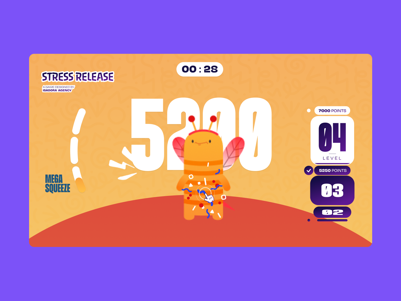
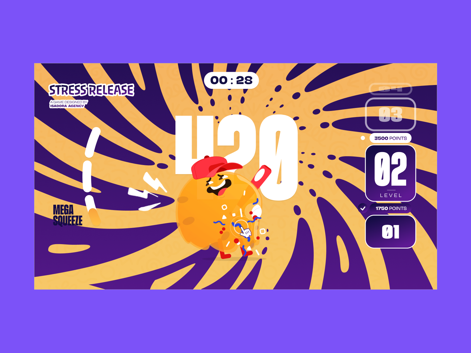
The
“Mega Squeeze” state combines layered animation sequences, background
transitions, and timed interaction feedback to heighten the sense of
impact.
Because our interactions required bespoke, highly controlled visual reactions, we opted for programmatic state control
over emergent simulation. This decision empowered the animators to
dictate the exact feel of the experience, leaving the code to do what it
does best: listen, calculate, and trigger.
Want to try implementing this yourself, or see exactly how it feels in the browser? Check out these resources:
Play with the code. We have prepared a simplified demo example on CodePen demonstrating a character reacting to a click using playSegments().
See the final product. Check out the live Stress Release site to see all 21 characters and the optimization strategies in action.
Read the docs. Explore the official Lottie Web documentation to learn more about the player controls we utilized. Specifically, explore loadAnimation(), playSegments(), setSpeed(), and setQuality() — the four methods that power the entire interaction layer described in this article.
The
gap between “you need a library for this” and “the browser does this”
keeps closing. A practical guide to auditing your dependencies and
finding what the web platform can now handle for you.
Most
of us install a dependency once and never look at it again. It does its
job, the tests pass, and we move on. But the web platform keeps moving
too, and a surprising number of the libraries sitting in your package.json today are now built into the browser.
In
a typical mid-sized JavaScript app, you can often find somewhere
between 60KB and 90KB (minified and gzipped) of dependencies that the
platform can now handle on its own. Date and number formatting, HTTP
requests, modals, tooltips, deep cloning, grouping arrays: these were
all real gaps a few years ago. A lot of them aren’t gaps anymore.
The
reason those libraries stick around isn’t laziness. It’s that most
teams don’t re-audit their dependencies on a Baseline cadence, or are
simply not aware of how fast browsers are shipping these days. You check
npm audit for security, but is this library still doing something the browser can’t? is a question that rarely gets asked. So the libraries stay.
In
this article, we’ll run that audit together. Instead of going through
dependencies one by one, we’ll work in clusters, because the wins tend
to come in groups. We’ll do the bundle math, build a small decision
framework you can reuse, and stay honest about the cases where the
platform still falls short. By the end, you’ll have a repeatable process
you can run on your own package.json.
What “Baseline” Actually Means
Before
we start deleting things, let’s quickly recap what Baseline is. Feel
free to skip this section if you’re already familiar.
Baseline is a project from the WebDX Community Group
that tells you, in plain terms, how safe a web feature is to use across
the major browsers (Chrome, Edge, Firefox, and Safari). A feature can
be in one of three states:
Limited availability The feature hasn’t shipped in all the major engines yet. Not safe to rely on without a fallback.
Baseline Newly available The
feature has just landed in all the major engines. It works for users on
up-to-date browsers, but older devices in the wild may not have it yet.
Baseline Widely available The feature has been in all the major engines for 30 months. At this point, you can reach for it without much thought.
That
30-month gap between “Newly” and “Widely” matters a lot for this audit.
A feature that’s Widely available is something you can usually drop a
library for today. A feature that’s only Newly available is something
you can drop a library for if you check your audience first, or
if you’re comfortable with a small feature check. We’ll treat those two
cases differently throughout.
You can look any feature up on webstatus.dev, on MDN (every reference page shows a Baseline badge near the top), or programmatically with the web-features npm package. We’ll use all three later when we run the audit on a real project.
A Decision Framework Before You Delete Anything
It’s tempting to read “the browser does this now”
and start ripping libraries out. Let’s not do that. A swap that looks
free on paper can quietly break things for a chunk of your users, or
cost you a feature you were relying on without realizing it.
So before dropping any library, ask three questions. We’ll reuse these in every cluster below.
1. Is the replacement Baseline-safe formyaudience?
Not “is it Baseline” in the abstract, but “is it safe for the people who actually use my app.” If the native feature is Widely available, this is usually a yes. If it’s only Newly available, check your analytics or your browserslist
config and see what share of your users would miss out. A B2B dashboard
where everyone’s on the latest browser is a very different situation
from a public-facing site with a long tail of old Android devices.
2. What does the swap actually cost?
Dropping
a library isn’t always free. Sometimes the native feature isn’t
supported widely enough yet, so you’d reach for a polyfill. If that
polyfill is heavier than the library you’re removing, you’ve made your
bundle bigger, unless you load it conditionally. We’ll see exactly this with Temporal later.
3. Does the platform feature cover my real use case?
Libraries often do more than the platform feature they resemble. axios isn’t just fetch with automatic JSON parsing; it has interceptors, request cancellation, and retries. If you’re using those, a straight swap to fetch will leave you reimplementing them. Check what you actually use before assuming it’s a drop-in replacement.
Keep these three in mind. Every cluster below is really just these questions applied to a different corner of your dependencies.
Cluster 1: Internationalization (The Biggest Drop Today Win)
This
is the cluster where you’ll usually find the most KBs sitting on top of
features that are already Widely available. The browser ships a whole
family of formatting tools under the Intl namespace, and a lot of small, popular libraries became unnecessary.
Here are the usual suspects and what replaces them:
The numeric: "auto"
option is the nice touch here: it gives you “yesterday” instead of “1
day ago” where the language has a word for it. You pass a number and a
unit, and you get a localized string back.
You may be wondering about the one thing timeago.js does that this snippet doesn’t: it picks the unit for you. Given a date, timeago.js decides whether to say “seconds” or “days.” Intl.RelativeTimeFormat
expects you to do that part. It’s a few lines of arithmetic (work out
the difference, find the largest unit that fits), and once you’ve
written that helper, you don’t need the library anymore.
Numbers, Currency, And Lists
Intl.NumberFormat covers most of what number-formatting libraries do: thousands separators, currency, percentages, and compact notation.
And Intl.ListFormat,
Widely available, handles the “join an array into a sentence” problem,
including the Oxford comma, which is the kind of thing people write
fiddly helper functions for:
const lf =newIntl.ListFormat("en",{ style:"long", type:"conjunction"});
lf.format(["Alice","Bob","Carol"]);// "Alice, Bob, and Carol"
The One Caveat: Durations
humanize-duration turns a number of milliseconds into “1 hour, 30 minutes”. The platform equivalent is Intl.DurationFormat:
One thing to keep in mind is that Intl.DurationFormat is Baseline Newly
available at the time of writing, not Widely available. It landed in
all the major engines in March 2025, and it’s on track to become Widely
available in 2027. So this one fails question 1 for broad-audience apps
unless you check your traffic first or add a fallback. For an internal
tool on modern browsers, it’s fine today. For a public site with old
devices, give it another year or guard it with a feature check.
The Math On This Cluster
If your app uses the full set (humanize-duration, timeago.js, pluralize, numeral), that’s roughly 14 KB gzipped
of dependencies, most of it replaceable right now with Widely available
APIs. The internationalization cluster is usually the easiest win in
the whole audit.
Cluster 2: HTTP Clients
This cluster is more nuanced, so it’s a good one to slow down on.
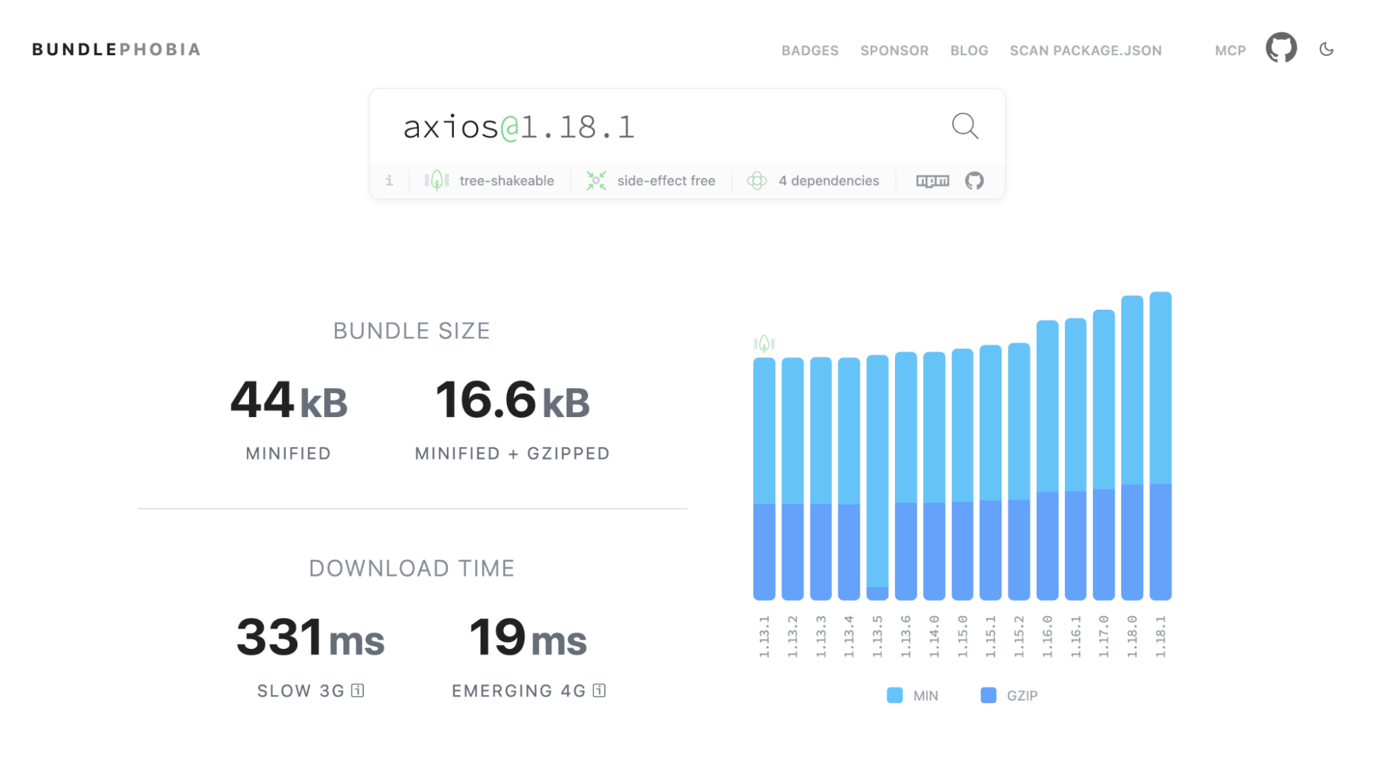
The browser HTTP libraries people reach for are axios (17 KB gz) and superagent (19 KB gz). For most requests, fetch plus AbortController covers what you need, and both are Widely available.
A basic GET looks like this:
// axiosconst{ data }=await axios.get("/api/users");// fetchconst res =awaitfetch("/api/users");const data =await res.json();
The one extra line (res.json()) is fetch being explicit where axios was implicit. That’s the pattern across this whole cluster: fetch does less for you by default, and you decide whether you want the things it leaves out.
axios has a timeout option. fetch has AbortSignal.timeout():
const res =awaitfetch("/api/users",{
signal: AbortSignal.timeout(5000),// abort after 5 seconds});
Where fetch Doesn’t Replace axios
This is where question 3 does most of the work, so let’s be specific about the gaps:
fetch doesn’t reject on HTTP errors. A 404 or 500 is a resolved promise, not a rejection. You have to check res.ok yourself. axios rejects on any non-2xx status.
No interceptors. If you rely on axios interceptors to attach auth tokens or handle 401s in one place, fetch has no equivalent. You’d wrap fetch in your own function or class to get the same behavior.
No automatic retries. axios (with a plugin) can retry failed requests. With fetch, that’s your code to write.
No upload progress. fetch
still can’t report upload progress in a first-class way. If you have a
file uploader with a progress bar, that’s a real reason to keep a
library.
I personally heavily rely on interceptors in my interactive online courses, such as Learn JavaScript, and I have solved that for years using a custom class on top of fetch. I’ve shipped this to millions of users and have seen lots of success with it.
None
of these are hard to rebuild, and most apps only use one or two of
them. But this is exactly the kind of cluster where you shouldn’t do a
blind find-and-replace. Look at how you actually use your HTTP client
first. If it’s plain GETs and POSTs, dropping axios for a thin fetch wrapper saves you about 17 KB gzipped.
Cluster 3: UI Primitives
This
cluster has some of the most satisfying swaps, because the platform
features don’t just match the libraries, they’re often more accessible
than what teams ship by hand.
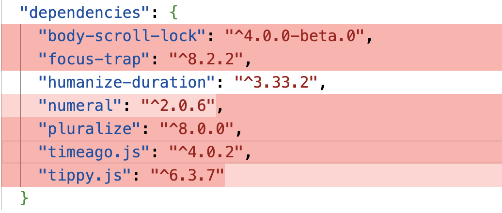
The libraries here are modal dialogs (something like a11y-dialog, 1.8 KB gz), tooltip and popover libraries (tippy.js, 14 KB gz, which bundles Popper for positioning), focus-trap (6.6 KB gz), and body-scroll-lock (1.3 KB gz). They get replaced by three platform features: the <dialog> element, the Popover API, and CSS anchor positioning.
The <dialog> Element
A huge amount of modal-related code exists to solve accessibility problems: trapping focus inside the modal, closing on Escape, restoring focus to the previous element when the dialog is closed, and rendering above everything else. The <dialog> element, Widely available, does all of that for you.
<dialog id="confirm"><form method="dialog"><p>Delete this file?</p><button value="cancel">Cancel</button><button value="delete">Delete</button></form></dialog>const dialog = document.querySelector("#confirm");
dialog.showModal();// focus moves in, background goes inert, Escape closes it
dialog.addEventListener("close",()=>{
console.log(dialog.returnValue);// "cancel" or "delete"});
Calling showModal() does the work that focus-trap was installed for: focus moves into the dialog, the rest of the page becomes inert so you can’t tab out of it, Escape closes it, and focus returns to the element that opened it. The dialog renders in the browser’s Top layer, so you don’t fight z-index. You also get a ::backdrop pseudo-element to style the overlay.
That single element can replace your modal library andfocus-trap. The one piece it doesn’t handle on its own is locking the background from scrolling, which is what body-scroll-lock was for. That’s now one line of CSS:
body:has(dialog:modal){overflow: hidden;}
If you’re wondering why we’re using dialog:modal instead of dialog[open], it’s because the open attribute is set as soon as you call show(), but the dialog isn’t actually modal so you don’t want to lock scrolling yet. The :modal pseudo-class is only true when the dialog is actually modal, which is the case when you call showModal().
So three libraries collapse into one element and one CSS rule.
Popover API And Anchor Positioning
For things that aren’t full modals (dropdown menus, tooltips, the small floating panels that tippy.js handles), the Popover API gives you light-dismiss behavior, top-layer rendering, and Escape-to-close with no JavaScript at all:
<buttonpopovertarget="menu"id="options">Options</button><divid="menu"popover><!-- menu content --></div>
Clicking the button toggles the popover. Clicking outside it closes it. It’s Baseline Newly available (since January 2025).
The other half of what a tooltip library does is positioning:
keeping the floating element pinned to its trigger and flipping it when
it would overflow the viewport. That’s what Popper (bundled inside tippy.js) handles, and it’s now a CSS feature called anchor positioning. Here it pins the same #menu popover directly under its trigger button:
Anchor
positioning is the newest feature in this article. It became Baseline
Newly available in January 2026, when Firefox 147 shipped it (Chrome had
it since version 125, and Safari since version 26). Because it’s this
fresh, it’s squarely a question-1 feature: great for modern audiences,
but check your traffic, and note that some of the more advanced parts
(like position-try fallbacks) have uneven support across versions. Keep a
sensible fallback for older browsers.
Between <dialog>, the Popover API, and anchor positioning, the UI primitives cluster (tooltip library, modal library, focus-trap, body-scroll-lock) adds up to roughly 24 KB gzipped, and you come out the other side with better accessibility defaults than most hand-rolled solutions.
Cluster 4: Lodash Utilities
Lodash is rarely imported whole anymore, but its individual functions show up everywhere, either as the full lodash package (25 KB gz) or as standalone installs like lodash.clonedeep and lodash.groupby. Several of the most common ones now have direct platform equivalents.
Grouping
lodash.groupby reorganizes an array into an object keyed by some property. Object.groupBy does exactly that:
There’s also Map.groupBy for when you want a Map
instead of a plain object (handy if your keys aren’t strings). Both are
Baseline Newly available, since March 2024, and on track to become
Widely available in late 2026.
Deep Cloning
lodash.clonedeep makes a deep copy of an object. structuredClone is the platform version, and it’s Widely available:
structuredClone handles the tricky cases that trip up JSON.parse(JSON.stringify(...)): it clones Date, Map, Set, ArrayBuffer,
and circular references correctly. The limit to know about (question 3
again) is that it can’t clone functions, DOM nodes, or class instances;
it throws on functions and drops the prototype on class instances. For
plain data, which is what most people deep-clone, it’s a clean
replacement.
Set Operations
If you’ve ever pulled in a Lodash helper for union, intersection, or difference, the Set object now has these built in. They’re Baseline Newly available, since June 2024:
const admins =newSet(["sam","alex","jo"]);const editors =newSet(["alex","kim"]);
admins.intersection(editors);// Set { "alex" }
admins.union(editors);// Set { "sam", "alex", "jo", "kim" }
admins.difference(editors);// Set { "sam", "jo" }
The full set of methods is union, intersection, difference, symmetricDifference, isSubsetOf, isSupersetOf, and isDisjointFrom.
What’s Worth Keeping
Not all of Lodash has moved into the platform. debounce and throttle still have no native equivalent, and they’re genuinely useful, so cherry-picking lodash.debounce
is reasonable. The point of this cluster isn’t “delete Lodash,” it’s
“stop shipping the parts the browser already has.” Dropping lodash.clonedeep and lodash.groupby alone is about 8 KB gzipped, and if you were importing the full lodash for a handful of functions, replacing the platform-covered ones can let you drop it entirely.
Cluster 5: Temporal, A Case Study In Not Dropping A Library Yet
Every
cluster so far has ended in “go ahead, drop it.” This one is the
opposite, and that’s why it’s worth including: it shows the framework
telling you to wait.
Temporal is the long-awaited replacement for JavaScript’s Date,
and it’s a genuinely better API: immutable objects, sane time zone
handling, and no more month indexes starting at zero. It reached TC39
Stage 4 in March 2026 and is part of the ES2026 specification. Firefox
shipped it in version 139 (in 2025), and Chrome shipped it in version
144 (January 2026). Safari hasn’t shipped it in a stable release yet;
it’s in Safari Technology Preview, with stable support expected later in
2026.
If Temporal is news to you, check out the Temporal Cheatsheet for a quick overview of the API and a comparison to Date.
However, Temporal is not Baseline. It’s still in limited availability,
because Safari users don’t have it. To use it across all browsers
today, you need a polyfill, and this is where the math turns against
you.
The official @js-temporal/polyfill is about 44 KB gzipped. There’s a smaller polyfill that internally does not depend on BigInt and it weighs 19 KB gzipped. A lightweight date library like dayjs is about 3 KB gzipped. So if you swap dayjs for Temporal plus its polyfill right now, you’re not saving 3 KB, you’re adding roughly 41 KB to your bundle, unless you are able to load the polyfill conditionally.
Run it through the framework:
Question 1 (audience): Temporal isn’t Baseline. For a broad audience, that’s a lot of people.
Question 2 (cost): the polyfill is more than ten times the size of the library you’d remove. The swap makes your bundle bigger.
Question 3 (feature gap): Temporal actually wins here; it does more than dayjs. But that doesn’t matter while questions 1 and 2 are failing.
The verdict is generally clear: keep dayjs (or date-fns)
for now. The moment to revisit is when Safari ships Temporal in a
stable release and it reaches Baseline. At that point you can use
Temporal natively and conditionally load the polyfill for users on older
browsers. This is a feature to write down and check again in a few
months, not one to act on today.
How To Run This Audit On Your Own package.json
The clusters above are a starting map, but your dependencies are your own. Here’s a repeatable process you can run this quarter.
Step 1: List Your Production Dependencies
Start by listing what actually ships to users:
npmls --omit=dev --depth=0
Step 2: Measure What Each One Costs
For a quick per-package number, Bundlephobia gives you the minified and gzipped size of any npm package. For the real picture (what each dependency costs in your actual bundle, after tree-shaking and deduplication), run a bundle analyzer against your build. npx source-map-explorer works on most bundles, and npx vite-bundle-visualizer works for Vite projects.
Step 3: Check The Baseline Status Of Each Replacement
For each candidate, find the platform feature that would replace it and check its Baseline status. The quickest way is webstatus.dev or the Baseline badge on the feature’s MDN page.
Step 4: Run The Three Questions
For
each library with a platform replacement, go back to the framework: Is
it Baseline-safe for your audience? What does the swap cost? Does the
feature cover how you actually use the library? Most of your decisions
will fall out of question 1 (check the feature’s status against your browserslist) and question 3 (check your own usage).
Step 5: Swap Behind Progressive Enhancement Where Needed #
For
Widely available features, swap and move on. For Newly available ones,
either confirm your audience is on modern browsers or guard the new code
with a quick feature check and keep a fallback:
if(typeof Intl.DurationFormat ==="function"){// use the platform feature}else{// fall back to the library, or a simpler format}
That way you ship less code to the users who can run it, without breaking the ones who can’t.
Wrapping Up
Add
the clusters up, and the picture is concrete. The internationalization
cluster is around 14 KB gzipped, HTTP is around 17 KB, the UI primitives
are around 24 KB, and the Lodash utilities are 8 KB or more depending
on how much of the library you were shipping. For a typical mid-sized
app, that’s somewhere between 60 KB and 90 KB gzipped of dependencies
you can hand back to the platform, and more if you were shipping the
full lodash or several of these libraries at once. (The
uncompressed numbers are two to three times larger, which is what you’ll
see in a bundle analyzer before gzip.)
I’ve chosen relatively
lean packages for most of these features, but some individual packages
could still be heavy. Your dialog package, for instance, could alone
weigh as much as 50KB gzipped depending on what you’re using.
A few features are worth keeping an eye on over the next year, because they’ll open up further swaps:
Temporal going native. Once Safari ships it in a stable release and it reaches Baseline, you can drop both your date library and the polyfill, turning today’s regression into a real win.
CSS anchor positioning maturing. It
became Baseline Newly available in January 2026. As it ages toward
Widely available, dropping tooltip and popover positioning libraries
gets safer for broad audiences.
Object.groupBy and friends crossing into Widely available. The
2024 batch (array grouping, Set methods) is on track to become Widely
available in late 2026, which moves them from “check your audience” to
“just use it.”
None of this is a one-time cleanup. The platform ships new features constantly, and the gap between “you need a library for this” and “the browser does this”
keeps closing. The habit worth building is small: once a quarter, run
the audit. List your dependencies, check what’s now Baseline, and hand
back what you can.
Pick one cluster from this article, open your package.json, and see how much of it the browser already does for you.