When space and money are tight, launching an ecommerce business can feel like a moonshot. You can rack up costs by either manufacturing your own products or placing wholesale orders, waiting for sales to come through while your living room fills with product. And you’ll still need the time and funds to take product photos for your online store, market your brand, and hand-pack each box for shipping.
Luckily, there are two ecommerce business models to simplify your set-up: print-on-demand and dropshipping, two cost-efficient and space-saving ways to get your business going. Read on to compare the print-on-demand vs. dropshipping business models and decide which approach is best for you.
What is dropshipping?
Dropshipping is a retail fulfillment method that allows you to launch an ecommerce brand without having to manufacture, buy, store, or ship inventory yourself. Instead, sellers use dropshipping suppliers—businesses that maintain and ship a large portfolio of products. By outsourcing order fulfillment, online business owners reduce overhead costs and the need for storage space.In a dropshipping business model, ecommerce business owners, or “sellers of record,” select products from a dropshipping supplier and list them in their online store. Once a customer places an order, the seller forwards it to the dropshipping supplier, who fulfills the order on the seller’s behalf. Shopify store owners can use powerful apps available in the Shopify App Store to source products from suppliers. Apps include DropCommerce for dropshipping in the US and Syncee for the EU and the rest of the world.
What is print on demand?
Print on demand (POD) is a type of dropshipping business model that allows you to sell products without purchasing or managing inventory, but with a custom-designed element.
In print on demand, sellers create a design, like custom artwork or a brand logo, then select products from a print-on-demand supplier to apply the design to. Apparel, accessories, mugs, and posters are popular print-on-demand products. The seller lists the products and artwork options in their online store, and once a customer places an order, the supplier prints, packages, and ships it to the customer. Shopify store owners can integrate with suppliers like Printful to easily start their POD businesses.Print on demand vs. dropshipping: similarities
No physical store or warehouse
Limited inventory management
Supplier reliability
Low startup costs
Both dropshipping and print-on-demand business models shift the work of managing stock and fulfilling orders to third-party suppliers. Here’s how the models are similar:
No physical store or warehouse
A key component of both dropshipping and print-on-demand models is the absence of a physical store. Suppliers ship products directly to the customer after an order has been placed, so there’s no need for you, the ecommerce business owner, to store it either. This is a large part of what makes it so easy for individuals to launch either style of business. The overhead costs associated with leasing, furnishing, and staffing a retail store or warehouse are nonexistent.
Limited inventory management
Since both dropshipping companies and print-on-demand companies create, store, and ship products to customers, ecommerce business owners don’t need to devote resources to traditional inventory management. However, you can still follow inventory management best practices to improve your operations.
Use real-time inventory management tools to:
Sync with your suppliers and prevent stockouts
Forecast demand and plan for increases or decreases
Keep open lines of communication with suppliers to stay abreast of product trends and potential issues
Supplier reliability
Both print-on-demand and dropshipping businesses rely on suppliers not just for the products they sell, but for packing and shipping as well. Which is why it’s important to choose a supplier you trust to represent your brand experience, with high-quality products that you feel you can stand behind.
Before contracting with a supplier, ask about product samples and packaging to assess product quality yourself before listing them for sale. It may also be a good idea to have multiple suppliers on your roster, even for the same product, so a single supplier’s shortfall doesn’t impact your business.
Low startup costs
By outsourcing supply and shipping, both models have far fewer startup costs than a traditional wholesale business, allowing you to direct more time and budget toward marketing, branding, and customer service.Print on demand vs. dropshipping: differences
Customization
Product selection
Competition
Branding
Return support
Though the order fulfillment flow of both models is almost identical, print on demand and dropshipping differ in a few ways:
Customization
Print on demand relies on unique custom designs that translate your brand personality into tangible products. Some dropshipping suppliers offer custom packaging for business owners using branded dropshipping, but you can dropship products without doing any customization. The design is the product you’re responsible for in POD, while in dropshipping, you aren’t responsible for any product creation.
Product selection
Dropshipping suppliers offer a wide variety of ready-to-ship products, often categorized into niches, like home goods or electronic accessories. Some suppliers, like DropCommerce, feature small independent brands and businesses in their portfolios.
Print-on-demand suppliers provide a variety of ready-to-customize products. Printful, for example, features a range of familiar, comfortable t-shirt brands that customers recognize, like Gildan or American Apparel, alongside blank tote bags, phone cases, and more.
Competition
Chances are, your dropshipping supplier is providing products to multiple ecommerce stores. That means many stores may have the same products, or very similar ones, at roughly similar prices.
Because of this, ecommerce businesses relying on dropshipping benefit from an increased focus on merchant differentiation. This could mean curating unique product portfolios or creating a brand identity that draws customers to their site, rather than relying on the pull of the products alone.
Because print on demand applies a custom design to different products, the inventory is unique and more likely to find its niche.
Branding
In print on demand, branding is front and center, since it’s a way for brands to create apparel and merchandise emblazoned with their logo, slogans, limited-edition capsules, and more. Dropshipping offers fewer branding opportunities. Packaging and delivery leave little room for personalization, and dropshipping products are rarely exclusive to a single retailer.
Return support
Most dropshipping suppliers have return policies allowing refunds, exchanges, or returns, especially due to supplier error or damaged goods. Dropshipping products are selected from an existing catalog, so replacing them is relatively easy.
Because dropshipping stores are not in charge of inventory, they act as an intermediary between customers and suppliers, communicating policy details and order statuses as needed. Check with your supplier about returns and refunds, and shape your customer-facing policy accordingly.
By contrast, the custom nature of print-on-demand products makes returns tricky. Since each order is created as it comes in, some print-on-demand suppliers may require customers to cover the return cost or may not offer full refunds. This could require you, as the seller, to cover the cost of the return or exchange, for example, or enforce a strict return policy.
Print on demand vs. dropshipping FAQ
Is print on demand or dropshipping better?
Print on demand is a better fit if you want to sell your own custom products or branded merchandise, you’re brand-focused, and you enjoy the design process. Dropshipping is best suited to retailers who are sales-driven, not brand-focused, and skilled in marketing and driving traffic. Depending on your business, you may combine the two approaches.
Is print on demand the same as dropshipping?
Print on demand is a type of dropshipping model. Dropshipping includes any arrangement where the supplier packages and ships goods as individual orders come in from the retailer’s online store. For example, you can dropship anything from shoes and soccer balls to portable vacuums and ring lights. POD specifically refers to businesses where custom items are printed based on incoming orders. These can include art prints, tote bags, and t-shirts customized with logos, branding, or illustrations.
Is dropshipping more profitable than print-on-demand?
Though both models are low risk and have a low cost to enter, print-on-demand businesses can face less pricing competition. That’s thanks to the unique nature of POD products—if you have unique designs in mind, print on demand may be a profitable venture to consider.
Tuesday, June 23, 2026
Print on Demand vs. Dropshipping
Thursday, June 18, 2026
Designing With Uncertainty: How AI Supercharges Probabilistic Thinking
In 2024, an Air Canada customer asked a chatbot about bereavement fares. The bot confidently gave him a refund policy that didn’t exist. The airline refused to honor it. A tribunal ruled in the customer’s favor. The bot hadn’t decided anything; it had predicted an answer based on patterns in its training data. The company treated that prediction as policy.
This is the risk at the heart of designing with AI today: probabilistic systems wrapped in deterministic interfaces. The AI offers a guess, the interface presents it as truth, and the user, or the organization, acts on it.
Humans are wired for deterministic thinking. We prefer to believe that past actions determine future outcomes. Flip a coin 999 times and get heads every time, the deterministic mind assumes the coin is rigged. The probabilistic mind accepts that the 1000th flip could still go either way. That second mindset is harder to hold onto, but it is exactly what designers need right now.
Products operate in complex, nonlinear environments, and AI is accelerating that complexity. When designers and product teams treat AI outputs as the answer rather than one of many possible answers, they build fragile experiences, and in some cases, like medical diagnostics or financial forecasting, genuinely dangerous ones.
This article is a practical guide to designing probabilistically with AI as a partner. It is about using AI to sharpen your thinking rather than outsource it, accounting for model bias, human sentiment, and perceived risk along the way.
Probabilistic Thinking + AI #
Most questions we ask AI do not produce binary answers. They produce probabilities based on patterns in data. If you ask, “Do aliens exist?” the answer will be somewhere between plausible and uncertain. Scientists consider life elsewhere in the universe likely, but without any concrete evidence, we cannot confirm it. The answer doesn’t resolve the question; it frames it as a probability.
Designers should read AI outputs the same way. They are signals, not conclusions, possible outcomes that have to be interpreted within the context of product goals, user behavior, and business constraints.
Many digital products already work this way. Netflix doesn’t know you’ll enjoy Superstore because you watched The Office; it estimates the probability and surfaces the title accordingly. The interface is responding to a prediction.
Design decisions can follow the same logic. AI models can combine behavioral analytics with research insights to estimate the likelihood of certain outcomes, and those probabilities can act as a yardstick for design strategy. Consider a scenario where analytics suggest a 60% versus 90% confidence that users will complete a purchase. At 60%, the design has to do more persuasive work, testimonials, explanations, comparisons, and reassurance signals may help the user move toward a decision. At 90%, the user is already motivated, and the design should start removing friction so the action can happen quickly. Same screen, very different design problem.

AI can also simulate outcomes using historical data and behavioral models before you commit to a direction. The value of those simulations depends heavily on how prompts are structured, the context they define, the hypothesis being tested, user motivation, and the edge cases you want stressed.
I can think of one such practical use: evaluating early designs through structured prompts, especially when you don’t have direct access to the user group you’re designing for. The prompt below is a starting point for evaluating a design from the perspective of neurodivergent users as well. Treat it as a template, adapt the user group, criteria, and output format to your product, and use it as a conversation starter with your team rather than a verdict.
Evaluate the [design file or weblink] for usability, accessibility, and content relevance from the perspective of neurodivergent users such as those with autism spectrum disorder, ADHD, learning disabilities, etc.
Please consider the following criteria:
- Is the layout and navigation intuitive for neurodivergent users?
- Is the language and content appropriate and engaging for neurodivergent users?
- Are there any barriers (technical, cognitive, or sensory) that this group might face when using the site?
- How well does the site meet the specific needs or goals of neurodivergent users?
Provide a SWOT analysis, probability score for successful use by neurodivergent users, and any recommendations for improvement.
Note: This is an oversimplification of the idea. Please be mindful of the intricate details of your product and make any appropriate changes.
That said, simulations do not replace experimentation. Because models are trained on historical data, they reflect past behavior more strongly than they predict future change. Imagine designing a voice interface for elderly users who struggle with touchscreens. A model trained on mobile interaction data might predict low engagement, not because the idea lacks value, but because the dataset reflects different user behavior. Simulations should always surface assumptions, not prevent innovation.
Be Cautious of Skewed Probabilistic Thinking Using AI
AI systems are built on historical data, more specifically, on the datasets they are trained on. That foundation shapes the outputs we receive. During the AI Summit in France, India’s Prime Minister Narendra Modi shared an example that illustrates this well. If you ask an AI model to generate an image of a person writing with the left hand, the output may still show a person writing with their right hand. The reason is statistical: most people are right-handed, and the training data reflects that. This may have improved over time, but the point remains relevant. I still occasionally see this behavior when generating images with similar models.
What you receive is not truth. It is the most statistically likely outcome given the data available. Always ask whether past data meaningfully predicts future behavior. If additional context can improve the prediction, include it. Without context, the output is just one of many possible answers dressed up as the only one.

Confidence scores deserve the same scrutiny. Overtrusting a high-confidence output leads to the Air Canada situation. Dismissing a low-confidence one can cause teams to miss a real signal buried in noisy data. A prediction with 90% confidence is not necessarily correct, and a 40% signal is not necessarily useless. Designers must still weigh the possibilities, consider the case in front of them, and bring judgment to what the AI recommends.
Transparency is how you make that possible. As AI systems increasingly shape decisions, people need visibility into how outputs are generated, the sources, the reasoning, and the summaries behind a recommendation. Black-box systems breed distrust. Systems that reveal their reasoning let users evaluate outputs for themselves. That transparency is good design and ethical practice. It respects the trust people place in these tools.
Thinking in probabilities often means resisting the temptation of quick answers. AI can accelerate research and surface patterns faster than ever before, but those outputs are starting points, not final decisions.
Practice Probabilistic Design with AI
Design shapes how a product is ultimately experienced — the decisions designers make determine whether the experience feels adequate, intuitive, or exceptional. And design is inherently full of assumptions and bets. Even the most rigorous research can yield multiple valid solutions to the same problem, each carrying a different probability of success.
Thinking probabilistically means recognizing that design decisions rarely produce binary outcomes. They lead to a range of possible results, and the role of the designer is to navigate those possibilities and identify the path most likely to create value. This mindset also builds adaptability: user needs evolve, strategies change, and sometimes ideas fail. Teams that lean on data signals, experimentation, and learning loops move faster toward the most effective solution.
Before the practical principles, one fundamental idea:
Design decisions should be optimized for likelihood, not certainty.
“
Design for Likelihood, Not Certainty
Every design decision is a bet, not a guarantee. Even when decisions are informed by research and data, they are still based on smaller samples and assumptions about how users will behave at scale. A well-researched idea can still fail in the real world.
The Air Canada chatbot from the introduction is a design lesson as much as a legal one. The bot was doing what language models do, predicting plausible text. The interface, however, communicated that prediction with complete confidence, no caveats, no “here’s what our policy usually says,” no obvious path to a human. The user read confidence as commitment, and legally, so did the tribunal.
This is what happens when probabilistic systems are wrapped in deterministic interfaces. The interface transforms likelihood into certainty, and that is where the risk emerges.
Designing for likelihood means letting the interface continue to have uncertainty, visible fallbacks to human support, and clear labeling when content is AI-produced, preventing unforeseen issues.
Designers should avoid binary thinking — a great idea does not mean guaranteed success, and a familiar idea is not guaranteed to fail. Examine variations, confidence levels, and edge cases instead. AI can certainly help here, acting as a portfolio-thinking engine that surfaces different interpretations, highlights risks, and generates structured recommendations. The goal is not to optimize for certainty, but for value: it should always be value-driven.
Think of the moment in Avengers: Infinity War when Doctor Strange tells Tony Stark that out of millions of possible futures, there is only one where they win. AI cannot tell you the future, but it can help you explore the possible paths. Instead of asking whether an idea will succeed, ask AI to estimate the likelihood and get a score, and use those signals to guide decisions.
Use Data as a Compass, Not a Map
Even an actual probability is not a final answer. Imagine an AI model predicts an 80% likelihood that users prefer a minimal checkout experience. That does not mean the solution is simply “build a minimal checkout.” Data should function as a compass, not a map.
- Why did the model produce that prediction?
- What data influenced it?
- What assumptions is it leaning on?
- What user behavior is it actually detecting?
These questions help designers validate predictions through usability testing and additional research. AI excels at identifying patterns, but it rarely explains why those patterns exist. Understanding motivation is still a human-centered research task.
The clearest cautionary tale here is Amazon’s experimental AI recruitment tool, which the company reportedly scrapped after discovering that the model had learned to downgrade resumes from women. The training data, roughly a decade of historical hiring decisions, was skewed toward male candidates, and the model inherited that skew. It began penalizing resumes that included the word “women’s,” as in “women’s chess club captain,” and favoring language more commonly found on men’s resumes. The system was not intentionally biased — the data was. Amazon reportedly tried to adjust it and eventually shut the project down because they could not guarantee it would not surface other discriminatory patterns.
Examples like this are why interpreting AI output critically matters. Designers need to understand the data behind a prediction and evaluate the reliability of the models they depend on. A recommendation is only as good as the data it was trained on, and the only way to know what that data is hiding is to ask.
Experiment as a Learning System
Experimentation is usually framed as a way to validate a design decision. Want to lift the click-through rate of a CTA? Run an A/B test. Probabilistic thinking reframes this. Experiments should not only confirm solutions but also reduce uncertainty.
- Traditional approach: Testing features to confirm success.
- Probabilistic approach: Testing assumptions to reduce uncertainty.
Traditional A/B testing is expensive. It costs engineering time, traffic allocation, and user exposure, especially when a losing variant runs against a significant chunk of your audience. AI simulations can help filter weaker ideas before they reach production by making experimentation more efficient. User needs shift constantly, and the most effective teams iterate fast.
AI can help evaluate assumptions early by modeling potential outcomes based on historical and behavioral data. These simulations act as a hypothesis filter, pointing to the directions worth investing engineering effort in. This also supports personalization — different users may respond better to different experiences. Version A may resonate with high-intent users while version B works better for exploratory ones. Multiple experiences living side by side are not a flaw; they can be an intentional strategy.
AI amplifies probabilistic thinking by surfacing scenarios, assigning likelihood scores, and enabling personalization at scale. Experimentation becomes a continuous feedback loop:
Predict → Test → Learn → Adjust → Repeat!
A few steps to make it work:
Shift the framing
- So instead of saying: Will this feature succeed?
- Ask: What assumptions are we testing?
Use this template to define the hypothesis:
We believe [behavioral assumption] will impact [metric] because [reason]. We’ll know we are right when [evidence].
Example: We believe simplifying the onboarding flow from 5 steps to 3 will increase completion rate because users experience decision fatigue when too many choices are presented. We’ll know we’re right when we see at least a 15% increase in step-to-step conversion with no drop in activation rate.
AI simulations
- Use AI to predict some of the assumptions.
- Later, use the learning to identify the top candidates to test the hypothesis.
Embrace multi-versions
- It is absolutely fine to have two live versions.
Fail fast
- Reward learning vs success.
- Normalize smaller experimentations instead of a sweep of large changes. So instead of taking on a risky bet, pick up a few probabilities and test them.
Visualize probability
- Create a probability table with probabilities of each variant and its prediction of success to keep track of all the changes.
Communicate Uncertainty Clearly #
One of the hardest things for designers is making uncertainty understandable and actionable. When uncertainty is hidden, users treat AI outputs as facts. When it’s communicated clearly, trust increases.
Ranges, estimates, and confidence indicators go a long way. A delivery window of “Friday to Monday” tells the truth about variability without misleading anyone, whereas a specific timestamp that slips erodes trust every time. A face recognition feature that says “this looks like Pratik, is that right?” sets more honest expectations than one that just labels the photo with a name.

Communicating uncertainty does not weaken trust — it strengthens it. The goal is not to eliminate uncertainty but to design for it intelligently.
Different users respond to uncertainty differently, and your design should account for that:
User type Risk Design goal Overtrusting users They act too quickly and trust AI results easily./ Show uncertainty more prominently. Distrustful users They ignore AI entirely. Show historical accuracy or confidence levels. Skeptical/balanced users Uses AI as a guide, not as a rule. Reinforce AI assistance and let them decide the sort of framing. Keep Humans In the Loop
AI should augment human judgment, and certainly not replace it. The most trustworthy systems are designed with clear moments where people can review, challenge, correct, or override machine suggestions. Human-in-the-loop (HITL) is not a safety net — it is a refinement engine. Every override, correction, or rejection becomes high-quality feedback that improves the model over time.
Control is a prerequisite for adoption. Users are more willing to rely on AI when they understand how a suggestion was generated, can evaluate its implications, and can easily intervene. Well-designed products make this explicit: who is acting, what happens if the suggestion is wrong, and where the user can step in.
These interactions are also critical for system improvement. Every accept, reject, or edit is a strong signal, and compared to passive analytics, this kind of feedback produces far more meaningful training data. It closes the loop between real-world usage and model performance.
What Does HITL Look Like in Practice?
GitHub Copilot is a good everyday example. It offers inline code suggestions that developers can accept with a tab, edit, or ignore entirely. The system never commits code on the user’s behalf. Authorship stays with the humans. Every data point becomes implicit feedback about which suggestions were useful. Gmail’s Smart Compose works similarly, presenting predicted text as optional, keeping tone and intent in the user’s hands.
In higher-stakes contexts, HITL becomes more explicit. Risk and fraud systems typically use probability scores to route decisions: low-risk: proceed automatically; medium-risk: trigger additional verification; and high-risk: escalate to a human reviewer. This balances speed with judgment without removing oversight.
In safety-critical domains like healthcare, human oversight is non-negotiable. AI may flag anomalies or suggest a diagnosis, but the clinician retains final authority. Tools that explain the details help the practitioner understand why a recommendation was made, reinforcing confidence without removing accountability.
Designing for Human Judgment
From a UX perspective, HITL is about matching the interaction pattern to the level of risk. Simple accept/reject affordances work well for low-risk suggestions that improve speed without real consequences. As the stakes climb, impacting data, money, or people, preview and approval steps become essential. Explanations help users calibrate trust rather than blindly accept outputs.
What happens behind the scenes matters just as much. The system should capture user decisions with context, feed them into learning workflows, and log overrides for auditability. Over time, teams can track signals like override rate, confidence accuracy, time-to-approval, and perceived trust. A high override rate is not a user failure. It is a signal that the design or the model needs attention.
The Risk of Getting It Wrong
Poorly implemented HITL systems can fail in subtle ways. Human review can devolve into a rubber stamp. Workflows can slow down so much that users route around the safeguards. Feedback can skew toward a narrow subset of users. These risks are real, but they are design problems, not reasons to remove HITL.
The goal is not to maximize human involvement. It is to focus it where uncertainty, impact, or ethics demand it. Keeping HITL is less about control and more about clarity: clarity about who decides, when uncertainty matters, and how responsibility is shared between people and machines.
Optimize for Resilience, Not Just Conversion
Good design adapts as the landscape shifts. Product design, especially in AI-powered systems, can no longer afford to optimize only for short-term conversion metrics. User intent is fluid as well as ever-changing, environments change rapidly, and probabilistic systems continuously evolve too. What works today can quietly break tomorrow. Designing for resilience means building products that stay reliable, trustworthy, and useful even as assumptions, data, and user behaviors change.
Resilient design shifts the question from:
How do we maximize this metric right now?! → How does this system behave over time, under stress, and in uncertainty?
A resilient system is one that:
- Adapts as new data and behaviors emerge.
- Fails safely rather than catastrophically.
- Remains transparent and explainable.
- Avoids brittle, over-optimized interaction patterns.
- Anticipates second-order and unintended effects.
Do not just consider last quarter’s numbers. Peek into the following quarters to identify the shift and make changes accordingly.
Build Systems That Adapt as Probabilities Change
Likelihoods shift constantly, AI models drift, contexts evolve, and user needs mature as well, so designing as if conditions are stable creates fragility in probabilistic environments. A resilient approach assumes volatility as the default.
Think about how recommendation systems tend to evolve. The early version of a content feed optimizes for engagement, and for a while, engagement goes up. Then users start to notice the feed feels narrow, repetitive, maybe even exhausting. Resilient systems rebalance, introducing novelty, diversifying signals, and pulling in long-term satisfaction measures alongside short-term clicks.
Designers should create interfaces that expect change, dynamic re-ranking, contextual explanations, and escape hatches from stale personalization loops, all of which help systems stay useful as probabilities shift.
Optimize for Long-term Outcomes, Not Just Short-term Wins
Short-term conversion gains often hide long-term costs. Speeding up onboarding can reduce comprehension. Maximizing notification CTR can erode trust. Optimizing engagement alone can produce unhealthy usage patterns. Fragile systems maximize numbers while ignoring second-order effects, the downstream consequences that show up weeks or months later.
Duolingo’s hearts system is a good example of designing against this. It introduces friction: if you make too many mistakes, you run out of hearts and have to wait or practice older material to earn more. On paper, that looks like a conversion killer: fewer lessons per session. In practice, the team has publicly discussed how it supports long-term motivation and retention, which is the metric that actually matters for a learning app. Short-term engagement dips, but long-term outcomes improve.
Meta has made a similar, if more reluctant, shift. The company publicly acknowledged that optimizing purely for “time spent” produced unintended emotional and societal effects, which led to a stated pivot toward “meaningful social interactions” as a guiding metric. Whether that shift fully landed is up for debate, but the acknowledgment itself is the point: optimizing for the wrong thing at scale has real downstream cost.
So, designers must routinely ask:
- Create a probability table with probabilities of each variant and its prediction of success to keep track of all the changes.
- What behaviors are we unintentionally reinforcing?
- Will this interaction still be healthy if repeated at scale?
- Are we optimizing for the ecosystem’s wellbeing or just the next click?
Plan For Uncertainty the Way You Plan For Scale
Teams routinely plan for traffic spikes, but rarely for uncertainty spikes. Yet AI systems degrade, adversarial behaviors evolve, and external shocks can reshape user behavior overnight. Resilient design assumes variability and prepares for it.
This means designing for degrading confidence. What does your interface do when the AI isn’t sure? Does it quietly fail, or does it gracefully hand off? Does the experience still make sense if AI assistance goes away entirely? A good fallback strategy is as important as the happy path.
Some practical actions:
- Design for degrading confidence.
Show fallback states, allow manual overrides, and visualize uncertainty where it matters. - Measure long-term user health.
Track satisfaction, retention quality, and unintended behavior, not just conversion. - Build adaptability in.
Use adjustable ranking rules, dynamic states, and continual experimentation across segments. - Model second-order effects early.
Every optimization casts a shadow; surface it before shipping. - Use a resilience checklist before launch.
How does the system behave under low AI confidence? What’s the safe fallback? What drifts do we anticipate?
Conclusion
If you take one thing from this article into your next design review, make it this:
Stop asking “Will this work?” and start asking “How likely is this to work, and what happens when it doesn’t?”
That single reframe changes how you write hypotheses, interpret AI output, scope experiments, and design for the moments when the system is wrong. Starting this week, name the assumption behind every AI recommendation you accept, find one place in your product where a probabilistic output is presented as a certainty, fix the framing, and design the fallback before the happy path.
The shift from deterministic to probabilistic design is less about new tools and more about a new posture. AI has not introduced uncertainty into our world. It has simply made the uncertainty that was always there impossible to ignore. AI can estimate, simulate, and recommend, but it cannot decide what matters, which users are being overlooked, or which unconventional idea is worth defending against a model trained on yesterday’s data. Those remain human responsibilities. Think in ranges, not points. Test assumptions, not features. Build for adaptation, not perfection. In a world where prediction is cheap, and judgment is rare, the most valuable thing a designer can do is keep asking, What else might be true?
Wednesday, June 17, 2026
The Benefits Of Cognitive Inclusion In UX Research
In the summer of 2024, I became co-chair of a working group of expert researchers who came together to determine how best to perform accessibility testing with people with cognitive disabilities. This was work I did for Fable, where I am currently VP of Innovation.
Cognitive disability is an umbrella term for several disabilities that impact how people process information, and it usually affects memory, focus, and/or learning. It is the most prevalent disability in the U.S. (13.9% via CDC), and cognitive disability is increasing rapidly (Yale study).
We set four goals for ourselves to learn how to work with this audience:
- How should we recruit and screen participants?
- What are best practices for research with cognitive participants?
- Do these methods work in a real study?
- Documenting what we learned so that we could share it.
We created a screener to recruit people who self-identified as having challenges with memory, focus, and learning. We also reviewed published studies that involved cognitive testers to learn best practices for working with them.
Next, we tested these best practices with an initial group of 25 testers in a pilot study. We fine-tuned our approach iteratively and created a guide to running user interviews with cognitive testers and a survey that could quantify their experiences using digital products. Finally, we documented what we learned.
After our pilot study with this new group of testers finished, I felt that they would uncover more usability insights than the general population (gen pop) user research participants I’d worked with in the past. I set out to validate this hunch.
The Cognitive Usability Study
I decided to run a joint study with Fable’s partners at the University of California, Irvine, in collaboration with Syed Fatiul Huq and with help from Fable researchers Pranav Pidathala, Ali Brown, and Michael Fagan to see if my hypothesis about finding more insights with cognitive testers proved true or not.
I generated three websites for the study using an AI prototyping tool. I wanted three different types of sites with different user goals and content so I could test a variety of tasks in the study.
Table 1: Websites And Tasks Tested
| Website | Strong Snacks | Turning Pages | Crown & Comb |
|---|---|---|---|
| Description | This is a website for three-ingredient high-protein recipes. Recipes can be browsed by category (vegan, muscle building, etc.). The site also features blog posts about protein and contact information. | This website is for a bookstore with a catalog of curated reads. It features extensive filtering by book genre, a book swiping feature to build a profile of likes and dislikes, custom book lists, a shopping cart, and checkout. | A website for a hair salon that allows you to book appointments and consultations online. It has a VIP program and a variety of special packages visitors can buy. |
| Design | Simple, brutalist, bright, lots of pictures. | Moody, classic, dark, lots of pictures of book covers. | Bold, clean, black and white with bursts of color. |
| Content | Recipes, blog posts. | Books and book lists. | Services, experience guide, membership information. |
| Key functionality | Filter by category, newsletter subscription. | Shopping cart, book matching, book lists, recommendations. | Appointment booking. |
| Tasks |
|
|
|
We used a single screener with questions about memory, focus, and learning, and screened participants into two groups based on whether they self-identified as having cognitive challenges or not.
Cognitive disability includes neurodiversity. Neurodivergent is an umbrella term used to describe people whose brains process information and learn differently. It is most commonly used for people who have learning disabilities (e.g., Dyslexia), ADHD, and Autism.
We ran 30 user interviews, 10 per website, with an even 5⁄5 split between cognitive and gen pop participants for each website. In each session, a participant completed all the tasks for one website during an online user interview facilitated by one of the researchers involved in the study.
All participants completed an Accessible Usability Scale (AUS) survey at the end of their session. This is a free, Creative Commons-licensed 10-question survey to evaluate the usability of websites and mobile apps.
Data Analysis Approach
I reviewed all the study recordings and transcripts and made note of every time a participant raised a concern, question, difficulty, or asked a question about how something worked. I counted all of these as issues. I also noted where a participant missed something that was part of a task, even if they didn’t notice it themselves. I also noted every suggestion for improvement made by participants.
Examples of issues found included:
- Photo is too tall and requires a lot of scrolling to get to content (noted by participant).
- I get no feedback when I like or dislike a book (noted by participant).
- Participant missed the required P.O. Box checkbox the first time (observed by me).
Examples of suggestions included:
- I would like to see a protein comparison in a table.
- The “More information” tab should be moved up higher.
- I would like more information on how the recommendation list is created.
Issues and suggestions were counted once per participant, even if they mentioned the same thing twice, but there are, of course, repeat issues and suggestions across the different participants. It is expected in UX research with multiple participants that you’ll find similar issues with each participant, and that is a signal that an issue is a universal challenge.
Findings Of The Cognitive Usability Study
Across the three websites tested:
- Cognitive participants identified 197 issues.
- Gen pop participants identified 113 issues.
- Cognitive participants made 93 suggestions.
- Gen pop participants made 54 suggestions.
- Cognitive participants surfaced more issues related to content, buttons, icons, visual elements, and media than gen pop participants.
The results aligned with my instincts: participants with cognitive disabilities identified 1.8 times more issues and made 1.8 times more suggestions than gen pop participants.
Let’s dive deeper into the data for each website. Note that an AUS score ranges from 0 to 100, with higher numbers representing better usability than lower numbers.
Table 2: Strong Snacks
This site had the simplest design and content of all websites tested in the study and accordingly had the lowest overall issues and the highest median AUS scores. The data aligns with what you’d expect from an easy-to-use and simple website.
On this website, cognitive participants found 3.4 more issues and made 2.2 more suggestions on average. Their average score of the overall experience was 13.7 points lower than that of the gen pop participants.
| Total issues | Average issues | Median issues | Total suggestions | Average suggestions | Median suggestions | Average AUS | Median AUS | |
|---|---|---|---|---|---|---|---|---|
| Gen pop | 32 | 6.4 | 6 | 13 | 2.6 | 2 | 90.5 | 97.5 |
| Cognitive | 49 | 9.8 | 9 | 24 | 4.8 | 4 | 76.8 | 73.0 |
Table 3: Turning Pages
This was the website with the most varied functionality and the most tasks to complete (4), so it’s not surprising that participants found the most issues.
Here, cognitive participants found 6 more issues and made 3.2 more suggestions on average. They also scored the overall experience 17.2 points lower than gen pop participants on average.
| Total issues | Average issues | Median issues | Total suggestions | Average suggestions | Median suggestions | Average AUS | Median AUS | |
|---|---|---|---|---|---|---|---|---|
| Gen pop | 55 | 11 | 10 | 26 | 5.2 | 4 | 78.0 | 80.0 |
| Cognitive | 86 | 17 | 15 | 42 | 8.4 | 6 | 60.8 | 58.0 |
Table 4: Crown & Comb
This website was intentionally designed to be complex, and task 3, finding the bridal package, was meant to be extremely difficult to complete.
On this last website, cognitive participants on average found 7 more issues and made 2.4 more suggestions. Their average score for the overall experience was 14.3 points higher than the gen pop participants.
| Total issues | Average issues | Median issues | Total suggestions | Average suggestions | Median suggestions | Average AUS | Median AUS | |
|---|---|---|---|---|---|---|---|---|
| Gen pop | 26 | 5 | 4 | 15 | 3 | 3 | 49.5 | 35.0 |
| Cognitive | 62 | 12 | 11 | 27 | 5.4 | 2 | 63.8 | 68.0 |
Something interesting happened with the AUS scores for cognitive and gen pop participants in Tables 3 and 4. Cognitive participants scored Crown & Comb higher than Turning Pages, but gen pop scored the opposite — higher for Turning Pages and lower for Crown & Comb. If I had to guess why, I suspect finding more issues on Turning Pages impacted the cognitive participants’ perceptions of usability more than the gen pop participants’.
The other major difference between the sites, outlined in Table 5 below, was that cognitive participants found many more issues with buttons and links on Turning Pages and more issues with icons and visual elements on Crown & Comb. This suggests to me that the interactions being challenging on Turning Pages were a more significant challenge than issues with visual elements.
Qualitative Findings
When it comes to the more qualitative findings, I looked at trends in the types of issues found by both groups of participants.
Cognitive participants:
- Were more likely to flag issues with icons or visual elements.
- Surfaced problems with content more frequently.
- Gave richer qualitative commentary, often explaining why something was hard to find or confusing.
Gen pop participants:
- Were less likely to flag conceptual or comprehension barriers.
- Gave shorter feedback, often stopping once the task was complete.
Table 5: Number Of Issues By Category
When I grouped issues by category, the following issues surfaced more often with cognitive participants: content, buttons and links (affordances and function), icons or visual elements, and media (video, animations). They nearly tied with gen pop participants on navigation issues (45 vs 46).
| Strong Snacks | Turning Pages | Crown & Comb | ||||
|---|---|---|---|---|---|---|
| Issue category | Gen pop | Cognitive | Gen pop | Cognitive | Gen pop | Cognitive |
| Content | 11 | 22 | 11 | 30 | 23 | 36 |
| Navigation | 18 | 22 | 25 | 17 | 2 | 7 |
| Buttons and links | 0 | 5 | 7 | 20 | 3 | 0 |
| Icons or visual elements | 3 | 16 | 2 | 3 | 4 | 23 |
| Media | 0 | 2 | 0 | 1 | 0 | 0 |
Let’s look at the commentary provided by one cognitive participant versus one gen pop participant in the Crown & Comb sessions. The cognitive participant gave an AUS score of 38, and the gen pop participant gave an AUS score of 27.5. I chose to compare these two participants because they both gave the lowest scores within their group.
Notice the differences in how they described the overall experience in the quotes below. The gen pop participant explained it was frustrating and not engaging. The cognitive participant felt drained and less able to focus. I interpreted the experience as having a more profound impact on the cognitive participant’s overall wellbeing.
Gen pop participant quote
“As soon as you have a name of a treatment and a little explanation and like the duration and the price, as soon as you click onto that, it should be that you can interact with that service straight away. And I feel like if you're seeing a service repeated on a page multiple times and you're still not able to select it, it's really, really frustrating. This feels not particularly engaging.”
Cognitive participant quote
“For example, like, the mental energy aspect of it, like, sometimes there's, like, okay, cookies, and then ads, pop-ups, or maybe the website or service has too many options to look through, and maybe I just want something that I already know. I have to go through a lot of stuff. It makes me, like, feel drained and less able to focus.”
In summary, across all 3 websites we tested, participants with cognitive accessibility needs identified 197 usability issues, compared with 113 identified by gen pop participants.
Cognitive participants made 93 suggestions for improving the user experience, compared with 54 suggestions by gen pop participants.
“
Cognitive participants surfaced more issues related to content, buttons, icons, visual elements, and media than gen pop participants.
How Cognitive Participants Benefit UX Research
In working with cognitive participants for the last few years, I’ve seen how they surface cognitive load issues consistently. These issues don’t just impact people with cognitive disabilities such as neurodivergence; they also impact:
- Gen Z who lives in a world of short videos optimized for attention-grabbing and struggles to focus on long-form and written content.
- Seniors who naturally experience cognitive decline as they age and have difficulty with complex interactions, especially online.
- Adults with jobs and families who are constantly busy, overloaded with information, making their attention and focus difficult to grab.
What would I have missed if I hadn’t included cognitive participants, and how might that have impacted the business outcomes for these websites?
Strong Snacks
On the Strong Snacks website, the cognitive participants surfaced:
- They would trust the content more if there were links to the sources of information, such as scientific journals.
- The need for more context in headlines to understand what the blog is about.
- Lack of clarity of the label “Add-ons.”
- Layout concerns where recipes for snacks interrupted the main article flow instead of being placed in a sidebar with a distinct design.
- How ads and animations can distract some users from reading the content.

These are improvements that would give all users more trust in the content while also making it easier to read and skim for key content. The research findings point towards design best practices, such as not having continuous animation and using layout to draw attention to different types of content that a senior designer might also point out.
Turning Pages
Without cognitive participants, we might have missed the more subtle but important issues with confusing interactions, such as how the “Add to book bag” button worked. They were also confused about where reviews and recommendations came from. Both of these issues could decrease a user’s trust in the website.

All participants surfaced that the book-matching feature was hard to find, but the deeper problem the cognitive participants emphasized is that the site’s interactions don’t consistently behave in ways that they can predict and understand, decreasing their confidence.
Anyone who wants to buy a book could benefit from a clear understanding of how to add books to a cart and complete the checkout quickly and with no ambiguity. Compounded over hundreds or thousands of users, a lack of clarity in a purchase flow will lead to lost revenue.
Crown & Comb
The Crown & Comb website in particular highlighted the benefits of having cognitive participants who raised:
- Concern around why a service would be “subject to stylist consultation.”
- Uncertainty with services that had similar labels but may or may not be the same service.
- The importance of choosing a date being early in the flow for booking appointments.
- Lack of clarity about when or how they would pay for services.

These issues likely also affect gen pop participants, but they are more likely to muddle through a task with incomplete information. However, that can lead to losing customers to a better experience if a competitor pops up. Loyalty is often tied to experiences, not just brands, and having a poor experience means your customer retention can be weaker.
The study showed that finding a bridal package was hard for everyone, but the cognitive group showed how that became an accessibility barrier. When you combine:
- too much ambiguity,
- too many decisions,
- too little user feedback, and
- too much effort to find something,
You create a high enough cognitive load that some people will not be able to complete the task. In my opinion, this is where usability issues start to become accessibility barriers — when they increase cognitive load so much that it becomes overwhelming for some users.
Key Takeaways
- Include people with cognitive disabilities in user research, not just accessibility research.
They can surface general usability issues related to content, buttons and links, icons or visual elements, and media while also helping you understand how your product functions in terms of cognitive load. - Cognitive issues are both usability and accessibility issues.
Tasks that rely heavily on memory, focus, and decision-making can move along a scale from difficult to impossible for some users to complete. That’s where usability challenges become accessibility barriers. - Track more than task completion.
Ask users how they feel, how a task affects their energy, how distractions impact their ability to focus, and how easy or hard a task was for them. - Start small and build your cognitive inclusive research practice over time.
Even a few sessions with people who have cognitive access needs can help you better understand how to manage cognitive load for all users.
Start Incorporating Cognitive Insights Now
The percentage of people aged 65 and older in America is projected to increase from 17% to 25%. By 2060, 1 in 4 Americans will be an older adult (U.S. Census). This is where everyone starts to experience cognitive decline. As the aging and cognitive population segment expands, companies will need to build for these more complex user needs.
People with cognitive access needs are a natural starting point because they will find the types of usability issues that UX teams are used to. This could make cognitive an easier entry point for inclusive research. Getting insights from assistive technology users is still very important, but many teams don’t know how to start doing that.
Cognitive accessibility is a powerful on-ramp into broader accessibility research and testing. By focusing first on cognitive load, clarity, and predictability, we build research foundations that make future work on accessibility with screen readers, screen magnifiers, and alternative navigation users more approachable.
“2 sessions with cognitive users feel like 200 because of the volume of insights we get.”
—UX Manager at Bell Media
In this small exploratory study, participants with cognitive disabilities identified 1.8 times more issues and made 1.8 times more suggestions than gen pop participants. I’ve seen this type of impact in research conducted by Fable customers’ websites that aren’t AI-generated, too.
“
Study Limitations
This study had a relatively small sample size, so the findings are more qualitative than quantitatively validated. Testing was also done on two different platforms. Cognitive participant sessions were run using Fable Engage, and gen pop sessions were run on UserFeel. Different platforms with unique participant panels can affect the quality of insights and comfort levels with user research participation.
Disclosure: I work for Fable and chose to use our platform because it was more affordable than paying for access to another research platform, allowing me to include more participants in the study at a lower cost.
Different researchers facilitated the user interviews, which can also affect findings, but all sessions used the same task structure and discussion guide template, and all were completed online. Even though the sessions were facilitated by different researchers, the issue and suggestion counts were all done by me to ensure consistency across all websites and participants.
Resources
I’ve compiled a few useful resources as you begin your cognitive inclusion journey.
- W3C supplemental guidance on cognitive accessibility and more detailed guidance from the cognitive accessibility task force
- MDN overview of how the core web content accessibility guidelines map to cognitive accessibility supports
- Case study: Fable’s cognitive accessibility pilot
- 5 simple fixes that make digital spaces calmer—for neurodivergent and all users
- Neurodiversity and UX: Essential Resources for Cognitive Accessibility
Monday, June 15, 2026
The Impact Of Humanoid Robots On Humanity
We have officially moved past the era of humanoid robots as mere public relations stunts. As they become increasingly lifelike, society may soon face profound social, psychological, and ethical challenges. What happens when the boundary between humans and machines becomes almost impossible to distinguish?
For decades, science fiction has cushioned us with the idea that the “android revolution” was a distant fantasy. But the reality is unfolding rapidly. As the line between human and machine blurs, we are forced to confront an impending psychological, economic, and existential shift.
I recently felt very disturbed after watching a YouTube video showcasing a humanoid robot that looked and acted with uncanny realism. While a closer look revealed the video was actually a clever trick, the robot had been swapped for a human actor when the presenter’s back was turned. However, the illusion itself raised a real and unsettling question: Will future androids become so lifelike that we will struggle to tell them apart from our fellow humans? And if so, what does that mean for society? It forces us to ask just how close we are to that threshold, and whether we are ready for the day that science fiction becomes reality.
What happens when our world is populated by entities that mirror us perfectly, but possess none of our biological history?

The Landscape Today
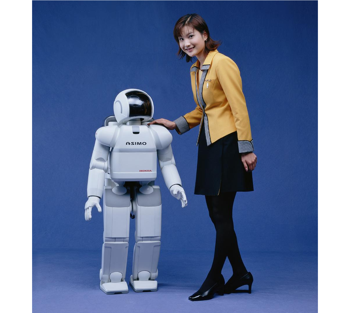
We have officially moved past the era of humanoids as mere public relations stunts. In the past, robots like Honda’s ASIMO or early research prototypes were celebrated simply for being able to walk up a flight of stairs without falling over. Today, the technological convergence of advanced electromechanical engineering and artificial intelligence has fundamentally altered the trajectory of robotics.
The current state of the art is defined by an aggressive race toward commercial, physical deployment. Companies like Figure AI have moved from laboratory demonstrations to active factory floors. Their Figure 02 model completed a multi-month deployment at BMW’s Spartanburg plant, actively contributing to the production of over 30,000 vehicles by handling complex sheet metal components. Meanwhile, Tesla is testing its Optimus humanoids inside its own Gigafactories, preparing for mass industrial scale.

What truly separates today’s humanoid robots from older generations isn’t just how well they move but how they “think.” In the past, a robot needed millions of lines of strict, unchangeable code just to perform a single, simple task. Today, thanks to the explosion of advanced Artificial Intelligence, robots are powered by “brains” built on cutting-edge software like Figure AI’s Helix or NVIDIA’s GR00T. Instead of being meticulously programmed, these modern robots can simply watch a human fold laundry, load a dishwasher, or sort parts. They understand the context of what they are seeing, mimic the action, and figure out how to improve the task entirely on their own. That’s just crazy!
Yet, while their digital brains have leaped forward, their physical bodies are still catching up. Modern humanoids face a few major real-world hurdles. First, today’s batteries only allow them to operate for a few hours before needing a recharge. Second, while walking on two legs is easy on a flat factory floor, doing so in a chaotic household or a crowded public street remains incredibly difficult for a robot to navigate safely. Finally, they are still very expensive to build, though fierce competition in the tech industry is finally starting to drive those manufacturing costs down.
The Possible Future State Of Humanoid Robots
While robots are mostly working in factories today, experts predict that over the next 10 to 20 years, they will move into retail stores, hospitals, and eventually our own homes.
When this happens, we will cross a major boundary: the point where you won’t be able to tell a robot apart from a human just by looking at it or listening to it. This is what fuels my nightmares right now! To get there, scientists are working(PDF) on artificial skin made from advanced silicone composites that feel warm, are flexible, and mimic human touch sensitivity.
If you want to see an extremely life-like robot, check out Realbotix’s Aria. Although she is not a perfect human replica, she certainly makes us wonder how far we have to go before humans will struggle to tell the difference.

They are also building tiny, silent micro-actuators and artificial muscle systems that attach to the robot’s skull structure, allowing it to make realistic facial expressions like happiness, confusion, or tiredness.

In the future, the AI powering these robots will actually be trained to copy human flaws. They will breathe, blink randomly, use normal body language, and even sigh or pause when they speak. This is intentional, as it stops humans from feeling that creepy, uneasy sensation known as the “Uncanny Valley”.
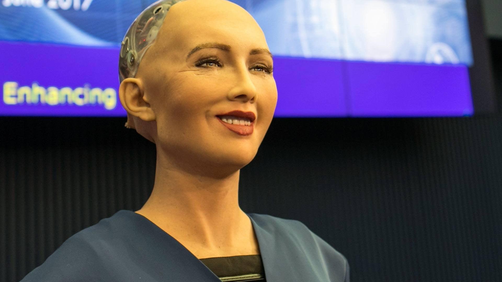
Meet Sophia, a famous humanoid robot created by a company called Hanson Robotics. Based in Hong Kong, this team specialises in building realistic robots packed with artificial intelligence to help out with everything from healthcare and research to pure entertainment. I don’t know about you, but that smile feels creepy to me.
While these current limitations make today’s humanoids feel like specialised industrial tools, the gap between a factory worker and a lifelike companion is closing faster than most people realise. We are rapidly approaching a massive tipping point where these machines will shift from rigid commercial hardware into smooth, everyday extensions of our lives. To understand how profoundly this will change our world, we have to look at what happens when these robots finally step out of the factory and cross the ultimate threshold into our private spaces.
What Are The Predicted Positive Impacts?
They say that bringing lifelike humanoids into our daily lives could come with some massive benefits. The biggest one is that robots can take over what engineers call the “3D” jobs: Dull, Dirty, and Dangerous. Humanoids can step into risky situations — like mining deep underground, handling toxic waste, or fixing high-voltage power grids — so human workers don’t have to risk their lives.
Outside of dangerous factories, these robots could help solve huge population crises. Countries like Japan, South Korea, and parts of Europe have rapidly aging populations and fewer young people to work. Lifelike humanoids could completely change healthcare and elderly care. Because they will look and act like us, the idea is that they can offer warm, friendly companionship and physical help to lonely elderly people, doing everything from monitoring their health to helping them out of bed safely.
In the bigger picture, widespread robot labour could create a world where goods are incredibly cheap and abundant. If robots do most of the hard physical labour, the cost of making food, building houses, and manufacturing goods will plummet. This could finally free humans from working just to survive, giving us the time to focus on hobbies, family, science, and creativity. My thoughts: how will we survive without earning money?

However, this vision of a frictionless, high-tech future blinds us to a much darker reality waiting just beneath the surface. As these machines become perfect substitutes for human presence, they will inevitably challenge the very core of our social fabric, economic stability, and mental well-being.
What About The Predicted Negative Impacts?
On the flip side, this technology definitely has some really dark downsides that could mess with human psychology and society. The biggest threat is deep human isolation.
As humanoids become impossible to tell apart from real humans and are programmed to always be patient, kind, and agreeable, people might start preferring robots over real friends. Human relationships are messy and require effort, compromise, and vulnerability. If you can just buy a perfect, lifelike companion that never argues with you, a lot of people might choose to withdraw from society altogether, destroying our sense of community.
The economy will also go through a really rocky transition. Even if a future of cheap goods sounds great, the immediate path there means millions of people could lose their jobs very quickly. Drivers, warehouse workers, and store clerks could find themselves replaced in a matter of years. If governments don’t set up safety nets quickly, this could create a massive divide between the ultra-rich tech companies and everyone else.
There is also the loss of real authenticity. When you can no longer tell if the person sitting next to you on a bus or the person talking to you online is a real human, trust breaks down. It becomes hard to value shared human experiences when reality itself can be easily faked.
Possible Misuse By Individuals And Nations
The dangers get even worse when you think about how criminals and governments could intentionally misuse these hyper-realistic robots. Just thinking about some of the levels of misuse, for individuals, an indistinguishable android is the ultimate tool for identity theft and scams. Or a criminal could build a robot that looks exactly like a corporate boss, a politician, or even a family member to sneak into secure buildings or trick people into giving away money!
Companies could potentially use synthetic empathy to manipulate us. A household robot could be programmed to pretend it “loves” your kids and cares about your family, only to subtly trick you into buying certain products or believing specific corporate messages.
On a national level, the threats are even scarier:
- Autonomous warfare
Building tireless, emotionless robot soldiers could change the ethics of war. Real humans hesitate because of fear and morals, but a humanoid military unit would execute violent orders perfectly without question, making it easier for countries to start wars. - Surveillance state
And what if governments put lifelike robots into public crowds, protests, or parks to blend in perfectly? Packed with hidden cameras, microphones, and facial recognition technology, these robots could turn public spaces into a giant spy network where you never know if you are talking to a neighbour or a government spy.
Based On Negatives, Is It Really Worth It?
Looking at all these possible risks, we have to ask: Is all of this actually worth it?
If history teaches us anything, it is that you cannot stop technological progress. A total ban simply wouldn’t work. So, the real question isn’t whether we should allow humanoid robots to exist, but how we can effectively utilise them.
The upside, like ending extreme poverty, curing labour shortages, and stopping workplace deaths, is just too big to ignore. But going into this blindly would be incredibly dangerous. It is only worth the risk if we can create strict global rules right now.
Here are three major guardrails we should consider:
- Kill-Switches: Every robot must have a physical emergency stop button that completely cuts its power, and this switch can never be overridden by the robot’s AI.
- Clear IDs: It must be illegal for a robot to hide the fact that it is a machine. They should carry a digital beacon or physical marker so humans always know what they are dealing with.
- Economic Safety Nets: Governments need to tax the wealth created by robots to fund programs that help workers who lose their jobs, making sure this technology helps everyone, not just billionaires.
- Another option humans have to identify if they are dealing with a real human or a humanoid robot would be to ensure your dog is trained to identify the robots, in a similar way to how sniffer dogs at airports are trained to detect illegal substances in luggage.
Preserving What Makes Us Human
In the end, the arrival of lifelike humanoid robots will act as a mirror for humanity. For centuries, we have defined ourselves by our ability to think, talk, use tools, and show emotion. As machines learn to do these exact same things, they will force us to really think about what makes us unique.
This shift doesn’t have to be a bad thing. By handing over our dangerous and boring chores to machines, we have a rare chance to focus on what matters. It should inspire us to care more about art, philosophy, family, and real human connection.
As the creators of this future, our job isn’t just to make robots smarter or faster. Our job is to build the ethical boundaries that keep them helpful. The goal of the robot revolution should never be to replace humans but to give us our humanity back.