⭐ If you would like to buy me a coffee, well thank you very much that is mega kind! : https://www.buymeacoffee.com/honeyvig
Hire a web Developer and Designer to upgrade and boost your online presence with cutting edge Technologies
Showing posts with label Accessibility. Show all posts

Friday, July 24, 2026

Why Accessibility Is An Operational Capability, Not A Feature


Teams can generate UI faster than ever, but they still have to guarantee that what they ship is usable, secure, and maintainable. Accessibility as an operational capability rather than a compliance checklist or end-of-project audit, and what that looks like in practice.

We know that right now, a senior engineer is shipping a checkout flow they “built” in a single afternoon. AI assistant does the heavy lifting, happy path runs clean, and a rotating chevron spins on the order summary. Two weeks later, engineering gets a notice from customer support: a blind customer using a screen reader can’t complete the purchase because the “Pay Now” control is a <div> with a click handler. No role. Not focusable. Not working.

That gap — between code that runs and a product people can actually use — is becoming one of the defining engineering challenges of the AI era. Teams can generate UI faster than ever, but they still have to guarantee that what they ship is usable, secure, and maintainable.

Accessibility sits right in the middle of that problem.

This is not an article about compliance checklists or end-of-project audits. It’s about engineering systems. Specifically, why accessibility should be treated as an operational capability — alongside privacy, security, reliability, and observability — and what that looks like in practice.

The Audit Trap

For years, the default way to “do” accessibility was the one-time, audit-only approach: hire a firm, get a list of 200 findings, fix some of them, file the report. A lot of teams have now moved beyond this model — and the reason is worth looking into.

Audits do matter. For sales, procurement, governance — they’re essential. When a buyer asks for a VPAT or an ACR, you need one. When legal asks if you’re meeting requirements, you need documentation. Audits serve those purposes well.

But audits don’t help you build accessible features during sprint planning. Audits can cost points during a sprint. They don’t catch problems before merge requests. They don’t scale with deployment velocity. The mistake, essentially, is tackling accessibility as a snapshot when you really need constant monitoring. Six months after the audit, the product has shipped dozens of releases, multiple new features, and a redesigned nav. The report is now fiction. Compliance is not a state you reach — it’s a state you maintain, and complexity fights you the whole way.

The WebAIM Million report, which scans the top one million home pages every year, found that 95.9% of pages had detectable WCAG failures in its 2026 run, with an average of 56.1 errors per page. The number of page elements jumped more than 20% in a single year, likely driven by AI-enabled development and ‘vibe coding’ — and more elements mean more places to break. Accessibility debt behaves exactly like technical debt: every inaccessible component you ship becomes a future remediation project, and the interest compounds.

Any strategy that treats accessibility as a periodic event rather than a continuous property of the system is going to lose.

The AI Problem Nobody Wants To Name

With the scale at which teams now generate UI, the gap doesn’t just persist; it multiplies.

Start with how fast this arrived. In February 2025, Andrej Karpathy coined “vibe coding” — a way of working where you “fully give in to the vibes” and “forget that the code even exists”. You describe intent, the model generates, you accept the diffs without reading them. It was meant for weekend projects. It did not stay there. Y Combinator reported that 25% of its Winter 2025 batch had codebases that were 95% AI-generated.

Models don’t land on non-semantic markup by accident — three forces push them there. Most React code on GitHub uses non-semantic “soup”, so that’s what the models learn. Human reviewers and evaluators judge output visually, so the feedback loop rewards looks, not semantics. And <div onClick> is fewer tokens than <button aria-expanded="true" ...>, so absent a constraint, the model takes the cheap path.

Here’s the thing about AI-generated UI: it’s inaccessible by default. Not occasionally — by default. A developer writing in Frontend Masters tested AI-generated React components across multiple tools and documented the pattern. A typical AI-generated sidebar had ten distinct accessibility failures in twenty-nine lines: no landmark, no heading, no list structure, elements with click handlers instead of buttons, no aria-expanded, no keyboard handling, and unlabeled icons. The accessibility tree — the structure screen readers actually read — came back as flat, unstructured text. “Same pixels” as the author put it. “One is a door. The other is a painting of a door”.

Now connect this to security, because the two failures come from the same root. Veracode’s 2025 GenAI Code Security Report tested large language models across dozens of coding tasks and found that a large fraction of AI-generated code introduced security vulnerabilities — including OWASP Top 10 flaws. Cross-site scripting failures were particularly common, and security performance did not meaningfully improve with newer, larger models. The issue wasn’t model intelligence. It was process: developers generating code without specifying security constraints and accepting output without systematic verification.

The same shortcut that skips the security review skips the accessibility review. At scale, AI won’t close the accessibility gap — it has industrialized the very thing that creates it.

The fix is not to ban AI. Your developers are already using it. The fix is to constrain it and verify it — to treat AI as a very fast teammate who always needs guardrails.

Velocity and Accessibility Are Not Enemies #

This is usually where someone says, “Guardrails? Sounds great, but they will slow us down.”

In practice, the opposite tends to be true.

Shift-left is the entire DevOps thesis, and it applies cleanly here. An accessibility issue caught during design review is a comment. The same issue found in production is a remediation project.

Catching an accessibility issue as a component is built takes minutes. Fixing one after the fact — discovering it in an audit, diagnosing the root cause, restructuring the markup, applying the necessary fix, writing tests — can easily take hours. Multiply that across hundreds of findings from a late-stage audit, and you have weeks of unplanned work that earlier automated checks — whether in design reviews, development workflows, or CI — could have prevented.

Teams that integrate accessibility into everyday workflows avoid the expensive surprises: emergency audits, remediation sprints, procurement blockers, and redesigns that quietly break core user journeys. Accessibility doesn’t reduce velocity. Unexpected work reduces velocity. In-flow accessibility is one way of eliminating unexpected work.

What Enterprise-Ready Actually Looks Like

The organizations that scale accessibility successfully do not rely on heroes. They rely on systems.

The highest-leverage place to start is the design system. One accessible component can be reused thousands of times. The GOV.UK Design System is a useful example: components undergo both automated and manual testing using assistive technologies such as JAWS, NVDA, VoiceOver, and TalkBack. The team is explicit about the limits of automation and supplements tooling with user testing involving people with disabilities. They’re equally clear that using the design system doesn’t “magically” make a service accessible; it just gives you a higher starting point.

Accessibility becomes infrastructure. That’s the lesson.

From there, it moves into the engineering workflow:

  • Accessibility requirements are included in the Definition of Done.
  • Pull request reviews include explicit accessibility checks.
  • Interactive controls use semantic elements (<button>, <a>) by default.
  • Keyboard navigation and focus management are treated as standard engineering concerns, not optional polish.

Finally, accessibility becomes enforceable through automation:

At that point, accessibility stops depending on memory and starts depending on the process. It becomes part of your platform.

Patterns That Actually Scale

A few implementation patterns consistently show up in teams that do this well.

Constrain AI Before It Generates

Instead of fixing accessibility after generation, bake requirements directly into tooling through Cursor rules, Copilot instructions, or repository-level standards. Tell the model to use semantic HTML. Tell it when to use buttons versus links. Tell it to expose the state and labels correctly. Models follow persistent constraints far more reliably than one-off prompts.

Stop Hand-Rolling Complex Widgets

Comboboxes, menus, tabs, modals, and similar controls routinely become accessibility hotspots. Libraries such as Radix UI, React Aria, and Headless UI already solve many of these problems. The scalable approach is not about repeatedly implementing accessibility correctly. It’s inheriting accessible behavior from well-tested primitives.

Capture Accessibility During Design Handoff

Focus order, labels, heading hierarchy, and interaction states should be specified before implementation begins. If accessibility requirements are absent from the design artifact, they are often absent from the final product. A simple memo at design handoff — what is the tab order, what are the labels, what happens on error — removes a huge amount of guesswork later.

None of these patterns is exotic. They’re just DevOps and platform thinking applied to accessibility.

The Broader Business Impact

Engineering leaders rarely prioritize accessibility solely because of regulations. But regulations, procurement requirements, user retention, and product quality all point in the same direction.

Legal pressure continues to increase. Digital accessibility lawsuits in the United States have stayed in the thousands per year, and they are not limited to large enterprises. The European Accessibility Act is now enforceable across the EU, applying to e‑commerce, banking, ticketing, telecoms, and more, regardless of where the company is headquartered. The message is clear: accessibility is no longer a “nice-to-have” in the eyes of regulators.

But compliance is only part of the story. The bigger story is the market you leave on the table. The World Economic Forum (December 2023) estimates that the world’s 1.3 billion people with disabilities, “along with their friends and family, has a spending power of $13 trillion”; disabled consumers alone control roughly $8 trillion in annual disposable income, per the Valuable 500.

In the UK alone, the Click-Away Pound Report 2019 found the “Click-Away Pound has risen to £17.1 billion” — more than 4.9 million users with access needs who abandon inaccessible sites and spend elsewhere, up almost 45% from £11.75 billion in 2016. People don’t file a bug report. They leave and buy from a competitor.

There is also a procurement reality that turns accessibility from a cost into a moat. If you sell B2B or to government, you will increasingly be asked for proof of accessibility — VPATs/ACRs or equivalent documentation. According to Level Access’s Seventh Annual State of Digital Accessibility Report, 75% of organizations now require proof of accessibility at least most of the time when purchasing digital products — essentially unchanged from 74% in the previous report, but with a notable shift towards stricter enforcement, as those that always require it rose from 27% to 31%. A strong ACR accelerates the sales cycle; a weak one, or none at all, creates redlines that stall or kill it. For some buyers, this is a hard requirement before your product can even enter evaluation. A strong accessibility story accelerates the sales cycle. A weak one creates redlines that stall or kill it.

Step back and the deeper pattern is clear: accessibility is a proxy for engineering maturity. A team that ships semantic HTML, manages focus, exposes state correctly, and tests it in CI is a team that has its house in order. The same discipline that produces an accessible component produces a maintainable, testable, less buggy one.

For dev and product leaders, that’s the real business case: accessibility work is platform work. It pays off every time a feature ships faster and more smoothly, with less rework, than it otherwise would have.

Systems, Not Sprints

If you take one thing from this, make it this: accessibility doesn’t come from an audit, a hero, or a heroic remediation sprint before launch. It comes from systems.

An accessible design system so components start right. A Definition of Done so they stay right. Automated testing and CI gates so regressions fail the build. Governance, so someone owns it. Guardrails for AI-assisted development so your fastest tool stops being your biggest liability.

None of those practices is particularly glamorous. That’s exactly why they work. They’re the same kinds of boring, reliable systems you already trust for security, reliability, and performance.

But there’s one thing no tool on that list can do. No linter, no automated scanner run, no dashboard will ever tell you what it’s actually like to use your product as a blind person with a screen reader, or to navigate your checkout with a keyboard because a tremor makes a mouse inoperable. So build the systems — you need them, and they’re the only way accessibility survives contact with a real release schedule. But test with real users with disabilities regularly. The first time you sit behind someone using JAWS to fight through a form your team thought was “done”, something changes. The tooling tells you whether you passed. A real person tells you whether it actually works.

Accessibility is not a feature. It’s an operational capability. Treat it that way, and you get something dev and product leaders already care about: a faster, safer, more reliable way to ship software.

Monday, May 11, 2026

Stop Ignoring These Frontend Skills—You’ll Need Them Sooner Than You Think


Let’s be honest: the way we create for the web is evolving at a pace that many people are reluctant to acknowledge.

What was once considered “nice to have” just a year ago is quickly turning into a “must-have” today. If you’re not keeping an eye on these changes, you’ll definitely notice the impact soon.

Here are the frontend skills I believe are shifting from “maybe later” to “learn now” over the next 2–3 years:

1. AI-Powered Coding Tools : Tools like Copilot and Codeium are more than just a novelty. They’re rapidly becoming essential parts of our daily workflow. If you can effectively guide, review, and enhance the suggestions that AI provides, you’ll be able to deliver your projects faster and with greater intelligence.

2. Real Accessibility & Inclusive Design: These days, accessibility is something we expect rather than just admire. Creating experiences that cater to all users right from the beginning will really make you stand out. Very soon, it will become essential for every project.

3. Building for Every Device :These days, it’s not just about web and mobile anymore. Your creations need to look fantastic on every screen - whether it’s a smart TV or whatever new tech comes our way. Responsive and resilient user interfaces are now the standard we should all aim for.

4. Performance Matters : Let’s face it, nobody wants to deal with sluggish apps. Taking the time to profile, optimize, and genuinely care about the user experience is what sets the good apart from the truly great.

5. Privacy-First Frontends; Trust is everything. Make privacy clear, easy to understand, and simple to control in your user interface. For many users - and regulators - this is already a deal-breaker.

6. Strong Fundamentals, Flexible Stack: Frameworks may evolve, but the top developers really grasp the essential concepts and can easily switch between different tools. Stay curious. Keep learning. Don’t limit yourself to just one stack.

What’s Next?

Get ready for more AI in your development tools. The demand for user-friendly and privacy-conscious interfaces is only going to rise. Expect lightning-fast, resilient apps to become standard on every device.

By mastering these skills, you won’t just be securing your future career; you’ll also unlock opportunities for roles and projects that you might not even be aware of yet. If you’re aiming for bigger chances—and want the confidence to embrace them—now’s the time to start.

Feel free to drop a comment if you’d like an invite, or send me a DM if you think there’s a skill that should be added to the list.

What are you currently learning to stay ahead? Let’s chat about it in the comments!


Stop Building "Dead" Websites. (The Pixel-Perfect Era is Over)


Your $50k website is officially a dinosaur. 🦖

For a decade, we’ve been obsessed with "Pixel Perfection." We argued over hex codes, debated the radius of a button, and spent months perfecting "Click Paths."

The reality? In 2026, your users don’t want to click through your beautiful menu. They want an answer.

We are witnessing the violent transition from Deterministic UI (the static site you built) to Generative UI (the interface that builds itself around the user).


1. The Netflix-ification of Everything

Remember when you had to browse "Genres" to find a movie? Now, Netflix builds a unique homepage for you the second you log in.

If your SaaS or E-commerce site still looks the same for a first-time visitor as it does for a 5-year veteran, you aren't "consistent"—you’re irrelevant. Generative UI means the interface morphs based on intent. If the AI detects a user is frustrated, the "Help" button shouldn't just be there; it should be the only thing there.

2. Accessibility is your new SEO

Here is a hard truth: If an AI Agent (like Gemini or GPT-6) can’t "crawl" your site and understand it instantly, you don't exist.

  • Old way: Making your site accessible to be "nice."
  • New way: Using Semantic HTML because if the AI can’t read your site, it won't recommend you to the millions of people using Voice Search and AI Personal Assistants.

3. The "Invisible" UI (Example: Uber)

The most successful interface of the last decade is the Uber map. Why? Because it’s invisible. You don’t "navigate" a menu to find a car. You see a map, you see a car, you press one button.

The future isn't more buttons; it’s Zero UI. It’s systems that use token-driven logic to automate the boring stuff so humans can do the creative stuff.


The Bottom Line:

Stop building for browsers. Start building for behaviors.

Article content


If your design system requires a manual to understand, you’ve already lost. The winners of 2026 will be the ones who blend high-end aesthetics with "Invisible" AI logic.


I’m calling it: The "Sidebar and Dashboard" layout is officially dead. Who’s brave enough to disagree? 👇

Drop a comment below: Is your team still stuck in the "Pixel-Perfect" trap, or are you building for the AI era?

Monday, April 6, 2026

Testing Font Scaling For Accessibility With Figma Variables


Accessibility works best when it blends into everyday design workflows. The goal isn’t a big transformation, but simple work processes that fit naturally into a team’s routine. With Figma variables, testing font size increases becomes part of the design flow itself, making accessibility feel almost inevitable rather than optional.

Building a true culture of digital accessibility in a company is a mission of resilience and perseverance. It’s not difficult for the discourse on accessibility to fall into the usual clichés. Accessibility is very important for people. The accessibility of digital products and services promotes inclusion. Or even, all professionals on the teams should be involved in accessibility work. Of course. No one in their right mind will dispute any of these statements (I hope).

However, the second part of this conversation, which very few companies reach, is “how?” How do we make this happen in the midst of the day-to-day work of digital transformation teams, which, as we all know, are immersed in demanding scripts, often with a very limited number of people available? Most of the time, the choice ends up being between “we do this” and “that.” And it shouldn’t, because, in these cases, I never saw accessibility winning in this equation.

It shouldn’t be this way. You don’t need to be this way. First of all, because choosing between accessibility and anything else isn’t the right choice. Accessibility is no longer just another feature to be added to the others. It’s an added value for the business and, currently, a legal obligation that can have serious consequences for companies. On the other hand, there are intelligent, optimized, and impactful ways to incorporate accessibility principles into the natural dynamics of teams. It’s possible to work on accessibility without turning team operations upside down. In essence, that’s what AccessibilityOps does. Empowering people and providing teams with simple processes so they can integrate accessibility work into their daily routines without disproportionate effort.

Accessibility And Design

Working on digital accessibility in design can involve several actions. It’s clear that we need to pay particular attention to color and how it’s used to convey meaning. Of course, the interaction sizes of elements must be comfortable. But, most importantly, we must think about design from a versatile perspective. An interface isn’t a poster. We can control many aspects of that design, but how users interact with the interface is subject to an endless number of variables. The type of device, context, purpose, network quality, etc. All of this greatly affects each person’s experience and interaction. Along with all this, when digital accessibility concerns are brought into the design process, it adds even more variables.

Assistive technologies
(Large preview)

People often use what are called assistive technologies and strategies. Basically, these are technological tools or, at the very least, “tricks” that people resort to in order to find more comfortable usage models. The famous screen readers, commonly associated with the use of blind people (but which are not only useful to them), for example, are an assistive technology. Changing colors or color contrasts between different elements is also an assistive technology. Increasing the font size (which we discussed in this text) is another example. There are countless assistive technologies and strategies. Almost as many as the different contexts of use for each person.\

We Don’t Control Everything 

In other words (and this is the “bad news” for us designers), “our design” is subject, from the users’ perspective, to transformations that we don’t control. It will be “transformed” by the user, ensuring that they can interact with the application and everything it offers in the most comfortable way possible. And that’s a good thing. If this happens and everything goes well, we will have surely done our accessibility work very well, and we all deserve congratulations. If the user applies any of these support technologies and strategies and still cannot use the digital application, it’s a sign that something is not working as it should.

Oh, and speaking of which. Don’t even think about blocking the use of these technologies or support strategies. They may be “destroying” your beautiful design, but they are allowing more and more people to actually use the app. In the end, wasn’t that exactly what we promised we wanted to do? Design for (all) people. Without exception?

Increase Font Size #

How many times have we heard someone — friends, family, or even colleagues — complaining that this or that text is too small? Text plays a very important role in the digital experience. Much information is conveyed through text: instructions for use, button captions, or interactive elements. All of this uses text as a communication tool. If reading all these elements is difficult, naturally, the experience is severely impaired.

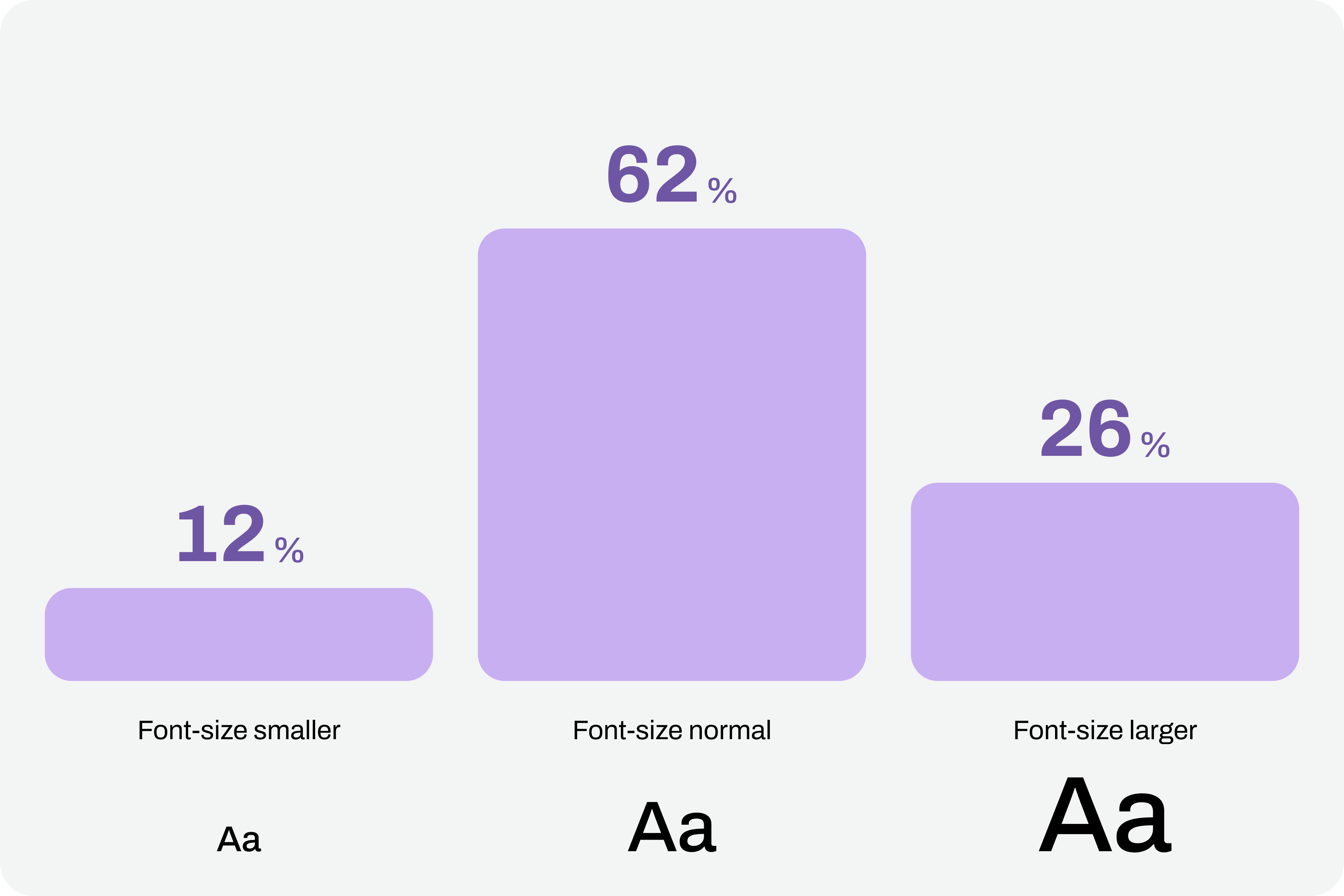
Comfortable text reading, regardless of its function, is a non-negotiable principle. This reading can be facilitated by using comfortable sizes in the design. However, supporting technologies and strategies, through the functionality of increasing font size, can also help improve readability. According to APPT data, 26% of Android and iOS mobile device users increase the default font size (data from February 2026). One in four users increases the font size on their smartphone. This is a very significant sample of people, making this functionality unavoidable in design processes.

Chart with font sizes where 26% of users use large font-size.
(Large preview)

Compliance With Guidelines

Increasing font size in interfaces can represent a huge design challenge. It’s important to understand that, suddenly, some text elements, due to user actions, can double in size from their initial size.

“With the exception of captions and text images, text can be resized without assistive technology up to 200% without loss of content or functionality.”

Success criterion 1.4.4, “Resizing Text” of the Web Content Accessibility Guidelines (WCAG), version 2.2

This success criterion is at the AA compliance level, meaning this is an absolutely mandatory feature according to any legal framework.

It’s easy to understand the 200% in this success criterion. If we assume we design the interfaces at a 100% scale, meaning the element size is the initial size, then increasing the text by up to 200% will correspond to doubling the initial size. Other enlargement scales can also be used, such as 120%, 140%, and so on. In other words, we have to ensure that users can increase the text to double its initial size through supporting technologies or strategies (and this is not a minor detail).

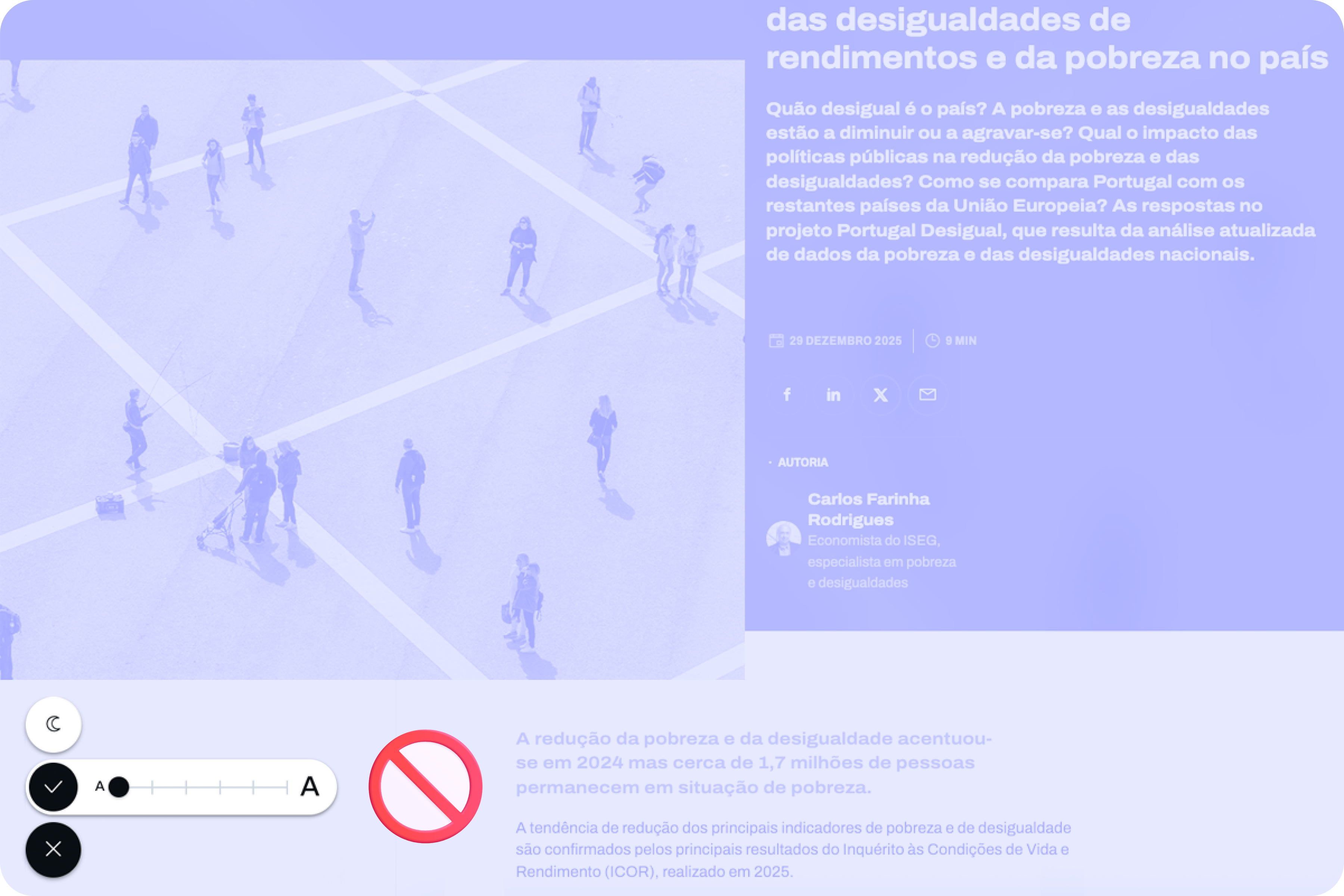
To comply with this standard, we don’t need to provide text size increase tools in the interfaces. In practice, these features are nothing more than redundancy. Devices already allow this to be done in a standardized way. Users who really need this setting know it (because, without it, their lives would be much more difficult). Well, they already have this setting applied across their device. And that means we can eliminate these additional interface elements, simplifying the experience.

Text size increase tool in the interface
(Large preview)

Standardized Access

An important concept to remember about assistive technologies, particularly in this case regarding increasing font size, is that most devices already have many of these tools installed by default. In other words, in many cases, users don’t need to purchase their own software or buy a specific type of device just to have this functionality.

Whether on mobile devices or even in web browsers, in the vast majority of cases, it’s easy to find installed features that allow you to increase the default font size we’re using throughout the interface. This principle of increasing font size can be applied to digital products, such as apps, or even to any type of website running on the standard web browsers used today.

iPhones #

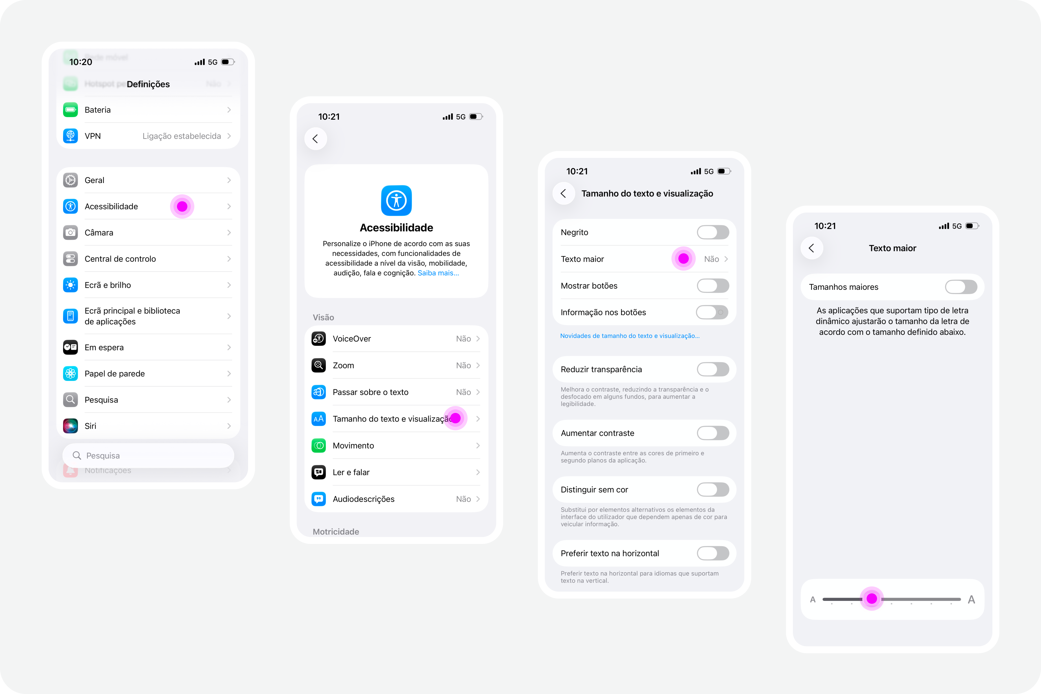
On iPhone devices, the font size increase feature is integrated by default. To use this feature, simply access the “Settings” panel, select “Accessibility,” and within the “Vision” options group, access the “Text Size and Display” feature and configure the desired font size increase on that screen.

iPhone screens with settings on accessibility
(Large preview)

Google Chrome

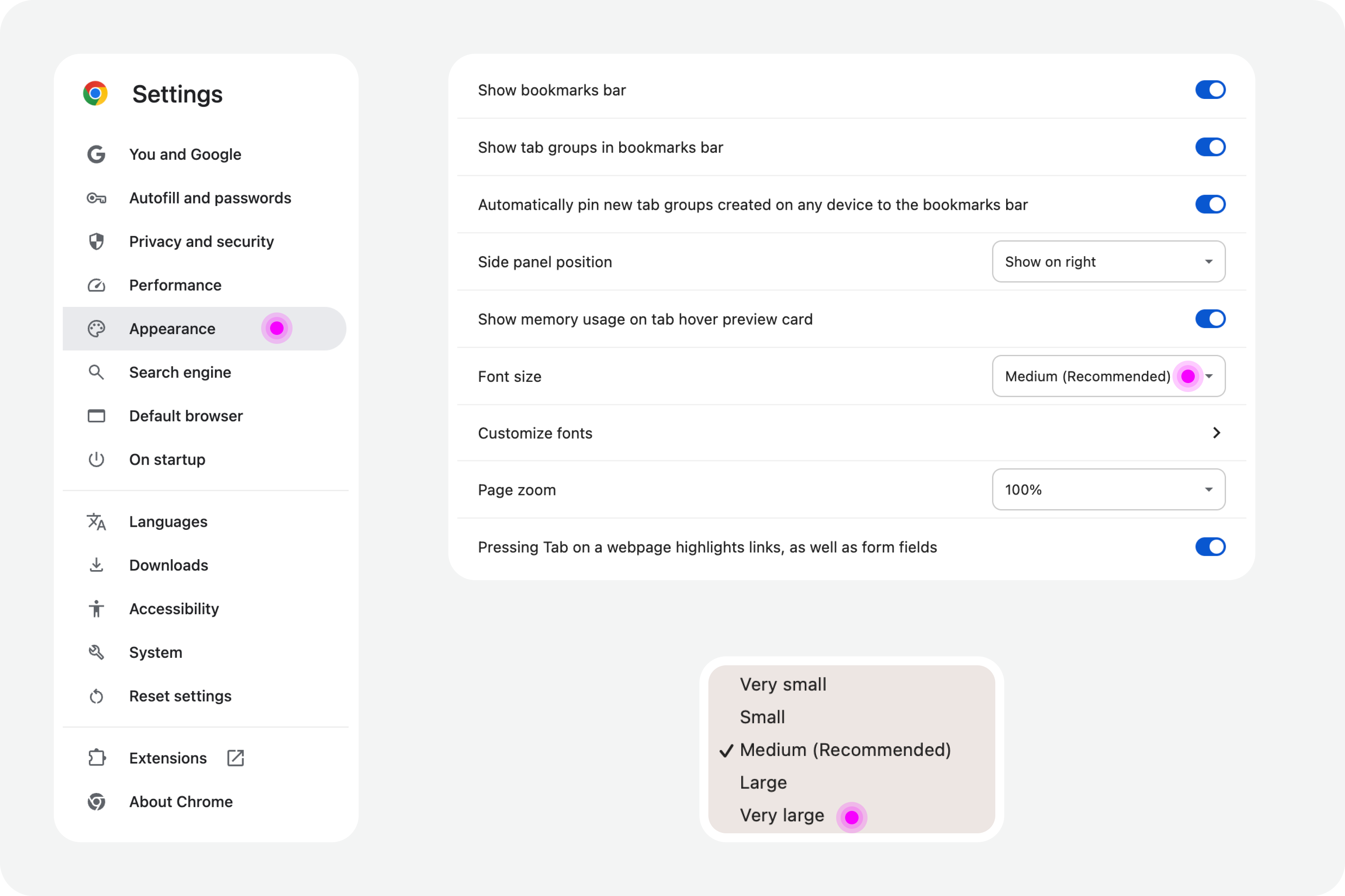
Web browsers also offer, by default, the functionality to increase font size. For example, in Google Chrome, this feature is available in the “Options” panel, specifically in the “Appearance” area. In the list of options that appear in this group, simply select the “Font size” option. Normally, the “Medium — Recommended” option will be selected. You can change this setting to any other available font size. Try, for example, the “Very large” option.

Google Chrome settings on accessibility
(Large preview)

Test In Figma #

To ensure that digital accessibility work becomes effective in the daily lives of teams, it is essential to find simple work processes. Actions or initiatives that can be integrated into the team’s routine, that address accessibility in an integrated way, and do not require a dramatic transformation of the current reality. If that were necessary, he believes, it wouldn’t happen most of the time. Therefore, designing simple work processes is half the battle for accessibility to truly happen, in this case, also within a design team.

Regarding testing font size increases in design, we have extraordinary tools at our disposal today. Those who remember the days of designing complex interfaces in Adobe Photoshop will recognize the differences in the tools we have today (and thankfully so). It’s now possible, through tools like Figma, to create such dynamism in design that testing font size increases for accessibility becomes almost unavoidable for the team.

Visualization on font sizes
(Large preview)

Note: To take this test, you need to have a strong grasp of Figma’s text styles, auto layouts, and variables. These three are fundamental tools for success without much extra effort. If you haven’t yet mastered these features, it’s highly recommended that you start there. Don’t skip steps. Learning is a gradual process that must be followed in a structured, step-by-step manner.

Where Do We Want To Go?

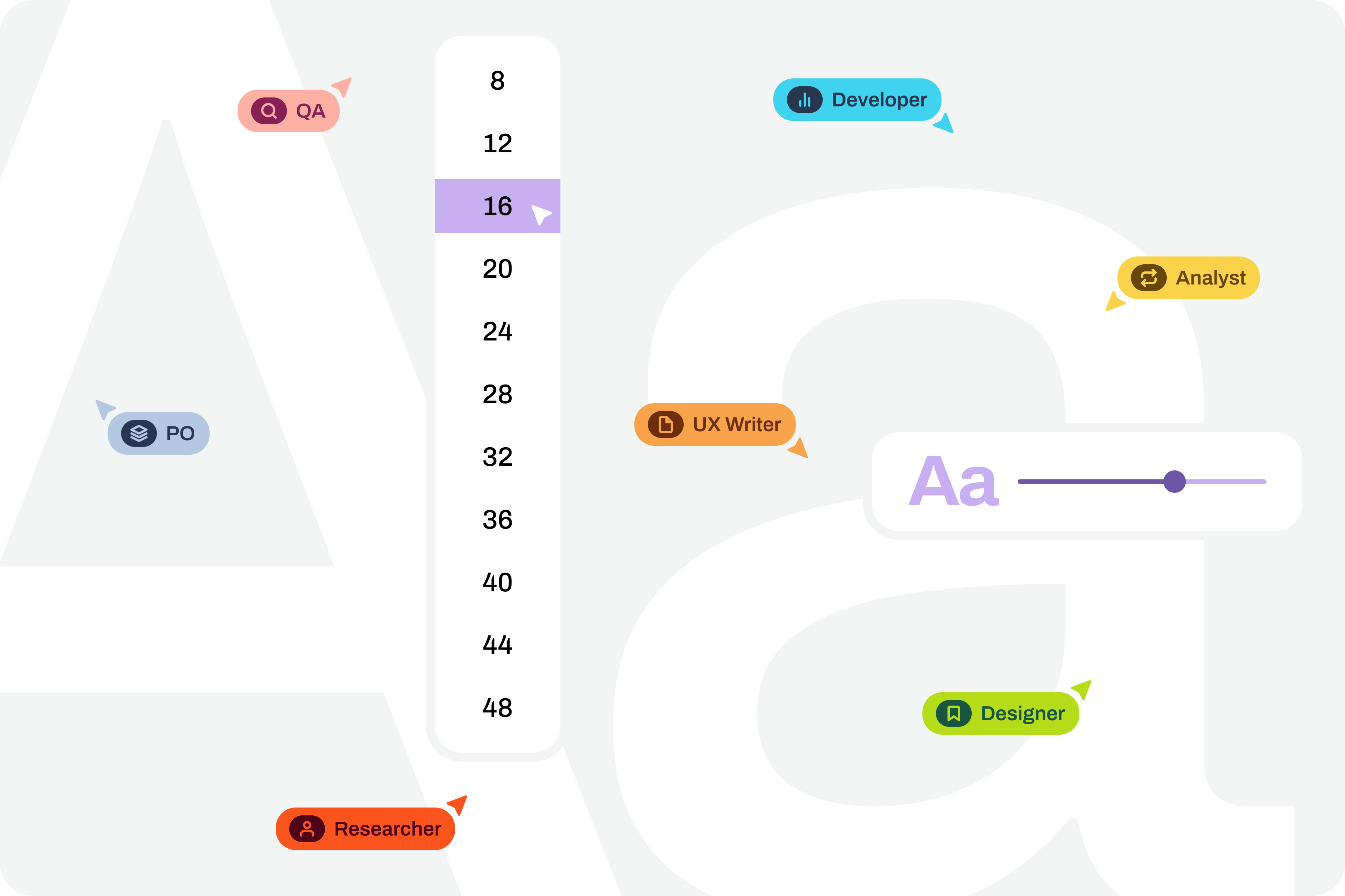
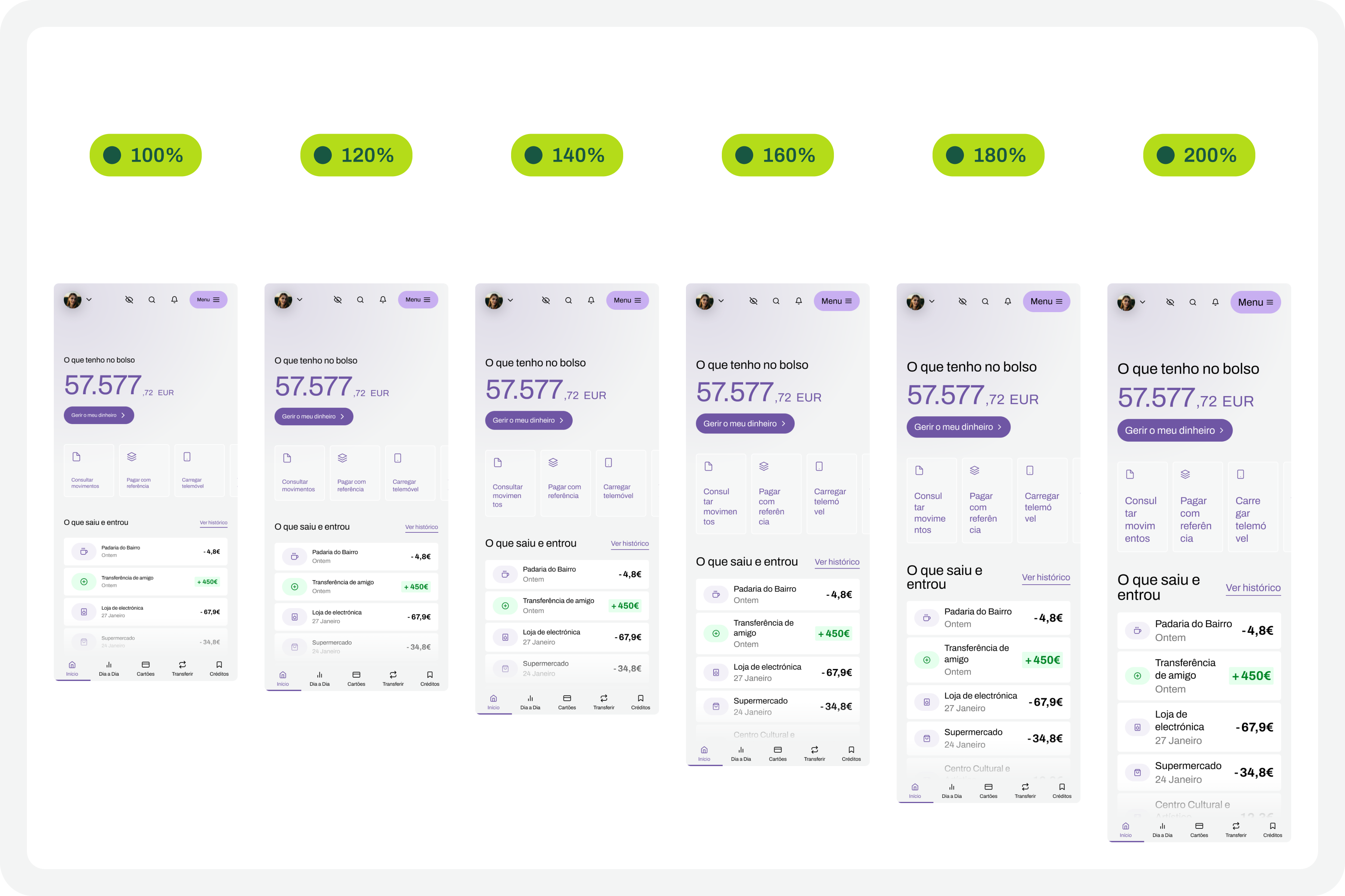
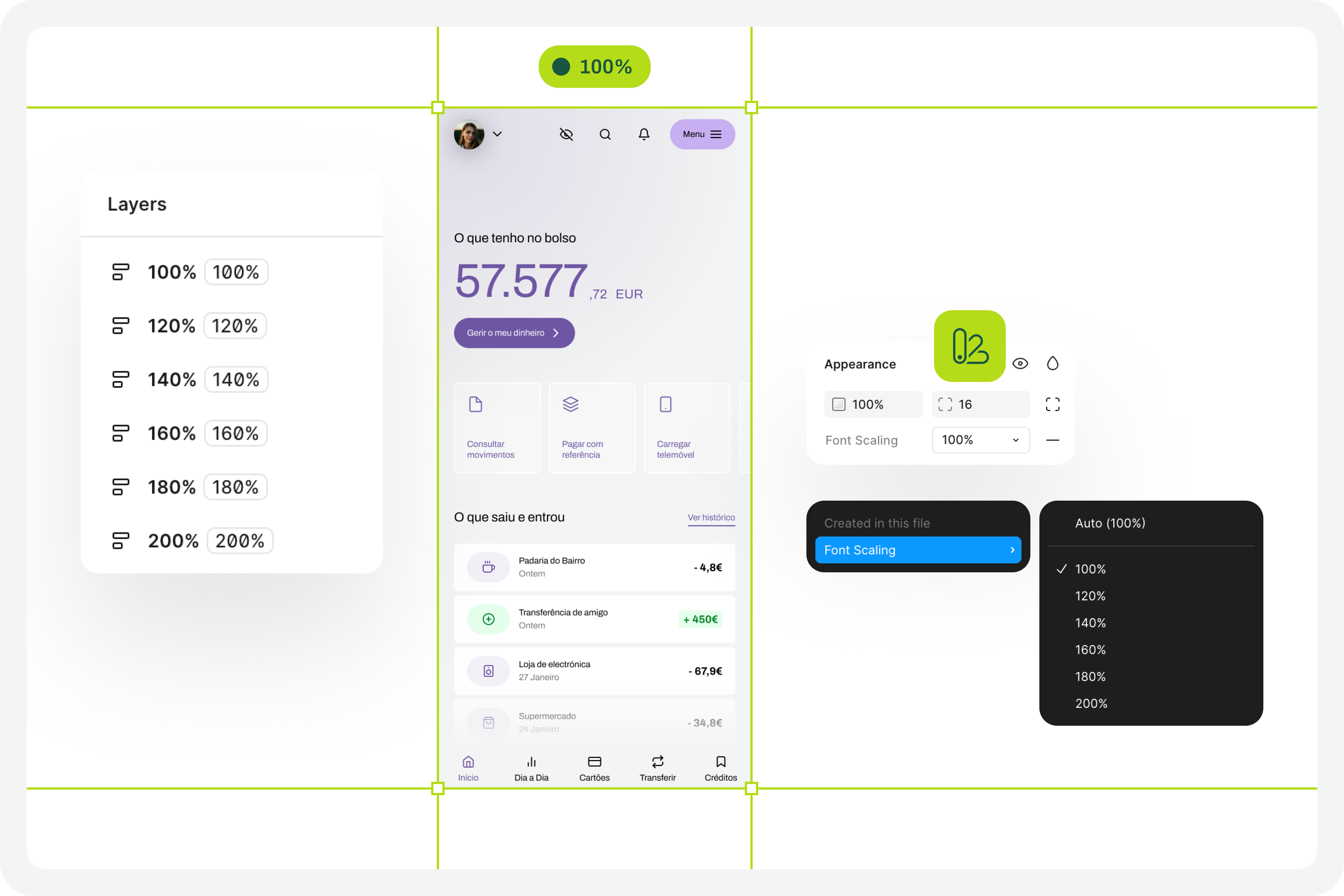
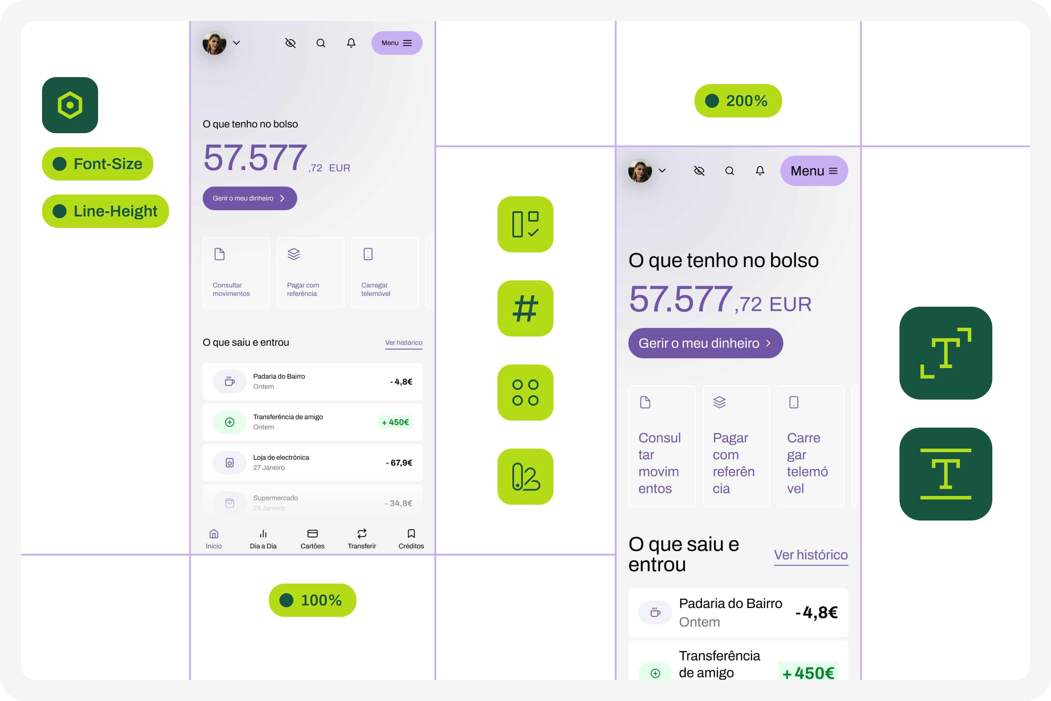
The font size increase test in Figma that we want to perform is simple. We want to have a set of variables available for all the text styles we use in the interface, allowing us to choose whether we want to see the interface with the text at a scale of 100%, 120%, 140%, 160%, 180%, or 200%. As we apply this set of variables (much like applying variables for light and dark mode), we observe the transformations of the text in the interface and understand to what extent adaptations are needed in each version of the interface with different typographic scales.

Font scaling
(Large preview)

How Do We Make This Happen? #

For this test to go so smoothly, you need to do some groundwork. Design systems can greatly help optimize much of this initial work. But I won’t lie to you. For the test to work well, your design needs to have a very serious level of organization and systematization.

This isn’t really a guide, because each team will have its own work model, and these recommendations can be applied in different ways (and that’s okay). However, for this test to work, it’s important to ensure certain assumptions in the design. To help you phase the implementation of this test model, here are some steps to follow. Step-by-step instructions to guide you in organizing your files and ensuring you can fully execute this test in the simplest and most practical way possible.

1. Designing The Interfaces #

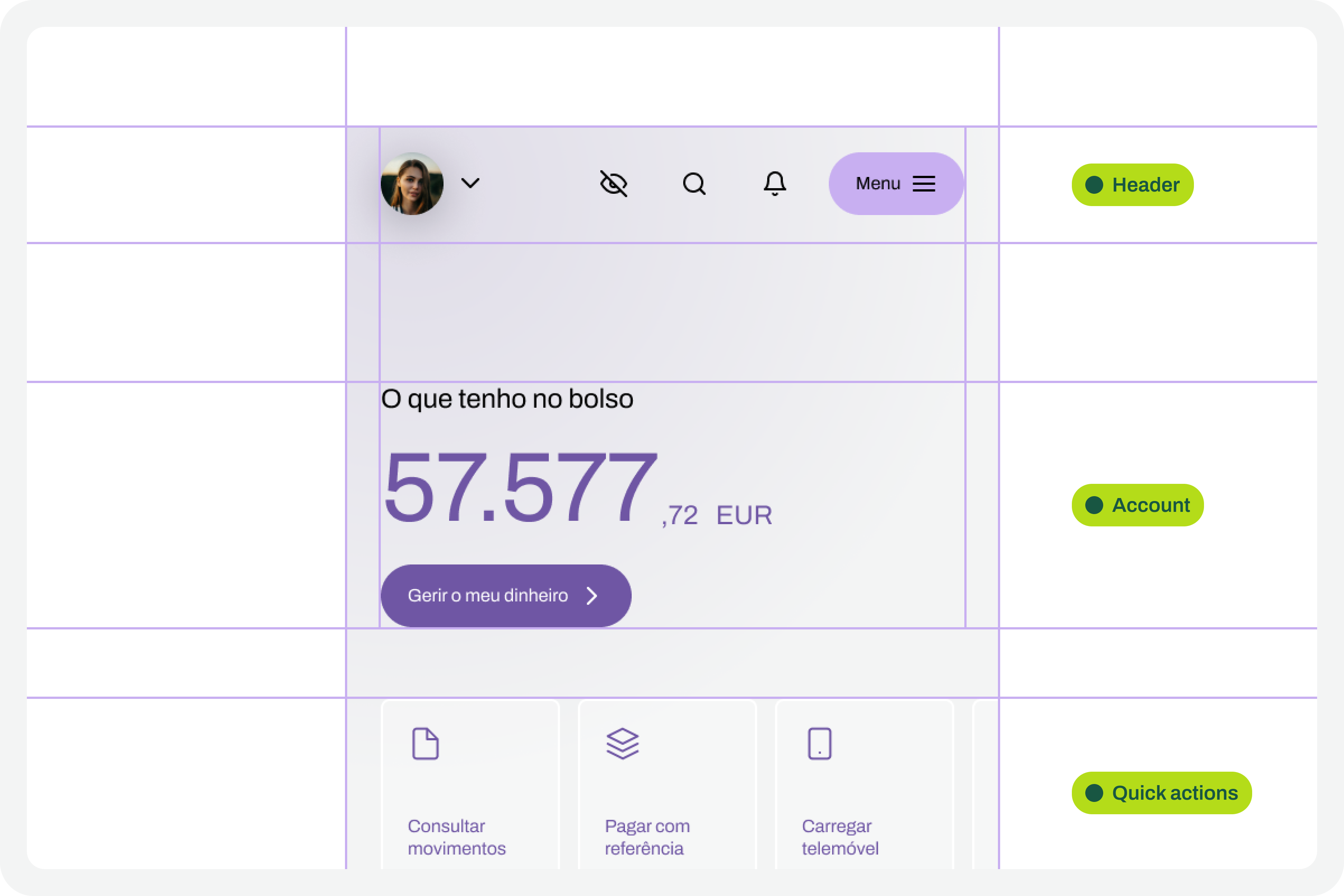
It all starts with the design. Before any testing, the focus should, as it should, be on the design of each interface that we will want to test later. At this stage, there is still no specific concern with the font size increase test that we will perform later. Naturally, all interface design should, from the outset, follow the most basic accessibility recommendations applied to design.

Design screens
(Large preview)

2. Apply Auto Layouts To All Elements 

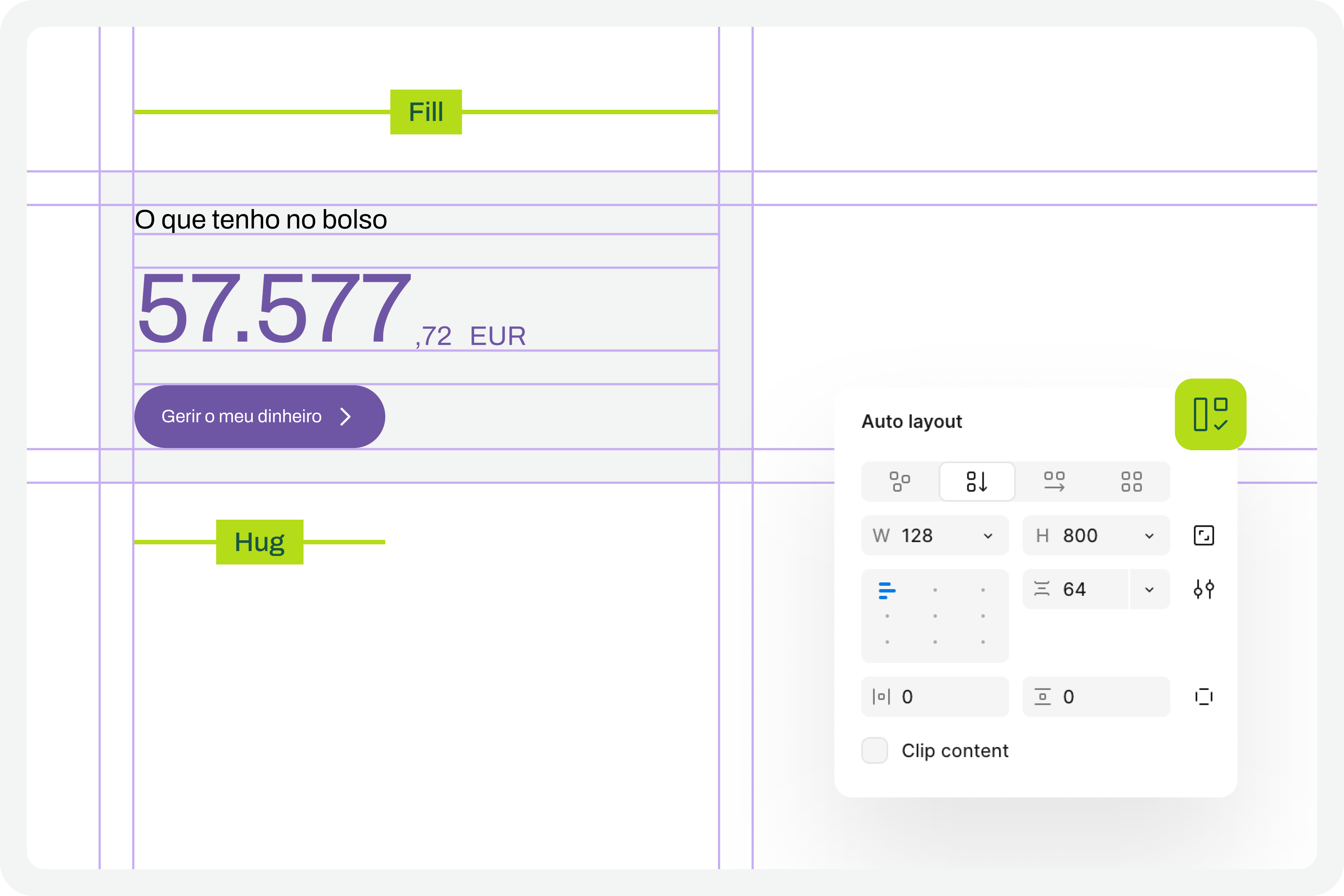
In every screen design you create, you’ll need to ensure you apply auto layouts perfectly. This is a very important step. It’s this consistent application of auto layouts to the entire structure and design elements that will later guarantee the scalability of the interface when we start testing font size increases. You really can’t underestimate this step. If you don’t pay it the attention it deserves, you’ll see when we test typographic scaling in the interfaces, everything breaking down like an elephant in a china shop.

Auto layout
(Large preview)

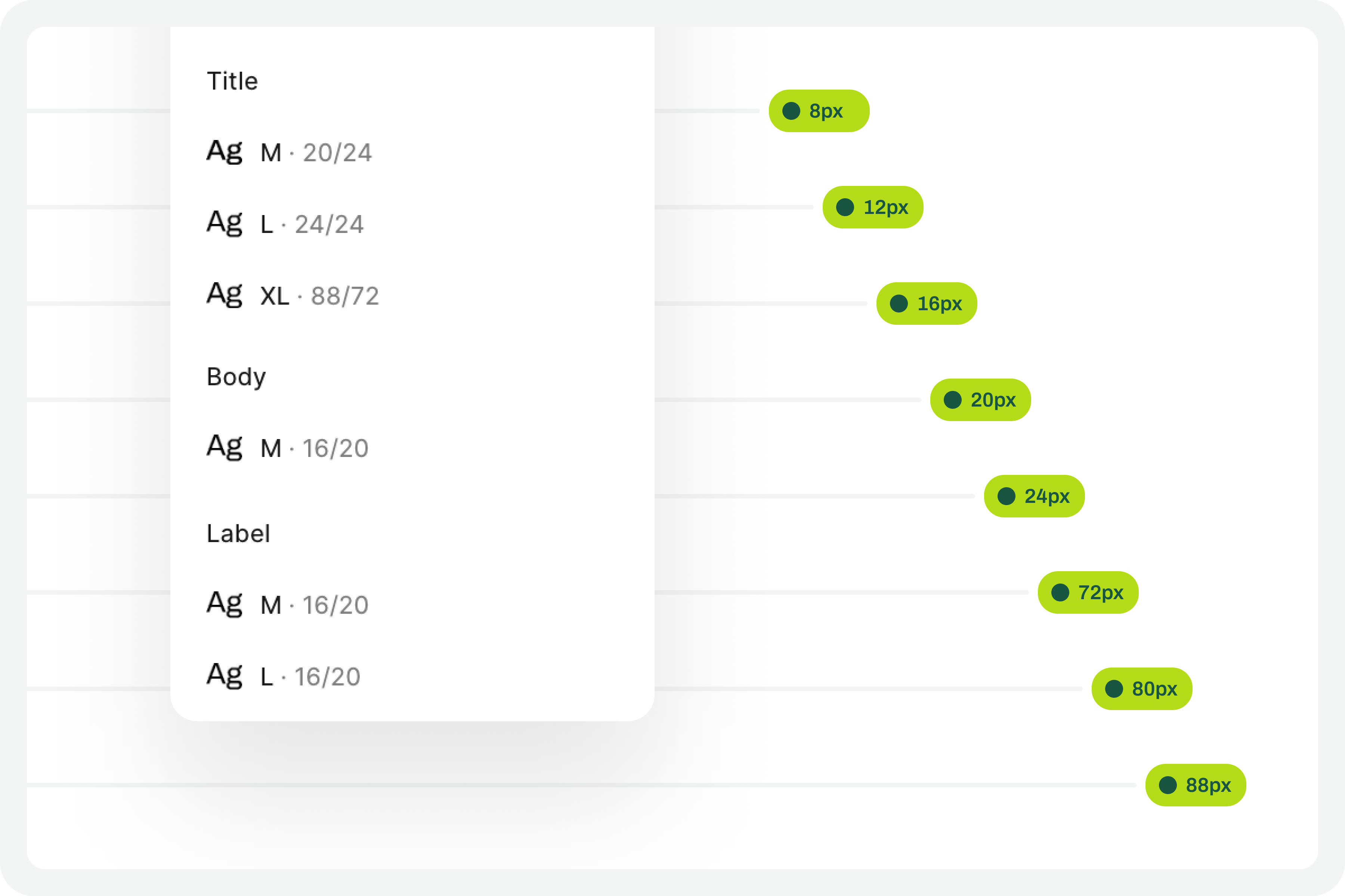
3. Structuring And Applying Text Styles

To perform our font size increase test, we’ll also need you to have applied text styles to each interface design. You probably even started creating them as you were drawing. Great. If you haven’t done so, it’s important that you do it now. For the test to work perfectly, we really need this. Don’t leave any text element in the design without a text style applied.

Text styles
(Large preview)

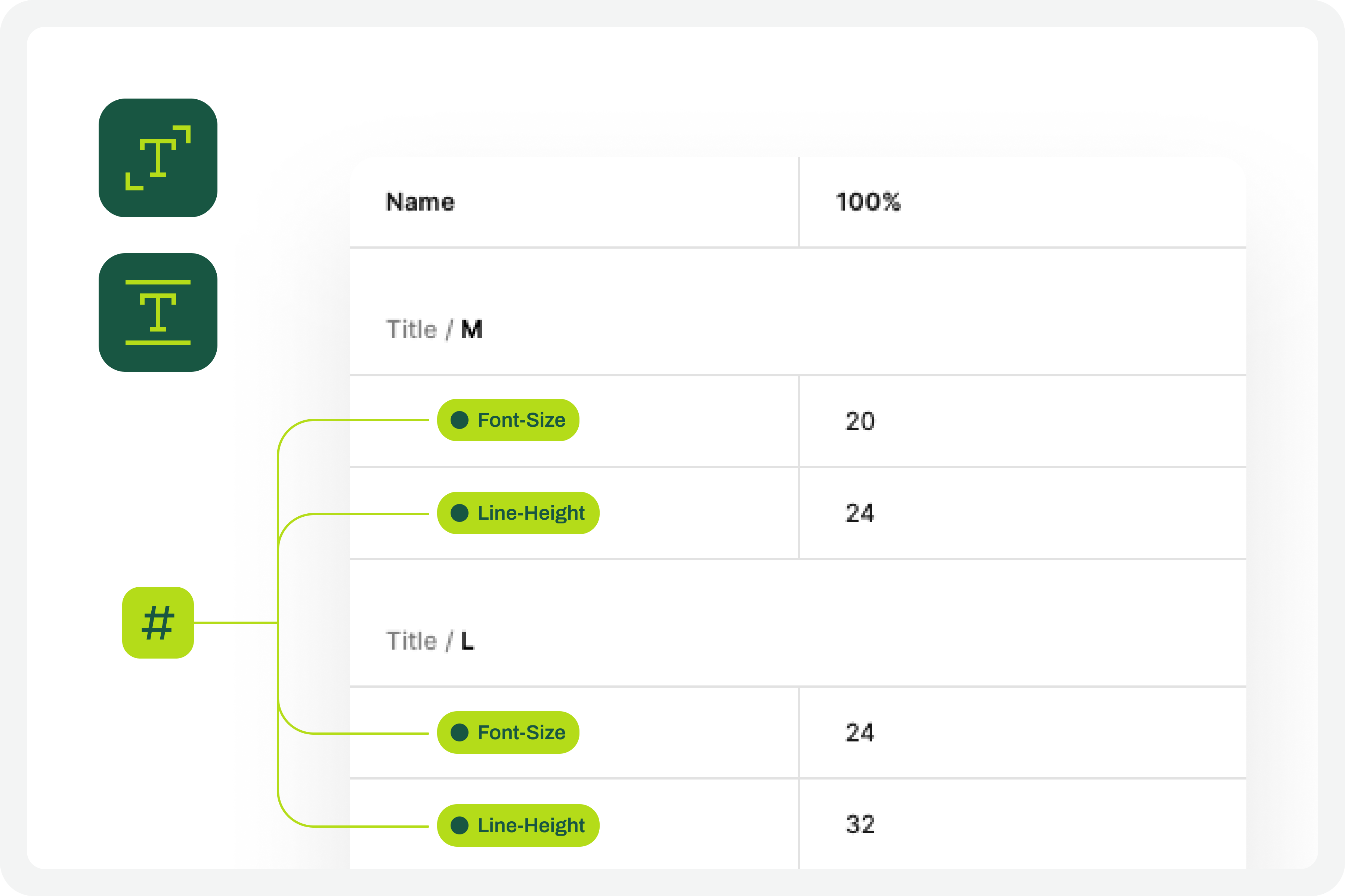
4. Define The Set Of Variables 100% #

This test forces a fairly high degree of optimization. In practice, this means we will have to use Figma variables for all the characteristics of the text styles we have in the interface. At this stage, you must define Figma “number” variables for at least the font-size and line-height of the text styles you applied to the drawing. With this step, you are defining the font size increase scale values for a 100% visualization model, that is, the initial and reference version of the drawing. It is important that you structure these variables for each text style in the drawing because, subsequently, we will have to consider the enlargement scale of each of these text elements.

Defining the set of variables 100%
(Large preview)

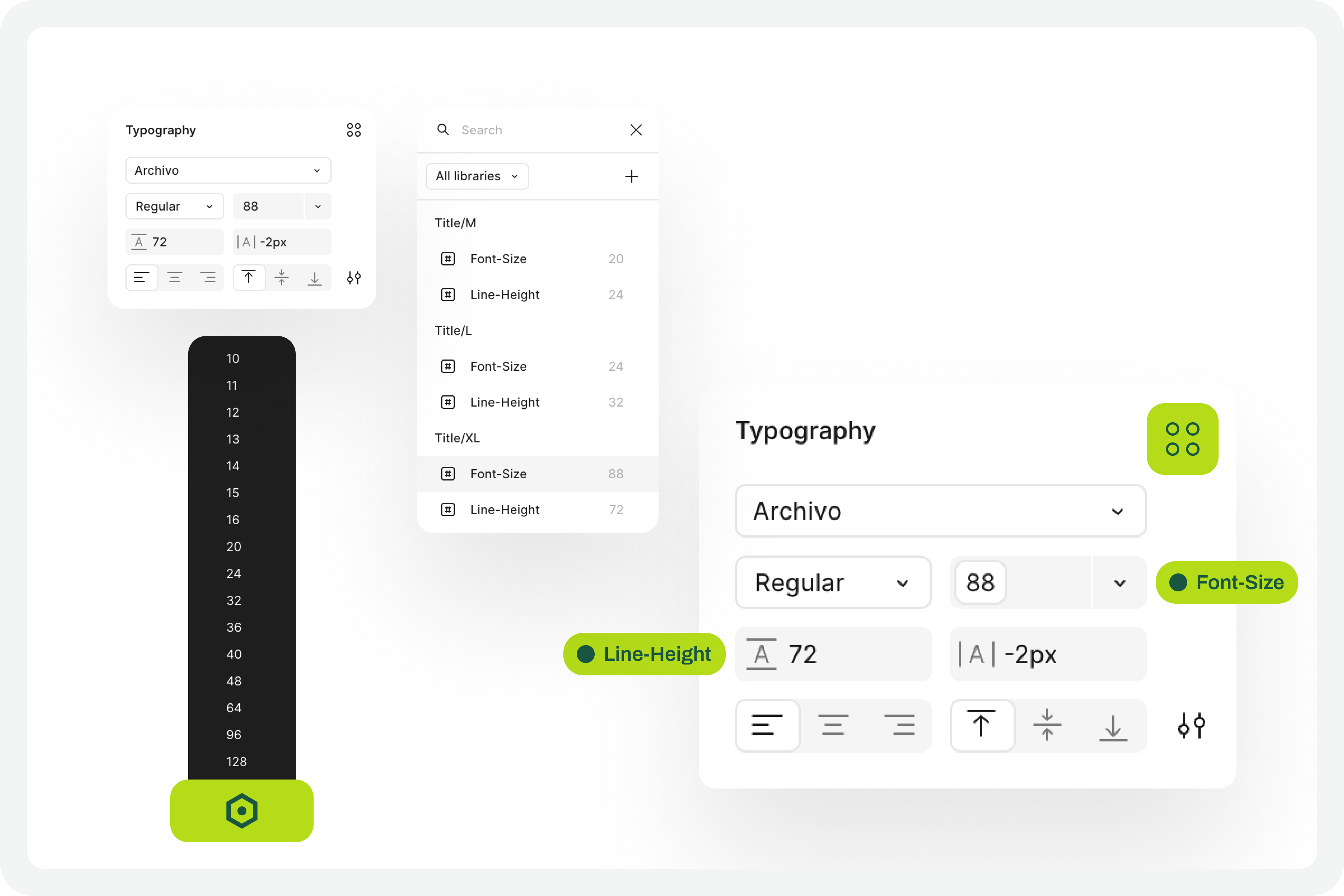
5. Apply The Variables To The Text Styles 

Having defined the variables for the 100% scale text styles, you must now apply them to the elements of the text styles already created. Don’t forget to apply variables at least to the font-size and line-height characteristics. If you have more typographical variables, that’s fine. But you should at least have variables applied to font-size and line-height. This is really very important.

Applying variables to the text styles
(Large preview)

6. Define The Variables For Increasing The Text Size #

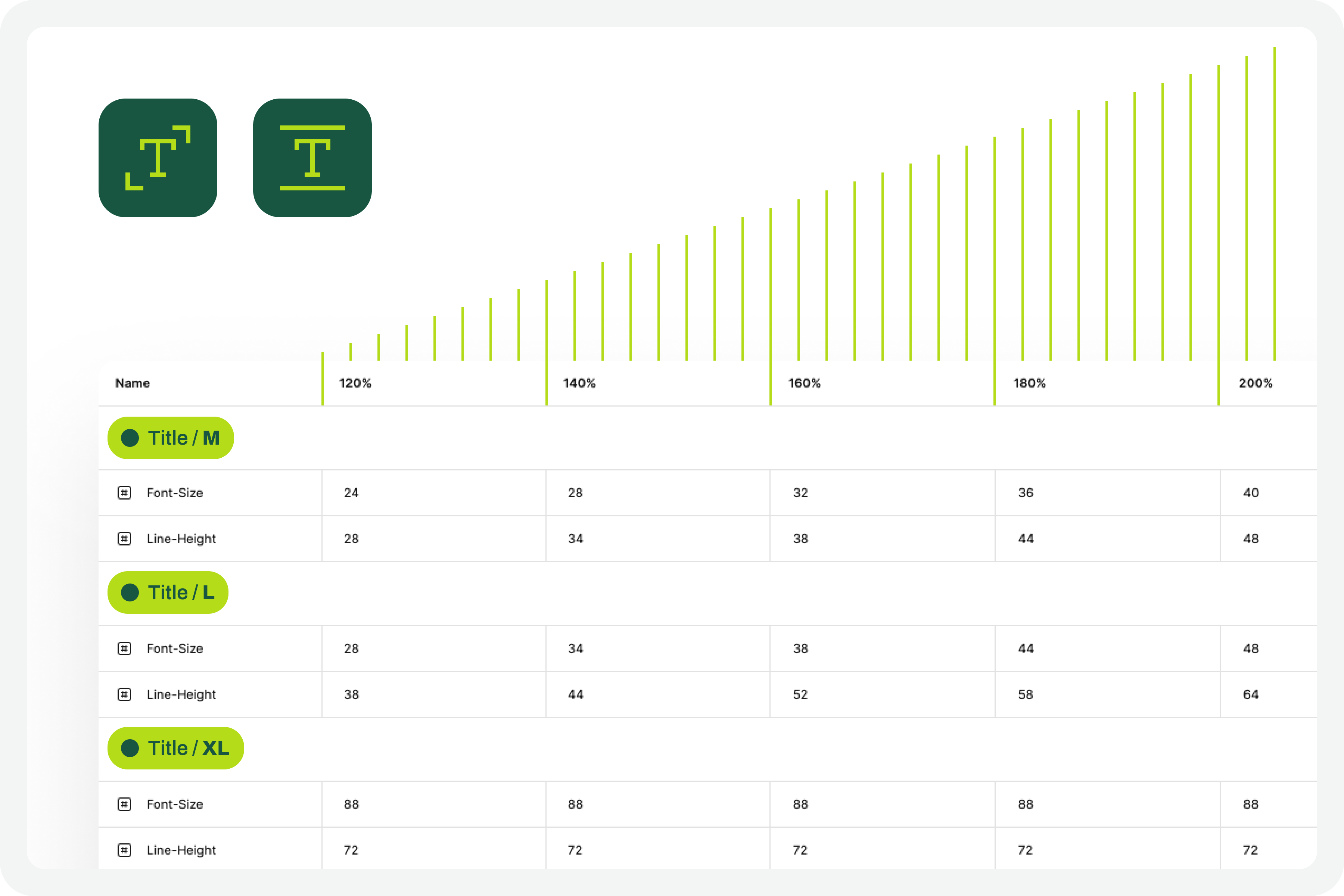
Now that you have the variables applied to the 100% scale text styles, the next step is to create the variables for the other font size increase scales. In practice, you have to create the variables that will tell the system what font size each text style will grow to when the increase scale is 120%, 140%, 160%, etc.

To define the font-size and line-height values, simply multiply the initial value by the scale percentage. For example, if a text style has a font-size of 16px, the size for the 120% scale will be 16 multiplied by 1.2, which gives a result of 19.2. Repeat this calculation for all font-size and line-height values of the font size increase scale percentages you choose.

You can also choose whether or not to apply rounding to the final values. This is an approximate test, and therefore any differences that may arise from rounding will not affect the final perception of the test result.

Font scalling variables
(Large preview)

7. Apply Variables To Different Scale Versions

The moment of truth has arrived. The next step is to understand if we have everything working so that the test runs perfectly. Therefore, you should copy the original interface and apply the set of variables for each of the font size increase rates that make sense to you. Repeat this process for all the font size increase percentages you have defined.

As a suggestion, you can use the 120%, 140%, 160%, 180%, and 200% increase percentages as a reference. If you want to simplify, you can reduce the number of scaling percentages you are working with. Regardless of the number of percentages you are working with, you should always work with the minimum of 100% and 200% scales.

Applied variables to different scale versions
(Large preview)

8. Identify Areas For Improvement #

By applying different font size increase scales to the same screen, it’s easy to understand where improvements might be needed. This is where the real test of increasing font size in interface design and the most interesting accessibility work begins.

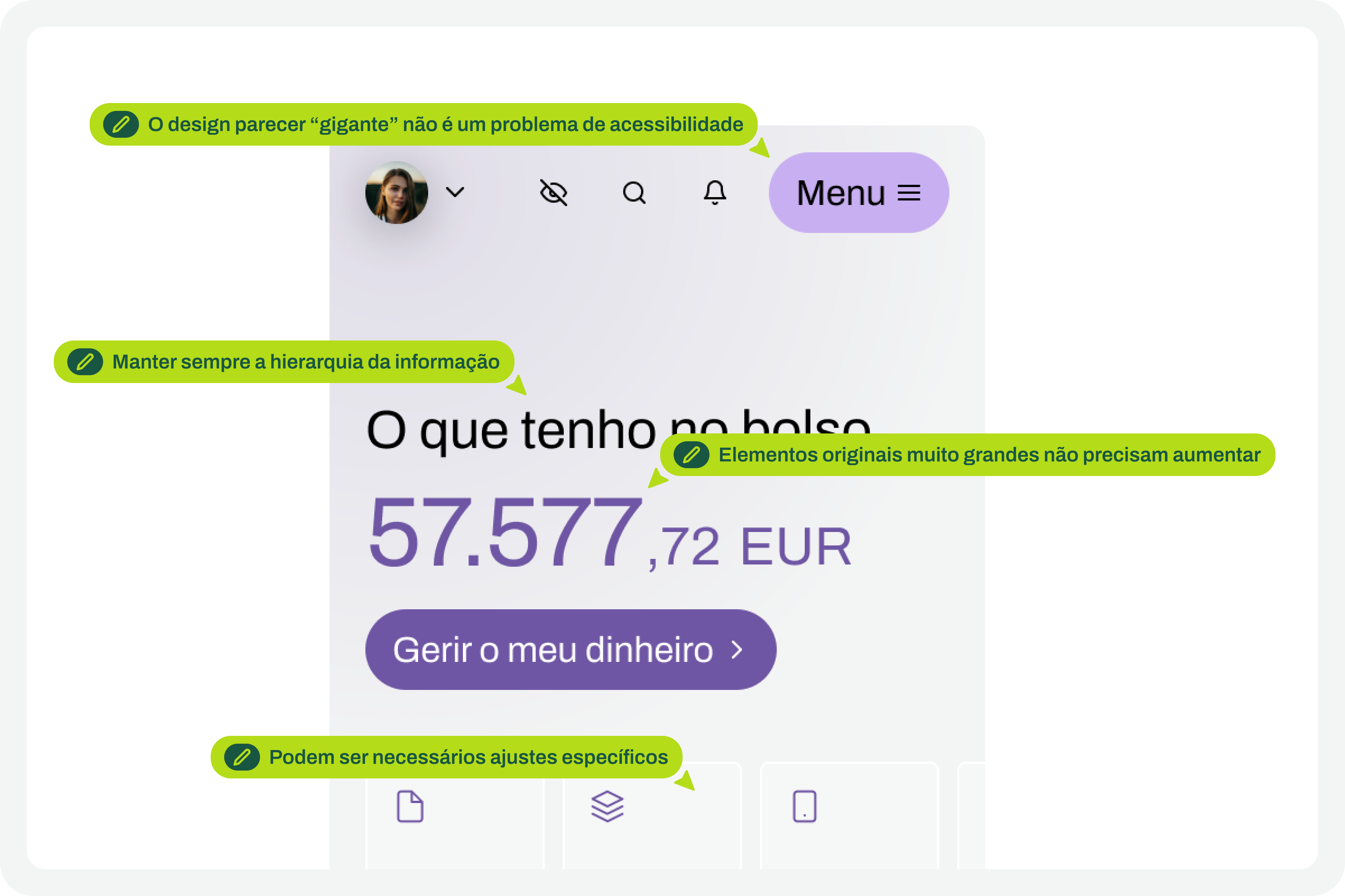
In your analysis of the various screens, keep some important aspects in mind:

  • The fact that the text appears gigantic isn’t a problem and doesn’t “ruin” the design. Remember that this can mean the difference between someone being able to use a particular product or service or not.
  • An accessibility problem exists when increasing the font size makes it impossible for the user to read certain texts or to activate certain controls.
  • For text elements that are already very large, increasing the font size might not make sense. Doing so could make those elements disproportionate, which wouldn’t improve readability (since they are already a good size) and would occupy completely unnecessary space.
  • If there are elements that appear to be popping out of the screen, the first step is to confirm how you are applying auto layout. Many design aspects can be easily resolved with the proper use of auto layout.
  • Regardless of the scale of font size increase, it is essential to maintain the visual hierarchy of the typography, as this readability is important for perceiving the different levels of information present on the screen.
  • This test can help identify elements that may need adjustments directly in the code to function well at a given scale of increase. Not everything can be solved through design alone, and that’s perfectly fine. Accessibility is essentially a team effort.
Critical points for improvement
(Large preview)

9. Make Corrections And Adjustments To The Design

Finally, based on the various screens with different text enlargement scales applied, you can make the design changes that make sense. Some of these adjustments may only be necessary in code. In these cases, you document all these suggestions and pass them on to the development team. It is also crucial to reinforce (again) that some of the problems you may encounter in the design can be quickly resolved in the design process, with the simple and correct application of auto-layout properties.

Design changes to those critical points
(Large preview)

10. Go Back To The Beginning And Repeat The Process

This is a cyclical approach. This means you should repeat these steps, or variations thereof, as many times as necessary throughout the project. It’s natural that, over time and with process optimization, some of these steps will cease to make sense. That’s absolutely not a problem. But the most important thing to realize here is that accessibility and this process of testing font size increases shouldn’t be done just once, and that’s it. It’s a test to be done many, many times throughout the day-to-day work of each project and team.

Starting point
(Large preview)

The Role Of Design Systems #

At first glance, this list of steps might seem like a complex exercise. But it’s not. This is because the vast majority, if not all, of these steps are easy to execute in any context where a design system exists. In fact, design systems have become an unavoidable standard in the Product Design industry. We can discuss what each team calls a design system, but the truth is that it’s very difficult today to find a Product Design team that doesn’t have, at the very least, a minimally structured library of components and styles.

Visualization on design systems

With this foundation, whether more or less documented, it’s very easy to apply this type of font size increase test using Figma variables. Furthermore, if your design system already has, for example, structured variables for light and dark mode, it means you’re already applying the exact same principles we used to perform this test. So, nothing new.

Working with design systems involves a level of structuring and organization that is also very useful for creating this type of test. There’s a myth that design systems limit creativity. This is not true. Design systems help solve the “bureaucratic” part of design, so we can actually have more time for what matters: in this case, testing accessibility and building more and more products and services that are truly accessible to the greatest number of people.

Example File

It’s always easier to see an example than just read a description of a process. If this is true in many disciplines of knowledge, in design, this premise makes even more sense. Therefore, in this Figma file, freely published and openly available to the community, you’ll find a practical example of the entire testing process described here. Remember that this is just an example. There may be countless ways to perform this type of test within the context of a Figma file.

Visualization for the Figma file on testing font scaling
(Large preview)

Be sure to look at this approach with a critical eye. It’s a suggestion for testing font size increases that follows a specific process. Despite this, the approach should be adapted to your team’s specific reality, processes, and level of maturity. Simply copying formulas from other teams without understanding if they make sense in our own context is a sure way to make accessibility efforts disproportionate. Every situation is unique. This approach attempts to simplify accessibility work as much as possible in this specific context. And remember: if something happens, however small, it’s a step forward, not a step backward. And that should be celebrated by everyone on the team.

Sunday, January 18, 2026

How To Design For (And With) Deaf People

 Practical UX guidelines to keep in mind for 466 million people who experience hearing loss.

When we think about people who are deaf, we often assume stereotypes, such as “disabled” older adults with hearing aids. However, this perception is far from the truth and often leads to poor decisions and broken products.

Let’s look at when and how deafness emerges, and how to design better experiences for people with hearing loss.

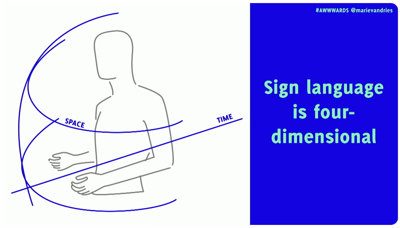
A diagram illustrates sign language with a torso, hands, and blue lines indicating 'SPACE' and 'TIME,' beside blue text stating 'Sign language is four-dimensional.
Sign language is 4-dimensional, including 3D space and time, and often includes facial expressions, too. 

Deafness Is A Spectrum

Deafness spans a broad continuum, from minor to profound hearing loss. Around 90–95% of deaf people come from hearing families, and deafness often isn’t merely a condition that people are born with. It frequently occurs due to exposure to loud noises, and it also emerges with age, disease, and accidents.

A chart showing sound frequencies and decibel levels, illustrating types of hearing loss and common everyday sounds.

The loudness of sound is measured in units called decibels (dB). Everybody is on the spectrum of deafness, from normal hearing (up to 15 dB) to profound hearing loss (91+ dB):

  • Slight Hearing Loss, 16–25 dB
    At 16 dB hearing loss, a person can miss up to 10% of speech when a speaker is at a distance greater than 3 feet.
  • Mild hearing loss, 26–40 dB
    Soft sounds are hard to hear, including whispering, which is around 40 dB in volume. It’s more difficult to hear soft speech sounds spoken at a normal volume. At 40dB hearing loss, a person may miss 50% of meeting discussions.
  • Moderate hearing loss, 41–55 dB
    A person may hear almost no speech when another person is talking at normal volume. At a 50dB hearing loss, a person may not pick up to 80% of speech.
  • Moderately Severe Hearing Loss, 56–70 dB
    A person may have problems hearing the sounds of a dishwasher (60dB). At 70 dB, they might miss almost all speech.
  • Severe Hearing Loss, 71–90 dB
    A person will hear no speech when a person is talking at a normal level. They may hear only some very loud noises: vacuum (70 dB), blender (78 dB), hair dryer (90 dB).
  • Profound Hearing Loss, 91+ dB
    Hear no speech and at most very loud sounds such as a music player at full volume (100 dB), which would be damaging for people with normal hearing, or a car horn (110 dB).

It’s worth mentioning that loss of hearing can also be situational and temporary, as people with “normal” hearing (0 to 25 dB hearing loss) will always encounter situations where they can’t hear, e.g., due to noisy environments.

Useful Things To Know About Deafness

Assumptions are always dangerous, and in the case of deafness, there are quite a few that aren’t accurate. For example, most deaf people actually do not know a sign language — it’s only around 1% in the US.

Also, despite our expectations, there is actually no universal sign language that everybody uses. For example, British signers often cannot understand American signers. There are globally around 300 different sign languages actively used.

“We never question making content available in different written or spoken languages, and the same should apply to signed languages.”

Johanna Steiner
Three smartphone screens displaying parts of a podcast app, including a browsing page, a now-playing screen with an avatar, and a live transcription feature.
Heardio concept: making podcasts accessible for deaf people — with live transcription and sign language avatars.

Sign languages are not just gestures or pantomime. They are 4D spatial languages with their own grammar and syntax, separate from spoken languages, and they don’t have a written form. They rely heavily on facial expression to convey meaning and emphasis. And they are also not universal — every country has its own sign language and dialects.

  • You can only understand 30% of words via lip-reading.
  • Most deaf people do not know any sign language.
  • Many sign languages have local dialects that can be hard to interpret.
  • Not all deaf people are fluent signers and often rely on visual clues.
  • For many deaf people, a spoken language is their second language.
  • Sign language is 4-dimensional, incorporating 3D space, time and also facial expressions.

How To Communicate Respectfully

Keep in mind that many deaf people use the spoken language of their country as their second language. So to communicate with a deaf person, it’s best to ask in writing. Don’t ask how much a person can understand, or if they can lip-read you.

However, as Rachel Edwards noted, don’t assume someone is comfortable with written language because they are deaf. Sometimes their literacy may be low, and so providing information as text and assuming that covers your deaf users might not be the answer.

Also, don’t assume that every deaf person can lip-read. You can see only about 30% of words on someone’s mouth. That’s why many deaf people need additional visual cues, like text or cued speech.

Seven accessibility symbols for people with hearing loss are displayed: International Symbol of Access, assistive listening devices, telephone typewriter, volume control telephone, sign language interpretation, closed captioning, and open captioning.
7 accessibility symbols for people with hearing loss.

It’s also crucial to use respectful language. Deaf people do not always see themselves as disabled, but rather as a cultural linguistic minority with a unique identity. Others, as Meryl Evan has noted, don’t identify as deaf or hard of hearing, but rather as “hearing impaired”. So, it’s mostly up to an individual how they want to identify.

  • Deaf (Capital ‘D’)
    Culturally Deaf people who have been deaf since birth or before learning to speak. Sign language is often the first language, and written language is the second.
  • deaf (Lowercase ‘d’)
    People who developed hearing loss later in life. Used by people who feel closer to the hearing/hard-of-hearing world and prefer to communicate written and/or oral.
  • Hard of Hearing
    People with mild to moderate hearing loss who typically communicate orally and use hearing aids.

In general, avoid hearing impairment if you can, and use Deaf (for those deaf for most of their lives), deaf (for those who became deaf later), or hard of hearing (HoH) for partial hearing loss. But either way, ask politely first and then respect the person’s preferences.

Practical UX Guidelines

When designing UIs and content, consider these key accessibility guidelines for deaf and hard-of-hearing users:

An infographic on a teal background titled 'Designing for users who are deaf or hard of hearing,' listing 'Do's and Don'ts' with icons.
How to design for users who are deaf or hard of hearing, a Gov.uk-inspired poster 
  1. Don’t make the phone required or the only method of contact.
  2. Provide text alternatives for all audible alerts or notices.
  3. Add haptic feedback on mobile (e.g., vibration patterns).
  4. Ensure good lighting to help people see facial expressions.
  5. Circular seating usually works better, so everyone can see each other’s faces.
  6. Always include descriptions of non-spoken sounds (e.g., rain, laughter) in your content.
  7. Add a transcript and closed captions for audio and video.
  8. Clearly identify each speaker in all audio and video content.
  9. Design multiple ways to communicate in every instance (online + in-person).
  10. Invite video participants to keep the camera on to facilitate lip-reading and the viewing of facial expressions, which convey tone.
  11. Always test products with the actual community, instead of making assumptions for them.

Wrapping Up

I keep repeating myself like a broken record, but better accessibility always benefits everyone. When we improve experiences for some groups of people, it often improves experiences for entirely different groups as well.

As Marie Van Driessche rightfully noted, to design a great experience for accessibility, we must design with people, rather than for them. And that means always include people with lived experience of exclusion into the design process — as they are the true experts.

Accessibility never happens by accident — it’s a deliberate decision and a commitment.

No digital product is neutral. There must be a deliberate effort to make products and services more accessible. Not only does it benefit everyone, but it also shows what a company stands for and values.

And once you do have a commitment, it will be so much easier to retain accessibility rather than adding it last minute as a crutch — when it’s already too late to do it right and way too expensive to do it well.

Meet “Smart Interface Design Patterns”

You can find more details on design patterns and UX in Smart Interface Design Patterns, our 15h-video course with 100s of practical examples from real-life projects — with a live UX training later this year. Everything from mega-dropdowns to complex enterprise tables — with 5 new segments added every year. Jump to a free preview. Use code BIRDIE to save 15% off.


Meet Smart Interface Design Patterns, our video course on interface design & UX.

Video + UX Training

$ 495.00 $ 699.00 Get Video + UX Training

25 video lessons (15h) + Live UX Training.
100 days money-back-guarantee.

Video only

$ 300.00$ 395.00
Get the video course

40 video lessons (15h). Updated yearly.
Also available as a UX Bundle with 2 video courses.

Useful Resources

Useful Books

  • Sound Is Not Enough, by Svetlana Kouznetsova
  • Mismatch: How Inclusion Shapes Design, by Kat Holmes
  • Building for Everyone: Extend Your Product’s Reach Through Inclusive Design (+ free excerpt), by Annie Jean-Baptiste

Saturday, July 19, 2025

Designing For Neurodiversity

 Designing for neurodiversity means recognizing that people aren’t edge cases but individuals with varied ways of thinking and navigating the web. So, how can we create more inclusive experiences that work better for everyone?

Neurodivergent needs are often considered as an edge case that doesn’t fit into common user journeys or flows. Neurodiversity tends to get overlooked in the design process. Or it is tackled late in the process, and only if there is enough time.

But people aren’t edge cases. Every person is just a different person, performing tasks and navigating the web in a different way. So how can we design better, more inclusive experiences that cater to different needs and, ultimately, benefit everyone? Let’s take a closer look.

Neurodiversity Or Neurodivergent?

There is quite a bit of confusion about both terms on the web. Different people think and experience the world differently, and neurodiversity sees differences as natural variations, not deficits. It distinguishes between neurotypical and neurodivergent people.

  • Neurotypical people see the world in a “typical” and widely perceived as expected way.
  • Neurodivergent people experience the world differently, for example, people with ADHD, dyslexia, dyscalculia, synesthesia, and hyperlexia.

According to various sources, around 15–40% of the population has neurodivergent traits. These traits can be innate (e.g., autism) or acquired (e.g., trauma). But they are always on a spectrum, and vary a lot. A person with autism is not neurodiverse — they are neurodivergent.

One of the main strengths of neurodivergent people is how imaginative and creative they are, coming up with out-of-the-box ideas quickly. With exceptional levels of attention, strong long-term memory, a unique perspective, unbeatable accuracy, and a strong sense of justice and fairness.

Being different in a world that, to some degree, still doesn’t accept these differences is exhausting. So unsurprisingly, neurodivergent people often bring along determination, resilience, and high levels of empathy.

Design With People, Not For Them

As a designer, I often see myself as a path-maker. I’m designing reliable paths for people to navigate to their goals comfortably. Without being blocked. Or confused. Or locked out.

That means respecting the simple fact that people’s needs, tasks, and user journeys are all different, and that they evolve over time. And: most importantly, it means considering them very early in the process.

Better accessibility is better for everyone. Instead of making decisions that need to be reverted or refined to be compliant, we can bring a diverse group of people — with accessibility needs, with neurodiversity, frequent and infrequent users, experts, newcomers — in the process, and design with them, rather than for them.

Neurodiversity & Inclusive Design Resources

A wonderful resource that helps us design for cognitive accessibility is Stéphanie Walter’s Neurodiversity and UX toolkit. It includes practical guidelines, tools, and resources to better understand and design for dyslexia, dyscalculia, autism, and ADHD.


Another fantastic resource is Will Soward’s Neurodiversity Design System. It combines neurodiversity and user experience design into a set of design standards and principles that you can use to design accessible learning interfaces.

Last but not least, I’ve been putting together a few summaries about neurodiversity and inclusive design over the last few years, so you might find them helpful, too:

A huge thank-you to everyone who has been writing, speaking, and sharing articles, resources, and toolkits on designing for diversity. The topic is often forgotten and overlooked, but it has an incredible impact. 👏🏼👏🏽👏🏾

Monday, June 16, 2025

WCAG 3.0’s Proposed Scoring Model: A Shift In Accessibility Evaluation


WCAG is evolving. Since 1999, the Web Content Accessibility Guidelines have defined accessibility in binary terms: either a success criterion is met or not. But real user experience is rarely that simple. WCAG 3.0 rethinks the model — prioritizing usability over compliance and shifting the focus toward the quality of access rather than the mere presence of features. Could this be the start of a new era in accessibility?

Since their introduction in 1999, the Web Content Accessibility Guidelines (WCAG) have shaped how we design and develop inclusive digital products. The WCAG 2.x series, released in 2008, introduced clear technical criteria judged in a binary way: either a success criterion is met or not. While this model has supported regulatory clarity and auditability, its “all-or-nothing” nature often fails to reflect the nuance of actual user experience (UX).

Over time, that disconnect between technical conformance and lived usability has become harder to ignore. People engage with digital systems in complex, often nonlinear ways: navigating multistep flows, dynamic content, and interactive states. In these scenarios, checking whether an element passes a rule doesn’t always answer the main question: can someone actually use it?

WCAG 3.0 is still in draft, but is evolving — and it represents a fundamental rethinking of how we evaluate accessibility. Rather than asking whether a requirement is technically met, it asks how well users with disabilities can complete meaningful tasks. Its new outcome-based model introduces a flexible scoring system that prioritizes usability over compliance, shifting focus toward the quality of access rather than the mere presence of features.

Draft Status: Ambitious, But Still Evolving

WCAG 3.0 was first introduced as a public working draft by the World Wide Web Consortium (W3C) Accessibility Guidelines Working Group in early 2021. The draft is still under active development and is not expected to reach W3C Recommendation status for several years, if not decades, by some accounts. This extended timeline reflects both the complexity of the task and the ambition behind it:

WCAG 3.0 isn’t just an update — it’s a paradigm shift.

Unlike WCAG 2.x, which focused primarily on web pages, WCAG 3.0 aims to cover a much broader ecosystem, including applications, tools, connected devices, and emerging interfaces like voice interaction and extended reality. It also rebrands itself as the W3C Accessibility Guidelines (while the WCAG acronym remains the same), signaling that accessibility is no longer a niche concern — it’s a baseline expectation across the digital world.

Importantly, WCAG 3.0 will not immediately replace 2.x. Both standards will coexist, and conformance to WCAG 2.2 will continue to be valid and necessary for some time, especially in legal and policy contexts.

This expansion isn’t just technical.

WCAG 3.0 reflects a deeper philosophical shift: accessibility is moving from a model of compliance toward a model of effectiveness.

Rules alone can’t capture whether a system truly works for someone. That’s why WCAG 3.0 leans into flexibility and future-proofing, aiming to support evolving technologies and real-world use over time. It formalizes a principle long understood by practitioners:

Inclusive design isn’t about passing a test; it’s about enabling people.

A New Structure: From Success Criteria To Outcomes And Methods

WCAG 2.x is structured around four foundational principles — Perceivable, Operable, Understandable, and Robust (aka POUR) — and testable success criteria organized into three conformance levels (A, AA, AAA). While technically precise, these criteria often emphasize implementation over impact.

WCAG 3.0 reorients this structure toward user needs and real outcomes. Its hierarchy is built on:

  • Guidelines: High-level accessibility goals tied to specific user needs.
  • Outcomes: Testable, user-centered statements (e.g., “Users have alternatives for time-based media”).
  • Methods: Technology-specific or agnostic techniques that help achieve the outcomes, including code examples and test instructions.
  • How-To Guides: Narrative documentation that provides practical advice, user context, and design considerations.

This shift is more than organizational. It reflects a deeper commitment to aligning technical implementation with UX. Outcomes speak the language of capability, which is about what users should be able to do (rather than just technical presence).

Crucially, outcomes are also where conformance scoring begins to take shape. For example, imagine a checkout flow on an e-commerce website. Under WCAG 2.x, if even one field in the checkout form lacks a label, the process may fail AA conformance entirely. However, under WCAG 3.0, that same flow might be evaluated across multiple outcomes (such as keyboard navigation, form labeling, focus management, and error handling), with each outcome receiving a separate score. If most areas score well but the error messaging is poor, the overall rating might be “Good” instead of “Excellent”, prompting targeted improvements without negating the entire flow’s accessibility.

From Binary Checks To Graded Scores

Rather than relying on pass or fail outcomes, WCAG 3.0 introduces a scoring model that reflects how well accessibility is supported. This shift allows teams to recognize partial successes and prioritize real improvements.

How Scoring Works

Each outcome in WCAG 3.0 is evaluated through one or more atomic tests. These can include the following:

  • Binary tests: “Yes” and “no” outcomes (e.g., does every image have alternative text?)
  • Percentage-based tests: Coverage-based scoring (e.g., what percentage of form fields have labels?)
  • Qualitative tests: Rated judgments based on criteria (e.g., how descriptive is the alternative text?)

The result of these tests produces a score for each outcome, often normalized on a 0-4 or 0-5 scale, with labels like Poor, Fair, Good, and Excellent. These scores are then aggregated across functional categories (vision, mobility, cognition, etc.) and user flows.

This allows teams to measure progress, not just compliance. A product that improves from “Fair” to “Good” over time shows real evolutiona concept that doesn’t exist in WCAG 2.x.

Critical Errors: A Balancing Mechanism

To ensure that severity still matters, WCAG 3.0 introduces critical errors, which are high-impact accessibility failures that can override an otherwise positive score.

For example, consider a checkout flow. Under WCAG 2.x, a single missing label might cause the entire flow to fail conformance. WCAG 3.0, however, evaluates multiple outcomes — like form labeling, keyboard access, and error handling — each with its own score. Minor issues, such as unclear error messages or a missing label on an optional field, might lower the rating from “Excellent” to “Good”, without invalidating the entire experience.

But if a user cannot complete a core action, like submitting the form, making a purchase, or logging in, that constitutes a critical error. These failures directly block task completion and significantly reduce the overall score, regardless of how polished the rest of the experience is.

On the other hand, problems with non-essential features — like uploading a profile picture or changing a theme color — are considered lower-impact and won’t weigh as heavily in the evaluation.

Conformance Levels: Bronze, Silver, Gold

In place of categorizing conformance in tiers of Level A, Level AA, and Level AAA, WCAG 3.0 proposes three different conformance tiers:

  • Bronze: The new minimum. It is comparable to WCAG 2.2 Level AA, but based on scoring and foundational outcomes. The requirements are considered achievable via automated and guided manual testing.
  • Silver: This is a higher standard, requiring broader coverage, higher scores, and usability validation from people with disabilities.
  • Gold: The highest tier. Represents exemplary accessibility, likely requiring inclusive design processes, innovation, and extensive user involvement.

Unlike in WCAG 2.2, where Level AAA is often seen as aspirational and inconsistent, these levels are intended to incentivize progression. They can also be scoped in the sense that teams can claim conformance for a checkout flow, mobile app, or specific feature, allowing iterative improvement.

What You Should Do Now

While WCAG 3.0 is still being developed, its direction is clear. That said, it’s important to acknowledge that the guidelines are not expected to be finalized in a few years. Here’s how teams can prepare:

  • Continue pursuing WCAG 2.2 Level AA. It remains the most robust, recognized standard.
  • Familiarize yourself with WCAG 3.0 drafts, especially the outcomes and scoring model.
  • Start thinking in outcomes. Focus on what users need to accomplish, not just what features are present.
  • Embed accessibility into workflows. Shift left. Don’t test at the end — design and build with access in mind.
  • Involve users with disabilities early and regularly.

These practices won’t just make your product more inclusive; they’ll position your team to excel under WCAG 3.0.

Potential Downsides

Even though WCAG 3.0 presents a bold step toward more holistic accessibility, several structural risks deserve early attention, especially for organizations navigating regulation, scaling design systems, or building sustainable accessibility practices. Importantly, many of these risks are interconnected: challenges in one area may amplify issues in others.

Subjective Scoring

The move from binary pass or fail criteria to scored evaluations introduces room for subjective interpretation. Without standardized calibration, the same user flow might receive different scores depending on the evaluator. This makes comparability and repeatability harder, particularly in procurement or multi-vendor environments. A simple alternative text might be rated as “adequate” by one team and “unclear” by another.

Reduced Compliance Clarity

That same subjectivity leads to a second concern: the erosion of clear compliance thresholds. Scored evaluations replace the binary clarity of “compliant” or “not” with a more flexible, but less definitive, outcome. This could complicate legal enforcement, contractual definitions, and audit reporting. In practice, a product might earn a “Good” rating while still presenting critical usability gaps for certain users, creating a disconnect between score and actual access.

As clarity around compliance blurs, so does alignment with existing legal frameworks. Many current laws explicitly reference WCAG 2.x and its A, AA, and AAA levels (e.g. Section 508 of the Rehabilitation Act of 1973, European Accessibility Act, The Public Sector Bodies (Websites and Mobile Applications) (No. 2) Accessibility Regulations 2018).

Until WCAG 3.0 is formally mapped to those standards, its use in regulated contexts may introduce risk. Teams operating in healthcare, finance, or public sectors will likely need to maintain dual conformance strategies in the interim, increasing cost and complexity.

Risk Of Minimum Viable Accessibility

Perhaps most concerning, this ambiguity can set the stage for a “minimum viable accessibility” mindset. Scored models risk encouraging “Bronze is good enough” thinking, particularly in deadline-driven environments. A team might deprioritize improvements once they reach a passing grade, even if essential barriers remain.

For example, a mobile app with strong keyboard support but missing audio transcripts could still achieve a passing tier, leaving some users excluded.

Conclusion

WCAG 3.0 marks a new era in accessibility — one that better reflects the diversity and complexity of real users. By shifting from checklists to scored evaluations and from rigid technical compliance to practical usability, it encourages teams to prioritize real-world impact over theoretical perfection.

As one might say, “It’s not about the score. It’s about who can use the product.” In my own experience, I’ve seen teams pour hours into fixing minor color contrast issues while overlooking broken keyboard navigation, leaving screen reader users unable to complete essential tasks. WCAG 3.0’s focus on outcomes reminds us that accessibility is fundamentally about functionality and inclusion.

At the same time, WCAG 3.0’s proposed scoring models introduce new responsibilities. Without clear calibration, stronger enforcement patterns, and a cultural shift away from “good enough,” we risk losing the very clarity that made WCAG 2.x enforceable and actionable. The promise of flexibility only works if we use it to aim higher, not to settle earlier.

For teams across design, development, and product leadership, this shift is a chance to rethink what success means. Accessibility isn’t about ticking boxes — it’s about enabling people.

By preparing now, being mindful of the risks, and focusing on user outcomes, we don’t just get ahead of WCAG 3.0 — we build digital experiences that are truly usable, sustainable, and inclusive.