There’s a moment in almost every usability session where a participant pauses at the login screen, types something, and glances up: checking whether they’re “doing it right.” That pause is a clear sign. They’ve already clocked that this isn’t a real app, and every data point collected after that moment is filtered through that awareness.
This article has been kindly supported by our dear friends at ProtoPie who help users turn their ideas into highly interactive animations and prototypes for mobile, desktop, web, and IoT. Thank you!
There’s a moment in almost every usability session where a participant pauses at the login screen, types something, and glances up: checking whether they’re “doing it right.” That pause is a clear sign. They’ve already clocked that this isn’t a real app, and every data point collected after that moment is filtered through that awareness.
In financial product testing, the problem is sharper. Finance users are trained to notice when something feels off: a balance that doesn’t add up, a field that accepts anything. When a banking prototype skips real authentication, participants don’t just disengage; they stop mid-session to flag it. The team walks away with findings that reflect how users behave in a demonstration, not in a real product.
The fix is narrower than you’d think. Identify the moment where participant trust is established and make that interaction real. In a banking app, that moment is the login.
This tutorial builds it: credentials that validate, a live error state, and a biometric animation that feels native — no code required.
What We’re Building: A Login That Behaves Like A Shipped Product
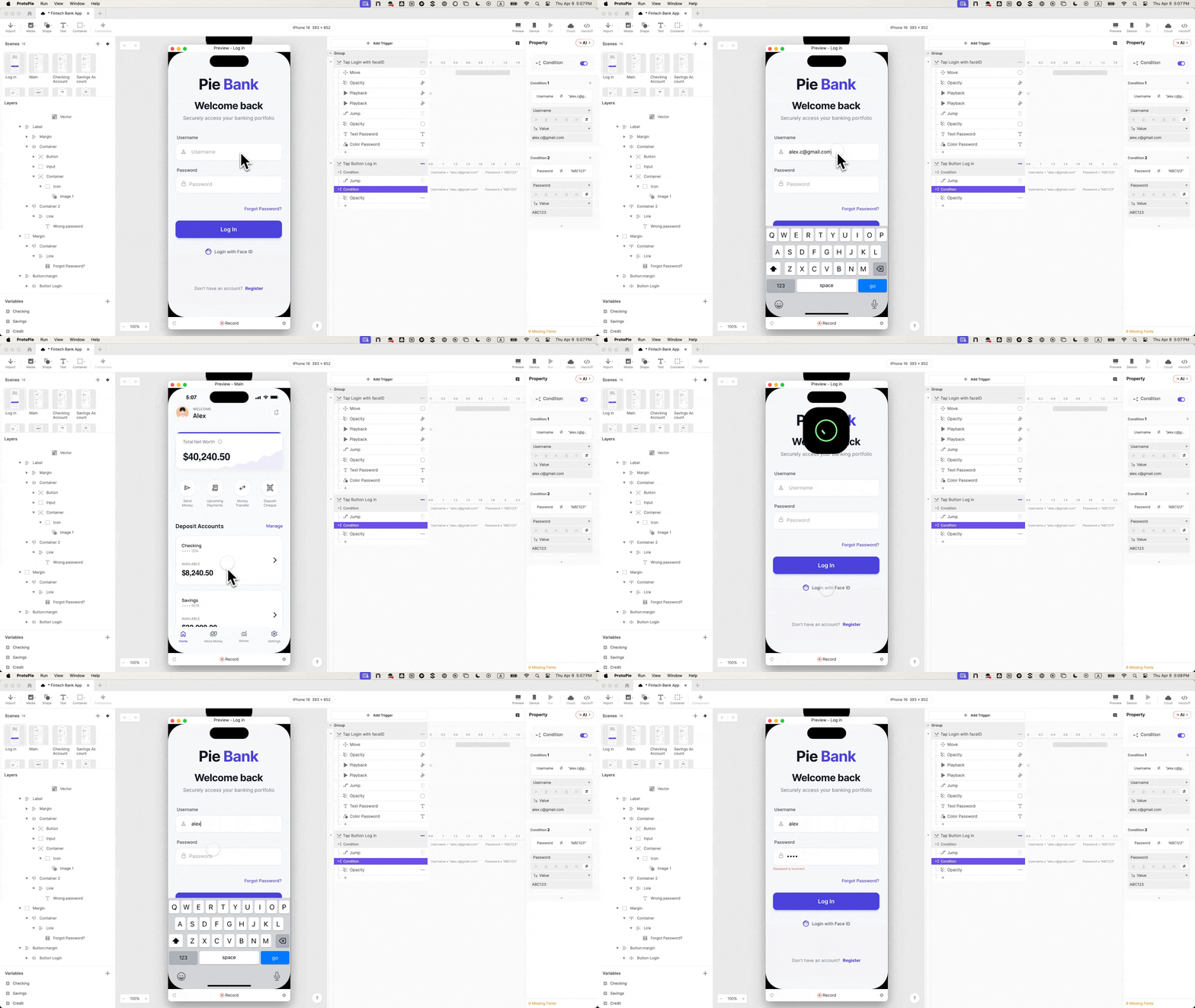
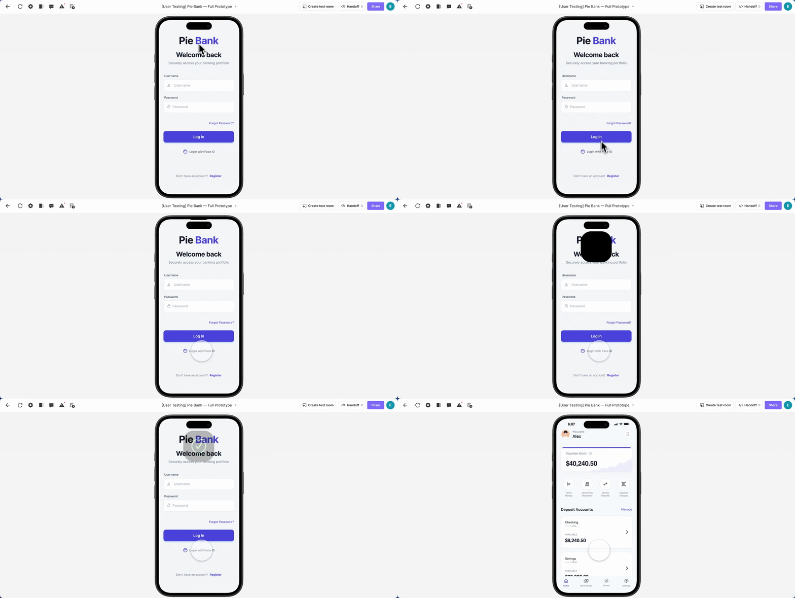
The login flow, built around Pie Bank, a mobile banking prototype, includes functional text inputs, a masked password field, credential validation, a live error state, and a Face ID animation timed to feel indistinguishable from iOS.
What you’ll need:
A login UI from Figma (or any supported design tool)
ProtoPie Studio — free to start, everything in this tutorial works on the free plan
A Lottie file for the Face ID animation (this one is what we used)
Step 1: Import From Figma Choose Scene, Not Flattened #
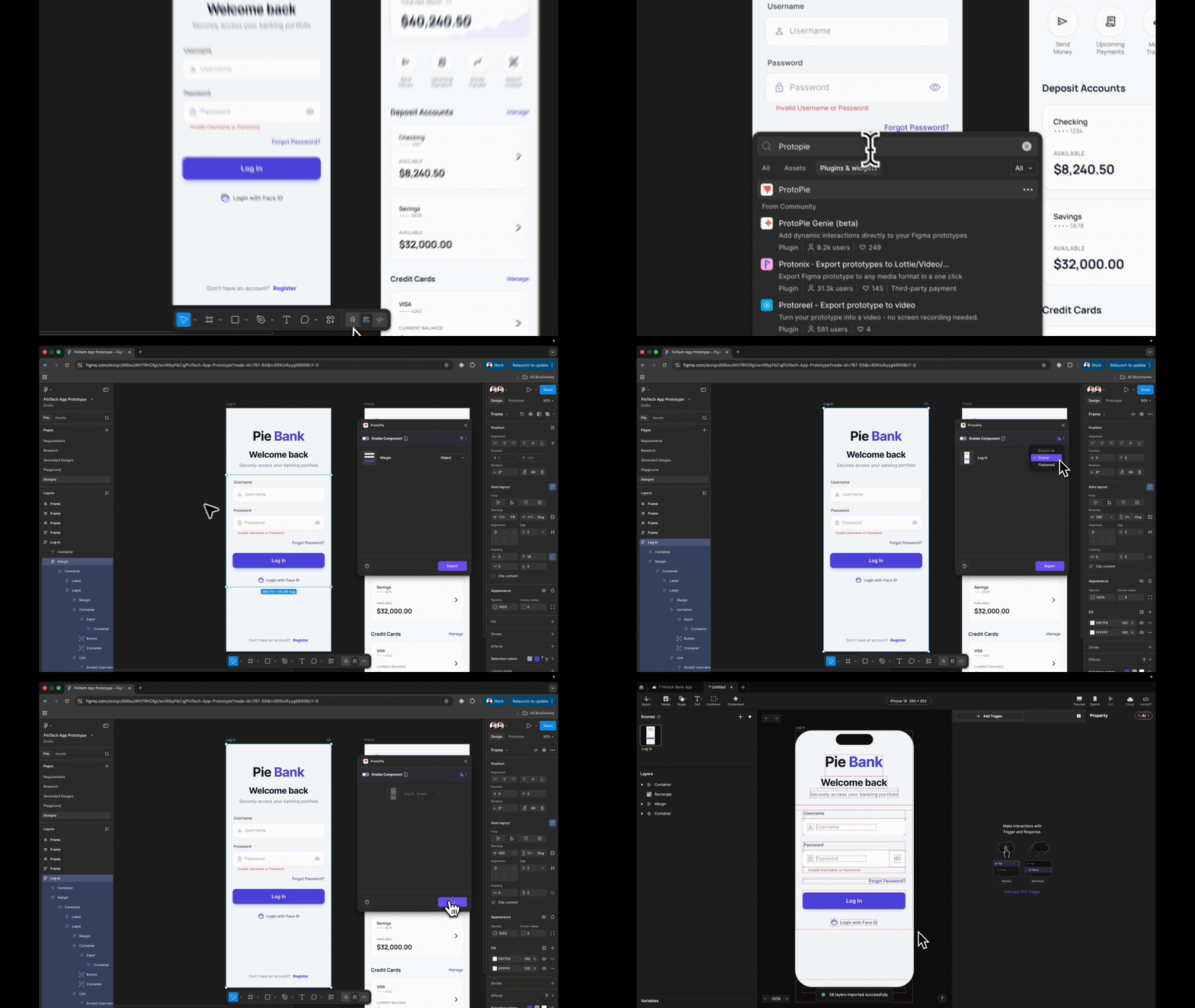
In Figma, open the ProtoPie plugin with your login frame selected and choose Scene when exporting. Flattened collapses everything into a single image; Scene preserves your layer hierarchy so every element arrives in ProtoPie as a separate, targetable layer.
Before moving on: rename every layer meaningfully. “Input Username” not “Rectangle 14”. You’ll reference these names in formulas: vague names compound into real time lost.
Step 2: Swap Static Fields For Inputs That Actually Accept Text #
ProtoPie’s native Input layer accepts real keyboard entry: participants type actual text, not tap a placeholder. Go to Text → Input, drag an Input layer onto your canvas, and nest it inside your username field group. Match it visually: placeholder text Username, background fill and font to match your design.
Hit preview. Click the field. Type. That’s the prototype starting to behave like an app rather than depicting one.
Rename this layer Input Username, duplicate it, and nest the copy inside your password field group.
Step 3: One Property Change Masks The Password
On the duplicated layer, change placeholder text to Password and set Type to Text Password. ProtoPie handles the masking: no custom logic needed.
Preview both fields: username shows text, password shows dots. It already feels real, and you haven’t written a single condition.
Step 4: Build The Destination Scene Before Wiring Navigation #
Add a new scene, even a blank one. The most common sequencing mistake in ProtoPie is trying to wire a navigation response before a destination exists. Create it first.
Step 5: Wire The Button: It Works, But It Still Lets Everyone Through
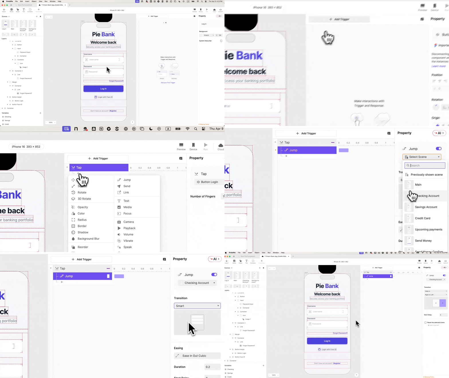
Select Log In, add a Tap trigger, set response to Jump, target your dashboard scene, transition Slide in from right to left.
Preview and tap. It navigates: but for any input, including nothing. The prototype is still lying. The next two steps are the fix.
Step 6: Add Variables So The Prototype Remembers What Was Typed
At the bottom-left of ProtoPie, add two Text type variables: username and password. Bind each to its input layer with a formula:
Enable the debug icons: green overlays will show live variable values as you type. When you see your keystrokes appear in real time, the binding is confirmed.
Step 7: Add A Condition So Only Valid Credentials Get Through
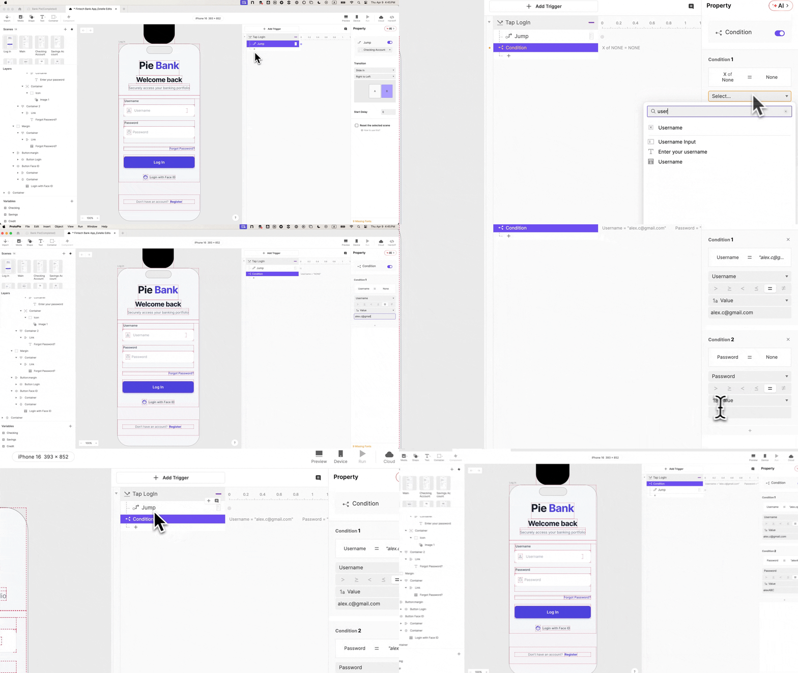
Go back to the Tap trigger on the login button. Add a Condition with two rules, both must be true:
username equals alex.c@gmail.com
password equals ABC123
Move the Jump response inside this condition. Wrong credentials, empty fields, wrong format: none get through. Participants now have to actually log in. That single constraint changes the texture of every test session that follows.
Step 8: Build The Error State, The Interaction Most Prototypes Skip
Find your error message layer, rename it Error Text, set initial opacity to 0. Add a second condition (the inverse of the first), and inside it, a Change Propertyresponse setting Error Text opacity to 100.
Wrong credentials: error appears. Correct credentials: dashboard. Two outcomes: which is what makes this testable, not just demonstrable.
Step 9: Add The Face ID Animation, The Detail That Makes Testers Ask “Is This Real”
Go to Media, drag a Lottie layer onto canvas, load your Face ID file, and position it off-screen above the iPhone frame. On your Login with Face ID button, add a Tap trigger (rename it Tap Face ID) with four responses in sequence:
Move: Lottie container to Y: 60
Playback: Seek: time 0s (resets so it always plays from the start)
Playback: Play: Lottie file
Jump: to dashboard
Step 10: Stagger The Timing, This Is What Makes It Feel Native
Without delays, all four responses fire at once and the scene jumps before the animation plays. Add offsets:
Response
Delay
Move
0s
Seek
0s
Play
0.5s
Jump
1s
Enable Reset selected scenes on Jump: without it, navigating back leaves the animation stuck at Y: 60.
Preview: tap Face ID, animation drops in, plays, screen transitions. A biometric login indistinguishable from the real thing.
A Login This Real Changes What You Can Learn From Your Prototype
When authentication actually works, the error state becomes a genuine research touchpoint: do users understand the message, do they retry, do they reach for Face ID instead? These are questions a faked login can’t answer.
In stakeholder reviews, the flow speaks for itself. In engineering handoff, the interaction panel documents the behavior (conditional logic, variable bindings, timing) so engineers see intent, not interpretation.
This is why FinTech teams invest in login fidelity even when the login isn’t the feature being tested. It’s where participant trust is established. Get it right, and everything downstream produces better signal.
This tutorial is part of the FinTech Prototyping with ProtoPie series on the ProtoPie blog. The series builds Pie Bank from the ground up across four chapters, covering the dashboard, money transfer logic, and camera integration. If this tutorial was useful, the rest of the series goes further.
Design always starts with function — function shapes form. But if that function can’t be made completely invisible and people still have to interact with it, it inevitably becomes part of their experience. In this article, Kyrylo Levashov explains why the question has shifted from, “Should your utility software feel better to use?” to “Can your utility software afford not to?“
This article has been kindly supported by our dear friends at MacPaw who not only believe that making great products requires seeing the world in a different light, but also strive to innovate and create incredible software ecosystem for users’ Macs. Thank you!
Your grandmother’s vacuum was a trusty but ugly workhorse hidden in a dark closet. Dyson turned that practical tool into an aspirational product, one you love leaving out even when guests come over. Dish soap was just dish soap until Method put it in a glass container, and it became an addition to, not a distraction from, the aesthetics of your kitchen. Physical product brands spent the last two decades transforming mundane, practical items like soap and vacuums into must-have experiences.
But utility software — especially maintenance tools, a type of system software designed to analyze, configure, optimize, and maintain a computer — hasn’t made that leap from something you open as a chore to an experience you choose with excitement. And that means those brands are missing an interesting design opportunity: these tools are well overdue for a more intelligent, more human, and less emotionally flat approach.
“The Most Underexplored Frontier In UX Is The Maintenance Layer.”
Utility software still feels like a chore. Using it has all the excitement of pulling out that dusty old vacuum from the back of the closet. These four common software design assumptions illustrate why the category hasn’t yet transcended its chore status.
Assuming the user already resents the task: they’re here because something is wrong, not because they chose to open this tool. Designing accordingly means assuming they want the software to be fast, clinical, invisible, and something to get out of the way, not get into. But a design built for resentment produces tools that deserve it. If you expect your users to want to get out of the product as fast as possible, they’ll feel it in the design.
Assuming function is enough and feelings are for consumer apps: emotion in interface design is decoration. The maintenance layer is infrastructure, and nobody decorates infrastructure. But nobody decorated dish soap either, until Method. They didn’t change the product, just the user’s relationship to the tool they use to accomplish a task.
Assuming your users are not your fans because nobody cares about maintenance tools: utility tools don’t build communities, and nobody posts about running a disk cleanup. But people care deeply about tools that respect their time and make complex things simple for them to use. The MacPaw team listens to our community and implements many of the features they ask for, because we know users can be fans too, and they should shape how our products work.
Assuming that designers shouldn’t waste pixels on personality: you need to hide complexity and show minimal UI. Utility software should look neutral, technical, and forgettable.
But when software hides the system, people lose trust in it.
Design always starts with function — function shapes form. But if that function can’t be made completely invisible and people still have to interact with it, it inevitably becomes part of their experience. In that case, people expect it not just to work, but to match their environment, influence their mood, and contribute to their overall experience.
A good example is a watch. Its core function is simple: show the time. But because a watch occupies physical space in a person’s world, you want more from it than just functionality. It needs to play an aesthetic role and complement the environment.
“The Maintenance Layer Is A Behavioral Problem, Not Just A UX One.”
The user experience in utility software matters more than the industry tends to admit. In utility software, experience is not something added on top of function. It emerges from how the function is structured, explained, and interacted with. If you think you can design the most functional app on the market without considering how users understand and experience the process, you’re missing an opportunity to build a relationship with that user.
Part of that ignored UX element is a behavioral problem: users don’t avoid utility software because using it is hard, but instead because it produces no positive emotional signal at any point. The problem is rarely complex. It’s the absence of meaningful interaction during the process of using the app.
Another issue is focusing solely on function. The aesthetic-usability effect shows us clearly that if something looks better, it feels better — ATM screens in a 1995 study were judged easier to use if the screen layout was more attractive. Even something as purely functional as an ATM screen display needs attention to how the function is structured, presented, and perceived.
And then there’s the memory problem. People remember the emotional peak and the ending of an experience, not the average. A completed process that ends with a clear “done” is remembered more positively than one that just fades out, even if the end task is completed successfully in both cases. System tools rarely intentionally design the ending of an interaction — they just stop running.
“Thoughtful System Design Can Transform Maintenance From A Technical Chore Into A Seamless User Experience.” #
What does emotional design actually mean, then, in utility UX? Here are three principles the MacPaw team follows to design its products against the category norm.
TRANSLATING SYSTEM COMPLEXITY INTO HUMAN LANGUAGE #
Maintenance tools deal with storage, task management, and background processes. Good design explains what’s happening, avoids system jargon, and communicates outcomes clearly.
Linear’s game-changing move that illustrates this principle was agreeing on straightforward units of work, like projects and teams, that any new user can immediately understand. That helps them spend less time ramping up and more time building.
MAKE THE PROCESS CLEAR AND SHOW PROGRESS
System tools run complex processes. Design should show progress, impact, and system change to create trust and control.
Vercel’s deployment infrastructure is an excellent example here. When you trigger a build, the browser tab favicon changes — a spinner while building, a green checkmark when done, a red X if it fails. It’s ruthlessly functional, not visual or warm, but it’s emotionally intelligent: it exists purely to reduce the low-level anxiety of waiting for a build to finish.
DESIGN THE MOMENT OF COMPLETION
Maintenance tasks often end quietly. But completion is the emotional payoff. Design should emphasize clarity of results, a sense of resolution, and visible improvement so users remember a positive and distinct ending.
Take the new CleanMyMac by MacPaw after its 2024 major update. Unlike the maintenance utility category norm, CleanMyMac uses visual language, including color, depth, motion, icons, and 3D illustrations, to shift the focus from diagnosing problems to showing progress: space cleared, threats removed, time saved. Instead of confronting the user with what’s wrong, the interface closes with a picture of a machine that’s already working better.
The task is the same, but the ending tells a different story, giving the user a picture of a machine that’s already working better.
“Even If You Don’t Care About Emotional Design As A Principle, The Change Is Coming Anyway.” #
The market is forcing this issue even for those who don’t find the argument I’ve made here compelling.
That’s partly generational — designers and users who grew up with Linear, Figma, and Notion have a completely different baseline for the tools they use. Good software is not a happy accident for them, but a given. That generation is now the primary audience for maintenance software, and so the old “it’s fine, it’s just a utility” excuse doesn’t work philosophically or commercially. Just like Dyson and Method changed how entire product categories approached design, the current state of utility software is shifting for good.
And digital fatigue is the current cultural state. The resurgence of vinyl records, film cameras, and dumbphones is not merely nostalgia, but a signal that the emotional relationship between people and their tools is changing.
The question has shifted from whether your utility software should feel better to use to whether it can afford not to.
guides
you through the essential aspects of color in digital design and user
experience, from the practical steps of creating effective and scalable
color palettes to critical accessibility considerations.
Color
plays a pivotal role in crafting compelling user experiences and
successful digital products. It’s far more than just aesthetics; color
strategically guides users, establishes brand identity, and evokes
specific emotions.
Beyond functionality, color is also a powerful tool for brand recognition and emotional connection.
Consistent use of brand colors across a digital product reinforces
identity and builds trust. Different hues carry cultural and
psychological associations, allowing designers to subtly influence user
perception and create the desired mood. A thoughtful and deliberate
approach to color in UX design elevates the user experience, strengthens
brand presence, and contributes significantly to the overall success
and impact of digital products. In this article, we will talk about the
importance of color and why they are important for creating emotional connection and delivering consistent and accessible digital products.
Well-chosen color palettes enhance usability
by creating visual hierarchies, highlighting interactive elements, and
providing crucial feedback on screens. For instance, a bright color
might draw attention to a call-to-action button, while consistent color
coding can help users navigate complex interfaces intuitively. Color
also contributes significantly to accessibility,
ensuring that users with visual impairments can still effectively
interact with digital products. By carefully considering contrast ratios
and providing alternative visual cues, designers can create inclusive
experiences that cater to a wider audience.
Communicating Brand Identity Through Color In The Digital Space
A
thoughtfully curated and vibrant color palette becomes a critical
differentiator, allowing a brand to stand out amidst the digital noise
and cultivate stronger connections with the audience.
Far beyond
mere decoration, color acts as a visual shorthand, instantly conveying a
brand’s personality, its underlying values, and its unique essence.
According to the American Marketing Association,
vibrant colors, in particular, possess an inherent magnetism, drawing
the eye and etching themselves into memory within the online
environment. They infuse the brand with energy and dynamism, projecting
approachability and memorability in a way that more muted tones often
cannot.
Consistency: The Core Of Great Design
Consistency
is important because it fosters trust and familiarity, allowing users
to quickly identify and connect with the brand in the online landscape.
The strategic deployment of vibrant colors is especially crucial for
brands seeking to establish themselves and flourish within the digital
ecosystem. In the absence of physical storefronts or tangible in-person
interactions, visual cues become paramount in shaping user perception
and building brand recognition. A carefully selected primary color,
supported by a complementary and equally energetic secondary palette,
can become synonymous with a brand’s digital presence. A consistent
application of the right colors across different digital touchpoints —
from the logo and website design to the user interface of an app and
engaging social media campaigns — creates a cohesive and instantly
recognizable visual language.
Several sources and professionals
agree that the psychology behind the colors plays a significant role in
shaping brand perception. The publication Insights Psychology,
for instance, explains how colors can create emotional and behavioural
responses. Vibrant colors often evoke strong emotions and associations. A
bold, energetic red, for example, might communicate passion and
excitement, while a bright, optimistic yellow could convey innovation
and cheerfulness. By consciously aligning their color choices with their
brand values and target audience preferences, digitally-native brands
can create a powerful emotional resonance.
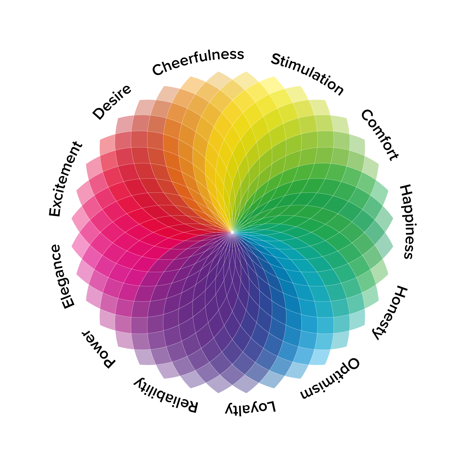
The psychology behind the colors plays a significant role in shaping brand perception. (Large preview)
Beyond Aesthetics: How Color Psychologically Impacts User Behavior In Digital #
As
designers working with digital products, we’ve learned that color is
far more than a superficial layer of visual appeal. It’s a potent, often subconscious, force that shapes how users interact with and feel about the digital products we build.
We’re
not just painting pixels, we’re conducting a psychological symphony,
carefully selecting each hue to evoke specific emotions, guide behavior,
and ultimately forge a deeper connection with the user.
The initial allure of a color palette might be purely aesthetic, but its true power lies in its ability to bypass conscious thought and tap directly into our emotional core.
Think about the subtle unease that might creep in when encountering a
predominantly desaturated interface for a platform promising dynamic
content, or the sense of calm that washes over you when a learning
application utilizes soft, analogous colors. These are not arbitrary
responses; they’re deeply rooted in our evolutionary history and
cultural conditioning.
To understand how colors psychologically
impact user behavior in digital, we first need to understand how colors
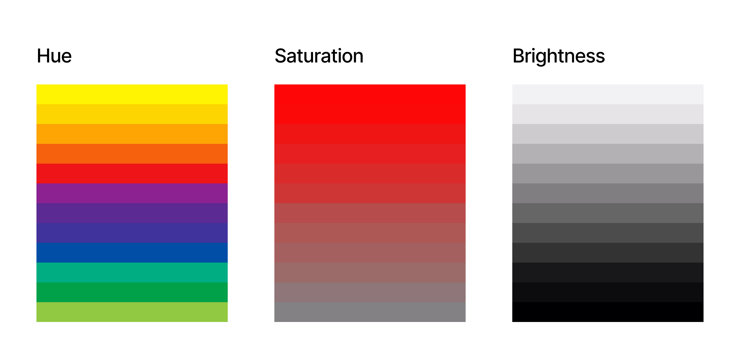
are defined. In digital design, colors are precisely defined using the HSB model, which stands for Hue, Saturation, and Brightness.
This model provides a more intuitive way for designers to think about
and manipulate color compared to other systems like RGB (Red, Green,
Blue). Here is a quick breakdown of each component:
HSB describes colors based on how humans perceive them, rather than the physical components of light like RGB. (Large preview)
This
is the pure color itself, the essence that we typically name, such as
red, blue, green, or yellow. On a color wheel, hue is represented as an
angle ranging from 0 to 360 degrees. For example, 0 is red, 120 is
green, and 240 is blue. Think of it as the specific wavelength of light
that our eyes perceive as a particular color. In UX, selecting the base
hues is often tied to brand identity and the overall feeling you want to
convey.
Saturation
Saturation
refers to the intensity or purity of the hue. It describes how vivid or
dull the color appears. A fully saturated color is rich and vibrant,
while a color with low saturation appears muted, grayish, or
desaturated. Saturation is typically expressed as a percentage, from 0%
(completely desaturated, appearing as a shade of gray) to 100% (fully
saturated, the purest form of the hue).
In UX, saturation levels are crucial for creating visual hierarchy
and drawing attention to key elements. Highly saturated colors often
indicate interactive elements or important information, while lower
saturation can be used for backgrounds or less critical content.
Brightness
Brightness,
sometimes also referred to as a value or lightness, indicates how light
or dark a color appears. It’s the amount of white or black mixed into
the hue. Brightness is also usually represented as a percentage, ranging
from 0% (completely black, regardless of the hue or saturation) to 100%
(fully bright). At 100% brightness and 0% saturation, you get white. In
UX, adjusting brightness is essential for creating contrast and ensuring readability.
Sufficient brightness contrast between text and background is a
fundamental accessibility requirement. Furthermore, variations in
brightness within a color palette can create visual depth and subtle
distinctions between UI elements.
By understanding and
manipulating these 3 color dimensions, digital designers have precise
control over their color choices. This allows for the creation of
harmonious and effective color palettes that not only align with brand
guidelines but also strategically influence user behavior.
Just as
in the physical world, colors in digital also carry symbolic meanings
and trigger subconscious associations. Understanding these color
associations is essential for UX designers aiming to craft experiences
that not only look appealing but also resonate emotionally and guide
user behavior effectively.
As the EMB Global
states, the way we perceive and interpret color is not universal, yet
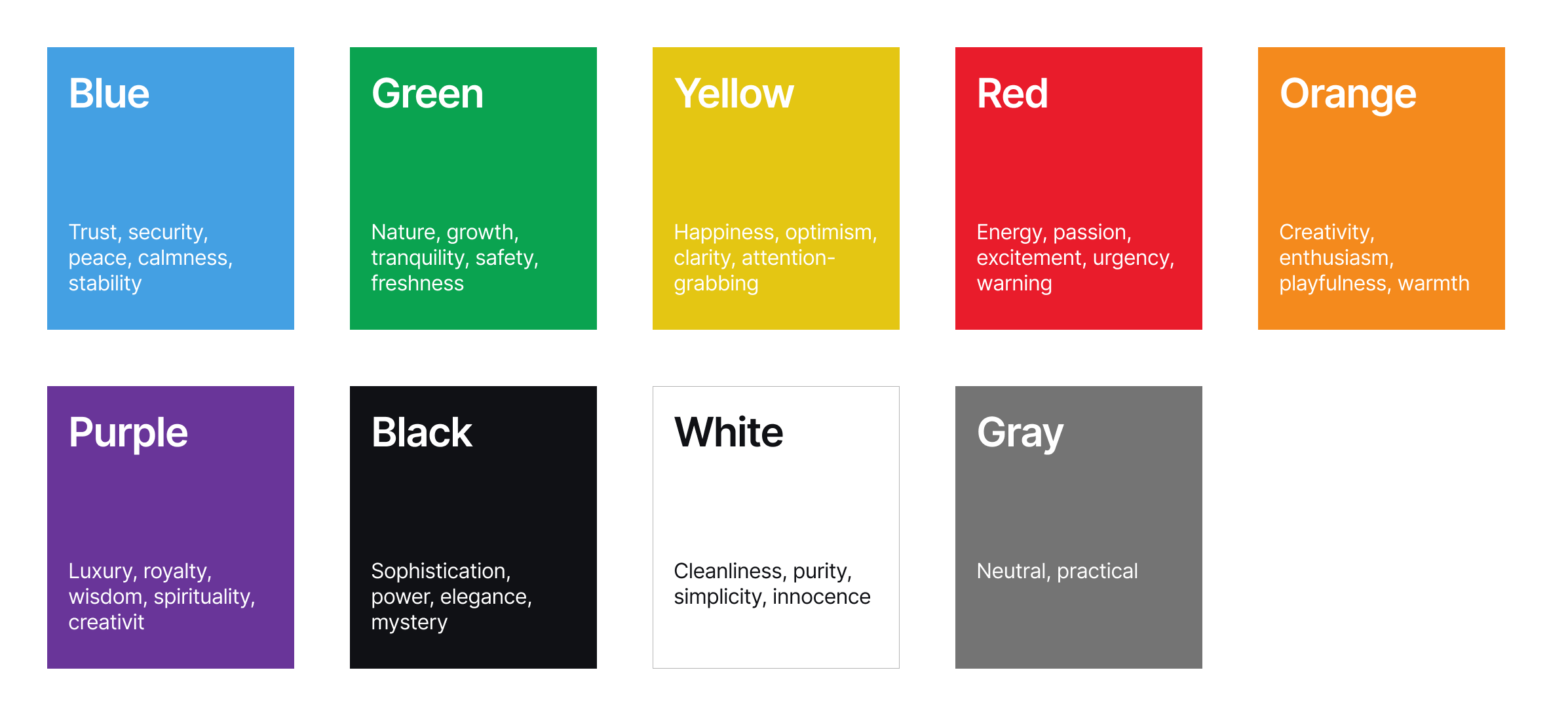
broad patterns of association exist. For instance, the color blue
often evokes feelings of trust, stability, and calmness. This
association stems from the natural world — the vastness of the sky and
the tranquility of deep waters. In the digital space, this makes blue a
popular choice for financial institutions, corporate platforms, and
interfaces aiming to project reliability and security. However, the
specific shade and context matter immensely. A bright, electric blue can
feel energetic and modern, while a muted and darker blue might convey a
more serious and authoritative tone.
Kendra Cherry, a psychosocial and rehabilitation specialist and author of the book Everything Psychology, explains very well how colors evoke certain responses in us. For example, the color green
is intrinsically linked to nature, often bringing about feelings of
growth, health, freshness, and tranquility. It can also symbolize
prosperity in some cultures. In digital design, green is frequently used
for health and wellness applications, environmental initiatives, and
platforms emphasizing sustainability. A vibrant lime green can feel
energetic and youthful, while a deep forest green can evoke a sense of
groundedness and organic quality.
Yellow, the
color of sunshine, is generally associated with optimism, happiness,
energy, and warmth. It’s attention-grabbing and can create a sense of
playfulness. In digital interfaces, yellow is often used for
highlighting important information, calls to action (though sparingly,
as too much can be overwhelming), or for brands wanting to project a
cheerful and approachable image.
Red, a color
with strong physiological effects, typically evokes excitement, passion,
urgency, and sometimes anger or danger. It commands attention and can
stimulate action. Digitally, red is often used for alerts, error
messages, sales promotions, or for brands wanting to project a bold and
energetic identity. Its intensity requires careful consideration, as
overuse can lead to user fatigue or anxiety.
Orange
blends the energy of red with the optimism of yellow, often conveying
enthusiasm, creativity, and friendliness. It can feel less aggressive
than red but still commands attention. In digital design, orange is
frequently used for calls to action, highlighting sales or special
offers, and for brands aiming to appear approachable and innovative.
Purple
has historically been associated with royalty and luxury. It can evoke
feelings of creativity, wisdom, and mystery. In digital contexts, purple
is often used for brands aiming for a sophisticated or unique feel,
particularly in areas like luxury goods, beauty, or spiritual and
creative platforms.
Black often signifies
sophistication, power, elegance, and sometimes mystery. In digital
design, black is frequently used for minimalist interfaces, luxury
brands, and for creating strong contrast with lighter elements. The
feeling it evokes heavily depends on the surrounding colors and overall
design aesthetic.
White is generally associated
with purity, cleanliness, simplicity, and neutrality. It provides a
sense of spaciousness and allows other colors to stand out. In digital
design, white space is a crucial element, and white is often used as a
primary background color to create a clean and uncluttered feel.
Gray
is often seen as neutral, practical, and sometimes somber or
conservative. In digital interfaces, various shades of gray are
essential for typography, borders, dividers, and creating visual
hierarchy without being overly distracting.
Guide to some common color associations.
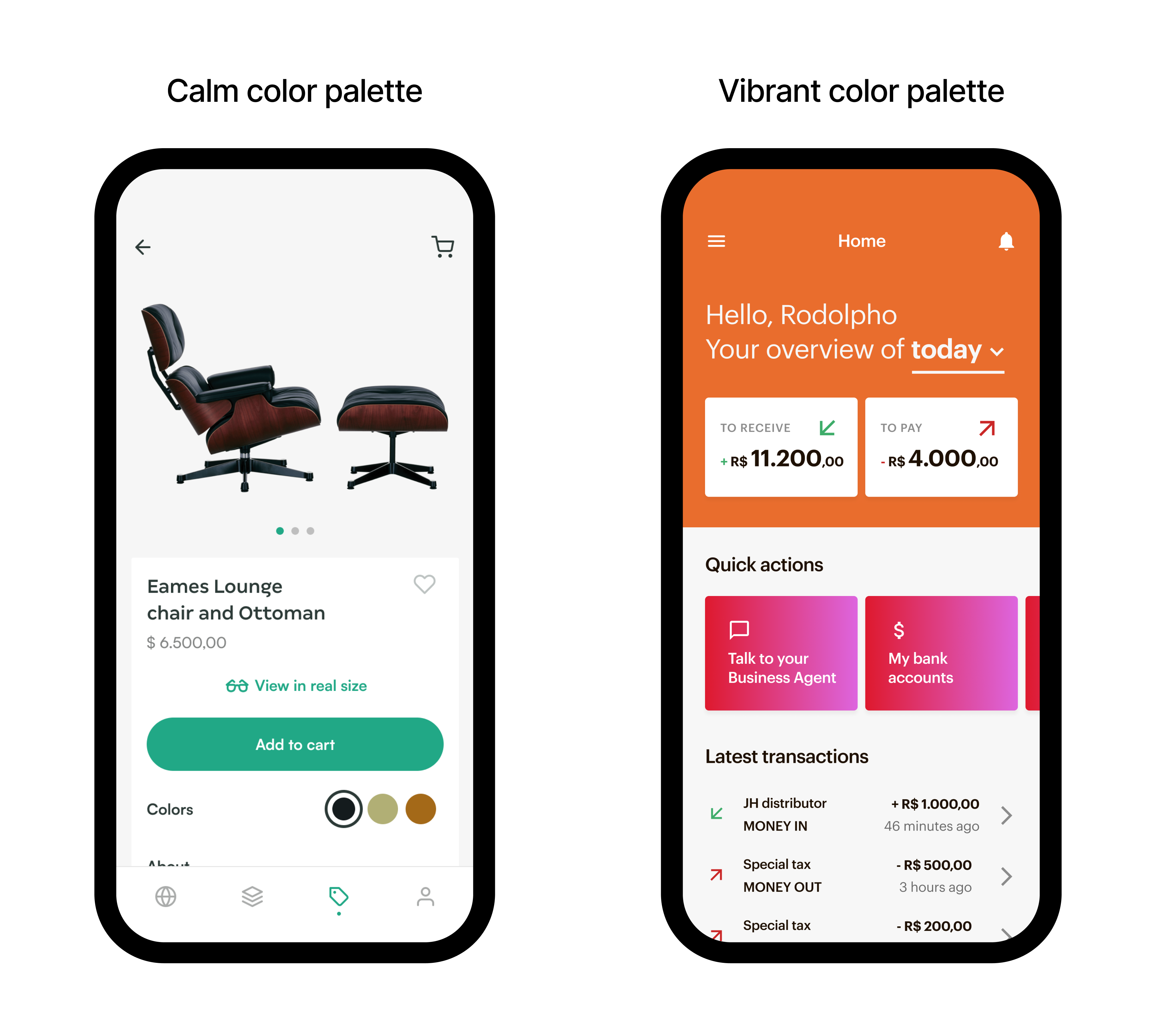
Evoking Emotions In Digital Interfaces
Imagine
an elegant furniture application. The designers might choose a primary
palette of soft, desaturated blues and greens, accented with gentle
earth tones. The muted blues could subtly induce a feeling of calmness
and tranquility, aligning with the app’s core purpose of relaxation. The
soft greens might evoke a sense of nature and well-being, further
reinforcing the theme of peace and mental clarity. The earthy browns
could ground the visual experience, creating a feeling of stability and
connection to the natural world.
Example of a calm and vibrant color palette. (Large preview)
Now,
consider a platform for extreme investment enthusiasts. The color
palette might be dominated by high-energy oranges and reds, contrasted
with stark blacks and sharp whites. The vibrant oranges could evoke
feelings of excitement and adventure, while the bold red might amplify
the sense of adrenaline and intensity. The black and white could provide
a sense of dynamism and modernity, reflecting the fast-paced nature of
the activities.
Choosing
the right colors isn’t about adhering to fleeting trends; it’s about
ensuring that our mobile applications and websites are usable by the
widest possible audience, including individuals with visual impairments.
Improper color choices can create significant barriers, rendering
content illegible, interactive elements indistinguishable, and
ultimately excluding a substantial portion of potential users.
Prioritizing
color with accessibility in mind is not just a matter of ethical
design; it’s a fundamental aspect of creating inclusive and
user-friendly digital experiences that benefit everyone.
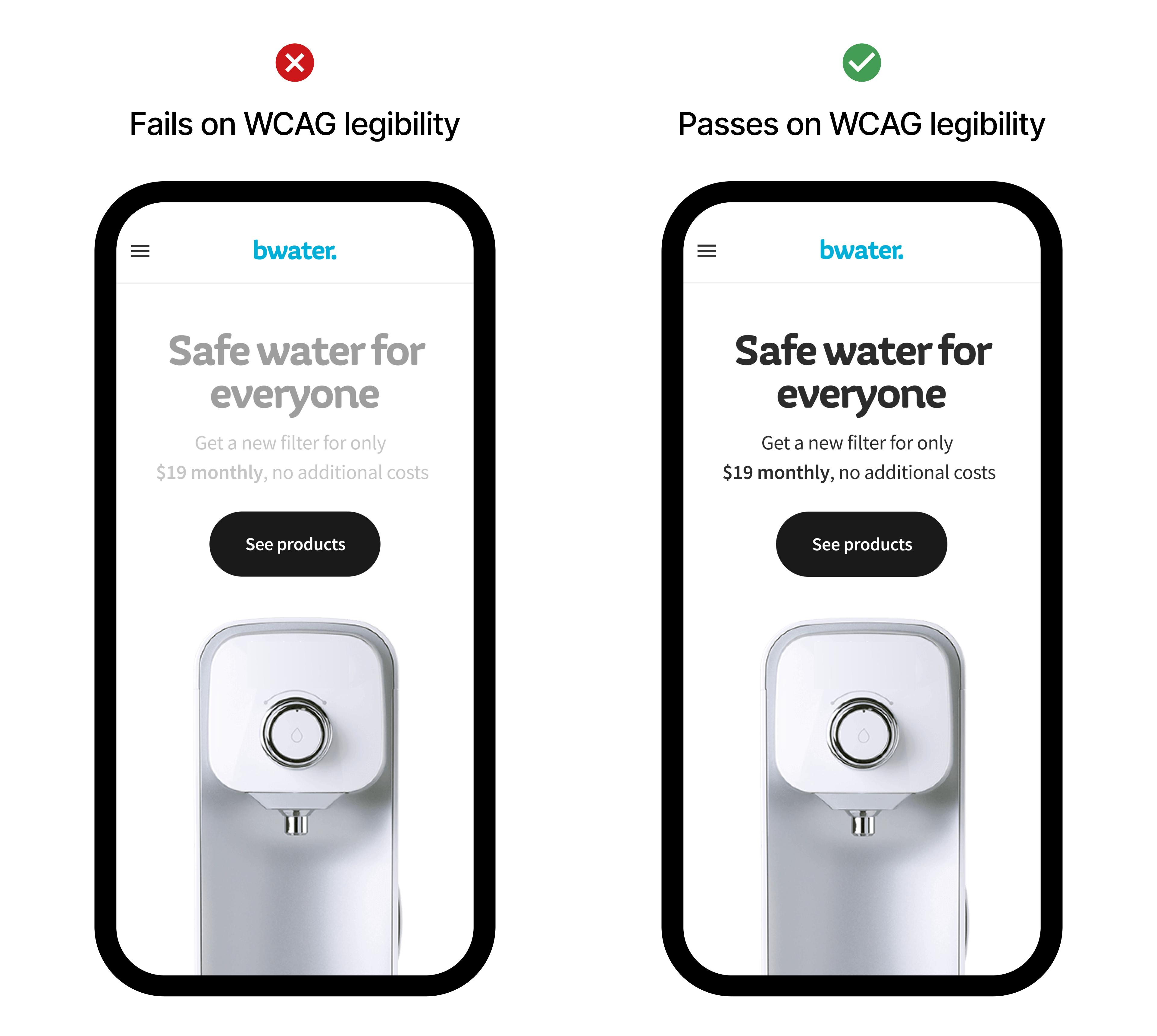
For
individuals with low vision, sufficient color contrast between text and
background is paramount for readability. Imagine trying to decipher
light gray text on a white background — a common design trend that
severely hinders those with even mild visual impairments. Adhering to Web Content Accessibility Guidelines (WCAG) contrast ratios ensures that text remains legible and understandable.
Furthermore,
color blindness, affecting a significant percentage of the population,
necessitates the use of redundant visual cues. Relying solely on color
to convey information, such as indicating errors in red without an
accompanying text label, excludes colorblind users. By pairing color
with text, icons, or patterns, we ensure that critical information is
conveyed through multiple sensory channels, making it accessible to all.
Thoughtful color selection, therefore, is not an optional add-on but an
integral component of designing digital products that are truly usable
and equitable.
Example of high and low contrast on texts.
Choosing Your Palette
As
designers, we need a strategic approach to choosing color palettes,
considering various factors to build a scalable and impactful color
system. Here’s a breakdown of the steps and considerations involved:
1. Deep Dive Into Brand Identity And Main Goals
The
journey begins with a thorough understanding of the brand itself. What
are its core values? What personality does it project? Is it playful,
sophisticated, innovative? Analyze existing brand guidelines (if any),
target audience demographics and psychographics, and the overall goals
of the digital product. The color palette should be a visual extension
of this identity, reinforcing brand recognition and resonating with the
intended users. For instance, a financial app aiming for trustworthiness
might lean towards blues and greens, while a creative platform could
explore more vibrant and unconventional hues.
2. Understand Color Psychology And Cultural Associations
As
discussed previously, colors carry inherent psychological and cultural
baggage. While these associations are not absolute, they provide a
valuable framework for initial exploration. Consider the emotions you
want to evoke and research how your target audience might perceive
different colors, keeping in mind cultural nuances that can
significantly alter interpretations. This step is important to help in
making informed decisions that align with the desired user experience
and brand perception.
3. Defining The Core Colors
Start
by identifying the primary color — the dominant hue that represents
your brand’s essence. This will likely be derived from the brand logo or
existing visual identity. Next, establish a secondary color or two that
complement the primary color and provide visual interest and hierarchy.
These secondary colors should work harmoniously with the primary,
offering flexibility for different UI elements and interactions.
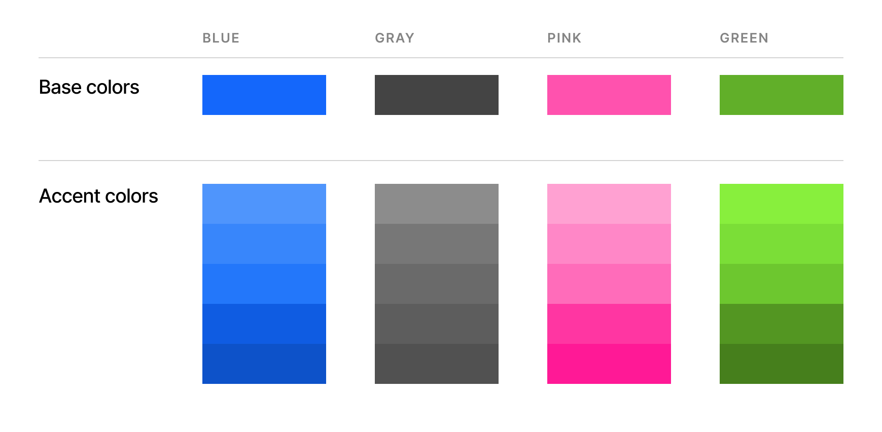
4. Build A Functional Color System
A
consistent and scalable color palette goes beyond just a few base
colors. It involves creating a system of variations for practical
application within the digital interface. This typically includes tints
and shades, accent colors, and neutral colors.
5. Do Not Forget About Usability And Accessibility
Ensure
sufficient color contrast between text and background, as well as
between interactive elements and their surroundings, to meet WCAG
guidelines. Tools are readily available to check color contrast ratios.
Test
your palette using color blindness simulators to see how it will be
perceived by individuals with different types of color vision
deficiencies. This helps identify potential issues where information
might be lost due to color alone.
Visual hierarchy is also
important to guide the user’s eye and establish a clear visual story.
Important elements should be visually distinct.
6. Testing And Iteration
Once
you have a preliminary color palette, it’s crucial to test it within
the context of your digital product. Create mockups and prototypes to
see how the colors work together in the actual interface. Gather
feedback from stakeholders and, ideally, conduct user testing to
identify any usability or aesthetic issues. Be prepared to iterate and
refine your palette based on these insights.
A well-defined color palette for the digital medium should be:
Consistent,
Scalable,
Accessible,
Brand-aligned,
Emotionally resonant, and
Functionally effective.
By
following these steps and keeping these considerations in mind,
designers can craft color palettes that are not just visually appealing
but also strategically powerful tools for creating effective and
accessible digital experiences.
Example of a consistent color palette with base colors and accent colors
Color Consistency: Building Trust And Recognition Through A Harmonized Digital Presence
Consistency
plays an important role in the whole color ecosystem. By maintaining a
unified color scheme for interactive elements, navigation cues, and
informational displays, designers create a seamless and predictable user
journey, building trust through visual stability.
Color
consistency directly contributes to brand recognition in the
increasingly crowded digital landscape. Just as a logo or typeface
becomes instantly identifiable, a consistent color palette acts as a
powerful visual signature. When users repeatedly encounter the same set
of colors associated with a particular brand, it strengthens their
recall and fosters a stronger brand association. This visual consistency
extends beyond the core interface to marketing materials, social media
presence, and all digital touchpoints, creating a cohesive and memorable
brand experience. By strategically and consistently applying a solid
and consistent color palette, digital products can cultivate stronger
brand recognition, build user trust, and enhance user loyalty.