⭐ If you would like to buy me a coffee, well thank you very much that is mega kind! : https://www.buymeacoffee.com/honeyvig Hire a web Developer and Designer to upgrade and boost your online presence with cutting edge Technologies
Showing posts with label Colors. Show all posts

Tuesday, December 9, 2025

The Grayscale Problem


From A/B tests to AI slop, the modern web is bleeding out its colour. Standardized, templated, and overoptimized, it’s starting to feel like a digital Levittown. But it doesn’t have to be.

Last year, a study found that cars are steadily getting less colourful. In the US, around 80% of cars are now black, white, gray, or silver, up from 60% in 2004. This trend has been attributed to cost savings and consumer preferences. Whatever the reasons, the result is hard to deny: a big part of daily life isn’t as colourful as it used to be.
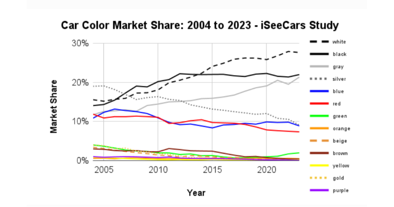
(Large preview)

The colourfulness of mass consumer products is hardly the bellwether for how vibrant life is as a whole, but the study captures a trend a lot of us recognise — offline and on. From colour to design to public discourse, a lot of life is getting less varied, more grayscale.
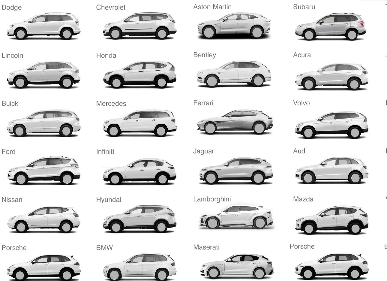
(Large preview)

The web is caught in the same current. There is plenty right with it — it retains plenty of its founding principles — but its state is not healthy. From AI slop to shoddy service providers to enshittification, the digital world faces its own grayscale problem.

This bears talking about. One of life’s great fallacies is that things get better over time on their own. They can, but it’s certainly not a given. I don’t think the moral arc of the universe does not bend towards justice, not on its own; I think it bends wherever it is dragged, kicking and screaming, by those with the will and the means to do so.

Much of the modern web, and the forces of optimisation and standardisation that drive it, bear an uncanny resemblance to the trend of car colours. Processes like market research and A/B testing — the process by which two options are compared to see which ‘performs’ better on clickthrough, engagement, etc. — have their value, but they don’t lend themselves to particularly stimulating design choices.

The spirit of free expression that made the formative years of the internet so exciting — think GeoCities, personal blogging, and so on — is on the slide.

Screenshot from the Geocities Gallery
Image source: The Geocities Gallery. (Large preview)

The ongoing transition to a more decentralised, privacy-aware Web3 holds some promise. Two-thirds of the world’s population now has online access — though that still leaves plenty of work to do — with a wealth of platforms allowing billions of people to connect. The dream of a digital world that is open, connected, and flat endures, but is tainted.

Monopolies #

One of the main sources of concern for me is that although more people are online than ever, they are concentrating on fewer and fewer sites. A study published in 2021 found that activity is concentrated in a handful of websites. Think Google, Amazon, Facebook, Instagram, and, more recently, ChatGPT:

“So, while there is still growth in the functions, features, and applications offered on the web, the number of entities providing these functions is shrinking. [...] The authority, influence, and visibility of the top 1,000 global websites (as measured by network centrality or PageRank) is growing every month, at the expense of all other sites.”

Monopolies by nature reduce variance, both through their domination of the market and (understandably in fairness) internal preferences for consistency. And, let’s be frank, they have a vested interest in crushing any potential upstarts.

Dominant websites often fall victim to what I like to call Internet Explorer Syndrome, where their dominance breeds a certain amount of complacency. Why improve your quality when you’re sitting on 90% market share? No wonder the likes of Google are getting worse.

The most immediate sign of this is obviously how sites are designed and how they look. A lot of the big players look an awful lot like each other. Even personal websites are built atop third-party website builders. Millions of people wind up using the same handful of templates, and that’s if they have their own website at all. On social media, we are little more than a profile picture and a pithy tagline. The rest is boilerplate.
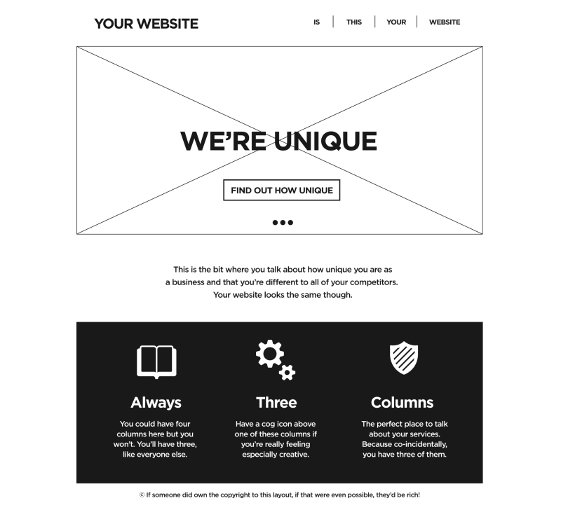
Gratscale minimalist layout example
(Large preview)

Should there be sleek, minimalist, ‘grayscale’ design systems and websites? Absolutely. But there should be colourful, kooky ones too, and if anything, they’re fading away. Do we really want to spend our online lives in the digital equivalent of Levittowns? Even logos are contriving to be less eye-catching. It feels like a matter of time before every major logo is a circle in a pastel colour.

(Large preview)

The arrival of Artificial Intelligence into our everyday lives (and a decent chunk of the digital services we use) has put all of this into overdrive. Amalgamating — and hallucinating from — content that was already trending towards a perfect average, it is grayscale in its purest form.

Mix all the colours together, and what do you get? A muddy gray gloop.
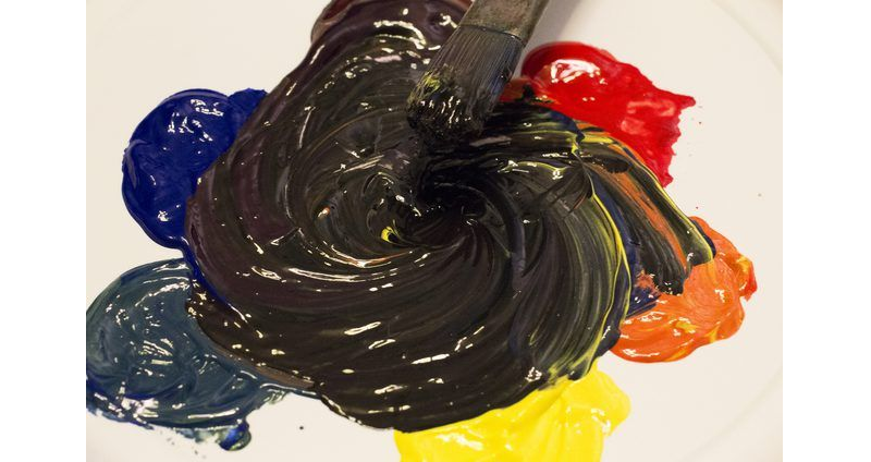
Colors mixed together into gray lopp
(Large preview)

I’m not railing against best practice. A lot of conventions have become the standard for good reason. One could just as easily shake their fist at the sky and wonder why all newspapers look the same, or all books. I hope the difference here is clear, though.

The web is a flexible enough domain that I think it belongs in the realm of architecture. A city where all buildings look alike has a soul-crushing quality about it. The same is true, I think, of the web.

In the Oscar Wilde play Lady Windermere’s Fan, a character quips that a cynic “knows the price of everything and the value of nothing.” In fairness, another quips back that a sentimentalist “sees an absurd value in everything, and doesn’t know the market price of any single thing.”

The sweet spot is somewhere in between. Structure goes a long way, but life needs a bit of variety too.

So, how do we go about bringing that variety? We probably shouldn’t hold our breath on big players to lead the way. They have the most to lose, after all. Why risk being colourful or dynamic if it impacts the bottom line?

We, the citizens of the web, have more power than we realise. This is the web, remember, a place where if you can imagine it, odds are you can make it. And at zero cost. No materials to buy and ship, no shareholders to appease. A place as flexible — and limitless — as the web has no business being boring.

There are plenty of ways, big and small, of keeping this place colourful. Whether our digital footprints are on third-party websites or ones we build ourselves, we needn’t toe the line.

Colour seems an appropriate place to start. When given the choice, try something audacious rather than safe. The worst that can happen is that it doesn’t work. It’s not like the sunk cost of painting a room; if you don’t like the palette, you simply change the hex codes. The same is true of fonts, icons, and other building blocks of the web.

As an example, a couple of friends and I listen to and review albums occasionally as a hobby. On the website, the palette of each review page reflects the album artwork:
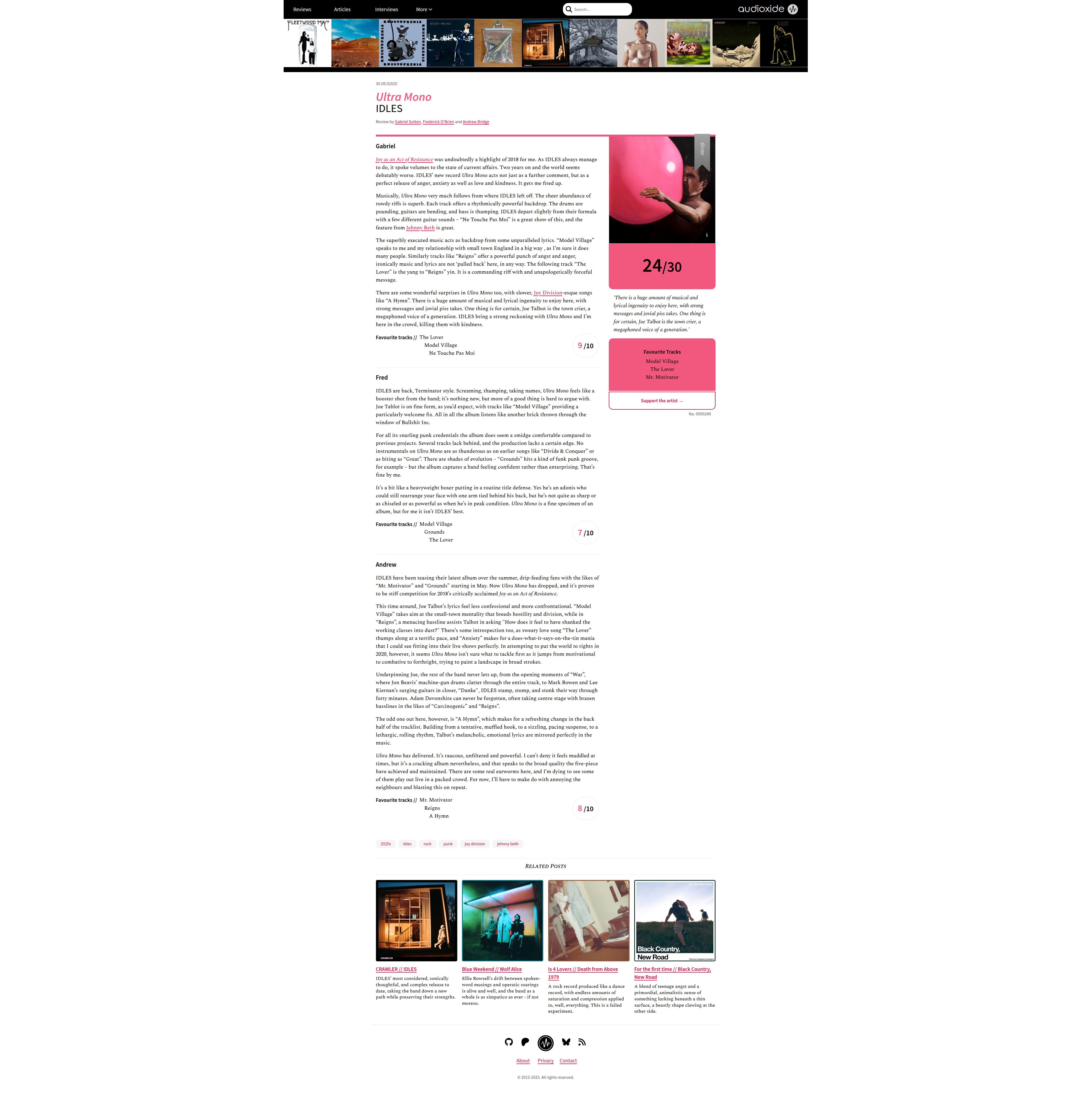
(Large preview)

I couldn’t tell you if reviews ‘perform’ better or worse than if they had a grayscale palette, because I don’t care. I think it’s a lot nicer to look at. And for those wondering, yes, I have tried to make every page meet AA Web Accessibility standards. Vibrant and accessible aren’t mutually exclusive.

Another great way of bringing vibrancy to the web is a degree of randomisation. Bruno Simon of Three Journey and awesome portfolio fame weaves random generation into a lot of his projects, and the results are gorgeous. What’s more, they feel familiar, natural, because life is full of wildcards.

3D model

This needn’t be in fancy 3D models. You could lightly rotate images to create a more informal, photo album mood, or chuck in the occasional random link in a list of recommended articles, just to shake things up.

In a lot of ways, it boils down to an attitude of just trying stuff out. Make your own font, give the site a sepia filter, and add that easter egg you keep thinking about. Just because someone, somewhere has already done it doesn’t mean you can’t do it your own way. And who knows, maybe your way stumbles onto someplace wholly new.

I’m wary of being too prescriptive. I don’t have the keys to a colourful web. No one person does. A vibrant community is the sum total of its people. What keeps things interesting is individuals trying wacky ideas and putting them out there. Expression for expression’s sake. Experimentation for experimentation’s sake. Tinkering for tinkering’s sake.

As users, there’s also plenty of room to be adventurous and try out open source alternatives to the software monopolies that shape so much of today’s Web. Being active in the communities that shape those tools helps to sustain a more open, collaborative digital world.

Although there are lessons to be taken from it, we won’t get a more colourful web by idealising the past or pining to get back to the ‘90s. Nor is there any point in resisting new technologies. AI is here; the choice is whether we use it or it uses us. We must have the courage to carry forward what still holds true, drop what doesn’t, and explore new ideas with a spirit of play.

Here are a few more Smashing articles in that spirit:

I do think there’s a broader discussion to be had about the extent to which A/B tests, bottom lines, and focus groups seem to dictate much of how the modern web looks and feels. With sites being squeezed tighter and tighter by dwindling advertising revenues, and AI answers muscling in on search traffic, the corporate entities behind larger websites can’t justify doing anything other than what is safe and proven, for fear of shrinking their slice of the pie.

Lest we forget, though, most of the web isn’t beholden to those types of pressure. From pet projects to wikis to forums to community news outlets to all manner of other things, there are countless reasons for websites to exist, and they needn’t take design cues from the handful of sites slugging it out at the top.

Connected with this is the dire need for digital literacy (PDF) — ‘the confident and critical use of a full range of digital technologies for information, communication and basic problem-solving in all aspects of life.’ For as long as using third-party platforms is a necessity rather than a choice, the needle’s only going to move so much.

There’s a reason why Minecraft is the world’s best-selling game. People are creative. When given the tools — and the opportunity — that creativity will manifest in weird and wonderful ways. That game is a lot of things, but gray ain’t one of them.

The web has all of that flexibility and more. It is a manifestation of imagination. Imagination trends towards colour, not grayness. It doesn’t always feel like it, but where the internet goes is decided by its citizens. The internet is ours. If we want to, we can make it technicolor.

Wednesday, October 8, 2025

The Psychology Of Color In UX And Digital Products


guides you through the essential aspects of color in digital design and user experience, from the practical steps of creating effective and scalable color palettes to critical accessibility considerations.

Color plays a pivotal role in crafting compelling user experiences and successful digital products. It’s far more than just aesthetics; color strategically guides users, establishes brand identity, and evokes specific emotions.

Beyond functionality, color is also a powerful tool for brand recognition and emotional connection. Consistent use of brand colors across a digital product reinforces identity and builds trust. Different hues carry cultural and psychological associations, allowing designers to subtly influence user perception and create the desired mood. A thoughtful and deliberate approach to color in UX design elevates the user experience, strengthens brand presence, and contributes significantly to the overall success and impact of digital products. In this article, we will talk about the importance of color and why they are important for creating emotional connection and delivering consistent and accessible digital products.

Well-chosen color palettes enhance usability by creating visual hierarchies, highlighting interactive elements, and providing crucial feedback on screens. For instance, a bright color might draw attention to a call-to-action button, while consistent color coding can help users navigate complex interfaces intuitively. Color also contributes significantly to accessibility, ensuring that users with visual impairments can still effectively interact with digital products. By carefully considering contrast ratios and providing alternative visual cues, designers can create inclusive experiences that cater to a wider audience.

The colors we choose are the silent language of our digital products, and speaking it fluently is essential for success.

Communicating Brand Identity Through Color In The Digital Space

A thoughtfully curated and vibrant color palette becomes a critical differentiator, allowing a brand to stand out amidst the digital noise and cultivate stronger connections with the audience.

Far beyond mere decoration, color acts as a visual shorthand, instantly conveying a brand’s personality, its underlying values, and its unique essence. According to the American Marketing Association, vibrant colors, in particular, possess an inherent magnetism, drawing the eye and etching themselves into memory within the online environment. They infuse the brand with energy and dynamism, projecting approachability and memorability in a way that more muted tones often cannot.

Consistency: The Core Of Great Design

Consistency is important because it fosters trust and familiarity, allowing users to quickly identify and connect with the brand in the online landscape. The strategic deployment of vibrant colors is especially crucial for brands seeking to establish themselves and flourish within the digital ecosystem. In the absence of physical storefronts or tangible in-person interactions, visual cues become paramount in shaping user perception and building brand recognition. A carefully selected primary color, supported by a complementary and equally energetic secondary palette, can become synonymous with a brand’s digital presence. A consistent application of the right colors across different digital touchpoints — from the logo and website design to the user interface of an app and engaging social media campaigns — creates a cohesive and instantly recognizable visual language.

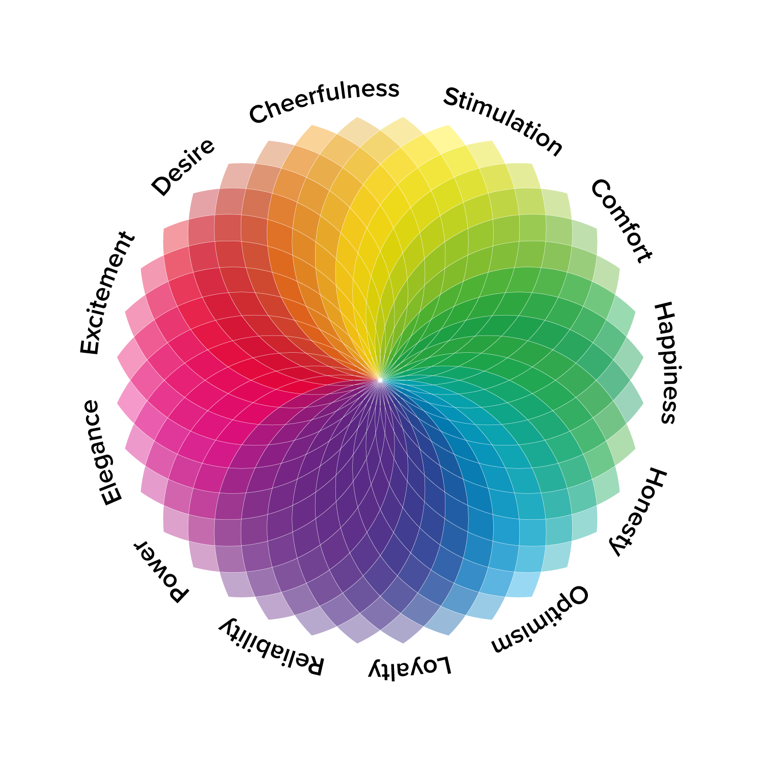
Several sources and professionals agree that the psychology behind the colors plays a significant role in shaping brand perception. The publication Insights Psychology, for instance, explains how colors can create emotional and behavioural responses. Vibrant colors often evoke strong emotions and associations. A bold, energetic red, for example, might communicate passion and excitement, while a bright, optimistic yellow could convey innovation and cheerfulness. By consciously aligning their color choices with their brand values and target audience preferences, digitally-native brands can create a powerful emotional resonance.

Colors with corresponding emotions and associations
The psychology behind the colors plays a significant role in shaping brand perception. (Large preview)

Beyond Aesthetics: How Color Psychologically Impacts User Behavior In Digital #

As designers working with digital products, we’ve learned that color is far more than a superficial layer of visual appeal. It’s a potent, often subconscious, force that shapes how users interact with and feel about the digital products we build.

We’re not just painting pixels, we’re conducting a psychological symphony, carefully selecting each hue to evoke specific emotions, guide behavior, and ultimately forge a deeper connection with the user.

The initial allure of a color palette might be purely aesthetic, but its true power lies in its ability to bypass conscious thought and tap directly into our emotional core. Think about the subtle unease that might creep in when encountering a predominantly desaturated interface for a platform promising dynamic content, or the sense of calm that washes over you when a learning application utilizes soft, analogous colors. These are not arbitrary responses; they’re deeply rooted in our evolutionary history and cultural conditioning.

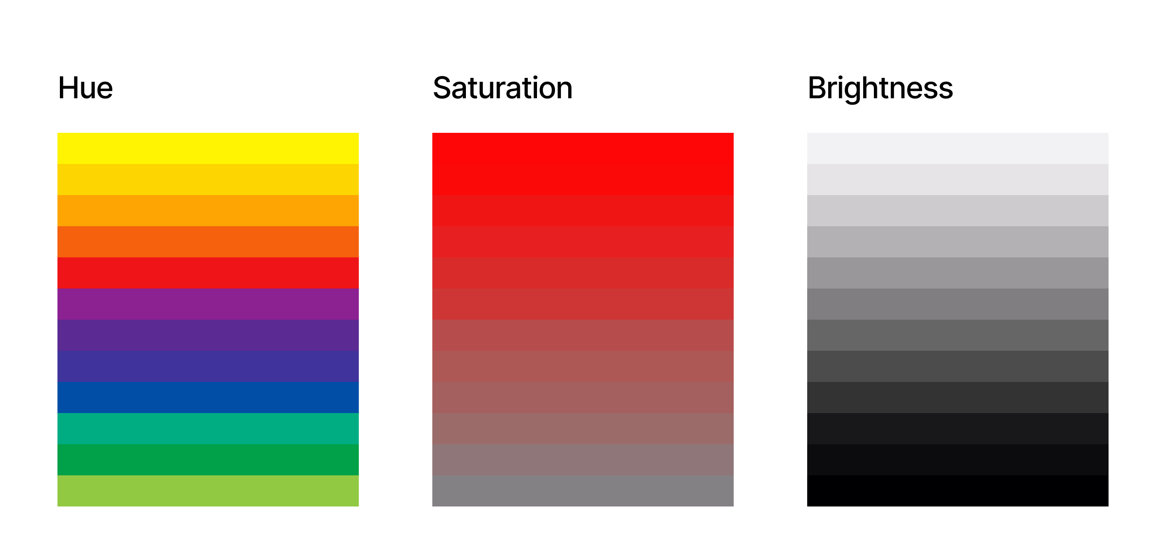
To understand how colors psychologically impact user behavior in digital, we first need to understand how colors are defined. In digital design, colors are precisely defined using the HSB model, which stands for Hue, Saturation, and Brightness. This model provides a more intuitive way for designers to think about and manipulate color compared to other systems like RGB (Red, Green, Blue). Here is a quick breakdown of each component:

HSB model
HSB describes colors based on how humans perceive them, rather than the physical components of light like RGB. (Large preview)

Hue #

This is the pure color itself, the essence that we typically name, such as red, blue, green, or yellow. On a color wheel, hue is represented as an angle ranging from 0 to 360 degrees. For example, 0 is red, 120 is green, and 240 is blue. Think of it as the specific wavelength of light that our eyes perceive as a particular color. In UX, selecting the base hues is often tied to brand identity and the overall feeling you want to convey.

Saturation

Saturation refers to the intensity or purity of the hue. It describes how vivid or dull the color appears. A fully saturated color is rich and vibrant, while a color with low saturation appears muted, grayish, or desaturated. Saturation is typically expressed as a percentage, from 0% (completely desaturated, appearing as a shade of gray) to 100% (fully saturated, the purest form of the hue).

In UX, saturation levels are crucial for creating visual hierarchy and drawing attention to key elements. Highly saturated colors often indicate interactive elements or important information, while lower saturation can be used for backgrounds or less critical content.

Brightness

Brightness, sometimes also referred to as a value or lightness, indicates how light or dark a color appears. It’s the amount of white or black mixed into the hue. Brightness is also usually represented as a percentage, ranging from 0% (completely black, regardless of the hue or saturation) to 100% (fully bright). At 100% brightness and 0% saturation, you get white. In UX, adjusting brightness is essential for creating contrast and ensuring readability. Sufficient brightness contrast between text and background is a fundamental accessibility requirement. Furthermore, variations in brightness within a color palette can create visual depth and subtle distinctions between UI elements.

By understanding and manipulating these 3 color dimensions, digital designers have precise control over their color choices. This allows for the creation of harmonious and effective color palettes that not only align with brand guidelines but also strategically influence user behavior.

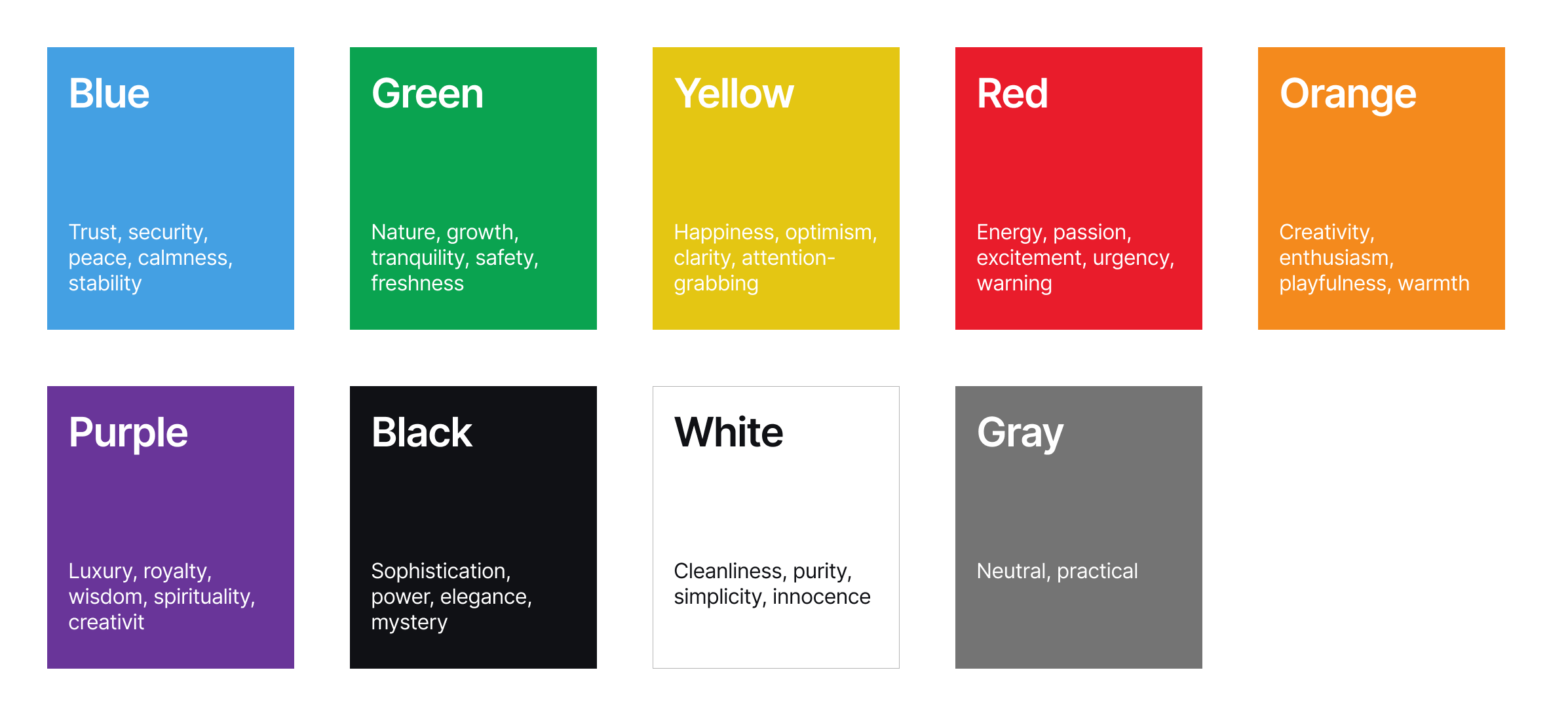
Just as in the physical world, colors in digital also carry symbolic meanings and trigger subconscious associations. Understanding these color associations is essential for UX designers aiming to craft experiences that not only look appealing but also resonate emotionally and guide user behavior effectively.

As the EMB Global states, the way we perceive and interpret color is not universal, yet broad patterns of association exist. For instance, the color blue often evokes feelings of trust, stability, and calmness. This association stems from the natural world — the vastness of the sky and the tranquility of deep waters. In the digital space, this makes blue a popular choice for financial institutions, corporate platforms, and interfaces aiming to project reliability and security. However, the specific shade and context matter immensely. A bright, electric blue can feel energetic and modern, while a muted and darker blue might convey a more serious and authoritative tone.

Kendra Cherry, a psychosocial and rehabilitation specialist and author of the book Everything Psychology, explains very well how colors evoke certain responses in us. For example, the color green is intrinsically linked to nature, often bringing about feelings of growth, health, freshness, and tranquility. It can also symbolize prosperity in some cultures. In digital design, green is frequently used for health and wellness applications, environmental initiatives, and platforms emphasizing sustainability. A vibrant lime green can feel energetic and youthful, while a deep forest green can evoke a sense of groundedness and organic quality.

Yellow, the color of sunshine, is generally associated with optimism, happiness, energy, and warmth. It’s attention-grabbing and can create a sense of playfulness. In digital interfaces, yellow is often used for highlighting important information, calls to action (though sparingly, as too much can be overwhelming), or for brands wanting to project a cheerful and approachable image.

Red, a color with strong physiological effects, typically evokes excitement, passion, urgency, and sometimes anger or danger. It commands attention and can stimulate action. Digitally, red is often used for alerts, error messages, sales promotions, or for brands wanting to project a bold and energetic identity. Its intensity requires careful consideration, as overuse can lead to user fatigue or anxiety.

Orange blends the energy of red with the optimism of yellow, often conveying enthusiasm, creativity, and friendliness. It can feel less aggressive than red but still commands attention. In digital design, orange is frequently used for calls to action, highlighting sales or special offers, and for brands aiming to appear approachable and innovative.

Purple has historically been associated with royalty and luxury. It can evoke feelings of creativity, wisdom, and mystery. In digital contexts, purple is often used for brands aiming for a sophisticated or unique feel, particularly in areas like luxury goods, beauty, or spiritual and creative platforms.

Black often signifies sophistication, power, elegance, and sometimes mystery. In digital design, black is frequently used for minimalist interfaces, luxury brands, and for creating strong contrast with lighter elements. The feeling it evokes heavily depends on the surrounding colors and overall design aesthetic.

White is generally associated with purity, cleanliness, simplicity, and neutrality. It provides a sense of spaciousness and allows other colors to stand out. In digital design, white space is a crucial element, and white is often used as a primary background color to create a clean and uncluttered feel.

Gray is often seen as neutral, practical, and sometimes somber or conservative. In digital interfaces, various shades of gray are essential for typography, borders, dividers, and creating visual hierarchy without being overly distracting.

Guide to some common color associations
Guide to some common color associations. 

Evoking Emotions In Digital Interfaces

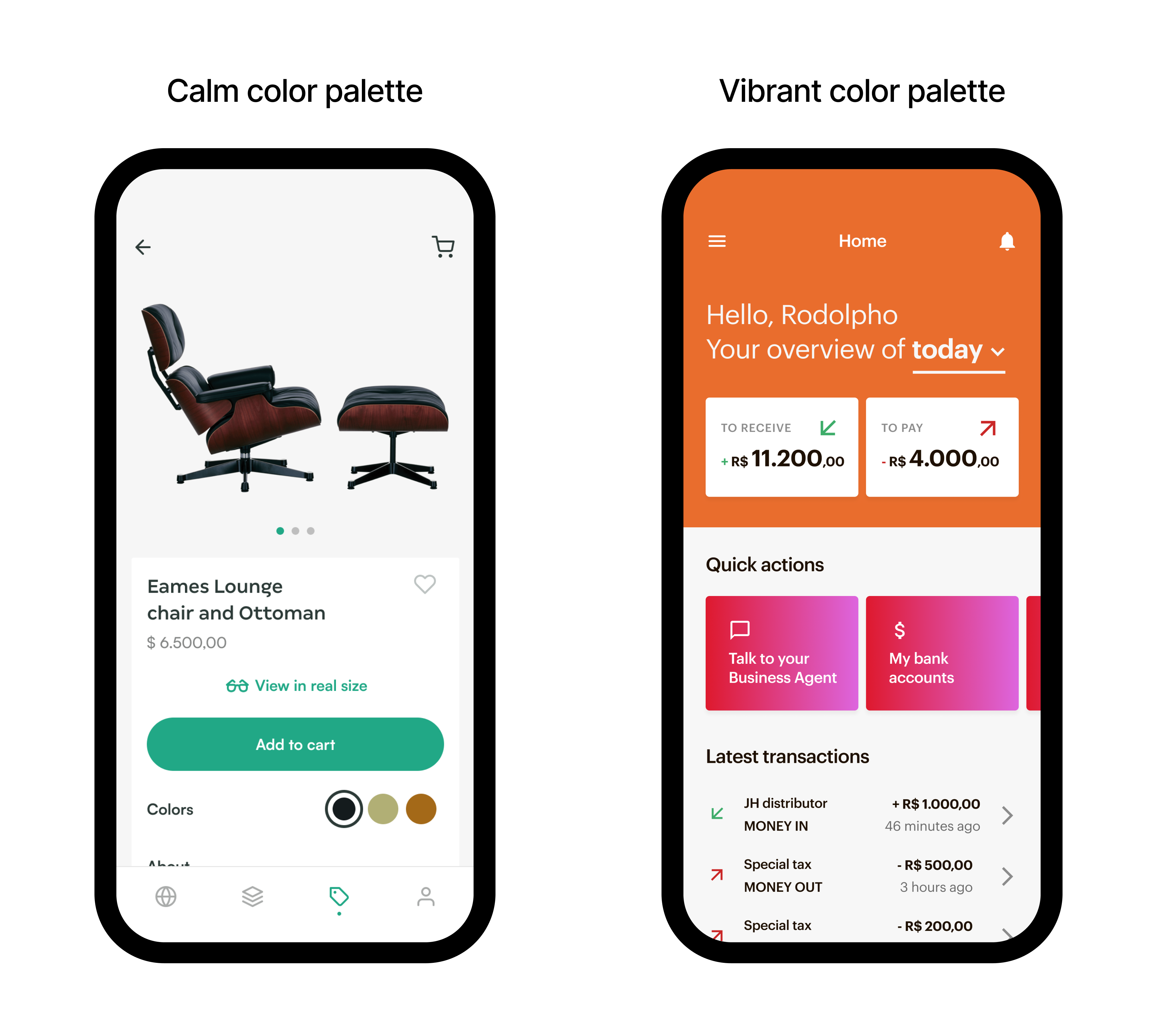
Imagine an elegant furniture application. The designers might choose a primary palette of soft, desaturated blues and greens, accented with gentle earth tones. The muted blues could subtly induce a feeling of calmness and tranquility, aligning with the app’s core purpose of relaxation. The soft greens might evoke a sense of nature and well-being, further reinforcing the theme of peace and mental clarity. The earthy browns could ground the visual experience, creating a feeling of stability and connection to the natural world.

Example of a calm and vibrant color palette
Example of a calm and vibrant color palette. (Large preview)

Now, consider a platform for extreme investment enthusiasts. The color palette might be dominated by high-energy oranges and reds, contrasted with stark blacks and sharp whites. The vibrant oranges could evoke feelings of excitement and adventure, while the bold red might amplify the sense of adrenaline and intensity. The black and white could provide a sense of dynamism and modernity, reflecting the fast-paced nature of the activities.

By consciously understanding and applying these color associations, digital designers can move beyond purely aesthetic choices and craft experiences that resonate deeply with users on an emotional level, leading to more engaging, intuitive, and successful digital products.

Color As A Usability Tool

Choosing the right colors isn’t about adhering to fleeting trends; it’s about ensuring that our mobile applications and websites are usable by the widest possible audience, including individuals with visual impairments. Improper color choices can create significant barriers, rendering content illegible, interactive elements indistinguishable, and ultimately excluding a substantial portion of potential users.

Prioritizing color with accessibility in mind is not just a matter of ethical design; it’s a fundamental aspect of creating inclusive and user-friendly digital experiences that benefit everyone.

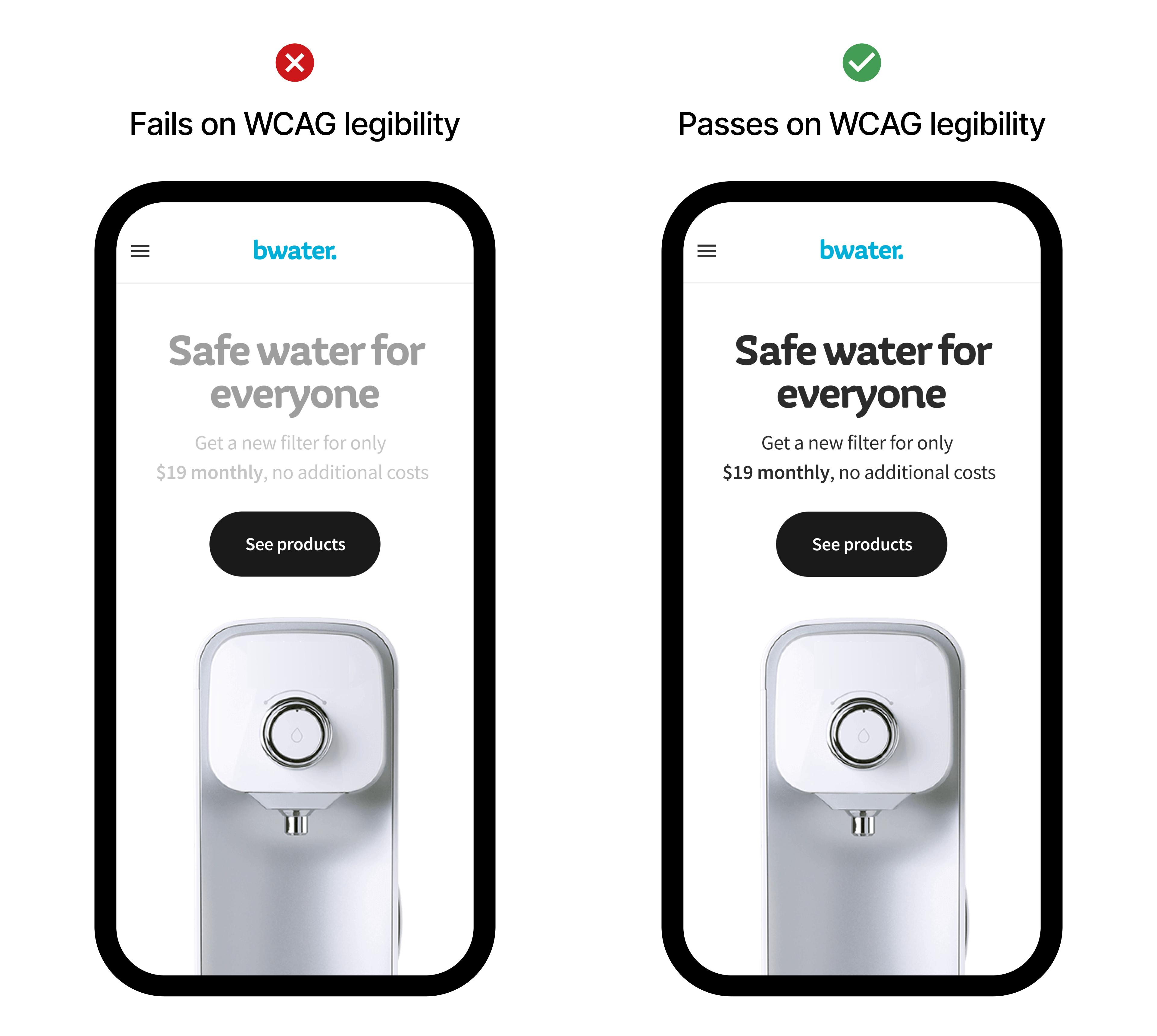
For individuals with low vision, sufficient color contrast between text and background is paramount for readability. Imagine trying to decipher light gray text on a white background — a common design trend that severely hinders those with even mild visual impairments. Adhering to Web Content Accessibility Guidelines (WCAG) contrast ratios ensures that text remains legible and understandable.

Furthermore, color blindness, affecting a significant percentage of the population, necessitates the use of redundant visual cues. Relying solely on color to convey information, such as indicating errors in red without an accompanying text label, excludes colorblind users. By pairing color with text, icons, or patterns, we ensure that critical information is conveyed through multiple sensory channels, making it accessible to all. Thoughtful color selection, therefore, is not an optional add-on but an integral component of designing digital products that are truly usable and equitable.

Example of high and low contrast on texts
Example of high and low contrast on texts.

Choosing Your Palette 

As designers, we need a strategic approach to choosing color palettes, considering various factors to build a scalable and impactful color system. Here’s a breakdown of the steps and considerations involved:

1. Deep Dive Into Brand Identity And Main Goals

The journey begins with a thorough understanding of the brand itself. What are its core values? What personality does it project? Is it playful, sophisticated, innovative? Analyze existing brand guidelines (if any), target audience demographics and psychographics, and the overall goals of the digital product. The color palette should be a visual extension of this identity, reinforcing brand recognition and resonating with the intended users. For instance, a financial app aiming for trustworthiness might lean towards blues and greens, while a creative platform could explore more vibrant and unconventional hues.

2. Understand Color Psychology And Cultural Associations

As discussed previously, colors carry inherent psychological and cultural baggage. While these associations are not absolute, they provide a valuable framework for initial exploration. Consider the emotions you want to evoke and research how your target audience might perceive different colors, keeping in mind cultural nuances that can significantly alter interpretations. This step is important to help in making informed decisions that align with the desired user experience and brand perception.

3. Defining The Core Colors

Start by identifying the primary color — the dominant hue that represents your brand’s essence. This will likely be derived from the brand logo or existing visual identity. Next, establish a secondary color or two that complement the primary color and provide visual interest and hierarchy. These secondary colors should work harmoniously with the primary, offering flexibility for different UI elements and interactions.

4. Build A Functional Color System

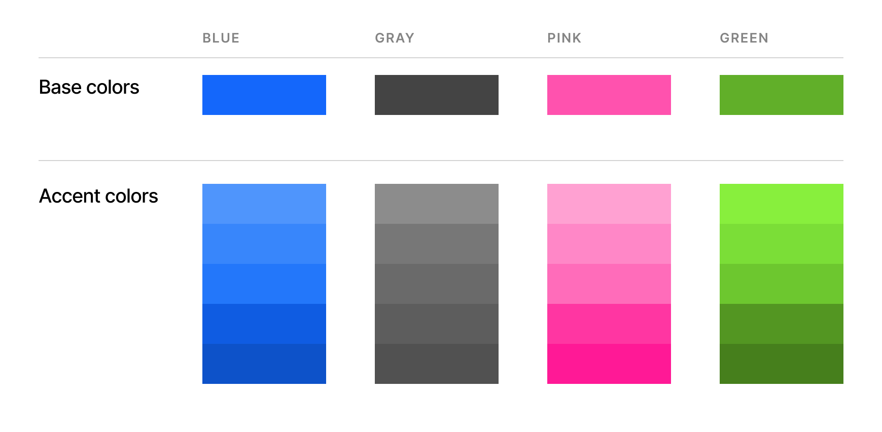
A consistent and scalable color palette goes beyond just a few base colors. It involves creating a system of variations for practical application within the digital interface. This typically includes tints and shades, accent colors, and neutral colors.

5. Do Not Forget About Usability And Accessibility

Ensure sufficient color contrast between text and background, as well as between interactive elements and their surroundings, to meet WCAG guidelines. Tools are readily available to check color contrast ratios.

Test your palette using color blindness simulators to see how it will be perceived by individuals with different types of color vision deficiencies. This helps identify potential issues where information might be lost due to color alone.

Visual hierarchy is also important to guide the user’s eye and establish a clear visual story. Important elements should be visually distinct.

6. Testing And Iteration

Once you have a preliminary color palette, it’s crucial to test it within the context of your digital product. Create mockups and prototypes to see how the colors work together in the actual interface. Gather feedback from stakeholders and, ideally, conduct user testing to identify any usability or aesthetic issues. Be prepared to iterate and refine your palette based on these insights.

A well-defined color palette for the digital medium should be:

  • Consistent,
  • Scalable,
  • Accessible,
  • Brand-aligned,
  • Emotionally resonant, and
  • Functionally effective.

By following these steps and keeping these considerations in mind, designers can craft color palettes that are not just visually appealing but also strategically powerful tools for creating effective and accessible digital experiences.

Example of a consistent color palette with base colors and accent colors

Color Consistency: Building Trust And Recognition Through A Harmonized Digital Presence

Consistency plays an important role in the whole color ecosystem. By maintaining a unified color scheme for interactive elements, navigation cues, and informational displays, designers create a seamless and predictable user journey, building trust through visual stability.

Color consistency directly contributes to brand recognition in the increasingly crowded digital landscape. Just as a logo or typeface becomes instantly identifiable, a consistent color palette acts as a powerful visual signature. When users repeatedly encounter the same set of colors associated with a particular brand, it strengthens their recall and fosters a stronger brand association. This visual consistency extends beyond the core interface to marketing materials, social media presence, and all digital touchpoints, creating a cohesive and memorable brand experience. By strategically and consistently applying a solid and consistent color palette, digital products can cultivate stronger brand recognition, build user trust, and enhance user loyalty.

Wednesday, October 23, 2024

Interview With Björn Ottosson, Creator Of The Oklab Color Space

 Go behind the scenes with Björn Ottosson, the Swedish engineer who created Oklab color space, and discover how he developed a simple yet effective model with good hue uniformity while also handling lightness and saturation well — and is “okay” to use.

Oklab is a new perceptual color space supported in all major browsers created by the Swedish engineer Björn Ottosson. In this interview, Philip Jägenstedt explores how and why Björn created Oklab and how it spread across the ecosystem.

Note: The original interview was conducted in Swedish and is available to watch.

About Björn

Philip Jägenstedt: Tell me a little about yourself, Björn.

Photo of Björn OttossonBjörn Ottosson: I worked for many years in the game industry on game engines and games like FIFA, Battlefield, and Need for Speed. I’ve always been interested in technology and its interaction with the arts. I’m an engineer, but I’ve always held both of these interests.

On Working With Color

Philip: For someone who hasn’t dug into colors much, what’s so hard about working with them?

Björn: Intuitively, colors can seem quite simple. A color can be lighter or darker, it can be more blue or more green, and so on. Everyone with typical color vision has a fairly similar experience of color, and this can be modeled.

However, the way we manipulate colors in software usually doesn’t align with human perception of colors. The most common color space is sRGB. There’s also HSL, which is common for choosing colors, but it’s also based on sRGB.

One problem with sRGB is that in a gradient between blue and white, it becomes a bit purple in the middle of the transition. That’s because sRGB really isn’t created to mimic how the eye sees colors; rather, it is based on how CRT monitors work. That means it works with certain frequencies of red, green, and blue, and also the non-linear coding called gamma. It’s a miracle it works as well as it does, but it’s not connected to color perception. When using those tools, you sometimes get surprising results, like purple in the gradient.

Purple in the gradient
Image source: How software gets color wrong. (Large preview)

On Color Perception

Philip: How do humans perceive color?

Björn: When light enters the eye and hits the retina, it’s processed in many layers of neurons and creates a mental impression. It’s unlikely that the process would be simple and linear, and it’s not. But incredibly enough, most people still perceive colors similarly.

People have been trying to understand colors and have created color wheels and similar visualizations for hundreds of years. During the 20th century, a lot of research and modeling went into color vision. For example, the CIE XYZ model is based on how sensitive our photoreceptor cells are to different frequencies of light. CIE XYZ is still a foundational color space on which all other color spaces are based.

There were also attempts to create simple models matching human perception based on XYZ, but as it turned out, it’s not possible to model all color vision that way. Perception of color is incredibly complex and depends, among other things, on whether it is dark or light in the room and the background color it is against. When you look at a photograph, it also depends on what you think the color of the light source is. The dress is a typical example of color vision being very context-dependent. It is almost impossible to model this perfectly.

Models that try to take all of this complexity into account are called color appearance models. Although they have many applications, they’re not that useful if you don’t know if the viewer is in a light or bright room or other viewing conditions.

The odd thing is that there’s a gap between the tools we typically use — such as sRGB and HSL — and the findings of this much older research. To an extent, this makes sense because when HSL was developed in the 1970s, we didn’t have much computing power, so it’s a fairly simple translation of RGB. However, not much has changed since then.

We have a lot more processing power now, but we’ve settled for fairly simple tools for handling colors in software.

Display technology has also improved. Many displays now have different RGB primaries, i.e., a redder red, greener green, or bluer blue. sRGB cannot reach all colors available on these displays. The new P3 color space can, but it’s very similar to sRGB, just a little wider.

On Creating Oklab

Philip: What, then, is Oklab, and how did you create it?

Björn: When working in the game industry, sometimes I wanted to do simple color manipulations like making a color darker or changing the hue. I researched existing color spaces and how good they are at these simple tasks and concluded that all of them are problematic in some way.

Many people know about CIE Lab. It’s quite close to human perception of color, but the handling of hue is not great. For example, a gradient between blue and white turns out purple in CIE Lab, similar to in sRGB. Some color spaces handle hue well but have other issues to consider.

When I left my job in gaming to pursue education and consulting, I had a bit of time to tackle this problem. Oklab is my attempt to find a better balance, something Lab-like but “okay”.

I based Oklab on two other color spaces, CIECAM16 and IPT. I used the lightness and saturation prediction from CIECAM16, which is a color appearance model, as a target. I actually wanted to use the datasets used to create CIECAM16, but I couldn’t find them.

IPT was designed to have better hue uniformity. In experiments, they asked people to match light and dark colors, saturated and unsaturated colors, which resulted in a dataset for which colors, subjectively, have the same hue. IPT has a few other issues but is the basis for hue in Oklab.

Using these three datasets, I set out to create a simple color space that would be “okay”. I used an approach quite similar to IPT but combined it with the lightness and saturation estimates from CIECAM16. The resulting Oklab still has good hue uniformity but also handles lightness and saturation well.

Philip: How about the name Oklab? Why is it just okay?

Björn: This is a bit tongue-in-cheek and some amount of humility.

For the tasks I had in mind, existing color spaces weren’t okay, and my goal was to make one that is. At the same time, it is possible to delve deeper. If a university had worked on this, they could have run studies with many participants. For a color space intended mainly for use on computer and phone screens, you could run studies in typical environments where they are used. It’s possible to go deeper.

Nevertheless, I took the datasets I could find and made the best of what I had. The objective was to make a very simple model that’s okay to use. And I think it is okay, and I couldn’t come up with anything better. I didn’t want to call it Björn Ottosson Lab or something like that, so I went with Oklab.

Philip: Does the name follow a tradition of calling things okay? I know there’s also a Quite OK Image format.

Björn: No, I didn’t follow any tradition here. Oklab was just the name I came up with.

On Oklab Adoption

Philip: I discovered Oklab when it suddenly appeared in all browsers. Things often move slowly on the web, but in this case, things moved very quickly. How did it happen?

Björn: I was surprised, too! I wrote a blog post and shared it on Twitter.

I have a lot of contacts in the gaming industry and some contacts in the Visual Effects (VFX) industry. I expected that people working with shaders or visual effects might try this out, and maybe it would be used in some games, perhaps as an effect for a smooth color transition.

But the blog post was spread much more widely than I thought. It was on Hacker News, and many people read it.

The code for Oklab is only 10 lines long, so many open-source libraries have adopted it. This all happened very quickly.

Chris Lilley from the W3C got in touch and asked me some questions about Oklab. We discussed it a bit, and I explained how it works and why I created it. He gave a presentation at a conference about it, and then he pushed for it to be added to CSS.

Photoshop also changed its gradients to use Oklab. All of this happened organically without me having to cheer it on.

On Okhsl #

Philip: In another blog post, you introduced two other color spaces, Okhsv and Okhsl. You’ve already talked about HSL, so what is Okhsl?

Björn: When picking colors, HSL has a big advantage, which is that the parameter space is simple. Any value 0-360 for hue (H) together with any values 0-1 for saturation (S) and lightness (L) are valid combinations and result in different colors on screen. The geometry of HSL is a cylinder, and there’s no way to end up outside that cylinder accidentally.

Color solid cylinder
Image source: Wikipedia. (Large preview)

By contrast, Oklab contains all physically possible colors, but there are combinations of values that don’t work where you reach colors that don’t exist. For example, starting from light and saturated yellow in Oklab and rotating the hue to blue, that blue color does not exist in sRGB; there are only darker and less saturated blues. That’s because sRGB in Oklab has a strange shape, so it’s easy to end up going outside it. This makes it difficult to select and manipulate colors with Oklab or Oklch.

sRGB shape in Oklab.
sRGB shape in Oklab. (Image source: Chris Cameron demo) (Large preview)

Okhsl was an attempt at compromise. It maintains Oklab’s behavior for colors that are not very saturated, close to gray, and beyond that, stretches out to a cylinder that contains all of sRGB. Another way to put it is that the strange shape of sRGB in Oklab has been stretched into a cylinder with reasonably smooth transitions.

The result is similar to HSL, where all parameters can be changed independently without ending up outside sRGB. It also makes Okhsl more complicated than Oklab. There are unavoidable compromises to get something with the characteristics that HSL has.

Everything with color is about compromises. Color vision is so complex that it's about making practical compromises.

This is an area where I wish there were more research. If I have a white background and want to pick some nice colors to put on it, then you can make a lot of assumptions. Okhsl solves many things, but is it possible to do even better?


On Color Compromises

Philip: Some people who have tried Oklab say there are too many dark shades. You changed that in Okhsl with a new lightness estimate.

Björn: This is because Oklab is exposure invariant and doesn’t account for viewing conditions, such as the background color. On the web, there’s usually a white background, which makes it harder to see the difference between black and other dark colors. But if you look at the same gradient on a black background, the difference is more apparent.

CIE Lab handles this, and I tried to handle it in Okhsl, too. So, gradients in Okhsl look better on a white background, but there will be other issues on a black background. It’s always a compromise.

And, Finally…

Philip: Final question: What’s your favorite color?

Björn: I would have to say Burgundy. Burgundy, dark greens, and navy blues are favorites.

Philip: Thank you for your time, Björn. I hope our readers have learned something, and I’ll remind them of your excellent blog, where you go into more depth about Oklab and Okhsl.

Björn: Thank you!