⭐ If you would like to buy me a coffee, well thank you very much that is mega kind! : https://www.buymeacoffee.com/honeyvig Hire a web Developer and Designer to upgrade and boost your online presence with cutting edge Technologies
Showing posts with label optimization. Show all posts

Saturday, October 11, 2025

Optimizing PWAs For Different Display Modes


Progressive Web Apps (PWAs) are a great way to make apps built for the web feel native, but in moving away from a browser environment, we can introduce usability issues. Declan covers how we can modify our app depending on what display mode is applied to mitigate these issues.

Progressive web apps (PWA) are a fantastic way to turn web applications into native-like, standalone experiences. They bridge the gap between websites and native apps, but this transformation can be prone to introducing design challenges that require thoughtful consideration.

We define our PWAs with a manifest file. In our PWA’s manifest, we can select from a collection of display modes, each offering different levels of browser interface visibility:

  • fullscreen: Hides all browser UI, using the entire display.
  • standalone: Looks like a native app, hiding browser controls but keeping system UI.
  • minimal-ui: Shows minimal browser UI elements.
  • browser: Standard web browser experience with full browser interface.

Oftentimes, we want our PWAs to feel like apps rather than a website in a browser, so we set the display manifest member to one of the options that hides the browser’s interface, such as fullscreen or standalone. This is fantastic for helping make our applications feel more at home, but it can introduce some issues we wouldn’t usually consider when building for the web.

It’s easy to forget just how much functionality the browser provides to us. Things like forward/back buttons, the ability to refresh a page, search within pages, or even manipulate, share, or copy a page’s URL are all browser-provided features that users can lose access to when the browser’s UI is hidden. There is also the case of things that we display on websites that don’t necessarily translate to app experiences.
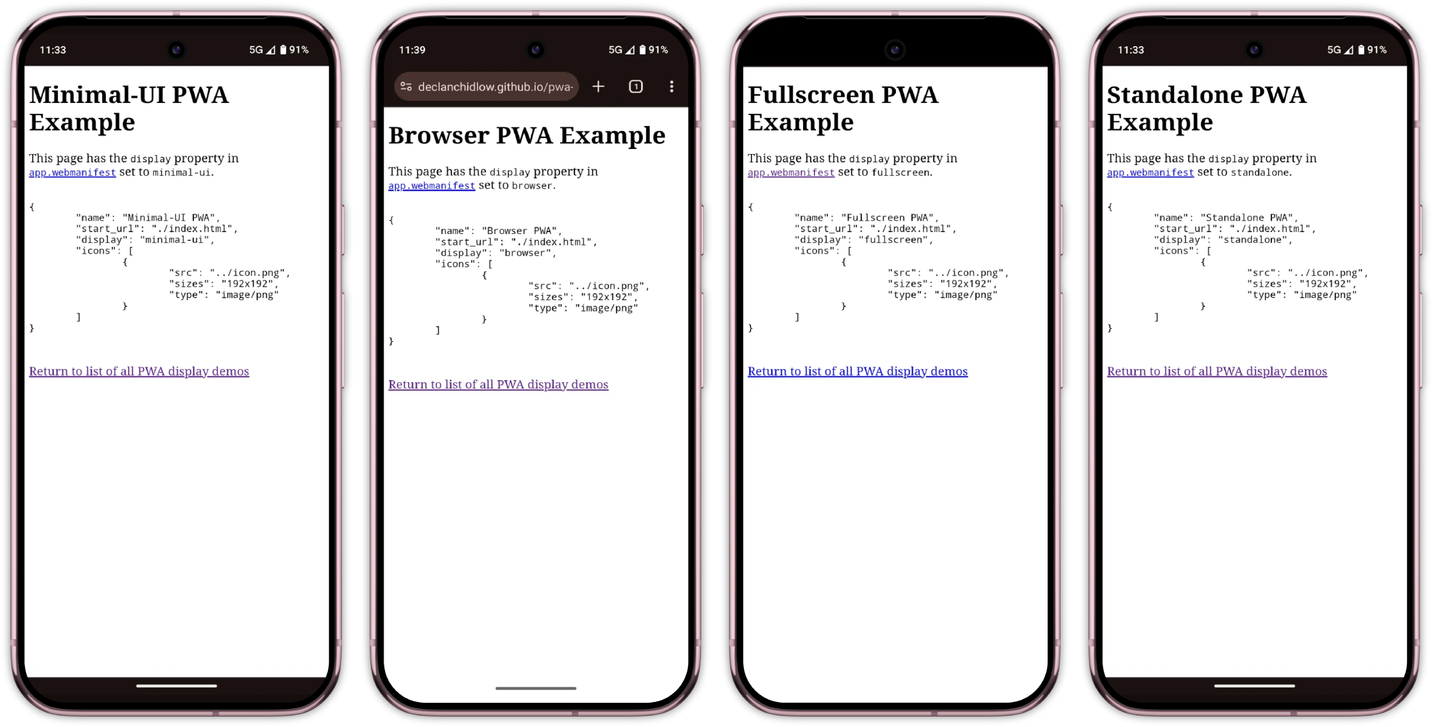
The different PWA display modes as seen on an Android phone running Chrome 138.
The different PWA display modes as seen on an Android phone running Chrome 138

Imagine a user deep into a form with no back button, trying to share a product page without the ability to copy a URL, or hitting a bug with no refresh button to bail them out!

Much like how we make different considerations when designing for the web versus designing for print, we need to make considerations when designing for independent experiences rather than browser-based experiences by tailoring the content and user experience to the medium.

Thankfully, we’re provided with plenty of ways to customise the web

Using Media Queries To Target Display Modes

We use media queries all the time when writing CSS. Whether it’s switching up styles for print or setting breakpoints for responsive design, they’re commonplace in the web developer’s toolkit. Each of the display modes discussed previously can be used as a media query to alter the appearance of documents depending.

Media queries such as @media (min-width: 1000px) tend to get the most use for setting breakpoints based on the viewport size, but they’re capable of so much more. They can handle print styles, device orientation, contrast preferences, and a whole ton more. In our case, we’re interested in the display-mode media feature.

Display mode media queries correspond to the current display mode.

Note: While we may set display modes in our manifest, the actual display mode may differ depending on browser support.

These media queries directly reference the current mode:

  • @media (display-mode: standalone) will only apply to pages set to standalone mode.
  • @media (display-mode: fullscreen) applies to fullscreen mode. It is worth noting that this also applies when using the Fullscreen API.
  • @media (display-mode: minimal-ui) applies to minimal UI mode.
  • @media (display-mode: browser) applies to standard browser mode.

It is also worth keeping an eye out for the window-controls-overlay and tabbed display modes. At the time of writing, these two display modes are experimental and can be used with display_override. display-override is a member of our PWA’s manifest, like display, but provides some extra options and power.

display has a predetermined fallback chain (fullscreen -> standalone -> minimal-ui -> browser) that we can’t change, but display-override allows setting a fallback order of our choosing, like the following:

"display_override": ["fullscreen", "minimal-ui"]

window-controls-overlay can only apply to PWAs running on a desktop operating system. It makes the PWA take up the entire window, with window control buttons appearing as an overlay. Meanwhile, tabbed is relevant when there are multiple applications within a single window.

In addition to these, there is also the picture-in-picture display mode that applies to (you guessed it) picture-in-picture modes.

We use these media queries exactly as we would any other media query. To show an element with the class .pwa-only when the display mode is standalone, we could do this:

.pwa-only {
    display: none;
}

@media (display-mode: standalone) {
    .pwa-only {
        display: block;
    }
}

If we wanted to show the element when the display mode is standalone or minimal-ui, we could do this:

@media (display-mode: standalone), (display-mode: minimal-ui) {
    .pwa-only {
        display: block;
    }
}

As great as it is, sometimes CSS isn’t enough. In those cases, we can also reference the display mode and make necessary adjustments with JavaScript:

const isStandalone = window.matchMedia("(display-mode: standalone)").matches;
// Listen for display mode changes
window.matchMedia("(display-mode: standalone)").addEventListener("change", (e) => {
  if (e.matches) {
    // App is now in standalone mode
    console.log("Running as PWA");
  }
});

Practical Applications

Now that we know how to make display modifications depending on whether users are using our web app as a PWA or in a browser, we can have a look at how we might put these newly learnt skills to use.

Tailoring Content For PWA Users

Users who have an app installed as a PWA are already converted, so you can tweak your app to tone down the marketing speak and focus on the user experience. Since these users have demonstrated commitment by installing your app, they likely don’t need promotional content or installation prompts.

Display More Options And Features

You might need to directly expose more things in PWA mode, as people won’t be able to access the browser’s settings as easily when the browser UI is hidden. Features like changing font sizing, switching between light and dark mode, bookmarks, sharing, tabs, etc., might need an in-app alternative.

Platform-Appropriate Features

There are features you might not want on your web app because they feel out of place, but that you might want on your PWA. A good example is the bottom navigation bar, which is common in native mobile apps thanks to the easier reachability it provides, but uncommon on websites.

People sometimes print websites, but they very rarely print apps. Consider whether features like print buttons should be hidden in PWA mode.

Install Prompts

A common annoyance is a prompt to install a site as a PWA appearing when the user has already installed the site. Ideally, the browser will provide an install prompt of its own if our PWA is configured correctly, but not all browsers do, and it can be finicky. MDN has a fantastic guide on creating a custom button to trigger the installation of a PWA, but it might not fit our needs.

We can improve things by hiding install prompts with our media query or detecting the current display mode with JavaScript and forgoing triggering popups in the first place.

We could even set this up as a reusable utility class so that anything we don’t want to be displayed when the app is installed as a PWA can be hidden with ease.

/* Utility class to hide elements in PWA mode */
.hide-in-pwa {
  display: block;
}

@media (display-mode: standalone), (display-mode: minimal-ui) {
  .hide-in-pwa {
    display: none !important;
  }
}

Then in your HTML:

<div class="install-prompt hide-in-pwa">
  <button>Install Our App</button>
</div>

<div class="browser-notice hide-in-pwa">
  <p>For the best experience, install this as an app!</p>
</div>

We could also do the opposite and create a utility class to make elements only show when in a PWA, as we discussed earlier.

Strategic Use Of Scope And Start URL

Another way to hide content from your site is to set the scope and start_url properties. These aren’t using media queries as we’ve discussed, but should be considered as ways to present different content depending on whether a site is installed as a PWA.

Here is an example of a manifest using these properties:

{
    "name": "Example PWA",
    "scope": "/dashboard/",
    "start_url": "/dashboard/index.html",
    "display": "standalone",
    "icons": [
        {
            "src": "icon.png",
            "sizes": "192x192",
            "type": "image/png"
        }
    ]
}

scope here defines the top level of the PWA. When users leave the scope of your PWA, they’ll still have an app-like interface but gain access to browser UI elements. This can be useful if you’ve got certain parts of your app that you still want to be part of the PWA but which aren’t necessarily optimised or making the necessary considerations.

start_url defines the URL a user will be presented with when they open the application. This is useful if, for example, your app has marketing content at example.com and a dashboard at example.com/dashboard/index.html. It is likely that people who have installed the app as a PWA don’t need the marketing content, so you can set the start_url to /dashboard/index.html so the app starts on that page when they open the PWA.

Enhanced Transitions

View transitions can feel unfamiliar, out of place, and a tad gaudy on the web, but are a common feature of native applications. We can set up PWA-only view transitions by wrapping the relevant CSS appropriately:

@media (display-mode: standalone) {
  @view-transition {
    navigation: auto;
  }
}

If you’re really ambitious, you could also tweak the design of a site entirely to fit more closely with native design systems when running as a PWA by pairing a check for the display mode with a check for the device and/or browser in use as needed.

Browser Support And Testing

Browser support for display mode media queries is good and extensive. However, it’s worth noting that Firefox doesn’t have PWA support, and Firefox for Android only displays PWAs in browser mode, so you should make the necessary considerations. Thankfully, progressive enhancement is on our side. If we’re dealing with a browser lacking support for PWAs or these media queries, we’ll be treated to graceful degradation.

Testing PWAs can be challenging because every device and browser handles them differently. Each display mode behaves slightly differently in every browser and OS combination.

Unfortunately, I don’t have a silver bullet to offer you with regard to this. Browsers don’t have a convenient way to simulate display modes for testing, so you’ll have to test out your PWA on different devices, browsers, and operating systems to be sure everything works everywhere it should, as it should.

Recap

Using a PWA is a fundamentally different experience from using a web app in the browser, so considerations should be made. display-mode media queries provide a powerful way to create truly adaptive Progressive Web Apps that respond intelligently to their installation and display context. By leveraging these queries, we can do the following:

  • Hide redundant installation prompts for users who have already installed the app,
  • Provide appropriate navigation aids when making browser controls unavailable,
  • Tailor content and functionality to match user expectations in different contexts,
  • Create more native-feeling experiences that respect platform conventions, and
  • Progressively enhance the experience for committed users.

The key is remembering that PWA users in standalone mode have different needs and expectations than standard website visitors. By detecting and responding to display modes, we can create experiences that feel more polished, purposeful, and genuinely app-like.

As PWAs continue to mature, thoughtful implementations and tailoring will become increasingly important for creating truly compelling app experiences on the web. If you’re itching for even more information and PWA tips and tricks, check out

Saturday, July 19, 2025

Reliably Detecting Third-Party Cookie Blocking In 2025


The web is mired in a struggle to eliminate third-party cookies, with the World Wide Web Consortium Technical Architecture Group leading the charge. But there are obstacles preventing this from happening, and, as a result, many essential web features continue to rely on cookies to function properly. That’s why detecting third-party cookie blocking isn’t just good technical hygiene but a frontline defense for user experience.

The web is beginning to part ways with third-party cookies, a technology it once heavily relied on. Introduced in 1994 by Netscape to support features like virtual shopping carts, cookies have long been a staple of web functionality. However, concerns over privacy and security have led to a concerted effort to eliminate them. The World Wide Web Consortium Technical Architecture Group (W3C TAG) has been vocal in advocating for the complete removal of third-party cookies from the web platform.

Major browsers (Chrome, Safari, Firefox, and Edge) are responding by phasing them out, though the transition is gradual. While this shift enhances user privacy, it also disrupts legitimate functionalities that rely on third-party cookies, such as single sign-on (SSO), fraud prevention, and embedded services. And because there is still no universal ban in place and many essential web features continue to depend on these cookies, developers must detect when third-party cookies are blocked so that applications can respond gracefully.

Yes, the ideal solution is to move away from third-party cookies altogether and redesign our integrations using privacy-first, purpose-built alternatives as soon as possible. But in reality, that migration can take months or even years, especially for legacy systems or third-party vendors. Meanwhile, users are already browsing with third-party cookies disabled and often have no idea that anything is missing.

Imagine a travel booking platform that embeds an iframe from a third-party partner to display live train or flight schedules. This embedded service uses a cookie on its own domain to authenticate the user and personalize content, like showing saved trips or loyalty rewards. But when the browser blocks third-party cookies, the iframe cannot access that data. Instead of a seamless experience, the user sees an error, a blank screen, or a login prompt that doesn’t work.

And while your team is still planning a long-term integration overhaul, this is already happening to real users. They don’t see a cookie policy; they just see a broken booking flow.

Detecting third-party cookie blocking isn’t just good technical hygiene but a frontline defense for user experience.

Why It’s Hard To Tell If Third-Party Cookies Are Blocked

Detecting whether third-party cookies are supported isn’t as simple as calling navigator.cookieEnabled. Even a well-intentioned check like this one may look safe, but it still won’t tell you what you actually need to know:

// DOES NOT detect third-party cookie blocking
function areCookiesEnabled() {
  if (navigator.cookieEnabled === false) {
    return false;
  }

  try {
    document.cookie = "test_cookie=1; SameSite=None; Secure";
    const hasCookie = document.cookie.includes("test_cookie=1");
    document.cookie = "test_cookie=; Max-Age=0; SameSite=None; Secure";

    return hasCookie;
  } catch (e) {
    return false;
  }
}

This function only confirms that cookies work in the current (first-party) context. It says nothing about third-party scenarios, like an iframe on another domain. Worse, it’s misleading: in some browsers, navigator.cookieEnabled may still return true inside a third-party iframe even when cookies are blocked. Others might behave differently, leading to inconsistent and unreliable detection.

These cross-browser inconsistencies — combined with the limitations of document.cookie — make it clear that there is no shortcut for detection. To truly detect third-party cookie blocking, we need to understand how different browsers actually behave in embedded third-party contexts.

How Modern Browsers Handle Third-Party Cookies

The behavior of modern browsers directly affects which detection methods will work and which ones silently fail.

Since version 13.1, Safari blocks all third-party cookies by default, with no exceptions, even if the user previously interacted with the embedded domain. This policy is part of Intelligent Tracking Prevention (ITP).

For embedded content (such as an SSO iframe) that requires cookie access, Safari exposes the Storage Access API, which requires a user gesture to grant storage permission. As a result, a test for third-party cookie support will nearly always fail in Safari unless the iframe explicitly requests access via this API.

Firefox’s Total Cookie Protection isolates cookies on a per-site basis. Third-party cookies can still be set and read, but they are partitioned by the top-level site, meaning a cookie set by the same third-party on siteA.com and siteB.com is stored separately and cannot be shared.

As of Firefox 102, this behavior is enabled by default in the Standard (default) mode of Enhanced Tracking Protection. Unlike the Strict mode — which blocks third-party cookies entirely, similar to Safari — the Standard mode does not block them outright. Instead, it neutralizes their tracking capability by isolating them per site.

As a result, even if a test shows that a third-party cookie was successfully set, it may be useless for cross-site logins or shared sessions due to this partitioning. Detection logic needs to account for that.

Chrome: From Deprecation Plans To Privacy Sandbox (And Industry Pushback) #

Chromium-based browsers still allow third-party cookies by default — but the story is changing. Starting with Chrome 80, third-party cookies must be explicitly marked with SameSite=None; Secure, or they will be rejected.

In January 2020, Google announced their intention to phase out third-party cookies by 2022. However, the timeline was updated multiple times, first in June 2021 when the company pushed the rollout to begin in mid-2023 and conclude by the end of that year. Additional postponements followed in July 2022, December 2023, and April 2024.

In July 2024, Google has clarified that there is no plan to unilaterally deprecate third-party cookies or force users into a new model without consent. Instead, Chrome is shifting to a user-choice interface that will allow individuals to decide whether to block or allow third-party cookies globally.

This change was influenced in part by substantial pushback from the advertising industry, as well as ongoing regulatory oversight, including scrutiny by the UK Competition and Markets Authority (CMA) into Google’s Privacy Sandbox initiative. The CMA confirmed in a 2025 update that there is no intention to force a deprecation or trigger automatic prompts for cookie blocking.

As for now, third-party cookies remain enabled by default in Chrome. The new user-facing controls and the broader Privacy Sandbox ecosystem are still in various stages of experimentation and limited rollout.

Edge (Chromium-Based): Tracker-Focused Blocking With User Configurability

Edge (which is a Chromium-based browser) shares Chrome’s handling of third-party cookies, including the SameSite=None; Secure requirement. Additionally, Edge introduces Tracking Prevention modes: Basic, Balanced (default), and Strict. In Balanced mode, it blocks known third-party trackers using Microsoft’s maintained list but allows many third-party cookies that are not classified as trackers. Strict mode blocks more resource loads than Balanced, which may result in some websites not behaving as expected.

Other Browsers: What About Them?

Privacy-focused browsers, like Brave, block third-party cookies by default as part of their strong anti-tracking stance.

Internet Explorer (IE) 11 allowed third-party cookies depending on user privacy settings and the presence of Platform for Privacy Preferences (P3P) headers. However, IE usage is now negligible. Notably, the default “Medium” privacy setting in IE could block third-party cookies unless a valid P3P policy was present.

Older versions of Safari had partial third-party cookie restrictions (such as “Allow from websites I visit”), but, as mentioned before, this was replaced with full blocking via ITP.

As of 2025, all major browsers either block or isolate third-party cookies by default, with the exception of Chrome, which still allows them in standard browsing mode pending the rollout of its new user-choice model.

To account for these variations, your detection strategy must be grounded in real-world testing — specifically by reproducing a genuine third-party context such as loading your script within an iframe on a cross-origin domain — rather than relying on browser names or versions.

Overview Of Detection Techniques

Over the years, many techniques have been used to detect third-party cookie blocking. Most are unreliable or obsolete. Here’s a quick walkthrough of what doesn’t work (and why) and what does.

Basic JavaScript API Checks (Misleading)

As mentioned earlier, the navigator.cookieEnabled or setting document.cookie on the main page doesn’t reflect cross-site cookie status:

  • In third-party iframes, navigator.cookieEnabled often returns true even when cookies are blocked.
  • Setting document.cookie in the parent doesn’t test the third-party context.

These checks are first-party only. Avoid using them for detection.

Storage Hacks Via localStorage (Obsolete)

Previously, some developers inferred cookie support by checking if window.localStorage worked inside a third-party iframe — which is especially useful against older Safari versions that blocked all third-party storage.

Modern browsers often allow localStorage even when cookies are blocked. This leads to false positives and is no longer reliable.

One classic method involves setting a cookie from a third-party domain via HTTP and then checking if it comes back:

  1. Load a script/image from a third-party server that sets a cookie.
  2. Immediately load another resource, and the server checks whether the cookie was sent.

This works, but it:

  • Requires custom server-side logic,
  • Depends on HTTP caching, response headers, and cookie attributes (SameSite=None; Secure), and
  • Adds development and infrastructure complexity.

While this is technically valid, it is not suitable for a front-end-only approach, which is our focus here.

Storage Access API (Supplemental Signal)

The document.hasStorageAccess() method allows embedded third-party content to check if it has access to unpartitioned cookies:

  • Chrome
    Supports hasStorageAccess() and requestStorageAccess() starting from version 119. Additionally, hasUnpartitionedCookieAccess() is available as an alias for hasStorageAccess() from version 125 onwards.
  • Firefox
    Supports both hasStorageAccess() and requestStorageAccess() methods.
  • Safari
    Supports the Storage Access API. However, access must always be triggered by a user interaction. For example, even calling requestStorageAccess() without a direct user gesture (like a click) is ignored.

Chrome and Firefox also support the API, and in those browsers, it may work automatically or based on browser heuristics or site engagement.

This API is particularly useful for detecting scenarios where cookies are present but partitioned (e.g., Firefox’s Total Cookie Protection), as it helps determine if the iframe has unrestricted cookie access. But for now, it’s still best used as a supplemental signal, rather than a standalone check.

iFrame + postMessage (Best Practice)

Despite the existence of the Storage Access API, at the time of writing, this remains the most reliable and browser-compatible method:

  1. Embed a hidden iframe from a third-party domain.
  2. Inside the iframe, attempt to set a test cookie.
  3. Use window.postMessage to report success or failure to the parent.

This approach works across all major browsers (when properly configured), requires no server (kind of, more on that next), and simulates a real-world third-party scenario.

We’ll implement this step-by-step next.

Bonus: Sec-Fetch-Storage-Access

Chrome (starting in version 133) is introducing Sec-Fetch-Storage-Access, an HTTP request header sent with cross-site requests to indicate whether the iframe has access to unpartitioned cookies. This header is only visible to servers and cannot be accessed via JavaScript. It’s useful for back-end analytics but not applicable for client-side cookie detection.

As of May 2025, this feature is only implemented in Chrome and is not supported by other browsers. However, it’s still good to know that it’s part of the evolving ecosystem.

Step-by-Step: Detecting Third-Party Cookies Via iFrame

So, what did I mean when I said that the last method we looked at “requires no server”? While this method doesn’t require any back-end logic (like server-set cookies or response inspection), it does require access to a separate domain — or at least a cross-site subdomain — to simulate a third-party environment. This means the following:

  • You must serve the test page from a different domain or public subdomain, e.g., example.com and cookietest.example.com,
  • The domain needs HTTPS (for SameSite=None; Secure cookies to work), and
  • You’ll need to host a simple static file (the test page), even if no server code is involved.

Once that’s set up, the rest of the logic is fully client-side.

Minimal version (e.g., https://cookietest.example.com/cookie-check.html):

<!DOCTYPE html>
<html>
  <body>
    <script>
      document.cookie = "thirdparty_test=1; SameSite=None; Secure; Path=/;";
      const cookieFound = document.cookie.includes("thirdparty_test=1");
    
      const sendResult = (status) => window.parent?.postMessage(status, "*");
    
      if (cookieFound && document.hasStorageAccess instanceof Function) {
        document.hasStorageAccess().then((hasAccess) => {
          sendResult(hasAccess ? "TP_COOKIE_SUPPORTED" : "TP_COOKIE_BLOCKED");
        }).catch(() => sendResult("TP_COOKIE_BLOCKED"));
      } else {
        sendResult(cookieFound ? "TP_COOKIE_SUPPORTED" : "TP_COOKIE_BLOCKED");
      }
    </script>
  </body>
</html>

Make sure the page is served over HTTPS, and the cookie uses SameSite=None; Secure. Without these attributes, modern browsers will silently reject it.

Step 2: Embed The iFrame And Listen For The Result #

On your main page:

function checkThirdPartyCookies() {
  return new Promise((resolve) => {
    const iframe = document.createElement('iframe');
    iframe.style.display = 'none';
    iframe.src = "https://cookietest.example.com/cookie-check.html"; // your subdomain
    document.body.appendChild(iframe);

    let resolved = false;
    const cleanup = (result, timedOut = false) => {
      if (resolved) return;
      resolved = true;
      window.removeEventListener('message', onMessage);
      iframe.remove();
      resolve({ thirdPartyCookiesEnabled: result, timedOut });
    };

    const onMessage = (event) => {
      if (["TP_COOKIE_SUPPORTED", "TP_COOKIE_BLOCKED"].includes(event.data)) {
        cleanup(event.data === "TP_COOKIE_SUPPORTED", false);
      }
    };

    window.addEventListener('message', onMessage);
    setTimeout(() => cleanup(false, true), 1000);
  });
}

Example usage:

checkThirdPartyCookies().then(({ thirdPartyCookiesEnabled, timedOut }) => {
  if (!thirdPartyCookiesEnabled) {
    someCookiesBlockedCallback(); // Third-party cookies are blocked.
    if (timedOut) {
      // No response received (iframe possibly blocked).
      // Optional fallback UX goes here.
      someCookiesBlockedTimeoutCallback();
    };
  }
});

Step 3: Enhance Detection With The Storage Access API #

In Safari, even when third-party cookies are blocked, users can manually grant access through the Storage Access API — but only in response to a user gesture.

Here’s how you could implement that in your iframe test page:

<button id="enable-cookies">This embedded content requires cookie access. Click below to continue.</button>

<script>
  document.getElementById('enable-cookies')?.addEventListener('click', async () => {
    if (document.requestStorageAccess && typeof document.requestStorageAccess === 'function') {
      try {
        const granted = await document.requestStorageAccess();
        if (granted !== false) {
          window.parent.postMessage("TP_STORAGE_ACCESS_GRANTED", "*");
        } else {
          window.parent.postMessage("TP_STORAGE_ACCESS_DENIED", "*");
        }
      } catch (e) {
        window.parent.postMessage("TP_STORAGE_ACCESS_FAILED", "*");
      }
    }
  });
</script>

Then, on the parent page, you can listen for this message and retry detection if needed:

// Inside the same `onMessage` listener from before:
if (event.data === "TP_STORAGE_ACCESS_GRANTED") {
  // Optionally: retry the cookie test, or reload iframe logic
  checkThirdPartyCookies().then(handleResultAgain);
}

(Bonus) A Purely Client-Side Fallback (Not Perfect, But Sometimes Necessary)

In some situations, you might not have access to a second domain or can’t host third-party content under your control. That makes the iframe method unfeasible.

When that’s the case, your best option is to combine multiple signals — basic cookie checks, hasStorageAccess(), localStorage fallbacks, and maybe even passive indicators like load failures or timeouts — to infer whether third-party cookies are likely blocked.

The important caveat: This will never be 100% accurate. But, in constrained environments, “better something than nothing” may still improve the UX.

Here’s a basic example:

async function inferCookieSupportFallback() {
  let hasCookieAPI = navigator.cookieEnabled;
  let canSetCookie = false;
  let hasStorageAccess = false;

  try {
    document.cookie = "testfallback=1; SameSite=None; Secure; Path=/;";
    canSetCookie = document.cookie.includes("test_fallback=1");

    document.cookie = "test_fallback=; Max-Age=0; Path=/;";
  } catch (_) {
    canSetCookie = false;
  }

  if (typeof document.hasStorageAccess === "function") {
    try {
      hasStorageAccess = await document.hasStorageAccess();
    } catch (_) {}
  }

  return {
    inferredThirdPartyCookies: hasCookieAPI && canSetCookie && hasStorageAccess,
    raw: { hasCookieAPI, canSetCookie, hasStorageAccess }
  };
}

Example usage:

inferCookieSupportFallback().then(({ inferredThirdPartyCookies }) => {
  if (inferredThirdPartyCookies) {
    console.log("Cookies likely supported. Likely, yes.");
  } else {
    console.warn("Cookies may be blocked or partitioned.");
    // You could inform the user or adjust behavior accordingly
  }
});

Use this fallback when:

  • You’re building a JavaScript-only widget embedded on unknown sites,
  • You don’t control a second domain (or the team refuses to add one), or
  • You just need some visibility into user-side behavior (e.g., debugging UX issues).

Don’t rely on it for security-critical logic (e.g., auth gating)! But it may help tailor the user experience, surface warnings, or decide whether to attempt a fallback SSO flow. Again, it’s better to have something rather than nothing.

Fallback Strategies When Third-Party Cookies Are Blocked

Detecting blocked cookies is only half the battle. Once you know they’re unavailable, what can you do? Here are some practical options that might be useful for you:

Redirect-Based Flows #

For auth-related flows, switch from embedded iframes to top-level redirects. Let the user authenticate directly on the identity provider’s site, then redirect back. It works in all browsers, but the UX might be less seamless.

Request Storage Access #

Prompt the user using requestStorageAccess() after a clear UI gesture (Safari requires this). Use this to re-enable cookies without leaving the page.

Token-Based Communication #

Pass session info directly from parent to iframe via:

This avoids reliance on cookies entirely but requires coordination between both sides:

// Parent
const iframe = document.getElementById('my-iframe');

iframe.onload = () => {
  const token = getAccessTokenSomehow(); // JWT or anything else
  iframe.contentWindow.postMessage(
    { type: 'AUTH_TOKEN', token },
    'https://iframe.example.com' // Set the correct origin!
  );
};

// iframe
window.addEventListener('message', (event) => {
  if (event.origin !== 'https://parent.example.com') return;

  const { type, token } = event.data;

  if (type === 'AUTH_TOKEN') {
    validateAndUseToken(token); // process JWT, init session, etc
  }
});

Partitioned Cookies (CHIPS) #

Chrome (since version 114) and other Chromium-based browsers now support cookies with the Partitioned attribute (known as CHIPS), allowing per-top-site cookie isolation. This is useful for widgets like chat or embedded forms where cross-site identity isn’t needed.

Note: Firefox and Safari don’t support the Partitioned cookie attribute. Firefox enforces cookie partitioning by default using a different mechanism (Total Cookie Protection), while Safari blocks third-party cookies entirely.

But be careful, as they are treated as “blocked” by basic detection. Refine your logic if needed.

Final Thought: Transparency, Transition, And The Path Forward

Third-party cookies are disappearing, albeit gradually and unevenly. Until the transition is complete, your job as a developer is to bridge the gap between technical limitations and real-world user experience. That means:

  • Keep an eye on the standards.
    APIs like FedCM and Privacy Sandbox features (Topics, Attribution Reporting, Fenced Frames) are reshaping how we handle identity and analytics without relying on cross-site cookies.
  • Combine detection with graceful fallback.
    Whether it’s offering a redirect flow, using requestStorageAccess(), or falling back to token-based messaging — every small UX improvement adds up.
  • Inform your users.
    Users shouldn’t be left wondering why something worked in one browser but silently broke in another. Don’t let them feel like they did something wrong — just help them move forward. A clear, friendly message can prevent this confusion.

The good news? You don’t need a perfect solution today, just a resilient one. By detecting issues early and handling them thoughtfully, you protect both your users and your future architecture, one cookie-less browser at a time.

And as seen with Chrome’s pivot away from automatic deprecation, the transition is not always linear. Industry feedback, regulatory oversight, and evolving technical realities continue to shape the time and the solutions.

And don’t forget: having something is better than nothing.

Friday, November 22, 2024

Why Optimizing Your Lighthouse Score Is Not Enough For A Fast Website

 Feeling good with your Lighthouse score of 100%? You should! But you should also know that you’re only looking at part of the performance picture. Learn how Lighthouse scores are measured differently than other tools, the impact that has on measuring performance metrics, and why you need real-user monitoring for a complete picture.We’ve all had that moment. You’re optimizing the performance of some website, scrutinizing every millisecond it takes for the current page to load. You’ve fired up Google Lighthouse from Chrome’s DevTools because everyone and their uncle uses it to evaluate performance.

After running your 151st report and completing all of the recommended improvements, you experience nirvana: a perfect 100% performance score!

Time to pat yourself on the back for a job well done. Maybe you can use this to get that pay raise you’ve been wanting! Except, don’t — at least not using Google Lighthouse as your sole proof. I know a perfect score produces all kinds of good feelings. That’s what we’re aiming for, after all!

Google Lighthouse is merely one tool in a complete performance toolkit. What it’s not is a complete picture of how your website performs in the real world. Sure, we can glean plenty of insights about a site’s performance and even spot issues that ought to be addressed to speed things up. But again, it’s an incomplete picture.

What Google Lighthouse Is Great At #

I hear other developers boasting about perfect Lighthouse scores and see the screenshots published all over socials. Hey, I just did that myself in the introduction of this article!

Lighthouse might be the most widely used web performance reporting tool. I’d wager its ubiquity is due to convenience more than the quality of its reports.

Open DevTools, click the Lighthouse tab, and generate the report! There are even many ways we can configure Lighthouse to measure performance in simulated situations, such as slow internet connection speeds or creating separate reports for mobile and desktop. It’s a very powerful tool for something that comes baked into a free browser. It’s also baked right into Google’s PageSpeed Insights tool!

And it’s fast. Run a report in Lighthouse, and you’ll get something back in about 10-15 seconds. Try running reports with other tools, and you’ll find yourself refilling your coffee, hitting the bathroom, and maybe checking your email (in varying order) while waiting for the results. There’s a good reason for that, but all I want to call out is that Google Lighthouse is lightning fast as far as performance reporting goes.

To recap: Lighthouse is great at many things!

  • It’s convenient to access,
  • It provides a good deal of configuration for different levels of troubleshooting,
  • And it spits out reports in record time.

And what about that bright and lovely animated green score — who doesn’t love that?!

OK, that’s the rosy side of Lighthouse reports. It’s only fair to highlight its limitations as well. This isn’t to dissuade you or anyone else from using Lighthouse, but more of a heads-up that your score may not perfectly reflect reality — or even match the scores you’d get in other tools, including Google’s own PageSpeed Insights.

It Doesn’t Match “Real” Users #

Not all data is created equal in capital Web Performance. It’s important to know this because data represents assumptions that reporting tools make when evaluating performance metrics.

The data Lighthouse relies on for its reporting is called simulated data. You might already have a solid guess at what that means: it’s synthetic data. Now, before kicking simulated data in the knees for not being “real” data, know that it’s the reason Lighthouse is super fast.

You know how there’s a setting to “throttle” the internet connection speed? That simulates different conditions that either slow down or speed up the connection speed, something that you configure directly in Lighthouse. By default, Lighthouse collects data on a fast connection, but we can configure it to something slower to gain insights on slow page loads. But beware! Lighthouse then estimates how quickly the page would have loaded on a different connection.

DebugBear founder Matt Zeunert outlines how data runs in a simulated throttling environment, explaining how Lighthouse uses “optimistic” and “pessimistic” averages for making conclusions:

“[Simulated throttling] reduces variability between tests. But if there’s a single slow render-blocking request that shares an origin with several fast responses, then Lighthouse will underestimate page load time.

Lighthouse averages optimistic and pessimistic estimates when it’s unsure exactly which nodes block rendering. In practice, metrics may be closer to either one of these, depending on which dependency graph is more correct.”

And again, the environment is a configuration, not reality. It’s unlikely that your throttled conditions match the connection speeds of an average real user on the website, as they may have a faster network connection or run on a slower CPU. What Lighthouse provides is more like “on-demand” testing that’s immediately available.

That makes simulated data great for running tests quickly and under certain artificially sweetened conditions. However, it sacrifices accuracy by making assumptions about the connection speeds of site visitors and averages things in a way that divorces it from reality.

While simulated throttling is the default in Lighthouse, it also supports more realistic throttling methods. Running those tests will take more time but give you more accurate data. The easiest way to run Lighthouse with more realistic settings is using an online tool like the DebugBear website speed test or WebPageTest.

It Doesn’t Impact Core Web Vitals Scores #

These Core Web Vitals everyone talks about are Google’s standard metrics for measuring performance. They go beyond simple “Your page loaded in X seconds” reports by looking at a slew of more pertinent details that are diagnostic of how the page loads, resources that might be blocking other resources, slow user interactions, and how much the page shifts around from loading resources and content. Zeunert has another great post here on Smashing Magazine that discusses each metric in detail.

The main point here is that the simulated data Lighthouse produces may (and often does) differ from performance metrics from other tools. I spent a good deal explaining this in another article. The gist of it is that Lighthouse scores do not impact Core Web Vitals data. The reason for that is Core Web Vitals relies on data about real users pulled from the monthly-updated Chrome User Experience (CrUX) report. While CrUX data may be limited by how recently the data was pulled, it is a more accurate reflection of user behaviors and browsing conditions than the simulated data in Lighthouse.

The ultimate point I’m getting at is that Lighthouse is simply ineffective at measuring Core Web Vitals performance metrics. Here’s how I explain it in my bespoke article:

“[Synthetic] data is fundamentally limited by the fact that it only looks at a single experience in a pre-defined environment. This environment often doesn’t even match the average real user on the website, who may have a faster network connection or a slower CPU.”

I emphasized the important part. In real life, users are likely to have more than one experience on a particular page. It’s not as though you navigate to a site, let it load, sit there, and then close the page; you’re more likely to do something on that page. And for a Core Web Vital metric that looks for slow paint in response to user input — namely, Interaction to Next Paint (INP) — there’s no way for Lighthouse to measure that at all!

It’s the same deal for a metric like Cumulative Layout Shift (CLS) that measures the “visible stability” of a page layout because layout shifts often happen lower on the page after a user has scrolled down. If Lighthouse relied on CrUX data (which it doesn’t), then it would be able to make assumptions based on real users who interact with the page and can experience CLS. Instead, Lighthouse waits patiently for the full page load and never interacts with parts of the page, thus having no way of knowing anything about CLS.

But It’s Still a “Good Start” #

That’s what I want you to walk away with at the end of the day. A Lighthouse report is incredibly good at producing reports quickly, thanks to the simulated data it uses. In that sense, I’d say that Lighthouse is a handy “gut check” and maybe even a first step to identifying opportunities to optimize performance.

But a complete picture, it’s not. For that, what we’d want is a tool that leans on real user data. Tools that integrate CrUX data are pretty good there. But again, that data is pulled every month (28 days to be exact) so it may not reflect the most recent user behaviors and interactions, although it is updated daily on a rolling basis and it is indeed possible to query historical records for larger sample sizes.

Even better is using a tool that monitors users in real-time.

Data pulled directly from the site of origin is truly the gold standard data we want because it comes from the source of truth. That makes tools that integrate with your site the best way to gain insights and diagnose issues because they tell you exactly how your visitors are experiencing your site.

I’ve written about using the Performance API in JavaScript to evaluate custom and Core Web Vitals metrics, so it’s possible to roll that on your own. But there are plenty of existing services out there that do this for you, complete with visualizations, historical records, and true real-time user monitoring (often abbreviated as RUM). What services? Well, DebugBear is a great place to start. I cited Matt Zeunert earlier, and DebugBear is his product.

So, if what you want is a complete picture of your site’s performance, go ahead and start with Lighthouse. But don’t stop there because you’re only seeing part of the picture. You’ll want to augment your findings and diagnose performance with real-user monitoring for the most complete, accurate picture.


Thursday, April 25, 2024

How To Monitor And Optimize Google Core Web Vitals

 The three Core Web Vitals metrics don’t only tell you how visitors experience your website but also impact your Google search result rankings. In this article, we’ll look at what Core Web Vitals are, how they are measured, and how you can use DebugBear to monitor them continuously.

Google’s Core Web Vitals initiative has increased the attention website owners need to pay to user experience. You can now more easily see when users have poor experiences on your website, and poor UX also has a bigger impact on SEO.

That means you need to test your website to identify optimizations. Beyond that, monitoring ensures that you can stay ahead of your Core Web Vitals scores for the long term.

Let’s find out how to work with different types of Core Web Vitals data and how monitoring can help you gain a deeper insight into user experiences and help you optimize them.

What Are Core Web Vitals?

There are three web vitals metrics Google uses to measure different aspects of website performance:

  • Largest Contentful Paint (LCP),
  • Cumulative Layout Shift (CLS),
  • Interaction to Next Paint (INP).
Three web vitals metrics that measure different aspects of website performance
(Large preview)

Largest Contentful Paint (LCP) #

The Largest Contentful Paint metric is the closest thing to a traditional load time measurement. However, LCP doesn’t track a purely technical page load milestone like the JavaScript Load Event. Instead, it focuses on what the user can see by measuring how soon after opening a page, the largest content element on the page appears.

The faster the LCP happens, the better, and Google rates a passing LCP score below 2.5 seconds.

Largest Contentful Paint
(Large preview)

Cumulative Layout Shift (CLS)

Cumulative Layout Shift is a bit of an odd metric, as it doesn’t measure how fast something happens. Instead, it looks at how stable the page layout is once the page starts loading. Layout shifts mean that content moves around, disorienting the user and potentially causing accidental clicks on the wrong UI element.

The CLS score is calculated by looking at how far an element moved and how big the element is. Aim for a score below 0.1 to get a good rating from Google.

Cumulative Layout Shift
(Large preview)

Interaction to Next Paint (INP)

Even websites that load quickly often frustrate users when interactions with the page feel sluggish. That’s why Interaction to Next Paint measures how long the page remains frozen after user interaction with no visual updates.

Page interactions should feel practically instant, so Google recommends an INP score below 200 milliseconds.

Interaction to Next Paint
(Large preview)

What Are The Different Types Of Core Web Vitals Data?

You’ll often see different page speed metrics reported by different tools and data sources, so it’s important to understand the differences. We’ve published a whole article just about that, but here’s the high-level breakdown along with the pros and cons of each one:

  • Synthetic Tests
    These tests are run on-demand in a controlled lab environment in a fixed location with a fixed network and device speed. They can produce very detailed reports and recommendations.
  • Real User Monitoring (RUM)
    This data tells you how fast your website is for your actual visitors. That means you need to install an analytics script to collect it, and the reporting that’s available is less detailed than for lab tests.
  • CrUX Data
    Google collects from Chrome users as part of the Chrome User Experience Report (CrUX) and uses it as a ranking signal. It’s available for every website with enough traffic, but since it covers a 28-day rolling window, it takes a while for changes on your website to be reflected here. It also doesn’t include any debug data to help you optimize your metrics.

Start By Running A One-Off Page Speed Test #

Before signing up for a monitoring service, it’s best to run a one-off lab test with a free tool like Google’s PageSpeed Insights or the DebugBear Website Speed Test. Both of these tools report with Google CrUX data that reflects whether real users are facing issues on your website.

Note: The lab data you get from some Lighthouse-based tools — like PageSpeed Insights — can be unreliable.

One-Off Page Speed Test with DebugBear
(Large preview)

INP is best measured for real users, where you can see the elements that users interact with most often and where the problems lie. But a free tool like the INP Debugger can be a good starting point if you don’t have RUM set up yet.

How To Monitor Core Web Vitals Continuously With Scheduled Lab-Based Testing #

Running tests continuously has a few advantages over ad-hoc tests. Most importantly, continuous testing triggers alerts whenever a new issue appears on your website, allowing you to start fixing them right away. You’ll also have access to historical data, allowing you to see exactly when a regression occurred and letting you compare test results before and after to see what changed.

Scheduled lab tests are easy to set up using a website monitoring tool like DebugBear. Enter a list of website URLs and pick a device type, test location, and test frequency to get things running:

A screenshot of how to schedule lab-based testing with DebugBear
(Large preview)

As this process runs, it feeds data into the detailed dashboard with historical Core Web Vitals data. You can monitor a number of pages on your website or track the speed of your competition to make sure you stay ahead.

An example of detailed dashboard with historical Core Web Vitals data
(Large preview)

When regression occurs, you can dive deep into the results using DebuBears’s Compare mode. This mode lets you see before-and-after test results side-by-side, giving you context for identifying causes. You see exactly what changed. For example, in the following case, we can see that HTTP compression stopped working for a file, leading to an increase in page weight and longer download times.

A screenshot with DebuBears’s Compare mode
(Large preview)

How To Monitor Real User Core Web Vitals

Synthetic tests are great for super-detailed reporting of your page load time. However, other aspects of user experience, like layout shifts and slow interactions, heavily depend on how real users use your website. So, it’s worth setting up real user monitoring with a tool like DebugBear.

To monitor real user web vitals, you’ll need to install an analytics snippet that collects this data on your website. Once that’s done, you’ll be able to see data for all three Core Web Vitals metrics across your entire website.

An analytics snippet to monitor real user web vitals with DebugBear
(Large preview)

To optimize your scores, you can go into the dashboard for each individual metric, select a specific page you’re interested in, and then dive deeper into the data.

For example, you can see whether a slow LCP score is caused by a slow server response, render blocking resources, or by the LCP content element itself.

You’ll also find that the LCP element varies between visitors. Lab test results are always the same, as they rely on a single fixed screen size. However, in the real world, visitors use a wide range of devices and will see different content when they open your website.

An example of a dashboard for the LCP metric with data reflecting the LCP score
(Large preview)

INP is tricky to debug without real user data. Yet an analytics tool like DebugBear can tell you exactly what page elements users are interacting with most often and which of these interactions are slow to respond.

INP elements
(Large preview)

Thanks to the new Long Animation Frames API, we can also see specific scripts that contribute to slow interactions. We can then decide to optimize these scripts, remove them from the page, or run them in a way that does not block interactions for as long.

Long Animation Frames API with a list of INP primary scripts that slow interactions
(Large preview)

Conclusion #

Continuously monitoring Core Web Vitals lets you see how website changes impact user experience and ensures you get alerted when something goes wrong. While it’s possible to measure Core Web Vitals using a wide range of tools, those tools are limited by the type of data they use to evaluate performance, not to mention they only provide a single snapshot of performance at a specific point in time.

A tool like DebugBear gives you access to several different types of data that you can use to troubleshoot performance and optimize your website, complete with RUM capabilities that offer a historial record of performance for identifying issues where and when they occur. Sign up for a free DebugBear trial here.