Payment of ₹ requested by HONEY VIG. Click the link to pay securely via Razorpay: Make 5000 payment Payment of ₹ requested by HONEY VIG. Click the link to pay securely via Razorpay: Make 5000 payment ⭐ If you would like to buy me a coffee, well thank you very much that is mega kind! : https://www.buymeacoffee.com/honeyvig
Hire a web Developer and Designer to upgrade and boost your online presence with cutting edge Technologies

Tuesday, October 13, 2026

Microformats: What They Are and How To Use Them


Web 2.0 has its positive and its negative sides. Apart from tremendous technological improvements, provided by Ajax, semantically organized content and the growing popularity of RSS-Feeds, the term “Web 2.0” still hadn’t managed to assert itself as the renewed Web rather than a new revolutionary technology as it is mistakenly being called.

Web 2.0 has its positive and its negative sides. Apart from tremendous technological improvements, provided by Ajax, semantically organized content and the growing popularity of RSS-Feeds, the term Web 2.0 still hadn’t managed to assert itself as the renewed Web rather than a new revolutionary technology as it is mistakenly being called. Here are the microformats.

About Microformats

Consequence: many renewed techniques, which somehow seem to be related to the “new” Web, aren’t fully or properly understood. This results in public misunderstandings and keeps both developers and users away from the use (the improvement) of these techniques.


One of the new terms on the horizon is Microformats (sometimes abbreviated µF or uF) - formats, which make it possible to create meta-content which can be not only read, but also understood by machines (which was the basic idea of Semantic Web, which is not Web 2.0). This post is supposed to give you an idea, what Microformats actually mean, which advantages they have and how you can use them to enrich your content and make it more visible and understandable for search engines.

Things you should know #
About Microformats
  • “Designed for humans first and machines second, microformats are a set of simple, open data formats built upon existing and widely adopted standards.” [Official definition]
  • “A microformat is a piece of mark up that allows expression of semantics in an HTML (or XHTML) web page. Programs can extract meaning from a web page that is marked up with one or more microformats.” [Wikipedia]
  • “With Microformats, you can send & publish things like events, business cards, and product reviews as meaningful XHTML that a person can read in a browser, but a program can import, index and remix as native data.” [Michael McCracken]
  • “Microformats are about using the standards we all know […] to convey as much semantic meaning as possible. They use current XHTML tags such as address, cite, and blockquote and attributes such as rel, rev, and title to create semantically appropriate blocks of code.” [Primer]
  • “Microformats are not a new language, but adapted to current behaviors and usage patterns and is connected with semantic XHTML.” [About]
  • “Principles: solve a specific problem, simple as possible, reuse from widely adopted standards (semantic (X)HTML), modularity / embeddability, decentralized development, content, services. [What are microformats]
  • “That’s what microformats are, adding semantics to markup to take it from being machine readable to being machine understandable.” [Introduction]
  • “There are lots of different microformats, ranging from very fundamental types of information like contacts, locations, and events, to the slightly more domain specific, like reviews and resumes, to the very domain specific, like wines.”[Introduction]

Existing Microformats

Microformats List
  • hAtom hAtom is a micro format for content that can be syndicated, primarily but not exclusively weblog postings. hAtom is based on a subset of the Atom syndication format.
  • hCalendar | hCalendar Creator hCalendar is a simple, open, distributed calendaring and events format, suitable for embedding in (X)HTML, Atom, RSS, and arbitrary XML.
  • hCard | hCard Creator hCard is a format for representing people, companies, organizations, and places, in semantic XHTML.
  • hResume | hResume Creator hResume is a microformat for publishing resumes and CVs.
  • hReview | hReview Creator hReview is an open, distributed format, suitable for embedding reviews (of products, services, businesses, events, etc.) in (X)HTML, Atom, RSS, and arbitrary XML.
  • rel="nofollow" Is an HTML attribute value used to instruct search engines that a hyperlink should not influence the link target’s ranking in the search engine’s index. Regarded as a microformat.
  • rel="tag" By adding rel=“tag” to a hyperlink, a page indicates that the destination of that hyperlink is an author-designated “tag” (or keyword/subject) for the current page. Note that a tag may just refer to a major portion of the current page (i.e. a blog post). e.g. by placing this link on a page, <a href="https://technorati.com/tag/tech" rel="tag">tech</a>, the author indicates that the page has the tag “tech”.
  • XFN XHTML Friends Network (XFN) is a simple way to represent human relationships using hyperlinks developed by Global Multimedia Protocols Group. XFN enables web authors to indicate their relationship(s) to the people in their blogrolls simply by adding a ‘rel’ attribute to their <a href> tags, e.g.: <a href="https://jeff.example.org" rel="friend met">.
  • XOXO XOXO (eXtensible Open XHTML Outlines) is an XML format for outlines built from XHTML modularization. Developed by several authors as an attempt to reuse XHTML building blocks instead of inventing unnecessary new XML elements/attributes, XOXO is both based on existing behavior of publishing outlines, lists, and blogrolls on the Web, and as a general outline format for 1:1 processing of fundamental programming language datastructures.
  • xFolk xFolk is a simple and open format for publishing collections of bookmarks.

Advantages of Microformats

  • “Now your information is scattered all over the Web, and you have to pick which sites you want to use. Soon: the combination of blogging and microformats is now reversing this model. Now, your information remains in your blog, and the Web sites come to you. For instance, if you want to sell something, you can blog about it using an hListing, and a site like edgeio will find it when it aggregates classified advertisements across the Web.” [Introduction]
  • “Microformats enable the publishing and sharing of higher fidelity information on the Web. Small bits of (X)HTML that identify richer data types like people and events in your webpages. Building blocks that enable users to own, control, move, and share their data on the Web.” [What are microformats]
  • “Like CSS, microformats let you to do some interesting things through JavaScript and the DOM. After all, microformats are just a bunch of XHTML.” [Primer]
  • Benefits: they are (search) machine-readable, accurate and appropriate metadata, meaningful markup.
  • “So what use would microformats be in a web browser? […] Future Web browsers are likely going to associate semantically marked up data you encounter on the Web with specific applications, either on your system or online. This means the contact information you see on a Web site will be associated with your favorite contacts application.” [Mozilla Does Microformats]
  • “The idea is that i.e. as soon as any page that has an hCard on it you can add to your address book, you can sync it with your PDA, your handheld, and it makes contact information, personal information, on the web a lot more useful.” [Evolving the Web]

Microformats are already being used!

  • Edgeio.com (Weblog based business as niche for small and large companies), Rubhub.com (determines relationships between websites and peoples, scenarios: find alternative connections for supplies in producer chains, bookseller, car suppliers, internal contact management within large companies), Technorati.com (indexes hCard, hCalendar, and hReview, and also cumulative data is updated via event-driven pings)
  • Microformats can be used within Firefox Extensions (Tails, Greasemonkey scripts for hCard, hCalendar, xFolks, etc.) and Blogging Extensions (Structured Blogging for Wordpress)

Articles About Microformats

  • What are micro formats? Designed for humans first and machines second, microformats are a set of simple, open data formats built upon existing and widely adopted standards. Learn more about microformats. The official web-page.
  • Digital Web Magazine - Primer Introductory article by Garrett Dimon
  • Add magic to your site Heard of the semantic web? Using Microformats everyone can contribute to the richness of the web. John Allsopp explains how.
  • Evolving the Web Jeremy Keith - This is a transcript of a panel I sat in on at South by Southwest 2006. My fellow panelists are Chris Messina and Norm! The moderator is Tantek Çelik.
  • Introduction Microformats: Introduction, Structured Data, The Fundamental, Introducing Operator
  • Microformats Challenge Web Feeds and Web APIs! Microformats are subversive: they not only challenge the approach of full-blown Semantic Web approaches, but even question fundamental Web 2.0 building blocks such as Web Feeds and Web APIs.
  • Microformats Designed for humans first.by Prof. Dr. Mathias Weske

Microformats Tools

Microformats Icons
  • Highlight Microformats with CSS Those that use Firefox with the Tails extension, read no further. This is not for you. You have it given to you on a plate, you don’t know how lucky you are. This is for those of us using Camino, Safari or Omniweb.
  • Dreamweaver Extension Dreamweaver extension (ideally for use with Dreamweaver 8, although should work for MX and above) implements a few simple Insert Bar Objects to help Dreamweaver users to add hCalendar, hCard, rel-license, rel-tag and XFN data to their documents. After installing, you’ll find a new Microformats category on your Insert Bar. Support for more formats is to follow, so check back.
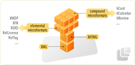
  • Cheat Sheet This microformats cheat sheet lists the properties by format and also lists each format and the hierarchy. This includes elemental microformats, compound microformats and some of the standard design patterns used.
  • Icons The starter set contains icons for hCal, hResume, hCard, XFN and a generic TAG icon.

Tutorials, Introductions 

  • Tutorials on Microformats This series of articles deals with numerous aspects of Microformats, including basic theory and purpose of Microformats, hCard, hCalendar, AHAH, hReview, xFolk, hResume, XOXO and hAtom.

Mike Jolley explains step-by-step, what Microformats are, how they can be integrated in web-pages and how you can enhance the efficicency of your content using them.

  • Pairing Wine and Microformats Microformats in Practice: Dan Cederholm about the use of Microformats in Cork’d.
  • Wikipedia: Microformats The Wikipedia Entry.
  • Using Microformats in WordPress There are two approaches you can take. One: Manually pasting relevant microformat code created via microformat creators. Step-by-step instructions are as follows.

Blogs & Wikis

  • Microformats.org Designed for humans first and machines second, microformats are a set of simple, open data formats built upon existing and widely adopted standards. Learn more about microformats.
  • Microformats Wiki What are microformats? What can you do with them?

Award-Winning Newspaper Designs


Print and Web are different. Traditional layout techniques from print, particularly an advanced formatting, aren’t applicable to the Web as CSS doesn’t offer sophisticated instruments to design such layouts (e.g. text floating around an embedded image; some “floating” techniques provide such results, however they produce bloated source code just as well).

Print and Web are different. Traditional layout techniques from print, particularly an advanced formatting, aren’t applicable to the Web as CSS doesn’t offer sophisticated instruments to design such layouts (e.g. text floating around an embedded image; some “floating” techniques provide such results. However they produce bloated source code just as well).

At the same time, the flexibility of the Web is hardly applicable to print as there is no way to customize a traditional periodical for reader’s convenience. Apart from that, online reading is very different from offline-reading: in the latter both leading and the line length are usually much shorter.

However, there are some fundamental principles which are often being used in both media. Over the last years newspapers and websites started to apply similar principles of data presentation, such as the heavy use of white space and grid-based design. The results can sometimes be very similar, but often they have almost nothing at common.

This issue of Monday inspiration series is supposed to provide you with some examples of outstanding newspaper designs which have been rewarded with prestigious awards (see references at the bottom of this post) and demonstrate unusual approaches of newspaper layout.

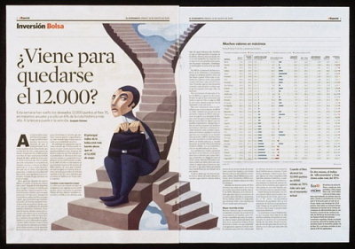
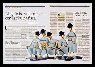
El Economista (Madrid, Spain) 

El Economista uses a very traditional, subtle and unique newspaper layout. Notice how well the typography reflects the weight of single articles. Infographics support the content and headlines are surrounded by huge amount of whitespace.

Excellent Newspaper Designs

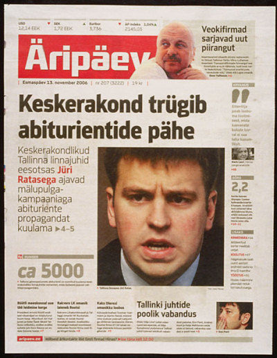
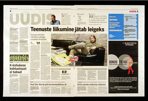
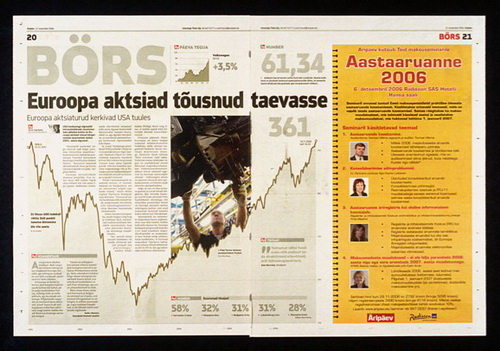
Äripäev (Tallinn, Estonia) 

Äripäev’s signature is the heavy use of typography. The layout may sometimes seem overcrowded, however the packaging is always clean, simple to digest and easy to read. Note the difference in weights of colors: color, grey and red are applied carefully and sparingly.

Excellent Newspaper Designs

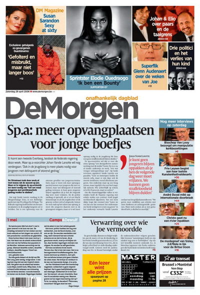
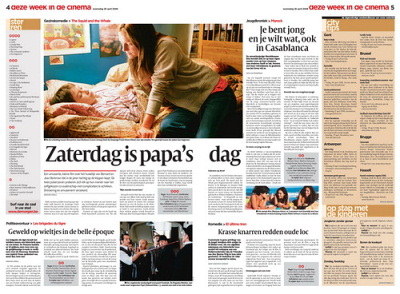
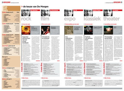
De Morgen (Belgium) 

De Morgen focuses on attractive packaging and a visually appealing layout. Vivid colors offer readers more eye-candy; however, they also have a function as they e.g. clearly separate quotations from the overall article. Headlines are centered, background-colors differ from page to page.

Excellent Newspaper Designs

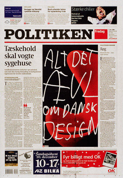
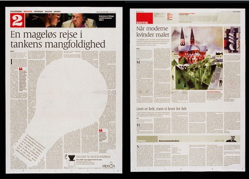
Politiken (Copenhagen, Denmark) 

Politiken has a very eye-pleasing, legible layout with soft, neutral colors. Notice the clean horizontal packaging on the right-hand side image below. The sharpness of typography is breathtaking.

Excellent Newspaper Designs

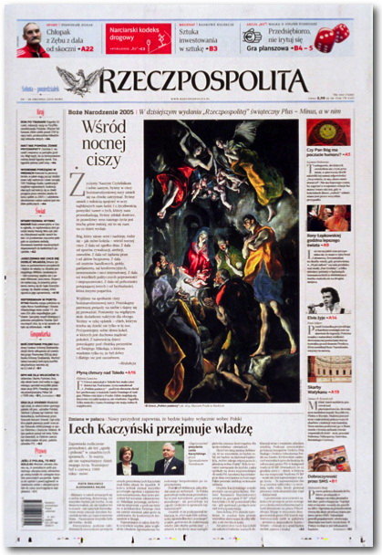
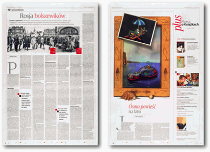
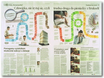
The Rzeczpospolita (Warsaw, Poland) 

The Rzeczpospolita displays its conservatism in a traditional, conservative layout. No fancy images, no vivid background colors in use. The content dominates and helps the layout to gain a rather traditional look.

Excellent Newspaper Designs

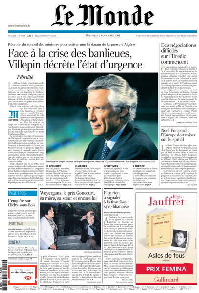
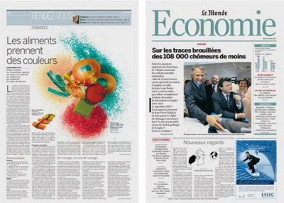
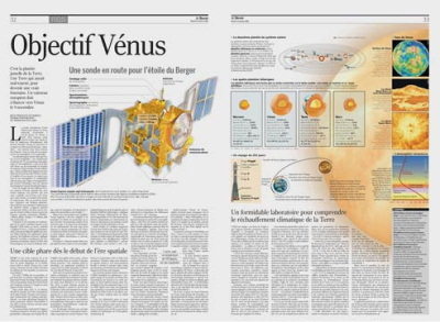
Le Monde (Paris, France) 

Le Monde presents a mix of colorful infographics, solid typography and professional content…

Excellent Newspaper Designs

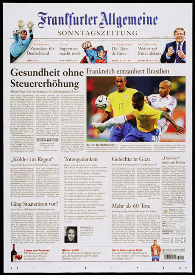
Frankfurter Allgemeine Zeitung (Frankfurt, Germany) 

…so does the “>Frankfurter Allgemeine Sonntagszietung: the excerpts are distributed uniformly which gives the page a clear and easy-to-read and easy-to-scan structure. It’s not always possible, though.

Excellent Newspaper Designs

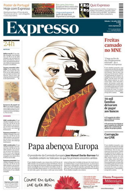
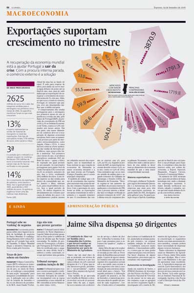
Expresso (Portugal) #

Expresso: with rich colors, clean grid-based layout and concise typography. Notice how the colors are applied and how the content is separated (see second screenshot).

Excellent Newspaper Designs

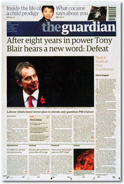
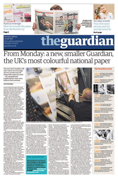
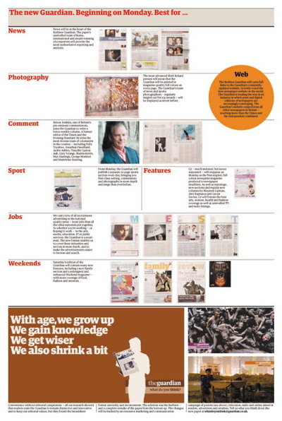
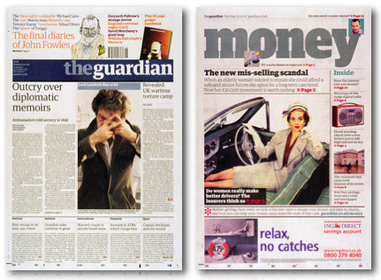
The Guardian (London, UK) 

The Guardian has recently finished its redesign. Result: more vivid colors and more vivid blocks. However, the legibility and the sharpness of presentation don’t suffer. A nice example of how multiple colors can be used not destroying the balance between visual appeal and legibility.

Excellent Newspaper Designs

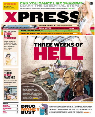
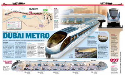
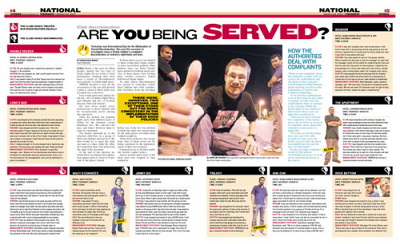
Dubai Express (Dubai, United Arab Emirates) 

Dubai Express is another example of colorful yet legible layout design. The layout has 10 colors on one single page, used in different contexts in different colors. Note the sharpness of typography and use of capital letters on the front page. In this case color is definitely appropriate as the newspaper’s main topic is entertainment.

Excellent Newspaper Designs

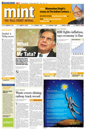
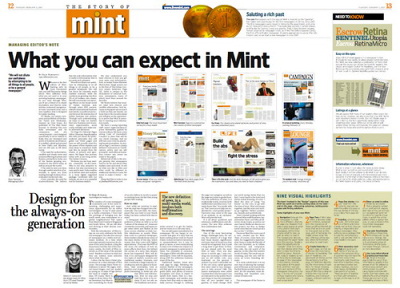
Mint (India) 

Mint, financial daily in India, uses large indentation for typography and elegant visual highlights to separate the content. That works well: both attractive, scannable and easy-to-read.

Excellent Newspaper Designs

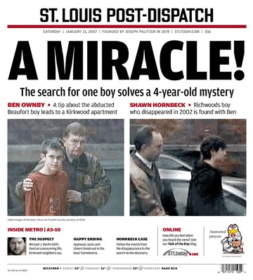
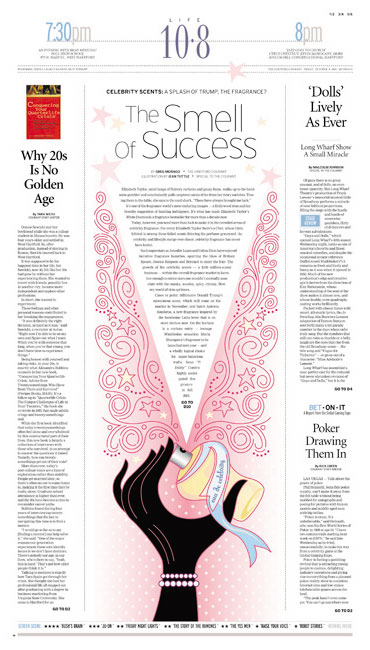
St. Louis Post-Dispatch (US) 

St. Louis Post-Dispatch (US) isn’t a boulevard-newspaper, but a local regional magazine. The layout has a clear content hierarchy and a very simple structure. Huge amount of whitespace: waste of space or a clever technique to focus readers’ attention on the main topics?
Excellent Newspaper Designs

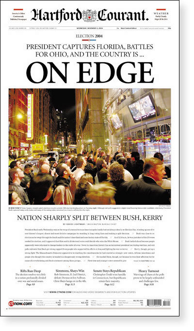
Hartford Courant (US) 

The Hartford Courant is a standout in the American newspaper market. The newspaper distinguishes itself with an enduring elegance in design and typography. Though conservative in their approach, designers engage readers with the bold use of visuals. The contrast between their quiet, understated style and the gutsy photography and illustrations create a tension that captures the attention of readers.

Excellent Newspaper Designs

Resources and Further References


Monday, October 12, 2026

Drunken Monkey Photoshop Tutorial


In this article I will explain step-by-step how I’ve designed an attractive character in one of our recent projects, namely for the company “Drunken Monkey Collectibles”. I will review the entire design process, from the first sketches and drafts to the final touches with Adobe Photoshop. In the post you’ll find further references to different articles published in my blog SOSNewbie; you might want to check them out as they cover more details of each phase of the process.

This Adobe Photoshop tutorial is a guest article written by Sergio Ordóñez, 29 years old Spanish designer and illustrator who is working as a freelancer in SOSFactory since 2004. The article focuses on creating a visually appealing mascot and a logo and provides insights in the designer’s workflow and the design process itself.

In this article I will explain step-by-step how I’ve designed an attractive character in one of our recent projects, namely for the company “Drunken Monkey Collectibles”. I will review the entire design process, from the first sketches and drafts to the final touches with Adobe Photoshop. In the post you’ll find further references to different articles published in my blog SOSArmy; you might want to check them out as they cover more details of each phase of the process.

To provide you with a profound understanding of the process from scratch, let me provide you with a brief outline of the article first.

Outline

Mascot and logo design

  1. Briefing Covers the inception phase, the phase of gathering requirements and analyzing the profile of the work.
  2. Looking for references The phase where we’re getting more familiar with the design requirements.
  3. Drawing the character We take a look at some basic principles in the corporate design of mascots and draw first sketches of the character.
  4. Coloring the character We make the character more vivid and pretty colorful using plain colors, shadows, lighting medium values, lights, reflection and lines coloring.
  5. Designing the logo The stage when we design a rather amusing logo which fits to the character.
  6. Final presentation We introduce final changes and finish the design combining everything we’ve created so far.

1. Briefing

Is a common instrument which is used in the beginning of the design process to obtain information about the results the company is expecting from us. It is similar to the Q&A-sessions where you are defining the objectives and the plan for the design process.

  • Name: Drunken Monkey Collectibles
  • Sector: Toys and collectibles
  • Audience: 5 — 25 years old
  • Message to communicate: the company wanted a character with an attitude, aggressive but also friendly, very energetic, and some kind of a hero with an oriental touch.
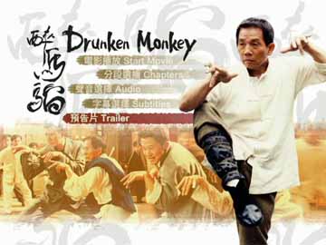
  • References: Drunken Master, a movie with Jackie Chan made in 1978. The main character uses a funny Kung Fu technique, especially for the position of hands. The company specified that the character shouldn’t look drunk.
  • Technical aspects: the design should be used for both Web and print. It must work together with the logo, but should also remain usable if the logo isn’t used.

2. Looking for references

So far we have all the information we need, so now it’s time to look for references to use as a base. Lucky me, as a child I really liked Karate movies; I remember that after watching this movie I spent several days beating my brother using exactly the same technique. The first image that comes to my mind is Jackie Chan (a stranger in that time, at least for me) in that characteristic pose.

After watching that video I think we’re in conditions to start. ;-)

This 10-minutes video is a pretty good manual of amazing poses; however it’s important to mention that the key was finding a pose not too comical that transmitted aggressivity as the client wanted, so I searched in Google and found one with the perfect balance between the comic and the heroic part:

Drunken Monkey

We had a freedom to decide which clothes should be used, so we decided to make it wear a kimono, something simple not to overload the design. We suggested it would be better to add further accessories once the the character is finished.

3. Drawing the character

Before starting to draw it’s a good idea to review the principles in the corporate design of mascots. In fact, you need to have few things in mind:

  • the character must transmit the desired attitude only in one single drawing,
  • the character must be attractive and original,
  • the pose must be clear and recognizable, it has to work in small sizes,
  • you shouldn’t overload the drawing. The lines should suggest the volumes to the colorist, as less lines the drawing has, the design will be cleaner and we will get a better sense of volume with the color.

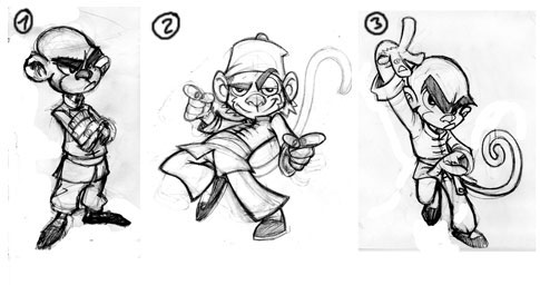
Sketches We’ve tried a number of different poses for our character, we’ve chosen the third one.

Over years it turned out to be extremely useful to start the design with sketches on paper. After that I usually pass it to Adobe Photoshop since I’m not very skilled with traditional drawing and I draw with the digitalizing PC tablet (Wacom Intuos3 A6). I draw everything in high resolution (about 6000x6000px); it’s easier because the errors will not heavily impact the design. Besides, we can also print the sketch in a large resolution if needed.

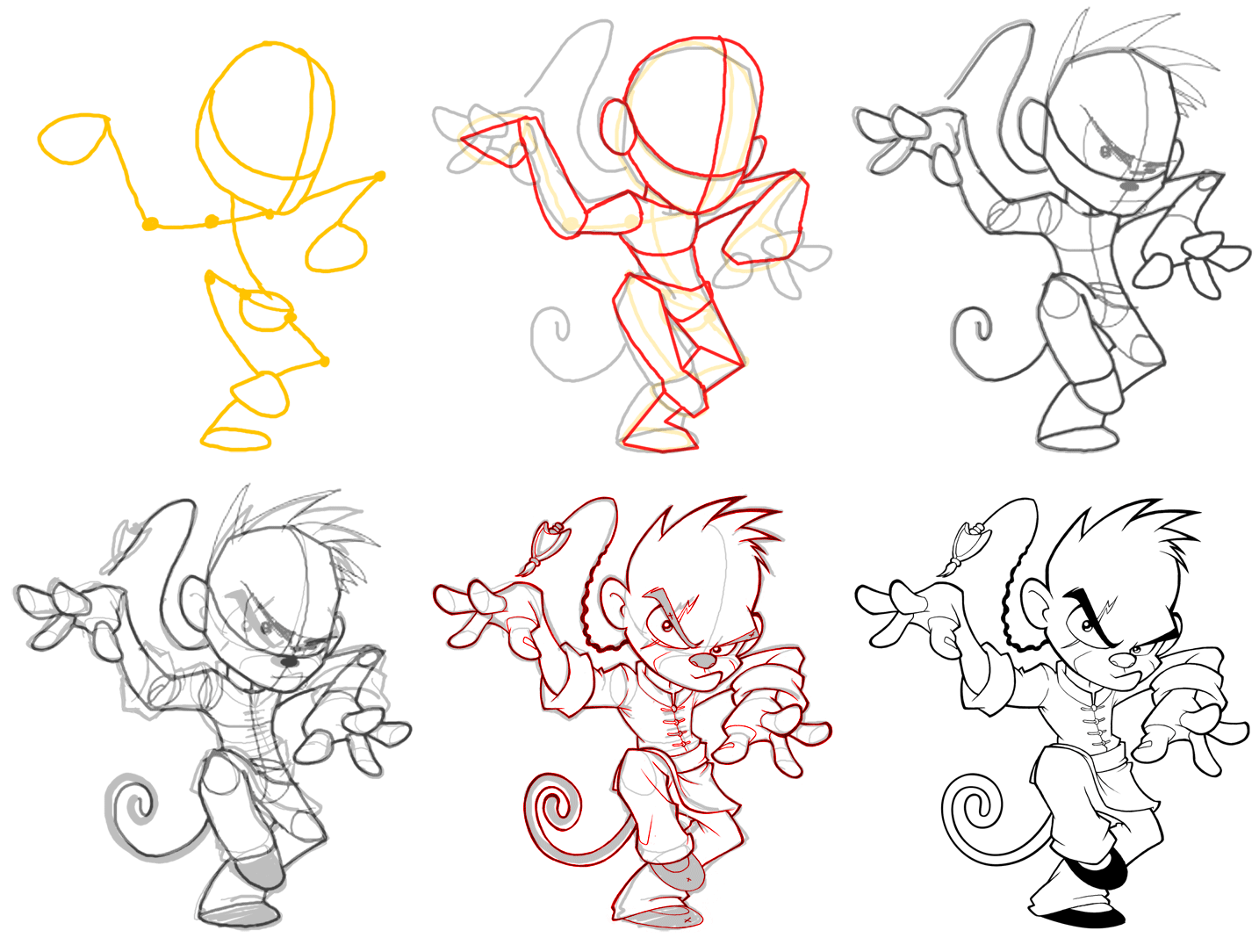
Below you can see the evolution of the drawing step by step:

Mascot design Progress
Character evolution, from the sketch to the final touches, took about 6 hours of work.

Now let me explain the creation process in a little more detail:

  1. Lines We plan the pose starting with the typical dummy. In this step, the most important thing is to find the correct corporal expression, adjust the character proportions and try to get a clear pose.
  2. Shapes We give shapes to the lines and start defining the character.
  3. Refining shapes We connect and soften the volumes.
  4. Adding details We keep refining the volumes and add details to the character.
  5. Final sketch In this phase the character is complete. We only have left to clean it and ink it.
  6. Inking
    • Option 1: digital inking with Photoshop, using the vector drawing tools and with some help from the digitalizing tablet. It’s the easiest option if like me, you’re not that good at drawing.
    • Option 2: mixed inking. We make the final drawing in pencil, scan it and after that using Photoshop we convert the pencil into ink. If you’re very good at drawing, it’s the best option and definitely the first option to consider.
    • Option 3: traditional inking. This option is only for very experienced designers.
  7. Final touches Once we finish the sketch and make sure everything is perfect. Usually it’s necessary to reassign line weights, clean stains or lines, simplify volumes, correct errors… Sometimes you might need to even re-create parts of the drawing.

Final lineart

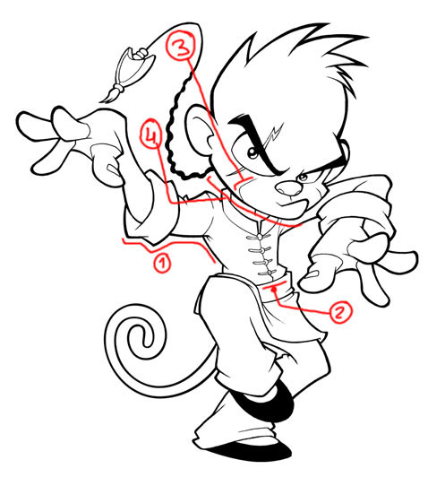
We have 3 types of lines:

  1. Contours: the thicker lines of the drawing. They give a unity appearance to it.
  2. Area delimiters: to distinguish elements in the design, we use a medium thickness.
  3. Intern lines: the lines that mark the cheek, those are the thinner lines.
  4. Transition lines: they start as a contour and get inside the design. We make it thick and start to make it thinner when it goes inside.

What we should never do:

  • Make shadows with the lines: we’ll only make the design dirty.
  • Create extremely thick lines without any thickness variations.
  • Long intern lines: these lines are used to mark volumes, you have to make them appear in a very subtle way, it’s just a guide to help you color afterwards.
  • Straight lines: if you take a look at the image, you’ll notice that all lines are slightly curved.
  • Small areas: try to make your volumes as big as possible, otherwise in the coloring phase you won’t have any space and the image will look flat.

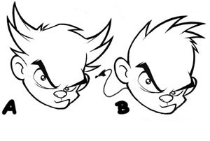
8. Corrections: I usually ask for the clients’ approval in each step (concept, sketch, inking, color), so I don’t have to do many corrections in the later phase of the design process. For instance, in this case I designed few different hairstyles:

Hairdress

4. Coloring the character

For coloring I usually use Adobe Photoshop or Illustrator, however the process is basically the same. I do it in various steps:

Digital color with Photoshop

Many illustrators color everything in one layer, i prefer to to it in separate ones, so i can make color modifications in any of the design tones, lights or shadows. Let me briefly explain each step, if you want to get into details I highly recommend you to watch the Photoshop coloring videotutorial.

4.1. Plain colors

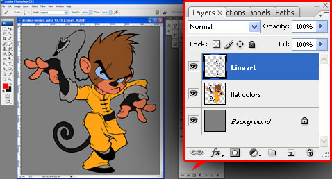
It’s ideal to have a set of the lines on a transparent background. If you inked it in the traditional way we’ll have the lines with a white background, so we need to extract the lines from the drawing. The advantage of this method is that we can color the lines easily although there are other methods like changing the blending mode of the drawing and multiply on top of all the color layers.

Layers palette in Photoshop

We create a layer under the drawing’s layer and fill it with plain colors of medium values (not too dark and not too light). Doing that we need to consider two objectives:

  • Start choosing the color scheme.
  • It’s useful to make quick selections of the different area of the drawing, using the magic wand.

4.2. Shadows

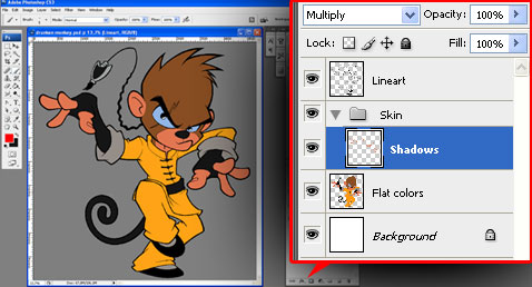
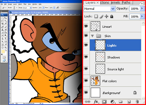
We’ll create a new layer set and name it “Skin”; after that we make a new layer and name it “Shadows” — obviously, here we’ll color the shadows. We have to change the layer’s blending mode to “Multiply”.

Layers palette in Photoshop

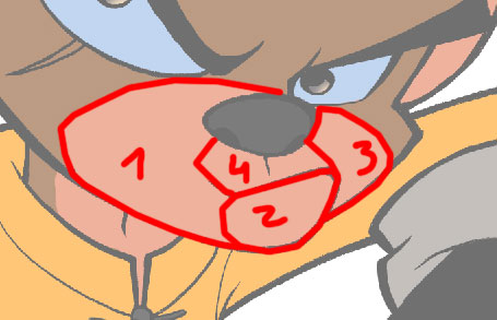
Before coloring like a madman study the volumes, try to visualize them in 3 dimensions, understand each volume separately, and then imagine how they look like if they’re connected. Here you have a little study:

Volume study
Face volume study

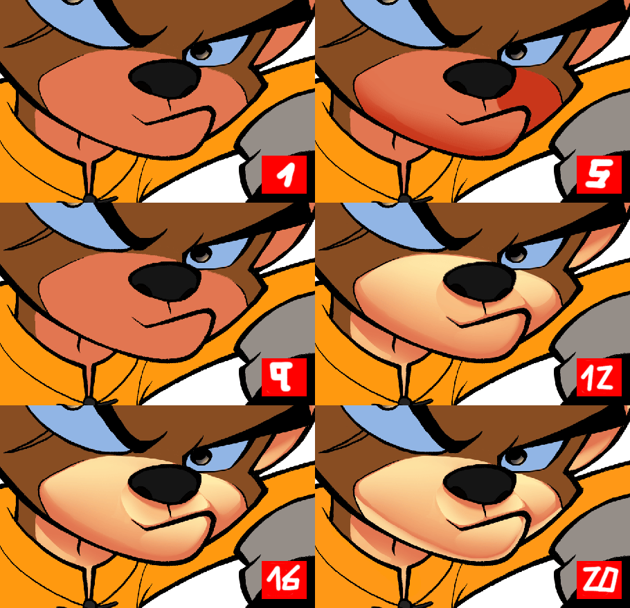
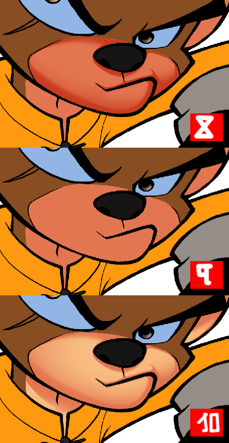
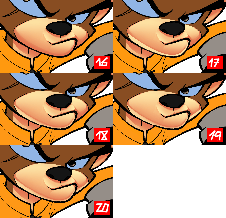
Now we’ll start to color the shadows. I used the same base color of the skin (but as we have the layer in “Multiply” mode we can see the difference) having in mind several things:

  • Leave a shadow margin near the edges, thicker in the inferior edge since the light comes from the top, later we’ll add reflections to mark the contours.
  • We have to obtain the perfect balance between soft and hard shadows. Usually the ample and curved surfaces are soft (Volume 1), and the angled ones are hard (Volume 4).
  • We need to leave some space for the lights, it’s not useful to overload the drawing with shadows.

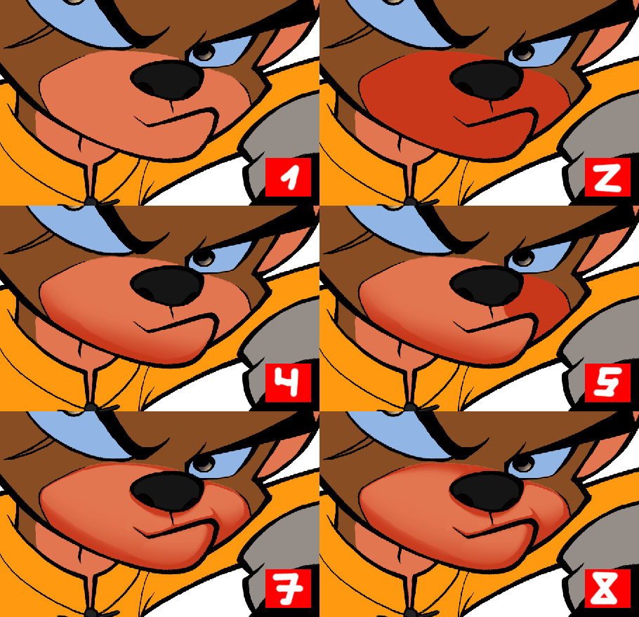
Painting shadows with Photoshop

This is the process I follow to color the shadows:

  1. Having the original image, I used the magic wand in the plain colors to select the face (you can hide the dotted lines with CTRL+H)
  2. Fill the area with the same background color (but with the layer in multiply mode)
  3. I erased until it’s degraded (you can also use the gradient tool)
  4. I added a hard border to the gradient
  5. Let’s go with the second volume, repeat step 2
  6. Repeat step 3
  7. Repeat step 4
  8. I added a gradient in the upper part

4.3. Medium lighting values

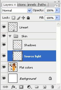
Layers palette in Photoshop

To define the light source we use the gradients; so we create a new layer, “Source Light” and put it below the shadows.

Source light

These are the steps i followed:

  • 8. This is step where we were before
  • 9. Let’s change the “Shadows” layer back to normal mode. We put it in Multiply before because we were using the same color as the background, just for comfort. Now it’ll look like nothing happened, but don’t worry about that for a moment.
  • 10. Let’s go to the “Source Light” layer and make a gradient with a lighter color… and magic! I chose a light source from the upper left corner.

4.4. Lights

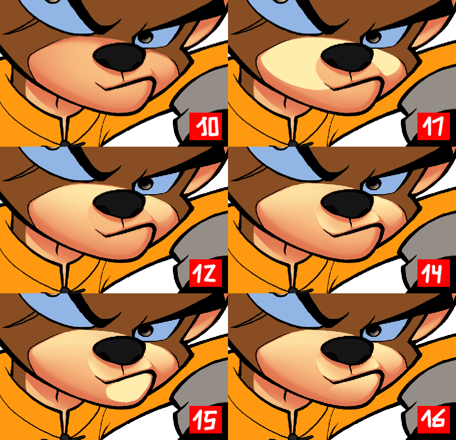
Let’s create again a layer called “Lights”, and put it on the top.

Lights

Having in mind our light source (upper left corner) we’ll color the lights for the different volumes. The lights should be in the upper part. Let’s take a look at the image to understand how I’ve done it:

Adding highlight with Photoshop
We color the lights with Photoshop

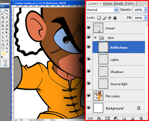
4.5. Reflections

Reflections in Photoshop

In this stage we simply add a few lines for brightness in the contours; this way we reinforce them and everything looks clearer. I just make the line and after that I blur it a little bit:

Reflections

4.6. Lines color

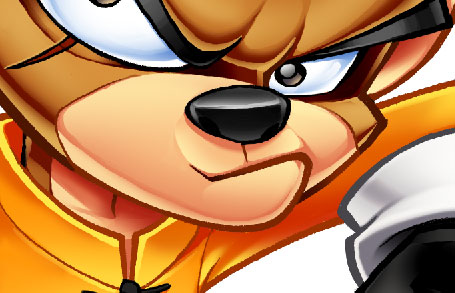
This stage is optional, I usually like to join the lines with the color to obtain a softer result, so what I do is coloring them. As we already extracted the lines of the drawing, now we only have to select them (CTRL+click in the “Lineart” layer thumbnail) and color them.

the best thing to do here is to choose a color a little bit darker than the skin tone , so it can still be distinguished. I like to have the colored lines in a layer different from the drawing layer, just in case I need to make any modifications.

Final color with Photoshop
This is the final result

I color the other parts of the character with the same technique, one by one; as you can imagine the process is pretty long, so I usually spend about 4-6 hours only coloring… but it’s worth it, don’t you think?

5. Designing the logo

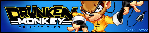
Drunken Monkey logo

The company which hired us ordered both the character and the logo design. My intention was to obtain a clean and simple logo, legible and typography-based, so the design wasn’t overloaded, worked with the mascot but also remained usable used without the mascot.

The logo should be funny and should convey strength and stability; however it should also remain flexible and transmit a lot of energy. Here you have the reasoning for my choices:

Font election
Plain O Matic (by Utopiafonts)

Typography: it’s a thick font, heavy but flexible due to the rounded parts of some characters. I only modified the width of the characters which are too thick for my taste.

Format: I chose a 3-lines-format, using two different fonts. This way we can distinguish the name of the trademark (it’s more important, that’s why it’s bigger) and their activity.

Base line: the base line of the word “Drunken” is irregular, a care-free touch. The word “Monkey” is regular, which suggest stability and gives unity to the design.

Borders: irregulars on top, to emphasize that care-free touch; a little bit more regular going down to suggest stability; regulars on the sides, to give this appearance of unity to both words of the design.

Shape: wide on top and narrow on the bottom, suggests activity, energy, power. I used some horizontal lines to give more stability to the logo and unity to the design.

Capital letters: very simple, more energy for the logo.

File formats for web and print

Click on the image to see different versions I usually create for Web or prints if the budget isn’t too constraining.

Rendering: when I design for web, I usually add bevel and effects, but this time I chose a more practical approach and used plain colors, ideal to print at low cost. When the budget allows it, it is reasonable to make different versions of the logo as well.

Colors: yellow and black (suggests danger, action, excitement). I used white to obtain the maximum contrast over the black background.

6. Final presentation

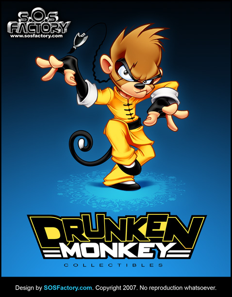
As a good designer as I am, I like to present my designs in an eye-catching and professional way. So here’s the final version:

Drunken Monkey mascot and lgoo design

Hopefully you’ll find it useful.