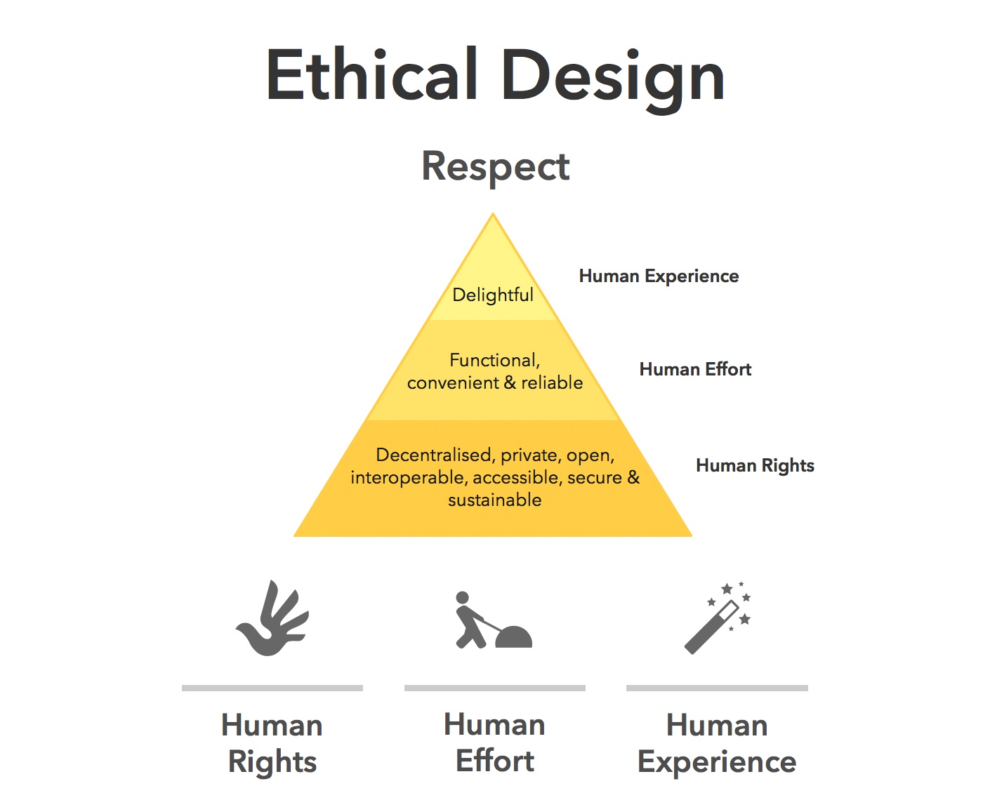
UX
design is entering a new phase, with designers shifting from makers of
outputs to directors of intent. AI can now generate wireframes,
prototypes, and even design systems in minutes, but UX has never been
only about creating interfaces. It’s about navigating ambiguity,
advocating for humans in systems optimised for efficiency, and solving
their problems through thoughtful design.
I’ve been
working in User Experience design for more than twenty years. Long
enough to have seen the many job titles, from when stakeholders asked us
to “just make it pretty” to when wireframes were delivered as annotated
PDFs. I’ve seen many tools come and go over the years, methodologies
rise and fall, and entire platforms disappear.
Yet, nothing has unsettled designers quite like AI.
When generative AI tools first entered my workflow, my reaction wasn’t excitement — it was unease, with a little bit of curiosity.
Watching an interface appear in seconds, complete with sensible
spacing, readable typography, and halfway-decent copy, triggered a very
real fear: If a machine can do this, where does that leave me?
That fear is now widespread. Designers at every level ask the same question, often quietly, “Will an AI agent replace me by next week/month/year?”
While the difference between next week and next year seems a lot, it
depends on where you are in your career and the speed at which your
employer chooses to engage with AI tools. I have been lucky in several
roles to be working with organisations that haven’t allowed the use of
AI tools due to data security concerns. If you’re interested in any of
these conversations, you can view the discussions happening on platforms
like Reddit.
Fearing
the takeover of AI in our roles is not irrational. We’re seeing AI
generate wireframes, prototypes, personas, usability summaries,
accessibility suggestions, and entire design systems. Tasks that once
took days can now literally take minutes.
Here’s the uncomfortable
truth: If your role is largely about producing artefacts, drawing
buttons, aligning components, or translating instructions into screens,
then parts of that work are already being automated.
Still, UX design has never truly been about just creating a user interface.
UX
is about navigating ambiguity. It’s about advocating for humans in
systems optimised for efficiency. It’s about translating messy human
needs and equally messy business goals into experiences that feel
coherent, fair, sensible, and usable. It’s about solving human problems
by creating a useful and effective user experience.
AI isn’t replacing that work. Rather, it’s amplifying everything around it. The real shift happening is that designers are moving from being makers of outputs to directors of intent.
From creators to curators. From hands-on executors to strategic
decision-makers. That feels exciting to me. And the creativity and
ingenuity this brings to the world of UX.
And that shift doesn’t reduce our value as UX designers, but it does redefine it.
What AI Does Better Than Us (The “Boring” Stuff)
Let’s be clear, AI is better than humans at certain aspects of design work. Fighting that reality only keeps us stuck in fear.
Speed And Volume
AI
is exceptionally good at generating large volumes of ideas quickly. For
example, layout variations, copy options, component structures, and
onboarding flows can all be produced in seconds. In early-stage design,
this changes everything. Instead of spending hours sketching three
concepts, you can review thirty. That doesn’t eliminate creativity but
does expand the playground.
McKinsey estimates that generative AI can reduce the time spent on creative and design-related tasks by up to 70%, particularly during ideation and exploration phases.
McKinseys report on generative AI. (Image source: McKinsey)
AI can also help with the research side of UX, for example, exploring the habits of a certain demographic, and creating personas.
While this can reduce research time required, the designer is still
required to guardrail this by providing accurate prompts and reviewing generated responses.
I have personally found that using AI to assist with the initial
research for design projects is incredibly useful, specifically when
there is limited time and access to users.
Consistency And Rule Adherence
Design
systems live or die by consistency. AI excels at following rules
relentlessly, colour tokens, spacing systems, typography scales, and
accessibility standards. It doesn’t forget. It doesn’t get tired. It
doesn’t “eyeball it.”
AI’s precision makes it incredibly valuable
for maintaining large-scale design systems, especially in enterprise or
government environments where consistency and compliance matter more
than novelty. This is one component of my UX role that I am happy to
hand over to AI to manage!
Data Processing At Scale
AI
can analyse behavioural data at volumes challenging, if not impossible,
for a human team to reasonably process. User journey paths, scroll
depth, heatmaps to identify mouse interactions, conversion funnels — AI
can identify patterns and anomalies almost instantly.
Behavioural analytics platforms increasingly rely on AI to surface insights that designers might otherwise miss. Contentsquare,
an AI-powered analytics platform, talks about the impacts and benefits
of utilising behavioural analytics data. I’ve always said that
quantitative data tells us the “what”, and qualitative data tells us the
“why”. This is the human component of research where we get to connect
with the users to understand the reason driving the behaviour.
An example of a session replay tool display. (Image Source: Contentsquare)
The key insight here is simple: Analysing large volumes of behavioural data was never where our highest value lay.
If
AI can take on repetitive production, system enforcement, and raw data
analysis, designers would be free to focus on interpretation, judgment,
and human meaning, the hardest parts of the job.
What Humans Do Better Than AI (The “Heart” Stuff)
For all its power, AI has a fundamental limitation: it has never and will never be human.
Empathy Is Lived Experience
AI can describe frustration. It can summarise user feedback. It can mimic empathetic language. But it has never felt
the quiet rage of a broken form, the anxiety of submitting sensitive
data, or the shame of not understanding an interface that assumes too
much.
Empathy in UX isn’t a dataset. It’s a lived, embodied understanding of human vulnerability.
This is why user interviews still matter. Why contextual inquiry still
matters. Why designers who deeply understand their users consistently
make better decisions.
In a previous role where I was designing an
incredibly complex fraud alert platform, the key to successful outcomes
of that design was based on my understanding of the variety of issues
faced by customers. I accessed this information directly from members of
the customer-facing team. This information was stored in their brain
and based on direct experience with customers. No AI could know or
access these goldmines of human experiences.
As the Nielsen Norman Group reminds us, good UX design is not about interfaces. It’s about communication and understanding.
Ethics Require Judgment
AI
optimises for the objectives we give it. If the goal is engagement, it
will try to maximise engagement — regardless of long-term harm.
It
doesn’t inherently recognise dark patterns, manipulation, or emotional
exploitation. Infinite scroll, variable rewards, and addictive loops are
all patterns AI can enthusiastically optimise unless a human
intervenes.
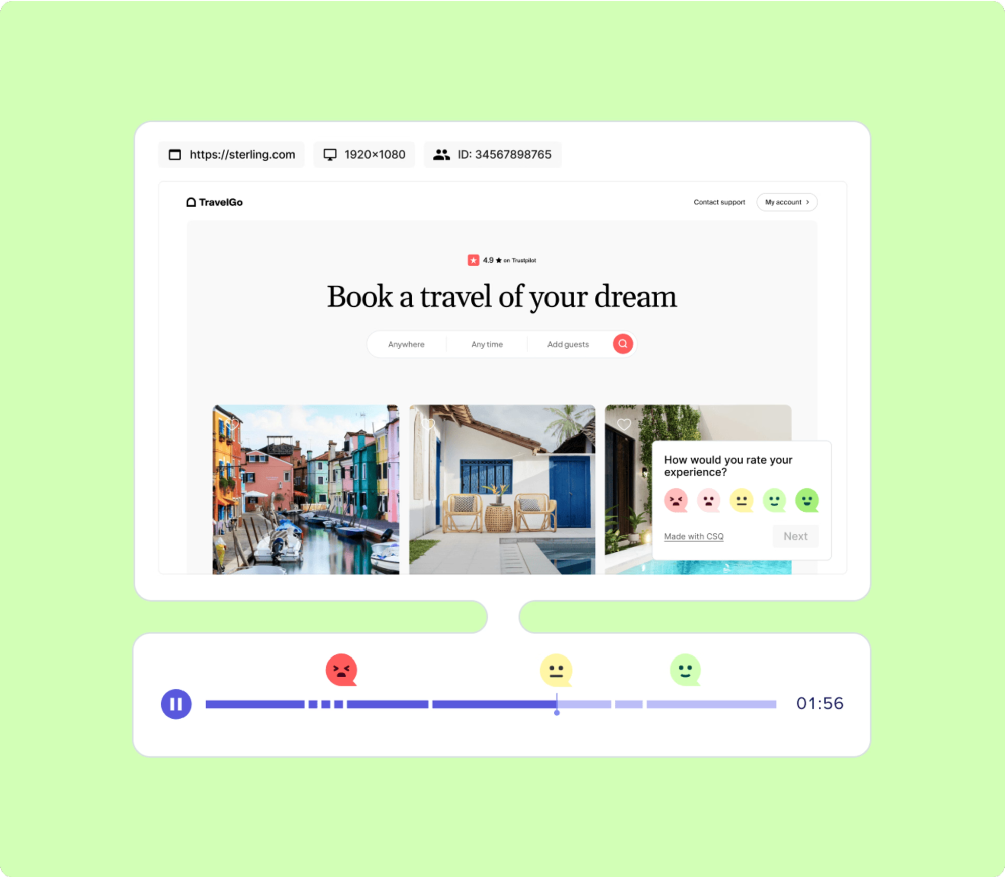
Ethical UX design requires designers who can say, “We could do this, but we shouldn’t.”
Ethical design choices require human review. (Image source: Medium)
Strategy Lives In Context
AI
doesn’t sit in stakeholder meetings. It doesn’t hear what’s implied but
not stated. It doesn’t understand organisational politics, regulatory
nuance, or long-term positioning.
This is why senior designers increasingly operate at the intersection of product, strategy, and culture.
The lesson is clear: As AI takes over execution, human designers become the guardians of intent.
How The Daily Work Of A Designer Is Changing
This shift isn’t theoretical. It’s already reshaping daily design practice.
From Designing To Prompting
Designers are moving from manipulating pixels to articulating intent. Clear goals, constraints, and priorities become the input.
Instead of asking AI to “draw a dashboard,” the task becomes:
“Create a dashboard that reduces cognitive load for first-time users.”
“Explore layouts optimised for accessibility and low vision.”
Prompting isn’t about clever wording; it’s about clarity of thinking and understanding the intent of the outcomes.
You may need to tweak your prompts as you go, but this is all part of
the learning process of directing AI to deliver the outcomes needed.
Four design screens created by Uizard Autodesigner, complete with user flow mapping. (Image source: Uizard.io)
From Making To Choosing
AI produces options. Designers make decisions.
A
significant portion of future design work will involve reviewing,
critiquing, and refining AI-generated outputs, and then selecting what
best serves the user and aligns with ethical, business, and
accessibility goals.
This mirrors how experienced designers
already work: mentoring juniors, reviewing their concepts, and guiding
direction, but at a much greater scale, given the sheer number of design
options AI tools can generate.
The Movie Director Metaphor
I
often describe the modern designer as a movie director. A director
doesn’t operate the camera, build the set, or act every role, but they
are responsible for the story, the emotional intent, and the audience
experience.
AI tools are the crew. Designers are responsible for the meaning of the story.
A Real-World Shift: What This Looks Like In Practice
To make this less abstract, let’s ground it in a familiar scenario.
Ten
years ago, a designer might spend days producing wireframes for a new
feature, carefully crafting each screen, annotating every interaction,
and defending each decision in reviews. Much of the designer’s perceived
value lived in the artefacts themselves.
Today, that same feature
can be scaffolded in an afternoon with AI support. But here’s what
hasn’t changed — the hard conversations.
The UX designer still has to ask:
Who is this actually for?
What problem are we solving, and for whom?
What happens when this fails?
Who might this unintentionally exclude or disadvantage?
In
practice, I’ve seen senior designers spend less time inside design
tools and more time facilitating workshops, synthesising messy inputs,
mediating between stakeholders, and protecting user needs when
trade-offs arise.
Treat outputs as conversation starters, not answers.
Confidence comes from familiarity, not avoidance.
Invest In Human Skills.
The most resilient designers will double down on:
Psychology and behavioural science;
Communication and facilitation;
Ethics, accessibility, and inclusion;
Strategic thinking and storytelling.
These skills compound over time, and they can’t be automated.
The designer’s responsibility in an AI-accelerated world:
There’s an uncomfortable implication in all of this that we don’t talk about enough: when AI makes it easier to design anything,
designers become more accountable for what gets released into the
world. Bad design used to be excused by constraints. Limited time,
limited tools, limited data. Those excuses are disappearing. When AI
removes friction from execution, the ethical and strategic responsibility lands squarely on human shoulders.
This is where UX designers can, and must, step up as stewards of quality, accessibility, and humanity in digital systems.
Final Thought
AI
won’t take your job. But a designer who knows how to think critically,
direct intelligently, and collaborate effectively with AI might take the
job of a designer who doesn’t.
The future of UX is no less human. It’s more intentional than ever.
Welcome back! Anthropic just doubled Claude's usage limits in a surprise weekend move, Elon Musk is admitting xAI needs to be rebuilt from scratch, Meta is reportedly preparing to cut 20% of its workforce to fund its AI bet, and a pet owner with no science background used four AI models to design a cancer vaccine that actually shrank his dog's tumor.
Anthropic Doubles Claude's Usage Limits Across Every Plan Article content
Anthropic dropped a surprise weekend announcement: double usage limits across all Claude plans for the next two weeks. The boost applies automatically outside peak hours, with no action needed. The company also made its full 1M-token context window generally available for Opus 4.6 and Sonnet 4.6 at no additional cost.
The details:
Double Usage: 2x limits on Free, Pro, Max and Team plans for two weeks, applied automatically outside peak hours (weekdays 5am to 11am PST). 1M Context Window: Full 1M-token context now GA for Claude Opus 4.6 and Sonnet 4.6, enabling uploads of entire codebases and long-form documents. No Price Increase: Both the usage expansion and the context window upgrade come at no extra cost. All Tools Included: The promotion covers all Claude tools, not just the chat interface.
The 1M-token context window is the bigger move here. For developers and researchers working with large codebases or dense documentation, this changes the scope of what a single conversation with Claude can handle.
Musk Admits xAI "Was Not Built Right" As Rebuild Begins Article content
Elon Musk publicly stated that xAI "was not built right" and needs a ground-up rebuild. Nine of the original 11 co-founders have now departed, leaving only Manuel Kroiss and Ross Nordeen. The admission comes as SpaceX, which owns xAI, prepares for a public listing later this year.
The rebuild:
Latest Departures: Zihang Dai and Guodong Zhang left the company, with Zhang reportedly blamed by Musk for Grok's coding shortfalls before exiting. New Hires: xAI brought in senior Cursor engineers Andrew Milich and Jason Ginsberg, both reporting directly to Musk, to accelerate Grok's coding capabilities. Coding Deficit: Musk has publicly acknowledged that Grok is "currently behind" on coding versus frontier competitors. IPO Pressure: The full rebuild is happening while SpaceX prepares for one of the largest public listings in recent history.
Rebuilding from scratch while preparing for an IPO is an extraordinary challenge. Musk is betting that new talent and a clean architecture can close the gap with OpenAI and Anthropic, but the timeline to prove that is tightening.
Meta Reportedly Weighing Layoffs Affecting 20% Of Its Workforce Article content
Meta is reportedly considering layoffs that could cut 20% or more of its nearly 79,000 employees. The move would offset aggressive AI infrastructure spending, including $600 billion earmarked for data centres by 2028.
The pressure points:
Potential Scale: A 20% cut would impact roughly 16,000 people across the company. AI Investment: Meta has committed $600B to data centre buildout, one of the largest infrastructure bets in tech history. Recent Acquisitions: The company's purchase of Manus adds to its AI portfolio and its cost base. Official Position: A Meta spokesperson described the reporting as "speculative reporting about theoretical approaches."
Meta is making one of the biggest infrastructure bets in corporate history while potentially cutting the workforce needed to operate it. A 20% reduction is not efficiency trimming. It is a structural bet that AI can absorb the work.
Sydney AI consultant Paul Conyngham built a custom mRNA cancer vaccine for his dog Rosie by chaining ChatGPT, Grok, DeepMind's AlphaFold and a university genomics lab. One tumor shrank by half after the first injection.
How it worked:
Diagnosis: Rosie was diagnosed with mast cell cancer in 2024 and given months to live after chemo and surgery failed. AI Pipeline: Conyngham used ChatGPT to map the research, paid $3,000 for genomic sequencing and ran the data through AlphaFold to model mutations. Vaccine Design: The UNSW RNA Institute helped produce the vaccine, with the final construct designed using Grok. Results: One tumor shrank 50% after a December injection. A second vaccine targeting non-responding tumors is now in development.
Try this yourself:
Conyngham's approach demonstrates what is possible when you chain multiple AI models together for a single complex problem. The tools he used (ChatGPT, Grok, AlphaFold) are all publicly accessible. The breakthrough was not any single model, but the pipeline connecting them.
Every
high-resolution hero image, autoplay video, and complex JavaScript
animation carries a cost. Sustainable UX challenges the era of
“unlimited pixels” and reframes performance as responsibility. In 2026,
truly sophisticated design is defined not by how much it adds, but by
how thoughtfully it reduces its footprint.
I’ve spent
over two decades in the trenches of user experience design. I remember
the transition from table-based layouts to CSS, the pivot to responsive
design when the iPhone launched, and the rise of the “attention
economy.” But as we navigate 2026, the industry is facing its most
significant shift yet. We are moving past the era of “design at any
cost” into the era of Sustainable UX.
It’s not
something most designers think about, including myself, until I was
prompted by hearing about this as a concept. For years, we have treated
the internet as an ethereal, weightless cloud. We have assumed that
digital products were “green” simply because they weren’t printed on
paper. I used to think that too, and before the concept of climate
change emerged, it was more about saving trees.
We were wrong. The
cloud is a physical infrastructure, a sprawling network of data
centres, undersea cables, and cooling systems that hum 24⁄7. While AI-focused data centers match the power consumption of massive aluminum smelters, their high geographic density creates an even more intense and localised environmental strain.
As
UX designers, we are the architects of this energy consumption. Every
high-resolution hero image, every auto-playing background video, and
every complex JavaScript animation we approve is a direct instruction to
a processor to consume power. If we want to build a future that lasts,
we must stop designing for “wow” and start designing for efficiency.
In
the early 2000s, white backgrounds were the standard because they
mimicked the familiarity of paper. However, the hardware has evolved,
and our design philosophy must follow. The shift from LCD to OLED
(Organic Light Emitting Diode) technology has fundamentally changed how
colour impacts energy.
Unlike traditional LCD screens, which require a backlight that is always on (even when displaying black), OLED screens illuminate each pixel individually. When a pixel is set to true black (#000000), that specific diode is turned completely off. It draws zero power.
The energy savings are far from negligible. A landmark study by Purdue University
in 2021, which has become the gold standard for this discussion,
revealed that at 100% brightness, switching from light mode to dark mode
can save an average of 39% to 47% of battery power. On
a global scale, if every major app defaulted to dark mode, the
reduction in grid demand would be astronomical.
In 2026, Dark Mode should no longer be a secondary “theme” tucked away in a settings menu. We should be designing with a “Dark-First” mentality. This doesn’t mean every site must look like The Matrix,
but it does mean prioritising high-contrast dark themes as the default
system-preferred state. This extends the hardware lifespan of the device
and lowers the carbon footprint of every interaction.
I
personally prefer Light-Mode for reading, so it makes sense to have both
light and dark mode options available. There are also accessibility considerations with providing both options.
Image And Video Optimisation
We have become lazy designers. With high-speed 5G and fibre optics, we’ve stopped worrying about file sizes. The average mobile page weight has increased by over 500% in the last decade, largely due to unoptimized visual assets.
The Logic
The
“Digital Fat” of a website (those 4MB Unsplash photos and 15MB
background videos) is the single largest contributor to page-load
energy. Every megabyte transferred from a server to a client requires
electricity for the transmission, the server’s processing, and the
user’s rendering engine. When we use massive files, we are essentially
“burning” energy to show a picture that could have been just as
effective at a fraction of the size. Not to mention, you are also
providing a better user experience with a page that loads much faster.
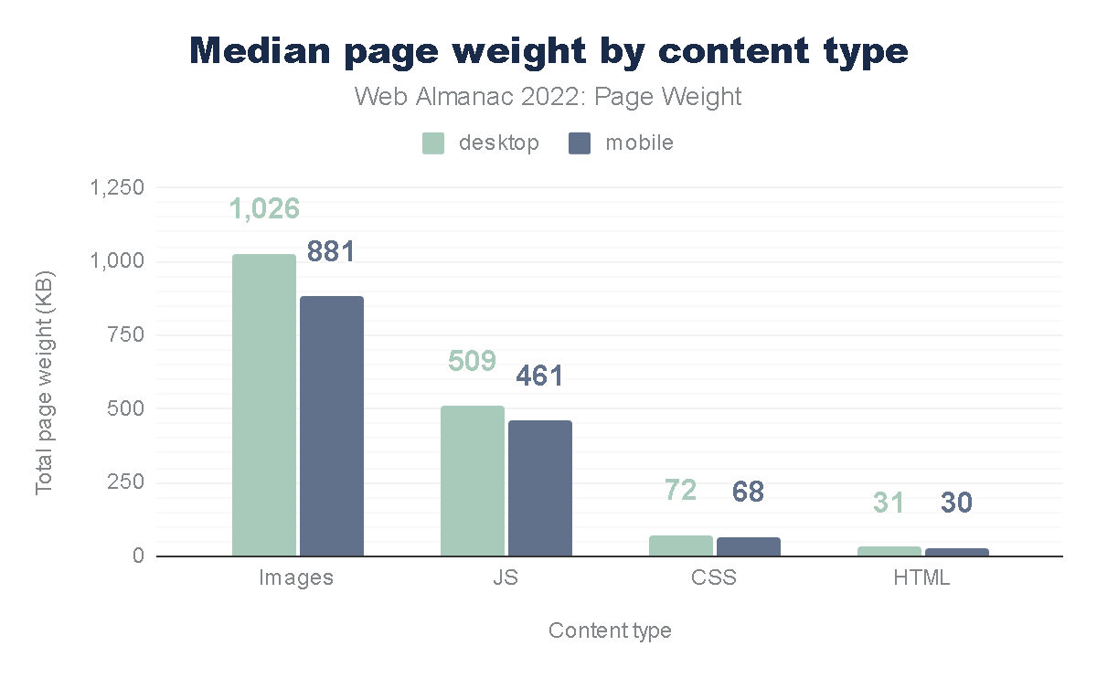
Median page weight by content type. (Image source: HTTP Archive)
The Data
According to the HTTP Archive,
images and video consistently account for the lion’s share of a page’s
total weight. However, the shift to modern formats like AVIF and WebP can reduce image weight by up to 50% compared to JPEG, without any perceptible loss in quality.
Although
these formats are not as familiar to me as JPG and PNG, I am definitely
looking forward to using them to reduce page size.
I
recently led a redesign for a cybersecurity platform. By implementing a
“Before and After” audit, we discovered that their homepage was loading
5.5MB of data. By replacing high-res photography with SVG (Scalable Vector Graphics) art and using clever CSS gradients instead of image assets, we dropped the load to 1.2MB. That is a 78% reduction in energy load! As a designer, your first question should always be:
“Do I need a photo for this, or can I achieve the same emotional resonance with code?”
Intentional Motion: Cutting “Loud” Animations
We live in an era of “scroll-jacking” and complex 3D Parallax effects. While these might win awards on Awwwards.com, they are often ecological disasters.
Animation is not free. To render a complex animation, the device’s GPU (Graphics Processing Unit) must work at high capacity. This increases the CPU temperature,
triggers cooling fans (in laptops), and drains battery rapidly. “Loud”
animations that run constantly in the background or trigger massive
re-paints of the browser are the energy equivalent of leaving your car
idling in the driveway.
Size comparison of uncompressed JPEG, PNG, WebP, and AVIF photos and text images. (Image source: Photutorial)
We must adopt Meaningful Motion. If an animation doesn’t help a user complete a task or understand a hierarchy, it is a waste. We should favour CSS transitions over heavy JavaScript libraries like GSAP or Lottie where possible, as CSS is hardware-accelerated and far more efficient for the browser to calculate.
As a UX designer, I can’t argue this approach. This not only helps reduce data waste but also improves UX for our users.
Setting A “Data Budget” For Every Project
In my 20+ years of UX, the most successful projects have generally been the ones with the tightest constraints.
A
Data Budget is a hard cap on the total size of a page (e.g., “This
landing page cannot exceed 1MB”). This forces the design team to make
difficult, intentional choices. If you want to add a new tracking script
or a fancy font weight, you have to “pay” for it by optimising or
removing something else. This prevents “feature creep” from turning into
“carbon creep.”
The Data
The Sustainable Web Design model, developed by pioneers like Wholegrain Digital,
provides a formula to calculate the CO2 per page view. The average
website produces about 0.5 grams of CO2 per view. For a site with 1
million monthly views, that’s 6 metric tons of CO2 a year, equivalent to
driving a car 15,000 miles.
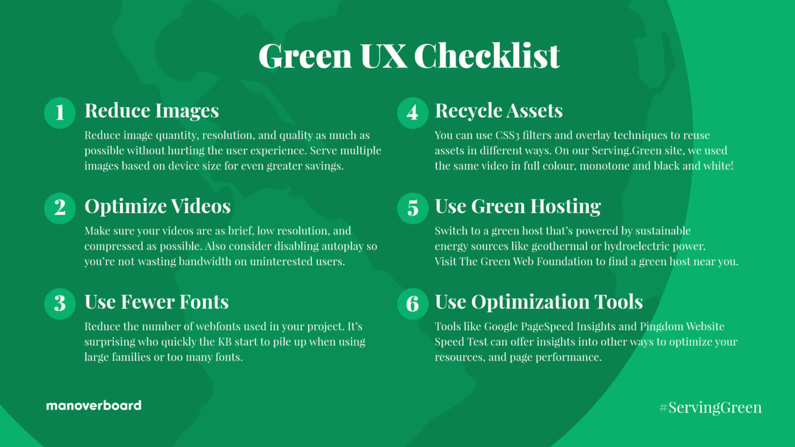
Reduce Images Question
the necessity of every visual and use the smallest resolution and most
efficient file formats (like AVIF) to minimize data transfer.
Optimise Video Eliminate
auto-playing media and prioritise highly compressed, short loops to
ensure energy is only spent on content the user intends to view.
Limit Fonts Use
a maximum of two web font weights or stick to classic system fonts to
remove unnecessary server requests and rendering bloat.
Recycle Assets Repurpose
a single image or video multiple times using CSS filters and overlays
to create visual variety without increasing the total page weight.
Choose Green Hosting Host your digital products on servers verified by The Green Web Foundation to ensure they are powered by renewable energy sources.
Minimize Data Distance Select
server locations geographically close to your primary audience to
reduce the energy required for data to travel through physical
infrastructure.
Printable Green UX checklist from Mangrove Web. (Image source: Mangrove Web)
The Business Case For Eco-friendly Design
Some
might argue that “Green UX” sounds like a compromise on quality. On the
contrary, it is a competitive advantage. Sustainable design is performance design.
When you reduce page weight, your site loads faster. When your site loads faster, your Core Web Vitals improve. When your Core Web Vitals improve, your SEO ranking
goes up. Furthermore, users on older devices or slower data plans
(especially in emerging markets) can actually access your product. This
is the definition of “Inclusive Design.”
By cutting the “digital
fat,” we create a leaner, faster, and more accessible web. We are moving
away from the “disposable design” of the 2010s toward a more permanent,
respectful digital architecture.
Conclusion: The Future Of “Clean” Design
In
my two decades of design, I’ve seen many trends come and go.
Skeuomorphism, Flat Design, Neumorphism — they were all aesthetic
choices. But sustainable UX isn’t a trend; it’s now a necessity. We are
the first generation of designers who have to reckon with the physical
consequences of our digital work.
Sustainable UX is a
“win-win-win.” It’s better for the planet because it reduces energy
consumption. It’s better for the user because it results in faster, more
responsive interfaces. And it’s better for the business because it
lowers hosting costs AND improves conversion rates.
The era of
“unlimited pixels” is over. In 2026, the most sophisticated design is
the one that leaves the smallest footprint. We are no longer just
designers; we are the guardians of the user’s battery, their data plan,
and ultimately, the environment.
The Call To Action
I challenge you to audit just one page of your current project today. Use a tool like the Website Carbon Calculator
to see its impact. Then, look for the “invisible waste.” Can that image
be an SVG? Can that video be a static hero? Can that “loud” animation
be silenced?
Start small. The most elegant solution is often the one with the fewest bytes.
What
makes streaks so powerful and addictive? To design them well, you need
to understand how they align with human psychology. Victor Ayomipo
breaks down the UX and design principles behind effective streak
systems.
I’m sure you’ve heard of streaks or used an
app with one. But ever wondered why streaks are so popular and powerful?
Well, there is the obvious one that apps want as much of your attention
as possible, but aside from that, did you know that when the popular
learning app Duolingo introduced iOS widgets to display streaks, user commitment surged by 60%.
Sixty percent is a massive shift in behaviour and demonstrates how
“streak” patterns can be used to increase engagement and drive usage.
At its most basic, a streak is the number of consecutive days that a user completes a specific activity. Some people also define it as a “gamified” habit or a metric designed to encourage consistent usage.
But
streaks transcend beyond being a metric or a record in an app; it is
more psychological than that. Human instincts are easy to influence with
the right factors. Look at these three factors: progress, pride, and fear of missing out (commonly called FOMO). What do all these have in common? Effort.
The more effort you put into something, the more it shapes your
identity, and that is how streaks crosses into the world of behavioural
psychology.
Now, with great power comes great responsibility, and because of that, there’s a dark side to streaks.
In
this article, we’ll be going into the psychology, UX, and design
principles behind building an effective streak system. We’ll look at (1)
why our brains almost instinctively respond to streak activity, (2) how
to design streaks in ways that genuinely help users, and (3) the
technical work involved in building a streak pattern.
To
design and build an effective streak system, we need to understand how
it aligns with how our brains are wired. Like, what makes it so
effective to the extent that we feel so much intense dedication to
protect our streaks?
There are three interesting, well-documented psychology principles that support what makes streaks so powerful and addictive.
Loss Aversion
This is probably the strongest force behind streaks. I say this because most times, you almost can’t avoid this in life.
Think
of it this way: If a friend gives you $100, you’d be happy. But if you
lost $100 from your wallet, that would hurt way more. The emotional
weight of those situations isn’t equal. Loss hurts way more than gain
feels good.
Let’s take it further and say that I give you $100 and
ask you to play a gamble. There’s a 50% chance you win another $100 and
a 50% chance you lose the original $100. Would you take it? I wouldn’t.
Most people wouldn’t. That’s loss aversion.
If you think about it, it is logical, it is understandable, it is human.
The
concept behind loss aversion is that we feel the pain of losing
something twice as much as the pleasure of gaining something of equal
value. In psychological terms, loss lingers more than gains do.
You
probably see how this relates to streaks. To build a noticeable streak,
it requires effort; as a streak grows, the motivation behind it begins
to fade; or more accurately, it starts to become secondary.
Here’s an example: Say your friend has a three-day streak closing their “Move Rings” on their Apple Watch.
They have almost nothing to lose beyond wanting to achieve their goal
and be consistent. At the same time, you have an impressive 219-day
streak going. Chances are that you are trapped by the fear of losing it.
You most likely aren’t thinking about the achievement at this point;
it’s more about protecting your invested effort, and that is loss
aversion.
Now that we understand the fear of losing the effort invested in longer streaks, another question is: What makes us do the thing in the first place, day after day, even before the streak gets big?
That’s what the Fogg Behaviour Model
is about. It is relatively simple. A behaviour (B) only occurs when
three factors — Motivation (M), Ability (A), and Prompt (P) — align at
the same moment. Thus, the equation B=MAP.
If any of these factors, even one, is missing at that moment, the behaviour won’t happen.
So, for a streak system to be efficient and recurring, all three factors must be present:
Motivation This
is fragile and not something that is consistently present. There are
days when you’re pumped to learn Spanish, and days you don’t even feel
an iota of willpower to learn the language. Motivation by itself to build a habit is unreliable and a losing battle from day one.
Ability To compensate for the limitations of motivation, ability
is critical. In this context, ability means the ease of action, i.e,
the effort is so easy that it’s unrealistic to say it isn’t possible.
Most apps intentionally use this. Apple Fitness just needs you to stand
for one minute in an hour to earn a tick towards your Stand goal.
Duolingo only needs one completed lesson. These tasks do not require all
that much effort. The barrier is so low that even on your worst days,
you can do it. But the combined effort of an ongoing streak is where the
idea of losing that streak kicks in.
Prompt This is what completes the equation. Humans are naturally forgetful, so yes, ability can get us 90% there. But a prompt
reminds us to act. Streaks are persistent by design, so users need to
be constantly reminded to act. To see how powerful a prompt can be, Duolingo did an A/B test to see if a little red badge on the app’s icon increased consistent usage. It produced a 6% increase in daily active users. Just a red badge.
Model Limitation
All
this being said, there is a limitation to the Fogg model whereby
critics and modern research have noticed that a design that relies too
heavily on prompts, like aggressive notifications, risks creating mental
fatigue. Constant notifications and overtime could cause users to
churn. So, watch out for that.
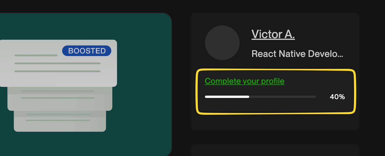
The Zeigarnik Effect
How
do you feel when you leave a task of project half-done? That irritates
many people because unfinished tasks occupy more mental space than the
things we complete. When something is done and gone, we tend to forget
it. When something is left undone, it tends to weigh on our minds.
This
is exactly why digital products use artificial progress indicators,
like Upwork’s profile completion bar, to let a user know that their
profile is only “60% complete”. It nudges the user to finish what they
started.
Upwork’s profile completion progress bar.
Let’s
look at another example. You have five tasks in a to-do list app, and
at the end of the day, you only check four of them as completed. Many of
us will feel unaccomplished because of that one unfinished task. That,
right there, is the Zeigarnik effect.
The Zeigarnik effecthe
was demonstrated by psychologist Bluma Zeigarnik, who described that we
tend to keep incomplete tasks active in our memory longer than
completed tasks.
A streak pattern naturally taps into this in UX
design. Let’s say you are on day 63 of a learning streak. At that point,
you’re in an ongoing pattern of unfinished business. Your brain would
rarely forget about it as it sits in the back of your mind. At this
point, your brain becomes the one sending you notifications.
When
you put these psychological forces together, you begin to truly
understand why streaks aren’t just a regular app feature; they are
capable of reshaping human behaviour.
But somewhere along the line
— I can’t say exactly when, as it differs for everyone — things reach a
point where a streak shifts from “fun” to something you feel you can’t
afford to lose. You don’t want 58 days of effort to go to waste, do you?
That is what makes a streak system effective. If done right, streaks help users build astounding habits that accomplish a goal. It could be reading daily or hitting the gym consistently.
These
repeated actions (sometimes small) compound over time and become
evident in our daily lives. But there are two sides to every coin.
The Thin Line Between Habit And Compulsion
If
you have been following along, you can already tell there’s a dark side
to streak systems. Habit formation is about consistency with a repeated
goal. Compulsion, however, is the consistency of working on a goal that
is no longer needed but held onto out of fear or pressure. It is a
razor-thin line.
You brush your teeth every morning without
thinking; it is automatic and instinctive, with a clear goal of having
good breath. That’s a streak that forms a good habit. An ethical streak
system gives users space to breathe. If, for some reason, you don’t
brush in the morning, you can brush at noon. Imperfection is allowed
without fear of losing a long effort.
Compulsion takes the
opposite route, whereby a streak makes you anxious, you feel guilty or
even exhausted, and sometimes, it feels like you haven’t accomplished
anything, despite all your work. You act not because you want to, but
because you’re subconsciously terrified of seeing your progress reset to
zero.
Someone even described this perfectly, “I felt that I was cheating, but simply did not care. I am nothing without my streak”.
This shows the extreme hold streaks can have on an individual. To the
extent that users begin to tie their self-worth to an arbitrary metric
rather than the original goal or reason they started the streak in the
first place. The streak becomes who they are, not just what they do.
A well-designed ethical streak system should feel like encouragement
to the user, not pressure or obligation. This relates to the balance of
intrinsic and extrinsic motivation. Extrinsic motivation (external
rewards, avoiding punishment) might get users started, but intrinsic
motivation (doing the task for a personal goal like learning Spanish
because you genuinely want to communicate with a loved one) is stronger
for long-term engagement.
A good system should gravitate towards
intrinsic motivation with careful use of extrinsic elements, i.e.,
remind users of how far they have come, not threaten them with what they
might lose. Again, it is a fine line.
A simple test when
designing a streak system is to actually take some time and think
whether your products make money by selling solutions to anxiety that
your product created. If yes, there’s a high chance you are exploiting
users.
So the next question becomes, If I choose to use streak, how do I design it in a way that genuinely helps users achieve their goals?
The UX of Good Streak System Design
I
believe this is where most projects either nail an effective streak
system or completely mess it up. Let’s go through some UX principles of a
good streak design.
Keep It Effortless
You’ve probably heard this before, maybe from books like Atomic Habits,
but it’s worth mentioning that one of the easiest ways habits can be
formed is by making the action tiny and easy. This is similar to the ability factor we discussed from the Fogg Behaviour Model.
If
a daily action requires willpower to complete, that action won’t make
it past five days. Why? You can’t be motivated five days in a row.
Case
in point: If you run a meditation app, you don’t need to make users go
through a 20-minute session just to maintain the streak. Try a single
minute, maybe even something as small as thirty seconds, instead.
As the saying goes, little drops of water make the mighty ocean.
Small efforts compile into big achievements with time. That should be
the goal: remove friction, especially when the moment might be
difficult. When users are stressed or overwhelmed, let them know that
simply showing up, even for a few seconds, counts as effort.
Humans
are visual by nature. Most times, we need to see something to believe;
there’s this need to visualize things to understand them better and put
things into perspective.
This is why streak patterns often use
visual elements, like graphs, checkmarks, progress rings, and grids, to
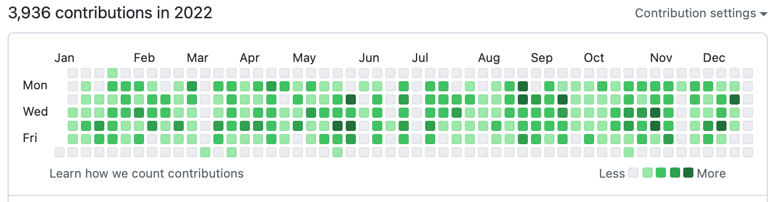
visualize effort. Look at GitHub’s contribution graph. It is a simple
visualization of consistency. Yet developers breathe it in like oxygen.
The contributions graph displayed on a GitHub user profile.
The key is not to make a streak system feel abstract.
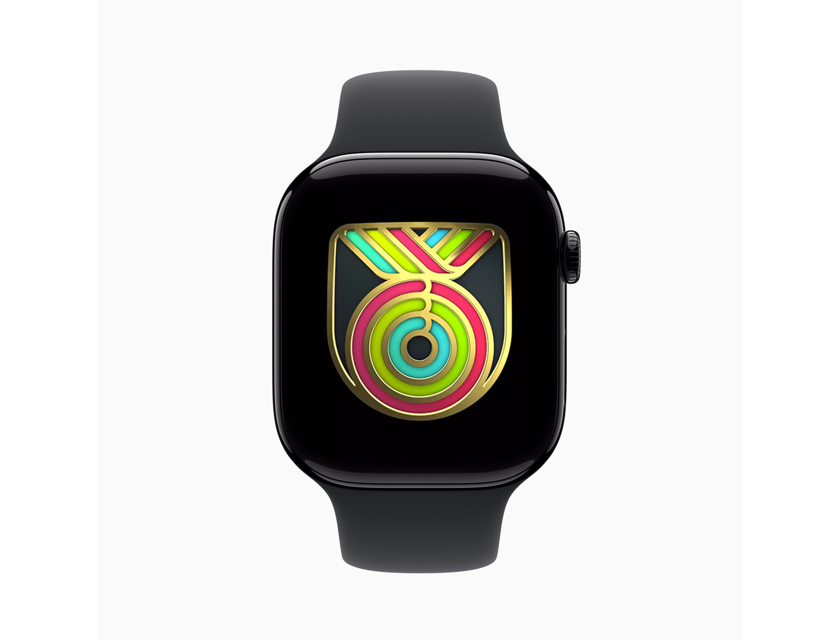
It should feel real and earned. For instance, Duolingo and Apple’s
Fitness activity rings use clean animation designs on completion of a
streak, and GitHub shows historical data of a user’s consistency over
time.
Apple Watch Fitness shows a limited animated badge on completion of all three Activity rings. (Image source: Apple)
I
mentioned earlierthat humans are generally forgetful by nature, and
that prompts can help maintain forward momentum. Without prompts, most new
users forget to keep going. Life can get busy, motivation disappears,
and things happen. Even long-time users benefit from prompts, though
most times, they are already locked inside the habit loop. Nevertheless,
even the most committed person can accidentally miss a day.
Your streak system most definitely needs reminders. The most-used prompt reminders are push notifications.
Timing really matters when working with push notifications. The type of
app matters, too. Sending a notification at 9 a.m. saying “You haven’t practiced today”
is just weird for a learning app because many have things to do in the
day before they even think about completing a lesson. If we’re talking
about a fitness app, though, it is reasonable and maybe even expected to
be reminded earlier in the day.
Push notifications vary significantly by app category.
Fitness apps, for instance, see higher engagement with early morning
notifications (7–8 AM), while productivity apps might perform better in
early noon. The key is to A/B test your app’s timing based on your
users’ behaviours rather than assuming things are one-size-fits-all.
What works for a meditation app might not work for a coding tracker.
Other prompt methods are red dots on the app icon and even app widgets. Studies vary, but the average person unlocks their device between 50-150 times a day
(PDF). If a user sees a red dot on an app or a widget that indicates a
current streak every time they unlock their phone, it increases
commitment.
Just don’t overdo it; the prompt should serve as a reminder, not a nag.
Celebrate Milestones
A streak system should try to celebrate milestones to reignite emotions, especially for users deep into a streak.
When
a user hits Day 7, Day 30, Day 50, Day 100, Day 365, you should make a
big deal out of it. Acknowledge achievements — especially for long-time
users.
As
we saw earlier, Duolingo figured this out and implemented an animated
graphic that celebrates milestones with confetti. Some platforms even
give substantial bonus rewards that validate users’ efforts. And this
can be beneficial to apps, such that users tend to share their
milestones publicly on social media.
Another benefit is the
anticipation that comes before reaching milestones. It isn’t just
keeping the streak alive endlessly; users have something to look forward
to.
Use Grace Mechanisms
Life
is unpredictable. People get distracted. Any good streak system should
expect imperfection. One of the biggest psychological threats to a
streak system is the hard reset to zero after just a single missed day.
An
“ethical” streak system should provide the user with some slack. Let’s
say you have a 90-day chess learning streak. You have been consistent
for three good months, and one day, your phone dies while traveling, and
just like that, 90 becomes 0 — everything, all that effort, is erased,
and progress vanishes. The user might be completely devastated. The
thought of rebuilding it from scratch is so demoralizing that the effort
isn’t worth it. At worst, a user might abandon the app after feeling
like a failure.
Consider adding a “grace” mechanism to your streak system:
Streak Freeze Allow users to intentionally miss a day without penalties.
Extra Time Allow a few hours (2–3) past the usual deadline before triggering a reset.
Decay Models Instead of a hard reset, the streak decreases by a small amount, e.g., 10 days is deducted from the streak per missed day.
Let’s compare two messages shown to users when a streak breaks:
“You lost your 42-day streak. Start over.”
“You showed up for 42 days straight. That’s incredible progress! Wanna give it another try?”
Both
convey the same information, but the emotional impact is different. The
first message would most likely make a user feel demoralized and cause
them to quit. The second message celebrates what has already been
achieved and gently encourages the user to try again.
Streak Systems Design Challenges
Before
we go into the technical specifics of building a streak system, you
should be aware of the challenges that you might face. Things can get
complicated, as you might expect.
Handling Timezones
There
is a reason why handling time and date is among the most difficult
concepts developers deal with. There’s formatting, internationalization,
and much more to consider.
Let me ask you this: What counts as a day?
We
know the world runs on different time zones, and as if that is not
enough, some regions have Daylight Saving Time (DST) that happens twice a
year. Where do you even begin handling these edge cases? What counts as
the “start” of tomorrow?
Some developers try to avoid this by
using one central timezone, like UTC. For some users, this would yield
correct results, but for some, it could be off by an hour, two hours, or
more. This inconsistency ruins the user experience. Users care less how
you handle the time behind the scenes; all they expect is that if they
perform a streak action at 11:40 p.m., then it should register at that
exact time, in their context. You should define “one day” based on the
user’s local timezone, not the server time.
Sure, you can take the
easy route and reset streaks globally for all users at midnight UTC,
but you are very much creating unfairness. Someone in California always
has eight extra hours to complete their task than someone living in
London. That’s an unjust design flaw that punishes certain users because
of their location. And what if that person in London is only visiting,
completes a task, then returns to another timezone?
One effective
solution to all these is to ask users to explicitly set their timezone
during onboarding (preferably after first authentication). It’s a good
idea to include a subtle note that providing timezone information is
only used for the app to accurately track progress, rather than being
used as personally identifiable data. And it’s another good idea to make
that a changeable setting.
I suggest that anyone avoid directly handling timezone logic in an app. Use tried-and-true date libraries, like Moment.js or pytz (Python), etc. There’s no need to reinvent the wheel for something as complex as this.
Another
challenge you should worry about is uncontrollable edge cases like
users oversleeping, server downtime, lag, network failures, and so on.
Using the idea of grace mechanisms, like the ones we discussed earlier, can help.
A
grace window of two hours might help both user and developer, in the
sense that users are not rigidly punished for uncontrollable life
circumstances. For developers, grace windows are helpful in those
uncontrollable moments when the server goes down in the middle of the
night.
Above all, never trust the client. Always validate on the server-side. The server should be the single source of truth.
Again, I cannot stress this enough: Make sure to validate everything server-side. Users are humans, and humans might cheat if given the opportunity. It is unavoidable.
You might try:
Storing all actions with UTC timestamps. The
client can send their local time, but the server can immediately
convert that to UTC and validate against the server time. That way, if
the client’s timestamp is suspiciously far, the system can reject it as
an error, and the UI can respond accordingly.
Using event-based tracking. In
other words, store a record of each action with metadata including
information like the user’s ID, the type of action performed, and the
timestamp and timezone. This helps with validation.
Building A Streak System Engine
This
isn’t a code tutorial, so I will avoid dumping a bunch of code on you.
I’ll keep this practical and describe how things generally operate a
streak system engine as far as architecture, flow, and reliability.
Core Architecture
As
I’ve said several times, make the serverthe single source of truth for
streak data. The architecture can go something like this on the server:
Store each user’s data in a database.
Store the current streak store (default as 0) as an integer.
Store
the timezone preference, i.e., IANA Timezone string (either implicitly
from local timestamp or explicitly by asking user to select their
timezone). For example, “America/New_York”.
Handle all logic to
determine if the streak continues or breaks, with a timezone check that
is relative to the user’s local timezone.
Meanwhile, on the client-side:
Display the current streak, normally fetched from the server.
Send
action done in the form of metadata to the server to validate whether
the user actually completed a qualifying streak action.
Provide visual feedback based on the server responses.
So,
in short, the brain is on the server, and the client is for display
purposes and submitting events. This saves you a lot of failures and
edge cases, plus makes updates and fixes easier.
Let’s simulate a walkthrough of how a minimal efficient streak system engine would go when a user completes an action:
The user completes a qualifying streak action.
The client sends an event to the server as metadata. This could be “User X completed action Y at timestamp Z”.
The
server receives this event and does basic validation. Is this a real
user? Are they authenticated? Is the action valid? Is the timezone
consistent?
If this passes, the server retrieves the user’s streak data from the database.
Then, convert the received action timestamp to the user’s local timezone.
Let the server compare the calendar dates (not timestamps) in the user’s local timezone:
If it is the same day, then the action is redundant and there is no change in the streak.
If it is the next day, then the streak extends and increments by 1.
If there is a gap of more than one day, the streak breaks. However, this is where you might apply grace mechanics.
If the grace mechanism is missed, then reset the streak to 1.
If
you choose to save historical data for milestone achievements, then
update variables like “longest streak” or “total active days”.
The server then updates the database and responds to the client. Something like this:
As a further measure, the server should either retry or reject and notify the client when anything fails during the process.
Building For Resilience
As
mentioned before, users losing a streak due to bugs or server downtime
is terrible UX, and users don’t expect to take the fall for it. Thus,
your streak system should have safeguards for those scenarios.
If
the server is down for maintenance (or whatever reason), consider
allowing a temporary window of additional hours to get it fixed so
actions can be submitted late and still count. You can also choose to
notify users, especially if the situation is capable of affecting an
ongoing streak.
Note: Establish an admin backdoor
where data can be manually restored. Bugs are inevitable, and some
users would call your app out or reach out to support that their streak
broke for a reason they could not control. You should be able to
manually restore the streaks if, after investigation, the user is right.
Conclusion
One thing remains clear: Streaks are really powerful because of how human psychology works on a fundamental level.
The
best streak system out there is the one that users don’t think about
consciously. It has become a routine of immediate results or visible
progress, like brushing teeth, which becomes a regular habit.
And
I’m just gonna say it: Not all products need a streak system. Should you
really force consistency just because you want daily active users? The
answer may very well be “no”.
What
happens if you rebuild a single tooltip using the browser’s native
model without the aid of a library? The Popover API turns tooltips from
something you simulate into something the browser actually understands.
Opening and closing, keyboard interaction, Escape handling, and much of
the accessibility now come from the platform itself, not from ad-hoc
JavaScript.
Tooltips feel like the smallest UI problem
you can have. They’re tiny and usually hidden. When someone asks how to
build one, the traditional answer almost always comes back using some
JavaScript library. And for a long time, that was the sensible advice.
I followed it, too.
On
the surface, a tooltip is simple. Hover or focus on an element, show a
little box with some text, then hide it when the user moves away. But
once you ship one to real users, the edges start to show. Keyboard users
Tab into the trigger, but never see the tooltip. Screen
readers announce it twice, or not at all. The tooltip flickers when you
move the mouse too quickly. It overlaps content on smaller screens.
Pressing Esc does not close it. Focus gets lost.
Over
time, my tooltip code grew into something I didn’t really want to own
anymore. Event listeners piled up. Hover and focus had to be handled
separately. Outside clicks needed special cases. ARIA attributes had to
be kept in sync by hand. Every small fix added another layer of logic.
Libraries
helped, but they were also more like black boxes I worked around
instead of fully understanding what was happening behind the scenes.
That was what pushed me to look at the newer Popover API. I wanted to see what would happen if I rebuilt a single tooltip using the browser’s native model without the aid of a library.
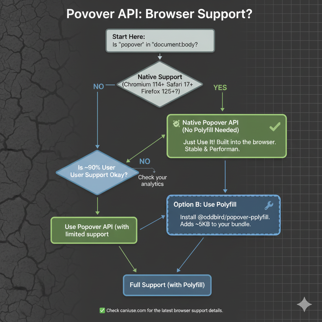
As
we start, it’s worth noting that, as with any new feature, there are
some things with it that are still being ironed out. That said, it
currently enjoys great browser support, although there are several
pieces to the overall API that are in flux. It’s worth keeping an eye on
Caniuse in the meantime.
The “Old” Tooltip
Before
the Popover API, using a tooltip library was not a shortcut. It was the
default. Browsers didn’t have a native concept of a tooltip that worked
across mouse, keyboard, and assistive technology. If you cared about
correctness, your only option was to use a library, and that is exactly
what I did.
At a high level, the pattern was always the same: a
trigger element, a hidden tooltip element, and JavaScript to coordinate
the two.
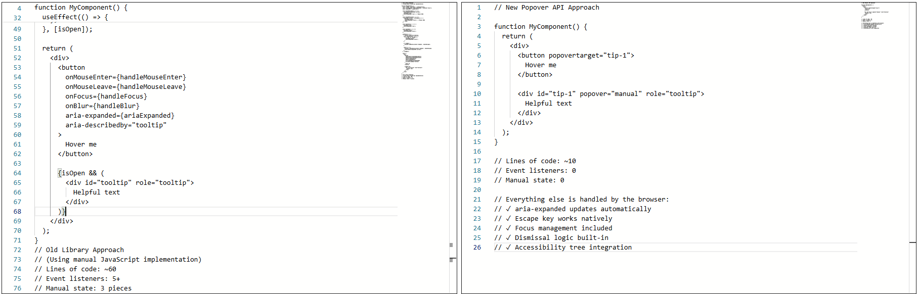
The
old approach required ~60 lines of JavaScript with five event listeners
and manual state management. The new approach is about 10 lines of
declarative HTML with zero event listeners.
The
library handled the wiring that allowed the element to show on hover or
focus, hide on blur or mouse leave, and reposition/resize on scroll.
None of it was accidental. It was merely compensating for gaps in web platform features.
Why I Used A Library
The
library was doing real work for me: positioning, flipping at viewport
edges, event coordination across input types, and scroll awareness
inside complex layouts. Positioning alone justified the dependency.
Handling scroll containers, transforms, and responsive layouts correctly
is not simple.
The real issues showed up in accessibility behavior, not visuals. The tooltip worked, but not all the time. Here’s where things started to fray at the seams:
Tooltips sometimes appeared late or not at all.
Tabbing quickly could skip them entirely.
Escape dismissal was not reliable.
Keyboard
navigation with the old implementation: Tabbing quickly causes tooltips
to be skipped entirely, and Escape dismissal is unreliable.
I also ran into issues trying to sync hover and focus behavior:
Mouse users expect immediacy.
Keyboard users expect predictability.
Supporting both meant delays and edge cases.
This timing mismatch creates an inconsistent experience across input methods.
Not to mention, there were issues with assistive technologies, particularly screen readers: Sometimes the tooltip was announced, sometimes it wasn’t, and sometimes it was announced twice.
Screen reader behavior with custom tooltips.
Keeping
ARIA attributes in sync required manual updates. Miss one state change,
and the tooltip became confusing or invisible to the accessibility
tree.
This Was Not Bad Code
The implementation was tested, the library was solid, and the behavior was reasonable given the tools available at the time.
The core problem was not the code. It was that the web platform lacked proper affordances.
For
example, the browser has no real way of knowing that the element was a
tooltip. Everything was built from conventions: generic elements, event
listeners, manually-managed ARIA, and custom dismissal logic.
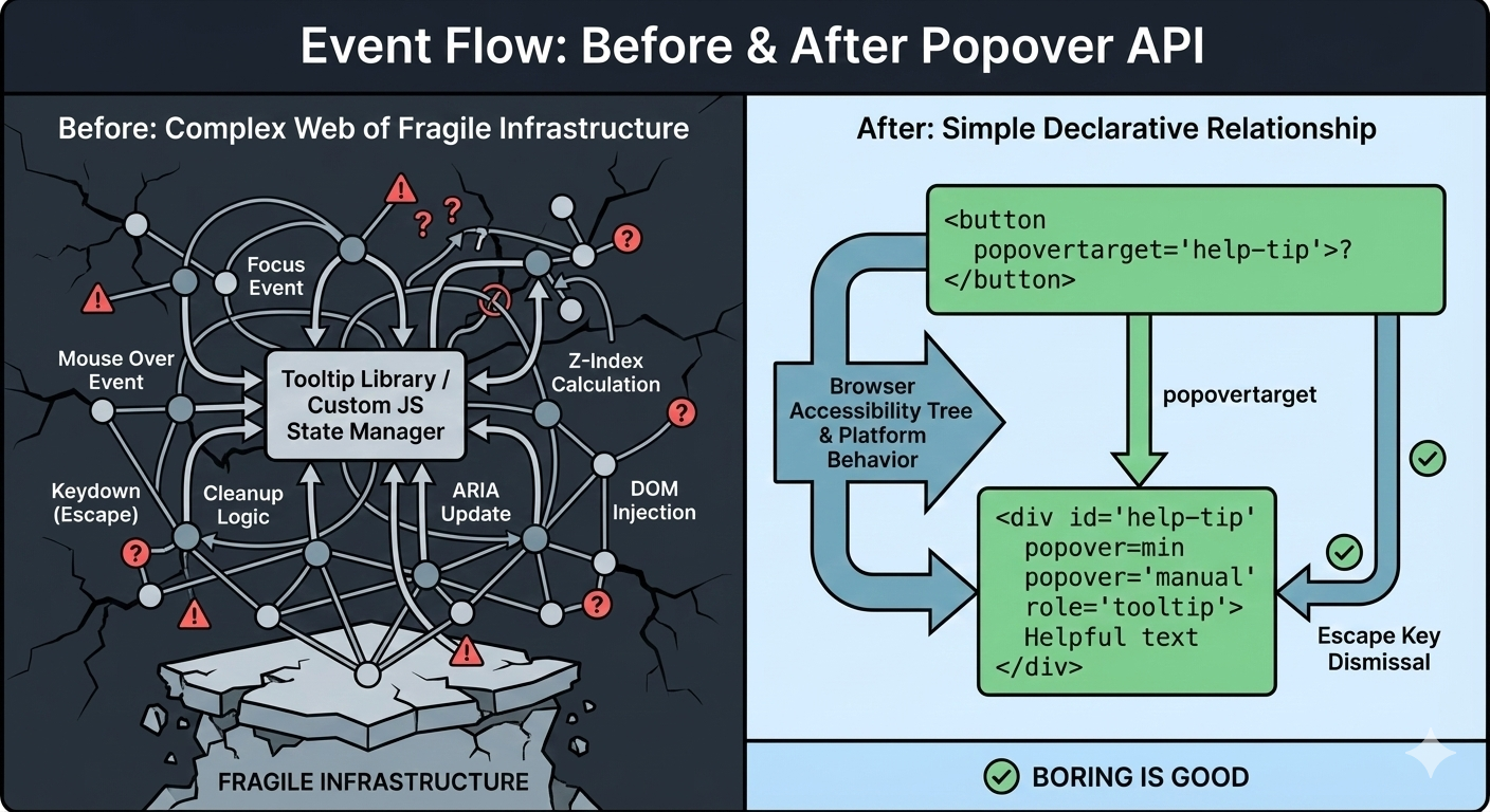
Before:
A tangled web of event listeners, state management, and manual ARIA
updates. After: The browser understands the relationship declaratively.
Over
time, the tooltip could become fragile. Small changes carried risk.
Minor fixes caused regressions. Worse, adding new tooltips inherited the
same complexity. Things technically worked, but never felt settled or
complete.
That was the state of things when I decided to rebuild the tooltip using the browser’s native Popover API.
The Moment I Tried The Popover API
I
didn’t switch to using the Popover API because I wanted to experiment
with something new. I switched because I was tired of maintaining
tooltip behavior that I believed the browser should have already
understood.
I was skeptical at first. Most new web APIs promise
simplicity, but still require glue, edge-case handling, or fallback
logic that quietly recreates the same complexity that you were trying to
escape.
So, I tried the Popover API in the smallest way possible. Here’s what that looked like:
<!-- popovertarget creates the connection to id="tip-1" --><buttonpopovertarget="tip-1">?</button><!-- popover="manual": browser manages this as a popover --><!-- role="tooltip": tells assistive technology what this is --><divid="tip-1"popover="manual"role="tooltip">
This button triggers a helpful tip.
</div>
The complete tooltip implementation using the Popover API
No
event listeners. No state tracking. No ARIA updates handled in
JavaScript. I focused the button, and the tooltip appeared. I pressed
the Esc key, and it disappeared.
What Immediately Stood Out
A few things became obvious within minutes:
I Didn’t Write Any JavaScript To Open Or Close It
The browser handled invocation entirely through HTML. The relationship between trigger and tooltip was explicit.
I didn’t add a key listener. Pressing the Esc key properly closed the tooltip because the browser understands that popovers should be dismissible.
ARIA State Automatically Synced
The aria-expanded
attribute updated on its own when the popover opened and closed. There
was no need for manual bookkeeping and no risk of stale state.
The browser’s DevTools showing aria-expanded automatically updating from false to true as the popover opens.
This was the moment that the Popover API stopped feeling like a convenience and more like true bona fide platform behavior.
What surprised me most was not the reduced code but the change in responsibility.
Before, the tooltip existed because my JavaScript said so. Now, it
exists because the browser understands what it is supposed to be and its
role in the markup. The tooltip is no longer simply a box positioned
near a button anymore, but participating in the browser’s focus model,
the accessibility tree, and native dismissal rules.
That’s when my migration to the Popover API started.
Understanding Invoker Commands
The popovertarget and popovertargetaction attributes are part of HTML’s invoker commands, a declarative way to control interactive elements without JavaScript.
popovertarget="id": Connects the button to a popover element.
popovertargetaction: Specifies what should happen:
show: Only opens the popover.
hide: Only closes the popover.
toggle(default): Opens the popover if closed and closes it if it’s open.
This means you can have multiple triggers for the same tooltip:
<buttonpopovertarget="help-tip"popovertargetaction="show">
Show Help
</button><buttonpopovertarget="help-tip"popovertargetaction="hide">
Close Help
</button><divid="help-tip"popover="manual"role="tooltip">
Help content
</div>
The browser coordinates everything with no JavaScript needed for the basic interaction.
Free Accessibility Wins
This
is the part that made me switch completely. I expected the Popover API
to reduce code. I didn’t expect it to remove entire categories of
accessibility bugs I had been chasing for years. Before the migration,
my tooltip system looked fine at the very least. Keyboard support
existed, ARIA attributes were present, and screen readers usually
behaved accordingly. But “usually” did a lot of heavy lifting.
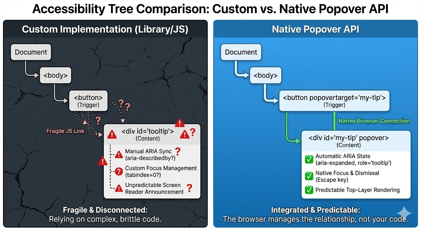
Once I swapped in native popovers, three things changed immediately.
Custom
implementations use fragile JavaScript to connect triggers and
tooltips. The Popover API creates a native browser connection that
assistive technology can trust.
1. The Keyboard “Just Works”
Keyboard support depended on multiple layers lining up correctly: focus had to trigger the tooltip, blur had to hide it, Esc
had to be wired manually, and timing mattered. If you missed one edge
case, the tooltip would either stay open too long or disappear before it
could be read.
With the popover attribute set to auto or manual, the browser takes over the basics: Tab and Shift+Tab behave normally, Esc closes the tooltip every time, and no extra listeners are required.
<divpopover="manual">
Helpful explanation
</div>
What disappeared from my codebase were global keydown handlers, Esc-specific
cleanup logic, and state checks during keyboard navigation. The
keyboard experience stopped being something I had to maintain, and it
became a browser guarantee.
2. Screenreader Predictability
This
was the biggest improvement. Even with careful ARIA work, the behavior
varied, as I outlined earlier. Every small change felt risky. Using a
popover with a proper role looks and feels a lot more stable and
predictable as far as what’s going to happen:
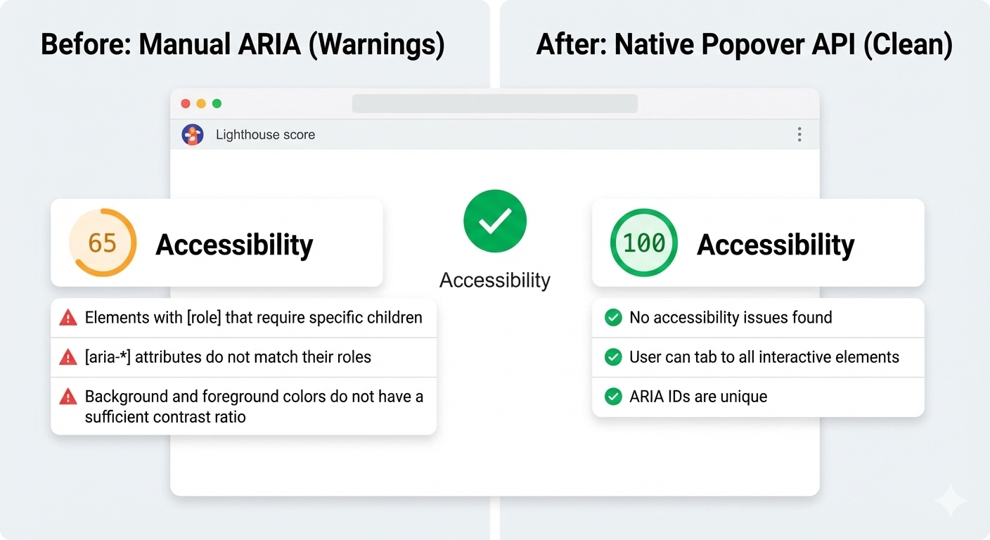
And here’s another win: After the switch, Lighthouse
stopped flagging incorrect ARIA state warnings for the interaction,
largely because there are no longer custom ARIA states for me to
accidentally get wrong.
Before
the migration, Lighthouse flagged accessibility warnings about
incorrect ARIA state management. After switching to the Popover API, the
audit score improved.
3. Focus Management
Focus
used to be fragile. Before, I had rules like: let focus trigger show
tooltip, move focus into tooltip and don’t close, blur trigger when it’s
too close, and close tooltip and restore focus manually. This worked
until it didn’t.
With the Popover API, the browser enforces a
simpler model where focus can more naturally move into the popover.
Closing the popover returns focus to the trigger, and there are no
invisible focus traps or lost focus moments. And I didn’t add focus
restoration code; I removed it.
Tab to focus the trigger, the tooltip appears, press Escape to dismiss, and focus automatically returns to the trigger.
Where The Popover API Maybe Still Isn’t Enough
As
much as the Popover API has simplified my code and improved semantics,
it still has not completely eliminated JavaScript. That’s not totally a
bad thing because what’s changed is that JavaScript is no longer a key
dependency. I am no longer compensating for missing platform behavior
anymore. I am much more focused on intent.
Here are a few places where I could see the API continue to improve.
Tooltip Timing Still Matters
Native
popovers open and close immediately. That is usually the expected
behavior, but not always ideal for what we consider to be tooltips. In
those cases, instant dismissal can feel unstable when you move your
mouse a few pixels too quickly or accidentally brush past the trigger —
the tooltip will flash, then disappear, which can be jarring.
I
want to be able to control that timing and apply delays between hover or
focus and opening the tooltip. So I still add small delays. What
changed was how much of the interaction logic I actually needed to own.
Before, even basic open and close behavior required JavaScript. With the
Popover API, and especially with HTML invoker commands, that
responsibility shifts back to the browser.
<buttonpopovertarget="help-tip"popovertargetaction="show">
?
</button><divid="help-tip"popover="manual"role="tooltip">
This button triggers a helpful tip.
</div>
At
this point, the browser handles invocation, dismissal, and ARIA state
on its own. There’s no JavaScript involved just to make the tooltip
appear or disappear.
JavaScript only comes back in when I want
intentional behavior. In this case, a short delay before hiding the
tooltip, and cancelling if the pointer moves into it. This isn’t about
accessibility fixes. It’s about human behavior.
It’s worth noting that CSS is beginning to explore this space as well. The emerging interest/invoker work introduces ways to express entry and exit delays directly in CSS,
which could remove this small bit of JavaScript entirely. For now, I
still handle it imperatively, but the direction of the platform is
clear.
let hideTimeout;constshow=()=>{clearTimeout(hideTimeout);
tooltip.showPopover();};consthide=()=>{
hideTimeout =setTimeout(()=>{
tooltip.hidePopover();},200);};
The
difference is that this logic stays small and local. It no longer
defines how the tooltip works. It simply refines how it feels.
Hover Intent With Invoker Commands
The
browser does not know why someone hovers over an element or focuses on
it. Was it intentional, or was the pointer just passing through? That
part has always required some judgment.
What changed is where that
logic lives. With invoker commands handling the core open and close
behavior, JavaScript no longer owns the interaction model. It only adds
intent on top of it.
The
platform manages invocation, dismissal, and ARIA state. JavaScript is
only needed when we want behavior that the browser cannot infer, such as
a short delay before hiding or cancelling dismissal if the pointer
moves into the tooltip.
let hideTimeout;constshow=()=>{clearTimeout(hideTimeout);
tooltip.showPopover();};consthide=()=>{
hideTimeout =setTimeout(()=>{
tooltip.hidePopover();},200);};
And
again, CSS is beginning to explore this space with new interaction
primitives, which may reduce the need for custom hover intent code even
further.
Manual Popovers And Focus
For popover="manual",
the browser does not restore focus automatically the way it can for
auto popovers. That responsibility remains explicit. When a tooltip
opens on focus and closes on blur, I return focus deliberately to the
trigger:
tooltip.hidePopover();
trigger.focus();
This is not a limitation but a clear boundary between platform behavior and person intent.
The
Popover API does not magically solve tooltips. It stopped forcing me to
rebuild fragile infrastructure. I still write JavaScript and think
about edge cases, but now I am solving product problems instead of
recreating UI primitives the browser should already understand.
Even
after migrating my tooltips to the Popover API, I did not walk away
thinking libraries were old and obsolete. They have earned their place,
just in more specific situations.
1. Large Or Mature Design Systems
If
you are maintaining a large design system used across multiple teams, a
tooltip library can still make sense because centralized behavior,
documented patterns, and consistent defaults across products. In those
environments, changing the underlying interaction model is not just a
technical decision; it is an organizational one. A well-maintained
library gives teams guardrails, especially when not everyone is deeply
familiar with accessibility nuances.
2. Complex Positioning Requirements
For
most tooltips, native positioning is enough, but if you need collision
detection across nested scroll containers, custom flipping logic, or
fine-grained control over offsets and boundaries, libraries like Floating UI still shine. They are optimized for geometry problems that the platform is only beginning to address.
It is also worth mentioning CSS anchor positioning,
which is starting to cover many of the problems that tooltip libraries
historically solved. Anchors allow a popover to be positioned relative
to a trigger using pure CSS, including viewport-aware placement and edge
flipping. This moves even more responsibility back to the platform
instead of JavaScript.
That said, anchor positioning is still new and there are known issues, although the good news is that they are part of Interop, meaning we can look forward to full and consistent browser support.
For teams that need consistent cross-browser behavior today, libraries
remain the practical choice. The direction is clear that the platform is
steadily absorbing work that once required dedicated positioning
engines.
3. Teams Without Accessibility Experience
This
one matters. If a team does not have strong accessibility knowledge, a
good library can act as a safety net, though it will not guarantee
perfect accessibility. It can, however, prevent the many common
mistakes. The Popover API gives you better defaults, but it still
assumes you know when to add roles, labels, focus management, and
testing. Without that understanding, even native tools can be misused.
And sometimes the right tool is still a library — just no longer by default.
Conc
The
Popover API means that tooltips are no longer something you simulate.
They’re something the browser understands. Opening, closing, keyboard
behavior, Escape handling, and a big chunk of accessibility now come
from the platform itself, not from ad-hoc JavaScript.
That does
not mean tooltip libraries are obsolete because they still make sense
for complex design systems, heavy customization, or legacy constraints,
but the default has shifted. For the first time, the
simplest tooltip can also be the most correct one. If you are curious,
try this experiment: Simply replace just one tooltip in your product
with the Popover API, do not rewrite everything, do not migrate a whole
system, and just pick one and see what disappears from your code.
When
the platform gives you a better primitive, the win is not just fewer
lines of JavaScript, but it is fewer things you have to worry about at
all.
