Icons are capable of enhancing the content that surrounds them, but they have to be self-explanatory for that to happen. We have icons for things we like (a thumbs up), things we can share (a box topped with an up arrow), and even for protection against malicious online attacks (a shield), but what are the options we have for representing “privacy”? The answer is not so straightforward, and Preethi Sam examines the possibilities in this article.
I’ve been on the lookout for a privacy icon and thought I’d bring you along that journey. This project I’ve been working on calls for one, but, honestly, nothing really screams “this means privacy” to me. I did what many of us do when we need inspiration for icons and searched The Noun Project, and perhaps you’ll see exactly what I mean with a small sample of what I found.
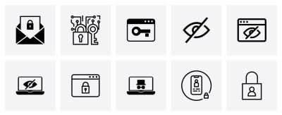
Padlocks, keys, shields, and unsighted eyeballs. There’s a lot of ambiguity here, at best, and certainly no consensus on how to convey “privacy” visually. Any of these could mean several different things. For instance, the eyeball with a line through it is something I often see associated with visibility (or lack thereof), such as hiding and showing a password in an account login context.
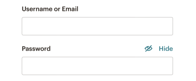
So, that is the journey I am on. Let’s poke at some of the existing options of icons that exist for communicating privacy to see what works and what doesn’t. Maybe you’ll like one of the symbols we’ll stumble across. Or maybe you’re simply curious how I — or someone else — approach a design challenge like this and where the exploration goes.
Is A Specific Icon Even Necessary? #
There are a couple of solid points to be made about whether we need a less ambiguous icon for privacy or if an icon is even needed in the first place.
For example, it’s fair to say that the content surrounding the icon will clarify the meaning. Sure, an eyeball with a line through it can mean several things, but if there’s a “Privacy” label next to it, then does any of this really matter? I think so.
“
In other words, I believe the visual should bolster the content, not the other way around.
Another fair point: text labels are effective on their own and do not need to be enhanced.
I remember a post that Thomas Byttebier wrote back in 2015 that makes this exact case. The clincher is the final paragraph:
“I hope all of this made clear that icons can easily break the [most important characteristic of a good user interface: clarity](https://thomasbyttebier.be/blog/a-clear-interface-is-a-better-interface). So be very careful, and test! And when in doubt, always remember this: the best icon is a text label.”
— Thomas Byttebier
The Nielsen Norman Group also reminds us that a user’s understanding of icons is based on their past experiences. It goes on to say that universally recognized icons are rare and likely exceptions to the rule:
“[…] Most icons continue to be ambiguous to users due to their association with different meanings across various interfaces. This absence of a standard hurts the adoption of an icon over time, as users cannot rely on it having the same functionality every time it is encountered.”
That article also makes several points in support of using icons, so it’s not like a black-and-white or a one-size-fits-all sort of rule we’re subject to. But it does bring us to our next point.
Communicating “Privacy” #
Let’s acknowledge off the bat that “privacy” is a convoluted term and that there is a degree of subjectivity when it comes to interpreting words and visuals. There may be more than one right answer or even different answers depending on the specific context you’re solving for.
In my particular case, the project is calling for a visual for situations when the user’s account is set to “private,” allowing them to be excluded from public-facing interfaces, like a directory of users. It is pretty close to the idea of the eyeball icons in that the user is hidden from view. So, while I can certainly see an argument made in favor of eyeballs with lines through them, there’s still some cognitive reasoning needed to differentiate it from other use cases, like the password protection example we looked at.
The problem is that there is no ironclad standard for how to represent privacy. What I want is something that is as universally recognized as the icons we typically see in a browser’s toolbar. There’s little if any, confusion about what happens when clicking on the Home icon in your browser. It’s the same deal with Refresh (arrow with a circular tail), Search (magnifying glass), and Print (printer).
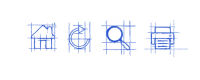
In a world with so many icon repositories, emoji, and illustrations, how is it that there is nothing specifically defined for something as essential on the internet as privacy?
If
there’s no accord over an icon, then we’ll just have to use our best
judgement. Before we look at specific options that are available in the
wild, let’s take a moment to define what we even mean when talking about
“privacy.” A quick define: privacy in DuckDuckGo produces a few meanings pulled from The American Heritage Dictionary:
- The quality or condition of being secluded from the presence or view of others. “I need some privacy to change into my bathing suit.”
- The state of being free from public attention or unsanctioned intrusion. “A person’s right to privacy.”
- A state of being private, or in retirement from the company or from the knowledge or observation of others; seclusion.
Those first two definitions are a good point of reference. It’s about being out of public view to the extent that there’s a sense of freedom to move about without intrusion from other people. We can keep this in mind as we hunt for icons.
The Padlock Icon #
We’re going to start with the icon I most commonly encounter when searching for something related to privacy: the padlock.
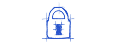
If I were to end my search right this moment and go with whatever’s out there for the icon, I’d grab the padlock. The padlock is good. It’s old, well-established, and quickly recognizable. That said, the reason I want to look beyond the lock is because it represents way too many things but is most widely associated with security and protection. It suggests that someone is locked up or locked out and that all it takes is a key to undo it. There’s nothing closely related to the definitions we’re working with, like seclusion and freedom. It’s more about confinement and being on the outside, looking in.
Relatively speaking, modern online privacy is a recent idea and an umbrella term. It’s not the same as locking up a file or application. In fact, we may not lock something at all and still can claim it is private. Take, for instance, an end-to-end encrypted chat message; it’s not locked with a user password or anything like that. It’s merely secluded from public view, allowing the participants to freely converse with one another.
I need a privacy symbol that doesn’t tie itself to password protection alone. Privacy is not a locked door or window but a closed one. It is not a chained gate but a tall hedge. I’m sure you get the gist.
But like I said before, a padlock is fairly reliable, and if nothing else works out, I’d gladly use it in spite of its closer alignment with security because it is so recognizable.
The Detective Icon #
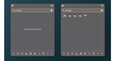
When searching “private” in an emoji picker, a detective is one of the options that come up. Get it, like a “private” detective or “private” eye?
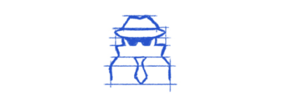
I have mixed feelings about using a detective to convey privacy. One thing I love about it is that “private” is in the descriptor. It’s actually what Chrome uses for its private browsing, or “Incognito” mode.

I knew what this meant when I first saw it. There’s a level of privacy represented here. It’s essentially someone who doesn’t want to be recognized and is obscuring their identity.
My mixed emotions are for a few reasons. First off, why is it that those who have to protect their privacy are the ones who need to look like they are spying on others and cover themselves with hats, sunglasses, and coats? Secondly, the detective is not minimal enough; there is a lot of detail to take in.
When we consider a pictograph, we can’t just consider it in a standalone context. It has to go well with the others in a group setting. Although the detective’s face doesn’t stand out much, it is not as minimal as the others, and that can lead to too many derivatives.
A very minimal icon, like the now-classic (it wasn’t always the case) hamburger menu, gives less leeway for customization, which, in turn, protects that icon from being cosmetically changed into something that it’s not. What if somebody makes a variation of the detective, giving him a straw hat and a Hawaiian shirt? He would look more like a tourist hiding from the sun than someone who’s incognito. Yes, both can be true at the same time, but I don’t want to give him that much credit.
That said, I’ll definitely consider this icon if I were to put together a set of ornate pictographs to be used in an application. This one would be right at home in that context.
The Zorro Mask Icon #
I was going to call it an eye mask, but that gives me a mental picture of people sleeping in airplanes. That term is taken. With some online searching, I found the formal name for this Zorro-esque accessory is called a domino mask.
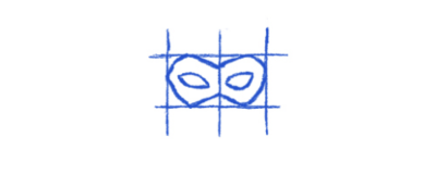
I’m going with the Zorro mask.
I like this icon for two reasons: It’s minimal, and it’s decipherable. It’s like a classy version of the detective, as in it’s not a full-on cover-up. It appears less “shady,” so to speak.
But does the Zorro mask unambiguously mean “privacy”? Although it does distinguish itself from the full-face mask icon that usually represents drama and acting (🎭), its association with theater is not totally non-existent. Mask-related icons have long been the adopted visual for conveying theater. The gap in meaning between privacy and theater is so great that there’s too much room for confusion and for it to appear out of context.
It does, however, have potential. If every designer were to begin employing the Zorro mask to represent privacy in interfaces, then users would learn to associate the mask with privacy just as effectively as a magnifying glass icon is to search.
In the end, though, this journey is not about me trying to guess what works in a perfect world but me in search of the “perfect” privacy pictograph available right now, and I don’t feel like it’s ended with the Zorro mask.
The Shield Icon #
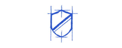
No. Just no.
Here’s why. The shield, just like the lock, is exceptionally well established as a visual for antivirus software or any defense against malicious software. It works extremely well in that context. Any security-related application can proudly don a shield to establish trust in the app’s ability to defend against attacks.
Again, there is no association with “secluded from public view” or “freedom from intrusion” here. Privacy can certainly be a form of defense, but given the other options we’ve seen so far, a shield is not the strongest association we can find.
Some New Ideas #
If we’re striking out with existing icons, then we might consider conceiving our own! It doesn’t hurt to consider new options. I have a few ideas with varying degrees of effectiveness.
The Blurred User Icon #
The idea is that a user is sitting behind some sort of satin texture or frosted glass. That could be a pretty sleek visual for someone who is unrecognizable and able to move about freely without intrusion.
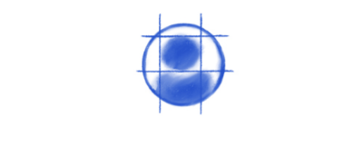
I like the subtlety of this concept. The challenge, though, is two-fold:
- The blurriness could get lost, or worse, distorted, when the icon is applied at a small size.
- Similarly, it might look like a poor, improperly formatted image file that came out pixelated.
This idea has promise, for sure, but clearly (pun intended), not without shortcomings.
The Venetian Blind Icon #
I can also imagine how a set of slatted blinds could be an effective visual for privacy. It blocks things out of view, but not in an act of defense, like the shield, or a locked encasing, such as the padlock.
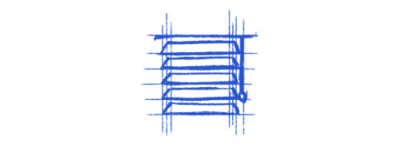
Another thing I really like about this direction is that it communicates the ability to toggle privacy as a setting. Want privacy? Close the blinds and walk freely about your house. Want guests? Lift the blinds and welcome in the daylight!
At the same time, I feel like my attempt or execution suffers from the same fate as the detective icon. While I love the immediate association with privacy, it offers too much visual detail that could easily get lost in translation at a smaller size, just as it does with the detective.
The Picket Fence Icon #
We’ve likened privacy to someone being positioned behind a hedge, so what if we riff on that and attempt something similar: a fence?
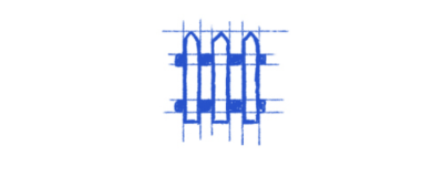
I like this one. For me, it fits the purpose just as well and effectively as the Zorro mask, perhaps better. It’s something that separates (or secludes) two distinct areas that prevent folks from looking in or hopping over. This is definitely a form of privacy.
Thinking back to The Norman Nielsen Group’s assertion that universally recognized icons are a rarity, the only issue I see with the fence is that it is not a well-established symbol. I remember seeing an icon of a castle wall years ago, but I have never seen a fence used in a user interface. So, it would take some conditioning for the fence to make that association.
So, Which One Should I Use? #
We’ve
looked at quite a few options! It’s not like we’ve totally exhausted
our options, either, but we’ve certainly touched on a number of
possibilities while considering some new ideas. I really wish there was
some instantly recognizable visual that screams “privacy” at any size,
whether it’s the largest visual in the interface or a tiny 30px×30px icon. Instead, I feel like everything falls somewhere in the middle of a wide spectrum.
Here’s the spoiler: I chose the Zorro mask. And I chose it for all the reasons we discussed earlier. It’s recognizable, is closely associated with “masking” an identity, and conveys that a user is freely able to move about without intrusion. Is it perfect? No. But I think it’s the best fit given the options we’ve considered.
Deep down, I really wanted to choose the fence icon. It’s the perfect metaphor for privacy, which is an instantly recognizable part of everyday life. But as something that is a new idea and that isn’t in widespread use, I feel it would take more cognitive load to make out what it is conveying than it’s worth — at least for now.
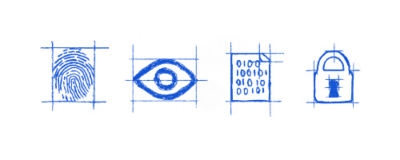
And if neither the Zorro mask nor the fence fit for a given purpose, I’m most likely to choose a pictograph of the exact feature used to provide privacy: encryption, selective visibility, or biometrics. Like, if there’s a set of privacy-related features that needs to be communicated for a product — perhaps for a password manager or the like — it might be beneficial to include a set of icons that can represent those features collectively.
“
Do you know how the “OK” hand sign (👌) is universally understood as a good thing, or how you know how to spot the food court in an airport with a fork and knife icon? That would be the ideal situation. Yet, for contemporary notions, like online privacy, that sort of intuitiveness is more of a luxury.
But with consistency and careful consideration, we can adopt new ideas and help users understand the visual over time. It has to reach a point where the icon is properly enhancing the content rather than the other way around, and that takes a level of commitment and execution that doesn’t happen overnight.
What do you think about my choice? This is merely how I’ve approached the challenge. I shared my thought process and the considerations that influenced my decisions. How would you have approached it, and what would you have decided in the end?
No comments:
Post a Comment