Effective collaboration between designers and developers is vital to creating good user experiences. However, bridging the handoff between design and development with the many tools and workflows available today has its pitfalls. Matthew Mattei introduces you to the Uno Platform. This free and open-source project offers a robust set of productivity boosters, including a design-to-code plugin that fosters better designer/developer collaboration.
Effective collaboration between designers and developers is vital for creating a positive user experience, but bridging the gap between design and code can be challenging at the best of times. The handoff process often leads to communication gaps, inconsistencies, and, most importantly, lost productivity, causing frustration for both designers and developers.
When we try to understand where most of the time is spent building software applications, we will notice that a significant amount of it is lost due to a lack of true collaboration, miscommunication, and no single “source of truth.” As a result, we see designers creating great user experiences for clients and passing on their approved designs with little input from the developers. They then attempt to recreate the designs with their developer tools, resulting in a complicated, cost-intensive process and often unimplementable designs.
Developers and integrators are supposed to closely inspect a design and try to analyze all there is to it: the margins, spacing, alignments, the types of controls, and the different visual states that the user interface might go through (a loading state, a partial state, an error state, and so on) during the interactions with it, and then try to figure out how to write the code for this interface. Traditionally, this is the design handoff process and has long become the norm.
We at Uno Platform believe that a better, more pragmatic approach must exist. So, we focused on improving the workflow and adding the option to generate the code for the user interface straight from the design while allowing developers to build upon the generated code’s foundation and further expand it.
“When designers are fully satisfied with their designs, they create a document with all the details and digital assets required for the development team to bring the product to life. This is the design handoff process.”
— UX Design Institute, “How to create a design handoff for developers”
Let’s look at some of the problems associated with the handoff process and how the Uno Platform for Figma Plugin may help alleviate the pitfalls traditionally seen in this process.
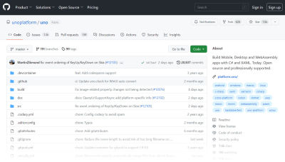
Note: The Uno Platform Plugin for Figma is free, so if you’d like to try it while reading this article, you can install it right away. Uno Platform is a developer productivity platform that enables the creation of native mobile, web, desktop, and embedded apps using a single codebase. As part of its comprehensive tooling, Uno Platform offers the Uno Figma plugin, enabling easy translation of designs to code. (While Uno Platform is free and open-source, the plugin itself is free but not open-source.) If you want to explore the code or contribute to the Uno project, please visit the Uno Platform GitHub repository.
Unifying Design And Development #
“Translating” design elements from Figma to code is time-consuming and prone to errors. Too often, projects are abandoned at handoff; developers and designers may opt to change a specific requirement in their designs but only sometimes communicate these changes effectively. Once designers pass their work files and documentation to the development team, they are on to the next project.
“
Designers and developers should not work in a waterfall system. Instead, they should have their own sets of specifications and requirements evolving in parallel. Developers usually work from a backlog, which is rarely used by designers whose point of view is generally a much wider lens, not well represented in granular backlog-type structures.
“The waterfall model is a linear, sequential approach to the software development lifecycle (SDLC) that is popular in software engineering and product development. The waterfall model uses a logical progression of SDLC steps for a project, similar to the direction in which water flows over the edge of a cliff. It sets distinct endpoints (or goals) for each phase of development. Those endpoints (goals) can’t be revisited after their completion.”
— Ben Lutkevich, “What is the waterfall model?”
When managing the dynamic aspect of the workflow — it’s not a waterfall type where you hand off the entire design project when it’s completely done — you need to constantly communicate the changes (colors, assets, layouts, typography, interactions, and so on). The more designers work on an interface, the more they have to effectively communicate the changes and details to the developers — making detailed documentation does not always suffice.
Another important point should be mentioned. Individual developers will not always have an extensive picture overview of what they are working on as their work is broken down into a set of granular tasks, which may lead to unnecessary rework, double work (that needs to be QA’ed multiple times), or a developer asking for changes that may not benefit the project as a whole. At the same time, designers often have the opposite issue where they constantly move vast chunks of layouts, which sometimes leads them to miss states and assets necessary to complete the details of a specific interaction. Even then, when the design is ready, it still requires a lot of implementation effort on the developers’ part once they start working inside their integrated development environment (IDE).
Choosing the Right Tools for Your Team #
In the past, designers and developers have often used different platforms and workflows, which led to miscommunication and delays in the handoff process. Nowadays, software development teams can benefit from the availability of many new technologies and tools, and by leveraging them, they can work together more efficiently, reducing the burden on both parties and ultimately delivering better results for their clients and customers. Figma and Uno Platform are some of those new available tools.
Why Figma? #
Uno Platform is one of many tools trying to solve the handoff issues for the designers and developers and improve their collaboration efficiency. In fact, many platforms are tackling every aspect of the workflow for every programming language.

A significant factor in choosing our current development path lies in the belief that Figma outperforms the Sketch + Zeplin combination (and not only) because of its platform-agnostic nature. Being a web-based tool, Figma is more universal, while Sketch is limited to MacOS, and sharing designs with non-Mac developers necessitates using third-party software. Figma offers an all-in-one solution, making it a more convenient option.
In addition, Figma now also supports plugins, many of them assisting with the handoff process specifically. For example, Rogie King recently launched a plugin “Clippy — add attachments” that allows attachments to your Figma files, which is very useful during the handoff process. Of course, there are many others.
This and other factors “weighed” us towards Figma Design. And we aren’t alone; others have picked up Figma as their key design tool after doing some research and then trying things in practice.
“Comparing the must-haves against the features of a list of possible design apps we compiled (including Sketch, Axure RP, Framer, and more), Figma came out as the clear forerunner. We decided to proceed with a short-term trial to test Figma’s suitability, and we haven’t looked back since. It met all of our key feature requirements but surprised us with a lot of other things along the way.”
— Simon Harper, “Why we chose Figma as our primary design tool”
Working with the Uno Figma Plugin #
1: Get Started with Uno Platform for Figma Plugin #
Uno for Figma presents a significant advantage for teams that rely on Figma as their primary design tool.
“
Getting started with the Uno Figma plugin is a straightforward process:
- Install the Uno Platform (Figma to C# or XAML) plugin.
- Open the Uno Platform Material Toolkit design file available from the Figma Community.
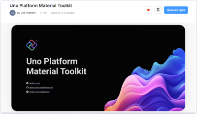
With the Uno Material Toolkit, you no longer need to design many of the components from scratch as the toolkit provides UI (user interface) controls designed specifically for multi-platform, responsive applications.
Note: To use the plugin, you must create your design inside the Uno Material Toolkit Figma file, using its components. Without it, the plugin won’t be able to generate any output, making it incompatible with existing Figma designs.
2: Setting Up Your Design #
Once you have installed the Uno Platform for Figma plugin and opened the Material Toolkit design file, you can use the “Getting Started” page in the file layers to set up your design. The purpose of this page is to simplify the process of defining your application’s theme, colors, and font styles.
You can also use DSP Tooling in Uno.Material for Uno Platform applications. This feature has been one of the top requests from the Uno Platform community, and it is now available both as a package and as part of the App Template Wizard.
If you’re unfamiliar with DSP (Design System Packages), it’s essentially a repository of design assets, including icons, buttons, and other UI elements, accompanied by JSON files containing design system information. With a DSP, you can craft a personalized theme that aligns with your brand, effortlessly integrate it into your Uno Platform application through the Figma plugin, and implement theme changes across the entire user interface of your application.
The ability to import custom Design System Packages (DSPs) is a significant development for Uno Platform. With this feature, designers can create and manage their own design systems, which can be shared across projects and teams. This not only saves time but also ensures consistency across all design work. Additionally, it allows designers to maintain control over the design assets, making it easier to make updates and changes as needed.
Note: The “Getting Started” page offers step-by-step instructions for modifying the colors and fonts of the user interface, including previewing your overall theme. While you can modify these later, I’d recommend doing this right at the beginning of your project for better organization.

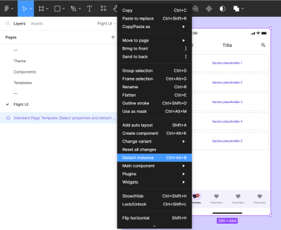
Afterward, create a new page and ensure that you begin by using the Standard Page Template provided in the Uno Toolkit components to start the design of your application. It’s essential to remember that you will have to detach the instance from the template to utilize it.
3: Start Creating The Design #
Most Toolkit Components have variants that will act as time savers, allowing a single component to contain its various states and variations, with specific attributes that you may toggle on and off.
For example, button components have a Leading Icon variant so you can use the same element with or without icons throughout the design.
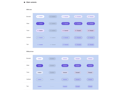
The Uno Toolkit provides a comprehensive library of pre-built components and templates that come with the appropriate layer structures to generate XAML (eXtensible Application Markup Language is Microsoft’s variant of XML for describing a graphic user interface) and C# markup and allows designers to preview their designs using the Uno plugin. This helps synchronize design and development efforts, maintain project consistency, and optimize code output. Furthermore, these components can be reused, making creating and managing consistent designs across multiple projects easier.
4: Live Preview Your App #
The Previewer in the Uno Platform is a powerful tool that enables designers to troubleshoot their designs and catch issues before the handoff process starts, avoiding redundancy in communications with developers. It provides a live interactive preview of the translated look, behavior, and code of the application’s design, including all styling and layout properties. Designers can interact with their design as if it is a running app, scrolling through content and testing components to see how they behave.
To preview the designed user interface, follow these steps:
- In Figma, select the screen you want to preview.
- Right-click the screen → Plugins → Uno Platform (Figma to C# or XAML).
- Once the plugin has launched, select the Preview tab.
- Press the Refresh button.
The Export tab view allows you to see the C# or XAML code separately, saving you the effort of writing the code yourself. The generated code uses Uno Toolkit components, which are provided with comprehensive developer documentation. Moreover, you are skipping the handoff where developers must inspect the assets to extract the visual specifications, which usually requires more communication efforts and multiple rounds of back-and-forth design “polishing.”
5: Generate and Export your Code #
Relying on a third-party tool to generate the code automatically may cause some initial reservations, but it can significantly improve workflow efficiency and save the designers’ and developers’ time. By “translating” the design to code directly from the Figma file, the developers can ensure that the application looks and behaves as intended, and designers can ensure that their designs remain pixel-perfect and provide the interaction/UX experience as they were originally intended.
Uno Platform uses C# and XAML as languages of choice. C# markup and XAML provide a wide range of features, such as support for animations, styles, and templates. In addition, XAML is generally perceived to be providing a good separation between UI styling and business logic, allowing the developers to focus more on high-level business logic during the development process while reducing the amount of code they need to write as XAML can be reused across Windows, iOS, Android, WebAssembly, macOS, and Linux. This level of precision ensures that the user experience is consistent throughout the application (regardless of the software platform being used), saves time, and reduces the likelihood of human error, even for the most experienced developers.
“XAML is a declarative markup language which simplifies creating user interfaces for .NET apps. You can create visible UI elements in the declarative XAML markup and then separate the UI definition from the run-time logic by using code-behind files that are joined to the markup through partial class definitions. XAML directly represents the instantiation of objects in a specific set of backing types defined in assemblies and enables a workflow where separate parties can work on the UI and the logic of an app, using potentially different tools.”
— XAML overview (Microsoft Docs)
How can you leverage the generated code from the Uno Figma plugin?
The Export tab in the Uno Figma plugin allows you to inspect and export the generated code — the code can be later used in your preferred IDE and by the developers. Using the top-left dropdown menu, you can alternate between C#, XAML,Color, and Fonts Override File to export. Additionally, the contextual controls at the bottom of the tab allow you to set the view type and refresh the view.
To generate and export the code, copy the Export tab’s content to the clipboard and paste it into your preferred IDE tool. As a designer, you do not have to do this; your development team can use the plugin (even without Figma editor role fees) using Dev Mode to access the code directly from your design.
To do this, follow these steps:
- Select the page or component that you want to inspect.
- From the Plugins menu in Figma, choose Uno Platform (Figma to C# or XAML).
- Select the Export tab.
- Click the Refresh button located at the bottom of the tab.
- Optionally, you can change the left-top dropdown to other files to view the theme’s colors, fonts, and Localization files. You can also export each of these files into your project. For Color Override File, copy the generated code into your application’s “Color Override” file. (This is documented in detail in the “Uno Material library → Customize Color Palette” help page.)
6: Build in Visual Studio #
Moving the generated code (C# markup and XAML) to Visual Studio is just as easy when your design is good enough to go into the development stage.
If you create a new project using the Uno Solution Template Wizard for Visual Studio, this user-friendly tool will automatically configure your project to your exact preferences and will allow you to use as many (or as few) of the Uno Platform features as you’d like, including the Uno.Material theme, which is made for designing applications that have a great look yet don’t feel too standard. Alternatively, you can use the Fluent theme, the default theme for WinUI-based applications.
Note: The Toolkit file’s default theme is Material. However, since Uno Platform supports overrides, you have the flexibility to customize your components and achieve a Fluent theme or any other style you like.
Practical Exercise: Flight App UI Tutorial #
Let’s review together a detailed practical example!
In this mini-tutorial, I will guide you step-by-step through the process of effectively using Uno Toolkit components and mastering some of the capabilities of the Uno Figma plugin. By the end of the tutorial, you will have the tools and knowledge needed for creating elegant interfaces and how to generate C# Markup and XAML, which could be extended further by you or your team.
Getting Started With The Tutorial: First Steps #
If you’re new to using the Uno Platform for Figma plugin, the first step is to install it from the Figma community. After downloading the plugin, proceed with the following steps:
- Navigate to the Uno Material Toolkit File in the Figma community and select Open in Figma to start a new project.
- Setting up your project theme first is optional but recommended. You can set your desired theme from the Getting Started page (included in the file) or import a DSP (Design System Package) file to quickly transform your theme.
- Create a new page. Within the Resources tab of the menu, under Components, find and select the “Standard Page Template.”
- Right-click on the template and select Detach the instance.
These are the initial steps for all new projects using the Uno Platform for Figma plugin and Uno Material Toolkit — not only the steps for this tutorial. This workflow will set you on the right path to creating various mobile app designs effectively.
Designing With Uno Material Toolkit #
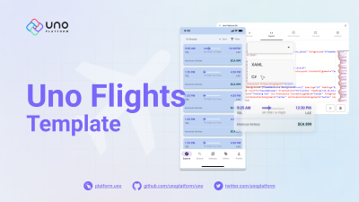
You can follow along here with the Uno Flights file template, which you can use for reference. Please note that when building your UI design, you should only use components that are part of the material toolkit file. Refer to the components page to see the list of available components.
Step 1: Search Results, Sort, And Filter #
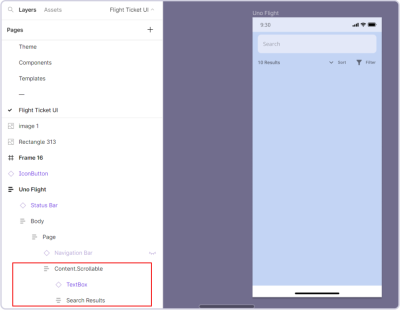
First, implement the search results and the Sort and Filter action buttons by following these steps:
- Add a TextBox and change the placeholder text.
- In the TextBox properties, toggle on a leading/trailing icon. (optional)
- Add Text to display the number of results and the associated text. (Use Shift + A to add them to an Auto Layout.)
- Add an IconButton (use the components provided by the Material Toolkit) and swap the default icon to a Filter icon. Include accompanying Text for the icon, and group them within a frame with a horizontal Auto Layout.
- Repeat the previous step for the filter action, adding an IconButton with a filter icon accompanied by Text and placing them in an Auto Layout.
- Nest both actions within another Auto Layout.
- Finally, group the three sections (number of results, sort action, and filter action) into an Auto Layout.
- Add the SearchBox and your final Layout and nest them inside Content.Scrollable.
By following these steps, you should see a result similar to the example below:
Step 2: Flight Information #
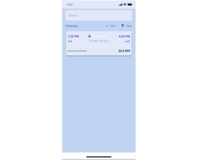
The Flight Itinerary block can be divided into three sections:

- Flight Times and the ProgressBar are included in the first Auto Layout.
- Airport and Flight Information are organized in a separate Auto Layout.
- Airline Information and Flight Costs are presented in a third Auto Layout.
Flight Times and ProgressBar
- Insert two Text elements for arrival and departure times.
- Locate the ProgressBar component in the Resources tab and add it between the two times created.
- Group the three components (arrival time, ProgressBar, departure time) into an Auto Layout.
- Add an icon and swap the instance with a plane icon.
- Select the absolute position and place the plane icon at the beginning of the ProgressBar.
Flight Info
- Insert Text for your flight time and flight status.
- Apply an Auto Layout to organize them and set it to Fill.
- Proceed to add Text for the Airport initials.
- Combine the two Texts and the previously created Auto Layout into a new horizontal Auto Layout.
Airline Information
- Add the necessary Text for Airline Information and pricing.
- Select both Text elements and apply an Auto Layout to them.
- Set the frame of the Auto Layout to Fill.
- Adjust the horizontal gap as desired.
Select the three sections you want to modify:
- Add a new Auto Layout.
- Apply a Fill color to the new layout.
- Adjust the vertical and horizontal spacing according to your preference.
- Move your component to the Standard Page Template by dragging it below the content.Scrollable layer.
Step 3. Bottom TabBar #
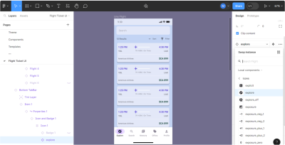
The Bottom TabBar is relatively simple to modify and is part of the Standard Page Template. To complete this section:
- Select each item from the Bottom TabBar.
- Expand it to the lowest icon layer.
- In the Design tab, replace the current instance with the appropriate one.
- Next, select the associated Text and update it to match the corresponding menu item.
Step 4. Preview, Export, And Transition From Figma To Visual Studio #
Once the user interface design is finalized in Figma, the Uno Platform Plugin enables us to render and preview our application with the click of a button. Within the Previewer, you can interact with the components, such as clicking the buttons, scrolling, toggling various functionalities, and so on.
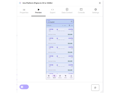
After previewing the app, we can examine the XAML code generated in the Export tab.
Open the Uno Figma Plugin (right-click the screen → Plugins → Uno Platform (Figma to C# or XAML).
For XAML
- You can change your namespace in the first tab (Properties) under Application (optional).
- Go to the Export tab and select Copy to Clipboard (bottom right button).
- Open Visual Studio and create a new project using the Uno App Template Wizard (this is where you will choose between using XAML or C# Markup for your user interface).
- Open your
MainPage.xamlfile, remove the existing code, and paste your exported code from the Uno Figma Plugin. - Change your
x:classandxmlns:localnamespaces. - Export the color override file and paste it into your
ColorPaletteOverride.xaml.
For C# Markup
- Go to the Export tab and select all contents from the line after
thisto the semicolon;at the end. (See the screenshot below.) - Copy the selected code to the clipboard (Ctrl/Cmd + C on Win/Mac).
- In Visual Studio, create a new project using the Uno App Template Wizard. (This is where you will choose between using XAML or C# Markup for your user interface.)
- Open
MainPage.csand replace all the Page contents with the copied code. - To set the appropriate font size for all buttons, access the
MaterialFontsOverride.csfile in theStylefolder. Go to the Figma Plugin, and in the Export tab, select Fonts Override File from the dropdown menu. Copy the content in the ResourceDictionary and replace it in yourMaterialFontsOverride.cs.
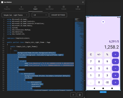
Here’s an example of the generated XAML (and also C#) code that you can import into Microsoft Visual Studio:
⏬ flightXAML.txt (38 kB)
⏬ flightCsharp.txt (56 kB)
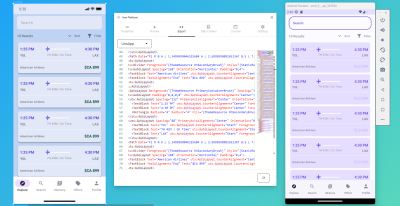
Conclusion #
Harmonizing design and development is no easy task, and the nuances between teams make it so there is no one-size-fits-all solution. However, by focusing on the areas that most often affect productivity, the Uno Platform for Figma tool helps enhance designer-developer workflows. It facilitates the efficient creation of high-fidelity designs, interactive prototypes, and the export of responsive code, making the entire process more efficient.
The examples provided in the article primarily showcase working with mobile design versions. However, there are no limitations in the document or the generated code that restrict you from creating suitable versions for desktops, laptops, tablets, and just the world of the World Wide Web. Specify the desired resolutions and responsive elements (and how they should behave), and the designs you create should be easily adaptable across different platforms and screen sizes.
Further Reading #
- “Five is for 5X productivity. Announcing Uno Platform 5.0,” (Uno Platform )
This article provides an overview of all the new features available in the Uno Platform, including the new Figma to C# Markup plugin feature. - “Intro to Figma for .NET Developers,” (Uno Platform )
This article provides an overview of Figma and its features and how .NET developers can use it together with the Uno Platform to streamline their design-to-development workflows. - “Uno Platform 5.0 — Figma plugin, C# Markup, and Hot Reload showcase via Uno Tube Player sample app,” (YouTube)
This is a short video highlight for Uno Platform v. 5.0, edited from the following steps in the Tube Player workshop (this is a Figma Design file which is part of the Tube Player workshop and is tailored to .NET developers specifically). - “Uno Platform for Figma — Uno Flight speed build,” (YouTube)
A short video that shows the making of the Uno Flight app UI compressed into only a minute and a half. - “Building a Login Page with Uno Platform and Figma,” (Uno Platform)
The Uno Platform’s plugin and toolkit offer a large library of ready-to-use components, allowing developers and designers to take advantage of a set of higher-level user interface controls designed specifically for multi-platform, responsive applications. - “Building a Profile Page with Uno Platform for Figma,” (Uno Platform)
In this tutorial, you will learn how to build a completely functional Profile page using Figma and Uno Platform and how to generate responsive and extendable XAML code. - “Replicating Pet Adoption UI with Uno Platform and Figma,” (Uno Platform)
This tutorial will walk you through creating a Pet Adopt user interface mobile screen and exporting your Figma designs into code, including setting up your Figma file and designing using Uno Material Toolkit components. - “From Figma to Visual Studio — Adding Back-End Logic to Goodreads App,” (Uno Platform)
The Uno Platform has an XAML tab (which houses the generated code for the page you created in Figma) and a Themes tab (which houses the Resource Dictionary for the page you created). This tutorial contains a working Goodreads sample and provides many details as to using the XAML and Themes tabs. - “Replicating a Dating App UI with .NET, Uno Platform and Figma,” (Uno Platform)
In this tutorial, you’ll learn how to use Uno Platform to create a dating app user interface, covering in detail various sections and components of the interface; at the end, you’ll also be able to export the design into Visual Studio Code. - “Getting Started with Uno Toolkit,” (Uno Platform)
Detailed developer documentation pages for working with Uno Platform. - “The 12 best IDEs for programming,” Franklin Okeke
To keep up with the fast pace of emerging technologies, there has been an increasing demand for IDEs among software development companies. We will explore the 12 best IDEs that currently offer valuable solutions to programmers. - “Why we chose Figma as our primary design tool,” Simon Harper (Purplebricks Digital)
Comparing the must-haves against the features of a list of possible design apps we compiled (including Sketch, Axure RP, Framer, and more), Figma came out as the clear forerunner. It met all of our key feature requirements but surprised us with a lot of other things along the way. - “Why we switched to Figma as the primary design tool at Zomato,” Vijay Verma
Before Figma, several other tools were used to facilitate the exchange of design mockups and updates; after Figma, the need to use other tools and services was reduced as everything comes in one single package. - “The Best Handoff Is No Handoff,” Vitaly Friedman (Smashing Magazine)
Design handoffs are often inefficient and painful; they cause frustration, friction, and a lot of back and forth. Can we avoid them altogether? This article discusses in detail the “No Handoff” fluid model, where product and engineering teams work on the product iteratively all the time, with functional prototyping being the central method of working together. - “Designing A Better Design Handoff File In Figma,” Ben Shih (Smashing Magazine)
Creating an effective handoff process from design to development is a critical step in any product development cycle. This article shares many practical tips to enhance the handoff process between design and development in product development, with guidelines for effective communication, documentation, design details, version control, and plugin usage. - “How I use Sketch with Zeplin to Design and Specify Apps,” Marc Decerle
Sketch is a very powerful tool in combination with Zeplin. In this article, the author describes how he organizes his Sketch documents and how he uses Sketch in conjunction with Zeplin. - Design System Package (DSP)
This document describes the Design System Package structure, including details on how each internal file or folder should be used.
No comments:
Post a Comment