Design systems can be of immense help, but failure to adopt them invalidates the hard work that goes into building the thing in the first place! In this two-part series of articles, Luis shares his experience with design systems and how you can overcome the potential pitfalls, starting from how to make designers on your team adopt the complex and well-built system that you created to what are the best naming conventions and how to handle the auto-layout of components, indexing/search, and more.
Design systems are on the tip of every designer’s tongue, but the narrative in the industry mainly focuses on why you need a design system and its importance rather than the reality of endless maintenance and internal politics. The truth is that design teams spend years creating these systems only to find out that few people adhere to the guidelines or stay within the “guardrails.”
I’ve been fortunate with Figma to host and run workshops at various conferences across Europe that center on one very specific aspect of product design: components.
I love components! They are the start, the end, the hair-tearing-out middle, the “building blocks,” and the foundation — the everything within every great product design organization.
The reason they are so important to me is because, firstly, who doesn’t like efficiency? Second, and more importantly, they are proven to increase the time-to-delivery from design to engineering, and here comes a buzzword — they offer a route to return on investment (ROI) within design teams. This is becoming increasingly important in a tough hiring market. So what’s not to love?
Note: You may be interested in watching Matt Gottschalk’s talk from Figma’s Config 2023 conference, which was dedicated to the topic of ROI within small design teams. The talk explored how small design teams can use design systems and design operations to help designers have the right environment for them to deliver better, more impactful results.
Well, let me tell you a little secret: components are hard, but not actually hard to create. In fact, it’s arguably too easy to create a component on the design side. Have you ever seen a local component in your design files, one that a member of your team created to speed up their ideation and workflow? And speaking of speed…
“It’s a signature trait of design system teams to believe they’re moving too slow and must move faster. Actually, successful design systems move more slowly than the products they support.”
— Josh Clark, “Ship Faster by Building Design Systems Slower”
There’s nothing stopping anyone from creating more components outside of your design system whenever they want. Nothing even stops people from creating components that are identical to the ones you already have! Don’t worry, we’ve all been there.
“
I would personally prefer not to use phrasings such as “good” or “bad” components because, as curious creatives, we all know that there’s no such thing as “one size fits them all” when it comes to design. That beautiful user interface kit you paid $99 for? It wasn’t designed for your business, so you have to recreate or manipulate a lot of the work to make it fit. That glorious ReactJS calendar widget your engineers found? It turns out it’s not accessible within screen readers, and you have to remodel it and then go through another round of quality assurance (QA) testing anyway.
Components are inherently part of a system that spans design and engineering — and often brand and marketing, too. We, as designers, are seemingly on a mission to call this a design system, but I’d much prefer for us as an industry to steer away from applying the word “design” to activities that are cross-functional by nature. It will improve collaboration and help to foster a culture of shared responsibility. It’s important to remind ourselves that everyone is a problem solver, regardless of job title! Maybe we could agree to call them simply… systems? (Let’s maybe not argue over that just yet; we’ve only just begun.)
As proof of this, a designer can help craft an API (application programming interface) structure, and an engineer can help fine-tune a user flow for a complex form. This is collaboration in its purest form and something we shouldn’t try to make harder by applying one discipline’s area as a stamp on cross-functional output.
Additionally, with the inherent flexibility of our design tools, we’re often setting ourselves up for failure with our creations.
Ultimately, all we want are components which are:
- Flexible,
- Repeatable,
- Adoptable,
- Indexable,
- Logical,
- Specific.
For now, let’s call this the FRAILS framework.
Note: You’re probably thinking: “flexible” and “specific,” aren’t they a bit conflicting? And you’d be kind of right. However, this is one of the goals of almost every design team I’ve spoken to. There is a world where both flexible and specific can live side by side, but the challenge we face is the need to decide on a model of a system that is either flexible or rigid or lives in a “halfway house.” (I’ll explain a little later how we can tackle either of these approaches.)
In this article (Part 1), we’ll take the first two points, Flexible and Repeatable, and we will look at building systems with these goals in mind. Ready? Let’s go.
Flexible #
When asked to define “consumable components,” I often find that the most common answer by the design teams is “a component that is flexible.” This can mean a few things!
Flexible: The Component Instances Can Be Modified #
When planning for scale, the easiest approach (from a maintenance perspective) is to create a small batch of components that can be modified infinitely at the instance level. This makes a lot of sense! Reusability — or don’t repeat yourself (DRY) — is a key concept in software engineering. Why wouldn’t we want to borrow from this established norm?
“Don’t repeat yourself (DRY) is a principle of software development aimed at reducing repetition of information that is likely to change, replacing it with abstractions that are less likely to change. The DRY principle is stated as: “Every piece of knowledge must have a single, unambiguous, authoritative representation within a system.”
— “Don’t repeat yourself” (Wikipedia)
But there is a side effect to flexibility, and that is when something is modified to a level that you, the maintainer, don’t want. As I said earlier, it’s incredibly easy to make changes in design software, which can sometimes mean you are setting components up to be too flexible.
As an example, let’s take the negative (warning) state of your form input fields, the one often with a nice red border if some data is missing or incorrectly entered into them. What happens if a designer on your team changes that to a rather nice green color? This is flexibility in its core, and we can accidentally promote this by creating generic components that require customization with every usage.
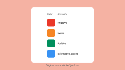
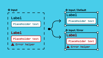
Like in most things, a solution to this is education and communication. If you aren’t comfortable with modifications on styles, you may want to set up your components in such a way as to indicate this. For example, using emojis in layers is the quickest way to say, “Hey, please don’t edit this!” or “You can edit this!”.
Or, consider shipping out components that are named for intention. Would separating components entirely (components named for intention) work better? An Input/Error, rather than a customizable Input?
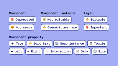
When considering the emoji name approach, here’s a set that I’ve relied on in the past:
- Components
- 🚨 Deprecated
- 🟠 Not ready
- Component instances
- 🔐️ Not editable
- ✍️ Overwritten name
- Layers
- ✍️ Editable
- 🚨 Important
- Component properties
- ◈ Type
- ✍️ Edit text
- 🔁️ Swap instance
- 🔘 Toggle
- ←️ Left
- →️ Right
- 🖱 Interaction
- 📈 Data
- ↔️ Size
Flexible: Responsive Design #
Ahh, our old friend, responsive design (RWD)!
“The control which designers know in the print medium, and often desire in the web medium, is simply a function of the limitation of the printed page. We should embrace the fact that the web doesn’t have the same constraints and design for this flexibility. But first, we must accept the ebb and flow of things.”
— John Allsopp, “A Dao of Web Design”
As it stands, there is no native solution within Figma to create fully responsive components. What I mean by “fully responsive” is that layout directions and contents change according to their breakpoint.
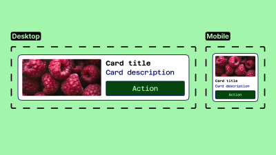
Here’s an example:

Note: It is technically possible to achieve this example now with auto layout wrapping and min/max widths on your elements, but this does not mean that you can build fully responsive components. Instead, you will likely end up in a magic numbers soup with a lengthy list of variables for your min and max widths!
With this limitation in mind, we may want to reconsider goals around responsive design within our component libraries. This may take the form of adapting their structure by introducing… more components! Do we want to be able to ship one component that changes from mobile all the way up to the desktop, or would it be easier to use, find, and customize separate components for each distinct breakpoint?
“Despite the fun sounding name, magic numbers are a bad thing. It is an old school term for ‘unnamed numerical constant,’ as in, just some numbers put into the code that are probably vital to things working correctly but are very difficult for anyone not intimately familiar with the code to understand what they are for. Magic numbers in CSS refer to values which ‘work’ under some circumstances but are frail and prone to break when those circumstances change.”
— Chris Coyier, “Magic Numbers in CSS”
Never be hesitant to create more components if there is a likelihood that adoption will increase.
Then, what does this look like within Figma? We have a few options, but first, we need to ask ourselves a few questions:
- Does the team design for various screen sizes/dimensions? E.g., mobile and desktop web.
- Does the development team build for a specific platform/screen size(s)? E.g., an iOS team.
- Do you build apps aligning with native style guides? E.g., Material Design.
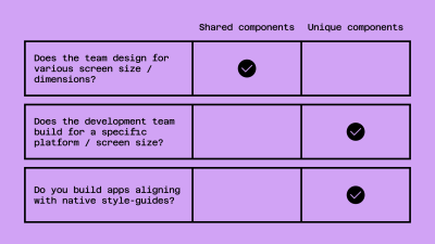
The answers to these questions will help us determine how we should structure our components and, more importantly, what our library structures will look like.
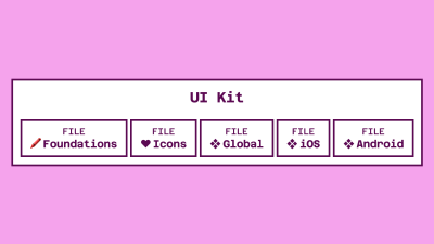
If the answer to questions 1. (Design for various screen sizes/dimensions?) and 2. (build for a specific platform/screen sizes?) is “No,” and to 3. (Build apps aligning with native style guides?) is “Yes,” to me, this means that we should split out components into separate component library files. We don’t want to enter into a world where an iOS component is accidentally added to a web design and pushed to production! This becomes increasingly common if we share component naming conventions across different platforms.
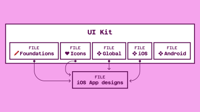
If the answer to question 3. (“Do we build native apps, using their design guidelines?”) is “Yes,” this definitely requires a separate component library for the platform-specific styles or components. You may want to investigate an option where you have a global set of styles and components used on every platform and then a more localized set for when designing on your native platforms.
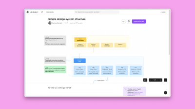
The example below, with an example mapping of library files for an iOS design project, is inspired by my Figma community file (“Simple design system structure”), which I created to help you set up your design system more easily across different platforms.
→ Get “Simple design system structure” [FigJam file / Luis Ouriach, CC-BY license]
If you are designing across multiple platforms in a device-agnostic manner, you can bring components a lot closer together! If you aren’t currently working with an agnostic codebase, it might be worth checking Mitosis (“Write components once, run everywhere”).
A common challenge among development teams is using the same language; while one sub-team may be using Vue, another perhaps is using React, causing redundant work and forcing you to create shared components twice. In “Create reusable components with Mitosis and Builder.io,” Alex Merced explores in detail Mitosis, a free tool developed under the MIT license. Mitosis can compile code to standard JavaScript code in addition to frameworks and libraries such as Angular, React, and Vue, allowing you to create reusable components with more ease and speed.
Using A Variant #
This may look like a variant set, with a specific property for device/size/platform added. For example,
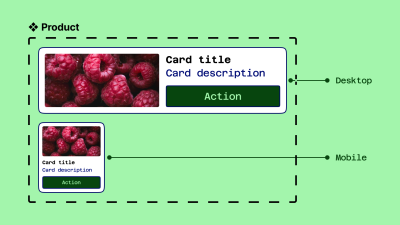
As you can imagine, as those components increase in complexity (with different states added, for example), this can become unwieldy. Combining them into the same variant is useful for a smaller system, but across larger teams, I would recommend splitting them up.
Using Sections #
You could consider grouping your components into different sections for each platform/device breakpoint. The approach would be the following:
- Use pages within Figma libraries to organize components.
- Within the pages, group each breakpoint into a section. This is titled by the breakpoint.
- Name the component by its semantic, discoverable name.
There is a caveat here! I’m sure you’re wondering: “But couldn’t variables handle these breakpoints, removing the need for different components?” The answer, as always, is that it’s down to your specific implementation and adoption of the system.
If your designer and developer colleagues are comfortable working within the variable workflow, you may be able to consolidate them! If not, we may be better served with many components.
Additionally, the split-component approach allows you to handle components in a structurally different manner across these different sizes — something that is not currently possible with variants.
Auto Layout #
Regardless of how we organize the components, responsiveness can be pushed very far with the use of auto layout at every level of our screens. Although it can be intimidating at first, the auto layout makes components work similarly to how they would be structured in HTML and CSS, moving design and engineering teams closer together.
As mentioned before, we can get very close to responsive design with Figma by using variables and auto layout, but should your layout structure or typography styles differ significantly between each breakpoint, you may be better off maintaining multiple components instead of one hyper-flexible one.
Repeatable #
In their essence, every component is repeatable. The challenge with how reusable a component is arises when we start to think about its specificity. Specificity normally means the following:
- Textual content: labels, titles, or text content generally.
- Imagery/media: cropping, aspect ratios, style.
- Arrangement: the order of elements within components.
Textual Content #
Overrides for text are often a large hurdle to jump over when starting your design system journey, but there are two main things we can do to reduce potential losses and maintain override preservation within our instances.
“Override preservation” is quite a mouthful, so let’s define that first.
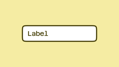
Let’s take a simple example: a generic input field. In your main component, you’re likely to have a text label within it with the text, e.g., “Label.” Generics are useful! It means that we can swap this content to be specific to our needs at an instance level.
Now, let’s say you insert this component into your design and swap that “Label” content for a label that reads “Email address.” This is our override; so far, so good.
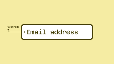
However, if you then decide to change your main component structurally, you put that label at risk of losing its overrides. As an example of a structural change, your original “Placeholder” now becomes a “Label” above the input field. Instinctively, this may mean creating a new text element for the label. But! Should you try this, you are losing the mapping between your original text element and the new one.
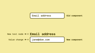
This could potentially break your existing signed-off designs. Even though this seems like it could work — layer names are a great way to preserve overrides — they are separate elements, and Figma won’t know how to transfer that override to the new element.
At this point, introducing component properties can save us from this trouble. I’d recommend adding a text component property to all of your text layers in order to try to prevent any loss of data across the design files in which we are using the component.
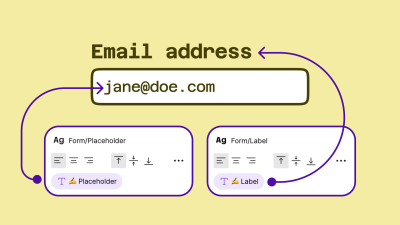
As I showed before, I find adding a writing emoji (✍️) to the property name is a nice way to keep our component properties panel as scannable as possible.
Content Specificity #
A decision then needs to be made about how specific the default content is within the component.
And this is where we should ask ourselves a question: do we need to change this content frequently? If the answer is yes, abstracting specific textual values from components means that they can be interpreted more widely. It’s a little bit of reverse psychology, but a text layer reading “[placeholder]” would prompt a designer to change it to their local use case.
![Two examples are shown. On the left is ‘Fixed content’, on the right is ‘Flexible content’. In the flexible content example (on the right), a text layer reading ’[placeholder]’ below ‘[Label]’ would prompt a designer to change it to their specific local use case.](https://res.cloudinary.com/indysigner/image/fetch/f_auto,q_80/w_400/https://files.smashing.media/articles/building-components-consumption-not-complexity-part1/14-input.png)
If the answer is no, we will bake the fixed value we want into the component. Going back to our input field example, we might set the default label value to be “Email address” instead of “placeholder.” Or, we could create an entirely new email address component! (This is a call we’d need to make based on anticipated/recorded usage of the component.)
Imagery / Media #
When setting up a content system within Figma, a few different questions immediately pop up:
- How do you use specific media for specific components?
- How do you fix aspect ratios for media?
Within Figma, an image is essentially a fill within a shape rather than its own content type, and this impacts how we manage that media. There are two ways to do this:
- Using styles.
- Using component sets (variants).
Before we look at styles and components, though, let’s take a look at the format that all assets within Figma could take.
![There are six boxes in the image. The top row is Media format: [Domain] / [Type] / [Name]; and the bottom row is Media example: Figma.com / Logo / FigJam.](https://res.cloudinary.com/indysigner/image/fetch/f_auto,q_80/w_400/https://files.smashing.media/articles/building-components-consumption-not-complexity-part1/15-media.png)
Practically, I would advise setting up your media assets as their own library within Figma, potentially even setting up a few libraries if you work across various products/brands with different approaches to media.

For example, the imagery your product team uses within design files and marketing materials is likely to be very different, so we would look to set these up as different Figma libraries. A designer using those assets would toggle “on” the library they need to create an asset for a specific intention, keeping the right media in the right place.
Because this media is the same as any other style or component within Figma, we can use slash naming conventions to group types of media within the names.
Domain examples:
- Company website,
- Product,
- Marketing,
- Sub brand/s.
Media types:
- Logo,
- Icon,
- Illustration,
- Image,
- Video.
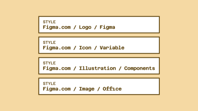
Example names, using the format:
Figma.com/Logo/Figma,Figma.com/Icon/Variable,Figma.com/Illustration/Components,Figma.com/Image/Office,Designsystems.com/Logo/Stripe,Designsystems.com/Icon/Hamburger,Designsystems.com/Illustration/Orbs,Designsystems.com/Image/Modular grid.
These are split into:
- Library:
Figma.comorDesignsystems.com, - Media type:
IllustrationorLogo, - Media name: e.g.,
Component libraries,Iconography.
Although I’m using images for the examples here, it works with video assets, too! This means we can move in the direction of effectively using Figma like a mini DAM (digital asset manager) and iterate fast on designs using brand-approved media assets, rather than relying on dummy content.
“A digital asset management solution is a software solution that provides a systematic approach to efficiently storing, organizing, managing, retrieving, and distributing an organization’s digital assets. DAM functionality helps many organizations create a centralized place where they can access their media assets.”
— IBM, “What is digital asset management?”
Using Fill Styles #
Fill styles aren’t just for color! We can use them for images, videos, and even illustrations if we want to. It’s worth bearing in mind that because of the flexible nature of fills, you may want to consider working within fixed sizes or aspect ratios to ensure cropping is kept to a minimum.
Figma’s redline “snapping” feature lets us know when the original asset’s aspect ratio is being respected as we resize. It’s a pretty cool trick!
Using Component Sets (Variants) #
Instinctively, this may not make much sense. Images as components? But they are images! However, it provides us with much more control over how images are used across the system.
Images as components is the method you’ll want to use if you are designing in a world of fixed aspect ratios for design, e.g., 16:9, 4:3, 1:1,
and so on. This is typically defined by the grid you use in designs and
is most useful for people who aren’t using media as a background for a
flexible object.
It’s also the best method for assets like logos, illustrations, and icons, where you may need variations of the original for different use cases. For example, a filled and an outline version or different stroke widths for different sizes.

You can get the above example from Figma’s community:
→ “Fixed aspect ratio images with variants” [Figma file / Luis Ouriach, CC-BY license]
For this world, though, I would advise against trying to hack Figma into setting up fully responsive images. Instead, I’d recommend working with a predefined fixed set of sizes in a component set. This may sound like a limitation, but I strongly believe that the more time we spend inside Figma, the further we get from the production environment. “Can we test this in the actual product?” is a question we should be asking ourselves frequently.
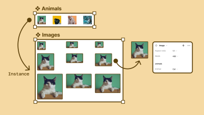
Practically, this looks like creating a component set where we set the fixed sizes along one dimension and the aspect ratio along the other. Creating a matrix like this means we can use the Component Properties panel to toggle between sizes and aspect ratios, preserving the media inside the component.
This can be used in tandem with a separate set of components specifically for images. If we combine this with Figma’s “nested instances” feature within variant components, we can “surface” all the preferred images from our component set within every instance at the aspect ratios needed!
Arrangement #
This is the hardest thing to predict when we think through the usability of customizable components. The simplest example here is our old enemy: the form. Instinctively, we may create a complete form in a component library and publish it to the team. This makes sense!
The issue is that when a designer working on a particular project requires a rearrangement of that structure, we are kind of in trouble.
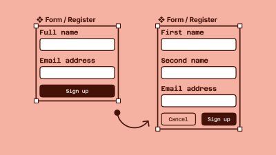
This problem extends to almost all component groups that require manipulation. Tables, menus, lists, forms, navigation… we will hit this wall frequently. This is where I’d like to introduce the concept of fixed vs flexible content within components, which should help to address the future problems of a world where we put the DRY (don’t repeat yourself) principles at risk.
As design system maintainers, we naturally want to keep components as composable as possible. How can this one component be used in lots of different ways without requiring us to ship an infinite number of variations? This is the central theme of the DRY principle but can be challenging in design tools because of the lack of component order management within the main components.
As a result, we often end up in a world where we build, maintain, and ship endless variations of the same component in an attempt to keep up with snowflake implementations of our core component.
“‘When should we make something a component?’ is a question I’ve been fielding for years. My strong answer: right from the start. Creating things with a component-based mindset right out the gate saves countless hours — everything is a component!”
— Brad Frost, “Design system components, recipes, and snowflakes”
For example, the form we spoke about before could be one for:
- Logging in;
- Registering;
- Signing up to the newsletter;
- Adding billing information.
These are all clearly forms that require different data points and functionality from an engineering perspective, but they will most likely share common design foundations, e.g., padding, margins, headings, labels, and input field designs. The question then becomes, “How can we reduce repetition whilst also encouraging combinatorial design?”
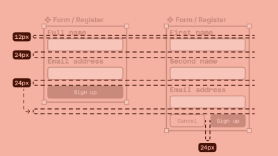
A concept that has been long-used in the developer world and loosely agreed upon in the design community is termed “component slots.” This approach allows the design system maintainers to ship component containers with agreed properties — sizing, padding, and styles — whilst allowing for a flexible arrangement of components inside it.
Taking our previous form examples, we can then abstract the content — login form, register form, newsletter form, and billing information form — and provide a much simpler shell component from the library. The designers using this shell (let’s call it a “form/wrapper”) will then build their forms locally and replace the slot component inside the shell with this new custom main component.
This is best explained visually:
The question then becomes: “Where should these custom components live?” The process becomes the same as it would for any component, which should hopefully align with your team’s policy already.

Does this custom component need to live in multiple files? If yes, we move it to the next level up, either team-level libraries or global, if working on a smaller system. If not, we can comfortably keep that component local to the specific Figma file on a page (I like to call it “❖ Components”).
Important: For this premise to really work, we must employ auto layout at every level, with no exceptions!
Conclusion #
That was a lot to process (over five thousand words, actually), and I think it‘s time for us to stop staring at the computer screen and take a little break before walking through the next set of principles.
Go grab a drink or take some rest, then meet me in Part 2, where you will learn even more about the adoptable, indexable, logical, and specific components.
No comments:
Post a Comment