Finding the right typeface is tricky as a whole. Dividing the process into steps and having the right information at hand will make this journey a design adventure full of surprises. To avoid sinking into unnecessary details, use this guide as a map for your path. Review various font paraments and learn how to apply them to your designs.
Welcome to the second part of the guide to typography in fintech. In Part 1, we reviewed the key points to consider when choosing typefaces:
- What is the content of your product? What type of data do you mainly work with?
- Who is your common user, and in which circumstances do they use the product?
- What are the specific points you need to keep in mind? For example, what language support is planned for the future? Or, maybe you need to use some specific glyphs (math or rare currency symbols) in your product.
We also reviewed all font parameters and started investigating how they affect readability and legibility. Now, let’s discuss how to apply them to your designs.
Adjust Texts And Tables #
Point Size #
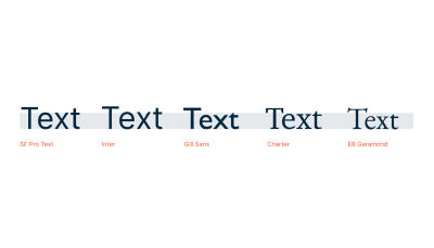
When choosing a point size, we need to consider the body text first. Body text is the most massive part of your content, and its style determines design and visual appearance. It’s also essential to remember that x-height might vary slightly from type to type. Therefore, not all typefaces will look the same in the same size, and you will probably need to adjust it.
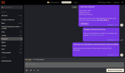
The general rule is that the size of the screen body text should be 12-16px. But this measurement may change depending on your needs. When you work with investment apps, users should be able to see a large amount of information on a single screen. An appropriate solution here might be to reduce the body text size to 10px but pay attention to legibility. In addition, traders usually want to see big amounts of data on a single screen, without scrolling anything, as it might affect the speed of reaction. We had such a case when a client asked us to make all the body text smaller to fit the screen.
Secondly, consider headings. Try to build a clear content hierarchy that will help users to work with the content. Figure out how many levels of headings you need. Don’t use too many, aiming for three to five levels.
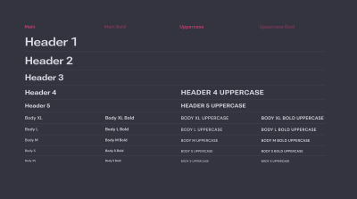
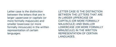
Try to avoid using uppercase capitalization. But if you capitalize headings in uppercase, make them short.
When set in uppercase, the text is less legible. The lowercase text has different shapes, ascenders, and descenders. They help us intuitively recognize letters in context without spending time deciphering them when reading. Uppercase text reduces this recognition because capital letters generally have square shapes. So, the more capitalized text you have in a row, the more time a user needs to read it.
Another tip is to avoid italics, underlining, and other ways to differentiate headings visually unless you’re working on a small visual material and have a strong reason for such expressive typography. If it’s a must, choose a bold font for visual contrast and accents, but use it sparingly.
Text Column #
When working with texts, you must determine a suitable length of text lines. Overly long text lines are hard to follow. Generally, the average size is 55-60 characters per line. Following these values will help you keep the text readable.
Line Spacing #
The
next step is to choose an appropriate line spacing (or leading) for
your text. This measurement determines the distance from the baseline to
the baseline in a text paragraph. Usually, optimal line spacing equals
120% of body text size, e.g., 12x1,2=14.4 for 12px text. But depending
on the circumstances, you can vary this setting between 120% and 145%.
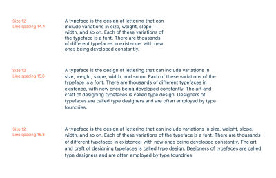
Besides the point size, the width of the column is an important aspect that affects line spacing. Generally, the rule is the wider the text column, the more spacing between lines you need (see the illustration above). For narrow columns, quite tight spacing works well, as you don’t need to follow the long way from the beginning to the end of the line. Also, consider the space between columns: line spacing should not be larger but noticeably smaller, as it will cause confusion and mess. Users should be able to distinguish text blocks from one another easily.
Letterspace And Tracking #
In high-quality typefaces, type designers carefully adjust letter spacing so you can use them by default. However, there are several cases when additional settings are required.
First, when setting text in small point size (10px or less), e.g., for captions or tooltips, add some small positive tracking — 1–2% is enough. It helps make the text more legible.
Positive tracking is also needed in lines set in capital letters. Uppercase characters (and their sidebearings) are designed to come before lowercase at the beginning of a word. For this reason, the All Caps setting is usually too tight and requires additional spacing.
Tips:
- Think twice when setting text in uppercase, and don’t do this without a strong reason because it affects legibility.
- Avoid more than three to five words in uppercase.
- For a larger amount of text, choose a typeface with small caps.
- Don’t try to imitate small caps by using capitals in smaller sizes.
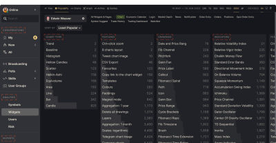
Negative tracking might be applied when you use a type in an extremely large point size.
Design The Spreadsheets #
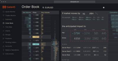
A spreadsheet is a complex form of data representation that should have a high level of legibility. Setting up a spreadsheet can be tricky because, in digital products, we work with dynamic data, and therefore, we can only sometimes predict their behavior.
A good practice is to consider all possible corner cases. What if a number has ten digits in the fractional part? Do we really need to show the whole number, or can we shorten it? What if cells contain data of very different lengths? Ask your analyst to consider all possible situations to avoid unpleasant surprises after release.
Here are several core rules to improve your spreadsheet:
Use Monospace (Or Tabular) Digits #
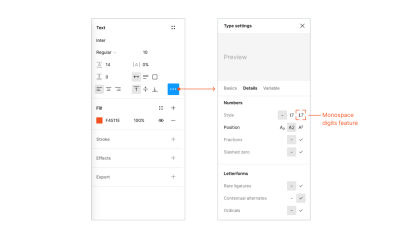
Monospace digits are a set of digits with equal space width and central position within them, unlike default ones. It’s the most convenient way to align data precisely, allowing you to place digits in a column one below another. Tabular digits are especially useful in compound products like traders’ watchlists and spreadsheets. They help to keep the layout while values change in real time.
The Open Type format supports this feature and can be enabled in the Type Settings menu > Details in Figma.
Align Numbers By The Right Side Or By A Decimal Separator #
Depending on using integers or fractionals, choose the appropriate alignment. The aim is to place digits with the same meaning one below another in a column.
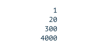
Right alignment allows you to align digits according to their position in the numeral system. It works well if you work with integers.
If you work with fractionals, align by a decimal separator.
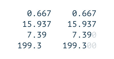
Alternatively, fill empty spaces with zero symbols. In this case, columns will align by separator automatically.
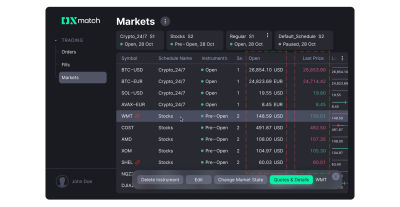
When adding additional symbols after values, such as currency or footnote, do it with an overhang.
Choose a suitable alignment for the column’s headings. Usually, the heading is aligned on the same side as the column’s content, and this is the most convenient and fast path for developers when working with dynamic data.
“
Use Appropriate Separation Marks #
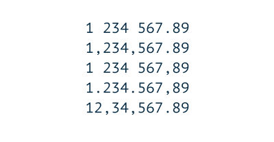
Consider applying different rules to the sign of the decimal separator. Depending on localization, it might be a comma or period: use periods for the US, the UK, Australia, and Canada, and choose a comma if your audience is from European countries, like France, Germany, and so on.
Thousands of separators vary between space, comma, apostrophe, and period, depending on the region. Find out which sign is used in your case and apply your approach consistently.
Pay Attention To Currency Symbols #
Note that the appropriate place for currency symbols also varies. The dollar sign and most signs of European currencies usually stand before the value. If you work with a specific symbol, ensure you know the usage rules.
The placement of the euro sign is determined by language. According to the EU Interinstitutional style guide (page 114), the character is placed before value in English-speaking countries, as well as in Dutch, Irish, and Maltese. In all other European languages, the order is reversed.
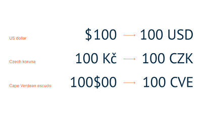
There are also rare cases when symbols are placed in the decimal separator position, for example, Cape Verdean escudo.
Make sure to place currency codes after value. It is a rule.
Avoid Unnecessary Graphics #
Striped backgrounds, lines, and borders are instruments of cell connection that help users follow the line in the spreadsheet. Repetitive striped backgrounds and lines often create visual noise and disturb attention. Make sure you have a solid reason to use it and apply sparingly.
Avoid using bright colors and patterned lines (dashed, dotted, and so on). Lines and borders should be solid and thin, as they are supporting elements that shouldn’t distract from data.
A neat layout is the best way to connect elements (cells) into a solid unit (row). Use the Proximity principle to show a relation between objects.
“
Try it before using any extra elements.
Master Accessibility #
If you’re a designer, you probably use high-quality screens to see a wide color range. In this situation, it is very tempting to use subtle color shades, pale shadows, and other details to make your product look visually sophisticated.
In real life, the average trading platform user may work in various conditions: on an old computer, on a low-quality screen, or simply in bright sunlight. Do not forget about people with special needs: low vision, color blindness, and so on. It is essential to remember that 90% of your audience will barely notice delicate color schemes and nuances. And this is a reason to take care of the contrast ratio.
Contrast Ratio #
Contrast ratio is a numeral value in format X:1 where X may vary from 1 (weakest contrast) to 21 (maximum). 1:1 means comparing colors with no contrast, and 21:1 is obtainable by comparing black and white.
When checking your contrast ratio, you will meet such labels as AA and AAA. These are levels of accessibility, from lower to higher, based on WCAG accessibility standards. According to several factors, such as how broad your audience is, which is the average age of the user, and which possible use circumstances you can predict, you should meet at least AA.
There are different criteria for text and graphic elements for each standard. Each level requires a specific contrast ratio:
- AA: at least 4.5:1 for normal text and 3:1 for bold or large text,
- AAA: 7:1 for normal text and 4.5:1 for bold or large text.
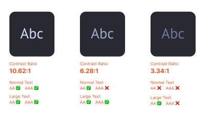
How do you check if your product meets these criteria? You can use one of many online tools, for example, Web AIM contrast checker. There are also plenty of plugins in Figma that you can try.
At Devexperts, we usually create products with dark themes as it gives us more freedom in color choice. Due to our specialization, we often need many colors to highlight various values and functions. It’s easier to pick a color with enough contrast to the dark background and make our products accessible to as many people as possible.
Find That One Typeface #
So, knowing these simple steps to consider, it’s time to choose a font for your fintech product. There are plenty of marketplaces where you can purchase licensed typefaces. Check myfonts.com first, as it is the biggest player in this field. Many type foundries and independent designers sell their fonts on this platform.
You can also buy a font directly from the type foundry’s website. This is probably the best idea, as you (or the type designer) will not pay an additional fee to the platform. You can also explore all typefaces by this type foundry and find some more fonts you like for future projects. Here is a list of foundries to check out.
Commercial Type #
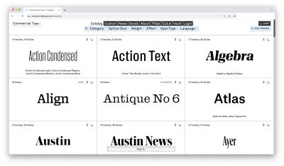
Commercial Type’s library includes a wide range of typefaces of exceptional quality.
The founders of Commercial Type are Paul Barnes and Christian Schwartz, designers who are well-known for their typeface Guardian Egyptian, created for The Guardian in 2004–05.
Type.Today #
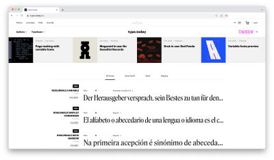
Type.Today is a store with an inspiring collection of modern, high-quality typefaces. The project was founded by Ilya Ruderman and Yuri Ostromensky, who are also co-founders of CSTM fonts type foundry.
You might also want to check the other part of the project: Type.Tomorrow, which presents more experimental and crazy typefaces.
Typotheque #
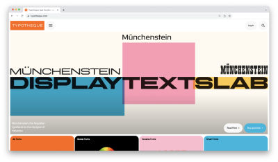
Typotheque is a Netherlands-based type design company founded by Peter Bilak in 1999. It has a massive library of retail fonts that may serve any designer’s need. They have plenty of great type-related products in their shop.
Klim #
Founded by Kris Sowersby in 2005, Klim type foundry creates custom and retail typefaces. Their work combines deep historical knowledge with a contemporary approach to graphics. Check their blog — it has lots of exciting reading.
Colophon Foundry #
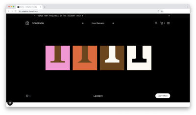
Colophon Foundry is a London-based type agency that offers an impressive choice of modern, perfectly executed typefaces. Don’t forget to check trials as well.
I Love Typography #
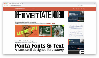
ILT is not only a shop with an impressive collection of accurately-picked typefaces. It is also a blog with lots of great type-related materials on a wide range of topics. Highly recommended!
Grilli Type #
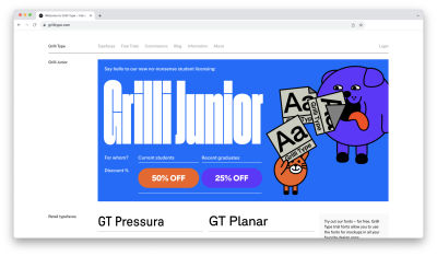
Grilli Type is a foundry that offers types with a very modern feeling. Their library is not that wide in amount of typefaces, but each has a vast number of styles. They also provide trial versions for all their faces.
TypeTogether #
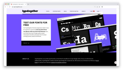
Established in 2006 by two graduates from Reading University, TypeTogether foundry is concentrated on text typefaces for editorial purposes. Except for that, they have plenty of display retail fonts in their catalog.
If you’re a student looking for a typeface for non-commercial use, check student license support on the website. Sometimes, foundries give scholars good discounts or even offer some fonts for free. There are also trial versions provided, so you can check if the typeface works well for your project before purchasing.
Also, you can try Fontstand. It is a great platform where you can try and rent fonts for a couple of dollars and use them for commercial projects.
At Future Fonts, you can find a great variety of typefaces in progress available for purchase with a good discount. You will also receive all updates for the purchased typeface, which sounds like a great investment!
And finally, if you don’t have a budget at all, there are still some options. For example, Google Fonts have a number of good typefaces which you can use for free for any kind of project. Take a look at IBM Type Family, Open Sans, PT Sans, Inter, or Roboto. These are widely used fonts we all know and meet in various products. For sure, you will find something suitable there.
In any case, do not forget to read the license carefully, and feel free to ask the vendor/type foundry if you have questions.
Conclusion #
Finding the right typeface is tricky as a whole. Dividing the process into steps and having the right information at hand will make this journey a design adventure full of surprises. To avoid sinking into unnecessary details, use this guide as a map for your path, and you will never get lost.
That’s it! Hopefully, you’ve found this article helpful for improving your workflow. Explore typefaces, as this is a great and powerful instrument for designers, and stay in touch
No comments:
Post a Comment