Payment of ₹ requested by HONEY VIG. Click the link to pay securely via Razorpay: Make 5000 payment Payment of ₹ requested by HONEY VIG. Click the link to pay securely via Razorpay: Make 5000 payment ⭐ If you would like to buy me a coffee, well thank you very much that is mega kind! : https://www.buymeacoffee.com/honeyvig
Hire a web Developer and Designer to upgrade and boost your online presence with cutting edge Technologies
Showing posts with label Process. Show all posts

Wednesday, October 15, 2025

Intent Prototyping: A Practical Guide To Building With Clarity (Part 2)


Ready to move beyond static mockups? Here is a practical, step-by-step guide to Intent Prototyping — a disciplined method that uses AI to turn your design intent (UI sketches, conceptual models, and user flows) directly into a live prototype, making it your primary canvas for ideation.

In Part 1 of this series, we explored the “lopsided horse” problem born from mockup-centric design and demonstrated how the seductive promise of vibe coding often leads to structural flaws. The main question remains:

How might we close the gap between our design intent and a live prototype, so that we can iterate on real functionality from day one, without getting caught in the ambiguity trap?

In other words, we need a way to build prototypes that are both fast to create and founded on a clear, unambiguous blueprint.

The answer is a more disciplined process I call Intent Prototyping (kudos to Marco Kotrotsos, who coined Intent-Oriented Programming). This method embraces the power of AI-assisted coding but rejects ambiguity, putting the designer’s explicit intent at the very center of the process. It receives a holistic expression of intent (sketches for screen layouts, conceptual model description, boxes-and-arrows for user flows) and uses it to generate a live, testable prototype.
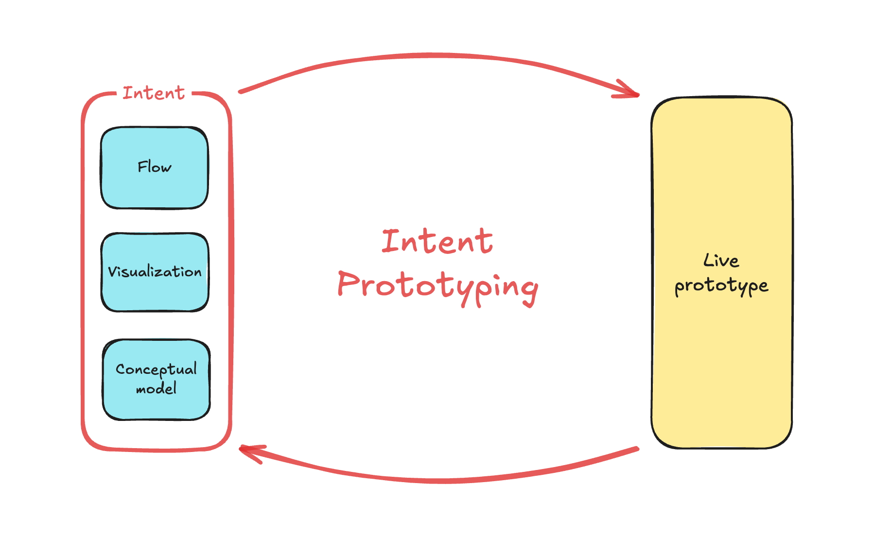
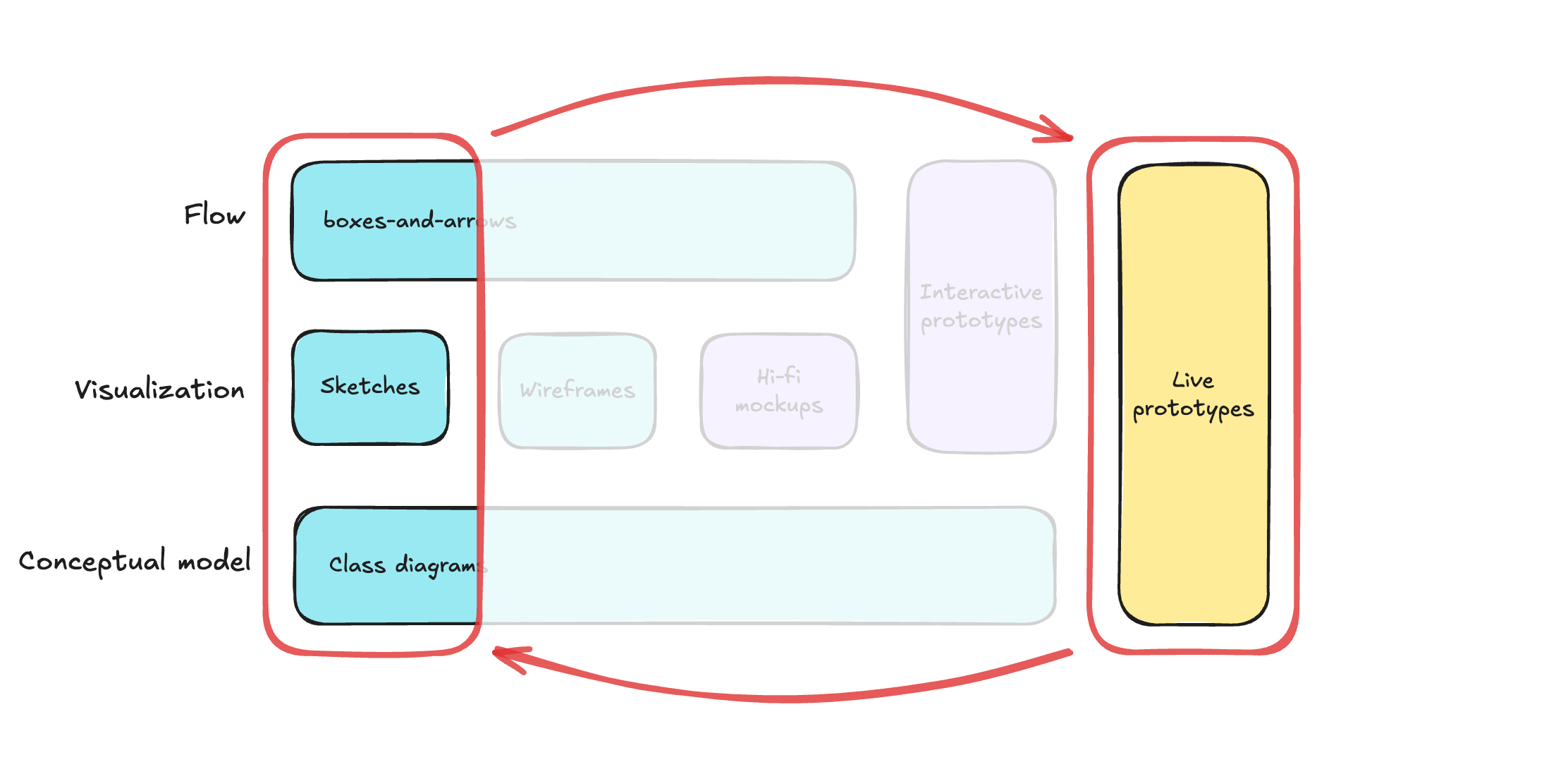
Diagram showing sketches, a conceptual model, and user flows as inputs to Intent Prototyping, which outputs a live prototype.
The Intent Prototyping workflow. (Large preview)

This method solves the concerns we’ve discussed in Part 1 in the best way possible:

  • Unlike static mockups, the prototype is fully interactive and can be easily populated with a large amount of realistic data. This lets us test the system’s underlying logic as well as its surface.
  • Unlike a vibe-coded prototype, it is built from a stable, unambiguous specification. This prevents the conceptual model failures and design debt that happen when things are unclear. The engineering team doesn’t need to reverse-engineer a black box or become “code archaeologists” to guess at the designer’s vision, as they receive not only a live prototype but also a clearly documented design intent behind it.

This combination makes the method especially suited for designing complex enterprise applications. It allows us to test the system’s most critical point of failure, its underlying structure, at a speed and flexibility that was previously impossible. Furthermore, the process is built for iteration. You can explore as many directions as you want simply by changing the intent and evolving the design based on what you learn from user testing.

My Workflow 

To illustrate this process in action, let’s walk through a case study. It’s the very same example I’ve used to illustrate the vibe coding trap: a simple tool to track tests to validate product ideas. You can find the complete project, including all the source code and documentation files discussed below, in this GitHub repository.

Step 1: Expressing An Intent

Imagine we’ve already done proper research, and having mused on the defined problem, I begin to form a vague idea of what the solution might look like. I need to capture this idea immediately, so I quickly sketch it out:
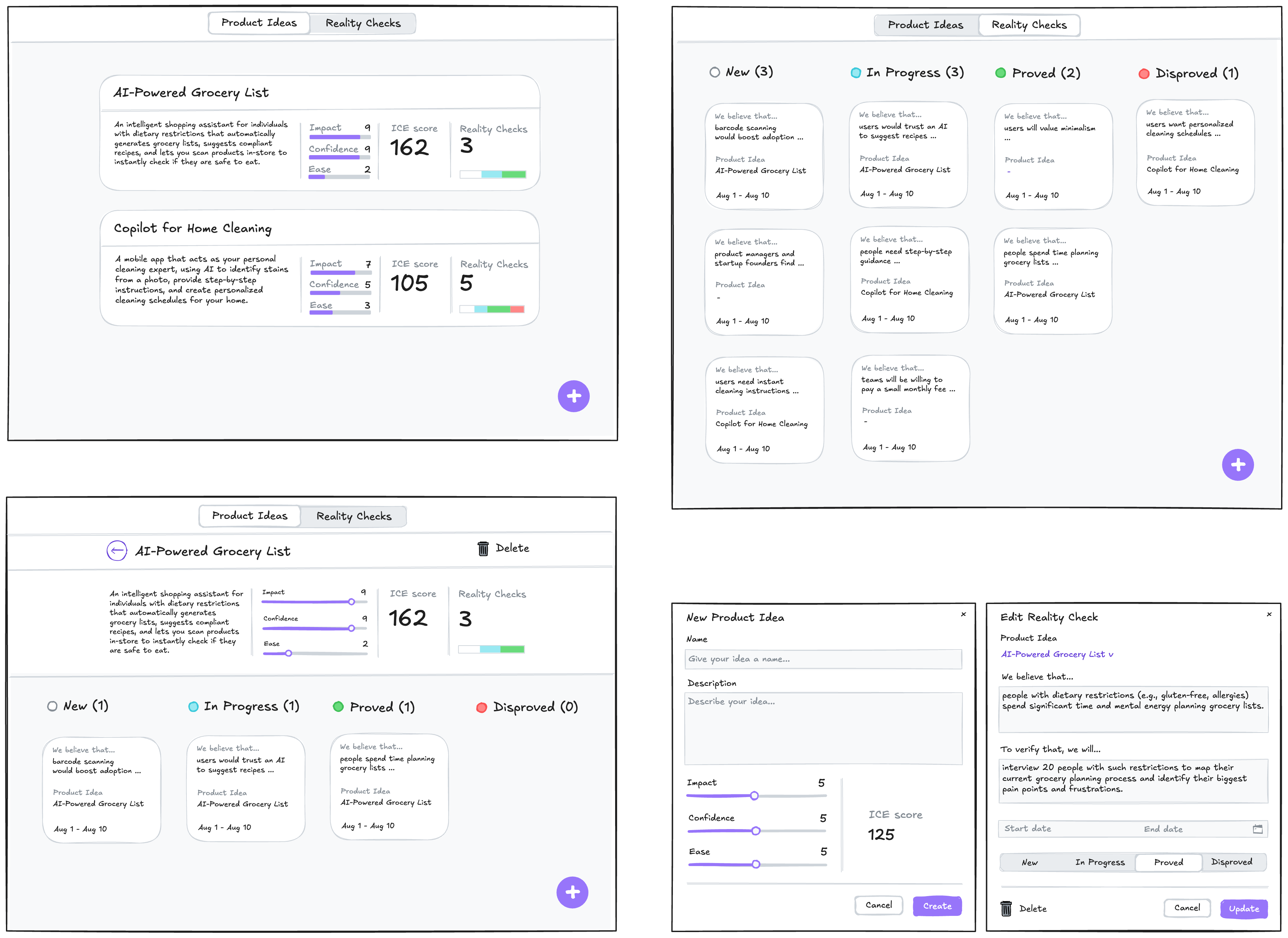
A rough sketch of screens to manage product ideas and reality checks.
A low-fidelity sketch of the initial idea.

In this example, I used Excalidraw, but the tool doesn’t really matter. Note that we deliberately keep it rough, as visual details are not something we need to focus on at this stage. And we are not going to be stuck here: we want to make a leap from this initial sketch directly to a live prototype that we can put in front of potential users. Polishing those sketches would not bring us any closer to achieving our goal.

What we need to move forward is to add to those sketches just enough details so that they may serve as a sufficient input for a junior frontend developer (or, in our case, an AI assistant). This requires explaining the following:

  • Navigational paths (clicking here takes you to).
  • Interaction details that can’t be shown in a static picture (e.g., non-scrollable areas, adaptive layout, drag-and-drop behavior).
  • What parts might make sense to build as reusable components.
  • Which components from the design system (I’m using Ant Design Library) should be used.
  • Any other comments that help understand how this thing should work (while sketches illustrate how it should look).

Having added all those details, we end up with such an annotated sketch:
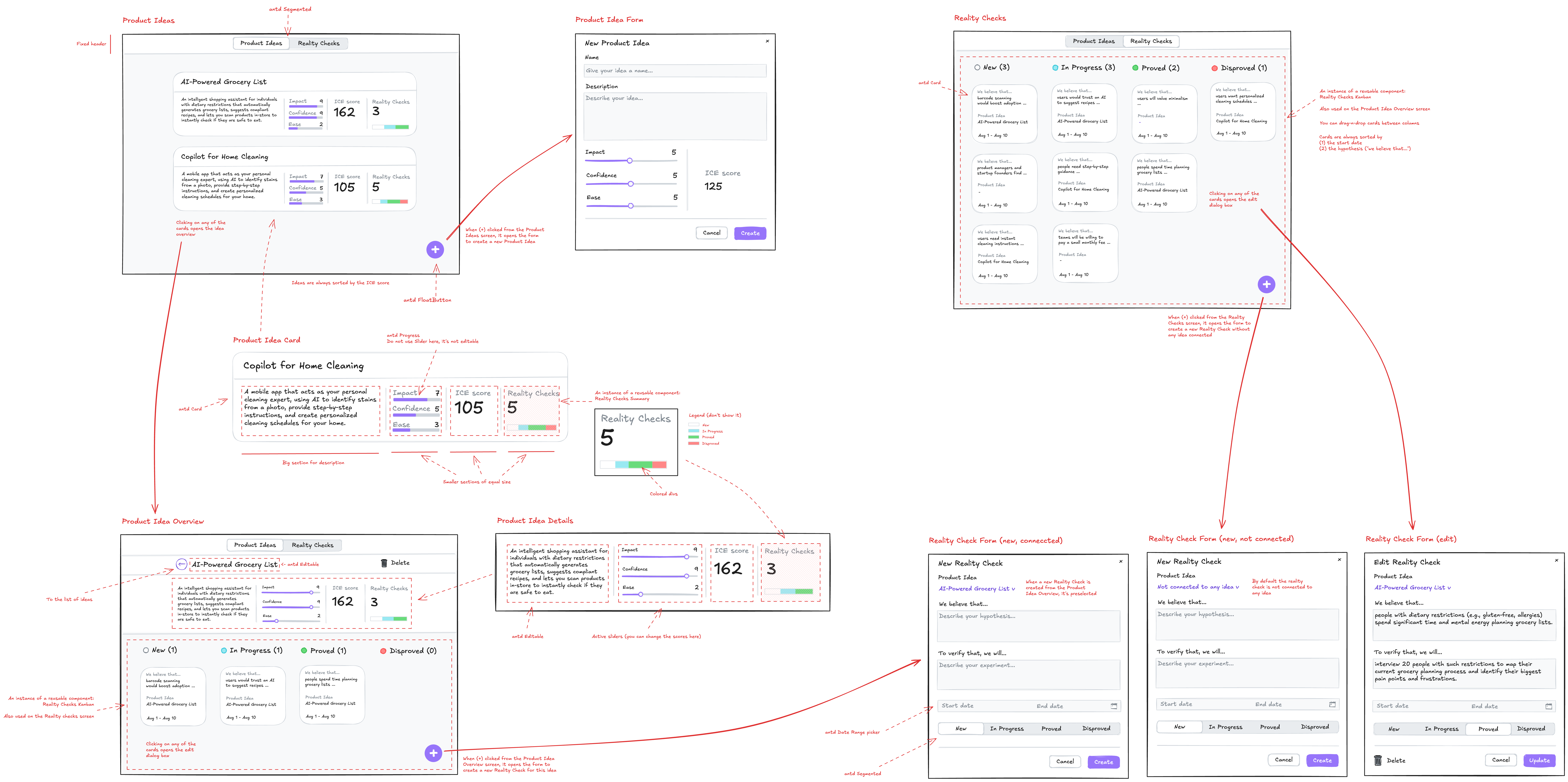
The initial sketch with annotations specifying components, navigation, and interaction details.
The sketch annotated with details. (Large preview)

As you see, this sketch covers both the Visualization and Flow aspects. You may ask, what about the Conceptual Model? Without that part, the expression of our intent will not be complete. One way would be to add it somewhere in the margins of the sketch (for example, as a UML Class Diagram), and I would do so in the case of a more complex application, where the model cannot be simply derived from the UI. But in our case, we can save effort and ask an LLM to generate a comprehensive description of the conceptual model based on the sketch.

For tasks of this sort, the LLM of my choice is Gemini 2.5 Pro. What is important is that this is a multimodal model that can accept not only text but also images as input (GPT-5 and Claude-4 also fit that criteria). I use Google AI Studio, as it gives me enough control and visibility into what’s happening:
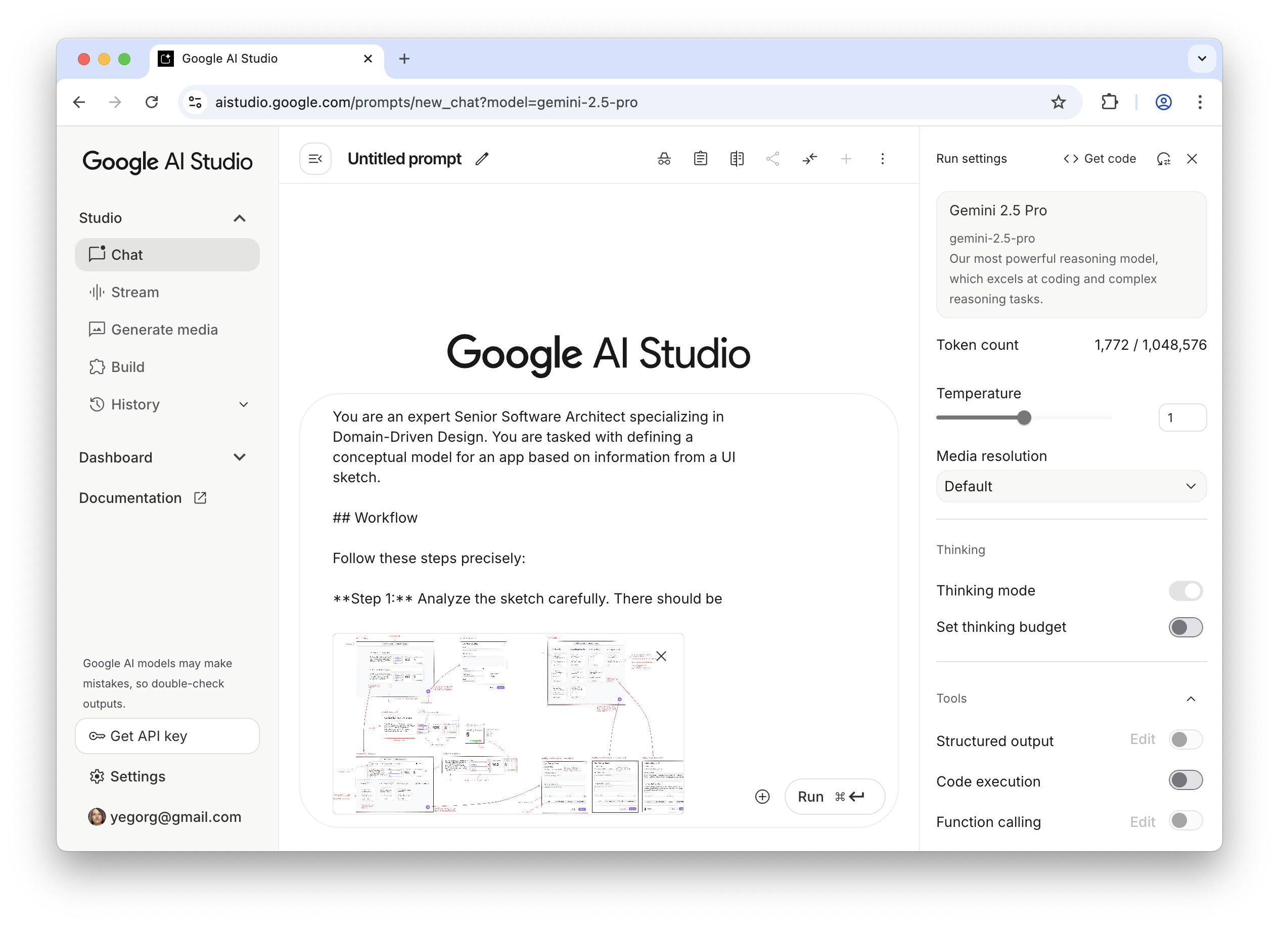
Screenshot of Google AI Studio with an annotated sketch as input.
Generating a conceptual model from the sketch using Google AI Studio. (Large preview)

Note: All the prompts that I use here and below can be found in the Appendices. The prompts are not custom-tailored to any particular project; they are supposed to be reused as they are.

As a result, Gemini gives us a description and the following diagram:
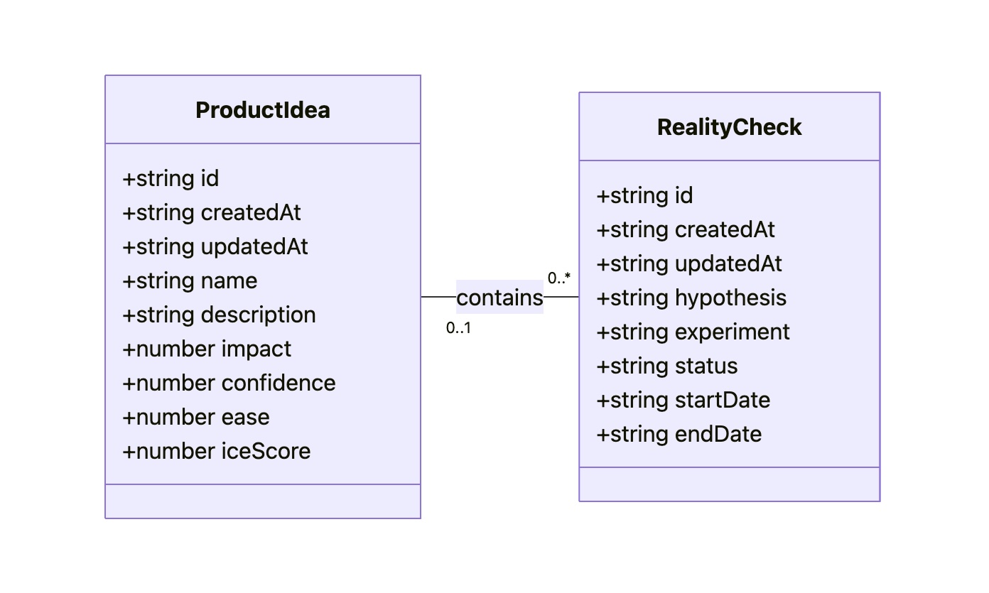
UML class diagram showing two connected entities: “ProductIdea” and “RealityCheck”.
UML class diagram.

The diagram might look technical, but I believe that a clear understanding of all objects, their attributes, and relationships between them is key to good design. That’s why I consider the Conceptual Model to be an essential part of expressing intent, along with the Flow and Visualization.

As a result of this step, our intent is fully expressed in two files: Sketch.png and Model.md. This will be our durable source of truth.

Step 2: Preparing A Spec And A Plan

The purpose of this step is to create a comprehensive technical specification and a step-by-step plan. Most of the work here is done by AI; you just need to keep an eye on it.

I separate the Data Access Layer and the UI layer, and create specifications for them using two different prompts (see Appendices 2 and 3). The output of the first prompt (the Data Access Layer spec) serves as an input for the second one. Note that, as an additional input, we give the guidelines tailored for prototyping needs (see Appendices 8, 9, and 10). They are not specific to this project. The technical approach encoded in those guidelines is out of the scope of this article.

As a result, Gemini provides us with content for DAL.md and UI.md. Although in most cases this result is quite reliable enough, you might want to scrutinize the output. You don’t need to be a real programmer to make sense of it, but some level of programming literacy would be really helpful. However, even if you don’t have such skills, don’t get discouraged. The good news is that if you don’t understand something, you always know who to ask. Do it in Google AI Studio before refreshing the context window. If you believe you’ve spotted a problem, let Gemini know, and it will either fix it or explain why the suggested approach is actually better.

It’s important to remember that by their nature, LLMs are not deterministic and, to put it simply, can be forgetful about small details, especially when it comes to details in sketches. Fortunately, you don’t have to be an expert to notice that the “Delete” button, which is in the upper right corner of the sketch, is not mentioned in the spec.

Don’t get me wrong: Gemini does a stellar job most of the time, but there are still times when it slips up. Just let it know about the problems you’ve spotted, and everything will be fixed.

Once we have Sketch.png, Model.md, DAL.md, UI.md, and we have reviewed the specs, we can grab a coffee. We deserve it: our technical design documentation is complete. It will serve as a stable foundation for building the actual thing, without deviating from our original intent, and ensuring that all components fit together perfectly, and all layers are stacked correctly.

One last thing we can do before moving on to the next steps is to prepare a step-by-step plan. We split that plan into two parts: one for the Data Access Layer and another for the UI. You can find prompts I use to create such a plan in Appendices 4 and 5.

Step 3: Executing The Plan

To start building the actual thing, we need to switch to another category of AI tools. Up until this point, we have relied on Generative AI. It excels at creating new content (in our case, specifications and plans) based on a single prompt. I’m using Google Gemini 2.5 Pro in Google AI Studio, but other similar tools may also fit such one-off tasks: ChatGPT, Claude, Grok, and DeepSeek.

However, at this step, this wouldn’t be enough. Building a prototype based on specs and according to a plan requires an AI that can read context from multiple files, execute a sequence of tasks, and maintain coherence. A simple generative AI can’t do this. It would be like asking a person to build a house by only ever showing them a single brick. What we need is an agentic AI that can be given the full house blueprint and a project plan, and then get to work building the foundation, framing the walls, and adding the roof in the correct sequence.

My coding agent of choice is Google Gemini CLI, simply because Gemini 2.5 Pro serves me well, and I don’t think we need any middleman like Cursor or Windsurf (which would use Claude, Gemini, or GPT under the hood anyway). If I used Claude, my choice would be Claude Code, but since I’m sticking with Gemini, Gemini CLI it is. But if you prefer Cursor or Windsurf, I believe you can apply the same process with your favourite tool.

Before tasking the agent, we need to create a basic template for our React application. I won’t go into this here. You can find plenty of tutorials on how to scaffold an empty React project using Vite.

Then we put all our files into that project:
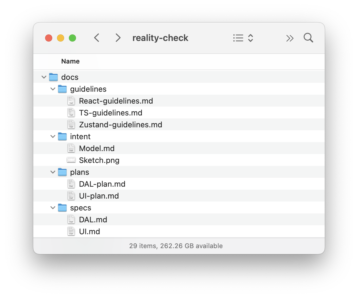
A file directory showing the docs folder containing DAL.md, Model.md, Sketch.png, and UI.md.
Project structure with design intent and spec files. (Large preview)

Once the basic template with all our files is ready, we open Terminal, go to the folder where our project resides, and type “gemini”:
Screenshot of a terminal showing the Gemini CLI.

And we send the prompt to build the Data Access Layer (see Appendix 6). That prompt implies step-by-step execution, so upon completion of each step, I send the following:

Thank you! Now, please move to the next task.
Remember that you must not make assumptions based on common patterns; always verify them with the actual data from the spec. 
After each task, stop so that I can test it. Don’t move to the next task before I tell you to do so.

As the last task in the plan, the agent builds a special page where we can test all the capabilities of our Data Access Layer, so that we can manually test it. It may look like this:
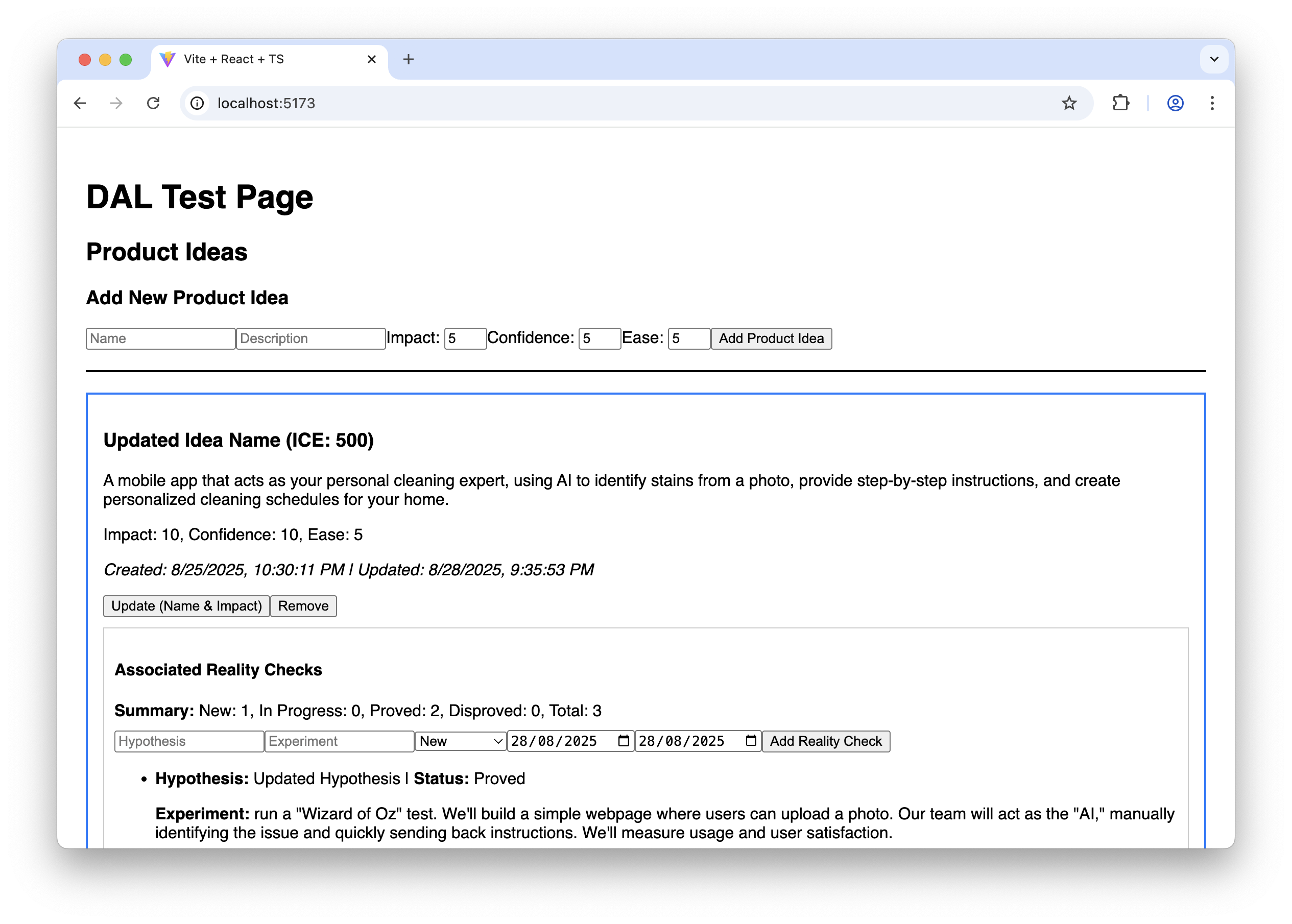
A basic webpage with forms and buttons to test the Data Access Layer’s CRUD functions.
The AI-generated test page for the Data Access Layer. (Large preview)

It doesn’t look fancy, to say the least, but it allows us to ensure that the Data Access Layer works correctly before we proceed with building the final UI.

And finally, we clear the Gemini CLI context window to give it more headspace and send the prompt to build the UI (see Appendix 7). This prompt also implies step-by-step execution. Upon completion of each step, we test how it works and how it looks, following the “Manual Testing Plan” from UI-plan.md. I have to say that despite the fact that the sketch has been uploaded to the model context and, in general, Gemini tries to follow it, attention to visual detail is not one of its strengths (yet). Usually, a few additional nudges are needed at each step to improve the look and feel:
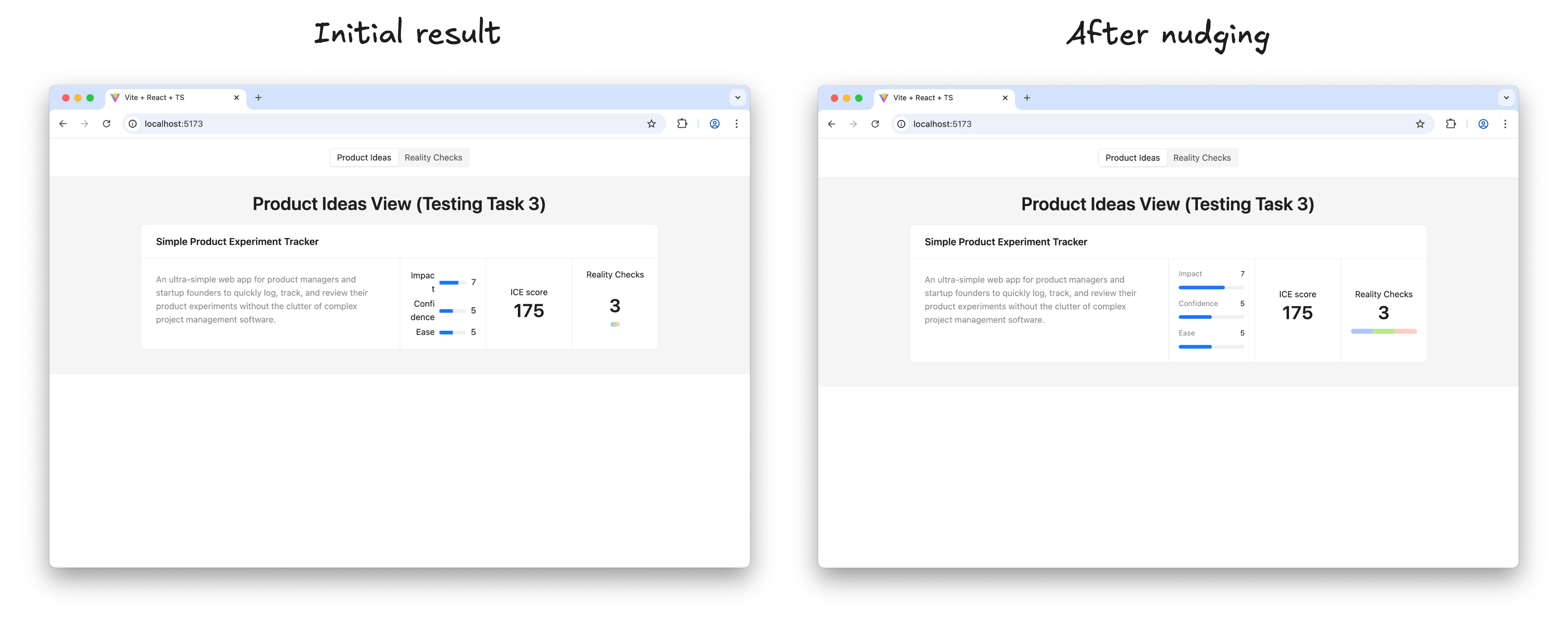
A before-and-after comparison showing the UI's visual improvement.
Refining the AI-generated UI to match the sketch. (Large preview)

Once I’m happy with the result of a step, I ask Gemini to move on:

Thank you! Now, please move to the next task.
Make sure you build the UI according to the sketch; this is very important. Remember that you must not make assumptions based on common patterns; always verify them with the actual data from the spec and the sketch.  
After each task, stop so that I can test it. Don’t move to the next task before I tell you to do so.

Before long, the result looks like this, and in every detail it works exactly as we intended:
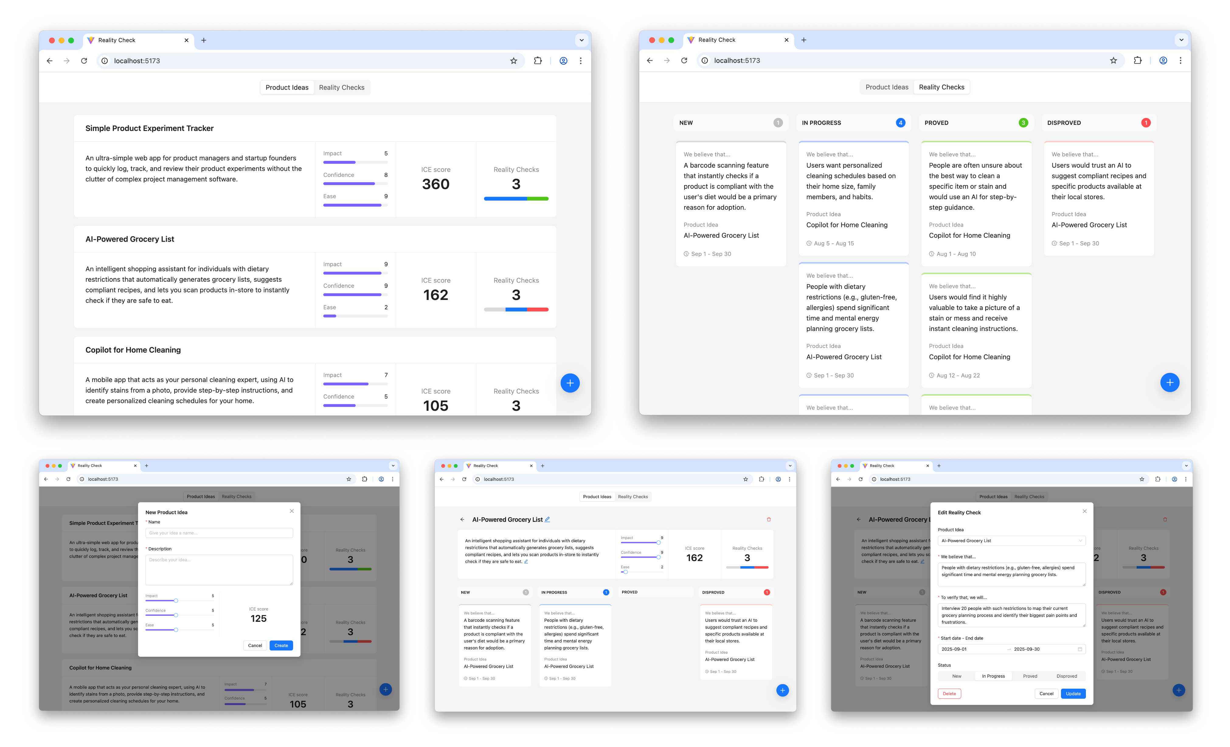
Screenshots of the final, polished application UI.
The final interactive prototype.

The prototype is up and running and looking nice. Does it mean that we are done with our work? Surely not, the most fascinating part is just beginning.

Step 4: Learning And Iterating

It’s time to put the prototype in front of potential users and learn more about whether this solution relieves their pain or not.

And as soon as we learn something new, we iterate. We adjust or extend the sketches and the conceptual model, based on that new input, we update the specifications, create plans to make changes according to the new specifications, and execute those plans. In other words, for every iteration, we repeat the steps I’ve just walked you through.

Is This Workflow Too Heavy?

This four-step workflow may create an impression of a somewhat heavy process that requires too much thinking upfront and doesn’t really facilitate creativity. But before jumping to that conclusion, consider the following:

  • In practice, only the first step requires real effort, as well as learning in the last step. AI does most of the work in between; you just need to keep an eye on it.
  • Individual iterations don’t need to be big. You can start with a Walking Skeleton: the bare minimum implementation of the thing you have in mind, and add more substance in subsequent iterations. You are welcome to change your mind about the overall direction in between iterations.
  • And last but not least, maybe the idea of “think before you do” is not something you need to run away from. A clear and unambiguous statement of intent can prevent many unnecessary mistakes and save a lot of effort down the road.

Intent Prototyping Vs. Other Methods 

There is no method that fits all situations, and Intent Prototyping is not an exception. Like any specialized tool, it has a specific purpose. The most effective teams are not those who master a single method, but those who understand which approach to use to mitigate the most significant risk at each stage. The table below gives you a way to make this choice clearer. It puts Intent Prototyping next to other common methods and tools and explains each one in terms of the primary goal it helps achieve and the specific risks it is best suited to mitigate.

Method/ToolGoalRisks it is best suited to mitigateExamplesWhy
Intent PrototypingTo rapidly iterate on the fundamental architecture of a data-heavy application with a complex conceptual model, sophisticated business logic, and non-linear user flows.Building a system with a flawed or incoherent conceptual model, leading to critical bugs and costly refactoring.
  • A CRM (Customer Relationship Management system).
  • A Resource Management Tool.
  • A No-Code Integration Platform (admin’s UI).
It enforces conceptual clarity. This not only de-risks the core structure but also produces a clear, documented blueprint that serves as a superior specification for the engineering handoff.
Vibe Coding (Conversational)To rapidly explore interactive ideas through improvisation.Losing momentum because of analysis paralysis.
  • An interactive data table with live sorting/filtering.
  • A novel navigation concept.
  • A proof-of-concept for a single, complex component.
It has the smallest loop between an idea conveyed in natural language and an interactive outcome.
AxureTo test complicated conditional logic within a specific user journey, without having to worry about how the whole system works.Designing flows that break when users don’t follow the “happy path.”
  • A multi-step e-commerce checkout.
  • A software configuration wizard.
  • A dynamic form with dependent fields.
It’s made to create complex if-then logic and manage variables visually. This lets you test complicated paths and edge cases in a user journey without writing any code.
FigmaTo make sure that the user interface looks good, aligns with the brand, and has a clear information architecture.Making a product that looks bad, doesn't fit with the brand, or has a layout that is hard to understand.
  • A marketing landing page.
  • A user onboarding flow.
  • Presenting a new visual identity.
It excels at high-fidelity visual design and provides simple, fast tools for linking static screens.
ProtoPie, FramerTo make high-fidelity micro-interactions feel just right.Shipping an application that feels cumbersome and unpleasant to use because of poorly executed interactions.
  • A custom pull-to-refresh animation.
  • A fluid drag-and-drop interface.
  • An animated chart or data visualization.
These tools let you manipulate animation timelines, physics, and device sensor inputs in great detail. Designers can carefully work on and test the small things that make an interface feel really polished and fun to use.
Low-code / No-code Tools (e.g., Bubble, Retool)To create a working, data-driven app as quickly as possible.The application will never be built because traditional development is too expensive.
  • An internal inventory tracker.
  • A customer support dashboard.
  • A simple directory website.
They put a UI builder, a database, and hosting all in one place. The goal is not merely to make a prototype of an idea, but to make and release an actual, working product. This is the last step for many internal tools or MVPs.


The key takeaway is that each method is a specialized tool for mitigating a specific type of risk. For example, Figma de-risks the visual presentation. ProtoPie de-risks the feel of an interaction. Intent Prototyping is in a unique position to tackle the most foundational risk in complex applications: building on a flawed or incoherent conceptual model.

Bringing It All Together

The era of the “lopsided horse” design, sleek on the surface but structurally unsound, is a direct result of the trade-off between fidelity and flexibility. This trade-off has led to a process filled with redundant effort and misplaced focus. Intent Prototyping, powered by modern AI, eliminates that conflict. It’s not just a shortcut to building faster — it’s a fundamental shift in how we design. By putting a clear, unambiguous intent at the heart of the process, it lets us get rid of the redundant work and focus on architecting a sound and robust system.

There are three major benefits to this renewed focus. First, by going straight to live, interactive prototypes, we shift our validation efforts from the surface to the deep, testing the system’s actual logic with users from day one. Second, the very act of documenting the design intent makes us clear about our ideas, ensuring that we fully understand the system’s underlying logic. Finally, this documented intent becomes a durable source of truth, eliminating the ambiguous handoffs and the redundant, error-prone work of having engineers reverse-engineer a designer’s vision from a black box.

Ultimately, Intent Prototyping changes the object of our work. It allows us to move beyond creating pictures of a product and empowers us to become architects of blueprints for a system. With the help of AI, we can finally make the live prototype the primary canvas for ideation, not just a high-effort afterthought.

Appendices

You can find the full Intent Prototyping Starter Kit, which includes all those prompts and guidelines, as well as the example from this article and a minimal boilerplate project, in this GitHub repository.

Tuesday, October 14, 2025

Intent Prototyping: The Allure And Danger Of Pure Vibe Coding In Enterprise UX (Part 1)


examines the problem of over-reliance on static high-fidelity mockups, which often leave the conceptual model and user flows dangerously underdeveloped. He then explores whether AI-powered prototyping is the answer, questioning whether the path forward is the popular “vibe coding” approach or a more structured, intent-driven approach.

There is a spectrum of opinions on how dramatically all creative professions will be changed by the coming wave of agentic AI, from the very skeptical to the wildly optimistic and even apocalyptic. I think that even if you are on the “skeptical” end of the spectrum, it makes sense to explore ways this new technology can help with your everyday work. As for my everyday work, I’ve been doing UX and product design for about 25 years now, and I’m always keen to learn new tricks and share them with colleagues. Right now, I’m interested in AI-assisted prototyping, and I’m here to share my thoughts on how it can change the process of designing digital products.

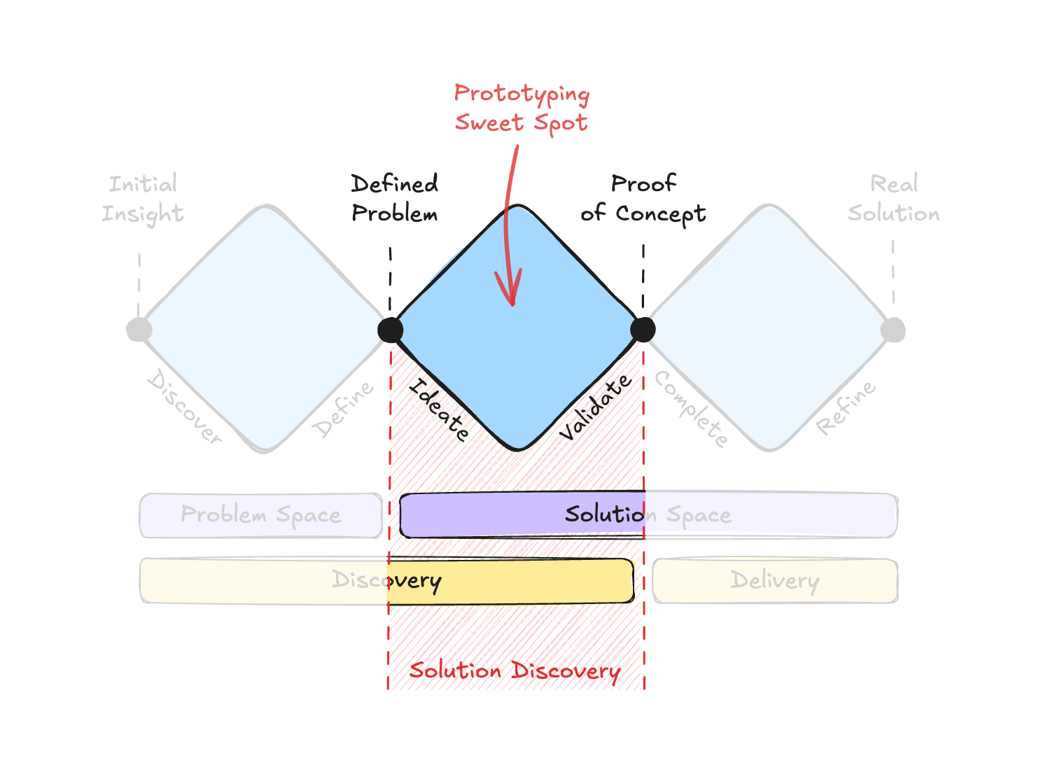
To set your expectations up front: this exploration focuses on a specific part of the product design lifecycle. Many people know about the Double Diamond framework, which shows the path from problem to solution. However, I think it’s the Triple Diamond model that makes an important point for our needs. It explicitly separates the solution space into two phases: Solution Discovery (ideating and validating the right concept) and Solution Delivery (engineering the validated concept into a final product). This article is focused squarely on that middle diamond: Solution Discovery.

Diagram of the Triple Diamond model: Problem Discovery, Solution Discovery, and Solution Delivery.
The Triple Diamond model and the prototyping sweet spot. (Large preview)

How AI can help with the preceding (Problem Discovery) and the following (Solution Delivery) stages is out of the scope of this article. Problem Discovery is less about prototyping and more about research, and while I believe AI can revolutionize the research process as well, I’ll leave that to people more knowledgeable in the field. As for Solution Delivery, it is more about engineering optimization. There’s no doubt that software engineering in the AI era is undergoing dramatic changes, but I’m not an engineer — I’m a designer, so let me focus on my “sweet spot”.

And my “sweet spot” has a specific flavor: designing enterprise applications. In this world, the main challenge is taming complexity: dealing with complicated data models and guiding users through non-linear workflows. This background has had a big impact on my approach to design, putting a lot of emphasis on the underlying logic and structure. This article explores the potential of AI through this lens.

I’ll start by outlining the typical artifacts designers create during Solution Discovery. Then, I’ll examine the problems with how this part of the process often plays out in practice. Finally, we’ll explore whether AI-powered prototyping can offer a better approach, and if so, whether it aligns with what people call “vibe coding,” or calls for a more deliberate and disciplined way of working.

What We Create During Solution Discovery

The Solution Discovery phase begins with the key output from the preceding research: a well-defined problem and a core hypothesis for a solution. This is our starting point. The artifacts we create from here are all aimed at turning that initial hypothesis into a tangible, testable concept.

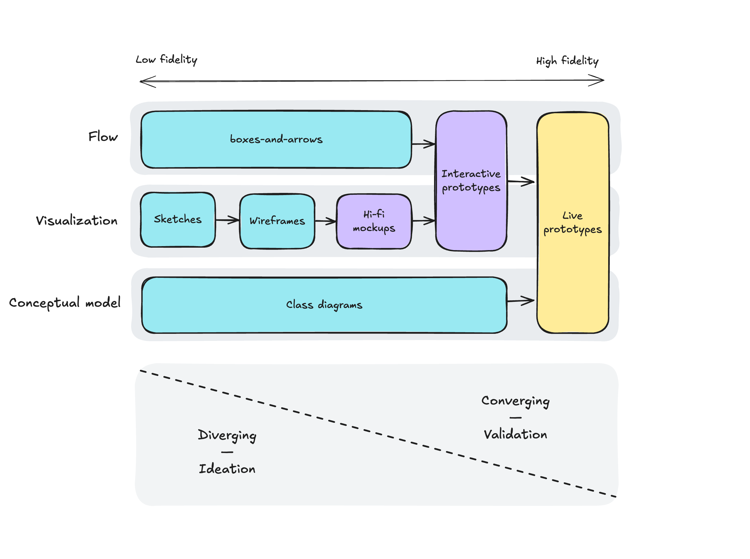
Traditionally, at this stage, designers can produce artifacts of different kinds, progressively increasing fidelity: from napkin sketches, boxes-and-arrows, and conceptual diagrams to hi-fi mockups, then to interactive prototypes, and in some cases even live prototypes. Artifacts of lower fidelity allow fast iteration and enable the exploration of many alternatives, while artifacts of higher fidelity help to understand, explain, and validate the concept in all its details.

It’s important to think holistically, considering different aspects of the solution. I would highlight three dimensions:

  1. Conceptual model: Objects, relations, attributes, actions;
  2. Visualization: Screens, from rough sketches to hi-fi mockups;
  3. Flow: From the very high-level user journeys to more detailed ones.

One can argue that those are layers rather than dimensions, and each of them builds on the previous ones (for example, according to Semantic IxD by Daniel Rosenberg), but I see them more as different facets of the same thing, so the design process through them is not necessarily linear: you may need to switch from one perspective to another many times.

This is how different types of design artifacts map to these dimensions:

Diagram mapping design artifacts to dimensions of Conceptual Model, Visualization, and Flow.
Mapping design artifacts to dimensions of Conceptual Model, Visualization, and Flow. (Large preview)

As Solution Discovery progresses, designers move from the left part of this map to the right, from low-fidelity to high-fidelity, from ideating to validating, from diverging to converging.

Note that at the beginning of the process, different dimensions are supported by artifacts of different types (boxes-and-arrows, sketches, class diagrams, etc.), and only closer to the end can you build a live prototype that encompasses all three dimensions: conceptual model, visualization, and flow.

This progression shows a classic trade-off, like the difference between a pencil drawing and an oil painting. The drawing lets you explore ideas in the most flexible way, whereas the painting has a lot of detail and overall looks much more realistic, but is hard to adjust. Similarly, as we go towards artifacts that integrate all three dimensions at higher fidelity, our ability to iterate quickly and explore divergent ideas goes down. This inverse relationship has long been an accepted, almost unchallenged, limitation of the design process.

The Problem With The Mockup-Centric Approach

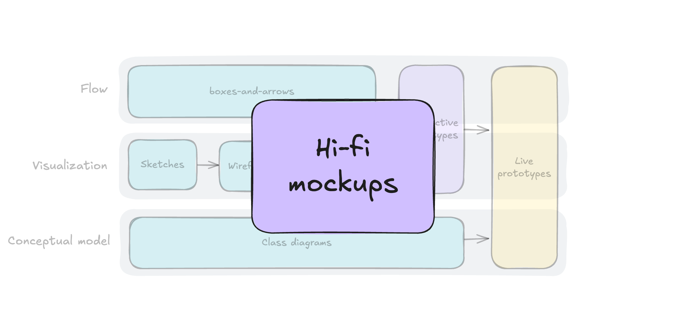
Faced with this difficult trade-off, often teams opt for the easiest way out. On the one hand, they need to show that they are making progress and create things that appear detailed. On the other hand, they rarely can afford to build interactive or live prototypes. This leads them to over-invest in one type of artifact that seems to offer the best of both worlds. As a result, the neatly organized “bento box” of design artifacts we saw previously gets shrunk down to just one compartment: creating static high-fidelity mockups.

The artifact map diagram, with “Hi-fi Mockup” enlarged to show an over-reliance on it.
The mockup-centric approach. (Large preview)

This choice is understandable, as several forces push designers in this direction. Stakeholders are always eager to see nice pictures, while artifacts representing user flows and conceptual models receive much less attention and priority. They are too high-level and hardly usable for validation, and usually, not everyone can understand them.

On the other side of the fidelity spectrum, interactive prototypes require too much effort to create and maintain, and creating live prototypes in code used to require special skills (and again, effort). And even when teams make this investment, they do so at the end of Solution Discovery, during the convergence stage, when it is often too late to experiment with fundamentally different ideas. With so much effort already sunk, there is little appetite to go back to the drawing board.

It’s no surprise, then, that many teams default to the perceived safety of static mockups, seeing them as a middle ground between the roughness of the sketches and the overwhelming complexity and fragility that prototypes can have.

As a result, validation with users doesn’t provide enough confidence that the solution will actually solve the problem, and teams are forced to make a leap of faith to start building. To make matters worse, they do so without a clear understanding of the conceptual model, the user flows, and the interactions, because from the very beginning, designers’ attention has been heavily skewed toward visualization.

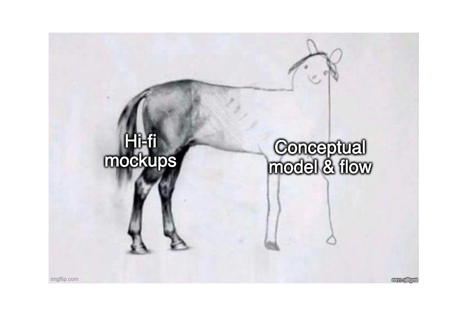
The result is often a design artifact that resembles the famous “horse drawing” meme: beautifully rendered in the parts everyone sees first (the mockups), but dangerously underdeveloped in its underlying structure (the conceptual model and flows).

The “horse drawing” meme, where the front is detailed and the back is a simple sketch.
The “lopsided horse” problem. (Large preview)

While this is a familiar problem across the industry, its severity depends on the nature of the project. If your core challenge is to optimize a well-understood, linear flow (like many B2C products), a mockup-centric approach can be perfectly adequate. The risks are contained, and the “lopsided horse” problem is unlikely to be fatal.

However, it’s different for the systems I specialize in: complex applications defined by intricate data models and non-linear, interconnected user flows. Here, the biggest risks are not on the surface but in the underlying structure, and a lack of attention to the latter would be a recipe for disaster.

Transforming The Design Process

This situation makes me wonder:

How might we close the gap between our design intent and a live prototype, so that we can iterate on real functionality from day one?

“
Diagram showing bridging the gap between “Design Intent” and “Live Prototype.”
How might we bridge the gap between design intent and a live prototype? (Large preview)

If we were able to answer this question, we would:

  • Learn faster.
    By going straight from intent to a testable artifact, we cut the feedback loop from weeks to days.
  • Gain more confidence.
    Users interact with real logic, which gives us more proof that the idea works.
  • Enforce conceptual clarity.
    A live prototype cannot hide a flawed or ambiguous conceptual model.
  • Establish a clear and lasting source of truth.
    A live prototype, combined with a clearly documented design intent, provides the engineering team with an unambiguous specification.

Of course, the desire for such a process is not new. This vision of a truly prototype-driven workflow is especially compelling for enterprise applications, where the benefits of faster learning and forced conceptual clarity are the best defense against costly structural flaws. But this ideal was still out of reach because prototyping in code took so much work and specialized talents. Now, the rise of powerful AI coding assistants changes this equation in a big way.

The Seductive Promise Of “Vibe Coding”

And the answer seems to be obvious: vibe coding!

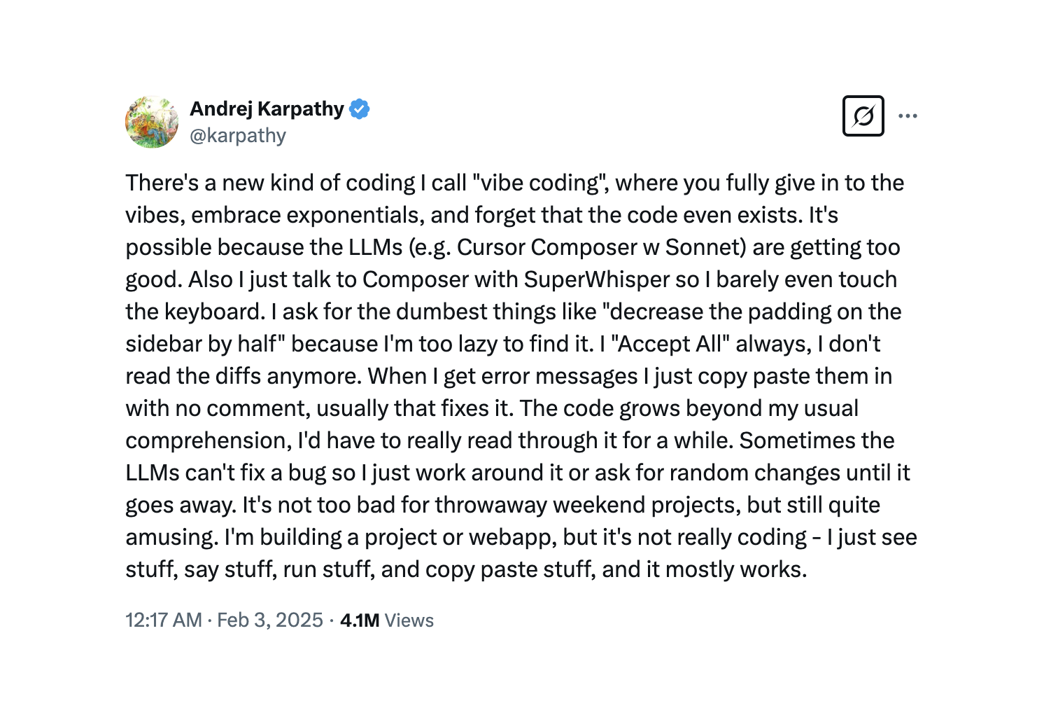
“Vibe coding is an artificial intelligence-assisted software development style popularized by Andrej Karpathy in early 2025. It describes a fast, improvisational, collaborative approach to creating software where the developer and a large language model (LLM) tuned for coding is acting rather like pair programmers in a conversational loop.”

— Wikipedia

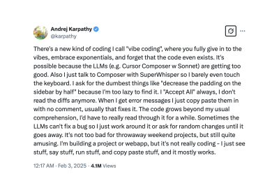
The original tweet by Andrej Karpathy:

Screenshot of Andrej Karpathy's tweet defining Vibe Coding.
Andrej Karpathy’s tweet that popularized the term “vibe coding”. (Image source: X) (Large preview)

The allure of this approach is undeniable. If you are not a developer, you are bound to feel awe when you describe a solution in plain language, and moments later, you can interact with it. This seems to be the ultimate fulfillment of our goal: a direct, frictionless path from an idea to a live prototype. But is this method reliable enough to build our new design process around it?

The Trap: A Process Without A Blueprint

Vibe coding mixes up a description of the UI with a description of the system itself, resulting in a prototype based on changing assumptions rather than a clear, solid model.

The pitfall of vibe coding is that it encourages us to express our intent in the most ambiguous way possible: by having a conversation.

“

This is like hiring a builder and telling them what to do one sentence at a time without ever presenting them a blueprint. They could make a wall that looks great, but you can’t be sure that it can hold weight.

I’ll give you one example illustrating problems you may face if you try to jump over the chasm between your idea and a live prototype relying on pure vibe coding in the spirit of Andrej Karpathy’s tweet. Imagine I want to prototype a solution to keep track of tests to validate product ideas. I open my vibe coding tool of choice (I intentionally don’t disclose its name, as I believe they all are awesome yet prone to similar pitfalls) and start with the following prompt:

I need an app to track tests. For every test, I need to fill out the following data:
- Hypothesis (we believe that...) 
- Experiment (to verify that, we will...)
- When (a single date, or a period) 
- Status (New/Planned/In Progress/Proven/Disproven)

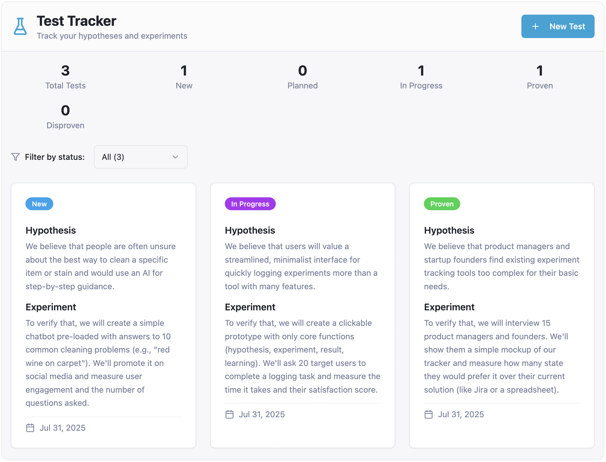
And in a minute or so, I get a working prototype:

Screenshot of a simple Test Tracker app.
The initial prototype. (Large preview)

Inspired by success, I go further:

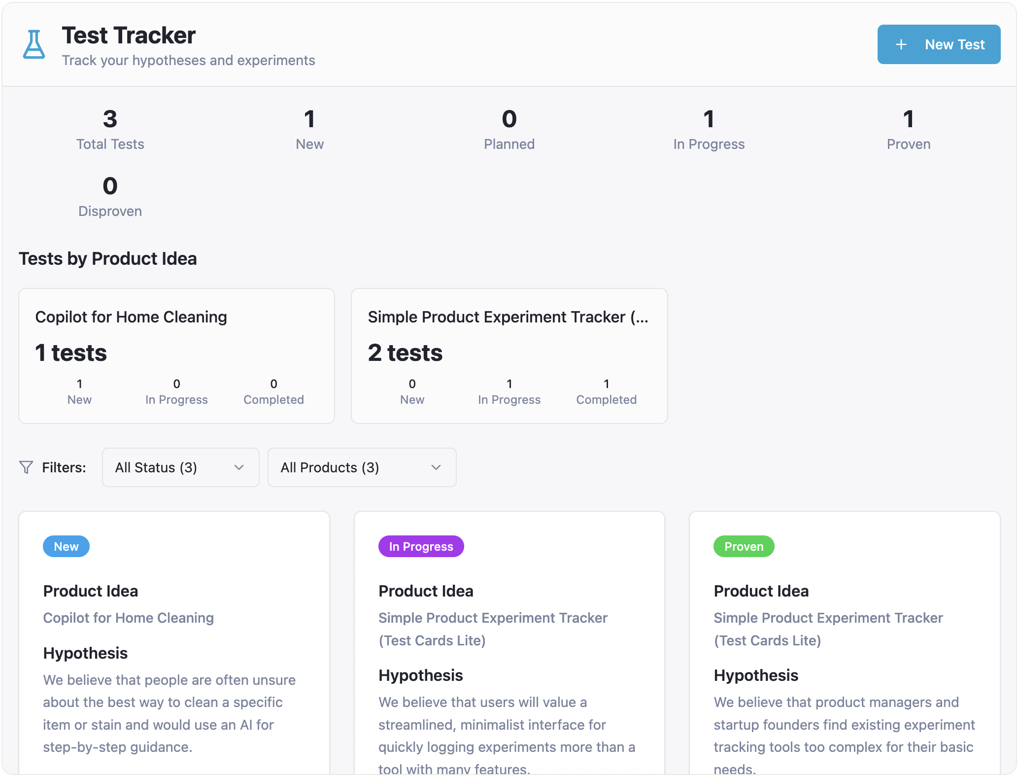
Please add the ability to specify a product idea for every test. Also, I want to filter tests by product ideas and see how many tests each product idea has in each status.

And the result is still pretty good:

The Test Tracker app screenshot, now with filtering by product ideas.
The prototype updated to include filtering tests by product ideas. (Large preview)

But then I want to extend the functionality related to product ideas:

Okay, one more thing. For every product idea, I want to assess the impact score, the confidence score, and the ease score, and get the overall ICE score. Perhaps I need a separate page focused on the product idea, with all the relevant information and related tests.

And from this point on, the results are getting more and more confusing.

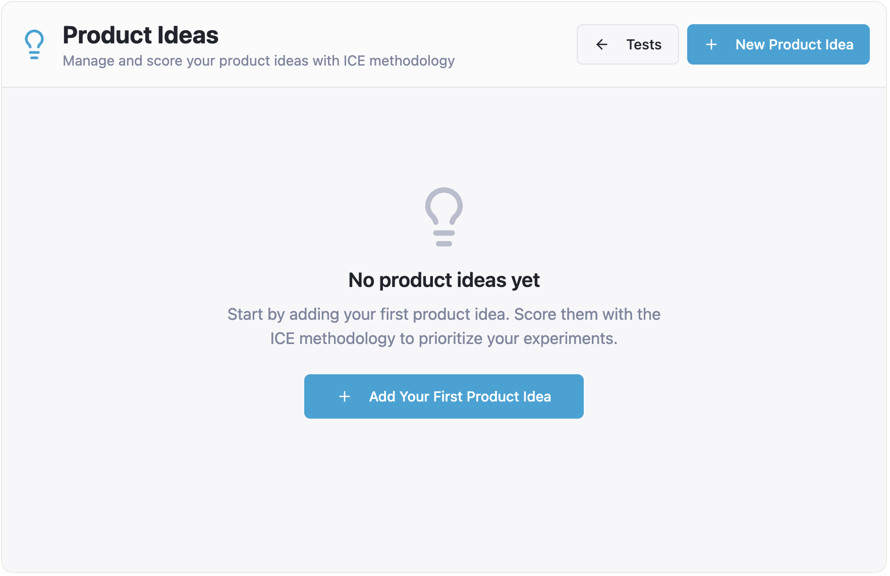
The flow of creating tests hasn’t changed much. I can still create a bunch of tests, and they seem to be organized by product ideas. But when I click “Product Ideas” in the top navigation, I see nothing:

Screenshot of the app’s blank Product Ideas page.
The Product Ideas page is empty. (Large preview)

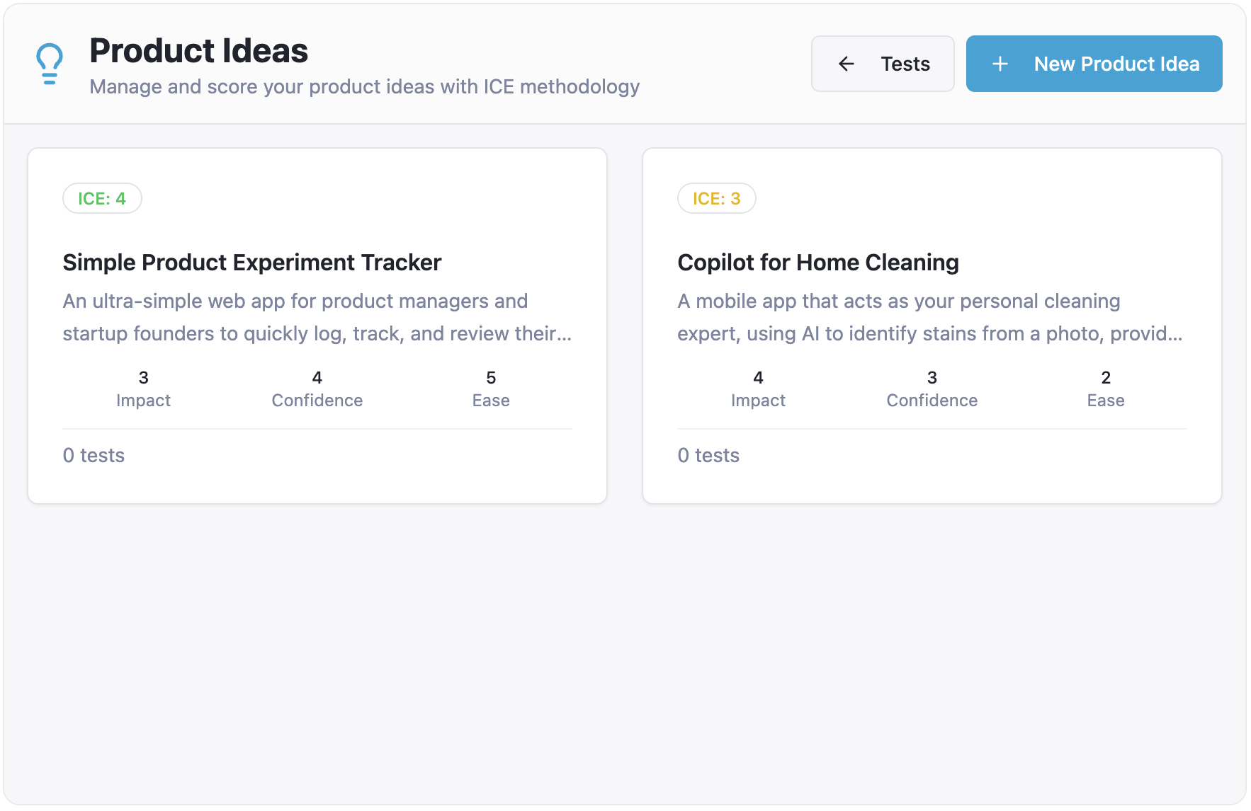
I need to create my ideas from scratch, and they are not connected to the tests I created before:

Screenshot of the Product Ideas page with newly created ideas not connected to tests.
The newly created product ideas are disconnected from existing tests. (Large preview)

Moreover, when I go back to “Tests”, I see that they are all gone. Clearly something went wrong, and my AI assistant confirms that:

No, this is not expected behavior — it’s a bug! The issue is that tests are being stored in two separate places (local state in the Index page and App state), so tests created on the main page don’t sync with the product ideas page.

Sure, eventually it fixed that bug, but note that we encountered this just on the third step, when we asked to slightly extend the functionality of a very simple app. The more layers of complexity we add, the more roadblocks of this sort we are bound to face.

Also note that this specific problem of a not fully thought-out relationship between two entities (product ideas and tests) is not isolated at the technical level, and therefore, it didn’t go away once the technical bug was fixed. The underlying conceptual model is still broken, and it manifests in the UI as well.

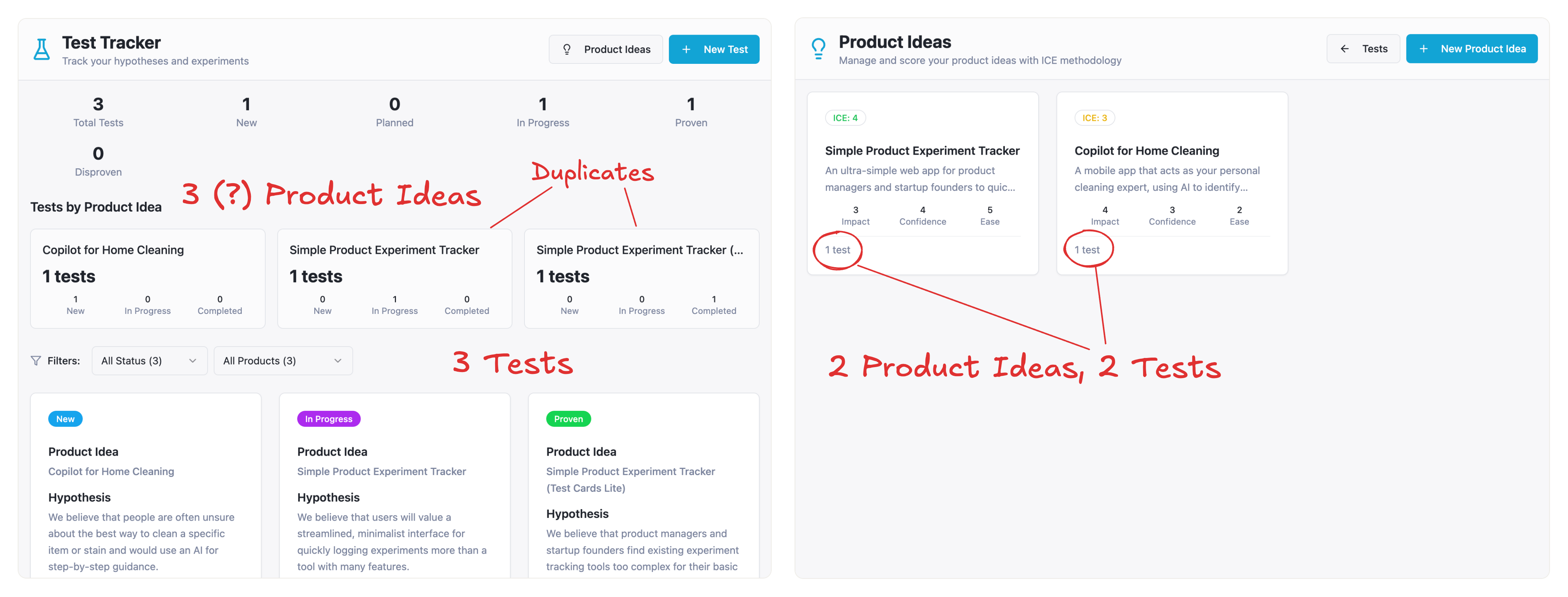
For example, you can still create “orphan” tests that are not connected to any item from the “Product Ideas” page. As a result, you may end up with different numbers of ideas and tests on different pages of the app:

Diagram showing conflicting data between the Tests page and the Product Ideas page.
A poorly defined conceptual model leads to data inconsistencies across the app. (Large preview)

Let’s diagnose what really happened here. The AI’s response that this is a “bug” is only half the story. The true root cause is a conceptual model failure. My prompts never explicitly defined the relationship between product ideas and tests. The AI was forced to guess, which led to the broken experience. For a simple demo, this might be a fixable annoyance. But for a data-heavy enterprise application, this kind of structural ambiguity is fatal. It demonstrates the fundamental weakness of building without a blueprint, which is precisely what vibe coding encourages.

Don’t take this as a criticism of vibe coding tools. They are creating real magic. However, the fundamental truth about “garbage in, garbage out” is still valid. If you don’t express your intent clearly enough, chances are the result won’t fulfill your expectations.

Another problem worth mentioning is that even if you wrestle it into a state that works, the artifact is a black box that can hardly serve as reliable specifications for the final product. The initial meaning is lost in the conversation, and all that’s left is the end result. This makes the development team “code archaeologists,” who have to figure out what the designer was thinking by reverse-engineering the AI’s code, which is frequently very complicated. Any speed gained at the start is lost right away because of this friction and uncertainty.

From Fast Magic To A Solid Foundation 

Pure vibe coding, for all its allure, encourages building without a blueprint. As we’ve seen, this results in structural ambiguity, which is not acceptable when designing complex applications. We are left with a seemingly quick but fragile process that creates a black box that is difficult to iterate on and even more so to hand off.

This leads us back to our main question: how might we close the gap between our design intent and a live prototype, so that we can iterate on real functionality from day one, without getting caught in the ambiguity trap? The answer lies in a more methodical, disciplined, and therefore trustworthy process.

In Part 2 of this series, “A Practical Guide to Building with Clarity”, I will outline the entire workflow for Intent Prototyping. This method places the explicit intent of the designer at the forefront of the process while embracing the potential of AI-assisted coding.

Tuesday, August 19, 2025

The Core Model: Start FROM The Answer, Not WITH The Solution


The Core Model is a practical methodology that flips traditional digital development on its head. Instead of starting with solutions or structure, we begin with a hypothesis about what users need and follow a simple framework that brings diverse teams together to create more effective digital experiences. By asking six good questions in the right order, teams align around user tasks and business objectives, creating clarity that transcends organizational boundaries.

Ever sat in a meeting where everyone jumped straight to solutions? “We need a new app!” “Let’s redesign the homepage!” “AI will fix everything!” This solution-first thinking is endemic in digital development — and it’s why so many projects fail to deliver real value. As the creator of the Core Model methodology, I developed this approach to flip the script: instead of starting with solutions, we start FROM the answer.

What’s the difference? Starting with solutions means imposing our preconceived ideas. Starting FROM the answer to a user task means forming a hypothesis about what users need, then taking a step back to follow a simple structure that validates and refines that hypothesis.

Six Good Questions That Lead to Better Answers

At its heart, the Core Model is simply six good questions asked in the right order, with a seventh that drives action. It appeals to common sense — something often in short supply during complex digital projects.

When I introduced this approach to a large organization struggling with their website, their head of digital admitted: “We’ve been asking all these questions separately, but never in this structured way that connects them.”

These questions help teams pause, align around what matters, and create solutions that actually work:

  1. Who are we trying to help, and what’s their situation?
  2. What are they trying to accomplish?
  3. What do we want to achieve?
  4. How do they approach this need?
  5. Where should they go next?
  6. What’s the essential content or functionality they need?
  7. What needs to be done to create this solution?

This simple framework creates clarity across team boundaries, bringing together content creators, designers, developers, customer service, subject matter experts, and leadership around a shared understanding.

Starting With a Hypothesis

The Core Model process typically begins before the workshop. The project lead or facilitator works with key stakeholders to:

  1. Identify candidate cores based on organizational priorities and user needs.
  2. Gather existing user insights and business objectives.
  3. Form initial hypotheses about what these cores should accomplish.
  4. Prepare relevant background materials for workshop participants.

This preparation ensures the workshop itself is focused and productive, with teams validating and refining hypotheses rather than starting from scratch.

The Core Model: Six Elements That Create Alignment 

Let’s explore each element of the Core Model in detail:

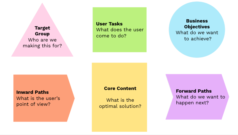
The Core Model framework
The Core Model framework with its six elements: Target Group, User Tasks, Business Objectives, Inward Paths, Forward Paths, and Core Content. (Large preview)

1. Target Group: Building Empathy First

Rather than detailed personas, the Core Model starts with quick proto-personas that build empathy for users in specific situations:

  • A parent researching childcare options late at night after a long day.
  • A small business owner trying to understand tax requirements between client meetings.
  • A new resident navigating unfamiliar public services in their second language.

The key is to humanize users and understand their emotional and practical context before diving into solutions.

2. User Tasks: What People Are Actually Trying to Do

Beyond features or content, what are users actually trying to accomplish?

  • Making an informed decision about a major purchase.
  • Finding the right form to apply for a service.
  • Understanding next steps in a complex process.
  • Checking eligibility for a program or benefit.

These tasks should be based on user research and drive everything that follows. Top task methodology is a great approach to this.

3. Business Objectives: What Success Looks Like

Every digital initiative should connect to clear organizational goals:

  • Increasing online self-service adoption.
  • Reducing support costs.
  • Improving satisfaction and loyalty.
  • Meeting compliance requirements.
  • Generating leads or sales.

These objectives provide the measurement framework for success. (If you work with OKRs, you can think of these as Key Results that connect to your overall Objective.)

4. Inward Paths: User Scenarios and Approaches

This element goes beyond just findability to include the user’s entire approach and mental model:

  • What scenarios lead them to this need?
  • What terminology do they use to describe their problem?
  • How would the phrase their need to Google or an LLM?
  • What emotions or urgency are they experiencing?
  • What channels or touchpoints do they use?
  • What existing knowledge do they bring?

Understanding these angles of different approaches ensures we meet users where they are.

5. Forward Paths: Guiding the Journey

What should users do after engaging with this core?

  • Take a specific action to continue their task.
  • Explore related information or options.
  • Connect with appropriate support channels.
  • Save or share their progress.

These paths create coherent journeys (core flows) rather than dead ends.

6. Core Content: The Essential Solution

Only after mapping the previous elements do we define the actual solution:

  • What information must be included?
  • What functionality is essential?
  • What tone and language are appropriate?
  • What format best serves the need?

This becomes our blueprint for what actually needs to be created.

Action Cards: From Insight to Implementation

The Core Model process culminates with action cards that answer the crucial seventh question: “What needs to be done to create this solution?”

These cards typically include:

  • Specific actions required;
  • Who is responsible;
  • Timeline for completion;
  • Resources needed;
  • Dependencies and constraints.

Action cards transform insights into concrete next steps, ensuring the workshop leads to real improvements rather than just interesting discussions.

The Power of Core Pairs

A unique aspect of the Core Model methodology is working in core pairs—two people from different competencies or departments working together on the same core sheet. This approach creates several benefits:

  • Cross-disciplinary insight
    Pairing someone with deep subject knowledge with someone who brings a fresh perspective.
  • Built-in quality control
    Partners catch blind spots and challenge assumptions.
  • Simplified communication
    One-to-one dialogue is more effective than group discussions.
  • Shared ownership
    Both participants develop a commitment to the solution.
  • Knowledge transfer
    Skills and insights flow naturally between disciplines.

The ideal pair combines different perspectives — content and design, business and technical, expert and novice — creating a balanced approach that neither could achieve alone.

Creating Alignment Within and Between Teams

The Core Model excels at creating two crucial types of alignment:

Within Cross-Functional Teams

Modern teams bring together diverse competencies:

  • Content creators focus on messages and narrative.
  • Designers think about user experience and interfaces.
  • Developers consider technical implementation.
  • Business stakeholders prioritize organizational needs.

The Core Model gives these specialists a common framework. Instead of the designer focusing only on interfaces or the developer only on code, everyone aligns around user tasks and business goals.

As one UX designer told me:

“The Core Model changed our team dynamic completely. Instead of handing off wireframes to developers who didn’t understand the ‘why’ behind design decisions, we now share a common understanding of what we’re trying to accomplish.”

Between Teams Across the Customer Journey

Users don’t experience your organization in silos — they move across touchpoints and teams. The Core Model helps connect these experiences:

  • Marketing teams understand how their campaigns connect to service delivery.
  • Product teams see how their features fit into larger user journeys.
  • Support teams gain context on user pathways and common issues.
  • Content teams create information that supports the entire journey.

By mapping connections between cores (core flows), organizations create coherent experiences rather than fragmented interactions.

Breaking Down Organizational Barriers 

The Core Model creates a neutral framework where various perspectives can contribute while maintaining a unified direction. This is particularly valuable in traditional organizational structures where content responsibility is distributed across departments.

The Workshop: Making It Happen

The Core Model workshop brings these elements together in a practical format that can be adapted to different contexts and needs.

Workshop Format and Timing

For complex projects with multiple stakeholders across organizational silos, the ideal format is a full-day (6–hour) workshop:

First Hour: Foundation and Context

  • Introduction to the methodology (15 min).
  • Sharing user insights and business context (15 min).
  • Reviewing pre-workshop hypotheses (15 min).
  • Initial discussion and questions (15 min).

Hours 2–4: Core Mapping

  • Core pairs work on mapping elements (120 min).
  • Sharing between core pairs and in plenary between elements.
  • Facilitators provide guidance as needed.

Hours 5–6: Presentation, Discussion, and Action Planning

  • Each core pair presents its findings (depending on the number of cores).
  • Extensive group discussion and refinement.
  • Creating action cards and next steps.

The format is highly flexible:

  • Teams experienced with the methodology can conduct focused sessions in as little as 30 minutes.
  • Smaller projects might need only 2–3 hours.
  • Remote teams might split the workshop into multiple shorter sessions.

Workshop Environment

The Core Model workshop thrives in different environments:

  • Analog: Traditional approach using paper core sheets.
  • Digital: Virtual workshops using Miro, Mural, FigJam, or similar platforms.
  • Hybrid: Digital canvas in physical workshop, combining in-person interaction with digital documentation.

Note: You can find all downloads and templates here.

Core Pairs: The Key to Success

The composition of core pairs is critical to success:

  • One person should know the solution domain well (subject matter expert).
  • The other brings a fresh perspective (and learns about a different domain).
  • This combination ensures both depth of knowledge and fresh thinking.
  • Cross-functional pairing creates natural knowledge transfer and breaks down silos.

Workshop Deliverables

Important to note: The workshop doesn’t produce final solutions.

Instead, it creates a comprehensive brief containing the following:

  • Priorities and context for content development.
  • Direction and ideas for design and user experience.
  • Requirements and specifications for functionality.
  • Action plan for implementation with clear ownership.

This brief becomes the foundation for subsequent development work, ensuring everyone builds toward the same goal while leaving room for specialist expertise during implementation.

Getting Started: Your First Core Model Implementation

Ready to apply the Core Model in your organization? Here’s how to begin:

1. Form Your Initial Hypothesis

Before bringing everyone together:

  • Identify a core where users struggle and the business impact is clear.
  • Gather available user insights and business objectives.
  • Form a hypothesis about what this core should accomplish.
  • Identify key stakeholders across relevant departments.

2. Bring Together the Right Core Pairs

Select participants who represent different perspectives:

  • Content creators paired with designers.
  • Business experts paired with technical specialists.
  • Subject matter experts paired with user advocates.
  • Veterans paired with fresh perspectives.

3. Follow the Seven Questions

Guide core pairs through the process:

  • Who are we trying to help, and what’s their situation?
  • What are they trying to accomplish?
  • What do we want to achieve?
  • How do they approach this need?
  • Where should they go next?
  • What’s the essential content or functionality?
  • What needs to be done to create this solution?

4. Create an Action Plan

Transform insights into concrete actions:

  • Document specific next steps on action cards.
  • Assign clear ownership for each action.
  • Establish timeline and milestones.
  • Define how you’ll measure success.

In Conclusion: Common Sense In A Structured Framework

The Core Model works because it combines common sense with structure — asking the right questions in the right order to ensure we address what actually matters.

By starting FROM the answer, not WITH the solution, teams avoid premature problem-solving and create digital experiences that truly serve user needs while achieving organizational goals.

Whether you’re managing a traditional website, creating multi-channel content, or developing digital products, this methodology provides a framework for better collaboration, clearer priorities, and more effective outcomes.

Thursday, March 30, 2023

Algorithm-Driven Design: How Artificial Intelligence Is Changing Design

 Digital products are getting more and more complex. In this article, Yury Vetrov explains why we need to support more platforms, tweak usage scenarios for more user segments, and hypothesize more.

I’ve been following the idea of algorithm-driven design for several years now and have collected some practical examples. The tools of the approach can help us to construct a UI, prepare assets and content, and personalize the user experience. The information, though, has always been scarce and hasn’t been systematic.

However, in 2016, the technological foundations of these tools became easily accessible, and the design community got interested in algorithms, neural networks and artificial intelligence (AI). Now is the time to rethink the modern role of the designer.

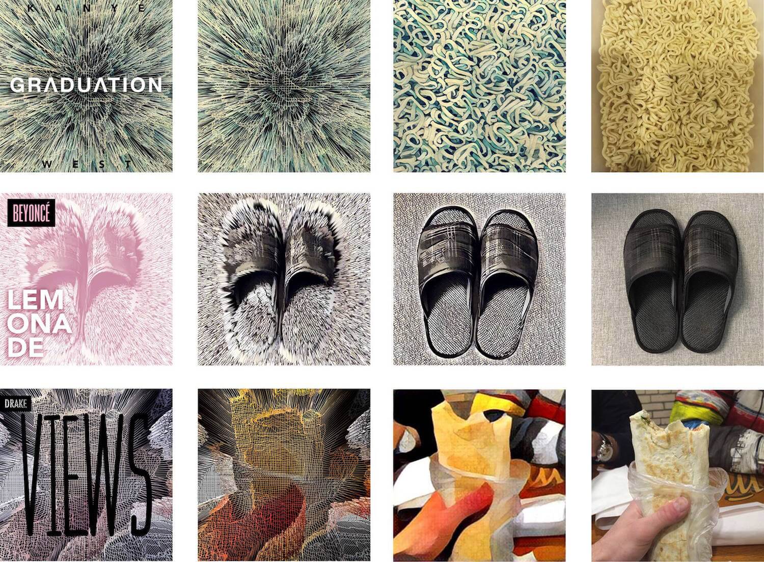
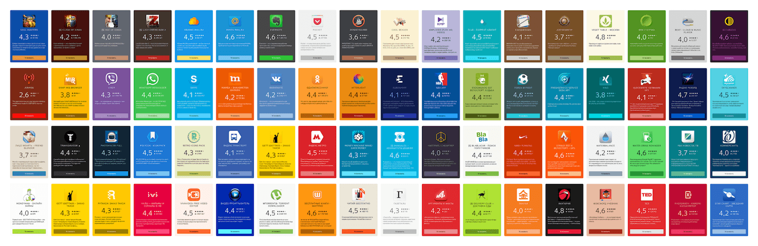
Album covers processed through Prisma and Glitché (View large version)

Further Reading on SmashingMag: #

More after jump! Continue reading below ↓

Will Robots Replace Designers? #

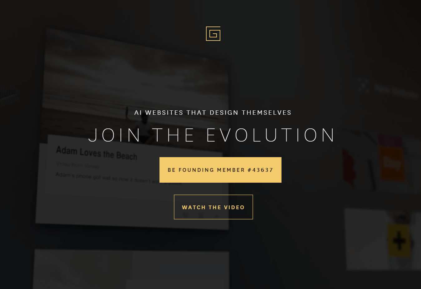
One of the most impressive promises of algorithm-driven design was given by the infamous CMS The Grid. It chooses templates and content-presentation styles, and it retouches and crops photos — all by itself. Moreover, the system runs A/B tests to choose the most suitable pattern. However, the product is still in private beta, so we can judge it only by its publications and ads.

The Designer News community found real-world examples of websites created with The Grid, and they had a mixed reaction — people criticized the design and code quality. Many skeptics opened a champagne bottle on that day.

The Grid CMS (View large version)

The idea to fully replace a designer with an algorithm sounds futuristic, but the whole point is wrong. Product designers help to translate a raw product idea into a well-thought-out user interface, with solid interaction principles and a sound information architecture and visual style, while helping a company to achieve its business goals and strengthen its brand.

Designers make a lot of big and small decisions; many of them are hardly described by clear processes. Moreover, incoming requirements are not 100% clear and consistent, so designers help product managers solve these collisions — making for a better product. It’s much more than about choosing a suitable template and filling it with content.

However, if we talk about creative collaboration, when designers work “in pair” with algorithms to solve product tasks, we see a lot of good examples and clear potential. It’s especially interesting how algorithms can improve our day-to-day work on websites and mobile apps.

Creative Collaboration With Algorithms #

Designers have learned to juggle many tools and skills to near perfection, and as a result, a new term emerged, “product designer.” Product designers are proactive members of a product team; they understand how user research works, they can do interaction design and information architecture, they can create a visual style, enliven it with motion design, and make simple changes in the code for it. These people are invaluable to any product team.

However, balancing so many skills is hard — you can’t dedicate enough time to every aspect of product work. Of course, a recent boon of new design tools has shortened the time we need to create deliverables and has expanded our capabilities. However, it’s still not enough. There is still too much routine, and new responsibilities eat up all of the time we’ve saved. We need to automate and simplify our work processes even more. I see three key directions for this:

  • constructing a UI,
  • preparing assets and content,
  • personalizing the UX.

I’ll show you some examples and propose a new approach for this future work process.

Constructing A UI #

Publishing tools such as Medium, Readymag and Squarespace have already simplified the author’s work — countless high-quality templates will give the author a pretty design without having to pay for a designer. There is an opportunity to make these templates smarter, so that the barrier to entry gets even lower.

For example, while The Grid is still in beta, a hugely successful website constructor, Wix, has started including algorithm-driven features. The company announced Advanced Design Intelligence, which looks similar to The Grid’s semi-automated way of enabling non-professionals to create a website. Wix teaches the algorithm by feeding it many examples of high-quality modern websites. Moreover, it tries to make style suggestions relevant to the client’s industry. It’s not easy for non-professionals to choose a suitable template, and products like Wix and The Grid could serve as a design expert.


Introducing Wix Artificial Design Intelligence

Surely, as in the case of The Grid, rejecting designers from the creative process leads to clichéd and mediocre results (even if it improves overall quality). However, if we consider this process more like "paired design" with a computer, then we can offload many routine tasks; for example, designers could create a moodboard on Dribbble or Pinterest, then an algorithm could quickly apply these styles to mockups and propose a suitable template. Designers would become art directors to their new apprentices, computers.

Of course, we can't create a revolutionary product in this way, but we could free some time to create one. Moreover, many everyday tasks are utilitarian and don't require a revolution. If a company is mature enough and has a design system, then algorithms could make it more powerful.

For example, the designer and developer could define the logic that considers content, context and user data; then, a platform would compile a design using principles and patterns. This would allow us to fine-tune the tiniest details for specific usage scenarios, without drawing and coding dozens of screen states by hand. Florian Schulz shows how you can use the idea of interpolation to create many states of components.

Florian Schultz Interpolation (Large preview)

My interest in algorithm-driven design sprung up around 2012, when my design team at Mail.Ru Group required an automated magazine layout. Existing content had a poor semantic structure, and updating it by hand was too expensive. How could we get modern designs, especially when the editors weren’t designers?

Well, a special script would parse an article. Then, depending on the article's content (the number of paragraphs and words in each, the number of photos and their formats, the presence of inserts with quotes and tables, etc.), the script would choose the most suitable pattern to present this part of the article. The script also tried to mix patterns, so that the final design had variety. It would save the editors time in reworking old content, and the designer would just have to add new presentation modules. Flipboard launched a very similar model a few years ago.

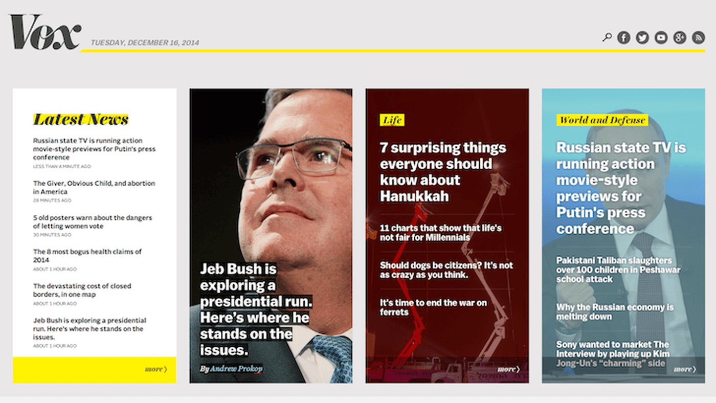
Vox Media made a home page generator using similar ideas. The algorithm finds every possible layout that is valid, combining different examples from a pattern library. Next, each layout is examined and scored based on certain traits. Finally, the generator selects the "best" layout — basically, the one with the highest score. It's more efficient than picking the best links by hand, as proven by recommendation engines such as Relap.io.

Vox's home page generator (View large version)

Preparing Assets And Content #

Creating cookie-cutter graphic assets in many variations is one of the most boring parts of a designer's work. It takes so much time and is demotivating, when designers could be spending this time on more valuable product work.

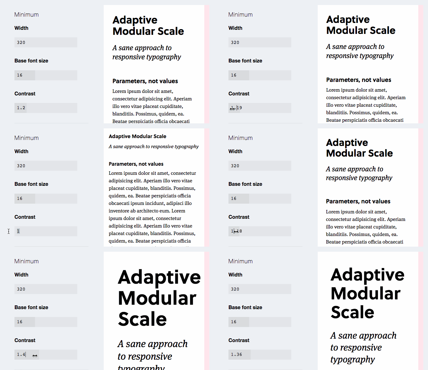
Algorithms could take on simple tasks such as color matching. For example, Yandex.Launcher uses an algorithm to automatically set up colors for app cards, based on app icons. Other variables could be automatically set, such as changing text color according to the background color, highlighting eyes in a photo to emphasize emotion, and implementing parametric typography.

Yandex.Launcher (View large version)

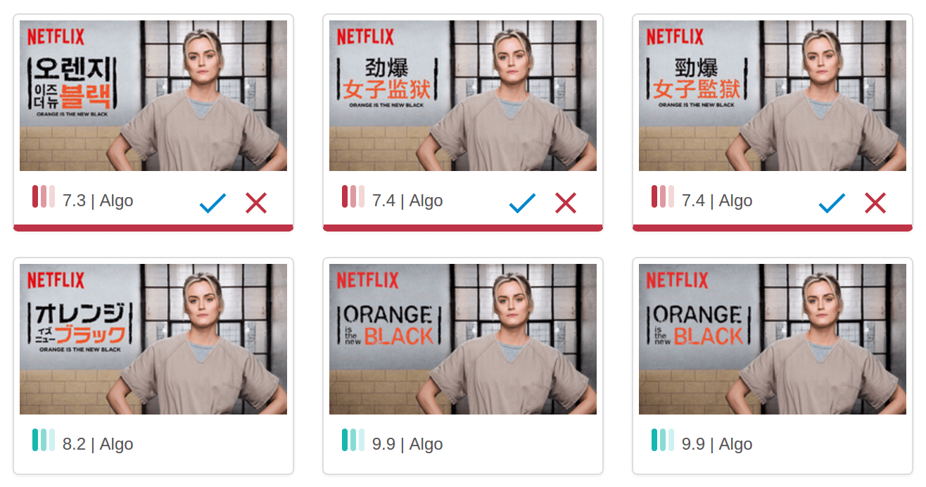
Algorithms can create an entire composition. Yandex.Market uses a promotional image generator for e-commerce product lists (in Russian). A marketer fills a simple form with a title and an image, and then the generator proposes an endless number of variations, all of which conform to design guidelines. Netflix went even further — its script crops movie characters for posters, then applies a stylized and localized movie title, then runs automatic experiments on a subset of users. Real magic! Engadget has nurtured a robot apprentice to write simple news articles about new gadgets. Whew!

Netflix movie ads (View large version)

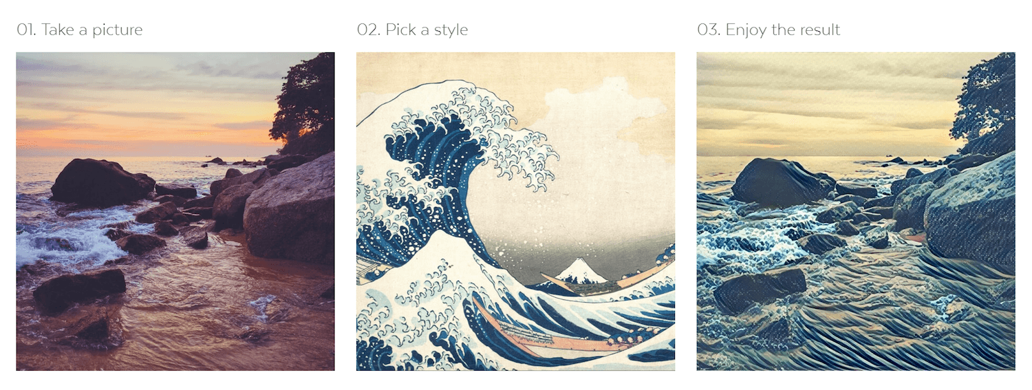
Truly dark magic happens in neural networks. A fresh example, the Prisma app, stylizes photos to look like works of famous artists. Artisto can process video in a similar way (even streaming video).

Prisma (View large version)
Aristo app: example

However, all of this is still at an early stage. Sure, you could download an app on your phone and get a result in a couple of seconds, rather than struggle with some library on GitHub (as we had to last year); but it's still impossible to upload your own reference style and get a good result without teaching a neural network. However, when that happens at last, will it make illustrators obsolete? I doubt it will for those artists with a solid and unique style. But it will lower the barrier to entry when you need decent illustrations for an article or website but don't need a unique approach. No more boring stock photos!

For a really unique style, it might help to have a quick stylized sketch based on a question like, "What if we did an illustration of a building in our unified style?" For example, the Pixar artists of the animated movie Ratatouille tried to apply several different styles to the movie's scenes and characters; what if a neural network made these sketches? We could also create storyboards and describe scenarios with comics (photos can be easily converted to sketches). The list can get very long.

Finally, there is live identity, too. Animation has become hugely popular in branding recently, but some companies are going even further. For example, Wolff Olins presented a live identity for Brazilian telecom Oi, which reacts to sound. You just can't create crazy stuff like this without some creative collaboration with algorithms.

Oi — Logo loop fundo cinza
### Personalizing UX

One way to get a clear and well-developed strategy is to personalize a product for a narrow audience segment or even specific users. We see it every day in Facebook newsfeeds, Google search results, Netflix and Spotify recommendations, and many other products. Besides the fact that it relieves the burden of filtering information from users, the users' connection to the brand becomes more emotional when the product seems to care so much about them.

However, the key question here is about the role of designer in these solutions. We rarely have the skill to create algorithms like these — engineers and big data analysts are the ones to do it. Giles Colborne of CX Partners sees a great example in Spotify's Discover Weekly feature: The only element of classic UX design here is the track list, whereas the distinctive work is done by a recommendation system that fills this design template with valuable music.

Spotify's Discover Weekly feature (a slide from Giles Colborne's presentation)

Colborne offers advice to designers about how to continue being useful in this new era and how to use various data sources to build and teach algorithms. It’s important to learn how to work with big data and to cluster it into actionable insights. For example, Airbnb learned how to answer the question, “What will the booked price of a listing be on any given day in the future?” so that its hosts could set competitive prices. There are also endless stories about Netflix’s recommendation engine.

“Interaction designers vs. algorithms” by Giles Colborne (Source)

A relatively new term, "anticipatory design" takes a broader view of UX personalization and anticipation of user wishes. We already have these types of things on our phones: Google Now automatically proposes a way home from work using location history data; Siri proposes similar ideas. However, the key factor here is trust. To execute anticipatory experiences, people have to give large companies permission to gather personal usage data in the background.

I already mentioned some examples of automatic testing of design variations used by Netflix, Vox Media and The Grid. This is one more way to personalize UX that could be put onto the shoulders of algorithms. Liam Spradlin describes the interesting concept of mutative design; it's a well-though-out model of adaptive interfaces that considers many variables to fit particular users.

An Exoskeleton For Designers #

I've covered several examples of algorithm-driven design in practice. What tools do modern designers need for this? If we look back to the middle of the last century, computers were envisioned as a way to extend human capabilities. Roelof Pieters and Samim Winiger have analyzed computing history and the idea of augmentation of human ability in detail. They see three levels of maturity for design tools:

  1. First-generation systems mimic analogue tools with digital means.
  2. The second generation is assisted creation systems, where humans and machines negotiate the creative process through tight action-feedback loops.
  3. The third generation is assisted creation systems 3.0, which negotiate the creative process in fine-grained conversations, augment creative capabilities and accelerate the acquisition of skills from novice to expert.
CreativeAI
CreativeAI (Large preview)

Algorithm-driven design should be something like an exoskeleton for product designers — increasing the number and depth of decisions we can get through. How might designers and computers collaborate?

The working process of digital product designers could potentially look like this:

  1. Explore a problem space, and pick the most valuable problem for the business and users to solve (analysis).
  2. Explore a solution space, and pick the best solution to fix the problem (analysis).
  3. Develop, launch and market a product that solves this problem (synthesis).
  4. Evaluate how the product works for real users, and optimize it (analysis and synthesis).
  5. Connect and unify the solution with other products and solutions of the company (synthesis).

These tasks are of two types: the analysis of implicitly expressed information and already working solutions, and the synthesis of requirements and solutions for them. Which tools and working methods do we need for each of them?

Analysis #

Analysis of implicitly expressed information about users that can be studied with qualitative research is hard to automate. However, exploring the usage patterns of users of existing products is a suitable task. We could extract behavioral patterns and audience segments, and then optimize the UX for them. It's already happening in ad targeting, where algorithms can cluster a user using implicit and explicit behavior patterns (within either a particular product or an ad network).

To train algorithms to optimize interfaces and content for these user clusters, designers should look into machine learning. Jon Bruner gives a good example: A genetic algorithm starts with a fundamental description of the desired outcome — say, an airline's timetable that is optimized for fuel savings and passenger convenience. It adds in the various constraints: the number of planes the airline owns, the airports it operates in, and the number of seats on each plane. It loads what you might think of as independent variables: details on thousands of flights from an existing timetable, or perhaps randomly generated dummy information. Over thousands, millions or billions of iterations, the timetable gradually improves to become more efficient and more convenient. The algorithm also gains an understanding of how each element of the timetable — the take-off time of Flight 37 from O'Hare, for instance — affects the dependent variables of fuel efficiency and passenger convenience.

In this scenario, humans curate an algorithm and can add or remove limitations and variables. The results can be tested and refined with experiments on real users. With a constant feedback loop, the algorithm improves the UX, too. Although the complexity of this work suggests that analysts will be doing it, designers should be aware of the basic principles of machine learning. O'Reilly published a great mini-book on the topic recently.

Synthesis #

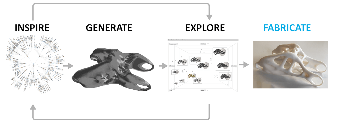
Two years ago, a tool for industrial designers named Autodesk Dreamcatcher made a lot of noise and prompted several publications from UX gurus. It's based on the idea of generative design, which has been used in performance, industrial design, fashion and architecture for many years now. Many of you know Zaha Hadid Architects; its office calls this approach "parametric design."

Autodesk Dreamcatcher (View large version)

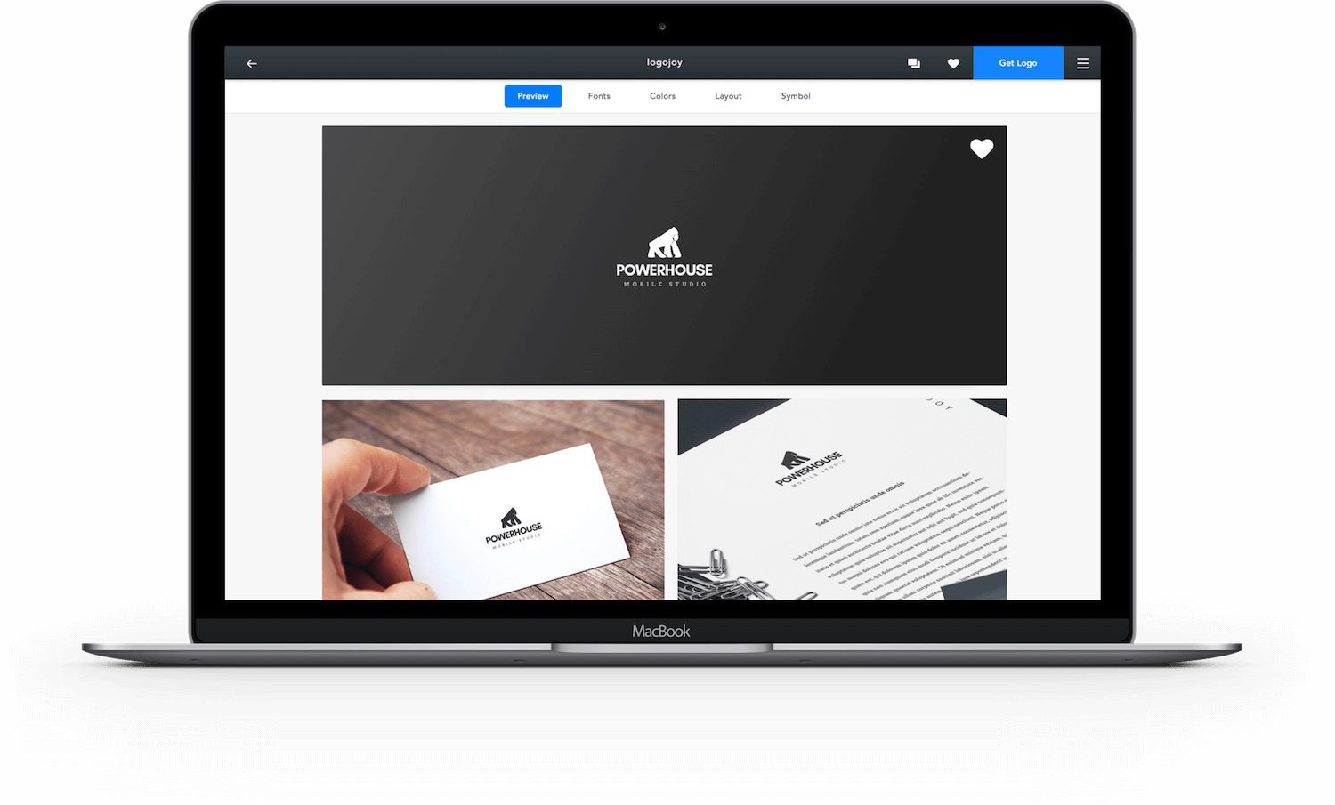
Logojoy is a product to replace freelancers for a simple logo design. You choose favorite styles, pick a color and voila, Logojoy generates endless ideas. You can refine a particular logo, see an example of a corporate style based on it, and order a branding package with business cards, envelopes, etc. It’s the perfect example of an algorithm-driven design tool in the real world! Dawson Whitfield, the founder, described machine learning principles behind it.

Logojoy (Large preview)

However, it’s not yet established in digital product design, because it doesn’t help to solve utilitarian tasks. Of course, the work of architects and industrial designers has enough limitations and specificities of its own, but user interfaces aren’t static — their usage patterns, content and features change over time, often many times. However, if we consider the overall generative process — a designer defines rules, which are used by an algorithm to create the final object — there’s a lot of inspiration. The working process of digital product designers could potentially look like this:

  1. An algorithm generates many variations of a design using predefined rules and patterns.
  2. The results are filtered based on design quality and task requirements.
  3. Designers and managers choose the most interesting and adequate variations, polishing them if needed.
  4. A design system runs A/B tests for one or several variations, and then humans choose the most effective of them.

It's yet unknown how can we filter a huge number of concepts in digital product design, in which usage scenarios are so varied. If algorithms could also help to filter generated objects, our job would be even more productive and creative. However, as product designers, we use generative design every day in brainstorming sessions where we propose dozens of ideas, or when we iterate on screen mockups and prototypes. Why can't we offload a part of these activities to algorithms?

Experiment by Jon Gold #

The experimental tool Rene by Jon Gold, who worked at The Grid, is an example of this approach in action. Gold taught a computer to make meaningful typographic decisions. Gold thinks that it's not far from how human designers are taught, so he broke this learning process into several steps:

  1. Analyze glyphs to understand similarities in typefaces.
  2. Formulate basic guidelines for combining typefaces.
  3. Identify the best examples of type combinations to understand trends.
  4. Create algorithms to observe how great designers work.

His idea is similar to what Roelof and Samim say: Tools should be creative partners for designers, not just dumb executants.

Generative design by Jon Gold: Plausible combinations

Gold’s experimental tool Rene is built on these principles. He also talks about imperative and declarative approaches to programming and says that modern design tools should choose the latter — focusing on what we want to calculate, not how. Jon uses vivid formulas to show how this applies to design and has already made a couple of low-level demos. You can try out the tool for yourself. It’s a very early concept but enough to give you the idea.

Rene — A Product Design Tool

While Jon jokingly calls this approach "brute-force design" and "multiplicative design," he emphasizes the importance of a professional being in control. Notably, he left The Grid team earlier this year.

Do Tools Already Exist? #

Unfortunately, there are no tools for product design for web and mobile that could help with analysis and synthesis on the same level as Autodesk Dreamcatcher does. However, The Grid and Wix could be considered more or less mass-level and straightforward solutions. Adobe is constantly adding features that could be considered intelligent: The latest release of Photoshop has a content-aware feature that intelligently fills in the gaps when you use the cropping tool to rotate an image or expand the canvas beyond the image's original size.

Introducing Content-Aware Crop

There is another experiment by Adobe and University of Toronto. DesignScape automatically refines a design layout for you. It can also propose an entirely new composition.

DesignScape: Design with Interactive Layout Suggestions

You should definitely follow Adobe in its developments, because the company announced a smart platform named Sensei at the MAX 2016 conference. Sensei uses Adobe's deep expertise in AI and machine learning, and it will be the foundation for future algorithm-driven design features in Adobe's consumer and enterprise products. In its announcement, the company refers to things such as semantic image segmentation (showing each region in an image, labeled by type — for example, building or sky), font recognition (i.e. recognizing a font from a creative asset and recommending similar fonts, even from handwriting), and intelligent audience segmentation.

However, as John McCarthy, the late computer scientist who coined the term "artificial intelligence," famously said, "As soon as it works, no one calls it AI anymore." What was once cutting-edge AI is now considered standard behavior for computers. Here are a couple of experimental ideas and tools that could become a part of the digital product designer's day-to-day toolkit:

But these are rare and patchy glimpses of the future. Right now, it's more about individual companies building custom solutions for their own tasks. One of the best approaches is to integrate these algorithms into a company's design system. The goals are similar: to automate a significant number of tasks in support of the product line; to achieve and sustain a unified design; to simplify launches; and to support current products more easily.

Modern design systems started as front-end style guidelines, but that's just a first step (integrating design into code used by developers). The developers are still creating pages by hand. The next step is half-automatic page creation and testing using predefined rules.

“Platform Thinking” by Yury Vetrov (Source)

Pros And Cons #

Should your company follow this approach?

Pros #

If we look in the near term, the value of this approach is more or less clear:

  • Remove the routine of preparing assets and content, which is more or less mechanical work.
  • Broaden creative exploration, where a computer makes combinations of variables, while the designer filters results to find the best variations.
  • Optimize a user interface for narrow audience segments or even specific users.
  • Quickly adapt a design to various platforms and devices, though in a primitive way.
  • Experiment with different parts of a user interface or particular patterns — ideally, automatically.

Altogether, this frees the designer from the routines of both development support and the creative process, but core decisions are still made by them. A neat side effect is that we will better understand our work, because we will be analyzing it in an attempt to automate parts of it. It will make us more productive and will enable us to better explain the essence of our work to non-designers. As a result, the overall design culture within a company will grow.

Cons #

However, all of these benefits are not so easy to implement or have limitations:

  • We can only talk about a company's custom solutions in the context of the company's own tasks. The work requires constant investment into development, support and enhancement.
  • As The Grid's CMS shows, a tool alone can't do miracles. Without a designer at the helm, its results will usually be mediocre. On the other hand, that's true of most professional tools.
  • Breaking past existing styles and solutions becomes harder. Algorithm-driven design is based on existing patterns and rules.
  • Copying another designer's work becomes easier if a generative design tool can dig through Dribbble.

There are also ethical questions: Is design produced by an algorithm valuable and distinct? Who is the author of the design? Wouldn't generative results be limited by a local maximum? Oliver Roeder says that "computer art" isn't any more provocative than "paint art" or "piano art." The algorithmic software is written by humans, after all, using theories thought up by humans, using a computer built by humans, using specifications written by humans, using materials gathered by humans, in a company staffed by humans, using tools built by humans, and so on. Computer art is human art — a subset, rather than a distinction. The revolution is already happening, so why don't we lead it?

Conclusion #

This is a story of a beautiful future, but we should remember the limits of algorithms — they're built on rules defined by humans, even if the rules are being supercharged now with machine learning. The power of the designer is that they can make and break rules; so, in a year from now, we might define "beautiful" as something totally different. Our industry has both high- and low-skilled designers, and it will be easy for algorithms to replace the latter. However, those who can follow and break rules when necessary will find magical new tools and possibilities.

Moreover, digital products are getting more and more complex: We need to support more platforms, tweak usage scenarios for more user segments, and hypothesize more. As Frog's Harry West says, human-centered design has expanded from the design of objects (industrial design) to the design of experiences (encompassing interaction design, visual design and the design of spaces). The next step will be the design of system behavior: the design of the algorithms that determine the behavior of automated or intelligent systems. Rather than hire more and more designers, offload routine tasks to a computer. Let it play with the fonts.