In today’s turbulent landscape of design, Penpot stands out with its
commitment to open-source, free unlimited access, and its unique, robust
features. An example could be its new components system that takes
another leap forward in aligning design with code. Let’s dive into how
it empowers both designers and developers to create more maintainable
and scalable design systems.f you’ve been following along with our Penpot series, you’re already
familiar with this exciting open-source design tool and how it is
changing the game for designer-developer collaboration. Previously,
we’ve explored Penpot’s Flex Layout and Grid Layout features, which bring the power of CSS directly into the hands of designers.
Today, we’re diving into another crucial aspect of modern web design and development: components.
This feature is a part of Penpot’s major 2.0 release, which introduces a
host of new capabilities to bridge the gap between design and code
further. Let’s explore how Penpot’s implementation of components can
supercharge your design workflow and foster even better collaboration
across teams.
About Components
Components
are reusable building blocks that form the foundation of modern user
interfaces. They encapsulate a piece of UI or functionality that can be
reused across your application. This concept of composability — building
complex systems from smaller, reusable parts — is a cornerstone of
modern web development.
Why does composability matter? There are several key benefits:
Single source of truth Changes to a component are reflected everywhere it’s used, ensuring consistency.
Flexibility with simpler dependencies Components can be easily swapped or updated without affecting the entire system.
Easier maintenance and scalability As your system grows, components help manage complexity.
In
the realm of design, this philosophy is best expressed in the concept
of design systems. When done right, design systems help to bring your
design and code together, reducing ambiguity and streamlining the
processes.
However, that’s not so easy to achieve when your
designs are built using logic and standards that are much different from
the code they’re related to. Penpot works to solve this challenge
through its unique approach. Instead of building visual artifacts that
only mimic real-world interfaces, UIs in Penpots are built using the
same technologies and standards as real working products.
This
gives us much better parity between the media and allows designers to
build interfaces that are already expressed as code. It fosters easier collaboration as designers and developers can speak the same language when discussing their components. The final result is more maintainable, too. Changes created by designers can propagate consistently, making it easier to manage large-scale systems.
Now,
let’s take a look at how components in Penpot work in practice! As an
example, I’m going to use the following fictional product page and
recreate it in Penpot:
To
create a component in Penpot, simply select the objects you want to
include and select “Create component” from the context menu. This
transforms your selection into a reusable element.
Create components
Creating Component Variants
Penpot
allows you to create variants of your components. These are alternative
versions that share the same basic structure but differ in specific
aspects like color, size, or state.
You can create variants by using slashes (/) in the components name, for example, by naming your buttons Button/primary and Button/secondary. This will allow you to easily switch between types of a Button component later.
Create variants
Nesting Components And Using External Libraries
Components
in Penpot can be nested, allowing you to build complex UI elements from
simpler parts. This mirrors how developers often structure their code.
In other words, you can place components inside one another.
Moreover,
the components you use don’t have to come from the same file or even
from the same organization. You can easily share libraries of components
across projects just as you would import code from various dependencies
into your codebase. You can also import components from external
libraries, such as UI kits and icon sets. Penpot maintains a growing list of such resources
for you to choose from, including everything from the large design
systems like Material Design to the most popular icon libraries.
Nesting components
Organizing Your Design System
The new major release of Penpot comes with a redesigned Assets panel,
which is where your components live. In the Assets panel, you can
easily access your components and drag and drop them into designs.
For the better maintenance of design systems, Penpot allows you to store your colors and typography as reusable styles. Same as components, you can name your styles and organize them into hierarchical structures.
Assets panel and styles
Configuring Components
One
of the main benefits of using composable components in front-end
libraries such as React is their support of props. Component props
(short for properties) allow you a great deal of flexibility in how you
configure and customize your components, depending on how, where, and
when they are used.
Penpot offers similar capabilities in a design
tool with variants and overrides. You can switch variants, hide
elements, change styles, swap nested components within instances, or
even change the whole layout of a component, providing flexibility while
maintaining the link to the original component.
Configure components
Creating Flexible, Scalable Systems
Allowing you to modify Flex and Grid layouts in component instances is where Penpot really shines. However, the power of these layout features goes beyond the components themselves.
With
Flex Layout and Grid Layout, you can build components that are much
more faithful to their code and easier to modify and maintain. But
having those powerful features at your fingertips means that you can
also place your components in other Grid and Flex layouts. That’s a big
deal as it allows you to test your components in scenarios much closer
to their real environment. Directly in a design tool, you can see how
your component would behave if you put it in various places on your
website or app. This allows you to fine-tune how your components fit
into a larger system. It can dramatically reduce friction between design
and code and streamline the handoff process.
Adjust and create overrides
Generating Components Code
As
Penpot’s components are just web-ready code, one of the greatest
benefits of using it is how easily you can export code for your
components. This feature, like all of Penpot’s capabilities, is
completely free.
Using Penpot’s Inspect panel, you can quickly
grab all the layout properties and styles as well as the full code
snippets for all components.
Code inspect
Documentation And Annotations
To
make design systems in Penpot even more maintainable, it includes
annotation features to help you document your components. This is
crucial for maintaining a clear design system and ensuring a smooth handoff to developers.
Annotations
Summary
Penpot’s
implementation of components and its support for real CSS layouts make
it a standout tool for designers who want to work closely with
developers. By embracing web standards and providing powerful, flexible
components, Penpot enables designers to create more developer-friendly designs without sacrificing creativity or control.
All
of Penpot’s features are completely free for both designers and
developers. As open-source software, Penpot lets you fully own your
design tool experience and makes it accessible for everyone, regardless
of team size and budget.
Ready to dive in? You can explore the file used in this article by downloading it and importing into your Penpot account.
As
the design tool landscape continues to evolve, Penpot is taking charge
of bringing designers and developers closer together. Whether you’re a
designer looking to understand the development process or a developer
seeking to streamline your workflow with designers, Penpot’s component
system is worth exploring.
WCAG
provides guidance for making interactive elements more accessible by
specifying minimum size requirements. In fact, the requirements are
documented in two Success Criteria: 2.5.5 and 2.5.8. Despite this, WCAG
can be difficult to achieve due to a number of misconceptions about the
requirements. In this article, Eric Bailey discusses the nuances of
interactive element sizes and clarifies what it looks like to provide
accessible interactive experiences using WCAG-compliant target sizes.
There
are many rumors and misconceptions about conforming to WCAG criteria
for the minimum sizing of interactive elements. I’d like to use this
post to demystify what is needed for baseline compliance and to point out an approach for making successful and inclusive interactive experiences using ample target sizes.
Getting right to it: When it comes to pure Web Content Accessibility Guidelines (WCAG) conformance, the bare minimumpixel sizefor an interactive, non-inline element is 24×24 pixels. This is outlined in Success Criterion 2.5.8: Target Size (Minimum).
Success Criterion 2.5.8 is level AA,
which is the most commonly used level for public, mass-consumed
websites. This Success Criterion (or SC for short) is sometimes confused
for SC 2.5.5 Target Size (Enhanced),
which is level AAA. The two are distinct and provide separate guidance
for properly sizing interactive elements, even if they appear similar at
first glance.
SC 2.5.8 is relatively new to WCAG, having been released as part of WCAG version 2.2, which was published on October 5th, 2023. WCAG 2.2 is the most current version of the standard,
but this newer release date means that knowledge of its existence isn’t
as widespread as the older SC, especially outside of web accessibility
circles. That said, WCAG 2.2 will remain the standard until WCAG 3.0 is released, something that is likely going to take 10–15 years or more to happen.
SC 2.5.5 calls for larger interactive elements sizes that are at least 44×44 pixels (compared to the SC 2.5.8 requirement of 24×24 pixels). At the same time, notice that SC 2.5.5 is level AAA (compared to SC 2.5.8, level AA) which is a level reserved for specialized support beyond level AA.
Sites that need to be fully WCAG Level AAA conformant are rare.
Chances are that if you are making a website or web app, you’ll only
need to support level AA. Level AAA is often reserved for large or
highly specialized institutions.
Making Interactive Elements Larger With CSS Padding #
The family of padding-related properties in CSS can be used to extend the interactive area of an element to make it conformant. For example, declaring padding: 4px;
on an element that measures 16×16 pixels invisibly increases its
bounding box to a total of 24×24 pixels. This, in turn, means the
interactive element satisfies SC 2.5.8.
This
is a good trick for making smaller interactive elements easier to click
and tap. If you want more information about this sort of thing, I
enthusiastically recommend Ahmad Shadeed’s post, “Designing better target sizes”.
I think it’s also worth noting that CSS margin could also hypothetically be used to achieve level AA conformance since the SC includes a spacing exception:
Spacing:
Undersized targets (those less than 24×24 CSS pixels) are positioned so
that if a 24 CSS pixel diameter circle is centered on the bounding box of each, the circles do not intersect another target or the circle for another undersized target;
[…]
The difference here is that padding extends the interactive area, while margin does not. Through this lens, you’ll want to honor the spirit of the success criterion because partial conformance is adversarial conformance. At the end of the day, we want to help people successfully click or tap interactive elements, such as buttons.
We
tend to think of targets in terms of block elements — elements that are
displayed on their own line, such as a button at the end of a
call-to-action. However, interactive elements can be inline elements as
well. Think of links in a paragraph of text.
Inline interactive elements, such as text links in paragraphs, do not need to meet the 24×24 pixel minimum requirement. Just as margin is an exception in SC 2.5.8: Target Size (Minimum), so are inline elements with an interactive target:
If
the differences between interactive elements that are inline and block
are still confusing, that’s probably because the whole situation is even
further muddied by third-party human interface guidelines requiring
interactive sizes closer to what the level AAA Success Criterion 2.5.5
Target Size (Enhanced) demands.
These may satisfy Apple and Google requirements for designing interfaces, but are they WCAG-conformant
Apple and Google — not to mention any other organization with UI
guidelines — can specify whatever interface requirements they want, but are they copasetic with WCAG SC 2.5.5 and SC 2.5.8?
It’s
important to ask this question because there is a hierarchy when it
comes to accessibility compliance, and it contains legal levels:
Human
interface guidelines often inform design systems, which, in turn,
influence the sites and apps that are built by authors like us. But
they’re not the “authority” on accessibility compliance. Notice how
everything is (and ought to be) influenced by WCAG at the very top of
the chain.
Even if these third-party interface guidelines conform
to SC 2.5.5 and 2.5.8, it’s still tough to tell when they are expressed
in “points” and “density independent pixels” which aren’t pixels, but often get conflated as such. I’d advise not getting too deep into researching what a pixel truly is.
Trust me when I say it’s a road you don’t want to go down. But whatever
the case, the inconsistent use of unit sizes exacerbates the issue.
After all, mouse cursors are for fine movements, and touchscreens are for more broad gestures, right? Not always. The thing is, devices are multimodal. They can support many different kinds of input
and don’t require a special switch to flip or button to press to do so.
A straightforward example of this is switching between a trackpad and a
keyboard while you browse the web. A less considered example is a
device with a touchscreen that also supports a trackpad, keyboard,
mouse, and voice input.
You might think that the combination of
trackpad, keyboard, mouse, and voice inputs sounds like some sort of
absurd, obscure Frankencomputer, but what I just described is a Microsoft Surface laptop, and guess what? They’re pretty popular.
There
is a difference between the two, even though they are often used
interchangeably. Let’s delineate the two as clearly as possible:
Responsive Design is about designing for an unknown device.
Inclusive Design is about designing for an unknown user.
The other end of this consideration is that people with motor control conditions
— like hand tremors or arthritis — can and do use mice inputs. This
means that fine input actions may be painful and difficult, yet
ultimately still possible to perform.
People also use more precise input mechanisms for touchscreens all the time, including both official accessories and aftermarket devices. In other words, some devices designed to accommodate coarse input can also be used for fine detail work.
I’d
be remiss if I didn’t also point out that people plug mice and
keyboards into smartphones. We cannot automatically say that they only
support coarse pointers:
My point is that a mode-based approach to inclusive design is a trap. This isn’t even about view–tap asymmetry.
Creating entire alternate experiences based on assumed input mode
reinforces an ugly “us versus them” mindset. It’s also far more work to
set up, maintain, and educate others.
It’s better to proactively accommodate an unknown number of unknown people using an unknown suite of devices in unknown ways by providing an inclusive experience by default. Doing so has a list of benefits:
A WCAG-conformant 24×24 minimum pixel size requirement for interactive elements is our industry’s best understanding
of what can accommodate most access needs distributed across a global
population accessing an unknown amount of content dealing with unknown
topics in unknown ways under unknown circumstances.
The load-bearing word in that previous sentence is minimum. The guidance — and the pixel size it mandates — is likely a balancing act between:
Setting something up that is functional enough while also
Avoiding a standard that would be impossible to broadly achieve (hence the SC 2.5.5 level AAA rating).
“This
Success Criterion defines a minimum size and, if this can't be met, a
minimum spacing. It is still possible to have very small and
difficult-to-activate targets and meet the requirements of this Success
Criterion.”
Larger interactive areas can be a good thing to strive for. This is to say a
minimum of approximately 40 pixels may be beneficial for individuals
who struggle with the smaller yet still WCAG-conformant size.
Interactive Area Sizing Is As Much An Art As It Is A Science #
We should also be careful not to overcorrect by dropping in gigantic interactive elements in all of our work. If an interactive area is too
large, it risks being activated by accident. This is important to note
when an interactive element is placed in close proximity to other
interactive elements and even more important to consider when activating
those elements can result in irrevocable consequences.
There is
also a phenomenon where elements, if large enough, are not interpreted
or recognized as being interactive. Consequently, users may
inadvertently miss them, despite large sizing.
Conformant and successful interactive areas — both large and small — require knowing the ultimate goals of your website or web app. When you arm yourself with this context, you are empowered to make informed decisions about the kinds of people who use your service, why they use the service, and how you can accommodate them.
For example, the Glow Baby app uses larger interactive elements
because it knows the user is likely holding an adorable, albeit squirmy
and fussy, baby while using the application. This allows Glow Baby to
emphasize the interactive targets in the interface to accommodate
parents who have their hands full.
Source: “Touch Targets on Touchscreens” by Neilsen Norman Group. (Large preview)
For
example, in digital maps, the position of pins is analogous to the
position of places shown on the map. If there are many pins close
together, the spacing between pins and neighboring pins will often be
below 24 CSS pixels. It is essential to show the pins at the correct map
location; therefore, the Essential exception applies.
[…]
When
the "Essential" exception is applicable, authors are strongly
encouraged to provide equivalent functionality through alternative means
to the extent practical.
Note that this exemption language is not carte blanche to make your own work an exception to the rule.
It is more of a mechanism, and an acknowledgment that broadly applied
rules may have exceptions that are worth thinking through and
documenting for future reference.
What about people who are driving in a car? People in
this context probably ought to be provided straightforward, simple
interactions that are facilitated via large interactive areas to prevent
them from taking their eyes off the road. The same could also be said
for high-stress environments like hospitals and oil rigs.
Similarly, devices and apps that are designed for children
may require interactive areas that are larger than WCAG requirements
for interactive areas. So would experiences aimed at older demographics,
where age-derived vision and motor control disability factors tend to
be more present.
Minimum conformant interactive area experiences
may also make sense in their own contexts. Data-rich, information-dense
experiences like the Bloomberg terminal come to mind here.
While you can control what components you include in a design system, you cannot control where and how they’ll be used by those who adopt and use that design system. Because of this, I suggest defensively baking accessible defaults into your design systems because they can go a long way toward incorporating accessible practices when they’re integrated right out of the box.
One option worth consideration is providing an accessible range of choices.
Components, like buttons, can have size variants (e.g., small, medium,
and large), and you can provide a minimally conformant interactive
target on the smallest variant and then offer larger, equally conformant
versions.
There
is no magic number or formula to get you that perfect Goldilocks “not
too small, not too large, but just right” interactive area size. It
requires knowledge of what the people who want to use your service want,
and how they go about getting it.
The best way to learn that? Ask people.
Accessibility
research includes more than just asking people who use screen readers
what they think. It’s also a lot easier to conduct than you might think!
For example, prototypes are a great way to quickly and inexpensively
evaluate and de-risk your ideas before committing to writing production
code. “Conducting Accessibility Research In An Inaccessible Ecosystem” by Dr. Michele A. Williams is chock full of tips, strategies, and resources you can use to help you get started with accessibility research.
built
an app that integrates vision language models (VLMs) and text-to-speech
(TTS) AI technologies to describe images audibly with speech. This
audio description tool can be a big help for people with sight
challenges to understand what’s in an image. But how this does it even
work? Joas explains how these AI systems work and their potential uses,
including how he built the app and ways to further improve it.
Audio
descriptions involve narrating contextual visual information in images
or videos, improving user experiences, especially for those who rely on
audio cues.
At the core of audio description technology are two crucial components: the description and the audio.
The description involves understanding and interpreting the visual
content of an image or video, which includes details such as actions,
settings, expressions, and any other relevant visual information.
Meanwhile, the audio component converts these descriptions into spoken
words that are clear, coherent, and natural-sounding.
So, here’s something we can do: build an app that generates and announces audio descriptions.
The app can integrate a pre-trained vision-language model to analyze
image inputs, extract relevant information, and generate accurate
descriptions. These descriptions are then converted into speech using
text-to-speech technology, providing a seamless and engaging audio
experience.
The
app allows users to upload an image file, which it uses to generate a
text description of the image before turning that into an audio file
that announces the description. (Large preview)
By
the end of this tutorial, you will gain a solid grasp of the components
that are used to build audio description tools. We’ll spend time
discussing what VLM and TTS models are, as well as many examples of them
and tooling for integrating them into your work.
When we finish,
you will be ready to follow along with a second tutorial in which we
level up and build a chatbot assistant that you can interact with to get
more insights about your images or videos.
They
are trained on vast amounts of data that include images, videos, and
text, allowing them to learn patterns and relationships between these
modalities. In simple terms, a VLM can look at an image or video and
generate a corresponding text description that accurately matches the
visual content.
VLMs typically consist of three main components:
An image model that extracts meaningful visual information,
A text model that processes and understands natural language,
A fusion mechanism that combines the representations learned by the image and text models, enabling cross-modal interactions.
Generally speaking, the image model
— also known as the vision encoder — extracts visual features from
input images and maps them to the language model’s input space, creating
visual tokens. The text model then processes and
understands natural language by generating text embeddings. Lastly,
these visual and textual representations are combined through the fusion mechanism, allowing the model to integrate visual and textual information.
VLMs
bring a new level of intelligence to applications by bridging visual
and linguistic understanding. Here are some of the applications where
VLMs shine:
Image captions: VLMs can provide
automatic descriptions that enrich user experiences, improve
searchability, and even enhance visuals for vision impairments.
Visual answers to questions:
VLMs could be integrated into educational tools to help students learn
more deeply by allowing them to ask questions about visuals they
encounter in learning materials, such as complex diagrams and
illustrations.
Document analysis: VLMs can
streamline document review processes, identifying critical information
in contracts, reports, or patents much faster than reviewing them
manually.
Image search: VLMs could open up the
ability to perform reverse image searches. For example, an e-commerce
site might allow users to upload image files that are processed to
identify similar products that are available for purchase.
Content moderation:
Social media platforms could benefit from VLMs by identifying and
removing harmful or sensitive content automatically before publishing
it.
Robotics: In industrial settings, robots
equipped with VLMs can perform quality control tasks by understanding
visual cues and describing defects accurately.
This is
merely an overview of what VLMs are and the pieces that come together to
generate audio descriptions. To get a clearer idea of how VLMs work,
let’s look at a few real-world examples that leverage VLM processes.
Based
on the use cases we covered alone, you can probably imagine that VLMs
come in many forms, each with its unique strengths and applications. In
this section, we will look at a few examples of VLMs that can be used
for a variety of different purposes.
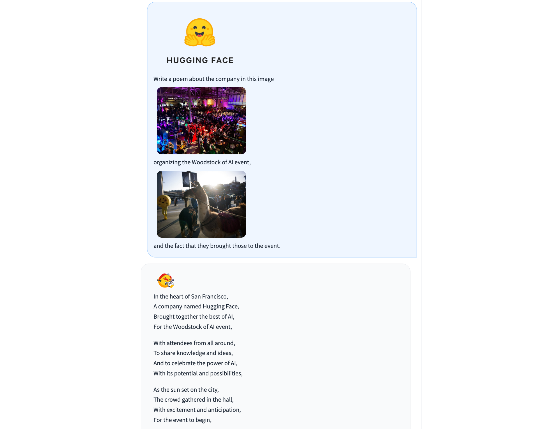
IDEFICS is an open-access model inspired by Deepmind’s Flamingo,
designed to understand and generate text from images and text inputs.
It’s similar to OpenAI’s GPT-4 model in its multimodal capabilities but
is built entirely from publicly available data and models.
IDEFICS can generate different types of content, including poetry, from the contents of an image file. (Large preview)
IDEFICS
is trained on public data and models — like LLama V1 and Open Clip —
and comes in two versions: the base and instructed versions, each
available in 9 billion and 80 billion parameter sizes.
The
model combines two pre-trained unimodal models (for vision and
language) with newly added Transformer blocks that allow it to bridge
the gap between understanding images and text. It’s trained on a mix of
image-text pairs and multimodal web documents, enabling it to handle a
wide range of visual and linguistic tasks. As a result, IDEFICS can
answer questions about images, provide detailed descriptions of visual
content, generate stories based on a series of images, and function as a
pure language model when no visual input is provided.
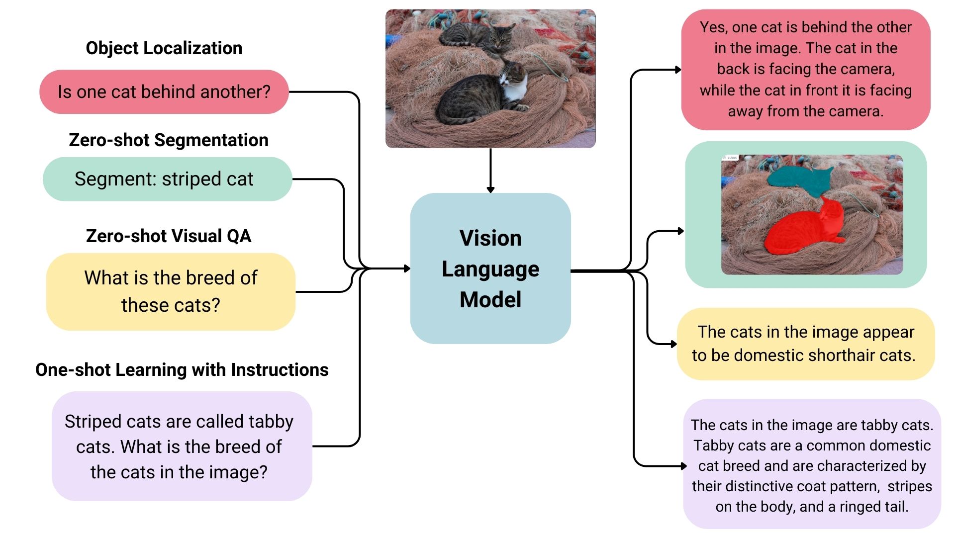
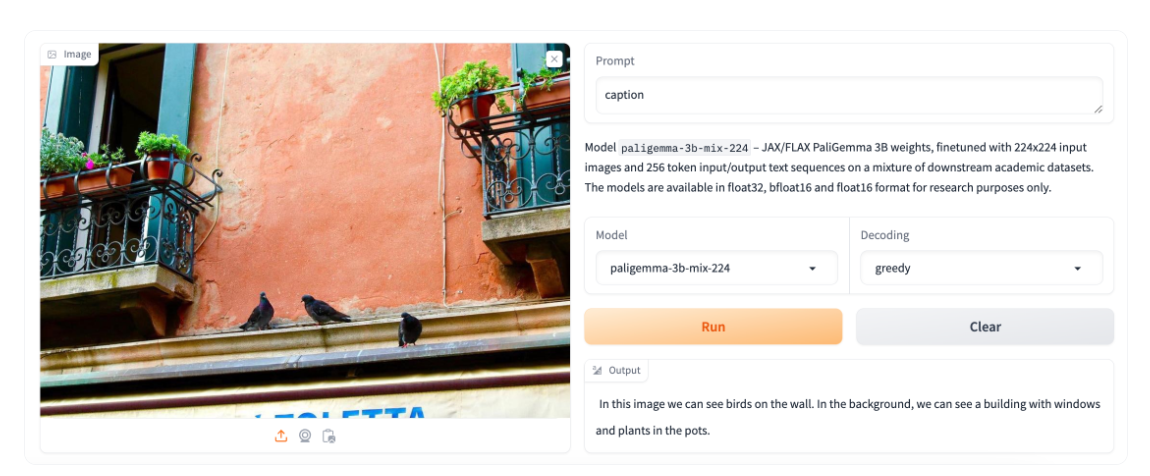
PaliGemma is an advanced VLM that draws inspiration from PaLI-3 and leverages open-source components like the SigLIP vision model and the Gemma language model.
Google’s PaliGemma model used to generate image captions. (Large preview)
Designed
to process both images and textual input, PaliGemma excels at
generating descriptive text in multiple languages. Its capabilities
extend to a variety of tasks, including image captioning, answering
questions from visuals, reading text, detecting subjects in images, and
segmenting objects displayed in images.
The core architecture of
PaliGemma includes a Transformer decoder paired with a Vision
Transformer image encoder that boasts an impressive 3 billion parameters. The text decoder is derived from Gemma-2B, while the image encoder is based on SigLIP-So400m/14.
Through
training methods similar to PaLI-3, PaliGemma achieves exceptional
performance across numerous vision-language challenges.
PaliGemma is offered in two distinct sets:
General Purpose Models (PaliGemma): These pre-trained models are designed for fine-tuning a wide array of tasks, making them ideal for practical applications.
Research-Oriented Models (PaliGemma-FT): Fine-tuned on specific research datasets, these models are tailored for deep research on a range of topics.
The Phi-3-Vision-128K-Instruct
model is a Microsoft-backed venture that combines text and vision
capabilities. It’s built on a dataset of high-quality, reasoning-dense
data from both text and visual sources. Part of the Phi-3 family, the
model has a context length of 128K, making it suitable for a range of
applications.
You might decide to use Phi-3-Vision-128K-Instruct
in cases where your application has limited memory and computing power,
thanks to its relatively lightweight that helps with
latency. The model works best for generally understanding images,
recognizing characters in text, and describing charts and tables.
Yi-VL is an open-source AI model developed by 01-ai
that can have multi-round conversations with images by reading text
from images and translating it. This model is part of the Yi LLM series
and has two versions: 6B and 34B.
What distinguishes Yi-VL from other models is its ability to carry a conversation,
whereas other models are typically limited to a single text input.
Plus, it’s bilingual making it more versatile in a variety of language
contexts.
There
are many, many VLMs and we only looked at a few of the most notable
offerings. As you commence work on an application with image-to-text
capabilities, you may find yourself wondering where to look for VLM
options and how to compare them.
There are two resources in the
Hugging Face community you might consider using to help you find and
compare VLMs. I use these regularly and find them incredibly useful in
my work.
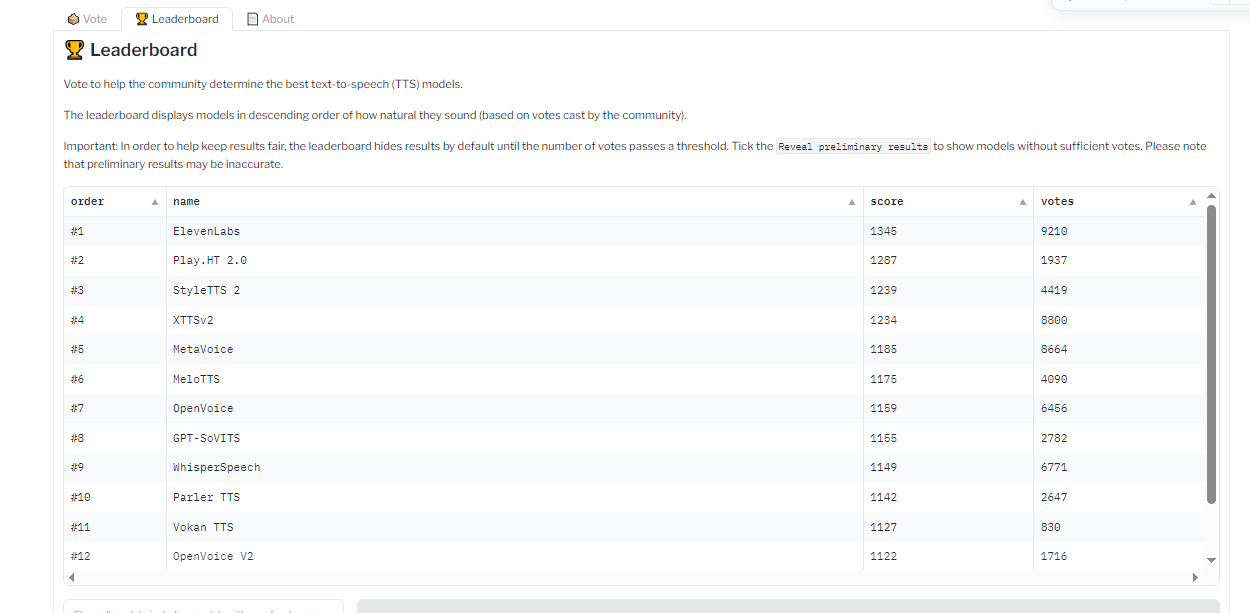
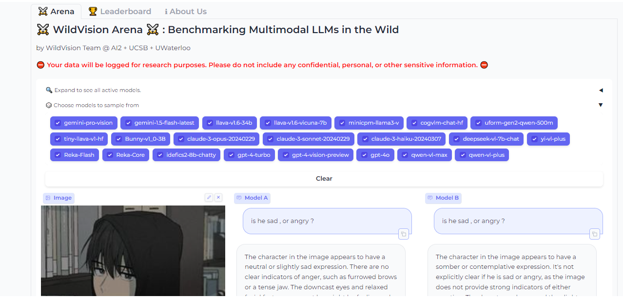
Vision Arena is a leaderboard that ranks VLMs based on anonymous user voting and reviews. But what makes it great is the fact that you can compare any two models side-by-side for yourself to find the best fit for your application.
And when you compare two models, you can contribute your own anonymous votes and reviews for others to lean on as well.
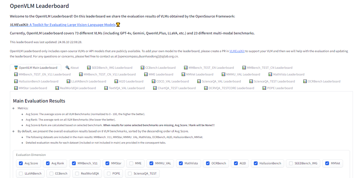
OpenVLM
is another leaderboard hosted on Hugging Face for getting technical
specs on different models. What I like about this resource is the wealth
of metrics for evaluating VLMs, including the speed and accuracy of a
given VLM.
Further, OpenVLM lets you filter models by size, type
of license, and other ranking criteria. I find it particularly useful
for finding VLMs I might have overlooked or new ones I haven’t seen yet.
Earlier,
I mentioned that the app we are about to build will use vision-language
models to generate written descriptions of images, which are then read
aloud. The technology that handles converting text to audio speech is
known as text-to-speech synthesis or simply text-to-speech (TTS).
TTS
converts written text into synthesized speech that sounds natural. The
goal is to take published content, like a blog post, and read it out
loud in a realistic-sounding human voice.
So, how does TTS work? First, it breaks down text into the smallest units of sound, called phonemes,
and this process allows the system to figure out proper word
pronunciations. Next, AI enters the mix, including deep learning
algorithms trained on hours of human speech data. This is how we get the
app to mimic human speech patterns, tones, and rhythms — all the things
that make for “natural” speech. The AI component is key as it elevates a
voice from robotic to something with personality. Finally, the system
combines the phoneme information with the AI-powered digital voice to
render the fully expressive speech output.
The result is
automatically generated speech that sounds fairly smooth and natural.
Modern TTS systems are extremely advanced in that they can replicate
different tones and voice inflections, work across languages, and
understand context. This naturalness makes TTS ideal for humanizing interactions with technology, like having your device read text messages out loud to you, just like Apple’s Siri or Microsoft’s Cortana.
Based
on the use cases we covered alone, you can probably imagine that VLMs
come in many forms, each with its unique strengths and applications. In
this section, we will look at a few examples of VLMs that can be used
for a variety of different purposes.
Just as we took a moment to
review existing vision language models, let’s pause to consider some of
the more popular TTS resources that are available.
“Bark is a transformer-based text-to-audio model created by Suno.
Bark can generate highly realistic, multilingual speech as well as
other audio — including music, background noise, and simple sound
effects. The model can also produce nonverbal communication, like
laughing, sighing, and crying. To support the research community, we are
providing access to pre-trained model checkpoints ready for inference.”
The
non-verbal communication cues are particularly interesting and a
distinguishing feature of Bark. Check out the various things Bark can do
to communicate emotion, pulled directly from the model’s GitHub repo:
[laughter]
[laughs]
[sighs]
[music]
[gasps]
[clears throat]
This
could be cool or creepy, depending on how it’s used, but reflects the
sophistication we’re working with. In addition to laughing and gasping,
Bark is different in that it doesn’t work with phonemes like a typical TTS model:
“It
is not a conventional TTS model but instead a fully generative
text-to-audio model capable of deviating in unexpected ways from any
given script. Different from previous approaches, the input text prompt
is converted directly to audio without the intermediate use of phonemes.
It can, therefore, generalize to arbitrary instructions beyond speech,
such as music lyrics, sound effects, or other non-speech sounds.”
🐶 Bark
Bark is a universal text-to-audio model created by [Suno](www.suno.ai),
with code publicly available [here](https://github.com/suno-ai/bark).
Bark can generate highly realistic, multilingual speech as well as other
audio - including music, background noise and simple sound effects.
This demo should be used for research purposes only. Commercial use is
strictly prohibited. The model output is not censored and the authors do
not endorse the opinions in the generated content. Use at your own
risk.
Generated Audio
Examples
Input Text
Acoustic Prompt
Please surprise me and speak in whatever voice you enjoy. Vielen Dank und Gesundheit!
Unconditional
Hello, my name is Suno. And, uh — and I like pizza. [laughs] But I also have other interests such as playing tic tac toe.
Speaker 1 (en)
Buenos días Miguel. Tu colega piensa que tu alemán es extremadamente malo. But I suppose your english isn't terrible.
Speaker 0 (es)
🌎 Foreign Language
Bark supports various languages out-of-the-box and automatically
determines language from input text. When prompted with code-switched
text, Bark will even attempt to employ the native accent for the
respective languages in the same voice.
Try the prompt:
Buenos días Miguel. Tu colega piensa que tu alemán es extremadamente malo. But I suppose your english isn't terrible.
🤭 Non-Speech Sounds
Below is a list of some known non-speech sounds, but we are finding
more every day. Please let us know if you find patterns that work
particularly well on Discord!
[laughter]
[laughs]
[sighs]
[music]
[gasps]
[clears throat]
— or … for hesitations
♪ for song lyrics
capitalization for emphasis of a word
MAN/WOMAN: for bias towards speaker
Try the prompt:
" [clears throat] Hello, my name is Suno. And, uh — and I like pizza. [laughs] But I also have other interests such as... ♪ singing ♪."
🎶 Music
Bark can generate all types of audio, and, in principle, doesn’t see a
difference between speech and music. Sometimes Bark chooses to generate
text as music, but you can help it out by adding music notes around
your lyrics.
Try the prompt:
♪ In the jungle, the mighty jungle, the lion barks tonight ♪
🧬 Voice Cloning
Bark has the capability to fully clone voices - including tone,
pitch, emotion and prosody. The model also attempts to preserve music,
ambient noise, etc. from input audio. However, to mitigate misuse of
this technology, we limit the audio history prompts to a limited set of
Suno-provided, fully synthetic options to choose from.
👥 Speaker Prompts
You can provide certain speaker prompts such as NARRATOR, MAN, WOMAN,
etc. Please note that these are not always respected, especially if a
conflicting audio history prompt is given.
Try the prompt:
WOMAN: I would like an oatmilk latte please.
MAN: Wow, that's expensive!
Details
Bark model by Suno, including official code
and model weights. Gradio demo supported by 🤗 Hugging Face. Bark is
licensed under a non-commercial license: CC-BY 4.0 NC, see details on GitHub.
Coqui/XTTS-v2
can clone voices in different languages. All it needs for training is a
short six-second clip of audio. This means the model can be used to
translate audio snippets from one language into another while
maintaining the same voice.
At the time of writing, Coqui
currently supports 16 languages, including English, Spanish, French,
German, Italian, Portuguese, Polish, Turkish, Russian, Dutch, Czech,
Arabic, Chinese, Japanese, Hungarian, and Korean.
##
This demo is currently running **XTTS v2.0.3** XTTS
is a multilingual text-to-speech and voice-cloning model. This demo
features zero-shot voice cloning, however, you can fine-tune XTTS for
better results. Leave a star 🌟 on Github 🐸TTS, where our open-source inference and training code lives.
Supported languages: Arabic: ar, Brazilian Portuguese: pt , Mandarin
Chinese: zh-cn, Czech: cs, Dutch: nl, English: en, French: fr, German:
de, Italian: it, Polish: pl, Russian: ru, Spanish: es, Turkish: tr,
Japanese: ja, Korean: ko, Hungarian: hu, Hindi: hi
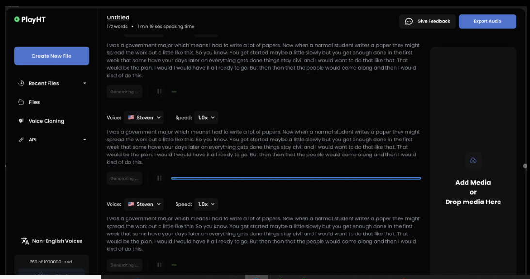
Parler-TTS excels at generating high-quality, natural-sounding speech in the style of a given speaker. In other words, it replicates a person’s voice.
This is where many folks might draw an ethical line because techniques
like this can be used to essentially imitate a real person, even without
their consent, in a process known as “deepfake” and the consequences can range from benign impersonations to full-on phishing attacks.
But
that’s not really the aim of Parler-TTS. Rather, it’s good in contexts
that require personalized and natural-sounding speech generation, such
as voice assistants and possibly even accessibility tooling to aid
visual impairments by announcing content.
Parler-TTS 🗣️
Parler-TTS is a training and inference library for
high-fidelity text-to-speech (TTS) models. The model demonstrated here, Parler-TTS Mini v0.1,
is the first iteration model trained using 10k hours of narrated
audiobooks. It generates high-quality speech
with features that can be controlled using a simple text prompt
(e.g. gender, background noise, speaking rate, pitch and reverberation).
Tips for ensuring good generation:
Include the term "very clear audio" to generate the
highest quality audio, and "very noisy audio" for high levels of
background noise
Punctuation can be used to control the prosody of the generations, e.g. use commas to add small breaks in speech
The remaining speech features (gender, speaking rate, pitch and reverberation) can be controlled directly through the prompt
Parler-TTS generation
Examples
Input Text
Description
Remember
- this is only the first iteration of the model! To improve the prosody
and naturalness of the speech further, we're scaling up the amount of
training data by a factor of five times.
A
male speaker with a low-pitched voice delivering his words at a fast
pace in a small, confined space with a very clear audio and an animated
tone.
'This is the best time of my life, Bartley,' she said happily.
A
female speaker with a slightly low-pitched, quite monotone voice
delivers her words at a slightly faster-than-average pace in a confined
space with very clear audio.
Montrose
also, after having experienced still more variety of good and bad
fortune, threw down his arms, and retired out of the kingdom.
A
male speaker with a slightly high-pitched voice delivering his words at
a slightly slow pace in a small, confined space with a touch of
background noise and a quite monotone tone.
Montrose
also, after having experienced still more variety of good and bad
fortune, threw down his arms, and retired out of the kingdom.
A
male speaker with a low-pitched voice delivers his words at a fast pace
and an animated tone, in a very spacious environment, accompanied by
noticeable background noise.
To improve the prosody and naturalness of the speech further,
we're scaling up the amount of training data to 50k hours of speech.
The v1 release of the model will be trained on this data, as
well as inference optimisations, such as flash attention
and torch compile, that will improve the latency by 2-4x. If you
want to find out more about how this model was trained and even
fine-tune it yourself, check-out the
Parler-TTS repository on GitHub.
The Parler-TTS codebase and its associated checkpoints are licensed under Apache 2.0.
Do
you know how I shared the OpenVLM Leaderboard for finding and comparing
vision language models? Well, there’s an equivalent leadership for TTS
models as well over at the Hugging Face community called TTS Arena.
TTS
models are ranked by the “naturalness” of their voices, with the most
natural-sounding models ranked first. Developers like you and me vote
and provide feedback that influences the rankings.
What
we just looked at are TTS models that are baked into whatever app we’re
making. However, some models are consumable via API, so it’s possible
to get the benefits of a TTS model without the added bloat if a
particular model is made available by an API provider.
Whether you
decide to bundle TTS models in your app or integrate them via APIs is
totally up to you. There is no right answer as far as saying one method
is better than another — it’s more about the app’s requirements and
whether the dependability of a baked-in model is worth the memory hit or
vice-versa.
All that being said, I want to call out a handful of TTS API providers for you to keep in your back pocket.
ElevenLabs offers a TTS API
that uses neural networks to make voices sound natural. Voices can be
customized for different languages and accents, leading to realistic,
engaging voices.
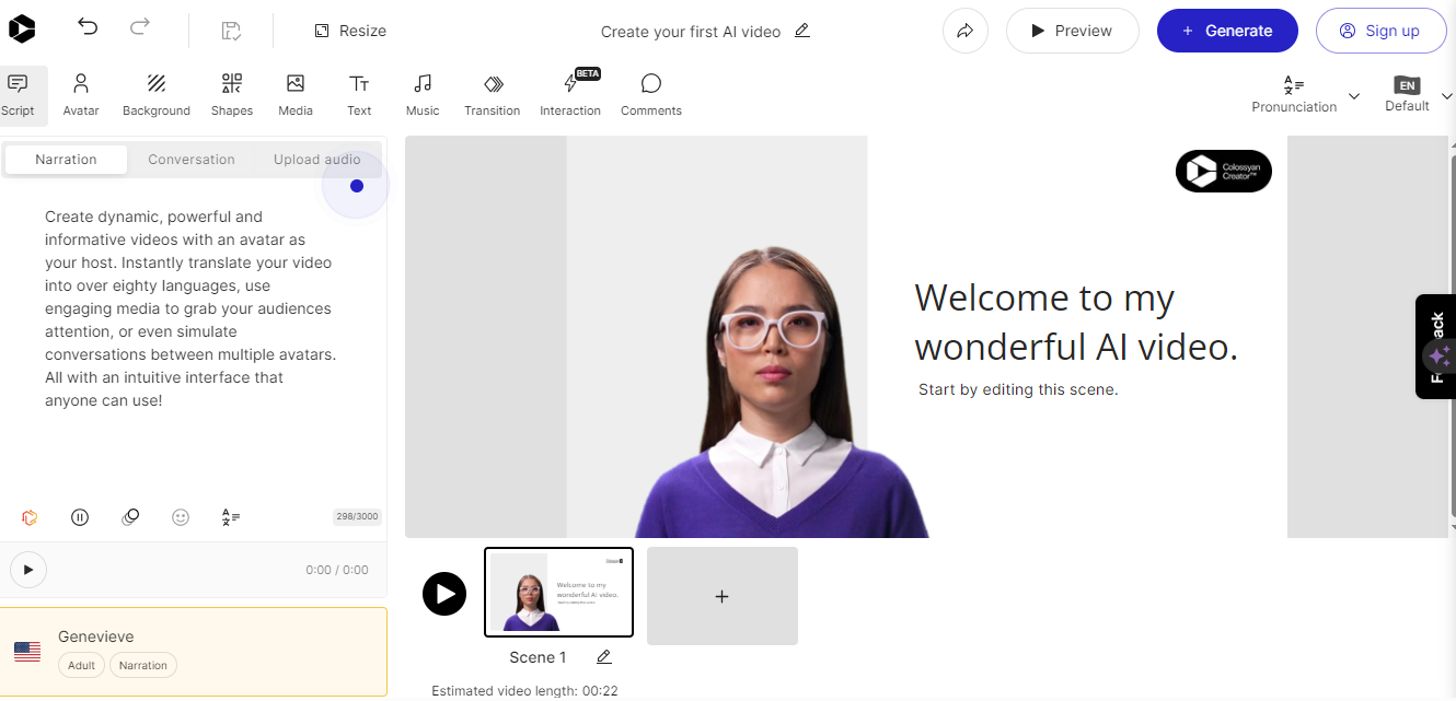
Colossyan’s text-to-speech API
converts text into natural-sounding voice recordings in over 70
languages and accents. From there, the service allows you to match the
audio to an avatar to produce something like a complete virtual
presentation based on your voice — or someone else’s.
Once
again, this is encroaching on deepfake territory, but it’s really
interesting to think of Colossyan’s service as a virtual casting call
for actors to perform off a script.
Murf.ai
is yet another TTS API designed to generate voiceovers based on real
human voices. The service provides a slew of premade voices you can use
to generate audio for anything from explainer videos and audiobooks to
course lectures and entire podcast episodes.
Amazon has its own TTS API called Polly. You can customize the voices using lexicons and Speech Synthesis Markup (SSML) tags for establishing speaking styles with affordances for adjusting things like pitch, speed, and volume.
So far, we have discussed the two primary components for generating audio from text: vision-language models and text-to-speech models.
We’ve covered what they are, where they fit into the process of
generating real-sounding speech, and various examples of each model.
Now,
it’s time to apply those concepts to the app we are building in this
tutorial (and will improve in a second tutorial). We will use a VLM so
the app can glean meaning and context from images, a TTS model to
generate speech that mimics a human voice, and then integrate our work
into a user interface for submitting images that will lead to generated
speech output.
I have decided to base our work on a VLM by Salesforce called BLIP, a TTS model from Kakao Enterprise called VITS, and Gradio as a framework for the design interface. I’ve covered Gradio extensively in other articles,
but the gist is that it is a Python library for building web interfaces
— only it offers built-in tools for working with machine learning
models that make Gradio ideal for a tutorial like this.
You can
use completely different models if you like. The whole point is less
about the intricacies of a particular model than it is to demonstrate how the pieces generally come together.
Oh, and one more detail worth noting: I am working with the code for all of this in Google Collab.
I’m using it because it’s hosted and ideal for demonstrations like
this. But you can certainly work in a more traditional IDE, like VS
Code.
Since we will pull our models directly from Hugging Face’s model hub, we can tap into them using pipelines.
This way, we’re working with an API for tasks that involve natural
language processing and computer vision without carrying the load in the
app itself.
This
establishes a pipeline for us to access BLIP for converting images into
textual descriptions. Again, you could establish a pipeline for any
other model in the Hugging Face hub.
We’ll need a pipeline connected to our TTS model as well:
What
we need now is a function that handles the audio conversion. Your code
will differ depending on the TTS model in use, but here is how I
approached the conversion based on the VITS model:
#pythondefgenerate_audio(text):# Generate speech from the input text using the Narrator (VITS model)
Narrated_Text = Narrator(text)# Extract the audio data and sampling rate
audio_data = np.array(Narrated_Text\["audio"\][0])
sampling_rate = Narrated_Text["sampling_rate"]# Save the generated speech as a WAV file
wavfile.write("generated_audio.wav", rate=sampling_rate, data=audio_data)# Return the filename of the saved audio filereturn"generated_audio.wav"
That’s
great, but we need to make sure there’s a bridge that connects the text
that the app generates from an image to the speech conversion. We can
write a function that uses BLIP to generate the text and then calls the generate_audio() function we just defined:
#pythondefcaption_my_image(pil_image):# Use BLIP to generate a text description of the input image
semantics = caption_image(images=pil_image)\[0\]["generated_text"]# Generate audio from the text descriptionreturn generate_audio(semantics)
Our
app would be pretty useless if there was no way to interact with it.
This is where Gradio comes in. We will use it to create a form that
accepts an image file as an input and then outputs the generated text
for display as well as the corresponding file containing the speech.
#python
main_tab = gr.Interface(
fn=caption_my_image,
inputs=[gr.Image(label="Select Image",type="pil")],
outputs=[gr.Audio(label="Generated Audio")],
title=" Image Audio Description App",
description="This application provides audio descriptions for images.")# Information tab
info_tab = gr.Markdown("""
# Image Audio Description App
### Purpose
This application is designed to assist visually impaired users by providing audio descriptions of images. It can also be used in various scenarios such as creating audio captions for educational materials, enhancing accessibility for digital content, and more.
### Limits
- The quality of the description depends on the image clarity and content.
- The application might not work well with images that have complex scenes or unclear subjects.
- Audio generation time may vary depending on the input image size and content.
### Note
- Ensure the uploaded image is clear and well-defined for the best results.
- This app is a prototype and may have limitations in real-world applications.
""")# Combine both tabs into a single app
demo = gr.TabbedInterface([main_tab, info_tab],
tab_names=["Main","Information"])
demo.launch()
The
interface is quite plain and simple, but that’s OK since our work is
purely for demonstration purposes. You can always add to this for your
own needs. The important thing is that you now have a working
application you can interact with.
At this point, you could run
the app and try it in Google Collab. You also have the option to deploy
your app, though you’ll need hosting for it. Hugging Face also has a feature called Spaces that you can use to deploy your work and run it without Google Collab. There’s even a guide you can use to set up your own Space.
Here’s the final app that you can try by uploading your own photo:
Image Audio Captioning App
This application provides audio descriptions for images..
We
covered a lot of ground in this tutorial! In addition to learning about
VLMs and TTS models at a high level, we looked at different examples of
them and then covered how to find and compare models.
But the
rubber really met the road when we started work on our app. Together, we
made a useful tool that generates text from an image file and then
sends that text to a TTS model to convert it into speech that is
announced out loud and downloadable as either an MP3 or WAV file.
But we’re not done just yet! What if we could glean even more detailed information from images and our app not only describes the images but can also carry on a conversation about them?
Sounds exciting, right? This is exactly what we’ll do in the second part of this tutorial.


 | | |
| ------------------------------- | --------------------------------------- |
| 🐸💬 **CoquiTTS** |
| | |
| ------------------------------- | --------------------------------------- |
| 🐸💬 **CoquiTTS** |