In this post, I’ll explain three common approaches to positioning text labels on web forms using CSS:
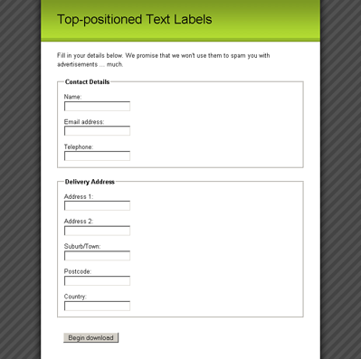
Positioning labels at the top of their form elements is probably the easiest layout to achieve, as we only need to tell the
As our form elements/labels are inside ordered list items (which are block elements), each pair will naturally fall onto a new line, as you can see from Figure 9. All we have to do is get the form elements and labels onto different lines.
This exercise is easily completed by turning the
It’s a simple change, but one which makes the form much neater, as shown below.
Left-aligning Text Labels
When we create a column of text labels to the left of the form elements, we’ll have to do a little bit more work than just to position them at the top. Once we begin floating elements, all hell breaks loose!
In order to position the labels next to the form elements, we
We also apply a little bit of
Once we float the
One markup-free solution to ensuring a parent contains any of its floated children is to also float the parent, so that’s what we’ll do:
If the list item is floated, it’ll contain all of its floated children, but its
However, once we float the list item, we find the same unwanted behavior on the
Where will this float madness end? Remain calm. It ends right here, with the submit
By turning off floating and setting the
None of the elements in the submit
After all that floating, we now have the layout shown below — a form with a column for the form labels and a column for the form elements.
Right-aligning Text Labels
With all that difficult floating safely out of the way, aligning the
And we’re done! Now you can take your pick of whichever form layout best fits your pages, all by changing a little CSS!
Which option do you prefer, and why? Let us know in the comments.
- top-positioned text labels
- left-aligned text labels
- right-aligned text labels
Positioning labels at the top of their form elements is probably the easiest layout to achieve, as we only need to tell the
label to take up the entire width of its parent element.As our form elements/labels are inside ordered list items (which are block elements), each pair will naturally fall onto a new line, as you can see from Figure 9. All we have to do is get the form elements and labels onto different lines.
This exercise is easily completed by turning the
label elements into block elements, so that they’ll occupy an entire line:label {
display: block;
}It’s a simple change, but one which makes the form much neater, as shown below.
Left-aligning Text Labels
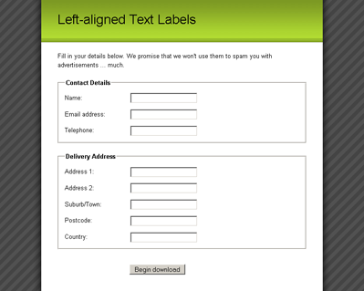
When we create a column of text labels to the left of the form elements, we’ll have to do a little bit more work than just to position them at the top. Once we begin floating elements, all hell breaks loose!
In order to position the labels next to the form elements, we
float the label elements to the left and give them an explicit width:label {
float: left;
width: 10em;
margin-right: 1em;
}We also apply a little bit of
margin-right to each label, so that the text of the label can never push right up next to the form element. We must define an explicit width
on the floated element so that all the form elements will line up in a
neat vertical column. The exact width we apply will depend upon the
length of the form labels. If possible, the longest form label should be
accommodated without wrapping, but there shouldn’t be such a large gap
that the smallest label looks like it’s unconnected to its form element.
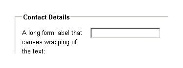
In the latter scenario, it is okay to have a label width that is smaller than the longest label, because the text will wrap naturally anyway, as you can see below.Once we float the
label,
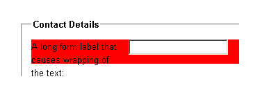
however, we run into a problem with its containing list item — the list
item will not expand to match the height of the floated element. This
problem is highly visible in the image below, where we’ve applied a background-color to the list item.One markup-free solution to ensuring a parent contains any of its floated children is to also float the parent, so that’s what we’ll do:
left-aligned-labels.css (excerpt)
 fieldset li {
 float: left;
 clear: left;
 width: 100%;
 padding-bottom: 1em;
 }
If the list item is floated, it’ll contain all of its floated children, but its
width must then be set to 100%, because floated elements try to contract to the smallest width possible. Setting the width of the list item to 100% means that it’ll still behave as if it were an unfloated block element. We also throw a clear :left property declaration in there to make sure that we won’t find any unwanted floating of list items around form elements. clear: left means that the list item will always appear beneath any prior left-floated elements instead of beside them.However, once we float the list item, we find the same unwanted behavior on the
fieldset — it won’t expand to encompass the floated list items. So, we have to float the fieldset. This is the main reason that we removed the padding from fieldset earlier — when we set its width to 100%, any padding will throw out our dimensions:left-aligned-labels.css (excerpt)
fieldset {
float: left;
clear: left;
width: 100%;
margin: 0 0 1.5em 0;
padding: 0;
}Where will this float madness end? Remain calm. It ends right here, with the submit
fieldset. Since it’s the last fieldset in the form, and because it doesn’t need as much special CSS styling as the other fieldsets, we can turn off that floating behavior for good:left-aligned-labels.css (excerpt)
fieldset.submit {
float: none;
width: auto;
border: 0 none #FFF;
padding-left: 12em;
}By turning off floating and setting the
width back to auto, the final submit fieldset becomes a normal block element that clears all the other floats. This means the form will grow to encompass all the fieldset elements, and we’re back in the normal flow of the document.None of the elements in the submit
fieldset are floated, but we want the button to line up with all of the other form elements. To achieve this outcome, we apply padding to the fieldset
itself, and this action pushes the submit button across to line up with
all the text fields. It’s best to have the button line up with the form
elements, because it forms a direct linear path that the user’s eye can
follow when he or she is completing the form.After all that floating, we now have the layout shown below — a form with a column for the form labels and a column for the form elements.
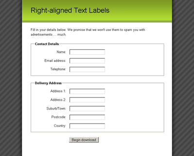
Right-aligning Text Labels
With all that difficult floating safely out of the way, aligning the
input labels to the right is a breeze; simply set the text alignment on the label elements to achieve a form that looks like the image below:right-aligned-labels.css (excerpt)
label {
float: left;
width: 10em;
margin-right: 1em;
text-align: right;
}And we’re done! Now you can take your pick of whichever form layout best fits your pages, all by changing a little CSS!
Which option do you prefer, and why? Let us know in the comments.
No comments:
Post a Comment