The goal for any web site should be to know your customers in order to deliver to them the most appropriate content.
This goal is even more important with mobile sites — not only do you need to know your customers, but you need to know what they are likely to be doing on your mobile site, as well as where they’ll be when they’re doing it. Traditional web site customers are most likely sitting at a desk facing a large monitor that has a decent resolution. Visitors who are browsing your mobile site are unlikely to be in the same circumstances — they might be waiting in line, riding on the train or the bus, running to the departure gate, or lost in an unfamiliar town late at night and trying to get somewhere.
Google is one company that has invested considerable effort into streamlining its web applications to suit mobile users. The web developers at Google have identified and focused on three main groups, and they attempt to target their applications to those customers’ needs. These are three solid categories, and are worth examining for your own mobile site. Let’s look at them now.
The goal should be to make your content more “sticky”, so that casual surfers come back for more. For example, you shouldn’t serve up long pieces of content. Instead, aim for small, bite-sized chunks that are just enough to keep customers interested, but not so long that users can’t browse your site in the time they have available.
Mobile web site customization can be difficult, but it’s not impossible. A traditional site might ask you to log in, but on a mobile device, data entry is not as easy to perform, so it’s best avoided.
One option is to allow visitors to use their desktop machines to streamline their mobile experience. Take a page from Apple’s iTunes Music Store as an example. A repeat customer might customize his or her version of the mobile site while at a desktop machine; this could generate a special URL in which all of that user’s preferences are encoded. The next time the user visits your site from a mobile device, he or she can take advantage of this special URL, enjoying an experience that’s completely customized to his or her preferences.
“My books were supposed to arrive yesterday. They’re late. Where are they?”
A more seriously urgent scenario might be:
“I’m running 15 minutes late. Will I be able to catch my flight?”
For some customers, everything is urgent! But by identifying the most important needs of your customers and making the relevant information accessible within one click or less, you’ll increase the usefulness of your mobile site enormously.
Of course, the other aspect of user targeting is knowing which device they’ll be using.
Of course, the mobile world is even worse! Not only must we cater for different screen sizes and resolutions, but also different shapes, as Figure 1 illustrates. From rectangles that are short and long, to those that are tall and skinny, to perfect squares, the mobile world contains a rich tapestry of variation that almost makes you want to pull your hair out!
If you consider the most common phones available, they can be categorized on the basis of screen size — give or take a few pixels:
Low- end mobile phones have several limitations, including screen resolution and a severely limited ability to render XHTML documents. As I mentioned in the previous section, if a majority of your customers fall in this group, then maybe WML is still for you.
At the other end of the spectrum, high-end devices often have the ability to run a web browser that’s comparable to one you might use on a desktop machine. Delivering a quality user experience to these devices can be tricky — while the device may be perfectly capable of rendering a full, traditional web page design, it’s probably transmitting data over a cellular network, which is much slower than standard broadband Internet speeds. So even though the device can handle a normal web site, the customer’s situation and the reason why they’re requesting your services may mean that sending them the normal version of your web site isn’t the best solution.
There’s a lot to know about your customers or users before you begin to design a mobile site. What advice or tips can you add? How do you gain data on the mobile users of the sites you’re developing?
This goal is even more important with mobile sites — not only do you need to know your customers, but you need to know what they are likely to be doing on your mobile site, as well as where they’ll be when they’re doing it. Traditional web site customers are most likely sitting at a desk facing a large monitor that has a decent resolution. Visitors who are browsing your mobile site are unlikely to be in the same circumstances — they might be waiting in line, riding on the train or the bus, running to the departure gate, or lost in an unfamiliar town late at night and trying to get somewhere.
Google is one company that has invested considerable effort into streamlining its web applications to suit mobile users. The web developers at Google have identified and focused on three main groups, and they attempt to target their applications to those customers’ needs. These are three solid categories, and are worth examining for your own mobile site. Let’s look at them now.
1. The Casual Surfer
These customers act in a similar way to customers of traditional web sites. Casual surfers are not really interested in any one thing, but have a few spare minutes between tasks to take a look around. In the world of desktop PCs, those few minutes might occur between meetings, or while the user’s on a short break. For a mobile customer, those few minutes might occur when the user’s sitting outside waiting to meet friends, in a car or taxi traveling somewhere, or even during the morning commute. If your site is focused on the sort of content that would appeal to casual surfers, then be aware of the limitations on the time and screen-size of your mobile customer.The goal should be to make your content more “sticky”, so that casual surfers come back for more. For example, you shouldn’t serve up long pieces of content. Instead, aim for small, bite-sized chunks that are just enough to keep customers interested, but not so long that users can’t browse your site in the time they have available.
2. The Repeat Visitor
Repeat customers are those that are constantly returning for some sort of specific news or data. If your site is the kind of site that offers information about stocks, weather or sports scores, you probably have plenty of repeat visitors. The interface of a mobile device is very limited, so if you know what your repeat visitors are coming back for, time and time again, let that naturally bubble up to the top of the site. Avoid burying the content your customers want behind 3 or 4 clicks.Mobile web site customization can be difficult, but it’s not impossible. A traditional site might ask you to log in, but on a mobile device, data entry is not as easy to perform, so it’s best avoided.
One option is to allow visitors to use their desktop machines to streamline their mobile experience. Take a page from Apple’s iTunes Music Store as an example. A repeat customer might customize his or her version of the mobile site while at a desktop machine; this could generate a special URL in which all of that user’s preferences are encoded. The next time the user visits your site from a mobile device, he or she can take advantage of this special URL, enjoying an experience that’s completely customized to his or her preferences.
3. The “Urgent, Now!” Visitor
Depending on your business, your definition of “Urgent, Now!” will vary. For an online store, a customer might consider the following message urgent:“My books were supposed to arrive yesterday. They’re late. Where are they?”
A more seriously urgent scenario might be:
“I’m running 15 minutes late. Will I be able to catch my flight?”
For some customers, everything is urgent! But by identifying the most important needs of your customers and making the relevant information accessible within one click or less, you’ll increase the usefulness of your mobile site enormously.
Of course, the other aspect of user targeting is knowing which device they’ll be using.
Know Your Phones
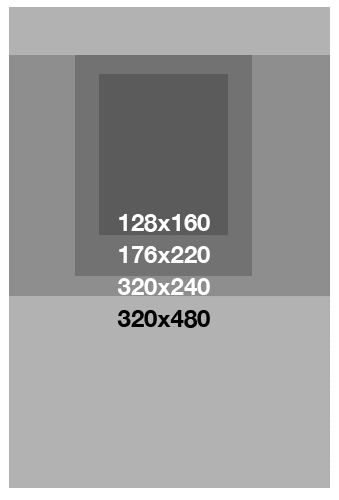
As plasma and HD TVs slowly hit the market, broadcasters have run into the problem of where to place their logo and news tickers. Previously, they knew that all TVs were the same 3x2 dimensions, so they knew the relative width of the screen. Now, they’re beginning to feel the pain of dealing with a wide assortment of TV resolutions and dimensions — an issue that web developers deal with on a daily basis.Of course, the mobile world is even worse! Not only must we cater for different screen sizes and resolutions, but also different shapes, as Figure 1 illustrates. From rectangles that are short and long, to those that are tall and skinny, to perfect squares, the mobile world contains a rich tapestry of variation that almost makes you want to pull your hair out!
If you consider the most common phones available, they can be categorized on the basis of screen size — give or take a few pixels:
- 128 x 160 pixels
- 176 x 220 pixels
- 240 x 320 pixels
- 320 x 480 pixels
For the iPhone 4 and 4S, you’ll need to cater for the Retina Display, which squeezes a 960 by 640 resolution into a 3.5″ area.
Knowing
these screen dimensions helps you optimize some of your content,
however it’s best to keep the shape and style of your site as minimal
and linear as possible. There is no mouse on a mobile phone — only an
up-down feature — so you can’t demand that users jump around the page.Smartphones & Tablets vs Green-screen Phones
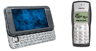
There are a couple of exceptions to the norm in the mobile phone market. They are the really high-end devices like the iPhone, iPad or the Nokia Internet Tablet, and the very basic, old “green-screen” monochrome dot matrix devices such as the Nokia 3310, both of which are shown in Figure 3.Low- end mobile phones have several limitations, including screen resolution and a severely limited ability to render XHTML documents. As I mentioned in the previous section, if a majority of your customers fall in this group, then maybe WML is still for you.
At the other end of the spectrum, high-end devices often have the ability to run a web browser that’s comparable to one you might use on a desktop machine. Delivering a quality user experience to these devices can be tricky — while the device may be perfectly capable of rendering a full, traditional web page design, it’s probably transmitting data over a cellular network, which is much slower than standard broadband Internet speeds. So even though the device can handle a normal web site, the customer’s situation and the reason why they’re requesting your services may mean that sending them the normal version of your web site isn’t the best solution.
There’s a lot to know about your customers or users before you begin to design a mobile site. What advice or tips can you add? How do you gain data on the mobile users of the sites you’re developing?
No comments:
Post a Comment