Before we get started, let’s get one thing straight:
I ♥ CSS3.
I understand that we’ve never had it so good. In fact, I have no doubt that time-travellers visiting from 2004 would be sick with jealousy at how easily we now conjure up rounded corners, shadows, and object rotations.
Sure, the browser-specific prefixes (i.e. –moz, –webkit –o, etc) are an irritation, but happily the rest of the notation is sensible, consistent and reliably supported across modern browsers.
That is, with one notable exception…
More importantly, support is complicated in most browsers and non-existent in some.
Here’s a snapshot of the current state of play:
Wow, that looks fun, huh? In short, it’s a blunt instrument with cranky syntax and patchy support.
Could it be we’re looking at it the wrong way?
In 2011, SVG is actually well-supported by all the current mainstream browsers — even on mobile. What if we started with SVG and patched around the edges? Looking back over the 15 year evolution of CSS, it’s been a slow, often tortured development. At that development rate, it’s hard to imagine CSS ever developing into a truly powerful, flexible, visual design tool.
But with SVG, arguably we have that fully-featured, visual language today.
Scalable Vector Graphics (SVG) is an XML-based file format for describing two-dimensional vector graphics. Like Illustrator’s AI format, it builds images using maths and geometry, rather than a grid of pixels (i.e. JPEGs, PSD, etc). That gives SVG images some very web-relevant superpowers — chiefly, SVG scales without distortion while maintaining tiny file sizes.
That’s enough theory. Let’s run through the simplest of SVG examples.
 2.
Before we do anything, try clicking that rather hideous ‘SVG’ button at
the top left. A popup showing your blank SVG document will appear.
You’ll notice the document size is set to 640px by 480px.Try changing
the width to 480px and hit ‘Apply Changes’ to see your changes back in
the Visual Editor view.
2.
Before we do anything, try clicking that rather hideous ‘SVG’ button at
the top left. A popup showing your blank SVG document will appear.
You’ll notice the document size is set to 640px by 480px.Try changing
the width to 480px and hit ‘Apply Changes’ to see your changes back in
the Visual Editor view.
Nice. You just wrote some SVG.
3. Next select the rectangle tool from the left toolbar and drag out a box roughly the same size as your document. Your rectangle will likely have a stroke outline by default. At the bottom of your editor you’ll notice your fill and stroke controls. Delete the stroke by setting your stroke-width to 0px.
4. Switching back to the SVG code view, you’ll see atag has been added with a set of properties for color, stroke and size. The great thing about SVG is it’s generally very human-readable. Since we got rid of the stroke, you can delete the stroke-width and stroke color properties if you like. If your rectangle doesn’t quite fit your canvas, manually edit the width and height to match the document. It should look something like this:
Try the linear gradient panel. You can choose your starting and ending colors with the color picker. The ‘x’ and ‘y’ settings control the direction of your gradient. The top-left corner is position 0:0 and the bottom-right corner is 1:1, so a begin-stop of 0:0 and an end-stop of 1:1 will give you a top-left to bottom-right diagonal gradient.
Changing your end stop to 0:1 will switch your gradient from horizontal to vertical. You’ll notice there is a slider along the bottom that lets you control the opacity of the entire object. Alternatively, you can set different transparency levels for each stop with the color picker. Try picking a starting and ending color and then have a peek at the SVG. It should look something like this.
Let’s throw it at a browser.
Open the SVG code view, select the markup and copy it to your clipboard. Next open your favorite code editor, create a new document and paste your SVG in.
Save your document as ‘
‘But what about three or more color gradients?’ you say.
Easy. Switch back to ‘
Ok, so you might be thinking ‘Fine, but we can do that with CSS3 gradients — what’s the big deal?’ This is very true, but the SVG does have some nice advantages.
 Back to SVG Edit. Select your rectangle again, click on the fill-color chip, and switch to the radial gradient tab. You’ll see a control panel not unlike the linear gradient panel.
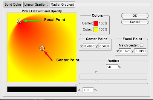
By default, gradients are centered on your shape (e.g. position x=0.5, y=0.5) but you’re free to drag and reposition the center point whenever you like.
The outer radius can be adjusted via the radius slider on the right. However I think the really nifty part is being able to have a separate center point and focal point.
Simply uncheck the ‘match center’ box and position the ‘F’ and ‘C’ icons wherever you like. As you can see in the screencap, this lets you stretch and contort your radial gradient in ways that are reminiscent of spotlights and shadow.
Even the hippest of new browsers can’t do that with pure CSS.

 To
me, this highlights a natural limitation with seamless tiling bitmaps
on the web: By definition they need to be boringly, almost clinically
flat-lit.
To
me, this highlights a natural limitation with seamless tiling bitmaps
on the web: By definition they need to be boringly, almost clinically
flat-lit.
More precisely, if you want the edges to blend, you can’t make the tile lighter on one side than the other.
What if we were to combine the strengths SVG with tiling bitmaps to get the best of both worlds?
Let’s start with this basic seamless brick tile (left). Rendered by itself, it’s not particularly impressive. Sure, we could use the cicada principle to randomize the brick pattern, but I think it’s the flat, sterile lighting that really makes it dull. Let’s fix that.
Using SVG Edit, I’ve created a simple, midnight blue rectangle with a semi-transparent radial gradient center.
I’ve skewed the focal point toward the top left corner to give it a spotlight feel.
 Copying the code into a new SVG file should look something like this:
As you can see, it’s still very concise and easy to read.
Firstly we’ll set up a fallback background for older (mostly IE) browsers that don’t support multiple backgrounds. We’ll also set the height of the HTML element to 100% to ensure our image fills the browser.
Obviously background images will tile by default. That’s perfect for our brick graphic but we want our SVG to conform to the browser window, so we’ll need to specify the background-size like this:
 Finally we add a dollop of web fonts and a pinch of CSS3 and we get something like this. You can poke at a live example here.
I think there are a number of points worth noting.
The first thing that strikes me is how much impact a very simple SVG can have on a flat-looking tile. The changing light means even tightly-repeating bricks seem far, far less noticeable than they were before.
Secondly, from a technical perspective, you’ll notice that the SVG scales to any browser window instantly and remains crystal clear regardless of screen resolution.
Support for SVG in CSS backgrounds is good in all current mainstream browsers.
 Time
to get serious and set SVG a bigger challenge. So far our first two
examples used just a single rectangle, but — unlike CSS3
gradients — there’s nothing stopping us from combining one, two or more
shapes and gradients into a single more complex SVG.
Time
to get serious and set SVG a bigger challenge. So far our first two
examples used just a single rectangle, but — unlike CSS3
gradients — there’s nothing stopping us from combining one, two or more
shapes and gradients into a single more complex SVG.
For this last example we’re going to create a loose picture gallery with a vintage feel. The HTML for our gallery is super clean — an unordered list of Flickr images courtesy of the National Library or Ireland. I want to create an auto-resizing SVG frame for each image.
Jumping back into SVG Edit, I’m going to create this new graphic from two simpler shapes.
The first shape is created using the polygon tool. It’s essentially a rectangle with its edges bowed out slightly — almost as if the shape was over-inflated. This shape will be my shadow, so I want to remove the stroke and give it a semi-opaque, 30% black fill.
Happily, SVG also supports a handy set of built-in filters, and we can use one of these to give our shadow a gentle blurred edge.
Select the shape and you should see the blur filter controls appear at the top of the editor. I’ve set my blur to 6 to get the soft edge you see below.
 The
second shape is just a rectangle. It has a light gray border and a
linear gradient of whites and light grays gives it a glossy
‘photographic paper’ look.
The
second shape is just a rectangle. It has a light gray border and a
linear gradient of whites and light grays gives it a glossy
‘photographic paper’ look.
Grab the code from the editor and paste it into a new SVG document. We now have a simple, scalable frame graphic that’s perfect for our needs.
Let’s look at the CSS.
 Firstly, we apply our new SVG to the background of the list item, and use
I’m also using
We also need to add some padding to make sure the photo doesn’t totally obscure our frame.
 Finally,
I’m using a touch of CSS3 rotation to give the gallery a loose,
scattered feel. I’m not going to break down the code for that here, but Frank Fuchs developed this idea in back in May.
Finally,
I’m using a touch of CSS3 rotation to give the gallery a loose,
scattered feel. I’m not going to break down the code for that here, but Frank Fuchs developed this idea in back in May.
Here’s the result.
It’s also nice to be able to adjust the blur or opacity with a few lazy keystrokes.
Sure, there are some drawbacks, but not too many.
Currently IE9 supports SVG nicely, but unfortunately not the SVG filters, so our shadow edge appears sharp.
Unsurprisingly, earlier IE’s ignore SVG, but it’s actually their lack of support for the
The only other significant non-SVG supporting browser seems to any Firefox before version 4, and with Mozilla’s move to automatic upgrades, this becomes less of an issue every day. Bizarrely, Firefox has actually supported SVG beautifully since 2008 — just not in CSS backgrounds where they’re so useful. Again I say, derp.
Anyway, I hope this article has sparked a few ideas on how you might weave some sexy vectors into your work. If not, it should’ve at least been a good SVG primer.
Bring on the Era of SVG!
I ♥ CSS3.
I understand that we’ve never had it so good. In fact, I have no doubt that time-travellers visiting from 2004 would be sick with jealousy at how easily we now conjure up rounded corners, shadows, and object rotations.
Sure, the browser-specific prefixes (i.e. –moz, –webkit –o, etc) are an irritation, but happily the rest of the notation is sensible, consistent and reliably supported across modern browsers.
That is, with one notable exception…
CSS3 gradients: Yes, they’re actually kinda crappy.
While the idea of programmable gradients is great, using them is seriously messy. Even in perfect-browser-utopia, gradients are consciously limited to rudimentary linear or radial application. You certainly can’t combine them, or make them contour a shape or anything useful like that.More importantly, support is complicated in most browsers and non-existent in some.
Here’s a snapshot of the current state of play:
| Browser | Radial CSS | Linear CSS |
|---|---|---|
| Firefox | -moz-radial-gradient( 500px 25%, circle, blue 20px, #eef 40px ); | -moz-linear-gradient(top, #444444, #999999);) |
| Chrome 11, Safari 5 | -webkit-radial-gradient(#cde6f9, #81a8cb); | -webkit-linear-gradient(top, #444444, #999999);) |
| Chrome | -webkit-gradient( radial, 500 25%, 20, 500 25%, 40, from(blue), to(#eef) ); | -webkit-gradient(linear, left top, left bottom, from(#444444), to(#999999)); |
| Opera 11 | No support | -o-linear-gradient(top, #444444, #999999);) |
| Opera 10– | No support | No support |
| IE10 beta | -ms-radial-gradient(top center, circle cover, | -ms-linear-gradient(30deg, orange, yellow 50%, turquoise); |
| IE9 | No support | No support |
| IE8 | No support | -ms-filter: "progid:DXImageTransform.Microsoft.gradient( la la la... |
| IE5-7 | No support | filter: progid:DXImageTransform.Microsoft.gradient(la la la.. |
Ok, so what’s the alternative?
While there have been some great recent discussions on the subject of gradients — John Allsop’s recent article gives the perfect overview — most focus on using CSS3, while occasionally patching a hole here and there with dab of SVG.Could it be we’re looking at it the wrong way?
In 2011, SVG is actually well-supported by all the current mainstream browsers — even on mobile. What if we started with SVG and patched around the edges? Looking back over the 15 year evolution of CSS, it’s been a slow, often tortured development. At that development rate, it’s hard to imagine CSS ever developing into a truly powerful, flexible, visual design tool.
But with SVG, arguably we have that fully-featured, visual language today.
Step back: Exactly what is SVG?
So, if you’re thinking ‘SVG? That’s the new Volkswagon, right?’, let’s do a quick catchup.Scalable Vector Graphics (SVG) is an XML-based file format for describing two-dimensional vector graphics. Like Illustrator’s AI format, it builds images using maths and geometry, rather than a grid of pixels (i.e. JPEGs, PSD, etc). That gives SVG images some very web-relevant superpowers — chiefly, SVG scales without distortion while maintaining tiny file sizes.
How do you make SVG?
There are quite a few ways to make your own SVG.- Hand code: If you’re geeky enough, just open your ol’ text editor and start typing. Like most XML formats, SVG mostly makes sense when you read it.
- Illustrator: Adobe Illustrator can export to SVG, though to be frank, the code is not exactly svelte and sexy. Maybe not the right tool here.
- Inkscape: Inkscape is a powerful free, open source editor that uses SVG as it’s native file format. It rightly has lots of fans, but might be overkill for producing simple web-ready graphics.
- Raven: Aviary’s Raven is an online vector application that includes a ‘save to SVG’ option. Raven is Flash-based, but it’s otherwise free and writes quite decent code too.
- SVG Edit: My personal favorite,
Google’sPavol Rusnak’s SVG Edit (hosted on Google Code)
- It’s free, and we always like free.
- It’s built from plain ol’ JavaScript, HTML, CSS and SVG so you can either use Google’s online version or run a copy on your local system.
- It writes tight, clean, readable markup.
- SVG Edit is designed to keep you in close contact with the SVG code all the way through the process.
That’s enough theory. Let’s run through the simplest of SVG examples.
Example 1: Simple linear gradients
1. Open SVG Edit in your browser (from the link the Demos section).
The blank SVG Edit Application
Nice. You just wrote some SVG.
3. Next select the rectangle tool from the left toolbar and drag out a box roughly the same size as your document. Your rectangle will likely have a stroke outline by default. At the bottom of your editor you’ll notice your fill and stroke controls. Delete the stroke by setting your stroke-width to 0px.
4. Switching back to the SVG code view, you’ll see atag has been added with a set of properties for color, stroke and size. The great thing about SVG is it’s generally very human-readable. Since we got rid of the stroke, you can delete the stroke-width and stroke color properties if you like. If your rectangle doesn’t quite fit your canvas, manually edit the width and height to match the document. It should look something like this:
5. Cross back to Visual Editor view. With your new rectangle selected, click on the Fill color chip (near the bucket). A tabbed popup launches which lets you choose between solid color, linear and radial gradients. Let’s face it: solid SVG color is less useful than plain ol’ CSS here, but the other two tabs are very useful.
Try the linear gradient panel. You can choose your starting and ending colors with the color picker. The ‘x’ and ‘y’ settings control the direction of your gradient. The top-left corner is position 0:0 and the bottom-right corner is 1:1, so a begin-stop of 0:0 and an end-stop of 1:1 will give you a top-left to bottom-right diagonal gradient.
Changing your end stop to 0:1 will switch your gradient from horizontal to vertical. You’ll notice there is a slider along the bottom that lets you control the opacity of the entire object. Alternatively, you can set different transparency levels for each stop with the color picker. Try picking a starting and ending color and then have a peek at the SVG. It should look something like this.
That markup should feel familiar. You’ll see that the gradient is defined at the top between the tags and has a unique ID — “svg_2”. The stops denote our starting and ending colors. Below that you’ll see the tag that is referencing the gradient via it’s ID (id=“svg_2”).
Let’s throw it at a browser.
Open the SVG code view, select the markup and copy it to your clipboard. Next open your favorite code editor, create a new document and paste your SVG in.
Save your document as ‘
gradient.svg’ to a testing folder. Next create a blank HTML document and in the head, add the following code.Save the HTML document with your SVG and preview it in a browser. You should be looking at an elegant two color gradient that effortlessly scales to fill ANY current browser window.
‘But what about three or more color gradients?’ you say.
Easy. Switch back to ‘
gradient.svg’
in your code editor. You’ll notice the stops in our linear gradient
have offsets of 0 and 1 respectively. Add a new with an offset of 0.5
and any color you like, and slot it in between your other two stops
like this:Save and reload and you should now have a three color rainbow.
Ok, so you might be thinking ‘Fine, but we can do that with CSS3 gradients — what’s the big deal?’ This is very true, but the SVG does have some nice advantages.
- Our CSS is so clean you could eat off it.
- We can tweak and tune our gradient without leaving our code editor.
- We now have a single set of numbers to manage rather than 4,5 or 6 syntaxes. (Even assuming we still might have to hack for older IE’s)
What about Radial Gradients?
SVG Edit — Radial gradient panel
By default, gradients are centered on your shape (e.g. position x=0.5, y=0.5) but you’re free to drag and reposition the center point whenever you like.
The outer radius can be adjusted via the radius slider on the right. However I think the really nifty part is being able to have a separate center point and focal point.
Simply uncheck the ‘match center’ box and position the ‘F’ and ‘C’ icons wherever you like. As you can see in the screencap, this lets you stretch and contort your radial gradient in ways that are reminiscent of spotlights and shadow.
Even the hippest of new browsers can’t do that with pure CSS.
Great film directors like Billy Wilder and Alfred Hitchcock use light and shadow to tell their story.
Example 2 –Lighting Effects
Recently I watched the old classic Sunset Boulevard and it got me thinking about how brilliantly directors like Billy Wilder and Alfred Hitchcock used shadow and light to create drama. The shadows almost become another character in the story.
Seamless tiles are great but they HAVE to be flat-lit to work
More precisely, if you want the edges to blend, you can’t make the tile lighter on one side than the other.
What if we were to combine the strengths SVG with tiling bitmaps to get the best of both worlds?
Let’s start with this basic seamless brick tile (left). Rendered by itself, it’s not particularly impressive. Sure, we could use the cicada principle to randomize the brick pattern, but I think it’s the flat, sterile lighting that really makes it dull. Let’s fix that.
Using SVG Edit, I’ve created a simple, midnight blue rectangle with a semi-transparent radial gradient center.
I’ve skewed the focal point toward the top left corner to give it a spotlight feel.
Radial gradients in SVG
As you can see, it’s still very concise and easy to read.
Firstly we’ll set up a fallback background for older (mostly IE) browsers that don’t support multiple backgrounds. We’ll also set the height of the HTML element to 100% to ensure our image fills the browser.
html { background:url(bricks3.jpg) ; height:100%; }
Next we’ll add our multi-image background. The brick tile is at the back (last) and our SVG overlays it.html {
background:url(bricks3.jpg) ;
background:url(spotlight.svg), url(bricks3.jpg) ;
height:100%;
}
Note I’m using the shorthand ‘background’ CSS property rather
than ‘background-image’ as older IE’s seem to try to read multiple
images as one long image when you use the more specific notation. Derp.Obviously background images will tile by default. That’s perfect for our brick graphic but we want our SVG to conform to the browser window, so we’ll need to specify the background-size like this:
html { background:url(bricks3.jpg) ;
background:url(spotlight.svg), url(bricks3.jpg);
background-size:100% 100%, auto; /* auto is tile */
 height:100%;
}
Combining SVG with a simple tile.
I think there are a number of points worth noting.
The first thing that strikes me is how much impact a very simple SVG can have on a flat-looking tile. The changing light means even tightly-repeating bricks seem far, far less noticeable than they were before.
Secondly, from a technical perspective, you’ll notice that the SVG scales to any browser window instantly and remains crystal clear regardless of screen resolution.
Support for SVG in CSS backgrounds is good in all current mainstream browsers.
- Chrome (since May 2010)
- Firefox (March 2011)
- IE9 (March 2010 beta)
- Safari (June 2010)
- Opera (June 2008).
Example 3 — Vintage gallery
Use the polygon tool to create a rectangle with slightly bowed-out edges.
For this last example we’re going to create a loose picture gallery with a vintage feel. The HTML for our gallery is super clean — an unordered list of Flickr images courtesy of the National Library or Ireland. I want to create an auto-resizing SVG frame for each image.
Jumping back into SVG Edit, I’m going to create this new graphic from two simpler shapes.
The first shape is created using the polygon tool. It’s essentially a rectangle with its edges bowed out slightly — almost as if the shape was over-inflated. This shape will be my shadow, so I want to remove the stroke and give it a semi-opaque, 30% black fill.
Happily, SVG also supports a handy set of built-in filters, and we can use one of these to give our shadow a gentle blurred edge.
Select the shape and you should see the blur filter controls appear at the top of the editor. I’ve set my blur to 6 to get the soft edge you see below.
Setting the blur filter to 6 gives us a soft shadow effect.
Grab the code from the editor and paste it into a new SVG document. We now have a simple, scalable frame graphic that’s perfect for our needs.
Let’s look at the CSS.
ul li { background: url(polaroid.svg);
 -moz-background-size: 100% 100%;
 background-size: 100% 100%;
 display:inline-block;
 padding:2% 2.5% 3% 2%;
 list-style: none;
  ... }
Using simple SVG to mimic the look of glossy photographic paper
background-size to make it match the size for each list-item.I’m also using
display:inline-block
on the list-items to make the photos stack across the screen. This
generally makes them stack more elegantly than floating each
list-item.We also need to add some padding to make sure the photo doesn’t totally obscure our frame.
Our SVG adapts effortlessly to any image regardless of size or orientation.
Here’s the result.
What do you think?
For me there’s a lot to like about this approach. The strengths of SVG seem clear. Each occurrence of the SVG scales, rotates and reshapes itself without any distortion or loss of image quality. The file size is an order of magnitude smaller — measured in bytes, not kilobytes.It’s also nice to be able to adjust the blur or opacity with a few lazy keystrokes.
Sure, there are some drawbacks, but not too many.
Currently IE9 supports SVG nicely, but unfortunately not the SVG filters, so our shadow edge appears sharp.
Unsurprisingly, earlier IE’s ignore SVG, but it’s actually their lack of support for the
background-size
CSS3 property that is the real showstopper here. Scaling SVG is where
the real power is. You might be able to concoct an IE8 fallback with
Microsoft filters. Good luck with that. Either way, CSS3 gradients
certainly aren’t your saviour.The only other significant non-SVG supporting browser seems to any Firefox before version 4, and with Mozilla’s move to automatic upgrades, this becomes less of an issue every day. Bizarrely, Firefox has actually supported SVG beautifully since 2008 — just not in CSS backgrounds where they’re so useful. Again I say, derp.
Anyway, I hope this article has sparked a few ideas on how you might weave some sexy vectors into your work. If not, it should’ve at least been a good SVG primer.
Bring on the Era of SVG!
No comments:
Post a Comment